Visualisation of Animal Tracking Data James Walker BCUR - 19.04.11.
18
Visualisation of Animal Tracking Data James Walker BCUR - 19.04.11
Transcript of Visualisation of Animal Tracking Data James Walker BCUR - 19.04.11.

Visualisation of Animal Tracking DataJames Walker
BCUR - 19.04.11

Introduction to Data
Visualisation

What is Data Visualisation?• A tool that allows the user to gain insight into
data. e.g. a graph
• Visualisation used on a day to day basis – Weather, maps... Etc.
• Data set sizes are ever-increasing making a graphical approach necessary.Data explosion!

• Abstract Data▫ Any data from a database!▫ Doesn’t exist in a spatial domain –
Our job to place it in space.
Information Visualisation
Visualisation of Animal Tracking
Data

Motivation•Biologists at
Swansea University use animal tracking devices
•Record real animal movement
•Some animals are not observable especially underwater (even with GPS!)Device attached to a penguin

How does it work?•Contain tri-axel
accelerometers •Accelerometer data can be
used to extract▫Orientation▫Movement vector
Its hard to extract these!!•Contain a tri-axel compass
– Used for determining an animals headingA Daily Diary
device

Devices contd...•Contain sensors to
determine the locale environment. Such as:▫Temperature▫Pressure▫Light intensity▫and More! Up to 13
sensors...•Small – About the size of a
match box.•Can record data for up to
4 days.

Benefits• Indirectly observe animals• Discover new animal behaviours (example)• Gain more insight into animals – Energy
expenditure
Whale Shark – Previously couldn’t be observed

Data AnalysisData from a Bird displayed on time intensity plots:
•Wave patterns represent animal activity•Typically 5 plots combined to determine a behaviour•Showing approx 1,000 data items – Data set consists
of 800,000 items. 800 Slides to analyse
The Problem...•Hard to combine several data attributes
and translate into an animal movement•Relies on the skill on biologist to extract
data from plots – Need years of experience
•Error prone!
Data sets can contain over a million entries.This is a massive challenge to biologists!
Large 2D time plots take a long time to analyse. Potentially days!

Our Solution!

Project Aims•Make data analysis less reliant on skill of
biologists.▫ Intuitive visual metaphors for perceiving the data.
•Combine multiple attributes together into one visualisation.▫ More knowledge based experience.
•Enable pattern finding capabilities.▫ Gain more knowledge from the data – Common
animal orientations.
•Quicker data analysis.▫ Assisting biologists in identifying areas of interest.

Demo of Solution

Project Aims - Recap•Make data analysis less reliant on skill of
biologists.▫ Visual metaphors for perceiving the data.
•Combine multiple attributes together into one visualisation.▫ More knowledge based experience.
•Enable pattern finding capabilities.▫ Gain more knowledge from the data – Common
animal orientations.
•Quicker data analysis.▫ Assisting biologists in identifying areas of interest.
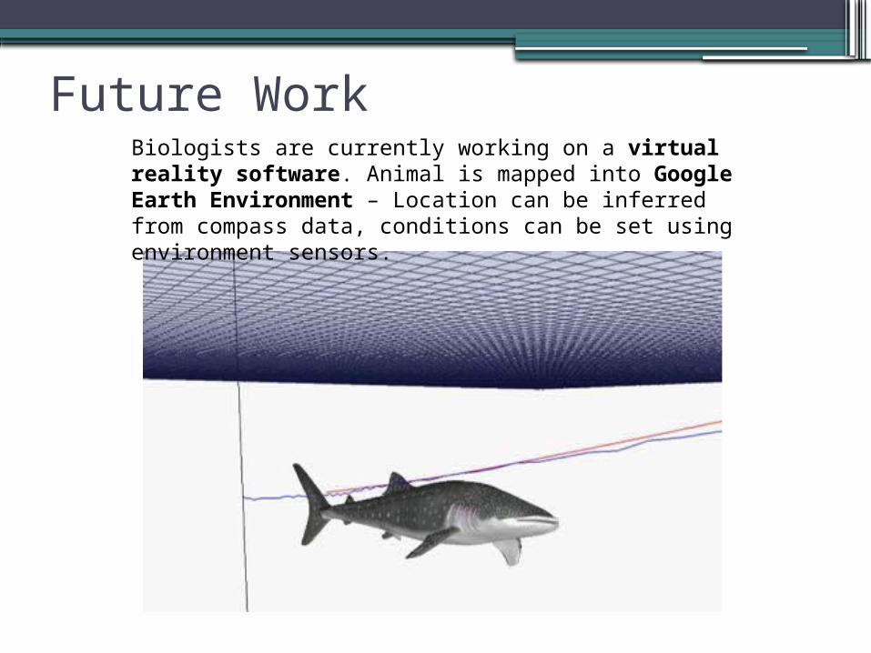
Future WorkBiologists are currently working on a virtual reality software. Animal is mapped into Google Earth Environment – Location can be inferred from compass data, conditions can be set using environment sensors.

Conclusion• This new technology is pushing the frontiers of
research into animal behaviour. New discoveries have already been made (e.g. Whale Shark).
• Aims have been achieved to enabled a better and more knowledgeable experience in data analysis.
• Important research area as indirectly observing animals is a key problem in many animal research areas.
• Firm belief that as Daily Diary devices get smaller and more advanced they will becoming more prevalent.

AcknowledgementsImages:1. Rolex Awards/Jürgen Freund
URL: http://rolexawards.com/en/the-laureates/rorywilson-home.jsp2. Conservation Magazine - Vol. 8, No. 1
URL: http://www.conservationmagazine.org/2008/07/wildlife-flight-recorder/
Research Papers:3. Visualisation of Sensor Data from Animal Movement
Edward Grundy2. Identification of animal movement patterns using tri-axial
accelerometryEmily Shepard
Supervisor:3. Bob Laramee