Visual Identity Guidelines - Baldwin Wallace … Baldwin Wallace University visual identity As...
18
Visual Identity Guidelines Effective July 1, 2012
Transcript of Visual Identity Guidelines - Baldwin Wallace … Baldwin Wallace University visual identity As...
Visual Identity GuidelinesEffective July 1, 2012
The Baldwin Wallace University visual identityAs communications become more varied, more complex and more frequent in the twenty-first century, clarity and consistency in communication becomes increasingly more important. The guidelines contained in this document were developed to help to consistently convey the “brand” that is Baldwin Wallace to our key target audiences. A unified visual presentation benefits all of us by establishing a clear and direct association between the University, our many and varied components, and our significant achievements and accomplishments.
This unified presentation becomes even more important to the institution as we transition to our new identity as Baldwin Wallace University. Consistent branding is necessary to establish our new name while still maintaining the institution’s connection to our history and accomplishments.
These guidelines are effective July 1, 2012 and should be used on all materials produced after that date. They should also be implemented prior to that date for materials that will be produced before that time but disseminated after July 1. Materials disseminated prior to July 1 should retain the branding for Baldwin-Wallace College.
The visual identity guidelines were developed and are administered by the Office of University Relations. Any questions regarding the guidelines should be directed to that office.
This document may be found on Blackboard on the Resources tab. Electronic files appropriate for various uses of the University logo can be downloaded at the same location. After July 1 these materials will be found on the University web site at www.bw.edu/quickfacts/brand/images. We encourage the use of these files by the members of the University community as well as our external partners and vendors.
2
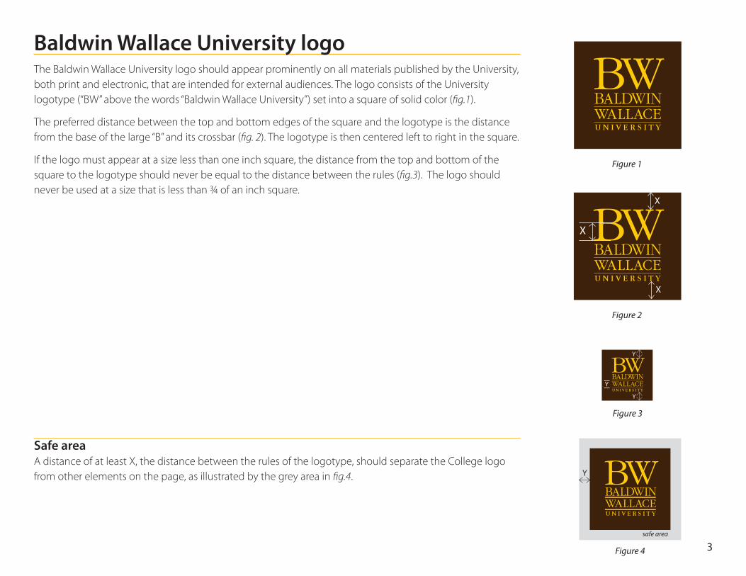
Baldwin Wallace University logoThe Baldwin Wallace University logo should appear prominently on all materials published by the University, both print and electronic, that are intended for external audiences. The logo consists of the University logotype (“BW” above the words “Baldwin Wallace University”) set into a square of solid color (fig.1).
The preferred distance between the top and bottom edges of the square and the logotype is the distance from the base of the large “B” and its crossbar (fig. 2). The logotype is then centered left to right in the square.
If the logo must appear at a size less than one inch square, the distance from the top and bottom of the square to the logotype should never be equal to the distance between the rules (fig.3). The logo should never be used at a size that is less than ¾ of an inch square.
Safe area A distance of at least X, the distance between the rules of the logotype, should separate the College logo from other elements on the page, as illustrated by the grey area in fig.4.
Figure 1
X
X
Figure 2
Figure 3
Y
X
Y
Y
Figure 4
Y
safe area
3
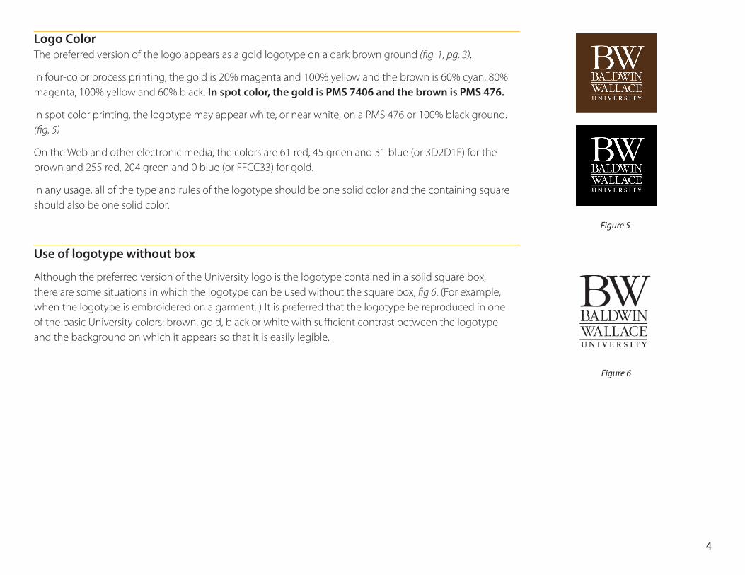
Logo Color The preferred version of the logo appears as a gold logotype on a dark brown ground (fig. 1, pg. 3).
In four-color process printing, the gold is 20% magenta and 100% yellow and the brown is 60% cyan, 80% magenta, 100% yellow and 60% black. In spot color, the gold is PMS 7406 and the brown is PMS 476.
In spot color printing, the logotype may appear white, or near white, on a PMS 476 or 100% black ground. (fig. 5)
On the Web and other electronic media, the colors are 61 red, 45 green and 31 blue (or 3D2D1F) for the brown and 255 red, 204 green and 0 blue (or FFCC33) for gold.
In any usage, all of the type and rules of the logotype should be one solid color and the containing square should also be one solid color.
Use of logotype without box
Although the preferred version of the University logo is the logotype contained in a solid square box, there are some situations in which the logotype can be used without the square box, fig 6. (For example, when the logotype is embroidered on a garment. ) It is preferred that the logotype be reproduced in one of the basic University colors: brown, gold, black or white with sufficient contrast between the logotype and the background on which it appears so that it is easily legible.
Figure 5
Figure 6
4
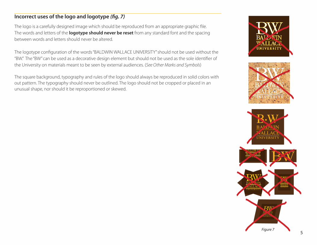
Incorrect uses of the logo and logotype (fig. 7)
The logo is a carefully designed image which should be reproduced from an appropriate graphic file. The words and letters of the logotype should never be reset from any standard font and the spacing between words and letters should never be altered.
The logotype configuration of the words “BALDWIN WALLACE UNIVERSITY” should not be used without the “BW.” The “BW” can be used as a decorative design element but should not be used as the sole identifier of the University on materials meant to be seen by external audiences. (See Other Marks and Symbols)
The square background, typography and rules of the logo should always be reproduced in solid colors with out pattern. The typography should never be outlined. The logo should not be cropped or placed in an unusual shape, nor should it be reproportioned or skewed.
B•WBALDWINWALLACEUNIVERSITY
Figure 75
Use of the College logo on the Web
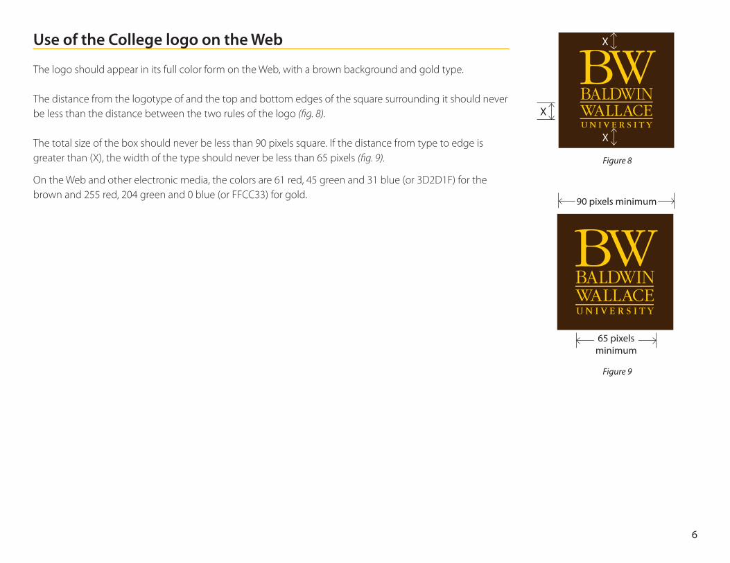
The logo should appear in its full color form on the Web, with a brown background and gold type.
The distance from the logotype of and the top and bottom edges of the square surrounding it should never be less than the distance between the two rules of the logo (fig. 8).
The total size of the box should never be less than 90 pixels square. If the distance from type to edge is greater than (X), the width of the type should never be less than 65 pixels (fig. 9).
On the Web and other electronic media, the colors are 61 red, 45 green and 31 blue (or 3D2D1F) for the brown and 255 red, 204 green and 0 blue (or FFCC33) for gold.
Figure 8
Figure 9
X
X
X
90 pixels minimum
65 pixels minimum
6
Other Marks and SymbolsSeveral other marks and symbols, in addition to the logo, are used to identify the University. These include the University Seal, the “BW” and the Stinger logo. While each of these have a purpose, their use is limited by the restrictions described below. The University logo is always the preferred graphic identity for the institution when communicating to external audiences.
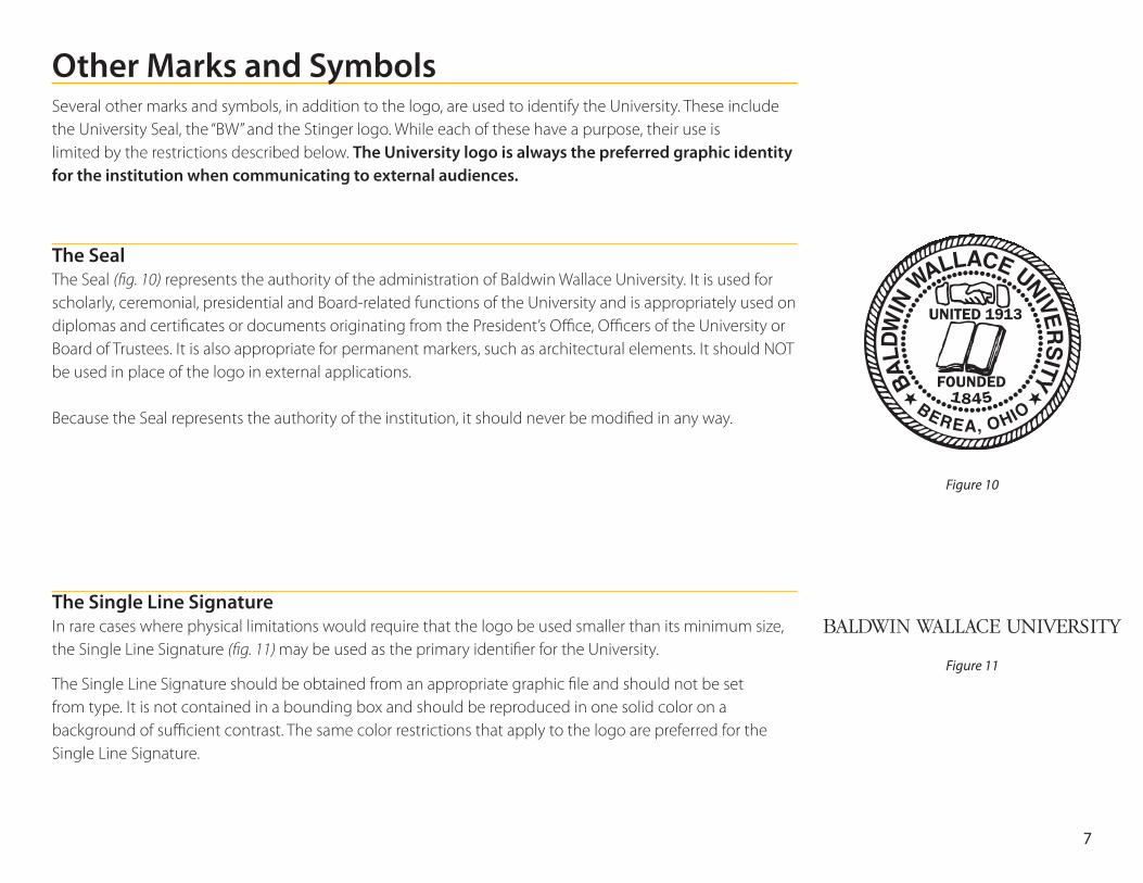
The Seal The Seal (fig. 10) represents the authority of the administration of Baldwin Wallace University. It is used for scholarly, ceremonial, presidential and Board-related functions of the University and is appropriately used on diplomas and certificates or documents originating from the President’s Office, Officers of the University or Board of Trustees. It is also appropriate for permanent markers, such as architectural elements. It should NOT be used in place of the logo in external applications. Because the Seal represents the authority of the institution, it should never be modified in any way.
The Single Line Signature In rare cases where physical limitations would require that the logo be used smaller than its minimum size, the Single Line Signature (fig. 11) may be used as the primary identifier for the University.
The Single Line Signature should be obtained from an appropriate graphic file and should not be set from type. It is not contained in a bounding box and should be reproduced in one solid color on a background of sufficient contrast. The same color restrictions that apply to the logo are preferred for the Single Line Signature.
Figure 10
Figure 11
BEREA, OHIO
BALD
WIN
WALLACE UNIVERSITY
7
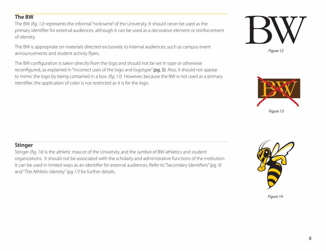
The BW The BW (fig. 12) represents the informal “nickname” of the University. It should never be used as the primary identifier for external audiences, although it can be used as a decorative element or reinforcement of identity.
The BW is appropriate on materials directed exclusively to internal audiences, such as campus event announcements and student activity flyers.
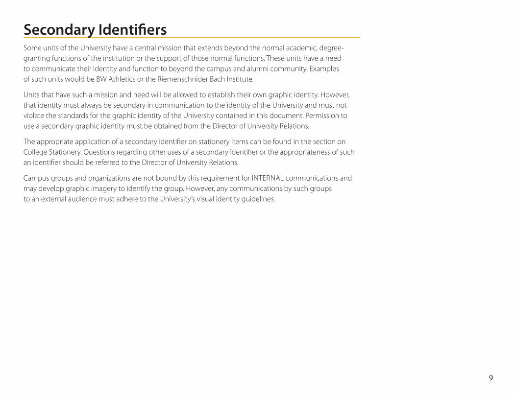
The BW configuration is taken directly from the logo and should not be set in type or otherwise reconfigured, as explained in “Incorrect uses of the logo and logotype” (pg. 5). Also, it should not appear to mimic the logo by being contained in a box. (fig. 13) However, because the BW is not used as a primary identifier, the application of color is not restricted as it is for the logo.
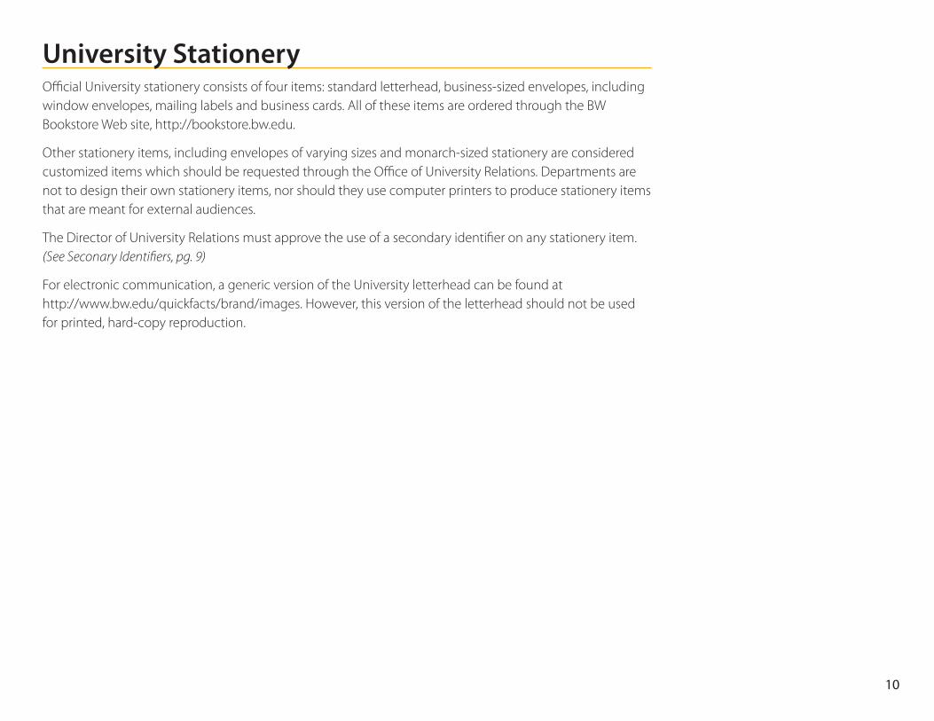
Stinger Stinger (fig. 14) is the athletic mascot of the University and the symbol of BW athletics and student organizations. It should not be associated with the scholarly and administrative functions of the institution. It can be used in limited ways as an identifier for external audiences. Refer to “Secondary Identifiers” (pg. 9)and “The Athletic Identity” (pg.17) for further details.
Figure 12
Figure 13
Figure 14
8
Secondary IdentifiersSome units of the University have a central mission that extends beyond the normal academic, degree- granting functions of the institution or the support of those normal functions. These units have a need to communicate their identity and function to beyond the campus and alumni community. Examples of such units would be BW Athletics or the Riemenschnider Bach Institute.
Units that have such a mission and need will be allowed to establish their own graphic identity. However, that identity must always be secondary in communication to the identity of the University and must not violate the standards for the graphic identity of the University contained in this document. Permission to use a secondary graphic identity must be obtained from the Director of University Relations.
The appropriate application of a secondary identifier on stationery items can be found in the section on College Stationery. Questions regarding other uses of a secondary identifier or the appropriateness of such an identifier should be referred to the Director of University Relations.
Campus groups and organizations are not bound by this requirement for INTERNAL communications and may develop graphic imagery to identify the group. However, any communications by such groups to an external audience must adhere to the University’s visual identity guidelines.
9
University StationeryOfficial University stationery consists of four items: standard letterhead, business-sized envelopes, including window envelopes, mailing labels and business cards. All of these items are ordered through the BW Bookstore Web site, http://bookstore.bw.edu.
Other stationery items, including envelopes of varying sizes and monarch-sized stationery are considered customized items which should be requested through the Office of University Relations. Departments are not to design their own stationery items, nor should they use computer printers to produce stationery items that are meant for external audiences.
The Director of University Relations must approve the use of a secondary identifier on any stationery item. (See Seconary Identifiers, pg. 9)
For electronic communication, a generic version of the University letterhead can be found at http://www.bw.edu/quickfacts/brand/images. However, this version of the letterhead should not be used for printed, hard-copy reproduction.
10
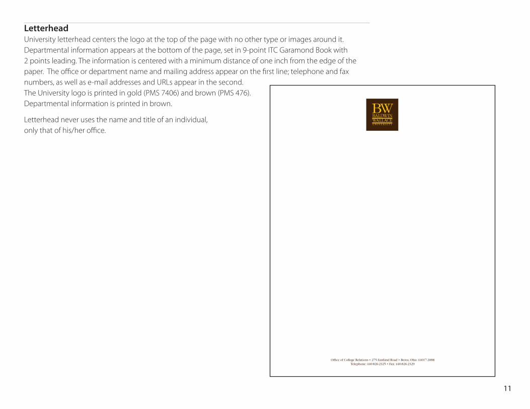
Letterhead University letterhead centers the logo at the top of the page with no other type or images around it. Departmental information appears at the bottom of the page, set in 9-point ITC Garamond Book with 2 points leading. The information is centered with a minimum distance of one inch from the edge of the paper. The office or department name and mailing address appear on the first line; telephone and fax numbers, as well as e-mail addresses and URLs appear in the second. The University logo is printed in gold (PMS 7406) and brown (PMS 476). Departmental information is printed in brown.
Letterhead never uses the name and title of an individual, only that of his/her office.
Office of College Relations • 275 Eastland Road • Berea, Ohio 44017-2088 Telephone: 440-826-2325 • Fax: 440-826-2329
11
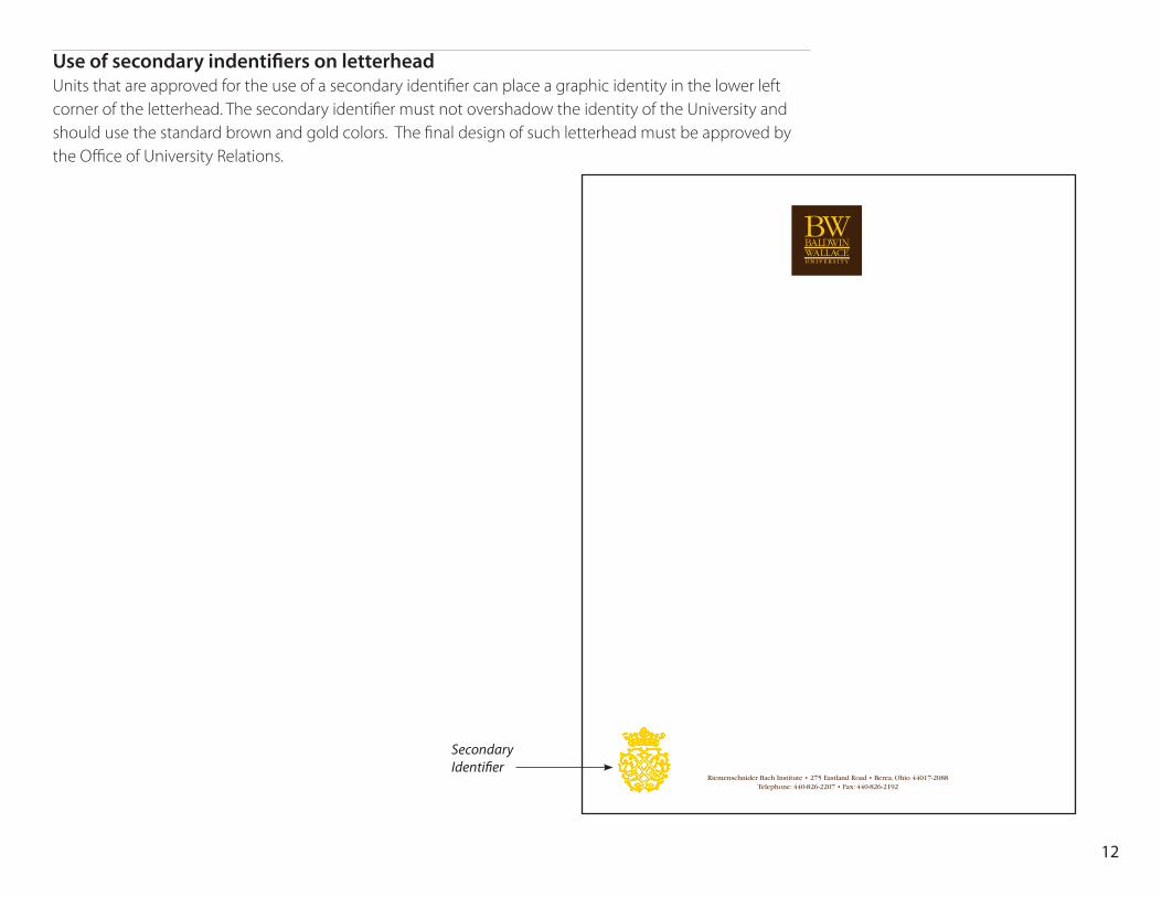
Use of secondary indentifiers on letterhead Units that are approved for the use of a secondary identifier can place a graphic identity in the lower left corner of the letterhead. The secondary identifier must not overshadow the identity of the University and should use the standard brown and gold colors. The final design of such letterhead must be approved by the Office of University Relations.
Riemenschnider Bach Institute • 275 Eastland Road • Berea, Ohio 44017-2088 Telephone: 440-826-2207 • Fax: 440-826-2192
Secondary Identifier
12
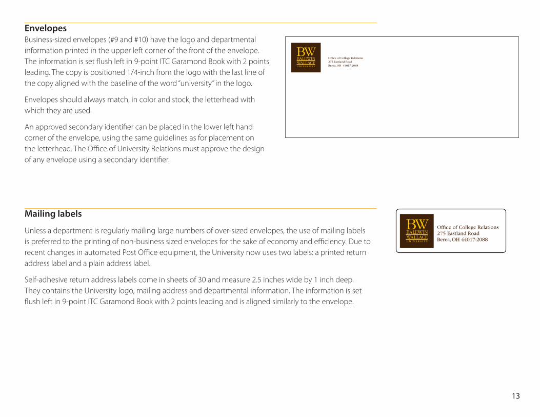
Envelopes Business-sized envelopes (#9 and #10) have the logo and departmental information printed in the upper left corner of the front of the envelope. The information is set flush left in 9-point ITC Garamond Book with 2 points leading. The copy is positioned 1/4-inch from the logo with the last line of the copy aligned with the baseline of the word “university” in the logo.
Envelopes should always match, in color and stock, the letterhead with which they are used.
An approved secondary identifier can be placed in the lower left hand corner of the envelope, using the same guidelines as for placement on the letterhead. The Office of University Relations must approve the design of any envelope using a secondary identifier.
Mailing labels
Unless a department is regularly mailing large numbers of over-sized envelopes, the use of mailing labels is preferred to the printing of non-business sized envelopes for the sake of economy and efficiency. Due to recent changes in automated Post Office equipment, the University now uses two labels: a printed return address label and a plain address label.
Self-adhesive return address labels come in sheets of 30 and measure 2.5 inches wide by 1 inch deep. They contains the University logo, mailing address and departmental information. The information is set flush left in 9-point ITC Garamond Book with 2 points leading and is aligned similarly to the envelope.
Office of College Relations275 Eastland RoadBerea, OH 44017-2088
Office of College Relations275 Eastland RoadBerea, OH 44017-2088
13
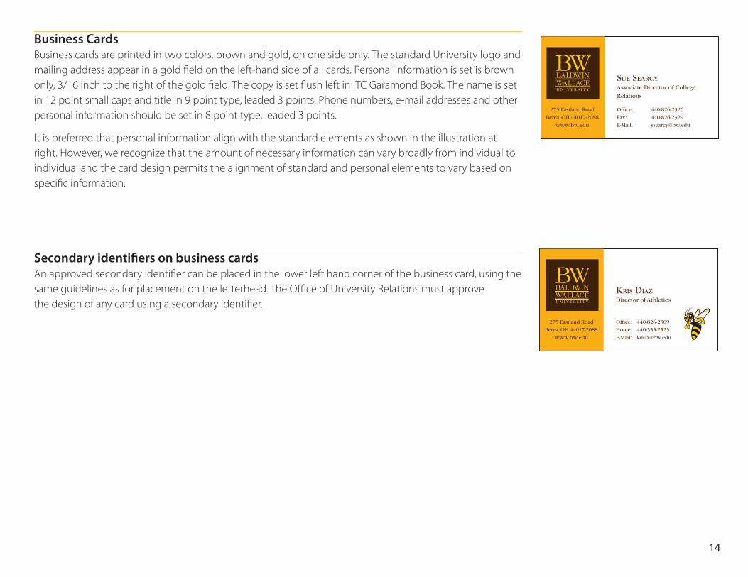
Business Cards Business cards are printed in two colors, brown and gold, on one side only. The standard University logo and mailing address appear in a gold field on the left-hand side of all cards. Personal information is set is brown only, 3/16 inch to the right of the gold field. The copy is set flush left in ITC Garamond Book. The name is set in 12 point small caps and title in 9 point type, leaded 3 points. Phone numbers, e-mail addresses and other personal information should be set in 8 point type, leaded 3 points.
It is preferred that personal information align with the standard elements as shown in the illustration at right. However, we recognize that the amount of necessary information can vary broadly from individual to individual and the card design permits the alignment of standard and personal elements to vary based on specific information.
Secondary identifiers on business cards An approved secondary identifier can be placed in the lower left hand corner of the business card, using the same guidelines as for placement on the letterhead. The Office of University Relations must approve the design of any card using a secondary identifier.
275 Eastland Road
Berea, OH 44017-2088
www.bw.edu
Sue SearcyAssociate Director of College Relations
Office: 440-826-2326
Fax: 440-826-2329
E-Mail: [email protected]
275 Eastland Road
Berea, OH 44017-2088
www.bw.edu
KriS DiazDirector of Athletics
Office: 440-826-2309
Home: 440-555-2525
E-Mail: [email protected]
14
Departmental IdentificationDepartmental identification is not normally part of the University identity. However, we recognize that in certain instances, such as work wear meant to identify the wearer as an employee of the University with an official function, that it is helpful to identify the department. In such cases, the following guidelines should be observed.
Department identification is appropriate for clothing, vehicles and equipment. This form of departmental identification is NOT to be used on stationery, publications and other documents.
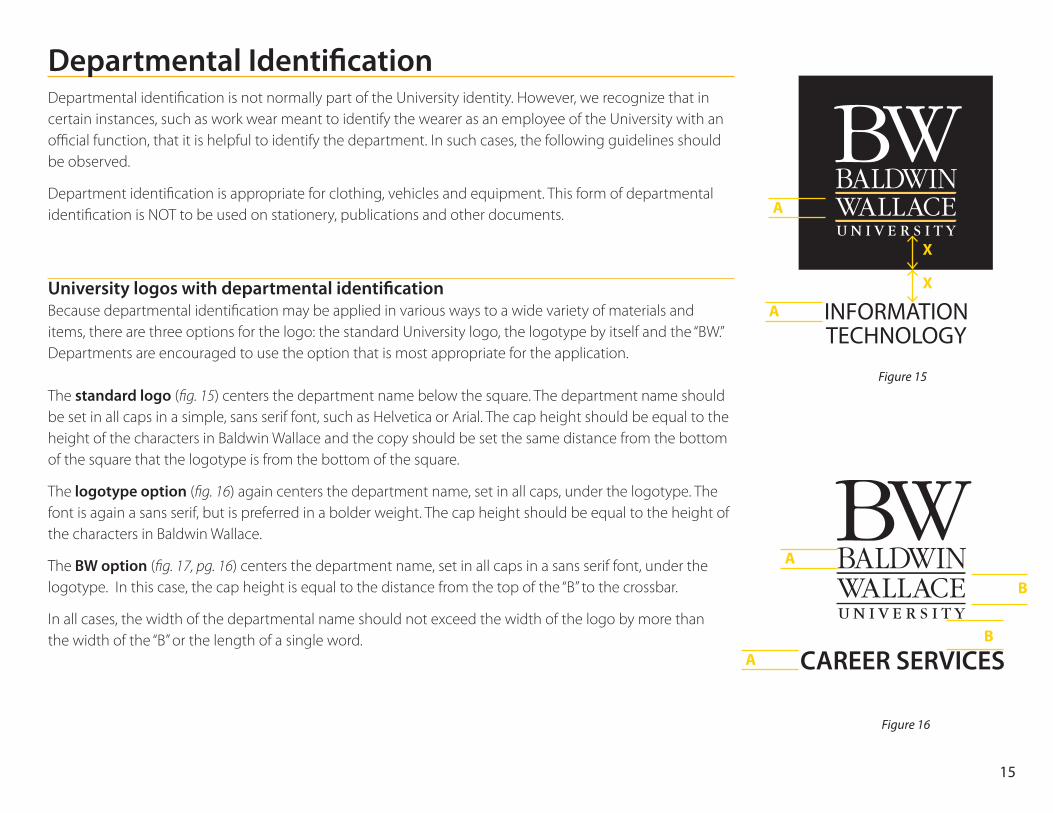
University logos with departmental identification Because departmental identification may be applied in various ways to a wide variety of materials and items, there are three options for the logo: the standard University logo, the logotype by itself and the “BW.” Departments are encouraged to use the option that is most appropriate for the application. The standard logo (fig. 15) centers the department name below the square. The department name should be set in all caps in a simple, sans serif font, such as Helvetica or Arial. The cap height should be equal to the height of the characters in Baldwin Wallace and the copy should be set the same distance from the bottom of the square that the logotype is from the bottom of the square.
The logotype option (fig. 16) again centers the department name, set in all caps, under the logotype. The font is again a sans serif, but is preferred in a bolder weight. The cap height should be equal to the height of the characters in Baldwin Wallace.
The BW option (fig. 17, pg. 16) centers the department name, set in all caps in a sans serif font, under the logotype. In this case, the cap height is equal to the distance from the top of the “B” to the crossbar.
In all cases, the width of the departmental name should not exceed the width of the logo by more than the width of the “B” or the length of a single word.
INFORMATIONTECHNOLOGY
A
A
X
X
Figure 15
CAREER SERVICES
B
B
A
A
Figure 16
15
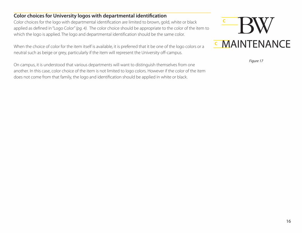
Color choices for University logos with departmental identification Color choices for the logo with departmental identification are limited to brown, gold, white or black applied as defined in “Logo Color” (pg. 4). The color choice should be appropriate to the color of the item to which the logo is applied. The logo and departmental identification should be the same color. When the choice of color for the item itself is available, it is preferred that it be one of the logo colors or a neutral such as beige or grey, particularly if the item will represent the University off-campus. On campus, it is understood that various departments will want to distinguish themselves from one another. In this case, color choice of the item is not limited to logo colors. However if the color of the item does not come from that family, the logo and identification should be applied in white or black.
MAINTENANCE
C
C
Figure 17
16
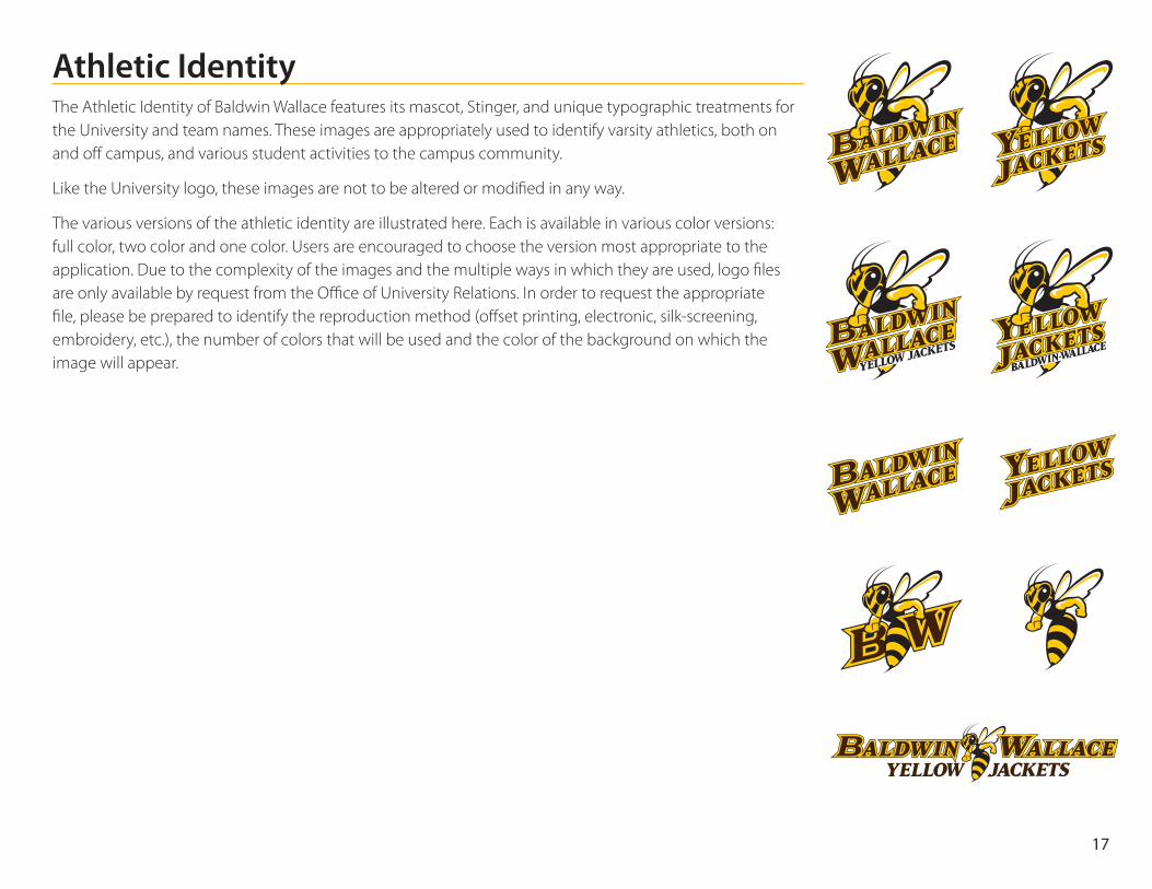
Athletic IdentityThe Athletic Identity of Baldwin Wallace features its mascot, Stinger, and unique typographic treatments for the University and team names. These images are appropriately used to identify varsity athletics, both on and off campus, and various student activities to the campus community.
Like the University logo, these images are not to be altered or modified in any way.
The various versions of the athletic identity are illustrated here. Each is available in various color versions: full color, two color and one color. Users are encouraged to choose the version most appropriate to the application. Due to the complexity of the images and the multiple ways in which they are used, logo files are only available by request from the Office of University Relations. In order to request the appropriate file, please be prepared to identify the reproduction method (offset printing, electronic, silk-screening, embroidery, etc.), the number of colors that will be used and the color of the background on which the image will appear.
17
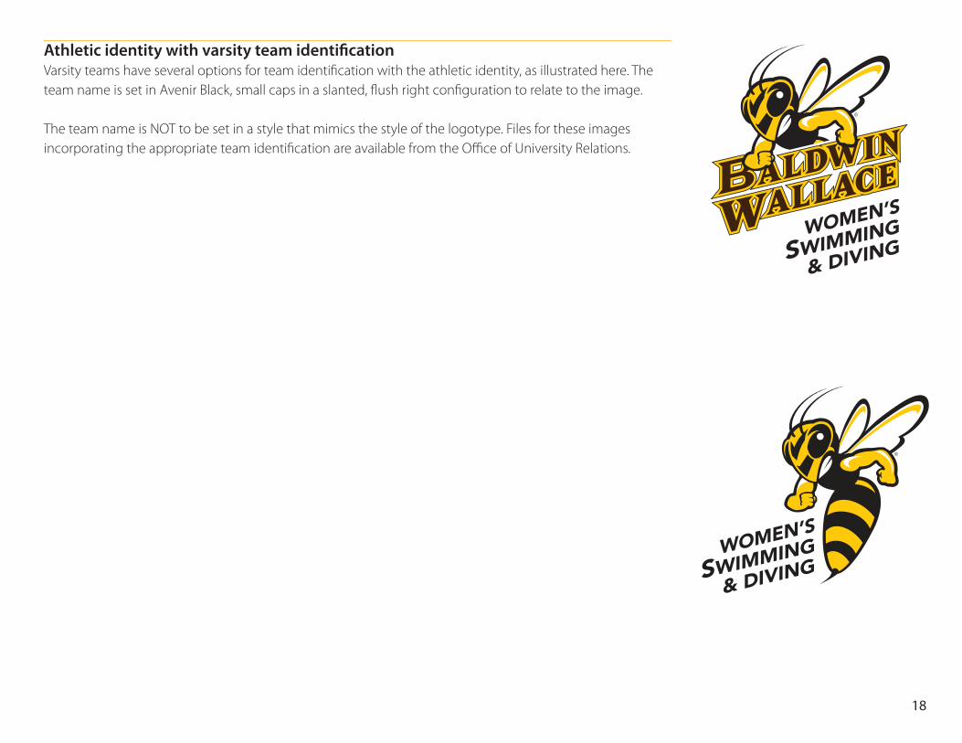
Athletic identity with varsity team identification Varsity teams have several options for team identification with the athletic identity, as illustrated here. The team name is set in Avenir Black, small caps in a slanted, flush right configuration to relate to the image. The team name is NOT to be set in a style that mimics the style of the logotype. Files for these images incorporating the appropriate team identification are available from the Office of University Relations.
WOMEN’S
SWIMMING
& DIVING
WOMEN’S
SWIMMING
& DIVING
18