A Robust Screen-Free Brain-Computer Interface for Robotic ...
date post
20-Dec-2015Category
view
221download
0
Visual design
The “look” of your interface
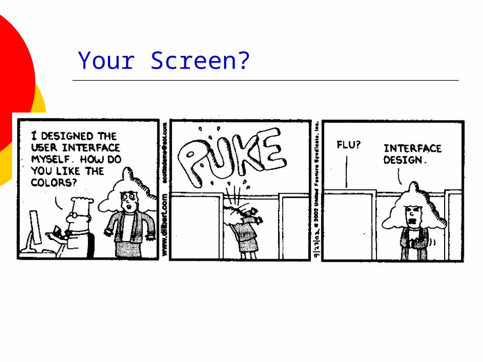
Your Screen?
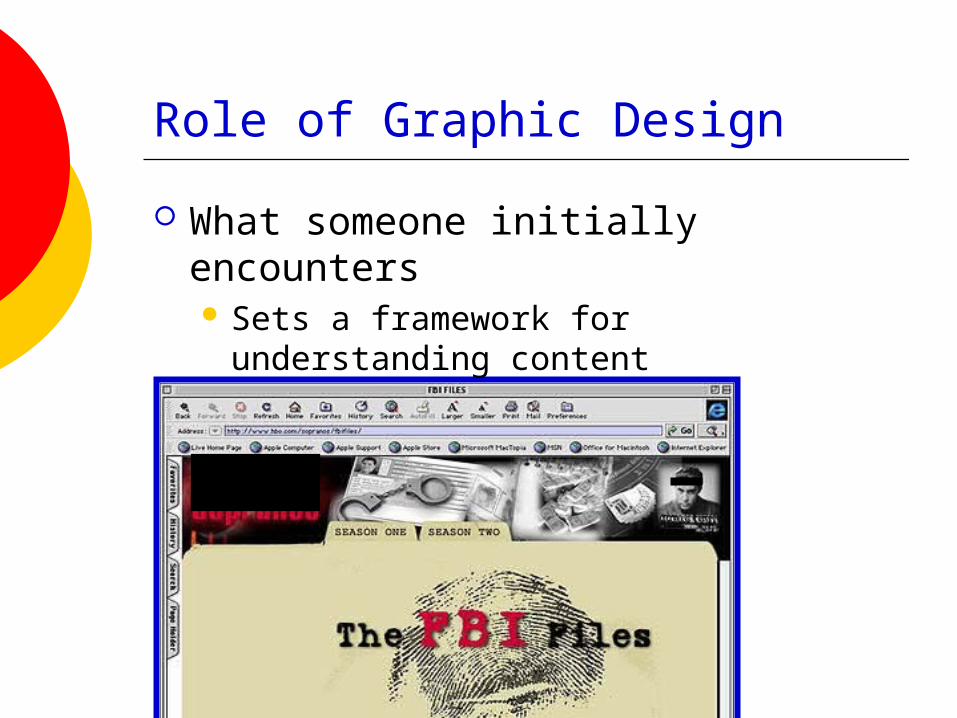
Role of Graphic Design
What someone initially encounters Sets a framework for understanding
content

Role of Graphic Design
What someone initially encounters Sets a framework for understanding
content

Role of Graphic Design
What someone initially encounters Sets a framework for understanding
content
Graphic Design
A comprehensible mental image Appropriate organization of data,
functions, tasks and roles High-quality appearances
The “look” Effective interaction sequencing
The “feel”
Classes at UNCC:http://www.uncc.edu/schedule/subject/artg.html

Graphic Design
Involves knowledge of: Sequencing Organization Layout Imagery Color Typography

Graphic Design Principles
Metaphor Clarity Consistency Alignment Proximity Contrast
Clarity
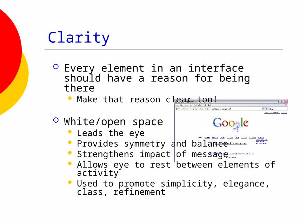
Every element in an interface should have a reason for being there Make that reason clear too!
White/open space Leads the eye Provides symmetry and balance Strengthens impact of message Allows eye to rest between elements of
activity Used to promote simplicity, elegance, class,
refinement

Example
Clear, cleanappearance
Opinion?

Example
Does this convey different impressions?
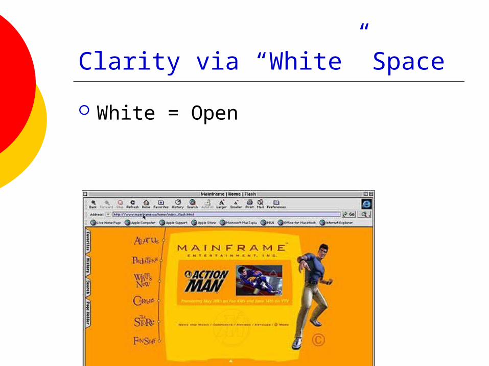
Clarity via “White” Space
White = Open

Consistency
In layout, color, images, icons, typography, text, …
Within screen, across screens Stay within metaphor everywhere
Platform may have a style guide Follow it!

Example
Home page Content page 1 Content page 2
www.santafean.com
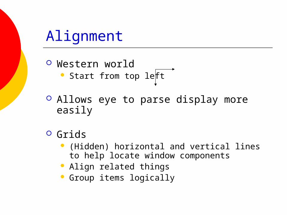
Alignment
Western world Start from top left
Allows eye to parse display more easily
Grids (Hidden) horizontal and vertical lines to help
locate window components Align related things Group items logically
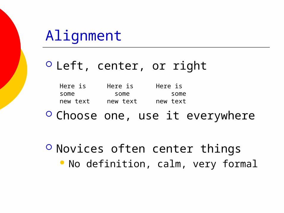
Alignment
Left, center, or right
Choose one, use it everywhere
Novices often center things No definition, calm, very formal
Here is somenew text
Here is some
new text
Here is some
new text

Grids – use them
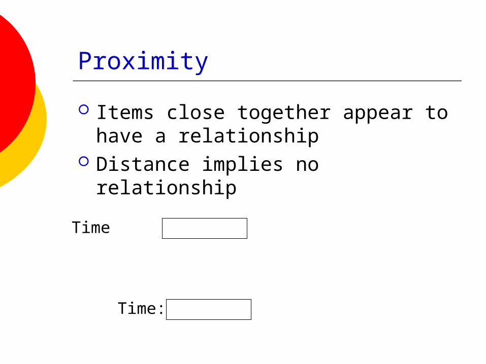
Proximity
Items close together appear to have a relationship
Distance implies no relationship
Time:
Time
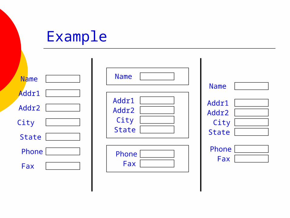
Example
Name
Addr1
Addr2
City
State
Phone
Fax
Name
Addr1Addr2
CityState
PhoneFax
Name
Addr1Addr2
CityState
PhoneFax
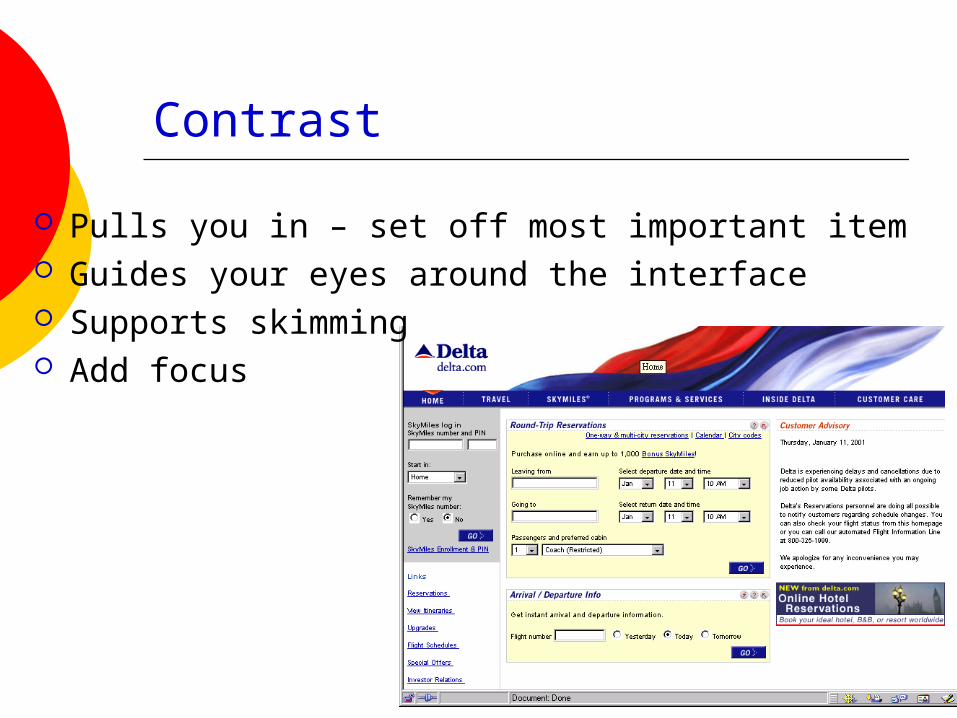
Contrast
Pulls you in – set off most important item Guides your eyes around the interface Supports skimming Add focus
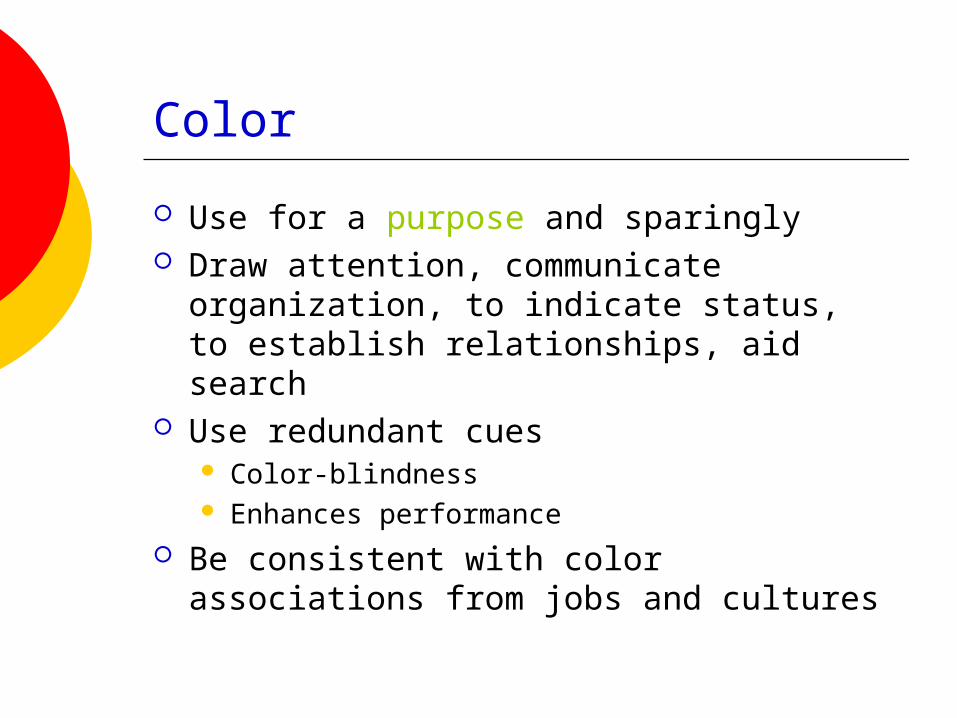
Color
Use for a purpose and sparingly Draw attention, communicate
organization, to indicate status, to establish relationships, aid search
Use redundant cues Color-blindness Enhances performance
Be consistent with color associations from jobs and cultures

How many small ovals?
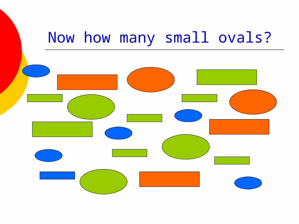
Now how many small ovals?
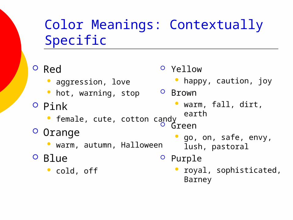
Yellow happy, caution, joy
Brown warm, fall, dirt, earth
Green go, on, safe, envy, lush,
pastoral Purple
royal, sophisticated, Barney
Color Meanings: Contextually Specific
Red aggression, love hot, warning, stop
Pink female, cute, cotton candy
Orange warm, autumn, Halloween
Blue cold, off
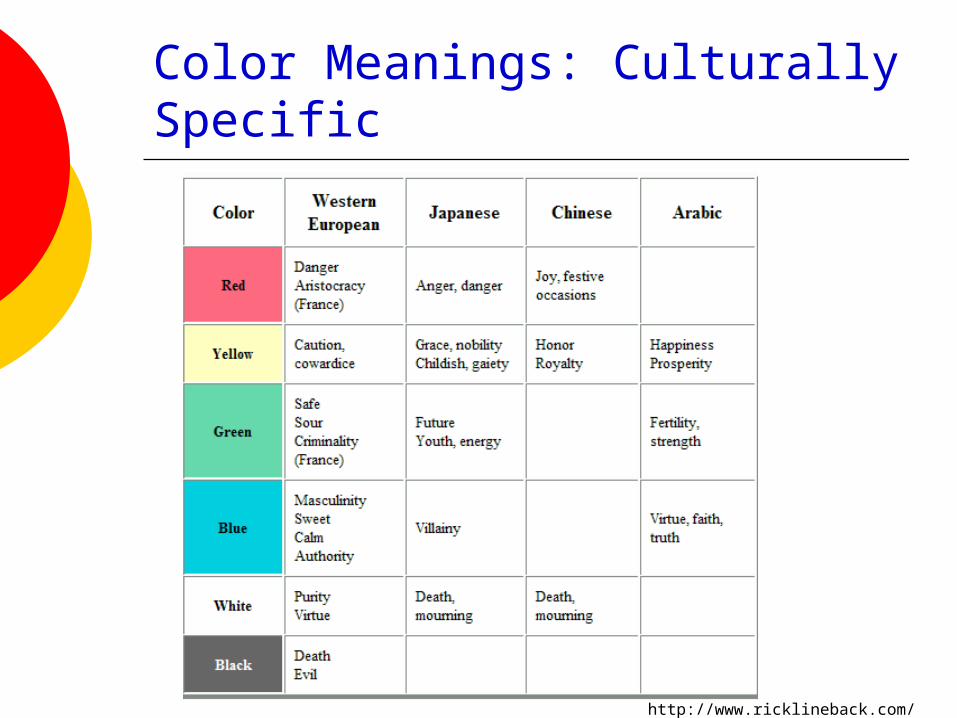
Color Meanings: Culturally Specific
http://www.ricklineback.com/culture2.htm
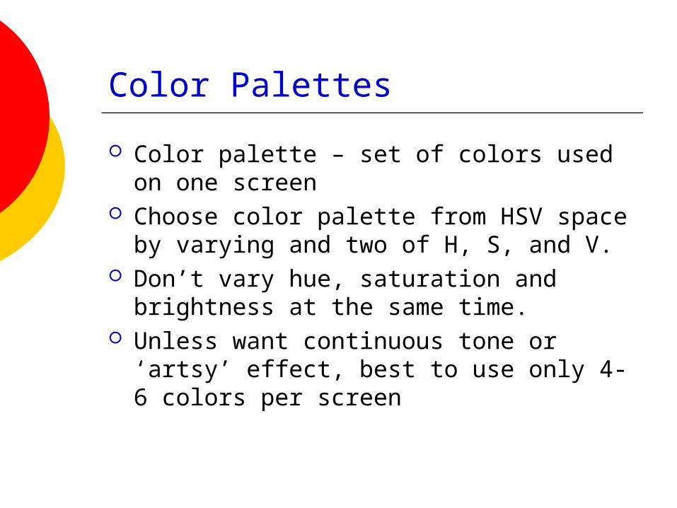
Color Palettes
Color palette – set of colors used on one screen
Choose color palette from HSV space by varying and two of H, S, and V.
Don’t vary hue, saturation and brightness at the same time.
Unless want continuous tone or ‘artsy’ effect, best to use only 4-6 colors per screen

Color Palettes/Suites
Designers often pick a palette of 4 or 5 colors
Variations of 2 colors
Monochromatic (variations of 1 color)
Southwestern (culturally evocative)

Effect of Colored Text on Colored Background
Black text on red
Gray text on red
Yellow text on red
Light yellow text on red
Green text on red
Light green text on red
Blue text on red
Pale blue text on red
Dark red text on red
Red text on red
Rose text on red

Effect of Colored Text on Colored Background
Black text on dark blue
Gray text on dark blue
Yellow text on dark blue
Light yellow text on dark blue
Green text on dark blue
Light green text on dark blue
Blue text on dark blue
Pale blue text on dark blue
Dark red text on dark blue
Red text on dark blue
Rose text on dark blue

Color Guidelines
Display color images on a black, white, or gray background
Be sure foreground colors contrast (in both brightness and hue) with background colors
Avoid using color in non-task related ways
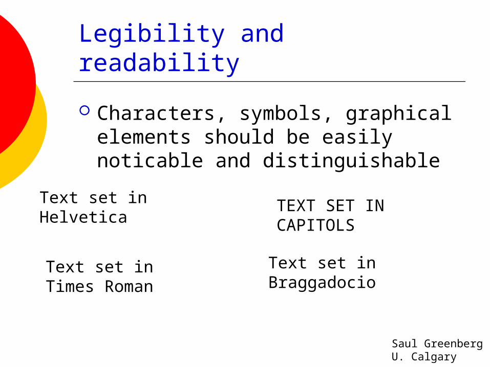
Legibility and readability
Characters, symbols, graphical elements should be easily noticable and distinguishable
Text set in Braggadocio
Text set in Helvetica
TEXT SET INCAPITOLS
Text set in Times Roman
Saul GreenbergU. Calgary

Legibility and readability
Proper use of typography 1-2 typefaces (3 max) normal, italics, bold 1-3 sizes max
LargeMediumSmall
LargeMediumSmall
Readable
Design components to be inviting and attractive
Design components to be inviting and attractive
Unreadable
Design components to be inviting and attractive
Design components to be inviting and attractive
Saul GreenbergU. Calgary

Example
Disorganized

Example
Visual noise

Example
Overuse of3D effects

Remember
Form follows function Visual elements should help convey
purpose and meaning Be consistent Just like all design – iterate and get
feedback!!

Review
Introduction What were the major interaction
paradigms? Requirements
Functional vs. Non-Functional Formative vs. Summative evaluation Gathering methods
Advantages, disadvantages, why use
Review
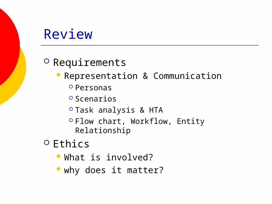
Requirements Representation & Communication
Personas Scenarios Task analysis & HTA Flow chart, Workflow, Entity Relationship
Ethics What is involved? why does it matter?
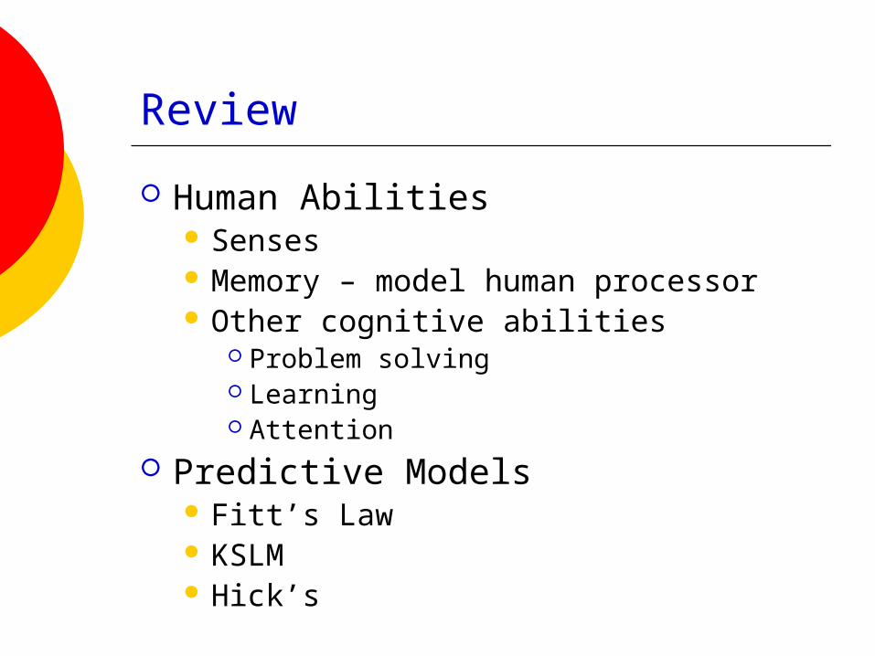
Review
Human Abilities Senses Memory – model human processor Other cognitive abilities
Problem solving Learning Attention
Predictive Models Fitt’s Law KSLM Hick’s

Review
Design General process Norman’s principles Norman’s Execution-Evaluation model Learnability, Flexibility, Robustness principles Error prevention
Prototyping Fidelity, horizontal vs. vertical Methods: storyboards, scenarios, mockups,
wizard of oz, etc.