Visual composition austin fata
21
Lines are used to guide the eye and in away point you in the direction to go. Lines are the basic element of design. The picture on the right is showing distance and the picture on the left is showing curved lines with sharp ends and looks like they are moving downwards. LINES
-
Upload
bluedevils -
Category
Documents
-
view
424 -
download
3
Transcript of Visual composition austin fata
Lines are used to guide the eye and in away point you in the direction to go. Lines are the basic element of design. The picture on the right is showing distance and the picture on the left is showing curved lines with sharp ends and looks like they are movingdownwards.
LINES
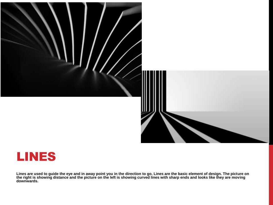
2d shapes are another basic element of design. Alone or in combination with other shapes and lines they can convey universal meanings as well as guide the eye and or organize information. The picture on the left there is a picture of sphere hiding behind blocks and the picture on the right is making us look through the picture.
2D SHAPES
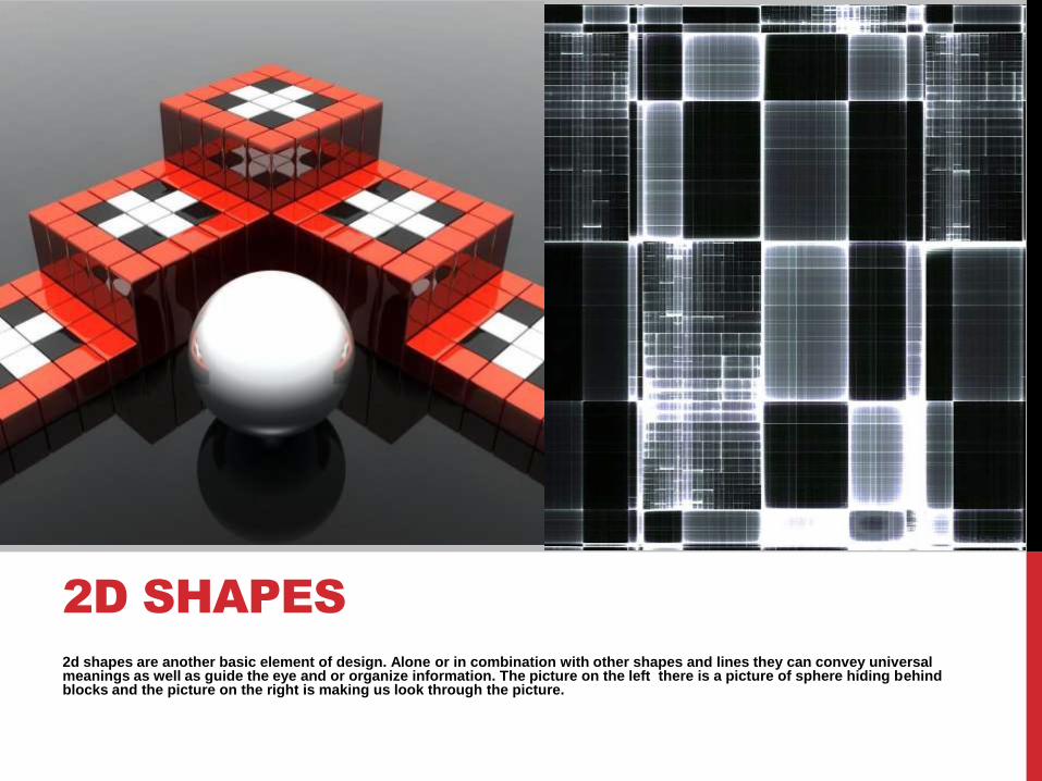
As you can see these two pictures are two dimensional but the form is three dimensional. You can hold a form, walk around a formand in some cases walk inside a form. Three dimensional pictures, shapes, and movies make you feel like you're their in the moment.
3D SHAPES
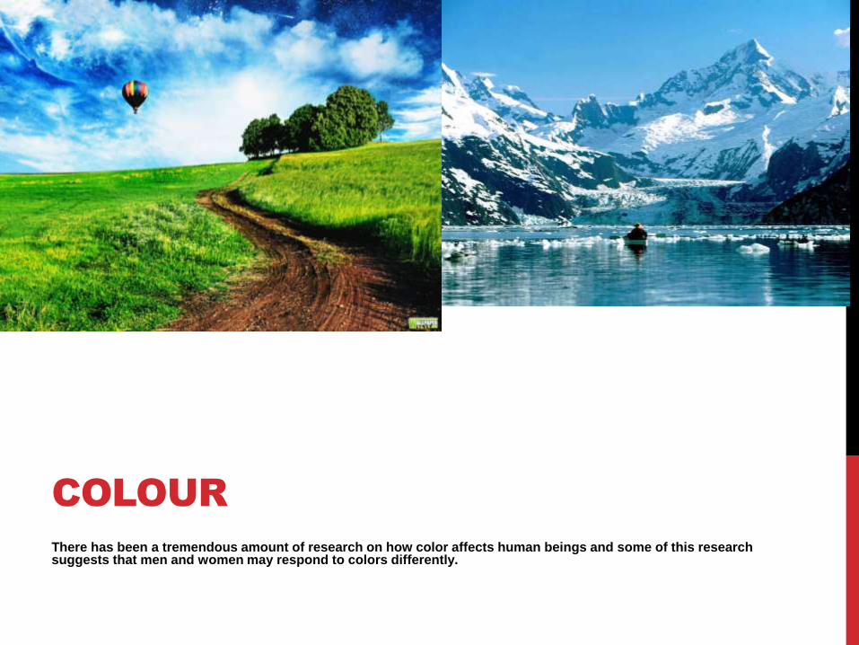
There has been a tremendous amount of research on how color affects human beings and some of this research suggests that men and women may respond to colors differently.
COLOUR
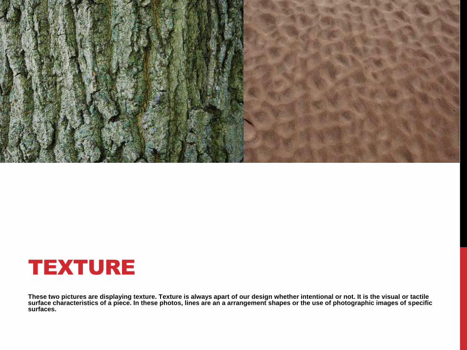
These two pictures are displaying texture. Texture is always apart of our design whether intentional or not. It is the visual or tactile surface characteristics of a piece. In these photos, lines are an a arrangement shapes or the use of photographic images of specific surfaces.
TEXTURE
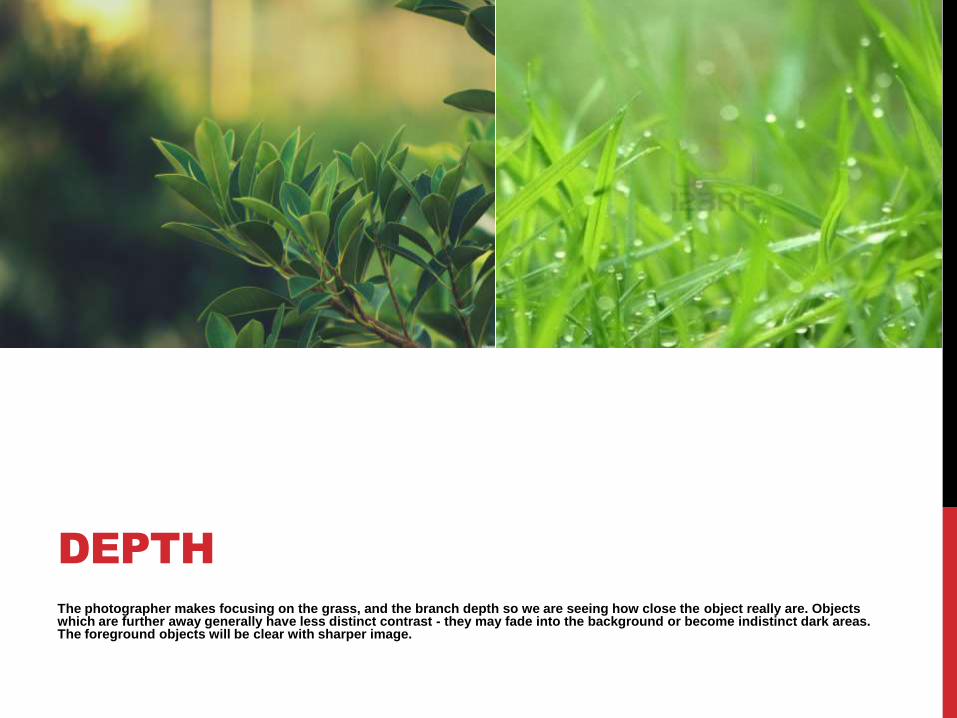
The photographer makes focusing on the grass, and the branch depth so we are seeing how close the object really are. Objects which are further away generally have less distinct contrast - they may fade into the background or become indistinct dark areas. The foreground objects will be clear with sharper image.
DEPTH
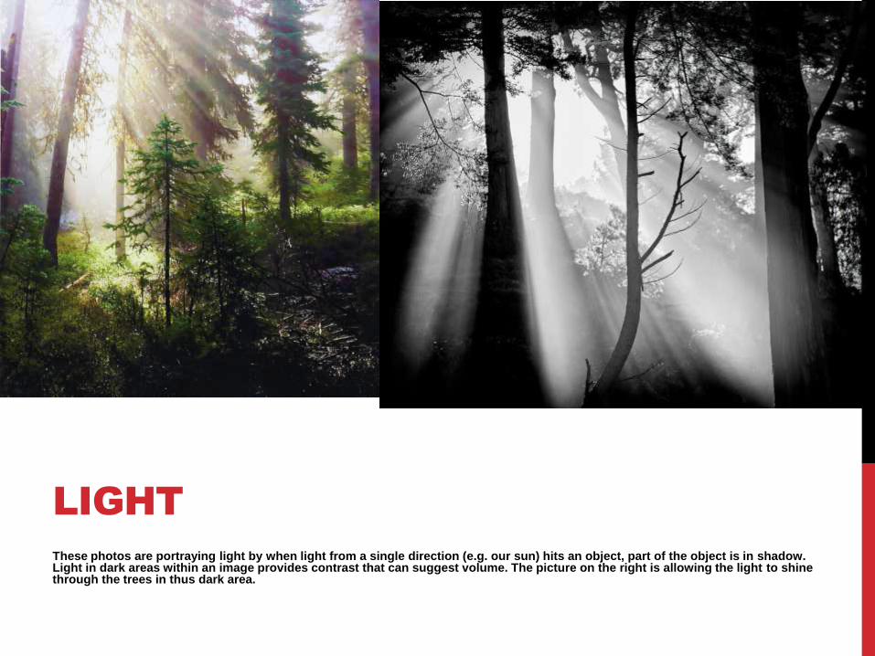
These photos are portraying light by when light from a single direction (e.g. our sun) hits an object, part of the object is in shadow. Light in dark areas within an image provides contrast that can suggest volume. The picture on the right is allowing the light to shine through the trees in thus dark area.
LIGHT
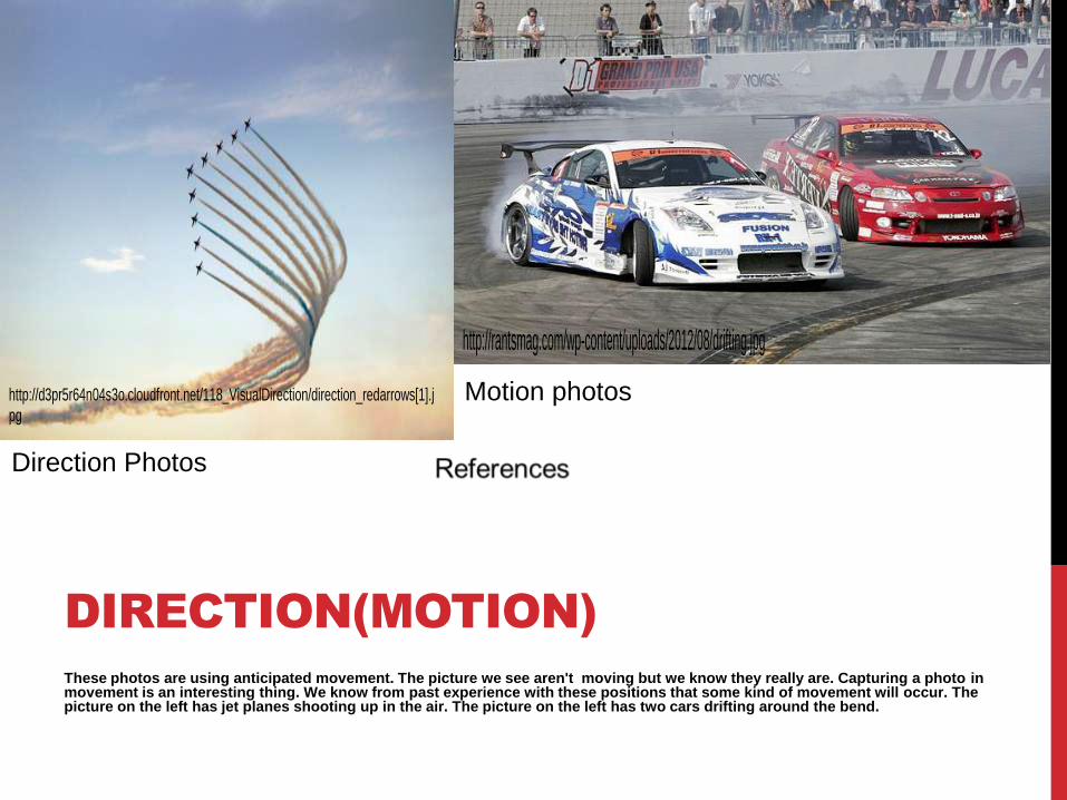
These photos are using anticipated movement. The picture we see aren't moving but we know they really are. Capturing a photo inmovement is an interesting thing. We know from past experience with these positions that some kind of movement will occur. The picture on the left has jet planes shooting up in the air. The picture on the left has two cars drifting around the bend.
DIRECTION(MOTION)
Direction Photos
http://d3pr5r64n04s3o.cloudfront.net/118_VisualDirection/direction_redarrows[1].jpg
Motion photos
http://rantsmag.com/wp-content/uploads/2012/08/drifting.jpg
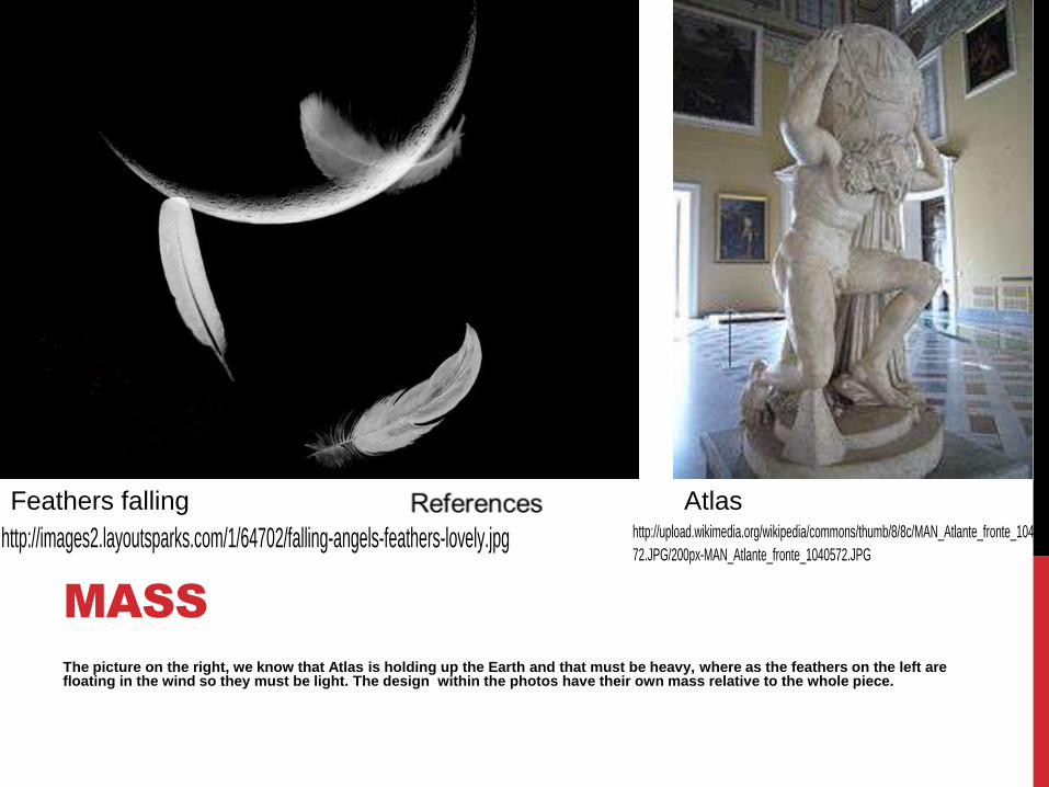
The picture on the right, we know that Atlas is holding up the Earth and that must be heavy, where as the feathers on the left are floating in the wind so they must be light. The design within the photos have their own mass relative to the whole piece.
MASS
Feathers falling
http://images2.layoutsparks.com/1/64702/falling-angels-feathers-lovely.jpg
Atlashttp://upload.wikimedia.org/wikipedia/commons/thumb/8/8c/MAN_Atlante_fronte_10405
72.JPG/200px-MAN_Atlante_fronte_1040572.JPG
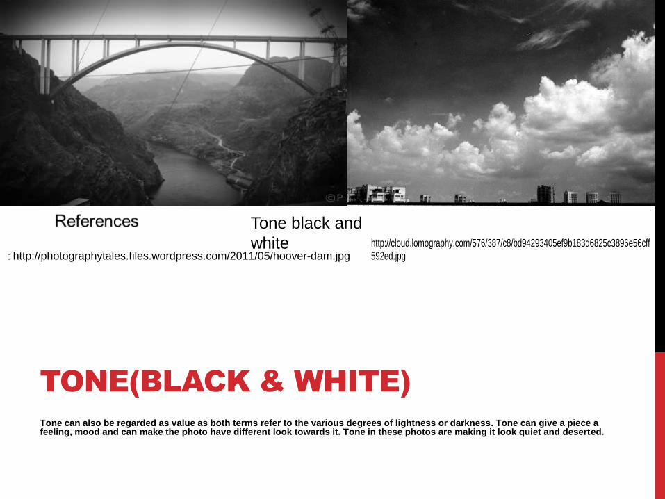
Tone can also be regarded as value as both terms refer to the various degrees of lightness or darkness. Tone can give a piece a feeling, mood and can make the photo have different look towards it. Tone in these photos are making it look quiet and deserted.
TONE(BLACK & WHITE)
Tone black and
white: http://photographytales.files.wordpress.com/2011/05/hoover-dam.jpg
http://cloud.lomography.com/576/387/c8/bd94293405ef9b183d6825c3896e56cff592ed.jpg
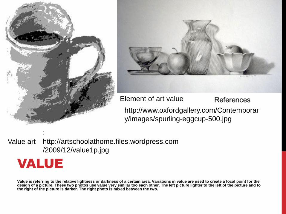
Value is referring to the relative lightness or darkness of a certain area. Variations in value are used to create a focal point for the design of a picture. These two photos use value very similar too each other. The left picture lighter to the left of the picture and to the right of the picture is darker. The right photo is mixed between the two.
VALUE
Value art
:
http://artschoolathome.files.wordpress.com
/2009/12/value1p.jpg
Element of art value
http://www.oxfordgallery.com/Contemporar
y/images/spurling-eggcup-500.jpg
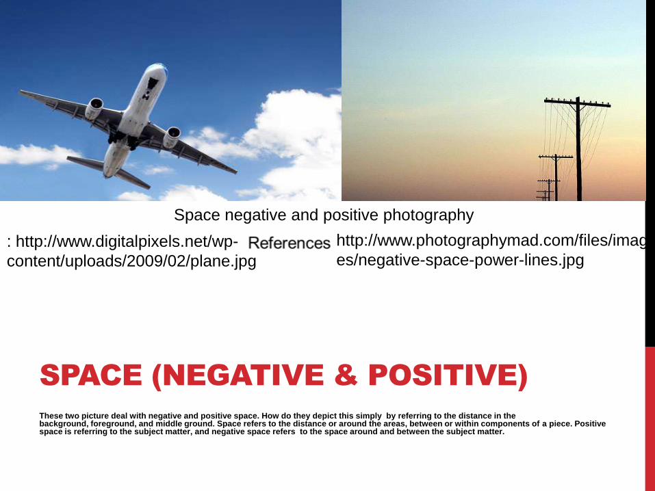
These two picture deal with negative and positive space. How do they depict this simply by referring to the distance in the background, foreground, and middle ground. Space refers to the distance or around the areas, between or within components of a piece. Positive space is referring to the subject matter, and negative space refers to the space around and between the subject matter.
SPACE (NEGATIVE & POSITIVE)
Space negative and positive photography
: http://www.digitalpixels.net/wp-
content/uploads/2009/02/plane.jpg
http://www.photographymad.com/files/imag
es/negative-space-power-lines.jpg
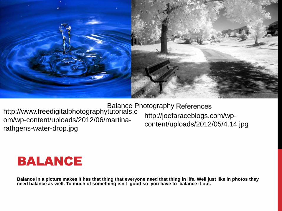
Balance in a picture makes it has that thing that everyone need that thing in life. Well just like in photos they need balance as well. To much of something isn't good so you have to balance it out.
BALANCE
Balance Photographyhttp://www.freedigitalphotographytutorials.c
om/wp-content/uploads/2012/06/martina-
rathgens-water-drop.jpg
http://joefaraceblogs.com/wp-
content/uploads/2012/05/4.14.jpg
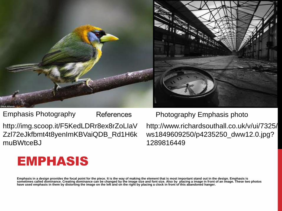
Emphasis in a design provides the focal point for the piece. It is the way of making the element that is most important stand out in the design. Emphasis is sometimes called dominance. Creating dominance can be changed by the image size and font size. Also by placing a image in front of an image. These two photos have used emphasis in them by distorting the image on the left and on the right by placing a clock in front of this abandoned hanger.
EMPHASIS
Emphasis Photography Photography Emphasis photo
http://img.scoop.it/F5KedLDRr8ex8rZoLIaV
Zzl72eJkfbmt4t8yenImKBVaiQDB_Rd1H6k
muBWtceBJ
http://www.richardsouthall.co.uk/v/ui/7325/
ws1849609250/p4235250_dww12.0.jpg?
1289816449
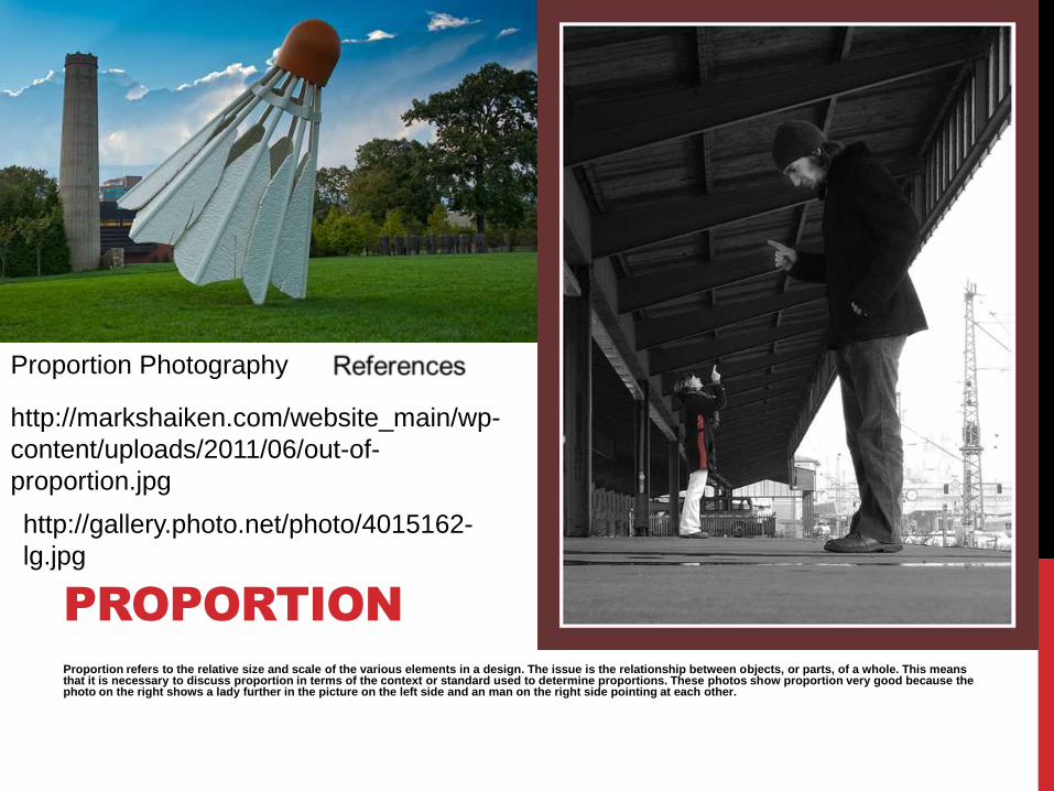
Proportion refers to the relative size and scale of the various elements in a design. The issue is the relationship between objects, or parts, of a whole. This means that it is necessary to discuss proportion in terms of the context or standard used to determine proportions. These photos show proportion very good because the photo on the right shows a lady further in the picture on the left side and an man on the right side pointing at each other.
PROPORTION
Proportion Photography
http://markshaiken.com/website_main/wp-
content/uploads/2011/06/out-of-
proportion.jpg
http://gallery.photo.net/photo/4015162-
lg.jpg
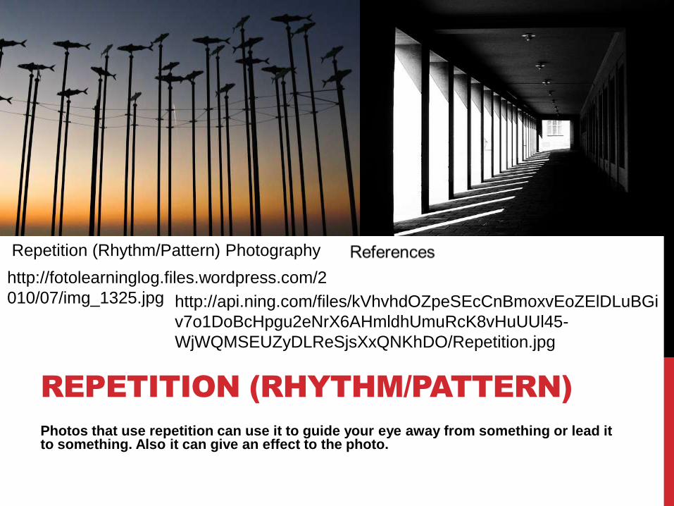
Photos that use repetition can use it to guide your eye away from something or lead it to something. Also it can give an effect to the photo.
REPETITION (RHYTHM/PATTERN)
Repetition (Rhythm/Pattern) Photography
http://fotolearninglog.files.wordpress.com/2
010/07/img_1325.jpg http://api.ning.com/files/kVhvhdOZpeSEcCnBmoxvEoZElDLuBGi
v7o1DoBcHpgu2eNrX6AHmldhUmuRcK8vHuUUl45-
WjWQMSEUZyDLReSjsXxQNKhDO/Repetition.jpg
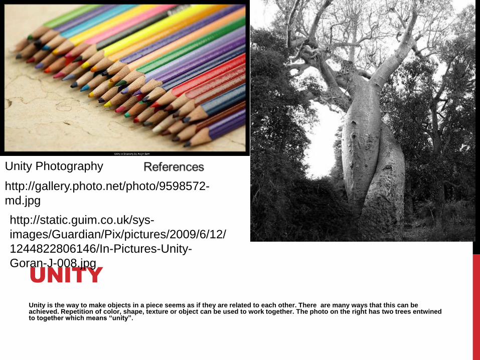
Unity is the way to make objects in a piece seems as if they are related to each other. There are many ways that this can be achieved. Repetition of color, shape, texture or object can be used to work together. The photo on the right has two trees entwined to together which means “unity”.
UNITY
Unity Photography
http://gallery.photo.net/photo/9598572-
md.jpg
http://static.guim.co.uk/sys-
images/Guardian/Pix/pictures/2009/6/12/
1244822806146/In-Pictures-Unity-
Goran-J-008.jpg
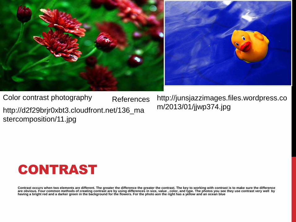
Contrast occurs when two elements are different. The greater the difference the greater the contrast. The key to working with contrast is to make sure the difference are obvious. Four common methods of creating contrast are by using differences in size, value , color, and type. The photos you see they use contrast very well by having a bright red and a darker green in the background for the flowers. For the photo aon the right has a yellow and an ocean blue
CONTRAST
Color contrast photography
http://d2f29brjr0xbt3.cloudfront.net/136_ma
stercomposition/11.jpg
http://junsjazzimages.files.wordpress.co
m/2013/01/jjwp374.jpgReferences
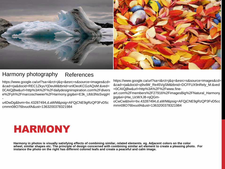
Harmony in photos is visually satisfying effects of combining similar, related elements. eg. Adjacent colors on the color wheel, similar shapes etc. The principle of design concerned with combining similar art element to create a pleasing photo. Forinstance the photo on the right has different colored leafs and create a peaceful and calm image.
HARMONY
Harmony photography
https://www.google.ca/url?sa=i&rct=j&q=&esrc=s&source=images&cd=
&cad=rja&docid=REC1ZkyuYjDeuM&tbnid=xnlOeoKCGzAQsM:&ved=
0CAIQjBw&url=http%3A%2F%2Fdailydesigninspiration.com%2Fdivers
e%2Fph%2Fmarcoschweier%2FHarmony.jpg&ei=E3k_Ubb3NsSvqgH
-
u4DwDg&bvm=bv.43287494,d.aWM&psig=AFQjCNE9gRzQP3FvD5c
cmmn08O76bvuofA&ust=1363200378321984
https://www.google.ca/url?sa=i&rct=j&q=&esrc=s&source=images&cd=
&cad=rja&docid=q9vdW_Re45VgSM&tbnid=DCFFUX9nRely_M:&ved
=0CAIQjBw&url=http%3A%2F%2Fwww.fine-
art.com%2Fmembers%2F27916%2FimagesBig%2FNatural_Harmony.
jpg&ei=jHw_UcWXJ8-rqQGm-
oCwCw&bvm=bv.43287494,d.aWM&psig=AFQjCNE9gRzQP3FvD5cc
mmn08O76bvuofA&ust=1363200378321984
References
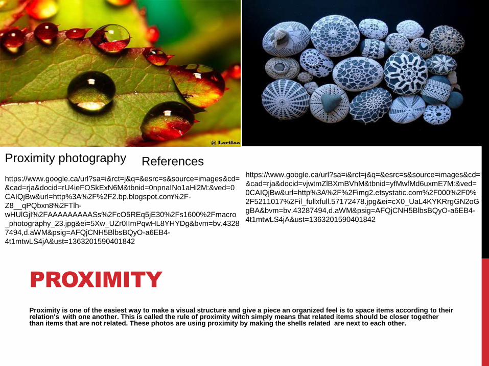
Proximity is one of the easiest way to make a visual structure and give a piece an organized feel is to space items according to their relation's with one another. This is called the rule of proximity witch simply means that related items should be closer together than items that are not related. These photos are using proximity by making the shells related are next to each other.
PROXIMITY
Proximity photography
https://www.google.ca/url?sa=i&rct=j&q=&esrc=s&source=images&cd=
&cad=rja&docid=rU4ieFOSkExN6M&tbnid=0npnaINo1aHi2M:&ved=0
CAIQjBw&url=http%3A%2F%2F2.bp.blogspot.com%2F-
Z8__qPQbxn8%2FTlh-
wHUlGjI%2FAAAAAAAAASs%2FcO5REq5jE30%2Fs1600%2Fmacro
_photography_23.jpg&ei=5Xw_UZr0IImPqwHL8YHYDg&bvm=bv.4328
7494,d.aWM&psig=AFQjCNH5BlbsBQyO-a6EB4-
4t1mtwLS4jA&ust=1363201590401842
https://www.google.ca/url?sa=i&rct=j&q=&esrc=s&source=images&cd=
&cad=rja&docid=vjwtmZlBXmBVhM&tbnid=yfMwfMd6uxmE7M:&ved=
0CAIQjBw&url=http%3A%2F%2Fimg2.etsystatic.com%2F000%2F0%
2F5211017%2Fil_fullxfull.57172478.jpg&ei=cX0_UaL4KYKRrgGN2oG
gBA&bvm=bv.43287494,d.aWM&psig=AFQjCNH5BlbsBQyO-a6EB4-
4t1mtwLS4jA&ust=1363201590401842
References
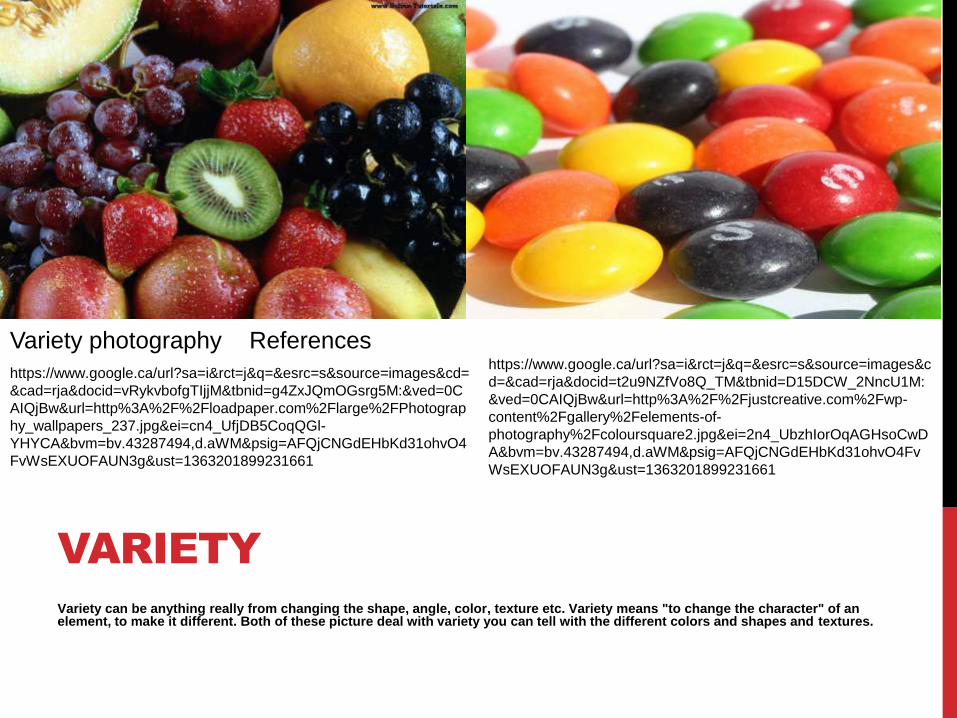
Variety can be anything really from changing the shape, angle, color, texture etc. Variety means "to change the character" of an element, to make it different. Both of these picture deal with variety you can tell with the different colors and shapes and textures.
VARIETY
Variety photography
https://www.google.ca/url?sa=i&rct=j&q=&esrc=s&source=images&cd=
&cad=rja&docid=vRykvbofgTIjjM&tbnid=g4ZxJQmOGsrg5M:&ved=0C
AIQjBw&url=http%3A%2F%2Floadpaper.com%2Flarge%2FPhotograp
hy_wallpapers_237.jpg&ei=cn4_UfjDB5CoqQGl-
YHYCA&bvm=bv.43287494,d.aWM&psig=AFQjCNGdEHbKd31ohvO4
FvWsEXUOFAUN3g&ust=1363201899231661
https://www.google.ca/url?sa=i&rct=j&q=&esrc=s&source=images&c
d=&cad=rja&docid=t2u9NZfVo8Q_TM&tbnid=D15DCW_2NncU1M:
&ved=0CAIQjBw&url=http%3A%2F%2Fjustcreative.com%2Fwp-
content%2Fgallery%2Felements-of-
photography%2Fcoloursquare2.jpg&ei=2n4_UbzhIorOqAGHsoCwD
A&bvm=bv.43287494,d.aWM&psig=AFQjCNGdEHbKd31ohvO4Fv
WsEXUOFAUN3g&ust=1363201899231661
References


![Minhaji Fata Morgana [English]](https://static.fdocuments.in/doc/165x107/577cdddc1a28ab9e78adeaa0/minhaji-fata-morgana-english.jpg)