VFW Organizational Brand Guidelinesvfwne.com/uploads/documents/VFWStyleGuide.pdfto bring forward a...
54
VFW Organizational Brand Guidelines Version 2. August 14, 2018
Transcript of VFW Organizational Brand Guidelinesvfwne.com/uploads/documents/VFWStyleGuide.pdfto bring forward a...

VFW Organizational Brand GuidelinesVersion 2. August 14, 2018

Refreshed Visual IdentitySame Proud History. Same Strong Commitment. Bold New Look.
The brand logo refresh you are about to discover was carefully undertaken with full respect to the VFW heritage and its future. A bold step was taken to bring forward a solid, contemporary look and feel that sets us apart as the longest established and largest combat veterans service organization with a relentless pursuit of exceptional service and dedication.
OUR MISSION IS SINCERE, OUR BRAND VOICE IS COHERENT, OUR ACTIONS ARE BOLD. By simplifying, clarifying and amplifying the look of our brand, we can create a strategically focused and impactful visual statement. We have achieved that by rethinking the hierarchy of our previous logo components, and isolating them so that they become more powerful stand-alone pieces of visual information, each with a strategic and distinct purpose.
As we move into the future and evolve to expand
our target market reach within a highly competitive
sector, it is essential that our organization’s logo is
not only relevant to our brand essence, but to our
audience and the modern era.
Upholding our logo’s integrity is crucial because
a consistent visual identity is key to promoting
a solid brand with a unified voice.
Our previous logo held too many elements with
no hierarchy resulting in not only visual
misinterpretations and complex graphic translations,
but a disconnect with who we are as an organization
and what we stand for.
Version 2. August 14, 2018 VFW Brand Guidelines | 2

Introduction04 Positioning Statement05 Our Mission and Vision
1. Logo07 Mark and Typography08 Full Color Logo09 Monochromatic Logo10 Minimum Size11 Clear Space12 Improper Usage, Alterations13 Application on Photographic
Backgrounds14 Improper Usage, Color and
Backgrounds
2. Tagline16 As Part of the Full Color Logo17 As Part of the Monochromatic Logo18 In Design Applications19 Expressed in Copy
3. Posts & Departments21 Logo Authorization
22 Full Color Logo23 Monochromatic Logo24 Paired with Tagline Logo25 Monochromatic Logo Paired with Tagline Logo
4. Typography27 Primary Font for Headings28 Primary Font for Body Copy29 Specialized Font
5. Colors31 Primary and Secondary Palettes
6. Graphic Devices33 Introduction34 Bold Stripes36 Progressive Growth38 Equal Repetitions
40 Visual Effects & Techniques41 Improper Usages
7. Stationery43 Templates & Requests
44 Business Cards
47 Letterheads
48 Envelopes49 Mailing Labels50 Email Signatures
8. Cross of Malta53 Approach to Limiting Usage
VFW Organizational Brand GuidelinesTable of Contents
Version 2. August 14, 2018 VFW Brand Guidelines | 3

The VFW is a dynamic United States combat veterans organization that serves, advocates and fosters camaraderie for ALL veterans, service members, their families and our community. The VFW harnesses its recognized authority, experience and resources to deliver comprehensive financial, educational, health and well-being programs and services at every stage of the veteran’s military and civilian life.
Positioning Statement
Version 2. August 14, 2018 VFW Brand Guidelines | 4
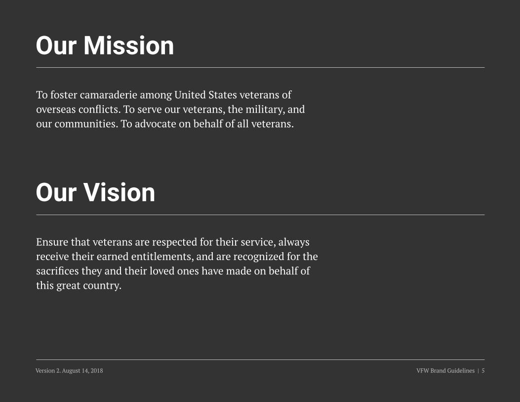
To foster camaraderie among United States veterans of overseas conflicts. To serve our veterans, the military, and our communities. To advocate on behalf of all veterans.
Ensure that veterans are respected for their service, always receive their earned entitlements, and are recognized for the sacrifices they and their loved ones have made on behalf of this great country.
Our Mission
Our Vision
Version 2. August 14, 2018 VFW Brand Guidelines | 5

1. Logo
Version 2. August 14, 2018 VFW Brand Guidelines | 6
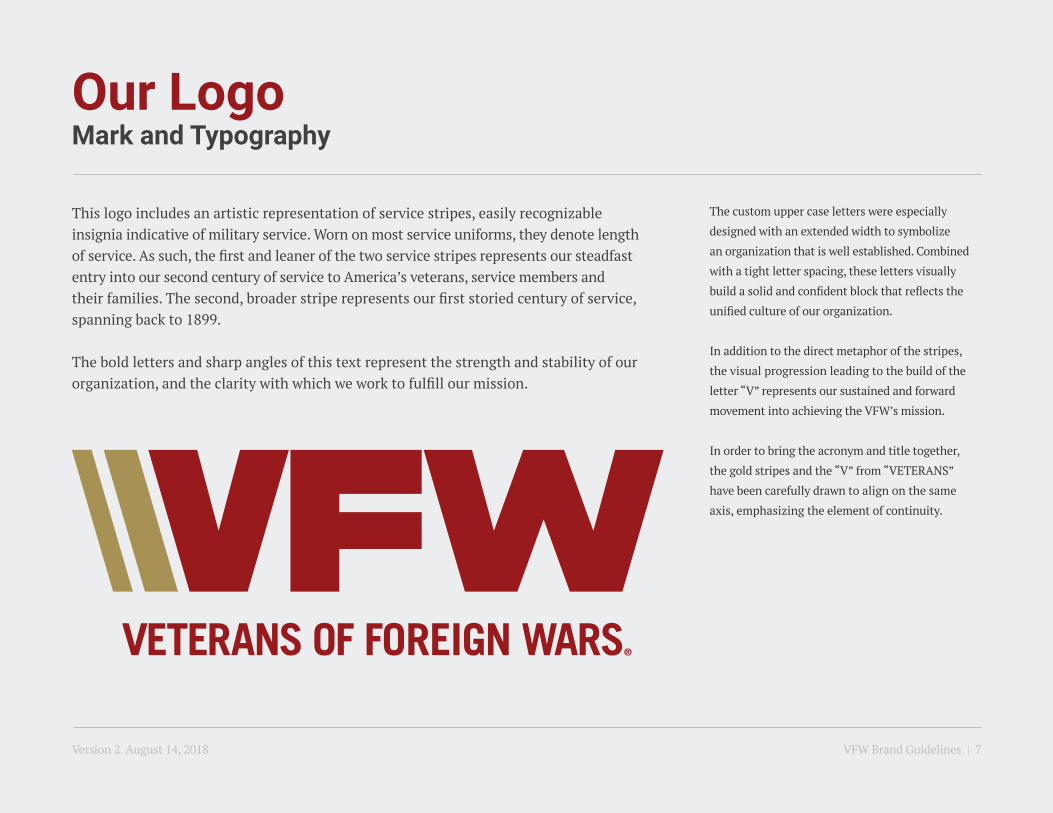
Our LogoMark and Typography
This logo includes an artistic representation of service stripes, easily recognizable insignia indicative of military service. Worn on most service uniforms, they denote length of service. As such, the first and leaner of the two service stripes represents our steadfast entry into our second century of service to America’s veterans, service members and their families. The second, broader stripe represents our first storied century of service, spanning back to 1899.
The bold letters and sharp angles of this text represent the strength and stability of our organization, and the clarity with which we work to fulfill our mission.
The custom upper case letters were especially
designed with an extended width to symbolize
an organization that is well established. Combined
with a tight letter spacing, these letters visually
build a solid and confident block that reflects the
unified culture of our organization.
In addition to the direct metaphor of the stripes,
the visual progression leading to the build of the
letter “V” represents our sustained and forward
movement into achieving the VFW’s mission.
In order to bring the acronym and title together,
the gold stripes and the “V” from “VETERANS”
have been carefully drawn to align on the same
axis, emphasizing the element of continuity.
Version 2. August 14, 2018 VFW Brand Guidelines | 7
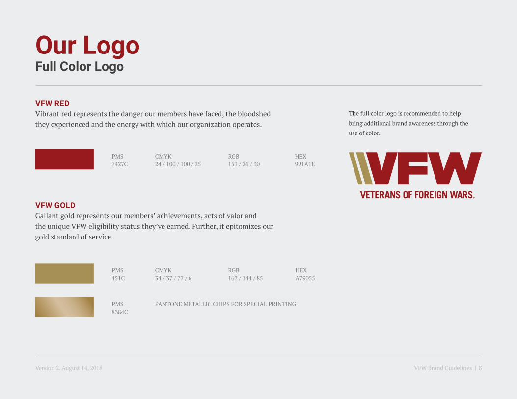
Our LogoFull Color Logo
VFW REDVibrant red represents the danger our members have faced, the bloodshed they experienced and the energy with which our organization operates.
VFW GOLDGallant gold represents our members’ achievements, acts of valor and the unique VFW eligibility status they’ve earned. Further, it epitomizes our gold standard of service.
CMYK24 / 100 / 100 / 25
CMYK34 / 37 / 77 / 6
PANTONE METALLIC CHIPS FOR SPECIAL PRINTING
RGB153 / 26 / 30
RGB167 / 144 / 85
HEX991A1E
PMS7427C
PMS451C
PMS8384C
HEXA79055
The full color logo is recommended to help
bring additional brand awareness through the
use of color.
Version 2. August 14, 2018 VFW Brand Guidelines | 8

Our LogoMonochromatic Logo
The monochromatic white logo should only be used when the full color logo has a low level of contrast with the solid background in play, or when applied on a photographic background. It is provided as the preferred alternative to assist in meeting any potential design or production issues.
The red and black versions should only be used for one-color jobs. Refer to pages 12 to 14 for more accurate examples.
CMYK24 / 100 / 100 / 25
CMYK0 / 0 / 0 / 100
RGB153 / 26 / 30
RGB35 / 31 / 32
HEX991A1E
HEX231F20
PMS7427C
PMSBLACK C
CMYK0 / 0 / 0 / 0
RGB255 / 255 / 255
HEXFFFFFF
WHITE
Version 2. August 14, 2018 VFW Brand Guidelines | 9

Our LogoMinimum Size
To maintain legibility and to prevent printing complications, the logo should be used at a size equal to or greater than the dimensions of each corresponding platform shown below.
1.25” (for print)
100px (on screen)
Version 2. August 14, 2018 VFW Brand Guidelines | 10

Our LogoClear Space
The clear space surrounding the logo should be equal to or greater than half of the height of the overall logo (mark + typography).
X½X ½X
½X
½X
Version 2. August 14, 2018 VFW Brand Guidelines | 11

Do not alter the logo by adding color or graphic effects.
Do not alter the logo’s shape, angle or proportions.
Do not alter the logo elements to readjust hierarchy, placement or add additional elements.
Our LogoImproper Usage, Alterations
Version 2. August 14, 2018 VFW Brand Guidelines | 12

The white logo should be used when the full color logo has a low level of contrast with the background.
Never introduce the red or black monochromatic logos, except for a one-color print job.
Do not place logos directly on top of full color images. Instead, place white monochromatic logo on top of a black gradient that is multiplied over the background image.
This applies to all greyscale and duotone photography as well.
Our LogoApplication on Photographic Backgrounds
Version 2. August 14, 2018 VFW Brand Guidelines | 13

Do not switch colors in the full color logo version.
Do not choose colors creating low contrast against background.
Do not place the logo on distracting backgrounds or in complex shapes.
Our LogoImproper Usage, Color and Backgrounds
Version 2. August 14, 2018 VFW Brand Guidelines | 14

2. Tagline
Version 2. August 14, 2018 VFW Brand Guidelines | 15

TaglineAs Part of the Full Color Logo
The VFW’s tagline, NO ONE DOES MORE FOR VETERANS, represents our pride in our programs and services that no other veteran service organization has matched in number or caliber.
When the tagline is used with the logo, it is imperative to use the provided logo files to help maintain the design and consistently communicate the messaging across all media.
Use is strictly limited to brand communications that do not involve collaboration with other veteran service organizations.
All previously mentioned guidelines to the
official logo apply to the tagline logo as well.
Similarly, the tagline logo is also available in
monochromatic versions, though the full color
is recommended when possible.
Version 2. August 14, 2018 VFW Brand Guidelines | 16

TaglineAs Part of the Monochromatic Logo
The monochromatic white logo should only be used when the full color logo has a low level of contrast with the solid background in play, or when applied on a photographic background. It is provided as the preferred alternative to assist in meeting any potential design or production issues.
The red and black versions should only be used for one-color jobs. Refer to pages 12 to 14 for more accurate examples.
CMYK24 / 100 / 100 / 25
CMYK0 / 0 / 0 / 100
RGB153 / 26 / 30
RGB35 / 31 / 32
HEX991A1E
HEX231F20
PMS7427C
PMSBLACK C
CMYK0 / 0 / 0 / 0
RGB255 / 255 / 255
HEXFFFFFF
WHITE
Version 2. August 14, 2018 VFW Brand Guidelines | 17

TaglineIn Design Applications
In design applications, the tagline should never appear with the tagline logo (page 16-17), in order to avoid repetition of brand messaging.
When applying our tagline, NO ONE DOES MORE FOR VETERANS, as a call-out in design applications, it is recommended to use the provided vector artwork to help consistently communicate the messaging across all media.
Exceptions may be made to accommodate special production issues in relation to the drop shadow and gradient if necessary (i.e. greyscale, any issue with legibility, etc.).
DROP SHADOW SETTINGS FOR PHOTOGRAPHIC BACKGROUNDSAt 72 DPI
Color: Black
Opacity: 70%
Angle: 30 Degrees
Distance: 5px
Spread: 0
Size: 21px
Version 2. August 14, 2018 VFW Brand Guidelines | 18

TaglineExpressed In Copy
SCENARIO 1When used in copy, NO ONE DOES MORE FOR VETERANS
should always be in all caps.
SCENARIO 2When using FOR VETERANS, it is uppercase if it’s placed
there for emphasis,
e.g., Let’s unite proudly — FOR VETERANS!
SCENARIO 3However, if it just happens to be used as a normal phrase
without emphasis, then it can be lowercase,
e.g.,“The VFW has programs in place for veterans to meet a wide variety of needs.”
We should use the sign-off as FOR VETERANS, in all possible and appropriate scenarios.
e.g. Scenario 1
About the VFWThe Veterans of Foreign Wars of the U.S. is a nonprofit veterans service organization comprised of eligible veterans and military service members from the active, Guard and Reserve forces. Founded in 1899 and chartered by Congress in 1936, the VFW is the nation’s largest organization of war veterans and oldest major veterans organization. Proud to proclaim “NO ONE DOES MORE FOR VETERANS,” the VFW and its Auxiliary are dedicated to veterans’ service, legislative advocacy, and military and community service programs. For more information or to join, visit our website at www.vfw.org.
Version 2. August 14, 2018 VFW Brand Guidelines | 19

3. Posts & Departments
Version 2. August 14, 2018 VFW Brand Guidelines | 20

Posts & DepartmentsLogo Authorization
Departments and Posts are authorized to use the VFW logos for official, noncommercial VFW business such as the creation of brochures for membership drives, websites, Post events and other outreach efforts.
For commercial logo use and those uses not associated with official VFW business, contact the VFW Quartermaster General’s office at 816-756-3390 or email [email protected].
In order to obtain your respective Post or Department logos to conduct official noncommercial business on behalf of the organization, you may download thelogo package specific to your Post or Department online. Authorization extendsonly to Post and Department leadership.
For Post logos visit
www.vfw.org/logos/Post[insert your Post number]
For example: www.vfw.org/logos/Post1234
For Department logos visit
www.vfw.org/logos/[insert state postal abbreviation]
For example: www.vfw.org/logos/MO
VFW District logos are available upon request
submitted to [email protected].
Version 2. August 14, 2018 VFW Brand Guidelines | 21

Posts & DepartmentsFull Color Logo
When the VFW Post and Department logos are used, it is imperative to use the provided logo files to help maintain the design and consistently communicate the messaging across all media.
As our primary font for body copy, the use of PT Serif along with the gray color swatch, helps to separate the Post & Department reference from our primary logo. The copy’s alignment to the right is a connotation to action and forward progress, while the hierarchy follows the informational hierarchy established in these brand guidelines.
Finally, in order to help harmonize the line length of Department names with Post names, the call-out to ‘Department of’ has been dismissed from this version of the logo which allows for, approximately, a 35% increase in font size which aids in legibility at small scale while maintaining a consistent type size.
All previously mentioned guidelines to the
official logo apply to the Post and Department
logos as well.
Similarly, the Post and Department logos are also
available in monochromatic versions, though the
full color is recommended when possible.
Version 2. August 14, 2018 VFW Brand Guidelines | 22
Posts & DepartmentsMonochromatic Logo
The monochromatic white logo should only be used when the full color logo has a low level of contrast with the solid background in play, or when applied on a photographic background. It is provided as the preferred alternative to assist in meeting any potential design or production issues.
The red and black versions should only be used for one-color jobs. Refer to pages 12 to 14 for more accurate examples.
CMYK24 / 100 / 100 / 25
CMYK0 / 0 / 0 / 100
RGB153 / 26 / 30
RGB35 / 31 / 32
HEX991A1E
HEX231F20
PMS7427C
PMSBLACK C
CMYK0 / 0 / 0 / 0
RGB255 / 255 / 255
HEXFFFFFF
WHITE
Version 2. August 14, 2018 VFW Brand Guidelines | 23
Posts & DepartmentsPaired with Tagline Logo
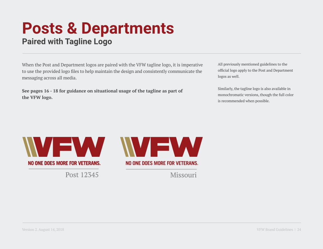
When the Post and Department logos are paired with the VFW tagline logo, it is imperative to use the provided logo files to help maintain the design and consistently communicate the messaging across all media.
See pages 16 - 18 for guidance on situational usage of the tagline as part ofthe VFW logo.
All previously mentioned guidelines to the
official logo apply to the Post and Department
logos as well.
Similarly, the tagline logo is also available in
monochromatic versions, though the full color
is recommended when possible.
Version 2. August 14, 2018 VFW Brand Guidelines | 24

Posts & DepartmentsMonochromatic Logos Paired with Tagline Logo
CMYK24 / 100 / 100 / 25
CMYK0 / 0 / 0 / 100
RGB153 / 26 / 30
RGB35 / 31 / 32
HEX991A1E
HEX231F20
PMS7427C
PMSBLACK C
CMYK0 / 0 / 0 / 0
RGB255 / 255 / 255
HEXFFFFFF
WHITE
The monochromatic white logo should only be used when the full color logo has a low level of contrast with the solid background in play, or when applied on a photographic background. It is provided as the preferred alternative to assist in meeting any potential design or production issues.
The red and black versions should only be used for one-color jobs. Refer to pages 12 to 14 for more accurate examples.
Version 2. August 14, 2018 VFW Brand Guidelines | 25
4. Typography
Version 2. August 14, 2018 VFW Brand Guidelines | 26
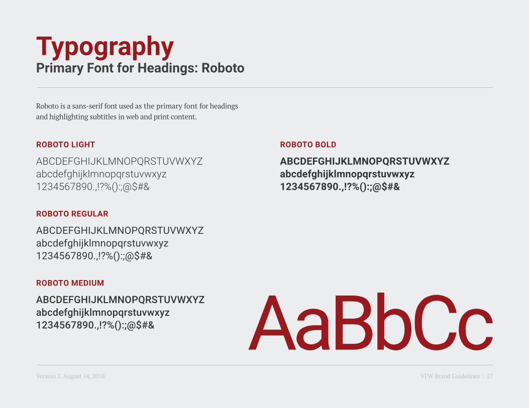
TypographyPrimary Font for Headings: Roboto
Roboto is a sans-serif font used as the primary font for headings and highlighting subtitles in web and print content.
ROBOTO LIGHT
ABCDEFGHIJKLMNOPQRSTUVWXYZabcdefghijklmnopqrstuvwxyz1234567890.,!?%():;@$#&
ROBOTO MEDIUM
ABCDEFGHIJKLMNOPQRSTUVWXYZabcdefghijklmnopqrstuvwxyz1234567890.,!?%():;@$#&
ROBOTO REGULAR
ABCDEFGHIJKLMNOPQRSTUVWXYZabcdefghijklmnopqrstuvwxyz1234567890.,!?%():;@$#&
ROBOTO BOLD
ABCDEFGHIJKLMNOPQRSTUVWXYZabcdefghijklmnopqrstuvwxyz1234567890.,!?%():;@$#&
AaBbCcVersion 2. August 14, 2018 VFW Brand Guidelines | 27
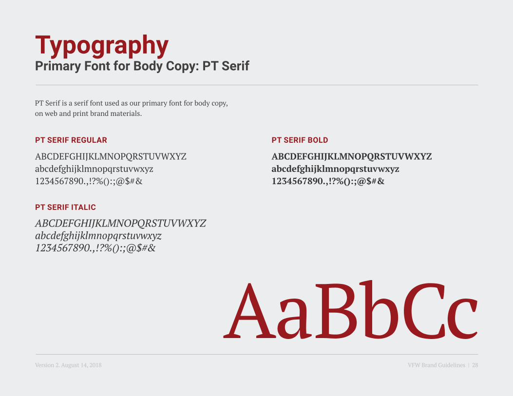
TypographyPrimary Font for Body Copy: PT Serif
PT Serif is a serif font used as our primary font for body copy, on web and print brand materials.
PT SERIF REGULAR
ABCDEFGHIJKLMNOPQRSTUVWXYZabcdefghijklmnopqrstuvwxyz1234567890.,!?%():;@$#&
PT SERIF BOLD
ABCDEFGHIJKLMNOPQRSTUVWXYZabcdefghijklmnopqrstuvwxyz1234567890.,!?%():;@$#&
PT SERIF ITALIC
ABCDEFGHIJKLMNOPQRSTUVWXYZabcdefghijklmnopqrstuvwxyz1234567890.,!?%():;@$#&
AaBbCcVersion 2. August 14, 2018 VFW Brand Guidelines | 28

TypographySpecialized Font: Trade Gothic
Trade Gothic is a sans-serif font used as the specialized typeface. It is only available in the uppercase format. Our font selection is like our message — bold, simple and modern.
TRADE GOTHIC, BOLD NO. 20 (TRACKING -65)
ABCDEFGHIJKLMNOPQRSTUVWXYZ1234567890.,!?%():;@$#&
ABCDEVersion 2. August 14, 2018 VFW Brand Guidelines | 29

5. Colors
Version 2. August 14, 2018 VFW Brand Guidelines | 30

ColorPrimary and Secondary Palettes
Primary palette is fixed and must not be altered.
A secondary palette is developed to complement the primary palette and is used to create accents and add depth while maintaining a concise and professional look.
PMS Cool Gray 9 is used for professionally printed stationery and collateral text color to maintain a visibly sharper finish.
Our primary colors have been carefully selected to highlight the VFW’s mission and its members. The blue in the secondary palette reinforces our organization’s loyalty and confidence.
CMYK24 / 100 / 100 / 25
CMYK0 / 0 / 0 / 100
CMYK55 / 46 / 44 / 11
CMYK98 / 77 / 22 / 7
CMYK0 / 0 / 0 / 75
CMYK0 / 0 / 0 / 25
CMYK0 / 0 / 0 / 0
RGB153 / 26 / 30
RGB35 / 31 / 32
RGB118 / 119 / 121
RGB22 / 74 / 131
RGB98 / 99 / 102
RGB198 / 200 / 202
RGB255 / 255 / 255
HEX991A1E
HEX231F20
HEX767779
HEX164C83
HEX626366
HEXC6C8CA
HEXFFFFFF
PMS7427C
PMSBLACK C: 100%
PMS7686C
PMSCOOL GRAY 9
BLACK C: 75%
BLACK C: 25%
WHITE
CMYK34 / 37 / 77 / 6
PANTONE METALLIC CHIPS FOR SPECIAL PRINTING
CMYK0 / 0 / 0 / 50
RGB167 / 144 / 85
RGB147 / 149 / 151
PMS451C
PMS8384C
BLACK C: 50%
HEXA79055
HEX939597
PRIMARY COLORS
SECONDARY COLORS
Version 2. August 14, 2018 VFW Brand Guidelines | 31

6. Graphic Devices
Version 2. August 14, 2018 VFW Brand Guidelines | 32

Graphic DevicesIntroduction
Derived from the artistic representation of service stripes in the logo, the following graphic devices have been developed to complement the VFW’s communication system, including website, advertising, print and digital material. Each device holds a distinguished expression of the brand and must be used appropriately. The following pages focus on an in-depth understanding of use and production.
Coming directly from our logo, the two bold stripes reference key aspects of the VFW brand. They are the brand’s main graphic device for all communications to reflect the confidence and unified culture of our organization.
The above device hints back to thesustained and forward movementinto achieving the VFW’s mission. Itmay be used on collateral communicating an expression of progression such as recruitment and financial goals.
Maintaining the logo’s stripe angle, the “equal repetitions” device was created to portray our organization’s strong foundation, transparency, equality and the steady services the VFW offers.
BOLD STRIPES PROGRESSIVE GROWTH EQUAL REPETITIONS
Primary Graphic Device Secondary Graphic Devices. The additional devices are available for visual diversity and may be used separately to complement the material’s messaging.
Version 2. August 14, 2018 VFW Brand Guidelines | 33
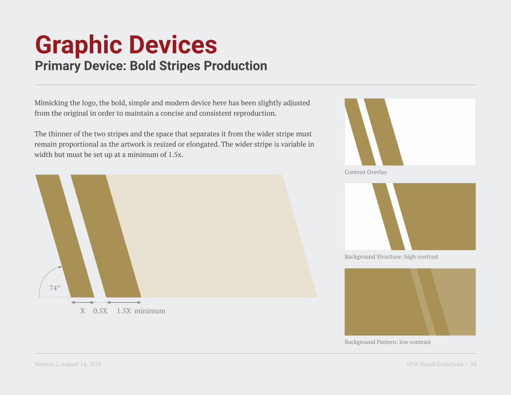
Graphic DevicesPrimary Device: Bold Stripes Production
Mimicking the logo, the bold, simple and modern device here has been slightly adjusted from the original in order to maintain a concise and consistent reproduction.
The thinner of the two stripes and the space that separates it from the wider stripe must remain proportional as the artwork is resized or elongated. The wider stripe is variable in width but must be set up at a minimum of 1.5x.
Background Structure: high contrast
Content Overlay
Background Pattern: low contrast
74°
minimumX 0.5X 1.5X
Version 2. August 14, 2018 VFW Brand Guidelines | 34

Graphic DevicesPrimary Device: Bold Stripes Usage Example
2018PRIORITY
GOALS
BROCHURE COVER WEBSITE
ABOUT USAcross America, the initials VFW are
a familiar sight and symbolize a commitment to the nation both
at home and abroad.
FIND A POST NEAR YOUThe True Character of America is Measured by her Communities
FIND OUT WHAT’S HAPPENING
POWERPOINT TITLE PAGE
POWERPOINT COVER
Legislative Victories2018 Priority Goals
2018 Priority GoalsDepartment of Washington
Monday May 21, 2018
Version 2. August 14, 2018 VFW Brand Guidelines | 35
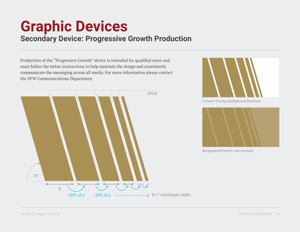
Graphic DevicesSecondary Device: Progressive Growth Production
Production of the “Progressive Growth” device is intended for qualified users and must follow the below instructions to help maintain the design and consistently communicate the messaging across all media. For more information please contactthe VFW Communications Department.
74°
0.1” minimum width
Background Pattern: low contrast
Content Overlay Background Structure
X-20% of x -20% of x
10%X
Version 2. August 14, 2018 VFW Brand Guidelines | 36

Graphic DevicesSecondary Device: Progressive Growth Usage Example
2018PRIORITY
GOALS
ABOUT USAcross America, the initials VFW are
a familiar sight and symbolize a commitment to the nation both
at home and abroad.
FIND A POST NEAR YOUThe True Character of America is Measured by her Communities
FIND OUT WHAT’S HAPPENING
Legislative Victories2018 Priority Goals
2018 Priority GoalsDepartment of Washington
Monday May 21, 2018
BROCHURE COVER WEBSITE POWERPOINT TITLE PAGE
POWERPOINT COVER
Version 2. August 14, 2018 VFW Brand Guidelines | 37

Graphic DevicesSecondary Device: Equal Repetitions Production
Production of the “Equal Repetition” device is intended for qualified users and must follow the below instructions to help maintain the design and consistently communicate the messaging across all media. For more information please contact the VFW Communications Department.
74° Minimum X = 0.1”Maximum X = 1”
Background Pattern: low contrast
Content Overlay Background Structure
X X
Version 2. August 14, 2018 VFW Brand Guidelines | 38

Graphic DevicesSecondary Device: Equal Repetitions Usage Example
2018PRIORITY
GOALS
ABOUT USAcross America, the initials VFW are
a familiar sight and symbolize a commitment to the nation both
at home and abroad.
FIND A POST NEAR YOUThe True Character of America is Measured by her Communities
FIND OUT WHAT’S HAPPENING
Legislative Victories2018 Priority Goals
2018 Priority GoalsDepartment of Washington
Monday May 21, 2018
BROCHURE COVER WEBSITE POWERPOINT TITLE PAGE
POWERPOINT COVER
Version 2. August 14, 2018 VFW Brand Guidelines | 39

Graphic DevicesVisual Effects & Techniques
Image Overlay: scenario 1
Image Overlay: scenario 3
Background Pattern: scenario 5
Image Overlay: scenario 2
Image Overlay: scenario 4
Background Pattern: scenario 6
When applied on top of an image, the graphic layer must be set with a “Multiply” layer effect as seen in scenario 1 or using a 70% opacity as in scenario 2.
It must never appear as a solid color fully veiling the content below.
In order to maintain the confident look of the primary device, this technique may not be applied on the bold stripes.
For application on the secondary devices, the graphic layer must be set with a “Multiply” layer effect or using a 70% opacity. Additionally, a gradient feather may be applied with the lighter tint going into the background content/image (scenario 3).
The background pattern is applicable on all graphic devices. The device in play must be applied on a solid background colored with a tint of the same swatch to create a low contrast and ensure content legibility when placed on top of the pattern.
Similar to the above, a gradient feather may be applied to the device as seen in scenario 6.
Version 2. August 14, 2018 VFW Brand Guidelines | 40
Graphic DevicesImproper Usages
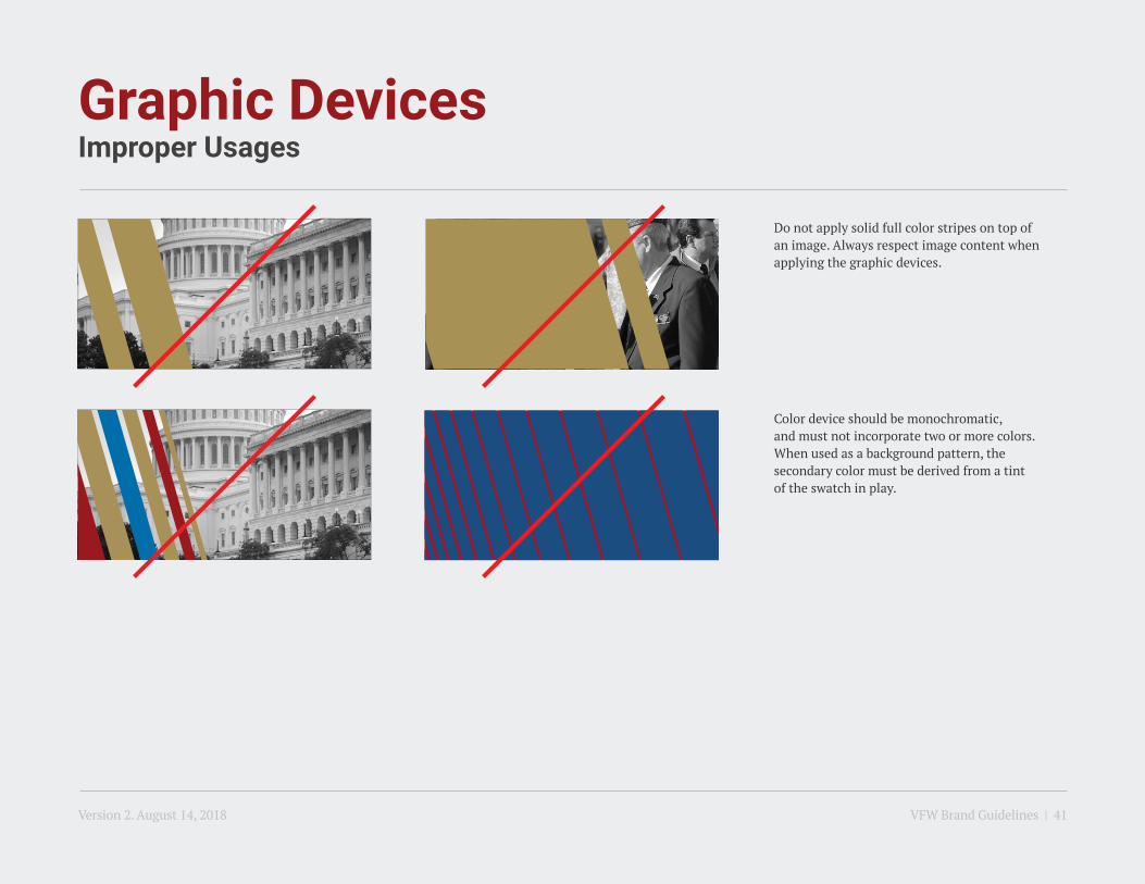
Color device should be monochromatic, and must not incorporate two or more colors. When used as a background pattern, thesecondary color must be derived from a tint of the swatch in play.
Do not apply solid full color stripes on top of an image. Always respect image content when applying the graphic devices.
Version 2. August 14, 2018 VFW Brand Guidelines | 41

7. Stationery
Version 2. August 14, 2018 VFW Brand Guidelines | 42
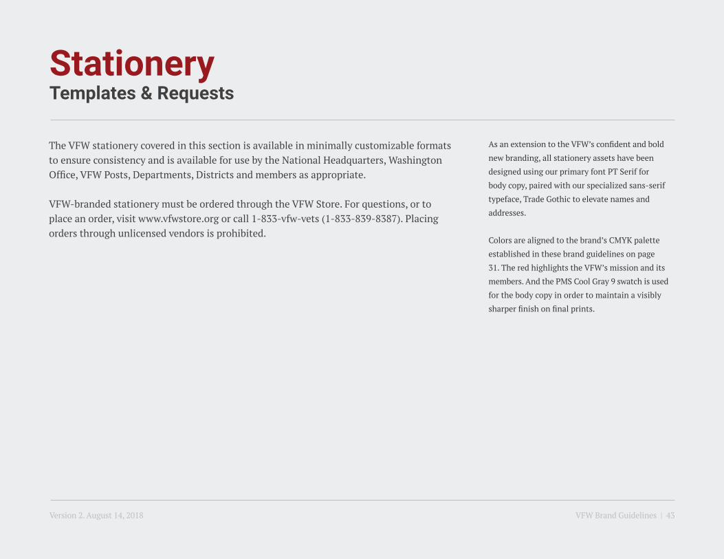
StationeryTemplates & Requests
The VFW stationery covered in this section is available in minimally customizable formats to ensure consistency and is available for use by the National Headquarters, Washington Office, VFW Posts, Departments, Districts and members as appropriate.
VFW-branded stationery must be ordered through the VFW Store. For questions, or to place an order, visit www.vfwstore.org or call 1-833-vfw-vets (1-833-839-8387). Placing orders through unlicensed vendors is prohibited.
As an extension to the VFW’s confident and bold
new branding, all stationery assets have been
designed using our primary font PT Serif for
body copy, paired with our specialized sans-serif
typeface, Trade Gothic to elevate names and
addresses.
Colors are aligned to the brand’s CMYK palette
established in these brand guidelines on page
31. The red highlights the VFW’s mission and its
members. And the PMS Cool Gray 9 swatch is used
for the body copy in order to maintain a visibly
sharper finish on final prints.
Version 2. August 14, 2018 VFW Brand Guidelines | 43

StationeryBusiness Cards: Variable Formats
Gold Life Members
Basic Information
Silver Life Members
Post/Department Information
Bronze Life Members
4-line address with building name
vs. standard 3 line address
Post/Department term & location information
Life member tiers
Post number or Department location
Element sizes, positioning and colors must not be altered.
National Headquarters406 W. 34th StreetKansas City, MO 64111www.vfw.org
Office 816.756.3390Cell [email protected]
JOHN DOETitle Here, Internal Department Name
406 W. 34th StreetKansas City, MO 64111www.vfw.org
Offi ce 816.756.3390Cell [email protected]
JOHN DOENational Council of Administration, Term Duration State
Gold Legacy Life Member
406 W. 34th StreetKansas City, MO 64111www.vfw.org
Offi ce 816.756.3390Cell [email protected]
JOHN DOETitle Here, Department of Missouri
Silver Legacy Life Member
406 W. 34th StreetKansas City, MO 64111www.vfw.org
Offi ce 816.756.3390Cell [email protected]
JOHN DOETitle Here, Department of Missouri
Bronze Legacy Life Member
406 W. 34th StreetKansas City, MO 64111www.vfw.org
Offi ce 816.756.3390Cell [email protected]
JOHN DOETitle Here, Department of Missouri
VARIABLES
Version 2. August 14, 2018 VFW Brand Guidelines | 44
1
1
1
1 1
1
2
3
4
2
3
4 4 4
3 3

StationeryBusiness Cards: Standard Format
With the exception of recruiters, claims representatives and executive personnel, all VFW business cards will carry the same back side design. The following page (p.46) introduces the variables that occur on the informational level expressed on the front of the cards.
Business Cards BackBusiness Cards Front
National Headquarters406 W. 34th StreetKansas City, MO 64111www.vfw.org
Offi ce 816.756.3390Cell [email protected]
JOHN DOETitle Here, Internal Department Name
Version 2. August 14, 2018 VFW Brand Guidelines | 45

StationeryBusiness Cards: Recruiters & Claims Representatives
RECRUITERS: Business Cards Front RECRUITERS: Business Cards Back
CLAIMS REPRESENTATIVES: Business Cards Front CLAIMS REPRESENTATIVES: Business Cards Back
Element sizes, positioning and colors must not be altered.
406 W. 34th StreetKansas City, MO 64111www.vfw.org
Offi ce 816.756.3390Cell [email protected]
JOHN DOECertifi ed National Recruiter
Veteran Contact
Name
Address
City St. zip
Home Cell
Branch
Qualifying Services
Period Covered
VFW Rep LocationsBarden Ed Center, Ft. Belvoir, VAVet. Svc. Ctr., JB Andrews, MDACAP/Bldg. 404, JB Myer-HH, VAWalter Reed Bldg. 11, BethesdaQuantico, 3025 John Quick RoadFamily Support Ctr., Bldg. 13, Bolling200 Maryland Ave., NE Wash., D.C.
Phone [email protected]
JOHN DOENational Pre-Discharge Claims Representative, National Veteran Service
Appointment Checklist- Medical Records (mil & civ/copy for VA)- Any prior DD214- Marriage/Divorce documents (vet & spouse)- Birth Certifi cates/Social Security Cards (spouse & children)- Banking information (account/routing numbers)
Please Be On Time so as not to impact the next veteran’s appointment.
Appointment Telephone Numbers: Ft. Belvoir, VA (202.480.0077), Joint Base Andrews, MD (202.570.6213), Joint Base Myer-HH, VA ([email protected]), Bolling/Anacostia (202.767.0450), Bethesda/Quantico (202.256.4272)
Claims Status/Apply for Benefi ts/DD214: www.ebenefi ts.va.gov
VA Medical Record/Appointments/Lab Reports: www.myhealth.va.gov
Job Assistance/Search for Jobs: www.vaforvets.va.gov
Scan to view website
Version 2. August 14, 2018 VFW Brand Guidelines | 46

StationeryLetterheads: Standard
VFW letterhead is available in two templates: one for use by the National Headquarters and Washington Office, and another customized for Posts and Departments. VFW District letterhead is also available.
Element sizes, positioning and colors must not be altered.
The letter’s body copy is set using the system font Times New Roman.
Standard Letterhead Post/Department Letterhead
Department location or Post
number details
Department or Post specific
email and web address
406 W. 34th StreetKansas City, MO 64111
200 Maryland Ave., N.E.Washington, D.C., 20002
Offi ce 816.756.3390 Fax 816.968.1157
Offi ce 202.543.2239 Fax 202.543.6719
NATIONAL HEADQUARTERS WASHINGTON OFFICE
May 10, 2018
Recipient Name HereUnion Design50 Broad Street, Suite 702New York, NY 10004
Dolenihicat faces adio.
Itassi omnime omni conse aritia simusapiet lit, ommolup tiorepro molo mi, corporeiur re pliate oihillut eum aliatis simolup taepudi ipici nem eum simi, ipsandam fugit harcienditi corestr uptatum quodi tem alique consece reprovita-tus vel ipicae. Rem eatur? Offic torrovidebis estruptaquis aute nestist orepra possum faccum quam essint es eum dit, optas eossiti atquae voloremquis demoluptam, odicimi, volut aut qui blaborem quo optatquo ea aceatur adis aborum sequosaped quisti dem nimpore rchictiore nusam ea doluptae. Lataquat ex et aut laccus ad quunt verum ut maxime voles excercim nim idebites es maximenesed utenimi, con esectur?
Ro voluptiust es susti aut quiamendi dolorpo repudis maio volupti busdaeprae pro corporia quam exernatur, inus enda dolorem porionsequis volupta volorep eruntisit eum facipid elesedit, adis quam sunt fuga. Maxima doluptas dit labor adicit volupta tquatibus et volorernat as audit, occusam consernatur? Sed quisquundia aut qui debit, ex even-dent maximenim hil mi, as sin nos dolenda erioreprerum quae. Aque ne doloreriscit voluptur, comnisi ullor reperrum ressin cuptatet eatem estiore rrorro ommoluptur, si int pa dolore con nos molupti cus, odit eos sequas que laute dolore secumquis ut int et que et, sunt.
Equo beruptum volupid ucidunto te comnistem con nest, ommolup tatiunt, tem quo etur arum harunt odiamus eos quid ut plabore nim etur? Quibus sus et voluptatqui cus derchic iistotatquas endae velendam esto id maion et vo-lention pa sumque dolorem vel ius sit venis dolum eatur siti utem qui rem dolorerume ariorib usdam, tecum harum autamus.
Em volor sitia,John Doe
VFW DEPARTMENT OF MISSOURI
406 W. 34th StreetKansas City, MO 64111
Offi ce 816.756.3390 Fax 816.968.1157
May 10, 2018
Recipient Name HereUnion Design50 Broad Street, Suite 702New York, NY 10004
Dolenihicat faces adio.
Itassi omnime omni conse aritia simusapiet lit, ommolup tiorepro molo mi, corporeiur re pliate oihillut eum aliatis simolup taepudi ipici nem eum simi, ipsandam fugit harcienditi corestr uptatum quodi tem alique consece reprovita-tus vel ipicae. Rem eatur? Offic torrovidebis estruptaquis aute nestist orepra possum faccum quam essint es eum dit, optas eossiti atquae voloremquis demoluptam, odicimi, volut aut qui blaborem quo optatquo ea aceatur adis aborum sequosaped quisti dem nimpore rchictiore nusam ea doluptae. Lataquat ex et aut laccus ad quunt verum ut maxime voles excercim nim idebites es maximenesed utenimi, con esectur?
Ro voluptiust es susti aut quiamendi dolorpo repudis maio volupti busdaeprae pro corporia quam exernatur, inus enda dolorem porionsequis volupta volorep eruntisit eum facipid elesedit, adis quam sunt fuga. Maxima doluptas dit labor adicit volupta tquatibus et volorernat as audit, occusam consernatur? Sed quisquundia aut qui debit, ex even-dent maximenim hil mi, as sin nos dolenda erioreprerum quae. Aque ne doloreriscit voluptur, comnisi ullor reperrum ressin cuptatet eatem estiore rrorro ommoluptur, si int pa dolore con nos molupti cus, odit eos sequas que laute dolore secumquis ut int et que et, sunt.
Equo beruptum volupid ucidunto te comnistem con nest, ommolup tatiunt, tem quo etur arum harunt odiamus eos quid ut plabore nim etur? Quibus sus et voluptatqui cus derchic iistotatquas endae velendam esto id maion et vo-lention pa sumque dolorem vel ius sit venis dolum eatur siti utem qui rem dolorerume ariorib usdam, tecum harum autamus.
Em volor sitia,John Doe
VARIABLES
Version 2. August 14, 2018 VFW Brand Guidelines | 47
1
2 1
2

StationeryEnvelopes: Standard
VFW envelopes are available in two templates: one for use by the National Headquarters/Washington Office, and another customized for Posts and Departments. VFW District envelopes are also available.
Element sizes, positioning and colors must not be altered.
No.10 (4.125” x 9.5”)
No.11 (8.75” x 11.25”)
Department location or Post
number details
200 Maryland Ave., N.E.Washington, D.C., 20002
WASHINGTON OFFICE
406 W. 34th StreetKansas City, MO 64111
VFW DEPARTMENT OF MISSOURI
200 Maryland Ave., N.E.Washington, D.C., 20002
WASHINGTON OFFICE
406 W. 34th StreetKansas City, MO 64111
VFW DEPARTMENT OF MISSOURI
VARIABLES
Version 2. August 14, 2018 VFW Brand Guidelines | 48
1
1
1

StationeryMailing Labels: Standard
VFW mailing labels are available in two templates: one for use by the National Headquarters/Washington Office, and another customized for Posts and Departments. VFW District mailing labels are also available.
Element sizes, positioning and colors must not be altered.
Standard Mailing Label Avery (4.75” x 3.75”) Avery (4.75” x 3.75”)Post/Department Mailing Label
Department location or Post
number details
200 Maryland Ave., N.E.Washington, D.C., 20002
WASHINGTON OFFICE
406 W. 34th StreetKansas City, MO 64111
VFW DEPARTMENT OF MISSOURI
VARIABLES
Version 2. August 14, 2018 VFW Brand Guidelines | 49
1
1
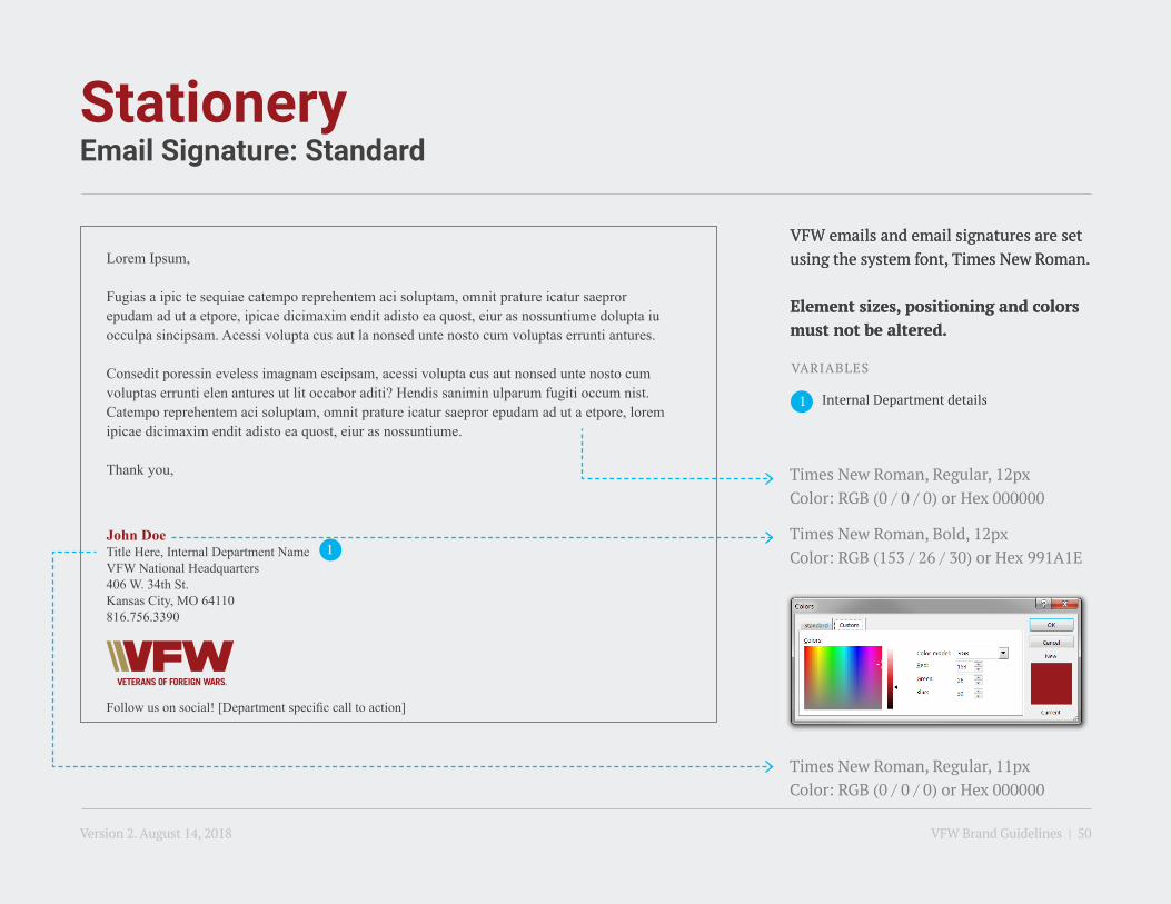
StationeryEmail Signature: Standard
Lorem Ipsum,
Fugias a ipic te sequiae catempo reprehentem aci soluptam, omnit prature icatur saepror epudam ad ut a etpore, ipicae dicimaxim endit adisto ea quost, eiur as nossuntiume dolupta iu occulpa sincipsam. Acessi volupta cus aut la nonsed unte nosto cum voluptas errunti antures.
Consedit poressin eveless imagnam escipsam, acessi volupta cus aut nonsed unte nosto cum voluptas errunti elen antures ut lit occabor aditi? Hendis sanimin ulparum fugiti occum nist. Catempo reprehentem aci soluptam, omnit prature icatur saepror epudam ad ut a etpore, lorem ipicae dicimaxim endit adisto ea quost, eiur as nossuntiume.
Thank you,
John DoeTitle Here, Internal Department NameVFW National Headquarters406 W. 34th St.Kansas City, MO 64110816.756.3390
Follow us on social! [Department specific call to action]
VFW emails and email signatures are set using the system font, Times New Roman.
Element sizes, positioning and colors must not be altered.
VFW emails and email signatures are set using the system font, Times New Roman.
Element sizes, positioning and colors must not be altered.
Internal Department details
Times New Roman, Bold, 12pxColor: RGB (153 / 26 / 30) or Hex 991A1E
Times New Roman, Regular, 12pxColor: RGB (0 / 0 / 0) or Hex 000000
Times New Roman, Regular, 11pxColor: RGB (0 / 0 / 0) or Hex 000000
VARIABLES
Version 2. August 14, 2018 VFW Brand Guidelines | 50
1
1

StationeryEmail Signature: Posts & Departments
Lorem Ipsum,
Fugias a ipic te sequiae catempo reprehentem aci soluptam, omnit prature icatur saepror epudam ad ut a etpore, ipicae dicimaxim endit adisto ea quost, eiur as nossuntiume dolupta iu occulpa sincipsam. Acessi volupta cus aut la nonsed unte nosto cum voluptas errunti antures.
Consedit poressin eveless imagnam escipsam, acessi volupta cus aut nonsed unte nosto cum voluptas errunti elen antures ut lit occabor aditi? Hendis sanimin ulparum fugiti occum nist. Catempo reprehentem aci soluptam, omnit prature icatur saepror epudam ad ut a etpore, lorem ipicae dicimaxim endit adisto ea quost, eiur as nossuntiume.
Thank you,
John DoeTitle Here VFW Department of Missouri406 W. 34th St.Kansas City, MO 64110816.756.3390
Visit us at vfw.org[Department specific website]!
VFW emails and email signatures are set using the system font, Times New Roman.
Element sizes, positioning and colors must not be altered.
Department location or Post
number details
Times New Roman, Bold, 12pxColor: RGB (153 / 26 / 30) or Hex 991A1E
Times New Roman, Regular, 12pxColor: RGB (0 / 0 / 0) or Hex 000000
Times New Roman, Regular, 11pxColor: RGB (0 / 0 / 0) or Hex 000000
VARIABLES
Version 2. August 14, 2018 VFW Brand Guidelines | 51
1
1
8. Cross of Malta
Version 2. August 14, 2018 VFW Brand Guidelines | 52

Cross of MaltaApproach to Limiting Usage
The VFW logo is the primary representation for the brand. The Cross of Malta is for special and distinguished situations only.
The appearance of the Cross of Malta emblem is generally reserved for official VFW caps, pins, flags, awards, official executive releases, signs and select VFW Store items whenever the Cross of Malta can be reproduced consistently, effectively and in its entirety. The Cross of Malta is not to appear in an incomplete or altered form.
Version 2. August 14, 2018 VFW Brand Guidelines | 53

IF YOU HAVE QUESTIONS REGARDING THIS VFW STYLE GUIDE
please contact the VFW Communications Department at [email protected].
INTELLECTUAL PROPERTY
Pursuant U.S.C. Title 36, Sections 230101-230107, the Veterans of Foreign Wars of the United States (VFW) has the exclusive right to the use of its name and the sole exclusive right to the use of the emblem and badges adopted by the corporation. The VFW’s marks are registered with the U.S. Patent and Trade Office. Also, as a Congressionally Chartered organization, it is a violation of federal law to manufacture, reproduce, distribute, sell, or print any badge, medal, emblem or other insignia or any colorable imitation thereof of any veterans’ organization chartered by an act of Congress or its auxiliary without express written consent. Use of the VFW name, logos or emblem by a VFW entity may be used for a VFW activity. VFW activities include the creation of handouts, membership drives, websites, Post or Department events, and other community outreach efforts consistent with the intended purposes of the VFW. All requests to use the VFW name, logos or emblems outside of the aforementioned purposes should be sent to the Quartermaster General’s office at [email protected].
Version 2. August 14, 2018 VFW Brand Guidelines | 54