
v j , Quarterly Review - Federal Reserve Bank of Minneapolis · Quarterly Review article thas t are...
36
Federal Reserve Bank of Minneapolis • .v, j Summer 2002 Quarterly Review Updated Facts on the U.S. Distributions of Earnings, Income, and Wealth (p. 2) Santiago Budria Rodriguez Javier Diaz-Gimenez Vincenzo Quadrini Jose-Victor Rfos-Rull
Transcript of v j , Quarterly Review - Federal Reserve Bank of Minneapolis · Quarterly Review article thas t are...
Federal Reserve Bank of Minneapolis
• . v , j
Summer 2002 Quarterly Review
Updated Facts on the U.S. Distributions of Earnings, Income, and Wealth (p. 2) Santiago Budria Rodriguez Javier Diaz-Gimenez Vincenzo Quadrini Jose-Victor Rfos-Rull
Federal Reserve Bank of Minneapolis
Quarterly Review vol. 26. 2b.no. 3
ISSN 0271-5287
This publication primarily presents economic research aimed at improving policymaking by the Federal Reserve System and other governmental authorities.
Any views expressed herein are those of the authors and not necessarily those of the Federal Reserve Bank of Minneapolis or the Federal Reserve System.
Editor: Arthur J. Rolnick Associate Editors: Patrick J. Kehoe, Warren E. Weber
Economic Advisory Board: Patrick J. Kehoe, Narayana R. Kocherlakota, Warren E. Weber
Managing Editor: Kathleen S. Rolfe Article Editor: Jenni C. Schoppers
Production Editor: Jenni C. Schoppers Designer: Phil Swenson
Typesetter: Mary E. Anomalay Circulation Assistant: Elaine R. Reed
The Quarterly Review is published by the Research Department of the Federal Reserve Bank of Minneapolis. Subscriptions are available free of charge. Quarterly Review articles that are reprints or revisions of papers published elsewhere may not be reprinted without the written permission of the original publisher. All other Quarterly Review articles may be reprinted without charge. If you reprint an article, please fully credit the source—the Minneapolis Federal Reserve Bank as well as the Quarterly Review—and include with the reprint a version of the standard Federal Reserve disclaimer (italicized above). Also, please send one copy of any publication that includes a reprint to the Minneapolis Fed Research Department.
Electronic files of Quarterly Review articles are available through the Minneapolis Fed's home page on the World Wide Web: http://www.minneapolisfed.org.
Comments and questions about the Quarterly Review may be sent to Quarterly Review Research Department Federal Reserve Bank of Minneapolis P. O. Box 291 Minneapolis, Minnesota 55480-0291 (Phone 612-204-6455 / Fax 612-204-5515). Subscription requests may also be sent to the circulation assistant at [email protected]; editorial comments and questions, to the managing editor at [email protected].
Federal Reserve Bank of Minneapolis Quarterly Review Summer 2002
Updated Facts on the U.S. Distributions of Earnings, Income, and Wealth
Santiago Budria Rodriguez* Teaching Associate Department of Economics Universidad Carlos III de Madrid
Jose-Victor Rios-Rull* Professor Department of Economics University of Pennsylvania and Research Fellow Centro de Altisimos Estudios Rios Perez and Research Associate National Bureau of Economic Research and Research Fellow Centre for Economic Policy Research
Javier Diaz-Gimenez* Associate Professor Department of Economics Universidad Carlos III de Madrid
Vincenzo Quadrini* Assistant Professor Department of Economics Stern School of Business New York University and Research Associate National Bureau of Economic Research and Research Affiliate Centre for Economic Policy Research
The purpose of this article is to report facts on the dis-tributions of earnings, income, and wealth in the United States. Specifically, we update the 1997 report published in the Quarterly Review (Diaz-Gimenez, Quadrini, and Rios-Rull 1997) that used data from the 1992 Survey of Consumer Finances (SCF) with the most recent wave of that survey, which dates from 1998. In this update, we do three things: we update the old tables using the new data; we add some new tables with data that have proved to be useful for our understanding of inequality and which are not part of the 1997 report; and we describe some of the changes that took place between the two periods consid-ered.
Even though our understanding of inequality has ad-vanced significantly since 1997, there is still no established theory to help organize the data. Therefore, we have at-tempted to report the data in a format that satisfies the fol-lowing two criteria: it should be possible to analyze the data with any given theoiy of inequality, and it should be possible to use the data to test the implications of any giv-
en theory of inequality. Thus, the pages that follow are an attempt to highlight the main features of the data in a co-herent and summarized fashion. This article, however, is not an attempt to carry out a thorough statistical analysis of the data.
As did the last report, this one uses the two most re-liable sources of data on inequality: the SCF mentioned above and the Panel Study of Income Dynamics (PSID). Every fact that we report in this article has been construct-ed from the data obtained from those two sources. Here we use the 1998 SCF and various recent waves of the PSID. (For technical details about these sources, see the Appen-dix.)
*The authors thank the members of the Editorial Board and the editorial staff of the Quarterly Review for valuable comments and suggestions. Diaz-Gimenez thanks the Banco Santander Central Hispano and the Direction General de Investigation Cientifica y Tecnica (Grant 98-0139) for their financial support, and Rios-Rull thanks the National Science Foundation, the National Institutes of Health, the University of Pennsylvania Research Foundation, and Spain's Ministerio de Education, Cultura y Deporte for theirs.
2

Santiago Budria Rodriguez, Javier Diaz-Gimenez, Vincenzo Quadrini, Jose-Victor Ros-Rull Updated Facts on the U.S. Distributions of Earnings, Income, and Wealth
The complexity of the problem of inequality has forced us to concentrate on the study of some of its dimensions and to ignore many others. Specifically, the dimensions of inequality which we describe in this article are the follow-ing:
Earnings, Income, and Wealth. The dimensions of in-equality that are most frequently studied are earnings, income, and wealth. As we discuss below, these three variables are correlated, and the relationships among them play an important role in helping to understand some of their distributional features. First, we define labor earnings as wages and salaries of all kinds plus a large fraction (85.7 percent) of business and farm in-come.1 Thus defined, earnings is a component of in-come, namely, the income obtained from labor. Next, we define income as revenue from all sources before taxes but after transfers.2 Finally, we define wealth as the net worth of the household. Thus defined, wealth is both the stock of unspent past income and the source from which one of the components of income, capital income, is obtained. Moreover, given that labor income and capital income are perfect substitutes as far as their purchasing power is concerned, wealth plays a poten-tially important role in the decision of how much to work and, hence, in the determination of labor earnings.
To document some of the earnings, income, and wealth inequality facts, we partition the 1998 SCF sam-ple into various groups along each one of these three dimensions, and we describe our findings below. We find that wealth, with a Gini index of 0.803, is by far the most concentrated of the three variables; that earn-ings, with a Gini index of 0.611, ranks second; and that income, with a Gini index of 0.553, is the least concen-trated of the three.3 Furthermore, we find that the cor-relations between earnings and wealth and between income and wealth, which are 0.463 and 0.600, respec-tively, are significantly smaller than the correlation be-tween earnings and income, which is 0.715. The Poor and the Rich. Earnings, income, and wealth inequality is essentially about the differences between the poor and the rich. However, the meanings of these two words are somewhat ambiguous. When we talk about the rich, it is not clear whether we are referring to the earnings-rich, the income-rich, or the wealth-rich, and the same ambiguity applies to the earnings-poor, the income-poor, and the wealth-poor. Below we de-scribe the earnings, the income, and the wealth of the
households in the tails of the three distributions, and we document the ways in which these three concepts of poor and rich differ. Age. Age is one of the main determinants of earnings, income, and wealth inequality. To document this fact, we partition the 1998 SCF into 10 age cohorts, and we report some of the main earnings, income, and wealth inequality facts of the groups in this age partition. We find that, on average, the households whose heads are between 51 and 55 years old are both the earnings- and the income-richest; that the households whose heads are between 61 and 65 are the wealth-richest; and that the households whose heads are under 25 are the earnings-, income-, and wealth-poorest. We also find that, overall, the measures of earnings, income, and wealth inequality within the age cohorts are similar to those for the entire sample. Employment Status. The employment status of the head of the household is another prime determinant of inequality. To document this relationship, we partition the 1998 SCF sample into workers (people who are em-ployed by others), the self-employed, retirees, and non-workers (people who do not work but who do not con-sider themselves to be retired) according to the employ-ment status of the head of the household. We find that the self-employed are, on average, the earnings-, income-, and wealth-richest; that the retired are the earnings-poorest; and that the nonworkers are the income- and wealth-poorest. Education. Education increases the market value of people's time. Consequently, it plays a potentially sig-nificant role in determining labor earnings, and, there-fore, it is an important determinant of earnings, income, and wealth inequality. To characterize the relationship between education and inequality, we partition the 1998
1 See the Appendix for a rationale for this choice. 2This is the definition of income most frequently used. Note that it is somewhat
inconsistent in its treatment of the role played by the government. 3The Gini index of a distribution is twice the area between its Loienz curve and the
diagonal of the unit square. Consequently, the Gini index of a variable that is exactly equally distributed is zero, and the Gini index of a variable that is completely accumu-lated in only one household is one.
The Lorenz curve of a distribution gives a measure of its relative inequality. Spe-cifically, on the horizontal axis of its graph, we plot the shares of the population (for ex-ample, the poorest 10 percent, the next 10 percent, and so on), and on the vertical axis we plot the shares of the total earnings, income, or wealth earned or owned by that group. Consequently, the Lorenz curve of a variable that is exactly equally distributed is a 45 degree line, and as the inequality of a distribution increases, its Lorenz curve be-comes increasingly bowed toward the bottom right comer of its graph.
3

SCF sample into no-high school households, high school households, and college households according to the education level of the head of the household. Not surprisingly, we find that earnings, income, and wealth inequality differs significantly among these education groups; that the college households are the earnings-, income-, and wealth-richest; and that the no-high school households are the earnings-, income-, and wealth-poorest. We also find that college households have a higher wealth-to-earnings ratio than the other two education groups. Marital Status. To explore the relationship between marital status and inequality, we partition the 1998 SCF sample into married households, single households with dependents, and single households without dependents according to the marital status of the head of the house-hold. The singles are further partitioned by sex. We re-port the main earnings, income, and wealth inequality facts for these seven marital status groups, and we find that, as far as the economic performance of households is concerned, married people tend to be better off. We also find that the worst lot corresponds to single females with dependents. Financial Trouble. Finally, we describe the economic circumstances of households in financial trouble. We find that households who delay the payments of their liabilities for two months or more and those who file for bankruptcy tend to be younger and less educated than the households who are not in financial trouble. We al-so find that a significant share of the households in fi-nancial trouble are headed by singles with dependents, and perhaps surprisingly, we find that the highest inci-dence of bankruptcy does not occur in the bottom in-come or wealth quintiles.4
Since people move up and down the economic scale, we also report here some facts about earnings, income, and wealth mobility. We find that earnings mobility is by far the smallest and that income mobility is greater than wealth mobility. The large number of retired households in the sample and the fact that their average earnings is es-sentially zero largely account for the first of these two find-ings. Not surprisingly, we also find that the households in the middle quintiles are more mobile than those in either the bottom or the top quintiles and that the wealth-rich are significantly less mobile than the wealth-poor.
Next we report some of the main changes in inequality and mobility that occurred during the 1990s. We compare
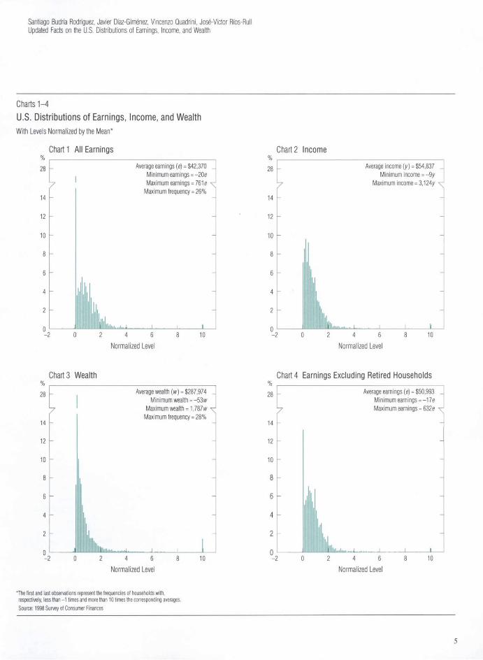
the results of the 1992 and the 1998 SCFs and the main PSID waves of the 1980s and 1990s. We find that during the 1990s, standard measures of inequality decreased for earnings and income and increased for wealth, but that these changes were small. Earnings, Income, and Wealth Inequality Wealth is the most unequally distributed of the three variables considered, and earnings is more unequally distributed than income except in the top tail. The 1998 SCF data set unambiguously shows that earn-ings, income, and wealth are unequally distributed across the households in the sample. The values of the concentra-tion statistics that we have computed are large, and the histograms of the earnings, income, and wealth distribu-tions are skewed to the right; that is, they present a short and fat bottom tail and a long and thin top tail (Charts 1,2, and 3).
The concentration statistics that we report in Table 1 rank wealth as the most unequally distributed of the three variables and income as the most equally distributed.
Another interesting feature of the data is that the cor-relations between income and wealth and, especially, be-tween earnings and wealth are significantly smaller than the correlation between earnings and income. Later, in Ta-bles 5, 6, and 7, we report a detailed set of statistics that describe the earnings, income, and wealth partitions. In this section, we use some of those statistics to highlight the main earnings, income, and wealth inequality facts.
Ranges and Shapes of the Distributions The ranges and shapes of the distributions of earnings, income, and wealth differ significantly, and the maximum income is surprisingly high. Charts 1-4 give a clear illustration of some of the differ-ences in the ranges and shapes of the distributions of earn-ings, income, and wealth. In these charts, the levels have been normalized by the mean, and the first and last ob-servations represent the frequencies of households with, respectively, less than -1 times and more than 10 times the corresponding averages. The differences in the ranges of the three distributions are very large. Earnings ranges from -20 times to 761 times average earnings (or from -17
4Strictly speaking, the /'th quintile of a distribution F is the value in the support of that distribution that solves the equation F(.v) = 0.2/. In this article, we discuss the shares of total earnings, income, and wealth earned or owned by various groups: the poorest 20 percent, the next 20 percent, and so on. However, we abuse the language and we call these groups quintiles.
4
Santiago Budra Rodriguez, Javier Diaz-Gimenez, Vincenzo Quadrini, Jose-Victor Ros-Rull Updated Facts on the U.S. Distributions of Earnings, Income, and Wealth
Charts 1-4 U.S. Distributions of Earnings, Income, and Wealth With Levels Normalized by the Mean*
Chart 1 All Earnings
7
Average earnings (e) = $42,370 Minimum earnings = -20e Maximum earnings = 761 e ^
Maximum frequency = 26%
.niii.i. J L 2 4 6
Normalized Level 10
Chart 2 Income
Average income (y) = $54,837 Minimum income = -9y
Maximum income = 3,124/ ^
llllllll.lll.. •• .1- J_ 2 4 6
Normalized Level 10
Chart 3 Wealth
7
Average wealth (w) = $287,974 _ Minimum wealth = -53 w
Maximum wealth = 1,787 w ^ Maximum frequency = 28%
2 4 6 Normalized Level
10
Chart 4 Earnings Excluding Retired Households
y
14 -
12
10 8 6
4
2
- 2
llllllL.
Average earnings (e) = $50,993 Minimum earnings = -17e Maximum earnings = 632e
2 4 6 Normalized Level
10
*The first and last observations represent the frequencies of households with, respectively, less than -1 times and more than 10 times the corresponding averages. Source: 1998 Survey of Consumer Finances
5
times to 632 times if we exclude retired households from the sample), income ranges from -9 times to 3,124 times average income, and wealth ranges from -53 times to 1,787 times average wealth.
The maximum value for income is surprisingly high. Specifically, it is 4.1 times the normalized maximum earn-ings and 1.7 times the normalized maximum wealth. Moreover, the income distribution is the only one of the three distributions whose support is clearly not connected. Specifically, there are no households with normalized incomes between 704 times and 908 times the average income and between 1,032 times and 2,850 times the average income. Moreover, the number of households in the very top tail of the income distribution is extremely small, and those households account for an insignificant part of total income. (Specifically, the households with normalized incomes greater than 704 times the average income represent only 5.41 x 10~3 percent of the sample, and they account for only 0.14 percent of total income.) The extremely large incomes of the income-richest are the realized capital gains from sales of shares or other assets. Specifically, the capital gains realized by the five income-richest households amount to $150 million, which con-trasts sharply with the $20 million earned by the corre-sponding households in the 1992 SCF sample.5
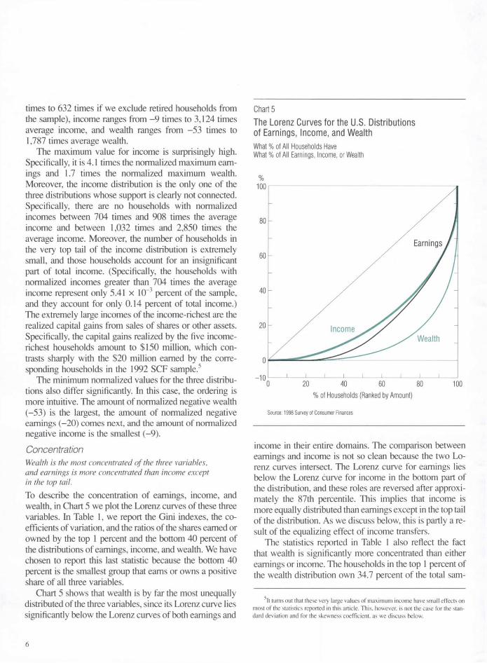
The minimum normalized values for the three distribu-tions also differ significantly. In this case, the ordering is more intuitive. The amount of normalized negative wealth (-53) is the largest, the amount of normalized negative earnings (-20) comes next, and the amount of normalized negative income is the smallest (-9). Concentration Wealth is the most concentrated of the three variables, and earnings is more concentrated than income except in the top tail. To describe the concentration of earnings, income, and wealth, in Chart 5 we plot the Lorenz curves of these three variables. In Table 1, we report the Gini indexes, the co-efficients of variation, and the ratios of the shares earned or owned by the top 1 percent and the bottom 40 percent of the distributions of earnings, income, and wealth. We have chosen to report this last statistic because the bottom 40 percent is the smallest group that earns or owns a positive share of all three variables.
Chart 5 shows that wealth is by far the most unequally distributed of the three variables, since its Lorenz curve lies significantly below the Lorenz curves of both earnings and
Chart 5 The Lorenz Curves for the U.S. Distributions of Earnings, Income, and Wealth What % of All Households Have What % of All Earnings, Income, or Wealth
%
Source: 1998 Survey of Consumer Finances
income in their entire domains. The comparison between earnings and income is not so clean because the two Lo-renz curves intersect. The Lorenz curve for earnings lies below the Lorenz curve for income in the bottom part of the distribution, and these roles are reversed after approxi-mately the 87th percentile. This implies that income is more equally distributed than earnings except in the top tail of the distribution. As we discuss below, this is partly a re-sult of the equalizing effect of income transfers.
The statistics reported in Table 1 also reflect the fact that wealth is significantly more concentrated than either earnings or income. The households in the top 1 percent of the wealth distribution own 34.7 percent of the total sam-
sIt turns out that these very large values of maximum income have small effects on most of the statistics reported in this article. This, however, is not the case for the stan-dard deviation and for the skewness coefficient, as we discuss below.
6
Santiago Budria Rodriguez, Javier Diaz-Gimenez, Vincenzo Quadrini, Jose-Victor Ros-Rull Updated Facts on the U.S. Distributions of Earnings, Income, and Wealth
pie wealth (Table 7), and they are on average 1,335 times wealth-richer than those in the bottom 40 percent of the wealth distribution. This difference between these top and bottom groups is about eight times larger than the differ-ence for the same groups in the earnings partition and about eighteen times larger than that difference for the same groups in the income partition.
The concentration statistics that we have computed also show that labor earnings is more concentrated than income. One of the reasons for this fact is the equalizing effect of income transfers, which we include in our definition of income and which we do not include in our definition of earnings. For instance, if we exclude transfers from our definition of income, then the Gini index of the resulting variable is 0.62, which is only slightly higher than the 0.61 that we have obtained for earnings. Another reason that makes earnings more concentrated than income is that there are a large number of retired households in the sam-ple (18.9 percent), and the labor earnings of many of these households is either very small or zero.6
Skewness All three distributions are significantly skewed to the right. We report three measures of the skewness of the earnings, income, and wealth distributions in Table 2. These mea-sures establish that all three distributions are significantly skewed to the right. They also show that wealth is signifi-cantly more skewed to the right than either earnings or in-come.
In the first and second columns of Table 2, we report the percentiles in which the means are located and the mean-to-median ratios. In symmetric distributions, the mean is located in the 50th percentile, so that the mean-to-median ratio is one. As the skewness to the right of a variable increases, the location of its mean moves to a higher percentile, and its mean-to-median ratio also in-creases. According to these two statistics, wealth is by far the most skewed to the right of the three variables, and income is somewhat more skewed than earnings.
Finally, in the last column of Table 2, we report the skewness coefficient proposed by Fisher. This statistic is defined as y = Hjjix-xf/o3, where is the relative fre-quency of realization /, and x and a are the mean and the standard deviation of the distribution, respectively. This coefficient is zero for symmetric unimodal distributions, it is positive for unimodal distributions that are skewed to the right, and it increases as right-hand skewness of the dis-tribution increases. This statistic confirms that all three dis-
Tables 1-3
Measures of U.S. Earnings, Income, and Wealth
Table 1 Concentration Top 1% to
Gini Coefficient Bottom 40% Variable Index of Variation Ratio
Earnings .611 2.65 158 Income .553 3.57 73 Wealth .803 6.53 1,335
Table 2 Skewness
Location Mean-to-of Mean Median
Variable (Percentile) Ratio Skewness
Earnings 65 1.57 60.8 Income 71 1.61 293.4 Wealth 81 4.03 86.5
Table 3 Correlation
Correlation Variables Coefficient
Earnings and Income .72 Earnings and Wealth .47 Income and Wealth .60
Source: 1998 Survey of Consumer Finances
tributions are significantly skewed to the right. However, the skewness coefficient of the income dis-
tribution is significantly larger than the corresponding sta-tistics of both the earnings and the wealth distributions.
6The average labor earnings of the retirees is $7,095 while the sample average is $42,370 (Table 8).
7

This unexpected result is due to the exceptionally large incomes earned by the households in the very top tail of the income distribution, which we have already discussed. If we exclude the households whose income is greater than $40 million (730 times average income), then the skew-ness coefficient drops to only 66.8 while the location of the mean and the mean-to-median ratio do not change. (Recall that these households represent only 5.41 x 10"3 percent of the sample and that they account for only 0.14 percent of total income.)
Correlation The correlations between earnings and wealth and between income and wealth are perhaps smaller than expected. In Table 3, we report the correlation coefficients between earnings, income, and wealth. The 1998 SCF data show that earnings, income, and wealth are positively correlated. They also show that the correlation between earnings and income is high (0.72). This should indeed be the case giv-en that average labor earnings accounts for approximately 77 percent of average household income. Two more in-teresting facts are that the correlation between income and wealth is significantly lower (0.60) than that between earn-ings and income and that the correlation between earnings and wealth (0.47) is even lower. This low correlation be-tween earnings and wealth is justified because there are a large number of retired households in the sample, because they are quite wealthy, and because their labor earnings are mostly zero.7 When the households headed by a retiree are excluded from the sample, the correlation between earn-ings and wealth increases from 0.47 to 0.51.
We report the correlations between earnings, income, and wealth and the various sources of income in Table 4. Not surprisingly, we find that earnings is highly correlated both with labor income (0.74) and with business income (0.77).8 The data also show that the correlation between earnings and capital income is low (0.21) and that the cor-relation between earnings and transfers is significantly negative (-0.11). This last fact can be taken as further evi-dence of the large role played by retirement pensions. As far as income is concerned, we find that it is most correlat-ed with capital income, which suggests that past savings play an important role in determining households' econom-ic well-being. Finally, we find that wealth is most correlat-ed with both capital and business income. This suggests that running a successful business is probably the best way to become wealthy.
Table 4 Correlation Between Earnings, Income, and Wealth and Various Sources of Income
Correlation
Variable Labor
Income Capital Income
Business Income Transfers
Earnings .74 .21 .77 -.11
Income .49 .67 .59 .01
Wealth .27 .49 .44 .05
Source: 1998 Survey of Consumer Finances
The Poor and the Rich The rich tend to be rich in all three dimensions. This is not the case with the poor. As we have already mentioned, the common usage of the concepts of the poor and the rich is somewhat ambiguous. To clarify this ambiguity, we distinguish between the poor and the rich in terms of earnings, income, and wealth. In this section, we discuss some of the facts reported in Ta-bles 5,6, and 7. In these tables, we report, respectively, the earnings, income, and wealth partitions. We organize these facts into two groups: those that pertain to the households in the bottom tails of the distributions, which we refer to generically as the poor, and those that pertain to the house-holds in the top tails of the distributions, which we refer to generically as the rich. We have chosen this organization criterion because we think that one of the hardest tasks faced by any theory of inequality is to account for both tails of the distributions simultaneously.
• The Earnings-Poor The earnings-poor are surprisingly wealthy. We start with the earnings-poor. As many as 22.5 percent of the households in the 1998 SCF sample have zero earn-
7Specifically, 18.9 percent of the sample households are retired, and a household with the average wealth of the retirees ($361,005) would be in the top quintile of the wealth partition (Tables 7 and 8).
8Recall that we have defined labor earnings as labor income plus 85.7 percent of business and farm income.
8
Santiago Budria Rodriguez, Javier Diaz-Gimnez, Vincenzo Quadrini, Jos-Vctor Rfos-Rull Updated Facts on the U.S. Distributions of Earnings, Income, and Wealth
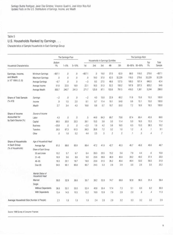
Table 5 U.S. Households Ranked by Earnings . . . Characteristics of Sample Households in Each Earnings Group
The Earnings-Poor The Earnings-Rich Households in Earnings Quintiles , ,
Bottom Top Total Household Characteristics 1% 1-5% 5-10% 1st 2nd 3rd 4th 5th 90-95% 95-99% 1% Sample
Earnings, Income, Minimum Earnings -857.1 .0 .0 -857.1 .0 19.0 37.0 62.0 88.0 116.0 279.6 -857.1 and Wealth Maximum Earnings .0 .0 .0 .0 19.0 37.0 62.0 32,229 116.0 279.6 32,229 32,229 (x 1031998 U.S. $) Average Earnings -6.7 .0 .0 -.3 8.5 27.5 48.6 127.5 100.0 167.4 645.5 42.4
Average Income 51.8 22.0 18.9 22.1 18.3 31.3 52.2 150.2 107.8 207.3 820.2 54.8 Average Wealth 835.7 240.7 241.3 271.7 125.8 97.1 153.6 791.5 416.0 1,361 5,244 288.0
Share of Total Sample Earnings -.2 .0 .0 -.2 4.0 13.0 22.9 60.2 11.8 15.8 15.3 100.0 (% of $) Income .9 1.5 2.0 8.1 6.7 11.4 19.1 54.8 9.8 15.1 15.0 100.0
Wealth 2.7 3.4 4.3 18.8 8.8 6.7 10.7 55.0 7.2 18.9 18.3 100.0
Share of Income Source of Income Accounted for Labor 4.3 .0 .0 .5 44.9 84.3 89.7 70.8 87.4 69.4 45.9 68.6 by Each Source (%) Capital 89.5 30.9 33.3 39.1 15.0 3.8 3.0 11.4 5.0 16.5 15.3 11.4
Business -20.8 .0 .0 -2.3 1.9 4.2 3.8 16.5 6.3 13.3 38.3 10.2 Transfers 26.5 67.3 61.5 58.3 35.6 7.2 3.2 1.0 1.2 .6 .1 9.1 Other .0 1.8 5.2 4.4 2.5 .5 .2 .2 .1 .3 .4 .7
Share of Households Age of Household Head in Each Group Average Age 61.0 66.6 65.9 66.4 47.2 41.9 42.7 45.3 45.7 46.6 49.6 48.7 (% of Households) Share of Each Group
30 and Under 10.2 5.7 6.7 6.4 28.3 23.5 15.2 5.8 7.9 4.4 .6 15.8 31-45 16.9 9.6 8.8 9.0 23.6 39.8 46.9 45.8 39.2 40.0 37.4 33.0 46-65 18.3 20.1 18.7 18.9 23.6 31.5 35.2 45.6 49.4 53.0 58.5 31.0 Over 65 54.5 65.1 65.8 65.7 24.5 5.3 2.8 2.9 3.5 2.6 3.5 20.2
Marital Status of Household Head Married 50.0 32.9 36.6 35.7 39.2 52.8 74.7 89.8 92.8 96.6 91.4 58.4 Single
Without Dependents 36.8 53.1 53.0 52.4 40.8 33.4 17.4 7.3 5.1 6.6 8.2 30.3 With Dependents 13.4 14.5 10.5 12.2 19.8 13.9 7.9 2.9 2.0 .8 .4 11.3
Average Household Size (Number of People) 2.1 1.9 1.9 1.9 2.4 2.6 2.9 3.2 3.3 3.2 3.2 2.6
Source: 1998 Survey of Consumer Finances
9
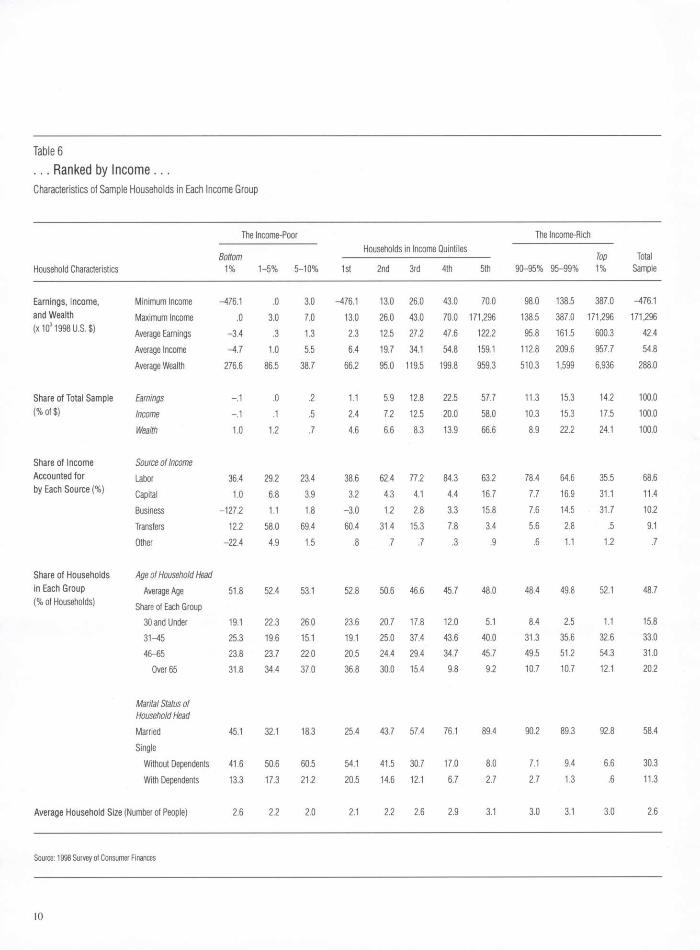
Table 6 . . . Ranked by Income . . . Characteristics of Sample Households in Each Income Group
Household Characteristics
The Income-Poor
1st
Households in Income Quintiles
2nd 3rd 4th 5th
The Income-Rich
Total Sample Household Characteristics
Bottom 1% 1-5% 5-10% 1st
Households in Income Quintiles
2nd 3rd 4th 5th 90-95% 95-99% Top 1%
Total Sample
Earnings, Income, Minimum Income -476.1 .0 3.0 -476.1 13.0 26.0 43.0 70.0 98.0 138.5 387.0 -476.1 and Wealth Maximum Income .0 3.0 7.0 13.0 26.0 43.0 70.0 171,296 138.5 387.0 171,296 171,296 (x103 1998 U.S. $) Average Earnings -3.4 .3 1.3 2.3 12.5 27.2 47.6 122.2 95.8 161.5 600.3 42.4
Average Income -4.7 1.0 5.5 6.4 19.7 34.1 54.8 159.1 112.8 209.6 957.7 54.8 Average Wealth 276.6 86.5 38.7 66.2 95.0 119.5 199.8 959.3 510.3 1,599 6,936 288.0
Share of Total Sample Earnings -.1 .0 .2 1.1 5.9 12.8 22.5 57.7 11.3 15.3 14.2 100.0 (% of $) Income -.1 .1 .5 2.4 7.2 12.5 20.0 58.0 10.3 15.3 17.5 100.0
Wealth 1.0 1.2 .7 4.6 6.6 8.3 13.9 66.6 8.9 22.2 24.1 100.0
Share of Income Source of Income Accounted for Labor 36.4 29.2 23.4 38.6 62.4 77.2 84.3 63.2 78.4 64.6 35.5 68.6 by Each Source (%) Capital 1.0 6.8 3.9 3.2 4.3 4.1 4.4 16.7 7.7 16.9 31.1 11.4
Business -127.2 1.1 1.8 -3.0 1.2 2.8 3.3 15.8 7.6 14.5 31.7 10.2 Transfers 12.2 58.0 69.4 60.4 31.4 15.3 7.8 3.4 5.6 2.8 .5 9.1 Other -22.4 4.9 1.5 .8 .7 .7 .3 .9 .6 1.1 1.2 .7
Share of Households Age of Household Head in Each Group Average Age 51.8 52.4 53.1 52.8 50.6 46.6 45.7 48.0 48.4 49.8 52.1 48.7 (% of Households) Share of Each Group
30 and Under 19.1 22.3 26.0 23.6 20.7 17.8 12.0 5.1 8.4 2.5 1.1 15.8 31-45 25.3 19.6 15.1 19.1 25.0 37.4 43.6 40.0 31.3 35.6 32.6 33.0 46-65 23.8 23.7 22.0 20.5 24.4 29.4 34.7 45.7 49.5 51.2 54.3 31.0
Over 65 31.8 34.4 37.0 36.8 30.0 15.4 9.8 9.2 10.7 10.7 12.1 20.2
Marital Status of Household Head Married 45.1 32.1 18.3 25.4 43.7 57.4 76.1 89.4 90.2 89.3 92.8 58.4 Single
Without Dependents 41.6 50.6 60.5 54.1 41.5 30.7 17.0 8.0 7.1 9.4 6.6 30.3 With Dependents 13.3 17.3 21.2 20.5 14.6 12.1 6.7 2.7 2.7 1.3 .6 11.3
Average Household Size (Number of People) 2.6 2.2 2.0 2.1 2.2 2.6 2.9 3.1 3.0 3.1 3.0 2.6
Source: 1998 Survey of Consumer Finances
10

Santiago Budria Rodriguez, Javier Diaz-Gimenez, Vincenzo Quadrini, Jose-Victor Ros-Rull Updated Facts on the U.S. Distributions of Earnings, Income, and Wealth
ings, and an additional 0.24 percent have negative earn-ings. The number of households with zero earnings is so large because of the retirees. Indeed, the average age of the heads of the households in the bottom earnings quintile is 66.4 years. This is further confirmed by the facts that households in the bottom quintile earn a significant share of income (8.1 percent) and that they own a sizable share of wealth (18.8 percent). Moreover, a household who owned the average wealth of the households in the bottom earnings quintile would be in the very top of the fourth quintile of the wealth distribution (Tables 5 and 7).
Recall that we have defined labor earnings as wages and salaries of all kinds, plus 85.7 percent of business and farm income. Given this definition of earnings, it turns out that the households with negative earnings are mostly headed by business owners in financial distress. In spite of these business losses, the average total income of these households is positive and large, since they receive sig-nificant shares of transfers and capital income. Moreover, in the 1998 SCF sample, the households with negative earnings are surprisingly wealthy. Specifically, the average wealth of the households in the bottom 1 percent of the earnings distribution is about three times the sample av-erage, which would put them in the 90-95th group of the wealth distribution (Chart 6 and Tables 5 and 7). The av-erage wealth of households in the bottom quintile of the earnings distribution, although smaller (94 percent of the sample average), is still significant (Chart 7).
• The Income-Poor The income-poor own significant amounts of wealth. As many as 2.1 percent of the households in the 1998 SCF sample have zero income, and another 0.15 percent have negative income. Recall that the fraction of households with zero earnings is 22.5 percent and that the fraction of those with negative earnings is 0.24 percent. If we exclude the households whose heads are over age 65, which are 20.2 percent of the 1998 SCF sample, we find that the fractions of households with, respectively, zero income and zero earnings are roughly the same. We also find that 20.6 percent of the sample households have positive income and nonpositive earnings and that 31.2 percent of these households (or 6.4 percent of the total sample) are of working age. The income of these households is mostly capital income or transfers. These facts suggest that a sig-nificant number of U.S. households have some form of an economic safety net, either private or public, that allows them to live without working.
A perhaps more surprising fact is that the income-poorest are significantly wealthy. Specifically, the house-holds in the bottom 1 percent of the income distribution own 1.0 percent of total wealth, and a household who owned their average wealth would be in the top quintile of the wealth distribution (Chart 7 and Tables 6 and 7).
Table 6 also shows that the shares of income obtained from transfers are decreasing in the income quintiles. Spe-cifically, transfers account for 60.4 percent of the income earned by the households in the bottom income quintile and for only 3.4 percent of the income earned by the households in the top income quintile. Perhaps more re-markable is the fact that when we exclude transfers from our definition of income, 13.6 percent of the sample house-holds have zero income and another 0.27 percent have negative income.
As far as their marital status is concerned, the majority (54.9 percent) of the income-poor are single, either with or without dependents. More specifically, while singles with-out dependents account for roughly 50 percent of the households in each of the bottom two quintiles, they rep-resent only 30 percent of the total sample. The share of singles with dependents in the bottom quintile (20.5 per-cent) is also significantly larger than their share in the total sample (11.3 percent). Finally, we find that the shares of singles with dependents are decreasing in the income quin-tiles.
• The Wealth-Poor The wealth-poor are reasonably well-to-do in terms of both earnings and income. Next, we discuss the wealth-poor. Approximately 2.5 per-cent of the sample households have zero wealth, and a surprising 7.4 percent have negative wealth (Table 7). This large number of wealth-poor households partially accounts for the fact that wealth is by far the most unequally dis-tributed of the three variables that we consider. More spe-cifically, the households in the bottom 40 percent of the wealth distribution own only 1.0 percent of the total sam-ple wealth, and those in the bottom 80 percent own only 18.3 percent of the total sample wealth.
Charts 6 and 7 and Tables 5, 6, and 7 show that some of the wealth-poor are reasonably well-to-do in terms of both earnings and income. Specifically, the average earn-ings of the households in the bottom 1 percent of the wealth distribution would put them in the fourth quintile of the earnings distribution, and their average income would put them in the top part of the third quintile of the
11
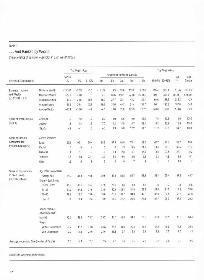
Table 7 . . . And Ranked by Wealth Characteristics of Sample Households in Each Wealth Group
Household Characteristics
The Wealth-Poor
1st
Households in Wealth Quintiles
2nd 3rd 4th 5th
The Wealth-Rich
Total Sample Household Characteristics
Bottom 1% 1-5% 5-10% 1st
Households in Wealth Quintiles
2nd 3rd 4th 5th 90-95% 95-99% Top 1%
Total Sample
Earnings, Income, Minimum Wealth -15,162 -22.9 -3.0 -15,162 4.9 39.6 110.2 273.8 495.4 909.1 3,876 -15,162 and Wealth Maximum Wealth -22.9 -3.0 .0 4.9 39.6 110.1 273.8 514,651 909.1 3,873 514,651 514,651 (x 103 1998 U.S. $) Average Earnings 40.9 23.5 10.5 16.9 27.7 35.1 42.2 90.1 66.6 133.5 382.3 42.4
Average Income 41.9 25.4 13.7 19.7 30.6 40.7 51.4 131.7 90.1 190.3 707.8 54.8 Average Wealth -56.4 -10.0 -.7 -4.1 19.0 72.6 175.3 1,177 649.8 1,663 9,983 288.0
Share of Total Sample Earnings .9 2.2 1.2 8.0 13.0 16.6 19.9 42.5 7.9 12.6 9.0 100.0 (% of $) Income .8 1.8 1.3 7.2 11.2 14.9 18.7 48.1 8.2 13.9 12.9 100.0
Wealth -.2 -.1 .0 -.3 1.3 5.0 12.2 81.7 11.3 23.1 34.7 100.0
Share of Income Source of Income Accounted for Labor 97.1 90.1 76.4 84.9 87.5 84.0 78.1 53.2 62.7 49.8 33.2 68.6 by Each Source (%) Capital .5 .5 .4 .5 .6 1.9 3.5 21.6 14.0 21.0 39.5 11.4
Business .4 2.1 .3 .9 3.4 2.8 4.7 17.5 13.0 23.6 24.1 10.2 Transfers 1.8 6.0 22.1 13.3 8.0 10.6 13.0 6.8 10.2 4.8 1.3 9.1 Other .2 .6 .9 .5 .5 .6 .7 .9 .1 .9 1.9 .7
Share of Households Age of Household Head in Each Group Average Age 34.2 33.8 40.6 39.5 42.6 50.5 54.7 56.3 56.4 56.4 57.9 48.7 (% of Households) Share of Each Group
30 and Under 49.5 48.6 36.4 37.5 26.9 8.8 4.3 1.7 .8 .9 .3 15.8 31-45 31.2 37.2 31.8 33.9 40.3 36.3 31.6 22.9 23.6 21.7 14.5 33.0 46-65 19.2 12.6 19.6 18.8 20.9 33.7 34.4 47.0 42.9 52.1 58.2 31.0 Over 65 .1 1.4 12.3 9.9 11.9 21.2 29.8 28.4 32.7 25.3 27.1 20.2
Marital Status of Household Head Married 72.3 39.9 33.7 39.2 48.7 59.3 64.8 80.3 82.3 79.5 83.6 58.4 Single
Without Dependents 24.7 42.7 41.8 39.3 35.3 31.0 29.1 16.6 14.4 16.9 14.4 30.3 With Dependents 3.0 17.3 24.6 21.6 16.1 9.7 6.1 3.1 2.8 3.7 2.0 11.3
Average Household Size (Number of People) 2.5 2.4 2.7 2.5 2.7 2.6 2.5 2.7 2.7 2.6 2.6 2.6
Source: 1998 Survey of Consumer Finances
12
Santiago Budria Rodriguez, Javier Diaz-Gimenez, Vincenzo Quadrini, Jose-Victor Ros-Rull Updated Facts on the U.S. Distributions of Earnings, Income, and Wealth
income distribution. Furthermore, given that these house-holds have a significant ability to borrow—their average debts amount to approximately 20 percent of average wealth—there must be some sense in which these house-holds are not poor.
The average net worth of the rest of the households in the bottom wealth quintile is approximately zero. How-ever, these households also make a significant amount of income. Specifically, a household who earned the average income of this group would be in the middle of the second quintile of the income distribution.
The wealth-poor tend to be both young and single. A total of 37.5 percent of the households in the bottom wealth quintile have a head under age 31. This percentage is more than twice the sample average (15.8 percent). The percentage of households in the bottom wealth quintile who are single is 60.9, which is 19.3 percentage points more than the sample average, and that of singles with depen-dents is 21.6 percent, which is almost twice the sample average (11.3 percent).
• The Earnings-Rich Most of the earnings-rich are married, and their households tend to be large. Next, we consider the earnings-rich. The average earnings of the households in the top 1 percent of the earnings dis-tribution is just over fifteen times the sample's average earnings, and the average earnings of those in the top quin-tile is three times the sample's average (Charts 8 and 9). A large share of the income of the earnings-richest (38.3 per-cent) comes from business sources, which includes income from professional practices, businesses, and farms. More-over, this type of income is increasing with earnings. Most of the earnings-richest (91.4 percent) are married, perhaps to a spouse who gives them extra incentives to work, and they tend to live in large households. Specifically, the av-erage household size in the top quintile of the earnings distribution is 3.2 people, while that in the bottom quintile is only 1.9 people. In fact, both the average share of mar-ried households and the average household size of the quintiles of the earnings partition are clearly increasing in earnings (Table 5).
• The Income-Rich The income-rich tend to be both earnings-rich and wealth-rich. Turning to the income-rich, we find that the households in the top 1 percent of the income distribution earn on aver-
age about 17.5 times the sample's average income. How-ever, when we consider the households in the top quintile, this number is reduced to 2.9 times (Charts 8 and 9).
As was the case with the earnings-rich, the income-rich receive a significant share of their income from business sources. Specifically, business income accounts for 31.7 percent of the income of the households in the top 1 per-cent of the income distribution and for 15.8 percent of the income of the households in the top income quintile.
The income-rich also tend to be both earnings-rich and wealth-rich. In fact, the households in the top income quintile hold very similar shares of earnings, income, and wealth: 57.7 percent, 58.0 percent, and 66.6 percent, re-spectively; and their normalized earnings, income, and wealth are also very similar: about three times the corre-sponding sample averages (Chart 8). Finally, the income-rich are mostly middle-aged and married, and they tend to live in large households. Specifically, 85.7 percent of the household heads in the top income quintile are between 31 and 65 years old, 89.4 percent are married, and the average size of these households is 3.1 people, while the sample averages are 64.0 percent, 58.4 percent, and 2.6 people, re-spectively. Furthermore, as was the case with the earnings quintiles, the shares of married households and the average household sizes are increasing in the income quintiles.
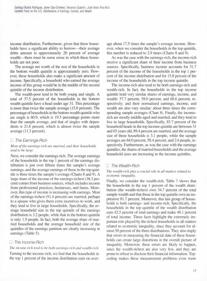
• The Wealth-Rich The wealth-rich play a crucial role in all matters related to economic inequality. Finally, we consider the wealth-rich. Table 7 shows that the households in the top 1 percent of the wealth distri-bution (the wealth-richest) own 34.7 percent of the total sample wealth and that those in the top quintile own an im-pressive 81.7 percent. Moreover, this last group of house-holds is both earnings- and income-rich. Specifically, the households in the top quintile of the wealth distribution earn 42.5 percent of total earnings and make 48.1 percent of total income. These facts highlight the extremely im-portant role played by the richest households in all matters related to economic inequality, since they account for al-most 50 percent of the three distributions. They also imply that errors in measuring the financial data of these house-holds can create large distortions in the overall picture of inequality. Moreover, these errors are likely to happen, since the wealth-richest are also very few, and they are prone to refuse to disclose their financial information. Top-coding makes these measurement problems even more
13
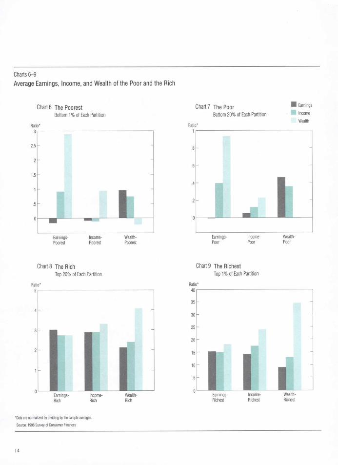
Charts 6 - 9 Ave rage Ea rn ings , I n c o m e , a n d W e a l t h of t h e P o o r a n d t he R i ch
Chart 6 The Poorest Bottom 1% of Each Partition
Ratio* 3
2.5
2
1.5
1
.5
0 t a Earnings- Income- Wealth-Poorest Poorest Poorest
Chart 7 The Poor • E a r n i n 9 s
Bottom 20% of Each Partition l n c o m e
Wealth Ratio*
1
.8
.6
.4
.2
0 . i
Earnings- Income- Wealth-Poor Poor Poor
Chart 8 The Rich Top 20% of Each Partition
Ratio* 5|
4 h
Rich Rich Rich
*Data are normalized by dividing by the sample averages. Source: 1998 Survey of Consumer Finances
Chart 9 The Richest Top 1% of Each Partition
Ratio* 40
35
30
25
20
15
10
5
0 M l
Earnings- Income- Wealth-Richest Richest Richest
14
Santiago Budria Rodriguez, Javier Daz-Gimenez, Vincenzo Quadrini, Jos-Victor Rfos-Rull Updated Facts on the U.S. Distributions of Earnings, Income, and Wealth
severe.9 Consequently, data sources such as the SCF that oversample the wealth-richest and minimize top-coding should be strongly preferred to other sources when measur-ing economic inequality.10
As far as their income sources are concerned, we find that the households in the top quintile of the wealth dis-tribution obtain significant shares of their income from capital (21.6 percent) and from business sources (17.5 per-cent). In what relates to the age and the marital status of the wealth-richest, we find that these households tend to be both older and married. Specifically, the percentage of household heads in the top wealth quintile over age 65 is 28.4, which is 8.2 percentage points higher than the sam-ple average, and 80.3 percent of the household heads in the top wealth quintile are married, which is 21.9 percent-age points higher than the sample average.
Other Dimensions of Inequality Here we discuss how age, employment status, education, marital status, and financial trouble shape the earnings, in-come, and wealth inequality.
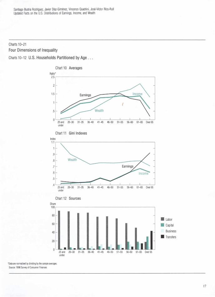
Age Earnings and income inequality tend to increase with age, whereas wealth inequality decreases until age 40 and becomes almost constant thereafter. Some of the differences in earnings, income, and wealth across households can be attributed to age.11 Two main methods can be used to quantify the relationship between age and inequality. One method is to compare the lifetime inequality statistics with their yearly counterparts. To im-plement this method, we must follow a sample of house-holds through their entire life cycles. Unfortunately, we do not have a long enough panel for this purpose, and this forces us to use cross-sectional data to quantify the age-related differences in inequality.
Specifically, we do the following: we partition the SCF sample into 10 cohorts according to the age of the house-hold heads, we compute the relevant statistics for each co-hort, and we compare them with the corresponding sta-tistics for the entire sample. These statistics are the cohort average earnings, income, and wealth and their respective Gini indexes; the average shares of income earned by each cohort from various income sources; the relative cohort size; and the number of people per primary economic unit in each cohort. We report these statistics in Table 8.
In Chart 10, we represent the average earnings, income, and wealth of each cohort, once they have been normal-
ized by dividing by their corresponding sample averages. As this chart illustrates, earnings and income display the typical hump shape conventionally attributed to the life cycle. Perhaps more interestingly, the life cycle pattern of average wealth is somewhat different. More specifically, average cohort earnings is monotonically increasing in the age of the household heads until age 55, and it starts to decline thereafter, and the average earnings of households whose head is over age 65 drops significantly to only about 20 percent of the sample average. Average cohort income displays a similar behavior: it is moderately in-creasing until age 55, and then it declines, albeit signifi-cantly more gradually than earnings. (The average income of households with a head over age 65 is approximately 65 percent of the sample average.) Finally, average cohort wealth also increases monotonically with the life cycle, but it peaks in the 61-65 cohort, a fall 10 years after both earnings and income. Moreover, the over-65 cohort is still significantly wealth-rich: it owns 33 percent more wealth than the sample average, and it is wealth-richer than any of the cohorts age 50 and under.
In Chart 11, we represent the Gini indexes of earnings, income, and wealth of the age cohorts. We find that the Gini indexes are high for all three variables and for all the age cohorts. We also find that the Gini indexes of earnings and income are moderately increasing with age and that their numerical values are very similar to each other for every cohort until age 60. After that age, the Gini index of earnings increases significantly, and its highest value cor-responds to the over-65 cohort. In contrast, the Gini index of wealth decreases with age: its highest value corresponds to the under-25 cohort, and its lowest value corresponds to the over-65 cohort.12 A perhaps more surprising fact is that
9Top-coding is a form of rounding error that occurs whenever intervals are used to describe the realizations of a continuous random variable. Obviously, every realization that is larger than a certain threshold must be included in the last interval. Therefore, some degree of top-coding is unavoidable. In distributions such as those we are con-sidering here, where a small number of households earn or own a large share of the aggregates, this error can be large. The SCF attempts to minimize this type of error by oversampling the households in the top tails of the distributions; that is, in the SCF sample, the earnings-rich, the income-rich, and the wealth-rich are overrepresented.
1 0 The SCF explicitly excludes the households included in the Forbes 400 list of the wealthiest people in the United States published annually by Forbes magazine. To in-crease the reliability of our measurements, we should perhaps augment the SCF sample with the Forbes data. See Kennickell 2000 for a discussion of these issues.
11 In fact, a large part of the quantitative heterogeneous-agent literature uses models in which differences in people's age are the main source of the inequality of earnings, income, and wealth. See, for example, Auerbach and Kotlikoff 1987, Fullerton and Rogers 1993, and Rios-Rull 1996.
12Note that the Gini index of wealth for the under-25 cohort shows a rarely seen value higher than one. This is because of the large number of households with negative wealth that belong to this cohort.
15

Table 8 Other Dimensions of U.S. Inequality Breakdown of U.S. Household 1998 Sample by Characteristics of Household Head
Average Average Level (1998$) Concentration (Gini Index) Source of Income (%) Household
% of Size Characteristic Earnings Income Wealth Earnings Income Wealth Labor Capital Business Transfers Other Sample (Number of People)
Age 25 and under 18,336 19,931 17,593 .460 .425 26-30 34,631 36,750 46,453 .442 .429 31-35 47,537 51,991 127,456 .438 .440 36-40 52,916 56,443 162,264 .451 .445 41-45 62,067 70,631 257,981 .506 .515 46-50 63,821 72,406 347,994 .461 .462 51-55 64,759 77,361 470,694 .529 .535 56-60 52,952 73,213 514,013 .611 .611 61-65 48,386 76,504 609,059 .766 .670 Over 65 8,383 35,387 381,643 .925 .610
Employment Status Worker 49,886 54,984 170,347 .435 .439 Self-Employed 91,476 120,740 958,484 .637 .643 Retired 7,095 35,022 361,005 .930 .594 Nonworker 13,815 21,828 107,986 .767 .584
Education No High School 14,705 21,824 78,548 .680 .498 High School 34,211 43,248 189,983 .566 .485 College 68,530 88,874 541,128 .559 .536
Marital Status Married 58,640 73,895 386,900 .543 .514 Single
With Dependents 20,335 26,396 105,251 .559 .470 Without Dependents 19,114 28,584 164,886 .669 .514
Single With Dependents
Male 33,400 39,831 129,547 .430 .387 Female 17,134 23,117 98,974 .576 .472
Single Without Dependents
Male 27,504 35,927 200,286 .604 .539 Female 13,269 23,328 137,042 .701 .468
Excluding Households Headed by Retired Widows
Single Without Dependents 23,717 31,524 158,555 .595 .501
Single Females Without Dependents 19,500 26,506 109,267 .570 .444
Total Sample 42,370 54,837 287,974 .611 .553
1.086 91.2 2.1 .9 4.2 1.5 6.8 2.40 .905 89.9 1.5 5.1 2.8 .7 9.0 2.74 .825 85.8 4.4 6.5 2.5 .8 9.7 3.26 .740 86.6 3.2 8.3 1.8 .0 11.3 3.29 .766 77.0 7.8 12.7 2.3 .2 12.0 3.21 .759 77.9 6.8 11.9 2.7 .6 9.9 2.78 .767 72.7 11.1 12.8 3.3 .1 8.7 2.51 .790 61.6 18.4 12.5 6.5 1.0 7.3 2.26 .798 50.6 18.2 14.7 14.4 2.1 5.1 1.99 .729 17.7 30.5 7.0 43.1 1.7 20.2 1.73
.768 88.1 5.4 3.0 3.1 .4 58.5 2.82
.775 49.1 16.7 31.2 2.7 .4 11.2 2.85
.701 17.1 30.4 3.7 45.7 3.1 18.9 1.77
.886 59.0 10.7 5.0 24.0 1.3 11.3 2.51
.751 64.1 7.0 3.8 24.7 .5 16.5 2.60
.762 71.1 7.9 9.3 10.8 .9 50.4 2.63
.784 67.2 14.6 11.6 5.9 .7 33.1 2.53
.777 69.5 11.6 11.5 6.7 .7 58.5 3.20
.865 74.5 6.2 3.0 15.7 .6 11.3 3.07
.799 61.7 12.5 6.0 18.7 1.0 30.2 1.22
.779 78.1 7.1 6.8 7.3 .7 2.2 2.87
.881 73.0 5.8 1.4 19.3 .6 9.1 3.11
.853 69.6 12.4 8.2 9.1 .8 12.1 1.26
.738 53.6 12.3 3.9 29.1 1.3 18.0 1.19
.827 69.6 10.6 6.5 12.2 1.1 25.6 1.24
.768 69.9 7.5 4.3 16.9 1.5 12.6 1.19
.803 68.6 11.4 10.2 9.1 .7 100.0 2.62
Source: 1998 Survey of Consumer Finances
16
Santiago Budria Rodriguez, Javier Diaz-Gimenez, Vincenzo Quadrini, Jose-Victor Ros-Rull Updated Facts on the U.S. Distributions of Earnings, Income, and Wealth
Charts 10-21 Four Dimensions of Inequality
Charts 10-12 U.S. Households Partit ioned by Age . . .
Chart 10 Averages
25 and 26-30 31-35 36-40 41-45 46-50 51-55 56-60 61-65 Over 65 under
Chart 11 Gini Indexes
25 and 26-30 31-35 36-40 41-45 46-50 51-55 56-60 61-65 Over 65 under
Chart 12 Sources
25 and 26-30 31-35 36-40 41-45 46-50 51-55 56-60 61-65 Over 65 under
Labor Capital Business Transfers
*Data are normalized by dividing by the sample averages. Source: 1998 Survey of Consumer Finances
17

age seems to make little difference for wealth inequality after age 35. (The maximum intercohort difference in this statistic after that age is only 0.069.)
In Chart 12, we represent the income sources of the age cohorts.13 We find that the shares of each type of income are approximately monotonic in age for labor, capital, and business income. The average share of labor income de-creases with age except for the 36-40 and 41-45 cohorts. In contrast, the average shares of both capital and business income tend to increase with age, but the share of business income decreases sharply after age 65. This suggests that business owners also retire. Finally, the average shares of income accounted for by transfers are quite small for all cohorts except, of course, the older cohorts. These shares increase somewhat in the 61-65 cohort, and they peak in the over-65 cohort. In fact, transfers account for almost 50 percent of this cohort's income. Transfers also account for a somewhat larger share of income in the under-25 cohort than in the middle age cohorts.
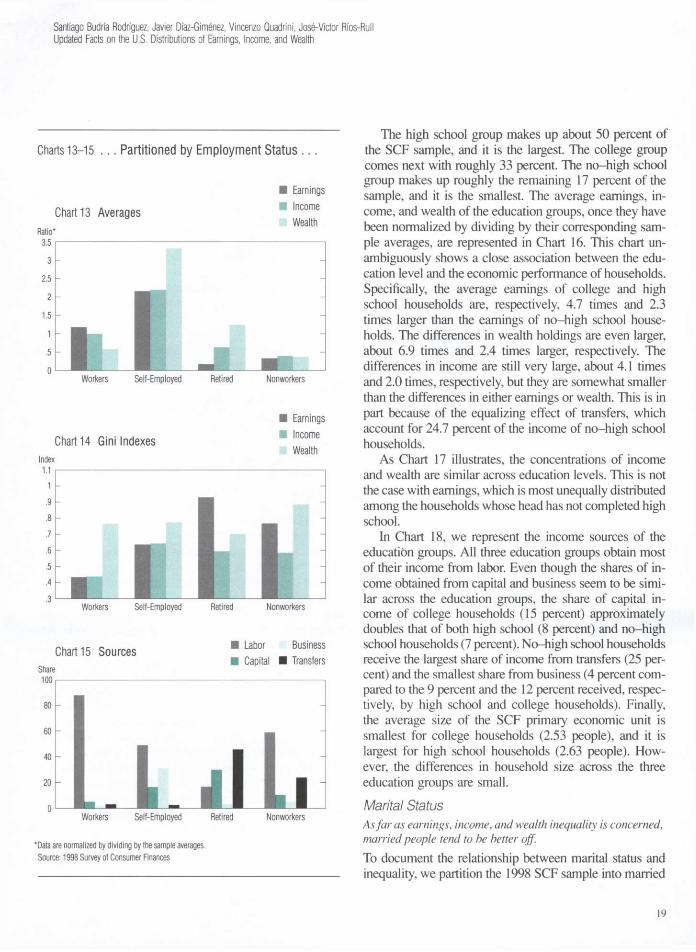
Employment Status Workers are wealth-poor; retirees are wealth-rich, and the self-employed are the kings of the hill. To document the relationship between income sources and inequality, we partition the 1998 SCF sample into work-ers, the self-employed, retirees, and nonworkers according to the employment status declared by the heads of the households. In the second block of Table 8, we report the sample averages and Gini indexes for earnings, income, and wealth; the shares of income obtained from various sources; the relative group sizes; and the number of peo-ple per primary economic unit for these four employment status groups and for the entire sample.
In Chart 13, we represent the average earnings, income, and wealth of the employment status groups, once they have been normalized by dividing by their corresponding sample averages. The differences across these groups are substantial. Workers make up 58.5 percent of the sample, and they are by far the largest group. Their earnings and income are close to the sample average, but they are sig-nificantly wealth-poorer than the sample average—their normalized wealth is only 0.59. The self-employed make up 11.2 percent of the sample, and they enjoy a remarkably good financial situation. Their income is about 2.2 times the sample average, and they own an even greater share of wealth: about 3.3 times the sample average. The retirees account for 18.9 percent of the sample, and they tend to be both earnings- and income-poor and wealth-rich—their
normalized earnings, income, and wealth are 0.17, 0.64, and 1.25, respectively. Nonworkers are poor along every dimension—their normalized earnings, income, and wealth are 0.33, 0.40, and 0.37, respectively.
As Chart 14 illustrates, the Gini indexes of earnings, income, and wealth differ significantly across the employ-ment status groups. Not surprisingly, earnings is most equally distributed among workers and most unequally dis-tributed among retirees. Income is also most equally dis-tributed among workers, and its Gini indexes are similar for the other three employment status groups. Finally, wealth is most unequally distributed among nonworkers, and its Gini indexes are both similar and high for the other groups.
In Chart 15, we represent the income sources of the em-ployment status groups. We find that the shares of income accounted for by labor, capital, business, and transfers dif-fer significantly with the employment status of the house-hold heads. The most noteworthy features of this figure are the significant share of capital income obtained by retired households (about 31 percent) and the fact that labor in-come, presumably earned by the spouse, accounts for 59 percent of the income of households headed by a non-worker. It is also remarkable that this group is the second-largest recipient of transfers (24 percent). Education Income inequality and wealth inequality are similar across the education groups, whereas earnings is most unequally distributed among no-high school households. To document the relationship between education and in-equality, we partition the 1998 SCF sample into three groups based on the level of education attained by the head of the household. The first group, labeled no-high school, includes the households whose head has not com-pleted high school. The second group, high school, in-cludes the households whose head has obtained a high school degree but has not completed college. The third group, college, includes the households whose head has obtained at least a college degree. In the third block of Table 8, we report the averages and Gini indexes for earn-ings, income, and wealth; the shares of income obtained from various sources; the relative group sizes; and the number of people per primary economic unit for these three education groups and for the entire sample.
13Note that the column "Other" from Table 8 has been omitted from Chart 12 to avoid clutter. Consequently, the shares accounted for by the various income sources do not sum to 100 percent. Charts 15, 18, and 21 have been simplified similarly.
18
Santiago Budria Rodriguez, Javier Diaz-Gimenez, Vincenzo Quadrini, Jos-Victor Rfos-Rull Updated Facts on the U.S. Distributions of Earnings, Income, and Wealth
Charts 13-15 . . . Partitioned by Employment Status . . .
Chart 13 Averages • Earnings • Income
Wealth
Workers Self-Employed
Chart 14 Gini Indexes
Retired Nonworkers
Earnings Income Wealth
Workers Self-Employed Retired Nonworkers
Chart 15 Sources • Labor Business • Capital • Transfers
Workers Self-Employed Retired Nonworkers
*Data are normalized by dividing by the sample averages. Source: 1998 Survey of Consumer Finances
The high school group makes up about 50 percent of the SCF sample, and it is the largest. The college group comes next with roughly 33 percent. The no-high school group makes up roughly the remaining 17 percent of the sample, and it is the smallest. The average earnings, in-come, and wealth of the education groups, once they have been normalized by dividing by their corresponding sam-ple averages, are represented in Chart 16. This chart un-ambiguously shows a close association between the edu-cation level and the economic performance of households. Specifically, the average earnings of college and high school households are, respectively, 4.7 times and 2.3 times larger than the earnings of no-high school house-holds. The differences in wealth holdings are even larger, about 6.9 times and 2.4 times larger, respectively. The differences in income are still very large, about 4.1 times and 2.0 times, respectively, but they are somewhat smaller than the differences in either earnings or wealth. This is in part because of the equalizing effect of transfers, which account for 24.7 percent of the income of no-high school households.
As Chart 17 illustrates, the concentrations of income and wealth are similar across education levels. This is not the case with earnings, which is most unequally distributed among the households whose head has not completed high school.
In Chart 18, we represent the income sources of the education groups. All three education groups obtain most of their income from labor. Even though the shares of in-come obtained from capital and business seem to be simi-lar across the education groups, the share of capital in-come of college households (15 percent) approximately doubles that of both high school (8 percent) and no-high school households (7 percent). No-high school households receive the largest share of income from transfers (25 per-cent) and the smallest share from business (4 percent com-pared to the 9 percent and the 12 percent received, respec-tively, by high school and college households). Finally, the average size of the SCF primary economic unit is smallest for college households (2.53 people), and it is largest for high school households (2.63 people). How-ever, the differences in household size across the three education groups are small.
Marital Status As far as earnings, income, and wealth inequality is concerned, married people tend to be better off. To document the relationship between marital status and inequality, we partition the 1998 SCF sample into married
19

Charts 16-18 . . . Partitioned by Education . . .
Chart 16 Averages • Earnings • Income
Wealth
No High School
Chart 17 Gini Indexes
High School College
• Earnings • Income
Wealth
L f c j J No High School High School
Chart 18 Sources
College
Labor Business Capital • Transfers
No High School High School College
"Data are normalized by dividing by the sample averages. Source: 1998 Survey of Consumer Finances
households and single households with and without de-pendents according to the marital status of the heads of the households. We also subdivide these last two groups ac-cording to the sex of the household heads. We refer to these groups as the marital status partition,14 In the last block of Table 8, we report the averages and Gini indexes for earnings, income, and wealth; the shares of income obtained from various sources; the relative group sizes; and the number of people per primary economic unit for these marital status groups and for the entire sample. In Chart 19, we represent the average earnings, income, and wealth of the marital status groups, once they have been normal-ized by dividing by their corresponding sample averages. In Chart 20, we represent the Gini indexes, and in Chart 21, we represent the income sources of the marital status groups.
First, we compare married and single households. We find that married households have substantially higher earnings and income and that they own a substantially larger amount of wealth than their single counterparts. This is still the case if we divide the earnings, income, and wealth of married households by two to account for double-income households. When we compare singles with and without dependents, we find that singles without dependents have somewhat higher levels of income and wealth than singles with dependents. Specifically, the in-come of singles without dependents is about 8 percent higher than that of singles with dependents, and their wealth is about 57 percent higher. This relative poverty of singles with dependents is more serious than it seems be-cause the average household size of singles with depen-dents is 2.6 times larger than the average household size of singles without dependents.
We also find that earnings are most unequally distribut-ed among single households without dependents and that wealth is most unequally distributed among single house-holds with dependents. However, income inequality is fair-ly similar across the three main marital status groups. Fi-nally, as far as the sources of income are concerned, we find that the share of income accounted for by transfers is about three times larger for single households than for married households. We also find that transfers account for a larger share of the income for singles without dependents (18.7 percent) than for singles with dependents (15.7 per-cent). This is not surprising since retired widows are most-
Note that singles without dependents do not necessarily live alone; they may live with other financially independent adults.
20
Santiago Budria Rodriguez, Javier Diaz-Gimenez, Vincenzo Quadrini, Jose-Victor Ros-Rull Updated Facts on the U.S. Distributions of Earnings, Income, and Wealth
Charts 19-21 . . . And Partit ioned by Marital Status
Chart 19 Averages
Married Single Single Single Males Females Males Without Without With Dependents Dependents Dependents
Earnings Income Wealth
Chart 20 Gini Indexes
Single Single Married Single Single Without With Males Females Dependents Dependents Without Without
Dependents Dependents
Chart 21 Sources
Single Single Males Females With With Dependents Dependents
Single Single Without With Dependents Dependents
Married Single Single Single Males Females Males Without Without With Dependents Dependents Dependents
• Earnings • Income
Wealth
Labor Capital Business Transfers
*Data are normalized by dividing by the sample averages. Source: 1998 Survey of Consumer Finances
21
ly singles without dependents, and they receive a signifi-cant share of their income as retirement pensions and other Social Security transfers. In fact, if we exclude the house-holds headed by retired widows from the sample, transfers account for only 12.2 percent of the income for singles without dependents.
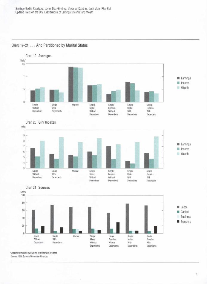
Next, we consider the partition of single households according to the sex of the household heads. In the 1998 SCF sample, the households headed by single females sig-nificantly outnumber those headed by single males. Spe-cifically, their sample shares are 27.1 percent and 14.3 per-cent, respectively. This difference is consistent with the facts that females live longer than males and that house-holds headed by retired widows account for 6.7 percent of the sample.
We find that on average, single females without depen-dents earn less (52 percent less), make less income (35 percent less), and own less wealth (32 percent less) than their male counterparts. Among single households with dependents, those headed by females are also significantly worse off than those headed males. (They earn 49 percent less, make 42 percent less income, and own 24 percent less wealth.) If we exclude the households headed by re-tired widows from the sample, we find that the average earnings and the average income of single females without dependents increase by 47 percent and 14 percent, respec-tively, and that their average wealth decreases by 20 per-cent. This is not surprising, since retired widows tend to be earnings- and income-poor and wealth-rich. Finally, households headed by single females with dependents are both numerous—they account for 9.1 percent of the sam-ple households—and in a particularly bad financial posi-tion: their normalized earnings, income, and wealth are on-ly 40 percent, 42 percent, and 34 percent, respectively, of the corresponding sample averages (Chart 19).
As far as the economic inequality among single house-holds with dependents is concerned, we find that all three variables are more unequally distributed among house-holds headed by females than among those headed by males. Among households without dependents, this is only true for earnings, since both income and wealth are more unequally distributed among households headed by single males (Chart 20).
Finally, as Chart 21 illustrates, households headed by single females both with and without dependents earn sig-nificantly smaller shares of their income from business sources and significantly larger shares from transfers than the corresponding groups headed by single males. This is
still true if we exclude the households headed by retired widows from the sample, in spite of the fact that, when we do so, the share of income of the households headed by single females without dependents accounted for by trans-fers drops by 12 percentage points, from 29 percent to 17 percent. Financial Trouble Recently there has been increasing interest in the study of households in financial trouble. (See, for example, Musto 1999; Lehnert and Maki 2000; Livshits, MacGee, and Ter-tilt 2001; Chatterjee et al. 2002; Athreya forthcoming; and Nakajima and Rios-Rull forthcoming.) We use the SCF to describe the economic and demographic features of these households and their relationship with earnings, income, and wealth inequality.
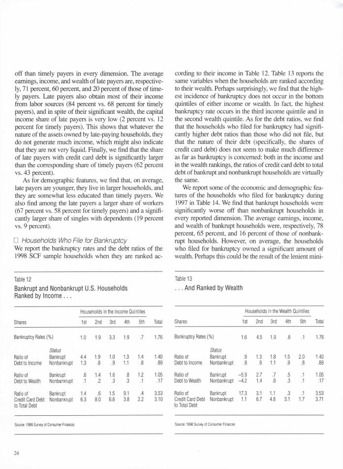
The SCF asks respondents whether or not they have filed for bankruptcy. Unfortunately, it does not ask them which chapter of the U.S. Bankruptcy Code has been invoked when filing.15 The SCF also asks respondents whether or not they have delayed their liability payments for two months or more.16 This is clearly a milder form of financial trouble: 6 percent of the sample households de-clare that they have delayed their payments for two months or more, and only 1.8 percent declare that they have filed for bankruptcy. • Households Who Delay Their Payments We report the late and timely payment status of the sample households when they are ranked according to their in-come in Table 9. We report the same variables when the households are ranked according to their wealth in Table 10. Not surprisingly, we find that the largest share of late payers are in the bottom wealth quintile and that the shares of late payers are decreasing in wealth. However, this does not happen in the income quintiles. When the households
1 5 According to the American Bankruptcy Institute (Parisi and Baily 1997), some of the relevant details of the U.S. Bankruptcy Code are the following: (i) Chapter 7 of the Bankruptcy Code is "available to both individual and business debtors. Its purpose is to achieve a fair distribution to creditors of whatever non-exempt property the debtor has." Unsecured debts not reaffirmed are discharged. This provides the filer with a fresh financial start, (ii) Chapter 11 of the Bankruptcy Code "is available to both consumer and business debtors. Its purpose is either to rehabilitate a business as a going concern or to reorganize a person's finances through a court-approved reorganization plan." (iii) Chapter 12 of the Bankruptcy Code "is designed to give special debt relief to families that obtain a regular income from farming." Chapter 12 expired on June 30,2000, and it was not reenacted until May 11, 2001. (iv) Chapter 13 of the Bankruptcy Code is available to individuals who have a regular source of income and whose debts do not exceed specific amounts. It is "typically used to budget some of the debtor's future earn-ings" under a plan designed to pay the creditors part or all of their outstanding loans.
l6Below, we refer to these households as the late payers, while we refer to the rest of the sample households as the timely payers.
22

Santiago Budria Rodriguez, Javier Diaz-Gimenez, Vincenzo Quadrini, Jose-Victor Rfos-Rull Updated Facts on the U.S. Distributions of Earnings, Income, and Wealth
Table 9 Late and Timely Payers Ranked by Income...
Households in the Income Quintiles
Shares 1st 2nd 3rd 4th 5th Total
Percentage of 5.78 7.94 8.29 5.56 2.33 5.98 Late Payers*
Payer Status Ratio of Late 2.07 1.34 1.04 1.14 1.06 1.16 Debt to Income Timely 1.30 .76 .94 1.14 .79 .88
Ratio of Late .45 1.00 1.22 .59 .42 .65 Debt to Wealth Timely .12 .15 .25 .30 .13 .16
Ratio of Late 3.50 8.99 10.64 4.57 5.99 7.07 Credit Card Debt Timely 6.31 7.55 6.17 3.89 2.11 3.54 to Total Debt
Timely
* Late payers are the households who delay their liability payments by two months or more. Source: 1998 Survey of Consumer Finances
Table 10 . . . And Ranked by Wealth
Households in the Wealth Quintiles Shares 1st 2nd 3rd 4th 5th Total
Percentage of 10.26 9.74 5.27 3.43 1.18 5.98 Late Payers*
Payer Status Ratio of Late 1.03 1.17 1.56 .83 1.31 1.16 Debt to Income Timely .85 .86 1.13 .95 .80 .88
Ratio of Late -2.69 2.04 .81 .26 .16 .65 Debt to Wealth Timely -4.70 1.37 .63 .28 .09 .16
Ratio of Late 15.05 5.02 4.11 9.44 1.60 7.07 Credit Card Debt Timely 9.85 6.68 4.78 2.90 1.70 3.54 to Total Debt
* Late payers are the households who delay their liability payments by two months or more. Source: 1998 Survey of Consumer Finances
Table 11 Economic and Demographic Features of Late and Timely Payers*
Payer Status
Economic Features Late Timely
Averages (1998 u.s. $) Earnings 30,464 43,168 Income 33,720 56,180 Wealth 60,128 302,462
Source of Income (%) Labor 83.7 68.0 Capital 2.3 11.8 Business 7.7 10.3 Transfers 6.1 9.2 Other .2 .8
Share With Credit Card Debt (%) 62.1 42.9
Demographic Features Average Age 41.0 49.2 Average Family Size 3.0 2.6
Employment Status (%) Workers 66.5 58.0 Self-Employed 13.9 11.1 Retired 2.3 20.0 Nonworkers 17.3 11.0
Education (%) No High School 18.6 16.3 High School 54.4 50.2 College 27.1 33.5
Marital Status (%) Married 51.9 65.8 Singles With Dependents 18.7 8.9 Singles Without Dependents 29.4 25.3
Ratepayers are the households who delay their liability payments by two months or more. Source: 1998 Survey of Consumer Finances
are ranked according to their income, the largest share of late payers is in the third income quintile, and late payers are quite evenly distributed throughout the income distribu-tion.
In Table 11, we report some of the economic and de-mographic features of late and timely payers. Not sur-prisingly, we find that late payers are significantly worse
23
off than timely payers in every dimension. The average earnings, income, and wealth of late payers are, respective-ly, 71 percent, 60 percent, and 20 percent of those of time-ly payers. Late payers also obtain most of their income from labor sources (84 percent vs. 68 percent for timely payers), and in spite of their significant wealth, the capital income share of late payers is very low (2 percent vs. 12 percent for timely payers). This shows that whatever the nature of the assets owned by late-paying households, they do not generate much income, which might also indicate that they are not very liquid. Finally, we find that the share of late payers with credit card debt is significantly larger than the corresponding share of timely payers (62 percent vs. 43 percent).
As for demographic features, we find that, on average, late payers are younger, they live in larger households, and they are somewhat less educated than timely payers. We also find among the late payers a larger share of workers (67 percent vs. 58 percent for timely payers) and a signifi-cantly larger share of singles with dependents (19 percent vs. 9 percent).
• Households Who File for Bankruptcy We report the bankruptcy rates and the debt ratios of the 1998 SCF sample households when they are ranked ac-
Table 12 Bankrupt and Nonbankrupt U.S. Households Ranked by Income...
Households in the Income Quintiles
Shares 1st 2nd 3rd 4th 5th Total
Bankruptcy Rates (%) 1.0 1.9 3.3 1.9 .7 1.76
Status Ratio of Bankrupt 4.4 1.9 1.0 1.3 1.4 1.40 Debt to Income Nonbankrupt 1.3 .8 .9 1.1 .8 .89
Ratio of Bankrupt .6 1.4 1.6 .8 1.2 1.05 Debt to Wealth Nonbankrupt .1 .2 .3 .3 .1 .17
Ratio of Bankrupt 1.4 .6 1.5 9.1 .4 3.53 Credit Card Debt Nonbankrupt 6.3 8.0 6.8 3.8 2.2 3.10 to Total Debt
Source: 1998 Survey of Consumer Finances
cording to their income in Table 12. Table 13 reports the same variables when the households are ranked according to their wealth. Perhaps surprisingly, we find that the high-est incidence of bankruptcy does not occur in the bottom quintiles of either income or wealth. In fact, the highest bankruptcy rate occurs in the third income quintile and in the second wealth quintile. As for the debt ratios, we find that the households who filed for bankruptcy had signifi-cantly higher debt ratios than those who did not file, but that the nature of their debt (specifically, the shares of credit card debt) does not seem to make much difference as far as bankruptcy is concerned: both in the income and in the wealth rankings, the ratios of credit card debt to total debt of bankrupt and nonbankrupt households are virtually the same.
We report some of the economic and demographic fea-tures of the households who filed for bankruptcy during 1997 in Table 14. We find that bankrupt households were significantly worse off than nonbankrupt households in every reported dimension. The average earnings, income, and wealth of bankrupt households were, respectively, 78 percent, 65 percent, and 16 percent of those of nonbank-rupt households. However, on average, the households who filed for bankruptcy owned a significant amount of wealth. Perhaps this could be the result of the lenient mini-
Table 13 . . . And Ranked by Wealth
Households in the Wealth Quintiles Shares 1st 2nd 3rd 4th 5th Total
Bankruptcy Rates (%) 1.6 4.5 1.9 .8 .1 1.76
Status Ratio of Bankrupt .9 1.3 1.8 1.5 2.0 1.40 Debt to Income Nonbankrupt .9 .9 1.1 .9 .8 .89
Ratio of Bankrupt -5.9 2.7 .7 .5 .1 1.05 Debt to Wealth Nonbankrupt -4.2 1.4 .6 .3 .1 .17
Ratio of Bankrupt 17.3 3.1 1.1 .3 .1 3.53 Credit Card Debt Nonbankrupt 1.1 6.7 4.8 3.1 1.7 3.71 to Total Debt
Source: 1998 Survey of Consumer Finances
24
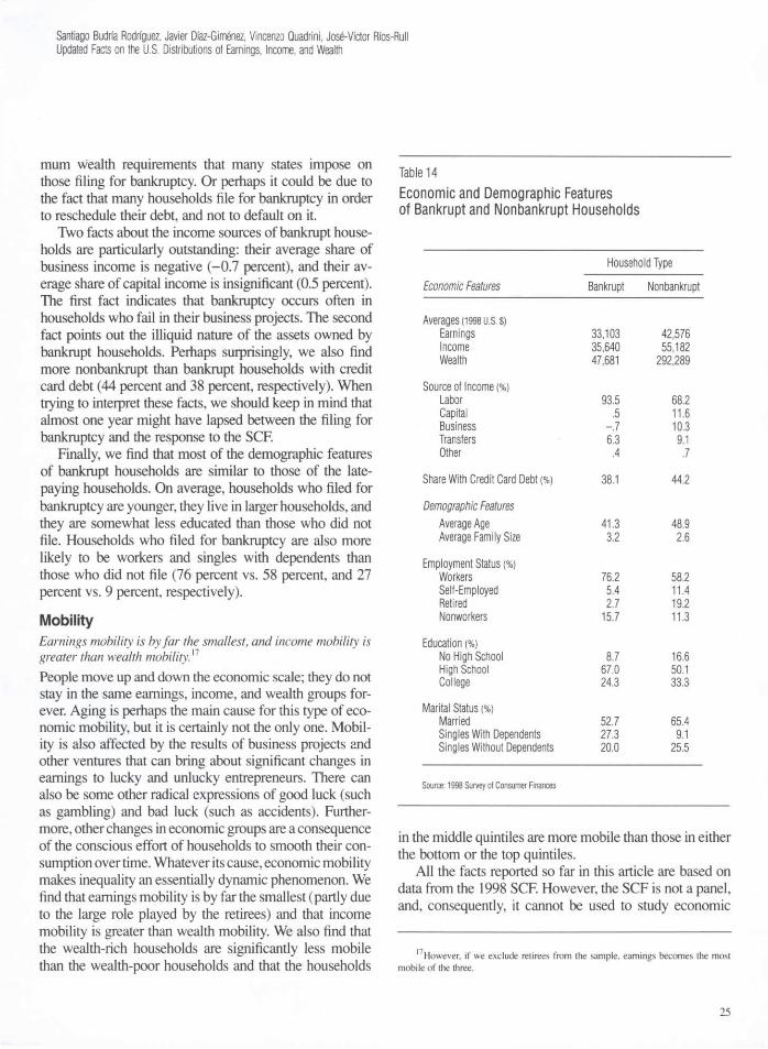
Santiago Budria Rodriguez, Javier Diaz-Gimnez, Vincenzo Quadrini, Jose-Victor Ros-Rull Updated Facts on the U.S. Distributions of Earnings, Income, and Wealth
mum wealth requirements that many states impose on those filing for bankruptcy. Or perhaps it could be due to the fact that many households file for bankruptcy in order to reschedule their debt, and not to default on it.
Two facts about the income sources of bankrupt house-holds are particularly outstanding: their average share of business income is negative (-0.7 percent), and their av-erage share of capital income is insignificant (0.5 percent). The first fact indicates that bankruptcy occurs often in households who fail in their business projects. The second fact points out the illiquid nature of the assets owned by bankrupt households. Perhaps surprisingly, we also find more nonbankrupt than bankrupt households with credit card debt (44 percent and 38 percent, respectively). When trying to interpret these facts, we should keep in mind that almost one year might have lapsed between the filing for bankruptcy and the response to the SCF.
Finally, we find that most of the demographic features of bankrupt households are similar to those of the late-paying households. On average, households who filed for bankruptcy are younger, they live in larger households, and they are somewhat less educated than those who did not file. Households who filed for bankruptcy are also more likely to be workers and singles with dependents than those who did not file (76 percent vs. 58 percent, and 27 percent vs. 9 percent, respectively).
Mobility Earnings mobility is by far the smallest, and income mobility is greater than wealth mobility.17
People move up and down the economic scale; they do not stay in the same earnings, income, and wealth groups for-ever. Aging is perhaps the main cause for this type of eco-nomic mobility, but it is certainly not the only one. Mobil-ity is also affected by the results of business projects and other ventures that can bring about significant changes in earnings to lucky and unlucky entrepreneurs. There can also be some other radical expressions of good luck (such as gambling) and bad luck (such as accidents). Further-more, other changes in economic groups are a consequence of the conscious effort of households to smooth their con-sumption over time. Whatever its cause, economic mobility makes inequality an essentially dynamic phenomenon. We find that earnings mobility is by far the smallest (partly due to the large role played by the retirees) and that income mobility is greater than wealth mobility. We also find that the wealth-rich households are significantly less mobile than the wealth-poor households and that the households
Table 14 Economic and Demographic Features of Bankrupt and Nonbankrupt Households
Household Type Economic Features Bankrupt Nonbankrupt
Averages (1998 U.S. $) Earnings 33,103 42,576 Income 35,640 55,182 Wealth 47,681 292,289
Source of Income (%) Labor 93.5 68.2 Capital .5 11.6 Business -.7 10.3 Transfers 6.3 9.1 Other .4 .7
Share With Credit Card Debt (%) 38.1 44.2
Demographic Features Average Age 41.3 48.9 Average Family Size 3.2 2.6
Employment Status (%) Workers 76.2 58.2 Self-Employed 5.4 11.4 Retired 2.7 19.2 Nonworkers 15.7 11.3
Education (%) No High School 8.7 16.6 High School 67.0 50.1 College 24.3 33.3
Marital Status (%) Married 52.7 65.4 Singles With Dependents 27.3 9.1 Singles Without Dependents 20.0 25.5
Source: 1998 Survey of Consumer Finances
in the middle quintiles are more mobile than those in either the bottom or the top quintiles.
All the facts reported so far in this article are based on data from the 1998 SCF. However, the SCF is not a panel, and, consequently, it cannot be used to study economic
l7However, if we exclude retirees from the sample, earnings becomes the most mobile of the three.
25
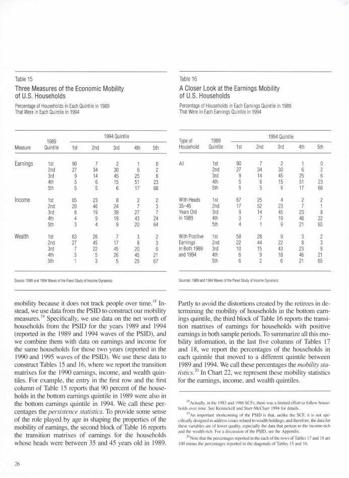
Table 15 Table 16 Three Measures of the Economic Mobility of U.S. Households Percentage of Households in Each Quintile in 1989 That Were in Each Quintile in 1994
1994 Quintile
Measure 1989
Quintile 1st 2nd 3rd 4th 5th
Earnings 1st 90 7 2 1 0 2nd 27 34 30 6 2 3rd 9 14 45 25 6 4th 5 6 15 51 23 5th 5 5 6 17 68
Income 1st 65 23 8 2 2 2nd 20 46 24 7 3 3rd 8 19 39 27 7 4th 4 9 19 43 24 5th 3 4 9 20 64
Wealth 1st 63 26 7 3 2 2nd 27 45 17 8 3 3rd 7 22 45 20 6 4th 3 5 26 45 21 5th 1 3 5 25 67
Source: 1989 and 1994 Waves of the Panel Study of Income Dynamics
mobility because it does not track people over time.18 In-stead, we use data from the PSID to construct our mobility measures.19 Specifically, we use data on the net worth of households from the PSID for the years 1989 and 1994 (reported in the 1989 and 1994 waves of the PSID), and we combine them with data on earnings and income for the same households for those two years (reported in the 1990 and 1995 waves of the PSID). We use these data to construct Tables 15 and 16, where we report the transition matrixes for the 1990 earnings, income, and wealth quin-tiles. For example, the entry in the first row and the first column of Table 15 reports that 90 percent of the house-holds in the bottom earnings quintile in 1989 were also in the bottom earnings quintile in 1994. We call these per-centages the persistence statistics. To provide some sense of the role played by age in shaping the properties of the mobility of earnings, the second block of Table 16 reports the transition matrixes of earnings for the households whose heads were between 35 and 45 years old in 1989.
A Closer Look at the Earnings Mobility of U.S. Households Percentage of Households in Each Earnings Quintile in 1989 That Were in Each Earnings Quintile in 1994
Household Quintile 1st 2nd 3rd 4th 5th
All 1st 90 7 2 1 0 2nd 27 34 30 6 2 3rd 9 14 45 25 6 4th 5 6 15 51 23 5th 5 5 6 17 68
With Heads 1st 67 25 4 2 2 35-45 2nd 17 52 23 7 1 Years Old 3rd 9 14 45 23 8 in 1989 4th 3 7 19 48 22
5th 4 1 9 21 65
With Positive 1st 58 28 9 3 2 Earnings 2nd 22 44 22 8 3 in Both 1989 3rd 10 15 43 23 9 and 1994 4th 6 9 18 46 21
5th 6 2 6 21 65
Sources: 1989 and 1994 Waves of the Panel Study of Income Dynamics
Partly to avoid the distortions created by the retirees in de-termining the mobility of households in the bottom earn-ings quintile, the third block of Table 16 reports the transi-tion matrixes of earnings for households with positive earnings in both sample periods. To summarize all this mo-bility information, in the last five columns of Tables 17 and 18, we report the percentages of the households in each quintile that moved to a different quintile between 1989 and 1994. We call these percentages the mobility sta-tistics?® In Chart 22, we represent these mobility statistics for the earnings, income, and wealth quintiles.
1 8 Actually, in the 1983 and 1986 SCFs, there was a limited effort to follow house-holds over time. See Kennickell and Starr-McCluer 1994 for details.
l9An important shortcoming of the PSID is that, unlike the SCF, it is not spe-cifically designed to address issues related to wealth holdings, and therefore, the data for these variables are of lower quality, especially the data that pertain to the income-rich and the wealth-rich. For a discussion of the PSID, see the Appendix.
2()Note that the percentages reported in the each of the rows of Tables 17 and 18 are 100 minus the percentages reported in the diagonals of Tables 15 and 16.
26
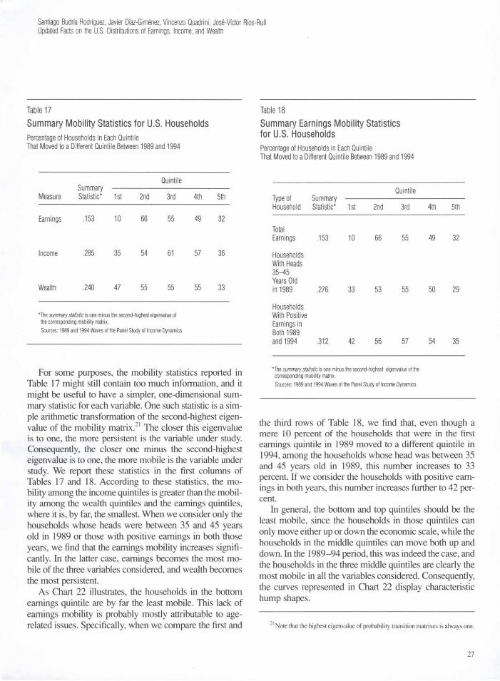
Santiago Budria Rodriguez, Javier Diaz-Gimenez, Vincenzo Quadrini, Jose-Victor Ros-Rull Updated Facts on the U.S. Distributions of Earnings, Income, and Wealth
Table 17 Summary Mobility Statistics for U.S. Households Percentage of Households in Each Quintile That Moved to a Different Quintile Between 1989 and 1994
Quintile Summary
Measure Statistic* 1st 2nd 3rd 4th 5th
Earnings .153 10 66 55 49 32
Income .285 35 54 61 57 36
Wealth .240 47 55 55 55 33
*The summary statistic is one minus the second-highest eigenvalue of the corresponding mobility matrix. Sources: 1989 and 1994 Waves of the Panel Study of Income Dynamics
For some purposes, the mobility statistics reported in Table 17 might still contain too much information, and it might be useful to have a simpler, one-dimensional sum-mary statistic for each variable. One such statistic is a sim-ple arithmetic transformation of the second-highest eigen-value of the mobility matrix.21 The closer this eigenvalue is to one, the more persistent is the variable under study. Consequently, the closer one minus the second-highest eigenvalue is to one, the more mobile is the variable under study. We report these statistics in the first columns of Tables 17 and 18. According to these statistics, the mo-bility among the income quintiles is greater than the mobil-ity among the wealth quintiles and the earnings quintiles, where it is, by far, the smallest. When we consider only the households whose heads were between 35 and 45 years old in 1989 or those with positive earnings in both those years, we find that the earnings mobility increases signifi-cantly. In the latter case, earnings becomes the most mo-bile of the three variables considered, and wealth becomes the most persistent.
As Chart 22 illustrates, the households in the bottom earnings quintile are by far the least mobile. This lack of earnings mobility is probably mostly attributable to age-related issues. Specifically, when we compare the first and
Table 18 Summary Earnings Mobility Statistics for U.S. Households Percentage of Households in Each Quintile That Moved to a Different Quintile Between 1989 and 1994
Quintile Type of Summary Household Statistic* 1st 2nd 3rd 4th 5th
Total Earnings .153 10 66 55 49 32
Households With Heads 35-45 Years Old in 1989 .276 33 53 55 50 29
Households With Positive Earnings in Both 1989 and 1994 .312 42 56 57 54 35
'The summary statistic is one minus the second-highest eigenvalue of the corresponding mobility matrix. Sources: 1989 and 1994 Waves of the Panel Study of Income Dynamics
the third rows of Table 18, we find that, even though a mere 10 percent of the households that were in the first earnings quintile in 1989 moved to a different quintile in 1994, among the households whose head was between 35 and 45 years old in 1989, this number increases to 33 percent. If we consider the households with positive earn-ings in both years, this number increases further to 42 per-cent.
In general, the bottom and top quintiles should be the least mobile, since the households in those quintiles can only move either up or down the economic scale, while the households in the middle quintiles can move both up and down. In the 1989-94 period, this was indeed the case, and the households in the three middle quintiles are clearly the most mobile in all the variables considered. Consequently, the curves represented in Chart 22 display characteristic hump shapes.
2 1 Note that the highest eigenvalue of probability transition matrixes is always one.
27

Table 19 The Ranges of the Normalized Earnings, Income, and Wealth Distributions*
Earnings Income Wealth Year Minimum Maximum Minimum Maximum Minimum Maximum
1992 -26 979
oo 7 1,633 -2 8,979
1998 -20 761 -9 3,124 -53 1,787
*Data are normalized by dividing by the sample averages. Sources: 1992,1998 Survey of Consumer Finances
As far as income and wealth mobility are concerned, again, the households in the top and bottom quintiles in 1989 are the least mobile, but they are more mobile than those in the corresponding quintiles of the earnings parti-tion. If we compare the income and the wealth mobility with the earnings mobility among households with positive earnings, the mobility statistics of all three variables are rather similar, and we would be hard put to say which one of them is the most mobile.
Changes in Inequality and Mobility During the 1990s To make comparisons of the 1992 and 1998 SCF samples meaningful, we used exactly the same variable definitions for the two samples. The earnings and income statistics that we computed for the 1992 SCF sample are essentially identical to those reported in Diaz-Gimenez, Quadrini, and Rios-Rull 1997. However, the statistics that we computed for wealth for the 1992 SCF sample using our current def-inition of this variable differ slightly from those reported in the 1997 article. The new tables for the 1992 SCF sample can be found at http://www.eco.uc3m.es/~kueli/res/qr2.pdf. Ranges and Shapes of the Distributions The general shapes of the histograms of the earnings, in-come, and wealth distributions are reasonably similar for 1992 and 1998, but their ranges changed significantly, es-pecially in the cases of income and wealth (Table 19). As we have already mentioned, the large changes in income can be attributed to the extraordinarily large capital gains realized by the income-richest households of the 1998 sample.22
28
Chart 22 Earnings, Income, and Wealth Mobility of U.S. Households in 1989-94
% of Households
1st 2nd 3rd 4th 5th Quintile Quintile Quintile Quintile Quintile
Sources: 1989 and 1994 Waves of the Panel Study of Income Dynamics
Concentration A glance at Charts 23, 24, and 25 shows that the changes in the concentration of earnings, income, and wealth be-tween the 1992 and 1998 SCFs are small. If anything, earnings inequality and income inequality decreased slight-ly, and wealth inequality increased, also slightly. More spe-cifically, the Gini index of earnings decreased from 0.629 to 0.611, the Gini index of income decreased from 0.574 to 0.553, and the Gini index of wealth increased from 0.791 to 0.803. In all three cases, these changes are mostly due to changes in the shares earned or owned by the top quintiles. The coefficients of variation and the ratios of the shares of the top 1 percent to the bottom 40 percent give the same qualitative results. We consider these changes to be too small to attribute them to important economic phe-nomena, and we think that they can be safely imputed to the large differences in the earnings, income, and wealth of the households in the top tails of both samples.
Skewness The distributions of earnings, income, and wealth were significantly skewed to the right in the 1992 sample, and they remain so in the 1998 sample. According to the lo-
~~The very large value of the maximum wealth holdings of the 1992 SCF sample is explained by the extraordinarily large net equity in nonresidential real estate of the five households of that 1992 SCF sample whose net wealth was larger than the maximum wealth of the 1998 SCF sample.

Santiago Budria Rodriguez, Javier Diaz-Gimenez, Vincenzo Quadrini, Jose-Victor Ros-Rull Updated Facts on the U.S. Distributions of Earnings, Income, and Wealth
Charts 23-25 Changes in the Concentration of U.S. Earnings, Income, and Wealth Between 1992 and 1998 What % of All Households Have What % of All Earnings, Income, or Wealth
Chart 23 Lorenz Curves for Earnings Chart 24 Lorenz Curves for Income % %
Chart 25 Lorenz Curves for Wealth %
Sources: 1992,1998 Survey of Consumer Finances
29

cations of the means and to the mean-to-median ratios, wealth is still the most skewed to the right of the three, and earnings is the least skewed. Quantitatively, the changes in these two measures of skewness are small. For instance, there are no changes in the locations of the means. In com-parison, Fisher's skewness coefficient is the statistic that shows the most conspicuous changes. In 1992, the skew-ness coefficients of earnings, income, and wealth were 91.9, 83.1, and 154.8, respectively, and in 1998 they are 60.8, 293.4, and 86.5, respectively. We attribute this spec-tacular change in the skewness coefficient to the large changes in the ranges of income in the 1992 and 1998 SCF samples and to the extremely sensitive nature of this sta-tistic to small, nonlinear changes both in the ranges and in the precise shapes of the tails of the distributions. Correlation The changes in the correlation coefficients between earn-ings, income, and wealth in the two samples are signifi-cant. The correlation between earnings and income de-creased from 0.93 to 0.72; the correlation between earnings and wealth increased from 0.24 to 0.47; and the correlation between income and wealth increased from 0.33 to 0.60. The last two of these changes are partly the result of a significant change in the correlation between wealth and business income, which increased from 0.17 to 0.44.23 Per-haps some of these changes can be attributed to the changes brought about by the new economy.
Economic Conditions of the Poor The changes in the economic conditions of the earnings-poor are very small. The share of households with zero or negative earnings decreased by about 2 percentage points. Households with negative earnings are still mostly headed by business owners in financial distress, and these house-holds are still significantly wealth-rich.
As far as the income-poor are concerned, the most con-spicuous change is that the share of households with zero or negative income more than doubled. It was 1.21 percent in the 1992 SCF sample, and it is 2.25 percent in the 1998 SCF sample. Although the households in the bottom 1 percent of the income distribution—the income-poorest— are still surprisingly wealth-rich, the share of total sample wealth that they own is less than 50 percent of what it used to be. It was 2.01 percent in the 1992 SCF sample, and it is 1.00 percent in the 1998 SCF sample. Another remark-able change in the economic conditions of the income-poorest is that transfers now account for a significantly higher share of their income. In the 1992 SCF sample,
transfers accounted for 6.5 percent of this group's income, and in the 1998 SCF sample, this share increased to 12.2 percent.
The changes in the economic conditions of the wealth-poor are also small. The percentages of households with zero or negative wealth remained essentially constant, and so did the shares of wealth owned by the different groups in the bottom tails of the wealth distributions. Specifically, the households in the bottom 40 percent of the wealth distribution owned 1.2 percent of the 1992 SCF sample wealth and 1.0 percent of the 1998 SCF sample wealth. The most conspicuous change took place in the income sources of the households in the bottom quintile of the wealth distribution. In the 1992 SCF sample, the shares of labor income and transfers were 72 percent and 18 percent, respectively, and in the 1998 SCF sample, these numbers are 85 percent and 13 percent, respectively. Economic Conditions of the Rich During the 1990s, the earnings-rich, the income-rich, and the wealth-rich households became relatively wealth-richer. Quantitatively, in the 1992 SCF sample, the share of total wealth owned by the top earnings quintile was 49.0 per-cent, and in the 1998 SCF sample, this share increased to 55.0 percent. For the households in the top 1 percent of the earnings distributions, these shares are 15.7 percent and 18.3 percent, respectively. These changes are even larger for the income-rich. Specifically, the households in the top 1 percent of the income distribution owned 17.3 percent of the total wealth in the 1992 SCF sample, and this number increased to 24.1 percent in the 1998 sample. Finally, the shares of total wealth owned by the households in the top 1 percent of the wealth distribution increased from 31.4 percent to 34.7 percent. Moreover, the shares of total earn-ings and total income earned by these households also in-creased during the 1990s (from 7.5 percent to 9.0 percent and from 9.5 percent to 12.9 percent, respectively). In spite of these changes, the sources of the income of the wealth-richest, their age, and their marital status remained virtually unchanged: by the end of the 1990s, the wealth-richest still obtained most of their income from businesses and capital sources, and they were still mostly married and older than 45.
Changes in Other Dimensions of Inequality Here we discuss the changes that occurred in the age, em-ployment status, education, and marital status partitions of
"̂ Keep in mind that business income is a component of both earnings and income.
30
Santiago Budria Rodriguez, Javier Daz-Gimenez, Vincenzo Quadrini, Jose-Victor Ros-Rull Updated Facts on the U.S. Distributions of Earnings, Income, and Wealth
the households in the 1992 and 1998 SCF samples. • Age The changes in the shares of earnings, income, and wealth inequality that can be attributed to differences in people's age are mostly insignificant. When we compare the statis-tics that describe the economic conditions of the age co-horts of the 1998 SCF sample and those of the age cohorts of the 1992 SCF sample, we are truly hard put to find any conspicuous changes.
• Employment Status In contrast, when we compare the employment status groups, we find some noteworthy changes. For instance, we find that the share of workers increased by 4.6 percent-age points, that their relative earnings are somewhat small-er than they used to be (from 25 percent higher than the sample average in the 1992 SCF to only 18 percent higher in the 1998 SCF), and that their relative income and their relative wealth also decreased by similar amounts. Another conspicuous change is the significant decrease in the rel-ative income of the retirees: in the 1992 SCF sample, it was 78 percent of the sample average, and in the 1998 SCF sample, it is 64 percent. Finally, the income sources of households headed by nonworkers also changed. In the 1998 SCF sample, labor accounts for a significantly larger share of the income of these households (about 9 percent-age points larger), and transfers account for a significantly smaller share (about 4 percentage points smaller).
• Education The education partition also shows some noteworthy changes. For instance, the share of college households in the sample increased by 1.2 percentage points, the share of high school households increased by 2.6 percentage points, and, consequently, the share of no-high school households decreased by 3.8 percentage points. Perhaps as a result of these changes, the relative average earnings of both college and high school households decreased somewhat. In the 1992 SCF sample, the average earnings of college house-holds was 5.8 times larger than that of no-high school households, and in the 1998 SCF sample, it is 4.7 times larger. For high school households, these two numbers are 2.6 and 2.3, respectively. Wealth holdings also changed, albeit in the opposite sense: when compared with no-high school households, both college and high school house-holds became relatively wealth-richer. In the 1992 SCF sample, the average wealth of college households was 4.9 times larger than that of no-high school households, and
in the 1998 SCF sample, it is 6.9 times larger. For high school households, these two numbers are 2.0 and 2.4, respectively. Finally, when compared with the changes in relative earnings, the changes in the relative incomes of the education groups are significantly smaller. This is perhaps because of the lower share of the income of no-high school households accounted for by transfers. In the 1992 SCF sample, this number was 28.9, and in the 1998 SCF sample, it is only 24.7.
• Marital Status As far as the marital status partition is concerned, the eco-nomic conditions of singles with dependents improved significantly—both with respect to singles without depen-dents and with respect to married households. Specifically, in the 1992 SCF sample, the average earnings, income, and wealth of singles with dependents were 88 percent, 76 percent, and 42 percent, respectively, of those of singles without dependents, and in the 1998 SCF sample, these numbers are 106 percent, 92 percent, and 64 percent, re-spectively. When compared with married households, the increases in the relative earnings, income, and wealth of singles with dependents are still significant, albeit some-what smaller. Finally, the economic situation of single fe-males both with and without dependents did not change: it was pretty bad when compared with that of their male counterparts both in the 1992 SCF and in the 1998 SCF.
Changes in Mobility The second eigenvalues show that the earnings mobility decreased somewhat. (Between 1984 and 1989, one minus the second eigenvalue of the earnings mobility matrix was 0.193, and between 1989 and 1994, this statistic decreased to 0.153.) In contrast, this measure of income mobility and, especially, of wealth mobility increased. (Income mobility increased from 0.258 to 0.285, and wealth mobility from 0.196 to 0.240.) When we compare the mobility statistics for the quintiles, the most striking difference is the signifi-cant increase in the mobility of the households in the bot-tom quintiles of the wealth distributions. (Between 1984 and 1989, the mobility statistic for these households was 0.33, and between 1989 and 1994, it increased to 0.47.)
Concluding Comments Inequality is a complex and multidimensional subject. Moreover, each of the dimensions of inequality can be described using several statistics. Recent theoretical work (for instance, Krusell and Smith 1998; De Nardi 2000; and Castaneda, Dfaz-Gimenez, and Rios-Rull forthcoming) has
31

been successful in accounting for a small subset of the statistics reported here. Accounting for most of them is probably still beyond the limits both of existing theory and of the available computational technologies. Still, many researchers have attempted to do so, more are attempting to do it while this article goes to print, and we hope that many more will attempt to do it in the future. It is with them in mind that we have collected and summarized the inequality data reported in this article. We hope that, if not entertaining, they will at least find them useful.
Appendix Data Sources and Definitions of Variables and Terms
Data Sources The SCF and the PSID Our primary data sources are the 1992 and the 1998 waves of the Survey of Consumer Finances (SCF) conducted by the National Opinion Research Center at the University of Chicago and sponsored by the Federal Reserve with the cooperation of the Department of the Treasury. The SCF is probably the most com-prehensive source of data on the earnings, income, and wealth of U.S. households.
The SCF uses a two-part sampling strategy designed to obtain a sufficiently large and unbiased sample of wealthier households. The 1998 sample includes 4,309 households (3,906 in 1992), out of which 2,813 (2,456 in 1992) were selected using standard multistage area-probability sampling methods. The remaining 1,496 households (1,450 in 1992) were selected using tax report data. This second group of households was specifically selected to oversample wealthier households. To en-hance the reliability of the data, the SCF also makes weighting adjustments for survey nonrespondents. (See Kennickell and Starr-McCluer 1994 and the references contained therein for details on the properties of this data set. Also see Kennickell, McManus, and Woodbum 1996 for the statistical apparatus used for understanding the significance of the results.)
Our secondary data source is the Panel Study of Income Dy-namics (PSID) conducted by the Survey Research Center of the University of Michigan and funded primarily by the National Science Foundation. The PSID follows households over time, and we have used its data to construct our measures of household mobility. The only recent years for which PSID data on house-hold wealth are available are 1989, 1994, and 1996.1 We com-bine these data on wealth with data on earnings and income from the 1990 and 1995 waves that refer to 1989 and 1994, respec-tively. Unlike the SCF sample, the PSID sample includes a very small number of income-rich and wealth-rich families; therefore, the statistics for the top tails of the earnings, income, and wealth distributions computed from the PSID data are less reliable than those computed from the SCF data.
The SCF and the U.S. NIPA The data from the SCF are consistent, to a certain extent, with data on income from the U.S. national income and product ac-
1 At the time this article was written, the 1999 PSID data on household wealth were not available.
32

Santiago Budria Rodriguez, Javier Diaz-Gimenez, Vincenzo Quadrini, Jose-Victor Rfos-Rull Updated Facts on the U.S. Distributions of Earnings, Income, and Wealth
counts (NIPA) and with data on wealth from the Federal Re-serve flow of funds. For example, in the 1998 SCF sample, aver-age household income for the calendar year of 1997 is $54,837 ($46,100 for 1991 in the 1992 SCF sample). In comparison, per-sonal household income, as measured by the U.S. NIPA for 1997, was $67,028 ($52,733 in 1991).2
Also, in the 1998 SCF sample, average household wealth in 1997 was $288,000, and the resulting ratio of wealth to income was 5.26. (In the 1992 SCF sample for the calendar year of 1991, average household wealth was $190,900, and the wealth-to-income ratio was 4.14.) In comparison, the ratio between the Federal Reserve flow of funds accounts measurement of house-hold net worth and the NIPA definition of personal income was 4.84 in 1997. (In 1991, this ratio was 4.31.) Notwithstanding the differences in the definitions of income and wealth, these two ratios are roughly consistent.3
Definitions of Variables Households The households in this article are the primary economic units of the SCF. A primary economic unit includes a person or a couple of people who live together and all the other people who live in the same household who are financially dependent on them. For example, underage children and, in some circumstances, older relatives are considered dependents. A financially independent person who lives in the same dwelling, such as a roommate or a brother-in-law, is not considered to be a member of the same economic unit.
We also follow the SCF convention of determining who is the head of the household. The SCF considers the male of a couple to be the head of the household.4
Earnings, Income, and Wealth The key variables that we consider in the preceding paper are labor earnings, income, and wealth. The definitions of these vari-ables are as follows. • Earnings We define labor earnings as wages and salaries of all kinds plus a fraction of business income. Business income includes income from professional practices, businesses, and farm sources. The value for the fraction of business and farm income that we im-pute to labor earnings is the samplewide ratio of unambiguous labor income (wages plus salaries) to the sum of unambiguous labor income and unambiguous capital income. This ratio is 0.857 for the 1998 SCF sample. (For the 1992 SCF sample, this ratio was 0.864.)
• Income We define income as all kinds of revenue before taxes. Hence, our definition of income includes both government and private transfers. Specifically, the sources of income that we consider are the following: wages and salaries; both positive and negative income from professional practices, businesses, and farm sourc-
es; interest income, dividends, gains or losses from the sale of stocks, bonds, and real estate; rent, trust income, and royalties from any other investments or business; unemployment and worker compensation; child support and alimony; family support payments, food stamps, and other forms of welfare and assis-tance; income from Social Security and other pensions, annuities, compensation for disabilities, and retirement programs; income from all other sources including settlements, prizes, scholarships and grants, inheritances, gifts, and so on.
In other words, the notion of income that we use attempts to include all before-tax income received during the year. It ap-proximately corresponds to the payments to the factors of pro-duction owned by the household plus transfers. However, it does not include the income imputed from the services of some assets such as owner-occupied housing. (See Slesnick 1992 and 1993 for details.)
• Wealth We define wealth as the net worth of the households. Our def-inition includes the value of financial and real assets of all kinds net of various kinds of debts. Specifically, the assets that we consider are the following: residences and other real estate; farms and all other businesses; checking accounts, certificates of de-posit, and other banking accounts; IRA/Keogh accounts, money market accounts, mutual funds, bonds and stocks, cash and call money at the stock brokerage, and all annuities, trusts and man-aged investment accounts; vehicles; the cash value of term life insurance policies and other policies; pension plans accumulated in accounts; and other assets.
The debts we consider are housing debts, such as mortgages and home equity loans and lines of credit; other residential prop-erty debts, such as those derived from land contracts and vaca-tion residences; credit card debts; installment loans; loans taken against pensions; loans taken against life insurance; margin loans; and other miscellaneous debts.5
Our definition of wealth differs slightly from those used in other studies. Wolff (1995), for instance, provides several defini-tions of household wealth. Wolff's (1995) definition that is closest to ours is what he calls marketable wealth. The main
2These calculations are based on population sizes of 268 million in 1997 and 253 million in 1991 and average household sizes of 2.59 people in 1997 and 2.62 people in 1991.
3To refine our comparisons, we should subtract from the NIPA definition of na-tional income the following components: corporate profits minus personal dividends, employer contributions to Social Security, and the rent imputed to owner-occupied houses. We should also subtract from the Federal Reserve flow of funds accounts mea-surement of household net worth the value of all consumer durables other than vehicles. These corrections would reduce both the numerator and the denominator of the wealth-to-income ratio, and we conjecture that the corrected value for that ratio would not differ by much from the one that we have quoted here.
4In single households, the financially independent person of either sex is considered to be the head of the household.
sNote that in our definition of wealth, we have not included the present value of pension plans that are not accumulated in accounts.
33

difference between this definition and ours is that Wolff does not include vehicles and pension plans accumulated in accounts, and we do. Kennickell and Starr-McCluer's (1994) definition differs from ours in that they include the current face value of term life insurance policies that build up a cash value (that is, the cash amount paid in case the insured event occurs), while ours includes only the cash value of these policies.
34

Santiago Budrfa Rodriguez, Javier Diaz-Gimenez, Vincenzo Quadrini, Jose-Victor Rios-Rull Updated Facts on the U.S. Distributions of Earnings, Income, and Wealth
References
Athreya, Kartik. Forthcoming. Welfare implications of the Bankruptcy Reform Act of 1999. Journal of Monetary Economics.
Auerbach, Alan J., and Kotlikoff, Laurence J. 1987. Dynamic fiscal policy. Cambridge, Mass.: Cambridge University Press.
Castaneda, Ana; Diaz-Gimenez, Javier, and Rfos-Rull, Jose-Victor. Forthcoming. Ac-counting for the U.S. earnings and wealth inequality. Journal of Political Econ-omy.
Chatterjee, Satyajit; Corbae, Dean; Nakajima, Makoto; and Rios-Rull, Jose-Victor. 2002. A quantitative theory of unsecured consumer credit with risk of default. Manu-script. University of Pennsylvania.
De Nardi, Mariacristina. 2000. Wealth inequality and intergenerational links. Research Department Working Paper 99-13. Federal Reserve Bank of Chicago.
Diaz-Gimenez, Javier, Quadrini, Vincenzo; and Rios-Rull, Jose-Victor. 1997. Dimen-sions of inequality: Facts on the U.S. distributions of earnings, income, and wealth. Federal Reserve Bank of Minneapolis Quarterly Review 21 (Spring): 3-21.
Fullerton, Don, and Rogers, Diane Lim. 1993. Who bears the lifetime tax burden? Washington, D. C.: Brookings Institution.
Kennickell, Arthur B. 2000. An examination of changes in the distribution of wealth from 1989 to 1998: Evidence from the Survey of Consumer Finances. SCF Working Paper 307. Board of Governors of the Federal Reserve System.
Kennickell, Arthur B.; McManus, Douglas A.; and Woodburn, R. Louise. 1996. Weighting design for the 1992 Survey of Consumer Finances. SCF Working Paper. Board of Governors of the Federal Reserve System.
Kennickell, Arthur B., and Starr-McCluer, Martha. 1994. Changes in family finances from 1989 to 1992: Evidence from the Survey of Consumer Finances. Federal Reserve Bulletin 80 (October): 861-82.
Krusell, Per, and Smith, Anthony A., Jr. 1998. Income and wealth heterogeneity in the macroeconomy. Journal of Political Economy 106 (October): 867-96.
Lehnert, Andreas, and Maki, Dean M. 2000. The great American debtor: A model of household consumption, portfolio choice, and bankruptcy. Manuscript. Board of Governors of the Federal Reserve System.
Livshits, Igor; MacGee, James; and Tertilt, Michele. 2001. Consumer bankruptcy: A fresh start. Research Department Working Paper 617. Federal Reserve Bank of Minneapolis.
Musto, David K. 1999. The reacquisition of credit following Chapter 7 personal bank-ruptcy. Financial Institutions Center Working Paper 99-22. Wharton School, Uni-versity of Pennsylvania.
Nakajima, Makoto, and Rios-Rull, Jose-Victor. Forthcoming. Default and aggregate fluctuations. Essays in honor of Herbert Scatf. Cambridge, Mass.: Cambridge University Press.
Parisi, Michele E., and Bailey, David B. 1997. Bankruptcy overview: Issues, law, and policy. 3rd ed. Alexandria, Va.: American Bankruptcy Institute.
Rios-Rull, Jose-Victor. 1996. Life-cycle economies and aggregate fluctuations. Review of Economic Studies 63 (July): 465-89.
Slesnick, Daniel T. 1992. Aggregate consumption and savings in the postwar United States. Review of Economics and Statistics 74 (November): 585-97.
. 1993. Gaining ground: Poverty in the postwar United States. Journal of Political Economy 101 (February): 1-38.
Wolff, Edward N. 1995. Top heavy: A study of the increasing inequality of wealth in America. New York: Twentieth Century Fund Press.


![Photoelectrochemicalsolarcellsusing[(dcbH RuLL L,L … · 2019. 8. 1. · Vol.3 INTERNATIONALJOURNALOFPHOTOENERGY 2001 Photoelectrochemicalsolarcellsusing[(dcbH2)2RuLL ], L,L =substitutedpyridines,asnanocrystallineTiO](https://static.fdocuments.in/doc/165x107/60cea97626e7ee5bd321d652/photoelectrochemicalsolarcellsusingdcbh-rull-ll-2019-8-1-vol3-internationaljournalofphotoenergy.jpg)

