
UX Principles and Android OS Considerations … · Android 4.0 guidelines to use action bars...
24
PART I UX Principles and Android OS Considerations Chapter 1 Design for Android: A Case Study Chapter 2 What Makes Android Different Chapter 3 Android Fragmentation Chapter 4 Mobile Design Process COPYRIGHTED MATERIAL
Transcript of UX Principles and Android OS Considerations … · Android 4.0 guidelines to use action bars...

Pa r t I
UX Principles and Android OS Considerations
Chapter 1 Design for Android: A Case Study
Chapter 2 What Makes Android Different
Chapter 3 Android Fragmentation
Chapter 4 Mobile Design Process
394151c01.indd 1 2/1/13 9:10 PM
COPYRIG
HTED M
ATERIAL

394151c01.indd 2 2/1/13 9:10 PM

C h a P t e r 1
Design for Android: A Case Study
This book is about what works: design patterns. Design patterns in this
book build on the official Google Android design guidelines by com-
municating best practices while addressing the complexities involved
in real design problems. The official Android guidelines (available at
http://developer.android.com/design/get-started/ui-overview.html) form the
foundation; this book shows you how to bring these guidelines to life as
complete solutions to real-world design challenges.
With this chapter, I am laying the foundation for the 58 patterns (and 12
antipatterns) in the book by providing a case study of an app that could
benefit from a more refined design—the AutoTrader app. The appropri-
ate patterns are referenced in each section of this chapter; feel free to
flip to the relevant pages to explore design solutions in more detail.
394151c01.indd 3 2/1/13 9:10 PM

Ch
aP
ter
1: D
esig
n fo
r a
ndro
id: a
Cas
e St
udy
4
The AutoTrader app is a typical example of a straight port, which is to say that it is basically an iOS app that was quickly and minimally made to work for Android. The following sections show you how to redesign this app for Android 4.0+ (Ice Cream Sandwich). The entire app isn’t covered because this would be exceedingly tedious to write (and even more tedious to read). Instead, three representative screens are discussed: home screen with a search form, the search results screen, and the item detail screen. These three screens should give you a good idea of some unique and interesting aspects of the Android visual design and navigation, and they give you a taste of the interaction design patterns in this book. Think of this chapter as an appetizer for a rich smorgasbord of practical solutions waiting for you in Part 2 of the book.
Launch IconThe first thing to look at is the launch icon. Most apps that do a straight port from iOS neglect the essential part of redesigning the launch icon. The Android launch icon design is not bound by the iOS square shape with rounded corners. Designers are encouraged to give their Android launch icons a distinctive outline shape. Take a look at the launch icons for Yelp and Twitter in Figure 1.1—these folks get it.
Figure 1.1: The Yelp and Twitter launch icons have distinctive shapes.
394151c01.indd 4 2/1/13 9:10 PM

action B
ars and Information a
rchitecture5
In contrast, AutoTrader, the app for the case study, did not take the time to cus-tomize its icon. Fortunately, this is often a simple modification. In the case of Auto-Trader, one suggested redesign is included in Figure 1.2. You could use the letter “A” borrowed from the rebranded iOS app and remove the background fill to cre-ate a distinctive shape. You are not bound to use a part of the logo—for instance the icon could have been in the shape of a car or steering wheel. The eye more readily perceives the shape of the icon when it is different from other apps, so this enables AutoTrader customers to find the app more easily in a long list.
Figure 1.2: The initial AutoTrader launch icon isn’t distinctive, so here’s a redesigned icon.
action Bars and Information architectureIn general, action bars and the accompanying functions form the nerve center of an app and are important in the overall design. Unfortunately, the current design of the AutoTrader app leaves much to be desired on this front (which is what makes this such a killer case study).
BeforeLook at the default home screen: the Car Search. The most emphasized menu function is Settings, which is prominently featured in the top-right corner (see Figure 1.3). That location is arguably the second-most important and prominent spot in the mobile UI (the most prominent spot on the screen is top left, occupied by a large logo).
Although it’s admirable to try to feature the Settings function, I unfortunately could not imagine a single primary or secondary use case that involves this func-tion. Especially because what is labeled as Settings is nothing more than the placeholder for lawyer-fluff such as the privacy policy, visitor agreement, and a button to e-mail feedback—hardly the essential functionality that the app needs to feature so prominently!
In contrast to the over-emphasized Settings button, the essential functions that need to be used, such as Find Cars, Find Dealers, Scan & Find, and My AutoTrader, are hidden in the older, Android 2.3-style navigation bar menu (see Figure 1.4).
394151c01.indd 5 2/1/13 9:10 PM

Ch
aP
ter
1: D
esig
n fo
r a
ndro
id: a
Cas
e St
udy
6
Figure 1.3: The AutoTrader app emphasizes the useless Settings function in the home screen design.
Figure 1.4: The AutoTrader app places essential functions in the old-style navigation bar menu, which is an antipattern.
394151c01.indd 6 2/1/13 9:10 PM
action B
ars and Information a
rchitecture7
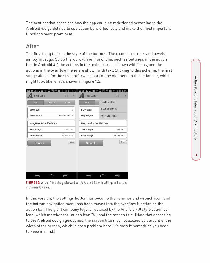
The next section describes how the app could be redesigned according to the Android 4.0 guidelines to use action bars effectively and make the most important functions more prominent.
afterThe first thing to fix is the style of the buttons. The rounder corners and bevels simply must go. So do the word-driven functions, such as Settings, in the action bar. In Android 4.0 the actions in the action bar are shown with icons, and the actions in the overflow menu are shown with text. Sticking to this scheme, the first suggestion is for the straightforward port of the old menu to the action bar, which might look like what’s shown in Figure 1.5.
Figure 1.5: Version 1 is a straightforward port to Android 4.0 with settings and actions in the overflow menu.
In this version, the settings button has become the hammer and wrench icon, and the bottom navigation menu has been moved into the overflow function on the action bar. The giant company logo is replaced by the Android 4.0 style action bar icon (which matches the launch icon “A”) and the screen title. (Note that according to the Android design guidelines, the screen title may not exceed 50 percent of the width of the screen, which is not a problem here; it’s merely something you need to keep in mind.)
394151c01.indd 7 2/1/13 9:10 PM

Ch
aP
ter
1: D
esig
n fo
r a
ndro
id: a
Cas
e St
udy
8
Unfortunately, as discussed in the “Before” section, these changes are not nearly enough. This basic redesign takes care of the Information Architecture (IA) port to Ice Cream Sandwich, but it does not take care of the inherent shortcomings of the app’s current IA: Key functions such as Find Dealers and My AutoTrader are still hidden, and the Settings clearly does not go anywhere useful. Worse, placing Set-tings on the top bar would actually discourage exploration of the menu because if the customer discovers that the Settings function is basically pretty lame, that would send a strong signal that the other functions hidden in the overflow menu are even more useless. The design can be improved even more.
One possible approach would be to bubble up the Find Dealers and My AutoTrader options to the top action bar and remove the Settings to the overflow menu. Figure 1.6 shows how this might look.
Figure 1.6: In Version 2, the more useful functions are on the top action bar and settings have been moved to the overflow menu.
This is an acceptable IA, and it is in line with the current Google Android recom-mendations for the Ice Cream Sandwich (4.0) and Jelly Bean (4.1) OS versions. However, it points out some key challenges with the implementation of the current UI specification of the action bars. For instance, on most devices, you cannot have more than a few functions on the action bar without taking up more than the rec-ommended 50 percent of the available space. Furthermore, placing more actions on additional action bars robs the app of the vertical real estate it so desperately
394151c01.indd 8 2/1/13 9:10 PM

action B
ars and Information a
rchitecture9
needs while also adding visual noise and complexity. This is not a small consider-ation that can be easily dismissed.
The main challenge is cognitive: Not every action can be easily represented with only an icon. For instance, in Figure 1.6, I use both of the original Find Dealers and My AutoTrader icons. While neither icon is bad, either one can be easily misinter-preted, as can most of the icons meant to represent complex or unusual actions. You could remove all the icons and place all of the actions in the overflow menu, but that solution is also far from ideal because it forces all the menu items to be solely text. When you use only text you miss out on the playful aspect that the icons bring to mobile computing, which is—at least for me—at the heart of what mobile navigation is all about. I have seen repeatedly that using icons and text together makes navigation most effective. When customers first learn the app, they rely on both aspects of the navigation. After using the app for a while, the icon often offers enough information scent to ensure recognition of the action behind it. So does Android offer a way to use both icons and text together?
Fortunately, the recent redesign of the Google Plus app points the way to use both icons and text by using a Drawer element (see Figure 1.7). The Drawer and other Swiss Army Navigation pattern techniques are covered in Chapter 13, “ Navigation,” so it’s not necessary to cover them here. Suffice it to say that the Drawer user interface (UI) element enables both icons and text—the best of both worlds.
Figure 1.7: The Google Plus app design uses a Drawer menu that includes both text and icons.
394151c01.indd 9 2/1/13 9:10 PM

Ch
aP
ter
1: D
esig
n fo
r a
ndro
id: a
Cas
e St
udy
10
The Android UI specification encourages the use of the Drawer element for top-level navigation if there are a number of views in the app that do not have a direct relationship with one another. This is exactly the case you have with Auto-Trader. The Car Search area of the app is different from the Find Dealer and My AutoTrader views, so placing these top-level navigation functions in the Drawer menu (shown in Version 3 of the redesign in Figure 1.8) makes a lot of sense. Scan & Find is a car search function, so it makes sense to make it contextual to the Car Search view. It is accessible with a single tap on the action bar. The useless (but, as the lawyers would argue, necessary) Settings function is the only one that hides in the overflow menu; it does not need to be accessible with one tap, so hid-ing it is the best strategy.
Figure 1.8: Version 3 is the recommended design for the AutoTrader app: a top-level redesign that uses a Drawer menu.
Version 3 is the preferred design. It strikes a good balance of showing both the icons and the text, while making the navigation accessible using a right-to-left swipe or a tap on the Up icon (left caret or <). It also frees the top action bar for showing a good-sized, clear screen label. One recommended modification to the standard Android guidelines is a thin line all along the left edge of the screen that signals to customers that they can open the Drawer menu by swiping from right to left (as well as by tapping the Up icon).
The Android UI guidelines caution that the Drawer can be used only for top-level navigation, which means that while your customers are deep in the middle of the
394151c01.indd 10 2/1/13 9:10 PM

tabs11
flow inside the Car Search view, they may be one or more steps away from access-ing the additional views. The good news is that—with the global navigation out of the way—the action bar can include functions that are contextual to the page the cus-tomers are on, which is recommended by the Android design standards document.
tabsTabs are an essential element of secondary navigation that can be used in the Android platform for a variety of applications. The Tabs pattern is covered in Chapter 8, “Sorting and Filtering.”
The AutoTrader app uses the iOS style visual design rendering for the tabs with rounded corners and the “depressed” beveled look for the selected tab (see Figure 1.9).
Use a simple redesign of the control with end-to-end underline; no shadows, bev-els, and rounded corners. The heavier “underline” element signals the selected tab. In this screen, there is just enough space for compact text labels (Basic | Advanced | Recent) so that is what is used in the suggested redesign.
What if the screen was smaller than could comfortably accommodate the full text in the tabs? Then the text labels would turn into corresponding icon-based tabs. As you read in Chapter 2, “What Makes Android Different,” the scalability of run-ning the interface on devices with smaller touch screens is a key differentiator for the Android OS. This scalability in turn dictates many of the basic visual design choices and guidelines.
Figure 1.9: The top shows the tabs in the AutoTrader app before a suggested redesign; the bottom is the suggested Android 4.0 treatment.
Dedicated Selection PageDedicated Selection Page is the primary pattern for selecting from a long list. It’s covered in more detail in Chapter 12, “Mobile Banking.” The AutoTrader app uses the iOS-style selection with the greater than sign, (right caret or >). (See the top of Figure 1.10.)
394151c01.indd 11 2/1/13 9:10 PM

Ch
aP
ter
1: D
esig
n fo
r a
ndro
id: a
Cas
e St
udy
12
Figure 1.10: The top shows the link to the Dedicated Selection Page before redesign; the bottom is the suggested Android 4.0 treatment.
iOS uses the > to show row-based interactivity. In contrast, in the Android OS there is no indication of the underlying functionality. As discussed in Chapter 2, the concept of Tap Anywhere is an important one to the Android OS. If there is any reason to tap anything like a selector, the assumption is that it will carry the cor-responding interactivity. Thus, visual design is implemented accordingly in a typi-cal Spartan Android fashion, using a slightly darker row background and without the right caret.
Select ControlThe Android platform comes with a full complement of touch-friendly controls that you can use on multiple screen sizes and device configurations. Ice Cream Sandwich comes fully equipped with touch sliders, a completely redesigned text entry, and a new dual-function wheel control, discussed in great detail in Chap-ter 10, “Data Entry.” For this section, suffice it to say that the AutoTrader Android port still uses the iOS-style form controls and form section headers. The follow-ing sections describe how to redesign them, Android-style.
BeforeThe first thing to notice is the composite iOS-style wheel control that the cus-tomer uses in the AutoTrader app to select the year and price (see Figure 1.11).
394151c01.indd 12 2/1/13 9:10 PM

Select C
ontrol13
Figure 1.11: The AutoTrader app uses an iOS-style form for selecting the year and price.
The iOS control is a non-native wheel that needs to change to the Android-style controls. Check out a couple of ideas in the following “After” section.
Another important aspect of the form design is the rounded container for the entry fields with an iOS-style section header. As discussed in Chapter 2, Android uses the Mobile Space, Unbound visual style principle that removes any contain-ers and boxes, especially those with rounded corners.
394151c01.indd 13 2/1/13 9:10 PM

Ch
aP
ter
1: D
esig
n fo
r a
ndro
id: a
Cas
e St
udy
14
afterAs discussed in Chapter 10, there are various touch-friendly ways to implement entry of the range of values in Android. The most straightforward one is to convert the combo wheel into min and max wheel controls (marked by a line with a small triangle on the right). Figure 1.12 shows one idea how this might look.
Figure 1.12: The redesign uses native Android wheel controls and a section header.
Although wheel controls offer a decent solution, you can use a variety of other interaction design patterns. Chapters 10 and 11 discuss a composite Drop Down control, separate min and max Sliders, a Dual Slider, and a Slider with a Histo-gram experimental design pattern. Applying those patterns is not complicated, but it is a sophisticated endeavor, which is discussed in detail in Part 2 of the book. The patterns are designed especially to limit the cases of zero results in the search, such as picking a price range that is too low or having no inventory for a specific desired year, which is the topic discussed in detail in Chapter 9, “Avoiding Missing or Undesirable Results.”
Forms in the Android 4.0/4.1 are allowed to flow in order to conform to a variety of screen heights and widths. Thus, instead of using containers for form sections, various parts of the form are separated from one other by simple headers. Native headers are in the all capital Roboto font (Helvetica is used in the figures) under-lined by a thin separator line of the contrasting color.
ButtonsThe AutoTrader app uses iOS-style buttons with rounded corners and bevels. The buttons are in two different heights and visual treatments, with lots of space in between, which makes the screen look rather lopsided. In addition, the buttons are positioned as Search/Reset, in other words in the OK/Cancel order (see Fig-ure 1.13). As described in Chapter 11, “Forms,” the preferred button orientation is the opposite: Cancel/OK, so the redesign flips the buttons from their “before” layout positions.
394151c01.indd 14 2/1/13 9:10 PM

Search r
esults15
Figure 1.13: The current AutoTrader buttons are shown at the top; the redesign is in the middle; and an alternative of Android “tap areas” is at the bottom.
In contrast, the Android buttons are business-like: flat, with no gradient and just barely rounded corners. The preferred Android Cancel/OK button treatment is to turn them into square solid tap areas that occupy 100 percent of the width of the screen, with just a hint of a separator. Tap areas are discussed further in Chapter 2. I chose to emphasize the primary action button, Search, and make it easier to tap by making it larger and adding a magnifying glass icon.
Search resultsWith the home screen and the IA redesigned, now turn your attention to the search results screen. Search results appear immediately after the customer searches with the home screen form, so this makes sense.
BeforeAgain, the search results screen for the AutoTrader app has been generally designed without adopting it to the Android Ice Cream Sandwich and Jelly Bean OS guidelines (see Figure 1.14). The screen uses mainly iOS standards, with a light mixture of Android thrown in. The screen uses three buttons: two with text and one with an icon. All three buttons use rounded corners and bevels. In addition, each result on the screen uses the iOS right caret > treatment. As seen previ-ously on the home screen, the top app menu can be obtained by tapping the menu key in the navigation bar on the bottom of the device.
394151c01.indd 15 2/1/13 9:10 PM

Ch
aP
ter
1: D
esig
n fo
r a
ndro
id: a
Cas
e St
udy
16
Figure 1.14: This is what the search screen looks like before redesign.
afterThe Drawer top navigation menu is safely out of the way on the Search Results screen. Tapping the icon in the top-left corner navigates back to the home screen, where the customer can get to the top menu by tapping the same button again. This leaves space on the screen for contextual action buttons: Filter, Map, and Share (see Figure 1.15).
Starting with the Ice Cream Sandwich OS, the Share function has been a special use case because of the multiple built-in sharing functions. Thus you can imple-ment Share as a standard drop-down menu per the Android UI design standards. The remaining Map and Filter buttons are implemented as the Android-style flat
394151c01.indd 16 2/1/13 9:10 PM

Search r
esults17
single-color icons, which are placed right on the action bar. This is one way that the map-list relationship can be implemented. Many more effective search and filtering patterns are discussed in Chapter 7, “Search,” and Chapter 8.
Figure 1.15: This is Version 1 of the redesigned AutoTrader app search screen with Title Bar.
In addition to using the title bar treatment of the action bar, one other version is possible: a drop down control that can be used to select from multiple views: in this case from several different ways to sort the inventory. In this Version 2 of the redesign, the screen title (maker and model of the car) is displayed above the multiple views drop-down. Version 2 of the redesign is recommended because it adds key functionality by taking full advantage of the Android 4.0 capabilities (see Figure 1.16).
394151c01.indd 17 2/1/13 9:10 PM

Ch
aP
ter
1: D
esig
n fo
r a
ndro
id: a
Cas
e St
udy
18
Figure 1.16: Recommended Version 2 of the AutoTrader app search screen redesign adds a Sort view selector.
The last thing to notice is the absence of the right caret > symbol in the search results. As mention earlier, touch space on the screen should be tap-enabled without having any special visual indicators. If an action, such as drilling down to the Result Detail screen, is valuable to the customer it should be enabled as a touch target without any external visual indicators. Speaking of which, it’s time to pretend someone actually tapped the search result. The next section describes the third and final screen: Result Detail.
394151c01.indd 18 2/1/13 9:10 PM

result D
etail19
result DetailWhat happens when the customer drills down into a car detail screen? It turns out that the last screen offers many opportunities for the new Android redesign, from IA to tabs and buttons.
BeforeThe detail screen again includes many iOS elements (see Figure 1.17). As dis-cussed earlier, tabs are text-based and have bevels and rounded corners. Simi-lar to the search results screen, there is another Share button; however, in this screen it occurs twice: once on the top menu bar and once inside the screen in the guise of a Save/Share button. This is confusing.
Figure 1.17: This is what the original AutoTrader app Result Detail screen looks like before redesign.
394151c01.indd 19 2/1/13 9:10 PM

Ch
aP
ter
1: D
esig
n fo
r a
ndro
id: a
Cas
e St
udy
20
Other actions include call and e-mail the seller, yet no primary button can be identified in the entire set—it is not clear what the app wants the customer to do first. The rest of the screen is laid out using containers with rounded corners; those have to go, of course.
Most important, the only way to navigate to the next item in the list is to “pogostick”: Press the Back button to return to the search results screen and then select a differ-ent detail screen. (Pogosticking is a navigation antipattern described in Chapter 13.)
afterIn the redesigned version of the screen, continue with the simple Up navigation by removing the global navigation functionality. But where should the action buttons go, and what’s the best way to identify the primary action that’s most likely to be taken by the customer? It’s easy to understand one way to implement this solution in the Android OS 4.0 by looking at the native Android Gmail app detail screen (see Figure 1.18).
Figure 1.18: The Gmail app uses the Swipe Views control in the Result Detail screen.
394151c01.indd 20 2/1/13 9:10 PM

result D
etail21
To reduce pogosticking, the native mail app uses a clever Android OS interface control, Swipe Views, to make navigation more efficient. This control enables the customer to swipe from right to left to get to the next result detail. This function-ality is shown to the customer using a thin, dark line on the bottom on the screen that states "2 of 133". Although this function works, in testing, the discoverability was poor. So for the redesign of the Android AutoTrader app, you should use a brief onscreen overlay tutorial as described in Chapter 5, “Welcome Experience,” or an animated transition Watermark pattern described in Chapter 13 to high-light the Swipe Views control for the customer and improve discoverability of this important feature. Regardless of the introduction you choose to display, after the customer learns the action, the tutorial is no longer necessary and can be sup-pressed, so these patterns aren’t shown here.
The swiping action in some applications is used to navigate between tabs. Because you want to preserve the swipe-to-next action to navigate to the next item detail, use the tap-only tabs on the top of the page, as shown in Figure 1.19.
Figure 1.19: This is how you can redesign the AutoTrader detail page.
394151c01.indd 21 2/1/13 9:10 PM

Ch
aP
ter
1: D
esig
n fo
r a
ndro
id: a
Cas
e St
udy
22
The primary and secondary contextual actions can now be placed in the action bar. Because there are only three actions on the car detail page, you need only a single action bar on the top, which accommodates all three actions above the tabs, next to the screen title (the name of the listing). If you need more space on smaller devices, or if future design iterations add more functionality, some of the detail page actions can either migrate to the overflow menu or to the split action bar that’s covered in the next chapter. Last but not least, remove all the containers on the screen, replacing them with Android 4.0 headers, following the Mobile Space Unbound principle discussed in Chapter 2. Note that frugal use of the real estate allows the redesigned screen to show several additional lines of text—no small feat on the mobile screen!
Bringing It all togetherFigure 1.20 shows three AutoTrader screens before the suggested redesign. Note the older IA and iOS treatment of the controls, fields, and buttons. Sections of the screen are separated from one another by containers with rounded corners. Within each section, the elements that implement interactivity are especially called out by the > symbol to separate them visually from noninteractive ele-ments, giving the overall visual style a heavy appearance.
Figure 1.20: This is what the three AutoTrader screens look like before redesign.
394151c01.indd 22 2/1/13 9:10 PM

Bringing It a
ll together23
In contrast, Figure 1.21 shows the three redesigned screens imbued with Android 4.0 DNA.
Figure 1.21: The three AutoTrader screens redesigned for Android 4.0.
In the redesign, a set of specialized touch controls and a unique navigational scheme recommended by the Android 4.0 guidelines are used. From a visual per-spective, the new design uses flat buttons, touch panels, and action bars that are mostly devoid of gradients and rounded corners. Finally, the new design removes any containers and extraneous touch indicators.
Throughout the process you examined several different versions of each screen. This is natural: Android design is not complicated, but very sophisticated: with crushing space constraints and exciting novel interaction opportunities. That is why it’s a great idea to customer-test new design ideas thoroughly before they are implemented, using quick, inexpensive prototypes. I prefer to do prototyping and testing with sticky notes, and throughout this book you see many examples of using this design methodology. Chapter 4, “Mobile Design Process,” provides a detailed description of the entire design and prototyping process and offers prac-tical techniques to tackle customer testing with confidence.
AutoTrader offered a great opportunity for showing the detail of the Android visual design language and widgets, which kicks off the book with a powerful example.
394151c01.indd 23 2/1/13 9:10 PM

However, this is just a short overview of many innovative, interesting, and use-ful design patterns found in Android. Before digging into the design patterns that form the bulk of the material for the book, the next chapter provides a quick look at a few aspects of Android that make it different from the other mobile operating systems.
394151c01.indd 24 2/1/13 9:10 PM