


Using Flexbox Today (Frontend United 2016)
117
Flexbox Zoe Mickley Gillenwater @zomigi Frontend United May 2016 TODAY USING
-
Upload
zoe-gillenwater -
Category
Internet
-
view
3.415 -
download
2
Transcript of Using Flexbox Today (Frontend United 2016)

Flexbox Zoe Mickley Gillenwater @zomigi Frontend United
May 2016
TODAY
USING

My portfolio site from 2000

My portfolio site from 2000

tables
positioning
floats
inline-block
table-cell
flexbox
grid multi-column exclusions
shapes
regions flexbox
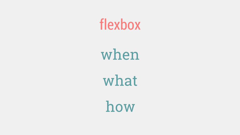
when
what
flexbox
how

Deciding when to use and not use flexbox
WHEN 1.

What browsers do I need to support?
Don’t ask yourself this—it’s irrelevant here (IMO)

Flexbox has 94% coverage worldwide
We support IE 7-9 at Booking, but still use flexbox as progressive enhancement.
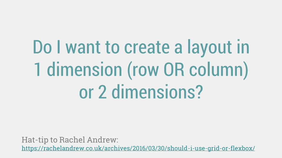
Do I want to create a layout in 1 dimension (row OR column)
or 2 dimensions?
Hat-tip to Rachel Andrew: https://rachelandrew.co.uk/archives/2016/03/30/should-i-use-grid-or-flexbox/
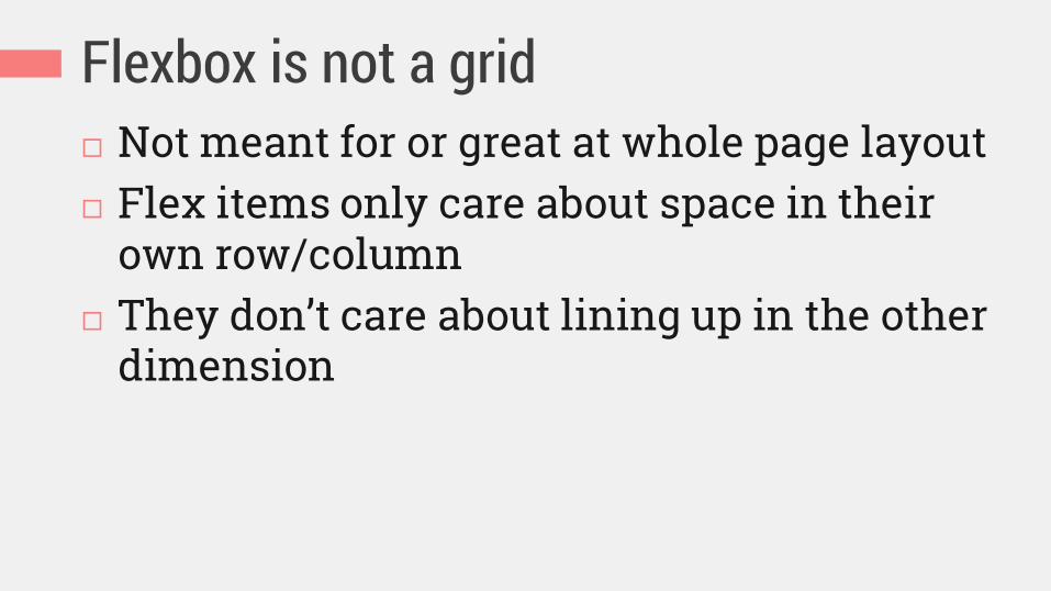
Flexbox is not a grid Not meant for or great at whole page layout Flex items only care about space in their
own row/column They don’t care about lining up in the other
dimension
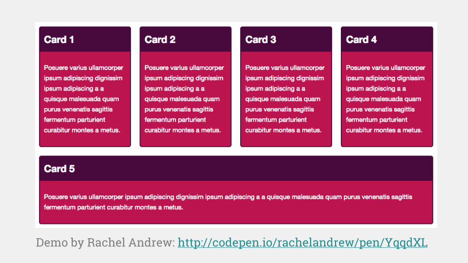
Demo by Rachel Andrew: http://codepen.io/rachelandrew/pen/YqqdXL

Flexbox is best for: UI components Simple whole page layouts (not grid-based) Enhancing a complex layout’s alignment,
spacing, etc. (not controlling placement)

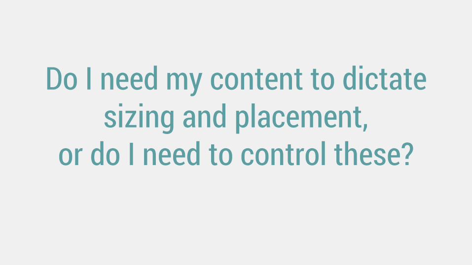
Do I need my content to dictate sizing and placement,
or do I need to control these?

Content determines boxes’ size and
placement
(Mega-useful when content is unknown and variable, or readability is
a top priority.)
Structure determines content’s size and
placement
(P.S. Flexbox can do this too, if you want. It’s just the reverse that doesn’t
work so well.)
Flexbox Grids

Does flexbox offer me anything I can’t already get
from an existing layout method?

New things flexbox offers Content-driven, unit-less sizes Content-driven, media-query-less layout changes Mixed-unit layouts Equal-height columns Vertical centering and other alignments Spacing out or stretching items to fill unknown width/height Combining content wrapping and block wrapping Pinning items without overlaps Visual order different than HTML/reading order
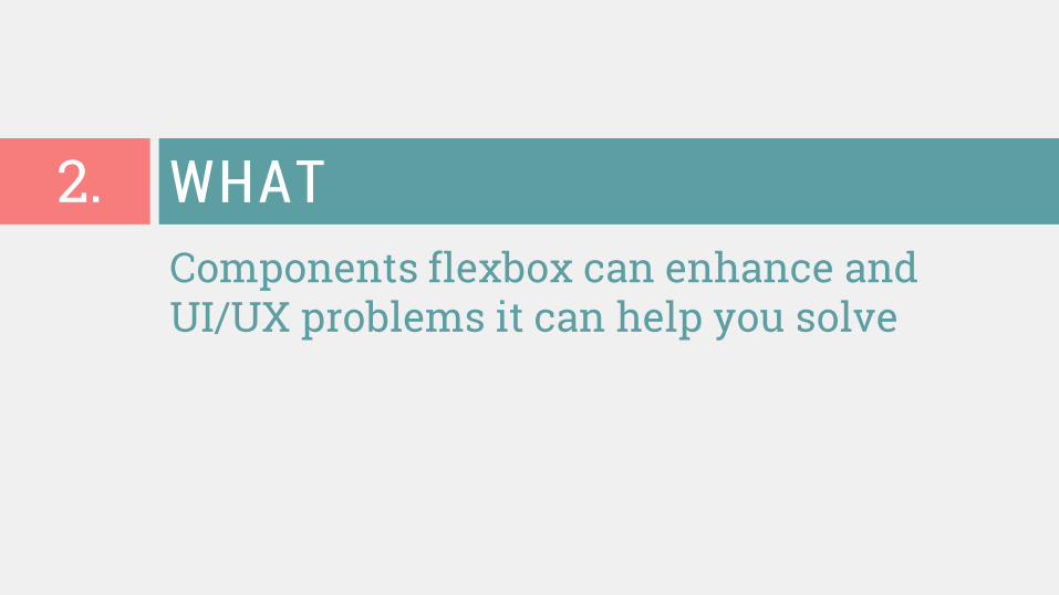
Components flexbox can enhance and UI/UX problems it can help you solve
WHAT 2.
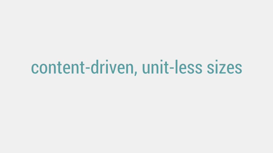
content-driven, unit-less sizes

How big do I make this thing?

% em/rem vw/vh

Relative units of measurement are your best guess at the
ideal, but they’re still a guess.

Flexbox gets us closer to the ideal, because it lets us design
without units.

Example: a responsive form from http://jobs.theguardian.com/

My copy of that form Same floats, same percentage widths

The trouble with explicit sizing Since the select and button are sized by a percentage, not sized automatically by their content, this can happen:
Box too small for its content Box too big for its content
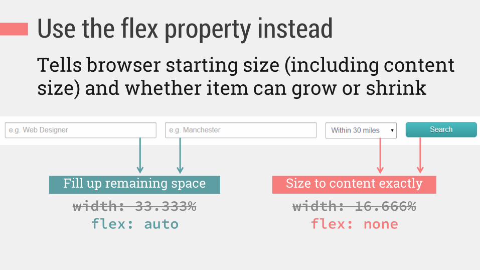
Use the flex property instead Tells browser starting size (including content size) and whether item can grow or shrink
width: 33.333% flex: auto
Fill up remaining space
width: 16.666% flex: none
Size to content exactly
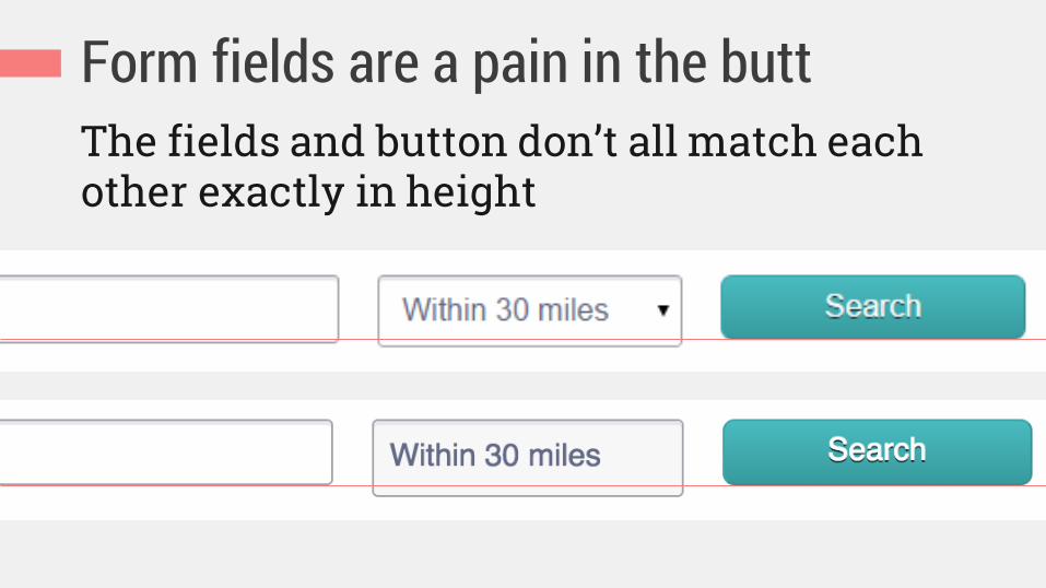
Form fields are a pain in the butt The fields and button don’t all match each other exactly in height
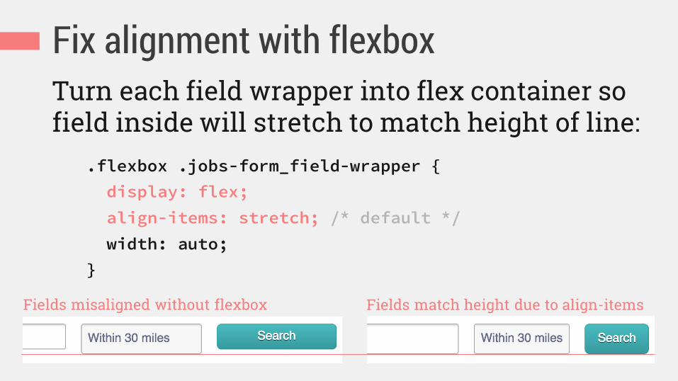
Fix alignment with flexbox Turn each field wrapper into flex container so field inside will stretch to match height of line:
.flexbox .jobs-form_field-wrapper {
display: flex;
align-items: stretch; /* default */
width: auto;
}
Fields misaligned without flexbox Fields match height due to align-items

Smarter sizing Non-flexbox
Flexbox enhanced
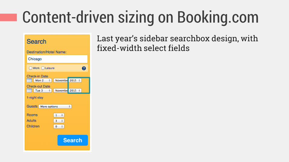
Content-driven sizing on Booking.com Last year’s sidebar searchbox design, with fixed-width select fields

Content-driven sizing on Booking.com Non-flexbox Flexbox enhanced

Content-driven sizing on Booking.com .sb-dates {
display: flex;
}
.sb-dates__icon {
flex: 0 0 23px;
}
.sb-dates__select-day {
flex: 1 0 auto;
margin: 0 6px;
}
.sb-dates__select-month {
flex: 1 1 auto;
}
flex container
main axis flex items

Defining the flex property flex-grow
how much flex item will grow relative to other items if extra space is available (proportion of extra space that it gets)
flex-shrink
how much item will shrink relative to others if there is not enough space (proportion of overflow that gets shaved off)
flex-basis the initial starting size before free space is distributed (any standard width/height value, including auto)

Translating the flex property .sb-dates {
display: flex;
}
.sb-dates__icon {
flex: 0 0 23px;
}
.sb-dates__select-day {
flex: 1 0 auto;
margin: 0 6px;
}
.sb-dates__select-month {
flex: 1 1 auto;
}
Start out 23px wide, and don’t grow or shrink further
Start out sized to your content, then grow with 1 share of any extra space available, but don’t ever shrink
Start out sized to your content, then grow with 1 share of extra space, but if there’s an overflow shrink

Mixed-unit layout is easier with calc(), but not even it can do: calc(100% - 23px - the width of the day field in Greek)
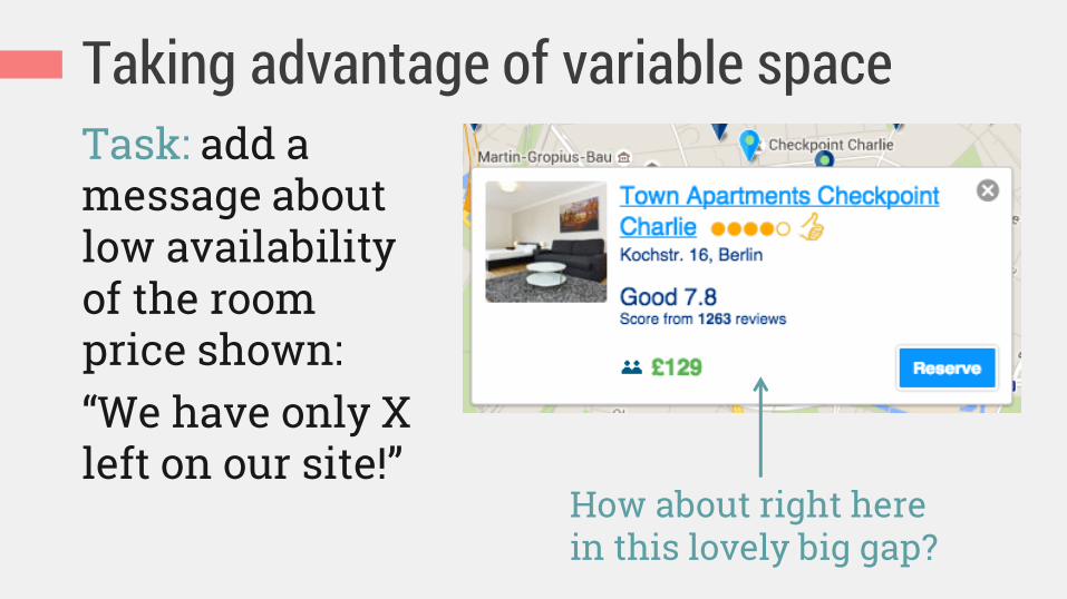
Taking advantage of variable space Task: add a message about low availability of the room price shown: “We have only X left on our site!”
How about right here in this lovely big gap?
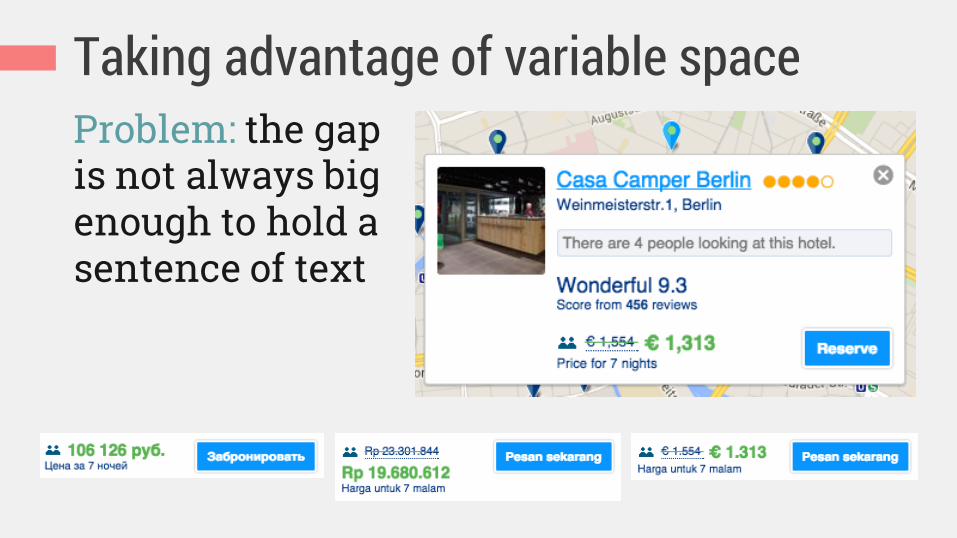
Taking advantage of variable space Problem: the gap is not always big enough to hold a sentence of text

Taking advantage of variable space Solution: use flexbox to place text beside price when space allows; otherwise, it can wrap below price

Progressive enhancement Non-flexbox Flexbox enhanced

Content-driven layout change 2 columns 3 columns
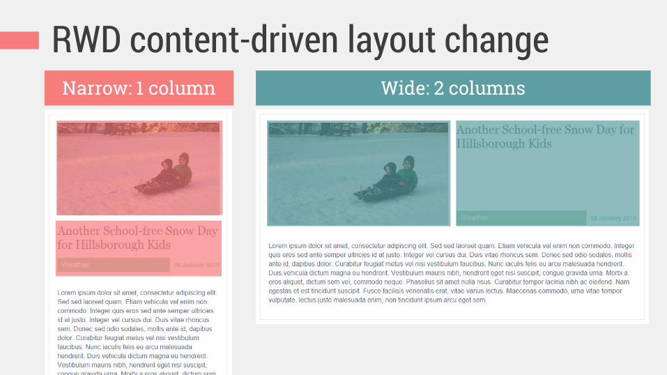
RWD content-driven layout change Narrow: 1 column Wide: 2 columns

RWD content-driven layout change .article-header {
display: flex;
flex-flow: row wrap;
margin-left: -20px;
}
.article-header-image {
flex: 1 1 320px;
padding-left: 20px;
}
When 320px + 20em can fit together, layout shifts to 1 row/2 columns
.article-header-text {
flex: 1 1 20em;
padding-left: 20px;
}
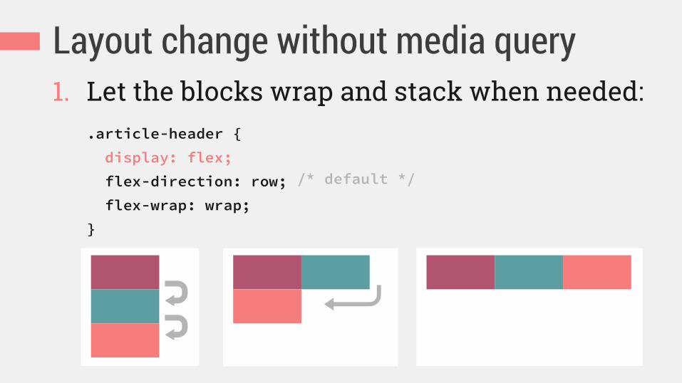
Layout change without media query 1. Let the blocks wrap and stack when needed:
.article-header {
display: flex;
flex-direction: row;
flex-wrap: wrap;
}
/* default */

Layout change without media query 2. Size the blocks to control their wrapping
point:
.article-header-image {
flex: 1 1 320px;
padding-left: 20px;
}
.article-header-text {
flex: 1 1 20em;
padding-left: 20px;
}
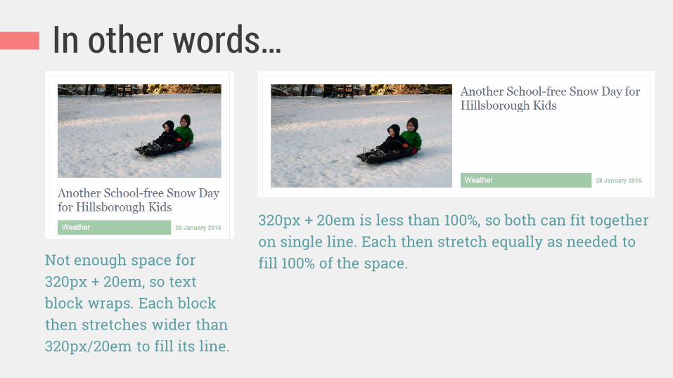
In other words…
Not enough space for 320px + 20em, so text block wraps. Each block then stretches wider than 320px/20em to fill its line.
320px + 20em is less than 100%, so both can fit together on single line. Each then stretch equally as needed to fill 100% of the space.
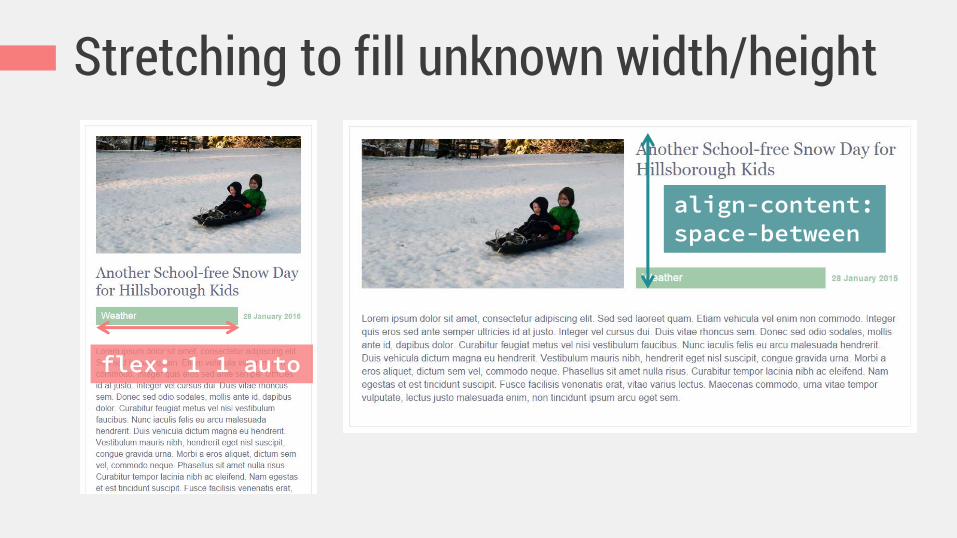
Stretching to fill unknown width/height
flex: 1 1 auto
align-content: space-between

Improved wrapping in RWD layout With float or text-align With flex or justify-content

Flexbox is great for spacing and aligning stuff, especially
shifting content in RWD.

Demo: full-width nav bar All links on same line First link flush left, last link flush right Equal spaces between all links

Trying display:table-cell All links on same line First link flush left, last link flush right Equal spaces between all links

Spacing with table-layout:fixed

Starter centered nav bar, no flexbox
.list-nav {
margin: 0;
padding: 0;
list-style: none;
text-align: center;
}
.list-nav-item {
display: inline-block;
padding: 0 .5em;
}
from www.smoresday.us

Enhanced to full-width with flexbox .list-nav {
display: flex;
justify-content: space-between;
margin: 0;
padding: 0;
list-style: none;
text-align: center; /* fallback */
}
.list-nav-item {
display: inline-block; /* fallback */
padding: 0 .5em; /* fallback */
}
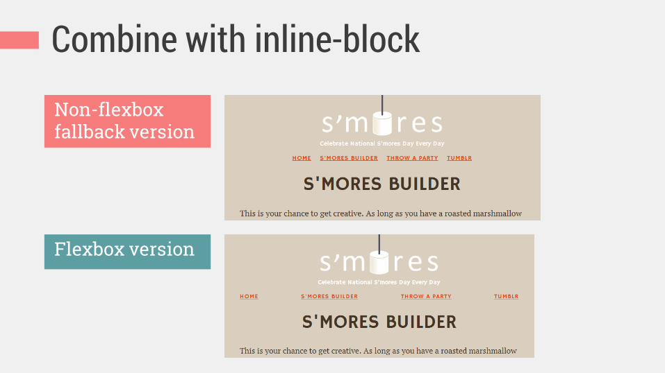
Combine with inline-block
Non-flexbox fallback version
Flexbox version

This works vertically too.

Demo: full-height stacked icons
.wrapper
.icons
.content
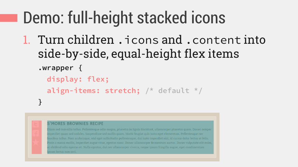
Demo: full-height stacked icons 1. Turn children .icons and .content into
side-by-side, equal-height flex items .wrapper {
display: flex;
align-items: stretch; /* default */
}

Only children become flex items
So these 2 children are the flex items
This is the flex container
These 3 grandchildren aren’t flex items (yet)

Demo: full-height stacked icons 2. Turn .icons into flex container with
vertically stacked children (the 3 icons):
.icons {
display: flex;
flex-direction: column; /* main axis */
}

Demo: full-height stacked icons 3. Equally space the 3 icons along the vertical
main axis:
.icons {
display: flex;
flex-direction: column;
justify-content: space-between;
}

Demo: full-height stacked icons

Fallback alignment options Top-aligned (float) Centered (table-cell)
Flexbox can also enhance visual ordering.

Improve the wide layout Wide: too stretched out
A more responsive enhancement

order integer to specify flow order of flex items
0 0 0 default source order 0 0
1 0 0 re-ordered 0 0
0 0 -1 re-ordered 0 0
2 1 0 re-ordered 1 0

Use order property to move logo
1. Divide nav bar into order groups: .list-nav-item_home, .list-nav-item_builder {
order: 0; /* default, and first here */ }
.logo {
order: 1; /* second */ }
.list-nav-item_party, .list-nav-item_tumblr {
order: 2; /* last */ }

Use order property to move logo
2. Split extra space on line to center logo: .logo {
order: 1;
margin-left: auto;
margin-right: auto; }

A more responsive nav bar
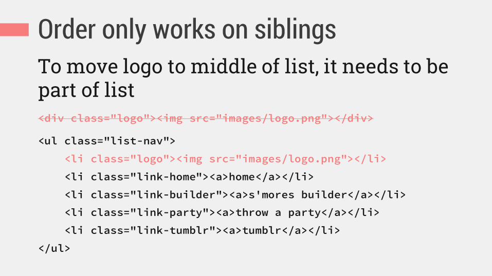
Order only works on siblings To move logo to middle of list, it needs to be part of list <div class="logo"><img src="images/logo.png"></div>
<ul class="list-nav">
<li class="logo"><img src="images/logo.png"></li>
<li class="link-home"><a>home</a></li>
<li class="link-builder"><a>s'mores builder</a></li>
<li class="link-party"><a>throw a party</a></li>
<li class="link-tumblr"><a>tumblr</a></li>
</ul>

Reorder for good, not evil.
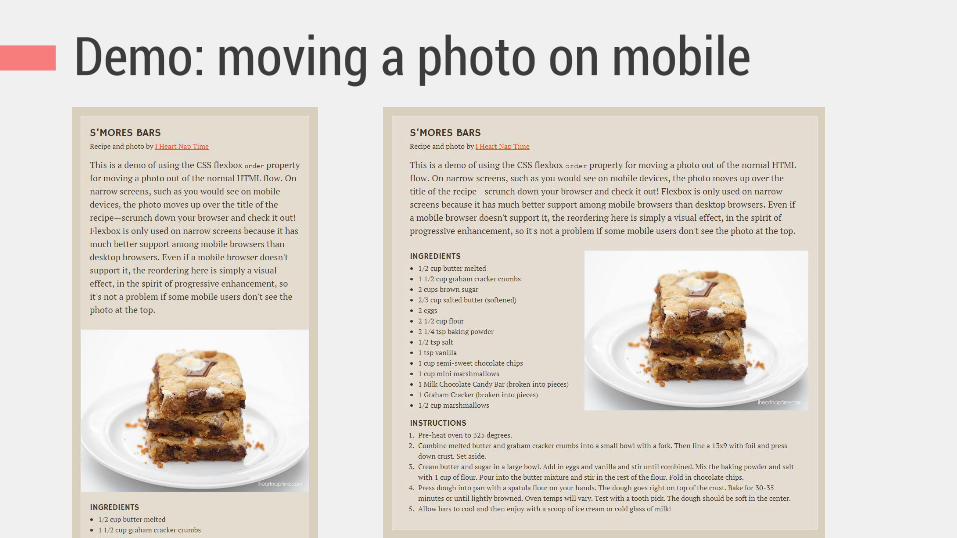
Demo: moving a photo on mobile

Demo: moving a photo on mobile Desktop: HTML order (no flexbox) Mobile: reordered

Use flexbox order in mobile styles .recipe {
display: flex;
flex-direction: column;
}
.recipe figure {
order: -1; /* before all items with default order: 0 */
}
.recipe figure img {
width: 100%;
}
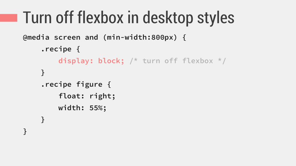
Turn off flexbox in desktop styles @media screen and (min-width:800px) {
.recipe {
display: block; /* turn off flexbox */
}
.recipe figure {
float: right;
width: 55%;
}
}
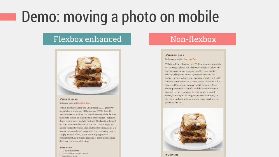
Demo: moving a photo on mobile Flexbox enhanced Non-flexbox
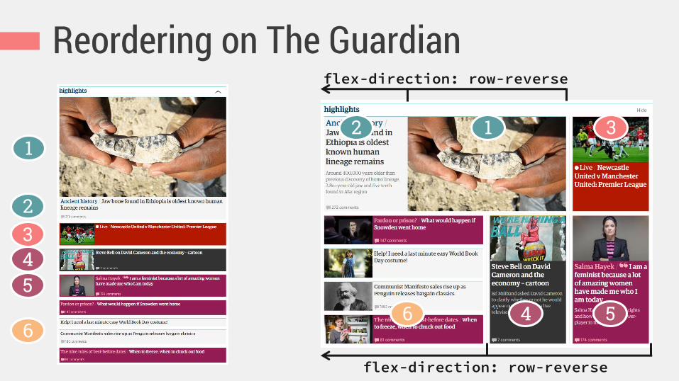
Reordering on The Guardian
1 2 3
4 5 6
flex-direction: row-reverse
flex-direction: row-reverse
1
2 3 4 5
6

These examples don’t look wrong or broken without flexbox.
Flexbox just enhances their sizing
and spacing to look better.
Step-by-step process for adding flexbox to your UI components effectively
HOW 3.

Don’t freak out

Decide whether flexbox is the right tool for the job
Decide which versions of flexbox to support
standard, 2011/2012, and/or 2009

Browser support approaches to choose Use only the non-prefixed, standard syntax … plus browser-prefixed versions of
standard syntax … plus -ms- prefixed 2011/2012 syntax … plus -webkit- prefixed 2009 syntax
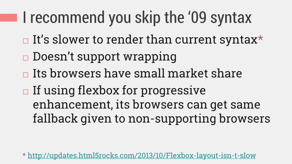
I recommend you skip the ‘09 syntax It’s slower to render than current syntax* Doesn’t support wrapping Its browsers have small market share If using flexbox for progressive
enhancement, its browsers can get same fallback given to non-supporting browsers
* http://updates.html5rocks.com/2013/10/Flexbox-layout-isn-t-slow

Let tools add browser variants for you Autoprefixer: https://github.com/ai/autoprefixer
Sass or LESS mixins can be customized to add just the browser variants you want https://github.com/mastastealth/sass-flex-mixin https://gist.github.com/cimmanon/4461470 https://github.com/thoughtbot/bourbon/blob/mast
er/app/assets/stylesheets/css3/_flex-box.scss https://github.com/annebosman/FlexboxLess

Add Modernizr as needed with flexbox Flexbox and fallback styles can often co-exist, but sometimes need to isolate them
http://zomigi.com/blog/using-modernizr-with-flexbox/

Or use @supports .gallery-item {
display: inline-block;
}
@supports (flex-wrap: wrap) {
.gallery {
display: flex;
flex-wrap: wrap;
}
}
https://developer.mozilla.org/en-US/docs/Web/CSS/@supports
But IE 10-11, which do support flexbox but don’t support @supports, won’t get these styles
Choose and add appropriate starter/fallback layout CSS

Things to consider Do I need content blocks to wrap? not table-cell
Do I want to prevent blocks from wrapping? floats, inline-block, but table-cell best
Do I need content-driven sizes? floats, but table-cell or inline-block best
Do I need vertical alignment? inline-block, table-cell
Do I need horizontal alignment? floats, table-cell, inline-block only with preset sizes

Pick your starter layout CSS
Floats table-cell inline-block
Absolute positioning
Flexbox will override: Flexbox will not override:
Just use whatever you normally would; flexbox plays nicely with most of them.

A real example of this process
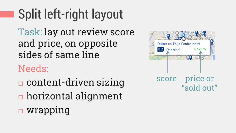
Split left-right layout Task: lay out review score and price, on opposite sides of same line Needs: content-driven sizing horizontal alignment wrapping
score price or “sold out”

Adding the starter CSS .iw_mini_review_score_wrapper {
float: left;
}
.iw_mini_price_wrapper {
float: right;
}
Start adding flexbox!

Decide whether entire component needs to be
block or inline-block display:flex or inline-flex
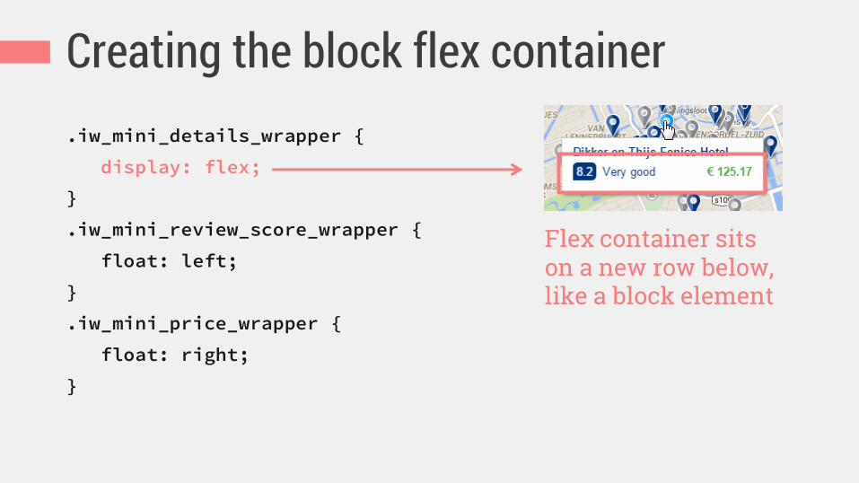
Creating the block flex container .iw_mini_details_wrapper {
display: flex;
}
.iw_mini_review_score_wrapper {
float: left;
}
.iw_mini_price_wrapper {
float: right;
}
Flex container sits on a new row below, like a block element

Decide flow of flex items

Things to consider Lay out horizontally or vertically? flex-direction:row or
column
Allow boxes to wrap? flex-wrap:wrap, wrap-reverse or nowrap
Order different than source? order values; flex-direction: row-reverse or column-reverse

Allowing wrapping .iw_mini_details_wrapper {
display: flex;
flex-wrap: wrap;
}
.iw_mini_review_score_wrapper {
float: left;
}
.iw_mini_price_wrapper {
float: right;
}
Allows second block to wrap down if needed

Decide which items can grow to fill space,
shrink to avoid overflow, or must stay at a certain size
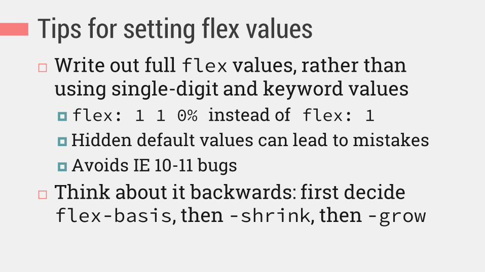
Tips for setting flex values Write out full flex values, rather than
using single-digit and keyword values flex: 1 1 0% instead of flex: 1 Hidden default values can lead to mistakes Avoids IE 10-11 bugs
Think about it backwards: first decide flex-basis, then -shrink, then -grow
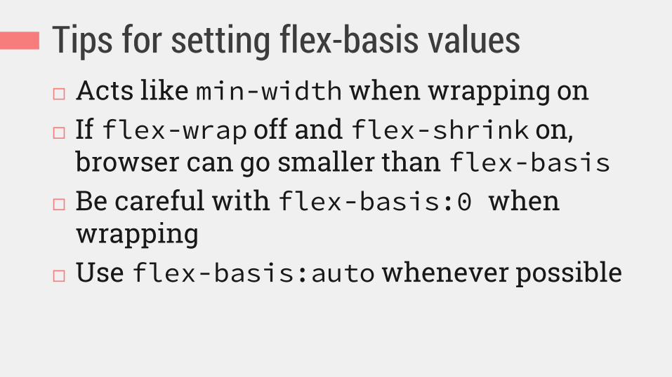
Tips for setting flex-basis values Acts like min-width when wrapping on If flex-wrap off and flex-shrink on,
browser can go smaller than flex-basis Be careful with flex-basis:0 when
wrapping Use flex-basis:auto whenever possible
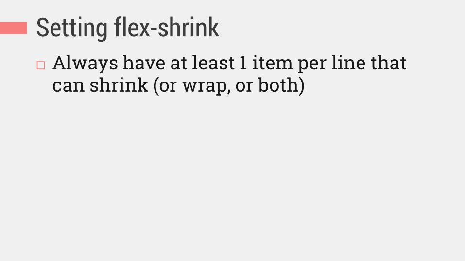
Setting flex-shrink Always have at least 1 item per line that
can shrink (or wrap, or both)
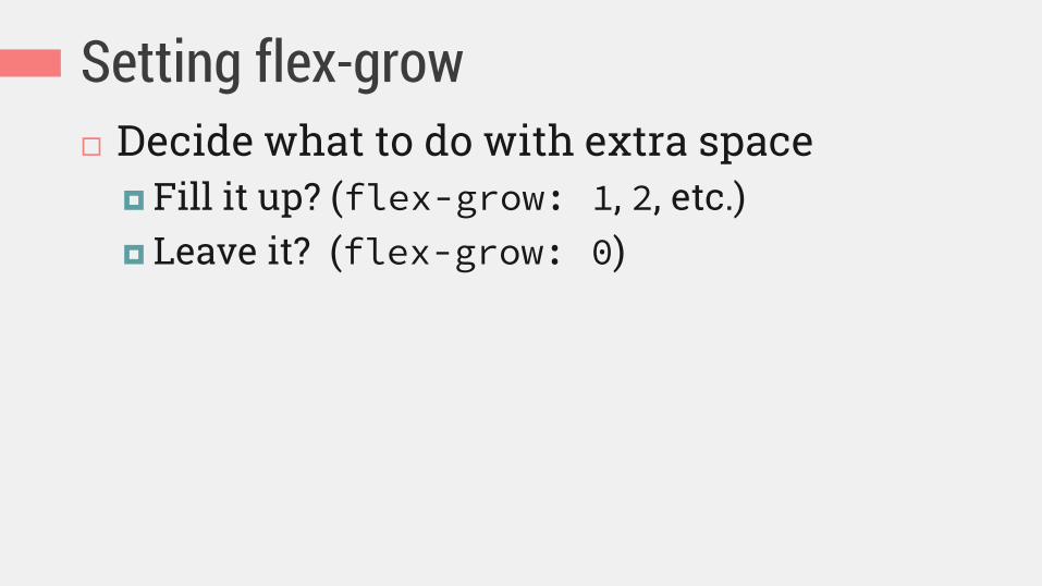
Setting flex-grow Decide what to do with extra space
Fill it up? (flex-grow: 1, 2, etc.) Leave it? (flex-grow: 0)

Setting flex values .iw_mini_details_wrapper {
display: flex;
flex-wrap: wrap;
}
.iw_mini_review_score_wrapper {
float: left;
flex: 0 1 auto;
}
.iw_mini_price_wrapper {
float: right;
flex: 0 1 auto;
}
Size to content, shrink smaller if you have to, don’t grow bigger (default value)

Decide how to align flex items

Main axis alignment
(horizontal when row, vertical when column)
Cross axis alignment
(vertical when row, horizontal when column)
(P.S. Also responsible for
equal-height columns)
justify-content align-items
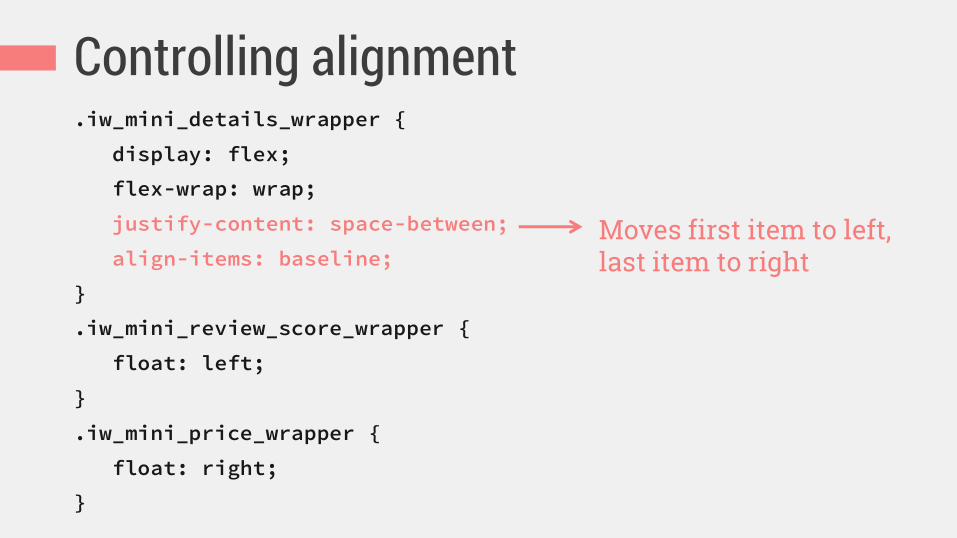
Controlling alignment .iw_mini_details_wrapper {
display: flex;
flex-wrap: wrap;
justify-content: space-between;
align-items: baseline;
}
.iw_mini_review_score_wrapper {
float: left;
}
.iw_mini_price_wrapper {
float: right;
}
Moves first item to left, last item to right

Improved wrapping Non-flexbox Flexbox enhanced

Flexbox with float fallback .iw_mini_details_wrapper {
display: flex;
flex-wrap: wrap;
justify-content: space-between;
align-items: baseline;
}
.iw_mini_review_score_wrapper {
float: left;
}
.iw_mini_price_wrapper {
float: right;
}
Flexbox properties on container override floating automatically in supporting browsers
Floating gets used by old browsers

Test

Testing your flexbox Too Flexy bookmarklet for toggling
Modernizr flexbox classes: http://chriswrightdesign.github.io/tooflexy/
If reordering, check tabbing and screen reading order to make sure it’s still logical

Summing up the process 1. Decide whether to use flexbox and which browser
versions of it 2. Choose and add starter layout CSS 3. Choose and add flexbox CSS
1. Block or inline-block container 2. Flow 3. Flex to control sizing 4. Alignment
4. Test and fix bugs
Flexbox is not for the future. You can use flexbox today.