
Using Flash Catalyst - Adobe
113
Using ADOBE ® FLASH ® CATALYST ™ CS5.5
Transcript of Using Flash Catalyst - Adobe
UsingADOBE® FLASH® CATALYST
™ CS5.5

Last updated 5/17/2011
Legal noticesLegal noticesFor legal notices, see http://help.adobe.com/en_US/legalnotices/index.html.

iii
Last updated 5/17/2011
Contents
Chapter 1: What’s New in Flash Catalyst CS5.5
Designer-developer workflows between Flash Catalyst CS5.5 and Flash Builder 4.5 . . . . . . . . . . . . . . . . . . . . . . . . . . . . . . . . . . . . . . 1
Resizable applications and components . . . . . . . . . . . . . . . . . . . . . . . . . . . . . . . . . . . . . . . . . . . . . . . . . . . . . . . . . . . . . . . . . . . . . . . . . . . . . . . . 1
New components and common library panel . . . . . . . . . . . . . . . . . . . . . . . . . . . . . . . . . . . . . . . . . . . . . . . . . . . . . . . . . . . . . . . . . . . . . . . . . . . 1
Ability to edit the appearance of developer-defined components . . . . . . . . . . . . . . . . . . . . . . . . . . . . . . . . . . . . . . . . . . . . . . . . . . . . . . . 1
More intuitive component naming . . . . . . . . . . . . . . . . . . . . . . . . . . . . . . . . . . . . . . . . . . . . . . . . . . . . . . . . . . . . . . . . . . . . . . . . . . . . . . . . . . . . . 2
Replacing objects on the artboard . . . . . . . . . . . . . . . . . . . . . . . . . . . . . . . . . . . . . . . . . . . . . . . . . . . . . . . . . . . . . . . . . . . . . . . . . . . . . . . . . . . . . 2
Enhanced alignment options . . . . . . . . . . . . . . . . . . . . . . . . . . . . . . . . . . . . . . . . . . . . . . . . . . . . . . . . . . . . . . . . . . . . . . . . . . . . . . . . . . . . . . . . . . 2
Transition timeline improvements . . . . . . . . . . . . . . . . . . . . . . . . . . . . . . . . . . . . . . . . . . . . . . . . . . . . . . . . . . . . . . . . . . . . . . . . . . . . . . . . . . . . . 2
Interaction enhancements . . . . . . . . . . . . . . . . . . . . . . . . . . . . . . . . . . . . . . . . . . . . . . . . . . . . . . . . . . . . . . . . . . . . . . . . . . . . . . . . . . . . . . . . . . . . . 2
Working with data lists defined by a developer . . . . . . . . . . . . . . . . . . . . . . . . . . . . . . . . . . . . . . . . . . . . . . . . . . . . . . . . . . . . . . . . . . . . . . . . . 3
Chapter 2: Workflows between Flash Catalyst and Flash Builder
Wireframe and prototype workflow within Flash Catalyst . . . . . . . . . . . . . . . . . . . . . . . . . . . . . . . . . . . . . . . . . . . . . . . . . . . . . . . . . . . . . . . 4
Small team workflow between Flash Catalyst and Flash Builder . . . . . . . . . . . . . . . . . . . . . . . . . . . . . . . . . . . . . . . . . . . . . . . . . . . . . . . . . 5
Multi-person workflow between Flash Builder and Flash Catalyst . . . . . . . . . . . . . . . . . . . . . . . . . . . . . . . . . . . . . . . . . . . . . . . . . . . . . . . 7
Chapter 3: User interface
Design workspace . . . . . . . . . . . . . . . . . . . . . . . . . . . . . . . . . . . . . . . . . . . . . . . . . . . . . . . . . . . . . . . . . . . . . . . . . . . . . . . . . . . . . . . . . . . . . . . . . . . . . 8
Code workspace . . . . . . . . . . . . . . . . . . . . . . . . . . . . . . . . . . . . . . . . . . . . . . . . . . . . . . . . . . . . . . . . . . . . . . . . . . . . . . . . . . . . . . . . . . . . . . . . . . . . . . 10
Start a new Flash Catalyst project . . . . . . . . . . . . . . . . . . . . . . . . . . . . . . . . . . . . . . . . . . . . . . . . . . . . . . . . . . . . . . . . . . . . . . . . . . . . . . . . . . . . . 11
Chapter 4: Importing artwork
Import Adobe Illustrator files . . . . . . . . . . . . . . . . . . . . . . . . . . . . . . . . . . . . . . . . . . . . . . . . . . . . . . . . . . . . . . . . . . . . . . . . . . . . . . . . . . . . . . . . . 13
Import Adobe Photoshop files . . . . . . . . . . . . . . . . . . . . . . . . . . . . . . . . . . . . . . . . . . . . . . . . . . . . . . . . . . . . . . . . . . . . . . . . . . . . . . . . . . . . . . . . 14
Import FXG files . . . . . . . . . . . . . . . . . . . . . . . . . . . . . . . . . . . . . . . . . . . . . . . . . . . . . . . . . . . . . . . . . . . . . . . . . . . . . . . . . . . . . . . . . . . . . . . . . . . . . . 14
Import bitmap images . . . . . . . . . . . . . . . . . . . . . . . . . . . . . . . . . . . . . . . . . . . . . . . . . . . . . . . . . . . . . . . . . . . . . . . . . . . . . . . . . . . . . . . . . . . . . . . . 15
Import SWF files . . . . . . . . . . . . . . . . . . . . . . . . . . . . . . . . . . . . . . . . . . . . . . . . . . . . . . . . . . . . . . . . . . . . . . . . . . . . . . . . . . . . . . . . . . . . . . . . . . . . . . 15
Import a Flash Catalyst library package . . . . . . . . . . . . . . . . . . . . . . . . . . . . . . . . . . . . . . . . . . . . . . . . . . . . . . . . . . . . . . . . . . . . . . . . . . . . . . . . 15
Chapter 5: Creating Application Mock-ups
Using Components . . . . . . . . . . . . . . . . . . . . . . . . . . . . . . . . . . . . . . . . . . . . . . . . . . . . . . . . . . . . . . . . . . . . . . . . . . . . . . . . . . . . . . . . . . . . . . . . . . . 16
Using placeholders . . . . . . . . . . . . . . . . . . . . . . . . . . . . . . . . . . . . . . . . . . . . . . . . . . . . . . . . . . . . . . . . . . . . . . . . . . . . . . . . . . . . . . . . . . . . . . . . . . . 16
Drawing and text tools . . . . . . . . . . . . . . . . . . . . . . . . . . . . . . . . . . . . . . . . . . . . . . . . . . . . . . . . . . . . . . . . . . . . . . . . . . . . . . . . . . . . . . . . . . . . . . . 17
Draw shapes and lines . . . . . . . . . . . . . . . . . . . . . . . . . . . . . . . . . . . . . . . . . . . . . . . . . . . . . . . . . . . . . . . . . . . . . . . . . . . . . . . . . . . . . . . . . . . . . . . . 17
Add text . . . . . . . . . . . . . . . . . . . . . . . . . . . . . . . . . . . . . . . . . . . . . . . . . . . . . . . . . . . . . . . . . . . . . . . . . . . . . . . . . . . . . . . . . . . . . . . . . . . . . . . . . . . . . 18
Select and position objects . . . . . . . . . . . . . . . . . . . . . . . . . . . . . . . . . . . . . . . . . . . . . . . . . . . . . . . . . . . . . . . . . . . . . . . . . . . . . . . . . . . . . . . . . . . 18
Size and rotate objects . . . . . . . . . . . . . . . . . . . . . . . . . . . . . . . . . . . . . . . . . . . . . . . . . . . . . . . . . . . . . . . . . . . . . . . . . . . . . . . . . . . . . . . . . . . . . . . 19
Modify drawing and text properties . . . . . . . . . . . . . . . . . . . . . . . . . . . . . . . . . . . . . . . . . . . . . . . . . . . . . . . . . . . . . . . . . . . . . . . . . . . . . . . . . . . 19
Chapter 6: Components: application building blocks
What is a component? . . . . . . . . . . . . . . . . . . . . . . . . . . . . . . . . . . . . . . . . . . . . . . . . . . . . . . . . . . . . . . . . . . . . . . . . . . . . . . . . . . . . . . . . . . . . . . . . 26
Components skin parts and states . . . . . . . . . . . . . . . . . . . . . . . . . . . . . . . . . . . . . . . . . . . . . . . . . . . . . . . . . . . . . . . . . . . . . . . . . . . . . . . . . . . . 26
Creating components . . . . . . . . . . . . . . . . . . . . . . . . . . . . . . . . . . . . . . . . . . . . . . . . . . . . . . . . . . . . . . . . . . . . . . . . . . . . . . . . . . . . . . . . . . . . . . . . 27

ivUSING FLASH CATALYST
Contents
Last updated 5/17/2011
Naming components . . . . . . . . . . . . . . . . . . . . . . . . . . . . . . . . . . . . . . . . . . . . . . . . . . . . . . . . . . . . . . . . . . . . . . . . . . . . . . . . . . . . . . . . . . . . . . . . . 30
Nesting components . . . . . . . . . . . . . . . . . . . . . . . . . . . . . . . . . . . . . . . . . . . . . . . . . . . . . . . . . . . . . . . . . . . . . . . . . . . . . . . . . . . . . . . . . . . . . . . . . 30
Editing a component with edit-in-place . . . . . . . . . . . . . . . . . . . . . . . . . . . . . . . . . . . . . . . . . . . . . . . . . . . . . . . . . . . . . . . . . . . . . . . . . . . . . . . 31
Making components resizable . . . . . . . . . . . . . . . . . . . . . . . . . . . . . . . . . . . . . . . . . . . . . . . . . . . . . . . . . . . . . . . . . . . . . . . . . . . . . . . . . . . . . . . . 35
Chapter 7: Resizing Applications and Components
Creating Resizable Components by Using Constraints . . . . . . . . . . . . . . . . . . . . . . . . . . . . . . . . . . . . . . . . . . . . . . . . . . . . . . . . . . . . . . . . . 37
Chapter 8: Defining structure with states
Types of states . . . . . . . . . . . . . . . . . . . . . . . . . . . . . . . . . . . . . . . . . . . . . . . . . . . . . . . . . . . . . . . . . . . . . . . . . . . . . . . . . . . . . . . . . . . . . . . . . . . . . . . 42
Using component states vs. application states . . . . . . . . . . . . . . . . . . . . . . . . . . . . . . . . . . . . . . . . . . . . . . . . . . . . . . . . . . . . . . . . . . . . . . . . . 43
Add, duplicate, and delete states . . . . . . . . . . . . . . . . . . . . . . . . . . . . . . . . . . . . . . . . . . . . . . . . . . . . . . . . . . . . . . . . . . . . . . . . . . . . . . . . . . . . . . 45
Naming states . . . . . . . . . . . . . . . . . . . . . . . . . . . . . . . . . . . . . . . . . . . . . . . . . . . . . . . . . . . . . . . . . . . . . . . . . . . . . . . . . . . . . . . . . . . . . . . . . . . . . . . . 46
Navigate between states . . . . . . . . . . . . . . . . . . . . . . . . . . . . . . . . . . . . . . . . . . . . . . . . . . . . . . . . . . . . . . . . . . . . . . . . . . . . . . . . . . . . . . . . . . . . . 46
Show and Hide artwork in states . . . . . . . . . . . . . . . . . . . . . . . . . . . . . . . . . . . . . . . . . . . . . . . . . . . . . . . . . . . . . . . . . . . . . . . . . . . . . . . . . . . . . . 47
Share objects between states . . . . . . . . . . . . . . . . . . . . . . . . . . . . . . . . . . . . . . . . . . . . . . . . . . . . . . . . . . . . . . . . . . . . . . . . . . . . . . . . . . . . . . . . . 47
Chapter 9: Layers
Organize a project using layers . . . . . . . . . . . . . . . . . . . . . . . . . . . . . . . . . . . . . . . . . . . . . . . . . . . . . . . . . . . . . . . . . . . . . . . . . . . . . . . . . . . . . . . 49
Selecting objects in the Layers panel . . . . . . . . . . . . . . . . . . . . . . . . . . . . . . . . . . . . . . . . . . . . . . . . . . . . . . . . . . . . . . . . . . . . . . . . . . . . . . . . . . 50
Manage artwork using layers . . . . . . . . . . . . . . . . . . . . . . . . . . . . . . . . . . . . . . . . . . . . . . . . . . . . . . . . . . . . . . . . . . . . . . . . . . . . . . . . . . . . . . . . . 51
Chapter 10: Create navigation and behavior with interactions
Add interactions . . . . . . . . . . . . . . . . . . . . . . . . . . . . . . . . . . . . . . . . . . . . . . . . . . . . . . . . . . . . . . . . . . . . . . . . . . . . . . . . . . . . . . . . . . . . . . . . . . . . . 53
Target Interactions . . . . . . . . . . . . . . . . . . . . . . . . . . . . . . . . . . . . . . . . . . . . . . . . . . . . . . . . . . . . . . . . . . . . . . . . . . . . . . . . . . . . . . . . . . . . . . . . . . . 54
On Application Start interactions . . . . . . . . . . . . . . . . . . . . . . . . . . . . . . . . . . . . . . . . . . . . . . . . . . . . . . . . . . . . . . . . . . . . . . . . . . . . . . . . . . . . . 54
Conditional interactions . . . . . . . . . . . . . . . . . . . . . . . . . . . . . . . . . . . . . . . . . . . . . . . . . . . . . . . . . . . . . . . . . . . . . . . . . . . . . . . . . . . . . . . . . . . . . . 55
Conditional list interactions . . . . . . . . . . . . . . . . . . . . . . . . . . . . . . . . . . . . . . . . . . . . . . . . . . . . . . . . . . . . . . . . . . . . . . . . . . . . . . . . . . . . . . . . . . . 55
Chapter 11: Animations
Animate transitions between view states . . . . . . . . . . . . . . . . . . . . . . . . . . . . . . . . . . . . . . . . . . . . . . . . . . . . . . . . . . . . . . . . . . . . . . . . . . . . . . 56
Trigger standalone animations using action sequences . . . . . . . . . . . . . . . . . . . . . . . . . . . . . . . . . . . . . . . . . . . . . . . . . . . . . . . . . . . . . . . . 61
Chapter 12: Libraries
Common library . . . . . . . . . . . . . . . . . . . . . . . . . . . . . . . . . . . . . . . . . . . . . . . . . . . . . . . . . . . . . . . . . . . . . . . . . . . . . . . . . . . . . . . . . . . . . . . . . . . . . . 63
Project library . . . . . . . . . . . . . . . . . . . . . . . . . . . . . . . . . . . . . . . . . . . . . . . . . . . . . . . . . . . . . . . . . . . . . . . . . . . . . . . . . . . . . . . . . . . . . . . . . . . . . . . . 63
Manage and place artwork from the Library panel . . . . . . . . . . . . . . . . . . . . . . . . . . . . . . . . . . . . . . . . . . . . . . . . . . . . . . . . . . . . . . . . . . . . . 64
Export and import a library package . . . . . . . . . . . . . . . . . . . . . . . . . . . . . . . . . . . . . . . . . . . . . . . . . . . . . . . . . . . . . . . . . . . . . . . . . . . . . . . . . . 64
Chapter 13: Replacing repeated artwork
Create an instance of a component . . . . . . . . . . . . . . . . . . . . . . . . . . . . . . . . . . . . . . . . . . . . . . . . . . . . . . . . . . . . . . . . . . . . . . . . . . . . . . . . . . . 66
Replace the other artwork . . . . . . . . . . . . . . . . . . . . . . . . . . . . . . . . . . . . . . . . . . . . . . . . . . . . . . . . . . . . . . . . . . . . . . . . . . . . . . . . . . . . . . . . . . . . 66
Chapter 14: Aligning graphics
Align Two or More Objects to One Another . . . . . . . . . . . . . . . . . . . . . . . . . . . . . . . . . . . . . . . . . . . . . . . . . . . . . . . . . . . . . . . . . . . . . . . . . . . . 68
Align Objects to the Artboard . . . . . . . . . . . . . . . . . . . . . . . . . . . . . . . . . . . . . . . . . . . . . . . . . . . . . . . . . . . . . . . . . . . . . . . . . . . . . . . . . . . . . . . . . 68
Show and hide rulers . . . . . . . . . . . . . . . . . . . . . . . . . . . . . . . . . . . . . . . . . . . . . . . . . . . . . . . . . . . . . . . . . . . . . . . . . . . . . . . . . . . . . . . . . . . . . . . . . 69
Edit grid and guide settings . . . . . . . . . . . . . . . . . . . . . . . . . . . . . . . . . . . . . . . . . . . . . . . . . . . . . . . . . . . . . . . . . . . . . . . . . . . . . . . . . . . . . . . . . . . 69
Set guides for precise drawing . . . . . . . . . . . . . . . . . . . . . . . . . . . . . . . . . . . . . . . . . . . . . . . . . . . . . . . . . . . . . . . . . . . . . . . . . . . . . . . . . . . . . . . . 69

vUSING FLASH CATALYST
Contents
Last updated 5/17/2011
Chapter 15: Optimizing graphics
Vector graphics . . . . . . . . . . . . . . . . . . . . . . . . . . . . . . . . . . . . . . . . . . . . . . . . . . . . . . . . . . . . . . . . . . . . . . . . . . . . . . . . . . . . . . . . . . . . . . . . . . . . . . 70
Bitmap (raster) graphics . . . . . . . . . . . . . . . . . . . . . . . . . . . . . . . . . . . . . . . . . . . . . . . . . . . . . . . . . . . . . . . . . . . . . . . . . . . . . . . . . . . . . . . . . . . . . . 71
Embedded vs. linked images . . . . . . . . . . . . . . . . . . . . . . . . . . . . . . . . . . . . . . . . . . . . . . . . . . . . . . . . . . . . . . . . . . . . . . . . . . . . . . . . . . . . . . . . . . 72
Optimizing tips . . . . . . . . . . . . . . . . . . . . . . . . . . . . . . . . . . . . . . . . . . . . . . . . . . . . . . . . . . . . . . . . . . . . . . . . . . . . . . . . . . . . . . . . . . . . . . . . . . . . . . . 72
Learn more from the community . . . . . . . . . . . . . . . . . . . . . . . . . . . . . . . . . . . . . . . . . . . . . . . . . . . . . . . . . . . . . . . . . . . . . . . . . . . . . . . . . . . . . . 73
Chapter 16: Round-trip editing of artwork
Launch and edit in Adobe Illustrator . . . . . . . . . . . . . . . . . . . . . . . . . . . . . . . . . . . . . . . . . . . . . . . . . . . . . . . . . . . . . . . . . . . . . . . . . . . . . . . . . . 74
Launch and edit in Adobe Photoshop . . . . . . . . . . . . . . . . . . . . . . . . . . . . . . . . . . . . . . . . . . . . . . . . . . . . . . . . . . . . . . . . . . . . . . . . . . . . . . . . . 75
Tips for preserving fidelity during round-trip editing . . . . . . . . . . . . . . . . . . . . . . . . . . . . . . . . . . . . . . . . . . . . . . . . . . . . . . . . . . . . . . . . . . . 76
Chapter 17: Data lists and scrolling panels
Overview of data lists . . . . . . . . . . . . . . . . . . . . . . . . . . . . . . . . . . . . . . . . . . . . . . . . . . . . . . . . . . . . . . . . . . . . . . . . . . . . . . . . . . . . . . . . . . . . . . . . . 79
Create a data list component . . . . . . . . . . . . . . . . . . . . . . . . . . . . . . . . . . . . . . . . . . . . . . . . . . . . . . . . . . . . . . . . . . . . . . . . . . . . . . . . . . . . . . . . . 80
Add design-time data . . . . . . . . . . . . . . . . . . . . . . . . . . . . . . . . . . . . . . . . . . . . . . . . . . . . . . . . . . . . . . . . . . . . . . . . . . . . . . . . . . . . . . . . . . . . . . . . 81
Overview of a scroll panel . . . . . . . . . . . . . . . . . . . . . . . . . . . . . . . . . . . . . . . . . . . . . . . . . . . . . . . . . . . . . . . . . . . . . . . . . . . . . . . . . . . . . . . . . . . . 82
Create a scroll panel component . . . . . . . . . . . . . . . . . . . . . . . . . . . . . . . . . . . . . . . . . . . . . . . . . . . . . . . . . . . . . . . . . . . . . . . . . . . . . . . . . . . . . . 82
Chapter 18: Custom skinnable components
Setting up the custom skinnable component . . . . . . . . . . . . . . . . . . . . . . . . . . . . . . . . . . . . . . . . . . . . . . . . . . . . . . . . . . . . . . . . . . . . . . . . . . 84
Custom skinnable components (with placeholder skins) . . . . . . . . . . . . . . . . . . . . . . . . . . . . . . . . . . . . . . . . . . . . . . . . . . . . . . . . . . . . . . . 84
Custom skinnable components (without placeholder skins) . . . . . . . . . . . . . . . . . . . . . . . . . . . . . . . . . . . . . . . . . . . . . . . . . . . . . . . . . . . . 86
Learn more from the community . . . . . . . . . . . . . . . . . . . . . . . . . . . . . . . . . . . . . . . . . . . . . . . . . . . . . . . . . . . . . . . . . . . . . . . . . . . . . . . . . . . . . . 89
Chapter 19: Video and sound
Add video . . . . . . . . . . . . . . . . . . . . . . . . . . . . . . . . . . . . . . . . . . . . . . . . . . . . . . . . . . . . . . . . . . . . . . . . . . . . . . . . . . . . . . . . . . . . . . . . . . . . . . . . . . . . 90
Set video player properties . . . . . . . . . . . . . . . . . . . . . . . . . . . . . . . . . . . . . . . . . . . . . . . . . . . . . . . . . . . . . . . . . . . . . . . . . . . . . . . . . . . . . . . . . . . 90
Control video playback . . . . . . . . . . . . . . . . . . . . . . . . . . . . . . . . . . . . . . . . . . . . . . . . . . . . . . . . . . . . . . . . . . . . . . . . . . . . . . . . . . . . . . . . . . . . . . . 91
Add sound effects . . . . . . . . . . . . . . . . . . . . . . . . . . . . . . . . . . . . . . . . . . . . . . . . . . . . . . . . . . . . . . . . . . . . . . . . . . . . . . . . . . . . . . . . . . . . . . . . . . . . 92
Chapter 20: Preview and publish
Previewing your project in a web browser . . . . . . . . . . . . . . . . . . . . . . . . . . . . . . . . . . . . . . . . . . . . . . . . . . . . . . . . . . . . . . . . . . . . . . . . . . . . . 93
Select publish options and publish a project . . . . . . . . . . . . . . . . . . . . . . . . . . . . . . . . . . . . . . . . . . . . . . . . . . . . . . . . . . . . . . . . . . . . . . . . . . 93
Optimize application performance . . . . . . . . . . . . . . . . . . . . . . . . . . . . . . . . . . . . . . . . . . . . . . . . . . . . . . . . . . . . . . . . . . . . . . . . . . . . . . . . . . . . 94
Chapter 21: Flash Catalyst and Flash Builder integration
Project structure for ensuring Flash Catalyst compatibility . . . . . . . . . . . . . . . . . . . . . . . . . . . . . . . . . . . . . . . . . . . . . . . . . . . . . . . . . . . . . 96
Ensure Flash Catalyst compatibility . . . . . . . . . . . . . . . . . . . . . . . . . . . . . . . . . . . . . . . . . . . . . . . . . . . . . . . . . . . . . . . . . . . . . . . . . . . . . . . . . . . 97
Passing files between Flash Builder and Flash Catalyst . . . . . . . . . . . . . . . . . . . . . . . . . . . . . . . . . . . . . . . . . . . . . . . . . . . . . . . . . . . . . . . . . 98
Edit Project in Flash Catalyst command . . . . . . . . . . . . . . . . . . . . . . . . . . . . . . . . . . . . . . . . . . . . . . . . . . . . . . . . . . . . . . . . . . . . . . . . . . . . . . . 99
Chapter 22: Keyboard shortcuts
Viewing and navigating the workspace . . . . . . . . . . . . . . . . . . . . . . . . . . . . . . . . . . . . . . . . . . . . . . . . . . . . . . . . . . . . . . . . . . . . . . . . . . . . . . 100
Creating and running projects . . . . . . . . . . . . . . . . . . . . . . . . . . . . . . . . . . . . . . . . . . . . . . . . . . . . . . . . . . . . . . . . . . . . . . . . . . . . . . . . . . . . . . . 101
Working with pages and states . . . . . . . . . . . . . . . . . . . . . . . . . . . . . . . . . . . . . . . . . . . . . . . . . . . . . . . . . . . . . . . . . . . . . . . . . . . . . . . . . . . . . . 102
Selecting tools in the Tools panel . . . . . . . . . . . . . . . . . . . . . . . . . . . . . . . . . . . . . . . . . . . . . . . . . . . . . . . . . . . . . . . . . . . . . . . . . . . . . . . . . . . . 102
Converting artwork to components . . . . . . . . . . . . . . . . . . . . . . . . . . . . . . . . . . . . . . . . . . . . . . . . . . . . . . . . . . . . . . . . . . . . . . . . . . . . . . . . . . 103
Modifying and editing objects . . . . . . . . . . . . . . . . . . . . . . . . . . . . . . . . . . . . . . . . . . . . . . . . . . . . . . . . . . . . . . . . . . . . . . . . . . . . . . . . . . . . . . . 103

viUSING FLASH CATALYST
Contents
Last updated 5/17/2011
Working in the Properties panel . . . . . . . . . . . . . . . . . . . . . . . . . . . . . . . . . . . . . . . . . . . . . . . . . . . . . . . . . . . . . . . . . . . . . . . . . . . . . . . . . . . . . . 104
Working with transitions and action sequences . . . . . . . . . . . . . . . . . . . . . . . . . . . . . . . . . . . . . . . . . . . . . . . . . . . . . . . . . . . . . . . . . . . . . . . 104
Chapter 23: Resources
Activation and registration . . . . . . . . . . . . . . . . . . . . . . . . . . . . . . . . . . . . . . . . . . . . . . . . . . . . . . . . . . . . . . . . . . . . . . . . . . . . . . . . . . . . . . . . . . 106
Services, downloads, and extras . . . . . . . . . . . . . . . . . . . . . . . . . . . . . . . . . . . . . . . . . . . . . . . . . . . . . . . . . . . . . . . . . . . . . . . . . . . . . . . . . . . . . . 107

1
Last updated 5/17/2011
Chapter 1: What’s New in Flash Catalyst CS5.5
Following is a list of new features for Flash Catalyst CS5.5.
Designer-developer workflows between Flash Catalyst CS5.5 and Flash Builder 4.5
With Flash Catalyst CS5.5 and Flash Builder 4.5, a true collaborative designer-developer workflows are now possible.
Designers and developers can pass FXP and FXPL files back and forth as needed between Flash Catalyst and Flash
Builder.
See “Workflows between Flash Catalyst and Flash Builder” on page 4.
Resizable applications and components
Designing applications for a variety of screen sizes is a huge challenge that designers face. Flash Catalyst CS5.5 allows
designers to define constraints that control how applications and components adjust when they appear on screens with
different sizes and resolutions.
See “Resizing Applications and Components” on page 36.
New components and common library panel
Components allow designers to quickly design functional, interactive wireframes, which can later be skinned or
modified by a developer. Flash Catalyst CS5.5 includes new components in a new common library panel.
See “Common library” on page 63.
Ability to edit the appearance of developer-defined components
Designers can now efficiently craft the visual appearance for developer-built custom components without the need to
understand their underlying code or logic.
See “Custom skinnable components” on page 84.

2USING FLASH CATALYST
What’s New in Flash Catalyst CS5.5
Last updated 5/17/2011
More intuitive component naming
When you convert artwork to a component, or when you double-click a wireframe component in order to skin it, that
component is added tothe library panel. In Flash Catalyst CS5, these components were named automatically (i.e.,
Button1, Button2, etc.). In Flash Catalyst CS5.5, anytime you convert artwork to a component or you attempt to skin
a wireframe component, a dialog appears, asking you to name the component. In this way, the components that appear
in your library are organized and named, making it easier to work with the project.
See “Naming components” on page 30.
Replacing objects on the artboard
Flash Catalyst CS5.5 makes it even easier to mock up functional wireframes by enabling you to easily replace objects
on the artboard. See “Replacing repeated artwork” on page 66.
Enhanced alignment options
Flash Catalyst CS5.5 features a new Align panel, similar to that found in other Adobe design applications such as
Illustrator.
See “Aligning graphics” on page 68.
Transition timeline improvements
Flash Catalyst CS5.5 includes a newly enhanced Timeline panel that includes a new scrollbar to make it easier to
navigate long transitions.
See “Animations” on page 56.
Interaction enhancements
Flash Catalyst CS5.5 provides you with more powerful interaction possibilities, including the ability to trigger
interactions with double click and the ability to target any component within the application.
See “Create navigation and behavior with interactions” on page 52.

3USING FLASH CATALYST
What’s New in Flash Catalyst CS5.5
Last updated 5/17/2011
Working with data lists defined by a developer
Flash Catalyst CS5 introduced the Design Time Data panel, allowing designers to create mock data sets to simulate a
connection to a data source. A developer could then open the file in Flash Builder 4 and replace the mock data with a
connection to a live database.
With Flash Catalyst CS5.5, a designer can now take the file back from the developer, keeping the data connection in
the Data List component intact, and alter the component’s visual appearance within Catalyst. Running the project
from Flash Catalyst will display the real, live data within the Data List component.
See “Overview of data lists” on page 79.

4
Last updated 5/17/2011
Chapter 2: Workflows between Flash Catalyst and Flash Builder
Flash Catalyst CS5.5 and Flash Builder 4.5 enables designers and developers to collaborate and work in-tandem on
projects. Here are overviews of three common workflows.
Wireframe and prototype workflow within Flash Catalyst
This workflow outlines a common set of steps designers will often complete within Flash Catalyst and other CS apps
to produce wireframes and rapidly prototype applications. With the involvement of a developer, Flash Catalyst
projects can be extended further using Flash Builder— for example to connect to a database or web services.
Workflows 2 and 3 show how files and parts of applications, like skins and components, can be exchanged between
designers and developers.
Plan the application Start with a detailed project specification. This specification describes each page or screen, the
artwork and interactive components on each page, user navigation, and the different states of each component. The
specification also describes any data list components used to retrieve and display external data.
Create wireframe or import a full-fidelity design Using the graphical tools in Flash Catalyst, create a wireframe of the
application’s layout, or import a design comp from Adobe Illustrator, Photoshop, or Fireworks.
Create or acquire additional artwork, video, and sound Create additional artwork, video, and sound for the
application.
Bring in artwork, video, and sound Bring the layered artwork into Flash Catalyst. You can also import individual
graphic files or create simple graphics using the built-in vector drawing tools. Import additional assets, such as video,
sound, and SWF content. For data-centric components, such as a data list, import a representative sample of the data
(text or images). For more information, see “Importing artwork” on page 13.
Designer
• Create wireframein Flash Catalyst
or
• Import full-fidelitydesigns from CS
• Create andmodify view states
• Round-trip editart in CS apps
• Create interactivecomponents
• Define or modifycomponent states
• Define interactionsand transitions
• Preview and testthe project
• Round-trip edit art in Illustrator, Photoshop
optionoption 2option
optionoption 2option
optionoption 2option Publish prototype
or extend in Builder
See workflows 2 or 3

5USING FLASH CATALYST
Workflows between Flash Catalyst and Flash Builder
Last updated 5/17/2011
After importing or creating artwork in Flash Catalyst, you can launch and edit artwork in Illustrator or Photoshop,
and then return the edited artwork to Flash Catalyst. Round-trip editing extends the graphic drawing and editing
capabilities of Flash Catalyst and improves the iterative design process. For more information, see “Round-trip editing of
artwork” on page 74.
Create and modify view states Create states according to the project specification. For more information, see “Types
of states” on page 42.
Create interactive components and define component states Convert artwork to ready-made components (buttons,
scroll bars, data lists, and so on). Use the Common Library panel to quickly add common components with a generic
appearance. Create custom components for behaviors that you can’t capture with the built-in components. For more
information, see “What is a component?” on page 26.
For data-centric applications, use design-time data to design data list components. Design-time data allows the use of
dummy content, such as sample database records or bitmap images, without having to actually connect to a back-end
system. A Flex developer can replace the design-time data with real data from a database or web service. For more
information on using Design-time data, see “Data lists and scrolling panels” on page 78.
Create or modify component states Components can have multiple states, such as the Up, Over, Down, and Disabled
states of a button. Create or modify the different states of each interactive component, according to your project
specification.
Note: The steps of creating page states and creating interactive components are interchangeable. Some designers prefer
to create all interactive components first, and then add those components to pages and states.
Define interactions and transitions Add interactions that define what happens as users interact with the application.
For example, you can add interactions that transition from one page or component state to another when a user clicks
a button. You can also add interactions that play animation, control video playback, or open a URL. Use the Timelines
panel to add and modify smooth animated transitions between pages and component states. For more information on
interactions, see “Create navigation and behavior with interactions” on page 52. For more information on transitions,
see “Animations” on page 56.
Test the project Test the project frequently during development to ensure that your interactions are working properly.
See “Previewing your project in a web browser” on page 93.
Small team workflow between Flash Catalyst and Flash Builder
For simpler projects consisting of a 1-2 person team, FXP files can be used to exchange a complete Flex project between
a designer working in Flash Catalyst and a developer working in Flash Builder. The FXP format is an archive format
that includes project folders, files, and metadata about the project.

6USING FLASH CATALYST
Workflows between Flash Catalyst and Flash Builder
Last updated 5/17/2011
If the same machine is used for design and development, use Edit Project in Flash Builder instead of exporting as FXP, for the most seamless roundtrip workflow.
An FXP file contains all of the assets necessary for working with the project in Flash Builder. The developer can provide
the designer with skins, basic layout, motion, and basic interactivity for the project through the FXP file.
Using Flash Builder, the developer can add business logic, data connectivity, advanced layout, and custom skinnable
component behaviors. The developer can send the FXP file back to the designer to further edit the skins, add
interactivity and motion as the project proceeds. All the while, the developer has to ensure that Flash Catalyst
compatibility is maintained in the project. For more information on Flash Catalyst compatibility in Flash Builder, see
Ensure Flash Catalyst compatibility.
If additional design work is required, the designer can reopen the FXP file in Flash Catalyst and modify the skins, basic
layout, and basic interactivity of the project. The designer can then resave the FXP and allow the developer to
incorporate those changes into the project in Flash Builder.
Note: Some components and other aspects of the project may be uneditable in Flash Catalyst once they have been
modified in Flash Builder.
Once complete, the project can be finalized and published in Flash Builder.
Publish app
• Import FXP from designer
• Develop application logic,connect to data and web services,advanced layout, custom components
• Confirm compatibility,export as FXP to designer
• Import FXP from designer
• Continue to develop application logic,connect to data and web services...
• Confirm compatibility...
• Create prototype
• Export FXP to developer
• Import FXP from developer
• Create skins, add interactivity
• Export FXP to developer
optionoption 2option
optionoption 2option
Developer
Designer

7USING FLASH CATALYST
Workflows between Flash Catalyst and Flash Builder
Last updated 5/17/2011
Multi-person workflow between Flash Builder and Flash Catalyst
For more complex projects, developers can let designers edit parts of the design in Flash Catalyst, and move only those
parts to a Flex library project. The developer can then reference the library project from the main project, and export
the library project as an FXPL file. The designer can import the FXPL file in Flash Catalyst, make changes as needed,
and export the FXPL file for handoff back to the developer.
The project is separated into a main project and subsidiary libraries of components. Only the libraries are edited in
Flash Catalyst. To create a library in Flash Builder, see Create Flex library projects. For more information about
working with libraries in Flash Catalyst, see “Libraries” on page 63.
An FXPL file is exported from the Project Library and contains information about the component that a developer
requires to work with that component in Flash Builder. In Flash Builder, the developer integrates the FXPL as a part
of a larger project.
The developer can export FXPL files back to the designer as custom skinnable components that can be edited in Flash
Catalyst. For more information on creating custom skinnable components in Flash Builder, see “Custom skinnable
components” on page 84.
You can then import the design assets into Flash Builder as a new project and compare and merge changes using the
Flash Builder tools. For more information, see “Passing files between Flash Builder and Flash Catalyst” on page 98
If additional design work is required, you can pass the FXPL files back and forth between Flash Builder and Flash
Catalyst. All the while ensuring that Flash Catalyst compatibility is maintained in the project. For more information
on maintaining Flash Catalyst compatibility in the project, see “Ensure Flash Catalyst compatibility” on page 97
You can then use the tools in Flash Builder to create a fully functional application. You can define data services that
fetch the data at runtime, and then bind the returned data to visual components in your project. For example, when
you click a button, you can call an HTTPService component. The component can use remote procedure calls to
interact with server environments, such as ColdFusion or PHP, and provide data to the application. For more
information, see Building data-centric applications with Flash Builder.
• Create Flash Catalystcompatible Flex project
• Set up library project(s)
• Create custom skinnablecomponents; export FXPLto designer
Develop application logic, connect to data and web services, advanced layout...
Deploy app
• Import FXPL from designerand merge changes
• Create additional libraries &custom skinnable components
• Confirm compatibility,export as FXPL
• Import FXPL from designerand merge changes
• Confirm compatibility...
• Import FXPL from developer
• Create visual skins, add interactivity
• Export FXPL to developer
• Import FXPL from developer
• Create additional skins,interactivity
• Export FXPL to developer
Developer
Designer
optionoption 2option
optionoption 2option
optionoption 2option

8
Last updated 5/17/2011
Chapter 3: User interface
The Flash Catalyst user interface has two workspaces. These workspaces include Design and Code. Use the
Workspaces pop-up menu to change between workspaces.
Design workspace
The Design workspace shows a graphical representation of your pages and states. This workspace includes the panels
and tools used for creating and editing projects. Use the Hand tool to grab and pan the artboard as an alternative to
scrolling. Use the Zoom tool or Magnification menu to change the view from between 25% and 800% of actual size.
Use the magnifying glass to zoom into a specific part of the artboard (Alt-click (Windows) or Option-click (Mac OS)
to zoom out). When you enter a term in the Search box, the Adobe Community Help client appears. It gives you access
to online Help and community resources.
Design workspaceA. View tools B. Heads Up Display C. Workspaces pop-up menu D. Search for help E. States panel F. Component breadcrumb G. Artboard H. Common library I. Tools panel J. Layers panel K. Interactions panel L. Properties panel
Artboard The artboard represents what users see when they view the published application. The artboard is where you
place artwork, interactive components, and other objects that make up the application interface. It has rulers, grids,
and guides for positioning and snapping elements. These features are available in the View menu. Use the Modify
menu to align, group, and arrange (front to back) the objects on the artboard.
Breadcrumbs bar The Breadcrumbs bar, located directly above the artboard, tracks where you are as you work in Flash
Catalyst. For example, when you open a component, you can use the Breadcrumbs bar to quickly close the component
and return to the main artboard.
G
H
F
E
A B C D
J
I
K
L

9USING FLASH CATALYST
User interface
Last updated 5/17/2011
States panel The States panel displays a thumbnail for each page in the application. It shows the different states for
any component you select. You can duplicate, remove, add, and rename pages and component states according to your
project plan. For more information, see “Types of states” on page 42.
Tools panel The Tools panel includes tools for creating, selecting, and transforming objects, including simple lines,
shapes, and text.
Layers panel The Layers panel is an organized collection of the objects in the application (artwork, components, video,
and so on). When you import a design document created in Illustrator, Photoshop, or Fireworks, Adobe Flash Catalyst
preserves the original layer structure. As you add states to the application, you use the Layers panel to show or hide
objects in each state. For more information, see “Layers” on page 49.
Project Library panel The Project Library displays the entire list of graphics and other media available in the project,
including your project skins and components. For more information, see “Libraries” on page 63.
Common Library panel The Common Library contains a set of wireframe components and placeholder objects that
are ready-to-use with a simple default appearance. You can drag these components and placeholders to the artboard
and use them “as is” or modify them to fit the appearance of your application. For more information, see “What is a
component?” on page 26.
Interactions panel Add interactions that define what happens as users interact with the application. For example, you
can add interactions that transition from one page or component state to another when a user clicks a button. You can
also add interactions that play animation, control video playback, or open an URL. For more information, see “Create
navigation and behavior with interactions” on page 52“Animations” on page 56.
Align panel The Align panel contains controls to align, distribute and match sizes of components and objects on the
artboard. For more information, see “Aligning graphics” on page 68.
Timelines panel The Timelines panel provides controls for creating and editing transitions and action sequences. You
can also use the Timelines panel to control the playback of video and SWF content, and to add sound effects. For more
information, see “Animations” on page 56.
Design-Time Data panel After creating a data list component, use the Design-Time Data panel to control which data
(images and text) appear in the data list. For more information, see “Data lists and scrolling panels” on page 78.
Properties panel Use the Properties panel to edit the properties for selected objects, such as graphics, text, and
components. The available properties change as you select different objects in the artboard, Layers panel, or Timelines
panel.
Heads Up Display (HUD) The HUD gives quick access to common commands related to the current action or currently
selected object. It shows some of the key actions you can perform on the selected objects. For example, the HUD
appears when you select artwork on the artboard, giving you the choice of converting the artwork to a component. Use
the HUD to quickly create components.
• If you don’t see the HUD when you select an object, select Window > HUD.
• When converting objects to components, the HUD displays a message if additional steps are required to complete
the component.
• All of the functionality in the HUD is also available in the main menu. For example, you can choose Modify >
Convert Artwork To Component.
Use the HUD to quickly:
• Convert artwork to components or component parts.
• Edit the parts and states of a component.
• Optimize graphics elements.

10USING FLASH CATALYST
User interface
Last updated 5/17/2011
• Make the parts of a component the same in all states or copy changes from one state to another.
HUD updates as a data list component is created
For more information on using the HUD, see “What is a component?” on page 26, “Data lists and scrolling panels”
on page 78, “Creating Application Mock-ups” on page 16.
Code workspace
The Code workspace shows the underlying application code. This code is generated automatically as you work in Flash
Catalyst.
The applications you build in Flash Catalyst are build on the Flex framework. Flex is an open source framework for
building and deploying applications that run in all major browsers and operating systems. MXML is the language
developers use to define the layout, appearance, and behaviors in Flex. ActionScript 3.0 is the language used to define
the client-side application logic. When you publish a Flash Catalyst project, your MXML and ActionScript are
compiled together as a SWF file.
Viewing the MXML code gives designers the opportunity to understand how the application is programmed. The
Code workspace is read-only. To edit the code, open the project in Adobe Flash Builder. For more information, see
“Workflows between Flash Catalyst and Flash Builder” on page 4.

11USING FLASH CATALYST
User interface
Last updated 5/17/2011
Code workspace
Code panel Shows the MXML code in the Code panel.
Problems panel Shows any errors in the current MXML code.
You can double-click an error in the Problems panel to locate the error in the code.
Project Navigator panel Shows the Flex project directory structure and files being created as you design your project
in Flash Catalyst.
Start a new Flash Catalyst project
You can start a new project in two ways:
• Start with a blank artboard and build your application. This approach is useful for rapid wire framing of user
interfaces. Catalyst provides common library components, drawing tools, and the ability to import various media
to rapidly prototype an interface.
• Import a completed design document as layered artwork created in Adobe Photoshop, Illustrator, or an exported
design from Fireworks. Using this approach, you can design in your favorite Adobe Creative Suite application and
quickly convert the artwork into a functioning interactive application.
Start a project with a blank artboard:
1 Start Flash Catalyst. In the Create New Project section of the Welcome screen, choose Adobe Flash Catalyst Project.
Note: If you already have a project open, choose File > New Project to begin a new blank project.

12USING FLASH CATALYST
User interface
Last updated 5/17/2011
2 In the New Project dialog box, name the project, enter values for the size and color of the artboard, and click OK.
The Resizable option is turned on by default. This allows your project to resize according to different viewing
situations. See “Resizing Applications and Components” on page 36.
You now have a new project with a blank artboard. By default, the Design workspace is open. You can build your
application by importing artwork, adding pages, creating components, and adding interactions and transitions.
Note: You can change the artboard values later by choosing Modify > Artboard Settings.
Start a project by importing artwork in a layered design document:
1 Start Flash Catalyst.
2 In the Create New Project from Design File section of the Welcome screen, choose the type of file you want to
import. Options include: Adobe Illustrator AI File, Adobe Photoshop PSD File, FXG File (FXG files can be exported
from Adobe Fireworks, as well as other applications).
Note: If you already have a project open, choose File > Import > <File Type>.
All artwork in the design document is added to the new Flash Catalyst project. The Layers panel reflects the layer
structure from the imported document, preserving the integrity of your original design.
You can now build your application by adding pages, creating components, and adding interactions and
transitions.
For more information, see “Importing artwork” on page 13.

13
Last updated 5/17/2011
Chapter 4: Importing artwork
There are several ways to get your artwork into Flash Catalyst.
• Import a layered design document created in Adobe Photoshop or Adobe Illustrator.
Note: Flash Catalyst only imports design documents that are 40 MB or less.
• Import a layered FXG file. You can export an FXG file from Adobe Fireworks and other Adobe Creative Suite
applications.
• Import one or more bitmap images.
• Copy and paste graphics into the Flash Catalyst artboard.
• Import a SWF file.
• Import a Flash Catalyst library package.
Import Adobe Illustrator files
You can start a new Flash Catalyst project by importing an Illustrator file.
1 Start Flash Catalyst.
2 In the Create New Project From Design File section of the Welcome screen, choose From Adobe Illustrator AI File.
You can also choose File > New Project From Design Comp. You can have only one project open at a time.
3 Browse to the file you want to import, select it, and click Open.
The Illustrator Import Options dialog box includes artboard settings and fidelity options. You can choose to import
non-visible layers and include unused symbols.
Note: Choosing Import Non-Visible Layers imports all layers, including layers that are hidden in the Illustrator file.
Choosing Include Unused Symbols imports the graphic symbols that ship with Illustrator and the symbols you create.
4 Specify a size and color for the artboard. Select import fidelity options and click OK.
Illustrator Import Options dialog box
The Illustrator file converts to the FXG format automatically, and then imports into a new Flash Catalyst project.
If the Illustrator file includes a single artboard, all artwork is placed in the same Flash Catalyst state. If the Illustrator
file includes multiple artboards, the artwork in each artboard is placed in a separate Flash Catalyst state.
You can copy and paste individual pieces of artwork from Illustrator into the Flash Catalyst artboard. The
Illustrator Import Fidelity Options also appear when you copy and paste artwork.

14USING FLASH CATALYST
Importing artwork
Last updated 5/17/2011
Note: Objects outside the Illustrator artboard are discarded when you import or copy and paste artwork into Flash
Catalyst.
Illustrator symbols import as Optimized Graphics. If your Illustrator file includes multiple instances of the same
symbol, then your Flash Catalyst document will include multiple instances of the same optimized graphic. In Flash
Catalyst, it is a best practice to use one instance of an object and then share that object to other states. You can remove
all but one instance of the optimized graphic, share the same instance to other states, and then apply different
properties in each state. To convert the optimized graphic into a Flash Catalyst component, you must first break it
apart by choosing Modify > Break Apart Graphic.
When creating a document in Illustrator that you intend to import into Flash Catalyst, you should use the Flash
Catalyst document profile. For more information on new document profiles in Illustrator, seeAbout new document
profiles.
Import Adobe Photoshop files
You can start a new Flash Catalyst project by importing a Photoshop file.
1 Start Flash Catalyst.
2 In the Create New Project From Design File section of the Welcome screen, choose From Adobe Photoshop PSD File.
If Flash Catalyst is already running, choose File > New Project From Design Comp. You can have only one project
open at a time.
3 Browse to the file you want to import, select it, and click Open.
The Photoshop Import Options dialog box includes artboard settings and fidelity options. You can also choose to
import non-visible layers.
Note: Choosing Import Non-Visible Layers imports all layers, including layers that are hidden in the Photoshop file.
4 Specify a size and color for the artboard. Select import fidelity options and click OK.
Photoshop Import Options dialog box
Click Advanced in the Photoshop Import Options dialog box to specify exactly which layers to import. You can select
and deselect layers to import, regardless of their visibility in Photoshop.
Import FXG files
Flash Catalyst imports artwork in the FXG file format, which can be created by programs such as Adobe Fireworks.
1 Start Flash Catalyst.
2 In the Create New Project From Design File section of the Welcome screen, choose FXG File.

15USING FLASH CATALYST
Importing artwork
Last updated 5/17/2011
You can also choose File > New Project From Design Comp. You can have only one project open at a time.
3 Browse to the file you want to import, select it, and click Open.
For information on exporting an FXG file from Fireworks, see Export FXG files.
Import bitmap images
Flash Catalyst accepts bitmap images saved as PNG, GIF, JPG, JPEG, and JPE.
1 Choose File > Import > Image.
2 Browse to locate the file, select it, and choose Open.
• When you import a single image file, it is placed in the Project Library and an instance is placed in the artboard
in the current state. A new layer for the object is added in the Layers panel.
• When you import multiple image files, they are placed in the Project Library. No image is added the artboard.
To add an instance of the image to the artboard, drag it from the Library panel to the artboard.
Import SWF files
1 Choose File > Import > SWF File.
2 Browse to locate the file, select it, and choose Open.
• When you import a single SWF file, it is placed in the Project Library and an instance is placed in the artboard
in the current state. A new layer for the object is added in the Layers panel.
• When you import multiple SWF files, they are placed in the project library. No SWF file is added the artboard.
To add an instance of the SWF file to the artboard, drag it from the Library panel to the artboard.
• You cannot preview a SWF file in the Project Library panel. To preview the SWF file, run the project by choosing
File > Run Project.
• Use interactions and effects in Flash Catalyst to control the playback of SWF files. You can also play or stop a
SWF file at a specific frame. For more information, see “Create navigation and behavior with interactions” on
page 52.
• Only SWF content written in ActionScript 3.0 and published using Adobe Flash Professional is controllable in
Flash Catalyst.
• There is no direct integration between Flash Catalyst and Flash Professional. Edit the SWF file in Flash
Professional, republish, and import the new file into Flash Catalyst. Use the Source link in the Properties panel
to swap the old SWF file for the new one.
Import a Flash Catalyst library package
For information on importing artwork in a library package, see “Export and import a library package” on page 64.

16
Last updated 5/17/2011
Chapter 5: Creating Application Mock-ups
Flash Catalyst includes tools for rapidly creating application prototypes or mock-ups. For example, pre-built
placeholder graphics can be used to quickly indicate size and placement of media, avatars, maps, graphs, etc. Drawing
and text tools can be used to quickly create and modify basic shapes and text, or to edit and enhance wireframe
components.
Using Components
Most application mock-ups will include components. For more information on components, see “What is a
component?” on page 26.
Using placeholders
The Common Library panel contains a set of placeholders that you can use to represent common objects. In many
cases, these placeholders will be left in place throughout your work in Flash Catalyst, and eventually replaced by a
developer in Flash Builder. You can also use them as temporary placeholders to test a layout while waiting for final art.
The Placeholders included with Flash Catalyst are:
• Image
• Video
• SWF
• Ad Unit - Leaderboard (728x90)
• Ad Unit - Skyscapper (120 x 600)
• Ad Unit - Standard (300 x 250)
• Avatar
• Map
• Bar Chart
• Column Chart
• Line Chart

17USING FLASH CATALYST
Creating Application Mock-ups
Last updated 5/17/2011
• Pie Chart
Placeholders can be added to the artboard by simply dragging them from the Common Library to the artboard. You
can replace a placeholder with final art using the Replace With command. See “Replacing repeated artwork” on
page 66 for more information.
Drawing and text tools
The drawing and text tools in Flash Catalyst can be used to add simple items that don't require the advanced graphics
and text features of Illustrator or Photoshop; they can also be used to customize the built-in wireframe components.
The drawing and text tools are located in the Flash Catalyst Drawing toolbar.
You can edit and enhance artwork created with Flash Catalyst's drawing tools in Illustrator or Photoshop. See
“Round-trip editing of artwork” on page 74.
Draw shapes and lines
The Flash Catalyst Drawing toolbar
• Click a drawing tool in the Tools panel to select it. Some tools share a spot in the menu. To select a hidden tool,
click and hold down the mouse button to open the pop-up menu, and then select a tool.
• Drag in the artboard to draw a shape.
• Hold down Shift as you draw with the Rectangle or Rounded Rectangle tools to create a perfect square.
• To create a rectangle with rounded corners, use the Rounded Rectangle tool. You can also use the Rectangle tool
and change the Corners value in the Properties panel.
• Hold down Shift as you draw with the Ellipse tool to draw a perfect circle.
• Drag the mouse as you draw triangles, hexagons, octagons, and stars to rotate the shapes as you draw them.
• Use the Line tool to draw lines. Hold down Shift to draw lines at perfect vertical, horizontal, or 45 degree angles.
Also see “Modify drawing and text properties” on page 19.

18USING FLASH CATALYST
Creating Application Mock-ups
Last updated 5/17/2011
Add text
Use the Text tool to create three types of text.
Point Text Does not line wrap. The text extends to fit all of the text. To add a line, you can press Enter (Windows) or
Return (Mac) to insert a line break.
Area Text Occupies a bounding box with fixed width and height. The text never grows any larger than the width and
height you specify. Text automatically line wraps, but you can also enter manual line breaks. If the text does not fit
within the box, the remainder is hidden. An overflow icon appears at the bottom of the bounding box. Clicking the
overflow icon changes the text to Fit Height. The bounding box height adjusts automatically.
Fit Height Text occupies a box with fixed width but variable height. The text stays within the width of the bounding
box. Text automatically wraps. You can also insert manual line breaks. The height of the box grows automatically, if
needed, to fit all of the text.
• Select the Text tool and click or drag in the artboard.
• Clicking the Text tool in the artboard places the insertion point and creates Point Text.
• Dragging the Text tool in the artboard creates area text. There are two ways to resize the text bounding box. Double-
clicking inside the box reveals four selection handles. Drag the handles to resize the box. Or, use the Select or Direct
Select tools to select the text bounding box. Selecting the box reveals eight selection handles. Drag the handles to
resize the bounding box.
• To change a text object from one type to another, use the Select or Direct Select tool to select the bounding box. In
the Properties panel, choose Point Text, Area Text, or Fit Height.
• Resizing Fit Height text converts it to Area Text.
Note: You can also copy text from external sources and then paste it in the artboard. Copied text does not retain its
original formatting.
For information on formatting text appearance, see “Modify drawing and text properties” on page 19.
Select and position objects
• Use the Select tool (dark arrow) to select and move grouped or ungrouped objects.
• Use the Direct Select tool (light arrow) to select objects that are inside a group.
• Drag a selected object to move it in the artboard. When moving an object, hold down Shift to move along a perfect
horizontal or vertical path.
• Select an object and change its position values (x/y) in the Properties panel to position the object in an exact
location.
• When positioning objects in the main application artboard, the x and y values are relative to the upper-left corner
of the artboard. The upper-left corner represents X:0 and Y:0.
• When positioning parts within a component in Edit-In-Place mode, the x and y values are relative to the
component bounds.
• After grouping objects, the x and y positions of its children are relative to the upper-left corner of the group.
You can nudge objects 1 pixel up, down, left, or right using the arrow keys. Hold down Shift as you press the arrow
keys to nudge the object 10 pixels.

19USING FLASH CATALYST
Creating Application Mock-ups
Last updated 5/17/2011
Size and rotate objects
• When you select an object, eight selection handles appear. Drag the handles to size the object vertically, horizontally
or diagonally.
Note: You cannot add, remove, or edit points on a path in Flash Catalyst. You can launch and edit the artwork in
Adobe Illustrator. For more information, see “Round-trip editing of artwork” on page 74.
• When resizing an object, hold down Shift as you drag a selection handle to maintain the current height to width
ratio. Hold down Alt (Windows) or Option (Mac) to resize from the center of the object instead of from the
opposite edge or corner.
• Use the Transform tool to rotate and size selected objects. First select the object and then select the Transform tool.
To size the object, drag a selection handle. To rotate an object, position the pointer over the object and drag. Hold
down Shift as you rotate to constrain the rotation to 45 degree angles. You can also use the Rotate tool to move the
transform point, which is the point around which the object will rotate.
• With the Transform tool selected, hold down Ctrl (Windows) or Command (Mac) to toggle between the Transform
and Select tools
To size a component you can either:
• Size its parts individually using Edit-In-Place mode. See “Editing a component with edit-in-place” on page 31.
• Size its parts all at once using Edit in Adobe Illustrator CS5. See “Launch and edit in Adobe Illustrator” on page 74.
Modify drawing and text properties
You can change the properties of shapes, lines, and text in the Properties panel.
• The properties change, depending on what you have selected. Some properties are unique to the selection. Others,
such as Filters, are common to most objects in Flash Catalyst.
• When you select a group, the panel displays the properties of the group as a whole, not its children.
• When you move over a numeric value in the Properties panel, the cursor changes to a fingertip with a double-head
arrow, called a scrubber. Drag horizontally to increase or decrease the value or click and type a new value. You can
also double-click the control and type a new value.
• Click the triangle next to a property to see extended options, such as fill opacity or gradient rotation.
The Opacity and Rotation properties are common to shapes, lines, text, and most other Flash Catalyst objects.
Opacity Set the opacity of an object from 0% to 100%. An object with 0% opacity is transparent.
Rotation Rotate an object. The value is equal to the rotation angle (0 – 360°) from its original position. If a shape, such
as a star, was originally drawn at an angle, its starting position is still 0. Use negative values to rotate the object counter-
clockwise.
For information on copying properties to the same object in other states, see “Share objects between states” on page 47.
Shape and line properties
Shapes and lines share most of the same properties.

20USING FLASH CATALYST
Creating Application Mock-ups
Last updated 5/17/2011
Shape and line properties
Rotate By Rotate a line a specific angle from its current position. Each time you rotate the line, its new position
becomes the starting (0) position.
Corners Make the corners of a rectangle round. You can change the corners of a rectangle or rounded rectangle.
Stroke and fill
The interior of a shape is its Fill. The border or outline around its outer edge is the Stroke. You can apply one of three
types of stroke and fill: none, solid, or linear gradient.
• Select the Solid, Gradient, or None option.
• If you select Solid, click the color box to open the Color Picker and select a new color.
• If you select multiple objects with different stroke or fill, the properties show no stroke or fill. Any new properties
you choose are added to all selected objects.
The following are properties within the stroke and fill properties:
Weight Change the weight (thickness) of a stroke line.
Opacity Stroke and Fill both have opacity values separate from the object’s opacity value.
End Cap: None A cap is the end of an open line. The None option is flush with the path’s end.
End Cap: Round Adds semicircular ends that extend half the line width beyond the end of the line.
End Cap: Square Adds a square cap that extends beyond the path by half the stroke width.
Joints A joint is where a line changes direction (turns a corner).
Miter Limit Adjust the amount of miter applied to a miter joint.

21USING FLASH CATALYST
Creating Application Mock-ups
Last updated 5/17/2011
Use the Color Picker
When you select the color box for stroke or fill, the Color Picker opens. You can select a color or enter a hexadecimal
color value. For additional colors, drag the slider (right-pointing arrow) up or down. Select a new color range and drag
in the color field to select a new color. You can also sample a color in the application by using the Eyedropper tool.
Color Picker pop-up menu
Choosing the eyedropper icon in the Color Picker activates the Eyedropper tool in the artboard. While the tool is
active, you can do the following:
• Click in the artboard to set the swatch color to the color under the eyedropper. After you sample the artboard color,
the Color Picker disappears and you return to the previous tool mode.
• Click the eyedropper icon again to leave the Color Picker open and return to the previous tool mode.
• If you select multiple objects of different colors, the properties show that no color is applied. Selecting a color in the
color swatch applies the new color to all of the selected objects.
Gradients
After you apply a gradient stroke or fill, a gradient swatch displays a preview of the gradient from left to right. A
checkerboard pattern indicates areas of transparency. Beneath the swatch are interactive handles for gradient color
stops.
A. Gradient swatch B. Gradient color stops
• Click anywhere in the gradient swatch to add a new stop.
• Click a stop without dragging to set the stop’s color and opacity.
• Drag a stop to move it.
• Drag a stop away from the swatch to remove it.
Note: You cannot remove stops when there are only two stops left. You can remove the first or last stops as long as
other stops exist in the middle.
• If you select multiple objects with different gradients (or some with no gradients), the properties show that no
gradient is applied. Clicking the blank gradient swatch resets all items to the default gradient.
• You can change the stroke or fill of from solid to gradient. The result is a gradient with the original solid color
changing to black. If you change it from a gradient to a solid, the start color from the gradient is used as the new
solid color. If you change the color setting from none to gradient, the result is a black to white gradient.
• You can change the Rotation property to rotate the angle of gradient.
Middle-click the Rotation dial control within the Gradient Fill properties to reverse the angle or direction of the
gradient 180°.
For information on copying properties to the same object in other states, see “Share objects between states” on page 47.
A
B

22USING FLASH CATALYST
Creating Application Mock-ups
Last updated 5/17/2011
Text properties
You can format text by using the Properties panel.
• To format text, select its text bounding box and specify properties in the Properties panel.
• To format a portion of text within the bounding box, double-click inside the text bounding box, and then highlight
the text you want to format. The properties you set apply only to the highlighted text.
• To change text color, select the text and click the color box in the Properties panel to open the Color Picker. Select
a new color or use the Eyedropper tool to sample a color in the artboard.
Text properties
The following additional properties are unique to text:
Font Change the font and style, such as bold or italic. The first five fonts listed are “web fonts” that cannot be
embedded within an application.
Size Select a size for the text from 1 through 720 points.
Underline Apply an underline to the text.
Strikethrough Format the text to appear as if a line has been drawn through it.
Alignment Align the text within its bounding box. Choose Left, Right, Center, or Justify.
Baseline Shift Set the position of the text relative to its baseline. Choose between None, Superscript, or Subscript.
Kerning Kerning puts a predetermined amount of space between certain character pairs to improve readability.
Line Height Adjust the space between each line of text. You can set a specific size in pixels or choose a percent of its
current font size.

23USING FLASH CATALYST
Creating Application Mock-ups
Last updated 5/17/2011
Tracking Tracking differs from kerning in that tracking is the adjustment of space for groups of letters and entire
blocks of text. Use tracking to change the overall appearance and readability of the text, making it more open and airy
or more dense.
Padding Create space between the text and the surrounding edges of its bounding box.
Filters
Filters are not specific to shapes, lines, and text. You can apply the same filters to bitmap images, components, and
video players. You can also apply filters to groups and the filter is applied to all children in the group equally.
Add filters
You can apply the following filters in the Properties panel: Blur, Drop Shadow, Inner Shadow, Bevel, Glow, Inner Glow.
• Click to open the Add Filter button (plus sign), and choose a filter.
• After you apply a filter, additional filter settings appear in the Properties panel.
• You can apply multiple filters to the same object. The order in which you apply filters in Flash Catalyst affects the
final appearance of the combined filters.
• To remove a filter, click the remove filter button (x in a circle).
Note: You cannot animate changes to filters.
Drop Shadow filter properties
Filter properties
Color Select a color for the filter. Click the color box to open the Color Picker and select a color or use the Eyedropper
to sample a color in the artboard.
Distance Set the distance a drop shadow or glow extends beyond the edge of the object. Set how far a blur extends into
the object from its edges. Set the size of a beveled edge.
Angle Change the angle that a drop shadow or bevel extends in relation to the object.
Use a different distance and angle in a drop shadow filter to alter the perceived direction of lighting.
Blur Add blur to give a filter a softer effect.
Opacity Change the opacity of a filter to give it a more realistic appearance.
Strength A stronger setting makes a filter more apparent, but can make it appear less realistic.
Knockout Knockout hides the original object, but shows only the parts of the filter that would be seen if the object were
visible.

24USING FLASH CATALYST
Creating Application Mock-ups
Last updated 5/17/2011
Hide Object Hide Object hides the original object, and shows the filter including parts that would have been obscured
if the object were visible. Hide Object has no effect if Knockout is also selected.
Note: There is a known bug that causes filter effects to size incorrectly relative to their object when changing the zoom
magnification. Rasterizing the object can cause the filter to shift position. The effects display correctly at 100%
magnification. The effects also display correctly when you publish the application.
Blend modes
Blend Modes are used to determine how layered objects blend together. It’s helpful to think in terms of the following
colors when visualizing a blend mode effect:
• The base color is the original color in the image.
• The blend color is the color being applied in a layer above it.
• The result color is the color resulting from the blend.
Topmost object with Normal blending (left) compared to Hard Light blending mode (right)A. Base colors in underlying objects at 100% opacity B. Blend color in topmost object C. Resulting colors after applying the Hard Light blending mode to the topmost object
Blend mode descriptions
Choose blend modes in the Appearance section of the Properties panel.
Normal Paints the selection with the blend color, without interaction with the base color. This is the default mode.
Darken Selects the base or blend color—whichever is darker—as the resulting color. Areas lighter than the blend color
are replaced. Areas darker than the blend color do not change.
Multiply Multiplies the base color by the blend color. The resulting color is always a darker color. Multiplying any
color with black produces black. Multiplying any color with white leaves the color unchanged. The effect is similar to
drawing on the page with multiple magic markers.
Color Burn Darkens the base color to reflect the blend color. Blending with white produces no change.
Subtract Looks at the color information in each layer and subtracts the blend color from the base color. In 8- and 16-
bit images, any resulting negative values are clipped to zero.
Lighten Looks at the color information in each channel and selects the base or blend color (whichever is lighter) as the
result color. Pixels darker than the blend color are replaced, and pixels lighter than the blend color do not change.
Screen Multiplies the inverse of the blend and base colors. The resulting color is always a lighter color. Screening with
black leaves the color unchanged. Screening with white produces white. The effect is similar to projecting multiple
slide images on top of each other.
Color Dodge Brightens the base color to reflect the blend color. Blending with black produces no change.
A B C

25USING FLASH CATALYST
Creating Application Mock-ups
Last updated 5/17/2011
Add Looks at the color information in each layer and brightens the base color to reflect the blend color by increasing
the brightness. Blending with black produces no change.
Overlay Multiplies or screens the colors, depending on the base color. Patterns or colors overlay the existing artwork,
preserving the highlights and shadows of the base color while mixing in the blend color to reflect the lightness or
darkness of the original color.
Soft Light Darkens or lightens the colors, depending on the blend color. The effect is similar to shining a diffused
spotlight on the artwork. If the blend color (light source) is lighter than 50% gray, the artwork is lightened, as if it were
dodged. If the blend color is darker than 50% gray, the artwork is darkened, as if it were burned in. Painting with pure
black or white produces a distinctly darker or lighter area but does not result in pure black or white.
Hard Light Multiplies or screens the colors, depending on the blend color. The effect is similar to shining a harsh
spotlight on the artwork. If the blend color (light source) is lighter than 50% gray, the artwork is lightened, as if it were
screened. This is useful for adding highlights to artwork. If the blend color is darker than 50% gray, the artwork is
darkened, as if it were multiplied. This is useful for adding shadows to artwork. Painting with pure black or white
results in pure black or white.
Difference Subtracts either the blend color from the base color or the base color from the blend color, depending on
which has the greater brightness value. Blending with white inverts the base-color values. Blending with black
produces no change.
Exclusion Creates an effect similar to but lower in contrast than the Difference mode. Blending with white inverts the
base-color components. Blending with black produces no change.
Invert Inverts the base and blend colors.
Hue Creates a resulting color with the luminance and saturation of the base color and the hue of the blend color.
Saturation Creates a resulting color with the luminance and hue of the base color and the saturation of the blend color.
Painting with this mode in an area with no saturation (gray) causes no change.
Color Creates a resulting color with the luminance of the base color and the hue and saturation of the blend color. This
preserves the gray levels in the artwork and is useful for coloring monochrome artwork and for tinting color artwork.
Luminosity Creates a resulting color with the hue and saturation of the base color and the luminance of the blend
color. This mode creates an inverse effect from that of the Color mode.
Lighter Color Compares the total of all values for the blend and base color and displays the higher value color. Lighter
Color does not produce a third color, which can result from the Lighten blend. It chooses the highest values from the
base and blend colors to create the result color.
Darker Color Compares the total of all values for the blend and base color and displays the lower value color. Darker
Color does not produce a third color, which can result from the Darken blend. It chooses the lowest values from both
the base and the blend color to create the result color.
Copy Alpha (when isolated) Applies an alpha or transparency mask.
Erase Alpha (when isolated) Removes all base color pixels, including colors in the background image.
Note: Copy Alpha and Erase Alpha blend modes only work when you place them inside a component and leave the
component’s blend mode set to Isolated.

26
Last updated 5/17/2011
Chapter 6: Components: application building blocks
What is a component?
Components are the building blocks of any Flash Catalyst project. All of your application’s visual controls such as
buttons, menus, and scrollbars will be components. Anything in the application that you want your user to interact
with will be a component. When you create a component, you define a combination of visual elements and interactive
behaviors that can be reused within an application. Components also provide a way for you to group elements of your
application together for easier management and editing.
Components skin parts and states
All components are made up of skin parts and states.
Skin parts define the visual aspects of the component. Some components have only a single part, while others have
many parts. Some of those parts may be required and must be specified whenever you work with the component, while
others may be optional.
A button, for example, has both a required label, the text on the button, and an optional shape to serve as the
background. Scrollbars have a required thumb, the piece your user drags to scroll, and a required track, the bar within
which the thumb is scrolled. They also have optional arrows at either end. Custom/Generic components always have
only a single part: the artwork used in creating the component.
States define the appearance of the component as the user interacts with it. Conceptually, component states are the
same as application states. See “Types of states” on page 42 for more general information on states. Some components
have a set of pre-defined states that cannot be altered. An example of this is a button, which has Up, Over, Down and
Disabled states. Custom/Generic components will have a single state when you first create them, but then you are free
to add additional states as needed.
This button has one required part: Label; and four states: Up, Over, Down, Disabled.

27USING FLASH CATALYST
Components: application building blocks
Last updated 5/17/2011
This search entry field has two parts: Prompt Display and Text Display; and four states: Normal, Disabled, Prompt Normal, Prompt Disabled.
This scrollbar has four parts: Thumb, Track, Left Button, Right Button; and three states: Normal, Disabled, Inactive.
This data list has one part: Repeated Item; and two states: Normal, Disabled.
Creating components
Creating instances of components
Anytime you either drag a component from the Project Library or the Common Library, or whenever you convert
artwork to a component, you are creating an instance of the component. Components can either be created directly in
Flash Catalyst, already exist in the Flex framework, or be given to you by a developer.

28USING FLASH CATALYST
Components: application building blocks
Last updated 5/17/2011
For more information on creating instances from the Project Library, see “Project library” on page 63.
You can convert your own artwork to a Custom/Generic component or use your own artwork as a skin for an existing
Flex component. See “Create a component from your own artwork” on page 28 for details on creating custom/generic
components.
You can create instances of components that exist in the Flex framework that already have a predefined look by
dragging them from the Common Library. See “Insert Flex Components from the Common Library Panel” on page 29
for details.
Create a component from your own artwork
You can use your own artwork to create either a Custom/Generic component or as a skin for a component from the
Flex framework.
When you convert artwork to a Custom/Generic component, Flash Catalyst groups the selected objects as a new
component. When you convert your own artwork to a Flex component, the artwork is applied as the component’s skin.
The component is added to the project library and appears in the Components category in the Project Library panel.
Flash Catalyst automatically replaces your artwork with an instance of the component. The component is now part of
your application, and you can share that same instance of the component to other states. The instance of the
component is also represented in the Layers panel.
To convert artwork to a component:
1 Using the Layers panel or in the artboard, select the objects you want to convert to a component.
2 In the HUD, click Choose Component and choose a component type. You can select one of the existing Flex types
or Custom/Generic component.
Note: Some projects will include Custom Skinnable Components, which will be listed at the bottom of the HUD’s drop-
down of component types. See “Custom skinnable components” on page 30 for more information.

29USING FLASH CATALYST
Components: application building blocks
Last updated 5/17/2011
3 Once you select the component type, the HUD will change to allow you to switch to Edit-in-Place mode for that
component. See “Editing a component with edit-in-place” on page 31.
• To make a component based on an existing one, right-click the component’s name in the Project Library panel and
choose Duplicate.
• To rename a component in the Project Library panel, right-click the component’s name and choose Rename. You
can also double-click the component’s name. Type a new name and press Enter (Windows) or Return (Mac OS).
Component names must contain only letters, numbers, or the underscore character. They must be unique to the
project and begin only with a letter or underscore.
If you create a component from artwork that is shared in multiple states, you lose state-specific properties or transition
effects associated with that item upon component creation. It is a good practice to define component structure before
building transitions. If you plan to convert artwork to components, avoid sharing that artwork to other states until you
have created your components.
Insert Flex Components from the Common Library Panel
The Common Library displays pre-built Flex components that can be used in your application. Some of these
components have skins that can be edited in Flash Catalyst, which are designated by a pencil icon in the panel. Others
do not have skins that you can edit in Flash Catalyst. You can drag either type of component onto the artboard to use
it in your application.
Note: The Common Library panel also contains a set of placeholders, which are not components but rather images for
wireframing common interface elements. See “Using placeholders” on page 16.
The components that allow you to edit their skins are:
Button Used for adding basic user interaction to your project.
Check Box Used in a group of selections where the user can select zero or more options from the choices.
Data List A list of items presented in a scrollable list.
Horizontal Scrollbar Add a horizontal scrollbar to another component to provide scrolling capability.
Horizontal Slider A horizontal slider can provide the user with the ability to choose from a predetermined range of
values.
Radio Button Used to present the user with a set of mutually exclusive options.
Text Input A simple text field into which the user can type values.
Toggle Button Similar in functionality to the Button, except that the Toggle Button retains a “selected” appearance
until another button in the same group is selected.
Vertical Scrollbar Identical to the Horizontal Scrollbar, except vertical.
30USING FLASH CATALYST
Components: application building blocks
Last updated 5/17/2011
Vertical Slider Identical to the Horizontal Slider, except vertical.
The components whose skins cannot be edited are:
Button Bar A set of toggle buttons, usually used for site navigation.
Combo Box A drop-down list that allows users to either select one from a list of provided values, or enter their own
value.
Drop-down A list from which users can select from a set of provided values.
Numeric Stepper Used to allow users to select a numeric value by either typing a number or using the arrows to
progress up or down through a range of values.
Tab Bar A set of tabs, often used for site navigation.
Custom skinnable components
Developers can create components in Flash Builder that have predefined states and parts. You can then use Flash
Catalyst to define the look and feel of these custom skinnable components. For more information, see “Custom
skinnable components” on page 84.
Naming components
Eventually, your components will be referenced or edited by a Flex developer in Flash Builder. Therefore, it is
important that you name components as you create them, and that you give them names that are easily understood by
your developer. Some naming best practices include:
• Give each component a clear name that represents its purpose. Rather than Button, name a navigation item
HomeButton. A custom data list component should be called CrewList, rather than DataList42.
• All native components in Flex use a casing scheme known as Pascal Case, where all single-word names are
capitalized. Multi-word names are combined into a single word, and the first letter of each word is capitalized. As
most Flex developers are in the habit of naming components using this same method, you should follow suit. Thus,
use Browncoats instead of browncoats, and CastAndCrew instead of castandcrew.
• Communicate with your developer. If you are at all unsure of a good name for a component, talk to your developer.
The most important key to successful workflow between you and the developer is communication.
Nesting components
Components can be nested within other components. For example, when created Custom/Generic components, you
can include other components such as Buttons, Text Inputs, Scrollbars, or even other Custom/Generic components.
Some components require that other components be nested within them in order to achieve the desired behavior. For
example, in order to create a scrollable Data List or a Scroll Panel, you must include a scrollbar component as part of
the definition.

31USING FLASH CATALYST
Components: application building blocks
Last updated 5/17/2011
In this example, a component named "TabsListSkin" is nested inside of a component named "MenuBar", which is in turn nested inside a component named "ContentSection". Double-clicking a component on the artboard allows you to navigate down into nested components; clicking the name in the breadcrumb allows you to navigate back up and out of nested components.
Editing a component with edit-in-place
After adding a component to the artboard, you can edit the component by using Edit-In-Place and modify its
individual parts. When you edit component parts using Edit-In-Place, the changes apply to all instances of the
component in all states. Any properties that you have applied in each state, such as opacity, are preserved.
All components, except Custom/Generic components, have a set of predefined states that cannot be edited.
Custom/Generic components will have no predefined states, and you are free to add additional states as needed.
1 Select the component you want to edit. If the component type has any required parts that need to be specified, the
HUD will display a message letting you know that you need to specify parts and provide a button to go into Edit-
in-Place and set the parts. If the component has no required parts, or if the required parts have already been
specified, the HUD will list the component’s states as buttons. Clicking any of the state buttons will take you to Edit-
in-Place mode. In the HUD, choose the state you want to edit, or click Edit Parts or Edit Appearance.
Note: You can also double-click a component to enter Edit-In-Place or choose Modify > Edit Component.
Flash Catalyst changes to Edit-In-Place mode, indicated by a dimmed artboard. The states of the component appear
in the States panel. The Breadcrumbs bar shows the name of the component you have open.
The Layers panel divides into sections. The top section shows the layers for the component your are editing. Below
that, one or more sections show the layers for the main application and any parent components. You can drag
objects between any of these sections.

32USING FLASH CATALYST
Components: application building blocks
Last updated 5/17/2011
Breadcrumbs bar
2 Use the Layers panel to hide or show artwork in each state.
When a component is in Edit-In-Place:
• You can duplicate states, add new blank states, or delete states in the States panel if you are editing a
Custom/Generic component.
• You can modify the artwork in each state by using the drawing tools and Properties panel. For example, you can
change the size, stroke, fill, and opacity of a shape or other parts of the component.
3 Exit Edit-In-Place mode by pressing Escape or clicking the name of the application in the Breadcrumb bar above
the artboard. You can also double-click the dimmed area in the artboard or choose Modify > Exit Editing.
Moving the parts of a component while in Edit-In-Place can change the size of the component. If you have Auto Size
Component Bounds selected in the Modify menu, the component bounds resize automatically in all states. When Auto
Size Component Bounds is turned off, you can select Clip To Component Bounds in the Modify menu. Clip To
Component Bounds clips any parts that extend beyond the component.
Editing definitions versus instances of components
It is important to note that when you edit a component in place, you are editing the component definition. Any
changes you make to the definition will affect all instances of that component in the application. You can edit some
properties of individual instances of components without editing the component definition, such as size and position,
by simply selecting the instance on the artboard and making the necessary changes.
Set instance properties
Components have a variety of properties that be set in the Properties panel, such as their position on the artboard, their
opacity, and their rotation.

33USING FLASH CATALYST
Components: application building blocks
Last updated 5/17/2011
A. With a data list component selected on the artboard, the Properties panel enables editing of a variety of properties.
To change component properties, select the component in the artboard, and modify its properties in the Properties
panel. When you apply component properties, the changes only apply to the current state. You are not editing the
component itself; instead, you are merely applying those properties to that instance in that state. To apply the same
properties to the same instance in all other states, select the component on the artboard and choose States > Make Same
In All Other States.
To make other changes that apply to all instances of the component, edit the component using Edit-In-Place. When
you edit a component using Edit-In-Place, the changes you make apply to all instances in all states. See “Editing a
component with edit-in-place” on page 31.
Component properties include:
Accepts Mouse Events Makes an object appear visible to the mouse. If you deselect Accepts Mouse Events, mouse
events pass through to the next item in the layer order. Changing this setting does not change how the component
appears.
Transparency Accepts Mouse Areas within the component or group bounds that are transparent respond to mouse
rollovers and clicks. The mouse-responsive area is always a rectangle (as opposed to following the contours of the
opaque pixels). In most cases, objects underneath the transparent area no longer respond to mouse rollovers and
clicks, because the transparent group/component on top is “blocking” them.
Suppose you have a text list with a background image spanning the entire list area. In order for the list to be visible,
individual list items (Repeated Items) must have a transparent background. Check “Transparency accepts mouse” so
that the user can click anywhere within the list item to select it (not just on the opaque text.)
Tab Index Controls the order of items when pressing tab to move the keyboard focus. Lower numbers place the item
earlier in the sequence. The -1 indicates a default order based on the Layer panel order.
Tab To Focus Means that it is possible to give the component keyboard focus by tabbing to it. If Tab To Focus is
deselected, pressing tab does not give the component keyboard focus. It must be clicked to get focus.
Tooltip Enter text to display as a tool tip when the user interacts with the component.
Display As Password Displays the text field’s contents as a series of asterisks.
A

34USING FLASH CATALYST
Components: application building blocks
Last updated 5/17/2011
Editable The text in a Text Input can be selected, but cannot be edited (when deselected).
Max Characters Automatically sizes a Text Input control to accommodate a specific number of characters. This
property is only applicable for a wireframe text input that has not been manually resized.
Selected Index The item selected in a list by default. The first item is 0, the second items is 1, and so on. A value of -1
means nothing is selected.
Focus Ring The color of the halo or highlight shown on a control when it has the keyboard focus.
Hand Cursor Rolling over the object with the mouse shows a pointing hand.
Accessible Text The text describing the object for screen reader technologies.
Radio Button Group Only one radio button within a group can be selected. Radio buttons are in the same group if this
property is set to the same name. Radio buttons are also in the same group if they are grouped, inside the same
component, or at the application level.
Page Size How far the thumb moves in a scrollbar when clicking in the track.
Step Size How far the thumb moves when clicking the arrows. In a slider, Step Size controls how far the thumb moves
when pressing the arrow keys.
Snap Interval Forces the thumb in a scrollbar to snap in increments rather than moving smoothly. Page Size and Step
Size are always forced to be multiples of the Snap Interval.
See the following for more information on setting object properties:
“Modify drawing and text properties” on page 19
Resizing component definitions
If you resize a component while editing the component’s definition, you will resize all instances of that component. If
all instances of the component are at the original size, meaning that you have not manually resized any instance, then
the instances will simply resize to match the new component defintion. However, if you have any instances of the
component that have been resized or constrained on both sides on the artboard, then Flash Catalyst will display a
dialog box warning you that you have resized instances when you leave Edit-in-Place mode. In this case, the instances
will not resize; rather, the artwork within the component will be resized.
For example, say you have a button whose initial width is 100 pixels. You place an instance of that button on the
artboard and leave it at that size. Then, you place a second instance and, using the Free Transform tool or the
Properties panel, you resize the second instance to a width of 200 pixels. Then, you double-click either instance to enter
Edit-in-Place mode. Working in Edit-in-Place, you add artwork that increases the default width of the button to 250
pixels. When you exit Edit-in-Place, you will see a dialog box informing you that you have changed the size. The first
instance of the button, which you left at its original size, will simply expand to 250 pixels. The second button, however,
will remain at the size you set - 200 pixels - and the artwork within the button will be squeezed into the smaller widht.
This same issue will happen if you move or rotate artwork within the defition of a component such that the overall
dimensions of the artwork change. Flash Catalyst will display a bounding box showing the overall dimensions of the
artwork, so while you work in Edit-in-Place mode you can visually see if any changes you make will alter the
dimensions and casue this behavior.

35USING FLASH CATALYST
Components: application building blocks
Last updated 5/17/2011
If you have instances of components that become distorted due to resizing the definition, you can select the artwork
and click the Reset to Default Size button on the Properties panel to resize the instance to match the definition’s size.
Making components resizable
You can make components resizable so that individual instances of the component can exist in different sizes and so
that components can dynamically resize to fit different screen sizes. For more information, see “Resizing Applications
and Components” on page 36.

36
Last updated 5/17/2011
Chapter 7: Resizing Applications and Components
Flash Catalyst allows you to create applications that can resize to fit different screen sizes or in response to your user
resizing his or her screen. Components contained within the application can be set to resize dynamically as the
application resizes.
To set an application to resize, either:
• Select the Resizable checkbox in the New Project dialog box.
• Choose Modify > Artboard Settings... and select the Resizable checkbox.
While working on a resizable application, you can test the appearance of your application a different size by dragging
the resizing preview handle in the bottom right corner of the artboard.
Dragging the resize handle in the lower right corner of a resizable application

37USING FLASH CATALYST
Resizing Applications and Components
Last updated 5/17/2011
Testing the resizable app
Creating Resizable Components by Using Constraints
Components can be resized by setting constraints. A constraint attaches a particular side of a component to the side
of its parent, causing the component to resize if the parent resizes. Components can be constrained to their parent.
When editing the main application, components that are direct children of the artboard will display constraint handles
when selected on the artboard. When editing a component in place, components that are direct children of the
component being edited will display the handles. Click the constraint handle on the side on which you wish to set the
constraint. You can set constraints on as many sides as you wish. You can quickly set constraints on all four sides by
right-clicking the component and choosing Add Constraints to All Selected Objects.

38USING FLASH CATALYST
Resizing Applications and Components
Last updated 5/17/2011
Clicking a constrain handle on a component on the artboard...
The right side of this component is now attached (constrained) to the right edge of the parent application.
You can remove a constraint by clicking on the constraint handle where it meets the parent component. You can
remove all constraints at once by right-clicking the component and selecting Remove Constraints or by selecting
Constraints > Remove All from the Modify menu.

39USING FLASH CATALYST
Resizing Applications and Components
Last updated 5/17/2011
Most constraints resize the component based on the position of the edge of the component to the edge of the parent.
This is known as a Fixed constraint. However, you can also use center constraints, which constrains the center of the
component, thus causing the component to move if the parent is resized but not resize itself. You can change a
constraint to a center constraint by right-clicking on a constraint handle and choosing Center. The constraint line will
display a spring.
Center constraints on a component are indicated by a spring.
Resizing Components without Constraints
If you manually resize a component on the artboard and that component’s children do not have constraints set, the
bounding box for the component will resize but the children will neither resize nor move. The HUD will display a
message informing you that the component’s content is fixed size, and to make the content resizable you need to edit
it and apply constraints. For more information on editing components, see “Editing a component with edit-in-place”
on page 31.
Resizing Groups
A constraint on a group defines the group’s position relative to its parent, rather than its size. Groups cannot have
constraints set on opposing sides, so for example if you set a constraint on the left side of a group and then attempt to
set a constraint on the right side, the left constraint will be removed automatically. You could however still set a top or
bottom constraint, but not both.
If you wish to make a group resizable, you must ungroup it and convert it instead to a custom component. For more
information on creating custom components, see “Create a component from your own artwork” on page 28.
The children of a group cannot have constraints set. If you select an item within a group using the Direct Select tool,
it will not display constraint handles.
Use Managed Layouts
You can have the Flex framework manage the layout of a group by selecting one of four choices in the Layout sectoin
of the Properties panel.
A
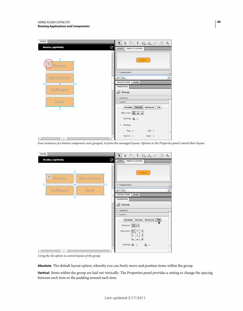
40USING FLASH CATALYST
Resizing Applications and Components
Last updated 5/17/2011
Four instances of a button component were grouped, to form this managed layout. Options in the Properties panel control their layout.
Using the tile option to control layout of the group.
Absolute The default layout option, whereby you can freely move and position items within the group.
Vertical Items within the group are laid out vertically. The Properties panel provides a setting to change the spacing
between each item or the padding around each item.

41USING FLASH CATALYST
Resizing Applications and Components
Last updated 5/17/2011
Horizontal Items within the group are laid out horizontally. The Properties panel provides a setting to change the
spacing between each item or the padding around each item
Tile The items within the group are tiled. The Properties panel provides options to adjust the direction of tiling, the
alignment of items within each cell, and vertical and horiztonal spacing.
Note: When selecting the Vertical option, the height of all items will be changed to a percentage to ensure that all items
will have an equal height. When selecting Horizontal, the widths are set to percentages. If you do not want items to have
equal heights or widths, you will need to open the project in Flash Builder and edit the code directly.
Once you apply vertical, horizontal or tile managed layout to a group, you will no longer be able to select individual
items within the group. The group’s children will still display on the Layers panel, but will have an additional icon
indicating that they are part of a managed layout. Selecting one of the layers in the group is possible, but the Properties
panel will be blank as you cannot edit the item. You can rearrange the stacking order of items in the group, but you
cannot drag any of the layers out of the group.

42
Last updated 5/17/2011
Chapter 8: Defining structure with states
Types of states
Most application projects you build will require multiple views for displaying information. The different views a user
sees when navigating through your application-- or when clicking on an interactive element (such as a button) inside
of your application-- are called "states.” There are two types of states:
Application states. A simple project might have one view that is displayed by default whenever the project is run, and
another view that displays a form for users to enter data into.
This project has 2 views defined as application states: normal, and uploadForm. You control what displays on a state by turning layers on and off in the layers panel.

43USING FLASH CATALYST
Defining structure with states
Last updated 5/17/2011
Click a thumbnail in the States panel to select that state; then use the layers panel to change what displays on the selected state.
Component states. Continuing with the same example above, a form view state may include interactive buttons to
trigger content upload. These button components can also have states, commonly called component states, which
define the look and feel of the button at a certain point, usually based on a mouse event or other user interaction.
This interactive button, named "highlightButtonSkin", has 4 component states: Up, Over, Down, and Disabled. The look and feel of the Down state, for example, is changed by selecting that state, selecting the objects you want to edit, and adjusting values in the Properties panel.
Using component states vs. application states
It is a best practice to build as much of your application using component-level states, vs. application-level states. By
encapsulating unique views and functionality of your application into component-level states, you will generally build
the most efficient, best performing application.

44USING FLASH CATALYST
Defining structure with states
Last updated 5/17/2011
You can use custom/generic components to create component-level states
Application states
Component states
custom component
button component
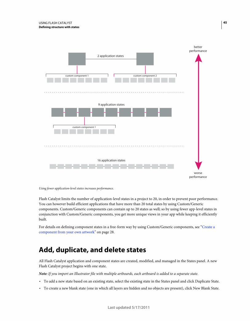
45USING FLASH CATALYST
Defining structure with states
Last updated 5/17/2011
Using fewer application-level states increases performance.
Flash Catalyst limits the number of application-level states in a project to 20, in order to prevent poor performance.
You can however build efficient applications that have more than 20 total states by using Custom/Generic
components. Custom/Generic components can contain up to 20 states as well; so by using fewer app-level states in
conjunction with Custom/Generic components, you get more unique views in your app while keeping it efficiently
built.
For details on defining component states in a free-form way by using Custom/Generic components, see “Create a
component from your own artwork” on page 28.
Add, duplicate, and delete states
All Flash Catalyst application and component states are created, modified, and managed in the States panel. A new
Flash Catalyst project begins with one state.
Note: If you import an Illustrator file with multiple artboards, each artboard is added to a separate state.
• To add a new state based on an existing state, select the existing state in the States panel and click Duplicate State.
• To create a new blank state (one in which all layers are hidden and no objects are present), click New Blank State.
2 application states
betterperformance
worseperformance
custom component 1 custom component 2
9 application states
16 application states
custom component 1

46USING FLASH CATALYST
Defining structure with states
Last updated 5/17/2011
• To delete a state, select it in the States panel and click the Delete button (trash can).
When you duplicate a state, you are not duplicating objects. The objects persist across states. You can show or hide the
objects in each state using the Layers panel.
An application or custom component can have no more than 20 states. Adding too many states can slow performance.
If the application requires more than 20 states, you can encapsulate them in custom components. For example, you
can encapsulate menu bars and other components that appear on multiple states.
In addition to improving application performance, there are other advantages to creating your different application
views using custom components.
• A custom component is more versatile than a state. It can have a unique set of properties (size, position, opacity)
in each state or parent component where it is used.
• A custom component can appear to the viewer as if they are viewing another state in the application.
• Components can be nested inside other components. Nesting components makes it possible to create a more
efficient application with many states or views.
• Editing a component in Edit-In-Place updates the component throughout the application.
Note: Some components have a fixed set of states, such as the Up, Over, Down, and Disabled states of a button. You
cannot duplicate or delete these component states, but you can hide them by hiding all layers for the selected state.
See the following for more information on creating and editing components:
“What is a component?” on page 26
Naming states
Consider the following when naming application and component states:
• To rename a state, double-click its name in the States panel, type a new name, and press Enter (Windows) or Return
(Mac OS).
• State names must begin with a letter.
• State names cannot contain spaces.
• State names cannot contain special characters such as @!#$%^&*().
Navigate between states
• To view the contents of a state, select it in the State panel. The artboard shows all visible objects in the selected state.
• To view the different states of a component, double-click the component in the artboard to enter Edit-In-Place
mode. When you edit a component in place, the States panel updates to show the states of the component.
Note: When a component is in Edit-In-Place mode, the Layers panel splits into sections. It shows layers for both the
project and any components you have open. You can drag objects from the main application layers into the component.
For more information on Edit-In-Place and, see “Editing a component with edit-in-place” on page 31.

47USING FLASH CATALYST
Defining structure with states
Last updated 5/17/2011
Show and Hide artwork in states
When you import a design document, the artwork is added to a state in Flash Catalyst.
To add additional objects to a state, do one of the following:
• Import new artwork.
• Drag assets from the Library panel to the artboard.
• Create new objects with the Flash Catalyst drawing tools.
For more information on the drawing tools, see “Creating Application Mock-ups” on page 16.
When you add objects to a state, they are present. They exist in that state. When an object is present, it can be made
visible or hidden. The following information helps identify the presence and visibility of objects in the current state
using the Layers panel:
Present and visible The name of the object is listed using dark text (present), and the eyeball icon is dark (visible).
Present and hidden The name of the object is listed using dark text (present), but there is no eyeball icon showing
(hidden). If the eyeball appears dimmed, the object’s visibility is on but its parent layer is hidden. When a parent layer
or group is hidden, its children are hidden automatically.
Not present The name of the object is listed using dimmed text (not present). The object is not present in the current
state, but it does exist in one or more other states of the application.
Use the following techniques to display or hide objects in a state:
• Turn the eyeball icon on or off to show or hide an object.
The eyeball icon is a toggle. Click the Show/Hide column (far left column) beside an object in the Layers panel to
toggle its visibility.
• Turn off the eyeball icon for a parent layer or group to hide all of its children.
• Select an object and press Delete to remove the object from the current state. If the object exists in other states, its
name turns dim in the Layers panel. If the object does not exist in any other states, it disappears from the Layers
panel.
• Turn on the eyeball icon to share an object to the current state when its name is dimmed.
• Select an object and click the Delete button (trash can) in the Layers panel to remove it from all states and the Layers
panel.
Note: You can make an object appear invisible or partially transparent by changing its Opacity value in the Properties
panel.
For more information on the Layers panel, see “Layers” on page 49.
Share objects between states
A single object can appear in multiple states. That object can have a different set of properties, such as size, position,
color, and transparency in each state where it exists. In most cases, when you modify an object, those changes apply
only to the object in the current state. Once you position and modify an object to your liking, you can quickly share
that object, along with its properties, to other states.

48USING FLASH CATALYST
Defining structure with states
Last updated 5/17/2011
This technique makes it possible to create smooth transitions from one state to the next. For example, you can create
the effect of an object fading in or out or morphing from one shape or position to another.
• To share an object to other states, select the object and choose States > Share To State. Select the states to which you
want to share the object.
• To remove an object from a specific state, select the object in one state and choose States > Remove From State.
Choose the state from which you want the object removed.
• To make an object the same in all states, modify its properties, and then choose States > Make Same In All Other
States.
Note: Some edits or changes apply to all states. Any change that affects the application hierarchy is shared across all states
automatically. For example, if you group objects or convert objects to components, the change applies to all states. If you
edit a component using Edit-In-Place mode, you edit the component definition in the project library. The changes apply
to all instances of the component in all states.
For more information on components, see “Set instance properties” on page 32.
For more information on transitions, see “Animations” on page 56.
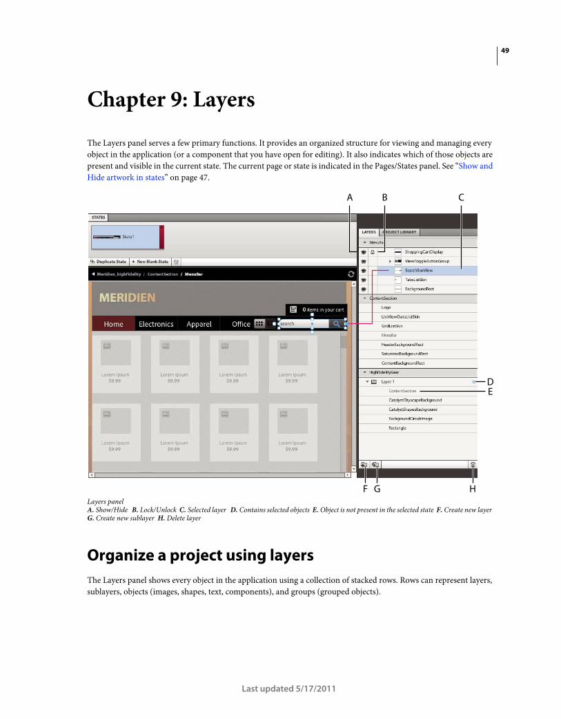
49
Last updated 5/17/2011
Chapter 9: Layers
The Layers panel serves a few primary functions. It provides an organized structure for viewing and managing every
object in the application (or a component that you have open for editing). It also indicates which of those objects are
present and visible in the current state. The current page or state is indicated in the Pages/States panel. See “Show and
Hide artwork in states” on page 47.
Layers panelA. Show/Hide B. Lock/Unlock C. Selected layer D. Contains selected objects E. Object is not present in the selected state F. Create new layer G. Create new sublayer H. Delete layer
Organize a project using layers
The Layers panel shows every object in the application using a collection of stacked rows. Rows can represent layers,
sublayers, objects (images, shapes, text, components), and groups (grouped objects).
A B C
F G H
DE

50USING FLASH CATALYST
Layers
Last updated 5/17/2011
An eyeball icon to the left of a row indicates that objects are visible in the current page or state. If an eyeball is dimmed,
it means that the row is visible, but its parent layer or group is hidden in the current state. Objects that do not exist in
the current state are dimmed with no eyeball. Objects that do exist but are hidden in the current state are regular text
with no eyeball. A padlock icon in the second column of a row means that it is locked. A locked layer can be viewed
but not edited. Locking layers prevents content from being selected or moved accidentally. The target layer for new
content that you add to the artboard is shaded light blue. The currently selected row/object is a slightly darker shade
of blue. A small blue square means that the row includes a selected object. You can follow the blue squares as you drill
down to find the selected item.
Note: If you are working on a project that was modified or created by a developer in Flash Builder, you may encounter
layers whose objects have their visibility set by ActionScript code so that they can be shown or hidden based on user
actions. In this case, Catalyst will display an icon in the Lock column that shows that the visibility of those items is bound
by code.
• To expand or collapse a layer or group, click the small arrow.
• To rename the row representing a layer, object, or group, double-click the current name, type a new name, and
press Enter (Windows) or Return (Mac OS).
• To add a new layer, click the Create New Layer or Create New Sublayer button.
• You can delete a layer, object, or group from all states in the application. Select its row and click the Delete button
(trash can) in the Layers panel. The object is removed from every state.
Flash Catalyst Layer panel terminology
The following list summarizes how Flash Catalyst layer terminology compares to layer terminology in Illustrator,
Photoshop, and Fireworks.
• A Flash Catalyst Layer is the same as an Illustrator Layer, a Photoshop Layer Group, and a Fireworks Layer Folder.
• A Flash Catalyst Object is the same as an Illustrator Object, a Photoshop Layer, and a Fireworks Layer.
Selecting objects in the Layers panel
You can select layers, objects, or groups (grouped objects) in the artboard or in the Layers panel.
• To select a single object, click its row in the Layers panel.
Note: Use the Select or Direct select tool to select an object or group in the artboard.
• Shift+click to select a contiguous range of objects in the Layers panel.
• To select non-contiguous objects in the Layers panel, Control+click (Windows) or Command+click (Mac) two or
more objects.
Note: Shift+click to select multiple objects in the artboard.
• Selecting a layer in the Layers panel selects the layer and all of its children.
• Selecting a group in the Layers panel selects the group as a single object. The group’s Properties are active in the
Properties panel.
• To select the individual children in a group, select their individual rows in the Layers panel.
Note: Use the Direct Select tool to select the children of a group in the artboard.

51USING FLASH CATALYST
Layers
Last updated 5/17/2011
Manage artwork using layers
When you import a design document created in Adobe Illustrator, Photoshop, or Fireworks (FXG), Flash Catalyst
maintains the integrity of the original design. With your artwork organized into layers, you can begin creating the
different pages, components, and component states for the application.
Use the Layers panel to determine which artwork is visible, hidden, or present on each page.
• Click the eyeball icon to hide or show an object in the current state. When you hide an object, it is still present in
the current state, but not visible.
• To remove an object from the current state, select it and press Delete. The object is no longer present in the current
state. If the item still exists in another state, the item’s name appears dimmed in the Layers panel. You can return
it to the current state by clicking its Show/Hide button.
• You can use the artwork in multiple layers to create interactive components, such as a button or scroll bar.
Components can have multiple states, such as up, over, down, and disabled. When you edit a component in Edit-
In-Place, the Layers panel expands to show the objects in the selected component. Use the Layers panel to hide or
show artwork in each component state.
• As you modify the artwork in a page or component state, each object’s size, position, and visual attributes are
remembered for each state. You can have the same object appear differently from one state to another. For more
information, see “Types of states” on page 42.
• To change the stacking order of objects in the application, you can drag rows up or down in the Layers panel. You
can also change the stacking order of objects within a layer or group. Drag the object row or select the object and
choose Modify > Arrange > Bring To Front, Bring Forward, Send Backward, or Send To Back.
Note: The stacking order of layers is constant across all states. Unlike object properties, you can't have a different stacking
order in different states.
See the following for more information on components and editing objects.
“Editing a component with edit-in-place” on page 31
“Creating Application Mock-ups” on page 16

52
Last updated 5/17/2011
Chapter 10: Create navigation and behavior with interactions
Interactions are events that occur in response to some user action, such as the click of a button. For example, the
application can display a new state when a user clicks a button. In this case, you define an interaction triggered by
clicking that button.
With the "latest" navigation button selected on the artboard, the Interactions panel is used to assign an On Click interaction that triggers a transition to the "latest" view state.
Flash Catalyst has many built-in interactions that you can quickly add to components or grouped objects, including:
• Transition from one component or application state to another
• Trigger an action sequence, such as playing a sound, moving an object, or playing an animation
• Go to a URL
• Play, pause, or stop a video clip

53USING FLASH CATALYST
Create navigation and behavior with interactions
Last updated 5/17/2011
From the Interactions panel, choose the event that triggers the interaction, such as On Click.
Add interactions
You can add interactions to components, optimizedgraphics, video players, or grouped artwork. Use groups to hold
interactions when you don't need a reusable component.
1 Select a component or group.
2 Click Add Interaction in the Interactions panel.
3 Choose an event that triggers the interaction, such as On Click or On Roll Over.
4 Choose an interaction, such as Play Transition to State or Go To URL.
• If you choose Play Action Sequence, edit the action sequence in the Timelines panel. For more information see
“Edit action sequences” on page 62.
• If you choose Go To URL, enter the URL, and select a window for displaying the web page.
• If you add an interaction used to control video, select a video to control. This video must exist in the project.

54USING FLASH CATALYST
Create navigation and behavior with interactions
Last updated 5/17/2011
• If you select Play Transition to State, choose which state to view when the event occurs.
You can also choose another component and play a transition to its state by selecting the component and then
selecting its state. You can only play transitions to states in other custom components.
Note: By default, new interactions apply to every instance of the component or group, unless you indicate a specific
state when adding the interaction. The default setting is When In Any State. When an interaction is set to function
only in a specific page or component state, you are creating a conditional interaction.
Target Interactions
You can build interactions whereby components can trigger transitions to other states in components other than the
parent. For example, a button in a component can be used to trigger a state change in another component.
To create an interaction that targets another component, follow these steps:
1 Double-click the component that contains the component that will initiate the interaction.
2 Select the component to which you wish to add the interaction.
3 On the Interactions panel, choose Add Interaction.
4 Select the event you wish to use, and choose Play Transition to State.
5 Select Choose Target.
6 Choose Select Other Item.
7 Use your mouse to select the other component. You can use the Breadcrumbs bar to exit editing mode for the
component if you need to select a component at a different level in the application.
8 Click Select.
9 Choose the state of the other component.
10 Click OK.
You can only target states in other custom components.
On Application Start interactions
You can create an interaction that plays automatically when someone starts the application. This is called an On
Application Start interaction. For the interaction type, you can choose to play a transition to state, go to a URL, control
a video, or play an action sequence. For example, you use an On Application Start interaction to trigger an action
sequence that plays a SWF file. When you add an action sequence, you can use the create an On Application Start
interaction, make sure that nothing is selected in the artboard when you click Add Interaction. The actions you define
occur as soon as the application starts.
To do this:
1 Import your SWF file to your Flash Catalyst project.
2 Make sure nothing is selected in the artboard.
3 In the Interactions panel, click Add Interaction.
Note: When nothing is selected in the artboard, On Application Start appears as the default event to trigger the
interaction.
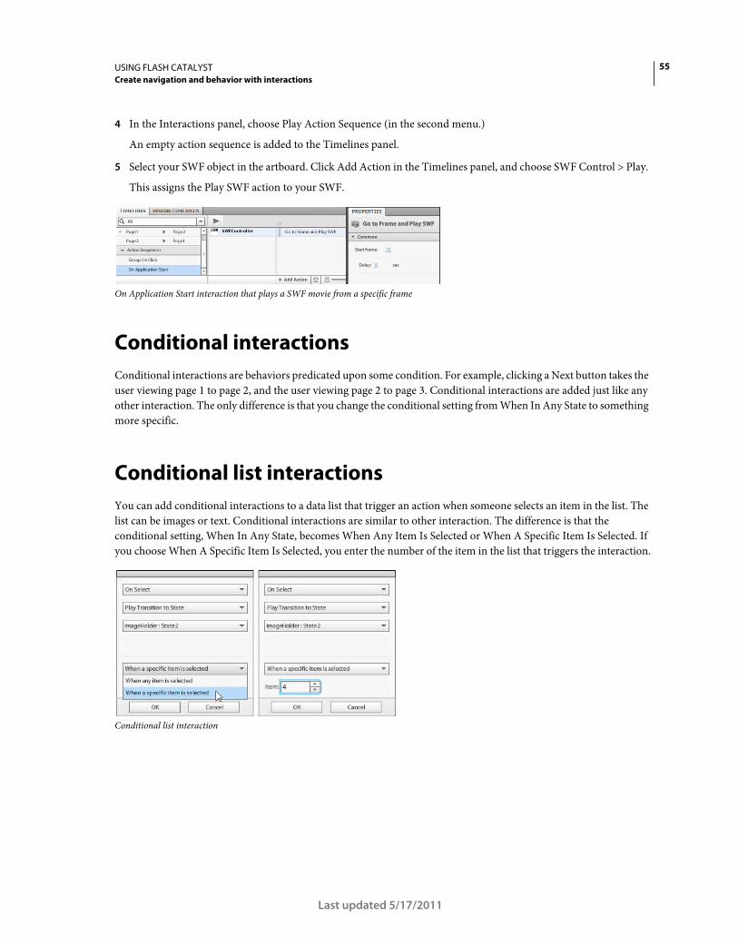
55USING FLASH CATALYST
Create navigation and behavior with interactions
Last updated 5/17/2011
4 In the Interactions panel, choose Play Action Sequence (in the second menu.)
An empty action sequence is added to the Timelines panel.
5 Select your SWF object in the artboard. Click Add Action in the Timelines panel, and choose SWF Control > Play.
This assigns the Play SWF action to your SWF.
On Application Start interaction that plays a SWF movie from a specific frame
Conditional interactions
Conditional interactions are behaviors predicated upon some condition. For example, clicking a Next button takes the
user viewing page 1 to page 2, and the user viewing page 2 to page 3. Conditional interactions are added just like any
other interaction. The only difference is that you change the conditional setting from When In Any State to something
more specific.
Conditional list interactions
You can add conditional interactions to a data list that trigger an action when someone selects an item in the list. The
list can be images or text. Conditional interactions are similar to other interaction. The difference is that the
conditional setting, When In Any State, becomes When Any Item Is Selected or When A Specific Item Is Selected. If
you choose When A Specific Item Is Selected, you enter the number of the item in the list that triggers the interaction.
Conditional list interaction
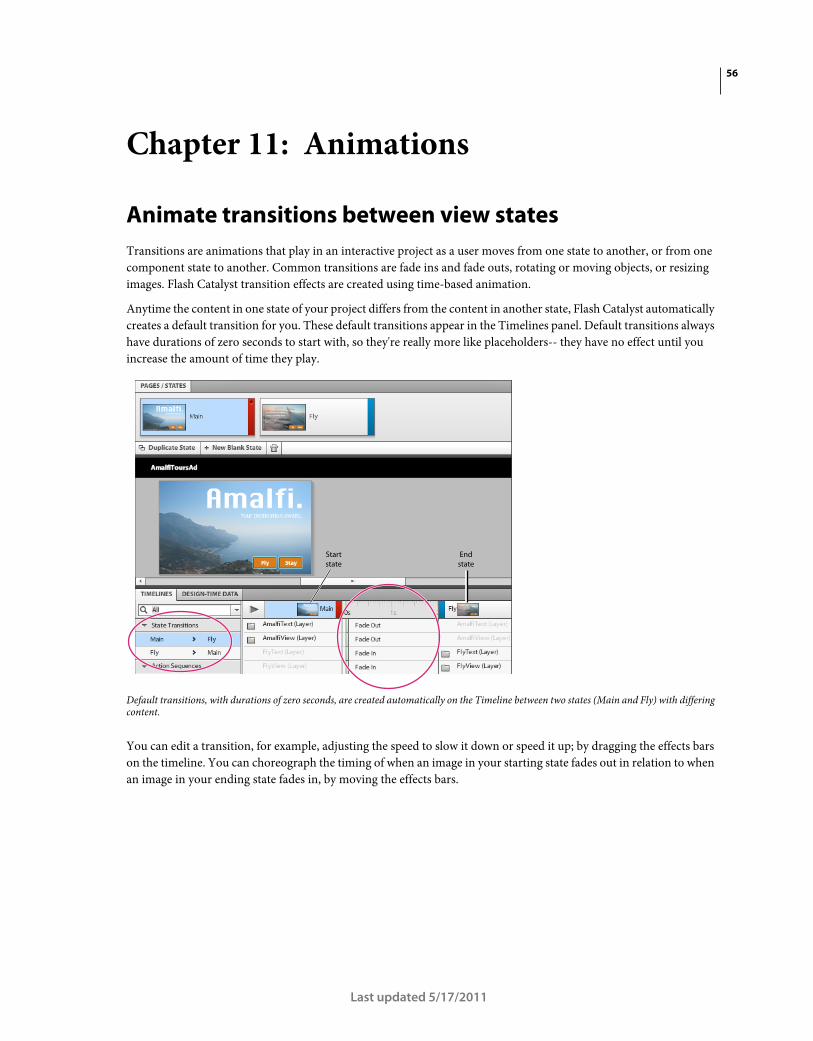
56
Last updated 5/17/2011
Chapter 11: Animations
Animate transitions between view states
Transitions are animations that play in an interactive project as a user moves from one state to another, or from one
component state to another. Common transitions are fade ins and fade outs, rotating or moving objects, or resizing
images. Flash Catalyst transition effects are created using time-based animation.
Anytime the content in one state of your project differs from the content in another state, Flash Catalyst automatically
creates a default transition for you. These default transitions appear in the Timelines panel. Default transitions always
have durations of zero seconds to start with, so they're really more like placeholders-- they have no effect until you
increase the amount of time they play.
Default transitions, with durations of zero seconds, are created automatically on the Timeline between two states (Main and Fly) with differing content.
You can edit a transition, for example, adjusting the speed to slow it down or speed it up; by dragging the effects bars
on the timeline. You can choreograph the timing of when an image in your starting state fades out in relation to when
an image in your ending state fades in, by moving the effects bars.
Startstate
Endstate

57USING FLASH CATALYST
Animations
Last updated 5/17/2011
Adjusting the Fade Out and Fade In transitions, to increase the time it takes to move between the start and end states, creating a more gradual transition.
Note: The type of default transition (Fade, Move, and so on) depends on how each instance of an object differs from one
state to another.
The following transition effects are added for you automatically:
• Fades (fade in or fade out)
• Move
• Rotate
• Resize
Transition effects are not added when you change the following properties:
• Stroke or fill
• Opacity
• Corners
• Blend modes
• Add filters
• Edit the text in a text object (same text object with different type in each state)
• Text properties
Edit transitions
1 In the States panel, select either the beginning or ending state of the transition.
Note: To edit a component transition, double-click the component to open it in Edit-In-Place mode. The component
transitions appear in the Timelines panel.
2 Select a transition in the State Transitions section of the Timelines panel.
Startstate
Endstate

58USING FLASH CATALYST
Animations
Last updated 5/17/2011
3 Click Smooth Transition.
The default transition changes from zero to one half second, creating a smooth transition between states.
Note: You can also click the Down Arrow beside the Smooth Transition button and enter a different duration for the
transition.
4 To shorten or lengthen the duration of a transition, drag the resize handle. To move the transition to begin earlier
or later, drag the transition effects bar rather than the resize handle.
A. A green dot means that a transition has been edited B. Play transition button C. Drag the effects bar to adjust transition timing D. Specify duration of effect (Fade in this case) by dragging the resize handle
5 To preview the transition, click the Play button (right-pointing arrow) in the Timelines panel.
You can also use the Properties panel to define properties for a selected transition.
Note: Transition effect bars are color coded. Effect bars are green. The selected effect is blue.
Transition Options
You can set transitions to automatically reverse themselves or repeat, and control how transitions behave when
interrupted.
Repeat Transitions
To understand reversing a transition, consider an example where you have a project with two states with an object in
each state. If you set up a transition to move the object when going from state 1 to state 2 with a duration of one second,
you would often want the same one second transition set to move the object back to its original position when going
from state 2 back to state 1. You can do this easily by clicking the Automatic Reverse checkbox on the Properties panel
when you have the transition selected. A double-headed arrow will appear on the transition to inform you that the
reverse is activated.
Interrupting Transitions
On occasion, you may have a transition that can be interrupted by another transition. For example, while the transition
from state 1 to state 2 is playing, your user might click a button to return to state 1. You can control what should occur
in this case by selecting the desired setting on the Properties panel for the transition. You can choose Smooth, in which
case the transition will stop and then play from its current location, or Snap to End, which will cause the object to
“jump” to the end of transition and play from there.
A B C D

59USING FLASH CATALYST
Animations
Last updated 5/17/2011
Repeating Entire Transitions
Individual effects can be set to repeat within transitions, but you can also configure the entire transition to repeat by
selecting the Repeat checkbox on the Transition’s Properties panel and then setting the desired options.
Common effect propertiesDuration Determines how long the effect lasts from start to finish.
Delay Delays the start of the effect relative to the start of the transition or action sequence.
Repeat Repeat the effect a specified number of times. Select Forever to repeat the effect continuously.
To and From Opacity Set the start and end opacity of an object in a fade in/fade out effect.
X and Y Position Set the start and end position of an object in a move effect.
Width (W) and Height (H) Set the start and end size of an object in a resize effect.
To and From Angle Set the start and end angle of an object in a rotation effect.
Easing Add gradual acceleration or deceleration during an animation, which makes your animations appear more
realistic.
Changing the origin of the transition
Move, Resize, and Rotate transitions allow you to specify the origin point. If you select a move transition, you can
choose State Transition to have the object move from its location in one state to its location in the other state. You can
also choose Relative and specify the number of pixels on the x and y axes to which the object should move in the
transition from , or Specific Location to choose the point to which it should move.
For a Resize transition, you can choose Relative to have the object resize from its size in the first state to its size in the
second, or Specific Size to set the width and height to which it should change. The Rotate transition similarly allows
you to set either Relative or Specific Angle.
Easing transitions
You can achieve more realistic looking movements by applying easing to your effects. Easing consists of two phases:
the acceleration, or ease in phase, followed by the deceleration, or ease out phase.
Easing is added in the Properties panel and there are several easing options:
Default Applies a constant rate of change from start to finish.
Linear Starts out slow, quickly easing into the effect. It then maintains a constant rate until just before the end of the
effect when the rate slows down, easing out of the effect.
Sine Eases in and accelerates to a mid point. It then immediately begins decelerating, or easing out.
Power Power is similar to Sine because it eases in to a point and then begins easing out. But with the Power option,
you can also set the Exponent property. A higher exponent value creates greater acceleration and deceleration.
Elastic Causes a moving object to snap back and jiggle one it reaches its destination.
Bounce Causes the moving object to reach its destination, and then bounce backward before settling into its final
position.

60USING FLASH CATALYST
Animations
Last updated 5/17/2011
Add extra effects to a transition
You can add more than one effect to the same objects to create more advance transitions. For example, an object can
fade in, rotate in 3D, and play a sound effect at the same time.
1 Open the Timelines panel.
2 Select a transition in the State Transitions section of the Timelines panel.
3 Select an object in the Timeline.
4 Click Add Action, and choose an action or effect from the pop-up menu.
5 Adjust the effect properties in the Timeline or Properties panel.
The following is a list of the effects and actions in the Add Action pop-up menu:
Video Control Play, pause, or stop a video. Import your video and add a video player before you can control video
playback. For more information, see “Video and sound” on page 90.
SWF Control Play or stop a SWF movie. You can also add play or stop a SWF movie at a specific frame in the SWF
movie. Set the Start Frame value in the Properties panel.
Set Component State Display a specified state of a component. Specify which state to display in the Properties panel.
Set Property Change a property of a component or group as the result of a user interaction. Specify which property to
change in the Properties panel.
Fade Fade an object from one opacity setting to another (fade in or fade out). Set the From and To Opacity values in
the Properties panel.
Sound Effect Play any sound effect in the project library. In the Properties panel, set the sound to play once or repeat.
If you choose Repeat, you can then set the Count value (number of repeats). You can choose Forever to make the sound
play continuously in a loop.
Move Move an object from one location to another. In the Properties panel, choose Relative to move the object a
specific number of pixels from its starting position. You can also choose Specific Location to move the object to an
exact X and Y location. When used in a transition, the effect is based on position in the old and new states.
Resize Resize an object. In the Properties panel, choose Relative to change the height and width to a specified
percentage of its current size. You can also choose Specific Size to change the height and width to an exact number of
pixels. When used in a transition, the effect is based on size in the old and new states.
Rotate Rotate an object. In the Properties panel, choose Relative to rotate the object relative to its current angle (if the
object begins rotated). Choose Specific Angle to rotate the object to a specific angle (starting from 0°). When used in
a transition, the effect is based on angle in the old and new states.
Rotate 3D Rotate an object in three dimensions. Using the Properties panel, you can set From and To angles for
rotation around the object’s center, a vertical axis, and a horizontal axis.
Transitioning Fills, Strokes, Gradients and Filters
You can change an object’s fill and stroke during a transition. For example, if you had a star with an orange fill in one
state and a blue fill in another state, you can set a transition to animate the color change. This transition is added
automatically to the Timeline when you have an object with different colors between states. The same applies to
strokes: if you change an object’s stroke between states, a Solid Color Stroke transition will be added to the Timeline.
Gradient transitions are likewise added automatically. However, a gradient transition will only be added if the gradient
has the same number of color spots in each state, and the fill of the shape must be a gradient in both states - you cannot
animate between a solid fill and a gradient fill. Both gradient fills and strokes can be used.

61USING FLASH CATALYST
Animations
Last updated 5/17/2011
You can also animate filters. If you set a filter on an object in one state, and then change any of the filter’s properties
in another state, a transition will be added to the timeline.
Smooth transition options
Clicking Smooth Transitions in the Timelines panel adds the default Smooth Transition settings to the effects in the
Timeline. You can change the default settings in the Smooth Transition Options dialog box.
Smooth Transition Options dialog box
Duration Sets the overall time of the transition from start to end. The start of the transition is at 0 seconds in the
Timeline, not when the first effect begins playing.
Simultaneous Applies smooth transitions to each effect equally, using the value you set in the Duration field. Each
effect begins and ends at the same time.
Smart Smoothing Adjusts the duration and delay (start time) of each effect, creating a series of staggered effects. The
effects play at different times over a duration you specify. Flash Catalyst uses a logical order for effects, beginning with
objects fading out. After objects fade out, all resize and move effects play, followed by objects fading in.
Overwrite Existing Effects Replaces existing transition settings with the settings in the dialog box.
Trigger standalone animations using action sequences
Create action sequences
Action sequences are interactions that trigger one or more actions. Action sequences occur within a single state, so
they can play over and over. For example, you can have an object that animates each time a user moves the pointer
over it.
The types of actions that are available include:
• Play, pause, or stop a video
• Control the playback of a SWF movie
• Set the component state
• Set the properties of an object
• Fade an object
• Add a sound effect
• Move, resize, or rotate an object
• Rotate an object in 3D

62USING FLASH CATALYST
Animations
Last updated 5/17/2011
Action sequences are added to components or groups using the interactions panel.
Note: To add an action sequence to a component or group within another component, double-click the parent component
to open it in Edit-In-Place mode.
1 Select the component or group to which you’ll add the action sequence.
2 Click Add Interaction in the Interactions panel.
3 Choose a method to trigger the action sequence.
4 Choose the Play Action Sequence interaction.
5 Choose the state where the action sequence occurs (or leave the default setting When In Any State).
6 Click OK.
An empty action sequence is added to the Timelines panel and ready for editing. Action sequences are nothing
more than sets of effects, so you can create the sequence by clicking Add Action, selecting the effect you wish to
add, and settings its properties and duration. You can have individual actions repeat, or set the entire sequence to
repeat by using the Action Sequence’s Properties panel.
Edit action sequences
Action sequences are edited in the Timelines panel. Editing an action is similar to editing a transition.
1 In the Timelines panel, select the action sequence you want to edit.
2 Select an object in the artboard, click Add Action, and choose an action or effect from the pop-up menu.
3 Repeat step 2 for any other objects, or add additional actions to the same object.
The Timelines panel displays the effects bar for each action you add to the sequence.
Action sequence in the Timelines panel
4 To shorten or lengthen the duration of the effect, drag the resize handle. To move the action to begin earlier or later,
drag the effects bar rather than the resize handle.
5 To preview the action sequence, click the Play button (right-pointing arrow) in the Timelines panel.
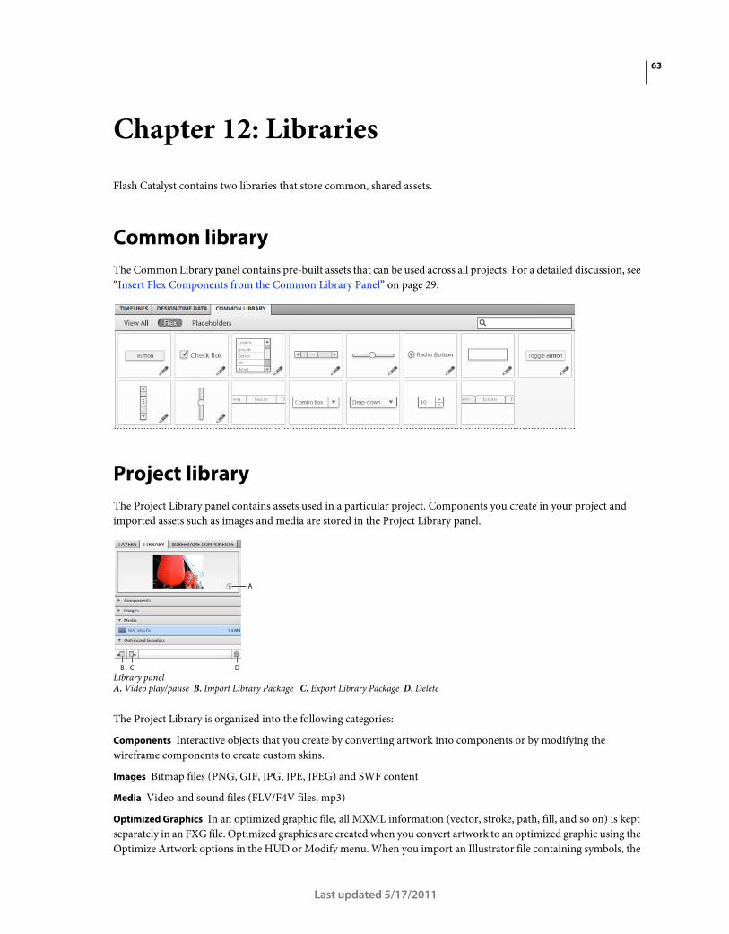
63
Last updated 5/17/2011
Chapter 12: Libraries
Flash Catalyst contains two libraries that store common, shared assets.
Common library
The Common Library panel contains pre-built assets that can be used across all projects. For a detailed discussion, see
“Insert Flex Components from the Common Library Panel” on page 29.
Project library
The Project Library panel contains assets used in a particular project. Components you create in your project and
imported assets such as images and media are stored in the Project Library panel.
Library panelA. Video play/pause B. Import Library Package C. Export Library Package D. Delete
The Project Library is organized into the following categories:
Components Interactive objects that you create by converting artwork into components or by modifying the
wireframe components to create custom skins.
Images Bitmap files (PNG, GIF, JPG, JPE, JPEG) and SWF content
Media Video and sound files (FLV/F4V files, mp3)
Optimized Graphics In an optimized graphic file, all MXML information (vector, stroke, path, fill, and so on) is kept
separately in an FXG file. Optimized graphics are created when you convert artwork to an optimized graphic using the
Optimize Artwork options in the HUD or Modify menu. When you import an Illustrator file containing symbols, the
A
B C D

64USING FLASH CATALYST
Libraries
Last updated 5/17/2011
symbols are automatically converted to optimized graphics. For more information, see “Optimizing graphics” on
page 70.
Note: When you import an Illustrator, Photoshop, or FXG file, its bitmap images are stored in a separate subfolder within
the Images category.
Manage and place artwork from the Library panel
After importing artwork or creating components, you can reuse these objects in other parts of your project. When you
drag a library item to the artboard, you are adding an instance of the library asset to the application. A new object is
created in the target layer folder in the Layers panel. Best practice is to give a descriptive name to each object in the
Layers panel. That instance of the asset persists across the other states in the application. After adding the asset to the
application, you can share it to other states. You can show and hide the asset, or delete it from a specific state. For more
information, see “Share objects between states” on page 47.
If you drag another copy of the same asset to the artboard, you have two instances of the same asset in the application.
It appears twice in the Layers panel. In most cases, you don’t want to add two instances of the same asset. If you want
the same asset to appear in more than one state, add one instance and share it to other states.
Note: If you are editing a component in Edit-In-Place mode, the asset is added to the component, not the application. If
you want the asset to appear in the component and in the main application, you can use two instances of the asset. For
more information, see “Editing a component with edit-in-place” on page 31.
• To rename an item in the Library panel, double-click its name, type a new name, and press Enter (Windows) or
Return (Mac OS).
• To preview an image in the Library panel, select it. A preview appears at the top of the panel. To preview an audio
or video clip in the Library panel, select it and click the Play button that appears.
• To delete an item from the project, select it in the Library panel, and click the Delete button (trash can). Deleting
an item from the Library removes all instances of the item from the project.
Note: The Layers and Library panels are not linked. Renaming an instance of an item in the layers panel does not affect
the original item definition name in the Library panel. When you change the properties of a library item in one state, you
are not affecting the properties of the asset in other states. However, if you edit a component in Edit-In-Place mode, you
edit the item definition in the project library. Editing the item definition changes every instance of the item in all states.
Export and import a library package
The Library panel facilitates collaboration among the design team. Exporting a library package creates a single package
containing all of the library items in the project. The package is saved as an FXPL file. FXPL packages can be used to
distribute your project assets to teams. Assets can include logos, video content, components, and so on. Sharing the
FXPL reduces duplication of work.

65USING FLASH CATALYST
Libraries
Last updated 5/17/2011
If you are creating a data-centric application, your FXPL document can be imported into Flash Builder by a Flex
developer.
• To export a library, click the Export Library Package button. Specify a name and location for the file, and click Save.
• To import a library, click the Import Library Package button. Browse to locate the file, select it, and click Open.
Note: Before you export the library package, be sure that your assets, including components, have descriptive names.
No developer wants to receive a library package filled with assets named, button1, button2, and so on.
For more information, see “Workflows between Flash Catalyst and Flash Builder” on page 4.

66
Last updated 5/17/2011
Chapter 13: Replacing repeated artwork
Flash Catalyst allows you to replace repeated artwork with a reusable component. Design comps often contain artwork
representing a repeating element, such as a button in a navigation bar. You can convert one instance of the artwork to
a component, and then apply that component to the repeated instances.
Create an instance of a component
The first step in reusing components is to create a single instance of the component, which can be used on the repeating
items.
1 Select the artwork that makes up one instance of the repeated element.
2 Select Choose component from the HUD and select the appropriate component type.
3 Name the component.
4 If necessary, edit the component to set up any required parts or complete any desired modifications on the
component.
5 Rename the layer.
Replace the other artwork
Once you have an instance of the component, you can use it to replace other artwork in the repeating element.
1 Select the artwork representing the repeated element.
2 Right-click the artwork and choose Replace with...
3 Select the component you created in the steps above.

67USING FLASH CATALYST
Replacing repeated artwork
Last updated 5/17/2011
Using Replace with... to replace wireframe placeholder art with a custom button component.
4 Repeat steps 1-3 to replace the remaining artwork with the component.
Ian Giblin provides a great tutorial on Adobe Developer Connection, covering use of Flash Catalyst and Illustrator to
create high fidelity prototypes.

68
Last updated 5/17/2011
Chapter 14: Aligning graphics
Flash Catalyst offers five main aids to assist you while drawing and aligning graphics. These include the Align panel,
rulers, custom guides, a visible grid for measuring and aligning artwork, and the Properties panel for positioning and
sizing objects down to the exact pixel.
Align Two or More Objects to One Another
To align multiple objects to one another, perform the following steps:
1 Select all of the items you wish to align.
2 Use the Align panel’s Align options to align the objects by their horizontal or vertical left or right edges or their
centers.
3 Use the Align panel’s Match Size options to set the objects to the same height, width, or both.
Note: When resizing components, be aware that objects within the component will not resize unless they have
constraints set. For more information on this, see “Resizing Applications and Components” on page 36
If you select two or more objects that have been rotated and then use the match width command, the widths of the
objects will be matched, but the heights may not be. The same is true for matching widths.
If you select three or more objects, you can also use the Distribute options in the Align panel to distribute the shapes
by their top, left, right or bottom edges or the vertical or horiztonal centers. You can use the Space options to equalize
the vertical or horiztonal space between the objects.
Align Objects to the Artboard
If you select one or more objects, you can also allign them to the artboard. You must check the Relative to Artboard
option at the top of the panel, even if you have only a single object selected.
Note: Aligning multiple objects to the artboard will likely cause them to overlap. Use the Layers panel to change the
stacking order of the objects. For more information on this, see “Manage artwork using layers” on page 51
69USING FLASH CATALYST
Aligning graphics
Last updated 5/17/2011
Show and hide rulers
By default, rulers appear above and to the left of the artboard. The rulers help you position artwork, but they're even
more useful when placing custom guides. You can hide the ruler to gain a little extra room in the workspace, but they
take up so little space you may want to leave them turned on all the time.
To hide rulers, choose View > Show Rulers to deselect it and hide the rulers.
Edit grid and guide settings
Using the grid is similar to placing a transparent sheet of graph paper over the artboard. The grid includes perfectly
spaced vertical and horizontal lines that help you align and draw perfectly measured artwork.
To change the default settings for all grid lines and guides, choose View > Grid & Guide Settings.
Set guides for precise drawing
Guides are another great tool for aligning and placing one or more objects in the artboard. Unlike the grid, you can
place horizontal or vertical guides anywhere you want. Use the ruler for exact placement of your custom guides. The
same guides persist across all states in the application.
To add a custom guide, position the cursor over the horizontal or vertical ruler, and drag toward the artboard. You
will see a guide appear. Release the mouse button to place the guide in the artboard.
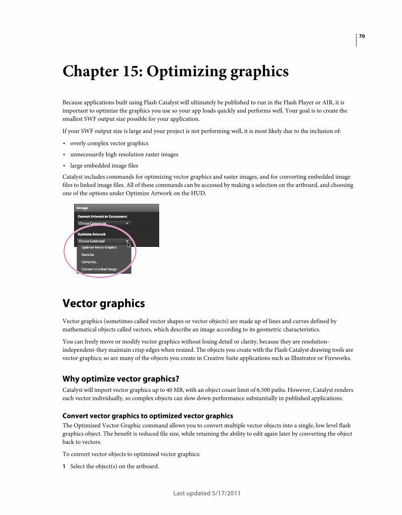
70
Last updated 5/17/2011
Chapter 15: Optimizing graphics
Because applications built using Flash Catalyst will ultimately be published to run in the Flash Player or AIR, it is
important to optimize the graphics you use so your app loads quickly and performs well. Your goal is to create the
smallest SWF output size possible for your application.
If your SWF output size is large and your project is not performing well, it is most likely due to the inclusion of:
• overly complex vector graphics
• unnecessarily high resolution raster images
• large embedded image files
Catalyst includes commands for optimizing vector graphics and raster images, and for converting embedded image
files to linked image files. All of these commands can be accessed by making a selection on the artboard, and choosing
one of the options under Optimize Artwork on the HUD.
Vector graphics
Vector graphics (sometimes called vector shapes or vector objects) are made up of lines and curves defined by
mathematical objects called vectors, which describe an image according to its geometric characteristics.
You can freely move or modify vector graphics without losing detail or clarity, because they are resolution-
independent-they maintain crisp edges when resized. The objects you create with the Flash Catalyst drawing tools are
vector graphics; so are many of the objects you create in Creative Suite applications such as Illustrator or Fireworks.
Why optimize vector graphics?
Catalyst will import vector graphics up to 40 MB, with an object count limit of 6,500 paths. However, Catalyst renders
each vector individually, so complex objects can slow down performance substantially in published applications.
Convert vector graphics to optimized vector graphics
The Optimized Vector Graphic command allows you to convert multiple vector objects into a single, low level flash
graphics object. The benefit is reduced file size, while retaining the ability to edit again later by converting the object
back to vectors.
To convert vector objects to optimized vector graphics:
1 Select the object(s) on the artboard.

71USING FLASH CATALYST
Optimizing graphics
Last updated 5/17/2011
2 On the HUD, choose Optimize Artwork>Optimize Vector Graphics.
3 A new graphic is added to the Optimized Graphics section of the Project Library; the optimized graphic can be
renamed by double-clicking its name.
To edit the original vector objects within an optimized vector graphic:
1 Select the object(s) on the artboard.
2 On the HUD, choose Optimize Artwork>Break Apart Graphic.
Convert vector graphics to raster images
The Rasterize command allows you to convert vector objects to a single raster image. This reduces the size and
complexity of your graphics substantially, but does not allow the added benefit of being able to revert back to vectors
later for continued editing. If you need to retain the flexibility of editing your vector graphics, use the Convert to
optimized graphic command.
To convert a vector object to a rasterized image:
1 Select the object(s) on the artboard.
2 On the HUD, choose Optimize Artwork > Rasterize.
3 A .png file containing the raster image is added to the Project Library.
Bitmap (raster) graphics
Raster images-sometimes called bitmap images-use a rectangular grid of picture elements (pixels) to represent images.
Each pixel is assigned a specific location and color value. When working with raster images, you edit pixels rather than
objects or shapes. Raster images are the most common electronic medium for continuous-tone images, such as
photographs or digital paintings, because they can more efficiently represent subtle gradations of shades and color.
Raster images are resolution-dependent-that is, they contain a fixed number of pixels. As a result, they can lose detail
and appear jagged if they are scaled to high magnifications. Images you create in Creative Suite applications such as
Photoshop are usually raster images.
Why optimize raster images?
Catalyst will import raster images with a maximum size of 2048 x 2048 pixels (20 million total pixel count). However,
large raster images (for example, high resolution images created for print output, or large masked images) can slow
down application performance unnecessarily. Always try to use raster images that are 72 ppi and as small as possible.
Compress raster images
The Compress command allows you to add compression to a raster image. This can reduce the size of your project
substantially, but as with any compression work, the balance between image quality and optimum file size should
always be considered. When you compress a raster image, a compressed copy is added to the Library panel, and the
original uncompressed image remains in the Library panel.
To compress a raster image:
1 Select the image on the artboard.
2 Choose Optimize Artwork > Compress... on the HUD.
3 Enter the amount of compression.

72USING FLASH CATALYST
Optimizing graphics
Last updated 5/17/2011
Embedded vs. linked images
By default the images you add to your application are embedded and published as part of the SWF file. To reduce the
size of your application, you can link images. Linking an image stores it outside the application (SWF file) and loads
the image when the application is run. If you link assets, then copy the linked files to the web server where you deploy
your application (SWF file).
To convert an image to a linked or embedded image:
1 Select the image on the artboard.
2 Choose Convert to Linked Image under Optimize Artwork on the HUD, or by right-clicking the name of the image
in the Project Library panel.
3 To convert a linked image back to an embedded image, right-click the linked image icon next to the image name
on the Project Library panel, and choose Embed Image.
Linked images display an icon next to their name on the Project Library panel
Optimizing tips
The following are some things to consider when building an optimized application.
Use efficient structure
• Use a single instance of an asset and share it to states. For more information, see “Share objects between states” on
page 47.
• When adding multiple videos to a project, use one instance of a video player. You can edit its properties in different
states to display and control a different source video. For more information, see “Add video” on page 90.
• Limit the number of main application states in your application. To create more views or screens, use the different
states of a custom component. Use nested components to create sites with more depth of content and fewer pages.
For more information, see “What is a component?” on page 26.
Optimize before import
There are several ways to optimize the performance of your application before bringing artwork into the project.
• Make sure that bitmap/raster images are 72 dpi.

73USING FLASH CATALYST
Optimizing graphics
Last updated 5/17/2011
• Make sure that the color mode is RGB.
• Use Align To Pixel Grid in Illustrator.
When designing artwork for Flash Catalyst using Adobe Illustrator, you can use the Flash Catalyst document
profile to automatically apply optimum settings. The profile applies settings for document size, color mode, PPI,
and Align To Pixel Grid. In Illustrator, click Flash Catalyst Document in the Create New section of the Welcome
screen. You can also choose File>New to open the New Document window. Click to open the New Document Profile
menu and select Flash Catalyst.
• When creating videos, use a preset or codec and compression settings that are optimized for the web.
Learn more from the community
Ian Giblin wrote an article on the Adobe Developer Center covering best practices for preparing art in Illustrator for
use in Flash Catalyst. See Best Practices for using Adobe Illustrator with Flash Catalyst CS5.5.
Tara Feener wrote a post on optimizing on the FlashCats blog. See Optimizing for smaller SWF output.

74
Last updated 5/17/2011
Chapter 16: Round-trip editing of artwork
Using Flash Catalyst round-trip editing, you can launch and edit your application artwork using the rich editing
capabilities of Adobe Illustrator CS5 and Adobe Photoshop CS5. Open the artwork in Illustrator or Photoshop, make
your edits, and then return to Flash Catalyst.
Note: FXG is the rich graphics interchange format used for round-trip editing. For more information on FXG files, see
Working with FXG.
• Use Illustrator to round-trip edit bitmaps and vectors. Use Illustrator to edit a single object, a mixed selection of
objects, or a group. Using Illustrator, you can also edit the following components: Button, Checkbox, Radio Button,
Horizontal Scrollbar, Vertical Scrollbar, Text Input, Toggle Button, Horizontal Slider or Vertical Slider. You cannot
round-trip edit Custom/Generic components.
Note: You cannot round-trip edit more than one component at a time. You cannot round-trip edit graphics that have
been optimized by choosing Optimize Vector Graphic.
• Use Photoshop to edit bitmap images, a selection of multiple images, or a group containing only images.
Note: If a component is part of a mixed selection or group, the custom component appears as a non-editable
placeholder layer in Photoshop or Illustrator.
• When you edit a vector (shape or text), changes apply only to the state in which you select the vector.
• Make all structural changes to objects in Flash Catalyst. Changing the structure of objects during round-trip editing
can break the intended behavior of objects or transitions in which they occur.
• When you edit an image or component that is stored in the Flash Catalyst library, you are editing the object
definition. If you’ve shared the object to multiple states, the changes apply in all states. If the image is used inside a
component, the changes are reflected in the component.
You can simulate editing a bitmap in a single state. Add a new layer in Photoshop with a copy of the original image.
Make edits to the copied layer and turn off the eyeball for the original layer.
• When you round-trip edit a button (or other component), its states are shown as separate layers in Illustrator and
Photoshop. If you round-trip edit a group, its children are shown as separate layers.
• When you round-trip edit an object, the surrounding objects in the artboard are visible (but dimmed) for reference.
These objects appear as locked background layers in Illustrator and Photoshop and cannot be edited.
Launch and edit in Adobe Illustrator
1 Select the object you want to edit in the artboard.
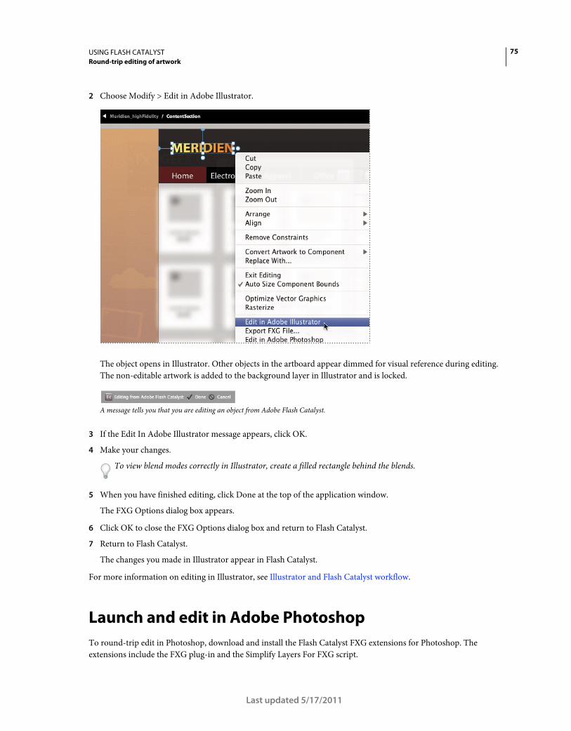
75USING FLASH CATALYST
Round-trip editing of artwork
Last updated 5/17/2011
2 Choose Modify > Edit in Adobe Illustrator.
The object opens in Illustrator. Other objects in the artboard appear dimmed for visual reference during editing.
The non-editable artwork is added to the background layer in Illustrator and is locked.
A message tells you that you are editing an object from Adobe Flash Catalyst.
3 If the Edit In Adobe Illustrator message appears, click OK.
4 Make your changes.
To view blend modes correctly in Illustrator, create a filled rectangle behind the blends.
5 When you have finished editing, click Done at the top of the application window.
The FXG Options dialog box appears.
6 Click OK to close the FXG Options dialog box and return to Flash Catalyst.
7 Return to Flash Catalyst.
The changes you made in Illustrator appear in Flash Catalyst.
For more information on editing in Illustrator, see Illustrator and Flash Catalyst workflow.
Launch and edit in Adobe Photoshop
To round-trip edit in Photoshop, download and install the Flash Catalyst FXG extensions for Photoshop. The
extensions include the FXG plug-in and the Simplify Layers For FXG script.
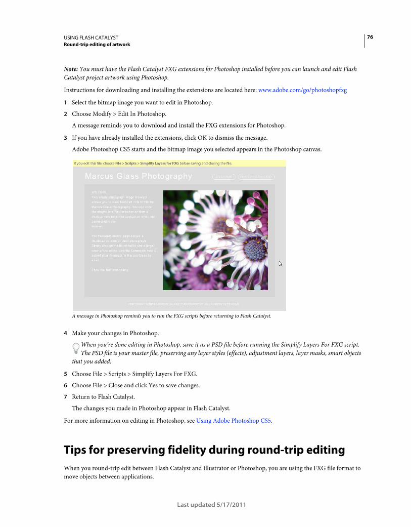
76USING FLASH CATALYST
Round-trip editing of artwork
Last updated 5/17/2011
Note: You must have the Flash Catalyst FXG extensions for Photoshop installed before you can launch and edit Flash
Catalyst project artwork using Photoshop.
Instructions for downloading and installing the extensions are located here: www.adobe.com/go/photoshopfxg
1 Select the bitmap image you want to edit in Photoshop.
2 Choose Modify > Edit In Photoshop.
A message reminds you to download and install the FXG extensions for Photoshop.
3 If you have already installed the extensions, click OK to dismiss the message.
Adobe Photoshop CS5 starts and the bitmap image you selected appears in the Photoshop canvas.
A message in Photoshop reminds you to run the FXG scripts before returning to Flash Catalyst.
4 Make your changes in Photoshop.
When you’re done editing in Photoshop, save it as a PSD file before running the Simplify Layers For FXG script.
The PSD file is your master file, preserving any layer styles (effects), adjustment layers, layer masks, smart objects
that you added.
5 Choose File > Scripts > Simplify Layers For FXG.
6 Choose File > Close and click Yes to save changes.
7 Return to Flash Catalyst.
The changes you made in Photoshop appear in Flash Catalyst.
For more information on editing in Photoshop, see Using Adobe Photoshop CS5.
Tips for preserving fidelity during round-trip editing
When you round-trip edit between Flash Catalyst and Illustrator or Photoshop, you are using the FXG file format to
move objects between applications.

77USING FLASH CATALYST
Round-trip editing of artwork
Last updated 5/17/2011
Follow these tips to preserve the fidelity of your Flash Catalyst artwork and the edits you make during round-trip
editing.
• The filters you add in Flash Catalyst are editable in Illustrator.
• If you rotate, or apply a filter to a bitmap in Flash Catalyst, you cannot edit it in Photoshop until you rasterize the
image. Choose Modify > Rasterize.
• Filters and effects you add in Illustrator convert to vectors or bitmaps when returning to Flash Catalyst.
• Adding layer effects, masks, shape layers, and adjustment layers in Photoshop requires that you run the Simplify
Layers for FXG script before returning to Flash Catalyst. There is no harm in running the script. A good practice is
to always run the script before returning to Flash Catalyst.
• Always set Proof Colors to Monitor RGB in Illustrator to lessen the difference when comparing colors between
Flash Catalyst and Illustrator. Use the following steps to change the setting for Proof Colors in Illustrator:
1 Choose View > Proof Colors (to select it)
2 Choose View > Proof Setup > Monitor RGB
For a video with more information on setting proof colors in Illustrator, go to the 27 min mark in this video:
Structuring UI design comps for use in Flash Catalyst
See the following for more information:
“Importing artwork” on page 13
Working with FXG

78
Last updated 5/17/2011
Chapter 17: Data lists and scrolling panels
When your projects require fitting large amounts of content in a limited space, creating scrolling images, panels and
lists can be a great solution. Flash Catalyst includes two interactive components specially designed for this purpose:
data lists and scroll panels.
A data list is a special type of component used to retrieve and display a series of related items; though the name data
list is a little misleading. Each unique record in a Flash Catalyst data list can include artwork, text, or a combination of
both. It doesn’t need to be a list at all.
Traditionally, a data list might look something like a spreadsheet or data table.
Using Flash Catalyst, you can build a Data List component that displays a tiled wall of images.
A list can be a scrolling filmstrip or series of thumbnails, from which you select and view other content or navigate to
new locations in the application. By adding a scroll bar, you can extend the list to include any number of items.

79USING FLASH CATALYST
Data lists and scrolling panels
Last updated 5/17/2011
You can create a horizontal data list; adding scroll arrows allows movement forward and backward through the list.
Overview of data lists
Data lists may be created directly in Flash Catalyst or be developed in Flash Builder. If the list was created in Flash
Catalyst and the data items have not been edited in Flash Builder, you will be able to fully edit the skin or appearance
of the data list and its items. If the list was created in Flash Builder, or if a developer has edited the data in a Flash
Catalyst-created list, you will be able to edit the skin of the list, but not of the individual data items, in Flash Catalyst.
You can skin, or modify the visual appearance of, a designer list in Catalyst quite easily.
• You can arrange a data list horizontally, vertically, or in a grid on the page.
• By adding a scroll bar, you can extend the list to include any number of items.
• Every data list component must include a master item called the “repeated item.” The repeated item is a template
that defines the appearance of every item in the list. For example, you can create a repeated item with an image,
descriptive text, and different up, over, and down states. Each item in the list shares these common elements and
properties. Changes applied to the repeated item are applied to every item in the list automatically at runtime.
When you import a project from Flash Builder that contains a list created by the developer, its data will likely be
uneditable. Flash Catalyst will display placeholders for data. If the data is text, placeholder data will be shown for each
item. If the data is an image, a placeholder image will display. Regardless of how many items are intended to display
in the list, Flash Catalyst will only display five placeholders.
Data lists are made up of three parts: the data, the skin of the list, and the skin for the repeated item. Using Catalyst,
you can skin the list and the item renderer. When skinning the item renderer, you can alter any properties that would
not affect the underlying data. For example, if the list contains text, you can change the font, color, size, and similar
properties.

80USING FLASH CATALYST
Data lists and scrolling panels
Last updated 5/17/2011
A data list using design-time data, or mock data
A developer data list, where the underlying data has been added in Flash Builder. The visual elements are still editable in Catalyst, but the data is protected.
Create a data list component
1 Position a copy of the first data list items on the artboard. If the list requires a slider, scroll bar, or similar control,
add it to the artboard. Size the control according to your design plan. Select these objects.

81USING FLASH CATALYST
Data lists and scrolling panels
Last updated 5/17/2011
A. Images and text used as the repeated items B. Include a scroll bar for a data list with several items.
2 In the HUD, click Choose Component > Data List.
Flash Catalyst creates the data list and issues a message in the HUD. The message asks you to specify which graphic
elements to use for the required part of the data list. The required part is a repeated item.
3 With the new component still selected on the artboard, click Edit Parts in the HUD.
Flash Catalyst enters Edit-In-Place mode to allow you to edit the parts and states of the component.
4 On the artboard, select the items to use as the repeated item. Do not include the scroll bar or other controls in the
repeated item.
5 In the HUD, click Convert to Data List Part > Repeated Item (recommended).
Flash Catalyst converts the selected item into the repeated item part. By default the list is aligned vertically.
6 Select the repeated item and choose Vertical, Horizontal, or Tile in the Layout section of the Properties panel. Use
the Properties panel to apply additional formatting, such as cell padding. Use the selection handles to size the
repeated item bounding box according to your design plan.
7 Double-click the repeated item to open it in the Pages/States panel.
A repeated item has normal, over, and selected states.
8 Edit the items in each state according to your design plan.
9 Close the data list component and return to the artboard.
You have created a data list component, but at first it displays the same repeated item over and over. You can use
the Design-Time Data panel to replace the temporary images with more realistic data. The design-time data shows
a developer how the application looks at runtime.
Add design-time data
1 Select the data list component on the artboard and open the Design-Time Data panel.
The Design-Time Data panel shows the items in your list. At first, every item in the list is the same.
2 If the repeated item includes text, you can edit the text for each item in the list. If the repeated item includes an
image, click one of the temporary images in the Design-Time Data panel.
The Select Asset dialog box opens.
3 In the Select Asset dialog box, select an image to display in the data list and click OK.
The Design-Time Data panel updates to show the new images and text.
Note: If the project library does not include the image you want to display in the data list, you can import it.
4 Replace the other repeated items with design-time data.
5 To add additional items to the data list, click Add Row and replace the temporary image with an image of your
choice.
A B

82USING FLASH CATALYST
Data lists and scrolling panels
Last updated 5/17/2011
6 Choose Modify > Add Text To Design-Time Data or Add Image To Design-Time Data to add additional images or
text to the repeated item. A new column is added to the Design-Time Data panel. To remove an item from the
repeated item, select it and choose Modify > Remove Text From Design-Time Data or Remove Image From
Design_Time Data.
A. Design-Time Data panel (shown expanded) B. Select Asset dialog box
Note: You can also use the Design-time Data panel to edit items that display in other components such as Button Bars
and Combo Boxes.
Overview of a scroll panel
To create a scrolling panel in Flash Catalyst, you need:
• An object to define the panel area, such as a rectangle shape (optional)
• Scrolling content, such as a long block of text or a series of images (required)
• A scroll bar used to scroll the content (recommended)
Note: You can create a scroll panel without a scroll bar, but it’s useless unless users can scroll to see the hidden content.
Create a scroll panel component
1 Import or draw an object to define the panel area (optional).
2 Add the content that you want to scroll. To create scrolling text, use the Text tool in the Tools panel.
3 Position the scrolling text or align a series of objects in the panel area. Leave some room along the right or bottom
edge of the panel for a scroll bar.
Note: Your scrolling content extends beyond the panel area temporarily.
4 Create a scroll bar component or drag a scroll bar from the Wireframe Components panel. Position and size the
scroll bar to match the size of the panel area.
BA

83USING FLASH CATALYST
Data lists and scrolling panels
Last updated 5/17/2011
Two examples of scroll panel parts, before creating the scroll panel component
5 Select all of the parts for the scroll panel. In the HUD, click Choose Component > Scroll Panel.
A message in the HUD reminds you to edit the parts of the component.
6 Click Edit Parts.
Another message tells you how to create the scrolling part of the panel.
7 Select the objects you want to scroll (text block or series of objects).
8 In the HUD, click Convert to Scroll Panel Part > Scrolling Content (recommended).
A new bounding box defines the visible area of the scrolling content.
9 If necessary, size the bounding box of the scrolling content to fit within the panel area.
10 Use the Breadcrumb bar to close the scroll panel. Choose File > Run Project to test the component.
Completed scroll panel component used to scroll a block of text in a confined panel area
For more information on creating text in Flash Catalyst, see “Creating Application Mock-ups” on page 16.

84
Last updated 5/17/2011
Chapter 18: Custom skinnable components
While Flash Catalyst comes with various wireframe components and can convert custom artwork into a set of pre-
defined components, many applications require custom components. A developer can create a custom component in
Flash Builder and focus solely on its structure and behaviors. By defining the component in Flash Builder as a custom
skinnable component, the developer can leave the visual aspects of the component - its skin - to the designer. The
designer can then import the component into Flash Catalyst and create the skin.
Setting up the custom skinnable component
Designers and developers should collaborate and discuss the desired functionality of the component so there is a
common understanding of and agreement upon the necessary parts, states and behaviors, and naming.
The developer starts the workflow by creating the custom skinnable component in Flash Builder. For detailed steps
(for developers) on creating custom skinnable components, see Create an ActionScript skinnable component in Using
Flash Builder). The designer then imports the custom skinnable component into Flash Catalyst, and edits the "skin" or
visual appearance.
Depending on your particular project and development team, you may end up working with custom skinnable
components that already have "dummy" or placeholder skins associated them, or not. Following are steps outlining
how to work with both.
Custom skinnable components (with placeholder skins)
When developers include a placeholder skin for the custom skinnable component, it appears in Catalyst’s Project
Library panel after import. Including a placeholder skin with custom skinnable components in Flash Builder is
considered a best practice, as it helps to clarify the purpose of the component, and gives the designer a visual
representation to drag onto the Flash Catalyst artboard.
You may receive custom skinnable components in either an FXP or FXPL file. If they are contained in an FXP, simply
open that file as a project in Flash Catalyst. If they are in an FXPL, follow these steps:
1 With the project open, click Import Library Package (.fxpl) on the Library panel.
2 Select the FXPL file that defines the custom skinnable component.
3 The custom skinnable component appears in the Project Library, and can be dragged onto the artboard.

85USING FLASH CATALYST
Custom skinnable components
Last updated 5/17/2011
Importing a Library Package that contains a custom skinnable component named "DragAndDropListSkin". The developer included a "dummy" skin for the component, so it shows up in the Project Library and can be dragged onto the artboard.
4 Position the component on the artboard as desired. You can edit the dummy skin by double-clicking the
component.
For details see “Editing a component with edit-in-place” on page 31.
5 If the custom skinnable component contains developer code that should not be edited in Flash Catalyst, you will
see messages alerting you to this.
Flash Catalyst shows you when a custom skinnable component contains protected developer code from Flash Builder; in this case the imported data list is connected to protected data.

86USING FLASH CATALYST
Custom skinnable components
Last updated 5/17/2011
Custom skinnable components (without placeholder skins)
The first step in working with a custom skinnable component that does not already have a placeholder skin, is, to
convert the artwork you will use for the skin into an instance of the component.
Prepare the artwork
1 In your Flash Catalyst project file, import or create the artwork needed for the component's skin. For example, for
a button or menu component, draw the shapes and text that represent the button.
2 Select all of the artwork for the component's skin.
Import the custom skinnable component
1 Click Import Library Package (.fxpl) on the Project Library panel.
2 Select the FXPL file that defines the custom skinnable component.

87USING FLASH CATALYST
Custom skinnable components
Last updated 5/17/2011
Convert the selected artwork to the component
1 With the artwork still selected, from the HUD select Choose Component, then Skinnable Component.
Note: Skinnable Component appears as an option under Convert Artwork to Component only when your Project
Library contains an imported Custom Skinnable Component. If you do not see this option in the HUD, ensure that
you imported the FXPL file that defines the component, or check with your developer.
2 In the Select skinnable component dialog box, select the custom skinnable component you received from the
developer. Flash Catalyst prompts you to name the skin you are creating for the component and suggests a name
based on best practice naming conventions. You can change this name if you wish; see “Naming components” on
page 30.
The artwork is now converted into an instance of the custom skinnable component. As with some of the more
complex built-in components, you may have to assign parts in the custom skinnable component.

88USING FLASH CATALYST
Custom skinnable components
Last updated 5/17/2011
Assign artwork to parts of the component
1 On the HUD, click Edit Parts. The HUD updates to indicate you need to select art and assign it to parts of the
component.
2 On the artboard, select the approriate pieces of art for a part of the component, then click on a part name in the
HUD to assign it.
Repeat steps 1-2 as needed to complete assigning parts to your custom skinnable component. For more info on
component parts and states, see “Components skin parts and states” on page 26and “Editing a component with edit-
in-place” on page 31.

89USING FLASH CATALYST
Custom skinnable components
Last updated 5/17/2011
Export the component skin for handoff
When you are finished editing the skin of your custom skinnable component, you can hand it back to the developer
for integration into the Flash Builder project.
1 Click Export Library Package (.fxpl) on the Project Library panel.
2 Save the FXPL file with a name according to the conventions you and your developer agree upon.
For an overview of how custom skinnable components can help facilitate a design-develop workflow for small to
medium teams, see “Multi-person workflow between Flash Builder and Flash Catalyst” on page 7.
Learn more from the community
There is a growing collection of custom skinnable components available for download from the FlashCats blog,
covering a wide range of options including the popup component used in the illustrations on this page.

90
Last updated 5/17/2011
Chapter 19: Video and sound
Flash Catalyst CS5 supports the import of FLV files and F4V video files and of mp3 sound files. The files are added to
the Media section in the Library panel. The Library panel shows the size of each video or sound file to the right of the
filename.
Add video
1 To import a video file, select File > Import > Video/Sound File. Browse to locate a video file, select it, and click
Open.
The video appears in the Library panel. To preview a video, select it in the Library panel and click the Play button
at the top of the panel.
2 To add a video to your design, drag it from the Library panel to the artboard. Flash Catalyst automatically wraps
the video in a video player control.
3 Set properties for the video player in the Properties panel. To remove the video playback controls, change the video
controls option in the Properties panel to None.
Video player properties
You can import an FLV file or F4V file with sound only and no video. A sound-only video file can be controlled like
other videos. Use this method to control the playback of large sound files, such as narration or soundtracks.
Set video player properties
To set the properties of a video player, select the video player in the artboard (or in the Layers panel). Set properties in
the Properties panel. The same video player can have different properties in each state.
Opacity Change the opacity of the video in the video player.
Volume Set the volume of the audio track in the video file.
Video Controls Change the controls that appear below the video player. You can choose between Wireframe,
Standard, and None.

91USING FLASH CATALYST
Video and sound
Last updated 5/17/2011
Source: Link to a source video in the project library. You can play different video files using the same video player by
changing the Source property of a video player in different states. Using one video player is one way to optimize an
application.
Scale Mode: None Video does not scale and displays at its natural size. Video is cropped if video player bounding box
is smaller than the source video.
Scale Mode: Letterbox Scale uniformly as large as possible without cropping the video. Black or white bars appear
around the video if the video is a different aspect ratio than the video player bounding box.
Scale Mode: Zoom Scale uniformly until video completely fills the frame. Video can be cropped.
Scale Mode: Stretch Scale non-uniformly to make video fit in the video player bounding box. Video is not cropped,
but can appear distorted from non-uniform scaling.
AutoPlay The video starts playing automatically.
Loop the video plays to the end and then repeats.
Muted Volume is set to 0.
Accessible Text Text that adaptive technologies recognize, such as screen readers.
You can use an action sequence to set a property for a video. For example, you can link different buttons to the same
video player. Clicking button 1 plays video 1, clicking button 2 plays video 2, and so on. Add an interaction that
changes the opacity of the video when the video is enabled or disabled. Add an interaction that mutes the audio or sets
the video to a specific volume.
See the following for more information:
“Create action sequences” on page 61
“Edit action sequences” on page 62
Control video playback
When you add a video player to the application, its Video Controls property is set to Wireframe. The Wireframe
controls include a generic-looking set of video playback controls. These controls include a Play/Pause button,
progress/scrubber bar, current time indicator, and Full Screen button.
• To change the video controls, use the Video Controls property in the Properties panel. You can use the blue
wireframe controls, the monochrome standard controls, or turn off the controls by choosing None.
• You can also use an Interaction to control the playback of a video. For example, you can hide the video controls in
the Properties panel, and then assign interactions (play, pause, stop) to a set of custom buttons.
When someone clicks the Full Screen button during playback, the video opens in a pop-up window. Any interaction
used to transition to a new state in the application does not work. If you want the video to play in full screen, do not
include a Transition To State interaction in the video controls.
See the following for more information:
“Create action sequences” on page 61
“Edit action sequences” on page 62

92USING FLASH CATALYST
Video and sound
Last updated 5/17/2011
Add sound effects
Sound effects can be added to transitions or action sequences triggered by interactive objects such as button
components. You cannot drag sound effects from the Library panel to the artboard.
1 Import sound by choosing File > Import > Video/Sound File. Browse to locate an mp3 file, select it, and click Open.
The sound file appears in the Library panel. To preview the sound file, select it in the Library panel, and click the
Play button at the top of the panel.
2 Select a transition or action sequence in the Timelines panel. Or, select an interactive object in the artboard.
3 In the Timelines panel, select Add Action > Sound Effect. Choose a sound file and click OK.
Flash Catalyst includes a collection of sounds. These sounds are located in the C\Program Files\Adobe\Adobe Flash
Catalyst CS5.5\sound effects folder (Windows) or Applications/Adobe Flash Catalyst CS5.5/sound effects folder (Mac OS).
See the following for more information on adding and controlling sound:
“Create navigation and behavior with interactions” on page 52
“Create action sequences” on page 61
“Edit action sequences” on page 62

93
Last updated 5/17/2011
Chapter 20: Preview and publish
You can preview your projects in a web browser as you work, and publish your final interactive projects as SWF or AIR
files. By default, Flash Catalyst generates two versions of a project. One version, Deploy to Web, includes the necessary
files to run the project as a web application, but cannot run locally. A second version, Run Local, cannot be run from
a web server or launch URLs. There is also an option to build an Adobe AIR application.
Previewing your project in a web browser
It is a best practice to view your work frequently in a web browser before publishing a final version. This allows you to
more efficiently check for accuracy and real-world performance.
❖ Choose File > Run Project.
Flash Catalyst launches the project in your default browser.
Preview your project in a web browser by choosing File > Run Project.
Select publish options and publish a project
1 Save the project and choose File > Publish To SWF/AIR.
The Build For Accessibility, Build Version For Upload To A Web Server and Build Version To View Offline options
are selected by default.
Publish To SWF dialog box
2 Select a folder in which to save the project files.

94USING FLASH CATALYST
Preview and publish
Last updated 5/17/2011
3 To create an Adobe AIR application, select the Build AIR Application check box (optional).
4 To embed fonts in the SWF content, select the Embed Fonts check box (optional). If your project does not include
fonts that you can embed, the option to embed is disabled.
Font Embedding dialog box
Embed any fonts other than Arial, Courier New, Georgia, Times New Roman, Verdana. Embedding non-web fonts
ensures that users see the design exactly as you do, even if they don't have the same fonts installed. Click the
Advanced button to open the Font Embedding dialog box. You can specify which fonts and character ranges to embed.
Limiting what you choose to embed can help reduce the size of your published SWF file.
5 Click Publish.
Inside the folder you specify, Flash Catalyst creates a subfolder with the same name as your project. Inside this
folder, Flash Catalyst publishes a separate folder and files for each version of the project you chose to publish. To
deploy your published project to the web, upload the entire contents of the deploy-to-web folder to your web server.
You can rename the deploy-to-web folder, but do not rename any of the files in the folder.
The published files include the main.html wrapper for the SWF file. This file references the swfobject.js code that
performs Flash Player version checks and redirects to upgrade Flash Player. You can reuse this code in your HTML
files. You can also use an HTML page you have designed in a program such as Adobe Dreamweaver, and insert the
published SWF into that page. For more information on inserting SWFs into pages in Dreamweaver, see Inserting
SWF files
Note: If the project has been edited in Flash Builder, it is recommended that you publish from Flash Builder and not
Flash Catalyst.
Optimize application performance
To optimize your application performance and reduce file size, use these strategies:
• Delete objects that are not being used in the application. If an object is not being used in a state (and is not included
in a transition), then delete it from that state. Select it and press Delete to remove it from the current state only. If
an object is not used in the application, select it and click the Delete button (trash can) in the Layers panel.
• Convert images to linked images.

95USING FLASH CATALYST
Preview and publish
Last updated 5/17/2011
• Optimize vector graphics using the Optimize Artwork options in the HUD.
• Compress graphics in the Library panel. Right-click a graphic in the Library panel, choose Compression Options,
reduce the Quality setting, and choose OK.
• Don't embed fonts if your users are likely to already have them. If you do embed fonts, use the Advanced button to
limit how much of the font is embedded.
See the following for more information on optimizing artwork:
“Optimizing graphics” on page 70

96
Last updated 5/17/2011
Chapter 21: Flash Catalyst and Flash Builder integration
Flash Catalyst CS5.5 and Flash Builder 4.5 provide tightly integrated workflows that let designers and developers
collaborate and work in-tandem on the same project.
Project structure for ensuring Flash Catalyst compatibility
Flash Catalyst CS5.5 supports a subset of features and components that are available in the Flex 4.5 framework.
Therefore, it is important that you structure your project such that it works seamlessly in Flash Catalyst.
Plan your project
When you plan your project, identify the visual parts of the project that a designer owns and the logical parts that a
developer owns. Typically, a designer owns the visual objects, animations, and the basic layout of the project. A
developer typically owns the architecture, functionality, and the application-level layout of the project.
Flash Catalyst and Flash Builder provide several tools that help you define a clear contract between design and
development. Separating your project into a main project and Flash Catalyst compatible library projects clearly defines
which parts of the project the designer can edit. Using skinnable components provides a clear separation between logic
and visuals at the component level.
Use library projects
Library projects let you separate the design and logic at the project level. Developers can use library projects to
segregate parts of the project that need to be edited in Flash Catalyst.
Library projects also simplify the merge process because the developer does not usually edit the library project while
the designer is working on it.
Create a main project and a subsidiary Flash Catalyst-compatible library project
1 Create the main Flex project. For more information, see Create Flex projects.
2 Create a Flex library project.
Ensure that the project is Flash Catalyst-compatible by selecting Make Project Flash Catalyst Compatible in the
New Flex Library Project wizard. For more information, see Create Flex library projects.
3 Add the library project to the build path of the main Flex project.
To do so, go to Project > Properties, and select Flex Build Path. Select the Library Tab, and click Add Project. For
more information, see Modify a project build path.
4 Place the skinnable components and skins in the library project and the code files in the main project.
Note: The main project depends on the library project. Therefore, the library cannot contain code that depends on the
main project and has to be self-contained.

97USING FLASH CATALYST
Flash Catalyst and Flash Builder integration
Last updated 5/17/2011
More Help topics
“Passing files between Flash Builder and Flash Catalyst” on page 98
Use skinnable components
The skinning architecture in Flex lets you create extendable skinnable components that are compatible with Flash
Catalyst. Creating skinnable components in Flash Builder and creating skins visually in Flash Catalyst lets you separate
design and logic at the component level.
A skinnable component contains the logical part of a component, while the skin contains the visual assets and layout
rules. Additionally, a skinnable component can indicate that its skin contains parts and states. The host component
can programmatically control the parts and states of the skin. Restricting communication between the skinnable
component and its skins to the parts and states lets the two parts to be highly independent and flexible. For more
information on creating custom skinnable components in Flash Builder, see Example: Creating a skinnable Spark
component.
After you create a skinnable component definition in Flash Builder, create an initial sample skin. If you do so and
import the project into Flash Catalyst, the skin shows up in the Components panel in Flash Catalyst. You can then
easily edit the skin in Flash Catalyst. Creating a sample skin helps the designer understand the basic structure of the skin.
More Help topics
“Custom skinnable components” on page 84
Using the Flash Catalyst compatibility checker to streamline your design-development workflow
Ensure Flash Catalyst compatibility
Like any visual coding tool, Flash Catalyst only supports a subset of Flex code. However, Flash Builder provides a
compatibility checker that tells you exactly which parts of your code are editable by Flash Catalyst.
When you create a Flash Catalyst compatible project in Flash Builder, the Flash Catalyst compatibility checker (Project
> Properties > Flash Catalyst) is automatically turned on. When you create a project in Flash Catalyst and import it
into Flash Builder, it is automatically configured to be Flash Catalyst compatible. If you introduce any
incompatibilities while editing the project, Flash Builder displays the compatibility errors in the Problems view
indicating which parts of the code can be edited in Flash Catalyst.
You do not necessarily need to resolve all compatibility issues before opening a project in Flash Catalyst. The "Type"
column of the Problems view displays the impact of each compatibility problem. Problems that prevent the project
from opening in Flash Catalyst appear as warnings. Less severe problems appear as "info" notifications.
Incompatibility type Description
Project incompatibility The project cannot be opened in Flash Catalyst
File incompatibility The file cannot be edited in Flash Catalyst.
Any incompatibilities in the main application makes the project incompatible.

98USING FLASH CATALYST
Flash Catalyst and Flash Builder integration
Last updated 5/17/2011
For more details about Flash Catalyst compatibility issues, see www.adobe.com/go/learn_fcprojectcompat_en.
Passing files between Flash Builder and Flash Catalyst
You can use FXP files to exchange a complete Flex project or to exchange components, component skins, and assets
between a designer and developer.
For complex projects, you can use a library project to structure your project's user interface as a series of skinnable
components and skins. For more information, see Use Flex library projects.
You can then pass FXPL files back and forth between Flash Builder and Flash Catalyst to exchange only the component
skins and design assets. To make sure that things are orderly, the designer can import the FXPL files into an empty
project in Flash Catalyst, create visual skins, and add interactivity.
Use the following export and import workflows to pass the FXP and FXPL files back and forth between Flash Builder
and Flash Catalyst.
Pass files from Flash Builder to Flash Catalyst
• To export an FXP or FXPL file from Flash Builder to Flash Catalyst, select Project > Flash Catalyst > Export Flash
Catalyst Project.
• To import the FXP or FXPL file from Flash Builder into Flash Catalyst, go to File > Import, and select Adobe FXG
File (.fxg) or Library Package (.fxpl).
Pass files from Flash Catalyst to Flash Builder
• To export an FXP or FXPL file from Flash Catalyst to Flash Builder, go to File > Export, and select either Adobe
FXG File (.fxg) or Library Package (.fxpl)
• To import an FXP or FXPL file from Flash Catalyst into Flash Builder, select Project > Flash Catalyst > Import Flash
Catalyst Project.
Edit FXP files using the Edit Project in Flash Catalyst command
If Flash Builder and Flash Catalyst are both installed on the same computer, you can use the Edit in Flash Builder
command to edit FXP files.
For more information, see “Edit Project in Flash Catalyst command” on page 99.
Merge changes from Flash Catalyst to Flash Builder
When you import FXP or FXPL files from Flash Catalyst into Flash Builder, you can compare and merge differences
between the two projects using the Compare Editor tool. You can also use a third-party merge tool of your choice.
Skinnable component incompatibility The component cannot be skinned in Flash Catalyst or the skin part cannot be
assigned in Flash Catalyst.
Design-time data incompatibility The list data is controlled by application code that is not editable in Flash Catalyst.
You can edit the list appearance in Flash Catalyst.
Flash Catalyst compatibility warning This warning does not reduce editability of the project in Flash Catalyst. It can,
however, indicate an editing experience that is not seamless.
Incompatibility type Description
99USING FLASH CATALYST
Flash Catalyst and Flash Builder integration
Last updated 5/17/2011
When you create design assets in Flash Catalyst, you can bring the assets into Flash Builder by importing the FXP or
FXPL file in the following ways.
• Import the design assets into a new project, and then compare and merge changes using the Flash Builder tools.
• Import contents of the library into the existing project.
• Overwrite the existing FXP file with the updated version only if no changes have been made to the project in the
meantime.
Note: You cannot overwrite library projects (.fxpl).
To compare projects using the Compare Editor tool, select the projects by pressing the Ctrl key and clicking the
projects to compare. Then, right-click the selected projects, and select Compare With > Each Other. The results are
displayed in the Text Compare panel.
Note: While merging, you can see several changes in setting files, like actionScriptProperties, or output files, like bin-
debug file, or other parts of the project. You can typically ignore these changes, and focus only on the changes in the source
folder.
For more information on using the Compare Editor tool, see the Eclipse documentation.
Edit Project in Flash Catalyst command
Use the Edit PRoject in Flash Catalyst command if you have both Flash Builder and Flash Catalyst installed on the same
computer. You can launch Flash Catalyst from within Flash Builder and make any design changes directly to the
project without passing the project files between Flash Builder and Flash Catalyst.
1 To launch Flash Catalyst directly from within Flash Builder, select Project > Flash Catalyst > Edit Project In Flash
Catalyst.
You can also select Flash Catalyst > Edit Project In Flash Catalyst from the context menu for the project.
2 Change the application design, as required. When you edit the project in Flash Catalyst, the project is locked in
Flash Builder. The project is locked to ensure that there are no conflicting changes.
3 Save changes and close the project in Flash Catalyst. You don’t have to exit Flash Catalyst.
4 In Flash Builder, select Project > Flash Catalyst > Resume Working On Project in Flash Builder. You can also select
Flash Catalyst > Resume Working On Project in Flash Builder from the context menu for the project.
When you do so, you are prompted to save the changes made in Flash Catalyst. Saving the changes brings the newly
saved project back into Flash Builder. In the background, the originally exported project version from Flash Builder
is deleted after the newly saved project version is successfully imported from Flash Catalyst.
The design changes are added to the project, and the project is opened for editing in Flash Builder.
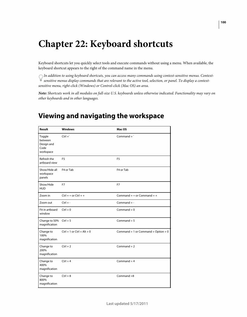
100
Last updated 5/17/2011
Chapter 22: Keyboard shortcuts
Keyboard shortcuts let you quickly select tools and execute commands without using a menu. When available, the
keyboard shortcut appears to the right of the command name in the menu.
In addition to using keyboard shortcuts, you can access many commands using context-sensitive menus. Context-
sensitive menus display commands that are relevant to the active tool, selection, or panel. To display a context-
sensitive menu, right-click (Windows) or Control-click (Mac OS) an area.
Note: Shortcuts work in all modules on full-size U.S. keyboards unless otherwise indicated. Functionality may vary on
other keyboards and in other languages.
Viewing and navigating the workspace
Result Windows Mac OS
Toggle
between
Design and
Code
workspace
Ctrl +` Command + `
Refresh the
artboard view
F5 F5
Show/Hide all
workspace
panels
F4 or Tab F4 or Tab
Show/Hide
HUD
F7 F7
Zoom in Ctrl + = or Ctrl + + Command + = or Command + +
Zoom out Ctrl + - Command + -
Fit in artboard
window
Ctrl + 0 Command + 0
Change to 50%
magnification
Ctrl + 5 Command + 5
Change to
100%
magnification
Ctrl + 1 or Ctrl + Alt + 0 Command + 1 or Command + Option + 0
Change to
200%
magnification
Ctrl + 2 Command + 2
Change to
400%
magnification
Ctrl + 4 Command + 4
Change to
800%
magnification
Ctrl + 8 Command +8

101USING FLASH CATALYST
Keyboard shortcuts
Last updated 5/17/2011
Creating and running projects
Show rulers in
artboard
Ctrl + R Command + R
Show grid in
artboard
Ctrl + ‘ Command + ‘
Snap to grid Ctrl + Shift + ‘ Command + Shift + ‘
Lock guides Ctrl + Alt + ; Command + Option + ;
Show guides Ctrl + ; Command + ;
Snap to guides Ctrl + Shift + ; Command + Shift + ;
Modify
artboard
settings
Ctrl + J Command + J
Text search in
the Code
workspace
Ctrl + F Command + F
Access
community
help
F1 F1
Result Windows Mac OS
Create a new
project
Ctrl + N Command + N
Save a project Ctrl + S Command + S
Save a project
as a new file
Ctrl + Shift + S Command + Shift + S
Save a copy of a
project
Ctrl + Alt + S Command + Alt + S
Open an
existing project
Ctrl + O Command + O
Close a project Ctrl + W Command + W
Run the project
in a browser
Ctrl + Enter Command + Return
Exit the Flash
Catalyst
application
Ctrl + Q Command + Q
Result Windows Mac OS

102USING FLASH CATALYST
Keyboard shortcuts
Last updated 5/17/2011
Working with pages and states
Selecting tools in the Tools panel
Result Windows Mac OS
Apply the same
properties to all
instances of the
same object in
other states
Ctrl + Alt + M Command + Option + M
Add a new
blank state
Ctrl + Shift + B Command + Shift + B
Duplicate a
state
Ctrl + Shift + D Command + Shift + D
Share (copy) an
object to all
other states
Ctrl + Alt + A Command + Option + A
Delete from all
states in the
application
Ctrl + Del Command + Del
Delete from
current state
Del or Backspace Del or Backspace
Result Windows Mac OS
Direct Select
tool
A A
Select tool V V
Hand tool H H
Transform
(rotate) tool
Q Q
Zoom tool Z Z
Text tool T T
Rounded
Rectangle tool
U U
Rectangle tool M M
Ellipse tool L L
Line tool N or \ N or \
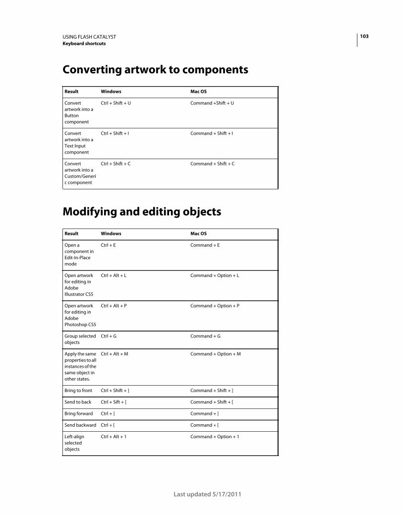
103USING FLASH CATALYST
Keyboard shortcuts
Last updated 5/17/2011
Converting artwork to components
Modifying and editing objects
Result Windows Mac OS
Convert
artwork into a
Button
component
Ctrl + Shift + U Command +Shift + U
Convert
artwork into a
Text Input
component
Ctrl + Shift + I Command + Shift + I
Convert
artwork into a
Custom/Generi
c component
Ctrl + Shift + C Command + Shift + C
Result Windows Mac OS
Open a
component in
Edit-In-Place
mode
Ctrl + E Command + E
Open artwork
for editing in
Adobe
Illustrator CS5
Ctrl + Alt + L Command + Option + L
Open artwork
for editing in
Adobe
Photoshop CS5
Ctrl + Alt + P Command + Option + P
Group selected
objects
Ctrl + G Command + G
Apply the same
properties to all
instances of the
same object in
other states.
Ctrl + Alt + M Command + Option + M
Bring to front Ctrl + Shift + ] Command + Shift + ]
Send to back Ctrl + Sift + [ Command + Shift + [
Bring forward Ctrl + ] Command + ]
Send backward Ctrl + [ Command + [
Left-align
selected
objects
Ctrl + Alt + 1 Command + Option + 1

104USING FLASH CATALYST
Keyboard shortcuts
Last updated 5/17/2011
Working in the Properties panel
Working with transitions and action sequences
Horizontal-
center selected
objects
Ctrl + Alt + 2 Command + Option + 2
Right-align
selected
objects
Ctrl + Alt + 3 Command + Option + 3
Top-align
selected
objects
Ctrl + Alt + 4 Command + Option + 4
Vertical-center
selected
objects
Ctrl + Alt + 5 Command + Option + 5
Bottom-align
selected
objects
Ctrl + Alt + 6 Command + Option + 6
Exit Edit-In-
Place mode
Esc Esc
Nudge by 1
pixel
Arrow keys Arrow keys
Nudge by 10
pixels
Shift + Arrows Shift + Arrows
Undo a change Ctrl + Z Command + Z
Result Windows Mac OS
Toggle the
eyedropper
on/off in a
color picker
I I
Change
numeric values
incrementally
up or down
Up/Down Arrows Up/Down Arrows
Jump to
maximum or
minimum
allowed values
Page Up/Page Down Page Up/Page Down
Result Windows Mac OS
Add a new
interaction
Ctrl + Alt + I Command + Option + I
Result Windows Mac OS

105USING FLASH CATALYST
Keyboard shortcuts
Last updated 5/17/2011
Play/Stop in the
Timeline
Ctrl + Shift + P or Enter Command + Shift + P or Return
Add smooth
transitions
Ctrl + Alt + T Command + Option + T
Result Windows Mac OS

106
Last updated 5/17/2011
Chapter 23: Resources
Activation and registration
Help with installation
For help with installation issues, see the Creative Suite Help and Support page at www.adobe.com/go/learn_cs_en.
License activation
During the installation process, your Adobe software contacts Adobe to complete the license activation process. No
personal data is transmitted. For more information on product activation, visit the Adobe website at
www.adobe.com/go/activation.
A single-user retail license activation supports two computers. For example, you can install the product on a desktop
computer at work and on a laptop computer at home. If you want to install the software on a third computer, first
deactivate it on one of the other two computers. Choose Help > Deactivate.
Register
Register your product to receive complimentary installation support, notifications of updates, and other services.
❖ To register, enter your Adobe ID when prompted when you install or launch the software.
If you choose to skip entering your Adobe ID during installation or launch, you can register at any time by choosing
Help > Product Registration.
Adobe Product Improvement Program
After you have used your Adobe software a certain number of times, a dialog box appears, asking whether you want
to participate in the Adobe Product Improvement Program.
If you choose to participate, data about your use of Adobe software is sent to Adobe. No personal information is
recorded or sent. The Adobe Product Improvement Program only collects information about the features and tools
that you use in the software and how often you use them.
You can opt in to or opt out of the program at any time:
• To participate, choose Help > Product Improvement Program and click Yes, Participate.
• To stop participating, choose Help > Product Improvement Program and click No, Thank You.
Adobe provides more information about the Product Improvement Program in a frequently asked questions (FAQ)
list on the Adobe website.
107USING FLASH CATALYST
Resources
Last updated 5/17/2011
Services, downloads, and extras
Adobe Exchange
Visit the Adobe Exchange at www.adobe.com/go/exchange to download samples as well as thousands of plug-ins and
extensions from Adobe and third-party developers. The plug-ins and extensions can help you automate tasks,
customize workflows, create specialized professional effects, and more.
Adobe downloads
Visit www.adobe.com/go/downloads to find free updates, tryouts, and other useful software.
Adobe Labs
Adobe Labs at www.adobe.com/go/labs gives you the opportunity to experience and evaluate new and emerging
technologies and products from Adobe.
Adobe TV
Visit Adobe TV at http://tv.adobe.com to view instructional and inspirational videos.
Extras
The installation disc contains various extras to help you make the most of your Adobe software. Some extras are
installed on your computer during the setup process; others are located on the disc.
To view the extras installed during the setup process, navigate to the application folder on your computer.
• Windows: [startup drive]\Program Files\Adobe\[Adobe application]
• Mac OS: [startup drive]/Applications/[Adobe application]