Usability sessions – Courier Mail Sport Refresh -All...
5
5 Page: 1 Usability sessions – Courier Mail Sport Refresh - All Observations Usability session results ID Service Affected area Finding Suggested improvement NP P/N Priority Users 1 Current Courier Mail Home Home page Users had interest in specific sports, to get information on these sports they tended to use the drop-down navigation to get directly to the sub-index page for those sports. Rather than go to the Sport index or scroll down to the news module on the homepage. Make sure Sub-Index & story pages include prominent and clear links to the Sport Index page & other Sport-sub index pages for users interested in multiple sports N 3 3 2 Courier Mail Sports Index Header/Style Was concerned that the variation between the CM Homepage & Sport index header (larger/orange) was too great and would confuse users. None of the 3 participants complained or even commented on the variation p 3 2 Courier Mail Sports Index Header Banner shaped content panels above navigation invisible to users. "What's Hot, "What's Not" & Fixtures table placed in this position were completely invisible to users, who started scanning the page from the navigation down. Don't place primary content in this position, Split content panel to not resemble dimensions of banner ad, visually connect to the navigation bar (orange colour?). Alternatively shrink header size by moving this content down into the page below the navigation NP N 3 3 3 Courier Mail Sports Index Header Navigation bar very well received and relied upon. Large, readable font size, good white space. User's looked here first rather than down the page when requiring a specific content type e.g. NRL news NP P 3 4 Courier Mail Sports Index Horizontal modules Equated by all users with a easier to understand page, easy to scan and see what's available NP P 3 5 Courier Mail Sports Index Page structure Horizontal module layout worked well to help the user understand what content was available but once the user reached the feature gallery they tended to stop scrolling. As if they'd decided prematurely that they'd seen all the important content. Try to keep horizontal modules of related content each with a clear heading at the top left (like AFL/NRL) to encourage users to scroll and take in the whole page. NP N 2 3 6 Courier Mail Sports Index Page structure When asked to view video / images related to AFL/NRL users went looking for this content in the modules with that heading rather than the Video/Gallery modules Include video/Image references in the Sport modules themselves. Make sure that the headings for the picture/video modules are clear and follow the same top left pattern & style as the above sports related modules N 1 2 7 Courier Mail Sports Index Top story carousel User's were not clear what the orange navigation dots were, overlooking the fact that there were multiple stories. Two users considered them to be related to the video - indicating progress of the video or numbers of videos. Set the image carousel to animate slowly, put numbers 1-4 in each of the dots, move them away from the video link, add alt tag with headline of stories behind dots?. Alternatively consider different interaction model: Arrow pagination as with the feature gallery below, or a module where the different story headlines can be seen without having to interact (e.g. League Central module) N 3 2 8 Courier Mail Sports Index Draggable team preference Easily understood planned behaviour, was what user's wanted & expected (change content in the module to reflect the selected team dragged to "My Team" panel). However user's also expected to be able to access general NRL news & news for different teams in this module and were unsure how to "reset" the module. Seemed cumbersome to drag different team or "all team" symbol to to change view after setting preference Some alternatives: - Add another icon next to team badges for "Best of NRL/AFL" Make the module content change on clicking the teams/general icon, not just dragging - Don't use draggable interface. Make the drag to area represent "Top content", when a user clicks a team make the team icon bigger, results in tab design where the first tab = top content for all teams. Make it "sticky" so that the team last picked is shown by default. - Make "NRL" header load in top general stories rather than one for a specific team. Make sure a very prominent additional link is added to NRL index N 3 3 9 Courier Mail Sports Index NRL/AFL modules No explicit way to access all content for the sport represented by the module. When asked users said they would go up to the navigation bar, click the header for the module or one of the stories where other content would be visible. User's actions would all work but adding explicit "more content like this" link should increase views of the indexes (see DT change) N 2 3 10 Courier Mail Sports Index Most Read Comments "What You're Saying" header not clear to users. Understood they were comments from users but unclear why they were being presented here? Heading does not give sense that these are picked by the editors, that they likely to be quality comments or that if you write a goed comment it might be showcased here. Change to something like "Your best comments" N 1 3 11 Courier Mail Sports Index Most Read Comments User's unclear how or why to do anything with this module Brief quotes seem out of context & link to read more of the comment or related comments not clear to the users. Change layout to present longer comment and have visible link to the story with explanation e.g. "Username commenting on <heading of story> " N 2 3 12 Courier Mail Sports Index Most Read Comments Default username "Guest" confusing, user was not sure what it meant Don't feature comments by anonymous users and/or change label for anonymous users, to something like "Anonymous" or "Unnamed commenter" NP N 1 1 13 Courier Mail Sports Index Stats/Ladder modules User's found it difficult to read labels on horizontal graph of player stats and found the player details obscured the chart. Preferred the red AFL module because player names were displayed horizontally & not obscured by popup dialog. Preferred the list of stat types over the dropdown selection because can be read and clicked immediately without investigating what's available. NP N 1 1 14 Courier Mail Sports Index Stats/Ladder modules Found Ladder/TV guide more valuable than detailed player stats Have Ladder be the default view especially if you can indicate the user's team on the ladder. Players involved in Tipping interested in player stats more. NP N 1 1 15 Courier Mail Sports Index Stats/Ladder modules List of stats in the dropdown on the AFL stats module got cut off (Chrome) - so user couldn't see or access all the available stats Reduce number of stats? Make dropdown scrollable? Show pane with two columns? One user preferred similar NRL panel eve though less stats were available because the stats were visible and clickable without interaction NP N 1 1 16 Courier Mail Sports Index Secondary sport modules "Cricket" & "Rugby Union" modules were overlooked by two users who returned to the navigation when asked to view this content. Change order of items. Place secondary sport modules to the left of "Latest News" module to take advantage of the visual pattern of the Orange headings. N 2 2 17 Courier Mail Sports Index Secondary sport modules User's didn't recognise the orange dots as representing different stories and seeing the one image & text assumed only one story was represented User's did identify the heading for these modules as a way to get through to more stories for the sport but the panels might be more effective if more stories were listed in the module - similarly to the current modules with one large story & image followed by three story links and a link to "More Cricket" N 2 3 18 Courier Mail Sports Index Gallery / Feature gallery When asked to view more image galleries users overlooked the row of image thumbnails and tried to click the orange "gallery" header. Make the "Gallery" label for the feature gallery look less like the main heading/links. Consider creating a single horizontal module with all images in it & the heading "Sports Galleries" or similar. Alternatively move the "Other Galleries" above the feature gallery and label it an orange header in the same style as AFL/NRL above N 2 3 19 Courier Mail Sports Index Twitter panel Participants didn't seem to recognise the purpose or value of the "Sport Tweets" panel. New it was something to do with Twitter but no that the tweets were from teams and players. Add short one line explanation to the header of the panel something like "Recent tweets from teams & players" N 1 2 20 Courier Mail Sports Index Twitter panel "Follow Us" not recognised as a button that can be clicked to follow the CM's tweets. "Buttonize" it. 1 1 21 Courier Mail Sports Index NRL TV Guide Hard to read the schedule on the TV guide Increase the contrast between the text and the grey background N 1 0 22 Courier Mail Sports Index Unselected tabs ooon modules Unselected tabs "Hot Topics", "AFL videos" & "Join the debate" not recognised as user interface. User's scrolled back up to other modules or the main navigation when asked to find content located behind these tabs. Make them look more clickable: e.g. underline, lighter background colour N 2 2 23 Courier Mail Sports Index Facebook social plugin "Join the debate" not recognised as a tabbed area but also it's function not understood. Add short explanation of why user might want to like the CM on face book? N 1 1 24 Courier Mail Sports Index Video Very positive response to video not auto-playing even though it's embedded on the page NP P 3 1 25 Courier Mail Sports Index Image gallery Very positive response to captions for each image in the feature gallery NP P 1 1 26 Courier Mail Sports Index Promos / SuperCoach Super coach promos were the first thing seen and commented on by all three users. Described by users as Ads for external services e.g "betfair" betting service There may be some advantage to styling these promos to look more like the mastheads own brand/style to make it clear that these are services offered by the masthead with the credibility/authority that the masthead has. N 1 3 27 Courier Mail Rugby Index Story listing All three users loved the easy to scan vertical listing of stories. Much preferred this simplicity to the current CM sub-index layouts NP P 3 3 28 Courier Mail Rugby Index Share interface Couldn't accurately guess what the orange plus was for. Suggest using an icon that looks like "share" e.g. one of the share tools, email etc. Or add a link/button labelled "Share" to the list of options under "Comments" rather than hiding it under the icon N 1 3 29 Courier Mail Rugby Index Fixtures module Invisible in this location. Banner shaped content panels above navigation invisible to users. "What's Hot, "What's Not" & Fixtures table placed in this position were completely invisible to users, who started scanning the page from the navigation down. Important content/navigation tool like this should be located below the navigation. Ideally across the top of the page. N 3 3 30 Courier Mail Rugby Index Fixtures module Not apparent that user can click through to see game page (future game, live coverage, results) The fixtures module as displayed in the mock-up users viewed had no obvious indication that the module could be clicked to access game/team pages. Suggest making date/time headers look clickable and possibly underlining teams on rollover? NP N 2 3 31 Courier Mail Rugby Index Fixtures module One user expressed interest in knowing when the game would be broadcast on TV - not just when it was to be held. NP N 1 1 32 Courier Mail Rugby Index Right hand column Not obvious to users that this column contained Rugby Union related content. User's tended to ignore the right-hand column and not notice that there were content options related to the current index available Locate all directly related features/content at the top of the right hand column and add orange section style heading (linking to the sub-index page) N 2 3 33 Courier Mail Sports Story Story text size Users suggested the text size was good and easy to read N 3 3 34 Courier Mail Sports Story Right hand column Not obvious to users that this column contained Rugby Union related content. User's tended to ignore the right-hand column and not notice that there were content options related to the current story/sport available Locate all directly related features/content at the top of the right hand column and add orange section style heading (linking to the sub-index page) N 2 3 35 Courier Mail Sports Story Embedded modules "Related links" / Poll modules embedded in the story so that it wrapped around them were noticed immediately and highly effective. NP P 3 3 36 Courier Mail Sports General perception Users Felt he new design was fresh & friendlier, less traditional and more interesting. Yet compared to the even flashier Bigpond version they said it had authority/credibility of the news organisation NP P 3
Transcript of Usability sessions – Courier Mail Sport Refresh -All...

5
Page: 1Usability sessions – Courier Mail Sport Refresh - All ObservationsUsability session results
ID Service Affected area Finding Suggested improvement NP P/N Priority Users
1 Current Courier Mail Home Home page Users had interest in specific sports, to get information on these sports they tended
to use the drop-down navigation to get directly to the sub-index page for those
sports. Rather than go to the Sport index or scroll down to the news module on the
homepage.
Make sure Sub-Index & story pages include prominent and clear links to the
Sport Index page & other Sport-sub index pages for users interested in
multiple sports N 3 3
2 Courier Mail Sports Index Header/Style Was concerned that the variation between the CM Homepage & Sport index header
(larger/orange) was too great and would confuse users. None of the 3 participants
complained or even commented on the variationp 3
2 Courier Mail Sports Index Header Banner shaped content panels above navigation invisible to users. "What's Hot,
"What's Not" & Fixtures table placed in this position were completely invisible to
users, who started scanning the page from the navigation down.
Don't place primary content in this position, Split content panel to not
resemble dimensions of banner ad, visually connect to the navigation bar
(orange colour?). Alternatively shrink header size by moving this content
down into the page below the navigation
NP N 3 3
3 Courier Mail Sports Index Header Navigation bar very well received and relied upon. Large, readable font size, good
white space. User's looked here first rather than down the page when requiring a
specific content type e.g. NRL newsNP P 3
4 Courier Mail Sports Index Horizontal modules Equated by all users with a easier to understand page, easy to scan and see what's
available NP P 3
5 Courier Mail Sports Index Page structure Horizontal module layout worked well to help the user understand what content
was available but once the user reached the feature gallery they tended to stop
scrolling. As if they'd decided prematurely that they'd seen all the important
content.
Try to keep horizontal modules of related content each with a clear heading
at the top left (like AFL/NRL) to encourage users to scroll and take in the
whole page. NP N 2 3
6 Courier Mail Sports Index Page structure When asked to view video / images related to AFL/NRL users went looking for this
content in the modules with that heading rather than the Video/Gallery modules
Include video/Image references in the Sport modules themselves. Make
sure that the headings for the picture/video modules are clear and follow
the same top left pattern & style as the above sports related modulesN 1 2
7 Courier Mail Sports Index Top story carousel User's were not clear what the orange navigation dots were, overlooking the fact
that there were multiple stories. Two users considered them to be related to the
video - indicating progress of the video or numbers of videos.
Set the image carousel to animate slowly, put numbers 1-4 in each of the
dots, move them away from the video link, add alt tag with headline of
stories behind dots?. Alternatively consider different interaction model:
Arrow pagination as with the feature gallery below, or a module where the
different story headlines can be seen without having to interact (e.g. League
Central module)
N 3 2
8 Courier Mail Sports Index Draggable team preference Easily understood planned behaviour, was what user's wanted & expected (change
content in the module to reflect the selected team dragged to "My Team" panel).
However user's also expected to be able to access general NRL news & news for
different teams in this module and were unsure how to "reset" the module. Seemed
cumbersome to drag different team or "all team" symbol to to change view after
setting preference
Some alternatives:
- Add another icon next to team badges for "Best of NRL/AFL" Make the
module content change on clicking the teams/general icon, not just dragging
- Don't use draggable interface. Make the drag to area represent "Top
content", when a user clicks a team make the team icon bigger, results in tab
design where the first tab = top content for all teams. Make it "sticky" so that
the team last picked is shown by default.
- Make "NRL" header load in top general stories rather than one for a specific
team. Make sure a very prominent additional link is added to NRL index
N 3 3
9 Courier Mail Sports Index NRL/AFL modules No explicit way to access all content for the sport represented by the module. When
asked users said they would go up to the navigation bar, click the header for the
module or one of the stories where other content would be visible.
User's actions would all work but adding explicit "more content like this"
link should increase views of the indexes (see DT change)N 2 3
10 Courier Mail Sports Index Most Read Comments "What You're Saying" header not clear to users. Understood they were comments
from users but unclear why they were being presented here?
Heading does not give sense that these are picked by the editors, that they
likely to be quality comments or that if you write a goed comment it might
be showcased here. Change to something like "Your best comments"N 1 3
11 Courier Mail Sports Index Most Read Comments User's unclear how or why to do anything with this module Brief quotes seem out of context & link to read more of the comment or
related comments not clear to the users. Change layout to present longer
comment and have visible link to the story with explanation e.g. "Username
commenting on <heading of story>"
N 2 3
12 Courier Mail Sports Index Most Read Comments Default username "Guest" confusing, user was not sure what it meant Don't feature comments by anonymous users and/or change label for
anonymous users, to something like "Anonymous" or "Unnamed
commenter"
NP N 1 1
13 Courier Mail Sports Index Stats/Ladder modules User's found it difficult to read labels on horizontal graph of player stats and found
the player details obscured the chart.
Preferred the red AFL module because player names were displayed
horizontally & not obscured by popup dialog. Preferred the list of stat types
over the dropdown selection because can be read and clicked immediately
without investigating what's available.
NP N 1 1
14 Courier Mail Sports Index Stats/Ladder modules Found Ladder/TV guide more valuable than detailed player stats Have Ladder be the default view especially if you can indicate the user's
team on the ladder. Players involved in Tipping interested in player stats
more.NP N 1 1
15 Courier Mail Sports Index Stats/Ladder modules List of stats in the dropdown on the AFL stats module got cut off (Chrome) - so user
couldn't see or access all the available stats
Reduce number of stats? Make dropdown scrollable? Show pane with two
columns? One user preferred similar NRL panel eve though less stats were
available because the stats were visible and clickable without interactionNP N 1 1
16 Courier Mail Sports Index Secondary sport modules "Cricket" & "Rugby Union" modules were overlooked by two users who returned to
the navigation when asked to view this content.
Change order of items. Place secondary sport modules to the left of "Latest
News" module to take advantage of the visual pattern of the Orange
headings.N 2 2
17 Courier Mail Sports Index Secondary sport modules User's didn't recognise the orange dots as representing different stories and seeing
the one image & text assumed only one story was represented
User's did identify the heading for these modules as a way to get through to
more stories for the sport but the panels might be more effective if more
stories were listed in the module - similarly to the current modules with one
large story & image followed by three story links and a link to "More
Cricket"
N 2 3
18 Courier Mail Sports Index Gallery / Feature gallery When asked to view more image galleries users overlooked the row of image
thumbnails and tried to click the orange "gallery" header.
Make the "Gallery" label for the feature gallery look less like the main
heading/links. Consider creating a single horizontal module with all images
in it & the heading "Sports Galleries" or similar. Alternatively move the
"Other Galleries" above the feature gallery and label it an orange header in
the same style as AFL/NRL above
N 2 3
19 Courier Mail Sports Index Twitter panel Participants didn't seem to recognise the purpose or value of the "Sport Tweets"
panel. New it was something to do with Twitter but no that the tweets were from
teams and players.
Add short one line explanation to the header of the panel something like
"Recent tweets from teams & players"N 1 2
20 Courier Mail Sports Index Twitter panel "Follow Us" not recognised as a button that can be clicked to follow the CM's tweets. "Buttonize" it.
1 1
21 Courier Mail Sports Index NRL TV Guide Hard to read the schedule on the TV guide Increase the contrast between the text and the grey backgroundN 1 0
22 Courier Mail Sports Index Unselected tabs ooon modules Unselected tabs "Hot Topics", "AFL videos" & "Join the debate" not recognised as
user interface. User's scrolled back up to other modules or the main navigation when
asked to find content located behind these tabs.
Make them look more clickable: e.g. underline, lighter background colour
N 2 2
23 Courier Mail Sports Index Facebook social plugin "Join the debate" not recognised as a tabbed area but also it's function not
understood.
Add short explanation of why user might want to like the CM on face book?
N 1 1
24 Courier Mail Sports Index Video Very positive response to video not auto-playing even though it's embedded on the
page NP P 3 1
25 Courier Mail Sports Index Image gallery Very positive response to captions for each image in the feature galleryNP P 1 1
26 Courier Mail Sports Index Promos / SuperCoach Super coach promos were the first thing seen and commented on by all three users.
Described by users as Ads for external services e.g "betfair" betting service
There may be some advantage to styling these promos to look more like the
mastheads own brand/style to make it clear that these are services offered
by the masthead with the credibility/authority that the masthead has. N 1 3
27 Courier Mail Rugby Index Story listing All three users loved the easy to scan vertical listing of stories. Much preferred this
simplicity to the current CM sub-index layouts NP P 3 3
28 Courier Mail Rugby Index Share interface Couldn't accurately guess what the orange plus was for. Suggest using an icon that looks like "share" e.g. one of the share tools,
email etc. Or add a link/button labelled "Share" to the list of options under
"Comments" rather than hiding it under the iconN 1 3
29 Courier Mail Rugby Index Fixtures module Invisible in this location. Banner shaped content panels above navigation invisible to
users. "What's Hot, "What's Not" & Fixtures table placed in this position were
completely invisible to users, who started scanning the page from the navigation
down.
Important content/navigation tool like this should be located below the
navigation. Ideally across the top of the page.
N 3 3
30 Courier Mail Rugby Index Fixtures module Not apparent that user can click through to see game page (future game, live
coverage, results)
The fixtures module as displayed in the mock-up users viewed had no
obvious indication that the module could be clicked to access game/team
pages. Suggest making date/time headers look clickable and possibly
underlining teams on rollover?
NP N 2 3
31 Courier Mail Rugby Index Fixtures module One user expressed interest in knowing when the game would be broadcast on TV -
not just when it was to be held. NP N 1 1
32 Courier Mail Rugby Index Right hand column Not obvious to users that this column contained Rugby Union related content. User's
tended to ignore the right-hand column and not notice that there were content
options related to the current index available
Locate all directly related features/content at the top of the right hand
column and add orange section style heading (linking to the sub-index page)N 2 3
33 Courier Mail Sports Story Story text size Users suggested the text size was good and easy to readN 3 3
34 Courier Mail Sports Story Right hand column Not obvious to users that this column contained Rugby Union related content. User's
tended to ignore the right-hand column and not notice that there were content
options related to the current story/sport available
Locate all directly related features/content at the top of the right hand
column and add orange section style heading (linking to the sub-index page)N 2 3
35 Courier Mail Sports Story Embedded modules "Related links" / Poll modules embedded in the story so that it wrapped around
them were noticed immediately and highly effective. NP P 3 3
36 Courier Mail Sports General perception Users Felt he new design was fresh & friendlier, less traditional and more
interesting. Yet compared to the even flashier Bigpond version they said it had
authority/credibility of the news organisation
NP P 3
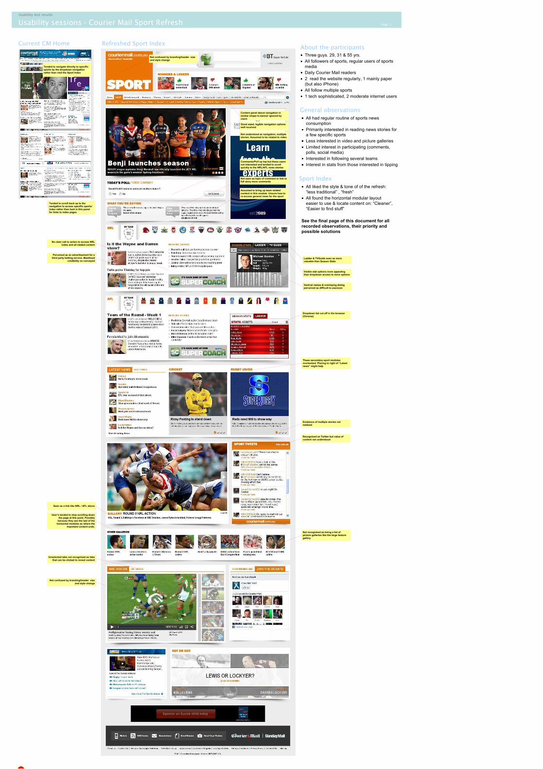
Usability sessions - Courier Mail Sport Refresh Page: 2
Usability test results
Refreshed Sport IndexCurrent CM Home
1
Tended to navigate directly to specific
sports by the dropdown navigation
rather than visit the Sport Index
Tended to scroll back up to the
navigation to access specific sports/
index rather than look in this panel
for links to index pages
About the participants
General observations
Not confused by branding/header size
and style change
Content panel above navigation in
similar shape to banner ignored by
users
Good sized, legible navigation options
well received
Not understood as navigation, multiple
stories. Assumed to be related to video
Assumed to bring up team related
content in this module. Unsure how to
re-access general news for the sport
Not seen as topic of comment or link to
full story more comments
No clear call to action to access NRL
index and all related content
Perceived as an advertisement for a
third party betting service. Masthead
credibility no conveyed
Visible stat options more appealing
than dropdown access to more options
Vertical names & overlaying dialog
perceived as difficult to use/scan
Dropdown list cut off in the browser
(Chrome)
Ladder & TVGuide seen as more
valuable than Season Stats
Existence of multiple stories not
realised
These secondary sport modules
overlooked. Placing to right of “Latest
news” might help
Seen as a link like NRL / AFL above
Unselected tabs not recognised as tabs
that can be clicked to reveal content
Not confused by branding/header size
and style change
Recognised as Twitter but value of
content not understood
Not recognised as being a list of
picture galleries like the large feature
gallery
Sport Index
Three guys. 29, 31 & 55 yrs.
All followers of sports, regular users of sports
media
Daily Courier Mail readers
2 read the website regularly, 1 mainly paper
(but also iPhone)
All follow multiple sports
1 tech sophisticated, 2 moderate internet users
All had regular routine of sports news
consumption
Primarily interested in reading news stories for
a few specific sports
Less interested in video and picture galleries
Limited interest in participating (comments,
polls, social media)
Interested in following several teams
Interest in stats from those interested in tipping
All liked the style & tone of of the refresh:
“less traditional” , “fresh”
All found the horizontal modular layout
easier to use & locate content on: “Cleaner”,
“Easier to find stuff”
See the final page of this document for all
recorded observations, their priority and
possible solutions
User’s tended to stop scrolling down
the page at this point. Possibly
because they see the last of the
horizontal modules as where the
important content ends.
Comments/Poll up top but these users
not interested and tended to scroll
quickly to the NRL/AFL news stories

Usability sessions - Courier Mail Sport Refresh Page: 3
Usability test results
Refreshed Sport Sub-Index (Rugby Union)
Not recognised as clickable or where
share functions might be located.
Not noticed by users above the navigation bar. Not perceived as way to
access match results, live scores etc.
Users did not look to the right hand column for more content related to this
sport

Usability sessions - Courier Mail Sport Refresh Page: 4
Usability test results
Refreshed Sport Story Page v1
These embedded elements were
noticed immediately and appreciated
Refreshed Sport Story Page v2
Not noticed by users above the
navigation bar.
Usability sessions - Courier Mail Sport Refresh Page: 5
Usability test results
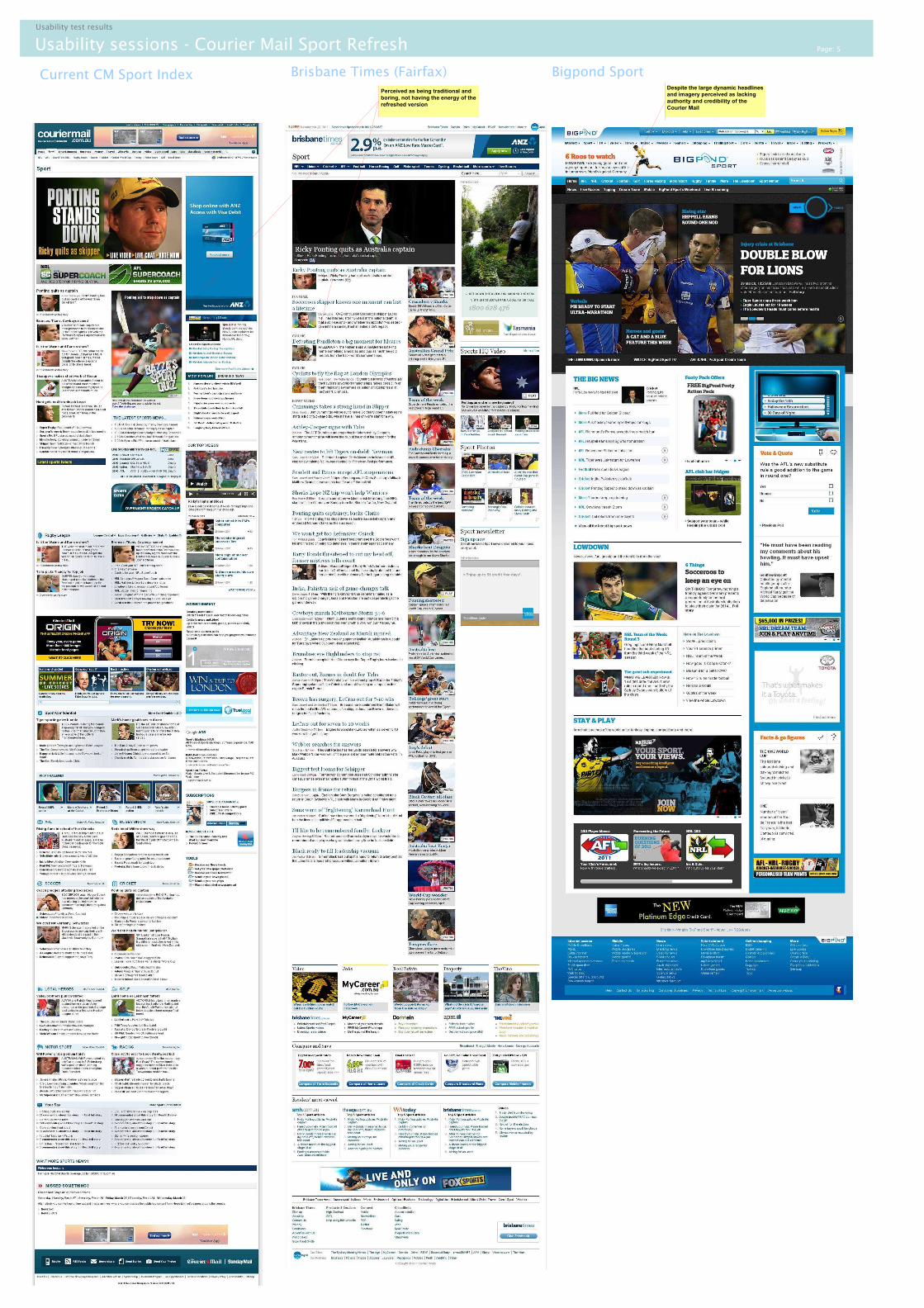
Current CM Sport Index Brisbane Times (Fairfax)Despite the large dynamic headlines
and imagery perceived as lacking
authority and credibility of the
Courier Mail
Bigpond Sport
Perceived as being traditional and
boring, not having the energy of the
refreshed version