UNIT III TQM TOOLS AND …dcemecha.weebly.com/uploads/5/8/0/3/58036683/ge2022_tqm_notes_… · ...
19
www.vidyarthiplus.com www.vidyarthiplus.com UNIT III TQM TOOLS AND TECHNIQUES THE SEVEN TRADITIOAL TOOLS OF QUALITY OR STATISTICAL PROCESS CONTROL Statistical process control (SPC) is the application of statistical methods to the monitoring and control of a process to ensure that it operates at its full potential to produce conforming product. Under SPC, a process behaves predictably to produce as much conforming product as possible with the least possible waste. Seven Tools: Pareto Diagram Process Flow Diagram Cause and Effect diagram Check sheets Histogram Scatter diagram Control charts 1. PARETO DIAGRAM: The Pareto diagram is a graphical overview of the process problems, in ranking order of the most frequent, down to the least frequent, in descending order from left to right. Thus, the Pareto diagram illustrates the frequency of fault types. Using a Pareto, you can decide which fault is the most serious or most frequent offender. The basic underlying rule behind Pareto's law is that in almost every case, 80% of the total problems incurred are caused by 20% of the problem cause types; such as people, machines, parts, processes, and other factors related to the production of the product. Therefore, by concentrating on the major problems first, you can eliminate the majority of your problems. The few items that have the largest amount of occurrence is your more frequent problem, than are the many items that only happen once in a while. This is called the "vital few over the trivial many" rule. Quite often, once you cure several of the "big hitters" you also eliminate some of the smaller problems at the same time.
Transcript of UNIT III TQM TOOLS AND …dcemecha.weebly.com/uploads/5/8/0/3/58036683/ge2022_tqm_notes_… · ...

www.vidyarthiplus.com
www.vidyarthiplus.com
UNIT III
TQM TOOLS AND TECHNIQUES
THE SEVEN TRADITIOAL TOOLS OF QUALITY
OR
STATISTICAL PROCESS CONTROL
Statistical process control (SPC) is the application of statistical methods to the monitoring and control of a process
to ensure that it operates at its full potential to produce conforming product. Under SPC, a process behaves
predictably to produce as much conforming product as possible with the least possible waste.
Seven Tools:
Pareto Diagram
Process Flow Diagram
Cause and Effect diagram
Check sheets
Histogram
Scatter diagram
Control charts
1. PARETO DIAGRAM:
The Pareto diagram is a graphical overview of the process problems, in ranking order of the most
frequent, down to the least frequent, in descending order from left to right.
Thus, the Pareto diagram illustrates the frequency of fault types.
Using a Pareto, you can decide which fault is the most serious or most frequent offender. The basic underlying rule behind Pareto's law is that in almost every case, 80% of the total
problems incurred are caused by 20% of the problem cause types; such as people, machines, parts,
processes, and other factors related to the production of the product.
Therefore, by concentrating on the major problems first, you can eliminate the majority of your
problems.
The few items that have the largest amount of occurrence is your more frequent problem, than are
the many items that only happen once in a while. This is called the "vital few over the trivial
many" rule.
Quite often, once you cure several of the "big hitters" you also eliminate some of the smaller
problems at the same time.

www.vidyarthiplus.com
www.vidyarthiplus.com
2. PROCESS FLOW DIAGRAM:
A process flow diagram (PFD) is a diagram commonly used in engineering to indicate the general flow of
plant processes and equipment.
The PFD displays the relationship between major equipment of a plant facility and does not show minor
details such as piping details and designations.
For many products and services it may be useful to construct a process flow diagram.
These diagrams show the flow of the product and service as it moves through various processing
operations.
The diagram makes it easy to visualize the entire system, identify potential trouble spots and locate control
activities.
It answers the question “Who is the next customer”?
Improvements can be made by changing, reducing, combining or eliminating steps.
3. CAUSE AND EFFECT DIAGRAM:
A C&E diagram is a picture composed of lines and symbols designed to represent a meaningful
relationship between an effect and its causes.
It is also referred to as fishbone diagram because of its shape.
For every effect, there are likely to be numerous causes.
In C&E diagram the effect is on the right side and causes on the left.
The first step in the construction of a C&E diagram is for the project team to identify the effect or quality
problem.
It is placed on the right side of a large piece of a paper by the team leader.
Next the major causes are identified and placed on the diagram.
The minor causes require brainstorming by the project team.

www.vidyarthiplus.com
www.vidyarthiplus.com
4. CHECK SHEETS:
The check sheet is a simple document that is used for collecting data in real-time and at the location
where the data is generated.
The document is typically a blank form that is designed for the quick, easy, and efficient recording of
the desired information, which can be either quantitative or qualitative. When the information is
quantitative, the check sheet is sometimes called a tally sheet.
A defining characteristic of a check sheet is that data is recorded by making marks ("checks") on it.
A typical check sheet is divided into regions, and marks made in different regions have different
significance.
Data is read by
observing the location and
number of marks on the sheet.
5.HISTOGRAM:
A graphical representation, similar to a bar chart in structure, that organizes a group of data points into
user-specified ranges.
The histogram condenses a data series into an easily interpreted visual by taking many data points and
grouping them into logical ranges or bins.
Histograms are commonly used in statistics to demonstrate how many of a certain type of variable
occurs within a specific range. For example, a census focused on the demography of a country may use a
histogram of how many people there are between the ages of 0 and 10, 11 and 20, 21 and 30, 31 and 40,
41 and 50 etc.
6. SCATTER DIAGRAM:

www.vidyarthiplus.com
www.vidyarthiplus.com
A scatter diagram is a tool for analyzing relationships between two variables.
One variable is plotted on the horizontal axis and the other is plotted on the vertical axis.
The pattern of their intersecting points can graphically show relationship patterns.
Most often a scatter diagram is used to prove or disprove cause-and-effect relationships.
7) CONTROL CHART:
A statistical tool to determine if a process is in control.
CONTROL CHARTS FOR VARIABLES AND ATTRIBUTES
VARIABLE CONTROL CHARTS
1. Deal with items that can be measured.
Example
1) Weight
2) Height
3) Speed
4) Volume
Types:
• X chart: deals with a average value in a process
• R chart: takes into count the range of the values
• MA chart: take into count the moving average of a process
2.ATTRIBUTE CONTROL CHART
Control charts that factor in the quality attributes of a process to determine if the process is performing in
or out of control.
Types:
• P chart
• C Chart
• U Chart
P Chart: a chart of the percent defective in each sample set.

www.vidyarthiplus.com
www.vidyarthiplus.com
C chart: a chart of the number of defects per unit in each sample set.
U chart: a chart of the average number of defects in each sample set.
Reasons for using Control Charts:
• Improve productivity
• Make defects visible
• Determine what process adjustments need to be made
• Determine if process is “in” or “out of control
SEVEN NEW MANAGEMENT TOOLS
The seven new management tools are:
1. Affinity Diagram
2. Interrelationship Digraph
3. Tree Diagram
4. Matrix Diagram
5. Prioritization Matrices
6. Process Decision Program Chart(PDPC)
7. Activity Network Diagram
1. Affinity Diagram:
This tool takes large amounts of disorganized data and information and enables one to organize it into
groupings based on natural relationships
This diagram allows the team to creatively generate a large number of issues/ideas and then logically
group them for problem understanding and possible break through solution.
The procedure is to state the issue in a sentence, brainstorming using short sentences on self-adhesive
notes, post them for the team to see, sort ideas in to logical groups and create concise descriptive
headings for each group.
Large groups should be divided in two smaller groups with appropriate headings.
Notes, that stand alone could become headers or placed in a miscellaneous category.
Affinity diagrams encourage team creativity, break down barriers, facilitate breakthroughs and stimulate
ownership of the process.

www.vidyarthiplus.com
www.vidyarthiplus.com
2. Interrelationship Digraph:
This tool displays all the interrelated cause-and-effect relationships and a factor involved in a complex
problem and describes desired outcomes.
The process of creating an interrelationship digraph helps a group analyze the natural links between
different aspects of a complex situation.
The interrelationship diagraph clarifies the interrelationship of many factors of a complex situation.
It allows the team to classify the cause and effect relationships among all the factors so that the key
drivers and outcomes can be used to solve the problem.
A relationship diagram allows a team to identify root causes from subjective data , systematically
explores cause and effect relationship, encourages member to think multi directionally and develops
team harmony and effectiveness

www.vidyarthiplus.com
www.vidyarthiplus.com
A concern with a high number of output arrows is a driver or key cause. A key cause affects a large number of
other items. The above diagram shows the following key causes:
Poor scheduling practices’ (6 outgoing arrows),
Late order from customer’ (5 outgoing arrows), and
Equipment breakdown (3 outgoing arrows).
A concern with a large number of input arrows is affected by a large number of other concerns. Thus, it could
be a source of a quality or performance metric. ‘Poor scheduling of the trucker’ has 4 input arrows.
3. Tree Diagram:
This tool is used to break down broad categories into finer and finer levels of detail
This tool is used to reduce any broad objective in to increasing levels of detail in order to achieve the
objective.
The procedure is to first choose an action oriented objective statement from the interrelationship
diagraph, affinity diagram, and brainstorming.
Second using brainstorming chooses the major headings.
The third step is to generate the next level by analyzing the major headings.
Ask “What needs to be addressed to achieve the objective? Repeat this question at each level.
Three levels below the objective are usually sufficient to complete the diagram and make appropriate
assignments.
The diagram should be reviewed to determine if these actions will give the results anticipated or if
something has been missed.
The tree diagram encourages team members to think creatively, makes large projects manageable and
generates a problem solving atmosphere.

www.vidyarthiplus.com
www.vidyarthiplus.com
4.Matrix Diagram:
The matrix diagram allows individuals or teams to identify, analyze and rate the relationship among two
or more variables.
QFD is the best example of the use of matrix diagram.
There are 5 standard formats
L-Shaped(2 Variables)
T-Shaped(3Variables)
Y-Shaped(3Variables)
C-Shaped(3 Variables)
X-Shaped(4 Variables)
The procedure for the diagram is to first select the factors affecting a successful plan.
Select the appropriate format Eg: L-Shaped
Next step is to determine the relationship symbols
Any symbols can be adopted provided the diagram contains a legend.
Numerical values are sometimes associated with the symbol as we have seen in QFD.
The last step is to complete the matrix by analyzing each cell and inserting the appropriate symbol.
The matrix diagram clearly shows the relationship of the two variables.
It encourages the team to think in terms of relationships, their strength and any patterns.
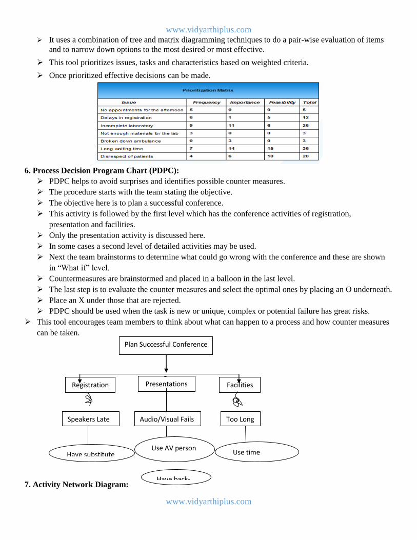
5. Prioritization Matrices:
This tool is used to prioritize items and describe them in terms of weighted criteria.
www.vidyarthiplus.com
www.vidyarthiplus.com
It uses a combination of tree and matrix diagramming techniques to do a pair-wise evaluation of items
and to narrow down options to the most desired or most effective.
This tool prioritizes issues, tasks and characteristics based on weighted criteria.
Once prioritized effective decisions can be made.
6. Process Decision Program Chart (PDPC):
PDPC helps to avoid surprises and identifies possible counter measures.
The procedure starts with the team stating the objective.
The objective here is to plan a successful conference.
This activity is followed by the first level which has the conference activities of registration,
presentation and facilities.
Only the presentation activity is discussed here.
In some cases a second level of detailed activities may be used.
Next the team brainstorms to determine what could go wrong with the conference and these are shown
in “What if” level.
Countermeasures are brainstormed and placed in a balloon in the last level.
The last step is to evaluate the counter measures and select the optimal ones by placing an O underneath.
Place an X under those that are rejected.
PDPC should be used when the task is new or unique, complex or potential failure has great risks.
This tool encourages team members to think about what can happen to a process and how counter measures
can be taken.
7. Activity Network Diagram:
Plan Successful Conference
Registration Presentations Facilities
Speakers Late Audio/Visual Fails Too Long
Have substitute
Have back-
up
Use AV person Use time
keeper

www.vidyarthiplus.com
www.vidyarthiplus.com
A project network is a graph (flow chart) depicting the sequence in which a project's terminal
elements are to be completed by showing terminal elements and their dependencies.
The work breakdown structure or the product breakdown structure show the "part-whole" relations. In
contrast, the project network shows the "before-after" relations.
The most popular form of project network is activity on node, the other one is activity on arrow.
The condition for a valid project network is that it doesn't contain any circular references.
Project dependencies can also be depicted by a predecessor table. Although such a form is very
inconvenient for human analysis, project management software often offers such a view for data entry.
An alternative way of showing and analyzing the sequence of project work is the design structure
matrix.
SIX SIGMA
Six Sigma is a business management strategy originally developed by Motorola, USA in 1986. Six Sigma
seeks to improve the quality of process outputs by identifying and removing the causes of defects (errors)
and minimizing variability in manufacturing and business processes.
It uses a set of quality management methods, including statistical methods, and creates a special
infrastructure of people within the organization ("Black Belts", "Green Belts", etc.) who are experts in
these methods.
www.vidyarthiplus.com
www.vidyarthiplus.com
Each Six Sigma project carried out within an organization follows a defined sequence of steps and has
quantified financial targets (cost reduction and/or profit increase). A six sigma process is one in which
99.99966% of the products manufactured are statistically expected to be free of defects (3.4 defects per
million).
SIX SIGMA IS SEVERAL THINGS
• A statistical basis of measurement: 3.4 defects per million opportunities
• A philosophy and a goal: as perfect as practically possible
• A methodology
• A symbol of quality
SIGMA VALUES
Sigma Level % Good PPM/DPMO
2 95.45 45500
3 99.73 2700
4 99.9937 63
5 99.999943 0.57
6 99.9999998 0.002
METHODS:
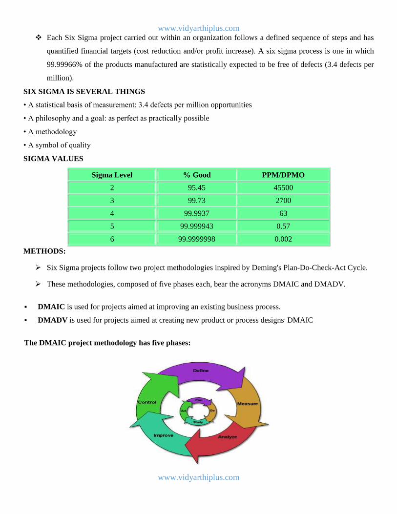
Six Sigma projects follow two project methodologies inspired by Deming's Plan-Do-Check-Act Cycle.
These methodologies, composed of five phases each, bear the acronyms DMAIC and DMADV.
DMAIC is used for projects aimed at improving an existing business process.
DMADV is used for projects aimed at creating new product or process designs. DMAIC
The DMAIC project methodology has five phases:

www.vidyarthiplus.com
www.vidyarthiplus.com
Define the problem, the voice of the customer, and the project goals, specifically.
Measure key aspects of the current process and collect relevant data.
Analyze the data to investigate and verify cause-and-effect relationships. Determine what the relationships
are, and attempt to ensure that all factors have been considered. Seek out root cause of the defect under
investigation.
Improve or optimize the current process based upon data analysis using techniques such as design of
experiments, poka yoke or mistake proofing, and standard work to create a new, future state process. Set up
pilot runs to establish process capability.
Control the future state process to ensure that any deviations from target are corrected before they result in
defects. Implement control systems such as statistical process control, production boards, visual workplaces,
and continuously monitor the process.
DMADV or DFSS
The DMADV project methodology, also known as DFSS ("Design For Six Sigma"), features five phases:
Define design goals that are consistent with customer demands and the enterprise strategy.
Measure and identify CTQs (characteristics that are Critical to Quality), product capabilities, production
process capability, and risks.
Analyze to develop and design alternatives, create a high-level design and evaluate design capability to
select the best design.
Design details, optimize the design, and plan for design verification. This phase may require simulations.
Verify the design, set up pilot runs, implement the production process and hand it over to the process
owner(s).
IMPLEMENTATION:
www.vidyarthiplus.com
www.vidyarthiplus.com
Six Sigma identifies several key roles for its successful implementation.
Executive Leadership includes the CEO and other members of top management. They are responsible for
setting up a vision for Six Sigma implementation. They also empower the other role holders with the
freedom and resources to explore new ideas for breakthrough improvements.
Champions take responsibility for Six Sigma implementation across the organization in an integrated
manner. The Executive Leadership draws them from upper management. Champions also act as mentors to
Black Belts.
Master Black Belts, identified by champions, act as in-house coaches on Six Sigma. They devote 100% of
their time to Six Sigma. They assist champions and guide Black Belts and Green Belts. Apart from
statistical tasks, they spend their time on ensuring consistent application of Six Sigma across various
functions and departments.
Black Belts operate under Master Black Belts to apply Six Sigma methodology to specific projects. They
devote 100% of their time to Six Sigma. They primarily focus on Six Sigma project execution, whereas
Champions and Master Black Belts focus on identifying projects/functions for Six Sigma.
Green Belts are the employees who take up Six Sigma implementation along with their other job
responsibilities, operating under the guidance of Black Belts.
Some organizations use additional belt colors, such as Yellow Belts, for employees that have basic training in
Six Sigma tools and generally participate in projects and 'white belts' for those locally trained in the concepts
but do not participate in the project team.
BENCHMARKING
Benchmarking is a systematic method by which organization can measure themselves against the best
industry practices.
It provides superior performance by providing an organized framework through which organizations
learn how the “best in class” do things, understand how these best practices differ from their own and
implement change to close the gap.
The essence of benchmarking is the process of borrowing ideas and adapting them to gain competitive
advantage.
It is a tool for continuous improvement.
Definition:

www.vidyarthiplus.com
www.vidyarthiplus.com
Reasons to benchmark:
To achieve business and competitive objectives.
To develop organization strengths and reduce weaknesses.
To inspire mangers to compete
It allows goals to be set objectively based on external information
Benchmarking is time and cost efficient because the process involves imitation and adaptation rather
than pure invention.
It provides a working model of an improved process which reduces some of the planning, testing and
prototyping efforts.
Process:
Six steps:
Decide what to benchmark
Understand current performance
Plan
Study others
Learn from the data
Use the findings
Step 1: Decide what to benchmark
Most organizations have a strategy that defines how the firm wants to position itself and compete in the
market place.
This strategy is usually expressed in terms of mission and vision statement.
Supporting these statements is a set of critical activities which the organization must do successfully to
realize its vision.
They are often referred as “critical success factors”
Broad and shallow:
What is done?
Broad and shallow studies are useful in developing strategies, setting goals and reorganizing
functions to be more effective.
Narrow and Deep:
How it is done?
www.vidyarthiplus.com
www.vidyarthiplus.com
It is useful in changing how people perform their jobs.
Step 2: Understanding Current Performance
To compare outside practices, it is necessary to thoroughly understand and document the current
process.
Attention must be paid to inputs and outputs.
The benchmarking team should be comprised of those who won or work in the process to ensure
suggested changes are actually implemented.
When documenting the process it is important to quantify it.
Units of measure must be determined.
These are the key metrics that will be compared during the benchmarking investigation.
Common examples are unit costs, hourly rates, asset measures and quality measures.
Step 3: Planning
Once internal processes are understood and documented it is possible to make decisions about how to
conduct the study.
Benchmark planning is a learning process.
The first is to use the information that are available in the public domain to focus the inquiry and to find
appropriate benchmark partners.
3 types of benchmarking
Internal
Competitive
Process
Internal-internal comparisons have several advantages, data are easy to obtain because problems of
confidentiality does not exist.
Competitive-product competitors are an obvious choice to benchmark. An organizations survival
depends on its performance relative to the competition.
Process-process benchmarking is sometimes known as functional or generic benchmarking.
Step 4: Studying others
Benchmarking studies look for two types of information: descriptions of how best in class processes are
practiced and the measurable results of these practices.
In seeking this information bench markers can use internal sources , data in the public domain, original
research or most likely a combination of sources.
When most people of benchmarking they generally think of conducting original research through site
visits and interviews.
This is not always necessary and some organizations find industrial tourism a waste of time.
Three techniques for conducting original research are questionnaires, site visits and focus groups.
Step 5: Learning from the data
Is there a gap between the organizations performance and the performance of the best in class
organizations?
What is the gap? How much is it?
Why is there a gap? What does the best in class do differently that is better?
If the best in class practices were adopted what would be the resulting improvement?
Benchmarking studies can reveal three different outcomes

www.vidyarthiplus.com
www.vidyarthiplus.com
External processes may be significantly better than internal processes( a negative gap)
Process performance may be approximately equal(parity)
The internal process may be better than that found in external organizations(positive gap)
Negative gap calls for a major improvement effort
Parity requires further investigation to determine if improvement opportunities exist.
Positive gap should result in recognition for the internal process.
When best in class processes have been described and quantified, additional analysis is necessary to
determine the root causes of the gaps.
Step 6: Use the findings
When a benchmark study reveals a negative gap in performance, the objective is to change the process
to close the gap.
Benchmarking is a waste of time if change does not occur as a result.
FAILURE MODE AND EFFECT ANALYSIS (FMEA)
FMEA is an analytical technique that combines the technology and experience of people in identifying
foreseeable failure modes of a product or process and planning for its elimination.
FMEA is a “before the event” action requiring a team effort to easily and inexpensively alleviate
changes in design and production.
Types:
Design FMEA
Process FMEA
Reliability:
Reliability is one of the most important characteristics of any product, no matter what its application.
It is also an important aspect when dealing with customer satisfaction, whether the customer is internal
or external.
Customers want a product that will have a relatively long service life, with long times between failures.
Reliability may be defined as the probability of the product to perform as expected for a certain period
of time, under the given operating conditions and at a given set of product performance characteristics.
Types of failures:
i. Debug
ii. Chance
iii. Wear out
Debug- includes a high failure rate at the initial stages because of inappropriate use or flaws in the design or
manufacturing.
Chance-is the failure of the product due to accidents, poor maintenance or limitations on the design.
Wear out-covers failure after the product or process has performed as expected for at-least the time given by
the manufacturer as the product or process life. A successful design or product should ideally fail only in this
last method.
Intent of FMEA:
When acquiring new machines, creating a new product or even modifying an existing product, it is
always necessary to determine the product or process.
One of the most powerful methods available for measuring the reliability of the process or product is
FMEA.
www.vidyarthiplus.com
www.vidyarthiplus.com
FMEA can be implemented both in design and process areas as it basically involves the identification of
the potential failure modes and the effect of those on both the internal and external customers.
FMEA attempts to detect the potential product related failure modes.
The technique is used to anticipate the causes of failure and prevent them from happening.
In order to make FMEA as successful, it is extremely important to treat the FMEA as a living document,
continually changing as new problems are found and being updated to ensure that the most critical
problems are identified and addressed quickly.
One purpose of FMEA is to compare the design characteristics relative to the planned manufacturing or
assembly methods to make certain that the product meets the customer requirements.
Corrective action should begin as soon as failure mode is identified.
Consumers today are far more particular than they have been in the past, demanding products of the
highest quality for the lowest possible cost.
FMEA also allows the engineer to keep a record of all thoughts and actions taken to ensure a safe and
reliable product.
FMEA Team:
The FMEA methodology is a team effort where the possible engineer involves assembly, manufacturing,
materials, quality, service, supplier and the customer.
The team leader has certain responsibilities, which include determining the meeting time and place,
communicating with the rest of the team, coordinating with the rest of the team, coordinating corrective
action assignment and follow-up, keeping files and records of FMEA forms, leading the team through
completion of the forms, keeping the process moving and finally drawing everyone in to participation.
There also should be a recorder who records the results on the form and distributes to participants in a
timely manner.
Stages of FMEA:
There are four stages of FMEA
Specifying Possibilities
Functions
Possible Failure Modes
Root Causes
Effects
Detection/Prevention
Quantifying Risk:
Probability of Cause
Severity of Effect
Effectiveness of Control to Prevent cause
Risk Priority Number
Correcting High Risk causes
Prioritizing Work
Detailing Action
Assigning Action Responsibility
Check Points on completion
Re-evaluation of Risk:
www.vidyarthiplus.com
www.vidyarthiplus.com
Recalculation of Risk Priority Number
FMEA DOCUMENTATION
The Design FMEA document
The top section in the form is used mainly for document tracking and organization.
1. FMEA Number: On the top left corner of the document is the FMEA number, which is only needed for
tracking
2. Item: The item space is used only to clarify which exact component or process is being analyzed.
3. Design Responsibility: The team in charge of the design or process should be included. The name and
company of the person or group responsible for preparing the document should be included.
4. Prepared By: The name, telephone number and address should be included.
5. Model number/Year: Both the name and identification number of the system, sub-system or component
should be included to avoid confusion between similar components.
6. Key Date: The date the initial FMEA is due should be placed.
7. FMEA date: The date the original FMEA was complied and the latest revision date should be placed in the
FMEA date space.
8. Core Team: The names of the responsible individuals and departments that have authority to perform tasks
should be listed.
9. Item/Function: The name and number of the item being analyzed is recorded here. This information should
be as precise as possible to avoid confusion involving similar items. Next the function of the item is to be
entered here.
10. Potential failure Mode: It may be the method in which the item being analyzed may fail to meet the design
criteria.
11. Potential Effects of Failure: It is the effect of failure as perceived by the customer. The effects of failure
must be described in terms of what the customer will notice or experience in the product.
12. Severity: Severity is the assessment of the seriousness of the effect of the potential failure mode to the next
component, subsystem, system or customer if it occurs.
13. Classification: This column is used to classify any special product characteristics for components,
subsystems or systems that may require additional process controls.
14. Potential Causes/ Mechanisms of Failure: The failure modes may have more than one cause or
mechanism of failure, each of these must be examined and listed separately. Then each of these causes must be
reviewed with equal weight.
15. Occurrence: Occurrence is the chance that one of the specific cause/mechanism will occur.
16. Current Design Controls: It consist of prevention measures, design validation and design verification.
17. Detection: It is a relative measure of the assessment of the ability of the design control to detect either a
potential cause/mechanism before the component, subsystem or system is completed for production.
18. Risk Priority Number (RPN): RPN= (S) * (O) * (D)
19. Recommended Actions: After every concern has been examined and given a risk priority number, the team
should begin to examine the corrective actions that may be employed, beginning with the greatest RPN and
moving to descending RPN number
20. Responsibility and Target Completion dates: Here the individual or group responsible for the
recommended actions and the target completion date should be entered.

www.vidyarthiplus.com
www.vidyarthiplus.com
21. Actions Taken: After an action has been implemented, a brief description of the actual action and its
effective date should be entered.