Unit 5: Scatter Plots - Michael Burns Scatter Plots.pdf · Displaying data visually can help you...
39
Unit 5: Scatter Plots
Transcript of Unit 5: Scatter Plots - Michael Burns Scatter Plots.pdf · Displaying data visually can help you...

Unit 5: Scatter Plots
scatter plot
regression
correlation
line of best fit/trend line
correlation coefficient
residual
residual plot
observed value
predicted value
I. Vocabulary List
Definitions will be given in notes
Researchers, such as anthropologists, are often interested in how two measurements are related. The statistical study of the relationship between variables is called regression.
II. Scatter Plots Basics
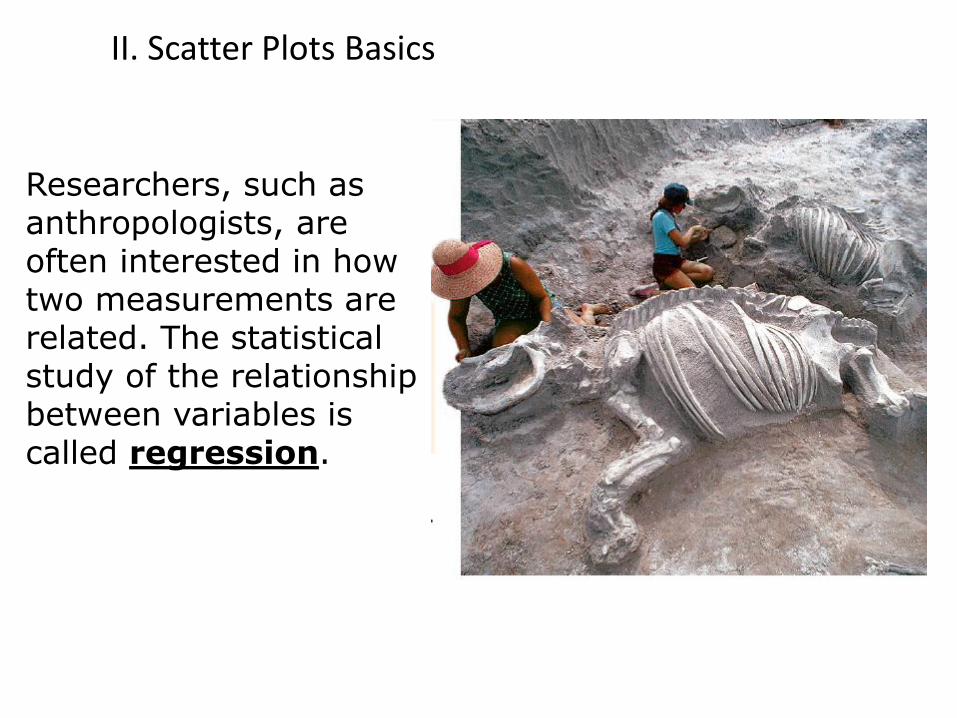
Displaying data visually can help you see relationships. A scatter plot is a graph with points plotted to show a possible relationship between two sets of data. A scatter plot is an effective way to display some types of data.
Is a scatter plot discrete or continuous?
discrete
A. Definition and Use
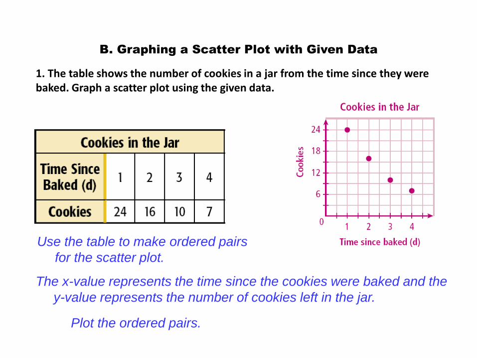
B. Graphing a Scatter Plot with Given Data
1. The table shows the number of cookies in a jar from the time since they were baked. Graph a scatter plot using the given data.
Use the table to make ordered pairs
for the scatter plot.
The x-value represents the time since the cookies were baked and the
y-value represents the number of cookies left in the jar.
Plot the ordered pairs.
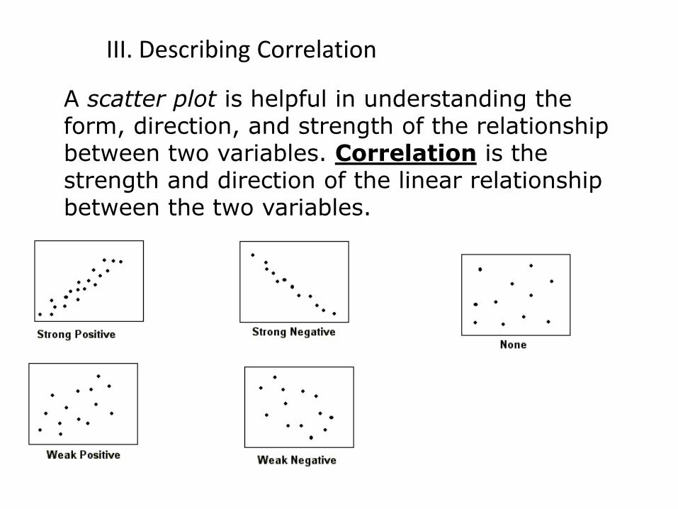
A scatter plot is helpful in understanding the form, direction, and strength of the relationship between two variables. Correlation is the strength and direction of the linear relationship between the two variables.
III. Describing Correlation
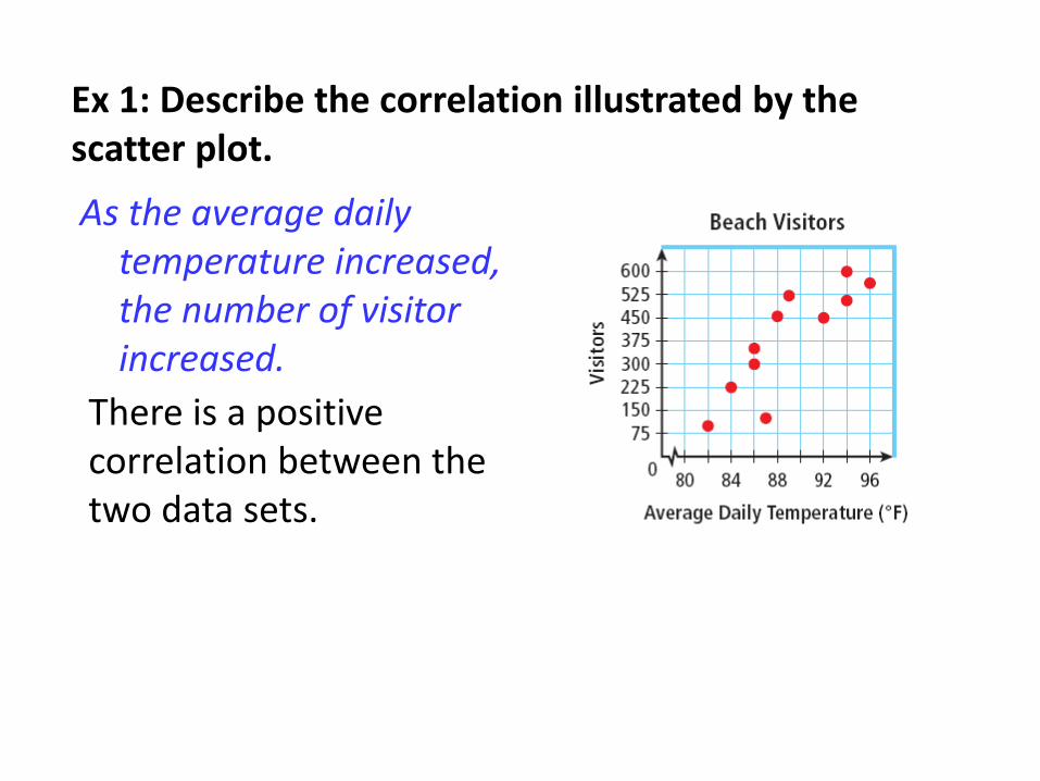
Ex 1: Describe the correlation illustrated by the scatter plot.
There is a positive correlation between the two data sets.
As the average daily temperature increased, the number of visitor increased.
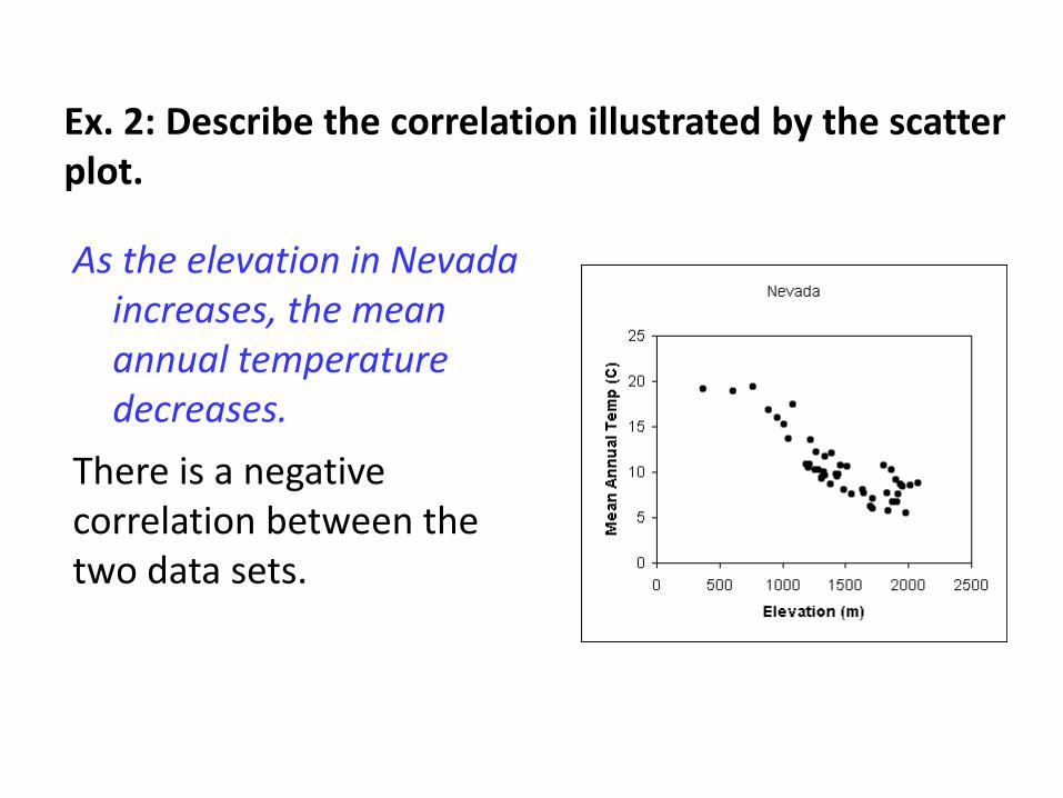
Ex. 2: Describe the correlation illustrated by the scatter plot.
There is a negative correlation between the two data sets.
As the elevation in Nevada increases, the mean annual temperature decreases.
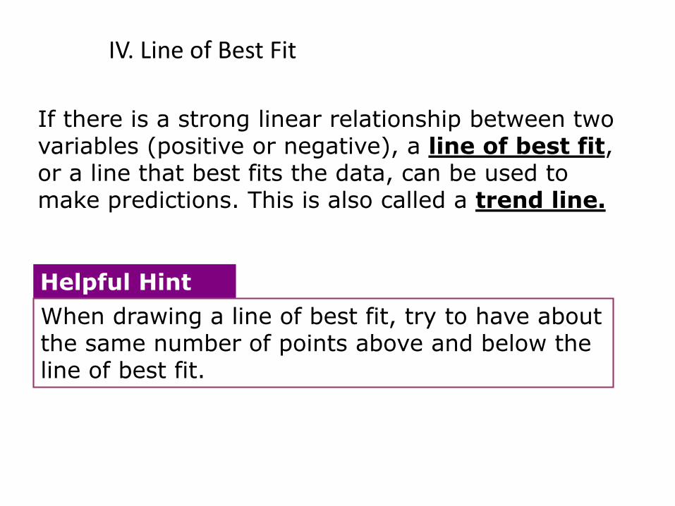
When drawing a line of best fit, try to have about the same number of points above and below the line of best fit.
Helpful Hint
If there is a strong linear relationship between two variables (positive or negative), a line of best fit, or a line that best fits the data, can be used to make predictions. This is also called a trend line.
IV. Line of Best Fit
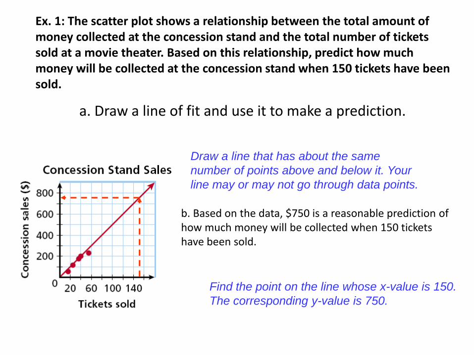
a. Draw a line of fit and use it to make a prediction.
Draw a line that has about the same
number of points above and below it. Your
line may or may not go through data points.
Find the point on the line whose x-value is 150.
The corresponding y-value is 750.
b. Based on the data, $750 is a reasonable prediction of how much money will be collected when 150 tickets have been sold.
Ex. 1: The scatter plot shows a relationship between the total amount of money collected at the concession stand and the total number of tickets sold at a movie theater. Based on this relationship, predict how much money will be collected at the concession stand when 150 tickets have been sold.
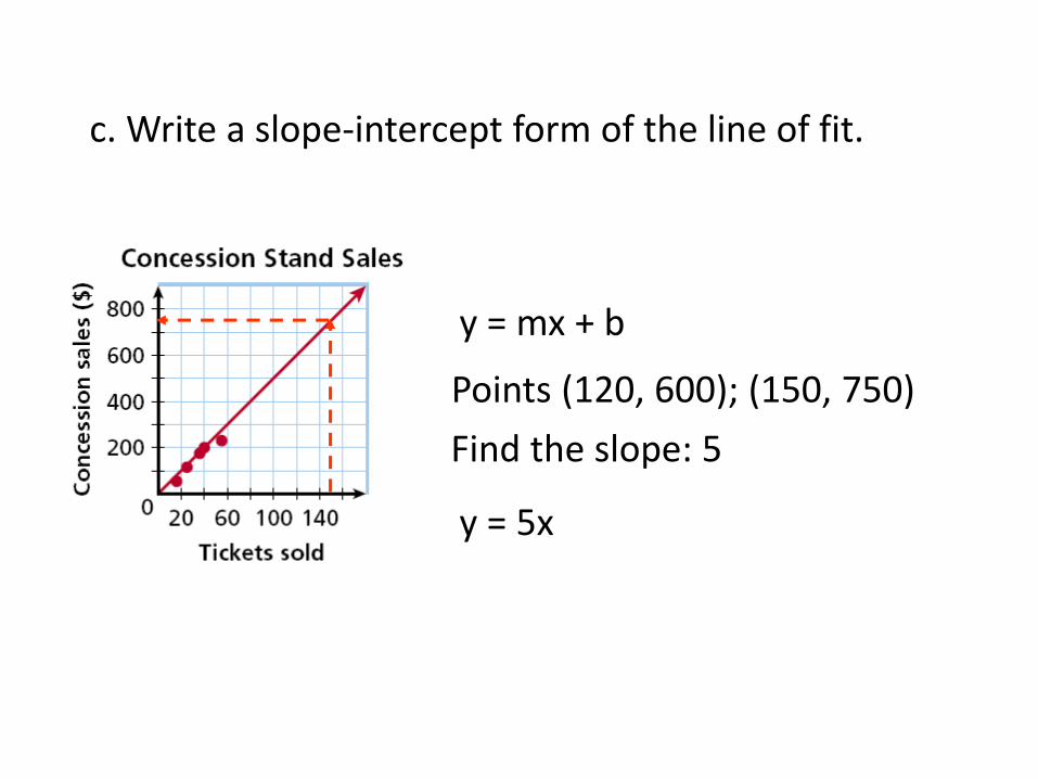
c. Write a slope-intercept form of the line of fit.
y = mx + b
Points (120, 600); (150, 750)
Find the slope: 5
y = 5x
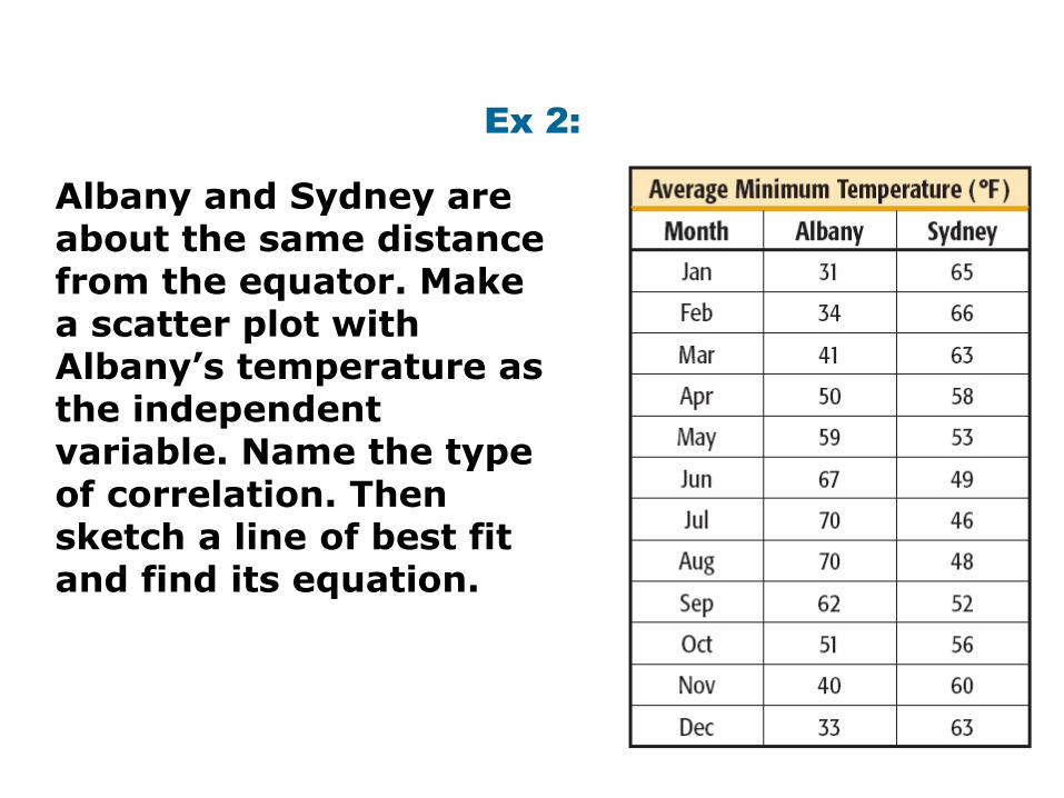
Ex 2:
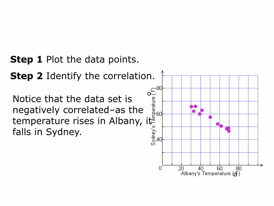
Albany and Sydney are about the same distance from the equator. Make a scatter plot with Albany’s temperature as the independent variable. Name the type of correlation. Then sketch a line of best fit and find its equation.
o
••••
•••
•••
•
Step 1 Plot the data points.
Step 2 Identify the correlation.
Notice that the data set is negatively correlated–as the temperature rises in Albany, it falls in Sydney.
o
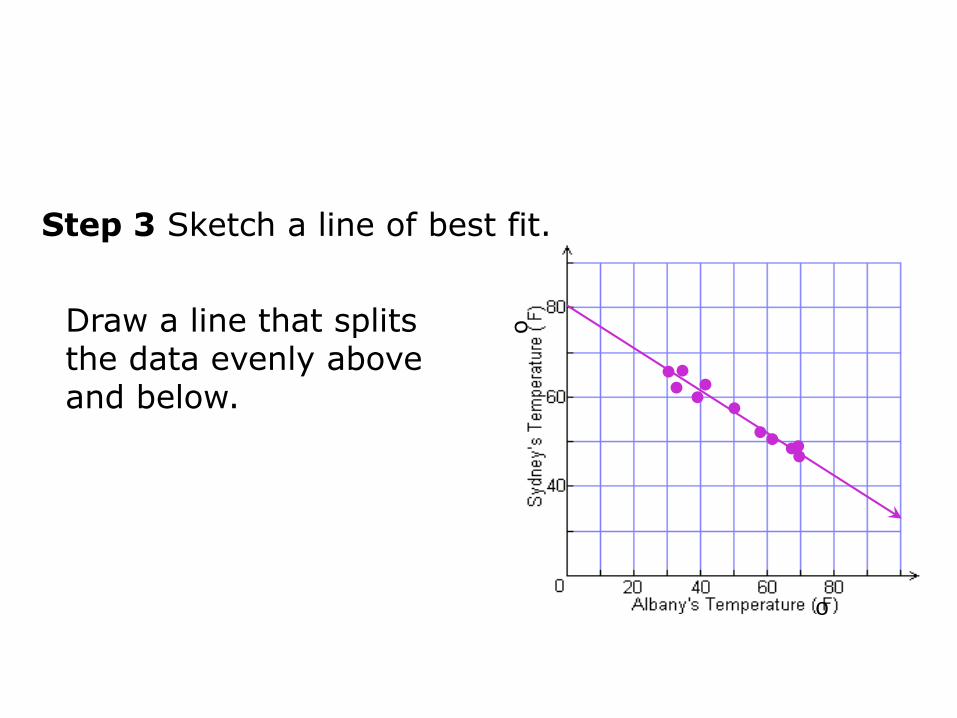
Step 3 Sketch a line of best fit.
Draw a line that splits the data evenly above and below.
••••
•••
•••
•
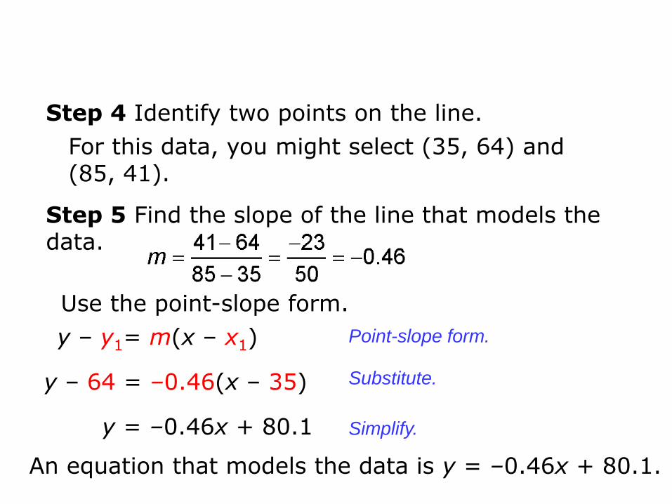
Step 4 Identify two points on the line.
For this data, you might select (35, 64) and (85, 41).
Step 5 Find the slope of the line that models the data.
Use the point-slope form.
An equation that models the data is y = –0.46x + 80.1.
y – y1= m(x – x1)
y – 64 = –0.46(x – 35)
y = –0.46x + 80.1
Point-slope form.
Substitute.
Simplify.
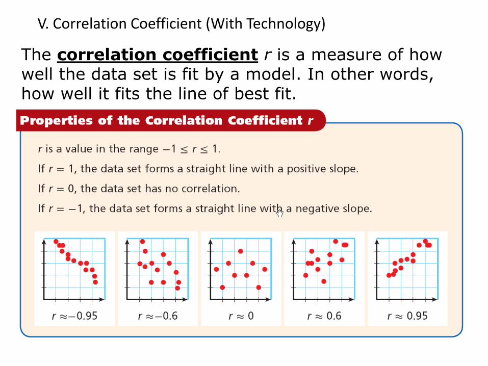
The correlation coefficient r is a measure of how well the data set is fit by a model. In other words, how well it fits the line of best fit.
V. Correlation Coefficient (With Technology)
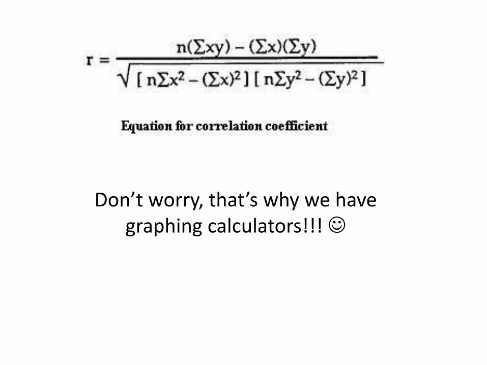
Don’t worry, that’s why we have graphing calculators!!!
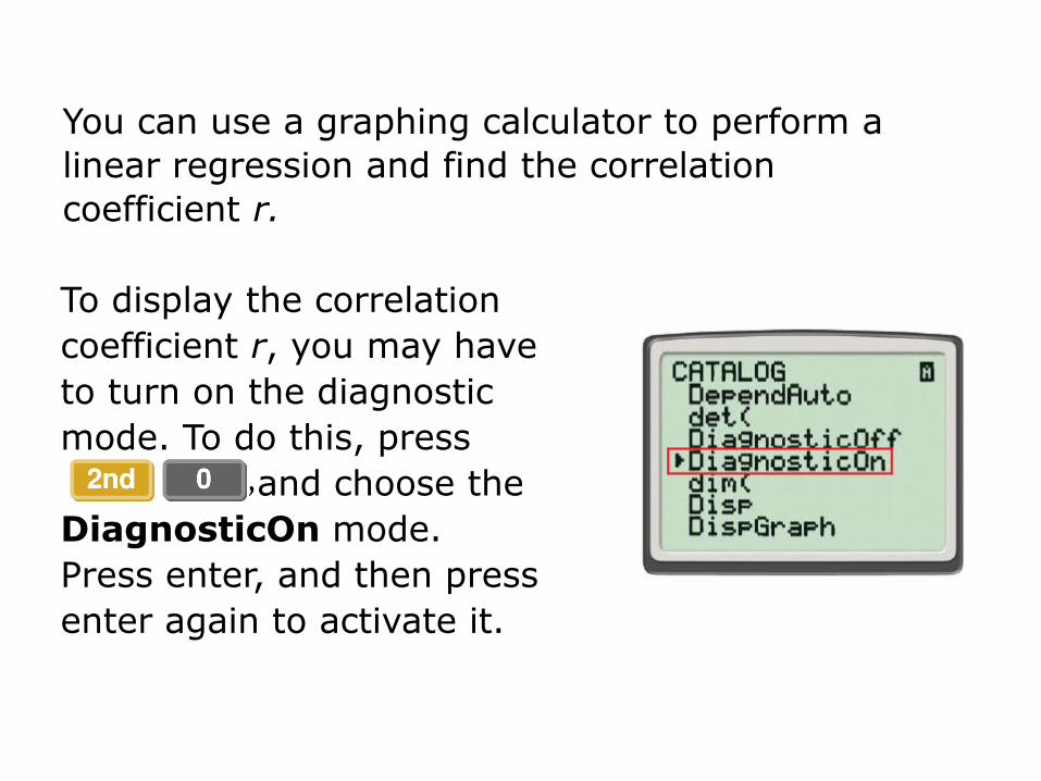
To display the correlation
coefficient r, you may have
to turn on the diagnostic
mode. To do this, press
and choose the
DiagnosticOn mode.
Press enter, and then press
enter again to activate it.
You can use a graphing calculator to perform a
linear regression and find the correlation
coefficient r.
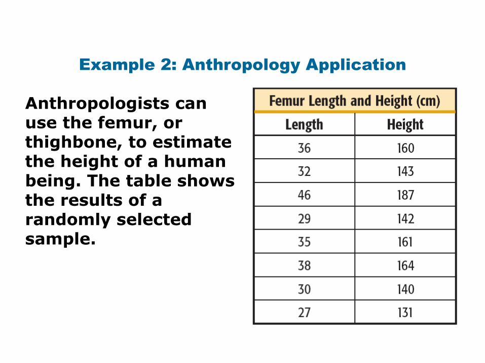
Example 2: Anthropology Application
Anthropologists can use the femur, or thighbone, to estimate the height of a human being. The table shows the results of a randomly selected sample.
••••
• • •
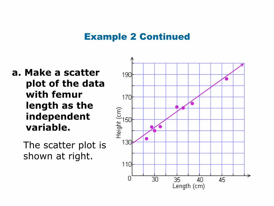
•a. Make a scatter
plot of the data with femur length as the independent variable.
The scatter plot is shown at right.
Example 2 Continued
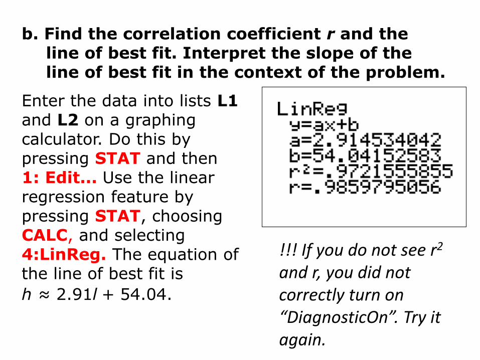
b. Find the correlation coefficient r and the line of best fit. Interpret the slope of the line of best fit in the context of the problem.
Enter the data into lists L1 and L2 on a graphing calculator. Do this by pressing STAT and then 1: Edit... Use the linear regression feature by pressing STAT, choosing CALC, and selecting 4:LinReg. The equation of the line of best fit is
h ≈ 2.91l + 54.04.
!!! If you do not see r2
and r, you did not correctly turn on “DiagnosticOn”. Try it again.
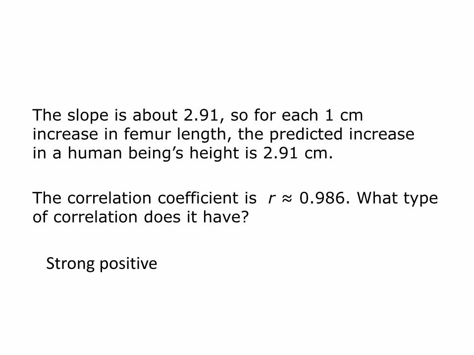
The slope is about 2.91, so for each 1 cm increase in femur length, the predicted increase in a human being’s height is 2.91 cm.
The correlation coefficient is r ≈ 0.986. What type of correlation does it have?
Strong positive
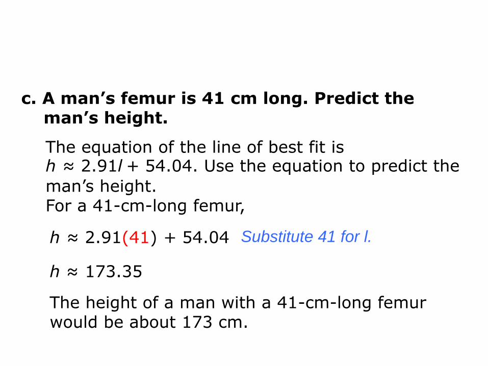
c. A man’s femur is 41 cm long. Predict the man’s height.
Substitute 41 for l.
The height of a man with a 41-cm-long femur would be about 173 cm.
h ≈ 2.91(41) + 54.04
The equation of the line of best fit is h ≈ 2.91l + 54.04. Use the equation to predict the
man’s height. For a 41-cm-long femur,
h ≈ 173.35
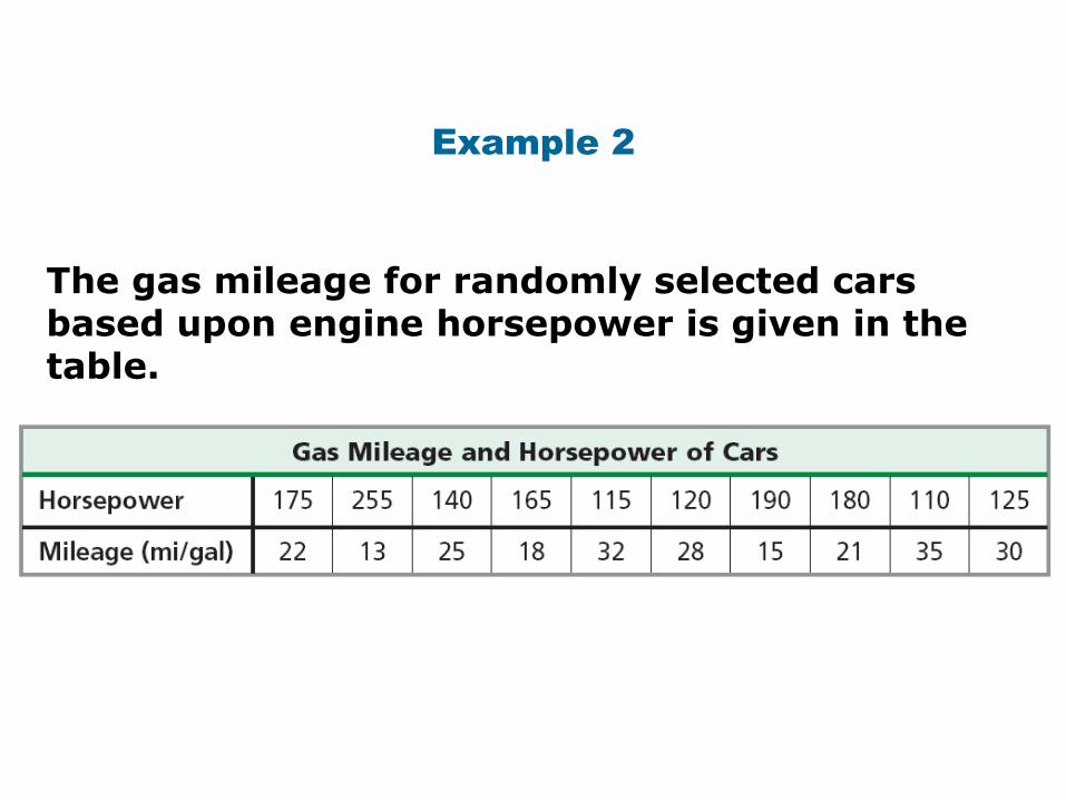
Example 2
The gas mileage for randomly selected cars based upon engine horsepower is given in the table.
••••••
••••
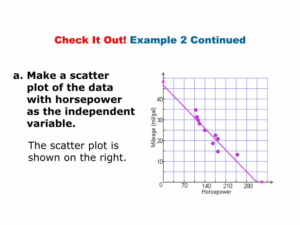
Check It Out! Example 2 Continued
a. Make a scatter plot of the datawith horsepoweras the independentvariable.
The scatter plot is shown on the right.
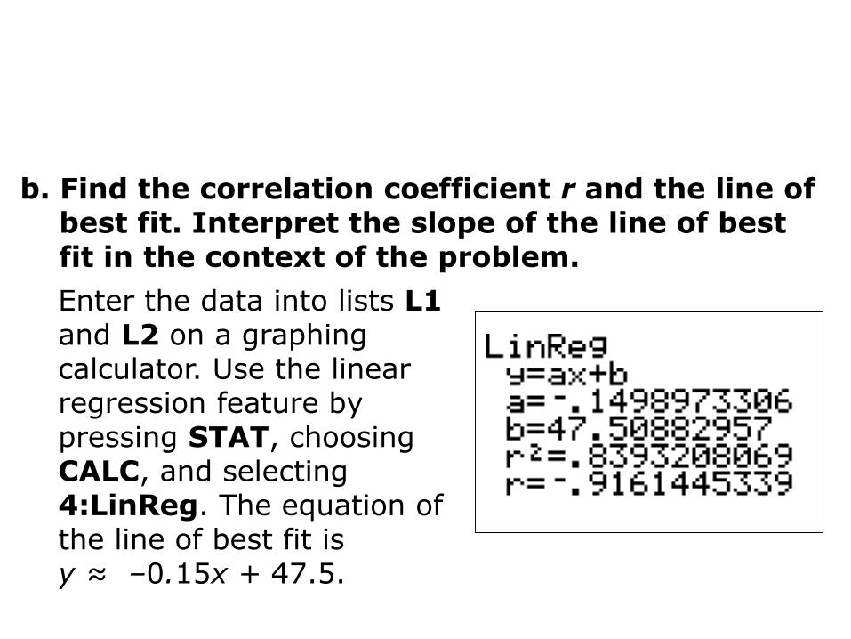
b. Find the correlation coefficient r and the line of best fit. Interpret the slope of the line of best fit in the context of the problem.
Enter the data into lists L1and L2 on a graphing calculator. Use the linear regression feature by pressing STAT, choosing CALC, and selecting 4:LinReg. The equation of the line of best fit isy ≈ –0.15x + 47.5.
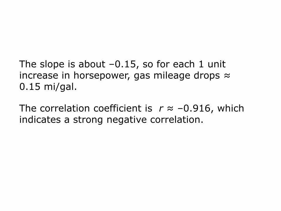
The correlation coefficient is r ≈ –0.916, which indicates a strong negative correlation.
The slope is about –0.15, so for each 1 unit increase in horsepower, gas mileage drops ≈ 0.15 mi/gal.
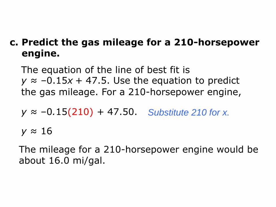
c. Predict the gas mileage for a 210-horsepowerengine.
Substitute 210 for x.
The mileage for a 210-horsepower engine would be about 16.0 mi/gal.
y ≈ –0.15(210) + 47.50.
The equation of the line of best fit is y ≈ –0.15x + 47.5. Use the equation to predict
the gas mileage. For a 210-horsepower engine,
y ≈ 16
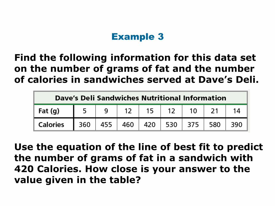
Example 3
Use the equation of the line of best fit to predict the number of grams of fat in a sandwich with 420 Calories. How close is your answer to the value given in the table?
Find the following information for this data set on the number of grams of fat and the number of calories in sandwiches served at Dave’s Deli.
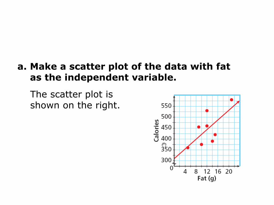
a. Make a scatter plot of the data with fat as the independent variable.
The scatter plot is shown on the right.
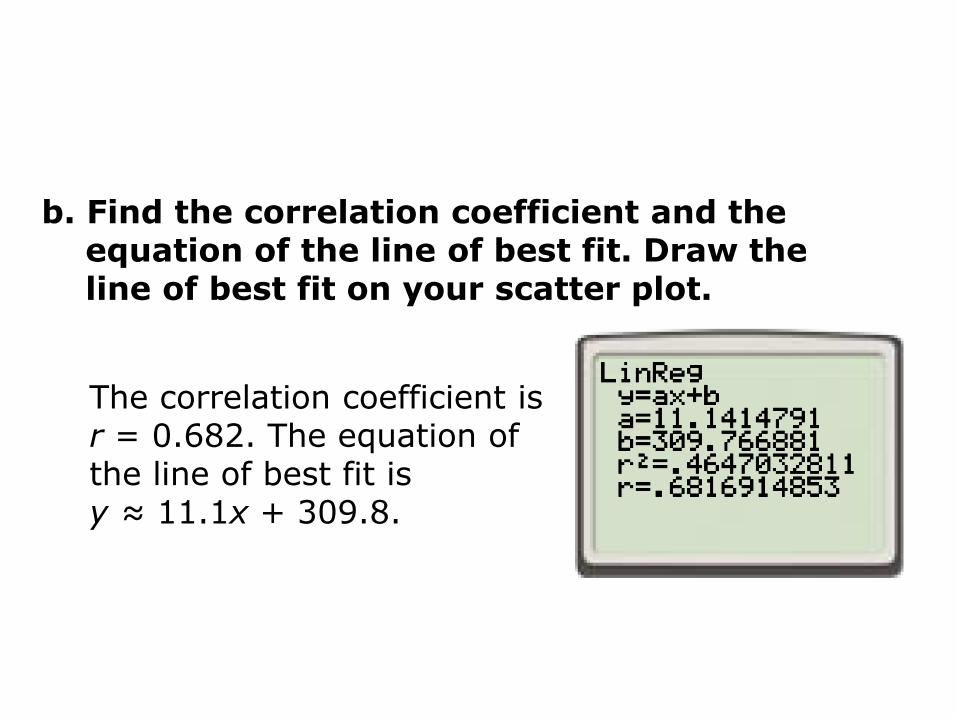
b. Find the correlation coefficient and the equation of the line of best fit. Draw theline of best fit on your scatter plot.
The correlation coefficient is r = 0.682. The equation of the line of best fit is y ≈ 11.1x + 309.8.
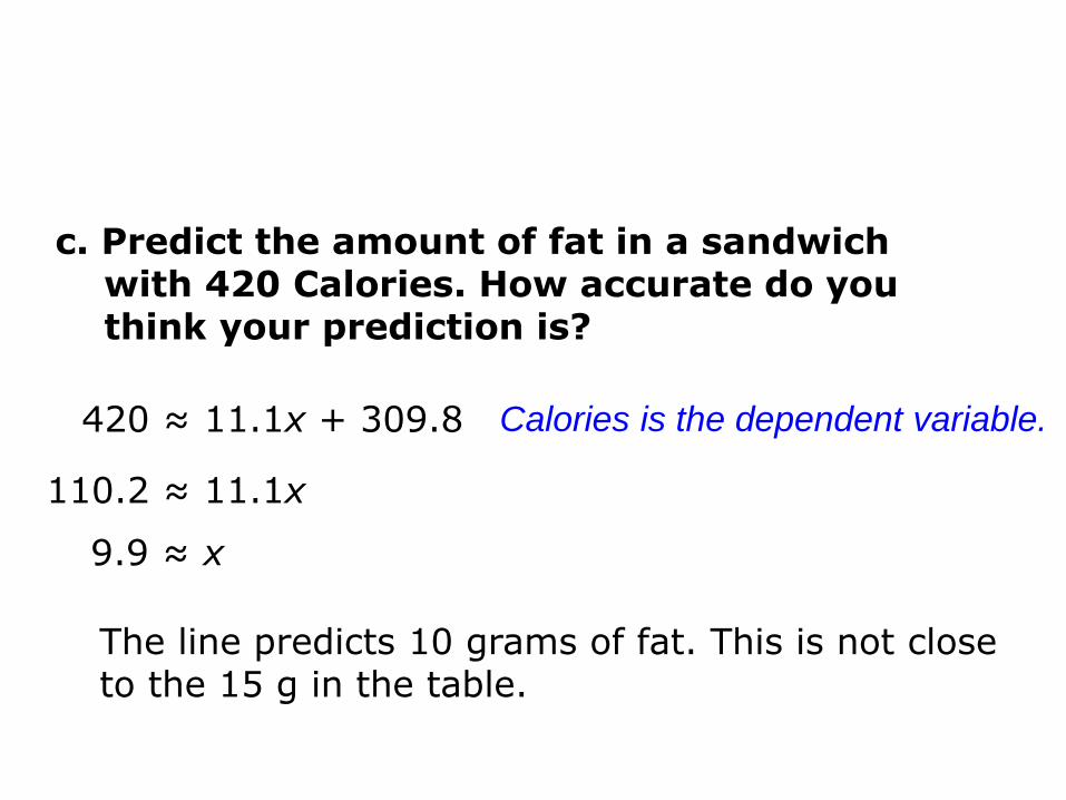
c. Predict the amount of fat in a sandwichwith 420 Calories. How accurate do you think your prediction is?
420 ≈ 11.1x + 309.8 Calories is the dependent variable.
110.2 ≈ 11.1x
9.9 ≈ x
The line predicts 10 grams of fat. This is not close to the 15 g in the table.
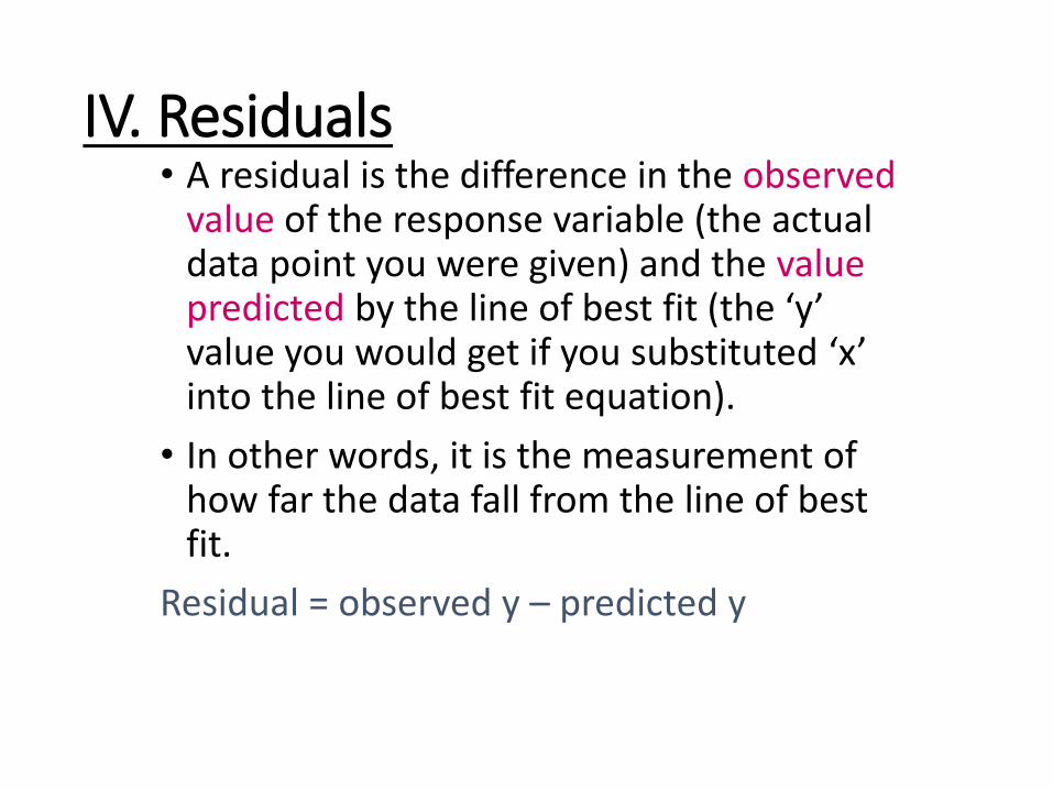
IV. Residuals• A residual is the difference in the observed
value of the response variable (the actual data point you were given) and the value predicted by the line of best fit (the ‘y’ value you would get if you substituted ‘x’ into the line of best fit equation).
• In other words, it is the measurement of how far the data fall from the line of best fit.
Residual = observed y – predicted y
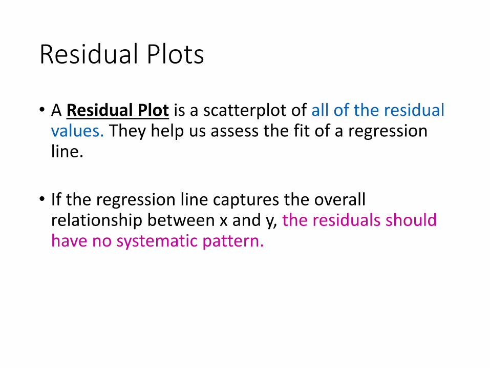
Residual Plots
• A Residual Plot is a scatterplot of all of the residual values. They help us assess the fit of a regression line.
• If the regression line captures the overall relationship between x and y, the residuals should have no systematic pattern.
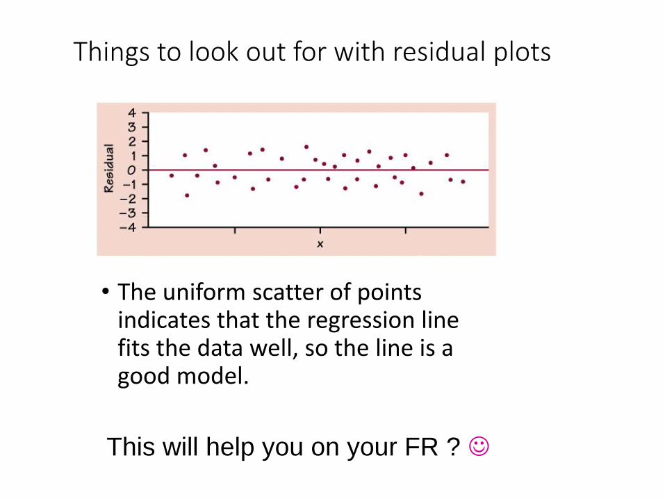
Things to look out for with residual plots
• The uniform scatter of points indicates that the regression line fits the data well, so the line is a good model.
This will help you on your FR ?
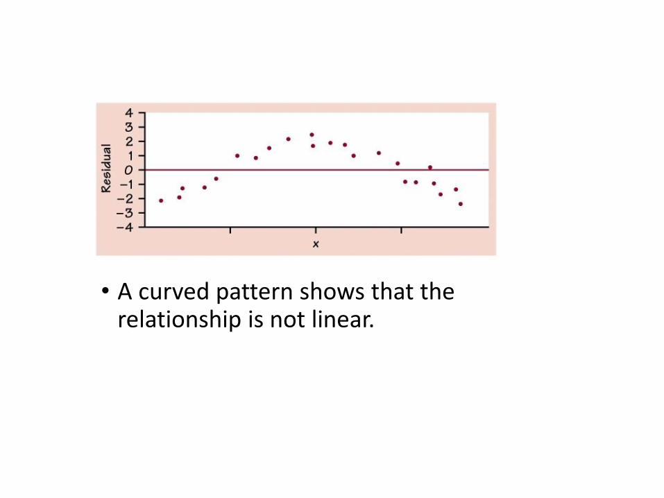
• A curved pattern shows that the relationship is not linear.
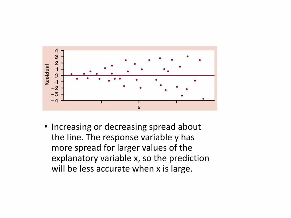
• Increasing or decreasing spread about the line. The response variable y has more spread for larger values of the explanatory variable x, so the prediction will be less accurate when x is large.
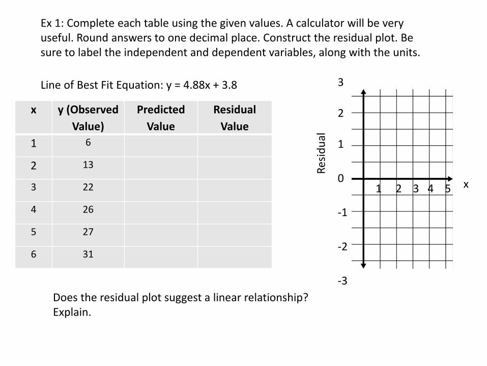
x y (Observed
Value)
Predicted
Value
Residual
Value
1 6
2 13
3 22
4 26
5 27
6 31
Ex 1: Complete each table using the given values. A calculator will be very useful. Round answers to one decimal place. Construct the residual plot. Be sure to label the independent and dependent variables, along with the units.
Does the residual plot suggest a linear relationship? Explain.
Line of Best Fit Equation: y = 4.88x + 3.8
Res
idu
al
x1 2 3 4 5
3
2
1
0
-1
-2
-3
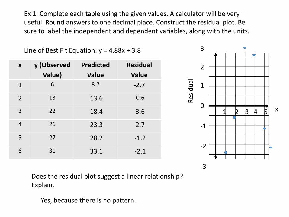
x y (Observed
Value)
Predicted
Value
Residual
Value
1 6 8.7 -2.7
2 13 13.6 -0.6
3 22 18.4 3.6
4 26 23.3 2.7
5 27 28.2 -1.2
6 31 33.1 -2.1
Ex 1: Complete each table using the given values. A calculator will be very useful. Round answers to one decimal place. Construct the residual plot. Be sure to label the independent and dependent variables, along with the units.
Does the residual plot suggest a linear relationship? Explain.
Line of Best Fit Equation: y = 4.88x + 3.8
Res
idu
al
x1 2 3 4 5
3
2
1
0
-1
-2
-3
Yes, because there is no pattern.