
unit 4
130
HUMAN COMPUTER INTERACTION B.TECH III YR II SEMESTER (TERM 08- 09) UNIT 4 PPT SLIDES TEXT BOOKS: The essential guide to user interface design, Wilbert O Galitz, Wiley DreamaTech. Designing the user interface. 3rd Edition Ben Shneidermann , Pearson Education Asia. No. of slides: 62
-
Upload
praveen-dhanush -
Category
Documents
-
view
219 -
download
0
description
Human Computer Interaction Unit IV
Transcript of unit 4

HUMAN COMPUTER INTERACTION
B.TECH III YR II SEMESTER (TERM 08-09)
UNIT 4 PPT SLIDES
TEXT BOOKS:
The essential guide to user interface design, Wilbert O Galitz, Wiley DreamaTech.
Designing the user interface. 3rd Edition Ben Shneidermann , Pearson Education Asia.
No. of slides: 62

INDEX UNIT 4 PPT SLIDES
S.NO. TOPIC LECTURE NO. PPTSLIDES
1. Screen designing L20 L20.1 to L20.5
2. Screen planning and purpose L21 L21.1 to L21.4
organizing screen elements 3. screen navigation and flow L22 L22.1 to L22.5
4. Visually pleasing composition L23 L23.1 to L23.10
L24 L24.1 to L24.11
5. focus and emphasis L25 L25.1 to L25.11
6. information retrieval on web L26 L26.1 to L26.5
7. statistical graphics L27 L27.1 to L27.5
8. Technological consideration L28 L28.1 to L28.2
in interface design9. REVISION L29

Screen design of the system is effected by many factors
• How much information is presented on the screen
• How a screen is organized
• The language used in the screen
• The distinctiveness of the screen components
• Screen consistency with other screen

Lecture 20 slide 1
Screen designing• How to distract the screen user
Unclear captions and badly worded questionsImproper type and graphic emphasisMisleading headingsIrrelevant and unnecessary contentBack track and rethink of previous answer Clustered and cramped layout Poor quality of presentation
LegibilityAppearanceArrangement

Micro Soft Suggest most common problem in screen and interface design.
• Visual inconsistency
• Lack control in the use of design features
• Over use of 3D presentations
• Overuse of too many bright colors
• Bad typography
• Metaphors are unpleasant or too cute

lecture 20 slide 2
Variety of distractions in web screens.Numerous audio and visual interruptionsExtensive visual clutterPoor information readabilityIn comprehensible screen componentsConfusing and inefficient navigationInefficient operationsExcessive or inefficient page scrollingInformation overloadDesign inconsistencyOutdated informationPoor design caused by emulation of printed documents
and past systems

Lecture 20 slide 3
What screen users want Aan orderly clean clutter free appearance
An obvious indication of what is being shown and what
should be done with it.
Expected information located where it should be.
A clear indication of what relates to what.
Plain and simple English
A clear indication of when an action can make a permanent
change in data

lecture 20 slide 4
What screen users do
Identifies a task to be performed or need to be fulfilled.
Decides how the task will be completed or need fulfilled.
Manipulates the computers controls.
Gathers necessary data.
Forms judgments resulting in decisions relevant to task

Lecture 20 slide 5
Interface Design goals Reduce visual work
Reduce intellectual work
Reduce memory work
Reduce mentor work
Eliminate burdens or instructions
back

Lecture 21 slide 1
Screen meaning and Purpose• Each screen element
Every controlAll textScreen organizationAll emphasisEach colorEvery graphicAll screen animationAll forms of feedback
• Must have meaning to screen users Serve a purpose in performing tasks

Lecture 21 slide 2
organizing screen elements clearly and meaning fully
• Consistency Provide real world consistency Provide internal consistency, including:
operational and navigational procedures visual identity or theme Component
organizationPresentationUsageLocations
Follow the same conventions and rules across all related interface
Deviate only when there is clear benefit to user

Lecture 21 slide 4

Lecture 22 slide 1
screen navigation and flow• Provide an ordering of screen information and elements that:
is rhythmic guiding a person’s eye through display encourages natural movement sequences. minimizes pointer and eye movement distances.
• Locate the most important and most frequently used elements or controls at top left.
• Maintain top to bottom , left to right flow.
• assist in navigation through a screen by Aligning elementsGrouping elementsUse of line borders

Lecture 22 slide 2
screen navigation and flow• Through focus and emphasis, sequentially , direct attention to
items that are criticalImportantSecondaryPeripheral [unimportant]
• Tab through window in logical order of displayed information.
• Locate command button at the end of the tabbing order sequence,
• when groups of related information must be broken and displayed on separate screens, provide breaks at logical or
natural points in the information flow.

Lecture 22 slide 3
screen navigation and flow
• In establishing eye movement through a screen, also consider that the eye trends to move sequentially , for example –From dark areas to light areasFrom big objects to little objectsFrom unusual shapes to common shapes.From highly saturated colors to unsaturated colors.
• These techniques can be initially used o focus a person’s attention

Lecture 22 slide 4
screen navigation and flow
• Maintain top to bottom, left to right throgh the screen.This top to bottom orientation is recommended for information entry for the following reasons –Eye movements between items will be shorter.Control movements between items will be shorter.Groupings are more obvious perceptually [viewing].When one’s eyes moves away from the screen and
then back, it returns to about same place it left, even if it is seeking next item in sequence.

Lecture 22 slide 5
screen navigation and flow
• Most product style guides recommend a left to right
orientation.
• Our earliest display screens reflected this left to right entry
orientation.
• Top to bottom orientation is also recommended for
presenting displays of read only information that must be
scanned.
back

Visually Pleasing Composition
• Communicates to the person non verbally
• It attracts, motivates and distracts
• Draw attention
• Convey positive message

Lecture 23 slide 1
Visually pleasing composition
• Provide visually pleasing composition with the following qualities –
BalanceSymmetryRegularityPredictabilitySequentialityEconomyUnityproportionSimplicityGroupings.

Balance• Provide an equal weight of screen elements, left and right, top and bottom
The opposite of balance is instability , the design elements ready to topple over.
• Balance is most often informal or, asymmetrical [irregular] with elements of different colors, sizes and shapes being positioned to strike the proper relationships.
• Dark colors, unusual shapes, and larger objects are “heavier,” where as light colors, regular shapes, and small objects are “lighter.
• Balance on a screen is accomplished through centring the display itself, maintaining an equal weighting of components on each side of the horizontal and vertical axis, and centring titles and illustrations
• Web page design, vertical, or left-to-right balance is usually the most important concept. Web pages are often scrollable, thereby shifting the horizontal, or top-to-bottom, balance point as the screen is scrolled. Horizontal balance is therefore more difficult to maintain.

Lecture 23 slide 2
Balance

Symmetry• Create symmetry by replicating elements
left and right of the screen centreline.
• A unit on one side of the centreline is exactly replicated on the other side.
• Our eye tends to perceive something as more compressed or compact when it is symmetric.

Lecture 23 slide 3
symmetry

Regularity
• Create regularity by establishing standard and consistently spaced horizontal and vertical alignment points.
• It is also achieved by using similar element sizes, shapes, colors, and spacing

Lecture 23 slide 4
Regularity

Predictability
• Create predictability by being consistent and following conventional orders or arrangements.
• Viewing one screen elements one to predict how another will look.
• The opposite of predictability — spontaneity — suggests no plan and thus an inability to predict the structure of the remainder of a screen or the structure of other screens.
• Viewing part of a screen enables one to predict how the rest of the screen will look
• screen design predictability is also enhanced through design consistency.

Lecture 23 slide 5
Predictability

Lecture 23 slide 6
sequentially Provide sequentially by arranging elements to guide the eye
through the screen an obvious, logical, rhythmic and efficient
manner.
The eye trends to be attracted to :
• A brighter element before one less bright
• Isolated elements before elements in a group
• Graphics before text
• Color before black and white
• Highly saturated colors before those less saturated.
• Dark areas before light areas
• Big objects before little objects

Sequentially – cont..
• A big element before a small one
• An unusual shape before a usual one


Economy
• Provide economy by using as few styles, display techniques, and colors as possible.
• Economy is the judicious use of display elements to get the message across as simply as possible
• The opposite is intricacy, the use of many elements just because they exist

Economy
• The effect of intricacy is ornamentation, which often detracts from clarity.
• Economy in screen design means organize just enough display elements and techniques to communicate the desired message.

Lecture 23 slide 8

Unity•Use similar sizes, shapes, or colors for
related information•Leave less space between elements of a
screen than the space left at the margins•The opposite of unity is fragmentation, each
piece retaining its own character.•In screen design, similar sizes, shapes, and
colors promote unity, as does white space
borders at the display boundary.

Lecture 23 slide 9

Proportion (quantity)
• Create windows and groupings of data or text with aesthetically pleasing proportions.
• Down through the ages, people and cultures have had preferred proportional relationships.
• What constitutes beauty in one culture is not necessarily considered the same by another culture,

Proportion
• but some proportional shapes are found in abundance today.

Lecture 23 slide 10

Simplicity (Complexity)
• Optimize the number of elements on a screen, within limits of clarity.
• Minimize the alignment points, especially horizontal or columnar.
• Provide standard grids of horizontal and vertical lines to position elements.

Simplicity (Complexity)
• The opposite pole on the continuum is complexity. The scale created may also be considered
• A scale of complexity, with extreme complexity at one end and minimal complexity (simplicity) at the other

Simplicity (Complexity)
• While the graphics designer usually considers this concept as simplicity.
• We will address it as complexity since it has been addressed by this term in the design literature, where an objective measure of it has been derived.

Lecture 24 slide 1

Simplicity (Complexity)• Bonsiepe (1968), who proposed a method of measuring
the complexity of typographically.• Designed pages through the application of information
theory this measure involves the following steps:• 1.Draw a rectangle around each element on a screen,
including captions, controls, headings, data, title, and so on.
• 2. Count the number of elements and horizontal alignment points (the number of columns in which a field, inscribed by a rectangle, starts).
• 3. Count the number of elements and vertical alignment points (the number of rows in which an element, inscribed by a rectangle, starts).

Simplicity (Complexity)
• A complexity calculation using information theory for each screen is as follows:
• Figure 3.10 (original):• 22 fields with 6 horizontal (column) alignment points = 41 bits.• 22 fields with 20 vertical (row) alignment points = 93 bits.• Overall complexity = 134 bits.• Figure 3.11 (redesigned):• 18 fields with 7 horizontal (column) alignment points = 43 bits.• 18 fields with 8 vertical (row) alignment points = 53 bits.• Overall complexity = 96 bits.• The redesigned screen is, thus, about 28 percent simpler, or less
complex, than the original screen

Lecture 24 slide 2

Lecture 24 slide 3

Grouping
• Provide function grouping for associated elements• Create spatial grouping as closely as possible to five
degree visual angle ( 1.67 inches diameter or about 6 to 7 lines of the text 12 to 14 character width).
• Evenly space control with in grouping allowing 1/8 to 1/4 inch between each
• Visually reinforce grouping
- Provide adequate separation between grouping
through liberal use of white space.
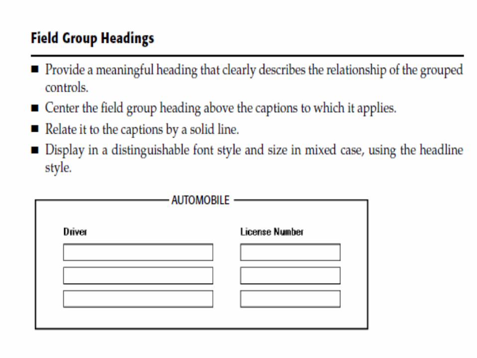
- Provide line around groups• Provide meaningful title for each grouping.

Lecture 24 slide 4

Lecture 24 slide 5

Perceptual Principle and functional grouping
• Use visual organization to create functional grouping.
• Combine visual organization principal in logic ways.
• Avoid visual organization principles that conflict.


Grouping and white spaces
• Provide adequate separation between grouping through liberal use of white spaces.
• For Web pages, carefully consider the trade-off between screen white space and the requirement for page
scrolling.

Lecture 24 slide 6

Grouping using backgrounds
• Incorporate contrasting background for related information
- The background not have the emphasis of the screen component. Consider 25% gray screening.
- Reverse higher contrast or “emphasizing” techniques for screen components to which attention should be drawn.

Visual style in webpage design
• Maintain a consistent and unified visual style throughout the pages of an entire website
• Base the visual style on
- The profile and goals of the web site
owner.
- The profiles, tastes and expectations of
the website user.

Lecture 24 slide 7

Lecture 24 slide 8

Lecture 24 slide 9

Lecture 24 slide 10

Lecture 24 slide 11
back


Lecture 25 slide 1
Focus and emphasisVisually emphasize the
most prominent element
Most important elements
Central idea or focal point

Lecture 25 slide 2
Focus and emphasis
To provide emphasis use techniques such as :
Higher brightness
Reverse polarity
Larger and distinctive font
Underlining
Blinking
Line rulings
Contrasting colors
Larger size
Positioning
Isolation
Distinctiveness
White space

De emphasize less important elements
To
ensure that the emphasis should avoid:
Empahsis too many screen elements are
emphasized.
screen clutter
using too many emphasize techniques
In webpage design:
Call attentation to new or changed content.
Ensure that page text is not overwhelmed by page background.
Focus and emphasis

Lecture 25 slide 3

Font Types and Families
• In typography, by definition the typeface is the name of the type such as Verdana.
• Use simple, common, readable fonts.
- Any sans serif as Helvetica or Verdana
- Time Roman
• Use no more than two families
- Assign a separate purpose to each family
- Allow one family to dominate

Font Types and Families cont
• To mix type face of family do the following :
- Never mix the family with same race.
- Assign separate purpose to each family.
- Allow one family to dominate.

Lecture 25 slide 4

Lecture 25 slide 5

Lecture 25 slide 6

Font case
• Use mixed-case for :
- Control caption.
- Data.
- Control choice description.
- Text.
- Information messages
- Instructional information
- Menu descriptions
- Button description

Font case (Cont)• Consider using upper case or capitalization:
- Title
- Section heading
- Caution and warning messages
- Words or phrases small in point size
• Use all lower case with caution.

Defaults
• For graphical operating system, use the standard system fonts.
• For web page design for the default browser fonts.
• Consider that the user may change the fonts.

Consistency
• Establish a consistent hierarchy and convention for using typefaces, styles and sizes.
• Decide on font for each different level of importance in hierarchy
• Communicate hierarchy with changes in:– Size– Weight– Color

Other
• Always consider the visual capabilities of the user
• Always verify the design has succeeded using the selected fonts

Paper versus Screen reading
• Provide a facility for printing out a hard copy of documents

Screen Elements – Caption and Labels
• Identify the control with captions or labels• Fully spell them out in a language meaningful to
the user• Display them in normal intensity• Use a mixed case font• Capitalize the first letter of each significant word.• End each caption with a colon• Choose distinct caption that can be easily
distinguished from other caption.


Data Fields:
• For entry or modification data fields, display with in:
- A line box.
- A reverse polarity
• For a inquiry or display/read-only screens, display the data on the normal background
• Visually emphasize the data fields

Lecture 25 slide 8

Lecture 25 slide 9

Lecture 25 slide 10

Lecture 25 slide 11back

Special Symbols
• Consider special symbol for emphasis
• Separate symbols from words by a space

Control section heading• Provide a meaningful heading that clearly describe the
relationship of grouped control• Locate the section heading above their related screen
controls.• Alternatively heading may be located within a border
surrounding a grouping, justified to the upper-left corner• Indent the control caption to the right of the start of the
heading• Fully spell out the upper case font• Display in normal intensity• Alternatively , if a different size font or style exist the heading
may be displayed in mixed case using heading style.

Control Section subheading or row heading

Web page heading
• Control Heading:– For grouping of controls, follow the control section
heading.
• Page and Text Heading:– Provide a meaningful page heading that clearly
describe the content and nature of the page that follows.
– Provide a meaning full text heading and subsection headings that clearly describes the content and nature of the text that follows.
– Establish a hierarchy of font styles, sizes, and weights depend upon the organization created and the important text content.

Web page heading
• Settle on as few sizes and styles as necessary to communicate page content and organization to the user.
• Do not randomly mix heading levels or skip heading levels.


Lecture 26 slide 1
Information retrieval on web
• The most sought after web commodity is content.
• Behavior is often goal driven.
• Reading is no longer a linear activity.
• Impatience.
• Frequent switching of purpose.
• Web users access site for different reasons: a focused search
for a piece of information or an answer less focused for
browsing or surf.
• High tech capabilities , fancy graphics do not compensable for
inefficient or poor content.


Lecture 26 slide 2
• Initial focus on attention
• Page perusal
• Scanning guidelines
• Browsing
• Browisng guidelines
• Searching
• Problems with search facilities
• Search facility guidelines
• Express the search
• Progressive search refinement
• Launch the search
• Present meaningful results

Lecture 26 slide 3
Scanning guidelines• Organization
Minimize eye movementProvide groupings of informationOrganize contenet in a logical and obvious way.
• WritingProvide meaningful headings and subheadings.Provide meaningful titlesConcisely write the text.Use bullets/ numbersArray information in tables
• Presentation– Key information in words or phrases– Important concepts

Lecture 26 slide 4
Browsing guidelines
• Facilitate scanning
• Provide multiple layers of structure
• Make navigation easy
• Respect users desire to leave
• Upon returning help users reorient themselves.
• Users can browse deeply or simply move on.
• Provide guidance to help reorientation
• Understand terms to minimize te need for users to switch
context.

Lecture 26 slide 5
Problems with searchingNot understanding the user.Difficulties in formulating the search.Difficulties in presenting meaningful results.Identify the level of expertise of user.
Know the search userPlan for user’s switchig purposes during search
process.Plan for flexibility in the search process.Anticipate
nature of every possible queryKind of information desiredHow much information will result the search.
back

Lecture 27 slide 1
statistical graphics
• A statistical graphic is data presented in a graphical format.
• A well designed statistical graphic also referred to as chart or graph, consists of complex ideas communicated with clarity, precision and efficiency.
• It will provide coherence to large amount of information by trying them together in a meaningful way, and it will encourage data comparisons of its different pieces of eye.


Lecture 27 slide 2
• Scales and shading
- place ticks to marks scales on the outside edge of each axis.
- employ a linear scale.
- mark scales at standard or customary intervals
- Start a numeric scale at zero.
- display only a single scale on axis.
- provide aids for scale interpretation.
- clearly label each axis.
- Provide scaling consistency
- consider duplicate axis for large scale data. - Proportion - Lines - Labeling - Title - Interpretation of numbers

Lecture 27 slide 3
Types of statistical graphscurve and line graphsSingle graph
Four or five maximumLabel identificationLegendTightly packed curves Important or critical dataComparing actual and projected dataData differences
Surface chartsOrderingCoding schemesLabels

Lecture 27 slide 4
Scatter plots two dimensionsConsistent intervals multiple data setsSignificant points
Bar graphs consistent orientationMeaningful organizationBar spacingDifferentiationImportant or critical dataRelated bar orderingReference indexlabeling

Lecture 27 slide 5
Segmented or stacked bars.Data category orderingLarge segmentsCoding schemeslabeling
Flow chartsOrder of stpsOrientationCoding conventionsArrowsHighlightingOne decission at each stepConsistently order and word all choices
Pie chart
back

Lecture 28 slide 1
Technological consideration -interface design
Graphical systems
• Screen design must be compatible with the capabilities of the system – system powerScreen sizeScreen resolutionDisplay colorsOther display features

Lecture 28 slide 2
• Screen design must be compatible with the capabilities of the Platform compatibility development and implementationPlatform style guide
• browser compatibility monitor size and resolution fontsColorBandwidthVersion
• other considerationsDownloadingCurrencyPage printingMaintainability