Unit 4 (2-Variable Quantitative): Scatter Plots Standards: SDP 1.0 and 1.2 Objective: Determine the...
33
Unit 4 (2-Variable Unit 4 (2-Variable Quantitative): Quantitative): Scatter Plots Scatter Plots Standards: SDP 1.0 and 1.2 Objective: Determine the correlation of a scatter plot
-
Upload
colin-sharp -
Category
Documents
-
view
232 -
download
0
Transcript of Unit 4 (2-Variable Quantitative): Scatter Plots Standards: SDP 1.0 and 1.2 Objective: Determine the...
Unit 4 (2-Variable Unit 4 (2-Variable Quantitative):Quantitative):Scatter PlotsScatter Plots
Standards: SDP 1.0 and 1.2Objective: Determine the correlation of
a scatter plot

Scatter PlotScatter Plot
• A scatter plot is a graph of a collection of ordered pairs (x,y).
• The graph looks like a bunch of dots, but some of the graphs are a general shape or move in a general direction.

Scatter Plots
• Summarizes the relationship between two quantitative variables.
• Horizontal axis represents one variable and vertical axis represents second variable.
• Plot one point for each pair of measurements.

Positive CorrelationPositive Correlation
• If the x-coordinates and the y-coordinates both increase, then it is POSITIVE CORRELATION.
• This means that both are going up, and they are related.

Positive CorrelationPositive Correlation
• If you look at the age of a child and the child’s height, you will find that as the child gets older, the child gets taller. Because both are going up, it is positive correlation.
Age 1 2 3 4 5 6 7 8
Height “
25 31 34 36 40 41 47 55

Negative CorrelationNegative Correlation
• If the x-coordinates and the y-coordinates have one increasing and one decreasing, then it is NEGATIVE CORRELATION.
• This means that 1 is going up and 1 is going down, making a downhill graph. This means the two are related as opposites.

Negative CorrelationNegative Correlation
• If you look at the age of your family’s car and its value, you will find as the car gets older, the car is worth less. This is negative correlation.
Age of car
1 2 3 4 5
Value
$30,000 $27,000
$23,500
$18,700
$15,350

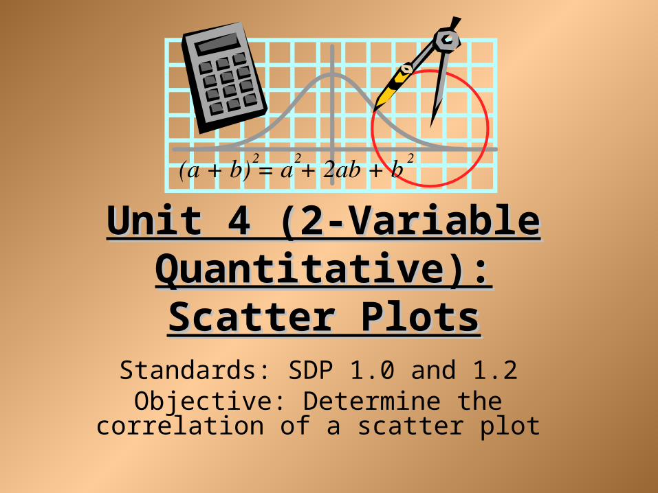
No CorrelationNo Correlation
• If there seems to be no pattern, and the points looked scattered, then it is no correlation.
• This means the two are not related.
No CorrelationNo Correlation
• If you look at the size shoe a baseball player wears, and their batting average, you will find that the shoe size does not make the player better or worse, then are not related.
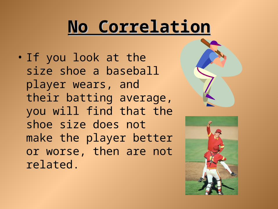
A number, r, from -1 to 1 that measures how well a line fits a set of data points. -1 – strong negative correlation -0.5 – weak negative corr. 0 – no correlation0.5 – weak positive corr.1 – strong positive corr.
Correlation Coefficient

Strength

Put the correlation coefficients in order from weakest to strongest
Ex 1: 0.87, -0.81, 0.43, 0.07, -0.98
Ex 2: 0.32, -0.65, 0.63, -0.42, 0.04
0.07, 0.43, -0.81, 0.87, & -0.98
0.04, 0.32, -0.42, 0.63, & -0.65

Match the Correlation Coefficient to the graph
GraphCorrelation Coefficients
-1
-0.5
0
0.5
1

Match the Correlation Coefficient to the graph
GraphCorrelation Coefficients
-1
-0.5
0
0.5
1

Match the Correlation Coefficient to the graph
GraphCorrelation Coefficients
-1
-0.5
0
0.5
1

A. The number of hours you work vs. The amount of money in your bank account
B. The number of hours workers receive safety training vs. The number of accidents on the job.
C. The number of students at Hillgrove vs. The number of dogs in Atlanta
Positive, Negative, or No Correlation?

Some Types of RegressionLinear Regression (straight line form)
Quadratic Regression (parabolic form)
Cubic Regression (cubic form)

ScatterplotsWhich scatterplots below show a linear trend?
a) c) e)
b) d) f)
NegativeCorrelation
PositiveCorrelation
ConstantCorrelation

Best Fit Line By Hand• The table shows the number of people y who attended
each of the first seven football games x of the season. Approximate the best-fitting line for the data.
•
• Steps:• 1) Draw a scatter plot.• 2) Sketch the best-fitting line.• 3) Choose 2 data points on the• best-fit line and solve for• the slope.• 4) Use one of the points and the slope• to solve for b in y = mx + b.
x 1 2 3 4 5 6 7
y 722 763 772 826 815 857 897

Year
Sport Utility Vehicles(SUVs) Sales in U.S.
Sales (in Millions)
19911992
199319941995
1996
19971998
1999
0.91.1
1.41.61.7
2.1
2.42.7
3.2
1991 1993 1995 1997 1999 1992 1994 1996 1998 2000
x
y
Year
Veh
icle
Sal
es (
Mil
lion
s)
5
4
3
2
1
Objective - To plot data points in the coordinate plane and interpret scatter
plots.

1991 1993 1995 1997 1999 1992 1994 1996 1998 2000
x
y
Year
Veh
icle
Sal
es (
Mil
lion
s)
5
4
3
2
1
Trend is increasing.
Scatterplot - a coordinate graph of data points.
Trend appears linear.
Positive correlation.
Year SUV Sales
Predict the sales in 2001.

Plot the data on the graph such that homework timeis on the y-axis and TV time is on the x-axis..
StudentTime SpentWatching TV
Time Spenton Homework
Sam
Jon
Lara
Darren
Megan
Pia
Crystal
30 min.
45 min.
120 min.
240 min.
90 min.
150 min.
180 min.
180 min.
150 min.
90 min.
30 min.
90 min.
90 min.
90 min.

Plot the data on the graph such that homework timeis on the y-axis and TV time is on the x-axis.
TV Homework
30 min.
45 min.
120 min.
240 min.
90 min.
150 min.
180 min.
180 min.
150 min.
90 min.
30 min.
120 min.
120 min.
90 min.
Time Watching TV
Tim
e on
Hom
ewor
k
30 90 150 210 60 120 180 240
240
210
180
150
120
90
60
30

Describe the relationship between time spent onhomework and time spent watching TV.
Time Watching TV
Tim
e on
Hom
ewor
k
30 90 150 210 60 120 180 240
240
210
180
150
120
90
60
30
Trend is decreasing.
Trend appears linear.
Negative correlation.
Time on TV Time on HW

Best Fit Line Using A TI-30x Calculator
1) Press [2nd], then [Stat]
2) Select 2-VAR
3) Press [Data]
4) X1 = first data point’s x
Y1 = first data point’s y
5) Keep pressing down arrow to go to new points
6) Press [STATVAR]
7) a = slope, b = y-intercept

Best Fit Line UsingA TI-84 Graphing Calculator
• See Handout

Example 1: Consumer Debt
The table shows the total outstanding consumer debt (excluding home mortgages) in billions of dollars in selected years. (Data is from the Federal Reserve Bulletin.)
Let x = 0 correspond to 1985.
a) Using a graphing calculator, draw the scatterplot. Interpret the plot:
1. Form
2. Strength
3. Direction
Year 1985 1990 1995 2000 2003
Consumer Debt 585 789 1096 1693 1987

Example 1: Consumer Debt (cont)
b) Find the regression equation appropriate for this data set. Round values to two decimal places.
c) Find and interpret the slope of the regression equation in the context of the scenario.
Year 1985 1990 1995 2000 2003
Consumer Debt 585 789 1096 1693 1987
79.859 463.35y x

Example 1: Consumer Debt (cont)
d) Find the approximate consumer debt in 1998.
e) Find the approximate consumer debt in 2008.
1501.52 billion
2300.11 billion

Example 1: Consumer Debt (cont)
f) Using the regression equation, predict the year when consumer debt will reach 2,500 billion dollars.
25.5 years or
2010 and a 1/2 year

Example 2: Health
The table below shows the number of deaths per 100,000 people from heart disease in selected years. (Data is from the U.S. National Center for Health Statistics.)
Let x = 0 correspond to 1960.a) Using a graphing calculator, draw the scatterplot. Interpret the plot:
1. Form
2. Strength
3. Direction
Year 1960 1970 1980 1990 2000 2002
Deaths 559 483 412 322 258 240

Example 2: Health (cont)
b) Find the regression equation appropriate for this data set. Round values to two decimal places.
c) Find and interpret the slope of the regression equation in the context of the scenario.
7.616 559.25y x

Example 2: Health (cont)
d) Find an approximation for the number of deaths due to heart disease in 1995.
e) Predict the number of deaths from heart disease in 2008.
635
194