Understanding Variation Six Sigma Foundations Continuous Improvement Training Six Sigma Foundations...
54
Understanding Variation Six Sigma Foundations Continuous Improvement Training Six Sigma Simplicity
-
Upload
cameron-moore -
Category
Documents
-
view
245 -
download
5
Transcript of Understanding Variation Six Sigma Foundations Continuous Improvement Training Six Sigma Foundations...

Understanding VariationUnderstanding Variation
Six Sigma FoundationsContinuous Improvement TrainingSix Sigma FoundationsContinuous Improvement Training
Six Sigma Simplicity

Key Learning PointsKey Learning Points
s Variation in the data represents the voice of the process
s Know the two types of variation – common cause and special cause – and the implication of the different causes
s Use appropriate tools to study variation in discrete and continuous situations
s Know how to use and interpret run charts and control charts and to take appropriate action based on the charts

VariationVariation
s All repetitive activities of a process have a certain amount of variation
s Input, process, and output measures will fluctuate
s This fluctuation is called variations Variation is the voice of the process
s All repetitive activities of a process have a certain amount of variation
s Input, process, and output measures will fluctuate
s This fluctuation is called variations Variation is the voice of the process
All processes have variation

From variation to information: 6M’sFrom variation to information: 6M’s
Materials
Machines
Methods
Measurements
Mother Nature
Manpower
P
R
O
C
E
S
S

Two types of variationTwo types of variation
Common cause No undue influence by one of the 6Ms
ExpectedNormalRandom
Special cause Undue influence by one of the 6Ms
UnexpectedNot normalNot random
Type Definition

Variation existsVariation existss All variation is causeds There are two major classifications of causes which
help you select appropriate management actions
s If all variation is due to “common cause,” the result will be a predictable or stable process
s If some variation is from “special causes,” the result is an unstable or unpredictable system
s To improve any process it is useful to understand its variation
s Variation is the “voice of the process” – learn to listen and understand it
s The sources of variation is eventually what we will focus on fixing in the improve stage of DMAIC
s All variation is causeds There are two major classifications of causes which
help you select appropriate management actions
s If all variation is due to “common cause,” the result will be a predictable or stable process
s If some variation is from “special causes,” the result is an unstable or unpredictable system
s To improve any process it is useful to understand its variation
s Variation is the “voice of the process” – learn to listen and understand it
s The sources of variation is eventually what we will focus on fixing in the improve stage of DMAIC

Tools for understanding variationTools for understanding variation
Type of data Variation for a period of time
Variation over time
Attribute(Count)
s Pareto Diagrams Bar chartss Pie charts
s Run chartss Control charts
s nP -charts P-charts C-charts U-charts Individual measurements
Variables(Continuous)
s Histogram/Frequency diagramss Box-plotss Multi-vari charts
s Run chartss Control charts
s Individual measurementss X-R chartss X-s charts

Control Charts Control Charts
“The use of control charts should start with management, not on the shop floor.”
-W. Edwards Deming
“The use of control charts should start with management, not on the shop floor.”
-W. Edwards Deming
“Management takes a major step forward when they stop asking you to explain random variation.”
-F. Timothy Fuller
“Management takes a major step forward when they stop asking you to explain random variation.”
-F. Timothy Fuller

Types of Control Charts Types of Control Charts
s For continuous (variables) data:s Xbar (average) & R (range) charts, An Xbar chart measures the central
tendency of Y over time. R charts measure the gain or loss of uniformity within sub-groups, which represents the variability in Y over time. R charts are based on the range of values within each sub-group.
s or Xbar & s (s- std deviation): is the same but track the variability based on the standard deviation within sub-group, not the range.

Types of Control Charts Types of Control Charts
s For attribute (count) data:s nP charts: A simple chart used to track the number
of non-conforming units (percentage of defective parts) assuming the sample size is constant.
s P charts: A simple chart used to track the number of non-conforming units (percentage of defective parts) assuming the sample size is NOT constant.
s C charts: A simple chart used to track the number of defects per units produced (not the % defective) assuming the sample size is constant.
s U charts: A simple chart used to track the number of defects per units produced (not the % defective) assuming the sample size is NOT constant.

Control ChartsControl Charts
Why use it?s To monitor, control and improve process performance over time by
studying variation in its source
What does it do?s Focuses attention on detecting and monitoring process variation
over times Distinguishes special from common cause of variation, as a guide
to local management actions Serves as a tool for ongoing control of a processs Helps improve a process to perform consistently and predictably
for higher quality, lower cost and higher effective capacitys Provides a common language for discussing process performance
Recognizing source of variation

VariationVariation
Variation types and StrategiesInterpreting Run or
control chart
Stable?
Special cause
strategy
Common cause
strategy
Unstable Stable

Variation: what to do nextVariation: what to do nextSpecial cause Common cause
Waste time Increase variation
Gain a betterunderstand
of the system
Reducevariation
Gain useful information
Reducevariation
Lose time in responding tothe problem
Waste time
Look for what was different between individual points
Take actionbased on thereporteddifference
Study all the data
Make basicchanges to the process
Typ
e o
f va
riat
ion
Spe
cial
cau
seC
omm
on c
ause

3020100
7
6
5
4
3
2
1
0
-1
Sample Number
Sam
ple
Mea
n
Xbar Chart for C3
1
1
11
1
1
11
X = 1.283
3.0SL = 2.945
-3.0SL =- 0.3793
Out of Control
In Control
Variation and Control ChartsVariation and Control Charts
SAMPLE NUMBER
Region of Non-Random Variation
Region of Non-Random Variation
Region of Random Variation
UpperControlLimit
ProcessAverage
LowerControlLimit

VariationVariationDetermining if your process is “out of control”
Zone A
Zone A
Zone B
Zone C
Zone C
Zone B
Upper control limit(UCL)
Average
Lower control limit(LCL)

VariationVariationTime plot
What is this graph telling you?
% on time shipment Roosendaal 2001
0%10%20%30%40%50%60%70%80%90%
100%
Month
pe
rce
nt
on
tim
e

VariationVariation
% on time shipment
70%
75%
80%
85%
90%
95%
100%
Month
pe
rce
nt
on
tim
eTime plot
What is this graph telling you?

VariationVariation
% on time shipment
70%
75%
80%
85%
90%
95%
100%
Month
per
cen
t on
tim
e
Median
Run Chart

VariationVariationRun Chart
4 14 24
0,75
0,85
0,95
Observation
On
time
rate
Number of runs about median:Expected number of runs:
Longest run about median:Approx P-Value for Clustering:
Approx P-Value for Mixtures:
Number of runs up or down:Expected number of runs:
Longest run up or down:Approx P-Value for Trends:
Approx P-Value for Oscillation:
8,000013,0000
5,0000 0,0184
0,9816
13,000015,6667
5,0000 0,0897
0,9103
Run Chart for On time rate
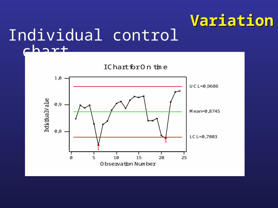
VariationVariationIndividual control chart
0 5 10 15 20 25
0,8
0,9
1,0
Observation Number
Indi
vidu
al V
alue
I Chart for On time
1
1
Mean=0,8745
UCL=0,9686
LCL=0,7803

VariationVariationl & MR chart
252015105Subgroup 0
1,0
0,9
0,8
Indi
vid
ual V
alu
e
11
Mean=0,8745
UCL=0,9686
LCL=0,7803
0,15
0,10
0,05
0,00
Movin
g R
ange
1
R=0,03540
UCL=0,1157
LCL=0
I and MR Chart for On time rate

VariationVariationP chart
2520151050
0,25
0,15
0,05
Sample Number
Prop
ortio
n
P Chart for Late
P=0,1253
UCL=0,1549
LCL=0,09570

VariationVariationStrategy for eliminating Special cause of variation
Timely data • Work to get special causes signaled quickly – use early warning indicators throughout your operation
Search for cause • Immediately search for cause when control chart gives a signal that a special cause has occurred
• Find out what was different on that occasion• Keep asking “why?, why?, why?” …
Take corrective action
• Immediate remedy to contain the damage• Do not make fundamental changes in that
process
Prevent and retain • Seek ways to prevent that special cause from recurring (mistake-proof), or, if results are good, retain the lesson

VariationVariationStrategy for improvement of a statistically stable system
All the data • All the data are relevant, not just high points or low points – not just the points we don’t like
More complex• Improving a stable process is more complex that
identifying a special cause – more time and more resources are generally needed
Management lead • Management should initiate and lead change effort to improve a system of common cause
High & low difference
• Common cause of variation can hardly ever be reduced by attempts to explain the difference between high and low points when a process is in statistical control
Process change • Processes in statistical control usually require fundamental changes in the system

Case Study 1
“Status Change” Requests

BackgroundBackgrounds A manager comes to you and states that they need your help
because their change request process is “totally out of control” and the number of change requests are going up. Department costs are skyrocketing because of all the manual processing that is needing to be done.
s This process handles employee’s who have a status change, for example, change in marital status, number of dependents change, etc.
s You decide to meet with the manager to obtain data and discuss with the manager the reasons why they feel there is a problem.
s Upon meeting in the office, the manager hands you the data and states that one look at the data and you can see the most recent point is a sign of major problems. Nothing about the process has changed, so the manager doesn’t know why things are getting worse. The data is on the next page….

Month # Status Changes Year
Jan 56 2000
Feb 82 2000
Mar 71 2000
Apr 74 2000
May 78 2000
Jun 63 2000
Jul 99 2000
Aug 95 2000
Sep 79 2000
Oct 127 2000
Nov 75 2000
Dec 54 2000
Month # Status Changes Year
Jan 50 2001
Feb 71 2001
Mar 32 2001
Apr 58 2001
May 43 2001
Jun 76 2001
Jul 54 2001
Aug 70 2001
Sep 45 2001
Oct 51 2001
Nov 53 2001
Dec 100 2001
How is the process?How is the process?s 2 Years worth of data are below…how are we doing? Can you tell from the
data below? Manager says much worse compared to the past. Are we?
s 2 Years worth of data are below…how are we doing? Can you tell from the data below? Manager says much worse compared to the past. Are we?
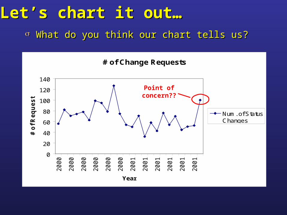
Let’s chart it out…Let’s chart it out…s What do you think our chart tells us?s What do you think our chart tells us?
# of Change Requests
0
20
40
60
80
100
120
140
20
00
20
00
20
00
20
00
20
00
20
00
20
01
20
01
20
01
20
01
20
01
20
01
Year
# o
f R
eq
ue
sts
Num. of StatusChanges
Point of concern??
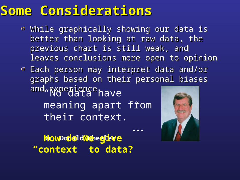
Some ConsiderationsSome Considerationss While graphically showing our data is better than
looking at raw data, the previous chart is still weak, and leaves conclusions more open to opinion
s Each person may interpret data and/or graphs based on their personal biases and experience.
s While graphically showing our data is better than looking at raw data, the previous chart is still weak, and leaves conclusions more open to opinion
s Each person may interpret data and/or graphs based on their personal biases and experience.
“No data have meaning apart from their context.” --- Dr. Donald Wheeler
How do we give “context” to data?

# of Change Requests
0
20
40
60
80
100
120
140
20
00
20
00
20
00
20
00
20
00
20
00
20
01
20
01
20
01
20
01
20
01
20
01
Year
# o
f R
eq
ue
sts
Num. of StatusChanges
Context Attempt #1
The Chart…The Chart…s How do you interpret the chart now?
Think this point is abnormal now?
How about this point?
How about this point?

What can we do?What can we do?s Statistical Process Control (SPC) is a way of bringing
out the “context” of the data.s Statistical Process Control charts have also been
called Process Behavior Charts.s Process Behavior Charts utilize all the data to
develop historical “context” to allow evaluation within context rather than single point comparison to another point.
s This “context” is more than comparing differences between one point and another, rather, it takes into consideration the variation of the data in the process under investigation.
s Statistical Process Control (SPC) is a way of bringing out the “context” of the data.
s Statistical Process Control charts have also been called Process Behavior Charts.
s Process Behavior Charts utilize all the data to develop historical “context” to allow evaluation within context rather than single point comparison to another point.
s This “context” is more than comparing differences between one point and another, rather, it takes into consideration the variation of the data in the process under investigation.
Let’s find out what we can see when statistics are applied:

Applying StatisticsApplying Statisticss There are two charts with limits on them. Also, we are viewing
data by years…However, have there been any process changes? No.
s There are two charts with limits on them. Also, we are viewing data by years…However, have there been any process changes? No.
0Subgroup 5 10 15 20 25
0
50
100
150
Indiv
idual
Val
ue
Mean=58.58
UCL=119.5
LCL=-2.345
2000 2001
01020304050607080
Mov
ing R
ange
R=22.91
UCL=74.85
LCL=0
2000 2001
I and MR Chart for # of Requests by Year1
2
Now what do you think?

0Subgroup 5 10 15 20 25
0
20
40
60
80
100
120
140
Indiv
idual
Val
ue 1
Mean=69
UCL=125.9
LCL=12.11
01020304050607080
Mov
ing R
ange
R=21.39
UCL=69.89
LCL=0
I and MR Chart for # of Requsts
Applying StatisticsApplying Statisticss If there have been no process changes, then this view of
the data may be appropriate:
s If there have been no process changes, then this view of the data may be appropriate:
Now what do you think?

Conclusion?Conclusion?
s October 2000 (point 10) indicated an unusually “high” number of requests (manager couldn’t remember why the number was so high). Otherwise, the process has “behaved” predictably…including the last data point.
s If the manager doesn’t like the current levels of requests, perhaps there are opportunities for reducing such manual intensive changes.
s These changes might involve a major change in the system.

“Managing a company by means of the monthly report is like trying to drive a car by watching the yellow line in the rear-view mirror.”
Dr. Myron Tribus

Case Study 2
Percentage On-Time Delivery

BackgroundBackground
s In a plant monthly report, the line with the smallest percent differences is percentage of on-time shipments.
s In the data following, it would seem the level is at an expected level by management, and would get only a “cursory glance.”
s In July, 91.0% of the shipments were shipped on time. This is 0.3% below the historic average and 0.9% below the value last July.
s By traditional comparisons, the on-time shipments performance is slightly lower, but essentially unchanged from last year.

InformationInformation
s Monthly Report:s Monthly Report:
Monthly Report for July Dept July Act. Monthly Avg. % Diff. % Diff July Year to Date Plan % Diff.
Value Value Last Year Avg.
20 91.0 91.3 -0.3 -0.9 90.8 91.3 -0.5
Monthly Report for July Dept July Act. Monthly Avg. % Diff. % Diff July Year to Date Plan % Diff.
Value Value Last Year Avg.
20 91.0 91.3 -0.3 -0.9 90.8 91.3 -0.5OnTime
Ship.

DataData
s Percentage On-time shipments for Department 20:
92.1 199991.6 199991.8 199991.5 199991.1 199991.1 199990.1 199989.2 199989.9 199990.8 199991.2 199991.2 199991.2 200091.1 200090.4 2000
90.7 200090.7 200091.3 200091.8 2000
92 200091.5 200091.9 200091.6 200091.4 200091.7 200191.1 200190.9 200190.2 200189.7 200190.8 2001
91 2001
% Year % Year
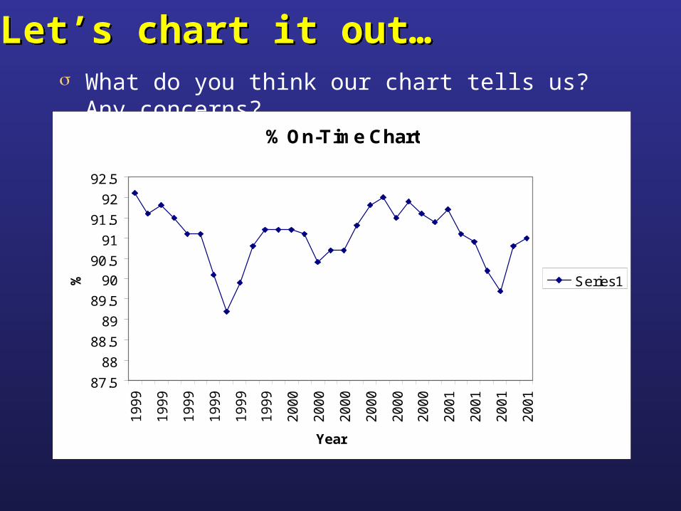
% On-Time Chart
87.5
88
88.5
89
89.5
90
90.5
91
91.5
92
92.5
19
99
19
99
19
99
19
99
19
99
19
99
20
00
20
00
20
00
20
00
20
00
20
00
20
01
20
01
20
01
20
01
Year
% Series1
Let’s chart it out…Let’s chart it out…s What do you think our chart tells us? Any concerns?

% On-Time Chart
87.5
88
88.5
89
89.5
90
90.5
91
91.5
92
92.5
19
99
19
99
19
99
19
99
19
99
19
99
20
00
20
00
20
00
20
00
20
00
20
00
20
01
20
01
20
01
20
01
Year
% Series1
The Chart…The Chart…s How do you interpret the chart now?
We still need more “context”!

Applying StatisticsApplying Statisticss With the Process Behavior charts, we can see times of
unpredictability. It is at these points that we look for an explanation why.
302010Subgroup 0
92
91
90
89
Individ
ual
Val
ue
1
11
Mean=91.05
UCL=92.18
LCL=89.93
1.5
1.0
0.5
0.0
Mov
ing R
ange
R=0.4233
UCL=1.383
LCL=0
I and MR Chart for % On-Time

Conclusion?Conclusion?
s Three of the individual values fall outside the limits. Thus, there is too much variation in this time series to be due to chance alone.
s The three values should be treated as signals, and investigations into the causes the percentage of on-time shipments dropped during these months.
s Since the process is “unpredictable,” it may happen again, only worse.

Case Study 3
Regional Sales

BackgroundBackground
s A sales manager who recently learned about Process Behavior charts decided to utilize this tools to put their regional sales data into “context.”
s The manager has plotted the data for the last 12 month’s and keeps the chart posted on their wall. The manager hopes this will also improve the monthly values over time for the monthly and quarterly reports.
s While more sales are always wanted, the manager is pleased that the sales process is consistent.
s During one of their weekly meetings, you see the chart on the wall and notices something…

Raw DataRaw Datas The manager has the raw sales data posted next to the
chart:
North South West East98180 99850 100110 10146097150 99150 101530 10189098240 98280 100560 10135097320 98680 101200 10222097820 98160 101460 10208098330 98930 100990 10212098210 99190 100750 10241097750 98760 101390 10233097590 98710 100000 10161098020 98900 101640 101740
100830 99490 101890 100850100890 99420 100260 101780

0Subgroup 5 10
97000
98000
99000
100000
101000
102000
103000
Sam
ple M
ean
Mean=100031
UCL=102784
LCL=97277
0
5000
10000
Sam
ple
Ran
ge
R=3780
UCL=8623
LCL=0
Xbar/R Chart for Data
The Sales ChartThe Sales Charts What do you think our chart tells us? Any concerns?
Sales Data

0Subgroup 5 10
97000
98000
99000
100000
101000
102000
103000
Sam
ple M
ean
Mean=100031
UCL=102784
LCL=97277
0
5000
10000
Sam
ple
Ran
ge
R=3780
UCL=8623
LCL=0
Xbar/R Chart for Data
A Second LookA Second Looks What is being plotted:
Sales Data
Notice what was being plotted on the process behavior chart. The
average. There are actually 4 different regions…let’s look at
them individually.
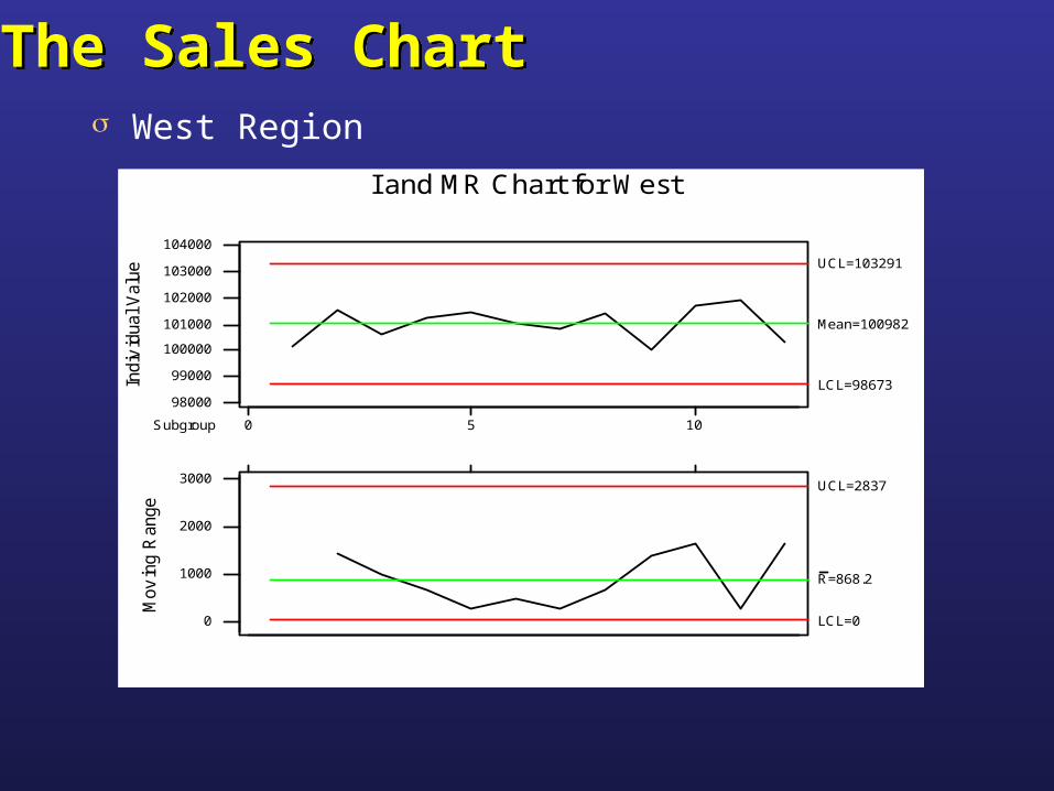
The Sales ChartThe Sales Charts West Region
105Subgroup 0
104000
103000
102000
101000
100000
99000
98000
Indi
vid
ual V
alue
Mean=100982
UCL=103291
LCL=98673
3000
2000
1000
0
Mov
ing
Ran
ge
R=868.2
UCL=2837
LCL=0
I and MR Chart for West

The Sales ChartThe Sales Charts East Region
0Subgroup 5 10
101000
102000
103000
Indi
vid
ual V
alu
e
Mean=101820
UCL=103043
LCL=100597
0
500
1000
1500
Mov
ing
Ran
ge
R=460
UCL=1503
LCL=0
I and MR Chart for East
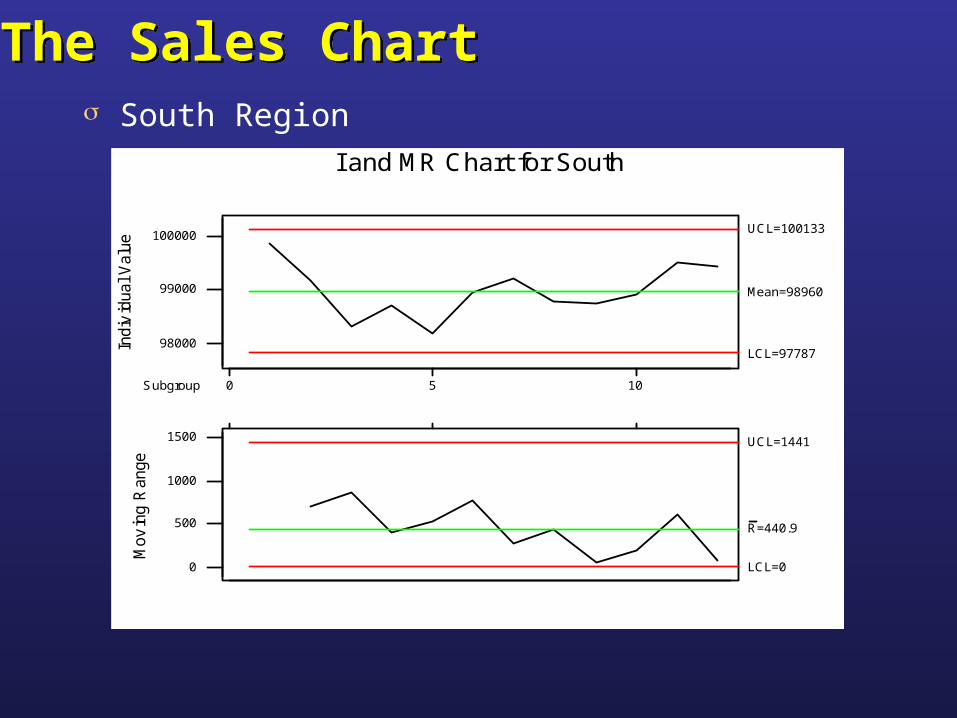
The Sales ChartThe Sales Charts South Region
0Subgroup 5 10
98000
99000
100000
Indi
vid
ual V
alu
e
Mean=98960
UCL=100133
LCL=97787
0
500
1000
1500
Mov
ing
Ran
ge
R=440.9
UCL=1441
LCL=0
I and MR Chart for South

0Subgroup 5 10
96000
97000
98000
99000
100000
101000
Indi
vid
ual V
alu
e
1 1
Mean=98361
UCL=100317
LCL=96405
0
1000
2000
3000
Mov
ing
Ran
ge
1
R=735.5
UCL=2403
LCL=0
I and MR Chart for North
The Sales ChartThe Sales Charts North Region
What is happening here??

Conclusion?Conclusion?
s The manager shouldn’t be so cozy in the consistency of the regional sales.
s Be careful not to “mix” your data. It could mask potential stability issues in your process.
s The manager needs to investigate and learn the causes of the excessive variation in the sales data of the north region.
s In this case, it may be a good thing…perhaps a new sales or marketing method being used

Understanding VariationUnderstanding Variation
Six Sigma FoundationsContinuous Improvement TrainingSix Sigma FoundationsContinuous Improvement Training