Understanding Brand Logos: Xerox Corporation
16
Understanding Brand Logos: Xerox Corporation Submitted to Professor Chittaranjan Bhattacharjee This assignment is part of an internal evaluation for the paper Marketing Research. For the purpose of this assignment, I have studied the Xerox Corporation’s Logo, followed by a primary research and secondary content collection and the results are presented in this document. Submitted by Anjan Sen| JBIMS| MMM | 121 | 2 nd Year | IV Semester | 28 th January 2014 |
Transcript of Understanding Brand Logos: Xerox Corporation
Understanding Brand Logos:
Xerox Corporation
Submitted to Professor Chittaranjan Bhattacharjee
This assignment is part of an internal evaluation for the paper Marketing Research. For the
purpose of this assignment, I have studied the Xerox Corporation’s Logo, followed by a primary
research and secondary content collection and the results are presented in this document.
Submitted by Anjan Sen| JBIMS| MMM | 121 | 2nd Year | IV Semester | 28th January 2014 |
No
Topic
Page Number
1
About Xerox Corporation
3
2
How was the data collected?
3
3
Evolution of the Xerox Logo
5
4
A trivia
10
5
User Feedback
11
6
Results of the Primary Research
13
7
Conclusion and References
16
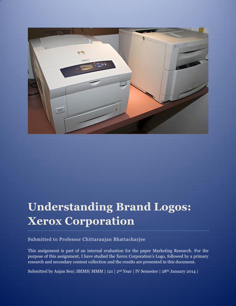
ABOUT XEROX CORPORATION:
For a layman, any machine that provides that offers ‘photo-copying’ facility is Xerox. To the
extent, that ‘Xerox’ like Google was used as a verb, and not a Noun or an adjective. Xerox
however, is the name of an American multinational corporation that is in the business of
document management. Its history dates back to 1906, when it was founded as ‘The Haloid
Photographic Company’ in Rochester. Since then, it has pioneered many innovations in the
area of document management. It is headquartered in Norwalk, Connecticut, though its largest
population of employees is based around Rochester, New York, the area in which the company
was founded.
An interesting anecdote, which circulates around Xerox Corporation, is how it lost its way into
the personal computing world. Legend has it that the Researchers at its Palo Alto Facility had
invented several important elements of personal computing. The then Board of Directors,
couldn’t fathom how it was relevant to their business and ordered it to be shared with Apple
engineers. The rest as they say- is history. The features were taken over by Apple Corporation
and subsequently Microsoft Corporation, who till date duopilize the personal computing
industry.
HOW WAS THE DATA COLLECTED?
The data was collected through three sources:
Xerox Corporation’s Community Manager: I communicated with the Xerox
Corporation’s Community manager on digital platform, James Mignano, who provided
relevant documents and link which has been used and mentioned in the references
section at the end of the assignment.
Internet: Xerox Corporation being in the Fortune 500 companies in the US and also
pioneer in the area of document technology a lot of relevant content was available on
the internet. Press Releases, Critical Review, Comparison document etc., contributed to
the making of this assignment.
Online Survey: An Online survey was conducted on January 28, 2014, asking elementary
questions to establish the awareness of the Xerox Brand and the Xerox Corporation’s
logo. 114 respondents participated in the survey. The reports of the survey are
mentioned in the document to demonstrate how the brand is perceived by the users.
The questions asked were:
Age Group
Have you heard about Xerox Corporation
How often do you use the 'Xerography' in your daily life?
Do you know what the Xerox Logo looks like?
What are the colors used in the Xerox Corporation's logo?
In the logo, how is the name Xerox Corporation written?
Do you know the significance of the colors used in the logo?
The data collected was not subjected to any statistical variances analysis but represented only
pictorially to give a broad idea of how the brand is perceived by the respondents. Most of the
respondents were from India, 1 from Nepal and 1 from Westland USA, 1 from San Jose, USA.
Within India, the concentration was more in Mumbai as the survey questionnaire was spread
within in the network first and gradually on social media.
EVOLUTION OF THE XEROX LOGO
To quote Ursula Burns, “Our customers, our employees and our shareholders connect the most
with what the brand stands for -- quality, innovation, customer-focus and a values-rich
culture. Today, we’re strengthening all our attributes and giving our brand a contemporary
look that is more relevant for business today – a bit less formal, a lot more lively with links to
our heritage and a nod to the future.”
(Ms. Burns is currently the Chief Executive at Xerox Corporation. The above quote is from a Press
Release, in 2008, when she was occupying the chair of the President)
An organization’s logo has to be contemporary, talk to its customers, stakeholders, base d on its
values and mission. It is undoubtedly the most prized asset for an organization as millions are
spend on collateral marketing to get visibility for the brand logo.
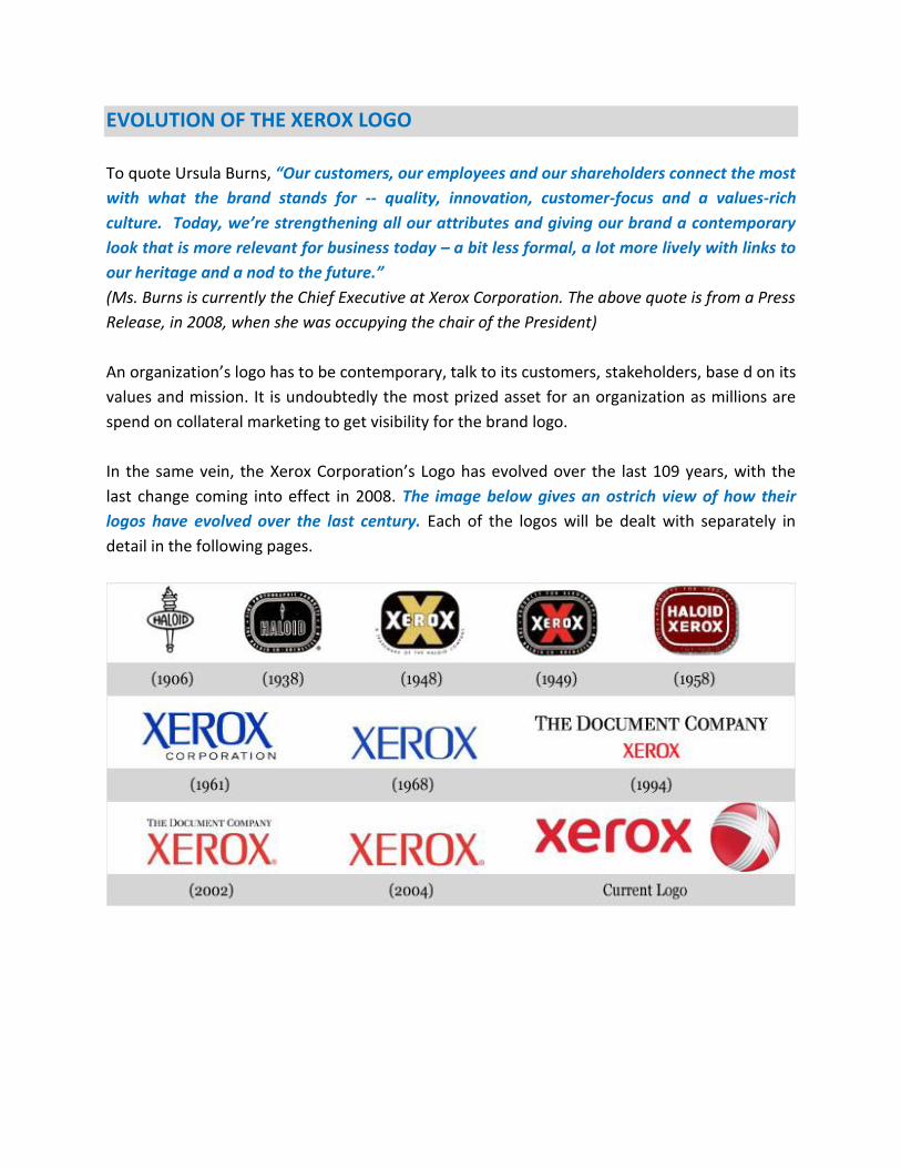
In the same vein, the Xerox Corporation’s Logo has evolved over the last 109 years, with the
last change coming into effect in 2008. The image below gives an ostrich view of how their
logos have evolved over the last century. Each of the logos will be dealt with separately in
detail in the following pages.
The table below has brief details (whatever could be sourced from the internet and after
writing to Xerox Corporation’s Community Manager on Social Media, both duly cited at the end
of the report)
No Year Logo Description
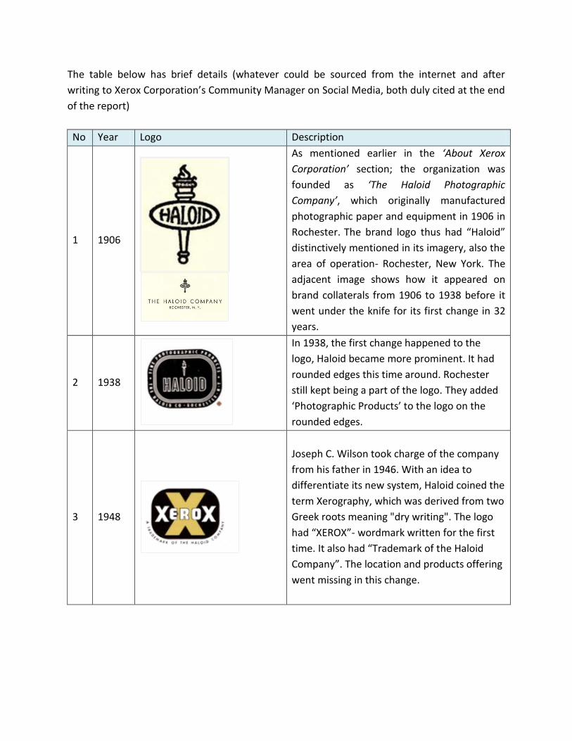
1 1906
As mentioned earlier in the ‘About Xerox
Corporation’ section; the organization was
founded as ‘The Haloid Photographic
Company’, which originally manufactured
photographic paper and equipment in 1906 in
Rochester. The brand logo thus had “Haloid”
distinctively mentioned in its imagery, also the
area of operation- Rochester, New York. The
adjacent image shows how it appeared on
brand collaterals from 1906 to 1938 before it
went under the knife for its first change in 32
years.
2 1938
In 1938, the first change happened to the
logo, Haloid became more prominent. It had
rounded edges this time around. Rochester
still kept being a part of the logo. They added
‘Photographic Products’ to the logo on the
rounded edges.
3 1948
Joseph C. Wilson took charge of the company
from his father in 1946. With an idea to
differentiate its new system, Haloid coined the
term Xerography, which was derived from two
Greek roots meaning "dry writing". The logo
had “XEROX”- wordmark written for the first
time. It also had “Trademark of the Haloid
Company”. The location and products offering
went missing in this change.
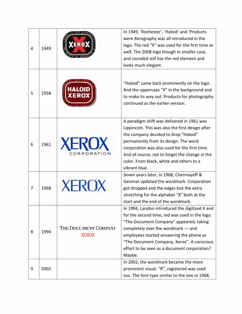
4 1949
In 1949, ‘Rochester’, ‘Haloid’ and ‘Products
were Xerography was all introduced in the
logo. The red “X” was used for the first time as
well. The 2008 logo though in smaller case,
and rounded still has the red element and
looks much elegant.
5 1958
“Haloid” came back prominently on the logo.
And the uppercase “X” in the background and
to make its way out. Products for photography
continued as the earlier version.
6 1961
A paradigm shift was delivered in 1961 was
Lippincott. This was also the first design after
the company decided to drop “Haloid”
permanently from its design. The word
corporation was also used for the first time.
And of course, not to forget the change in the
color. From black, white and others to a
vibrant blue.
7 1968
Seven years later, in 1968, Chermayeff &
Geismar updated the wordmark. Corporation
got dropped and the edges lost the extra
stretching for the alphabet “X” both at the
start and the end of the wordmark.
8 1994
In 1994, Landon introduced the digitized X and
for the second time, red was used in the logo.
“The Document Company” appeared, taking
completely over the wordmark — and
employees started answering the phone as
“The Document Company, Xerox”. A conscious
effort to be seen as a document corporation?
Maybe.
9 2002
In 2002, the wordmark became the more
prominent visual. “R”, registered was used
too. The font type similar to the one in 1968,
except the blue color, nothing changed.
10 2004
Later, in 2004, “The Document Company”
disappeared and it continued till 2008, when
the most paradigm change of all time till date
happened.
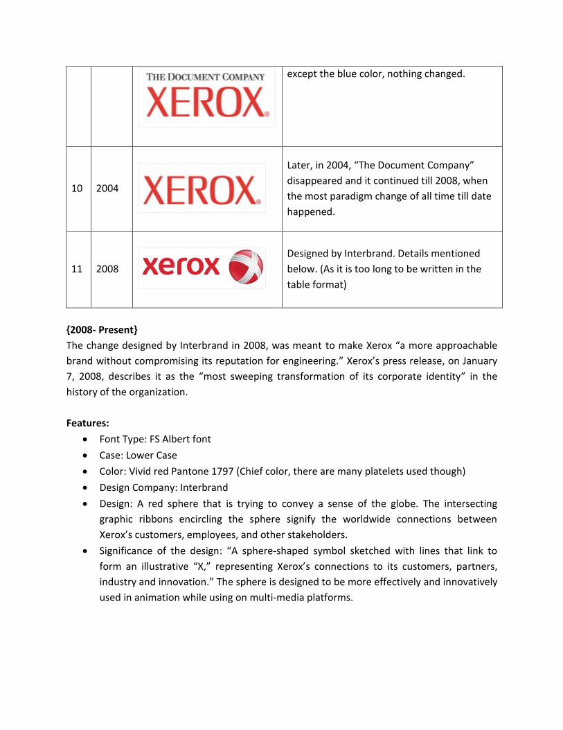
11 2008
Designed by Interbrand. Details mentioned
below. (As it is too long to be written in the
table format)
{2008- Present}
The change designed by Interbrand in 2008, was meant to make Xerox “a more approachable
brand without compromising its reputation for engineering.” Xerox’s press release, on January
7, 2008, describes it as the “most sweeping transformation of its corporate identity” in the
history of the organization.
Features:
Font Type: FS Albert font
Case: Lower Case
Color: Vivid red Pantone 1797 (Chief color, there are many platelets used though)
Design Company: Interbrand
Design: A red sphere that is trying to convey a sense of the globe. The intersecting
graphic ribbons encircling the sphere signify the worldwide connections between
Xerox’s customers, employees, and other stakeholders.
Significance of the design: “A sphere-shaped symbol sketched with lines that link to
form an illustrative “X,” representing Xerox’s connections to its customers, partners,
industry and innovation.” The sphere is designed to be more effectively and innovatively
used in animation while using on multi-media platforms.
Other Key Highlights:
An internal document circulated between Interbrand (which did the brand
reengineering) and Xerox Corporation calls the new graphic font this way: “I am FS
Albert. I am a modern and approachable font. My rounded corners make me more
human and less technical.”
Maryanne Stump, Interbrand’s senior director of brand strategy was quoted saying,
“The sphere symbol will be especially used on the Internet and will spin in other
animated applications.” (How the users have reacted to this, can be read in the User
Feedback to the Logo)
What Interbrand has to say about Xerox’s new logo
“Signaling a clear change and evoking a dramatic shift in the world’s perception of this iconic
brand, the visual and verbal identity system for Xerox has undergone a massive redesign. The
“connectors” are super-graphics that appear as reoccurring design elements.”
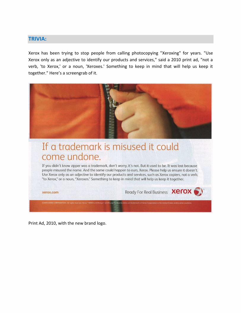
TRIVIA:
Xerox has been trying to stop people from calling photocopying "Xeroxing" for years. "Use
Xerox only as an adjective to identify our products and services," said a 2010 print ad, "not a
verb, 'to Xerox,' or a noun, 'Xeroxes.' Something to keep in mind that will help us keep it
together." Here’s a screengrab of it.
Print Ad, 2010, with the new brand logo.
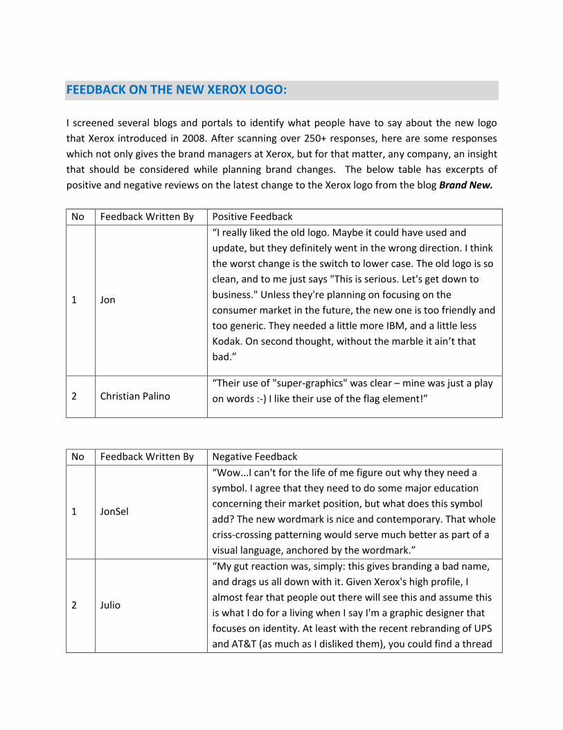
FEEDBACK ON THE NEW XEROX LOGO:
I screened several blogs and portals to identify what people have to say about the new logo
that Xerox introduced in 2008. After scanning over 250+ responses, here are some responses
which not only gives the brand managers at Xerox, but for that matter, any company, an insight
that should be considered while planning brand changes. The below table has excerpts of
positive and negative reviews on the latest change to the Xerox logo from the blog Brand New.
No Feedback Written By Positive Feedback
1 Jon
“I really liked the old logo. Maybe it could have used and
update, but they definitely went in the wrong direction. I think
the worst change is the switch to lower case. The old logo is so
clean, and to me just says "This is serious. Let's get down to
business." Unless they're planning on focusing on the
consumer market in the future, the new one is too friendly and
too generic. They needed a little more IBM, and a little less
Kodak. On second thought, without the marble it ain’t that
bad.”
2 Christian Palino “Their use of "super-graphics" was clear – mine was just a play
on words :-) I like their use of the flag element!”
No Feedback Written By Negative Feedback
1 JonSel
“Wow...I can't for the life of me figure out why they need a
symbol. I agree that they need to do some major education
concerning their market position, but what does this symbol
add? The new wordmark is nice and contemporary. That whole
criss-crossing patterning would serve much better as part of a
visual language, anchored by the wordmark.”
2 Julio
“My gut reaction was, simply: this gives branding a bad name,
and drags us all down with it. Given Xerox's high profile, I
almost fear that people out there will see this and assume this
is what I do for a living when I say I'm a graphic designer that
focuses on identity. At least with the recent rebranding of UPS
and AT&T (as much as I disliked them), you could find a thread
of logic in their execution: the new marks resembled the old.
Sure, the new ones were strange, bubbly badges carrying the
unfortunate debris of trendy, marketing-savvy, web 2.0 design
aesthetics, but at least some remnants of the previous brand
remained. But this? Where does this marble come from? This is
what 5,000 interviews and 24 months of work gets you? A
completely new, unnecessary, poorly-crafted element that
builds on none of the existing strengths of the brand for the
sake of asserting itself into the world? Welcome to the time of
full embrace of senseless, three dimensional corporate
branding, indeed.”
3 Willis
“The new logo looks like a bocce ball the factory messed up.
It's not helped by the fact that, should that object exist in
actual three dimensions, the "super-connector" criss-cross
lines would be completely lopsided and awkward-looking.
Is there a two-color version?
The old pixel-X was fantastic - easy to recognize, conveyed
rather complex meaning, and easy to represent.”
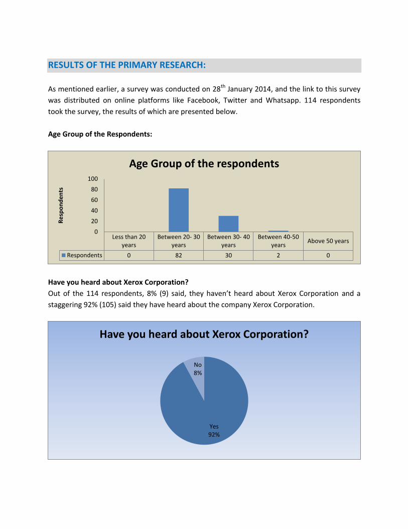
RESULTS OF THE PRIMARY RESEARCH:
As mentioned earlier, a survey was conducted on 28th January 2014, and the link to this survey
was distributed on online platforms like Facebook, Twitter and Whatsapp. 114 respondents
took the survey, the results of which are presented below.
Age Group of the Respondents:
Have you heard about Xerox Corporation?
Out of the 114 respondents, 8% (9) said, they haven’t heard about Xerox Corporation and a
staggering 92% (105) said they have heard about the company Xerox Corporation.
Less than 20years
Between 20- 30years
Between 30- 40years
Between 40-50years
Above 50 years
Respondents 0 82 30 2 0
0
20
40
60
80
100
Re
spo
nd
en
ts
Age Group of the respondents
Yes 92%
No 8%
Have you heard about Xerox Corporation?
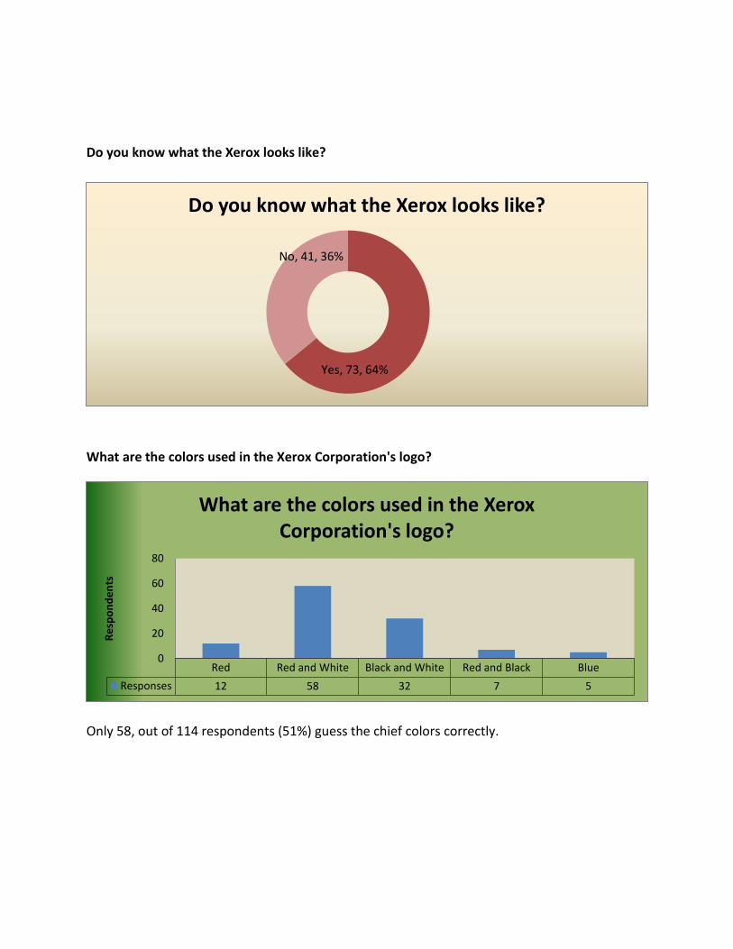
Do you know what the Xerox looks like?
What are the colors used in the Xerox Corporation's logo?
Only 58, out of 114 respondents (51%) guess the chief colors correctly.
Yes, 73, 64%
No, 41, 36%
Do you know what the Xerox looks like?
Red Red and White Black and White Red and Black Blue
Responses 12 58 32 7 5
0
20
40
60
80
Re
spo
nd
en
ts
What are the colors used in the Xerox Corporation's logo?
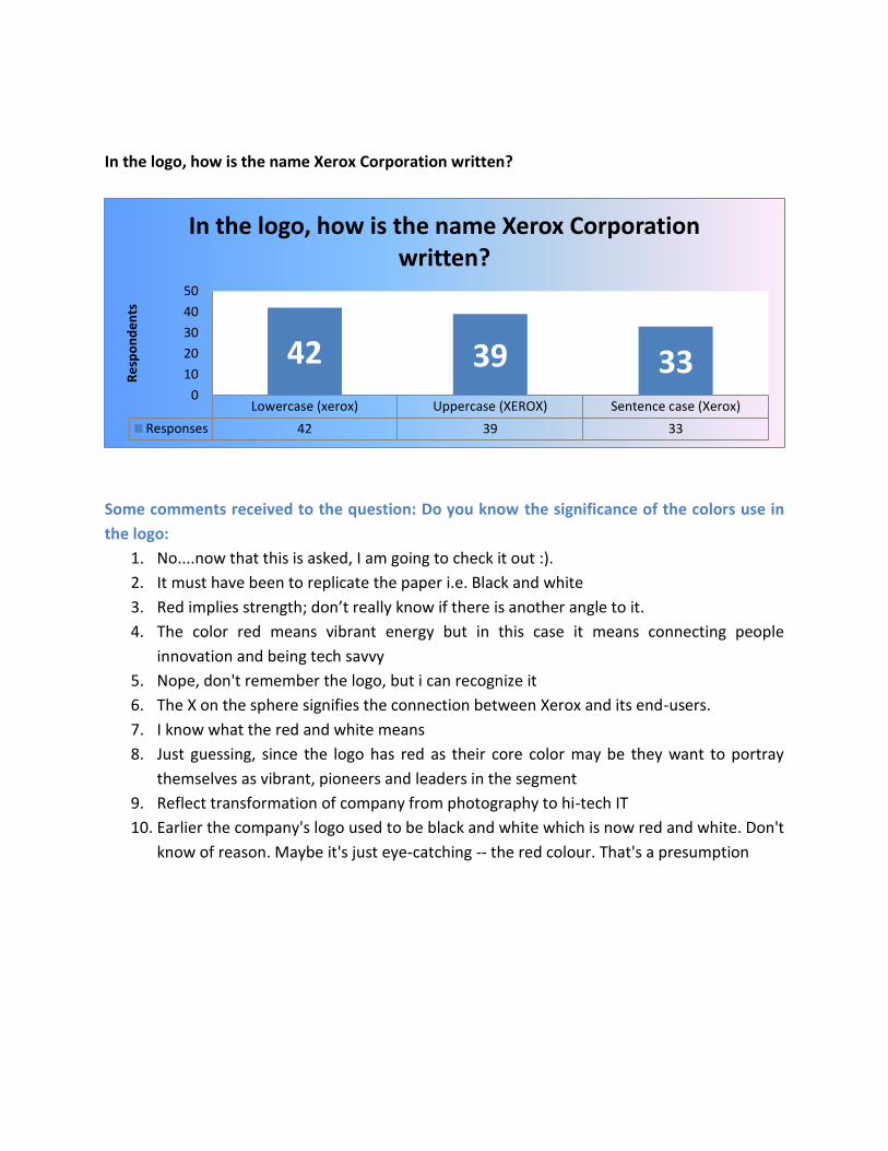
In the logo, how is the name Xerox Corporation written?
Some comments received to the question: Do you know the significance of the colors use in
the logo:
1. No....now that this is asked, I am going to check it out :).
2. It must have been to replicate the paper i.e. Black and white
3. Red implies strength; don’t really know if there is another angle to it.
4. The color red means vibrant energy but in this case it means connecting people
innovation and being tech savvy
5. Nope, don't remember the logo, but i can recognize it
6. The X on the sphere signifies the connection between Xerox and its end-users.
7. I know what the red and white means
8. Just guessing, since the logo has red as their core color may be they want to portray
themselves as vibrant, pioneers and leaders in the segment
9. Reflect transformation of company from photography to hi-tech IT
10. Earlier the company's logo used to be black and white which is now red and white. Don't
know of reason. Maybe it's just eye-catching -- the red colour. That's a presumption
Lowercase (xerox) Uppercase (XEROX) Sentence case (Xerox)
Responses 42 39 33
42 39 33 0
10
20
30
40
50
Re
spo
nd
en
ts
In the logo, how is the name Xerox Corporation written?
CONCLUSION AND REFERENCES Despite an honest attempt by Xerox to be looked as an energetic and more-customer focussed
company, the feedback received on multiple blogs do suggest that the change has not gone down
well for everyone. However, in business, you cannot make everyone happy! But a lesson for the
brand managers, at both Xerox and Interbrand, 5000 may also not be a very good sample!
REFERENCES
1. http://www.office.xerox.com/latest/XOGFL-18U.PDF
2. http://www.xerox.com/downloads/usa/en/n/nr_Xerox_Logo_History_2008Jan7.pdf
3. http://logoblink.com/new-xerox-logo-theory/
4. http://logos.wikia.com/wiki/Xerox
5. http://www.businessweek.com/stories/2008-01-07/xerox-gets-a-brand-makeoverbusinessweek-
business-news-stock-market-and-financial-advice
6. http://www.underconsideration.com/brandnew/archives/xerox_the_very_very_very_shiny.php
7. http://www.adrants.com/2008/01/xerox-unveils-beach-ball-as-new-logo.php
8. http://en.wikipedia.org/wiki?curid=347756
9. http://en.wikipedia.org/wiki?curid=14296469
10. http://www.knlxeroxassociation.com/