Ui is communication - Chapter 3 Part 1
48
-
Upload
chuck -
Category
Engineering
-
view
122 -
download
5
Transcript of Ui is communication - Chapter 3 Part 1


Chapter 3 Visual Design

UI design?Graphic design?

To explore visual UI design from the communication point of view
GOAL

Common Elements should communicate
• Layout • Typography • Icons and glyphs • Affordances • Graphics • Color • Animations and transitions
• Layout

NG Icon, but clear when labeled

If you are designing for a platform that has a visual style guide, give
that precedence.

Why effective visual design is important?

Design is not just what it looks like and feels like. Design is how it works.

Why effective visual design is important?

Your users will definitely notice if your product isn’t visually appealing -
regardless of the power and flexibility of its underlying technology.

Always working with graphic designer

Tips for working with graphic designers
• Hire the best graphic designers you can and trust them to do their job.
• Hire graphic designers early in the process, when they can have the most impact.
• Designers’ worst nightmare is having non-designers tell them how to do their job.

• Focus on your high-level project vision, goals, requirements, direction, and branding guidelines.
• Provide constructive feedback and give the designer the benefit of any doubt.
• Don’t trivialise designers’ contributions.
Layout

Definition
Layout is the placement, sizing, spacing and emphasis of UI
elements and content within a page

Layout design principle
Conversation patternsReading patterns

Reading patterns

Reading patterns

Small Screen expect differently

Layout design principle
Conversation patternReading pattern

Conversation pattern
Logical order versus out-of-sequence

Conversation pattern

inverted pyramid presentation style allows users to stop reading once they have the information they need.
Most important details
Important details
Less important details
Technical details or advanced
users
Reading order

User drives the conversation by asking for more information.

Attributes of an effective layout
• Focus • Flow • Termination • Order • Control sizing and spacing • Emphasis • Layout grids • Label alignment • Grouping • Layout efficiency • Balance

Focus Flow
Termination

The fold
Bigger control
Logical order
Emphasis font size

Reduce alignment grids

aren’t visible
Auto-resize

Top aligned design for scrolling

scan both labels and controls
makes the pair easier to read and it looks like one column instead of two
scan vertically to find specific labels but not likely to scan the controls
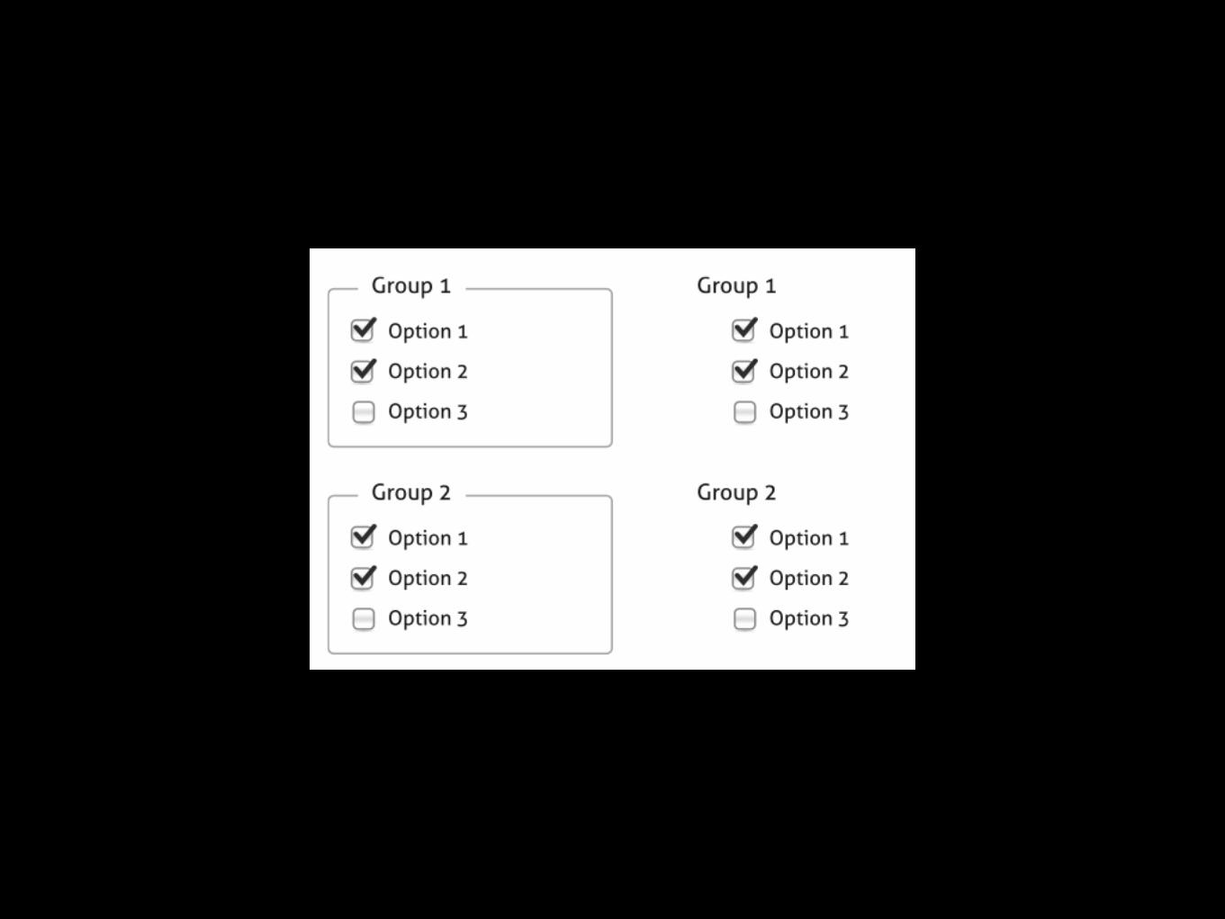

poor layout
Better layout
Waste space


Design for scanning

A model for scanning Designing a layout for scanning
Quick fixes to scanning problems
A model for scanning Designing a layout for scanning
Quick fixes to scanning problems

On large displays, users scan a page by starting at the focal point; scan across the page with a left-to-right, top-to-bottom arc; check UI elements that attract their attention along the
way; ignore UI elements that repulse their attention, and end in the lower-right corner.

A model for scanning Designing a layout for scanning
Quick fixes to scanning problems

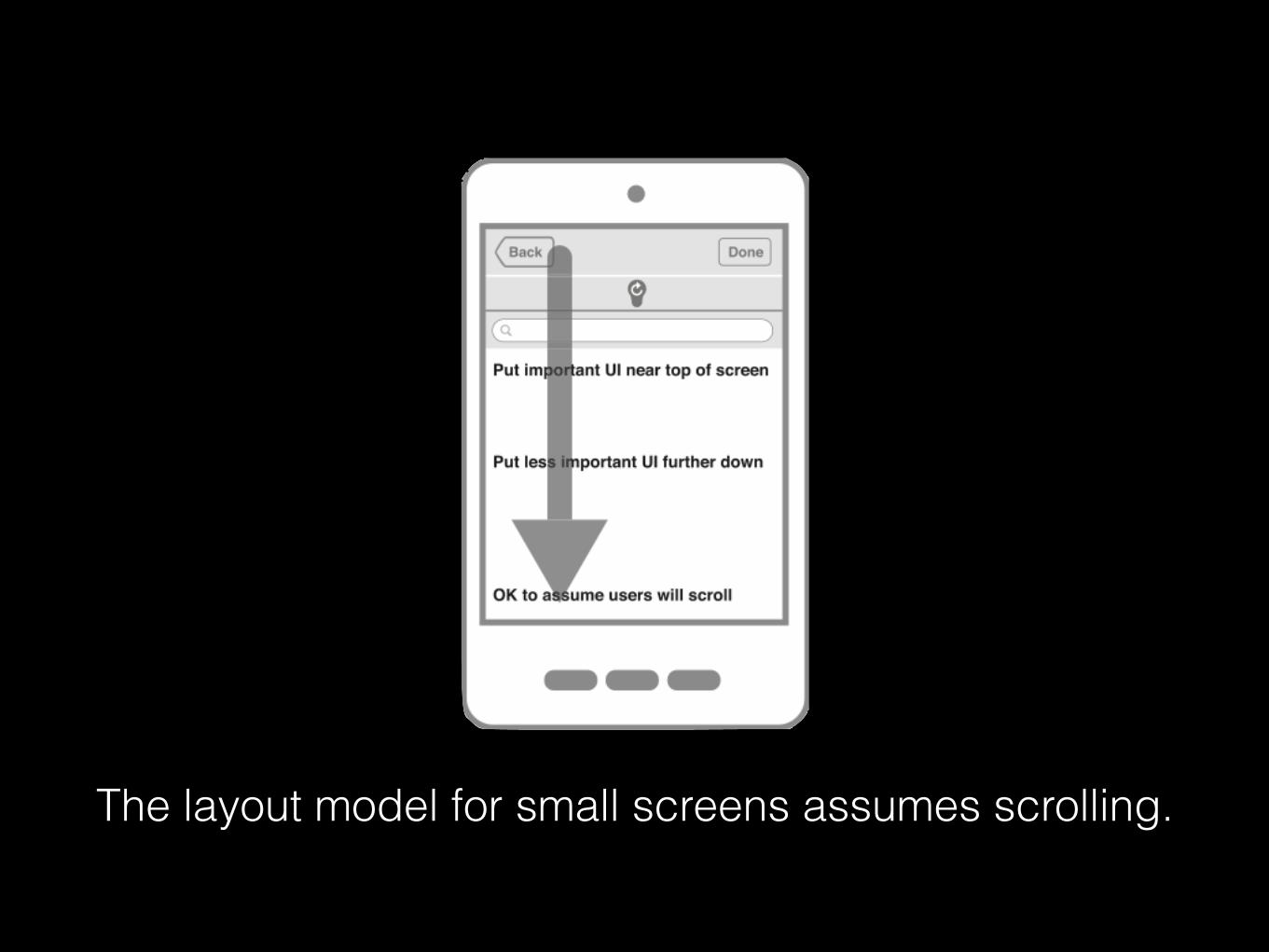
The layout model for small screens assumes scrolling.
A model for scanning Designing a layout for scanning
Quick fixes to scanning problems

Common Problems
• Multiple focal points. • An unnatural flow order. • Primary elements not attracting enough
attention. • Secondary elements attracting too much
attention.

Some scanning problems can be addressed by attracting the right amount of attention.

Users don’t read, they scan - where the goal of scanning is to find things quickly.
Scanning is so important that you should design pages specifically for scanning.

Reference
<UI is communication> by Everett N McKay