Typography on the Web - FITC Amsterdam 2015
51
TYPOGRAPHY ON THE WEB Michaël Chaize @mchaize
-
Upload
michael-chaize -
Category
Design
-
view
1.013 -
download
0
Transcript of Typography on the Web - FITC Amsterdam 2015

TYPOGRAPHY ON THE WEB
Michaël Chaize@mchaize

BonjourMichaël Chaize
@mchaize

wordsthoughts
design
reco
rd

typographyestablish a tone
add meaningrole
of
a d
esig
ner

hello »«

HELLO

lol ;)


by Alison Carmichael

What’s the difference between a Font and a Typeface ?

We have just entered the era of non-boring typography
TYPOGRAPHY ON THE WEB
1996
Andale MonoTimes New Roman
GeorgiaVerdanaArial
Courier NewTrebuchet MSComic Sans
Impact
200990K+ typefaces on the web
Focus on structure: H1,H2…
&

Web Design is 95% typography
TYPOGRAPHY ON THE WEB
1996 2014

“THE WEB SAVED TYPOGRAPHY”
Jean-François Porchez

STRUCTURE, CONTRAST, STRUCTURE
TYPOGRAPHY ON THE WEB

kerning, leading, uppercase…
DESIGN CHOICES
“Choosing typefaces relies on weighing the context of what you’re designing against your technical requirements, typographic knowledge, and gut instinct. Just as the best coffee machine won’t necessarily make you the best cup of coffee, good typography depends on the ingredients you choose, the particular combination of those ingredients, and the ways you combine them. Your typeface choices must fit the circumstances you need them for and so must your design.”
Excerpt From: Jason Santa Maria. “On Web Typography.”
“Choosing typefaces relies on weighing the context of what you’re designing against your technical requirements, typographic knowledge, and gut instinct. Just as the best coffee machine won’t necessarily make you the best cup of coffee, good typography depends on the ingredients you choose, the particular combination of those ingredients, and the ways you combine them.”
“ C h o o s i n g typefaces relies on w e i g h i n g t h e context of what you’re designing a g a i n s t y o u r t e c h n i c a l r e q u i r e m e n t s , t y p o g r a p h i c knowledge, and gut instinct. Just as the b e s t c o f f e e mach i n e won ’t necessarily make you the best cup of coffee, good
t y p o g r a p h y depends on the ingredients you c h o o s e , t h e p a r t i c u l a r combinat ion of those ingredients, and the ways you comb ine t hem . Yo u r t y p e f a c e choices must fit the circumstances you need them for and so must your design.”

“Choosing typefaces relies on weighing the context of what you’re designing against your techn i ca l requ i rements , t ypograph i c knowledge, and gut instinct. Just as the best coffee machine won’t necessarily make you the best cup of coffee, good typography depends on the ingredients you choose, the particular combination of those ingredients, and the ways you combine them. Your typeface choices must fit the circumstances you need them for and so must your design.”
FONT SIZE x 30
34px * 30 = 1020 pixels
TRICK
DESIGN CHOICES
READ IT LOUDTRICK

picking the right typeface
“Choosing typefaces relies on weighing the context of what you’re designing against your technical requirements, typographic knowledge, and gut instinct. Just as the best coffee machine won’t necessarily make you the best cup of coffee, good typography depends on the ingredients you choose, the particular combination of those ingredients, and the ways you combine them. Your typeface choices must fit the circumstances you need them for and so must your design.”
“Choosing typefaces relies on weighing the context of what you’re designing against your technical requirements, typographic knowledge, and gut instinct. Just as the best coffee machine won’t necessarily make you the best cup of coffee, good typography depends on the ingredients you choose, the particular combination of those ingredients, and the ways you combine them. Your typeface choices must fit the circumstances you need them for and so must your design.”
DESIGN CHOICES

Reading is a complex process for my brain. I need to understand how we read in order to make good design choices for my readers.
Reading is a complex process for my brain. I need to understand how we read in order to make good design choices for my readers.

DESIGNING CHARACTERS
“a A is a A”


VALISTIKA STUDIO MAD

FITC Amsterdam

FITC Amsterdam

FITC Amsterdam

FITC Amsterdam

FITC Amsterdam

FITC Amsterdam

FITC
Amsterdam
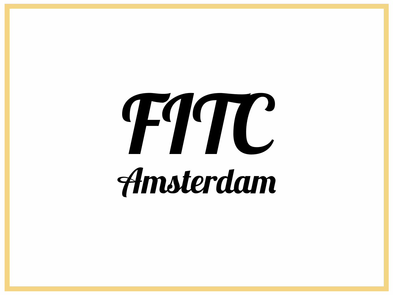
FITC Amsterdam

FITC
Amsterdam

DESIGN TRENDS

That’s why a typeface costs several hundreds of dollars
CREATIVE PROCESS
I DESIGNING A FONT IS A LOT OF WORK
technology culture feeling
emotion message

about 320$ per designer
PREMIUM TYPEFACE
II FOUNDRY - PARATYPE
Futura


about 320$ per designer
PREMIUM TYPEFACE
II FOUNDRY - PARATYPE
Futura

Be aware
PREMIUM TYPEFACE vs FREE TYPEFACE
I
BETTER QUALITY
II
MULTIPLE FONT STYLES
III
WON’T BE SEEN EVERYWHERE
IV
NO WORRIES OF LAWSUITS
V
LANGUAGES
I
DOES NOT INCLUDE ALL CHARACTERS
II
LACK OF CONSISTENCY
III
MAY REQUIRE ADDITIONAL LICENSE
IV
MAY BE A STOLEN DESIGN
V
LACK OF FONT STYLE OPTIONS
Typekit

Best friend of typographers and designers in general.
TYPEKIT
I 1000+ TYPEFACES
II SUBSCRIPTION MODEL SINCE 2009
III CREATIVE CLOUD MEMBERSHIP INCLUDES A
TYPEKIT PORTFOLIO PLAN
IV FULL CATALOG FOR YOUR WEBSITES
V 15 BILLION PAGE VIEWS/MONTH
Typekiton the web


Typekit& Web Design

You can create a 100% web safe visual workflow
The classic customer quote:
“The page of my website looked better in Photoshop”
99% of the time, this is because fonts look better in Photoshop. Design with the browser in mind.
PHOTOSHOP & WEB FONTS

Typekit& Publishing

What does it represent ?
& & &

Use professional fonts in your publications
TYPEKIT DESKTOP FONTS
Premium fonts in PDF, ePUB, Word, Powerpoint…

TypekitLinKs

Typography is practice
RESOURCES
MY BLOG
www.CreativeDroplets.com
TYPEKIT LESSONS
http://practice.typekit.com/
INSPIRATION
http://fontsinuse.com/

Michaël Chaize@mchaize
merci ;)