Typography' and the Information, Typography and the New...
24
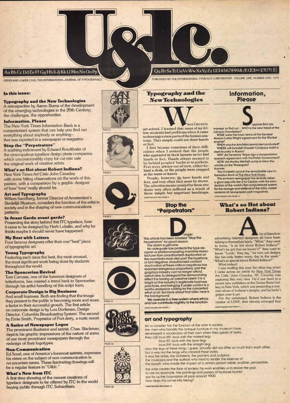
• O PAGE 20 PUBLISHED BY THE INTERNATIONAL TYPEFACE CORPORATION. VOLUME ONE, NUMBER ONE , 1973 Typography' and the New Technologies Information, Please a hen I went to art school, I learned that many of my fel- low students had problems when it came to drawing certain parts ofthe human ana- tomy. They simply could not draw hands or feet. I first became conscious of their diffi- culties when I noticed that the people who appeared in their layouts never had hands or feet. Hands always seemed to be behind peoples' backs or in pockets. Feet were always out of view, either be- hind a desk, or the people were cropped at the waist or knees. People, however, do have hands and feet, and very often they must be shown. The advertisements created by these stu- dents very often suffered as a result of these simple but important handicaps. CONTINUED ON PAGE 3 Stop the "Perpetrators" uppose that you wonted to find out... WHO is the new head of the Johnson Foundation? WHAT were the basic terms of the General Motors-Curtiss-Wright agreement for the Wonkel engine? WHEN was the Amchitka otomictestconducted? WHERE will Swindell-Dressler Company build a steel foundry in Russia? WHY did Secretary Volpe sign a transportation research agreement with the Polish Government? HOW did Martha Mitchell come to blow the whistle on the Watergate? Answer: You'd merely consult the remarkable new In- formation Bank of The New York Times. This eminent newspaper has recently taken a giant step into the 21st Century with the intro- duction of the world's first computerized system for the storage and retrieval of the richly varied contents of newspapers and magazines. CONTINUED ON PAGE 11 What's so Hot about Robert Indiana? anger. This article has been labeled "Stop the Perpetrators" for good reason. The alarm is genuine. No adequate law protects the type de- signer or photocomposing machine manu- facturer from unauthorized duplication of the machine's most vital part: the typeface or font negative. Unauthorized contact duplication of these critical negatives has reached dangerous proportions, and the graphics industry can no longer afford, ostrich-like, to disregard the demoralizing effect it is having on creative talent. It is a blight on the industry's legitimate business practices, and bringing it under control is a worthy endeavor calling for the concerted effort of all. But more about that later; here is the background: We operate in a free system where ethics and law contribute mightily to the function- CONTINUES:. ON PAGE 2 lot of friends in advertising—talented designers all—have been talking to themselves lately. "What," they want to know, "is so hot about Robert Indiana?" "What's he got that we haven't?" they want to know. "Look," they say, "we turn out designs like his—only better—every day in the week." "What's so special about Robert Indiana?" What indeed. I was mulling this over the other day when I came across an article by New York Times Art Critic, John Canaday. Mr. Canaday was exploring this very idea. He'd just been to a recent new exhibition at the Denise Rene Gal- lery in New York, which was presenting a one- man show of Indiana's designs, and he hadn't gotten over it yet. For the uninitiated, Robert Indiana is the creator of LOVE, that cleverly-arranged four CONTINUED ON PAGE 7 art and typography let us consider first the function of the artist in society. the men who handle the antique furniture in my museum have developed a vocabulary of their own when they speak of styles. they call louis XIV: louis with the twisted legs louis X\/: louis with the bow legs louis louis with the straight legs now the legs of these kings, i guess, actually did not differ so much from each other. but it was nor the kings who created these styles; it was the artists, the architects, the painters and sculptors, the musicians and the authors who tried to render the essence of the epoch, who made the impact of a certain period visible, audible, perceptible. the artist creates the face of society; his work enables us to revive the past. to cite an example, the paintings and posters of toulouse-lautrec ore for us the incarnation of Paris around 1900. how does this come into being? CONTINUED ON PAGE IS Aa Bb Cc Dd Ee Ff Gg1-11 -11iJj Kk LI Mm Nn Oo Pp UPPER AND LOWER CASE, THE INTERNATIONAL JOURNAL OF TYPOGRAPHICS In this issue: Typography and the New Technologies A retrospective by Aaron Burns of the development of the emerging technologies in the 20th Century; the challenges, the opportunities. Information, Please The New York Times Information Bank is a computerized system that can help you find out everything about anybody or anything— that was reported in a newspaper or magazine. Stop the "Perpetrators" A scathing indictment by Edward Rondthaler of the unscrupulous typeface design pirate companies which unconscionably copy for cut-rate sale the original work of creative artists. What's so Hot about Robert Indiana? New York Times Art Critic John Canaday with some biting observations on the work of this painter, with a comparison by a graphic designer of how"love" really should be. Art and Typography Willem Sandberg, former Director of Amsterdam's Stedelijk Museum, considers the function of the artist in society and in the shaping of new communications patterns. Is Avant Garde avant garde? Presenting the story behind this ITC typeface, how it came to be designed by Herb Lubalin, and why he thinks maybe it should never have happened. My Best with Letters Four famous designers offer their one"best" piece of typographic art. Young Typography Featuring each issue the best, the most unusual, the most significant work being done by students throughout the world. The Spencerian Revival Tom Carnase, one of the foremost designers of letterforms, has created a trend back to Spencerian through his artful handling of this script form. Corporate Design is Big Business And small business. Both are finding that the image they present to the public is becoming more and more a factor in their successful growth. The first article on corporate design is by Lou Dorfsman, Design Director, Columbia Broadcasting System. The second by Ernie Smith, Proprietor of Port Jerry, a rustic resort. A Satire of Newspaper Logos The prominent illustrator and satirist, Chas. Slackman, depicts his graphic impressions of the nature of some of our most prominent newspapers through the redesign of their logotypes. Non-Communication Ed Sorel, one of America's foremost satirists, expresses his views on the subject of non-communication in no uncertain terms. These fascinating drawings will be a regular feature in "U&lc." What's New from ITC A first-time showing of the newest creations of typeface designers to be offered by ITC to the world buying public through ITC Subscribers. Qq RrSsTt UuVvWwXxYy Zz1234567890&/ECEW£70!?( )[]
Transcript of Typography' and the Information, Typography and the New...
•
O
PAGE 20
PUBLISHED BY THE INTERNATIONAL TYPEFACE CORPORATION. VOLUME ONE, NUMBER ONE , 1973
Typography' and the New Technologies
Information, Please
a
hen I went to art school, I learned that many of my fel-low students had problems when it came to drawing certain parts ofthe human ana-tomy. They simply could not draw hands or feet.
I first became conscious of their diffi-culties when I noticed that the people who appeared in their layouts never had hands or feet. Hands always seemed to be behind peoples' backs or in pockets. Feet were always out of view, either be-hind a desk, or the people were cropped at the waist or knees.
People, however, do have hands and feet, and very often they must be shown. The advertisements created by these stu-dents very often suffered as a result of these simple but important handicaps. CONTINUED ON PAGE 3
Stop the "Perpetrators"
uppose that you
wonted to find out... WHO is the new head of the Johnson Foundation?
WHAT were the basic terms of the General Motors-Curtiss-Wright agreement for the Wonkel engine?
WHEN was the Amchitka otomictestconducted? WHERE will Swindell-Dressler Company build a
steel foundry in Russia? WHY did Secretary Volpe sign a transportation
research agreement with the Polish Government? HOW did Martha Mitchell come to blow the
whistle on the Watergate? Answer:
You'd merely consult the remarkable new In-formation Bank of The New York Times.
This eminent newspaper has recently taken a giant step into the 21st Century with the intro-duction of the world's first computerized system for the storage and retrieval of the richly varied contents of newspapers and magazines.
CONTINUED ON PAGE 11
What's so Hot about Robert Indiana?
anger. This article has been labeled "Stop the Perpetrators" for good reason.
The alarm is genuine. No adequate law protects the type de-
signer or photocomposing machine manu-facturer from unauthorized duplication of the machine's most vital part: the typeface or font negative. Unauthorized contact duplication of these critical negatives has reached dangerous proportions, and the graphics industry can no longer afford, ostrich-like, to disregard the demoralizing effect it is having on creative talent. It is a blight on the industry's legitimate business practices, and bringing it under control is a worthy endeavor calling for the concerted effort of all. But more about that later; here is the background:
We operate in a free system where ethics and law contribute mightily to the function-
CONTINUES:. ON PAGE 2
lot of friends in advertising—talented designers all—have been talking to themselves lately. "What," they want to know, "is so hot about Robert Indiana?"
"What's he got that we haven't?" they want to know. "Look," they say, "we turn out designs like his—only better—every day in the week."
"What's so special about Robert Indiana?" What indeed. I was mulling this over the other day when
I came across an article by New York Times Art Critic, John Canaday. Mr. Canaday was exploring this very idea. He'd just been to a recent new exhibition at the Denise Rene Gal-lery in New York, which was presenting a one-man show of Indiana's designs, and he hadn't gotten over it yet.
For the uninitiated, Robert Indiana is the creator of LOVE, that cleverly-arranged four
CONTINUED ON PAGE 7
art and typography let us consider first the function of the artist in society. the men who handle the antique furniture in my museum have developed a vocabulary of their own when they speak of styles. they call louis XIV: louis with the twisted legs
louis X\/: louis with the bow legs louis louis with the straight legs
now the legs of these kings, i guess, actually did not differ so much from each other. but it was nor the kings who created these styles; it was the artists, the architects, the painters and sculptors, the musicians and the authors who tried to render the essence of the epoch, who made the impact of a certain period visible, audible, perceptible.
the artist creates the face of society; his work enables us to revive the past. to cite an example, the paintings and posters of toulouse-lautrec ore for us the incarnation of Paris around 1900. how does this come into being?
CONTINUED ON PAGE IS
Aa Bb Cc Dd Ee Ff Gg1-11-11iJj Kk LI Mm Nn Oo Pp
UPPER AND LOWER CASE, THE INTERNATIONAL JOURNAL OF TYPOGRAPHICS
In this issue:
Typography and the New Technologies A retrospective by Aaron Burns of the development of the emerging technologies in the 20th Century; the challenges, the opportunities.
Information, Please The New York Times Information Bank is a computerized system that can help you find out everything about anybody or anything— that was reported in a newspaper or magazine.
Stop the "Perpetrators" A scathing indictment by Edward Rondthaler of the unscrupulous typeface design pirate companies which unconscionably copy for cut-rate sale the original work of creative artists.
What's so Hot about Robert Indiana? New York Times Art Critic John Canaday with some biting observations on the work of this painter, with a comparison by a graphic designer of how"love" really should be.
Art and Typography Willem Sandberg, former Director of Amsterdam's Stedelijk Museum, considers the function of the artist in society and in the shaping of new communications patterns. Is Avant Garde avant garde? Presenting the story behind this ITC typeface, how it came to be designed by Herb Lubalin, and why he thinks maybe it should never have happened.
My Best with Letters Four famous designers offer their one"best" piece of typographic art.
Young Typography Featuring each issue the best, the most unusual, the most significant work being done by students throughout the world.
The Spencerian Revival Tom Carnase, one of the foremost designers of letterforms, has created a trend back to Spencerian through his artful handling of this script form.
Corporate Design is Big Business And small business. Both are finding that the image they present to the public is becoming more and more a factor in their successful growth. The first article on corporate design is by Lou Dorfsman, Design Director, Columbia Broadcasting System. The second by Ernie Smith, Proprietor of Port Jerry, a rustic resort.
A Satire of Newspaper Logos The prominent illustrator and satirist, Chas. Slackman, depicts his graphic impressions of the nature of some of our most prominent newspapers through the redesign of their logotypes.
Non-Communication Ed Sorel, one of America's foremost satirists, expresses his views on the subject of non-communication in no uncertain terms. These fascinating drawings will be a regular feature in "U&lc."
What's New from ITC A first-time showing of the newest creations of typeface designers to be offered by ITC to the world buying public through ITC Subscribers.
Qq RrSsTt UuVvWwXxYy Zz1234567890&/ECEW£70!?( )[]
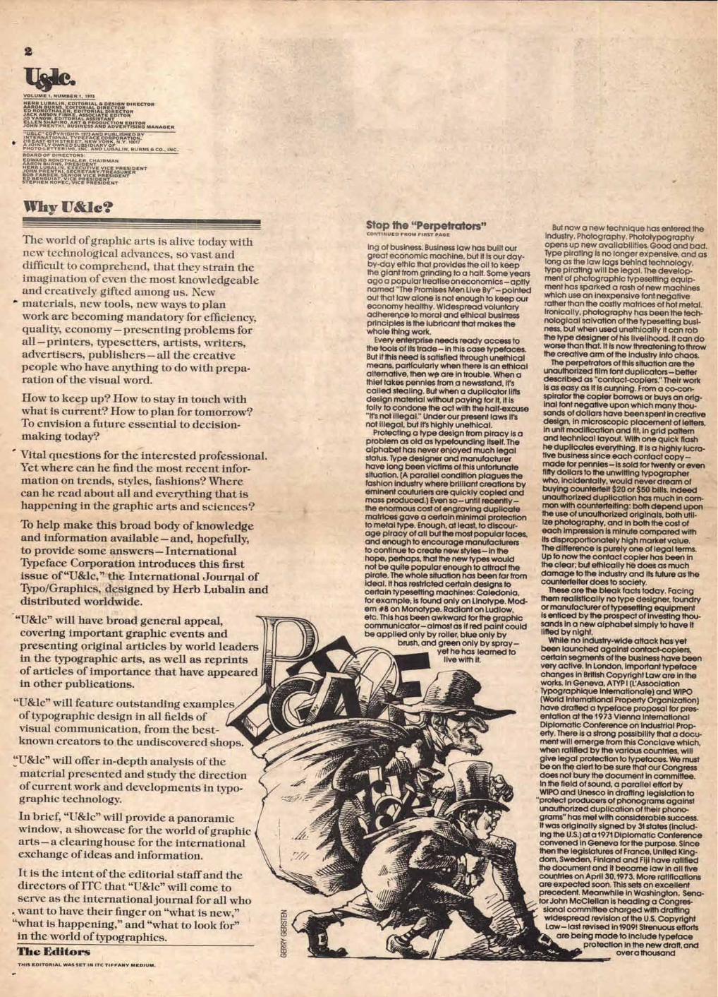
2
VOLUME I NUMBER 1, 1973
HERB LUBALIN, EDITORIAL & DESIGN DIRECTOR AARON BURNS. EDITORIAL DIRECTOR ED RONDTHALER, EDITORIAL DIRECTOR JACK ANSON F1NKE, ASSOCIATE EDITOR JO YANOW, EDITORIAL ASSISTANT ELLEN SHAPIRO, ART & PRODUCTION EDITOR JOHN PRENTKI, BUSINESS AND ADVERTISING MANAGER
- U&LC" COI, YRIGHT. 1973 AND PUBLISHED BY INTERNATIONAL TYPEFACE CORPORATION, 216 EAST 45TH STREET, NEW YORK, N.Y. 10017 AJOINTLY OWNED SUBSIDIARY OF PHOTO-LETTERING, INC. AND LUBALIN, BURNS & CO., INC.
BOARD OF DIRECTORS EDWARD RONDTHALER, CHAIRMAN AARON BURNS, PRESIDENT HERB LUBALIN, EXECUTIVE VICE PRESIDENT JOHN PRENTKI, SECRETARY/TREASURER BOB FARBER. SENIOR VICE PRESIDENT ED BENGUIAT, VICE PRESIDENT STEPHEN KOPEC, VICE PRESIDENT
GERR
Y GE
RSTE
N
y Ileac?
The world of graphic arts is alive today with new technological advances, so vast and difficult to comprehend, that they strain the imagination of even the most knowledgeable and creatively gifted among us. New materials, new tools, new ways to plan work are becoming mandatory for efficiency, quality, economy—presenting problems for all — printers, typesetters, artists, writers, advertisers, publishers — all the creative people who have anything to do with prepa-ration of the visual word.
How to keep up? How to stay in touch with what is current? How to plan for tomorrow? To envision a future essential to decision-making today?
Vital questions for the interested professional. Yet where can he find the most recent infor-mation on trends, styles, fashions? Where can he read about all and everything that is happening in the graphic arts and sciences?
To help make this broad body of knowledge and information available — and, hopefully, to provide some answers — International Typeface Corporation introduces this first issue of "U&lc," the International Journal of Typo/Graphics, designed by Herb Lubalin and distributed worldwide.
"U&lc" will have broad general appeal, covering important graphic events and presenting original articles by world leaders in the typographic arts, as well as reprints of articles of importance that have appeared in other publications.
"U&lc" will feature outstanding examples of typographic design in all fields of visual communication, from the best- known creators to the undiscovered shops.
"U&lc" will offer in-depth analysis of the material presented and study the direction of current work and developments in typo- graphic technology.
In brief, "U&lc" will provide a panoramic window, a showcase for the world of graphic arts — a clearinghouse for the international exchange of ideas and information.
It is the intent of the editorial staff and the directors of ITC that "U&lc" will come to serve as the international journal for all who want to have their finger on "what is new,"
"what is happening," and "what to look for" in the world of typographies.
The Editors
Stop the "Perpetrators" CONTINUED FROM FIRST PAGE
ing of business. Business law has built our great economic machine, but it is our day-by-day ethic that provides the oil to keep the giant from grinding to a halt. Some years ago a popular treatise on economics — aptly named "The Promises Men Live Br-pointed out that law alone is not enough to keep our economy healthy. Widespread voluntary adherence to moral and ethical business principles is the lubricant that makes the whole thing work.
Every enterprise needs ready access to the tools of its trade— in this case typefaces. But if this need is satisfied through unethical means, particularly when there is an ethical alternative, then we are in trouble. When a thief takes pennies from a newsstand, it's called stealing. But when a duplicator lifts design material without paying for it, it is folly to condone the act with the half-excuse "It's not illegal." Under our present laws it's not illegal, but it's highly unethical.
Protecting a type design from piracy is a problem as old as typefounding itself. The alphabet has never enjoyed much legal status. Type designer and manufacturer have long been victims of this unfortunate situation. (A parallel condition plagues the fashion industry where brilliant creations by eminent couturiers are quickly copied and mass produced.) Even so—until recently—the enormous cost of engraving duplicate matrices gave a certain minimal protection to metal type. Enough, at least, to discour-age piracy of all butthe most popular faces, and enough to encourage manufacturers to continue to create new styles— in the hope, perhaps, that the new types would not be quite popular enough to attract the pirate. The whole situation has been far from ideal. It has restricted certain designs to certain typesetting machines: Caledonia, for example, is found only on Linotype. Mod-em #8 on Monotype. Radiant on Ludlow, etc. This has been awkward for the graphic communicator—almost as if red paint could be applied only by roller, blue only by
brush, and green only by spray— yet he has learned to
live with it.
But now a new technique has entered the industry. Photography. Phototypography opens up new availabilities. Good and bad. Type pirating is no longer expensive, and as long as the law lags behind technology, type pirating will be legal. The develop-ment of photographic typesetting equip-ment has sparked a rash of new machines which use an inexpensive font negative rather than the costly matrices of hot metal. Ironically, photography has been the tech-nological salvation of the typesetting busi-ness, but when used unethically it can rob the type designer of his livelihood. It can do worse than that. It is now threatening to throw the creative arm of the industry into chaos.
The perpetrators of this situation are the unauthorized film font duplicators—better described as "contact-copiers." Their work is as easy as it is cunning. From a co-con-spirator the copier borrows or buys an orig-inal font negative upon which many thou-sands of dollars have been spent in creative design, in microscopic placement of letters, in unit modification and fit, in grid pattern and technical layout. With one quick flash he duplicates everything. It is a highly lucra-tive business since each contact copy—made for pennies— is sold for twenty or even fifty dollars to the unwitting typographer who, incidentally, would never dream of buying counterfeit $20 or $50 bills. Indeed unauthorized duplication has much in com-mon with counterfeiting: both depend upon the use of unauthorized originals, both util-ize photography, and in both the cost of each impression is minute compared with its disproportionately high market value. The difference is purely one of legal terms. Up to now the contact copier has been in the clear; but ethically he does as much damage to the industry and its future as the counterfeiter does to society.
These are the bleak facts today. Facing them realistically no type designer, foundry or manufacturer of typesetting equipment is enticed by the prospect of investing thou-sands in a new alphabet simply to have it lifted by night.
While no industry-wide attack has yet been launched against contact-copiers, certain segments of the business have been very active. In London, important typeface changes in British Copyright Law are in the works. In Geneva, ATYP I (L'Association Typographique Internationale) and WIPO (World International Property Organization) have drafted a typeface proposal for pres-entation at the 1973 Vienna International Diplomatic Conference on Industrial Prop-erty. There is a strong possibility that a docu-ment will emerge from this Conclave which, when ratified by the various countries, will give legal protection to typefaces. We must be on the alert to be sure that our Congress does not bury the document in committee. In the field of sound, a parallel effort by WIPO and Unesco in drafting legislation to
"protect producers of phonograms against unauthorized duplication of their phono-grams" has met with considerable success. It was originally signed by 31 states (includ-ing the U.S.) at a 1971 Diplomatic Conference convened in Geneva for the purpose. Since then the legislatures of France, United King-dom, Sweden, Finland and Fiji have ratified the document and it became law in all five countries on April 30,1973. More ratifications are expected soon. This sets an excellent precedent. Meanwhile in Washington, Sena-tor John McClellan is heading a Congres-sional committee charged with drafting widespread revision of the U.S. Copyright Law— last revised in 1909! Strenuous efforts
are being made to include typeface protection in the new draft, and
over a thousand
THIS EDITORIAL WAS SET IN ITC TIFFANY MEDIUM.
LONGEST WORD IN THE LANGUAGE
One question people never tire of asking is "What is the longest word in the English language?"
Youngsters run across this query in their earliest book of riddles,
complete with the answer: "Smiles,
because there's a mile between the first letter and the last" But the matter is one that
grownups frequently debate, and the belief is widespread that
anti- wstab- fish- men- . tartan- •
is the longest meaningful word in the language.
Actually, there is a longer word, a term found in the Oxford
English Dictionary:
floc_ cm;
ilihll- gm- lift_ ea-
don• The word is a noun defined as
"estimating as worthless." It is in the dictionary and, with its
twenty-nine letters, is one letter longer than anti-you-know-what.
Finally, the editors of the Merriam Webster New International
Dictionary have included in their "New Words" supplement the word
imen- mono-
silico- vol- liD"- osis.
an actual disease of the lungs to which miners are especially
susceptible. The longest word in the language — and, if you don't
believe it, look it up!
signatures supporting it are in the Senators hands. All this is good. But legal wheels move slowly.
Do we have to wait? No. Not if enough typographers and buyers of typography are shocked by the thought of counterfeit type—albeit legally counterfeited. Inter-national Typeface Corporation is one indus-try mover that has refused to wait. Facing the inequity squarely, the company has issued an "ITC design license mark" (see page%) to be used on all authorized film strips, grids, discs, transfer sheets or other master alphabet products using ITC designs and manufactured by licensed ITC sub-scribers. Any legitimate manufacturer may become a licensee. This mark clearly identifies the product's authenticity and assures the purchaser that a royalty has been paid. U&Ic urges other producers of original faces to use similar forms of pro-tection for the designer and the industry.
Finally, then, there is a very potent weapon available to every typographer and every buyer of typesetting: full-scale rejection of the contact-copier. As a growing number of professionals in the typographic commu-nity become clearly aware of this obviously unjust situation, those opportunists who cal-lously take advantage of the designer are becoming more and more exposed.Their position is increasingly difficult to defend.
Several graphics leaders have come for-ward in defense of the type designer in no uncertain terms. Are you ready to stand and be counted with them?
Milton Glaser of Push Pin Studio says: "It is almost impossible to distinguish
between legitimacy and plagiarism. We are in the business of making our
ideas public and available. One of the most agreeable ego satisfactions is seeing the way these ideas become part of a mutual graphics consciousness.
Plagiarism offers no satisfaction to any-one, neither victim, community, nor finally,
the plagiarist. There's no way of condoning any part of
it without everybody losing something. Since, in this situation, we can't call a
cop, we must find a way to take care of it ourselves!
George Lois, Chairman of Lois,Holland, Callaway says:
"There's enough illegality, unethicality and immorality in the world without having to condone the legalized plagiarism that has invaded the typographic field which I have always regarded as being curiously honest!
Saul Bass of Saul Bass & Associates says: "I don't have time to investigate who is
ethical and who isn't in our business. I have faith in the integrity of my suppliers and would be sorely disappointed if I found out otherwise. I sincerely hope my typogra-phers are not buying contact-copied fonts!
Louis Dorfsman, Vice President, Advertising & Design, CBS Broadcast Group says:
"I will avoid doing business with the type shops that buy unlicensed type fonts for the sake of bargain-hunting and bigger profits. I don't know much about that end of our profession, but thanks to ITC, I'm be-ginning to find out!
How would you say it? Will you say it where it counts—in a letter to your type sup-plier? And will you send a copy to U&Ic.? We'll forward it to Senator McClellan and use it in our continuing campaign against legalized plagiarism.
With your help added to that of others, we can move forward, so that the 70s, instead of marking the spread of legalized plagia-rism and the demise of type design, will be the years of its renaissance.
Take your pen in hand. Do your share to-day for integrity.
ED RONDTHALER
8
Tjtpography and the New ilechnologies CONTINUED FROM FIRST PAGE
How technology influences art. Photography freed these artists from
such inhibiting factors. The camera could faithfully render hands and feet, and the artist could now permit himself to think and create in terms that no longer were limited only to what he could draw.
With photography, the artist was now free to choose between "fine art" and a new form of "commercial art" as a ca-reer. A graphic art that today uses all the tools of modern graphic arts technology; type, platemaking, screen tints, printing presses, cameras, colored papers, trans-fer sheets, colored felt-tipped pens (in-stead of watercolor brushes) and scores of other materials and methods— all now available for the creatively gifted but technically limited graphic designer.
All of which is precisely the point I wish to make about the development of modern typography.
Ever since Gutenberg, typographic de-sign has developed in direct relationship to the advances that have taken place in graphic arts mechanization and technol-ogy. First, from a metal hand-set begin-ning almost 500 years ago — to a mechan-ical machine-set period begun 100 years ago —to an electronic film-set era less than 10 years old.
Suppose you had to set your own type.
During the metal/letterpress era, mak-ing a typographic layout almost always meant that whatever the artist planned as his layout he would have to set in type ... himself. To most artists, this was a slow process, and worse, an inhibiting
factor for a person who was talented at making layouts but all thumbs when it came to setting type.
Like those students who could not draw hands or feet, these "artists-with-type" were faced with similar inhibitions. The more complicated they made the lay-out... the more difficulty they would have when it came to setting the type.
It is easy to see, therefore, and also to understand, how or why most early typo-graphic formats probably were arrived at —more from a consideration of labor ef-forts and costs than from a consideration of esthetics and art. Gutenberg's first pages for his bible were set with a flush left and ragged right margin—not per-haps because it was more beautiful that way, but because it was easier that way. It was only when the mechanical fea-tures introduced by the linotype space bands were invented for use in newspa-per settings, that we had the introduc-tion of flush left and flush right settings. It was easier for the machine and the op-erator to set type this way. (It also made for pretty terrible typesetting. ) This feature of typesetting has remained as the predominant "style" for text set-ting ever since.
As printing mechanization developed and new typesetting processes emerged, artists were freed from the age -old me-chanical restrictions that hand-set metal type placed on their creative efforts.
From type to letterfornas.
A major design freedom for the typo-graphic artist was the invention of plate-making. Printing from a plate surface rather than directly from the type itself.
With this new graphic art technology, artists were able to take proofs of the metal type, cut them up and paste them into different positions without restric-tions—and make printing plates. This meant that all previous limitations, im-posed by metal type upon creative typo-graphic arrangements, no longer existed. The artist was now free from his "lead handcuffs." Type has never been the same.
Since the beginning of this century we have been witness to a design revolution in typography which has explored virtu-ally every facet of communications.
The ideas which were projected only yesterday in the research laboratories of industry by men who work at the arts and sciences of communications are becom-ing reality today; typesetting by Cathode Ray Tubes at speeds of from 1,000 to 30,000 characters per second; TV-News-paper printouts; FacsimileTransmissions via telephone and satellite; Electrostatic
printing; Laser Graphic Arts; computer-
ized typography; Computer Typograph-ics; and Optical Character Recognition.
All of this new technology will make possible a whole new typographic art. In future issues of 'Mc" we will present many examples and case histories of breakthroughs that are now being uncov-ered in the new world of typo/graphics.
One example of the new frontiers we can look forward to is discussed in the article presented on page 1 —The New York Times Information Bank.
AARON BURNS
THIS ARTICLE WAS SET IN AVANT GARDE GOTHIC MEDIUM THIS ARTICLE WAS SET IN TIFFANY MEDIUM WITH HEAVY
WITH BOLD.
AANT GIRCE
FUCHS' FENNIES giViLks
NTS OF THE AMERIGIN PEOPLE MONUMVIL
RTFOLIOEN
OF PHOTOGRAPHS
4
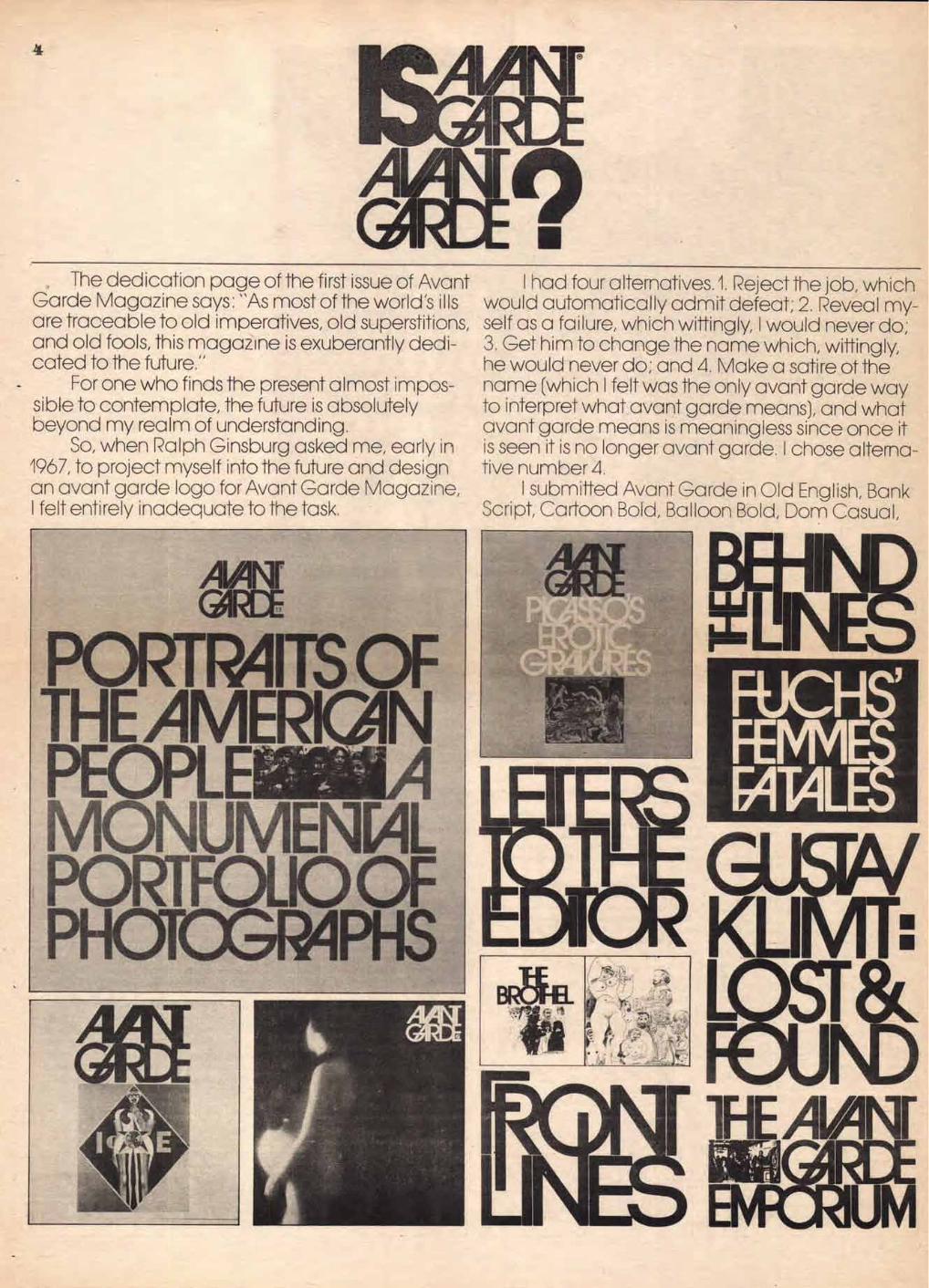
The cec ication oace of the first issue of Avant Garce Vagazine says: "As most of the woric's ills are traceable to old imperatives, old suoerstitions, anc olc fools, this magazine is exuberantly dedi-cated to the future."
For one who finds the °resent almostimoos-sible to contemplate, the future is a osolutely oeyonc my realm of uncerstanding.
So, when Ralph Ginsourg askec me, early in 1967, to project myself into the future anc cesign an avant garce logo for Avant Garce Vagazine, I felt entirely inacecuate to the task,
I hac four alternatives. 1. Reject the joo, which woulc automatically acmit cefeat; 2. Reveal my-self as a failure, which wittingly, I woulc never co; 3. Get hirTito change the name which, wittingly, he woulc never co; anc 4. Vake a satire of the name (which I felt was the only avant carce way to interpret what avant garce means), anc what avant garce means is meaningless since once it is seen it is no longer avant garde. I chose alterna-tive num oer 4.
I suomittec Avant Garde in Olc English, Bank Scriot, Cartoon Bolc, Balloon Bolc, Dom Casual,
cbcc deof
hijKI no
ocrs ffuvv wwx yyz
K
2
IVIC
IJIL
JIV
I
ABC DEFG HIJK LMN
OPQ RST
UVW XYZ
ILNIP RASST ST1FILI NVW
ANGI CEAP1 paHr IfAIAIN
Flash Italics, Wedcing Text, Vonastic, Buffalo Bill ligatures. But coo licatures. To my knowledge, anc a last-c itch effort reflective of Coca-Cola. n000cy hac ever foolec arounc with ca o licatures.
Ginsourg saic, "Stop kiccing around!" Anc that's how the logo -yoe for Avant Garce then tried to cazzle him with a multitude of Magazine was oorn. I createc an AV ligature, a VA
ornate swashes which usually does the trick with ligature, an A\ ligature, an \T ligature anc a GA less'knowing clients. ligature.
He saic, "Cut it out!" Ral oh saic "It's illeciole out great. I'll ouy it." When a man is as graphically astute as Ralph A reaction such as this from a client who is
Ginsourg, one is harc out to cazzle him with any- an ecitor anc oublisher, anc is more concerned thing but something comoletely out of the orcinary. with legi oili -y than almost anyoocy mace me feel
Ligatures! \000cy knows a oout ligatures. Not ecstatic anc spurred me on to new heights. That's lower case ligatures, not L ooer and lower case when we cecicec to cesign the entire alphabet
CONTINUED ON PAGE 7
ABC DEFG
UK LV\
OPQ RST VW
XY7
IL\FID RA SST ST1F-Cr
123 345 fo78 90
ABC DEF HIJK LMN
OPQ RST
UVW XYZ
123 345 678 90
123 345 678 90
abcc deef
hijkl mno
abcc deef ghiki mno
pqrs truvv wwx yyz
ps TILIW
qr
wwx yyz
OPQ RST
UVVV XYZ
123 345 678 90
abcc deef ghijkl mno
pqrs t tuvv wwx yyz
ABC DEFG HIJK LmN
OPQ
URA XYZ
> Ak01 emu ROW KAMM
abcc degf ghijkl mno
pqrs t tuvv wwx yyz
6
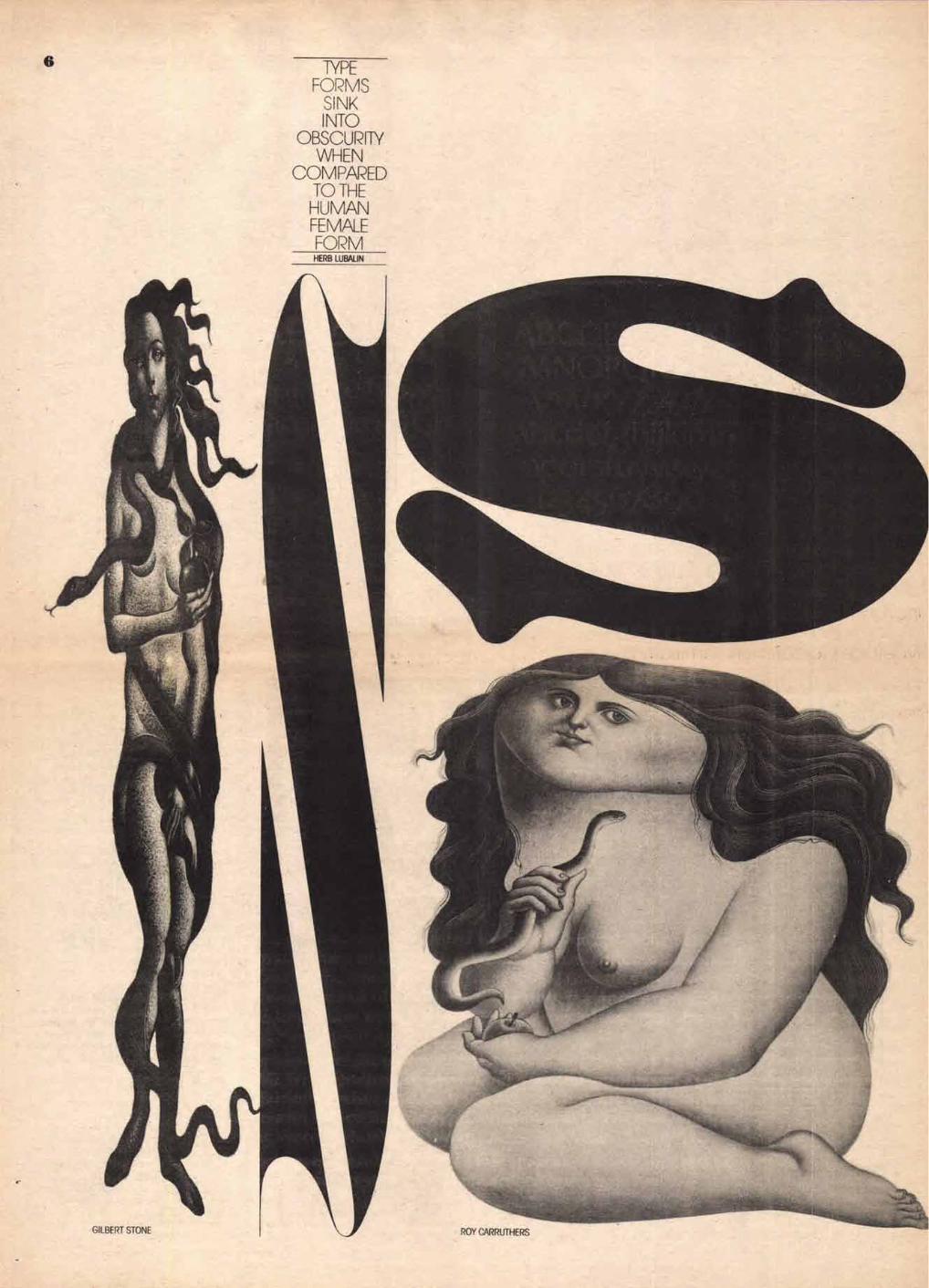
TYPE FORMS
SINK INTO
OBSCURITY WHEN
COMPARED TO THE HUMAN FEMALE FORM
HERB LUBALIN
OURS
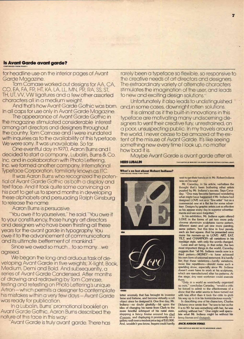
letter anomaly that has brought its inventor fame and fortune, and become virtually a cult object since he designed it. One fine day, Mr. Indiana — no doubt gleefully — hit upon the idea of changing his name from Clark to the more fanciful sobriquet of his natal state, slapping a fancy frame around his chef d'oeuvre. and displaying it prominently on a gallery wall over a modest price tag of $10,000. And, wouldn't you know, buyers could hardly
7
Is Avant Garde avant garde? CONTINUED FROM PAGE 5
for heac line use on the interior pages of Avant Garce Vagazine.
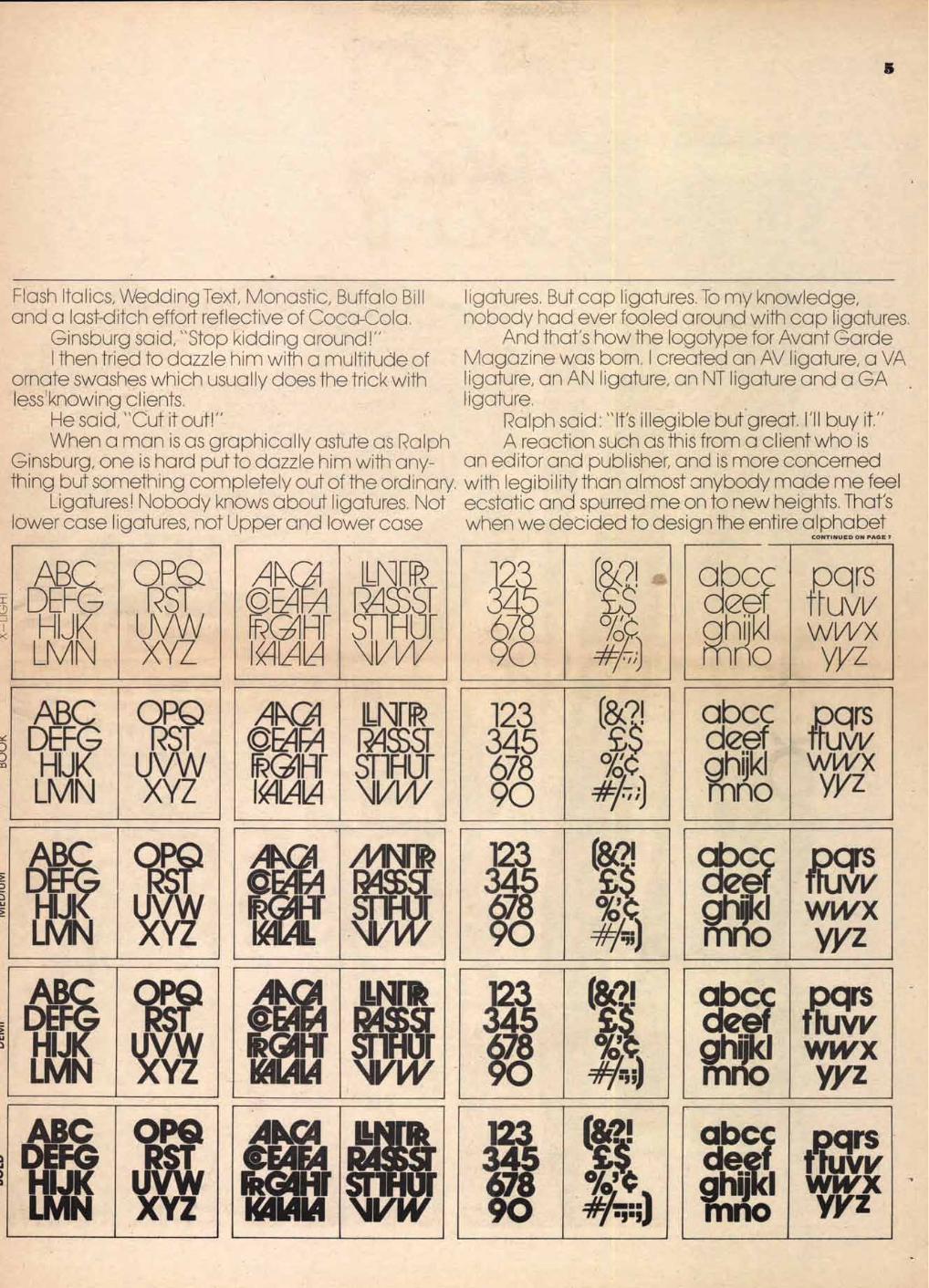
Tom Carnase worked out designs for AA, CA, CO, EA, FA, FR, HT, KA, LA, LL, M \, PR, RA, SS, ST, TH, UT, VV, VW ligatures anc a few other assorted characters all in a mecium weight.
Anc that's how Avant Garde Gothic was born. In all caps for use only in Avant Garce Vagazine.
The a ooearance of Avant Garde Gothic in the magazine stimulatec considerable interest among art cirectors and cesigners throughout the country. Tom Carnase anc I were inuncated with inquiries as to the avai la oili -y of this ypeface. We were sorry. it was unavailaole. So far.
One eventful cay in 1970, Aaron Burns and I deciced to start a company, Luoalin, Burns & Co. Inc. anc in collaboration with Photo Lettering, Inc. we formec another cor T pony, International Tyoeface Corporation, familiarly known as ITC.
It was Aaron Burns who recognizes the poten-tial of Avant Garce Gothic as oath a cisplay anc text face. Anc it took cuite some convincing on his oart to get us to soend months in developing these a 1pha Gets anc oersuading Ralph Ginsburg to release the name.
Aaron. Burns is persuasive. "You owe it to yourselves," he said, "You owe it
to your constituency, those hungry art c irectors anc designers who have oeen thirsting all these years for the avant garce in Npography. You owe it to the advancement of communications and its ultimate petterment of mankind."
Since we owed so much. ..to so many...we agreec.
We began the long anc arcuous task of ce-velooing Avant Garce in five weights; X-light, Book, Mecium, Demi anc Bolc. And suosecuently, a series of Avant Garce Concensec. After months of crowing and rec rowing oy Tom Carnase, testing anc retesting on Photo Lettering's unicue Alton — which permits a cesigner to contemolate his mistakes within a very few cays— Avant Garce was ready for ouolication,
In a Luoalin, Burns' Promotional 000klet on Avant Garce Gothic, Aaron Burns cescribed the nature of this face in this way:
"Avant Garce is truly avant garce. There has
rarely peen a yoeface so flexiole, so resoonsive to the creative neecs of art directors anc cesigners. The extraordinary varie -y of alternate characters stimulates the imagination of the user, anc leads to new and exciting cesign solutions. -
Unfortunately it also leads to uncistinguishec and, in some cases, cownricht rotten solutions.
It is almost as if the ouilt-in innovations in this -yoeface are motivating many unciscerninc ce-signers to vent their creative fury, unrestrained, on a poor, unsuspecting ouolic. In my travels around the world, I never cease to oe amazes at the ex-tent of the misuse of Avant Garce. It's like seeing something new every time I look uo, no matter how oad it is.
Maybe Avant Garde is avant garce after all. HERB WBALIN THIS ARTICLE WAS SET IN AVANT GARDE GOTHIC EXTRA LIGHT.
What's so hot about Robert Indiana? CONTINUED FROM FIRST PAGE
wait to get their hands on it. Mr. Robert Indiana was on his way!
Mr. Canaday, in his article, verbalizes the thought that's been bothering other artists puzzled by Mr. Indiana's success. Says Cana-day: "One may become bemused wondering what might have happened if Mr. Indiana had designed LOVE not as a "fine artist" but as a commercial one at a flat fee for some adver-tiser. Designs by graphic artists just as effective as his appear every day in superior advertise-ments and are soon forgotten."
In his exhibition, Mr. Indiana again offered LOVE in the forms of yet two more poly-chrome aluminum sculptures (same pattern, different sizes) and yet one more painting, same pattern, but this time in four panels, each six feet square. And he presented once more his runners-up to LOVE: ART, EAT, TILT, and CHAMPION—all variations in his roadsign style, with only the words changed.
Love and art being, in that order, the two most important things in the world, Canaday suggests that "all Mr. Indiana needs now is a third pattern — MONEY — to have achieved his own form of universal statement. It is hardly fair that these variations—hardly variations, more like repetitions—should make such a sparkling show, especially since Mr. Indiana doesn't even have to work at his sculptures, which are manufactured after his patterns. At this stage, any neat workman could execute them.
"Only in a world as wretchedly organized as ours," concludes Canaday, "would a critic be forced to admit to the effectiveness of a show that the artist seems to have turned out with less effort than it took the critic to grub his way up to it in his formicidacious rounds."
In describing one of his characters, Charles Dickens once wrote that "he was to her as the 0 is to 90: he was something with her, he was nothing without her." One might well specu-late what Mr. Indiana might be without his fancy frames and chutzpah.
JACK ANSON FINKE
THIS ARTICLE WAS SET IN ITC SOUVENIR LIGHT.
10 Januar tris 30_ April
• . Herr ±4lontag 20.22 • • '
,....
The Westinghouse digital clock radio can control. features nutmeg cabinet with walnut- lull you to sleep with Chopin or awaken you to grained top. Available at your Westinghouse morning news or buzzer alarm. Large easy- dealer. For his location please call 471-2500 to-read numerals are illuminated for 24-hour You can be sure ... if it's Westinghouse. 0
time telling. Low silhouette styling, with slide
John, is
that Billy
coughing? 'Get up and give
him some
Coldene.
8
MY BEST WITH LETTERS
I suspect that this is the best symbol I have done. Certainly
it is omnipresent on the Canadian scene. CN Express
trucks drive through every city; CN Trains span the
country; most cities have a CN Hotel; and CN Marine has
ships on both coastlines. I owe a great debt of grati- tude to James Valkus who
chose me to do it, and to Donald Gordon (now dead),
the former president of CN who agreed to its use. The
only regret I have is that my father, who worked all of his
short life for CN as a time keeper in the freight yards,
did not live to see it appear.
ALLAN R. FLEMING CANADA
This poster interprets with pure typographical ele-
ments one of the most important principles of
film: movement. The over- lapping of the word "Film"
with "der" produces the im- pression of motion. The
height of the letters of the title "der Film" is equal to
1/5 of that of the poster. The space beneath the title is also 1/5. The space above
the title is 3/5. (2/5:3/5 = the golden section). I like
the dual function of the typog- raphy in this poster: the
cinematic and aesthetic effect within a proportional
structure. JOSEF MULLER-BROCKMANN
SWITZERLAND
This illustration is one of a series of advertisements for Westinghouse radios and record players which appeared in the Pittsburgh Symphony Orchestra's concert program. The problem was to associate a Westinghouse product with the name of a famous composer. I wanted to avoid the obvious use of a picture of the composer and instead to suggest, by typographic means, either the spirit of the composer's music or the instrument with which his work is most closely associated. This example may or may not be "my best with letters;' but it is perhaps one of my best demonstrations of descriptive typography. It also demonstrates, I believe, that a word can sometimes say more than a thousand pictures.
PAUL RAND USA
This is an ad I did in 1960. It was an unusual looking ad (it was a bleed, just as you see it, no packages, body copy, etc.). It demonstrates to me a fresh use of typo-graphy. Letters are not an art form (although they can be artistic). Letters put together spell words that should say something to communicate a selling message. The idea should be interruptive, star-tling, fresh, and should touch on a person's life style. Sell-ing ideas should be ambi-tious and should treat people as if they are sharp enough to understand a bright con-cept. This discussion in bed of a married couple in 1960 is a "typographic" solution that enhances the idea and, in and of itself, becomes the visual.
GEORGE LOIS USA
THIS FEATURE WAS SET IN AVANT
GARDE GOTHIC BOLD.
CHIC CHIC DIE CHIC CHIC DIE CHIC CHIC CHIC 31H3 CHIC 31113 CHIC 3IH3
CHIC 31113 011C3IH3
CHIC31143 CHIC31K3
CHIC3P13 CHIC31113 CHIC31•3 CHIC3013
CHIC3H3 CHE31143
9
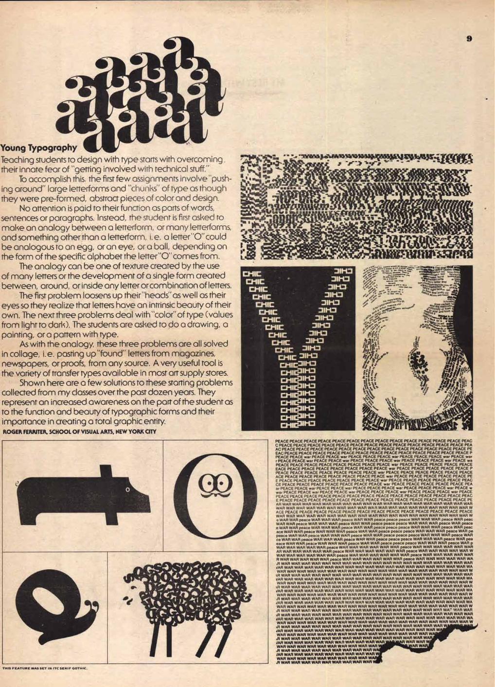
Young Typography Teaching students to design with type starts with overcoming their innate fear of "getting involved with technical stuff."
To accomplish this, the first few assignments involve "push-ing around" large letterforms and "chunks" of type as though they were pre-formed, abstract pieces of color and design.
No attention is paid to their function as parts of words, sentences or paragraphs. Instead, the student is first asked to make an analogy between a letterform, or many letterforms, and something other than a letterforrn, i.e. a letter"0" could be analogous to an egg, or an eye, or a ball, depending on the form of the specific alphabet the letter"O" comes from.
The analogy can be one of texture created by the use of many letters or the development of a single form created between, around, or inside any letter or combination of letters.
The first problem loosens up their"heads" as well as their eyes so they realize that letters have an intrinsic beauty of their own. The next three problems deal with "color" of type (values from light to dark). The students are asked to do a drawing, a painting, or a pattern with type.
As with the analogy, these three problems are all solved in collage, i.e. pasting up"found" letters from magazines, newspapers, or proofs, from any source. A very useful tool is the variety of transfer types available in most art supply stores.
Shown here are a few solutions to these starting problems collected from my classes over the past dozen years. They represent an increased awareness on the part of the student as to the function and beauty of typographic forms and their importance in creating a total graphic entity. ROGER FERRITER, SCHOOL OF VISUAL ARTS, NEW YORK CITY
PEACE PEACE PEACE PEACE PEACE PEACE PEACE PEACE PEACE PEACE PEACE PEACE PEACE PEAC C PEACE PEACE PEACE PEACE PEACE PEACE PEACE PEACE PEACE PEACE PEACE PEACE PEACE PEA AC PEACE PEACE PEACE PEACE PEACE PEACE PEACE PEACE PEACE PEACE PEACE PEACE PEACE PE EAC PEACE PEACE PEACE PEACE PEACE PEACE PEACE PEACE PEACE PEACE PEACE PEACE PEACE P PEACE PEACE war PEACE PEACE war PEACE PEACE PEACE war PEACE PEACE PEACE war PEACE war r PEACE PEACE war PEACE PEACE war PEACE PEACE PEACE war PEACE PEACE PEACE war PEACE wa PEACE PEACE PEACE PEACE PEACE PEACE PEACE PEACE war PEACE PEACE PEACE PEACE PEACE EACE PEACE PEACE PEACE PEACE PEACE PEACE PEACE war PEACE PEACE PEACE PEACE PEACE P PEACE PEACE PEACE PEACE PEACE PEACE PEACE war PEACE PEACE PEACE PEACE PEACE PEACE ACE PEACE PEACE PEACE PEACE PEACE PEACE PEACE war PEACE PEACE PEACE PEACE PEACE PE E PEACE PEACE PEACE PEACE PEACE PEACE PEACE war PEACE PEACE PEACE PEACE PEACE PEAC CE PEACE PEACE PEACE PEACE PEACE PEACE PEACE war PEACE PEACE PEACE PEACE PEACE PEA ar PEACE PEACE war PEACE PEACE war PEACE PEACE PEACE war PEACE PEACE PEACE war PEACE w war PEACE PEACE war PEACE PEACE war PEACE PEACE PEACE war PEACE PEACE PEACE war PEACE PEACE PEACE PEACE PEACE PEACE PEACE PEACE PEACE PEACE PEACE PEACE PEACE PEACE PEAC E PEACE PEACE PEACE PEACE PEACE PEACE PEACE PEACE PEACE PEACE PEACE PEACE PEACE PE AR WAR WAR WAR WAR WAR WAR WAR WAR WAR WAR WAR WAR WAR WAR WAR WAR WAR WAR WAR WAR WAR WAR WAR WAR WAR WAR WAR WAR WAR WAR WAR WAR WAR WAR WAR WAR WAR WAR W ACE PEACE PEACE PEACE PEACE PEACE PEACE PEACE PEACE PEACE PEACE PEACE PEACE PEACE WAR WAR WAR WAR WAR WAR WAR WAR WAR WAR WAR WAR WAR WAR WAR WAR WAR WAR WAR W e WAR WAR peace WAR WAR WAR peace WAR WAR peace peace peace WAR WAR WAR peace WAR peac WAR WAR peace WAR WAR WAR peace WAR WAR peace peace peace WAR WAR WAR peace WAR peace e WAR WAR peace WAR WAR WAR peace WAR WAR peace peace peace WAR WAR WAR peace WAR peac ace WAR WAR peace WAR WAR WAR peace WAR WAR peace peace peace WAR WAR WAR peace WAR pe peace WAR WAR peace WAR WAR WAR peace WAR WAR peace peace peace WAR WAR WAR peace WAR ce WAR WAR peace WAR WAR WAR peace WAR WAR peace peace peace WAR WAR WAR peace WAR pea eace WAR WAR peace WAR WAR WAR peace WAR WAR peace peace peace WAR WAR WAR peace WAR p WAR WAR WAR WAR WAR peace WAR WAR WAR WAR WAR WAR peace WAR WAR WAR WAR WAR WAR AR WAR WAR WAR WAR WAR peace WAR WAR WAR WAR WAR WAR peace WAR WAR WAR WAR WAR W WAR WAR WAR WAR WAR WAR peace WAR WAR WAR WAR WAR WAR peace WAR WAR WAR WAR WAR R WAR WAR WAR WAR WAR peace WAR WAR WAR WAR WAR WAR peace WAR WAR WAR WAR WAR WA ,R WAR WAR WAR WAR WAR WAR WAR WAR WAR WAR WAR WAR WAR WAR WAR WAR WAR WAR WAR JAR WAR WAR WAR WAR WAR WAR WAR WAR WAR WAR WAR WAR WAR WAR WAR WAR WAR WAR WA WAR WAR WAR WAR WAR WAR WAR WAR WAR WAR WAR WAR WAR WAR WAR WAR WAR WAR WAR W
1R WAR WAR WAR WAR WAR WAR WAR WAR WAR WAR WAR WAR WAR WAR WAR WAR WAR WAR WAR VAR WAR WAR WAR WAR WAR WAR WAR WAR WAR WAR WAR WAR WAR WAR WAR WAR WAR WAR WA WAR WAR WAR WAR WAR WAR WAR WAR WAR WAR WAR WAR WAR WAR WAR WAR WAR WAR WAR W
01 WAR WAR WAR WAR WAR WAR WAR WAR WAR WAR WAR WAR WAR WAR WAR WAR WAR WAR WAR VAR WAR WAR WAR WAR WAR WAR WAR WAR WAR WAR WAR WAR WAR WAR WAR WAR WAR WAR WA WAR WAR WAR WAR WAR WAR WAR WAR WAR WAR WAR WAR WAR WAR WAR WAR WAR WAR WAR W
WAR WAR WAR WAR WAR WAR WAR WAR WAR WAR WAR WAR WAR WAR WAR WAR WAR WAR WAR JAR WAR WAR WAR WAR WAR WAR WAR WAR WAR WAR WAR WAR WAR WAR WAR WAR WAR WAR WA WAR WAR WAR WAR WAR WAR WAR WAR WAR WAR WAR WAR WAR WAR WAR WAR WAR WAR WAR W di WAR WAR WAR WAR WAR WAR WAR WAR WAR WAR WAR WAR WAR WAR WAR WAR wAr WAR WAR uR WAR WAR WAR WAR WAR WAR WAR WAR WAR WAR WAR WAR WAR WAR WAR WAR WAR WAR WAR JAR WAR WAR WAR WAR WAR WAR WAR WAR WAR WAR WAR WAR WAR WAR WAR WAR WAR WAR WA WAR WAR WAR WAR WAR WAR WAR WAR WAR WAR WAR WAR WAR WAR WAR WAR WAR WAR WAR W *R WAR WAR WAR WAR WAR WAR WAR WAR WAR WAR WAR WAR WAR WAR WAR WAR W JAR WAR WAR WAR WAR WAR WAR WAR WAR WAR WAR WAR WAR WAR WAR WAR W WAR WAR WAR WAR WAR WAR WAR WAR WAR WAR WAR WAR WAR WAR WAR W
WAR WAR WAR WAR WAR WAR WAR WAR WAR WAR WAR WAR WAR WAR W /AR WAR WAR WAR WAR WAR WAR WAR WAR WAR WAR WAR WAR W WAR WAR WAR WAR WAR WAR WAR WAR WAR WAR AR W di WAR WAR WAR WAR WAR WAR WAR WAR WAR W /AR WAR WAR WAR WAR WAR WAR WAR WAR WAR WAR WAR WAR WAR WAR WAR WAR WAR WAR W .R WAR WAR WAR WAR WAR WAR WAR WAR WAR
10
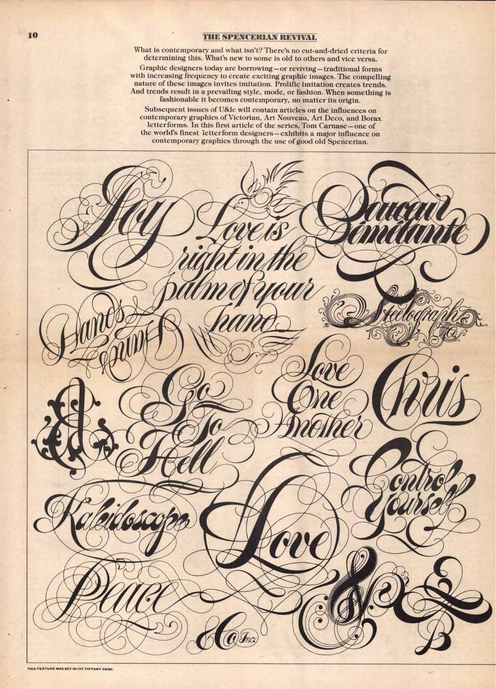
THE SPENCERIAN REVIVAL
What is contemporary and what isn't? There's no cut-and-dried criteria for determining this. What's new to some is old to others and vice versa.
Graphic designers today are borrowing — or reviving — traditional forms with increasing frequency to create exciting graphic images. The compelling nature of these images invites imitation. Prolific imitation creates trends.
And trends result in a prevailing style, mode, or fashion. When something is fashionable it becomes contemporary, no matter its origin.
Subsequent issues of U&lc will contain articles on the influences on contemporary graphics of Victorian, Art Nouveau, Art Deco, and Borax
letterforms. In this first article of the series, Tom Carnase — one of the world's finest letterform designers— exhibits a major influence on
contemporary graphics through the use of good old Spencerian.
THIS FEATURE WAS SET IN ITC TIFFANY DEMI,
A CRT (Cathode Roy Tube) Terminal. There ore 60 such instruments throughout The Times building.
11
Information, Please CONTINUED FROM FIRST PAGE
The Information Bank has been designed os a tool for industry, government and commerce, and for the staff of The Times. It is a tool of major importance for decision-making and research.
The Information Bonk computer will search for those for whom information is an essential ele-ment in the conduct of their professional affairs — search through thousands of documents in sec-onds to bring them hard facts from lost week, last year, and beyond.
The Bonk will help them with reports, speeches, public statements, press releases, negotiations, litigation, investigations, and surveys. It will bring them facts at hand that one would never even attempt to find by manual research.
To those for whom this information is essential, the Information Bonk is a powerful new tool of modern technology. In a very real sense, it is o qualitative odvonce in the formerly tedious busi-ness of retrieving specific and useful information from files of news reports, articles, essays, edi-torials, columns, and reviews.
Just a few years ago, public visionaries were predicting the eventual possibility of on instru-ment like the Information Bonk. Remarkobly, the prediction has already come to pass. The instru-ment is here.
The availability of this Information Bonk is a truly momentous event in the field of information science. For The New York Times it is a major mile-stone in an ambitious, long-range program be-gun over six years ago. For its customers, it offers participation in an imaginative new step in wed-ding computer technology to the printed word.
WHAT IS THE NEW YORK TIMES INFORMATION BANK?
It is a comprehensive, constantly-updated file of information from over 30 publications.
Ranging from Business Week to The Bulletin of the Atomic Scientists, the Information Bank selects material that is relevant to our times. At the heart is the massive reporting of the world's affairs pub-lished in The New York Times itself. Each day sev-eral hundred stories, articles, reports, and columns are processed into the system. The Information Bank is totally cumulative, continuously growing.
It is fact-filled abstracts prepared by information specialists. When a topic is searched in the Information Bank, the answer comes in the form of tersely written abstracts, each headed by a bibliographic cita-tion. Abstracts appear on the video screen of a cathode ray tube ("CRT") terminal: they con also be printed out if desired. Abstracts are long on facts and short on adornment, supplying all the information needed short of the complete orig-inal clipping.
It is a precise, easy-to-use computer system. Less than on hour of instruction on a CRT terminal will get one started making simple but powerful searches over the entire Information Bank file. Subsequently, one can advance to highly sophis-ticated techniques if desired, The Times providing the necessary guidance. The Information Bank is searched by topic, using common English words
as index terms (coiled "descriptors" to denote their intended use for reference purposes).
It is a direct link to The New York Times' computer. The Information Bonk is "on-line," meaning that subscribers submit requests for information directly to the computer and receive on immediate an-swer. The telecommunications link between the video terminal in one's office or library and The Times' computer is either a private phone line or o switched phone connection.
It is original clippings of The New York Times on microfiche. When one needs to refer to the full text of an arti-cle published in The Times, it is quickly found in the Information Bank microfiche file. At present, microfiche are available for The New York Times. As copyright agreements are made with other publishers, material from their publications will also be issued on microfiche.
It is hard copy prints in addition to video display. Information Bonk subscribers are furnished with a high-speed printer connected to their CRT video terminal. Operating at speeds up to 165 charac-ters per second, it creates collections of abstracts on special topics within minutes. Complete prints from microfiche can also be obtained by using combination reader-printers.
HOW DOES IT WORK?
The Bank was created for people—subscribers and staff—whose need for information is wide-ranging or very urgent, or both.
The New York Times fits both categories: a large network of CRT terminals in The Times build-ing helps hundreds of reporters and editors to produce o better newspaper.
In addition, the Information Bank serves The Times marketing, advertising, public relations, legal, and corporate development departments.
In general, the Information Bonk con be an efficient research tool for: the staff of The New York Times, industrial corporations, government agencies; publishers, broadcast media, adver-tising and public relations agencies; brokerage houses, banks, insurance companies, labor unions; political organizations and their candi-dates, trade associations, university and public libraries.
In many organizations, applications for the Informotion Dank include several departments. In a large corporation it could benefit the execu-tive office, marketing, advertising, public rela-tions, legal investment, environmental control, corporate development, and product develop-ment departments.
WHO USES THE INFORMATION BANK?
Seated of a CRT terminal, you go through basic steps similar to those required in searching con-ventional reference works: listing the terms that describe your topic and restricting the amount you retrieve by using various criteria. The differ-ence is in the amount of time expended which, in turn, affects the scope of research that can fea-sibly be conducted. With the Information Bank the time is short (usually between five and fifteen minutes) and the scope is huge (thousands of items are electronically scrutinized). You actually converse with the computer about your informa-tion via its keyboard.
Suppose you hove on interest in the field of agri-culture labor and wish to scan a wide variety of items on that subject. To instruct the Information Bonk to retrieve them for you, you would type out on the terminal:
AGRICULTURE AND LABOR.
This would bring out a substantial amount of ma-terial — news stories, feature articles, editorials, letters, et cetera —unrestricted by date, type of material, or the journal in which it appeared. In a matter of seconds.
To expand the scope of the search to include all types of migratory labor, you would replace agriculture and labor with the single term:
MIGRATORY LABOR.
Again, in a matter of seconds, you would have the material. Then, further to expand the search and look at the whole broad topic of labor, you would key in only that single word:
LABOR.
Now, going bock to the original search on "agri-culture and labor," you con narrow its scope by progressively adding descriptors and linking them by means of the "and," "or," or "not" commands. You can also substitute descriptors that are intrin-sically more specific. For example:
LABOR AND CITRUS AND CALIFORNIA OR TEXAS.
Thus, you would retrieve only material dealing with labor activity in the citrus groves of these two states. To be even more specific, you might frame the search this way:
UNITED FARM WORKERS AND CITRUS NOT CALIFORNIA
OR TEXAS OR ARIZONA.
By focusing on a single union and purposely ex-cluding major western citrus-growing states, you would find out about the Farm Worker's organizing activities in other states. Finally, to be extremely precise, you might ask the computer for a search on:
MANUEL CHAVEZ AND FLORIDA AND CITRUS
AND COCA-COLA COMPANY.
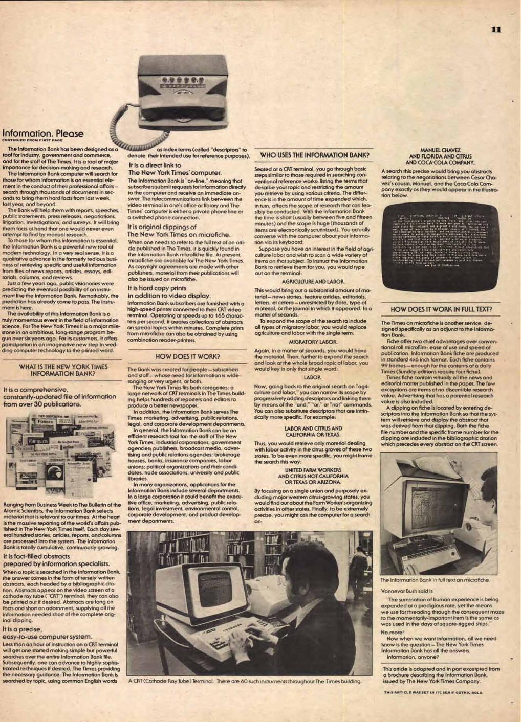
A search this precise would bring you abstracts relating to the negotiations between Cesar Cha-vez's cousin, Manuel, and the Coco-Cola Com-pany exactly as they would appear in the illustra-tion below.
2 or 2 Neff,. 1172- 2. I 2, 1 41,1.7 noun 311 -72 - s0, 11.1 2201/100
Ported Farm Yorkers Oroam,,A, C00. faro lebOr aro, has sent eo flO, true bolt wave desired to ,prOve opr,ne andl
. ti
tpos for ,ddaot and ....t f,eld hands, der, /ast
mos. . lad bp M Ches., 00011, Of C Chavez, nos 1.d conga ta sdur rrrrrrr active pa eeee Spot on A
tide. to establish berga,,, oeth,orp for 4,1d hand Choy. e•tend, pr,ote tall, with c.trus rrrrr Glens hove been fru,ful, and that accord ■ s em.nent th mo,ar producer, un.on Fla cameo,. he, mo,or test cf ,s ob.l,p to aepear to fors. lab rrrrr
rg ots,. Men -Aster r an. -andrf le .t has
successfully pan,ed C/... .nca , mu., demtiostrete that .t can • su rrrrr fro• !Oat. inern•rs oho roost tut. rnot•lp W. of labor
•rrrrr , state S c ■ trus .odus,
obstacles to Orgen,,t, tae e !Ober Pla are hell foro,able, s ■ Ac• re, ono ant r•rrr• We r ons ,s re frod it .on end alt rrrrrrr en ere! 0. che•ez . tws to Pio Iowa onarlt•rf
op OP OM.. rm.
HOW DOES IT WORK IN FULL TEXT?
The Times on microfiche is another service, de-signed specifically os an adjunct to the Informa-tion Bank.
Fiche offer two chief advantages over conven-tional roll microfilm: ease of use and speed of publication. Information Bonk fiche are produced in standard 4x6 inch format. Each fiche contains 99 frames—enough for the contents of a doily Times (Sunday editions require four fiche).
Times fiche contain virtually all the news and editorial matter published in the paper. The few exceptions are items of no discernible research value. Advertising that has a potential research value is also included.
A clipping on fiche is located by entering de-scriptors into the Information Bank so that the sys-tem will retrieve and display the abstract that was derived from that clipping. Both the fiche file number and the specific frame number for the clipping are included in the bibliographic citation which precedes every abstract on the CRT screen.
The Information Bank in full text on microfiche.
This article is adapted and in port excerpted from o brochure describing the Information Bonk, issued by The New York Times Company.
THIS ARTICLE WAS SET IN ITC SERIF GOTHIC BOLD.
Vonnevor Bush said it:
"The summation of human experience is being expanded at a prodigious rote, yet the means we use for threading through the consequent maze to the momentarily-important item is the some as was used in the days of square-rigged ships."
No more! Now when we wont information, all we need
know is the question —The New York Times Information Bonk has all the answers.
Information, anyone?
ha ,a,
1 CNN THerlode. woo. ,
First of s seven-part series
I ststlititi t,'ILk•iiistlir'!i'tr' .; ■ .csiT
10 TONIGHT CRS NEWS S2
hat a corn- panyproduces or the services it renders is obviously the most important thing about it. But it is equally clear that un-less a company takes the same pains to make its products and services known as it does in producing them, it is not likely to gain a market large enough to enable it to stay in business. As a result, market research, sales, publicity and promotion have become inevitable dimensions of every commercial enter-prise. Eventually, all these activities combine to form a total impression that has come to be known as the company `image"—the aspect of the company that endures throughout changes in product line and services. What helps to fuse all these elements into a dis-tinctive, publicly identifiable "image," character or personality is a continuing concern for all phases of the company's visual expression—from the buildings it occupies to the design of its letterheads, from the appearance of its trucks to the design of its packaging.
Dr. Frank Stanton, former President of CBS, said that he "... never felt it to be a matter of corporate altruism for a com-pany to erect its building or print its publications or manufacture its product in accordance with high standards of design. The company merely acts in its own self-interest. More is derived from time and effort spent in congenial surroundings than in ugly ones. More attention is invited by the well-designed publication than by the haphazard one."
A s far back as 1953, FORTUNE magazine attributed the success of CBS to its "performance par excellence in management, promo-tion and salesmanship; others may be superior in manufacturing, facilities, patents, etc., but CBS has the edge on showmanship." FORTUNE also stated that "few firms have been awarded as many accolades for advertising art as CBS." I can only hope that such praise is still justified.
My story is chiefly concerned with the Graphic Arts developments at CBS, but these developments are intimately tied in with the growth of the company as a whole. For, over the years, the com-pany's growth has had a direct effect on the type of Graphic Arts that we have produced.
Since broadcasting is the primary function of CBS, I would like to explore this area in some depth. In all advertis-ing, it is essential to be aware of the specific audience to be reached. But in the case of broadcasting, this "audience"
is a much more difficult group to pin down, to classify, than, say, the pros-pective buyer of a Volkswagen or a bar of soap. Obviously, our most important audience is the consumer, the vast public that watches television and listens to radio, and we spend a great deal of time and effort to win their approval.
But in commercial television, one must have advertisers to survive. The time buyers in advertising agencies, and their clients, the men who manufac-ture the products advertised on the medium, become another specific audi-ence that must be reached, and sold on CBS.
A third audience is made up of the men who own the independent stations which broadcast the programs the net-work produces. These affiliates, especially in larger cities, have a cer- tain amount of choice as to which network they carry. It is important that we prove to them that to carry CBS programs will guarantee their supremacy in their particular area.
Still another audience, and in some ways, our most important audience, is the nation's intellectual community, its business leaders and government officials. Although networks as such are not directly subject to the Federal Com-munications Commission rulings (the FCC primarily concerns itself with the licensing of individual stations) we are affected by these regulations through our owned stations, as well as through the public pressure the Commission is in a position to exert. It is important, therefore, that we win the respect of these men who, often too busy to watch much television, are in the position to influence government decisions affect-ing broadcasting.
Any advertisement directed to one of the above publics will, naturally, also reach one or more of the other groups. With this consideration in mind, the advertis-ing we produce can be broken down roughly into the following categories:
1. Consumer Advertising designed to attract viewers.
Tune-in consumer advertising must ap-peal to the widest possible public to be worthwhile. However, the traditional emphasis that CBS places on quality and taste in design is as much a part of these advertisements as it is on any printed material produced by CBS. When effec-tive, tune-in advertising can reach all of the special groups mentioned above, but the primary goal in this area is to attract an audience.
2. Trade Advertising designed to promote CBS Television Network.
Although directed primarily to time buyers in advertising agencies, these advertisements also play an important role in our continuing public relations efforts with our affiliated stations. Everyone likes a winner, and these advertisements, based on comparative program popularity (average rating, number in 'top 10' ); comparative overall rating of the network; comparative gross billings or comparative hours of
sponsored dine, are proof of the net-work's leadership in the field.
3. Institutional Advertising designed to promote the medium.
Here we have two audiences: the in-tellectual, business and governmental leaders, and the agency time buyers and sponsors. We are trying to attract the attention of the most sophisticated audi-ence in the country. These advertise-ments must appeal to the intelligence and cultivated taste of a discriminating few.
Advertisements in this area are based on success stories, comparison with other advertising media (cost-per-thousand circulation, etc.) or the unique selling ability of television and its importance to the business and intel-lectual communities.
So far, we have been discussing print advertising However, one of the most effective tools at television's command in calling attention to its programming is the medium itself. Extensive use of
on-air advertising of programming is made by all networks in the United States. A promotion announcement of an upcoming program is carried at the end of every broadcast. Announcements are also scheduled within the body of a pro-gram if there is unsold commercial time available.
Sales tools used in on-air promotion include: 1. Sixty-second film trailers produced by the advertising and promotion de-partment which contain highlights of an upcoming broadcast.
2. Twenty-second and ten-second film trailers which air at the end of all pro-grams (these trailers always end with the network identification... the CBS "eye" which has become the most im-mediately recognizable symbol of any network).
3. Slides containing either artwork or photographs from the broadcast with live announce copy promoting the broadcast.
TRADE ADS
Digging amino', we discovered that of all the shows in television's Top 40 plli years (Igo Dull 10 are still there ',Aril. A nd the big scoop is this: alt _Ware ours. Von can balk, another good season of 0 lbowlation like that. CBS 'Thievish», Network*
*2 10:30-11:00PM WCBS-TV WHAT'S MY LINE? John Daly's guests do the oddest things, but his famous panel can usually ferret out their lines.
CONSUMER ADS
CBS: How a Corporation Sells Itself
13
Affiliated stations are also provided with a full kit of promotion material for use on the local level to promote the network shows which they carry. These promotion kits include: sixty-second and twenty-second promotion trailers; slides and glossy reproduction proofs of slide art with space for local station identifica-tion; one-minute, twenty-second and ten-second announce copy; 160-line ad mat with glossy reproduction proofs; 1/4-page TV GUIDE ad mat with glossy reproduction proofs; exploitation sug-gestions; publicity photos of the stars and suggested copy for displays at the station.
These kits represent the network image in the eyes of the affiliated sta-tions. Dr. Stanton says "... each piece that leaves this office represents Columbia Broadcasting System in print. Each piece must have the stamp of CBS excellence." This emphasis on detail demands that the packaging and shipping of material receive as much attention as the contents themselves.
Presentations are also produced for use by the sales department as aids in selling time on the network. They fall into the following categories:
1. Presentations designed to sell the medium.
These take many forms. An example would be a film produced to show the relative selling power of the medium in relation to magazine advertising.
2. Presentations on CBS Television Network leadership.
These are produced for distribution to time buyers and sponsors, to document the network's dominance in the medium and its specific sales potential.
3. Presentations for the purpose of prestige, on specific shows or coverage of news, sports or cultural events.
Presentations in this area serve several functions. They may take the form of a book on CBS coverage of professional football or of a political convention or the European tour of a President of the
United States. They can be used to create an interest on the part of sponsors for future broadcasts or, when distrib-uted to a selected mailing list of in-fluential leaders, to call attention to the scope of network programming.
Sometimes I would wish that advertising and promotion were all that I was re-sponsible for as head of the Design Department. But there are many other projects, equally important and certainly no less demanding, that we are in-volved in.
Recently CBS moved into its new head-quarters building. From its inception, the building provided an unparalleled opportunity to create a distinguished, unified expression of the corporate personality. The concern of the top management did not stop with the ap-proval of the design of the building itself, but extended to even the smallest of graphic details.
The Design Department was responsi-ble for all the graphics throughout the
ABCDEF GHIJKLMN OPQRSTU VWXYZ& .!'?$12345 678900
building. No detail was too small to warrant serious attention. (Even the mail room, which no visitor would ever see. ) Every graphics problem, from the lettering on the exterior to the type used on the elevator panels, from the faces of the clocks to the lavatory door handles, from name plates on office doors to directional signs, was given painstaking care.
The Design Department is also respon-sible for displays and exhibits, annual reports, interior design of CBS buildings and studio facilities, trucks, TV equip-ment, the redesigning of all stationery and office forms used throughout the company, the selection and hanging of some 3,000 pieces of art in offices and reception areas throughout the build-ing and, a project dear to my heart, the design and execution of a large mural in the employees' dining mom_
This mural, which has been dubbed "Gastrotypographicalassemblage," (I'll let you figure that one out) was a major project in itself. Each panel in the mural, which is 38 feet wide and 8-112 feet high, is composed of white painted wooden letters which spell out words and phrases having to do with food. In all, 250 typefaces were used, as well as 85 nontypographic objects, such as foods, containers, and utensils.
At CBS, graphic design is all of one package. Whether it be a full-page advertisement in a newspaper, a filmed promotion trailer, a letter to a prospec-tive time-buyer, the mailing container for a promotion kit, all are a part of the top management's concern to coordinate and integrate the graphics image of the company. This is not a matter of cor-porate altruism. This is not art for the sake of art. For as Dr. Stanton has said, "... the company that strives for quality in design, that respects the eye of those upon whom it is dependent—employees, stockholders, customers and the com-munity— ultimately benefits most of all itself."
LOUIS DORFSMAN
THIS ARTICLE WAS SET IN ITC TIFFANY MEDIUM.
ABCD EFGHIJ RL MNOPQRS TIAWXYZ &.!'?$12345 67890.
CORPORATE TYPEFACES
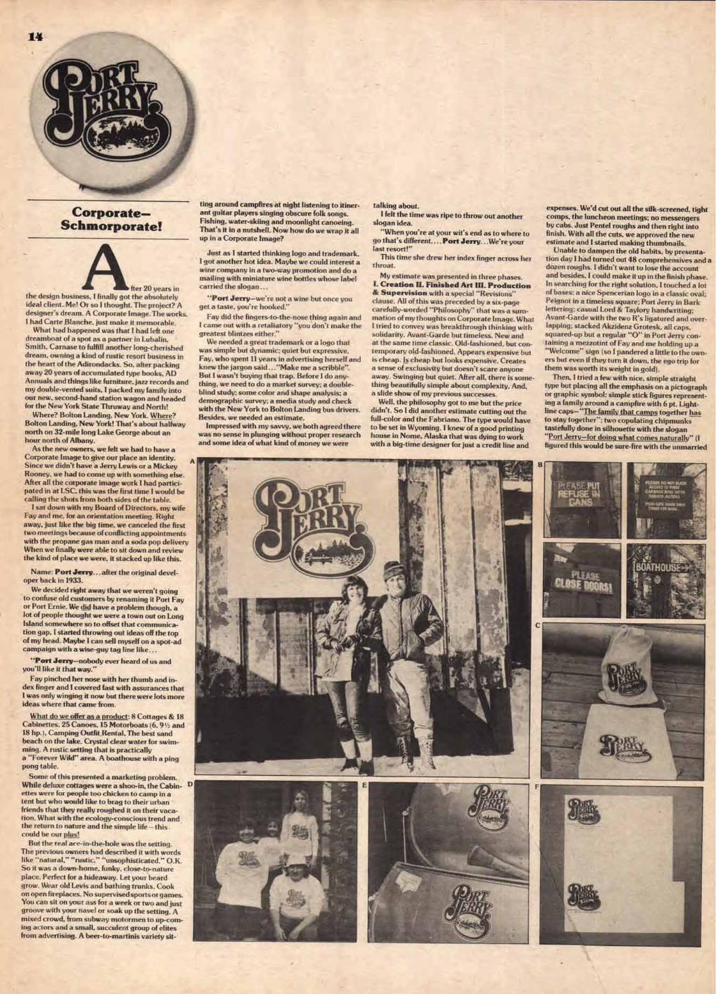
Corporate- Schmorporate!
fter 20 years in the design business. I finally got the absolutely
ideal client. Me! Or so I thought. The project? A
designer's dream. A Corporate Image. The works.
I had Carte Blanche. just make it memorable. What had happened was that I had left one
dreamboat of a spot as a partner in Lubalin, Smith, Carnase to fulfill another long-cherished
dream, owning a kind of rustic resort business in the heart of the Adirondacks. So, after packing
away 20 years of accumulated type books, AD
Annuals and things like furniture, jazz records and
my double-vented suits, I packed my family into our new, second-hand station wagon and headed for the New York State Thruway and North!
Where? Bolton Landing, New York. Where? Bolton Landing, New York! That's about halfway north on 32-mile long Lake George about an hour north of Albany.
As the new owners, we felt we had to have a Corporate Image to give our place an identity. A
Since we didn't have a Jerry Lewis or a Mickey
Rooney, we had to come up with something else. After all the corporate image work I had partici-
pated in at LSC, this was the first time I would be calling the shots from both sides of the table.
I sat down with my Board of Directors, my wife Fay and me, for an orientation meeting. Right
away, just like the big time, we canceled the first two meetings because of conflicting appointments
with the propane gas man and a soda pop delivery When we finally were able to sit down and review
the kind of place we were, it stacked up like this.
Name: Port Jerry... after the original devel-oper back in 1933.
We decided right away that we weren't going to confuse old customers by renaming it Port Fay or Port Ernie. We did have a problem though, a lot of people thought we were a town out on Long
Island somewhere so to offset that communica-
tion gap. I started throwing out ideas off the top
of my head. Maybe I can sell myself on a spot-ad campaign with a wise-guy tag line like...
"Port Jerry—nobody ever heard of us and you'll like it that way."
Fay pinched her nose with her thumb and in-dex finger and I covered fast with assurances that
I was only winging it now but there were lots more ideas where that came from.
What do we offer as a product: 8 Cottages & 18 Cabinettes, 25 Canoes, 15 Motorboats (6.9' and 18 hp.), Camping Outfit.Rental, The best sand beach on the lake. Crystal clear water for swim-ming. A rustic setting that is practically
a "Forever Wild" area. A boathouse with a ping pong table.
Some of this presented a marketing problem.
While deluxe cottages were a shoo-in, the Cabin-ettes were for people too chicken to camp in a tent but who would like to brag to their urban friends that they really roughed it on their vaca-tion. What with the ecology-conscious trend and the return to nature and the simple life —this could be our plus!
But the real ace-in-the-hole was the setting. The previous owners had described it with words like "natural," "rustic." "unsophisticated." O.K. So it was a down-home, funky, close-to-nature
place. Perfect for a hideaway. Let your beard
grow. Wear old Levis and bathing trunks. Cook on open fireplaces. No supervised sports or games. You can sit on your ass for a week or two and just groove with your nave! or soak up the setting. A
mixed crowd, from subway motormen to up-com-ing actors and a small, succulent group of elites from advertising, A beer-to-martinis variety sit-
ting around campfires at night listening to itiner-ant guitar players singing obscure folk songs.
Fishing, water-skiing and moonlight canoeing.
That's it in a nutshell. Now how do we wrap it all up in a Corporate Image?
Just as I started thinking logo and trademark. I got another hot idea. Maybe we could interest a
wine company in a two-way promotion and do a mailing with miniature wine bottles whose label carried the slogan ...
"Port Jerry—we're not a wine but once you get a taste, you're hooked."
Fay did the fingers-to-the-nose thing again and I came out with a retaliatory "you don't make the greatest blintzes either."
We needed a great trademark or a logo that was simple but dynamic; quiet but expressive.
Fay, who spent 11 years in advertising herself and knew the jargon said ..."Make me a scribble". But I wasn't buying that trap. Before I do any-
thing, we need to do a market survey; a double-blind study; some color and shape analysis; a demographic survey; a media study and check with the New York to Bolton Landing bus drivers. Besides, we needed an estimate.
Impressed with my savvy, we both agreed there was no sense in plunging without proper research
and some idea of what kind of money we were
talking about.
I felt the time was ripe to throw out another slogan idea.
"When you're at your wit's end as to where to go that's different.... Port Jerry...We're your last resort!"
This time she drew her index finger across her throat.
My estimate was presented in three phases.
I. Creation II. Finished Art III. Production & Supervision with a special "Revisions" clause. All of this was preceded by a six-page
carefully-worded "Philosophy" that was a sum-mation of my thoughts on Corporate Image. What I tried to convey was breakthrough thinking with
solidarity. Avant-Garde but timeless. New and at the same time classic. Old-fashioned, but con-
temporary old-fashioned. Appears expensive but
is cheap. Is cheap but looks expensive. Creates a sense of exclusivity but doesn't scare anyone
away. Swinging but quiet. After all, there is some-thing beautifully simple about complexity. And, a slide show of my previous successes,
Well, the philosophy got to me but the price
didn't. So I did another estimate cutting out the
full-color and the Fabriano. The type would have to be set in Wyoming. I knew of a good printing house in Nome, Alaska that was dying to work
with a big-time designer for just a credit line and
expenses. We'd cut out all the silk-screened, tight
comps. the luncheon meetings; no messengers
by cabs. Just Pentel roughs and then right into finish. With all the cuts, we approved the new
estimate and I started making thumbnails. Unable to dampen the old habits, by presenta-
tion day I had turned out 48 comprehensives and a dozen roughs. I didn't want to lose the account
and besides, I could make it up in the finish phase. In searching for the right solution, I touched a lot
of bases: a nice Spencerian logo in a classic oval;
Peignot in a timeless square; Port Jerry in Bark lettering: casual Lord & Taylory handwriting; Avant-Garde with the two R's ligatured and over-lapping; stacked Akzidenz Grotesk, all caps,
squared-up but a regular "0" in Port Jerry con-taining a mezzotint of Fay and me holding up a
"Welcome" sign (so I pandered a little to the own-ers but even if they turn it down, the ego trip for them was worth its weight in gold).
Then, I tried a few with nice, simple straight type but placing all the emphasis on a pictograph
or graphic symbol: simple stick figures represent-
ing a family around a campfire with 6 pt. Light-line caps—"The family that camps together has to stay together"; two copulating chipmunks
tastefully done in silhouette with the slogan
"Port Jerry—for doing what comes naturally" (I figured this would be sure-fire with the unmarried
MAU. CO 501 AGM-1 TO Mit
CMS/WE SONS MTN moo RUTOSI
0.4 LBOATHOUSE
D
all water craft flying the Port Jerry emblem. Which brings me to the final logo, an old-fash-
ioned outline script with an oval-swash tail on the "Y" which contains an old-engraving style illustration of a water scene with two canoeists (male & female) paddling on a reflective surface.
On Presentation Day, remembering my old training, I tried to inject a little drama into the proceedings by showing up in my Goodyear rub-ber boots and a thermal underwear shirt. The sartorial touch apparently made an impression because I was mistaken for the man who was to clean out the septic tanks. After the jocularity had died down over the incident, I unveiled the entire program, hitting us first with my philos-ophy; then all the research and background data in the form of press-down type easel cards and charts and finally...the logo, done in the officially recommended colors—green and white. Detect-ing a touch of excitement in the eyes of the client and wanting to exploit the low gasps of admira-tion, I rapidly hit with the follow-ups: Sweatshirts with logos; the Boathouse sign; envelopes and letterheads; an all-weather decal for canoes and motorboats; a logo'd camping utensil bag; a rub-ber stamp; a novelty plastic button. Keeping up the pace, I expanded into my projections for ball point pens; portable camp stoves and coolers; bumper stickers; monogrammed dishes and glassware; towels; silverware; the station wagon; the garbage cans; outdoor showers; beach chairs; butt cans; toilet seat lids.
While we were still reeling, I read my test results which were sensational. My test panel consisted of a checkout girl at the Grand Union; the Postmaster and the owner of the local hardware store. Him I had in my pocket or he wouldn't get my business. I finished with a flourish by pasting a corporate logo decal on all four stra-tegic locations of a hired nude model's anatomy and had her coo sexily ..."PORT JER-EEEE... you're sumpthin' else!"
To cinch it, I gave the client a year's box seats to all the Yankee games and told her I was able to bring the whole program in on budget, $350. The finishes were all beautifully done by a former LSC designer/lettering msn, Roger Barrow4, who is now a permanent member of the Port Jerry Board of Directors. I wound it up by point-ing out that for that kind of money, we would only have a 1-year exclusive on Port Jerry Expedient and after that, it would appear for photo typesetting and in press-down sheets.
Watching the client for a reaction, I mistakenly thought I saw a flash of rejection flicker in her eyes so I leaped up onto the windowsill and threat-ened to jump out with the layouts if she didn't see the light. (I knew what I was doing because it was only a 4-foot drop but I counted on the ele-ment of surprise). She smiled, held up her hand and formed an "0" with her thumb and fore-finger. I was home! Now all I had to do is bill it ...and collect! It was all accepted without reser-vations. (Wait a minute, that's no way to run a resort.) For reservations, call (518) 644-3311 and ask for Fay or Ernie Smith. We'd love to show you our Corporate Image.
ERNIE SMITH
A.Fay and Ernie Smith. Bucolic winter scene in front of large Corporate Sign on boathouse.
B. Port Jerry Expedient as applied to Corporate Signage where rapid readability and outdoor weatherability are salient factors. Because such signage utilizes any available lumber, often short in length, two variations of the Corporate Typeface were developed, Condensed and Extra Condensed. C. Logo as applied to Camping Utensil Bags.
D. Corporation wearing Corporate Look. (Fay, Rebecca, Kathryn and Ernie.)
E.The Corporate Logo, in the form of decals applied to canoes, where legibility afloat is crucial. F.Letterhead and Envelope.
G. A wide range of Corporate Containerage.
H. Design Director Roger Barrows displaying tools needed to preserve typographic integrity. 1. Port Jerry Expedient utilized to identify cabinettes.
15
art and typography CONTINUED FROM FIRST PAGE
couples which was certainly part of our market and growing every year). Since our place was located up in the mountains, the elevation gave me another slogan idea that might grab a piece of the youth market—an old engraving of the Cannabis sativa plant in the letter "0" over which is stacked the slogan "If you want to move up to nature this vacation... get high at Port Jerry".
To round out the presentation, I established an overall typographic style that would be applied to all signage, directional markers, boats and ca-noes, camping equipment, paper material and housekeeping units. I settled on a very simple but versatile and highly legible gothic typeface that guests could relate to quickly when they wanted to find those few simple things so necessary for comfortable, outdoor living like Rest Rooms:* Men—Women; Main Parking Lot; Garbage Disposal Here. I gave the newly designed face an exclusive name: Port Jerry Expedient.
Corporate typographic integrity would be maintained throughout by referring to a 124-page Manual that would act as an infallible guide for the corporate style. The lettering would follow the prescribed format of "all Caps", single-stroke Gothic achieved with the use of a 15¢ Woolworth Natural Bristle Brush and whatever paint hap-pens to be around. A stencil-version variation was developed to give an official appearance to
because the real artist has antennae, he feels not only the atmosphere of the moment with great acuteness, but also where we are going. the artist is often a guide and his work contains a message. for new messages he creates new forms.
in times of great change the form becomes revolutionary, just as in 1500 when the painter no longer tried to organize space by decorating a wall, but sot down on a chair and fixed the scene on his panel from one point of view. this discovery we call perspective. leonardo did not paint o mural, but opened a window to the outer world. since the renaissance the face of the earth never changed scr rapidly as of the beginning of this century. new sources of energy came into use, new ways of communication, new methods and production of goods on a larger scale, for everybody; new relations between the work and the worker, between the worker and the employer.
fifty years ago a painter stood up from his chair and walked around the subject he was going to paint. he tried to get the different viewpoints on the some canvas. this revolution we call cubism. the name of the painter was picasso.
both revolutions were not limited to the artistic field; they were the result of a change of attitude towards life. the pre-renaissance painter saw a table as a rectangle and painted it as such. the renaissance painter knew that a table was a rectangle but painted it as a trapezoid because the farthest side of the table looked shorter than the side where he was sitting. the world of the 20th century artist is no longer limited to the reality of the eye. he renders things as he knows that they are or as he feels them to be. from that moment art is no longer what it was before.
it freed itself from portraying nature to create a new reality. movement, transparency, clarity, became leading principles. french cubism opened the way to futurism in italy, suprematism in russia, abstract art in holland and action painting in the u.s.a. rill that moment the movie camera stood fixed and people had to move in front of the camera, but now it started to turn around the scene. futurism laid down several stages of a moving object on one canvas; time entered as a new element in plastic art- marcel duchamp painted his "nude descending the staircase:' later on even sculpture began to move (colder). architects favour transparency. the walls no longer bear the roof. the use of new materials like concrete and steel makes it possible to lift buildings from the soil.
gloss and plastics do not separate our dwellings from the outer world but allow nature to enter our room. palaces and churches are no longer the most characteristic constructions, but bridges, crones and the masts that carry electricity from town to town.
typography enters into art. characters and pieces of newspaper enliven the early works of brogue and picasso. kurt schwitters composes pictures with coloured pieces of printed paper. but experiment in modern typography had already started at the end of the 19th century. mallarme, the french poet who succeeded in musicalising language, gave his verses a new visual form, freed his poems from the traditional way of typesetting. his sentences ran freely over the pages. gradually typography leaves its rectangular prison, no longer feels the chains of symmetry, tries to lead the eye over the page and accentuates the direction from the left to the right.
the revolution in art originates a new typography. contrasts destroy the grey form. old characters acquire new value. the white of the character becomes more important than the including form. the white of the page reigns over the black. transparency is one of the fundamental principles. typography becomes a means to bring quick messages to the many. publicity in daily papers and in weeklies, light publicity in our cities makes extensive use of new discoveries. the importance of the designer increases every day; is he aware of his responsibility?
willem sandberg, former director, stedelijk museum, omsterdam THIS ARTICLE WAS SET IN ITC SERIF GOTHIC.
NOTED SEMANTICIST L RAPOPORT
SAIDMPOGRAPHY IS TO PRINTING
AMCUT1ON AND DRAMATICS ARE TO 1HE SPOKEN WORD':
A GREAT ART DIRECTOR iS A MAN WHO KNOWS WHEN
SOMEONE ELSE HAS A 13E1 I ER IDEA THAN HE HAS .
16
Something for Everybody from U&lc.
THE FLAGS THAT FLY ATOP SOME ()FAME RICAS MOST PRESTIGIOUS NEWSPAPERS AS SEEN ROUGH THE EYES OF WI RIST C1-11^6. SLACKMAN
•
is 1*., - , „, ,„ , „,,, ,_, _ . ...
_,,f,,.--_,„, -- ,
, CE WALL STRTIET JOURNAL +---: TI
4 to <2.-,-). ---,
,,,..„
_
s•-• Ai=
,,_ ************-,04„ANOTTELLA__ ************ ' 1 1
Ittfi.
, DAgy .,[2, ,,,r7-7/1 NEWS NEW YORK S ..".111.11111116. PICTURE NEWSPAPER
- "45
THE WASHINGTON POST , NJ.- M,, 4‘,.„,..„,,., „iik..... Apf -, ,p ,,:, p, , , p \--,
g-0
- -
,, - --
• chieNee e7/7,0"eije,
...4 br / i 11 / A It)) lorZr. ,.. .1.2 4 • 0%t t
Oatt 2alte
THE FEATURETTES ON THIS PAGE WERE SET IN ITC SERIF GOTHIC.
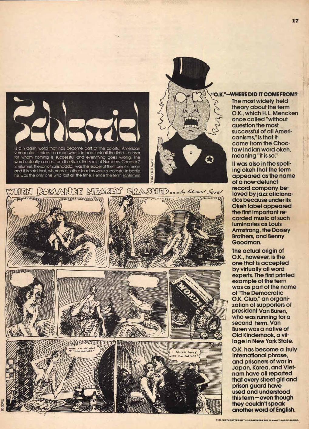
is a Yiddish word that has become part of the colorful American vernacular. It refers to a man who is in bad luck all the time— a loser, for whom nothing is successful and everything goes wrong. The word actually comes from the Bible, the Book of Numbers, Chapter 2 .
Shelumiel, the son of Zurishaddai, was the leader of the tribe of Simeon and it is said that, whereas all other leaders were successful in bathe, he was the only one who lost all the time. Hence the term schlemiel
›ARIA1-21V e2,/;-̀ 0014.30004
17
—WHERE DID IT COME FROM? The most widely held theory about the term O.K., which H.L. Mencken once called "without question the most successful of all Ameri-canisms," is that it came from the Choc-taw Indian word okeh, meaning "it is so." It was also in the spell-ing okeh that the term appeared as the name of a now-defunct record company be-loved by jazz aficiona-dos because under its Okeh label appeared the first important re-corded music of such luminaries as Louis Armstrong, the Dorsey Brothers, and Benny Goodman.
The actual origin of O.K., however, is the one that is accepted by virtually all word experts. The first printed example of the tern was as part of the rime of "The Democratic O.K. Club," an organi-zation of supporters of president Van Buren, who was running for a second term. Van Buren was a native of Old Kinderhook, a vil-lage in New York State.
O.K. has become a truly international phrase, and prisoners of war in Japan, Korea, and Viet-nam have all reported that every street girl and prison guard have used and understood this term—even though they couldn't speak another word of English.
THE FEATURETTES ON THIS PAGE WERE SET IN AVANT GARDE GOTHIC.
18 What's New from ITC?
Avant Garde Gothic Condensed and Friz Quadrata are new from ITC. Only licensed ITC Subscribers are
authorized to reproduce, manufacture and offer for sale Avant Garde Gothic
Condensed, Friz Quadrata and all other ITC typefaces shown in this
issue. This mark is your guarantee of authenticity.
ENS ENS 0
AvANr m TIO I R I ) W I C CONDENSED
In this issue of "U&Ic," ITC announ- ces four additions to its highly popular Avant Garde Gothic series. In response to the demand from designers for condensed versions of this versatile face, ITC has added four new members to the Avant Garde Gothic family: Book, Medium, Demi and Bold Condensed.
ABCDEFGHIJKLM NOPQRSTUVWXYZ ANCEAIEVIRGIITIcel IALIIINIRRACESSST 1HUMNWMNV
(80! iS% 0#/=:.": ,:**) 1234567890 abcdefghijklm
nopqrstuvwxyzcO ceecceNvwwys
BOOK CONDENSED
ABCDEFGHIJKLM NOPQRSTUVWXYZ ANGIEA/ERRGAHNSA IAL111■11PRICESSST
1HUINMWMNV OPii$%0 4/--1-17i:°*)
123456789(i abcdefghijklm
nopqrstuvwxyzçO ceeccelvwwyB
MEDIUM CONDENSED
The Avant Garde Gothic Condensed series retains the same extra-large "x" height of the lower case letterforms, with their shortened ascenders and descenders. This characteristic is one feature that distinguishes Avant Garde Gothic from other sans serif designs.
The ickge full-bodied lower case letters make for better legi- billy and offer greater reading ease when large quantities of in- formation require the use of condensed leflerfomis for corn- pact areas. With very few exceptions, and wherever possible, (*most Mot the liga- twos and variant letterforms of the imigind Avant Garde Gothic family have been retained in the Condensed series.
Avant Garde Gothic Condensed is even legible in sizes as small as 3 and 4pt... this promises to make the face most useful for packaging, labels, classified newspaper advertising and for catalogs, price list- ings, etc. Avant Garde Gothic Condensed was specially drawn for ITC by Edward Benguiat and is based on the original Avant Garde Gothic series created by Herb Lubalin and Tom Carnase.
ABCDEFGHIJKLM NOPQRSTUVWXYZ A AGEA/ERRGAHrliti
IAIAINFIRACESST 1HUMNWAINV
akin E$%0 46/2". ::'*)
1234567890 abcdefghijklm
nopqrstuvwxyzcO cee ccelvviwyB
DEMI CONDENSED
ABCDEFGHIJKLM NOPQRSTUVWXYZ
AkECERNIA ILNrIkRACESSIST 1HUINMWM1V
OP! ES% C117:.*) 1234567890
abcdefghijklm nopqrstuvwxyzcil
ceeccelvwwyB BOLD CONDENSED
FRIZ Award-Winning VGC Typeface Now Available as PhotoText Face from ITC
RATA
19
Letter-consciousness no longer the pri-vate domain of the
typographic connoisseur. Just a few years have changed all that. While the man in the street can't tell Caslon from Garamond, he no longer thinks all letters look alike. Not any more.
He's bombarded with posters, bro-chures, and ads telling him in no uncertain terms that letters can have many forms and very exotic personalities. If he lives in New York and travels by subway he may spend a bumpy hour or two every day pondering the grotesque shapes of transit graffiti. Much as he may dislike both spray can and marker, and much as he may feel that their indiscriminate use on public property is a most unworthy contribution to the art of lettering, nevertheless it has brought millions of John Does like himself to an awareness of letterforms— for good or for bad. Inevitably the more imag-inative of these observers have tried to develop a taste for lettering— to learn to distinguish between naive graffiti and the real thing.
A letter-conscious public is precisely what many of us have been hoping for, for many years. And here it is. Thanks to the enormous impact of
display lettering— good and bad—the lettering-conscious community has grown from thousands to millions! And in these new millions are those who would like to try their hand at serious letter design.
A few years ago,Visual Graphics Corporation recognized this latent potential and pursued it vigorously by launching a typeface design contest of considerable magnitude. As a result of the contest Visual Graphics issued 2-inch film fonts of 15 Award-Winning faces, all of which have made significant impact on display typography. One wonders to what extent the more conservative of these faces are adaptable to text composition. Text sizes, traditionally, are the first to be developed. Display, as a rule, comes later. Will photo-typography lead to a reversal of this sequence?
ABCDEFGHIJKL MNOPQRSTU VWXYZA0
abcdefshijIdmn opqrstuvvvxyz
1234567890
FRIZ QUADRATA REGULAR
ABCDEFGHIJKL MNOPQRSTU VWXYZAO
abcdefghijklm nopqrstuvwxyz
1234567890 (8.1?m0$494VV)
FRIZ QUADRATA BOW
The question is best answered by action, and to demonstrate the possibilities of the Award Winning faces, International Typeface Corp., under license from Visual Graphics to develop Friz Quadrata and offer it for sale, is now making two weights of this important design available to all manufacturers of text typesetting equipment.
The original weight of this fine letter was designed by Ernst Friz. Mr. Friz, a native of Switzerland, studied graphics at Zurich with Rudolf Bircher and Walter Koch. He has his own graphic studio and specializes in type, symbol and package design, having won the National Swiss Packaging Award for 1962.
The bold weight adaptation of Friz Quadrata was executed by Victor Caruso, designer with Photo-Lettering Inc.
20
Future issues of "U&Ic" will be devoted to a broad spectrum of original articles as well as a review and reprinting, in whole
or in part, of a selection of the most interesting, significant, and eventful articles, statements, opinions, lectures, seminars, and exhibitions on the subject of the typographic arts produced
in the twentieth century. Here is a sampling of the material that readers can look forward to seeing in future issues.
(1)
PERSPECTIVE ON INTERNATIONAL NEWS HERBERT SPENCER (15)
WORLD TYPOGRAPHY TODAY (24) THE BEST OF '72
What's happening currently on the European typographic scene as re-ported by one of the world's leading authorities in this field.
(2FROM WHERE
I T\ L L BEURRET I N
The absence of a thorough training period for designers often results in a flippant attitude towards the craft and skill of type handling. A total revision of our educational structure is needed to meet stagger-ing new demands.
(3) WHAT MAKES UGH-LY GREAT? HERB LUBALIN
The word "ugly" is probably the most misused word in the English language, especially as it is applied to the graphic arts. Ugly can be beautiful or, conversely, beautiful can be ugly.
Another regular section of U&Ic, devoted to a review of international typographic news, events, and work.
(16) Q: WHAT MAKES A TREND? A: A BUNCH OF COPYCATS
The dumbest question and the one most prevalently asked is "What are the future trends in graphics?" Creators of graphics find it impos-sible to answer this question be-cause trends are determined not by originators, but by imitators.
(17)FADDISM VERSUS PRACTICAUTY
Some type designs come and go, and some last forever. What has happened to all the Caslons, Goudys, Bodonis, and Baskervilles? They're hidden behind an extrava-gance of psychodelic display faces that saturate the typographic market.
A panel of design experts, organ-ized by this newspaper, select the outstanding typographies produced throughout the world last year, with emphasis on the design solution rather the concept.
( 25) TOHFE RAOP AMNAENSIEZ ATION
IP COMMUNICATIONS Since World War II, there has been a tremendous American influence in Japan that in some ways is harmful to that country's fine her-itage in the arts. This article will tell about the Americanization of Japanese typography.
)
VISIT TO THE LAND OF THE RISING SUN MASSIMO VIGNELLI
The famed designer makes some interesting typographic observa-tions brought about by his recent trip to Japan.
(26
(4)
PATTERN, SOUND, AND MOTION
Experiments in trying to make words look or sound like what they mean by London Central School students.
(5)
A DEBATE ON THE NEW LEGIBIUTY
Reading has been illegible since the invention of hot metal type. With photo composition, we're all going to have to adjust our reading to compensate for this new unaccustomed legibility.
( 6 ) GETTING USED TOLEGIBILITY
THE EW
How do you convince a client that words and sentences and pare- . graphs should be set in type the way they are spoken. Granted ifs a tough assignment, but wait 'til next year.
WE— AS TYPOGRAPHERS-U SA.
(7) BRADBURY THOMPS. ON
To help understand the place of the American designer— in world typography— one of America's most gifted typographic designers traces briefly the history of printing design since 1450.
(8)
THE ART AND SCIENCE OF TYPOGRAPHY
A review of the first world seminar on typography held at Silvermine, Connecticut in 1958, which explored the role typography plays in world communications on four conceptual levels: Tra-dition; The New Arts; Science and Technology; Mass Communication.
(9)
TOWARD A PICTORIAL LANGUAGE
The use of typography in con-junction with graphic symbolism to give additional meaning to words and create a more positive emotional reader response.
(10)
"MY FAVORITE TYPEFACE" AND HOW I USE IT
A series of short articles written by prominent designers and art directors on the merits of the par-ticular typeface they most enjoy using, with a graphic represen-tation of its use.
TYPE IS TO READ WILLIAM GOLDEN
If there is such a thing as a "New American Typography'; surely it speaks with a foreign accent. And it probably talks too much. Much of what it says is obvious non-sense. A good deal of it is so pom-pous that it sounds like nonsense, though if you listen very carefully it isn't quite. It is just over-compli-cated. When translated into pre-World War II English, it is merely obvious,
ta0
flop it-R, Aso 4', #04$*
Awf kAiw
Who needs all the faddist here-today-gone-tomorrow display type-faces that saturate the typographic scene and seem to multiply faster than rabbits when there is such a complete dearth of good, practical faces.. Jor text as well as display.
(13) OCR-OPTICAL CHARACTER RECOGNITION
The latest information about this new frontier of typographic tech-nology that promises to be the next major revolution in typographic copy preparation.
TYPOGRAPHY AND THE NEW TECHNOLOGIES AARON BURNS
A continuing retrospective by one of the major figures in the field.
(18)
WHAT'S HAPPENED TO THE DINGBAT?
Once upon a time you could spe-cify from your typographer any-thing from an aardvark to a zebra. Where are all those type cuts, those juicy typographic morsels of the olden days?
(19)THE LOST ART OF CALLIGRAPHY
Time and Technology have caused the virtual disappearance of one of the world's most beautiful art forms.
(20)
ANIMATED TYPOGRAPHY FOR N AND FILMS
Some of the most exciting typo-graphics appear on your TV tube and motion picture screens. The added dimensionality of move-ment offers the designer a veritable playground for typographic experi-mentation.
(21)
MILE-A-MINUTE TYPOGRAPHY HERBERT SPENCER
One of the world's foremost auth-orities on modem typography with some interesting highlights on speed and facility in the new technology.
(22)
TRADITION IN TYPOGRAPHY HERBERT SPENCER
More illumination by the former designer and editor of Typographica: an incisive appreciation of the essence of tradition,
(23)
STUDENT EXPERIMENTS IN PHOTOTYPOGRAPHY
The new photographic technolo-gies in typesetting give the designer broader scope to play around with letterforms. Included in this article are some exciting graphic examples of typographic experimentation by students at the School of Visual Arts under the direction of Roger Ferriter.
(27) THE ART OF TYPE REPRODUCTION EDWARD RONDTHALE
The Chairman of Photo-Lettering tells how to prepare typefaces for reproduction.
(28
)
TYPAHGRRPHY- GOOD AND BAD USAGE OF
Some hard-hitting comments by Herb Lubalin on how ITC faces should and should not be used, with emphasis on Avant Garde and Serif Gothic— two faces that seem to offer designers the great-est opportunity for abuse. This is a no-holds-barred exposé by the designer of these faces, who is slowly becoming convinced that he should have stood in bed.
(29)
TYPOGRAPHY WITH HEART LESTER BEALL
The whole person, including his heart, must be behind the job. Superficial effects, fads, gimmicks, naive use of fancy lettering, the robbing of our cultural heritage—be it Byzantine or Victorian—merely to achieve a shock effect, have evolved embarrassing typo-graphical monstrosities— par-ticularly in display typography.
(30)NEWSPAPER TYPOGRAPHY
A worldwide analysis of new lay-out presentations and formats, made possible by the new tech-nologies in typesetting and the graphic arts.
(31)
CANADIAN INNOVATIONS IN GRAPHIC FORMS CARL DAIR
Reprinted from Format (1964), published by the Society of Typo-graphic Designers of Canada.
(32)
THE CALIFORNIA JOB CASE IS DEAD
Long live the California job case. Metal type is slowly disappearing, and with it, the job case, for all practical purposes. It is, however, now a big thing in well decor.
(12) TYPOGRAPHIC PROLIFERATION
Reprinted from Typographica (1954)
AMERICA NEEDS A NEW DESIGN MANUAL FOR TYPOGRAPHERS ALVIN EISENMAN
In the absence of a consistent style, compositors and other work-men responsible for the great bulk of American typography, are for the present flying blind— working without a set of organizing princi-ples. Their opposite number in Switzerland have a clearly defined method of type selection and or-ganization based on a manual of design principles for compositors.
(35) WHICH IS WHICH: LOGOS AND TRADEMARKS
An article that tries to clear the air of certain semantic misconcep-tions by clients. Sometimes a logo can be a trademark and sometimes a trademark can be a logo, and sometimes a logo is logo and a trademark is a trademark and never the twain shall meet.
(34)
21
(33) LOCOMOTIVE LETTERING PATRICIA DAVEY
(36)
ITA: INITIAL TEACHING ALPHABET SIR JAMES PITMAN
Reprinted from Format (1964)
(37)A TYPOGRAPHIC REVIEW
In each issue of "U&Ic'; leaders in such fields as advertising typo-graphy, editorial typography, book and packaging typography, poster typography, sales promotion and architectural typography will select examples and offer critical opinion on the best and, perhaps, the worst efforts produced during the several months preceding publication.
(38)
COMPETITION: "AMERICAN TYPEWRITER—WHAT WILL YOU DO WITH IT?"
ITC awards cash prizes to the designers who create the best posters using its newest text type face (ITC American Typewriter)
(39)
TYPOGRAPHY TODAY MAX BILL
An examination by the world-famous Swiss architect and designer of the two kinds of typo-graphy: "elementary" and "functional"
(40)
MUST LINE-LENGTH BE UNIFORM? WILLEM SANDBERG
When reading or writing a letter, we are not in the least disturbed that the lines are of uneven length. Is it really necessary that type -material should be forced to form a neat rectangle? The famous Dutch typographer and museum director examines the reason, or lack of reasons, for this mechanically inspired typesetting practice.
(41)
COVERAGE: LETRESET WINNERS
The 25 winning entries of the Letreset International Typeface Design Competition with brief comments by judges Colin Forbes, Derek Birdsall, Arman Hoffman, Roger Escoffon, Marcello Minalli and Herb Lubalin.
(42)COMPUTER ANIMATION
Dolphin Productions explains the use of the computer in creating exciting typographic visual images for television.
(43)
IS THERE A NEW STYLE OF TYPOGRAPHY? HERBERT SIMON
All new ideas and notions naturally create protagonists for this style or that. Principles are proclaimed and there is a tendency to deride any- thing that may be labeled old-fashioned. But, we must ask, are there in fact new principles? Is there a new style of typography?
)
HOW MANY NEW TYPEFACES WOULD BE DESIGNED IF THE T-SQUARE, TRIANGLE, AND COMPASS BECAME OBSOLETE?
Let's go back to the good old days when typefaces were drawn by craftsmen, by hand, without the aid of all the mechanical devices now available to make the type de-signers life easier, less creative, and more boring. With this for starters, designer Herb Lubalin elaborates.
(45)
MODERN TYPOG- RAPHY IN THE MODERN WORLD
Do you use lower case letters be-cause they look modern? Do you use sanserif faces becauSe they lookup-to-date'?' Paul Rand asks these and many other thought-provoking questions having to do with a better understanding and truer appreciation of the meaning of being modern.
(46)
HOW TO MAKE ADS LOOK DIFFERENT WITHOUT DRIVING THE COPYWRITER OUT OF HIS MIND
The same graphic means are avail-able to all advertising art directors. The same typefaces, the same photographers, and the same illustrators. The results have been a sameness of advertising graphics. The answer to this problem lies in a back-to-the-forties movement where the art director will once again become a designer and the copywriter will once again become a happy man.
(47)
THE NEW TYPOGRAPHY'S EXPANDING FUTURE LADISLAV SUTNAR
A pioneer in modem design offers a clear and concise understanding of the problems facing the graphic designer today.
(48)
DO WE HAVE SOURCES OF INSPIRATION? BRAD THOMPSON
Reprinted from "Typography—USA" (Seminar 1959), sponsored by the Type Directors Club of New York
(49)
TRADITION: A JAPANESE DILEMMA KAMEKURA
A leading Japanese designer dis-cusses the problem of how the very simplicity of traditional Japan-ese Arts— how their very ancient-ness— renders them inappropriate to some of the requirements of today's living. And how in search for visual communication effective-ness, Japanese designers turn to Western design approaches, which better fit the demands of modern industry.
(50)
A REVIEW OF THE DEVELOPMENT OF TYPOGRAPHIC DESIGN THROUGH-OUT THE WORLD
A few of the areas covered in the years spanning 1900 to 1973: Early Poster Typographic Art (Germany, France); The DeStijhl Movement (Netherlands); The Italian Futurist Movement; The Russian Constructionist Movement; The Bauhaus (Germany); De Neue Typografie...Jan Tschichold (Germany); Early Modern American Typography.
(
5A1 AARNEAWTIEONDAEVL ESLTy0PLIENG
1 1 ALVIN EISENMAN
Reprinted from "Typography— USA" (Seminar 1959) sponsored by the Type Directors Club of New York.
(52)
HUMANISM IN TODAY'S TYPOGRAPHY ALDO NOVARESE
Reprinted from Format (1964)
(53)
TYPOGRAPHIC SHOWCASE
A regular section of "U&Ic",.which will present new work of interest-ing typographic design. Designers everywhere are invited to submit for consideration for inclusion in "U&Ic' Among the typographic subjects: architectural graphics; package design; trademarks and logos; corporate design; reports; advertising design; promotion; poster design; editorial design; books; book jackets; record album covers; film and TV.
(54)
TYPOGRAPHIC PIONEERS
A visual presentation of the signifi-cant work of designers who have pioneered in modern typographic design in the 20th Century—accompanied by commentaries from the artists themselves as well as short listings of their careers including present work. A regular feature.
(55 )
THE PRINTED PAGE HERBERT SPENCER
Literacy is ceasing to be a privilege. A vast new audience for the visual word is emerging. The renowned international expert discusses what is— when properly employed— a highly-efficient vehicle of communi-cation.
(56) IN KEYSTROKES: A TALE OF TWO TECHNOLOGIES FRANK ROMANO
Two new technologies make it possible to capture keystrokes— to turn a typed manuscript directly into typesetting input, with no further keyboarding necessary. The President of Graphic Arts Marketing Associates writes about the remark-able innovations of word process- ing and optical character recognition
(57) THE REAL LEADERS WILLEM SANDBERG
"Chidren when young start scribb-ling: registrate movement with pencil often without looking..." The beginning of an unusual piece of blank verse by the Dutch master. Reprinted from Vision 65, the inaugural congress of the Inter-national Center for the Communi-cation Arts and Sciences.
(58)
THE YOUTH EXPLOSION IN TYPOGRAPHY
A look at some up-and-coming young graphic designers in various schools throughout the world.
(59)
HIGH POTENTIAL TRENDS IN COMMUNICATION BUCKMINSTER FULLER
The famed inventor-engineer-educator thinks out loud on present technical devices and new ones which may develop to facilitate communication.
(60)
MANKIND MAY NOT MAKE IT THROUGH ROBERT OSBORN
'Mankind thinks he'll make it through. Regardless of what he does, or does not do, he happily assumes he will survive. But the hard facts gainsay his hopeful vagaries" The social commentator and painter examines this provoca-tive theme.
(61)
AMERICAN ADS VS. EUROPEAN ADS
Exploring the lack of common ground in visual communication due to socio-economic, traditional, and cultural differences.
(62)
WHAT'S NEW IN NEON?
A compilation of some outstanding examples of neon signage with a short blurb on how you can design your own personalized sign and get it made cheap.
(63)THE CUBIT TURNED IT DOWN!
Each issue, U&Ic will feature a heretofore unseen, unprinted, "still-born" graphic idea that was re-vered by the artist and rejected by the client.
(64)
FROM THE LABS (WHAT'S COMING, WHAT'S NEEDED)
Another regular column featuring the latest scientific developments and technologies in the field of the graphic arts.
(65)
LOGOTYPES ARE BIG BUSINESS
Outstanding typographic logos, trademarks, and symbols around the world which distinguish the corporate visual profile.
(66)THE ORIGINS OF THE CBS WALL
Many people have seen the finished product, but very few have seen the finished art from which the wall was created. A short short story by Lou Dorfsman and Herb Lubalin, the wall's designers, on how it all happened.
(67) THE GOOD OLD SATURDAY EVENING POST
Herb Lubalin, twice ill-fated designer of this defunct magazine, shows some 19th century Post page designs and comments on how great it was' before a few sophisticated 20th century design-ers got their hands on it.
(68)
DESIGNING FOR A RETAIL ESTABLISHMENT
A series on the changing face of retail graphics featuring: Wana-maker, Philadelphia; Eaton, Canada; Neiman Marcus, Dallas; Galeries Lafayette, Paris; Barney's, New York,' Cox, Pittsburgh and others.
(69)
THE GOOD OLD NEUE TYPOGRAPHIE PAUL RAND
A tribute by one of the world's fore-most designers, an American, to the dynamic influence upon modern typography and designers everywhere, of the book, "Die Neue Typographie': written by Jan Tschichold, Germany (circa)1925.
(70) THE HOME-GROWN HAND PRESS
A series of articles displaying the creative output of a bunch of self-made, do-it-yourself-in-your-garage hand press proprietors starting with Mo Lebowitz.
(71)
THE NEED FOR A NEW NEW TESTAMENT
A comparison of some of the grand old bibles with the best of a sorry lot of contemporary ones.
(72) OF YTILIADS WI
A plea for less lead and larger type in advertising.
(73)
ILLUSTRATED CORPORATE DESIGN
12 top illustrators add their draw-ing styles to a designer's logotype to create a scintillating corporate image program.
(74) TYPE THAT LOOKS UKE WHAT IT MEANS
Or, how to make words more meaningful than their actual meaning conveys. First in a series on this subject by Herb Lubalin.
(75) Special of the week! For sale, cheap! One dozen assorted, re-jected typographies by some of America's leading designers. Avail-able for a limited time only to the first 12 lucky customers.
(76) CIRCUS TYPOGRAPHY
Steve Frankfurt and Tony Palladino redesign the look of Barnum & Bailey and Ringling Bros. circus literature without losing its flavor.
(77) "DEIDI WAS HEREr
A photographic documentation of signs, posters and graffiti seen on the walls of the world.
(78)
SCOREBOARD GRAPHICS
A prominent sports writer provides some insight on the dissemination of information at some of our most illustrious ball parks.
(80) "WISE A luscious alphabet conceived by Ernie Smith and Lorraine Badger.
(81)THE AMERICAN BICENTENNIAL
A look at 200 years of American graphics as symbolized by our stamp designs. Because were getting older, does that mean we're getting better?
This is a random sampling of some of the articles and ex-hibitions of significance that you are likely to see in forth-coming issues of litdc:' A steady flow of similar work on the subject of the Typo-graphic Arts is being produced daily in every corner of the world. "U&Ic" takes this opportunity to invite the world communi-ty to use these pages as a universal clearinghouse for the interchange of information and for the submission of ex-ceptional articles and designs to the editors for publication. This is your newspaper. We hope you will make re-warding use of it.
THIS ARTICLE WAS SET IN AVANT GARDE GOTHIC CONDENSED.
WE CAN GET IT FOR YOU WHOLESALE
22 You can use U&lc as a house organ for your company.
23
Think what you could do with this space!
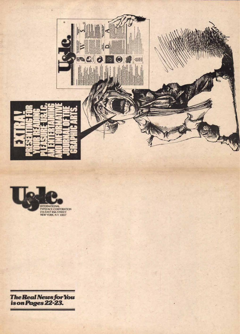
INTERNATIONAL TYPEFACE CORPORATION 216 EAST 45th STREET NEW YORK, N.Y. 10017
TheRealNewsforYou isonPages22-23.