Typographic Essentials
200
-
Upload
danielle-aldrich -
Category
Documents
-
view
250 -
download
2
description
Exploring typography.
Transcript of Typographic Essentials


typographic essentialsdanielle aldrich spring 2010 wertzberger


contents


CONTENTS
1 typographic rules
2 x-height
3 hyphenation
4 alignment
5 justification
6 combining typefaces
7 quotes, apostrophes, & dashes
8 special characters
9 bullets
10 numerals & figures
11 small caps
12 paragraph breaks
13 headers, subheads, & crossheads
14 captions & notes
15 classification of type
16 characteristics, classification, & designer
17 font list
18 typography terminology


typographic rules
1


• Use only one space between sentences.• Use real quotation marks.• Use real apostrophes.• Make sure the apostrophes are where they belong.• Hang the punctuation off the aligned edge.• Use en or em dashes, use consistently. • Kern all headlines where necessary.• Never use the spacebar to align, always set tabs and use the tab key.• Leave no widows or orphans.• Avoid more than three hyphenations in a row.• Avoid too many hyphenations in any paragraph.• Avoid hyphenating or line brakes of names and proper nouns.• Leave a least two characters on the line and three following.• Avoid beginning consecutive lines with the same word.• Avoid ending consecutive lines with the same word.• Avoid ending lines with the words: the, of, at, a, by..• Never hyphenate words in a headline & avoid hyphens in a call out.• Never justify the text on a short line.• Keep the word spacing consistent.• Tighten the leading in lines with all caps or with few ascenders/desc.• Use a one-em first-line indent on all indented paragraphs.• Adjust the spacing between paragraphs.• Indent the first line of paragraphs or add extra space between them.• Use decimals or right-align tab for the numbers in numbered paragraphs.• Never have one line in a paragraph in the column or following.• Never combine two serif fonts on one page.• Rarely combine two sans serif fonts on one page.• Rarely combine more than three typefaces on one page.• Use special characters when necessary, including super and subscript.• Spend the time to create nice fraction or chose a font that has fractions.• If a correctly spelled word needs an accent mark, use it.
TYPOGRAPHIC RULES
1
TYPO
GR
APH
IC R
ULE
S


x-height
2

Readability and legibility are two key elements of printed text that typogra-phers strive to maximize. Readability is the extended amount of text—such as an article, book, or annual report—that is easy to read. Legibility refers to whether a short burst of text—such as a headline or stop sign—is able to be recognized instantly.
There are several factors that determine whether a text is readable. When deciding what typeface should be used for a job, consideration should be given to the typeface and its x-height. It is important to understand how a block of text can express a message through its texture/color, therefore suit-ing a particular design solution. Fonts set in the same size, same leading and column width will produce varying degrees of “color”.
In typography, color can also describe the balance between black and white on the page of text. A typeface’s color is determined by stroke width, x-height, character width and serif styles.
As a designer, if you are only asked to make the text readable on the page the following questions should be asked...
READABILITY & LEGIBILITY
Who is to read it?Someone that wants to read it? Someone that has to read it?
How will it be read?Quickly. In passing. Focused. Near. Far.
4
TYPO
GR
APH
IC E
SSEN
TIA
LS

5
X-H
EIG
HT

Futurism was first announced on February 20, 1909, when the Paris newspaper Le Figaro published a manifesto by the Italian poet and editor Filippo Tommaso Marinetti. The name Futurism, coined by Marinetti, reflected his emphasis on discarding what he conceived to be the static and irrelevant art of the past and celebrating change, original-ity, and innovation in culture and society. Futurism rejected traditions and glorified contemporary life, mainly by emphasizing two dominant themes, the machine and motion. The works were characterized by the depiction of several successive actions of a subject at the same time. Marinetti’s manifesto glorified the new technology of the automobile and the beauty of its speed, power, and movement. He exalted violence and conflict and called for the sweeping repudiation of traditional cultural, social, and political values and the destruction of such cultural institutions as museums and libraries.
GARAMOND Regularclaude garamond
serif: old-stylex-height: smalltext color: medium
72 point
Futurism was first announced on February 20, 1909, when the Paris newspaper Le Figaro published a manifesto by the Italian poet and editor Filippo Tommaso Marinetti. The name Futurism, coined by Marinetti, reflected his emphasis on dis-carding what he conceived to be the static and irrelevant art of the past and celebrating change, originality, and innovation in culture and society. Futurism rejected traditions and glori-fied contemporary life, mainly by emphasizing two dominant themes, the machine and motion. The works were character-ized by the depiction of several successive actions of a subject at the same time. Marinetti’s manifesto glorified the new tech-nology of the automobile and the beauty of its speed, power, and movement. He exalted violence and conflict and called for the sweeping repudiation of traditional cultural, social, and political values and the destruction of such cultural institutions as museums and libraries.
HELVETICA Regularmax miedinger
sans serif: grotesque x-height: largetext color: dark
XxhgXxhg
EXAMPLES

Futurism was first announced on February 20, 1909, when the Paris newspaper Le Figaro published a manifesto by the Italian poet and editor Filippo Tommaso Marinetti. The name Futurism, coined by Marinetti, reflected his emphasis on discarding what he conceived to be the static and irrelevant art of the past and celebrating change, originality, and innovation in culture and society. Futurism rejected traditions and glorified contemporary life, mainly by emphasizing two dominant themes, the machine and motion. The works were characterized by the depiction of several successive actions of a subject at the same time. Marinetti’s manifesto glorified the new technology of the automobile and the beauty of its speed, power, and movement. He exalted violence and conflict and called for the sweep-ing repudiation of traditional cultural, social, and political values and the destruction of such cultural institutions as museums and libraries.
ADOBE CASLON Regularcarol twombly
serif: transitionalx-height: smalltext color: medium
72 point
Futurism was first announced on February 20, 1909, when the Paris newspaper Le Figaro published a manifesto by the Italian poet and editor Filippo Tommaso Marinetti. The name Futurism, coined by Marinetti, reflected his emphasis on discarding what he conceived to be the static and irrelevant art of the past and celebrating change, originality, and innovation in culture and society. Futurism rejected traditions and glorified contemporary life, mainly by emphasizing two dominant themes, the machine and motion. The works were characterized by the depiction of several successive actions of a subject at the same time. Marinetti’s manifesto glorified the new technology of the automobile and the beauty of its speed, power, and move-ment. He exalted violence and conflict and called for the sweeping repudiation of traditional cultural, social, and political values and the destruction of such cultural institu-tions as museums and libraries.
UNIVERS 55 Romanadrian frutiger
sans serif: grotesque x-height: largetext color: dark
XxhgXxhg
7
X-H
EIG
HT

Futurism was first announced on February 20, 1909, when the Paris newspaper Le Figaro published a manifesto by the Italian poet and editor Filippo Tommaso Marinetti. The name Futurism, coined by Marinetti, reflected his emphasis on discarding what he conceived to be the static and irrelevant art of the past and celebrating change, originality, and innovation in culture and society. Futurism rejected traditions and glorified contemporary life, mainly by emphasizing two dominant themes, the machine and motion. The works were characterized by the depiction of several successive actions of a subject at the same time. Marinetti’s manifesto glorified the new technology of the automobile and the beauty of its speed, power, and movement. He exalted violence and conflict and called for the sweep-ing repudiation of traditional cultural, social, and political values and the destruction of such cultural institutions as museums and libraries.
BASKERVILLE Regularjohn baskerville
serif: transitionalx-height: smalltext color: light
72 point
Futurism was first announced on February 20, 1909, when the Paris newspaper Le Figaro published a manifesto by the Italian poet and editor Filippo Tommaso Marinetti. The name Futurism, coined by Marinetti, reflected his emphasis on discarding what he conceived to be the static and irrelevant art of the past and celebrating change, originality, and innovation in culture and society. Futurism rejected traditions and glorified contemporary life, mainly by emphasizing two dominant themes, the machine and motion. The works were characterized by the depiction of several successive actions of a subject at the same time. Marinetti’s manifesto glorified the new technology of the automobile and the beauty of its speed, power, and move-ment. He exalted violence and conflict and called for the sweeping repudiation of traditional cultural, social, and political values and the destruction of such cultural institu-tions as museums and libraries.
FRUTIGER 55 Romanadrian frutiger
sans serif: humanistx-height: largetext color: dark
XxhgXxhg

Futurism was first announced on February 20, 1909, when the Paris newspaper Le Figaro published a manifesto by the Italian poet and editor Filippo Tommaso Marinetti. The name Futurism, coined by Marinetti, reflected his emphasis on dis-carding what he conceived to be the static and irrelevant art of the past and celebrating change, originality, and innovation in culture and society. Futurism rejected traditions and glori-fied contemporary life, mainly by emphasizing two dominant themes, the machine and motion. The works were characterized by the depiction of several successive actions of a subject at the same time. Marinetti’s manifesto glorified the new technol-ogy of the automobile and the beauty of its speed, power, and movement. He exalted violence and conflict and called for the sweeping repudiation of traditional cultural, social, and politi-cal values and the destruction of such cultural institutions as museums and libraries.
BAUER BODONI Romanheinrich jost
serif: modernx-height: smalltext color: medium
72 point
Futurism was first announced on February 20, 1909, when the Paris newspaper Le Figaro published a manifesto by the Italian poet and editor Filippo Tommaso Marinetti. The name Futurism, coined by Marinetti, reflected his emphasis on discarding what he conceived to be the static and irrel-evant art of the past and celebrating change, originality, and innovation in culture and society. Futurism rejected traditions and glorified contemporary life, mainly by emphasizing two dominant themes, the machine and motion. The works were characterized by the depiction of several successive actions of a subject at the same time. Marinetti’s manifesto glorified the new technology of the automobile and the beauty of its speed, power, and movement. He exalted violence and conflict and called for the sweeping repudiation of traditional cultural, social, and political values and the destruction of such cultural institutions as museums and libraries.
FUTURA Bookpaul renner
sans serif: geometric x-height: averagetext color: dark
XxhgXxhg
9
X-H
EIG
HT

Futurism was first announced on February 20, 1909, when the Paris newspaper Le Figaro published a manifesto by the Italian poet and editor Filippo Tommaso Marinetti. The name Futurism, coined by Marinetti, reflected his emphasis on discarding what he conceived to be the static and irrelevant art of the past and celebrating change, originality, and innovation in culture and society. Futurism rejected traditions and glorified contemporary life, mainly by emphasizing two dominant themes, the machine and motion. The works were characterized by the depiction of several successive actions of a subject at the same time. Marinetti’s manifesto glorified the new technology of the automobile and the beauty of its speed, power, and movement. He exalted violence and conflict and called for the sweeping repudiation of traditional cultural, social, and political values and the destruction of such cultural institutions as museums and libraries.
GOUDY Old Stylefrederic w. goudy
serif: old-stylex-height: averagetext color: light
Xxhg 72 point
Futurism was first announced on February 20, 1909, when the Paris newspaper Le Figaro published a manifesto by the Italian poet and editor Filippo Tommaso Marinetti. The name Futurism, coined by Marinetti, reflected his emphasis on discarding what he conceived to be the static and irrelevant art of the past and celebrating change, originality, and innovation in culture and soci-ety. Futurism rejected traditions and glorified contemporary life, mainly by emphasizing two dominant themes, the machine and motion. The works were characterized by the depiction of several successive actions of a subject at the same time. Marinetti’s manifesto glorified the new technology of the automobile and the beauty of its speed, power, and movement. He exalted violence and conflict and called for the sweeping repudiation of traditional cultural, social, and political values and the destruction of such cultural institutions as museums and libraries.
FRANKLIN GOTHIC BOOK Regularmax miedinger
sans serif: grotesque x-height: largetext color: medium
Xxhg

72 point
Futurism was first announced on February 20, 1909, when the Paris newspaper Le Figaro published a manifesto by the Italian poet and editor Filippo Tommaso Marinetti. The name Futurism, coined by Marinetti, reflected his emphasis on discarding what he conceived to be the static and irrelevant art of the past and celebrating change, originality, and innovation in culture and society. Futurism rejected traditions and glorified contempo-rary life, mainly by emphasizing two dominant themes, the machine and motion. The works were characterized by the depiction of several successive actions of a subject at the same time. Marinetti’s manifesto glorified the new technology of the automobile and the beauty of its speed, power, and movement. He exalted violence and conflict and called for the sweeping repudiation of traditional cultural, social, and political values and the destruction of such cultural institutions as museums and libraries.
OPTIMA Regularherman zapf
sans serif: humanistx-height: largetext color: medium
XxhgFuturism was first announced on February 20, 1909, when the Paris newspaper Le Figaro published a manifesto by the Italian poet and editor Filippo Tommaso Marinetti. The name Futurism, coined by Marinetti, reflected his emphasis on discarding what he conceived to be the static and irrelevant art of the past and celebrating change, originality, and innovation in culture and society. Futurism rejected traditions and glorified contemporary life, mainly by emphasizing two dominant themes, the machine and motion. The works were characterized by the depiction of several successive actions of a subject at the same time. Marinetti’s manifesto glorified the new technology of the automobile and the beauty of its speed, power, and movement. He exalted violence and conflict and called for the sweeping repudiation of traditional cultural, social, and political values and the destruction of such cultural institutions as museums and libraries.
TIMES Regularstanley morison
serif: transitionalx-height: averagetext color: dark
Xxhg
11
X-H
EIG
HT

Futurism was first announced on February 20, 1909, when the Paris newspaper Le Figaro published a manifesto by the Italian poet and editor Filippo Tommaso Marinetti. The name Futurism, coined by Marinetti, reflected his emphasis on discarding what he conceived to be the static and irrelevant art of the past and celebrating change, originality, and innovation in culture and society. Futurism rejected traditions and glorified contemporary life, mainly by emphasizing two dominant themes, the machine and motion. The works were characterized by the depiction of several successive actions of a subject at the same time. Marinetti’s manifesto glorified the new technology of the automobile and the beauty of its speed, power, and move-ment. He exalted violence and conflict and called for the sweeping repudiation of traditional cultural, social, and political values and the destruction of such cultural institu-tions as museums and libraries.
CENTURY Regularmorris fuller benton
serif: transitionalx-height: averagetext color: dark
Xxhg 72 point
Futurism was first announced on February 20, 1909, when the Paris newspaper Le Figaro published a manifesto by the Italian poet and editor Filippo Tommaso Marinetti. The name Futurism, coined by Marinetti, reflected his emphasis on discarding what he conceived to be the static and irrelevant art of the past and celebrating change, originality, and innovation in culture and society. Futurism rejected traditions and glorified contemporary life, mainly by emphasizing two dominant themes, the machine and motion. The works were characterized by the depiction of several successive actions of a subject at the same time. Marinetti’s manifesto glorified the new technology of the automobile and the beauty of its speed, power, and movement. He exalted violence and conflict and called for the sweeping repudiation of traditional cultural, social, and political values and the destruction of such cultural institutions as museums and libraries.
GILL SANS Regulareric gill
sans serif: humanistx-height: averagetext color: dark
Xxhg

Futurism was first announced on February 20, 1909, when the Paris newspaper Le Figaro published a manifesto by the Italian poet and editor Filippo Tommaso Marinetti. The name Futurism, coined by Marinetti, reflected his emphasis on dis-carding what he conceived to be the static and irrelevant art of the past and celebrating change, originality, and innovation in culture and society. Futurism rejected traditions and glori-fied contemporary life, mainly by emphasizing two dominant themes, the machine and motion. The works were character-ized by the depiction of several successive actions of a subject at the same time. Marinetti’s manifesto glorified the new tech-nology of the automobile and the beauty of its speed, power, and movement. He exalted violence and conflict and called for the sweeping repudiation of traditional cultural, social, and political values and the destruction of such cultural institu-tions as museums and libraries.
PALATINO Regularherman zapf
serif: old-stylex-height: averagetext color: medium
72 point
Futurism was first announced on February 20, 1909, when the Paris newspaper Le Figaro published a manifesto by the Italian poet and editor Filippo Tommaso Marinetti. The name Futurism, coined by Marinetti, reflected his emphasis on discarding what he conceived to be the static and irrelevant art of the past and celebrating change, originality, and innovation in culture and soci-ety. Futurism rejected traditions and glorified contemporary life, mainly by emphasizing two dominant themes, the machine and motion. The works were characterized by the depiction of sev-eral successive actions of a subject at the same time. Marinetti’s manifesto glorified the new technology of the automobile and the beauty of its speed, power, and movement. He exalted violence and conflict and called for the sweeping repudiation of traditional cultural, social, and political values and the destruction of such cultural institutions as museums and libraries.
AKZIDENZ-GROTESK Regulargünter gerhard lange
sans serif: grotesque x-height: averagetext color: dark
XxhgXxhg
13
X-H
EIG
HT

Futurism was first announced on February 20, 1909, when the Paris newspaper Le Figaro published a manifesto by the Italian poet and editor Filippo Tommaso Marinetti. The name Futurism, coined by Marinetti, reflected his emphasis on dis-carding what he conceived to be the static and irrelevant art of the past and celebrating change, originality, and innovation in culture and society. Futurism rejected traditions and glori-fied contemporary life, mainly by emphasizing two dominant themes, the machine and motion. The works were characterized by the depiction of several successive actions of a subject at the same time. Marinetti’s manifesto glorified the new technol-ogy of the automobile and the beauty of its speed, power, and movement. He exalted violence and conflict and called for the sweeping repudiation of traditional cultural, social, and politi-cal values and the destruction of such cultural institutions as museums and libraries.
SABON Regularjan tschichold
serif: old-stylex-height: averagetext color: light
72 point
Futurism was first announced on February 20, 1909, when the Paris newspaper Le Figaro published a manifesto by the Italian poet and editor Filippo Tommaso Marinetti. The name Futurism, coined by Marinetti, reflected his emphasis on discarding what he conceived to be the static and irrelevant art of the past and celebrating change, originality, and innovation in culture and soci-ety. Futurism rejected traditions and glorified contemporary life, mainly by emphasizing two dominant themes, the machine and motion. The works were characterized by the depiction of sev-eral successive actions of a subject at the same time. Marinetti’s manifesto glorified the new technology of the automobile and the beauty of its speed, power, and movement. He exalted violence and conflict and called for the sweeping repudiation of traditional cultural, social, and political values and the destruction of such cultural institutions as museums and libraries.
DIN SCHRIFT 1451 Mittelschriftalbert jan-pool
sans serif: old style x-height: largetext color: dark
XxhgXxhg

Futurism was first announced on February 20, 1909, when the Paris newspaper Le Figaro published a manifesto by the Italian poet and editor Filippo Tommaso Marinetti. The name Futurism, coined by Marinetti, reflected his emphasis on discarding what he conceived to be the static and irrelevant art of the past and celebrating change, originality, and innovation in culture and society. Futurism rejected traditions and glorified contemporary life, mainly by emphasizing two dominant themes, the machine and motion. The works were charac-terized by the depiction of several successive actions of a subject at the same time. Marinetti’s manifesto glorified the new technology of the automobile and the beauty of its speed, power, and movement. He exalted violence and conflict and called for the sweeping repudiation of traditional cultural, social, and political values and the destruction of such cultural institutions as museums and libraries.
BEMBO Regularstanley morison
serif: old-stylex-height: smalltext color: light
72 point
Futurism was first announced on February 20, 1909, when the Paris newspaper Le Figaro published a manifesto by the Italian poet and editor Filippo Tommaso Marinetti. The name Futurism, coined by Marinetti, reflected his emphasis on discarding what he conceived to be the static and irrelevant art of the past and celebrating change, originality, and innovation in culture and society. Futurism rejected traditions and glorified contemporary life, mainly by emphasizing two dominant themes, the machine and motion. The works were characterized by the depiction of several successive actions of a subject at the same time. Marinetti’s manifesto glorified the new technology of the automobile and the beauty of its speed, power, and movement. He exalted violence and conflict and called for the sweeping repudiation of traditional cultural, social, and political values and the destruction of such cultural institutions as museums and libraries.
MYRIAD PRO Regularmax miedinger
sans serif: humanistx-height: largetext color: medium
XxhgXxhg
15
X-H
EIG
HT


hyphenation
3

In unjustified text, the text block is set with normal letter and word spacing. Because of the even spacing, the text will have an even texture—no large spaces between words. The lines will naturally vary in length. A ragged text block can integrate with the layout and add a visual interest to the page. The difficulty is making the ragged edge have a pleasing silhouette. When the first line in the text is longer than the second, it becomes separate from the layout and creates a box-like shape. This destroys one of the advantages of unjustified text. The ragged edge needs to have life, but a narrow column can be less active. Another advantage to ragged text is less hyphenation is needed. Therefore, names, dates or words which are normally read together can stay together.
Hyphenation rules• Avoid widows• Avoid hyphenating or line brakes of names and proper nouns• Leave at least two characters on the line and three following• Avoid beginning consecutive lines with the same word• Avoid ending lines with the words: the, of, at, a, by, etc.• Never hyphenate words in a headline or in a call out• Avoid ending consecutive lines with the same word
Line BreaksLook for bad line breaks throughout every line of body copy. Do this only on a final copy after all editing has been done. Examples of what to look for:
• Make sure headline text is justified appropriately• Use line breaks to bump text to next line when needed• Use kerning to bring a hyphenated word together if necessary• Never hyphenate people’s names• Try substituting a short or a long word to make text fit.
HYPHENATION, LINE BREAKS
18
TYPO
GR
APH
IC E
SSEN
TIA
LS

HeadlinesDon’t hyphenate headlines.
Watch where the first line of a two-line headline ends — does it create a silly or misleading phrase? If it does, fix it.
Don’t leave widows in headlines.
Widows and OrphansNever leave widows and orphans bereft on the page. Avoid both of these situations. If you have editing privileges, rewrite the copy, or at least add or delete a word or two. Sometimes you can remove spacing from the letters, words, or lines, depending on which program you’re working in. Sometimes widening a margin just a hair will do it. But it must be done. Widows and orphans on a page are wrong. Widows and orphans on a page are tacky.
Widow: When a paragraph ends and leaves fewer than seven characters on the last line, that line is called a widow. Worse than leaving one word at the end of a line is leaving part of a word, the other part being paraphrased on the one above.
Orphan: When the last line of a paragraph, be it ever so long, won’t fit at the bottom of a column and must end itself at the top of the next column, that is an orphan. Never let this happen, or else fix it.
Rivers: In typography, rivers, or rivers of white, are usually unattractive gaps appearing to run down a paragraph of text. They can occur with any spac-ing, though they are most noticeable with wide word spaces caused by ei-ther full text justification or monospaced fonts.
Don Quixote de la Man-cha
Professor and The-rapist to Lecture
Man Walks Barefoot Across BayBridge
19
HYP
HEN
ATI
ON

Casing AdderBatHeresy borsch-boil starry aboarder borsch boil gamplate lung, lung a gore in-ner ladle wan-hearse torncoiled Mutt-fill. Mutt-fill worsen mush of-fter torn, butted hatter puttygut borsch-boil tame, an offoiler pliers honor tame, doormoist cerebrated worse Cas-ing. Casing worsted sickenedbasement, any hatter bettingorphanage off .526 (fife toesex). Casing worse gut lurkingan furry poplar—spatiallywetter gull coiled Any-bally.Any-bally worse Casing’ssweat-hard, any harpy cobblewandered toe gat merit,bought Casing worse tow poretoe becalm Any-bally’shorsebarn. (Boil pliers honorMutt-fill tame dint gat mushoffer celery; infect, day gutnosing atoll.) But less gat earn wetter star-ry.
1. Justify the headline so it stays on one line.
2. Use a line break (shift+return) to bump “a” down to the next line, where it fits very nicely.
3. Kern the line a tiny bit to bring the rest of the word up.
4. Type a dischy in front of the word to bump it down.
5. Never hyphenate a person’s name. I had to go up a few lines, bump “off” down, which bumped the otherline endings down.
6. Fix widow.
7. There is plenty of room to squeeze “bought” on this line, perhaps by kerning the line a tiny bit.
8. “Horsebarn” is a good long word that could be hyphenated; type a dischy. Better yet, when “bought” moved up, it gave enough room to move “horsebarn” up. If not, try openingthe text box a wee bit.
9. Edit: to get rid of that terrible widow, exchange a short word for a long word.
HYPHENATION ADJUSTMENTS
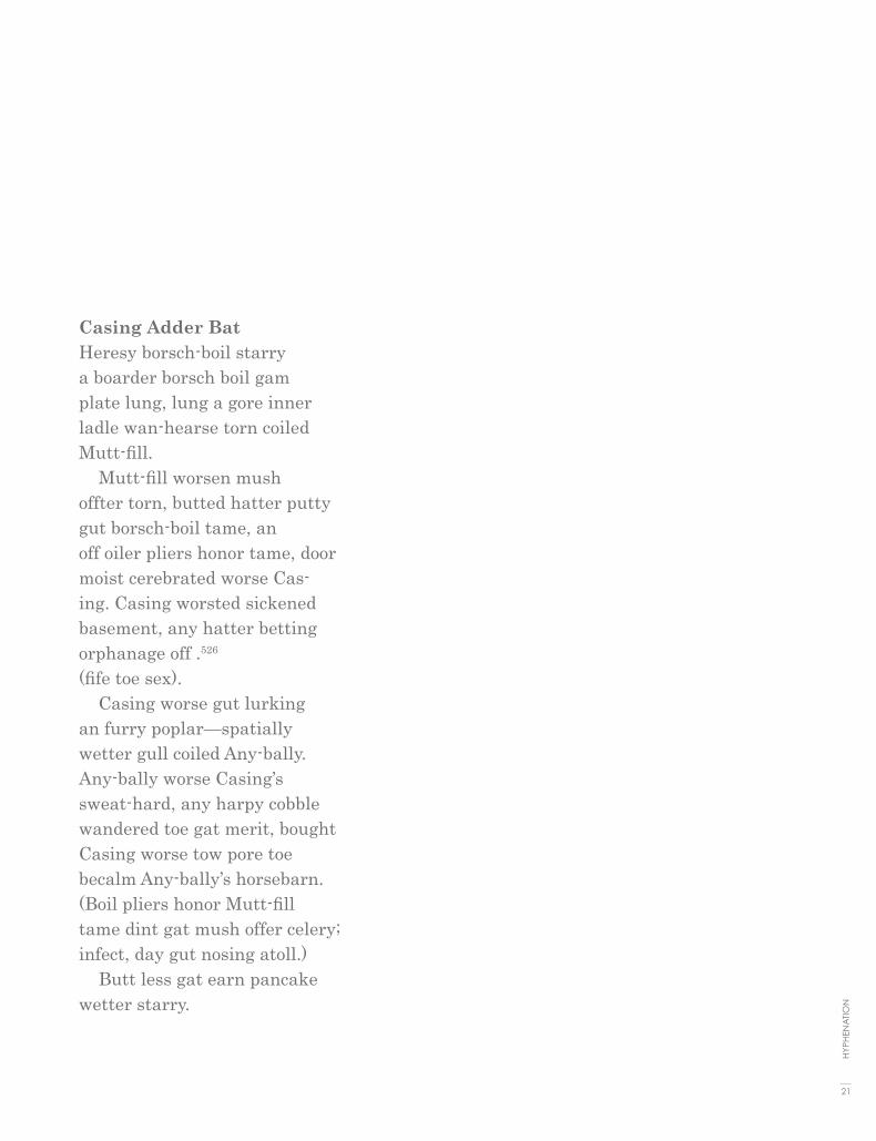
Casing Adder BatHeresy borsch-boil starry a boarder borsch boil gamplate lung, lung a gore inner ladle wan-hearse torn coiled Mutt-fill. Mutt-fill worsen mush offter torn, butted hatter puttygut borsch-boil tame, an off oiler pliers honor tame, door moist cerebrated worse Cas-ing. Casing worsted sickened basement, any hatter betting orphanage off .526 (fife toe sex). Casing worse gut lurkingan furry poplar—spatiallywetter gull coiled Any-bally.Any-bally worse Casing’ssweat-hard, any harpy cobblewandered toe gat merit, bought Casing worse tow pore toe becalm Any-bally’s horsebarn. (Boil pliers honor Mutt-filltame dint gat mush offer celery; infect, day gut nosing atoll.) Butt less gat earn pancake wetter starry.
21
HYP
HEN
ATI
ON

If someone insists that fully justified text is better than left-aligned text, tell them they are wrong. If some-one else tells you that left-aligned text is better than justified text, tell them they are:

wrong.If they are both wrong, then what’s right?


alignment
4

...Alignment is only a small piece of the puzzle. What works for one design might be totally inappropriate for another layout. As with all layouts, it de-pends on the purpose of the piece, the audience and its expectations, the fonts, the margins and white space, and other elements on the page. The most appropriate choice is the alignment that works for that particular design.
Justified TextTraditionally many books, newsletters, and newspapers use full-justification as a means of packing as much information onto the page as possible to cut down on the number of pages needed. While the alignment was chosen out of necessity, it has become so familiar to us that those same types of publica-tions set in left-aligned text would look odd, even unpleasant. You may find that fully-justified text is a necessity either due to space constraints or expec-tations of the audience. If possible though, try to break up dense blocks of texts with ample subheadings, margins, or graphics.• Considered more formal, less friendly than left-aligned text.• Usually allows for more characters per line, packing more into the same amount of space (than the same text set left-align).• May require extra attention to word and character spacing and hyphenation to avoid unsightly rivers of white space running through the text.• May be more familiar to readers in some types of publications, such as newspapers.• Some people are naturally drawn to the “neatness” of text that lines up perfectly on the left and on the right.
Left-Aligned, Ragged Right• Often considered more informal, friendlier than justified text.• The ragged right edge adds an element of white space.• May require extra attention to hyphenation to keep right margin from being ragged.• Generally type set left-aligned is easier to work with, (it will require
a lot less time, attention, kerning,and tweaking from the designer to make it look good).
JUSTIFIED, LEFT-ALIGN, CENTERED
26
TYPO
GR
APH
IC E
SSEN
TIA
LS

CenteredThere is nothing inherently wrong with centered text. As with ragged right or fully-justified text alignment, what works for one design might be totally inappropriate for another layout. There are simply fewer situations where centered text is appropriate. When in doubt, don't center it.
As with all layouts, alignment depends on the purpose of the piece, the audience and its expectations, the fonts, the margins and white space, and other elements on the page. The most appropriate choice is the align-ment that works for that particular design. No matter what alignment you use, remember to pay close attention to hyphenation and word/character spacing as well to insure that your text is as readable as possible. There will undoubtedly be well-meaning friends, business associates, clients, and oth-ers who will question your choices. Be prepared to explain why you chose the alignment you did and be prepared to change it (and make necessary adjustments to keep it looking good) if the person with final approval still insists on something different.
The alignment of your text plays a vital part in the look and readability of your work. It’s not the only factor—typeface, line length, style, size, linespac-ing, and case (caps or lowercase) also contribute. Type that is easy and pleasant to read encourages people to read what is written. Type that is not so readable can discourage a significant portion of the audience.
In short text, as in an advertisement or package design, you can often get away with using a design feature that detracts from the readability but adds to the attractiveness and impact of the piece (such as extreme letter spacing, or all caps with a justified alignment, or fringe type)—but this only works when you can justify that the look of the piece is more important than the accompanying loss of readability.
27
ALI
GN
MEN
T

Speaking just in terms of alignment, text aligned on the left is the most readable. Left-aligned text uses the opti-mum work spacing and letter spacing that the designer built into the font, and the spacing is very consistent so you don’t have to struggle through the words at all. As you read, your eye can quickly find the beginning of the next line. When you align text left, strive to keep the right, “ragged” side as smooth as possible, or in a slightly con-cave shape. Sometimes this necessitates forcing line breaks to fill in holes or to prevent long text strings from hanging beyond the rest of the lines. Below, the word of is hanging off the right edge, while in the line just below it there is clearly plenty of room to accommodate the word. Bump of down to the next line. If you bump words down, be sure you do it as the last touch in your final layout. Otherwise when you edit the text, change the type size or column width, or alter the layout in any way, you will end up with tab spaces, empty spaces, or line breaks in the middle of your sentences. Fortunately, in a flush left alignment you can easily make type corrections and adjust lines, often without affecting the rest of the text at all.
EXAMPLES
left align
28
TYPO
GR
APH
IC E
SSEN
TIA
LS

Text aligned on the right creates a definite look, as shown to the left, quite different from left-aligned. The
letter and word spacing still retain their ideal built-in settings, and corrections can often be made without
affecting the rest of the text. The biggest drop in readability comes from the fact that the left edge,
where your eye returns to find the next line to read, is not consistent so your eye has to find the beginning of
the line again every time it moves to the left. In small amounts of text, this isn’t a major problem,
and the sacrifice can be worth it in exchange for the distinctive layout. When you use a right alignment
for the look it creates, then emphasize the look—don’t be a wimp. Instead of keeping the ragged edge as
smooth as possible, try to exaggerate it.There is no excuse for widows or hyphenated words
when you set a right alignment. Since you are determining the line endings and since this format is
rarely used with an extended amount of text, you can help compensate for the lower readability by being
thoughtful in the grouping of phrases. And while you’re at it you can completely eliminate any hyphenation.
right align
29
ALI
GN
MEN
T

When you justify text, the computer forces the lines to extend to a certain length by adding or deleting space between the words, and sometimes between the letters. Some pro-grams let you specify the minimum and maximum amounts the spacing can adjust, but the computer will override your specifications if necessary. The greatest problem with justified text, both in terms of readability and aesthetics, is the uneven word spacing and letter spacing: some lines have extra spacing, some less. This irregularity is visually disturbing and interrupts reading. The shorter the line length in relation to the size of the type, the worse this problem becomes because there are fewer words between which to add or delete space. One simple rule for determining whether a line length is “long enough” to justify this: The line length in picas should be twice the point size of the type: if you’re using 12-point type, the minimum line length before you should try to justify is 24 picas (6 picas equal 1 inch). For many years, justified type reigned supreme as the way to set most text. But the trend of the past couple decades has been to allow the natural spacing of flush left text to dominate, losing the structured look of the “block” of text, but maximizing the text’s readability.
justified
30
TYPO
GR
APH
IC E
SSEN
TIA
LS

A centered alignment also gives a particular look to text: a more formal sedate, and potentially more
boring sort of look. People who are just beginning to work with text tend to center everything because it’s
safe. It’s symmetrical. It fills the space, everything balances automatically.
However, a centered alignment can create a dreadfully dull piece, and in the hands of a non-designer,
it most likely will create an amateurish page.A centered alignment has consistent letter and word spacing, but you have to keep finding the beginning
of the lines as you read so it is not the most readable arrangement. But if you’re going to do it, then do
it. Make it clear that the text is centered, not just poorly justified.
Varying line lengths make the page visually interesting. Also, a centered alignment gives you
a chance to group the lines into logical thoughts. And always remember, there’s never an excuse
for hyphenated words.
centered
31
ALI
GN
MEN
T


I’ve always wantedto be somebody. But I can see now
I should have been more specific.
Lily Tomlin
If you make the right alignmentstrong, it adds another dimension
to be the type and takes it beyondmerely words on the page.
On with the dance!Let joy be unconfined;
No sleep ’til morn, when youth and pleasure meetTo chase the glowing hours
with flying feet.
Lord Byron
This layout has a really intriguing shape.Take advantage of the flexibility of centered lines.
I declare! Sometimes it seems tome that every time a new piece of machinery comes in at the door some of our wits fly out at the window.
Aunt Abigail in Understood Betsyby Dorothy Canfield Fisher
We get an really good “rag” for left alignment by narrowing the entire paragraph so the lines break.
So sweet a kiss the golden sun gives not to those fresh morning drops upon the rose, as thy eye-beams, when their fresh rays have smote the night of dew that on my cheeks down flows: nor shines the silver moon one half so bright through the transparent bosom of the deep, as doth thy face through tears of mine give light; thou shinest in every tear that I do weep.William Shakespeare, Love’s Labour’s Lost
Even with a long enough line length, you will still get uneven word spacing in justified text
33
ALI
GN
MEN
T

When your work comes out of a printer, turnit upside downand squint at it. The rivers will be very easy to spot. Get rid of them. Try squinting atthe exampleon the next page.

Find anything?
When your work comes out of a printer, turnit upside downand squint at it. The rivers will be very easy to spot. Get rid of them. Try squinting at the exampleon the next page.


justification
5

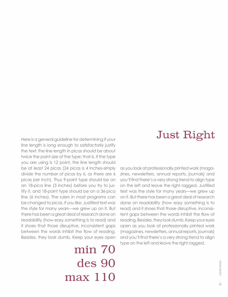
Justify text only if the line is long enough to prevent awkward and inconsistent word spacing. The only time you can safely get away with justifying text is if your type is small enough and your line is long enough, as in books where the text goes all the way across the page. If your line is shorter—as in newsletters or if there aren’t many words in a line—then as the type aligns to the margins the words space themselves to accommodate it. It usually looks awkward. You've seen newspaper columns where all text is justified, often with a word stretching all the way across the column, or a little word on either side of the column with a big gap in the middle. Gross. But that's what can happen with justified type. When you do it, the effect might not be as radical as the newspaper column, but if your lines are relatively short, you will inevitably end up with uncomfort-able gaps in some lines, while other lines will be all squished together.
Here is a general guideline for determining if your line length is long enough to satisfactorily justify the text: the line length in picas should be about twice the point size of the type; that is, if the type you are using is 12 point, the line length should be at least 24 picas (24 picas is 4 inches—simply divide the number of picas by 6, as there are 6 picas per inch). Thus 9-point type should be on an 18-pica line (3 inches) before you try to justify it, and 18-point type should be on a 36-pica line (6 inches). The rulers in most programs can be changed to picas, if you like.
Justified text was the style for many years—we grew up on it. But there has been a great deal of research done on readability (how easy something is to read) and it shows that those disruptive, inconsistent gaps between the words inhibit the flow of reading. Besides, they look dumb. Keep your eyes open as you look at professionally printed work (magazines, newsletters, annual reports, journals) and you’ll find there’s a very strong trend to align type on the left and leave the right ragged.
JUSTIFICATION
38
TYPO
GR
APH
IC E
SSEN
TIA
LS

Here is a general guideline for determining if your line length is long enough to satisfactorily justify the text: the line length in picas should be about twice the point size of the type; that is, if the type you are using is 12 point, the line length should be at least 24 picas (24 picas is 4 inches-simply divide the number of picas by 6, as there are 6 picas per inch). Thus 9-point type should be on an 18-pica line (3 inches) before you try to justify it, and 18-point type should be on a 36-pica line (6 inches). The rulers in most programs can be changed to picas, if you like. Justified text was the style for many years—we grew up on it. But there has been a great deal of research done on readability (how easy something is to read) and it shoes that those disruptive, inconsistent gaps between the words inhibit the flow of reading. Besides, they look
min 130des 140
max 180
dumb. Keep your eyes open as you look at professionally printed work (magazines, news-letters, annual reports, journals) and you’ll find there’s a very strong trend to align type on the left and leave the right ragged. Justified text was the style for many years—we grew up on it. But there has been a great deal of research done on readability (how easy something is to read) and it shoes that those disruptive, and in-consistent gaps between the words inhibit the flow of reading. Besides, they look dumb. Keep your eyes open as you look at professionally printed work (magazines, newsletters, annual reports, journals) and you’ll find there’s a very strong trend to align type on the left and leave the right ragged.
TOO BIG
39
JUST
IFIC
ATI
ON

40
TYPO
GR
APH
IC E
SSEN
TIA
LS
SANS SERIF
Here is a general guideline for determining if your line length is long enough to satisfactorily justify the text: the line length in picas should be about twice the point size of the type; that is, if the type you are using is 12 point, the line length should be at least 24 picas (24 picas is 4 inches-simply divide the number of picas by 6, as there are 6 picas per inch). Thus 9-point type should be on an 18-pica line (3 inches) before you try to justify it, and 18-point type should be on a 36-pica line (6 inches). The rulers in most programs can be changed to picas, if you like. Justified text was the style for many years—we grew up on it. But there has been a great deal of re-search done on readability (how easy something is to read) and it shoes that those disruptive, incon-sistent gaps between the words inhibit the flow of reading. Besides, they look dumb. Keep your eyes open as you look at professionally printed work
(magazines, newsletters, annual reports, jour-nals) and you’ll find there’s a very strong trend to align type on the left and leave the right ragged. Justified text was the style for many years—we grew up on it. But there has been a great deal of re-search done on readability (how easy something is to read) and it shoes that those disruptive, incon-sistent gaps between the words inhibit the flow of reading. Besides, they look dumb. Keep your eyes open as you look at professionally printed work (magazines, newsletters, annual reports, journals) and you’ll find there’s a very strong trend to align type on the left and leave the right side more ragged.
min 6 des 7
max 8

Here is a general guideline for determining if your line length is long enough to satisfactorily justify the text: the line length in picas should be about twice the point size of the type; that is, if the type you are using is 12 point, the line length should be at least 24 picas (24 picas is 4 inches-simply divide the number of picas by 6, as there are 6 picas per inch). Thus 9-point type should be on an 18-pica line (3 inches) before you try to justify it, and 18-point type should be on a 36-pica line (6 inch-es). The rulers in most programs can be changed to picas, if you like. Justified text was the style for many years—we grew up on it. But there has been a great deal of research done on readability (how easy something is to read) and it shoes that those disruptive, inconsistent gaps between the words inhibit the flow of reading. Besides, they look dumb. Keep your eyes open as you look at
professionally printed work (magazines, news-letters, annual reports, journals) and you’ll find there’s a very strong trend to align type on the left and leave the right ragged. Justified text was the style for many years—we grew up on it. But there has been a great deal of research done on readability (how easy something is to read) and it shoes that those disruptive, inconsistent gaps between the words inhibit the flow of reading. Besides, they look dumb. Keep your eyes open as you look at professionally printed work (maga-zines, newsletters, annual reports, journals) and you’ll find there’s a very strong trend to align type on the left and leave the right ragged.
min 20 des 30
max 35
too small
41
JUST
IFIC
ATI
ON

42
TYPO
GR
APH
IC E
SSEN
TIA
LS
Here is a general guideline for determining if your line length is long enough to satisfactorily justify the text: the line length in picas should be about twice the point size of the type; that is, if the type you are using is 12 point, the line length should be at least 24 picas (24 picas is 4 inches-simply divide the number of picas by 6, as there are 6 picas per inch). Thus 9-point type should be on an 18-pica line (3 inches) before you try to justify it, and 18-point type should be on a 36-pica line (6 inch-es). The rulers in most programs can be changed to picas, if you like. Justified text was the style for many years—we grew up on it. But there has been a great deal of research done on readabil-ity (how easy something is to read) and it shoes that those disruptive, inconsistent gaps between the words inhibit the flow of reading. Besides, they look dumb. Keep your eyes open as you look at
min 60des 80
max 90
professionally printed work (magazines, news-letters, annual reports, journals) and you’ll find there’s a very strong trend to align type on the left and leave the right ragged. Justified text was the style for many years—we grew up on it. But there has been a great deal of research done on readability (how easy something is to read) and it shoes that those disruptive, inconsistent gaps between the words inhibit the flow of reading. Besides, they look dumb. Keep your eyes open as you look at professionally printed work (maga-zines, newsletters, annual reports, journals) and you’ll find there’s a very strong trend to align type on the left and leave the right ragged.
43
JUST
IFIC
ATI
ON
Here is a general guideline for determining if your line length is long enough to satisfactorily justify the text: the line length in picas should be about twice the point size of the type; that is, if the type you are using is 12 point, the line length should be at least 24 picas (24 picas is 4 inches-simply divide the number of picas by 6, as there are 6 picas per inch). Thus 9-point type should be on an 18-pica line (3 inches) before you try to jus-tify it, and 18-point type should be on a 36-pica line (6 inches). The rulers in most programs can be changed to picas, if you like. Justified text was the style for many years—we grew up on it. But there has been a great deal of research done on readability (how easy something is to read) and it shoes that those disruptive, inconsistent gaps between the words inhibit the flow of reading. Besides, they look dumb. Keep your eyes open
min 70des 90
max 110
as you look at professionally printed work (maga-zines, newsletters, annual reports, journals) and you’ll find there’s a very strong trend to align type on the left and leave the right ragged. Justified text was the style for many years—we grew up on it. But there has been a great deal of research done on readability (how easy something is to read) and it shoes that those disruptive, inconsis-tent gaps between the words inhibit the flow of reading. Besides, they look dumb. Keep your eyes open as you look at professionally printed work (magazines, newsletters, annual reports, journals) and you’ll find there’s a very strong trend to align type on the left and leave the right ragged.
Just Right

44
TYPO
GR
APH
IC E
SSEN
TIA
LS
SERIF
“Right and wrong do not exist in graphic design. There is only effective and non-effective communication.” – Peter Bilak{

45
JUST
IFIC
ATI
ON
Here is a general guideline for determining if your line length is long enough to satisfactorily justify the text: the line length in picas should be about twice the point size of the type; that is, if the type you are using is 12 point, the line length should be at least 24 picas (24 pi-cas is 4 inches-simply divide the number of pi-cas by 6, as there are 6 picas per inch). Thus 9-point type should be on an 18-pica line (3 inches) before you try to justify it, and 18-point type should be on a 36-pica line (6 inches). The rulers in most programs can be changed to picas, if you like. Justified text was the style for many years—we grew up on it. But there has been a great deal of research done on readability (how easy something is to read) and it shoes that those disruptive, inconsis-tent gaps between the words inhibit the flow of
min 130des 140
max 180
reading. Besides, they look dumb. Keep your eyes open as you look at professionally printed work (magazines, newsletters, annual reports, journals) and you’ll find there’s a very strong trend to align type on the left and leave the right ragged. Justified text was the style for many years—we grew up on it. But there has been a great deal of research done on read-ability (how easy something is to read) and it shoes that those disruptive, and inconsistent gaps between the words inhibit the flow of reading. Besides, they look dumb. Keep your eyes open as you look at professionally printed work (magazines, newsletters, annual reports, journals) and you’ll find there’s a very strong trend to align type on the left and leave the right ragged.
TOO BIG“Right and wrong do not exist in graphic design. There is only effective and non-effective communication.” – Peter Bilak

46
TYPO
GR
APH
IC E
SSEN
TIA
LS
Here is a general guideline for determining if your line length is long enough to satisfactorily justify the text: the line length in picas should be about twice the point size of the type; that is, if the type you are using is 12 point, the line length should be at least 24 picas (24 picas is 4 inches-simply di-vide the number of picas by 6, as there are 6 picas per inch). Thus 9-point type should be on an 18-pica line (3 inches) before you try to justify it, and 18-point type should be on a 36-pica line (6 inch-es). The rulers in most programs can be changed to picas, if you like. Justified text was the style for many years—we grew up on it. But there has been a great deal of research done on readability (how easy something is to read) and it shoes that those disruptive, inconsistent gaps between the words inhibit the flow of reading. Besides, they look dumb. Keep your eyes open as you look at profes-
sionally printed work (magazines, newsletters, annual reports, journals) and you’ll find there’s a very strong trend to align type on the left and leave the right ragged. Justified text was the style for many years—we grew up on it. But there has been a great deal of research done on readability (how easy something is to read) and it shoes that those disruptive, inconsistent gaps between the words inhibit the flow of reading. Besides, they look dumb. Keep your eyes open as you look at profes-sionally printed work (magazines, newsletters, annual reports, journals) and you’ll find there’s a very strong trend to align type on the left and leave the right ragged.
min 5 des 6
max 7

47
JUST
IFIC
ATI
ON
Here is a general guideline for determining if your line length is long enough to satisfactorily justify the text: the line length in picas should be about twice the point size of the type; that is, if the type you are using is 12 point, the line length should be at least 24 picas (24 picas is 4 inches-simply di-vide the number of picas by 6, as there are 6 picas per inch). Thus 9-point type should be on an 18-pica line (3 inches) before you try to justify it, and 18-point type should be on a 36-pica line (6 inch-es). The rulers in most programs can be changed to picas, if you like. Justified text was the style for many years—we grew up on it. But there has been a great deal of research done on readability (how easy something is to read) and it shoes that those disruptive, inconsistent gaps between the words inhibit the flow of reading. Besides, they look dumb. Keep your eyes open as you look at profes-
sionally printed work (magazines, newsletters, annual reports, journals) and you’ll find there’s a very strong trend to align type on the left and leave the right ragged. Justified text was the style for many years—we grew up on it. But there has been a great deal of research done on readability (how easy something is to read) and it shoes that those disruptive, inconsistent gaps between the words inhibit the flow of reading. Besides, they look dumb. Keep your eyes open as you look at professionally printed work (magazines, news-letters, annual reports, journals) and you’ll find there’s a very strong trend to align type on the left and leave the right ragged.
min 20 des 30
max 35
too small

48
TYPO
GR
APH
IC E
SSEN
TIA
LS
Here is a general guideline for determining if your line length is long enough to satisfactorily justify the text: the line length in picas should be about twice the point size of the type; that is, if the type you are using is 12 point, the line length should be at least 24 picas (24 picas is 4 inches-simply divide the number of picas by 6, as there are 6 picas per inch). Thus 9-point type should be on an 18-pica line (3 inches) before you try to justify it, and 18-point type should be on a 36-pica line (6 inches). The rulers in most programs can be changed to picas, if you like. Justified text was the style for many years—we grew up on it. But there has been a great deal of research done on readability (how easy something is to read) and it shoes that those disruptive, inconsistent gaps between the words inhibit the flow of reading. Besides, they look dumb. Keep your eyes open as
min 60des 80
max 90
you look at professionally printed work (maga-zines, newsletters, annual reports, journals) and you’ll find there’s a very strong trend to align type on the left and leave the right ragged. Justified text was the style for many years—we grew up on it. But there has been a great deal of research done on readability (how easy something is to read) and it shoes that those disruptive, incon-sistent gaps between the words inhibit the flow of reading. Besides, they look dumb. Keep your eyes open as you look at professionally printed work (magazines, newsletters, annual reports, journals) and you’ll find there’s a very strong trend to align type on the left and leave the right side ragged.

Here is a general guideline for determining if your line length is long enough to satisfactorily justify the text: the line length in picas should be about twice the point size of the type; that is, if the type you are using is 12 point, the line length should be at least 24 picas (24 picas is 4 inches-simply divide the number of picas by 6, as there are 6 picas per inch). Thus 9-point type should be on an 18-pica line (3 inches) before you try to justify it, and 18-point type should be on a 36-pica line (6 inches). The rulers in most programs can be changed to picas, if you like. Justified text was the style for many years—we grew up on it. But there has been a great deal of research done on readability (how easy some-thing is to read) and it shoes that those disrup-tive, inconsistent gaps between the words inhib-it the flow of reading. Besides, they look dumb.
min 70des 90
max 110
Keep your eyes open as you look at professional-ly printed work (magazines, newsletters, annual reports, journals) and you’ll find there’s a very strong trend to align type on the left and leave the right ragged. Justified text was the style for many years—we grew up on it. But there has been a great deal of research done on readability (how easy something is to read) and it shoes that those disruptive, inconsistent gaps between the words inhibit the flow of reading. Besides, they look dumb. Keep your eyes open as you look at professionally printed work (magazines, news-letters, annual reports, journals) and you’ll find there’s a very strong trend to align type on the left and leave the right ragged.
Just Right
49
JUST
IFIC
ATI
ON
co
mb
inin
g t
yp
efa
ce
s c
om
bin
ing
typ
efa
ce
s c
om
bin
ing
typ
efa
ce
s c
om
bin
ing
typ
efa
ce
s c
om
bin
ing
typ
efa
ce
s c
om
bin
ing
typ
efa
ce
s c
om
bin
ing
typ
efa
ce
s c
om
bin
ing
typ
efa
ce
s c
om
bin
ing
typ
efa
ce
s c
om
bin
ing
typ
efa
ce
s c
om
bin
ing
typ
e-
fac
es
co
mb
inin
g t
yp
efa
ce
s c
om
bin
ing
typ
efa
ce
s c
om
bin
ing
typ
efa
ce
s c
om
bin
ing
typ
efa
ce
s c
om
bin
ing
typ
efa
ce
s c
om
bin
ing
typ
efa
ce
s c
om
bin
ing
typ
efa
ce
s c
om
bin
ing
typ
efa
ce
s c
om
bin
ing
typ
efa
ce
s c
om
bin
ing
typ
efa
ce
s c
om
bin
ing
co
mb
inin
g t
yp
efa
ce
s c
om
bin
ing
typ
efa
ce
s c
om
bin
ing
typ
efa
ce
s c
om
bin
ing
typ
efa
ce
s c
om
bin
ing
typ
efa
ce
s c
om
bin
ing
typ
efa
ce
s c
om
bin
ing
typ
efa
ce
s c
om
bin
ing
typ
efa
ce
s c
om
bin
ing
typ
efa
ce
s c
om
bin
ing
typ
efa
ce
s c
om
bin
ing
typ
efa
ce
s c
om
bin
ing
typ
efa
ce
s c
om
bin
ing
typ
efa
ce
s c
om
bin
ing
typ
efa
ce
s c
om
bin
ing
typ
efa
ce
s c
om
bin
ing
typ
efa
ce
s
com
bin
ing t
ypefaces c
om
bin
ing t
ypefaces c
om
bin
ing t
ypefaces c
om
bin
ing t
ypefaces c
om
bin
ing t
ypefaces c
om
bin
ing t
ypefaces c
om
bin
ing t
ypefaces c
om
bin
ing t
ypefaces c
om
bin
ing t
ypefaces c
om
bin
ing t
ypefaces c
om
bin
ing t
ypefaces c
om
bin
ing t
ypefaces c
om
bin
ing t
ype-
faces c
om
bin
ing t
ypefaces c
om
bin
ing t
ypefaces c
om
bin
ing t
ypefaces c
om
bin
ing t
ypefaces c
om
bin
ing t
ypefaces c
om
bin
ing t
ypefaces c
om
bin
ing t
ypefaces c
om
bin
ing t
ypefaces c
om
bin
ing t
ypefaces c
om
bin
ing t
ypefaces c
om
bin
ing t
ypefaces c
om
bin
ing t
ypefaces c
om
bin
ing
co
mb
inin
g t
yp
efa
ce
s c
om
bin
ing
typ
efa
ce
s c
om
bin
ing
typ
efa
ce
s c
om
bin
ing
typ
efa
ce
s c
om
bin
ing
typ
efa
ce
s c
om
bin
ing
typ
efa
ce
s c
om
bin
ing
typ
efa
ce
s c
om
bin
ing
typ
efa
ce
s c
om
bin
ing
typ
efa
ce
s c
om
bin
ing
typ
efa
ce
s c
om
bin
ing
typ
efa
ce
s c
om
bin
ing
typ
efa
ce
s c
om
bin
ing
typ
efa
ce
s c
om
bin
ing
typ
efa
ce
s c
om
bin
ing
typ
efa
ce
s c
om
bin
ing
typ
efa
ce
s c
om
bin
ing
typ
efa
ce
s c
om
bin
ing
typ
efa
ce
s c
om
bin
ing
typ
efa
ce
s c
om
bin
ing
typ
efa
ce
s c
om
bin
ing
typ
efa
ce
s c
om
bin
ing
typ
efa
ce
s c
om
bin
ing
typ
efa
ce
s c
om
bin
ing
typ
efa
ce
s c
om
bin
ing
typ
efa
ce
s c
om
bin
ing
typ
efa
ce
s c
om
bin
ing
typ
efa
ce
s c
om
bin
ing
typ
efa
ce
s c
om
bin
ing
typ
efa
ce
s c
om
bin
ing
typ
efa
ce
s c
om
bin
ing
typ
efa
ce
s c
om
bin
ing
typ
efa
ce
s
com
bini
ng t
ypef
aces
com
bini
ng t
ypef
aces
com
bini
ng t
ypef
aces
com
bini
ng t
ypef
aces
com
bini
ng t
ypef
aces
com
bini
ng t
ypef
aces
com
bini
ng t
ypef
aces
com
bini
ng t
ypef
aces
com
bini
ng t
ypef
aces
com
bini
ng t
ypef
aces
com
bini
ng t
ypef
aces
com
bini
ng t
ypef
aces
com
bini
ng t
ypef
aces
com
bini
ng t
ypef
aces
com
bini
ng t
ypef
aces
com
bini
ng t
ypef
aces
co
mbi
ning
typ
efac
es c
ombi
ning
typ
efac
es c
ombi
ning
typ
efac
es c
ombi
ning
typ
efac
es c
ombi
ning
typ
efac
es c
ombi
ning
typ
efac
es c
ombi
ning
typ
efac
es c
ombi
ning
typ
efac
es c
ombi
ning
typ
efac
es c
ombi
ning
typ
efac
es c
ombi
ning
typ
efac
es c
ombi
ning
typ
efac
es c
ombi
ning
typ
efac
es c
ombi
ning
typ
efac
es c
ombi
ning
typ
efac
es c
ombi
ning
typ
efac
es
com
bin
ing t
yp
efa
ces c
om
bin
ing t
yp
efa
ces c
om
bin
ing t
yp
efa
ces c
om
bin
ing t
yp
efa
ces c
om
bin
ing t
yp
efa
ces c
om
bin
ing t
yp
efa
ces c
om
bin
ing t
yp
efa
ces c
om
bin
ing t
yp
efa
ces c
om
bin
ing t
yp
efa
ces c
om
bin
ing t
yp
efa
ces c
om
bin
ing t
yp
efa
ces c
om
bin
ing t
yp
efa
ces c
om
bin
ing
typ
efa
ces c
om
bin
ing t
yp
efa
ces c
om
bin
ing t
yp
efa
ces c
om
bin
ing t
yp
efa
ces c
om
bin
ing t
yp
efa
ces c
om
bin
ing t
yp
efa
ces c
om
bin
ing t
yp
efa
ces c
om
bin
ing t
yp
efa
ces c
om
bin
ing t
yp
efa
ces c
om
bin
ing t
yp
efa
ces c
om
bin
ing t
yp
efa
ces c
om
bin
ing t
yp
efa
ces c
om
bin
ing t
yp
efa
ces c
om
co
mb
inin
g t
yp
efa
ce
s c
om
bin
ing
ty
pe
fac
es
co
mb
inin
g t
yp
efa
ce
s c
om
bin
ing
ty
pe
fac
es
co
mb
inin
g t
yp
efa
ce
s c
om
bin
ing
ty
pe
fac
es
co
mb
inin
g t
yp
efa
ce
s c
om
bin
ing
ty
pe
fac
es
co
mb
inin
g t
yp
efa
ce
s c
om
bin
ing
ty
pe
fac
es
co
mb
inin
g t
yp
e-
fac
es
co
mb
inin
g t
yp
efa
ce
s c
om
bin
ing
ty
pe
fac
es
co
mb
inin
g t
yp
efa
ce
s c
om
bin
ing
ty
pe
fac
es
co
mb
inin
g t
yp
efa
ce
s c
om
bin
ing
ty
pe
fac
es
co
mb
inin
g t
yp
efa
ce
s c
om
bin
ing
ty
pe
fac
es
co
mb
inin
g t
yp
efa
ce
s c
om
bin
ing
ty
pe
fac
es
com
bin
ing
co
mbin
ing
typ
efa
ces
co
mbin
ing
typ
efa
ces
co
mbin
ing
typ
efa
ces
co
mbin
ing
typ
efa
ces
co
mbin
ing
typ
efa
ces
co
mbin
ing
typ
efa
ces
co
mbin
ing
typ
efa
ces
co
mbin
ing
typ
efa
ces
co
mbin
ing
typ
efa
ces
co
mbin
ing
typ
efa
ces
co
mbin
ing
typ
e-fa
ces
co
mbin
ing
typ
efa
ces
co
mbin
ing
typ
efa
ces
co
mbin
ing
typ
efa
ces
co
mbin
ing
typ
efa
ces
co
mbin
ing
typ
efa
ces
co
mbin
ing
typ
efa
ces
co
mbin
ing
typ
efa
ces
co
mbin
ing
typ
efa
ces
co
mbin
ing
typ
efa
ces
co
mbin
ing
typ
efa
ces
co
mbi
nin
g
co
mb
inin
g t
yp
ef
ac
es
co
mb
inin
g t
yp
ef
ac
es
co
mb
inin
g t
yp
ef
ac
es
co
mb
inin
g t
yp
ef
ac
es
co
mb
inin
g t
yp
ef
ac
es
co
mb
inin
g t
yp
ef
ac
es
co
mb
inin
g t
yp
ef
ac
es
co
mb
inin
g t
yp
ef
ac
es
co
mb
inin
g t
yp
ef
ac
es
co
mb
inin
g t
yp
ef
ac
es
co
mb
inin
g t
yp
ef
ac
es
co
mb
inin
g t
yp
ef
ac
es
co
mb
inin
g t
yp
ef
ac
es
co
mb
inin
g t
yp
ef
ac
es
co
mb
inin
g t
yp
ef
ac
es
co
mb
inin
g t
yp
ef
ac
es
c
om
bin
ing
ty
pe
fa
ce
s c
om
bin
ing
ty
pe
fa
ce
s c
om
bin
ing
ty
pe
fa
ce
s c
om
bin
ing
ty
pe
fa
ce
s c
om
bin
ing
ty
pe
fa
ce
s c
om
bin
ing
ty
pe
fa
ce
s c
om
bin
ing
ty
pe
fa
ce
s c
om
bin
ing
ty
pe
fa
ce
s c
om
bin
ing
ty
pe
fa
ce
s c
om
bin
ing
ty
pe
fa
ce
s c
om
bin
ing
ty
pe
fa
ce
s c
om
bin
ing
ty
pe
fa
ce
s c
om
bin
ing
ty
pe
fa
ce
s c
om
bin
ing
ty
pe
fa
ce
s c
om
bin
ing
ty
pe
fa
ce
s c
om
bin
ing
ty
pe
fa
ce
s
com
bin
ing
typ
efa
ces
com
bin
ing
typ
efa
ces
com
bin
ing
typ
efa
ces
com
bin
ing
typ
efa
ces
com
bin
ing
typ
efa
ces
com
bin
ing
typ
efa
ces
com
bin
ing
typ
efa
ces
com
bin
ing
typ
efa
ces
com
bin
ing
typ
efa
ces
com
bin
ing
typ
efa
ces
com
bin
ing
typ
efa
ces
com
bin
ing
typ
efa
ces
com
bin
ing
typ
efa
ces
com
bin
ing
typ
efa
ces
com
bin
ing
typ
efa
ces
com
bin
ing
typ
efa
ces
com
bin
ing
typ
efa
ces
com
bin
ing
typ
efa
ces
com
bin
ing
typ
efa
ces
com
bin
ing
typ
efa
ces
com
bin
ing
typ
efa
ces
com
bin
ing
typ
efa
ces
com
bin
ing
typ
efa
ces
com
bin
ing
typ
efa
ces
com
bin
ing
typ
efa
ces
com
bin
ing
typ
efa
ces
co
mb
inin
g t
yp
efa
ce
s c
om
bin
ing
typ
efa
ce
s c
om
bin
ing
typ
efa
ce
s c
om
bin
ing
typ
efa
ce
s c
om
bin
ing
typ
efa
ce
s c
om
bin
ing
typ
efa
ce
s c
om
bin
ing
typ
efa
ce
s c
om
bin
ing
typ
efa
ce
s c
om
bin
ing
typ
efa
ce
s c
om
bin
ing
typ
efa
ce
s c
om
bin
ing
typ
efa
ce
s c
om
bin
ing
typ
efa
ce
s c
om
bin
ing
typ
efa
ce
s c
om
bin
ing
typ
efa
ce
s c
om
bin
ing
typ
efa
ce
s c
om
bin
ing
typ
efa
ce
s c
om
bin
ing
typ
efa
ce
s c
om
bin
ing
typ
efa
ce
s c
om
bin
ing
typ
efa
ce
s c
om
bin
ing
typ
efa
ce
s c
om
bin
ing
typ
efa
ce
s c
om
bin
ing
typ
efa
ce
s c
om
bin
ing
typ
efa
ce
s c
om
bin
ing
typ
efa
ce
s c
om
bin
ing
typ
efa
ce
s c
om
bin
ing
typ
efa
ce
s c
om
bin
ing
typ
efa
ce
s c
om
bin
ing
typ
efa
ce
s c
om
bin
ing
typ
efa
ce
s c
om
bin
ing
typ
efa
ce
s c
om
bin
ing
typ
efa
ce
s c
om
bin
ing
typ
efa
ce
s
com
bin
ing
typ
efa
ces
com
bin
ing
typ
efa
ces
com
bin
ing
typ
efa
ces
com
bin
ing
typ
efa
ces
com
bin
ing
typ
efa
ces
com
bin
ing
typ
efa
ces
com
bin
ing
typ
efa
ces
com
bin
ing
typ
efa
ces
com
bin
ing
typ
efa
ces
com
bin
ing
typ
efa
ces
com
bin
ing
typ
efa
ces
com
bin
ing
typ
efa
ces
com
bin
ing
typ
efa
ces
com
bin
ing
typ
efa
ces
com
bin
ing
typ
efa
ces
com
bin
ing
typ
efa
ces
com
-b
inin
g ty
pe
face
s co
mb
inin
g ty
pe
face
s co
mb
inin
g ty
pe
face
s co
mb
inin
g ty
pe
face
s co
mb
inin
g ty
pe
face
s co
mb
inin
g ty
pe
face
s co
mb
inin
g ty
pe
face
s co
mb
inin
g ty
pe
face
s co
mb
inin
g ty
pe
face
s co
mb
inin
g ty
pe
face
s co
mb
inin
g ty
pe
face
s co
mb
inin
g ty
pe
face
s co
mb
inin
g ty
pe
face
s co
mb
inin
g ty
pe
face
s co
mb
inin
g ty
pe
face
s co
mb
inin
g ty
pe
face
s
com
bin
ing
typef
aces
com
bin
ing
typef
aces
com
bin
ing
typef
aces
com
bin
ing
typef
aces
com
bin
ing
typef
aces
com
bin
ing
typef
aces
com
bin
ing
typef
aces
com
bin
ing
typef
aces
com
bin
ing
typef
aces
com
bin
ing
typef
aces
com
bin
ing
typef
aces
com
bin
ing
typef
aces
com
bin
ing
typef
aces
com
bin
ing
typef
aces
com
bin
ing
typef
aces
com
bin
ing
typef
aces
co
mbin
ing
typef
aces
com
bin
ing
typef
aces
com
bin
ing
typef
aces
com
bin
ing
typef
aces
com
bin
ing
typef
aces
com
bin
ing
typef
aces
com
bin
ing
typef
aces
com
bin
ing
typef
aces
com
bin
ing
typef
aces
com
bin
ing
typef
aces
com
bin
ing
typef
aces
com
bin
ing
typef
aces
com
bin
ing
typef
aces
com
bin
ing
typef
aces
com
bin
ing
typef
aces
com
bin
ing
typef
aces
co
mb
inin
g t
yp
efa
ce
s c
om
bin
ing
typ
efa
ce
s c
om
bin
ing
typ
efa
ce
s c
om
bin
ing
typ
efa
ce
s c
om
bin
ing
typ
efa
ce
s c
om
bin
ing
typ
efa
ce
s c
om
bin
ing
typ
efa
ce
s c
om
bin
ing
typ
efa
ce
s c
om
bin
ing
typ
efa
ce
s c
om
bin
ing
typ
efa
ce
s c
om
bin
ing
typ
efa
ce
s c
om
bin
ing
typ
efa
ce
s c
om
bin
ing
typ
efa
ce
s c
om
bin
ing
typ
efa
ce
s c
om
bin
ing
typ
efa
ce
s c
om
bin
ing
typ
efa
ce
s c
om
bin
ing
typ
efa
ce
s c
om
bin
ing
typ
efa
ce
s c
om
bin
ing
typ
efa
ce
s c
om
bin
ing
typ
efa
ce
s c
om
bin
ing
typ
efa
ce
s c
om
bin
ing
typ
efa
ce
s c
om
bin
ing
typ
efa
ce
s c
om
bin
ing
typ
efa
ce
s c
om
bin
ing
typ
efa
ce
s c
om
bin
ing
typ
efa
ce
s c
om
bin
ing
typ
efa
ce
s c
om
bin
ing
typ
efa
ce
s c
om
bin
ing
typ
efa
ce
s c
om
bin
ing
typ
efa
ce
s c
om
bin
ing
typ
efa
ce
s c
om
bin
ing
typ
efa
ce
s
co
mb
inin
g t
yp
efa
ce
s c
om
bin
ing
typ
efa
ce
s c
om
bin
ing
typ
efa
ce
s c
om
bin
ing
typ
efa
ce
s c
om
bin
ing
typ
efa
ce
s c
om
bin
ing
typ
efa
ce
s c
om
bin
ing
typ
efa
ce
s c
om
bin
ing
typ
efa
ce
s c
om
bin
ing
typ
efa
ce
s c
om
bin
ing
typ
efa
ce
s c
om
bin
ing
typ
e-
fac
es
co
mb
inin
g t
yp
efa
ce
s c
om
bin
ing
typ
efa
ce
s c
om
bin
ing
typ
efa
ce
s c
om
bin
ing
typ
efa
ce
s c
om
bin
ing
typ
efa
ce
s c
om
bin
ing
typ
efa
ce
s c
om
bin
ing
typ
efa
ce
s c
om
bin
ing
typ
efa
ce
s c
om
bin
ing
typ
efa
ce
s c
om
bin
ing
typ
efa
ce
s c
om
bin
ing
co
mb
inin
g t
yp
efa
ce
s c
om
bin
ing
typ
efa
ce
s c
om
bin
ing
typ
efa
ce
s c
om
bin
ing
typ
efa
ce
s c
om
bin
ing
typ
efa
ce
s c
om
bin
ing
typ
efa
ce
s c
om
bin
ing
typ
efa
ce
s c
om
bin
ing
typ
efa
ce
s c
om
bin
ing
typ
efa
ce
s c
om
bin
ing
typ
efa
ce
s c
om
bin
ing
typ
efa
ce
s c
om
bin
ing
typ
efa
ce
s c
om
bin
ing
typ
efa
ce
s c
om
bin
ing
typ
efa
ce
s c
om
bin
ing
typ
efa
ce
s c
om
bin
ing
typ
efa
ce
s
co
mb
inin
g t
yp
efa
ce
s c
om
bin
ing
typ
efa
ce
s c
om
bin
ing
typ
efa
ce
s c
om
bin
ing
typ
efa
ce
s c
om
bin
ing
typ
efa
ce
s c
om
bin
ing
typ
efa
ce
s c
om
bin
ing
typ
efa
ce
s c
om
bin
ing
typ
efa
ce
s c
om
bin
ing
typ
efa
ce
s c
om
bin
ing
typ
efa
ce
s c
om
bin
ing
typ
efa
ce
s c
om
bin
ing
typ
efa
ce
s c
om
bin
ing
typ
efa
ce
s c
om
bin
ing
typ
efa
ce
s c
om
bin
ing
typ
efa
ce
s c
om
bin
ing
typ
efa
ce
s c
om
bin
ing
typ
efa
ce
s c
om
bin
ing
typ
efa
ce
s c
om
bin
ing
typ
efa
ce
s c
om
bin
ing
typ
efa
ce
s c
om
bin
ing
typ
efa
ce
s c
om
bin
ing
typ
efa
ce
s c
om
bin
ing
typ
efa
ce
s c
om
bin
ing
typ
efa
ce
s c
om
bin
ing
typ
efa
ce
s c
om
bin
ing
typ
efa
ce
s c
om
bin
ing
typ
efa
ce
s c
om
bin
ing
typ
efa
ce
s c
om
bin
ing
typ
efa
ce
s c
om
bin
ing
typ
efa
ce
s c
om
bin
ing
typ
efa
ce
s c
om
bin
ing
typ
efa
ce
s
com
bini
ng t
ypef
aces
com
bini
ng t
ypef
aces
com
bini
ng t
ypef
aces
com
bini
ng t
ypef
aces
com
bini
ng t
ypef
aces
com
bini
ng t
ypef
aces
com
bini
ng t
ypef
aces
com
bini
ng t
ypef
aces
com
bini
ng t
ypef
aces
com
bini
ng t
ypef
aces
com
bini
ng t
ypef
aces
com
bini
ng t
ypef
aces
com
bini
ng t
ypef
aces
com
bini
ng t
ypef
aces
com
bini
ng t
ypef
aces
com
bini
ng t
ypef
aces
co
mbi
ning
typ
efac
es c
ombi
ning
typ
efac
es c
ombi
ning
typ
efac
es c
ombi
ning
typ
efac
es c
ombi
ning
typ
efac
es c
ombi
ning
typ
efac
es c
ombi
ning
typ
efac
es c
ombi
ning
typ
efac
es c
ombi
ning
typ
efac
es c
ombi
ning
typ
efac
es c
ombi
ning
typ
efac
es c
ombi
ning
typ
efac
es c
ombi
ning
typ
efac
es c
ombi
ning
typ
efac
es c
ombi
ning
typ
efac
es c
ombi
ning
typ
efac
es
co
mb
inin
g t
yp
efa
ce
s c
om
bin
ing
ty
pe
fac
es
co
mb
inin
g t
yp
efa
ce
s c
om
bin
ing
ty
pe
fac
es
co
mb
inin
g t
yp
efa
ce
s c
om
bin
ing
ty
pe
fac
es
co
mb
inin
g t
yp
efa
ce
s c
om
bin
ing
ty
pe
fac
es
co
mb
inin
g t
yp
efa
ce
s c
om
bin
ing
ty
pe
fac
es
co
mb
inin
g t
yp
e-
fac
es
co
mb
inin
g t
yp
efa
ce
s c
om
bin
ing
ty
pe
fac
es
co
mb
inin
g t
yp
efa
ce
s c
om
bin
ing
ty
pe
fac
es
co
mb
inin
g t
yp
efa
ce
s c
om
bin
ing
ty
pe
fac
es
co
mb
inin
g t
yp
efa
ce
s c
om
bin
ing
ty
pe
fac
es
co
mb
inin
g t
yp
efa
ce
s c
om
bin
ing
ty
pe
fac
es
com
bin
ing
co
mbin
ing
typ
efa
ces
co
mbin
ing
typ
efa
ces
co
mbin
ing
typ
efa
ces
co
mbin
ing
typ
efa
ces
co
mbin
ing
typ
efa
ces
co
mbin
ing
typ
efa
ces
co
mbin
ing
typ
efa
ces
co
mbin
ing
typ
efa
ces
co
mbin
ing
typ
efa
ces
co
mbin
ing
typ
efa
ces
co
mbin
ing
typ
e-fa
ces
co
mbin
ing
typ
efa
ces
co
mbin
ing
typ
efa
ces
co
mbin
ing
typ
efa
ces
co
mbin
ing
typ
efa
ces
co
mbin
ing
typ
efa
ces
co
mbin
ing
typ
efa
ces
co
mbin
ing
typ
efa
ces
co
mbin
ing
typ
efa
ces
co
mbin
ing
typ
efa
ces
co
mbin
ing
typ
efa
ces
co
mbi
nin
g
co
mb
inin
g t
yp
ef
ac
es
co
mb
inin
g t
yp
ef
ac
es
co
mb
inin
g t
yp
ef
ac
es
co
mb
inin
g t
yp
ef
ac
es
co
mb
inin
g t
yp
ef
ac
es
co
mb
inin
g t
yp
ef
ac
es
co
mb
inin
g t
yp
ef
ac
es
co
mb
inin
g t
yp
ef
ac
es
co
mb
inin
g t
yp
ef
ac
es
co
mb
inin
g t
yp
ef
ac
es
co
mb
inin
g t
yp
ef
ac
es
co
mb
inin
g t
yp
ef
ac
es
co
mb
inin
g t
yp
ef
ac
es
co
mb
inin
g t
yp
ef
ac
es
co
mb
inin
g t
yp
ef
ac
es
co
mb
inin
g t
yp
ef
ac
es
c
om
bin
ing
ty
pe
fa
ce
s c
om
bin
ing
ty
pe
fa
ce
s c
om
bin
ing
ty
pe
fa
ce
s c
om
bin
ing
ty
pe
fa
ce
s c
om
bin
ing
ty
pe
fa
ce
s c
om
bin
ing
ty
pe
fa
ce
s c
om
bin
ing
ty
pe
fa
ce
s c
om
bin
ing
ty
pe
fa
ce
s c
om
bin
ing
ty
pe
fa
ce
s c
om
bin
ing
ty
pe
fa
ce
s c
om
bin
ing
ty
pe
fa
ce
s c
om
bin
ing
ty
pe
fa
ce
s c
om
bin
ing
ty
pe
fa
ce
s c
om
bin
ing
ty
pe
fa
ce
s c
om
bin
ing
ty
pe
fa
ce
s c
om
bin
ing
ty
pe
fa
ce
s
com
bin
ing
typ
efa
ces
com
bin
ing
typ
efa
ces
com
bin
ing
typ
efa
ces
com
bin
ing
typ
efa
ces
com
bin
ing
typ
efa
ces
com
bin
ing
typ
efa
ces
com
bin
ing
typ
efa
ces
com
bin
ing
typ
efa
ces
com
bin
ing
typ
efa
ces
com
bin
ing
typ
efa
ces
com
bin
ing
typ
efa
ces
com
bin
ing
typ
efa
ces
com
bin
ing
typ
efa
ces
com
bin
ing
typ
efa
ces
com
bin
ing
typ
efa
ces
com
bin
ing
typ
efa
ces
com
bin
ing
typ
efa
ces
com
bin
ing
typ
efa
ces
com
bin
ing
typ
efa
ces
com
bin
ing
typ
efa
ces
com
bin
ing
typ
efa
ces
com
bin
ing
typ
efa
ces
com
bin
ing
typ
efa
ces
com
bin
ing
typ
efa
ces
com
bin
ing
typ
efa
ces
com
bin
ing
typ
efa
ces
co
mb
inin
g t
yp
efa
ce
s c
om
bin
ing
typ
efa
ce
s c
om
bin
ing
typ
efa
ce
s c
om
bin
ing
typ
efa
ce
s c
om
bin
ing
typ
efa
ce
s c
om
bin
ing
typ
efa
ce
s c
om
bin
ing
typ
efa
ce
s c
om
bin
ing
typ
efa
ce
s c
om
bin
ing
typ
efa
ce
s c
om
bin
ing
typ
efa
ce
s c
om
bin
ing
typ
efa
ce
s c
om
bin
ing
typ
efa
ce
s c
om
bin
ing
typ
efa
ce
s c
om
bin
ing
typ
efa
ce
s c
om
bin
ing
typ
efa
ce
s c
om
bin
ing
typ
efa
ce
s c
om
bin
ing
typ
efa
ce
s c
om
bin
ing
typ
efa
ce
s c
om
bin
ing
typ
efa
ce
s c
om
bin
ing
typ
efa
ce
s c
om
bin
ing
typ
efa
ce
s c
om
bin
ing
typ
efa
ce
s c
om
bin
ing
typ
efa
ce
s c
om
bin
ing
typ
efa
ce
s c
om
bin
ing
typ
efa
ce
s c
om
bin
ing
typ
efa
ce
s c
om
bin
ing
typ
efa
ce
s c
om
bin
ing
typ
efa
ce
s c
om
bin
ing
typ
efa
ce
s c
om
bin
ing
typ
efa
ce
s c
om
bin
ing
typ
efa
ce
s c
om
bin
ing
typ
efa
ce
s
com
bin
ing
typ
efa
ces
com
bin
ing
typ
efa
ces
com
bin
ing
typ
efa
ces
com
bin
ing
typ
efa
ces
com
bin
ing
typ
efa
ces
com
bin
ing
typ
efa
ces
com
bin
ing
typ
efa
ces
com
bin
ing
typ
efa
ces
com
bin
ing
typ
efa
ces
com
bin
ing
typ
efa
ces
com
bin
ing
typ
efa
ces
com
bin
ing
typ
efa
ces
com
bin
ing
typ
efa
ces
com
bin
ing
typ
efa
ces
com
bin
ing
typ
efa
ces
com
bin
ing
typ
efa
ces
com
-b
inin
g ty
pe
face
s co
mb
inin
g ty
pe
face
s co
mb
inin
g ty
pe
face
s co
mb
inin
g ty
pe
face
s co
mb
inin
g ty
pe
face
s co
mb
inin
g ty
pe
face
s co
mb
inin
g ty
pe
face
s co
mb
inin
g ty
pe
face
s co
mb
inin
g ty
pe
face
s co
mb
inin
g ty
pe
face
s co
mb
inin
g ty
pe
face
s co
mb
inin
g ty
pe
face
s co
mb
inin
g ty
pe
face
s co
mb
inin
g ty
pe
face
s co
mb
inin
g ty
pe
face
s co
mb
inin
g ty
pe
face
s
com
bin
ing
typef
aces
com
bin
ing
typef
aces
com
bin
ing
typef
aces
com
bin
ing
typef
aces
com
bin
ing
typef
aces
com
bin
ing
typef
aces
com
bin
ing
typef
aces
com
bin
ing
typef
aces
com
bin
ing
typef
aces
com
bin
ing
typef
aces
com
bin
ing
typef
aces
com
bin
ing
typef
aces
com
bin
ing
typef
aces
com
bin
ing
typef
aces
com
bin
ing
typef
aces
com
bin
ing
typef
aces
co
mbin
ing
typef
aces
com
bin
ing
typef
aces
com
bin
ing
typef
aces
com
bin
ing
typef
aces
com
bin
ing
typef
aces
com
bin
ing
typef
aces
com
bin
ing
typef
aces
com
bin
ing
typef
aces
com
bin
ing
typef
aces
com
bin
ing
typef
aces
com
bin
ing
typef
aces
com
bin
ing
typef
aces
com
bin
ing
typef
aces
com
bin
ing
typef
aces
com
bin
ing
typef
aces
com
bin
ing
typef
aces
co
mb
inin
g t
yp
efa
ce
s c
om
bin
ing
typ
efa
ce
s c
om
bin
ing
typ
efa
ce
s c
om
bin
ing
typ
efa
ce
s c
om
bin
ing
typ
efa
ce
s c
om
bin
ing
typ
efa
ce
s c
om
bin
ing
typ
efa
ce
s c
om
bin
ing
typ
efa
ce
s c
om
bin
ing
typ
efa
ce
s c
om
bin
ing
typ
efa
ce
s c
om
bin
ing
typ
efa
ce
s c
om
bin
ing
typ
efa
ce
s c
om
bin
ing
typ
efa
ce
s c
om
bin
ing
typ
efa
ce
s c
om
bin
ing
typ
efa
ce
s c
om
bin
ing
typ
efa
ce
s c
om
bin
ing
typ
efa
ce
s c
om
bin
ing
typ
efa
ce
s c
om
bin
ing
typ
efa
ce
s c
om
bin
ing
typ
efa
ce
s c
om
bin
ing
typ
efa
ce
s c
om
bin
ing
typ
efa
ce
s c
om
bin
ing
typ
efa
ce
s c
om
bin
ing
typ
efa
ce
s c
om
bin
ing
typ
efa
ce
s c
om
bin
ing
typ
efa
ce
s c
om
bin
ing
typ
efa
ce
s c
om
bin
ing
typ
efa
ce
s c
om
bin
ing
typ
efa
ce
s c
om
bin
ing
typ
efa
ce
s c
om
bin
ing
typ
efa
ce
s c
om
bin
ing
typ
efa
ce
s

co
mb
inin
g t
yp
efa
ce
s c
om
bin
ing
typ
efa
ce
s c
om
bin
ing
typ
efa
ce
s c
om
bin
ing
typ
efa
ce
s c
om
bin
ing
typ
efa
ce
s c
om
bin
ing
typ
efa
ce
s c
om
bin
ing
typ
efa
ce
s c
om
bin
ing
typ
efa
ce
s c
om
bin
ing
typ
efa
ce
s c
om
bin
ing
typ
efa
ce
s c
om
bin
ing
typ
e-
fac
es
co
mb
inin
g t
yp
efa
ce
s c
om
bin
ing
typ
efa
ce
s c
om
bin
ing
typ
efa
ce
s c
om
bin
ing
typ
efa
ce
s c
om
bin
ing
typ
efa
ce
s c
om
bin
ing
typ
efa
ce
s c
om
bin
ing
typ
efa
ce
s c
om
bin
ing
typ
efa
ce
s c
om
bin
ing
typ
efa
ce
s c
om
bin
ing
typ
efa
ce
s c
om
bin
ing
6combining typefaces

When combining serif and sans serif text fonts, one should try and match the characteristics of form and type color: proportion, x-heights.
“There is no binding recipe for type combinations. It is a matter of typographic sensitivity and experience. Expert typographers, as well as careless amateurs permit themselves combinations that would horrify colleagues with more tra-ditional sympathies.”
Although there is no recipe there is a place to start: keep an eye on the char-acteristic shapes of the letterform. A well designed page contains no more than two different typefaces or four different type variations such as type size and bold or italic style. {Using 2 different serif fonts or 2 different sans serifs fonts in the same composition is never a good idea}
COMBINING SERIF & SANS SERIFcombining typefaces combining typefaces combining typefaces combining typefaces combining typefaces combining typefaces combining typefaces combining typefaces combining typefaces combining typefaces combining typefaces combining typefaces combining typefaces combining typefaces combining typefaces combining typefaces combining typefaces combining typefaces combining typefaces combining typefaces combining typefaces combining typefaces combining typefaces combining typefaces combining typefaces combining typefaces combining typefaces combining typefaces combining typefaces combining typefaces combining typefaces combining typefaces
52
TYPO
GR
APH
IC E
SSEN
TIA
LS

WORDS IN LIBERTYA Prologue to Futurism: Futurism was first announced on February 20, 1909, when the Paris newspaper Le Figaro published a manifesto by the Italian poet and editor Filippo Tommaso Marinetti. The name Futurism, coined by Marinetti, reflected his emphasis on dis-carding what he conceived to be the static and irrelevant art of the past and celebrating change, originality, and innovation in culture and soci-ety. Futurism rejected traditions and glorified contemporary life, mainly by emphasizing two dominant themes, the machine and motion. The works were characterized by the depiction of several successive actions of a subject at the same time. Marinetti’s manifesto glorified the new technology of the automobile and the beauty of its speed, power, and movement. He exalted violence and conflict and called for the sweep-ing repudiation of traditional cultural, social, and political values and the destruction of such cultural institutions as museums and libraries.
WORDS IN LIBERTYA Prologue to Futurism: Futurism was first announced on February 20, 1909, when the Paris newspaper Le Figaro published a manifesto by the Italian poet and editor Filippo Tommaso Marinetti. The name Futurism, coined by Marinetti, reflected his emphasis on discarding what he conceived to be the static and irrelevant art of the past and celebrating change, originality, and innovation in culture and society. Futurism rejected traditions and glorified contemporary life, mainly by emphasizing two dominant themes, the machine and motion. The works were characterized by the depiction of several suc-cessive actions of a subject at the same time. Marinetti’s manifesto glorified the new technology of the automobile and the beauty of its speed, power, and movement. He exalted violence and conflict and called for the sweeping repudiation of traditional cultural, social, and political values and the destruction of such cultural institutions as mu-seums and libraries.
aa BB ee GG gg aa BB ee GG ggAkzidenz Grotesk 16pt : Grotesque, Bembo 24pt: Old Style
These fonts also present a nice sense of contrast, with Akzidenz Grotesque being set in bold. Bembo’s larger x-height offsets the boldness of Akzidenz Grotesque.
Frutiger 16pt : Humanist, Garamond 24pt: Old Style
Frutiger and Garamond work well together in this setting mainly because of their contrast in stroke width and color. Frutiger had to be set in a bolder stroke so as to create more visual contrast between the two. Overall, Garamond reflects Frutiger’s friendly, light style.
53
CO
MBI
NIN
G T
YPEF
AC
ES

WORDS IN LIBERTYA Prologue to Futurism: Futurism was first announced on February 20, 1909, when the Paris newspaper Le Figaro pub-lished a manifesto by the Italian poet and editor Filippo Tommaso Marinetti. The name Futurism, coined by Marinetti, reflected his emphasis on discarding what he conceived to be the static and irrelevant art of the past and celebrating change, originality, and innovation in culture and society. Futurism rejected traditions and glorified contemporary life, mainly by emphasizing two dominant themes, the machine and motion. The works were characterized by the depiction of several successive actions of a subject at the same time. Marinetti’s manifesto glorified the new technology of the automobile and the beauty of its speed, power, and move-ment. He exalted violence and conflict and called for the sweeping repudiation of traditional cultural, social, and political values and the destruction of such cultural institutions as museums and libraries.
aa BB ee GG ggITC New Baskerville 16pt : Transitional and Futura 24pt: Geometric
The size of ITC New Baskerville needed to be bumped up a few points so that it really popped against Futura’s geometric style. Its stroke weight also changed to bold to further contrast it against Futura’s lighter quality.
WORDS IN LIBERTYA Prologue to Futurism: Futurism was first announced on February 20, 1909, when the Paris newspaper Le Figaro published a manifesto by the Italian poet and editor Filippo Tommaso Marinetti. The name Futurism, coined by Marinetti, reflected his emphasis on discarding what he conceived to be the static and irrelevant art of the past and celebrating change, originality, and innovation in culture and society. Futurism rejected traditions and glorified contempo-rary life, mainly by emphasizing two dominant themes, the machine and motion. The works were characterized by the depiction of several successive actions of a subject at the same time. Marinetti’s manifesto glorified the new technology of the automobile and the beauty of its speed, power, and movement. He exalted violence and conflict and called for the sweeping repudiation of traditional cultural, social, and political values and the destruction of such cultural institutions as mu-seums and libraries.
aa BB ee GG ggRotis Sans Serif 16pt : Grotesque and Mrs Eaves 24pt: Transitional
Mrs. Eaves’ small, wide, transitional characters contrast against Rotis Sans taller, narrower letterforms. Mrs. Eaves had to be low-ered in size to create higher contrast between the two fonts.
EXAMPLEScombining typefaces combining typefaces combining typefaces combining typefaces combining typefaces combining typefaces combining typefaces combining typefaces combining typefaces combining typefaces combining typefaces combining typefaces combining typefaces combining typefaces combining typefaces combining typefaces combining typefaces combining typefaces combining typefaces combining typefaces combining typefaces combin-ing typefaces combining typefaces combining typefacesw
54
TYPO
GR
APH
IC E
SSEN
TIA
LS
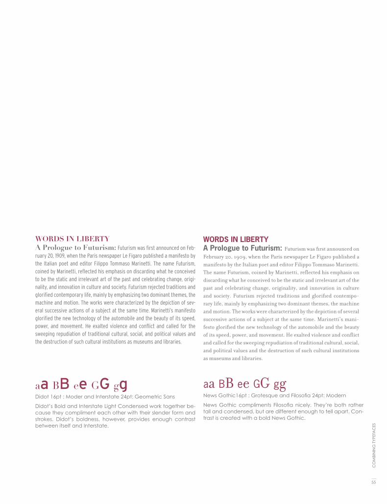
WORDS IN LIBERTYA Prologue to Futurism: Futurism was first announced on Feb-ruary 20, 1909, when the Paris newspaper Le Figaro published a manifesto by the Italian poet and editor Filippo Tommaso Marinetti. The name Futurism, coined by Marinetti, reflected his emphasis on discarding what he conceived to be the static and irrelevant art of the past and celebrating change, origi-nality, and innovation in culture and society. Futurism rejected traditions and glorified contemporary life, mainly by emphasizing two dominant themes, the machine and motion. The works were characterized by the depiction of sev-eral successive actions of a subject at the same time. Marinetti’s manifesto glorified the new technology of the automobile and the beauty of its speed, power, and movement. He exalted violence and conflict and called for the sweeping repudiation of traditional cultural, social, and political values and the destruction of such cultural institutions as museums and libraries.
aa BB ee GG ggDidot 16pt : Moder and Interstate 24pt: Geometric Sans
Didot’s Bold and Interstate Light Condensed work together be-cause they compliment each other with their slender form and strokes. Didot’s boldness, however, provides enough contrast between itself and Interstate.
WORDS IN LIBERTYA Prologue to Futurism: Futurism was first announced on February 20, 1909, when the Paris newspaper Le Figaro published a manifesto by the Italian poet and editor Filippo Tommaso Marinetti. The name Futurism, coined by Marinetti, reflected his emphasis on discarding what he conceived to be the static and irrelevant art of the past and celebrating change, originality, and innovation in culture and society. Futurism rejected traditions and glorified contempo-rary life, mainly by emphasizing two dominant themes, the machine and motion. The works were characterized by the depiction of several successive actions of a subject at the same time. Marinetti’s mani-festo glorified the new technology of the automobile and the beauty of its speed, power, and movement. He exalted violence and conflict and called for the sweeping repudiation of traditional cultural, social, and political values and the destruction of such cultural institutions as museums and libraries.
aa BB ee GG ggNews Gothic16pt : Grotesque and Filosofia 24pt: Modern
News Gothic compliments Filosofia nicely. They’re both rather tall and condensed, but are different enough to tell apart. Con-trast is created with a bold News Gothic.
55
CO
MBI
NIN
G T
YPEF
AC
ES

WORDS IN LIBERTYA Prologue to Futurism: Futurism was first announced
on February 20, 1909, when the Paris newspaper Le Figaro pub-
lished a manifesto by the Italian poet and editor Filippo Tommaso
Marinetti. The name Futurism, coined by Marinetti, reflected his
emphasis on discarding what he conceived to be the static and
irrelevant art of the past and celebrating change, originality,
and innovation in culture and society. Futurism rejected tradi-
tions and glorified contemporary life, mainly by emphasizing
two dominant themes, the machine and motion. The works were
characterized by the depiction of several successive actions of a
subject at the same time. Marinetti’s manifesto glorified the new
technology of the automobile and the beauty of its speed, power,
and movement. He exalted violence and conflict and called for
the sweeping repudiation of traditional cultural, social, and po-
litical values and the destruction of such cultural institutions as
museums and libraries.
aa BB ee GG ggFutura16pt : Geometric and Swift 24pt: Transitional
Swift’s angular characteristics work well with Futura’s geometric forms. Both are heavier in stroke weight, but Swift is lighter.
WORDS IN LIBERTYA Prologue to Futurism: Futurism was first announced on February 20, 1909, when the Paris newspaper Le Figaro published a manifesto by the Italian poet and editor Filippo Tommaso Marinetti. The name Futurism, coined by Mari-netti, reflected his emphasis on discarding what he con-ceived to be the static and irrelevant art of the past and cel-ebrating change, originality, and innovation in culture and society. Futurism rejected traditions and glorified contem-porary life, mainly by emphasizing two dominant themes, the machine and motion. The works were characterized by the depiction of several successive actions of a subject at the same time. Marinetti’s manifesto glorified the new technol-ogy of the automobile and the beauty of its speed, power, and movement. He exalted violence and conflict and called for the sweeping repudiation of traditional cultural, social, and political values and the destruction of such cultural in-stitutions as museums and libraries.
aa BB ee GG ggTrade Gothic 16pt : Grotesque and Bookman 24pt: Old-Style
News Gothic compliments Filosofia nicely. They’re both rather tall and condensed, but are different enough to tell apart. Con-trast is created with a bold News Gothic.
56
TYPO
GR
APH
IC E
SSEN
TIA
LS

WORDS IN LIBERTYA Prologue to Futurism: Futurism was first an-nounced on February 20, 1909, when the Paris newspaper Le Fi-garo published a manifesto by the Italian poet and editor Filippo Tommaso Marinetti. The name Futurism, coined by Marinetti, reflect-ed his emphasis on discarding what he conceived to be the static and irrelevant art of the past and celebrating change, originality, and innovation in culture and society. Futurism rejected traditions and glorified contemporary life, mainly by emphasizing two domi-nant themes, the machine and motion. The works were character-ized by the depiction of several successive actions of a subject at the same time. Marinetti’s manifesto glorified the new technology of the automobile and the beauty of its speed, power, and move-ment. He exalted violence and conflict and called for the sweeping repudiation of traditional cultural, social, and political values and the destruction of such cultural institutions as museums and libraries.
aa BB ee GG ggBelizio 16pt : Slab Serif and Futura 24pt: Geometric
In this composition, Belizio’s thick, curvilinear forms as well as its dark color contrast go well with Futura’s light geometric shapes.
WORDS IN LIBERTYA Prologue to Futurism: Futurism was first an-nounced on February 20, 1909, when the Paris newspaper Le Figaro published a manifesto by the Italian poet and editor Filippo Tommaso Marinetti. The name Futurism, coined by Marinetti, reflected his em-phasis on discarding what he conceived to be the static and irrelevant art of the past and celebrating change, originality, and innovation in culture and society. Futurism rejected traditions and glorified contem-porary life, mainly by emphasizing two dominant themes, the machine and motion. The works were characterized by the depiction of sev-eral successive actions of a subject at the same time. Marinetti’s mani-festo glorified the new technology of the automobile and the beauty of its speed, power, and movement. He exalted violence and conflict and called for the sweeping repudiation of traditional cultural, social, and political values and the destruction of such cultural institutions as museums and libraries.
aa BB ee GG ggVolta 16pt : Slab Serif and Gill Sans 24pt: Humanist
The humanist qualities of Gill Sans work with Volta’s thick color to create a well-balanced composition. Volta is in medium, Gill Sans is in light.
57
CO
MBI
NIN
G T
YPEF
AC
ES

“”””””””””””””””””””””””””””””””””””””””””””””
“””””””””””””””””””””””””””””””””””””””””””””””””””””””””””
“””””””””””””””””””””””””””””””””””””””””””””””””””””””””””””””””””””””””””””””””””””””””””””””””””
“”””””””””””””””””””””””””””
“””””””””””””””””””””””””””””””””””””””””””””””
“””””””””””””””””””””””””””””””””””””””””””””””
“””””””””””””””””””””””””””””””””””””””””””””””””””””””””””
“””””””””””””””””””””””””””””””””””””””””””””””””””””””””””””””””””””””””””””””””””””””””””””””””””
“”””””””””””””””””””””””””””””””””””””””””””””””””””””
“””””””””””””””””””””””””””””””””””””””””””””””””””””””””””””””””””””””””””””””””””””””””””””””””””

quotes, apostrophes, & dashes
7

Quotation MarksUse real quotation marks—never those grotesque generic marks that actu-ally symbolize ditto/inch or foot marks: use “and” for quotes—not "and". Most software applications will convert the typewriter quotes to the real quotes for you automatically as you type. Check the preferences for your application—you’ll find a check box to tell your application to automatically set something like “typographer’s quotes,” “smart quotes,” or “curly quotes.” Then as you type using the standard ditto key ("), the software will set the correct quota-tion marks for you. But it is necessary to know how to set them yourself be-cause sometimes the software doesn’t do it or does it wrong.
ApostropheFor possessives: Turn the phrase around. The apostrophe will be placed after whatever word you end up with. For example, in the phrase the boys’ camp, to know where to place the apostrophe say to yourself, “The camp belongs to the boys.” The phrase the boy’s camp says “The camp belongs to the boy.”
“The big exception to this is “its.” “Its” used as a possessive never has an apos-trophe! The word “it” only has an apostrophe as a contraction—“it’s” always means “it is” or “it has.” Always.
It may be easier to remember if you recall that yours, hers, and his don’t use apostrophes—and neither should its. For contractions: The apostrophe replaces the missing letter. For example: you’re always means you are; the apostrophe is replacing the a from are. That’s an easy way to distinguish it
QUESTION MARKS & APOSTROPHES
“ Option [” Option Shift [‘ Option ]’ Option Shift ]
Bridge Clearance: 16' 7 " The young man stood 6' 2"
“““““““““““““““““““““““““““““““““““““““““““““““““““““““““““““““““““““““““““““““““““““““““““““““““““““““““““““““
60
TYPO
GR
APH
IC E
SSEN
TIA
LS
feet and inch marks

from your as in your house and to make sure you don’t say: Your going to the store. As previously noted, it’s means “it is”; the apostrophe is indicating where the i is left out. Don’t means “do not”; now the apostrophe is indicat-ing where the o is left out.
For omission of letters: In a phrase such as Rock ’n’ Roll, there should be an apostrophe before and after the n, because the a and the d are both left out. And don’t turn the first apostrophe around—just because it appears in front of the letter does not mean you need to use the opposite single quote. An apostrophe is still the appropriate mark (not ‘n’).
In a phrase such as House o’ Fashion, the apostrophe takes the place of the f. There is not really a reason for an apostrophe to be set before the o.
In a phrase such as Gone Fishin’ the same pattern is followed—the g on “fishing” is missing.
In a date when part of the year is left out, an apostrophe needs to indicate the missing year. In the 80s would mean the temperature; In the ’80s would mean the decade. (Notice there is no apostrophe before the s! Why would there be? It is not possessive, nor is it a contraction—it is simply plural.)
DashesNever use two hyphens instead of a dash.Use hyphens, en dashes, and em dashes appropriately.
Everyone knows what a hyphens is—that tiny little dash that belongs in some words, like mother-in-law, or in phone numbers. It’s also used to break a word at the end of a line, of course.
You might have been taught to use a double hyphen to indicate a dash, like so: -- . This is a typewriter convention because typewriters didn’t have the real dash used in professional typesetting. On a Mac, no one needs to use the double hyphen—we have a professional em dash, the long one, such as you see in this sentence. We also have an en dash, which is a little shorter than the em dash.
61
QU
OTE
S, A
POST
RO
PHES
, & D
AH
ES

HyphenA hyphen is one third of the em rule and is used to link words. It serves as a compound modifier where two words become one, such as x-height. A hyphen is also used to break works at syllables in text blocks.
En dashTo type an en dash:en dash – Option Hyphenhold the Option key down, then tap the hyphen key
An en dash is half of the em rule (the width of a capital N) and is used be-tween words that indicate a duration, such as time or months or years. Use it where you might otherwise use the word “to.” In a page layout application, the en dash can be used with a thin space on either side of it. If you want you can kern it so that it doesn’t have to be a full space.
Em dashTo type an em dash:em dash — Shift Option Hyphenhold the Shift and Option keys down, then tap the hyphen key.
The em dash is twice as long as the en dash—it’s about the size of a capital letter M in whatever size and typeface you’re using at the moment. This dash is often used in place of a colon or parentheses, or it might indicate an abrupt change in thought, or it’s used in a spot where a period is too strong and a comma is too weak.
Our equivalent on the typewriter was the double hyphen, but now we have a real em dash. Using two hyphens (or worse, one) where there should be an em dash makes your look very unprofessional. When using an—no space is used on either side.
DASHES & HYPHENS
hyphen -en dash –em dash —
“““““““““““““““““““““““““““““““““““““““““““““““““““““““““““““““““““““““““““““““““““““““““““““““““““““““““““““““
62
TYPO
GR
APH
IC E
SSEN
TIA
LS


hgfkjkhhkj
lk;sda,mxciouwqer907345asd.,weq;dsm,vm,cxi
oupqwerytopqa;mkncxvfowe/
as
dj
fk
hb
qwe
rp
oi
ue
th
y;zx.
/c
nv
li
a[
c/
sm
cl
/s
da
sd
;k
fl
me
wr
iu
tp
o;
cxm
,m
,d
as
df
lk
mn
we
qr
sa
kl
jd
s,m
xdf
io
vu
we
qr
izs
c,d
fs
a
hgfkj
khhkjlk;sda,mxciouwqer907345asd.,weq;
dsm,vm,cxioupqwerytopq
hgfkjk
hhkjlk;sda,mxciouwqer907345asd.,weq;dsm,vm,
as
dj
fk
hb
qwe
rp
oi
ue
th
y;zx.
/c
nv
li
a[
c/
sm
cl
/s
da
sd
;k
fl
me
wr
iu
tp
o;
cxm
,m
,d
as
df
lk
mn
we
qr
sa
kl
jd
s,m
xdf
io
vu
we
qr
izs
c,d
fs
a
as
dj
fk
hb
qwe
rp
oi
ue
th
y;zx.
/c
nv
li
a[
c/
sm
cl
/s
da
sd
;k
fl
me
wr
iu
tp
o;
cxm
,m
,d
as
df
lk
m
as
dj
fk
hb
qwe
rp
oi
ue
th
y;zx.
/c
nv
li
a[
c/
sm
cl
/s
da
sd
;k
fl
me
wr
iu
tp
o;
cxm
,m
,d
as
df
lk
mn
we
qr
sa
kl
jd
s,m
xdf
io
vu
we
qr
izs
c,d
fs
a
hgfkj
khhkjlk;sda,mxciouwqer907345asd.,weq
hgfkjkhhkjlk;sda,mxciouwqer907345asd.,weq;dsm,vm,cxioupqwerytopq
hgfkjkhhkj
lk;sda,mxciouwqer907345asd.,weq;dsm,vm,cxi
oupqwerytopqa;mkncxvfowe/
as
dj
fk
hb
qwe
rp
oi
ue
th
y;zx.
/c
nv
li
a[
c/
sm
cl
/s
da
sd
;k
fl
me
wr
iu
tp
o;
cxm
,m
,d
as
df
lk
mn
we
qr
sa
kl
jd
s,m
xdf
io
vu
we
qr
izs
c,d
fs
a
hgfk
jkhhkjlk;sda,mxciouwqer907345asd.,weq;
dsm,vm,cxioupqwerytopq
hgfkj
khhkjlk;sda,mxciouwqer907345asd.,weq;dsm,vm,
as
dj
fk
hb
qwe
rp
oi
ue
th
y;zx.
/c
nv
li
a[
c/
sm
cl
/s
da
sd
;k
fl
me
wr
iu
tp
o;
cxm
,m
,d
as
df
lk
mn
we
qr
sa
kl
jd
s,m
xdf
io
vu
we
qr
izs
c,d
fs
a
as
dj
fk
hb
qwe
rp
oi
ue
th
y;zx.
/c
nv
li
a[
c/
sm
cl
/s
da
sd
;k
fl
me
wr
iu
tp
o;
cxm
,m
,d
as
df
lk
m
as
dj
fk
hb
qwe
rp
oi
ue
th
y;zx.
/c
nv
li
a[
c/
sm
cl
/s
da
sd
;k
fl
me
wr
iu
tp
o;
cxm
,m
,d
as
df
lk
mn
we
qr
sa
kl
jd
s,m
xdf
io
vu
we
qr
izs
c,d
fs
a
hgfkjkhhkjlk;sda,mxciouwqer907345asd.,weq
hgfkjkhhkjlk;sda,mxciouwqer907345asd.,weq;dsm,vm,cxioupqwerytopq

special characters
hgfkjkhhkjlk;sda,mxciouwqer907345asd.,weq
8

“ Option [ opening double quote” Option Shift [ closing double quote‘ Option ] opening single quote’ Option Shift ] closing single quote; apostrophe– Option Hyphen en dash— Option Shift Hyphen em dash… Option ; ellipsis • Option 8 bulletfi Option Shift 5 ligature of f and ifl Option Shift 6 ligature of f and l€ Option Shift 2 Euro symbol⁄ Option Shift 1 (one) fraction bar ° Option Shift 8 degree symbol (102°F)© Option g copyright symbol™ Option 2 trademark symbol® Option r registered symbol¢ Option $ ¡ Option 1 (one)¿ Option Shift ?£ Option 3ç Option c Ç Option Shift c
´ Option e` Option ~ ¨ Option u˜ Option nˆ Option i
The following is a list of the most often-used special characters and accent marks. On the following pages are the key combinations for just about every accent you might need.
Remember, to set an accent mark over a letter, press the Option key and the letter, then press the letter you want under it.
SPECIAL CHARACTERShgfkjkhhkjlk;sda,mxciouwqer907345asd.,weq;dsm,vm,cxioupqwerytopq hgfkjkhhkjlk;sda,mxciouwqer907345asd.,weq;dsm,vm,cxioupqwerytopqouwqer907345asd.,weq;dsm,vm,cxioupqwerytopq
66
TYPO
GR
APH
IC E
SSEN
TIA
LS


bullets
9

Bullets, of course! This is a very useful typographic element that can add emphasis, clarity and visual interest. Simply put, a bullet is a large dot used to draw attention to each item in a list or series. The items can be single words, phrases, sentences or paragraphs. Even if you use the bullet that is part of your font, don’t automatically assume it’s the right size: it might need to be altered in scale or position to make it look balanced next to the text.
Bullets should be centered on either the cap height or x-height, depending on the nature of your copy. If all of your items begin with a cap, center the bullet on the cap, or a bit lower so it balances with the negative spaces created by the lowercase. If your items all begin with lowercase charac-ters, center the bullets on the x-height. Insert some space after the bullet to avoid over-crowding.
The preferred way to align bullets is with the left margin. You can also have the bullets overhang the margin, and keep all your text aligned with the left margin. Whichever style you choose, your listing will look best if items that run more than one line are indented so that the copy aligns with itself, and not with the bullet on the first line.
To be more creative, substitute symbols or dingbats for the actual bullets. Try squares, triangles or check marks (just not all at once, as shown in the illustration!). Keep these simple and in proportion with the rest of your text.
BULLETS
70
TYPO
GR
APH
IC E
SSEN
TIA
LS
Bullets, of course!
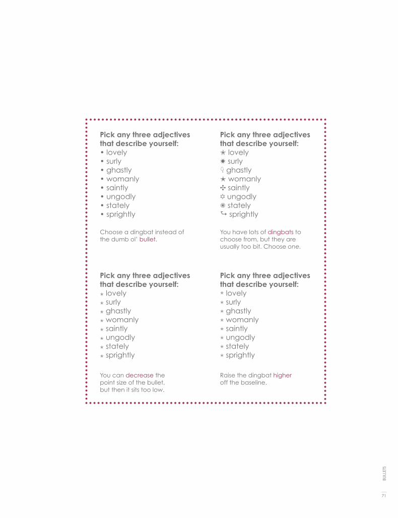
Pick any three adjectivesthat describe yourself:• lovely• surly• ghastly• womanly• saintly• ungodly• stately• sprightly
Pick any three adjectivesthat describe yourself:L lovelyW surlyK ghastlyM womanlyC saintlyA ungodlyZ statelyA sprightly
Pick any three adjectivesthat describe yourself:L lovelyL surlyL ghastlyL womanlyL saintlyL ungodlyL statelyL sprightly
Choose a dingbat instead of the dumb ol’ bullet.
You have lots of dingbats to choose from, but they are usually too bit. Choose one.
You can decrease the point size of the bullet, but then it sits too low.
Raise the dingbat higher off the baseline.
Pick any three adjectivesthat describe yourself:L lovelyL surlyL ghastlyL womanlyL saintlyL ungodlyL statelyL sprightly
71
BULL
ETS

1092873568970123487643034857987013287484759847529834934563874019283748365902101238478
1092873568970123487643034857987013287484759847529834934563874019283748365902101238478
109287356897012348764303485798748365902101238478
10928735689701234874392853401238478
1092873568970123487643034857987013287484759847529873459872389475602934875289347502346-0981349834934563874019283748365902101238478
109287356897012348764303485798748365902101238478
1092873568970123487643034857987013287484759847529873459872389475602934875289347502346-0981349834934563874019283748365902101238478
1092873568970123487643034857987013287484759847529834934563874019283748365902101238478
1092873568970123487643034857987013287484759847529834934563874019283748365902101238478
109287356897012348764303485798748365902101238478
1092873568970123487643034857987013287484759847529834934563874019283748365902101238478
1092873568970123487643034857987013287484759847529834934563874019283748365902101238478
109287356897012348764303485798748365902101238478
10928735689701234874392853401238478
1092873568970123487643034857987013287484759847529873459872389475602934875289347502346-0981349834934563874019283748365902101238478
109287356897012348764303485798748365902101238478
1092873568970123487643034857987013287484759847529873459872389475602934875289347502346-0981349834934563874019283748365902101238478
1092873568970123487643034857987013287484759847529834934563874019283748365902101238478
1092873568970123487643034857987013287484759847529834934563874019283748365902101238478
109287356897012348764303485798748365902101238478

numerals & figures
10
1092873568970123487643034857987013287484759847529834934563874019283748365902101238478
1092873568970123487643034857987013287484759847529834934563874019283748365902101238478
109287356897012348764303485798748365902101238478
10928735689701234874392853401238478
1092873568970123487643034857987013287484759847529873459872389475602934875289347502346-0981349834934563874019283748365902101238478
109287356897012348764303485798748365902101238478
1092873568970123487643034857987013287484759847529873459872389475602934875289347502346-0981349834934563874019283748365902101238478
1092873568970123487643034857987013287484759847529834934563874019283748365902101238478
1092873568970123487643034857987013287484759847529834934563874019283748365902101238478
109287356897012348764303485798748365902101238478

Oldstyle figures are a style of numeral which approximate lowercase letter-forms by having an x-height and varying ascenders and descenders. They are considerably different from the more common “lining” (or “aligning”) figures which are all-cap height and typically monospaced in text faces so that they line up vertically on charts. Oldstyle figures have more of a tradi-tional, classic look. They are only available for certain typefaces, sometimes as the regular numerals in a font, but more often within a supplementary or expert font. The figures are proportionately spaced, eliminating the white spaces that result from monospaced lining figures, especially around the numeral one.
Oldstyle figures are very useful and quite beautiful when set within text. Un-like lining figures, they blend in without disturbing the color of the body copy. They also work well in headlines since they’re not as intrusive as lining figures. In fact, many people prefer them overall for most uses except charts and tables. It’s well worth the extra effort to track down and obtain typefaces with oldstyle numerals; the fonts that contain them might well become some of your favorites.
NUMERALS & FIGURES091283746590182734091237548632108768975649387SD4879128367481263510238468723654102834636751982374012736549817561023896741087365102839469817561083264017651092836548173560128934701298365876354019283740165139287401983650192837098720817238498213758293847861928344
74
TYPO
GR
APH
IC E
SSEN
TIA
LS

Dear John,Please call me at 438–9762 at 3:00.Or write to me at Route 913, zip code 87505.
Dear John,Please call me at 438–9762 at 3:00.Or write to me at Route 913, zip code 87505.
75
NU
MER
ALS
& F
IGU
RES

small caps
11

Small caps are uppercase (capital) letters that are about the size of normal lowercase letters in any given typeface. Small caps are less intrusive when all uppercase appears within normal text or can be used for special emphasis. Computer programs can generate small caps for a any typeface, but those are not the same as true small caps. True small caps have line weights that are proportionally correct for the typeface, which means that they can be used within a body of copy without looking noticeably wrong.
• Use small caps for acronyms. Set acronyms such as NASA or NASDAQ in small caps when they appear in body text or headlines.
• Use small caps for common abbreviations. Set common abbreviations such as AM or PM in small caps so they don't overpower the accompanying text. Use small caps for A.M. and P.M.; space once after the number, and use periods. (If the font does not have small caps reduce the font size slightly.)
• Use true small caps fonts. Avoid simply resizing capital letters or using the small caps feature in some programs. Instead use typefaces that have been specifically created as small caps.
SMALL CAPS
78
TYPO
GR
APH
IC E
SSEN
TIA
LS

If you set acronyms in regular all caps, their visual presence is unnecessarily overwhelming. One standard and practical place to use small caps is in ac-ronyms such as FBI, CBS, or SIMM.
Traditionally, “A.M.” and “P.M.”, are set with small caps. If you were taught to type on a typewriter (or if you were taught on a keyboard by someone who was taught on a typewriter), you probably learned to set these abbreviations in all caps because there were no small caps on typewriters. But now that you have the capability, you can and should set them properly.
Harriet, an FBI agent turned on CNN to get the dirt on the CIA before going to bed at 9:30 P.M.
Harriet, an FBI agent turned on CNN to get the dirt on the CIA before going to bed at 9:30 P.M.
The capital letters in the middle of the sentence call too much attention to themselves. Notice how the small caps blend in with the text. The capital letters for P.M. are much too large—the ab-breviation is not that important.
The Wicked Are Very WeAry The weight of the computer-drawn small caps is thinner than the weight of the regular initial (first letter) caps.
79
SMA
LL C
APS


12paragraph breaks

Paragraph breaks set a rhythm for the reader. The breaks have a relationship with the column of text as well as the page margins. A break may be intro-duced as an indentation, as a space or both. The overall page feel will be influenced by your choice.
In typography there are 4 rules regarding paragraph breaks:
1. First line at the beginning of an article should be flush left (do not indent the first paragraph).
2. Block paragraphs are flush left and are separated by extra leading, not a full return.
3. The amount to indent is = to the leading (sometimes needs a bit more).4. Never hit two returns between paragraphs.
PARAGRAPH BREAKS
82
TYPO
GR
APH
IC E
SSEN
TIA
LS

Futurism was first announced on February 20, 1909, when the Paris newspaper Le Figaro published a manifesto by the Italian poet and editor Filippo Tommaso Marinetti. The name Futurism, coined by Mari-
netti, reflected his emphasis on discarding what he conceived to be the static and irrelevant art of the past and celebrating change, originality, and inno-vation in culture and society.1 He exalted violence and conflict and called for the sweeping repudiation of traditional cultural, social, and political values and the destruction of such cultural institutions as museums and libraries. The manifesto’s rhetoric was passionately bombastic; its tone was aggressive and inflammatory and was purposely intended to inspire public anger and amaze-ment, to arouse controversy, and to attract widespread attention.
But it is the movements which survive, oddly, here where we live and work as poets and artists: or, if not the movements, then their sense
of art as a life itself. All of which, as futurism, had come sharply into focus by the start of the world war: a first radical mix of art and life, the epitome in the poplar mind of an avant-garde. It was, on both its Russian & Italian sides, the first great “art” movement led by poets; and if its means now sometimes seem exaggerated or unripe in retrospect, they carry within them the seed of all that we were later to become.
While Marinetti’s opening manifesto for Italian Futurism bristled with a polemical stance in favor of the transformed present (1909), the later
manifestos of Futurist poets & artists offered formal, ”technical” approaches to the works then getting under way. The key term—still resonant today—was pa-role in liberta2 , by which poetry was to become “an uninterrupted sequence of new images… (a) strict bet of images or analogies, to be cast into the mys-terious sea of phenomena.” This freedom-of-the-world, while it resembled oth-er forms of collage and of image juxtaposition, more fully explored the use of innovative and expressive typography in the visual presentation of language, as set in motion by forerunners like Mallarme.] Outrageous and aggressive, the Futurists’ performances mixed declamation and gesture, events and surround-ings, indifference and engagement, to break the barriers between themselves and those who came to jeer or cheer them. Wrote Marinetti Selbst3 (circa 1915): Everything of any value is theatrical.”
83
PAR
AG
RA
PH B
REA
KS

Futurism was first announced on February 20, 1909, when the Paris news-paper Le Figaro published a manifesto by the Italian poet and editor Filippo Tommaso Marinetti. The name Futurism, coined by Marinetti, re-flected his emphasis on discarding what he conceived to be the static and irrelevant art of the past and celebrating change, originality, and innovation in culture and society.1 He exalted violence and conflict and called for the sweeping repudiation of traditional cultural, social, and political values and the destruction of such cultural institutions as muse-ums and libraries. The manifesto’s rhetoric was passionately bombastic; its tone was aggressive and inflammatory and was purposely intended to inspire public anger and amazement, to arouse controversy, and to attract widespread attention.
But it is the movements which survive, oddly, here where we live and work as poets and artists: or, if not the movements, then their sense of art as a life itself. All of which, as futurism, had come sharply into focus by the start of the world war: a first radical mix of art and life, the epitome in the poplar mind of an avant-garde. It was, on both its Russian & Italian sides, the first great “art” movement led by poets; and if its means now sometimes seem exaggerated or unripe in retrospect, they carry within them the seed of all that we were later to become.
While Marinetti’s opening manifesto for Italian Futurism bristled with a polemical stance in favor of the transformed present (1909), the later manifestos of Futurist poets & artists offered formal, “techni-cal” approaches to the works then getting under way. The key term—still resonant today—was parole in liberta2, by which poet-ry was to become “an uninterrupted sequence of new images… (a) strict bet of images or analogies, to be cast into the mysterious sea of phenomena.” This freedom-of-the-world, while it resembled other forms of collage and of image juxtaposition, more fully ex-plored the use of innovative and expressive typography in the vi-sual presentation of language, as set in motion by forerunners like Mallarme. Outrageous and aggressive, the Futurists’ performances mixed declamation and gesture, events and surroundings, indiffer-ence and engagement, to break the barriers between themselves and those who came to jeer or cheer them. Wrote Marinetti Selbst3 (circa 1915): “Everything of any value is theatrical.”
84
TYPO
GR
APH
IC E
SSEN
TIA
LS

85
PAR
AG
RA
PH B
REA
KS
Futurism was first announcedon February 20, 1909, when the Paris news-paper Le Figaro published a manifesto by the Italian poet and editor Filippo Tommaso Marinetti. The name Futurism, coined by Marinetti, reflected his em-phasis on discarding what he conceived to be the static and irrelevant art of the past and celebrating change, originality, and innovation in culture and society.1 He exalted violence and conflict and called for the sweeping repu-diation of traditional cultural, social, and political values and the destruction of such cultural institutions as museums and libraries. The manifesto’s rhetoric was passionately bombastic; its tone was aggressive and inflammatory and was purposely intended to inspire public anger and amazement, to arouse controversy, and to attract widespread attention.
But it is the movements which survive, oddly, here where we live and work as poets and artists: or, if not the movements, then their sense of art as a life itself. All of which, as futurism, had come sharply into focus by the start of the world war: a first radical mix of art and life, the epitome in the pop-lar mind of an avant-garde. It was, on both its Russian & Italian sides, the first great “art” movement led by poets; and if its means now sometimes seem exaggerated or unripe in retrospect, they carry within them the seed of all that we were later to become.
While Marinetti’s opening manifesto for Italian Futurism bristled with a polemical stance in favor of the transformed present (1909), the later manifestos of Futurist poets & artists offered formal, “technical” approaches to the works then getting under way. The key term—still resonant today—was parole in liberta2, by which poetry was to become “an uninterrupted sequence of new images… (a) strict bet of images or analogies, to be cast into the mysterious sea of phenomena.” This freedom-of-the-world, while it resembled other forms of collage and of image juxtaposition, more fully ex-plored the use of innovative and expressive typography in the visual presen-tation of language, as set in motion by forerunners like Mallarme. Outrageous and aggressive, the Futurists’ performances mixed declamation and gesture, events and surroundings, indifference and engagement, to break the barri-ers between themselves and those who came to jeer or cheer them. Wrote Marinetti Selbst3 (circa 1915): “Everything of any value is theatrical.”

86
TYPO
GR
APH
IC E
SSEN
TIA
LS
Futurism was first announced on February 20, 1909, when the Paris newspaper Le Figaro published a manifesto by the Italian poet and editor Filippo Tom-maso Marinetti. The name Futurism, coined by Marinetti, reflected his em-phasis on discarding what he conceived to be the static and irrelevant art of the past and celebrating change, originality, and innovation in culture and society.1 He exalted violence and conflict and called for the sweeping repu-diation of traditional cultural, social, and political values and the destruction of such cultural institutions as museums and libraries. The manifesto’s rhetoric was passionately bombastic; its tone was aggressive and inflammatory and was purposely intended to inspire public anger and amazement, to arouse controversy, and to attract widespread attention._________________________But it is the movements which survive, oddly, here where we live and work as poets and artists: or, if not the movements, then their sense of art as a life itself. All of which, as futurism, had come sharply into focus by the start of the world war: a first radical mix of art and life, the epitome in the poplar mind of an avant-garde. It was, on both its Russian & Italian sides, the first great “art” movement led by poets; and if its means now sometimes seem exaggerated or unripe in retrospect, they carry within them the seed of all that we were later to become._________________________________________________________While Marinetti’s opening manifesto for Italian Futurism bristled with a polemi-cal stance in favor of the transformed present (1909), the later manifestos of Futurist poets & artists offered formal, “technical” approaches to the works then getting under way. The key term—still resonant today—was parole in liberta2, by which poetry was to become “an uninterrupted sequence of new images… (a) strict bet of images or analogies, to be cast into the mysteri-ous sea of phenomena.” This freedom-of-the-world, while it resembled other forms of collage and of image juxtaposition, more fully explored the use of innovative and expressive typography in the visual presentation of language, as set in motion by forerunners like Mallarme. Outrageous and aggressive, the Futurists’ performances mixed declamation and gesture, events and surroundings, indifference and engagement, to break the barriers between themselves and those who came to jeer or cheer them. Wrote Marinetti Selbst3 (circa 1915): “Everything of any value is theatrical.”

87
PAR
AG
RA
PH B
REA
KS
Futurism was first announced on February 20, 1909, when the Paris newspaper Le Figaro published a manifesto by the Italian poet and editor Filippo Tom-maso Marinetti. The name Futurism, coined by Marinetti, reflected his em-phasis on discarding what he conceived to be the static and irrelevant art of the past and celebrating change, originality, and innovation in culture and society.1 He exalted violence and conflict and called for the sweeping repu-diation of traditional cultural, social, and political values and the destruction of such cultural institutions as museums and libraries. The manifesto’s rhetoric was passionately bombastic; its tone was aggressive and inflammatory and was purposely intended to inspire public anger and amazement, to arouse controversy, and to attract widespread attention.
But it is the movements which survive, oddly, here where we live and work as poets and artists: or, if not the movements, then their sense of art as a life itself. All of which, as futurism, had come sharply into focus by the startof the world war: a first radical mix of art and life, the epitome in the poplar mind of an avant-garde. It was, on both its Russian & Italian sides, the first great “art” movement led by poets; and if its means now sometimes seem exaggerated or unripe in retrospect, they carry within them the seed of all that we were later to become.
While Marinetti’s opening manifesto for Italian Futurism bristled with a polemi-cal stance in favor of the transformed present (1909), the later manifestos of Futurist poets & artists offered formal, “technical” approaches to the works then getting under way. The key term—still resonant today—was parole in liberta2, by which poetry was to become “an uninterrupted sequence of new images… (a) strict bet of images or analogies, to be cast into the mysteri-ous sea of phenomena.” This freedom-of-the-world, while it resembled other forms of collage and of image juxtaposition, more fully explored the use of innovative and expressive typography in the visual presentation of language, as set in motion by forerunners like Mallarme. Outrageous and aggressive, the Futurists’ performances mixed declamation and gesture, events and surroundings, indifference and engagement, to break the barriers between themselves and those who came to jeer or cheer them. Wrote Marinetti Selbst3 (circa 1915): “Everything of any value is theatrical.”

88
TYPO
GR
APH
IC E
SSEN
TIA
LS
__________Futurism was first announced on February 20, 1909, when the Paris newspaper Le Figaro published a manifesto by the Italian poet and editor Filippo Tommaso Marinetti. The name Futurism, coined by Marinetti, reflected his emphasis on discarding what he conceived to be the static and irrelevant art of the past and celebrating change, originality, and innovation in culture and society.1 He exalted violence and conflict and called for the sweeping repudiation of traditional cultural, social, and political values and the de-struction of such cultural institutions as museums and libraries. The manifesto’s rhetoric was passionately bombastic; its tone was aggressive and inflamma-tory and was purposely intended to inspire public anger and amazement, to arouse controversy, and to attract widespread attention._____But it is the movements which survive, oddly, here where we live and work as poets and artists: or, if not the movements, then their sense of art as a life itself. All of which, as futurism, had come sharply into focus by the start of the world war: a first radical mix of art and life, the epitome in the poplar mind of an avant-garde. It was, on both its Russian & Italian sides, the first great “art” movement led by poets; and if its means now sometimes seem exaggerated or unripe in retrospect, they carry within them the seed of all that we were later to become._____While Marinetti’s opening manifesto for Italian Futurism bristled with a polemical stance in favor of the transformed present (1909), the later manifestos of Futurist poets & artists offered formal, “technical” approaches to the works then getting under way. The key term—still resonant today—was parole in liberta2, by which poetry was to become “an uninterrupted sequence of new images… (a) strict bet of images or analogies, to be cast into the mysterious sea of phenomena.” This freedom-of-the-world, while it resembled other forms of collage and of image juxtaposition, more fully ex-plored the use of innovative and expressive typography in the visual presen-tation of language, as set in motion by forerunners like Mallarme. Outrageous and aggressive, the Futurists’ performances mixed declamation and gesture, events and surroundings, indifference and engagement, to break the barri-ers between themselves and those who came to jeer or cheer them. Wrote Marinetti Selbst3 (circa 1915): “Everything of any value is theatrical.”

89
PAR
AG
RA
PH B
REA
KS
F u t u r i s m w a s f i r s t a n n o u n c e d on February 20, 1909, when the Paris newspaper Le Figaro published a mani-festo by the Italian poet and editor Filippo Tommaso Marinetti. The name Futurism, coined by Marinetti, reflected his emphasis on discarding what he conceived to be the static and irrelevant art of the past and celebrat-ing change, originality, and innovation in culture and society.1 He exalted violence and conflict and called for the sweeping repudiation of traditional cultural, social, and political values and the destruction of such cultural insti-tutions as museums and libraries. The manifesto’s rhetoric was passionately bombastic; its tone was aggressive and inflammatory and was purposely in-tended to inspire public anger and amazement, to arouse controversy, and to attract widespread attention.
B u t i t i s t h e m o v e m e n t s w h i c h s u r v i v e , o d d l y , h e r e w h e r e we live and work as poets and artists: or, if not the movements, then their sense of art as a life itself. All of which, as futurism, had come sharply into focus by the start of the world war: a first radical mix of art and life, the epitome in the poplar mind of an avant-garde. It was, on both its Russian & Italian sides, the first great “art” movement led by poets; and if its means now sometimes seem exaggerated or unripe in retrospect, they carry within them the seed of all that we were later to become.
W h i l e M a r i n e t t i ’ s o p e n i n g m a n i f e s t o f o r I t a l i a n F u t u r i s m bristled with a polemical stance in favor of the transformed present (1909), the later manifestos of Futurist poets & artists offered formal, “technical” ap-proaches to the works then getting under way. The key term—still resonant today—was parole in liberta2, by which poetry was to become “an uninter-rupted sequence of new images… (a) strict bet of images or analogies, to be cast into the mysterious sea of phenomena.” This freedom-of-the-world, while it resembled other forms of collage and of image juxtaposition, more fully explored the use of innovative and expressive typography in the visual presentation of language, as set in motion by forerunners like Mallarme. Out-rageous and aggressive, the Futurists’ performances mixed declamation and gesture, events and surroundings, indifference and engagement, to break the barriers between themselves and those who came to jeer or cheer them. Wrote Marinetti Selbst3 (circa 1915): “Everything of any value is theatrical.”

90
TYPO
GR
APH
IC E
SSEN
TIA
LS
Futurism was first announced on February 20, 1909, when the Paris newspaper Le Figaro published a manifesto by the Italian poet and editor Filippo Tommaso Marinetti. The name Futurism, coined by Marinetti, reflected his emphasis on discarding what he conceived to be the static and irrelevant art of the past and celebrating change, originality, and innova-tion in culture and society.1 He exalted violence and conflict and called for the sweeping repudiation of traditional cultural, social, and political values and the destruction of such cultural institutions as museums and libraries. The manifesto’s rhetoric was passionately bombastic; its tone was aggressive and inflammatory and was purposely intended to inspire public anger and amazement, to arouse controversy, and to attract widespread attention.
But it is the movements which survive, oddly, here where we live and work as poets and artists: or, if not the movements, then their sense of art as a life itself. All of which, as futurism, had come sharply into fo-cus by the start of the world war: a first radical mix of art and life, the epitome in the poplar mind of an avant-garde. It was, on both its Russian & Italian sides, the first great “art” movement led by poets; and if its means now some-times seem exaggerated or unripe in retrospect, they carry within them the seed of all that we were later to become.
While Marinetti’s opening manifesto for Italian Futurism bristled with a polemical stance in favor of the transformed present (1909), the later manifestos of Futurist poets & artists offered formal, “technical” ap-proaches to the works then getting under way. The key term—still resonant today—was parole in liberta2, by which poetry was to become “an uninter-rupted sequence of new images… (a) strict bet of images or analogies, to be cast into the mysterious sea of phenomena.” This freedom-of-the-world, while it resembled other forms of collage and of image juxtaposition, more fully explored the use of innovative and expressive typography in the visual presentation of language, as set in motion by forerunners like Mallarme. Out-rageous and aggressive, the Futurists’ performances mixed declamation and gesture, events and surroundings, indifference and engagement, to break the barriers between themselves and those who came to jeer or cheer them. Wrote Marinetti Selbst3 (circa 1915): “Everything of any value is theatrical.”

91
PAR
AG
RA
PH B
REA
KS
Futurism was first announced on February 20, 1909, when the Paris newspa-per Le Figaro published a manifesto by the Italian poet and editor Filippo
Tommaso Marinetti. The name Futurism, coined by Marinetti, reflected his em-phasis on discarding what he conceived to be the static and irrelevant art of the past and celebrating change, originality, and innovation in culture and society.1 He exalted violence and conflict and called for the sweeping repu-diation of traditional cultural, social, and political values and the destruction of such cultural institutions as museums and libraries. The manifesto’s rhetoric was passionately bombastic; its tone was aggressive and inflammatory and was purposely intended to inspire public anger and amazement, to arouse controversy, and to attract widespread attention.
But it is the movements which survive, oddly, here where we live and work as poets and artists: or, if not the movements, then their sense of art as a life itself. All of which, as futurism, had come sharply into focus by the start of the world war: a first radical mix of art and life, the epitome in the poplar mind of an avant-garde. It was, on both its Russian & Italian sides, the first great “art” movement led by poets; and if its means now sometimes seem exaggerated or unripe in retrospect, they carry within them the seed of all that we were later to become.
While Marinetti’s opening manifesto for Italian Futurism bristled with a po-lemical stance in favor of the transformed present (1909), the later manifestos of Futurist poets & artists offered formal, “technical” approaches to the works then getting under way. The key term—still resonant today—was parole in liberta2, by which poetry was to become “an uninterrupted sequence of new images… (a) strict bet of images or analogies, to be cast into the mysteri-ous sea of phenomena.” This freedom-of-the-world, while it resembled other forms of collage and of image juxtaposition, more fully explored the use of innovative and expressive typography in the visual presentation of language, as set in motion by forerunners like Mallarme. Outrageous and aggressive, the Futurists’ performances mixed declamation and gesture, events and surroundings, indifference and engagement, to break the barriers between themselves and those who came to jeer or cheer them. Wrote Marinetti Selbst3 (circa 1915): “Everything of any value is theatrical.”

92
TYPO
GR
APH
IC E
SSEN
TIA
LS
FUTURISM WAS FIRST ANNOUNCED ON FEBRUARY 20, 1909, WHEN THE PARIS newspaper Le Figaro published a manifesto by the Italian poet and editor Filippo Tommaso Marinetti. The name Futurism, coined by Marinetti, reflected his emphasis on discarding what he conceived to be the static and irrelevant art of the past and celebrating change, originality, and innovation in culture and society.1 He exalted violence and conflict and called for the sweeping repudiation of traditional cultural, social, and political values and the de-struction of such cultural institutions as museums and libraries. The manifesto’s rhetoric was passionately bombastic; its tone was aggressive and inflamma-tory and was purposely intended to inspire public anger and amazement, to arouse controversy, and to attract widespread attention.
BUT IT IS THE MOVEMENTS which survive, oddly, here where we live and work as poets and artists: or, if not the movements, then their sense of art as a life itself. All of which, as futurism, had come sharply into focus by the start of the world war: a first radical mix of art and life, the epitome in the poplar mind of an avant-garde. It was, on both its Russian & Italian sides, the first great “art” movement led by poets; and if its means now sometimes seem exaggerated or unripe in retrospect, they carry within them the seed of all that we were later to become.
WHILE MARINETTI’S opening manifesto for Italian Futurism bristled with a polemical stance in favor of the transformed present (1909), the later mani-festos of Futurist poets & artists offered formal, “technical” approaches to the works then getting under way. The key term—still resonant today—was pa-role in liberta2, by which poetry was to become “an uninterrupted sequence of new images… (a) strict bet of images or analogies, to be cast into the mysterious sea of phenomena.” This freedom-of-the-world, while it resembled other forms of collage and of image juxtaposition, more fully explored the use of innovative and expressive typography in the visual presentation of lan-guage, as set in motion by forerunners like Mallarme. Outrageous and ag-gressive, the Futurists’ performances mixed declamation and gesture, events and surroundings, indifference and engagement, to break the barriers be-tween themselves and those who came to jeer or cheer them. Wrote Mari-netti Selbst3 (circa 1915): “Everything of any value is theatrical.”

93
PAR
AG
RA
PH B
REA
KS
n Futurism was first announced on February 20, 1909, when the Paris news-paper Le Figaro published a manifesto by the Italian poet and editor Filippo Tommaso Marinetti. The name Futurism, coined by Marinetti, reflected his em-phasis on discarding what he conceived to be the static and irrelevant art of the past and celebrating change, originality, and innovation in culture and society.1 He exalted violence and conflict and called for the sweeping repu-diation of traditional cultural, social, and political values and the destruction of such cultural institutions as museums and libraries. The manifesto’s rhetoric was passionately bombastic; its tone was aggressive and inflammatory and was purposely intended to inspire public anger and amazement, to arouse controversy, and to attract widespread attention. n But it is the movements which survive, oddly, here where we live and work as poets and artists: or, if not the movements, then their sense of art as a life itself. All of which, as futurism, had come sharply into focus by the start of the world war: a first radical mix of art and life, the epitome in the poplar mind of an avant-garde. It was, on both its Russian & Italian sides, the first great “art” movement led by poets; and if its means now sometimes seem exaggerated or unripe in retrospect, they carry within them the seed of all that we were later to be-come. n While Marinetti’s opening manifesto for Italian Futurism bristled with a polemical stance in favor of the transformed present (1909), the later manifestos of Futurist poets & artists offered formal, “technical” approaches to the works then getting under way. The key term—still resonant today—was parole in liberta2, by which poetry was to become “an uninterrupted sequence of new images… (a) strict bet of images or analogies, to be cast into the mysterious sea of phenomena.” This freedom-of-the-world, while it resembled other forms of collage and of image juxtaposition, more fully ex-plored the use of innovative and expressive typography in the visual presen-tation of language, as set in motion by forerunners like Mallarme. Outrageous and aggressive, the Futurists’ performances mixed declamation and gesture, events and surroundings, indifference and engagement, to break the barri-ers between themselves and those who came to jeer or cheer them. Wrote Marinetti Selbst3 (circa 1915): “Everything of any value is theatrical.”


13headers, subheads, & crossheads

HeaderA line or block of text that appears at the beginning of a document.
SubheadA heading given to a subsection of a piece of writing.
KerningSpacing in a header is the key to creating an appropriate visual hierarchy in a document or page of text. Proper spacing is achieved by kerning. Kerning is the process of removing small amounts of space between letters to cre-ate visually consistent letterspacing. The larger the text is, the more attention should be paid to kerning.
TYPOGRAPHY unkerned
TYPOGRAPHY kerned
The key to kerning is visual perception. The more white space that surrounds an object or letter, the smaller it seems, even if it is next to an object of equal size, but with less white space around it. The pacing between letters may not all be the exact same, but it will appear that way with the proper kerning.
HEADER, SUBHEAD, KERNING
96
TYPO
GR
APH
IC E
SSEN
TIA
LS

Words in LibertyA Prologue to Futurism
Header
Subhead
97
HEA
DER
S, S
UBH
EAD
S, &
CR
OSS
HEA
DS

98
TYPO
GR
APH
IC E
SSEN
TIA
LS
Futurism was first announced on February 20, 1909, when the Paris newspaper Le Figaro published a manifesto by the Italian poet and editor Filippo Tommaso Marinetti. The name Futurism, coined by Marinetti, reflected his emphasis on discarding what he conceived to be the static and irrelevant art of the past and celebrat-ing change, originality, and innovation in culture and society.1 He exalted violence and conflict and called for the sweeping repudiation of traditional cultural, social, and political values and the destruction of such cultural institutions as museums and libraries. The manifesto’s rhetoric was passionately bombastic; its tone was aggressive and inflamma-tory and was purposely intended to inspire public anger and amazement, to arouse con-troversy, and to attract widespread attention.
But it is the movements which survive, oddly, here where we live and work as poets and artists: or, if not the movements, then their sense of art as a life itself. All of which, as futurism, had come sharply into focus by the start of the world war: a first radical mix of art and life, the epitome in the poplar mind of an avant-garde. It was, on both its Russian & Italian sides, the first great “art” movement led by poets; and if its means now sometimes seem exaggerated or unripe in retrospect, they carry within them the seed of all that we were later to become.
While Marinetti’s opening manifesto for Italian Futurism bristled with a polemical stance in favor of the transformed present (1909), the later manifestos of Futurist poets & artists offered formal, “technical” approaches to the works then get-ting under way. The key term—still resonant today—was parole in liberta2, by which poetry was to become “an uninterrupted sequence of new images… (a) strict bet of images or analogies, to be cast into the mysterious sea of phenomena.” This freedom-of-the-world, while it resembled other forms of collage and of image juxtaposition, more fully explored the use of innovative and expressive typography in the visual presentation of language, as set in motion by forerunners like Mallarme. Outrageous and aggressive, the Futurists’ performances mixed declamation and gesture, events and surroundings, indifference and engagement, to break the barriers between themselves and those who came to jeer or cheer them. Wrote Marinetti Selbst3 (circa 1915): “Everything of any value is theatrical.”
Words in LibertyA Prologue to Futurism
Radical mix of art and life

99
HEA
DER
S, S
UBH
EAD
S, &
CR
OSS
HEA
DS
WORDS IN LIBERTYA PROLOGUE TO FUTURISM Futurism was first announced on February 20, 1909, when the Paris newspaper Le Figaro published a manifesto by the Italian poet and editor Filippo Tommaso Marinetti. The name Futurism, coined by Marinetti, reflected his emphasis on discarding what he conceived to be the static and irrelevant art of the past and cele-brating change, originality, and innovation in culture and society.1 He exalted violence and conflict and called for the sweeping repudiation of traditional cultural, social, and political values and the destruction of such cultural institutions as museums and librar-ies. The manifesto’s rhetoric was passionately bombastic; its tone was aggressive and inflammatory and was purposely intended to inspire public anger and amazement, to arouse controversy, and to attract widespread attention.
RADICAL MIX OF ART AND LIFE But it is the movements which survive, oddly, here where we live and work as poets and artists: or, if not the movements, then their sense of art as a life itself. All of which, as futurism, had come sharply into focus by the start of the world war: a first radical mix of art and life, the epitome in the poplar mind of an avant-garde. It was, on both its Russian & Italian sides, the first great “art” movement led by poets; and if its means now sometimes seem exaggerated or unripe in retrospect, they carry within them the seed of all that we were later to become.
While Marinetti’s opening manifesto for Italian Futurism bristled with a polemical stance in favor of the transformed present (1909), the later manifestos of Futurist po-ets & artists offered formal, “technical” approaches to the works then getting under way. The key term—still resonant today—was parole in liberta2, by which poetry was to become “an uninterrupted sequence of new images… (a) strict bet of images or anal-ogies, to be cast into the mysterious sea of phenomena.” This freedom-of-the-world, while it resembled other forms of collage and of image juxtaposition, more fully ex-plored the use of innovative and expressive typography in the visual presentation of language, as set in motion by forerunners like Mallarme. Outrageous and aggressive, the Futurists’ performances mixed declamation and gesture, events and surroundings, indifference and engagement, to break the barriers between themselves and those who came to jeer or cheer them. Wrote Marinetti Selbst3 (circa 1915): “Everything of any value is theatrical.”

WORDS IN LIBERTY
radical mix of art and life
a prologue to futurism
100
TYPO
GR
APH
IC E
SSEN
TIA
LS
Futurism was first announced on February 20, 1909, when the Paris newspaper Le Fi-garo published a manifesto by the Italian poet and editor Filippo Tommaso Marinetti. The name Futurism, coined by Marinetti, reflected his emphasis on discarding what he con-ceived to be the static and irrelevant art of the past and celebrating change, originality, and innovation in culture and society.1 He exalted violence and conflict and called for the sweeping repudiation of traditional cultural, social, and political values and the destruc-tion of such cultural institutions as museums and libraries. The manifesto’s rhetoric was passionately bombastic; its tone was aggressive and inflammatory and was purposely intended to inspire public anger and amazement, to arouse controversy, and to attract widespread attention.
But it is the movements which survive, oddly, here where we live and work as poets and artists: or, if not the movements, then their sense of art as a life itself. All of which, as fu-turism, had come sharply into focus by the start of the world war: a first radical mix of art and life, the epitome in the poplar mind of an avant-garde. It was, on both its Russian & Italian sides, the first great “art” movement led by poets; and if its means now sometimes seem exaggerated or unripe in retrospect, they carry within them the seed of all that we were later to become.
While Marinetti’s opening manifesto for Italian Futurism bristled with a polemical stance in favor of the transformed present (1909), the later manifestos of Futurist poets & art-ists offered formal, “technical” approaches to the works then getting under way. The key term—still resonant today—was parole in liberta2, by which poetry was to become “an uninterrupted sequence of new images… (a) strict bet of images or analogies, to be cast into the mysterious sea of phenomena.” This freedom-of-the-world, while it re-sembled other forms of collage and of image juxtaposition, more fully explored the use of innovative and expressive typography in the visual presentation of language, as set in motion by forerunners like Mallarme. Outrageous and aggressive, the Futurists’ per-formances mixed declamation and gesture, events and surroundings, indifference and engagement, to break the barriers between themselves and those who came to jeer or cheer them. Wrote Marinetti Selbst3 (circa 1915): “Everything of any value is theatrical.”

Words in LibertyA Prologue to Futurism
101
HEA
DER
S, S
UBH
EAD
S, &
CR
OSS
HEA
DS
Radical mix of art and life
Futurism was first announced on February 20, 1909, when the Paris newspaper Le Figaro published a manifesto by the Italian poet and editor Filippo Tommaso Marinetti. The name Futurism, coined by Marinetti, reflected his emphasis on discarding what he conceived to be the static and irrelevant art of the past and celebrating change, origi-nality, and innovation in culture and society.1 He exalted violence and conflict and called for the sweeping repudiation of traditional cultural, social, and political values and the destruction of such cultural institutions as museums and libraries. The mani-festo’s rhetoric was passionately bombastic; its tone was aggressive and inflammatory and was purposely intended to inspire public anger and amazement, to arouse con-troversy, and to attract widespread attention.
But it is the movements which survive, oddly, here where we live and work as poets and artists: or, if not the movements, then their sense of art as a life itself. All of which, as futurism, had come sharply into focus by the start of the world war: a first radical mix of art and life, the epitome in the poplar mind of an avant-garde. It was, on both its Russian & Italian sides, the first great “art” movement led by poets; and if its means now sometimes seem exaggerated or unripe in retrospect, they carry within them the seed of all that we were later to become.
While Marinetti’s opening manifesto for Italian Futurism bristled with a polemical stance in favor of the transformed present (1909), the later manifestos of Futurist po-ets & artists offered formal, “technical” approaches to the works then getting under way. The key term—still resonant today—was parole in liberta2, by which poetry was to become “an uninterrupted sequence of new images… (a) strict bet of images or analogies, to be cast into the mysterious sea of phenomena.” This freedom-of-the-world, while it resembled other forms of collage and of image juxtaposition, more fully explored the use of innovative and expressive typography in the visual presentation of language, as set in motion by forerunners like Mallarme. Outrageous and aggressive, the Futurists’ performances mixed declamation and gesture, events and surroundings, indifference and engagement, to break the barriers between themselves and those who came to jeer or cheer them. Wrote Marinetti Selbst3 (circa 1915): “Everything of any value is theatrical.”

WORDS IN
LIBERTY
102
TYPO
GR
APH
IC E
SSEN
TIA
LS
A prologue to FuturismFuturism was first announced on February 20, 1909, when the Paris newspaper Le Figaro published a manifesto by the Italian poet and editor Filippo Tommaso Mari-netti. The name Futurism, coined by Marinetti, reflected his emphasis on discarding what he conceived to be the static and irrelevant art of the past and celebrating change, originality, and innovation in culture and society.1 He exalted violence and conflict and called for the sweeping repudiation of traditional cultural, social, and political values and the destruction of such cultural institutions as museums and libraries. The manifesto’s rhetoric was passionately bombastic; its tone was ag-gressive and inflammatory and was purposely intended to inspire public anger and amazement, to arouse controversy, and to attract widespread attention.
Radical mix of art and lifeBut it is the movements which survive, oddly, here where we live and work as poets and artists: or, if not the movements, then their sense of art as a life itself. All of which, as futurism, had come sharply into focus by the start of the world war: a first radical mix of art and life, the epitome in the poplar mind of an avant-garde. It was, on both its Russian & Italian sides, the first great “art” movement led by poets; and if its means now sometimes seem exaggerated or unripe in retrospect, they carry within them the seed of all that we were later to become.
While Marinetti’s opening manifesto for Italian Futurism bristled with a polemical stance in favor of the transformed present (1909), the later manifestos of Futurist poets & artists offered formal, “technical” approaches to the works then getting under way. The key term—still resonant today—was parole in liberta2, by which poetry was to become “an uninterrupted sequence of new images… (a) strict bet of images or analogies, to be cast into the mysterious sea of phenomena.” This freedom-of-the-world, while it resembled other forms of collage and of image juxtaposition, more fully explored the use of innovative and expressive typography in the visual presentation of language, as set in motion by forerunners like Mal-larme. Outrageous and aggressive, the Futurists’ performances mixed declamation and gesture, events and surroundings, indifference and engagement, to break the barriers between themselves and those who came to jeer or cheer them. Wrote Marinetti Selbst3 (circa 1915): “Everything of any value is theatrical.”

rad
ical
mix
of a
rt a
nd li
fe
WO
RD
S IN
LIBER
TY
103
HEA
DER
S, S
UBH
EAD
S, &
CR
OSS
HEA
DS
Futurism was first announced on February 20, 1909, when the Paris newspaper Le Figaro published a manifesto by the Italian poet and editor Filippo Tommaso Marinetti. The name Futurism, coined by Mari-netti, reflected his emphasis on discarding what he conceived to be the static and irrelevant art of the past and celebrating change, origi-nality, and innovation in culture and society.1 He exalted violence and conflict and called for the sweeping repudiation of traditional cultural, social, and political values and the destruction of such cultural institu-tions as museums and libraries. The manifesto’s rhetoric was passion-ately bombastic; its tone was aggressive and inflammatory and was purposely intended to inspire public anger and amazement, to arouse controversy, and to attract widespread attention.
But it is the movements which survive, oddly, here where we live and work as poets and artists: or, if not the movements, then their sense of art as a life itself. All of which, as futurism, had come sharply into focus by the startof the world war: a first radical mix of art and life, the epitome in the poplar mind of an avant-garde. It was, on both its Russian & Italian sides, the first great “art” movement led by poets; and if its means now sometimes seem exaggerated or unripe in retrospect, they carry within them the seed of all that we were later to become.
While Marinetti’s opening manifesto for Italian Futurism bristled with a polemi-cal stance in favor of the transformed present (1909), the later manifestos of Futurist poets & artists offered formal, “technical” approaches to the works then getting under way. The key term—still resonant today—was parole in liberta2, by which poetry was to become “an uninterrupted sequence of new images… (a) strict bet of images or analogies, to be cast into the mysteri-ous sea of phenomena.” This freedom-of-the-world, while it resembled other forms of collage and of image juxtaposition, more fully explored the use of innovative and expressive typography in the visual presentation of language, as set in motion by forerunners like Mallarme. Outrageous and aggressive, the Futurists’ performances mixed declamation and gesture, events and surroundings, indifference and engagement, to break the barriers between themselves and those who came to jeer or cheer them. Wrote Marinetti Selbst3 (circa 1915): “Everything of any value is theatrical.”
a pro
log
ue to
futurism


14captions & notes

Footnotes and EndnotesFootnotes and endnotes are necessary components of scholarly and tech-nical writing. They’re also frequently used by writers of fiction, from Herman Melville (Moby-Dick) to contemporary novelists. Whether their intent is aca-demic or artistic, footnotes present special typographic challenges.
Specifically, a footnote is a text element at the bottom of a page of a book or manuscript that provides additional information about a point made in the main text. The footnote might provide deeper background, offer an al-ternate interpretation or provide a citation for the source of a quote, idea or statistic. Endnotes serve the same purpose but are grouped together at the end of a chapter, article or book, rather than at the bottom of each page.
These general guidelines will help you design footnotes and endnotes that are readable, legible and economical in space. (Note that academic presses and journals can be sticklers for format: before proceeding, check with your client or publisher to see if they have a specific stylesheet that must be followed.)
FOOTNOTES & ENDNOTES,NUMBERS, & SIZE
106
TYPO
GR
APH
IC E
SSEN
TIA
LS

Numbers or SymbolsFootnotes are most often indicated by placing a superscript numeral imme-diately after the text to be referenced. The same superscript numeral then precedes the footnoted text at the bottom of the page. Numbering foot-notes is essential when there are many of them, but if footnotes are few they can be marked with a dagger, asterisk, or other symbol instead. Endnotes should always use numerals to facilitate easy referencing.
SizeFootnotes and endnotes are set smaller than body text. The difference in size is usually about two points, but this can vary depending on the size, style and legibility of the main text. Even though they’re smaller, footnotes and end-notes should still remain at a readable size.
107
CA
PTIO
NS
& N
OTE
S

108
TYPO
GR
APH
IC E
SSEN
TIA
LS
1. Philip Meggs, History of Graphic Design, Van Nostrand Reinhold, 1988
2. parole in liberta = words set free (liberty)
3. Selbst = himself
Futurism was first announced on February 20, 1909, when the Paris newspaper Le Figaro published a manifesto by the Italian poet and editor Filippo Tommaso Marinetti. The name Futurism, coined by Marinetti, reflected his emphasis on discarding what he conceived to be the static and irrelevant art of the past and celebrat-ing change, originality, and innovation in culture and society.1 He exalted violence and conflict and called for the sweeping repudiation of traditional cultural, social, and political values and the destruction of such cultural institutions as museums and libraries. The manifesto’s rhetoric was passionately bombastic; its tone was aggressive and inflamma-tory and was purposely intended to inspire public anger and amazement, to arouse con-troversy, and to attract widespread attention.
But it is the movements which survive, oddly, here where we live and work as poets and artists: or, if not the movements, then their sense of art as a life itself. All of which, as futurism, had come sharply into focus by the start of the world war: a first radical mix of art and life, the epitome in the poplar mind of an avant-garde. It was, on both its Russian & Italian sides, the first great “art” movement led by poets; and if its means now sometimes seem exaggerated or unripe in retrospect, they carry within them the seed of all that we were later to become.
While Marinetti’s opening manifesto for Italian Futurism bristled with a polemical stance in favor of the transformed present (1909), the later manifestos of Futurist poets & artists offered formal, “technical” approaches to the works then get-ting under way. The key term—still resonant today—was parole in liberta2, by which poetry was to become “an uninterrupted sequence of new images… (a) strict bet of images or analogies, to be cast into the mysterious sea of phenomena.” This freedom-of-the-world, while it resembled other forms of collage and of image juxtaposition, more fully explored the use of innovative and expressive typography in the visual presentation of language, as set in motion by forerunners like Mallarme. Outrageous and aggressive, the Futurists’ performances mixed declamation and gesture, events and surroundings, indifference and engagement, to break the barriers between themselves and those who came to jeer or cheer them. Wrote Marinetti Selbst3 (circa 1915): “Everything of any value is theatrical.”
Words in LibertyA Prologue to Futurism
Radical mix of art and life

109
CA
PTIO
NS
& N
OTE
S
1. Philip Meggs, History of Graphic Design,
Van Nostrand Reinhold, 1988
3. Selbst = himself
2. parole in liberta = words set free (liberty)
WORDS IN LIBERTYA PROLOGUE TO FUTURISM Futurism was first announced on February 20, 1909, when the Paris newspaper Le Figaro published a manifesto by the Italian poet and editor Filippo Tommaso Marinetti. The name Futurism, coined by Marinetti, reflected his emphasis on discarding what he conceived to be the static and irrelevant art of the past and cele-brating change, originality, and innovation in culture and society.1 He exalted violence and conflict and called for the sweeping repudiation of traditional cultural, social, and political values and the destruction of such cultural institutions as museums and librar-ies. The manifesto’s rhetoric was passionately bombastic; its tone was aggressive and inflammatory and was purposely intended to inspire public anger and amazement, to arouse controversy, and to attract widespread attention.
RADICAL MIX OF ART AND LIFE But it is the movements which survive, oddly, here where we live and work as poets and artists: or, if not the movements, then their sense of art as a life itself. All of which, as futurism, had come sharply into focus by the start of the world war: a first radical mix of art and life, the epitome in the poplar mind of an avant-garde. It was, on both its Russian & Italian sides, the first great “art” movement led by poets; and if its means now sometimes seem exaggerated or unripe in retrospect, they carry within them the seed of all that we were later to become.
While Marinetti’s opening manifesto for Italian Futurism bristled with a polemical stance in favor of the transformed present (1909), the later manifestos of Futurist po-ets & artists offered formal, “technical” approaches to the works then getting under way. The key term—still resonant today—was parole in liberta2, by which poetry was to become “an uninterrupted sequence of new images… (a) strict bet of images or anal-ogies, to be cast into the mysterious sea of phenomena.” This freedom-of-the-world, while it resembled other forms of collage and of image juxtaposition, more fully ex-plored the use of innovative and expressive typography in the visual presentation of language, as set in motion by forerunners like Mallarme. Outrageous and aggressive, the Futurists’ performances mixed declamation and gesture, events and surroundings, indifference and engagement, to break the barriers between themselves and those who came to jeer or cheer them. Wrote Marinetti Selbst3 (circa 1915): “Everything of any value is theatrical.”

110
TYPO
GR
APH
IC E
SSEN
TIA
LS
WORDS IN LIBERTY
radical mix of art and life
a prologue to futurismFuturism was first announced on February 20, 1909, when the Paris newspaper Le Figaro published a manifesto by the Italian poet and editor Filippo Tommaso Mari-netti. The name Futurism, coined by Marinetti, reflected his emphasis on discarding what he conceived to be the static and irrelevant art of the past and celebrating change, originality, and innovation in culture and society.1 He exalted violence and conflict and called for the sweeping repudiation of traditional cultural, social, and political values and the destruction of such cultural institutions as museums and li-braries. The manifesto’s rhetoric was passionately bombastic; its tone was aggressive and inflammatory and was purposely intended to inspire public anger and amaze-ment, to arouse controversy, and to attract widespread attention.
But it is the movements which survive, oddly, here where we live and work as poets and artists: or, if not the movements, then their sense of art as a life itself. All of which, as futurism, had come sharply into focus by the start of the world war: a first radical mix of art and life, the epitome in the poplar mind of an avant-garde. It was, on both its Russian & Italian sides, the first great “art” movement led by poets; and if its means now sometimes seem exaggerated or unripe in retrospect, they carry within them the seed of all that we were later to become.
While Marinetti’s opening manifesto for Italian Futurism bristled with a polemical stance in favor of the transformed present (1909), the later manifestos of Futurist poets & artists offered formal, “technical” approaches to the works then getting un-der way. The key term—still resonant today—was parole in liberta2, by which poetry was to become “an uninterrupted sequence of new images… (a) strict bet of images or analogies, to be cast into the mysterious sea of phenomena.” This freedom-of-the-world, while it resembled other forms of collage and of image juxtaposition, more fully explored the use of innovative and expressive typography in the visual pre-sentation of language, as set in motion by forerunners like Mallarme. Outrageous and aggressive, the Futurists’ performances mixed declamation and gesture, events and surroundings, indifference and engagement, to break the barriers between themselves and those who came to jeer or cheer them. Wrote Marinetti Selbst3 (circa 1915): “Everything of any value is theatrical.”
1. Philip Meggs, History of Graphic
Design, Van Nostrand Reinhold, 1988
2. parole in liberta = words set free (liberty)
3. Selbst = himself

111
CA
PTIO
NS
& N
OTE
S
Futurism was first announced on February 20, 1909, when the Paris newspaper Le Figaro published a manifesto by the Italian poet and editor Filippo Tommaso Marinetti. The name Futurism, coined by Marinetti, reflected his emphasis on discarding what he conceived to be the static and irrelevant art of the past and celebrating change, origi-nality, and innovation in culture and society.1 He exalted violence and conflict and called for the sweeping repudiation of traditional cultural, social, and political values and the destruction of such cultural institutions as museums and libraries. The mani-festo’s rhetoric was passionately bombastic; its tone was aggressive and inflammatory and was purposely intended to inspire public anger and amazement, to arouse con-troversy, and to attract widespread attention.
But it is the movements which survive, oddly, here where we live and work as poets and artists: or, if not the movements, then their sense of art as a life itself. All of which, as futurism, had come sharply into focus by the start of the world war: a first radical mix of art and life, the epitome in the poplar mind of an avant-garde. It was, on both its Russian & Italian sides, the first great “art” movement led by poets; and if its means now sometimes seem exaggerated or unripe in retrospect, they carry within them the seed of all that we were later to become.
While Marinetti’s opening manifesto for Italian Futurism bristled with a polemical stance in favor of the transformed present (1909), the later manifestos of Futurist po-ets & artists offered formal, “technical” approaches to the works then getting under way. The key term—still resonant today—was parole in liberta2, by which poetry was to become “an uninterrupted sequence of new images… (a) strict bet of images or analogies, to be cast into the mysterious sea of phenomena.” This freedom-of-the-world, while it resembled other forms of collage and of image juxtaposition, more fully explored the use of innovative and expressive typography in the visual presentation of language, as set in motion by forerunners like Mallarme. Outrageous and aggressive, the Futurists’ performances mixed declamation and gesture, events and surroundings, indifference and engagement, to break the barriers between themselves and those who came to jeer or cheer them. Wrote Marinetti Selbst3 (circa 1915): “Everything of any value is theatrical.”
Words in LibertyA Prologue to Futurism
Radical mix of art and life
1. Philip Meggs, History of Graphic Design, Van Nostrand Reinhold, 1988
2. parole in liberta = words set free (liberty)
3. Selbst = himself

112
TYPO
GR
APH
IC E
SSEN
TIA
LS
WORDS IN
LIBERTYA prologue to FuturismFuturism was first announced on February 20, 1909, when the Paris newspaper Le Figaro published a manifesto by the Italian poet and editor Filippo Tommaso Mari-netti. The name Futurism, coined by Marinetti, reflected his emphasis on discarding what he conceived to be the static and irrelevant art of the past and celebrating change, originality, and innovation in culture and society.1 He exalted violence and conflict and called for the sweeping repudiation of traditional cultural, social, and political values and the destruction of such cultural institutions as museums and libraries. The manifesto’s rhetoric was passionately bombastic; its tone was ag-gressive and inflammatory and was purposely intended to inspire public anger and amazement, to arouse controversy, and to attract widespread attention.
Radical mix of art and lifeBut it is the movements which survive, oddly, here where we live and work as poets and artists: or, if not the movements, then their sense of art as a life itself. All of which, as futurism, had come sharply into focus by the start of the world war: a first radical mix of art and life, the epitome in the poplar mind of an avant-garde. It was, on both its Russian & Italian sides, the first great “art” movement led by poets; and if its means now sometimes seem exaggerated or unripe in retrospect, they carry within them the seed of all that we were later to become.
While Marinetti’s opening manifesto for Italian Futurism bristled with a polemical stance in favor of the transformed present (1909), the later manifestos of Futurist poets & artists offered formal, “technical” approaches to the works then getting under way. The key term—still resonant today—was parole in liberta2, by which poetry was to become “an uninterrupted sequence of new images… (a) strict bet of images or analogies, to be cast into the mysterious sea of phenomena.” This freedom-of-the-world, while it resembled other forms of collage and of image juxtaposition, more fully explored the use of innovative and expressive typography in the visual presentation of language, as set in motion by forerunners like Mal-larme. Outrageous and aggressive, the Futurists’ performances mixed declamation and gesture, events and surroundings, indifference and engagement, to break the barriers between themselves and those who came to jeer or cheer them. Wrote Marinetti Selbst3 (circa 1915): “Everything of any value is theatrical.”1. Philip Meggs, History of Graphic Design,
Van Nostrand Reinhold, 1988
3. Selbst = himself2. parole in liberta = words set free (liberty)

113
CA
PTIO
NS
& N
OTE
S
rad
ical
mix
of a
rt a
nd li
fe
WO
RD
S IN
LIBER
TYFuturism was first announced on February 20, 1909, when the Paris newspaper Le Figaro published a manifesto by the Italian poet and editor Filippo Tommaso Marinetti. The name Futurism, coined by Mari-netti, reflected his emphasis on discarding what he conceived to be the static and irrelevant art of the past and celebrating change, origi-nality, and innovation in culture and society.1 He exalted violence and conflict and called for the sweeping repudiation of traditional cultural, social, and political values and the destruction of such cultural institu-tions as museums and libraries. The manifesto’s rhetoric was passion-ately bombastic; its tone was aggressive and inflammatory and was purposely intended to inspire public anger and amazement, to arouse controversy, and to attract widespread attention.
But it is the movements which survive, oddly, here where we live and work as poets and artists: or, if not the movements, then their sense of art as a life itself. All of which, as futurism, had come sharply into focus by the startof the world war: a first radical mix of art and life, the epitome in the poplar mind of an avant-garde. It was, on both its Russian & Italian sides, the first great “art” movement led by poets; and if its means now sometimes seem exaggerated or unripe in retrospect, they carry within them the seed of all that we were later to become.
While Marinetti’s opening manifesto for Italian Futurism bristled with a polemi-cal stance in favor of the transformed present (1909), the later manifestos of Futurist poets & artists offered formal, “technical” approaches to the works then getting under way. The key term—still resonant today—was parole in liberta2, by which poetry was to become “an uninterrupted sequence of new images… (a) strict bet of images or analogies, to be cast into the mysteri-ous sea of phenomena.” This freedom-of-the-world, while it resembled other forms of collage and of image juxtaposition, more fully explored the use of innovative and expressive typography in the visual presentation of language, as set in motion by forerunners like Mallarme. Outrageous and aggressive, the Futurists’ performances mixed declamation and gesture, events and surroundings, indifference and engagement, to break the barriers between themselves and those who came to jeer or cheer them. Wrote Marinetti Selbst3 (circa 1915): “Everything of any value is theatrical.”
a pro
log
ue to
futurism
1. Philip Meggs, H
istory of Graphic D
esign, Van N
ostrand Reinhold, 1988
2. parole in liberta = words set free (liberty)
3. Selbst = himself


classification of type
15

Garamond did not think of himself as an Old Style designer any more than John Baskerville could realize that some day he would be considered a Transitional designer. What happened is this: over the centuries type became more and more refined; that is, the contrast between thick and thin strokes became greater and the serifs became finer. This refinement was possible because of the development of smoother papers, better inks, and more advanced printing methods. The ultimate refinement was attained in the late 1700’s when Bodoni reduced the thin strokes and serifs to fine hairline strokes.
After Bodoni, type design became eclectic. In search of new forms of typo-graphic expression, designers began to borrow features from one period and add them to another. We see a lot of this today. Many of the fonts designed in the 20th century are difficult to classify.
Variations in StressAs early typefaces were based on the written letterforms the scribes, it was important that the type designer tries to capture as much of the written form as possible. The letter O is a good example to study the distribution of weight which creates a vertical stress through the thinnest part of the let-terform. It was this characteristic that the early typefaces tried to imitate. This is quite clear in Garamond. As type evolved and the designer was no longer influenced by handwriting, the stress became more vertical as in Baskerville and later totally vertical with Bodoni. In Univers you will find no noticeable stress.
STRESS, THICKNESS, & SERIF VARIATIONS
116
TYPO
GR
APH
IC E
SSEN
TIA
LS

Variations in Thicks and ThinsFaces also vary in degree of contrast between thick and thin strokes of the letters. In Garamond you can see a prominent characteristic of little con-trast between thick and thin strokes of a letter. In Transitional faces there is a tendency toward refinement and greater contrast between thick and thins. Bodoni has maximum contrast in these strokes (extreme contrast of thick and thins, hairline serifs). With Serifa there is a return to very little contrast (almost mono-weight). In Univers there is an absence of any noticeable thick and thin strokes; there is a uniformity of strokes (mono-weight).
Variations in SerifsSerifs also vary from one face to the next in their weight and in the way they are bracketed; that is the way in which the serif meets the vertical stroke of the letter. Once again, you can see the evolution of type from Garamond, to Baskerville, to Bodoni. This was followed by the return of the heavy serif in Serifa and the elimination of the serif in Univers.
117
CLA
SSIF
ICA
TIO
N O
F TY
PE
After Bodoni, type design became eclectic.[

SERIF
– little contrast between thick and thin of strokes
– stroke weight has inflections similar to handwriting
– strong diagonal stress such as on letter o
– sloping bar on letter e
Jenson, Goudy’s Kennerly, Bruce Rogers’ Centaur
– extreme contrast between thick and thin strokes
– hairline (strokes) serifs
– horizontal stress
– horizontal bar on e
Bodoni, Bauer Bodoni, Walbaum
– sturdy typefaces hold up under poor printing
– little contrast between thick and thin strokes
– horizontal stress
– horizontal bar on e
– tall x-height
– shorter ascenders, descenders
Bookman, Century Schoolbook, Cheltenham
– mono weight
– square ended serifs
– horizontal stress
– horizontal bar on e
Memphis, Clarendon, Serifa, Rockwell
xoeangdp
– contrast between thick and thin strokes is more pronounced
– horizontal bar on e
– diagonal stress is less prominent
– shorter x-height
– scooped serifs, sturdy without being heavy
Sabon, Garamond, Bembo, Times, Plantin, Caslon Old Style
Egyptian or Slab-serif
New Transitional
Didone (modern)Humanist
xoaengdp
– contrast between thick and thin strokes is pronounced
– very slight diagonal stress
– bracketed serifs
– horizontal bar on e
– tall x-height
Baskerville, Caslon, Perpetua
xoeangdpTransitional
xoeangdpxoaengdpOld Style (Geralde)
xoaengdp

SANS SERIF
– slight contrast in the stoke weight
– slight squareness to the curves
– usually a tall x-height : short ascenders and descenders
– usually a two story lowercase a
– capital R usually has a curled leg
– capital G usually has a spur
Helvetica, Univers, Akzidenz-Grotesk, Folio
Grotesque
xAag
xAagGeometric
– very little contrast in the stoke weight (monoline)
– a little wider set
– constructed from simple shapes : circle and rectangle
– usually a one story lowercase a
– uppercase A has a pointed apex
Futura, Kabel, Metro
xAagHumanist
– based on the proportions of the Roman capitals
– some contrast in the stroke weight
– lowercase a and g are usually two story
Syntax, Frutiger, Praxis, Stone Sans
119
CLA
SSIF
ICA
TIO
N O
F TY
PE


characteristics, classification, & designer
16

HAMBURGERQ hamburgerq?!& AKZIDENZ GROTESK:
DESIGNER: GUNTER GERHARD LANGE CLASSIFICATION: GROTESQUE CHARACTERISTICS: SPUR ON “G”, TALL X-HEIGHT, SHORT ASCENDERS
HAMBURGERQ hamburgerq !?& BASKERVILLE (NEW BASKERVILLE)
DESIGNER: JOHN BASKERVILLE CLASSIFICATION: TRANSITIONAL CHARACTERISTICS: DIAGONAL STRESS, BRACKETED SERIFS, TALL X-HEIGHT
HAMBURGERQ hamburgerq ?!& BELIZIO DESIGNER: DAVID BERLOW CLASSIFICATION: SLAB SERIF CHARACTERISTICS: MONO-WEIGHT, SQUARE SERIFS, BALL TERMINALS HAMBURGERQ hamburgerq ?!&BEMBO
DESIGNER: STANLEY MORISON CLASSIFICATION: OLD STYLE CHARACTERISTICS: CONTRAST BETWEEN THICK/THIN
HAMBURGERQ hamburgerq !?&BOOKMAN
DESIGNER: ALEXANDER PHEMISTER CLASSIFICATION: NEW TRANSITIONAL CHARACTERISTICS: HORIZONTAL STRESS, TALL X-HEIGHT
HAMBURGERQ hamburgerq !?&BODONI (BAUER BODONI)
DESIGNER: GIAMBATTISTA BODONI CLASSIFICATION: DIDONE CHARACTERISTICS: EXTREME CONTRAST BETWEEN THICK AND THIN
HAMBURGERQ hamburgerq !?&CASLON (ADOBE CALSON)
DESIGNER: CAROL TWOMBLY CLASSIFICATION: TRANSITIONAL CHARACTERISTICS: LONG TAIL ON Q, SLIGHT DIAGONAL STRESS
DESIGNER, CLASSIFICATION, CHARACTERISTICS

HAMBURGERQ !? & HAMBURGERQ ?!&CHOLLA
DESIGNER: SIBYLLE HAGMANN CLASSIFICATION: GEOMETRIC CHARACTERISTICS: SQUARED CURVES, SHORT ASCENDERS/DESC
HAMBURGERQ hamburgerq !?& CLARENDON DESIGNER: ROBERT BESLEY CLASSIFICATION: EGYPTIAN SLAB CHARACTERISTICS: LARGE BALL TERMINALS, MONO WEIGHT
HAMBURGERQ hamburgerq !?& CLICKER
DESIGNER: GREG THOMPSON CLASSIFICATION: GRID-BASED SANS SERIF CHARACTERISTICS: LITTLE STROKE CONTRAST, TECHNOLOGY BASED
HAMBURGERQ hamburgerq 1?& DIDOT
DESIGNER: FIRMM DIDOT CLASSIFICATION: MODERN CHARACTERISTICS: CONTRASTING STROKE WEIGHT, TALL X-HEIGHT
HAMBURGERQ hamburgerq !?&DIN
DESIGNER: ALBERT JAN-POOL CLASSIFICATION: GROTESQUE CHARACTERISTICS: NO STROKE CONTRAST, TALL X-HEIGHT
HAMBURGERQ HAMBURGERQ !?&DISTURBANCE
DESIGNER: JEREMY TANKARD CLASSIFICATION: NEW TRANSITIONAL SERIF CHARACTERISTICS: MIX OF UPPER/LOWER CASE, WIERD G, BRACKETED SERIF
HAMBURGERQ hamburgerq !?&FILOSOFIA
DESIGNER: ZUZANA LICKO CLASSIFICATION: MODERN CHARACTERISTICS: BRACKETLESS SERIF, CONTRASTING STOKE WEIGHT
HAMBURGERQ hamburgerq !?& FRUTIGER
DESIGNER: ADRIAN FRUTIGER CLASSIFICATION: HUMANIST CHARACTERISTICS: LOW CONTRAST, SHORT ASCENDERS/DESC
123
CH
AR
AC
TER
ISTI
CS,
CLA
SSIF
ICA
TIO
N &
DES
IGN
ER

HAMBURGERQ hamburgerq?!& FUTURA
DESIGNER: PAUL RENNER CLASSIFICATION: GEOMETRIC CHARACTERISTICS: CIRCULAR BOWLS/COUNTERS, MONO WEIGHT, WIDE
HAMBURGERQ hamburgerq?!&GARAMOND (ADOBE GARAMOND)
DESIGNER: CLAUDE GARAMOND CLASSIFICATION: OLD STYLE CHARACTERISTICS: BRACKETED SERIF, SHORT X-HEIGHT, WEIGHT VARIES
HAMBURGERQ hamburgerq?!&GILL SANS
DESIGNER: ERIC GILL CLASSIFICATION: HUMANIST CHARACTERISTICS: MINIMAL STROKE WIDTH, WIDE WIDTH
HAMBURGERQ hamburgerq ?!& GOUDY
DESIGNER: FREDERIC W. GOUDY CLASSIFICATION: OLD STYLE CHARACTERISTICS: SHORT X-HEIGHT, WIDE CHARACTER WIDTH
HAMBURGERQ hamburgerq ?!&HELVETICA
DESIGNER: MAX MEDINGER CLASSIFICATION: GROTESQUE CHARACTERISTICS: TALL X-HEIGHT, 2 STORY A, SQUARED LEG KICKS
HAMBURGERQ hamburgerq ?!&INTERSTATE
DESIGNER: TOBIAS FRERE-JONES CLASSIFICATION: GROTESQUE CHARACTERISTICS: SHORT ASCENDERS/DESC, STROKES CUT AT ANGLES
Hg Ay Bur Ger Eat Rope Que ?!&KUENSTLER SCRIPT
DESIGNER: HANS BOHN CLASSIFICATION: SCRIPT CHARACTERISTICS: DIFFERENT LINE WEIGHT, BALL TERMINALS, GOUDY CAPS
HAMBURGERQ hamburgerq ?!&MELIOR
DESIGNER: HERMAN ZAPF CLASSIFICATION: TRANSITIONAL SERIF CHARACTERISTICS: THICK & THIN CONTRAST, SQUARE SERIF ENDS

HAMBURGERQ hamburgerq ?!& MEMPHIS
DESIGNER: RUDOLF WEISS CLASSIFICATION: SLAB SERIF CHARACTERISTICS: MONO WEIGHT, SQUARE SERIFS, HORIZONTAL STRESS
HAMBURGERQ hamburgerq ?!&MRS EAVES
DESIGNER: ZUZANA LICKO CLASSIFICATION: TRANSITIONAL CHARACTERISTICS: VERTICAL STRESS, G HAS NO OPEN COUNTER
HAMBURGERQ hamburgerq ?!& NEWS GOTHIC
DESIGNER: MORRIS FULLER BENTON CLASSIFICATION: GROTESQUE CHARACTERISTICS: TALL X-HEIGHT, SHALLOW DESCENDERS
HAMBURGERQ hamburgerq ?!&PLATELET
DESIGNER: CONOR MANGAT CLASSIFICATION: SANS SERIF CHARACTERISTICS: NO STROKE VARIATION, HALF UPPER/HALF LOWER
HAMBURGERQ hamburgerq ?!&ROCKEWELL
DESIGNER: MONOTYPE STAFF CLASSIFICATION: SLAB-SERIF CHARACTERISTICS: MONO WEIGHT, SQUARE SERIF
HAMBURGERQ hamburgerq ?!&ROTIS SANS
DESIGNER: OTL AICHER CLASSIFICATION: HUMANIST SANS SERIF CHARACTERISTICS: TALL X-HEIGHT, TWO STORY A, Q TAIL ABOVE BASELINE
HAMBURGERQ hamburger ?!&ROTIS SERIF
DESIGNER: OTL AICHER CLASSIFICATION: HUMANIST SERIF CHARACTERISTICS: BRACKETED SERIFS, TALL X-HEIGHT
HAMBURGERQ hamburgerg ?!&SABON
DESIGNER: JAN TSCHICHOLD CLASSIFICATION: SLAB SERIF CHARACTERISTICS: MONO WEIGHT, SQUARE SERIFS
125
CH
AR
AC
TER
ISTI
CS,
CLA
SSIF
ICA
TIO
N &
DES
IGN
ER

HAMBURGERQ hamburgerq ?!& SERIFA
DESIGNER: ADRIAN FRUTIGER CLASSIFICATION: SLAB SERIF CHARACTERISTICS: MONO WEIGHT, SQUARE SERIFS, STRESS
AMBUhamburgerq HAMBURGERQ SHELLY
DESIGNER: MATTHEW CARTER CLASSIFICATION: SCRIPT CHARACTERISTICS: ALL JOINED UP, LOOP IS THE SAME
BURGERQ hamburgerq HAMGERQ SNELL ROUNDHAND
DESIGNER: MATTHEW CARTER CLASSIFICATION: SCRIPT CHARACTERISTICS: CALLIGRAPHY INFLUENCED, STRONG STROKE VARY
HAMBURGERQ hamburgerq ?!&SWIFT
DESIGNER: GERARD UNGER CLASSIFICATION: NEW TRANSITIONAL/HUMANIST CHARACTERISTICS: TALL X-HEIGHT, SHORT ASCENDERS/DESC, STURDY
HAMBURGERQ hamburgerq ?!& TRADE GOTHIC
DESIGNER: JACKSON BURKE CLASSIFICATION: HUMANIST SANS SERIF CHARACTERISTICS: MONO WEIGHT, TALL X-HEIGHT
HAMBURGERQ hamburger ?!&UNIVERS
DESIGNER: ADRIAN FRUTIGER CLASSIFICATION: GROTESQUE CHARACTERISTICS: MONO WEIGHT, HEAVY
HAMBURGERQ hamburgerq ?!& VOLTA
DESIGNER: KONRAD BAUER, WALTER BAUM CLASSIFICATION: SLAB SERIF CHARACTERISTICS: THICK/THIN STROKES, LARGE SQUARE SERIFS
HAMBURGERQ hamburgerq?!&WALBAUM
DESIGNER: JUSTUS ERICH WALBAUM CLASSIFICATION: MODERN CHARACTERISTICS: EXTREME CONTRAST, HAIRLINE SERIFS


typ
e t
ype
typ
e t
ype
typ
e t
ype
typ
e t
ype
typ
e t
ype
typ
e t
ype
typ
e t
ype
typ
e t
ype
typ
e t
ype
typ
e t
ype
typ
e t
ype
typ
e t
ype
typ
e t
ype
typ
e t
ype
typ
e t
ype
typ
e t
ype
typ
e t
ype
typ
e t
ype
typ
e t
ype
typ
e t
ype
typ
e t
ype
typ
e
typ
e t
yp
e t
yp
e t
yp
e t
yp
e t
yp
e t
yp
e t
yp
e t
yp
e t
yp
e t
yp
e t
yp
e t
yp
e t
yp
e t
yp
e t
yp
e t
yp
e t
yp
e t
yp
e t
yp
e t
yp
e t
yp
e t
yp
e t
yp
e t
yp
e t
yp
e t
yp
e t
yp
e t
yp
e t
yp
e t
yp
e t
yp
e
typ
e t
yp
e t
yp
e t
yp
e t
yp
e t
yp
e t
yp
e t
yp
e t
yp
e t
yp
e t
yp
e t
yp
e t
yp
e t
yp
e t
yp
e t
yp
e t
yp
e t
yp
e t
yp
e t
yp
e t
yp
e t
yp
e t
yp
e
type type type type type type type type type type type type type type type type type type
typ
e t
yp
e t
yp
e t
yp
e t
yp
e t
yp
e t
yp
e t
yp
e t
yp
e t
yp
e t
yp
e t
yp
e t
yp
e t
yp
e t
yp
e t
yp
e t
yp
e t
yp
e t
yp
e t
yp
e t
yp
e t
yp
e
typ
e
type t
ype t
ype t
ype t
ype t
ype t
ype t
ype t
ype t
ype t
ype t
ype t
ype t
ype t
ype t
ype t
ype t
ype t
ype t
ype t
ype t
ype t
ype t
ype t
ype t
ype t
ype t
ype t
ype t
ype t
ype
type
typ
e t
yp
e t
yp
e t
yp
e t
yp
e t
yp
e t
yp
e t
yp
e t
yp
e t
yp
e t
yp
e t
yp
e t
yp
e t
yp
e t
yp
e t
yp
e t
yp
e t
yp
e t
yp
e t
yp
e t
yp
e t
yp
e t
yp
e t
yp
e t
yp
e t
yp
e t
yp
e t
yp
e t
yp
e t
yp
e t
yp
e t
yp
e
typ
e ty
pe
typ
e ty
pe
typ
e ty
pe
typ
e ty
pe
typ
e ty
pe
typ
e ty
pe
typ
e ty
pe
typ
e ty
pe
typ
e ty
pe
typ
e t
yp
e t
yp
e t
yp
e t
yp
e t
yp
e t
yp
e t
yp
e t
yp
e t
yp
e t
yp
e t
yp
e t
yp
e t
yp
e t
yp
e t
yp
e t
yp
e t
yp
e
typ
e t
yp
e t
yp
e t
yp
e t
yp
e t
yp
e t
yp
e t
yp
e t
yp
e t
yp
e t
yp
e t
yp
e t
yp
e t
yp
e t
yp
e t
yp
e t
yp
e t
yp
e t
yp
e t
yp
e t
yp
e t
yp
e t
yp
e t
yp
e t
yp
e t
yp
e t
yp
e t
yp
e t
yp
e t
yp
e t
yp
e t
yp
e t
yp
e t
yp
e t
yp
e t
yp
e t
yp
e
typ
e t
ype
typ
e t
ype
typ
e t
ype
typ
e t
ype
typ
e t
ype
typ
e t
ype
typ
e t
ype
typ
e t
ype
typ
e t
ype
typ
e t
ype
typ
e t
ype
typ
e t
ype
typ
e t
ype
typ
e t
ype
typ
e t
ype
typ
e t
ype
typ
e t
ype
typ
e t
ype
typ
e t
ype
typ
e t
ype
typ
e t
ype
typ
e
typ
e t
yp
e t
yp
e t
yp
e t
yp
e t
yp
e t
yp
e t
yp
e t
yp
e t
yp
e t
yp
e t
yp
e t
yp
e t
yp
e t
yp
e t
yp
e t
yp
e t
yp
e t
yp
e t
yp
e t
yp
e t
yp
e t
yp
e t
yp
e t
yp
e t
yp
e t
yp
e t
yp
e t
yp
e t
yp
e t
yp
e t
yp
e
typ
e t
yp
e t
yp
e t
yp
e t
yp
e t
yp
e t
yp
e t
yp
e t
yp
e t
yp
e t
yp
e t
yp
e t
yp
e t
yp
e t
yp
e t
yp
e t
yp
e t
yp
e t
yp
e t
yp
e t
yp
e t
yp
e t
yp
e
type type type type type type type type type type type type type type type type type type
typ
e t
yp
e t
yp
e t
yp
e t
yp
e t
yp
e t
yp
e t
yp
e t
yp
e t
yp
e t
yp
e t
yp
e t
yp
e t
yp
e t
yp
e t
yp
e t
yp
e t
yp
e t
yp
e t
yp
e t
yp
e t
yp
e
typ
e
type t
ype t
ype t
ype t
ype t
ype t
ype t
ype t
ype t
ype t
ype t
ype t
ype t
ype t
ype t
ype t
ype t
ype t
ype t
ype t
ype t
ype t
ype t
ype t
ype t
ype t
ype t
ype t
ype t
ype t
ype
type
typ
e t
yp
e t
yp
e t
yp
e t
yp
e t
yp
e t
yp
e t
yp
e t
yp
e t
yp
e t
yp
e t
yp
e t
yp
e t
yp
e t
yp
e t
yp
e t
yp
e t
yp
e t
yp
e t
yp
e t
yp
e t
yp
e t
yp
e t
yp
e t
yp
e t
yp
e t
yp
e t
yp
e t
yp
e t
yp
e t
yp
e t
yp
e
typ
e ty
pe
typ
e ty
pe
typ
e ty
pe
typ
e ty
pe
typ
e ty
pe
typ
e ty
pe
typ
e ty
pe
typ
e ty
pe
typ
e ty
pe
typ
e t
yp
e t
yp
e t
yp
e t
yp
e t
yp
e t
yp
e t
yp
e t
yp
e t
yp
e t
yp
e t
yp
e t
yp
e t
yp
e t
yp
e t
yp
e t
yp
e t
yp
e
typ
e t
yp
e t
yp
e t
yp
e t
yp
e t
yp
e t
yp
e t
yp
e t
yp
e t
yp
e t
yp
e t
yp
e t
yp
e t
yp
e t
yp
e t
yp
e t
yp
e t
yp
e t
yp
e t
yp
e t
yp
e t
yp
e t
yp
e t
yp
e t
yp
e t
yp
e t
yp
e t
yp
e t
yp
e t
yp
e t
yp
e t
yp
e t
yp
e t
yp
e t
yp
e t
yp
e t
yp
e

17font list
typ
e t
yp
e t
yp
e t
yp
e t
yp
e t
yp
e t
yp
e t
yp
e t
yp
e t
yp
e t
yp
e t
yp
e t
yp
e t
yp
e t
yp
e t
yp
e t
yp
e t
yp
e t
yp
e t
yp
e t
yp
e t
yp
e t
yp
e t
yp
e t
yp
e t
yp
e t
yp
e t
yp
e t
yp
e t
yp
e t
yp
e t
yp
e t
yp
e t
yp
e t
yp
e t
yp
e t
yp
e
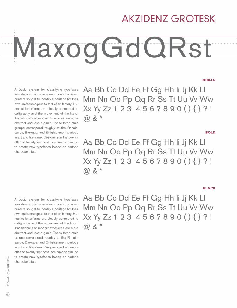
ROMAN
BOLD
BLACK
AKZIDENZ GROTESK
MaxogGdQRstA basic system for classifying typefaces was devised in the nineteenth century, when printers sought to identify a heritage for their own craft analogous to that of art history. Hu-manist letterforms are closely connected to calligraphy and the movement of the hand. Transitional and modern typefaces are more abstract and less organic. These three main groups correspond roughly to the Renais-sance, Baroque, and Enlightenment periods in art and literature. Designers in the twenti-eth and twenty-first centuries have continued to create new typefaces based on historic characteristics.
A basic system for classifying typefaces was devised in the nineteenth century, when printers sought to identify a heritage for their own craft analogous to that of art history. Hu-manist letterforms are closely connected to calligraphy and the movement of the hand. Transitional and modern typefaces are more abstract and less organic. These three main groups correspond roughly to the Renais-sance, Baroque, and Enlightenment periods in art and literature. Designers in the twenti-eth and twenty-first centuries have continued to create new typefaces based on historic characteristics.
Aa Bb Cc Dd Ee Ff Gg Hh Ii Jj Kk Ll Mm Nn Oo Pp Qq Rr Ss Tt Uu Vv Ww Xx Yy Zz 1 2 3 4 5 6 7 8 9 0 ( ) { } ? ! @ & *
Aa Bb Cc Dd Ee Ff Gg Hh Ii Jj Kk Ll Mm Nn Oo Pp Qq Rr Ss Tt Uu Vv Ww Xx Yy Zz 1 2 3 4 5 6 7 8 9 0 ( ) { } ? ! @ & *
Aa Bb Cc Dd Ee Ff Gg Hh Ii Jj Kk Ll Mm Nn Oo Pp Qq Rr Ss Tt Uu Vv Ww Xx Yy Zz 1 2 3 4 5 6 7 8 9 0 ( ) { } ? ! @ & *
130
TYPO
GR
APH
IC E
SSEN
TIA
LS

REGULAR
SMALL CAPS
ITALIC
BOLD
NEW BASKERVILLE
MxaogGdQRtA basic system for classifying typefaces was devised in the nineteenth century, when printers sought to identify a heritage for their own craft analogous to that of art his-tory. Humanist letterforms are closely con-nected to calligraphy and the movement of the hand. Transitional and modern typefac-es are more abstract and less organic. These three main groups correspond roughly to the Renaissance, Baroque, and Enlighten-ment periods in art and literature. Design-ers in the twentieth and twenty-first centu-ries have continued to create new typefaces based on historic characteristics.
A basic system for classifying typefaces was devised in the nineteenth century, when printers sought to identify a heritage for their own craft analogous to that of art his-tory. Humanist letterforms are closely con-nected to calligraphy and the movement of the hand. Transitional and modern typefac-es are more abstract and less organic. These three main groups correspond roughly to the Renaissance, Baroque, and Enlighten-ment periods in art and literature. Design-ers in the twentieth and twenty-first centu-ries have continued to create new typefaces based on historic characteristics.
Aa Bb Cc Dd Ee Ff Gg Hh Ii Jj Kk Ll Mm Nn Oo Pp Qq Rr Ss Tt Uu Vv Ww Xx Yy Zz 1 2 3 4 5 6 7 8 9 0 ( ) { } ? ! @ & *
Aa Bb Cc Dd Ee Ff Gg Hh Ii Jj Kk Ll Mm Nn Oo Pp Qq Rr Ss Tt Uu Vv Ww Xx Yy Zz 1 2 3 4 5 6 7 8 9 0 ( ) { } ? ! @ & *
Aa Bb Cc Dd Ee Ff Gg Hh Ii Jj Kk Ll Mm Nn Oo Pp Qq Rr Ss Tt Uu Vv Ww Xx Yy Zz 1 2 3 4 5 6 7 8 9 0 ( ) { } ? ! @ & *
Aa Bb Cc Dd Ee Ff Gg Hh Ii Jj Kk Ll Mm Nn Oo Pp Qq Rr Ss Tt Uu Vv Ww Xx Yy Zz 1 2 3 4 5 6 7 8 9 0 ( ) { } ? ! @ & *
131
FON
T LI
ST

REGULAR
ITALIC
BOLD
BLACK ITALIC
BELIZIO
MxagGdQrRA basic system for classifying type-faces was devised in the nineteenth century, when printers sought to identify a heritage for their own craft analogous to that of art histo-ry. Humanist letterforms are closely connected to calligraphy and the movement of the hand. Transitional and modern typefaces are more ab-stract and less organic. These three main groups correspond roughly to the Renaissance, Baroque, and En-lightenment periods in art and lit-erature. Designers in the twentieth and twenty-first centuries have con-tinued to create new typefaces based on historic characteristics.
A basic system for classifying typefaces was devised in the nineteenth centu-ry, when printers sought to identify a heritage for their own craft analogous to that of art history. Humanist letter-forms are closely connected to callig-raphy and the movement of the hand. Transitional and modern typefaces are more abstract and less organic. These three main groups correspond roughly to the Renaissance, Baroque, and Enlightenment periods in art and literature. Designers in the twentieth and twenty-first centuries have contin-ued to create new typefaces based on historic characteristics.
Aa Bb Cc Dd Ee Ff Gg Hh Ii Jj Kk Ll Mm Nn Oo Pp Qq Rr Ss Tt Uu Vv Ww Xx Yy Zz 1 2 3 4 5 6 7 8 9 0 ( ) { } ? ! @ & *
Aa Bb Cc Dd Ee Ff Gg Hh Ii Jj Kk Ll Mm Nn Oo Pp Qq Rr Ss Tt Uu Vv Ww Xx Yy Zz 1 2 3 4 5 6 7 8 9 0 ( ) { } ? ! @ & *
Aa Bb Cc Dd Ee Ff Gg Hh Ii Jj Kk Ll Mm Nn Oo Pp Qq Rr Ss Tt Uu Vv Ww Xx Yy Zz 1 2 3 4 5 6 7 8 9 0 ( ) { } ? ! @
Aa Bb Cc Dd Ee Ff Gg Hh Ii Jj Kk Ll Mm Nn Oo Pp Qq Rr Ss Tt Uu Vv Ww Xx Yy Zz 1 2 3 4 5 6 7 8 9 0 ( ) { } ? ! @ & *132
TYPO
GR
APH
IC E
SSEN
TIA
LS

MxagGdQrRLIGHT
BOLD
BLACK
BELL GOTHIC
MxagGdQrRIA basic system for classifying typefaces was
devised in the nineteenth century, when print-
ers sought to identify a heritage for their own
craft analogous to that of art history. Hu-
manist letterforms are closely connected to
calligraphy and the movement of the hand.
Transitional and modern typefaces are more
abstract and less organic. These three main
groups correspond roughly to the Renais-
sance, Baroque, and Enlightenment periods in
art and literature. Designers in the twentieth
and twenty-first centuries have continued to
create new typefaces based on historic char-
acteristics.
Aa Bb Cc Dd Ee Ff Gg Hh Ii Jj Kk Ll Mm Nn Oo Pp Qq Rr Ss Tt Uu Vv Ww Xx Yy Zz 1 2 3 4 5 6 7 8 9 0 ( ) { } ? ! @ & *
Aa Bb Cc Dd Ee Ff Gg Hh Ii Jj Kk Ll Mm Nn Oo Pp Qq Rr Ss Tt Uu Vv Ww Xx Yy Zz 1 2 3 4 5 6 7 8 9 0 ( ) { } ? ! @ & *
Aa Bb Cc Dd Ee Ff Gg Hh Ii Jj Kk Ll Mm Nn Oo Pp Qq Rr Ss Tt Uu Vv Ww Xx Yy Zz 1 2 3 4 5 6 7 8 9 0 ( ) { } ? ! @ & *
A basic system for classifying typefaces was devised in the nineteenth century, when print-ers sought to identify a heritage for their own craft analogous to that of art history. Hu-manist letterforms are closely connected to calligraphy and the movement of the hand. Transitional and modern typefaces are more abstract and less organic. These three main groups correspond roughly to the Renais-sance, Baroque, and Enlightenment periods in art and literature. Designers in the twenti-eth and twenty-first centuries have continued to create new typefaces based on historic characteristics.
133
FON
T LI
ST

REGULAR
ITALIC
BOLD
EXTRA BOLD
BEMBO
MxnogGdQrRstA basic system for classifying typefaces was de-
vised in the nineteenth century, when printers
sought to identify a heritage for their own craft
analogous to that of art history. Humanist let-
terforms are closely connected to calligraphy
and the movement of the hand. Transitional
and modern typefaces are more abstract and less
organic. These three main groups correspond
roughly to the Renaissance, Baroque, and En-
lightenment periods in art and literature. De-
signers in the twentieth and twenty-first cen-
turies have continued to create new typefaces
based on historic characteristics.
A basic system for classifying typefaces
was devised in the nineteenth century,
when printers sought to identify a heri-
tage for their own craft analogous to that
of art history. Humanist letterforms are
closely connected to calligraphy and the
movement of the hand. Transitional and
modern typefaces are more abstract and
less organic. These three main groups cor-
respond roughly to the Renaissance, Ba-
roque, and Enlightenment periods in art
and literature. Designers in the twentieth
and twenty-first centuries have continued
to create new typefaces based on historic
characteristics.
Aa Bb Cc Dd Ee Ff Gg Hh Ii Jj Kk Ll Mm Nn Oo Pp Qq Rr Ss Tt Uu Vv Ww Xx Yy Zz 1 2 3 4 5 6 7 8 9 0 ( ) { } ? ! @ & *
Aa Bb Cc Dd Ee Ff Gg Hh Ii Jj Kk Ll Mm Nn Oo Pp Qq Rr Ss Tt Uu Vv Ww Xx Yy Zz 1 2 3 4 5 6 7 8 9 0 ( ) { } ? ! @ & *
Aa Bb Cc Dd Ee Ff Gg Hh Ii Jj Kk Ll Mm Nn Oo Pp Qq Rr Ss Tt Uu Vv Ww Xx Yy Zz 1 2 3 4 5 6 7 8 9 0 ( ) { } ? ! @ & *
Aa Bb Cc Dd Ee Ff Gg Hh Ii Jj Kk Ll Mm Nn Oo Pp Qq Rr Ss Tt Uu Vv Ww Xx Yy Zz 1 2 3 4 5 6 7 8 9 0 ( ) { } ? ! @ & *
134
TYPO
GR
APH
IC E
SSEN
TIA
LS

MxnogGdQrRstREGULAR
ITALIC
BOLD
BOLD ITALIC
BOOKMAN
MxaogGdQrRA basic system for classifying typefac-es was devised in the nineteenth cen-tury, when printers sought to identify a heritage for their own craft analo-gous to that of art history. Humanist letterforms are closely connected to calligraphy and the movement of the hand. Transitional and modern type-faces are more abstract and less or-ganic. These three main groups cor-respond roughly to the Renaissance, Baroque, and Enlightenment periods in art and literature. Designers in the twentieth and twenty-first centuries have continued to create new typefac-es based on historic characteristics.
A basic system for classifying type-faces was devised in the nineteenth century, when printers sought to identify a heritage for their own craft analogous to that of art histo-ry. Humanist letterforms are closely connected to calligraphy and the movement of the hand. Transitional and modern typefaces are more ab-stract and less organic. These three main groups correspond roughly to the Renaissance, Baroque, and Enlightenment periods in art and literature. Designers in the twenti-eth and twenty-first centuries have continued to create new typefaces based on historic characteristics.
Aa Bb Cc Dd Ee Ff Gg Hh Ii Jj Kk Ll Mm Nn Oo Pp Qq Rr Ss Tt Uu Vv Ww Xx Yy Zz 1 2 3 4 5 6 7 8 9 0 ( ) { } ? ! @ & *
Aa Bb Cc Dd Ee Ff Gg Hh Ii Jj Kk Ll Mm Nn Oo Pp Qq Rr Ss Tt Uu Vv Ww Xx Yy Zz 1 2 3 4 5 6 7 8 9 0 ( ) { } ? ! @ & *
Aa Bb Cc Dd Ee Ff Gg Hh Ii Jj Kk Ll Mm Nn Oo Pp Qq Rr Ss Tt Uu Vv Ww Xx Yy Zz 1 2 3 4 5 6 7 8 9 0 ( ) { } ? ! @ & *
Aa Bb Cc Dd Ee Ff Gg Hh Ii Jj Kk Ll Mm Nn Oo Pp Qq Rr Ss Tt Uu Vv Ww Xx Yy Zz 1 2 3 4 5 6 7 8 9 0 ( ) { } ? ! @ & *
135
FON
T LI
ST

REGULAR
ITALIC
BOLD
(BAUER) BODONI
MxaogGdQrRstA basic system for classifying typefaces was devised in the nineteenth century, when printers sought to identify a heritage for their own craft analogous to that of art his-tory. Humanist letterforms are closely con-nected to calligraphy and the movement of the hand. Transitional and modern typefac-es are more abstract and less organic. These three main groups correspond roughly to the Renaissance, Baroque, and Enlightenment periods in art and literature. Designers in the twentieth and twenty-first centuries have continued to create new typefaces based on historic characteristics.
A basic system for classifying typefaces was devised in the nineteenth century, when printers sought to identify a heritage for their own craft analogous to that of art his-tory. Humanist letterforms are closely con-nected to calligraphy and the movement of the hand. Transitional and modern typefac-es are more abstract and less organic. These three main groups correspond roughly to the Renaissance, Baroque, and Enlighten-ment periods in art and literature. Design-ers in the twentieth and twenty-first centu-ries have continued to create new typefaces based on historic characteristics.
Aa Bb Cc Dd Ee Ff Gg Hh Ii Jj Kk Ll Mm Nn Oo Pp Qq Rr Ss Tt Uu Vv Ww Xx Yy Zz 1 2 3 4 5 6 7 8 9 0 ( ) { } ? ! @ & * 1 2 3 4 5 6 7 8 9
Aa Bb Cc Dd Ee Ff Gg Hh Ii Jj Kk Ll Mm Nn Oo Pp Qq Rr Ss Tt Uu Vv Ww Xx Yy Zz 1 2 3 4 5 6 7 8 9 0 ( ) { } ? ! @ & *
Aa Bb Cc Dd Ee Ff Gg Hh Ii Jj Kk Ll Mm Nn Oo Pp Qq Rr Ss Tt Uu Vv Ww Xx Yy Zz 1 2 3 4 5 6 7 8 9 0 ( ) { } ? ! @ & *
136
TYPO
GR
APH
IC E
SSEN
TIA
LS

MxaogGdQrRstREGULAR
ITALIC
SWASH
ORNAMENT
ALTERNATE
(ADOBE) CASLON
MxanogGdQRtA basic system for classifying typefaces was devised in the nineteenth century, when print-ers sought to identify a heritage for their own craft analogous to that of art history. Humanist letterforms are closely connected to calligraphy and the movement of the hand. Transitional and modern typefaces are more abstract and less organic. These three main groups corre-spond roughly to the Renaissance, Baroque, and Enlightenment periods in art and litera-ture. Designers in the twentieth and twenty-first centuries have continued to create new typefaces based on historic characteristics.
A basic system for classifying typefaces was devised in the nineteenth century, when printers sought to identify a heritage for their own craft analogous to that of art history. Humanist letterforms are closely connected to calligraphy and the movement of the hand. Transitional and modern typefaces are more abstract and less organic. These three main groups correspond roughly to the Renais-sance, Baroque, and Enlightenment periods in art and literature. Designers in the twen-tieth and twenty-first centuries have contin-ued to create new typefaces based on historic characteristics.
Aa Bb Cc Dd Ee Ff Gg Hh Ii Jj Kk Ll Mm Nn Oo Pp Qq Rr Ss Tt Uu Vv Ww Xx Yy Zz 1 2 3 4 5 6 7 8 9 0 ( ) { } ? ! @ & *
Aa Bb Cc Dd Ee Ff Gg Hh Ii Jj Kk Ll Mm Nn Oo Pp Qq Rr Ss Tt Uu Vv Ww Xx Yy Zz 1 2 3 4 5 6 7 8 9 0 ( ) { } ? ! @ & *
Aa Ba Ca Da Ea Fa Ga Ha Ia Ja Ka La Ma Na Oa Pa Qa Ra Sa Ta Ua Va Wa Xa Ya Z
A a Bb C c D d Ee F f G g H h Ii Jj Kk Ll Mm Nn Oo Pp Qq Or S s Ot Uu Vv Ww X x y Z z 1 2 3 4
c h i k l Ss T t
137
FON
T LI
ST

REGULAR
ITALIC
BOLD
BOLD ITALIC
NEW CENTURY SCHOOLBOOK
MxaogGdQrRtA basic system for classifying typefaces was devised in the nineteenth century, when printers sought to identify a heri-tage for their own craft analogous to that of art history. Humanist letterforms are closely connected to calligraphy and the movement of the hand. Transitional and modern typefaces are more abstract and less organic. These three main groups correspond roughly to the Renaissance, Baroque, and Enlightenment periods in art and literature. Designers in the twentieth and twenty-first centuries have continued to create new typefaces based on historic characteristics.
A basic system for classifying typefaces was devised in the nineteenth century, when printers sought to identify a heri-tage for their own craft analogous to that of art history. Humanist letterforms are closely connected to calligraphy and the movement of the hand. Transitional and modern typefaces are more abstract and less organic. These three main groups correspond roughly to the Renaissance, Baroque, and Enlightenment periods in art and literature. Designers in the twentieth and twenty-first centuries have continued to create new typefaces based on historic characteristics.
Aa Bb Cc Dd Ee Ff Gg Hh Ii Jj Kk Ll Mm Nn Oo Pp Qq Rr Ss Tt Uu Vv Ww Xx Yy Zz 1 2 3 4 5 6 7 8 9 0 ( ) { } ? ! @ & * 1 2 3 4 5 6 7 8 9
Aa Bb Cc Dd Ee Ff Gg Hh Ii Jj Kk Ll Mm Nn Oo Pp Qq Rr Ss Tt Uu Vv Ww Xx Yy Zz 1 2 3 4 5 6 7 8 9 0 ( ) { } ? ! @ & *
Aa Bb Cc Dd Ee Ff Gg Hh Ii Jj Kk Ll Mm Nn Oo Pp Qq Rr Ss Tt Uu Vv Ww Xx Yy Zz 1 2 3 4 5 6 7 8 9 0 ( ) { } ? ! @ & *
Aa Bb Cc Dd Ee Ff Gg Hh Ii Jj Kk Ll Mm Nn Oo Pp Qq Rr Ss Tt Uu Vv Ww Xx Yy Zz 1 2 3 4 5 6 7 8 9 0 ( ) { } ? ! @ & *
138
TYPO
GR
APH
IC E
SSEN
TIA
LS

ROMAN
LIGHT
BOLD
CLARENDON
MxaogGdQrRA basic system for classifying typefac-es was devised in the nineteenth centu-ry, when printers sought to identify a heritage for their own craft analogous to that of art history. Humanist letter-forms are closely connected to callig-raphy and the movement of the hand. Transitional and modern typefaces are more abstract and less organic. These three main groups correspond roughly to the Renaissance, Baroque, and Enlightenment periods in art and literature. Designers in the twentieth and twenty-first centuries have con-tinued to create new typefaces based on historic characteristics.
A basic system for classifying type-faces was devised in the nineteenth century, when printers sought to identify a heritage for their own craft analogous to that of art histo-ry. Humanist letterforms are closely connected to calligraphy and the movement of the hand. Transitional and modern typefaces are more ab-stract and less organic. These three main groups correspond roughly to the Renaissance, Baroque, and En-lightenment periods in art and lit-erature. Designers in the twentieth and twenty-first centuries have con-tinued to create new typefaces based on historic characteristics.
Aa Bb Cc Dd Ee Ff Gg Hh Ii Jj Kk Ll Mm Nn Oo Pp Qq Rr Ss Tt Uu Vv Ww Xx Yy Zz 1 2 3 4 5 6 7 8 9 0 ( ) { } ? ! @ & * 1 2 3 4 5 6 7 8
Aa Bb Cc Dd Ee Ff Gg Hh Ii Jj Kk Ll Mm Nn Oo Pp Qq Rr Ss Tt Uu Vv Ww Xx Yy Zz 1 2 3 4 5 6 7 8 9 0 ( ) { } ? ! @ & *
Aa Bb Cc Dd Ee Ff Gg Hh Ii Jj Kk Ll Mm Nn Oo Pp Qq Rr Ss Tt Uu Vv Ww Xx Yy Zz 1 2 3 4 5 6 7 8 9 0 ( ) { } ? ! @ & *
139
FON
T LI
ST

BOOK
ITALIC
BOLD
ULTRA
CHELTENHAM
MxaogGdQrRtA basic system for classifying typefaces was devised in the nineteenth century, when printers sought to identify a heri-tage for their own craft analogous to that of art history. Humanist letterforms are closely connected to calligraphy and the movement of the hand. Transitional and modern typefaces are more abstract and less organic. These three main groups correspond roughly to the Renaissance, Baroque, and Enlightenment periods in art and literature. Designers in the twen-tieth and twenty-first centuries have con-tinued to create new typefaces based on historic characteristics.
A basic system for classifying typefaces was devised in the nineteenth century, when printers sought to identify a heritage for their own craft analogous to that of art history. Humanist letterforms are closely connected to calligraphy and the move-ment of the hand. Transitional and modern typefaces are more abstract and less or-ganic. These three main groups correspond roughly to the Renaissance, Baroque, and Enlightenment periods in art and literature. Designers in the twentieth and twenty-first centuries have continued to create new typefaces based on historic characteristics.
Aa Bb Cc Dd Ee Ff Gg Hh Ii Jj Kk Ll Mm Nn Oo Pp Qq Rr Ss Tt Uu Vv Ww Xx Yy Zz 1 2 3 4 5 6 7 8 9 0 ( ) { } ? ! @ & * 1 2 3 4 5 6 7 8 9
Aa Bb Cc Dd Ee Ff Gg Hh Ii Jj Kk Ll Mm Nn Oo Pp Qq Rr Ss Tt Uu Vv Ww Xx Yy Zz 1 2 3 4 5 6 7 8 9 0 ( ) { } ? ! @ & *
Aa Bb Cc Dd Ee Ff Gg Hh Ii Jj Kk Ll Mm Nn Oo Pp Qq Rr Ss Tt Uu Vv Ww Xx Yy Zz 1 2 3 4 5 6 7 8 9 0 ( ) { } ? ! @ & *
Aa Bb Cc Dd Ee Ff Gg Hh Ii Jj Kk Ll Mm Nn Oo Pp Qq Rr Ss Tt Uu Vv Ww Xx Yy Zz 1 2 3 4 5 6 7 8 9 0 ( ) { } ? ! @ & *
140
TYPO
GR
APH
IC E
SSEN
TIA
LS
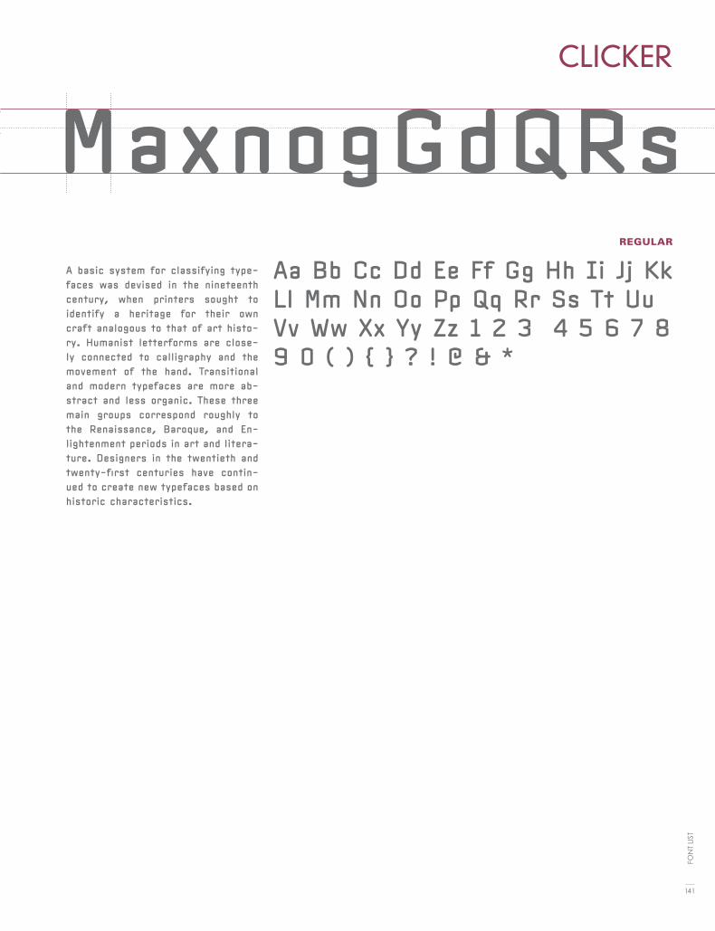
MxaogGdQrRtREGULAR
CLICKER
MaxnogGdQRsA basic system for classifying type-faces was devised in the nineteenth century, when printers sought to identify a heritage for their own craft analogous to that of art histo-ry. Humanist letterforms are close-ly connected to calligraphy and the movement of the hand. Transitional and modern typefaces are more ab-stract and less organic. These three main groups correspond roughly to the Renaissance, Baroque, and En-lightenment periods in art and litera-ture. Designers in the twentieth and twenty-first centuries have contin-ued to create new typefaces based on historic characteristics.
Aa Bb Cc Dd Ee Ff Gg Hh Ii Jj Kk Ll Mm Nn Oo Pp Qq Rr Ss Tt Uu Vv Ww Xx Yy Zz 1 2 3 4 5 6 7 8 9 0 ( ) { } ? ! @ & *
141
FON
T LI
ST
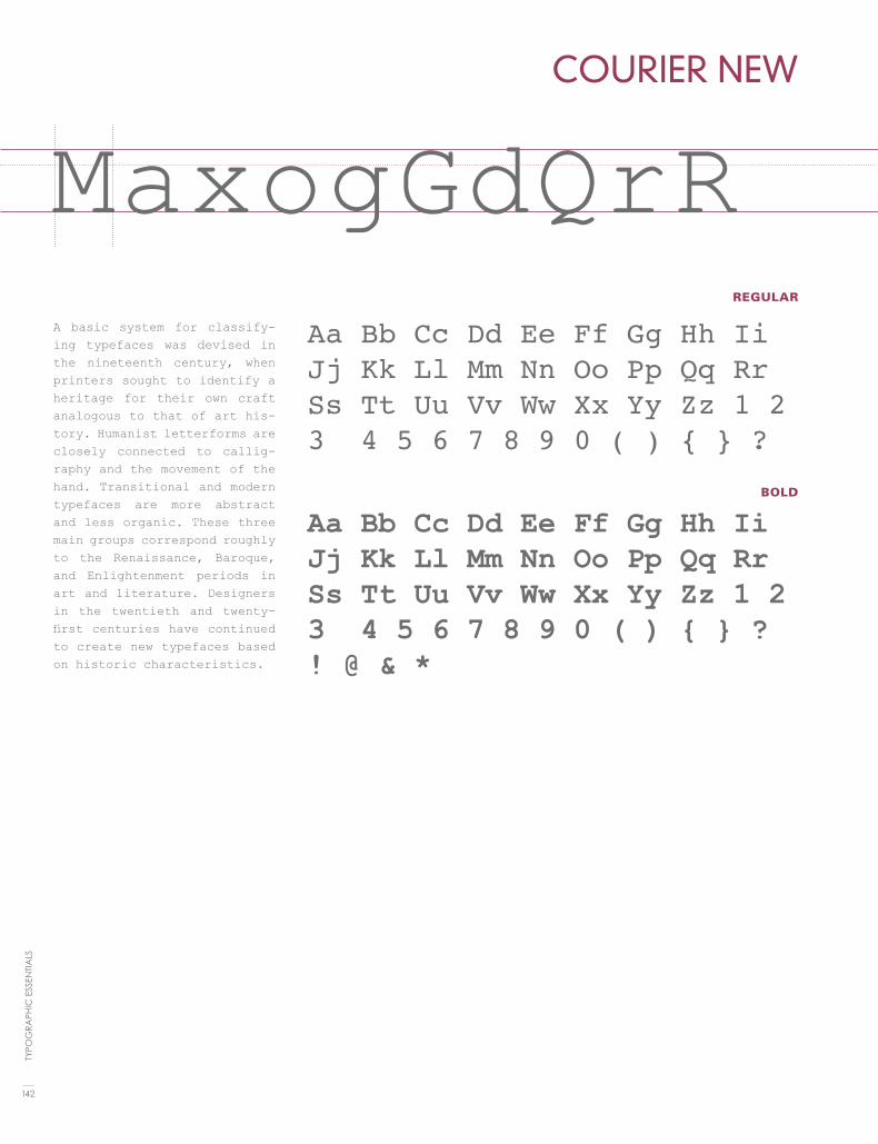
REGULAR
BOLD
COURIER NEW
MaxogGdQrRA basic system for classify-ing typefaces was devised in the nineteenth century, when printers sought to identify a heritage for their own craft analogous to that of art his-tory. Humanist letterforms are closely connected to callig-raphy and the movement of the hand. Transitional and modern typefaces are more abstract and less organic. These three main groups correspond roughly to the Renaissance, Baroque, and Enlightenment periods in art and literature. Designers in the twentieth and twenty-first centuries have continued to create new typefaces based on historic characteristics.
Aa Bb Cc Dd Ee Ff Gg Hh Ii Jj Kk Ll Mm Nn Oo Pp Qq Rr Ss Tt Uu Vv Ww Xx Yy Zz 1 2 3 4 5 6 7 8 9 0 ( ) { } ?
Aa Bb Cc Dd Ee Ff Gg Hh Ii Jj Kk Ll Mm Nn Oo Pp Qq Rr Ss Tt Uu Vv Ww Xx Yy Zz 1 2 3 4 5 6 7 8 9 0 ( ) { } ? ! @ & *
142
TYPO
GR
APH
IC E
SSEN
TIA
LS

MaxogGdQrRREGULAR
ITALIC
BOLD
DIDOT
MxaogGdQrRtA basic system for classifying typefaces was devised in the nineteenth century, when printers sought to identify a heri-tage for their own craft analogous to that of art history. Humanist letterforms are closely connected to calligraphy and the movement of the hand. Transitional and modern typefaces are more abstract and less organic. These three main groups correspond roughly to the Renaissance, Baroque, and Enlightenment periods in art and literature. Designers in the twentieth and twenty-first centuries have continued to create new typefaces based on historic characteristics.
A basic system for classifying typefaces was devised in the nineteenth century, when printers sought to identify a heritage for their own craft analogous to that of art his-tory. Humanist letterforms are closely con-nected to calligraphy and the movement of the hand. Transitional and modern typefac-es are more abstract and less organic. These three main groups correspond roughly to the Renaissance, Baroque, and Enlighten-ment periods in art and literature. Design-ers in the twentieth and twenty-first centu-ries have continued to create new typefaces based on historic characteristics.
Aa Bb Cc Dd Ee Ff Gg Hh Ii Jj Kk Ll Mm Nn Oo Pp Qq Rr Ss Tt Uu Vv Ww Xx Yy Zz 1 2 3 4 5 6 7 8 9 0 ( ) { } ? ! @ & * 1 2 3 4 5 6 7 8 9
Aa Bb Cc Dd Ee Ff Gg Hh Ii Jj Kk Ll Mm Nn Oo Pp Qq Rr Ss Tt Uu Vv Ww Xx Yy Zz 1 2 3 4 5 6 7 8 9 0 ( ) { } ? ! @ & *
Aa Bb Cc Dd Ee Ff Gg Hh Ii Jj Kk Ll Mm Nn Oo Pp Qq Rr Ss Tt Uu Vv Ww Xx Yy Zz 1 2 3 4 5 6 7 8 9 0 ( ) { } ? ! @ & *
143
FON
T LI
ST
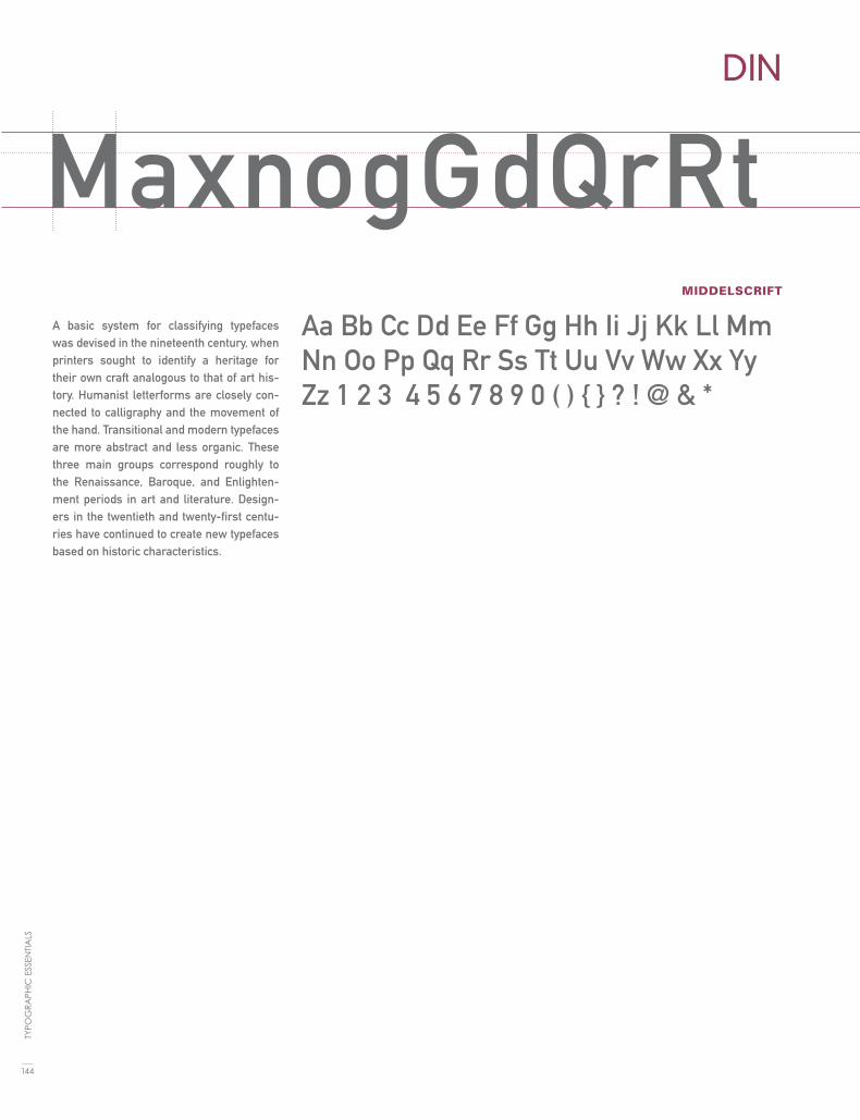
MIDDELSCRIFT
DIN
MaxnogGdQrRtA basic system for classifying typefaces was devised in the nineteenth century, when printers sought to identify a heritage for their own craft analogous to that of art his-tory. Humanist letterforms are closely con-nected to calligraphy and the movement of the hand. Transitional and modern typefaces are more abstract and less organic. These three main groups correspond roughly to the Renaissance, Baroque, and Enlighten-ment periods in art and literature. Design-ers in the twentieth and twenty-first centu-ries have continued to create new typefaces based on historic characteristics.
Aa Bb Cc Dd Ee Ff Gg Hh Ii Jj Kk Ll Mm Nn Oo Pp Qq Rr Ss Tt Uu Vv Ww Xx Yy Zz 1 2 3 4 5 6 7 8 9 0 ( ) { } ? ! @ & *
144
TYPO
GR
APH
IC E
SSEN
TIA
LS

MaxnogGdQrRtREGULAR
ITALIC
BOLD
DISTURBANCE
MxnatQbWFGdR
A basic system for classifying typefaces was devised
in the nineteenth century, when printers sought
to identify a heritage for their own craft analo-
gous to that of art history. Humanist letterforms
are closely connected to calligraphy and the
movement of the hand. Transitional and modern
typefaces are more abstract and less organic. These
three main groups correspond roughly to the Re-
naissance, Baroque, and Enlightenment periods in
art and literature. Designers in the twentieth and
twenty-first centuries have continued to create
new typefaces based on historic characteristics.
Aa Bb Cc Dd Ee Ff Gg Hh Ii Jj Kk Ll Mm Nn Oo
Pp Qq Rr Ss Tt Uu Vv Ww Xx Yy Zz 1 2 3 4 5 6 7 8
9 0 ( ) { } ? ! @ & * 1 2 3 4 5 6 7 8 9
Aa Bb Cc Dd Ee Ff Gg Hh Ii Jj Kk Ll Mm Nn Oo Pp
Qq Rr Ss Tt Uu Vv Ww Xx Yy Zz 1 2 3 4 5 6 7 8 9 0
( ) { } ? ! @ & *
Aa Bb Cc Dd Ee Ff Gg Hh Ii Jj Kk Ll Mm Nn Oo
Pp Qq Rr Ss Tt Uu Vv Ww Xx Yy Zz 1 2 3 4 5 6 7
8 9 0 ( ) { } ? ! @ & *
145
FON
T LI
ST

REGULAR
FETTE FRAKTUR
MxnaopQrRtA basic system for classifying typefaces was devised in the nineteenth century, when printers sought to identify a heri-tage for their own craft analogous to that of art history. Humanist letterforms are closely connected to calligraphy and the movement of the hand. Transitional and modern typefaces are more abstract and less organic. These three main groups correspond roughly to the Renaissance, Baroque, and Enlightenment periods in art and literature. Designers in the twentieth and twenty-first centuries have continued to create new typefaces based on historic characteristics.
Aa Bb Cc Dd Ee Ff Gg Hh Ii Jj Kk Ll Mm Nn Oo Pp Qq Rr Ss Tt Uu Vv Ww Xx Yy Zz 1 2 3 4 5 6 7 8 9 0 ( ) { } ? ! @ & *
146
TYPO
GR
APH
IC E
SSEN
TIA
LS
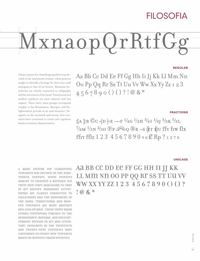
MxnaopQrRtREGULAR
FRACTIONS
UNICASE
FILOSOFIA
MxnaopQrRtfGgA basic system for classifying typefaces was de-vised in the nineteenth century, when printers sought to identify a heritage for their own craft analogous to that of art history. Humanist let-terforms are closely connected to calligraphy and the movement of the hand. Transitional and modern typefaces are more abstract and less organic. These three main groups correspond roughly to the Renaissance, Baroque, and En-lightenment periods in art and literature. De-signers in the twentieth and twenty-first cen-turies have continued to create new typefaces based on historic characteristics.
A basic system for classifying typefaces was devised in the nine-teenth century, when printers sought to identify a heritage for their own craft analogous to that of art history. Humanist letter-forms are closely connected to calligraphy and the movement of the hand. Transitional and mod-ern typefaces are more abstract and less organic. These three main groups correspond roughly to the Renaissance, Baroque, and Enlight-enment periods in art and litera-ture. Designers in the twentieth and twenty-first centuries have continued to create new typefaces based on historic characteristics.
Aa Bb Cc Dd Ee Ff Gg Hh Ii Jj Kk Ll Mm Nn Oo Pp Qq Rr Ss Tt Uu Vv Ww Xx Yy Zz 1 2 3 4 5 6 7 8 9 0 ( ) { } ? ! @ & *
Aa Bb Cc Dd Ee Ff Gg Hh Ii Jj Kk Ll Mm Nn Oo Pp Qq Rr Ss Tt Uu Vv Ww Xx Yy Zz 1 2 3 4 5 6 7 8 9 0 ( ) { } ? ! @ & *
Aa Bb Cc Dd Ee Ff Gg Hh Ii Jj Kk Ll Mm Nn Oo Pp Qq Rr Ss Tt Uu Vv Ww Xx Yy Zz 1 2 3 4 5 6 7 8 9 0 ( ) { } ? ! @ & *
147
FON
T LI
ST

BOOK
DEMI
HEAVY
CONDENSED
FRANKLIN GOTHIC
MaxodQRtfGgA basic system for classifying typefaces was devised in the nineteenth century, when printers sought to identify a heritage for their own craft analogous to that of art history. Humanist letterforms are closely connected to calligraphy and the move-ment of the hand. Transitional and modern typefaces are more abstract and less or-ganic. These three main groups correspond roughly to the Renaissance, Baroque, and Enlightenment periods in art and literature. Designers in the twentieth and twenty-first centuries have continued to create new typefaces based on historic characteristics.
A basic system for classifying typefaces was devised in the nineteenth century, when printers sought to identify a heritage for their own craft analogous to that of art history. Hu-manist letterforms are closely connected to calligraphy and the movement of the hand. Transitional and modern typefaces are more abstract and less organic. These three main groups correspond roughly to the Renais-sance, Baroque, and Enlightenment periods in art and literature. Designers in the twenti-eth and twenty-first centuries have continued to create new typefaces based on historic characteristics.
Aa Bb Cc Dd Ee Ff Gg Hh Ii Jj Kk Ll Mm Nn Oo Pp Qq Rr Ss Tt Uu Vv Ww Xx Yy Zz 1 2 3 4 5 6 7 8 9 0 ( ) { } ? ! @ & *
Aa Bb Cc Dd Ee Ff Gg Hh Ii Jj Kk Ll Mm Nn Oo Pp Qq Rr Ss Tt Uu Vv Ww Xx Yy Zz 1 2 3 4 5 6 7 8 9 0 ( ) { } ? ! @ & *
Aa Bb Cc Dd Ee Ff Gg Hh Ii Jj Kk Ll Mm Nn Oo Pp Qq Rr Ss Tt Uu Vv Ww Xx Yy Zz 1 2 3 4 5 6 7 8 9 0 ( ) { } ? ! @ & *
Aa Bb Cc Dd Ee Ff Gg Hh Ii Jj Kk Ll Mm Nn Oo Pp Qq Rr Ss Tt Uu Vv Ww Xx Yy Zz 1 2 3 4 5 6 7 8 9 0 ( ) { } ? ! @ & *
148
TYPO
GR
APH
IC E
SSEN
TIA
LS

CONDENSED
REGULAR
BOLD
ULTRA BLACK
FRUTIGER
MaxodQRtfGgA basic system for classifying typefaces was devised in the nineteenth century, when printers sought to identify a heri-tage for their own craft analogous to that of art history. Humanist letter-forms are closely connected to callig-raphy and the movement of the hand. Transitional and modern typefaces are more abstract and less organic. These three main groups correspond roughly to the Renaissance, Baroque, and En-lightenment periods in art and litera-ture. Designers in the twentieth and twenty-first centuries have continued to create new typefaces based on his-toric characteristics.
A basic system for classifying typefaces was devised in the nineteenth century, when printers sought to identify a heri-tage for their own craft analogous to that of art history. Humanist letterforms are closely connected to calligraphy and the movement of the hand. Transitional and modern typefaces are more ab-stract and less organic. These three main groups correspond roughly to the Re-naissance, Baroque, and Enlightenment periods in art and literature. Designers in the twentieth and twenty-first centu-ries have continued to create new type-faces based on historic characteristics.
Aa Bb Cc Dd Ee Ff Gg Hh Ii Jj Kk Ll Mm Nn Oo Pp Qq Rr Ss Tt Uu Vv Ww Xx Yy Zz 1 2 3 4 5 6 7 8 9 0 ( ) { } ? ! @ & *
Aa Bb Cc Dd Ee Ff Gg Hh Ii Jj Kk Ll Mm Nn Oo Pp Qq Rr Ss Tt Uu Vv Ww Xx Yy Zz 1 2 3 4 5 6 7 8 9 0 ( ) { } ? ! @ & *
Aa Bb Cc Dd Ee Ff Gg Hh Ii Jj Kk Ll Mm Nn Oo Pp Qq Rr Ss Tt Uu Vv Ww Xx Yy Zz 1 2 3 4 5 6 7 8 9 0 ( ) { } ? ! @ & *
Aa Bb Cc Dd Ee Ff Gg Hh Ii Jj Kk Ll Mm Nn Oo Pp Qq Rr Ss Tt Uu Vv Ww Xx Yy Zz 1 2 3 4 5 6 7 8 9 0 ( ) { } ? ! @ & *
149
FON
T LI
ST

BOOK
BOLD
EXTRA BOLD
FUTURA
MxaopQRstGgA basic system for classifying typefaces was devised in the nineteenth century, when printers sought to identify a heri-tage for their own craft analogous to that of art history. Humanist letterforms are closely connected to calligraphy and the movement of the hand. Transitional and modern typefaces are more abstract and less organic. These three main groups cor-respond roughly to the Renaissance, Ba-roque, and Enlightenment periods in art and literature. Designers in the twentieth and twenty-first centuries have continued to create new typefaces based on historic characteristics.
A basic system for classifying type-faces was devised in the nineteenth century, when printers sought to identify a heritage for their own craft analogous to that of art histo-ry. Humanist letterforms are closely connected to calligraphy and the movement of the hand. Transitional and modern typefaces are more ab-stract and less organic. These three main groups correspond roughly to the Renaissance, Baroque, and Enlightenment periods in art and literature. Designers in the twenti-eth and twenty-first centuries have continued to create new typefaces based on historic characteristics.
Aa Bb Cc Dd Ee Ff Gg Hh Ii Jj Kk Ll Mm Nn Oo Pp Qq Rr Ss Tt Uu Vv Ww Xx Yy Zz 1 2 3 4 5 6 7 8 9 0 ( ) { } ? ! @ & *
Aa Bb Cc Dd Ee Ff Gg Hh Ii Jj Kk Ll Mm Nn Oo Pp Qq Rr Ss Tt Uu Vv Ww Xx Yy Zz 1 2 3 4 5 6 7 8 9 0 ( ) { } ? ! @ & *
Aa Bb Cc Dd Ee Ff Gg Hh Ii Jj Kk Ll Mm Nn Oo Pp Qq Rr Ss Tt Uu Vv Ww Xx Yy Zz 1 2 3 4 5 6 7 8 9 0 ( ) { } ? ! @ & *
150
TYPO
GR
APH
IC E
SSEN
TIA
LS

REGULAR
ITALIC
BOLD
GILL SANS
MaxnbyogGQRtA basic system for classifying typefaces was de-vised in the nineteenth century, when printers sought to identify a heritage for their own craft analogous to that of art history. Humanist let-terforms are closely connected to calligraphy and the movement of the hand. Transitional and modern typefaces are more abstract and less organic. These three main groups correspond roughly to the Renaissance, Baroque, and En-lightenment periods in art and literature. De-signers in the twentieth and twenty-first cen-turies have continued to create new typefaces based on historic characteristics.
A basic system for classifying typefaces was devised in the nineteenth century, when printers sought to identify a heri-tage for their own craft analogous to that of art history. Humanist letterforms are closely connected to calligraphy and the movement of the hand. Transitional and modern typefaces are more abstract and less organic. These three main groups correspond roughly to the Renaissance, Baroque, and Enlightenment periods in art and literature. Designers in the twen-tieth and twenty-first centuries have continued to create new typefaces based on historic characteristics.
Aa Bb Cc Dd Ee Ff Gg Hh Ii Jj Kk Ll Mm Nn Oo Pp Qq Rr Ss Tt Uu Vv Ww Xx Yy Zz 1 2 3 4 5 6 7 8 9 0 ( ) { } ? ! @ & *
Aa Bb Cc Dd Ee Ff Gg Hh Ii Jj Kk Ll Mm Nn Oo Pp Qq Rr Ss Tt Uu Vv Ww Xx Yy Zz 1 2 3 4 5 6 7 8 9 0 ( ) { } ? ! & *
Aa Bb Cc Dd Ee Ff Gg Hh Ii Jj Kk Ll Mm Nn Oo Pp Qq Rr Ss Tt Uu Vv Ww Xx Yy Zz 1 2 3 4 5 6 7 8 9 0 ( ) { } ? ! @ & *
151
FON
T LI
ST

REGULAR
ITALIC
BOLD
GOUDY
MabyoigGdQrRA basic system for classifying typefaces was de-vised in the nineteenth century, when printers sought to identify a heritage for their own craft analogous to that of art history. Humanist let-terforms are closely connected to calligraphy and the movement of the hand. Transitional and modern typefaces are more abstract and less organic. These three main groups corre-spond roughly to the Renaissance, Baroque, and Enlightenment periods in art and literature. Designers in the twentieth and twenty-first cen-turies have continued to create new typefaces based on historic characteristics.
A basic system for classifying typefaces was devised in the nineteenth century, when printers sought to iden-tify a heritage for their own craft analogous to that of art history. Humanist letterforms are closely con-nected to calligraphy and the movement of the hand. Transitional and modern typefaces are more abstract and less organic. These three main groups correspond roughly to the Renaissance, Baroque, and Enlighten-ment periods in art and literature. Designers in the twentieth and twenty-first centuries have continued to create new typefaces based on historic characteristics.
Aa Bb Cc Dd Ee Ff Gg Hh Ii Jj Kk Ll Mm Nn Oo Pp Qq Rr Ss Tt Uu Vv Ww Xx Yy Zz 1 2 3 4 5 6 7 8 9 0 ( ) { } ? ! @ & *
Aa Bb Cc Dd Ee Ff Gg Hh Ii Jj Kk Ll Mm Nn Oo Pp Qq Rr Ss Tt Uu Vv Ww Xx Yy Zz 1 2 3 4 5 6 7 8 9 0 ( ) { } ? ! & *
Aa Bb Cc Dd Ee Ff Gg Hh Ii Jj Kk Ll Mm Nn Oo Pp Qq Rr Ss Tt Uu Vv Ww Xx Yy Zz 1 2 3 4 5 6 7 8 9 0 ( ) { } ? ! @ & *
152
TYPO
GR
APH
IC E
SSEN
TIA
LS

REGULAR
BOLD
BLACK
HELVETICA
MaoygGdQrRtA basic system for classifying typefaces was devised in the nineteenth century, when printers sought to identify a heri-tage for their own craft analogous to that of art history. Humanist letterforms are closely connected to calligraphy and the movement of the hand. Transitional and modern typefaces are more abstract and less organic. These three main groups correspond roughly to the Renaissance, Baroque, and Enlightenment periods in art and literature. Designers in the twentieth and twenty-first centuries have continued to create new typefaces based on historic characteristics.
A basic system for classifying typefaces was devised in the nineteenth century, when printers sought to identify a heri-tage for their own craft analogous to that of art history. Humanist letterforms are closely connected to calligraphy and the movement of the hand. Transitional and modern typefaces are more abstract and less organic. These three main groups correspond roughly to the Re-naissance, Baroque, and Enlightenment periods in art and literature. Designers in the twentieth and twenty-first centuries have continued to create new typefac-es based on historic characteristics.
Aa Bb Cc Dd Ee Ff Gg Hh Ii Jj Kk Ll Mm Nn Oo Pp Qq Rr Ss Tt Uu Vv Ww Xx Yy Zz 1 2 3 4 5 6 7 8 9 0 ( ) { } ? ! @ & *
Aa Bb Cc Dd Ee Ff Gg Hh Ii Jj Kk Ll Mm Nn Oo Pp Qq Rr Ss Tt Uu Vv Ww Xx Yy Zz 1 2 3 4 5 6 7 8 9 0 ( ) { } ? ! @ & *
Aa Bb Cc Dd Ee Ff Gg Hh Ii Jj Kk Ll Mm Nn Oo Pp Qq Rr Ss Tt Uu Vv Ww Xx Yy Zz 1 2 3 4 5 6 7 8 9 0 ( ) { } ? ! @ & *
Aa Bb Cc Dd Ee Ff Gg Hh Ii Jj Kk Ll Mm Nn Oo Pp Qq Rr Ss Tt Uu Vv Ww Xx Yy Zz 1 2 3 4 5 6 7 8 9 0 ( ) { } ? ! @ & *
THIN EXTENDED
153
FON
T LI
ST

REGULAR
ITALIC
BLACK
BOLD
HOEFLER TEXT
MxaoygGdQRA basic system for classifying typefaces was devised in the nineteenth century, when printers sought to identify a heritage for their own craft analogous to that of art his-tory. Humanist letterforms are closely con-nected to calligraphy and the movement of the hand. Transitional and modern typefaces are more abstract and less organic. These three main groups correspond roughly to the Renaissance, Baroque, and Enlightenment periods in art and literature. Designers in the twentieth and twenty-first centuries have continued to create new typefaces based on historic characteristics.
A basic system for classifying typefaces was devised in the nineteenth century, when printers sought to identify a heritage for their own craft analogous to that of art history. Humanist letterforms are closely connected to calligraphy and the movement of the hand. Transitional and modern typefaces are more abstract and less organic. These three main groups correspond roughly to the Renaissance, Ba-roque, and Enlightenment periods in art and litera-ture. Designers in the twentieth and twenty-first centuries have continued to create new typefaces based on historic characteristics.
Aa Bb Cc Dd Ee Ff Gg Hh Ii Jj Kk Ll Mm Nn Oo Pp Qq Rr Ss Tt Uu Vv Ww Xx Yy Zz 1 2 3 4 5 6 7 8 9 0 ( ) { } ? ! @ & *
Aa Bb Cc Dd Ee Ff Gg Hh Ii Jj Kk Ll Mm Nn Oo Pp Qq Rr Ss Tt Uu Vv Ww Xx Yy Zz 1 2 3 4 5 6 7 8 9 0 ( ) { } ? ! @ & *
Aa Bb Cc Dd Ee Ff Gg Hh Ii Jj Kk Ll Mm Nn Oo Pp Qq Rr Ss Tt Uu Vv Ww Xx Yy Zz 1 2 3 4 5 6 7 8 9 0 ( ) { } ? ! @ & *
AaBbCcDdEeFfGgHhIiJjKkLlMm NnOoPpQqRrSs─tuvwxyz1238 9 0
154
TYPO
GR
APH
IC E
SSEN
TIA
LS

MxaoygGdQRREGULAR
BOLD
BLACK
BOLD CONDENSED
INTERSTATE
MaoygGdQrRtA basic system for classifying typefaces
was devised in the nineteenth century,
when printers sought to identify a heri-
tage for their own craft analogous to that
of art history. Humanist letterforms are
closely connected to calligraphy and the
movement of the hand. Transitional and
modern typefaces are more abstract and
less organic. These three main groups
correspond roughly to the Renaissance,
Baroque, and Enlightenment periods in
art and literature. Designers in the twen-
tieth and twenty-first centuries have
continued to create new typefaces based
on historic characteristics.
Abasicsystemforclassifyingtypefac-
es was devised in the nineteenth cen-
tury, when printers sought to identify
aheritagefortheirowncraftanalogous
tothatofarthistory.Humanistletter-
forms are closely connected to callig-
raphy and the movement of the hand.
Transitional and modern typefaces are
more abstract and less organic. These
three main groups correspond roughly
to the Renaissance, Baroque, and En-
lightenment periods in art and litera-
ture. Designers in the twentieth and
twenty-first centuries have continued
to create new typefaces based on his-
toriccharacteristics.
Aa Bb Cc Dd Ee Ff Gg Hh Ii Jj Kk Ll Mm Nn Oo Pp Qq Rr Ss Tt Uu Vv Ww Xx Yy Zz 1 2 3 4 5 6 7 8 9 0 ( ) { } ? ! @ & *
AaBbCcDdEeFfGgHhIiJjKkLlMmNnOoPpQqRrSsTtUuVvWwXxYyZz1234567890(){}?!@&*
Aa Bb Cc Dd Ee Ff Gg Hh Ii Jj Kk Ll Mm Nn Oo Pp Qq Rr Ss Tt Uu Vv Ww Xx Yy Zz 1 2 3 4 5 6 7 8 9 0 ( ) { } ? ! @ & *
Aa Bb Cc Dd Ee Ff Gg Hh Ii Jj Kk Ll Mm Nn Oo Pp Qq Rr Ss Tt Uu Vv Ww Xx Yy Zz 1 2 3 4 5 6 7 8 9 0 ( ) { } ? ! @ & *
155
FON
T LI
ST

FEATHERWEIGHT
WELTER
FULL HEAVY
KNOCKOUT
MaexnyogGdQrRtA basic system for classifying typefaces was devised
in the nineteenth century, when printers sought to
identify a heritage for their own craft analogous to
that of art history. Humanist letterforms are closely
connected to calligraphy and the movement of the
hand. Transitional and modern typefaces are more
abstract and less organic. These three main groups
correspond roughly to the Renaissance, Baroque, and
Enlightenment periods in art and literature. Design-
ers in the twentieth and twenty-first centuries have
continued to create new typefaces based on historic
characteristics.
A basic system for classifying type-faces was devised in the nineteenth century, when printers sought to identify a heritage for their own craft analogous to that of art histo-ry. Humanist letterforms are closely connected to calligraphy and the movement of the hand. Transitional and modern typefaces are more ab-stract and less organic. These three main groups correspond roughly to the Renaissance, Baroque, and En-lightenment periods in art and litera-ture. Designers in the twentieth and twenty-first centuries have contin-ued to create new typefaces based on historic characteristics.
Aa Bb Cc Dd Ee Ff Gg Hh Ii Jj Kk Ll Mm Nn Oo Pp Qq Rr Ss Tt Uu Vv Ww Xx Yy Zz 1 2 3 4 5 6 7 8 9 0 ( ) { } ? ! @ & *
Aa Bb Cc Dd Ee Ff Gg Hh Ii Jj Kk Ll Mm Nn Oo Pp Qq Rr Ss Tt Uu Vv Ww Xx Yy Zz 1 2 3 4 5 6 7 8 9 0 ( ) { } ? ! @ & *
Aa Bb Cc Dd Ee Ff Gg Hh Ii Jj Kk Ll Mm Nn Oo Pp Qq Rr Ss Tt Uu Vv Ww Xx Yy Zz 1 2 3 4 5 6 7 8 9 0 ( ) { } ? ! @ & *
156
TYPO
GR
APH
IC E
SSEN
TIA
LS

REGULAR
KUNSTLER SCRIPT
xyogGdQrRstAa Bb Cc Dd Ee Ff Gg Hh Ii Jj Kk Ll Mm Nn Oo Pp Qq Rr Ss Tt Uu Vv Ww Xx Yy Zz 1 2 3 4 5 6 7 8 9 0 ( ) { } ? ! @ & *
A basic system for classifying typefaces was de-vised in the nineteenth century, when printers sought to identify a heritage for their own craft analogous to that of art history. Humanist letterforms are closely connected to calligraphy and the movement of the hand. Transitional and modern typefaces are more abstract and less organic. These three main groups correspond roughly to the Renaissance, Baroque, and Enlightenment periods in art and literature. Designers in the twentieth and twenty-first centuries have continued to create new typefaces based on his-toric characteristics.
157
FON
T LI
ST

REGULAR
ITALIC
BOLD
BOLD
MELIOR
MayogGdQrRtA basic system for classifying typefaces was devised in the nineteenth century, when printers sought to identify a heri-tage for their own craft analogous to that of art history. Humanist letterforms are closely connected to calligraphy and the movement of the hand. Transitional and modern typefaces are more abstract and less organic. These three main groups correspond roughly to the Renaissance, Baroque, and Enlightenment periods in art and literature. Designers in the twen-tieth and twenty-first centuries have con-tinued to create new typefaces based on historic characteristics.
A basic system for classifying typefaces was devised in the nineteenth century, when printers sought to identify a heri-tage for their own craft analogous to that of art history. Humanist letterforms are closely connected to calligraphy and the movement of the hand. Transitional and modern typefaces are more abstract and less organic. These three main groups correspond roughly to the Renaissance, Baroque, and Enlightenment periods in art and literature. Designers in the twen-tieth and twenty-first centuries have continued to create new typefaces based on historic characteristics.
Aa Bb Cc Dd Ee Ff Gg Hh Ii Jj Kk Ll Mm Nn Oo Pp Qq Rr Ss Tt Uu Vv Ww Xx Yy Zz 1 2 3 4 5 6 7 8 9 0 ( ) { } ? ! @ & *
Aa Bb Cc Dd Ee Ff Gg Hh Ii Jj Kk Ll Mm Nn Oo Pp Qq Rr Ss Tt Uu Vv Ww Xx Yy Zz 1 2 3 4 5 6 7 8 9 0 ( ) { } ? ! @ & *
Aa Bb Cc Dd Ee Ff Gg Hh Ii Jj Kk Ll Mm Nn Oo Pp Qq Rr Ss Tt Uu Vv Ww Xx Yy Zz 1 2 3 4 5 6 7 8 9 0 ( ) { } ? ! @ & *
Aa Bb Cc Dd Ee Ff Gg Hh Ii Jj Kk Ll Mm Nn Oo Pp Qq Rr Ss Tt Uu Vv Ww Xx Yy Zz 1 2 3 4 5 6 7 8 9 0 ( ) { } ? ! @ & *158
TYPO
GR
APH
IC E
SSEN
TIA
LS

MayogGdQrRtLIGHT
MEDIUM
EXTRA BOLD
MEMPHIS
MxagGdQrRtA basic system for classifying typefaces was devised in the nineteenth century, when printers sought to identify a heri-tage for their own craft analogous to that of art history. Humanist letterforms are closely connected to calligraphy and the movement of the hand. Transitional and modern typefaces are more abstract and less organic. These three main groups correspond roughly to the Renaissance, Baroque, and Enlightenment periods in art and literature. Designers in the twen-tieth and twenty-first centuries have con-tinued to create new typefaces based on historic characteristics.
A basic system for classifying typefaces was devised in the nineteenth century, when printers sought to identify a heri-tage for their own craft analogous to that of art history. Humanist letterforms are closely connected to calligraphy and the movement of the hand. Transi-tional and modern typefaces are more abstract and less organic. These three main groups correspond roughly to the Renaissance, Baroque, and Enlighten-ment periods in art and literature. De-signers in the twentieth and twenty-first centuries have continued to create new typefaces based on historic characteris-tics.
Aa Bb Cc Dd Ee Ff Gg Hh Ii Jj Kk Ll Mm Nn Oo Pp Qq Rr Ss Tt Uu Vv Ww Xx Yy Zz 1 2 3 4 5 6 7 8 9 0 ( ) { } ? ! @ & *
Aa Bb Cc Dd Ee Ff Gg Hh Ii Jj Kk Ll Mm Nn Oo Pp Qq Rr Ss Tt Uu Vv Ww Xx Yy Zz 1 2 3 4 5 6 7 8 9 0 ( ) { } ? ! @ & *
Aa Bb Cc Dd Ee Ff Gg Hh Ii Jj Kk Ll Mm Nn Oo Pp Qq Rr Ss Tt Uu Vv Ww Xx Yy Zz 1 2 3 4 5 6 7 8 9 0 ( ) { } ? ! @ & *
159
FON
T LI
ST

REGULAR
CAPS
BLACK
ITALIC
META
MaxogGdQrRstA basic system for classifying typefaces was devised in the nineteenth century, when printers sought to identify a heritage for their own craft analogous to that of art his-tory. Humanist letterforms are closely con-nected to calligraphy and the movement of the hand. Transitional and modern typefaces are more abstract and less organic. These three main groups correspond roughly to the Renaissance, Baroque, and Enlightenment periods in art and literature. Designers in the twentieth and twenty-first centuries have continued to create new typefaces based on historic characteristics.
A basic system for classifying typefaces was devised in the nineteenth century, when printers sought to identify a heri-tage for their own craft analogous to that of art history. Humanist letterforms are closely connected to calligraphy and the movement of the hand. Transitional and modern typefaces are more abstract and less organic. These three main groups cor-respond roughly to the Renaissance, Ba-roque, and Enlightenment periods in art and literature. Designers in the twentieth and twenty-first centuries have continued to create new typefaces based on historic characteristics.
Aa Bb Cc Dd Ee Ff Gg Hh Ii Jj Kk Ll Mm Nn Oo Pp Qq Rr Ss Tt Uu Vv Ww Xx Yy Zz 1 2 3 4 5 6 7 8 9 0 ( ) { } ? ! @ & *
Aa Bb Cc Dd Ee Ff Gg Hh Ii Jj Kk Ll Mm Nn Oo Pp Qq Rr Ss Tt Uu Vv Ww Xx Yy Zz 1 2 3 4 5 6 7 8 9 0 ( ) { } ? ! @ & *
Aa Bb Cc Dd Ee Ff Gg Hh Ii Jj Kk Ll Mm Nn Oo Pp Qq Rr Ss Tt Uu Vv Ww Xx Yy Zz 1 2 3 4 5 6 7 8 9 0 ( ) { } ? ! @ & *
Aa Bb Cc Dd Ee Ff Gg Hh Ii Jj Kk Ll Mm Nn Oo Pp Qq Rr Ss Tt Uu Vv Ww Xx Yy Zz 1 2 3 4 5 6 7 8 9 0 ( ) { } ? ! @ & *
160
TYPO
GR
APH
IC E
SSEN
TIA
LS

MaxogGdQrRstREGULAR
ITALIC
BOLD
FRACTIONS
MRS EAVES
MaxogGdQrRstA basic system for classifying typefaces was de-
vised in the nineteenth century, when printers
sought to identify a heritage for their own craft
analogous to that of art history. Humanist let-
terforms are closely connected to calligraphy
and the movement of the hand. Transitional
and modern typefaces are more abstract and less
organic. These three main groups correspond
roughly to the Renaissance, Baroque, and En-
lightenment periods in art and literature. De-
signers in the twentieth and twenty-first centu-
ries have continued to create new typefaces based
on historic characteristics.
A basic system for classifying typefaces was devised in the nine-
teenth century, when printers sought to identify a heritage for
their own craft analogous to that of art history. Humanist
letterforms are closely connected to calligraphy and the move-
ment of the hand. Transitional and modern typefaces are more
abstract and less organic. These three main groups correspond
roughly to the Renaissance, Baroque, and Enlightenment
periods in art and literature. Designers in the twentieth and
twenty-first centuries have continued to create new typefaces
based on historic characteristics.
Aa Bb Cc Dd Ee Ff Gg Hh Ii Jj Kk Ll Mm Nn Oo Pp Qq Rr Ss Tt Uu Vv Ww Xx Yy Zz 1 2 3 4 5 6 7 8 9 0 ( ) { } ? ! @ & * 1 2 3 4 5 6 7 8 9
Aa Bb Cc Dd Ee Ff Gg Hh Ii Jj Kk Ll Mm Nn Oo Pp Qq Rr Ss Tt Uu Vv Ww Xx Yy Zz 1 2 3 4 5 6 7 8 9 0 ( ) { } ? ! @ & *
Aa Bb Cc Dd Ee Ff Gg Hh Ii Jj Kk Ll Mm Nn Oo Pp Qq Rr Ss Tt Uu Vv Ww Xx Yy Zz 1 2 3 4 5 6 7 8 9 0 ( ) { } ? ! @ & *
Aa Bb Cc Dd Ee Ff Gg Hh Ii Jj Kk Ll Mm Nn Oo Pp Qq Rr Ss Tt Uu Vv Ww Xx Yy Zz 1 2 3 4 5 6 7 8 9 0 ( ) { } ? ! @ & *
161
FON
T LI
ST

REGULAR
ITALIC
BOLD
NEWS GOTHIC
MaxogGdQrRstA basic system for classifying typefaces was devised in the nineteenth century, when printers sought to identify a heritage for their own craft analogous to that of art history. Hu-manist letterforms are closely connected to calligraphy and the movement of the hand. Transitional and modern typefaces are more abstract and less organic. These three main groups correspond roughly to the Renais-sance, Baroque, and Enlightenment periods in art and literature. Designers in the twenti-eth and twenty-first centuries have continued to create new typefaces based on historic characteristics.
A basic system for classifying typefaces was devised in the nineteenth century, when printers sought to identify a heritage for their own craft analogous to that of art history. Hu-manist letterforms are closely connected to calligraphy and the movement of the hand. Transitional and modern typefaces are more abstract and less organic. These three main groups correspond roughly to the Renais-sance, Baroque, and Enlightenment periods in art and literature. Designers in the twenti-eth and twenty-first centuries have continued to create new typefaces based on historic characteristics.
Aa Bb Cc Dd Ee Ff Gg Hh Ii Jj Kk Ll Mm Nn Oo Pp Qq Rr Ss Tt Uu Vv Ww Xx Yy Zz 1 2 3 4 5 6 7 8 9 0 ( ) { } ? ! @ & * 1 2 3 4 5 6 7 8 9
Aa Bb Cc Dd Ee Ff Gg Hh Ii Jj Kk Ll Mm Nn Oo Pp Qq Rr Ss Tt Uu Vv Ww Xx Yy Zz 1 2 3 4 5 6 7 8 9 0 ( ) { } ? ! @ & *
Aa Bb Cc Dd Ee Ff Gg Hh Ii Jj Kk Ll Mm Nn Oo Pp Qq Rr Ss Tt Uu Vv Ww Xx Yy Zz 1 2 3 4 5 6 7 8 9 0 ( ) { } ? ! @ & *
162
TYPO
GR
APH
IC E
SSEN
TIA
LS

MaxogGdQrRstREGULAR
OCR A
MaopQRfGgA basic system for clas-
sifying typefaces was
devised in the nineteenth
century, when printers
sought to identify a her-
itage for their own craft
analogous to that of art
history. Humanist letter-
forms are closely con-
nected to calligraphy and
the movement of the hand.
Transitional and modern
typefaces are more ab-
stract and less organic.
These three main groups
correspond roughly to the
Renaissance, Baroque, and
Enlightenment periods
in art and literature.
Designers in the twen-
tieth and twenty-first
centuries have continued
to create new typefaces
based on historic charac-
teristics.
Aa Bb Cc Dd Ee Ff Gg Hh Ii Jj Kk Ll Mm Nn Oo Pp Qq Rr Ss Tt Uu Vv Ww Xx Yy Zz 1 2 3 4 5 6 7 8 9 0 ( ) { } ? ! @ & *
163
FON
T LI
ST

SANS
SANS BOLD
SERIF
SERIF BOLD
OFFICINA
MxaodQRtfGgA basic system for classifying typefaces was devised in the nineteenth century, when printers sought to identify a heri-tage for their own craft analogous to that of art history. Humanist letter-forms are closely connected to callig-raphy and the movement of the hand. Transitional and modern typefaces are more abstract and less organic. These three main groups correspond roughly to the Renaissance, Baroque, and En-lightenment periods in art and litera-ture. Designers in the twentieth and twenty-first centuries have continued to create new typefaces based on his-toric characteristics.
A basic system for classifying typefaces was devised in the nineteenth century, when printers sought to identify a heri-tage for their own craft analogous to that of art history. Humanist letterforms are closely connected to calligraphy and the movement of the hand. Transitional and modern typefaces are more ab-stract and less organic. These three main groups correspond roughly to the Re-naissance, Baroque, and Enlightenment periods in art and literature. Designers in the twentieth and twenty-first centu-ries have continued to create new type-faces based on historic characteristics.
Aa Bb Cc Dd Ee Ff Gg Hh Ii Jj Kk Ll Mm Nn Oo Pp Qq Rr Ss Tt Uu Vv Ww Xx Yy Zz 1 2 3 4 5 6 7 8 9 0 ( ) { } ? ! @ & *
Aa Bb Cc Dd Ee Ff Gg Hh Ii Jj Kk Ll Mm Nn Oo Pp Qq Rr Ss Tt Uu Vv Ww Xx Yy Zz 1 2 3 4 5 6 7 8 9 0 ( ) { } ? ! @ & *
Aa Bb Cc Dd Ee Ff Gg Hh Ii Jj Kk Ll Mm Nn Oo Pp Qq Rr Ss Tt Uu Vv Ww Xx Yy Zz 1 2 3 4 5 6 7 8 9 0 ( ) { } ? ! @ & *
Aa Bb Cc Dd Ee Ff Gg Hh Ii Jj Kk Ll Mm Nn Oo Pp Qq Rr Ss Tt Uu Vv Ww Xx Yy Zz 1 2 3 4 5 6 7 8 9 0 ( ) { } ? ! @ & *
164
TYPO
GR
APH
IC E
SSEN
TIA
LS

BOOK
ITALIC
BOLD
OPTIMA
MxaopQRstGgA basic system for classifying typefaces was devised in the nineteenth century, when printers sought to identify a heritage for their own craft analogous to that of art history. Humanist letterforms are closely connected to calligraphy and the move-ment of the hand. Transitional and modern typefaces are more abstract and less or-ganic. These three main groups correspond roughly to the Renaissance, Baroque, and Enlightenment periods in art and literature. Designers in the twentieth and twenty-first centuries have continued to create new typefaces based on historic characteristics.
A basic system for classifying typefaces was devised in the nineteenth century, when printers sought to identify a heritage for their own craft analogous to that of art history. Humanist letterforms are closely connected to calligraphy and the move-ment of the hand. Transitional and modern typefaces are more abstract and less or-ganic. These three main groups correspond roughly to the Renaissance, Baroque, and Enlightenment periods in art and literature. Designers in the twentieth and twenty-first centuries have continued to create new typefaces based on historic characteristics.
Aa Bb Cc Dd Ee Ff Gg Hh Ii Jj Kk Ll Mm Nn Oo Pp Qq Rr Ss Tt Uu Vv Ww Xx Yy Zz 1 2 3 4 5 6 7 8 9 0 ( ) { } ? ! @ & *
Aa Bb Cc Dd Ee Ff Gg Hh Ii Jj Kk Ll Mm Nn Oo Pp Qq Rr Ss Tt Uu Vv Ww Xx Yy Zz 1 2 3 4 5 6 7 8 9 0 ( ) { } ? ! @ & *
Aa Bb Cc Dd Ee Ff Gg Hh Ii Jj Kk Ll Mm Nn Oo Pp Qq Rr Ss Tt Uu Vv Ww Xx Yy Zz 1 2 3 4 5 6 7 8 9 0 ( ) { } ? ! @ & *
165
FON
T LI
ST

LIGHT
OLD STYLE
MEDIUM
PALATINO
MxaopQRstGgA basic system for classifying typefaces was devised in the nineteenth century, when printers sought to identify a heri-tage for their own craft analogous to that of art history. Humanist letterforms are closely connected to calligraphy and the movement of the hand. Transitional and modern typefaces are more abstract and less organic. These three main groups cor-respond roughly to the Renaissance, Ba-roque, and Enlightenment periods in art and literature. Designers in the twentieth and twenty-first centuries have continued to create new typefaces based on historic characteristics.
A basic system for classifying typefaces was devised in the nineteenth century, when printers sought to identify a heri-tage for their own craft analogous to that of art history. Humanist letterforms are closely connected to calligraphy and the movement of the hand. Transitional and modern typefaces are more abstract and less organic. These three main groups correspond roughly to the Renaissance, Baroque, and Enlightenment periods in art and literature. Designers in the twen-tieth and twenty-first centuries have con-tinued to create new typefaces based on historic characteristics.
Aa Bb Cc Dd Ee Ff Gg Hh Ii Jj Kk Ll Mm Nn Oo Pp Qq Rr Ss Tt Uu Vv Ww Xx Yy Zz 1 2 3 4 5 6 7 8 9 0 ( ) { } ? ! @ & *
Aa Bb Cc Dd Ee Ff Gg Hh Ii Jj Kk Ll Mm Nn Oo Pp Qq Rr Ss Tt Uu Vv Ww Xx Yy Zz 1 2 3 4 5 6 7 8 9 0 ( ) { } ? ! @ & *
Aa Bb Cc Dd Ee Ff Gg Hh Ii Jj Kk Ll Mm Nn Oo Pp Qq Rr Ss Tt Uu Vv Ww Xx Yy Zz 1 2 3 4 5 6 7 8 9 0 ( ) { } ? ! @ & *
166
TYPO
GR
APH
IC E
SSEN
TIA
LS

REGULAR
ITALIC
BOLD
PERPETUA
MxaopQRstGgqA basic system for classifying typefaces was devised in the nineteenth century, when printers sought to identify a heritage for their own craft analogous to that of art history. Humanist letterforms are closely connected to calligraphy and the movement of the hand. Transitional and modern typefaces are more abstract and less organic. These three main groups correspond roughly to the Renaissance, Baroque, and Enlightenment periods in art and literature. Designers in the twentieth and twenty-first centu-ries have continued to create new typefaces based on historic characteristics.
A basic system for classifying typefaces was devised in the nineteenth century, when printers sought to identify a heritage for their own craft analogous to that of art his-tory. Humanist letterforms are closely con-nected to calligraphy and the movement of the hand. Transitional and modern typefaces are more abstract and less organic. These three main groups correspond roughly to the Renaissance, Baroque, and Enlighten-ment periods in art and literature. Design-ers in the twentieth and twenty-first centu-ries have continued to create new typefaces based on historic characteristics.
Aa Bb Cc Dd Ee Ff Gg Hh Ii Jj Kk Ll Mm Nn Oo Pp Qq Rr Ss Tt Uu Vv Ww Xx Yy Zz 1 2 3 4 5 6 7 8 9 0 ( ) { } ? ! @ & *
Aa Bb Cc Dd Ee Ff Gg Hh Ii Jj Kk Ll Mm Nn Oo Pp Qq Rr Ss Tt Uu Vv Ww Xx Yy Zz 1 2 3 4 5 6 7 8 9 0 ( ) { } ? ! @ & *
Aa Bb Cc Dd Ee Ff Gg Hh Ii Jj Kk Ll Mm Nn Oo Pp Qq Rr Ss Tt Uu Vv Ww Xx Yy Zz 1 2 3 4 5 6 7 8 9 0 ( ) { } ? ! @ & *
167
FON
T LI
ST
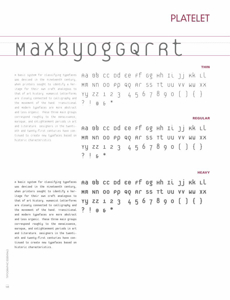
THIN
REGULAR
HEAVY
PLATELET
MaxbyogGQrRtA basic system for classifying typefaces
was devised in the nineteenth century,
when printers sought to identify a her-
itage for their own craft analogous to
that of art history. Humanist letterforms
are closely connected to calligraphy and
the movement of the hand. Transitional
and modern typefaces are more abstract
and less organic. These three main groups
correspond roughly to the Renaissance,
Baroque, and Enlightenment periods in art
and literature. Designers in the twenti-
eth and twenty-first centuries have con-
tinued to create new typefaces based on
historic characteristics.
A basic system for classifying typefaces
was devised in the nineteenth century,
when printers sought to identify a her-
itage for their own craft analogous to
that of art history. Humanist letterforms
are closely connected to calligraphy and
the movement of the hand. Transitional
and modern typefaces are more abstract
and less organic. These three main groups
correspond roughly to the Renaissance,
Baroque, and Enlightenment periods in art
and literature. Designers in the twenti-
eth and twenty-first centuries have con-
tinued to create new typefaces based on
historic characteristics.
Aa Bb Cc Dd Ee Ff Gg Hh Ii Jj Kk Ll
Mm Nn Oo Pp Qq Rr Ss Tt Uu Vv Ww Xx
Yy Zz 1 2 3 4 5 6 7 8 9 0 ( ) { }
? ! @ & *
Aa Bb Cc Dd Ee Ff Gg Hh Ii Jj Kk Ll
Mm Nn Oo Pp Qq Rr Ss Tt Uu Vv Ww Xx
Yy Zz 1 2 3 4 5 6 7 8 9 0 ( ) { }
? ! & *
Aa Bb Cc Dd Ee Ff Gg Hh Ii Jj Kk Ll
Mm Nn Oo Pp Qq Rr Ss Tt Uu Vv Ww Xx
Yy Zz 1 2 3 4 5 6 7 8 9 0 ( ) { }
? ! @ & *
168
TYPO
GR
APH
IC E
SSEN
TIA
LS

REGULAR
ALTERNATE
BOLD
PRIORI SANS
MxanopdrRtSfGgA basic system for classifying typefaces was devised in
the nineteenth century, when printers sought to identify a
heritage for their own craft analogous to that of art his-
tory. Humanist letterforms are closely connected to cal-
ligraphy and the movement of the hand. Transitional and
modern typefaces are more abstract and less organic.
These three main groups correspond roughly to the Re-
naissance, Baroque, and Enlightenment periods in art
and literature. Designers in the twentieth and twenty-first
centuries have continued to create new typefaces based
on historic characteristics.
A basic system for classifying typefaces was devised in
the nineteenth century, when printers sought to iden-
tify a heritage for their own craft analogous to that
of art history. Humanist letterforms are closely con-
nected to calligraphy and the movement of the hand.
Transitional and modern typefaces are more abstract
and less organic. These three main groups correspond
roughly to the Renaissance, Baroque, and Enlighten-
ment periods in art and literature. Designers in the
twentieth and twenty-first centuries have continued
to create new typefaces based on historic character-
istics.
Aa Bb Cc Dd Ee Ff Gg Hh Ii Jj Kk Ll Mm Nn Oo Pp Qq Rr Ss Tt Uu Vv Ww Xx Yy Zz 1 2 3 4 5 6 7 8 9 0 ( ) { } ? ! @ & *
Aa Bb Cc Dd Ee Ff Gg Hh Ii Jj Kk Ll Mm Nn Oo Pp Qq Rr Ss Tt Uu Vv Ww Xx Yy Zz 1 2 3 4 5 6 7 8 9 0 ( ) { } ? ! @ & *
Aa Bb Cc Dd Ee Ff Gg Hh Ii Jj Kk Ll Mm Nn Oo Pp Qq Rr Ss Tt Uu Vv Ww Xx Yy Zz 1 2 3 4 5 6 7 8 9 0 ( ) { } ? ! @ & *
169
FON
T LI
ST

REGULAR
ALTERNATE
BOLD
PRIORI SERIF
MxanodQrRtSfgA basic system for classifying typefaces was devised
in the nineteenth century, when printers sought to
identify a heritage for their own craft analogous to
that of art history. Humanist letterforms are closely
connected to calligraphy and the movement of the
hand. Transitional and modern typefaces are more
abstract and less organic. These three main groups
correspond roughly to the Renaissance, Baroque,
and Enlightenment periods in art and literature.
Designers in the twentieth and twenty-first centu-
ries have continued to create new typefaces based
on historic characteristics.
A basic system for classifying typefaces was de-
vised in the nineteenth century, when printers
sought to identify a heritage for their own craft
analogous to that of art history. Humanist let-
terforms are closely connected to calligraphy
and the movement of the hand. Transitional and
modern typefaces are more abstract and less
organic. These three main groups correspond
roughly to the Renaissance, Baroque, and En-
lightenment periods in art and literature. De-
signers in the twentieth and twenty-first cen-
turies have continued to create new typefaces
based on historic characteristics.
Aa Bb Cc Dd Ee Ff Gg Hh Ii Jj Kk Ll Mm Nn Oo Pp Qq Rr Ss Tt Uu Vv Ww Xx Yy Zz 1 2 3 4 5 6 7 8 9 0 ( ) { } ? ! @ & *
Aa Bb Cc Dd Ee Ff Gg Hh Ii Jj Kk Ll Mm Nn Oo Pp Qq Rr Ss Tt Uu Vv Ww Xx Yy Zz 1 2 3 4 5 6 7 8 9 0 ( ) { } ? ! @ & *
Aa Bb Cc Dd Ee Ff Gg Hh Ii Jj Kk Ll Mm Nn Oo Pp Qq Rr Ss Tt Uu Vv Ww Xx Yy Zz 1 2 3 4 5 6 7 8 9 0 ( ) { } ? ! @ & *
170
TYPO
GR
APH
IC E
SSEN
TIA
LS

(55) SANS
ITALIC
SERIF
ITALIC
ROTIS
MxanopQrRtGgA basic system for classifying typefaces was devised in the nineteenth century, when print-ers sought to identify a heritage for their own craft analogous to that of art history. Humanist letterforms are closely connected to calligraphy and the movement of the hand. Transitional and modern typefaces are more abstract and less organic. These three main groups corre-spond roughly to the Renaissance, Baroque, and Enlightenment periods in art and literature. Designers in the twentieth and twenty-first centuries have continued to create new type-faces based on historic characteristics.
A basic system for classifying typefaces was devised in the nineteenth century, when printers sought to identify a heritage for their own craft analogous to that of art his-tory. Humanist letterforms are closely con-nected to calligraphy and the movement of the hand. Transitional and modern typefaces are more abstract and less organic. These three main groups correspond roughly to the Renaissance, Baroque, and Enlightenment periods in art and literature. Designers in the twentieth and twenty-first centuries have continued to create new typefaces based on historic characteristics.
Aa Bb Cc Dd Ee Ff Gg Hh Ii Jj Kk Ll Mm Nn Oo Pp Qq Rr Ss Tt Uu Vv Ww Xx Yy Zz 1 2 3 4 5 6 7 8 9 0 ( ) { } ? ! @ & *
Aa Bb Cc Dd Ee Ff Gg Hh Ii Jj Kk Ll Mm Nn Oo Pp Qq Rr Ss Tt Uu Vv Ww Xx Yy Zz 1 2 3 4 5 6 7 8 9 0 ( ) { } ? ! @ & *
Aa Bb Cc Dd Ee Ff Gg Hh Ii Jj Kk Ll Mm Nn Oo Pp Qq Rr Ss Tt Uu Vv Ww Xx Yy Zz 1 2 3 4 5 6 7 8 9 0 ( ) { } ? ! @ & *
Aa Bb Cc Dd Ee Ff Gg Hh Ii Jj Kk Ll Mm Nn Oo Pp Qq Rr Ss Tt Uu Vv Ww Xx Yy Zz 1 2 3 4 5 6 7 8 9 0 ( ) { } ? ! @ & *
171
FON
T LI
ST

REGULAR
SMALL CAPS
BOLD
BOLD ITALIC
SABON
MxayogGQfRA basic system for classifying typefaces was devised in the nineteenth century, when printers sought to identify a heritage for their own craft analogous to that of art his-tory. Humanist letterforms are closely con-nected to calligraphy and the movement of the hand. Transitional and modern typefac-es are more abstract and less organic. These three main groups correspond roughly to the Renaissance, Baroque, and Enlighten-ment periods in art and literature. Designers in the twentieth and twenty-first centuries have continued to create new typefaces based on historic characteristics.
A basic system for classifying typefaces was devised in the nineteenth century, when printers sought to identify a heritage for their own craft analogous to that of art his-tory. Humanist letterforms are closely con-nected to calligraphy and the movement of the hand. Transitional and modern typefac-es are more abstract and less organic. These three main groups correspond roughly to the Renaissance, Baroque, and Enlighten-ment periods in art and literature. Designers in the twentieth and twenty-first centuries have continued to create new typefaces based on historic characteristics.
Aa Bb Cc Dd Ee Ff Gg Hh Ii Jj Kk Ll Mm Nn Oo Pp Qq Rr Ss Tt Uu Vv Ww Xx Yy Zz 1 2 3 4 5 6 7 8 9 0 ( ) { } ? ! @ & *
Aa Bb Cc Dd Ee Ff Gg Hh Ii Jj Kk Ll Mm Nn Oo Pp Qq Rr Ss Tt Uu Vv Ww Xx Yy Zz 1 2 3 4 5 6 7 8 9 0 ( ) { } ? ! & *
Aa Bb Cc Dd Ee Ff Gg Hh Ii Jj Kk Ll Mm Nn Oo Pp Qq Rr Ss Tt Uu Vv Ww Xx Yy Zz 1 2 3 4 5 6 7 8 9 0 ( ) { } ? ! @ & *
Aa Bb Cc Dd Ee Ff Gg Hh Ii Jj Kk Ll Mm Nn Oo Pp Qq Rr Ss Tt Uu Vv Ww Xx Yy Zz 1 2 3 4 5 6 7 8 9 0 ( ) { } ? ! @ & *
172
TYPO
GR
APH
IC E
SSEN
TIA
LS

REGULAR
CAPS
ITALIC
BOLD
SCALA SANS
MxabyogGdQrRA basic system for classifying typefaces was
devised in the nineteenth century, when print-
ers sought to identify a heritage for their own
craft analogous to that of art history. Hu-
manist letterforms are closely connected to
calligraphy and the movement of the hand.
Transitional and modern typefaces are more
abstract and less organic. These three main
groups correspond roughly to the Renais-
sance, Baroque, and Enlightenment periods
in art and literature. Designers in the twenti-
eth and twenty-first centuries have continued
to create new typefaces based on historic
characteristics.
A basic system for classifying typefaces was
devised in the nineteenth century, when print-
ers sought to identify a heritage for their own
craft analogous to that of art history. Hu-
manist letterforms are closely connected to
calligraphy and the movement of the hand.
Transitional and modern typefaces are more
abstract and less organic. These three main
groups correspond roughly to the Renais-
sance, Baroque, and Enlightenment periods
in art and literature. Designers in the twen-
tieth and twenty-first centuries have contin-
ued to create new typefaces based on historic
characteristics.
Aa Bb Cc Dd Ee Ff Gg Hh Ii Jj Kk Ll Mm Nn Oo Pp Qq Rr Ss Tt Uu Vv Ww Xx Yy Zz 1 2 3 4 5 6 7 8 9 0 ( ) { } ? ! @ & *
Aa Bb Cc Dd Ee Ff Gg Hh Ii Jj Kk Ll Mm Nn Oo Pp Qq Rr Ss Tt Uu Vv Ww Xx Yy Zz 1 2 3 4 5 6 7 8 9 0 ( ) { } ? ! & *
Aa Bb Cc Dd Ee Ff Gg Hh Ii Jj Kk Ll Mm Nn Oo Pp Qq Rr Ss Tt Uu Vv Ww Xx Yy Zz 1 2 3 4 5 6 7 8 9 0 ( ) { } ? ! @ & *
Aa Bb Cc Dd Ee Ff Gg Hh Ii Jj Kk Ll Mm Nn Oo Pp Qq Rr Ss Tt Uu Vv Ww Xx Yy Zz 1 2 3 4 5 6 7 8 9 0 ( ) { } ? ! @ & *
173
FON
T LI
ST

MxaoygGdQRREGULAR
ITALIC
BOLD
SERIFA
A basic system for classifying typefaces
was devised in the nineteenth century,
when printers sought to identify a heri-
tage for their own craft analogous to
that of art history. Humanist letterforms
are closely connected to calligraphy and
the movement of the hand. Transitional
and modern typefaces are more abstract
and less organic. These three main
groups correspond roughly to the Re-
naissance, Baroque, and Enlightenment
periods in art and literature. Designers
in the twentieth and twenty-first centu-
ries have continued to create new type-
faces based on historic characteristics.
A basic system for classifying type-faces was devised in the nineteenth century, when printers sought to identify a heritage for their own craft analogous to that of art history. Hu-manist letterforms are closely con-nected to calligraphy and the move-ment of the hand. Transitional and modern typefaces are more abstract and less organic. These three main groups correspond roughly to the Renaissance, Baroque, and Enlight-enment periods in art and literature. Designers in the twentieth and twen-ty-first centuries have continued to create new typefaces based on his-toric characteristics.
Aa Bb Cc Dd Ee Ff Gg Hh Ii Jj Kk Ll Mm Nn Oo Pp Qq Rr Ss Tt Uu Vv Ww Xx Yy Zz 1 2 3 4 5 6 7 8 9 0 ( ) { } ? ! @ & *
Aa Bb Cc Dd Ee Ff Gg Hh Ii Jj Kk Ll Mm Nn Oo Pp Qq Rr Ss Tt Uu Vv Ww Xx Yy Zz 1 2 3 4 5 6 7 8 9 0 ( ) { } ? ! @ & *
Aa Bb Cc Dd Ee Ff Gg Hh Ii Jj Kk Ll Mm Nn Oo Pp Qq Rr Ss Tt Uu Vv Ww Xx Yy Zz 1 2 3 4 5 6 7 8 9 0 ( ) { } ? ! @ & *
174
TYPO
GR
APH
IC E
SSEN
TIA
LS

REGULAR
SNELL ROUNDHAND
axogbGdQrRstAa Bb Cc Dd Ee Ff Gg Hh Ii Jj Kk Ll Mm Nn Oo Pp Qq Rr Ss Tt Uu Vv Ww Xx Yy Zz 1 2 3 4 5 6 7 8 9 0 ( ) { } ? ! @ & *
A basic system for classifying typefaces was devised in the nineteenth century, when printers sought to identify a heritage for their own craft analogous to that of art history. Humanist letterforms are closely connected to calligraphy and the movement of the hand. Transitional and modern typefaces are more abstract and less organic. These three main groups correspond roughly to the Renaissance, Baroque, and Enlightenment periods in art and literature. Designers in the twentieth and twenty-first centuries have continued to create new typefaces based on his-toric characteristics.
175
FON
T LI
ST

BOLD CONDENSED
REGULAR
ITALIC
BOLD
SWIFT
MxaoygGdQrRA basic system for classifying typefaces
was devised in the nineteenth century,
when printers sought to identify a heri-
tage for their own craft analogous to that
of art history. Humanist letterforms are
closely connected to calligraphy and the
movement of the hand. Transitional and
modern typefaces are more abstract and
less organic. These three main groups cor-
respond roughly to the Renaissance, Ba-
roque, and Enlightenment periods in art
and literature. Designers in the twentieth
and twenty-first centuries have continued
to create new typefaces based on historic
characteristics.
A basic system for classifying typefaces was de-
vised in the nineteenth century, when printers
sought to identify a heritage for their own craft
analogous to that of art history. Humanist let-
terforms are closely connected to calligraphy
and the movement of the hand. Transitional
and modern typefaces are more abstract and
less organic. These three main groups corre-
spond roughly to the Renaissance, Baroque, and
Enlightenment periods in art and literature.
Designers in the twentieth and twenty-first cen-
turies have continued to create new typefaces
based on historic characteristics.
Aa Bb Cc Dd Ee Ff Gg Hh Ii Jj Kk Ll Mm Nn Oo Pp Qq Rr Ss Tt Uu Vv Ww Xx Yy Zz 1 2 3 4 5 6 7 8 9 0 ( ) { } ? ! @ & *
Aa Bb Cc Dd Ee Ff Gg Hh Ii Jj Kk Ll Mm Nn Oo Pp Qq Rr Ss Tt Uu Vv Ww Xx Yy Zz 1 2 3 4 5 6 7 8 9 0 ( ) { } ? ! @ & *
Aa Bb Cc Dd Ee Ff Gg Hh Ii Jj Kk Ll Mm Nn Oo Pp Qq Rr Ss Tt Uu Vv Ww Xx Yy Zz 1 2 3 4 5 6 7 8 9 0 ( ) { } ? ! @ & *
Aa Bb Cc Dd Ee Ff Gg Hh Ii Jj Kk Ll Mm Nn Oo Pp Qq Rr Ss Tt Uu Vv Ww Xx Yy Zz 1 2 3 4 5 6 7 8 9 0 ( ) { } ? ! @ & *
176
TYPO
GR
APH
IC E
SSEN
TIA
LS

REGULAR
BOLD
BLACK
BLACK
SYNTAX
MxaoygGdQrRA basic system for classifying typefaces was devised in the nineteenth century, when printers sought to identify a heritage for their own craft analogous to that of art his-tory. Humanist letterforms are closely con-nected to calligraphy and the movement of the hand. Transitional and modern typefaces are more abstract and less organic. These three main groups correspond roughly to the Renaissance, Baroque, and Enlighten-ment periods in art and literature. Designers in the twentieth and twenty-first centuries have continued to create new typefaces based on historic characteristics.
A basic system for classifying typefaces was devised in the nineteenth century, when printers sought to identify a heritage for their own craft analogous to that of art history. Humanist letterforms are closely connected to calligraphy and the move-ment of the hand. Transitional and modern typefaces are more abstract and less or-ganic. These three main groups correspond roughly to the Renaissance, Baroque, and Enlightenment periods in art and literature. Designers in the twentieth and twenty-first centuries have continued to create new typefaces based on historic characteristics.
Aa Bb Cc Dd Ee Ff Gg Hh Ii Jj Kk Ll Mm Nn Oo Pp Qq Rr Ss Tt Uu Vv Ww Xx Yy Zz 1 2 3 4 5 6 7 8 9 0 ( ) { } ? ! @ & *
Aa Bb Cc Dd Ee Ff Gg Hh Ii Jj Kk Ll Mm Nn Oo Pp Qq Rr Ss Tt Uu Vv Ww Xx Yy Zz 1 2 3 4 5 6 7 8 9 0 ( ) { } ? ! @ & *
Aa Bb Cc Dd Ee Ff Gg Hh Ii Jj Kk Ll Mm Nn Oo Pp Qq Rr Ss Tt Uu Vv Ww Xx Yy Zz 1 2 3 4 5 6 7 8 9 0 ( ) { } ? ! @ & *
Aa Bb Cc Dd Ee Ff Gg Hh Ii Jj Kk Ll Mm Nn Oo Pp Qq Rr Ss Tt Uu Vv Ww Xx Yy Zz 1 2 3 4 5 6 7 8 9 0 ( ) { } ? ! @ & *
177
FON
T LI
ST

CONDENSED
MEDIUM
BOLD
BOLD NO.2
TRADE GOTHIC
MxanyogGdQrRA basic system for classifying typefaces was devised in the nineteenth century, when printers sought to identify a heritage for their own craft analogous to that of art history. Humanist letterforms are closely connected to calligraphy and the move-ment of the hand. Transitional and modern typefaces are more abstract and less or-ganic. These three main groups correspond roughly to the Renaissance, Baroque, and Enlightenment periods in art and literature. Designers in the twentieth and twenty-first centuries have continued to create new typefaces based on historic characteristics.
A basic system for classifying typefaces was devised in the nineteenth century, when printers sought to identify a heritage for their own craft analogous to that of art history. Humanist letterforms are closely connected to calligraphy and the move-ment of the hand. Transitional and modern typefaces are more abstract and less or-ganic. These three main groups correspond roughly to the Renaissance, Baroque, and Enlightenment periods in art and literature. Designers in the twentieth and twenty-first centuries have continued to create new typefaces based on historic characteristics.
Aa Bb Cc Dd Ee Ff Gg Hh Ii Jj Kk Ll Mm Nn Oo Pp Qq Rr Ss Tt Uu Vv Ww Xx Yy Zz 1 2 3 4 5 6 7 8 9 0 ( ) { } ? ! @ & *
Aa Bb Cc Dd Ee Ff Gg Hh Ii Jj Kk Ll Mm Nn Oo Pp Qq Rr Ss Tt Uu Vv Ww Xx Yy Zz 1 2 3 4 5 6 7 8 9 0 ( ) { } ? ! @ & *
Aa Bb Cc Dd Ee Ff Gg Hh Ii Jj Kk Ll Mm Nn Oo Pp Qq Rr Ss Tt Uu Vv Ww Xx Yy Zz 1 2 3 4 5 6 7 8 9 0 ( ) { } ? ! @ & *
Aa Bb Cc Dd Ee Ff Gg Hh Ii Jj Kk Ll Mm Nn Oo Pp Qq Rr Ss Tt Uu Vv Ww Xx Yy Zz 1 2 3 4 5 6 7 8 9 0 ( ) { } ? ! @ & *
178
TYPO
GR
APH
IC E
SSEN
TIA
LS

MxanyogGdQrRREGULAR
ITALIC
SMALL CAPS
BOLD
WALBAUM
MxyagGdQrRA basic system for classifying typefaces was devised in the nineteenth century, when printers sought to identify a heri-tage for their own craft analogous to that of art history. Humanist letterforms are closely connected to calligraphy and the movement of the hand. Transi-tional and modern typefaces are more abstract and less organic. These three main groups correspond roughly to the Renaissance, Baroque, and Enlighten-ment periods in art and literature. De-signers in the twentieth and twenty-first centuries have continued to create new typefaces based on historic characteris-tics.
A basic system for classifying typefac-es was devised in the nineteenth cen-tury, when printers sought to identify a heritage for their own craft analo-gous to that of art history. Humanist letterforms are closely connected to calligraphy and the movement of the hand. Transitional and modern type-faces are more abstract and less or-ganic. These three main groups cor-respond roughly to the Renaissance, Baroque, and Enlightenment periods in art and literature. Designers in the twentieth and twenty-first centuries have continued to create new type-faces based on historic characteris-tics.
Aa Bb Cc Dd Ee Ff Gg Hh Ii Jj Kk Ll Mm Nn Oo Pp Qq Rr Ss Tt Uu Vv Ww Xx Yy Zz 1 2 3 4 5 6 7 8 9 0 ( ) { } ? ! @ & *
Aa Bb Cc Dd Ee Ff Gg Hh Ii Jj Kk Ll Mm Nn Oo Pp Qq Rr Ss Tt Uu Vv Ww Xx Yy Zz 1 2 3 4 5 6 7 8 9 0 ( ) { } ? ! @ & *
Aa Bb Cc Dd Ee Ff Gg Hh Ii Jj Kk Ll Mm Nn Oo Pp Qq Rr Ss Tt Uu Vv Ww Xx Yy Zz 1 2 3 4 5 6 7 8 9 0 ( ) { } ? ! @ & *
Aa Bb Cc Dd Ee Ff Gg Hh Ii Jj Kk Ll Mm Nn Oo Pp Qq Rr Ss Tt Uu Vv Ww Xx Yy Zz 1 2 3 4 5 6 7 8 9 0 ( ) { } ? ! @ & *
179
FON
T LI
ST
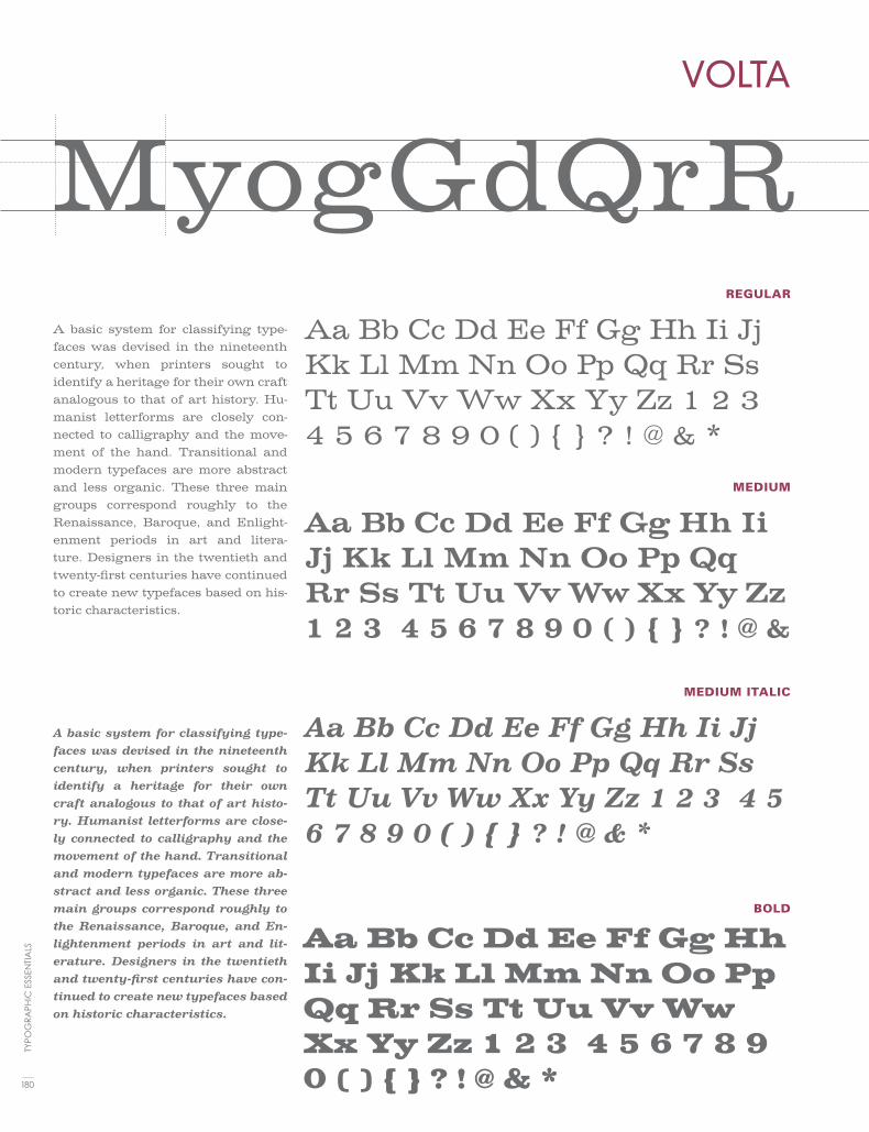
REGULAR
MEDIUM
MEDIUM ITALIC
BOLD
VOLTA
MyogGdQrRA basic system for classifying type-faces was devised in the nineteenth century, when printers sought to identify a heritage for their own craft analogous to that of art history. Hu-manist letterforms are closely con-nected to calligraphy and the move-ment of the hand. Transitional and modern typefaces are more abstract and less organic. These three main groups correspond roughly to the Renaissance, Baroque, and Enlight-enment periods in art and litera-ture. Designers in the twentieth and twenty-first centuries have continued to create new typefaces based on his-toric characteristics.
A basic system for classifying type-faces was devised in the nineteenth century, when printers sought to identify a heritage for their own craft analogous to that of art histo-ry. Humanist letterforms are close-ly connected to calligraphy and the movement of the hand. Transitional and modern typefaces are more ab-stract and less organic. These three main groups correspond roughly to the Renaissance, Baroque, and En-lightenment periods in art and lit-erature. Designers in the twentieth and twenty-first centuries have con-tinued to create new typefaces based on historic characteristics.
Aa Bb Cc Dd Ee Ff Gg Hh Ii Jj Kk Ll Mm Nn Oo Pp Qq Rr Ss Tt Uu Vv Ww Xx Yy Zz 1 2 3 4 5 6 7 8 9 0 ( ) { } ? ! @ & *
Aa Bb Cc Dd Ee Ff Gg Hh Ii Jj Kk Ll Mm Nn Oo Pp Qq Rr Ss Tt Uu Vv Ww Xx Yy Zz 1 2 3 4 5 6 7 8 9 0 ( ) { } ? ! @ &
Aa Bb Cc Dd Ee Ff Gg Hh Ii Jj Kk Ll Mm Nn Oo Pp Qq Rr Ss Tt Uu Vv Ww Xx Yy Zz 1 2 3 4 5 6 7 8 9 0 ( ) { } ? ! @ & *
Aa Bb Cc Dd Ee Ff Gg Hh Ii Jj Kk Ll Mm Nn Oo Pp Qq Rr Ss Tt Uu Vv Ww Xx Yy Zz 1 2 3 4 5 6 7 8 9 0 ( ) { } ? ! @ & *180
TYPO
GR
APH
IC E
SSEN
TIA
LS


18typography terminology
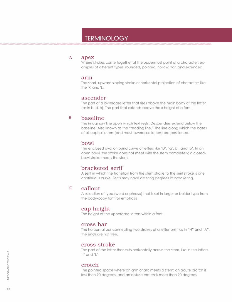
apexWhere strokes come together at the uppermost point of a character; ex-amples of different types: rounded, pointed, hollow, flat, and extended.
armThe short, upward sloping stroke or horizontal projection of characters like the 'X' and 'L'.
ascenderThe part of a lowercase letter that rises above the main body of the letter (as in b, d, h). The part that extends above the x-height of a font.
baselineThe imaginary line upon which text rests. Descenders extend below the baseline. Also known as the “reading line.” The line along which the bases of all capital letters (and most lowercase letters) are positioned.
bowlThe enclosed oval or round curve of letters like ‘D’, ‘g’, b’, and ‘o’. In an open bowl, the stroke does not meet with the stem completely; a closed-bowl stroke meets the stem.
bracketed serifA serif in which the transition from the stem stroke to the serif stroke is one continuous curve, Serifs may have differing degrees of bracketing.
calloutA selection of type (word or phrase) that is set in larger or bolder type from the body-copy font for emphasis
cap heightThe height of the uppercase letters within a font.
cross barThe horizontal bar connecting two strokes of a letterform, as in “H” and “A”, the ends are not free.
cross strokeThe part of the letter that cuts horizontally across the stem, like in the letters ‘t’ and ‘f.’
crotchThe pointed space where an arm or arc meets a stem: an acute crotch is less than 90 degrees, and an obtuse crotch is more than 90 degrees.
TERMINOLOGY
184
TYPO
GR
APH
IC E
SSEN
TIA
LS
A
B
C

descenderThe lowest portion of letters such as ‘g,’ ‘j,’ ‘p.’ ‘q,’ and ‘y’ that extends below the baseline, or reading line of type. The portion of a lowercase letter that extends below the base line of the letter.
drop capAn oversized capital letter used at the start of a paragraph. Drop caps oc-cupy two or more lines of body copy, usually used for design emphasis.
earThe projection on letters like the lowercase ‘g’ and ‘p.’
emA unit of measure, which is the square of a face’s point size. Traditionally, the width of a face’s widest letter, the capital ‘M.’ For instance, if the ‘M’ is 10 points wide, an em is equal to 10 points.
em dashOne em wide, the em dash indicates missing material or a break in thought. Spaces may be added to both sides of the em dash.
enA unit of measurement equal to half of one em.
en dashOne en wide, the en dash indicates duration, “to” or “through” such as, “re-fer to pages 4-9.” It may also be used in compound adjectives as in “post-World War I”. A space can be added to both sides of the en dash.
glyphA shape in a font that is used to represent a character code on screen or paper. The symbols and shapes in a font like ITC Zapf Dingbats are also glyphs.
gutterThe space between two facing pages (inside margins). The term is some-times used to refer to the space between two columns
hanging indentA paragraph with the first line extending to the left of the other lines.
185
TYPO
GR
APH
Y TE
RM
INO
LOG
Y
C
E
G
H

kerningThe adjustment of spacing between letters. The process of improving ap-pearance and legibility by adjusting the white space between certain paired characters, such as ‘Ty’, ‘To’, or ‘Ye’, which are known as “kerning pairs.” Manual kerning allows the desktop publisher to move letters either closer or farther apart or adjust and improve the space between them.
leadingThe amount of vertical space between lines of type. The distance from the baseline of one line of type and the baseline of another line of type immedi-ately above or below it.
legibilitythe ease with which the reader can discern the type on the page, based on the tone of the type in relation to the background and the letterforms’ shape with respect to each other.
ligatureA special double character in a font representing two letters as one. For example, ae and oe. One character that is made up of two or more letters.
orphan lineA single line of a paragraph at the top of a page or column.
picaA unit of measurement equal to one-sixth of an inch. There are 12 points to a pica. A typographic measurement that has survived the digital revolution. 12 points = 1 pica; 6 picas = 1 inch; 72 points = 1 inch.
pointA unit of measurement, often used to measure type size, equal to 0.013837 inch (approximately equal to 1/72”). The traditional point measurement was slightly more or less than 72 points to the inch (depending on the typesetting measurement system).
raggedThe uneven alignment of text lines. Ragged is the opposite of flush. A text block may be formatted to be evenly aligned (flush) on one side and un-evenly aligned (ragged) on the other.
readabilityThe overall appearance of how the type is spaced in the column.
186
TYPO
GR
APH
IC E
SSEN
TIA
LS
K
L
O
P
R

sans serifA typeface without serifs. For example, Helvetica or Modern. Sans serif type is more legible in headings than in a long passage of text.
serifSmall, finishing strokes on the arms, stems, and tails of characters. Serif type-faces are usually used for text since the serifs form a link between letters that leads the eye across a line of type.
spurA finishing stroke like the ones on certain uppercase ‘G’s.
stemThe upright element of a letter or character.
stressThe vertical, horizontal, or diagonal emphasis on the stroke of a letter.
tailA character’s downward projection such as on the letter ‘Q’.
terminalsNot serifs but ends of certain letter shapes such as the letters ‘f’, ‘j’, ‘y’, ‘r’, and ‘a’.
trackingThe overall letterspacing in text. Tracking can also be used to tighten or loosen a block of type.
vertexWhere the stems join at the lowest joint of a character.
widowA single line of a paragraph at the bottom of a page or column.
x-heightThe height of those lowercase letters such as “x”, which do not have as-cenders or descenders. The lowercase ‘x’ is used for measurement since it usually sits squarely on the baseline.
187
TYPO
GR
APH
Y TE
RM
INO
LOG
Y
S
T
V
W
X


EXAMPLES
A E b S T
V
K
f y i g
5 fi a h
q A Q G P
apex
crossbar
serif
finial
cross stroke
flag
terminal
spur
arm
beak
ascender
bowl
barb
spine
stem
bracket
crotch
vertex
descender dot ear
link
loop
leg ligature sans serif shoulder
swash tail throat counter
189
TYPO
GR
APH
Y TE
RM
INO
LOG
Y
Designed by Danielle Aldrich. Third class project for Professor Wertzberger's Typography 02 at the University of Kansas, Spring 2010. Text for the book was compiled from the following sources: Elements of Typographic Style by Robert Bringhurst, Getting it Right with Type: the Do's and Don'ts of Typography by Victoria Squire, Mac is Not A Typewriter by Robin Williams. This book is not to be sold to the public and to only be used by the designer for their student design portfolio.