TYPES OF INFOGRAPHICS YOU SHOULD BE … · 1 INTRODUCTION Humans process information visually, so...
13
TYPES OF INFOGRAPHICS YOU SHOULD BE USING IN YOUR CONTENT MARKETING
Transcript of TYPES OF INFOGRAPHICS YOU SHOULD BE … · 1 INTRODUCTION Humans process information visually, so...
TYPES OF INFOGRAPHICS YOU SHOULD BE USING IN YOUR
CONTENT MARKETING

TABLE OF CONTENTS
Introduction #5: Informational or List-Based Infographic
#1: Flowchart Infographic #6: Process Infographic
#3: Comparison Infographic #8: Geographic Infographic
#2: Timeline Infographic #7: Interactive Infographic
#4: Data Visualization Infographic
Conclusion

1
INTRODUCTION
Humans process information visually, so why not
communicate with prospects through imagery?
Infographics are a cornerstone of content marketing, and
they add branded design elements to your company’s
image and assets. On social media, infographics are
shared three times more than other content types.
To keep your customers informed, promote your brand
and position your company as more creative, versatile
and strategic, infographics are your go-to resource.
And there are plenty of infographic styles to choose from,
some with heavy reliance of numbers or text, others with
2-D character illustrations or 3-D interactive features.
Let’s look at the most common and successful types
of infographics your brand can leverage throughout the
sales funnel.

2
1 FLOWCHART INFOGRAPHIC
A flowchart style infographic distills sequences, steps
and procedures into easy-to-understand visual cues.
Illustrations are linked together by lines, dots or arrows,
noting how and where users should be following along.
Oftentimes, single questions that then branch out
into several follow-up questions or scenarios are best
represented in a flowchart format. With each split or
break, users take a graphically guided tour through a
stream of information, something that would be much
more arduous if done in a purely text composition.
Flowcharts also work well on social media, as they
encourage users to answer questions, select between
multiple options and reach the bottom of the infographic
at their own pace and based on their own decisions.
Should I Drink Coffee?
Do you have coffee?
YES NO
DRINK COFFEE! BUY COFFEE!

3
2 TIMELINE INFOGRAPHIC
Linear storylines, whether vertical or horizontal, lend
themselves well to a timeline infographic arrangement.
By tracing the history of a company from its roots to its
present-day status, for example, timelines plot key dates,
facts, figures and moments in time, enabling users to
stitch together a compelling narrative.
Timelines are some of the simplest mediums for
chronologically displaying information such as how
events shaped history or how ideas evolved over time.
Stories matter, and telling them sequentially through
rich media makes them accessible and user-friendly to
a wide audience.
Decade-Defining Musical Artists 1980s-Present
1980s: MICHAEL JACKSON
2000s: EMINEM
1990s: SPICE GIRLS
2010s: LADY GAGA

4
3 COMPARISON INFOGRAPHIC
A comparison, or versus, infographic is exactly
what it sounds like: It compares and contrasts two
or more items in a visual format. This design is
often a side-by-side arrangement or contains several
columns of information.
The comparison layout highlights one product’s or
company’s advantages over another, typically with
several tiers that feature, for instance, price, customer
service, technical expertise and so on.
These attributes allow users to quickly understand
what’s at stake, which can inform purchasing decisions.
VS.
WINE BEER
Good for the heart Stronger bones
Reduces risk of diseases
Vitamin booster
Prevets sunburnGuards against
carcinogens

5
4 DATA VISUALIZATION INFOGRAPHIC
Although most infographics lean on numbers or
statistical trends as a component of the design, not
all use data as the thematic throughline.
Employing charts, graphs, plots and other data-driven
illustrations brings to life the crux of the infographic.
With less text, data visualization infographics allow
the numbers to speak for themselves, often in dollars,
percentages or absolute figures.
Large, bold font puts data at the forefront of the visual,
and users can interpret the context and storyline of the
graphic based on the numbers and the headers alone.
This is a bread-and-butter type infographic, and it can
be used to promote positive stats about your company,
convey complex data points about a serious issue within
your industry and relay proprietary survey results to your
customers and prospects.
90% of information sent to the brainis visual.
Visuals with color increase people’s willingness to read a piece of content by
80%.

6
5 INFORMATIONAL OR LIST-BASED INFOGRAPHIC
The opposite of the data visualization infographic is the
informational or list-based layout.
Not all ideas are best represented as hard stats, and some
stories need to be told with a conversational narrative.
These types of infographics are akin to a traditional
evergreen blog post, in that they follow a standard
structure of large header-copy-large header-copy.
The text can be in shorter snippets or as fully formed
paragraphs, space permitting.
While the point is to provide information that will
resonate, text doesn’t have to shoulder the sole burden.
Dynamic colors and attractive iconographic schemes
still play a prominent role.
3 TIPS FOR CREATING A COMPELLING INFOGRAPHIC
1. FIND A HOT TOPIC:Deeply research what your
target audience cares about
using social media and other
tools, and make that the
focus of your infographic.
3. LOOK OUT FOR LEGIBILITY:Utilize padding around
text and images to
enhance readability and
comprehension.
2. TONE DOWN THE TEXT:Make your visuals the star
of the show and the means
of telling the story by
keeping text to a minimum.

7
6 PROCESS INFOGRAPHIC
Similar to the informational format, a how-to or process
method relies on text to narrate a step-by-step activity.
Think how to bake peanut butter oatmeal cookies or
the model for setting up Microsoft Office on your
computer – you need directions organized logically in
sequential order along with helpful images that provide
status updates or clues as to what your cookie or
computer screen should look like at a given moment.
Infographics in this style do, in some respects, overlap
with flowcharts, as they tend to feature lines or arrows
that prompt users to navigate to the next intended step.
While visual representations of data can be included
as well (and even sometimes recommended),
the primary actor is still the stream of information
and how it’s ordered.
PEANUT BUTTER OATMEAL COOKIES
In a small bowl, cream peanut butter and
brown sugar until fluffy. Beat in egg. Add oats
and baking soda to creamed mixture; mix well.
Drop by tablespoonfuls 2 in. apart onto
greased baking sheets; flatten slightly. Bake at
350° for 6-8 minutes. Remove to wire racks to
cool. Store in an airtight container.
STEP 1:
STEP 2:

8
7 INTERACTIVE INFOGRAPHIC
Interactive infographics are a newer addition to the
marketing ecosystem. Combining custom code with
traditional design features, interactive infographics
rely on user engagement to uncover the full scope of
information contained on the page.
Users can control and manipulate certain graphical
elements by swiping, zooming and clicking on buttons,
dropdown menus, data points, animated imagery
and other options. This allows them to uncover new
information, explore the graphic based on their own
interest and modify visualizations on the screen.
This is a common medium for maps, globes, skylines,
quizzes, informational charts and data-specific formats.
Though they take more time to create and involve
advanced UX knowledge, interactive infographics
gamify large concepts and stand above flat, static or 2-D
renderings. Plus, interactivity confers upon your brand
an image of creativity, boldness and sophistication.
QUIZ: What year was Harry Potter born?
1989
1985
1980
1991
NEXT QUESTION
9
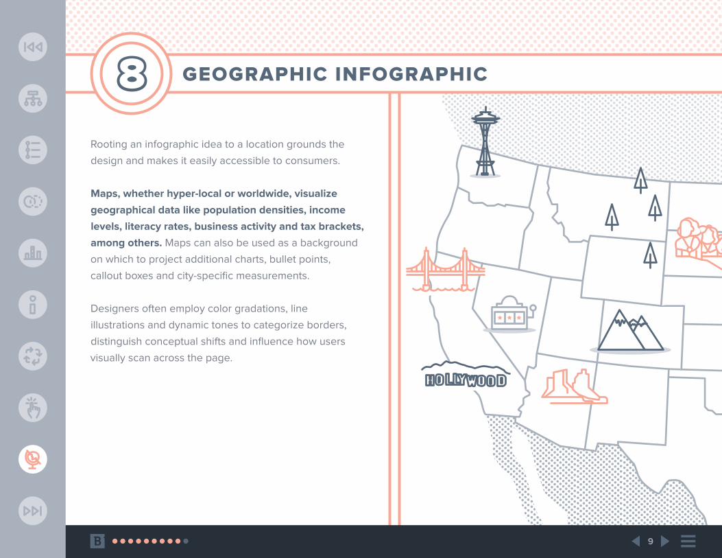
8 GEOGRAPHIC INFOGRAPHIC
Rooting an infographic idea to a location grounds the
design and makes it easily accessible to consumers.
Maps, whether hyper-local or worldwide, visualize
geographical data like population densities, income
levels, literacy rates, business activity and tax brackets,
among others. Maps can also be used as a background
on which to project additional charts, bullet points,
callout boxes and city-specific measurements.
Designers often employ color gradations, line
illustrations and dynamic tones to categorize borders,
distinguish conceptual shifts and influence how users
visually scan across the page.

10
CONCLUSION
Visual content is paramount in today’s marketing,
and it’s a brand differentiator that audiences
immediately recognize.
Humans comprehend and retain information much
more effectively through the prism of visuals, so to
forgo infographics and other design vehicles is to put a
physiological barrier between you and your customers.
And because graphics are universal to B2B and B2C
audiences, you can use stats, narratives, humor and
a range of other devices and emotions to connect with
those with which you intend to connect and convert.
This makes infographics business assets that serve
as sales-enablement mechanisms and instruments for
brand awareness. Spread them far and wide through
social feeds, email channels and organic marketing
initiatives. Print them out and bring them to trade
shows and industry events as well!

WWW.BRAFTON.COM
brafton.com/graphic-design/infographic-design-services/