typebook
8
Exploration of Type A Look Behind The Process of Logo Design. By: James L Patterson
-
Upload
james-patterson -
Category
Documents
-
view
212 -
download
0
description
typebook so far
Transcript of typebook

Exploration of Type
A Look Behind The Process of Logo Design. By: James L Patterson

Logo Development
Stroke Analysis

Micro-aesthetic & Counterforms

Partial letter forms & New Letter forms

Free Form
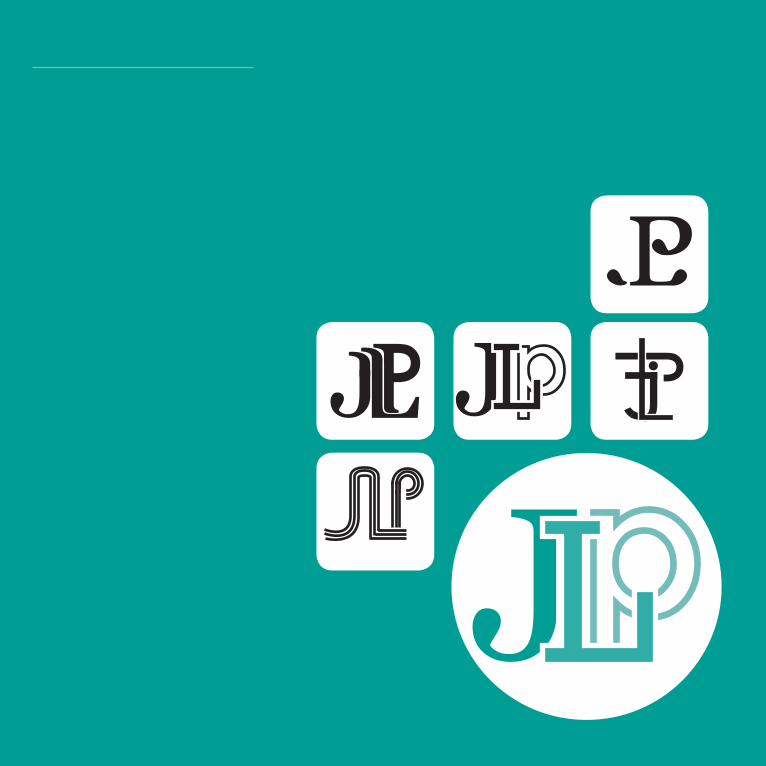
Final Design
Front

Business Card
My first card i tried to keep really simple by keeping out any unneces-sary shapes. Once i really looked at it i noticed that the background didn’t need any color. It took away from the text . I also found it was unnecessary to have text and the
logo on the back of the card. On the front i didnt like how the text was centered. It made it look to sym-metric. To throw off the symmetry I tried the main text in different alignments and positions on from the text i made smaller then the text.
James Patterson567 Cross Ct
Akron, Oh 44311(440)645-1182
JLPatterson Design
James Patterson567 Cross Ct
Akron, Oh 44311(440)645-1182
[email protected] James Patterson
567 Cross CtAkron, Oh 44311(440)[email protected]
James Patterson567 Cross CtAkron, Oh 44311(440)[email protected]
Front Back
Out of all the designs for the back of the card i felt the logo worked best placed inside a circle. To get the viewers attention to go to the text first i made sure make my from the text i made smaller then the text. Out of all the designs for the back
of the card i felt the logo worked best placed inside a circle. To get the viewers attention to go to the text first I made sure make my name bold.