Type 1 Book
50
Q a `
-
Upload
hillary-scott -
Category
Documents
-
view
236 -
download
0
description
Type 1 book
Transcript of Type 1 Book

Qplethora hootenanny g

Qplethora hootenanny g

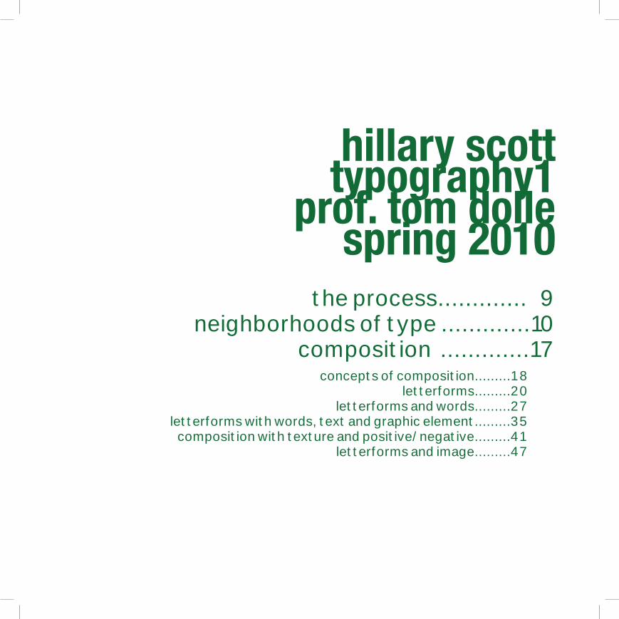
hillary scott typography1
prof. tom dollespring 2010
the process............. 9neighborhoods of type .............10
composition .............17concepts of composition.........18
letterforms.........20 letterforms and words.........27
letterforms with words, text and graphic element.........35composition with texture and positive/negative.........41
letterforms and image.........47

8

9
Upon beginning my Typography class, I’d had no previous experience whatsoever related to typography or typographic elements. Through the course of the semester, creating compositions, examining typography in
every day settings and my attempts to alter type and type layout for this book I’ve gained a much greater sense of what constitutes as “good type.”
There were times when I experienced a great deal of frustration and feelings of defeatedness, but those combined with feelings of accomplishment have
combined to at the very least give me a sense of progress. Although I would not consider myself a professional typographer or designer at this point in
time, I’ve made significant steps in that direction and will continue to do so.
the process
10
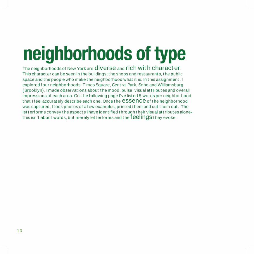
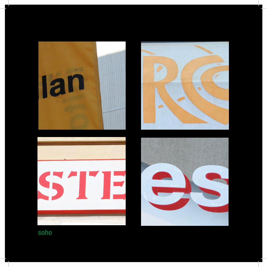
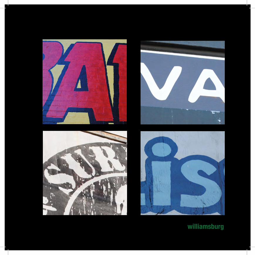
neighborhoods of typeThe neighborhoods of New York are diverse and rich with character. This character can be seen in the buildings, the shops and restaurants, the public space and the people who make the neighborhood what it is. In this assignment, I explored four neighborhoods: Times Square, Central Park, Soho and Williamsburg (Brooklyn). I made observations about the mood, pulse, visual attributes and overall impressions of each area. On t he following page I’ve listed 5 words per neighborhood that I feel accurately describe each one. Once the essence of the neighborhood was captured, I took photos of a few examples, printed them and cut them out. The letterforms convey the aspects I have identified through their visual attributes alone-this isn’t about words, but merely letterforms and the feelings they evoke.
11
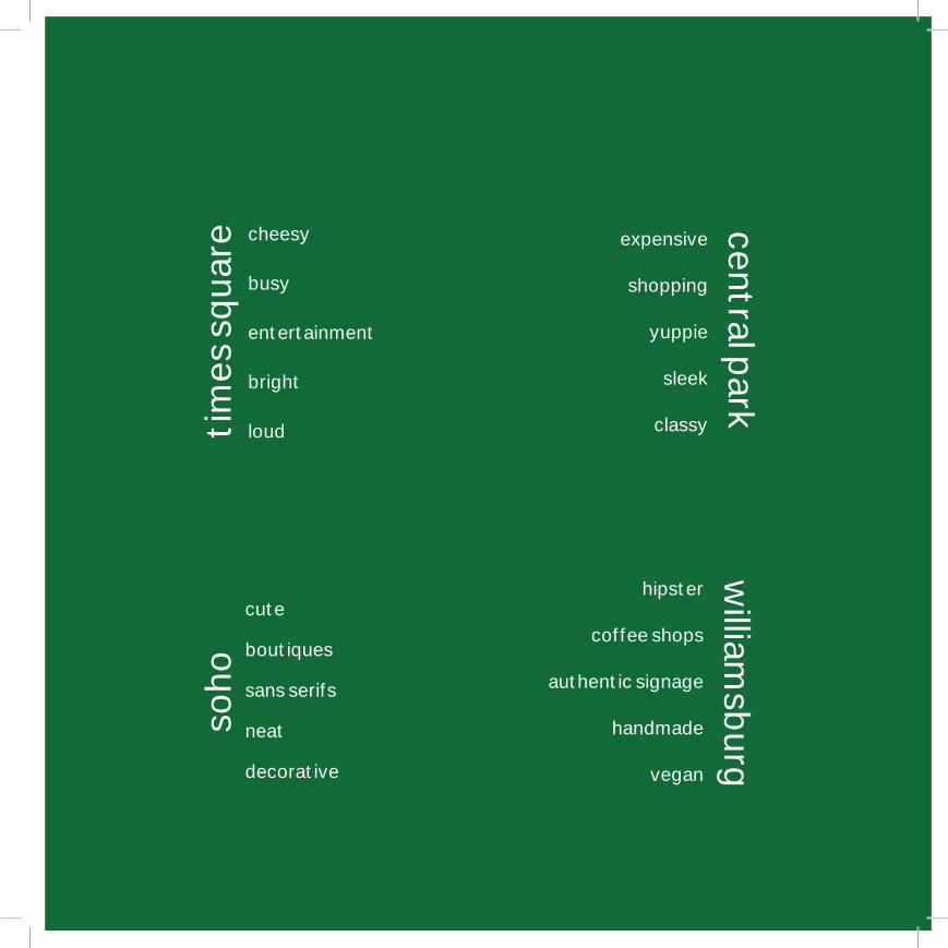
williamsburg
soho
times
squa
re central parkcheesy
busy
entertainment
bright
loud
expensive
shopping
yuppie
sleek
classy
cute
boutiques
sans serifs
neat
decorative
hipster
coffee shops
authentic signage
handmade
vegan
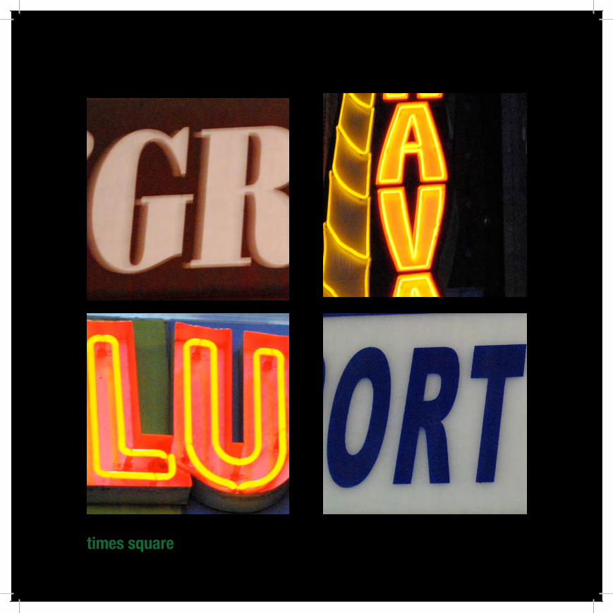
12times square

13central park
14
soho
15williamsburg

16

17
compositionComposition is the organization or grouping of the different parts of a work of art so as to achieve a unified whole.Although typographic composition utilizes the same basic compositional concepts that are part of all visual arts, there are unique ways that typography relates to each of these concepts. By forming relationships between the elements, and incorporating visual concepts in abstract ways, a new and more open relationship with typography is achieved. Shown on the following pages, the exploration of typographic composition started with simple elements--three letterforms--and became a process of identifying abstract concepts as they became visualized. Additional elements were added each week, and new relationships evolved as we explored positive/negative, texture and image use.

18
concepts of composition

19
SizeBalance
Tension/HamonyContrastContextMeaning
FocusForm
StructureDirection
RhythmColor
DepthDetail
TextureDrama
20
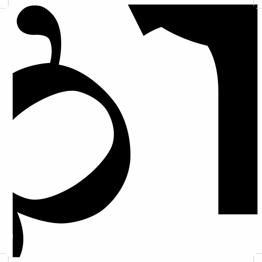
letterformsThese compositions feature three letters from the alphabet, set in any of the
following typefaces: Helvetica, Univers, Futura, Garamond, Times Roman, Century, Baskerville and/or Bodoni. By using size, scale, spacial relationships, bleeds and positioning as the variables, I created six compositions using only the three
letterforms. The final compositions are 8.5”x 8.5” (standard format throughout)

Qg
Qg
Qg

gQ

25
Qg

26
27
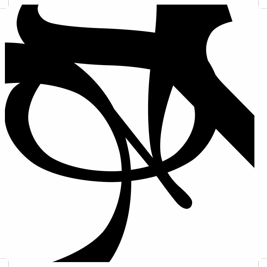
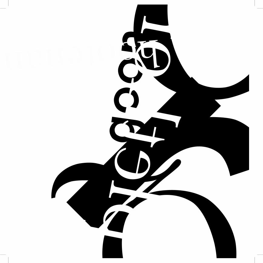
letterforms and wordsKeeping the three letters from the previous assignment, I have now included three
words. The words do not have to have any particular meaning or association with each other. Each letter and word is set in one of the following typefaces:
Helvetica, Univers, Futura, Garamond, Times Roman, Century, and/or Bodoni. Using only the three letters and three words, I created the following compositions.
Qgplethora hootenanny

plethora
Qhootenanny g
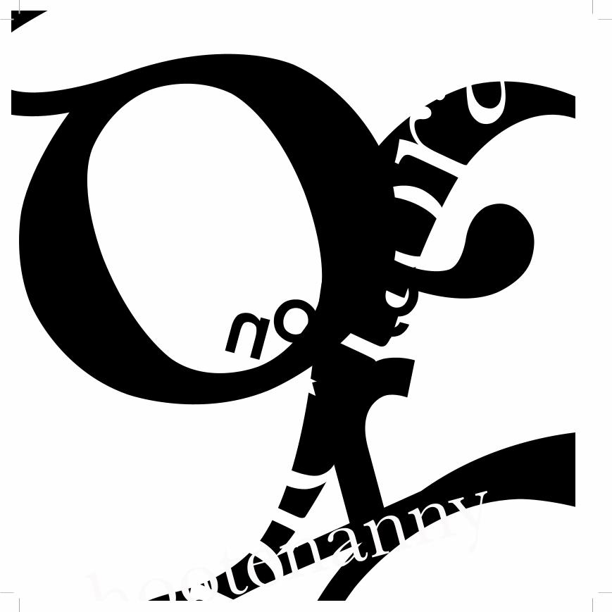
Qplethorag
hootenanny

gQpleth
ora
hootenanny

Qplethoraho
otenannyg
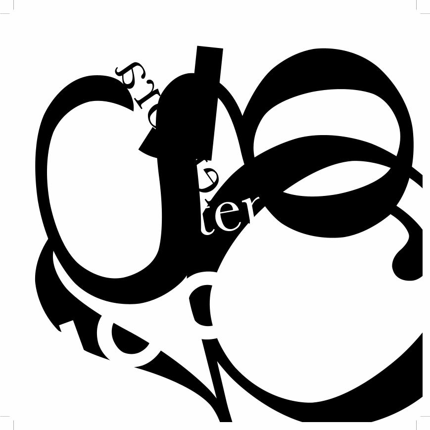
33Qpletho
ra
hootenanny
g

34
35
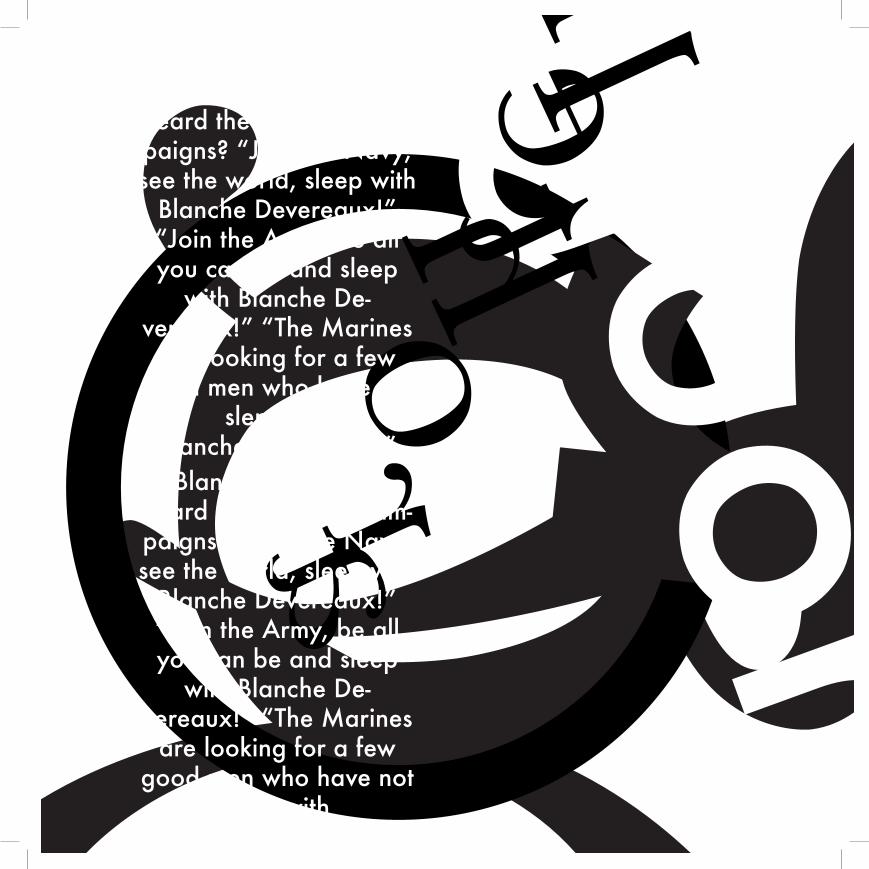
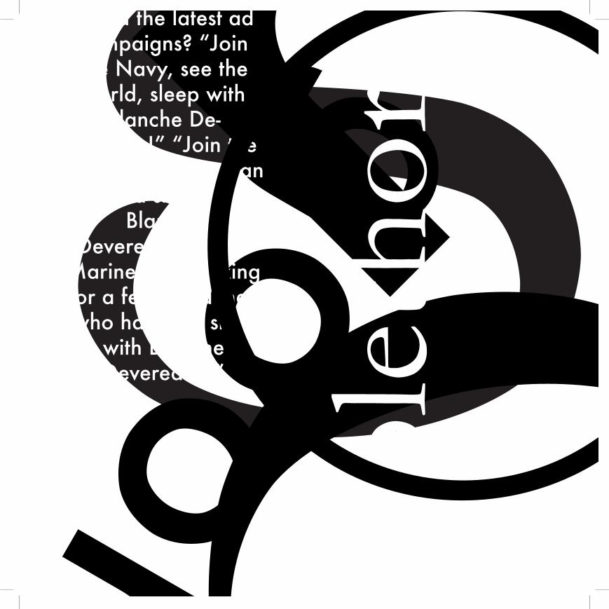
letter forms with words, text and graphic elements
Starting with the same three letters and three words from the previous assignments, I am now adding some text and a graphic element. I am setting the text in one of the approved typefaces
from before, adjusting the leading,column width, type size, etc. to achieve different results. As abstract compositions, it is not necessary that the text or other typographic
elements be readable. I also included a graphic element: a circle outlined. Screens of black could be employed, white type could be used, and structure was to be considered.
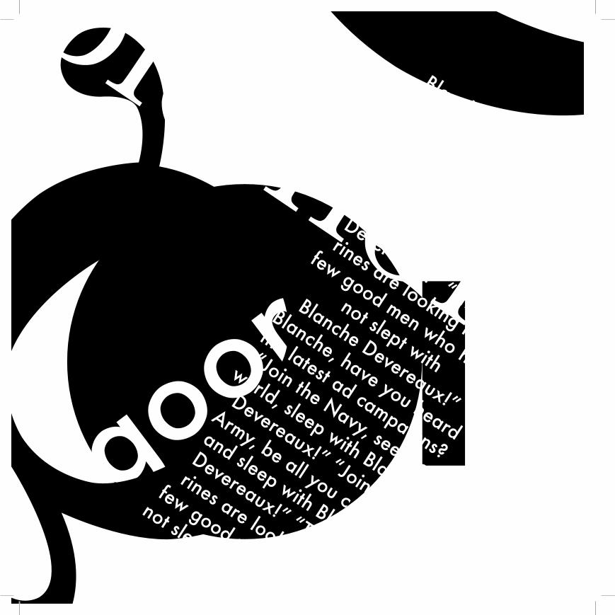
Qgplethora
37 gQplethora

Qpletho
ra g
gQpl
etho
ra

40
41
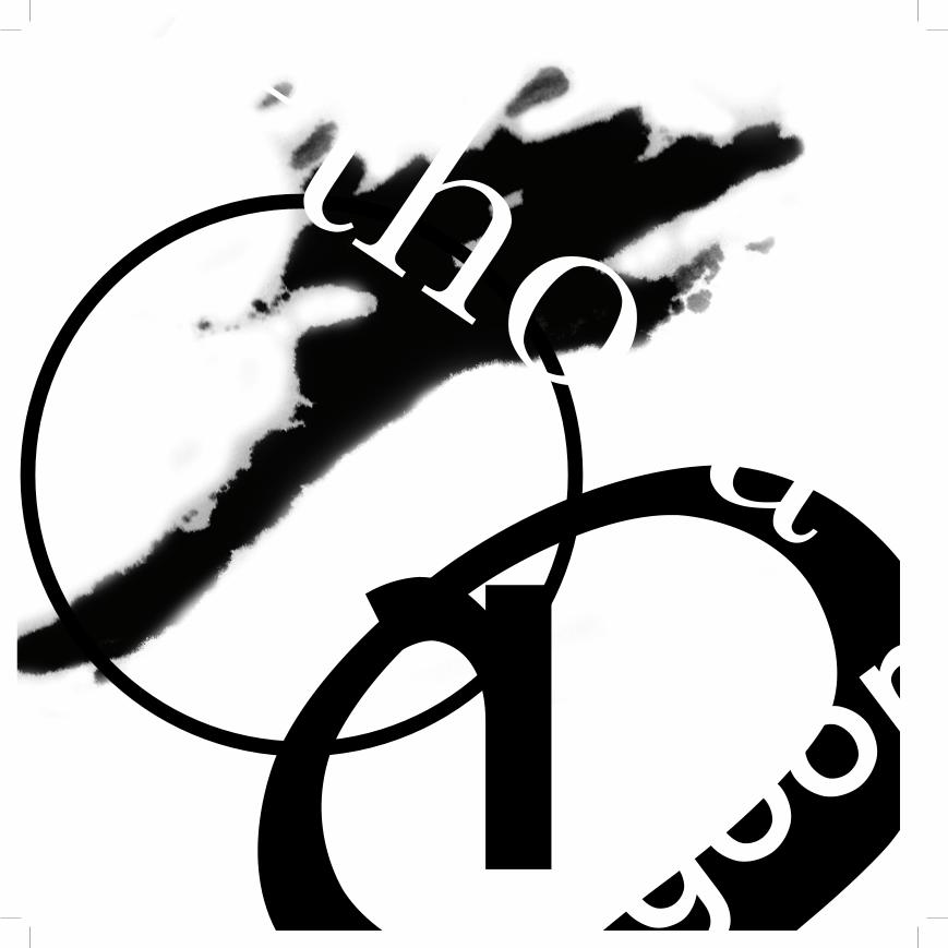
composition with texture and positive/negative
Positive/negative is the relationship between figure and ground Are there black elements on a white ground, or white elements on a black ground? Does the ground
interchange from black to white? Just making a composition negative does not deal with those issues.Texture is the ability to render type in ways other than just hard edge black
and white. Combining hand effects (drawing, painting), machined effects (photocopying, scanning), computer effects (Photoshop, Illustrator) and/or accidental effects (spills,
crumples, rips) allows you to define type in unusual and unique ways-challenging you to see it differently. Typography exists in our world in many forms—this was an opportunity
to explore non-traditional representations of typographic form. Starting with the same three letters, three words and text used in the last assignments, I incorporated positive/
negative and texture as major design components. Graphic elements were optional.
gplethoraQ

Qg
plethora
Qg
plethora

Qgplethora

46

47
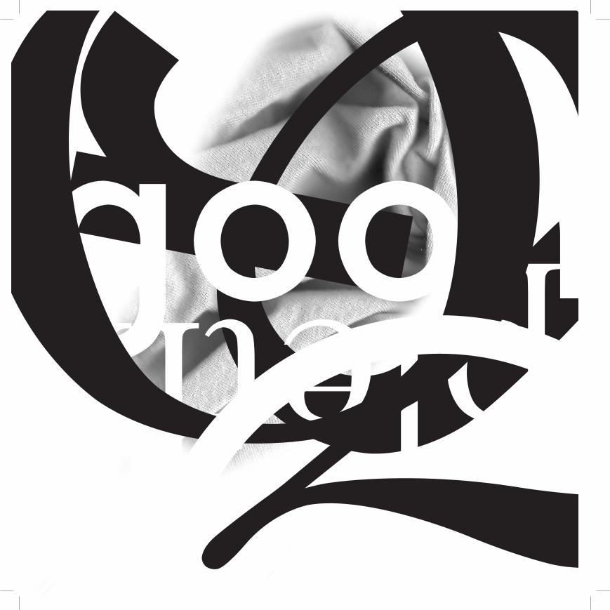
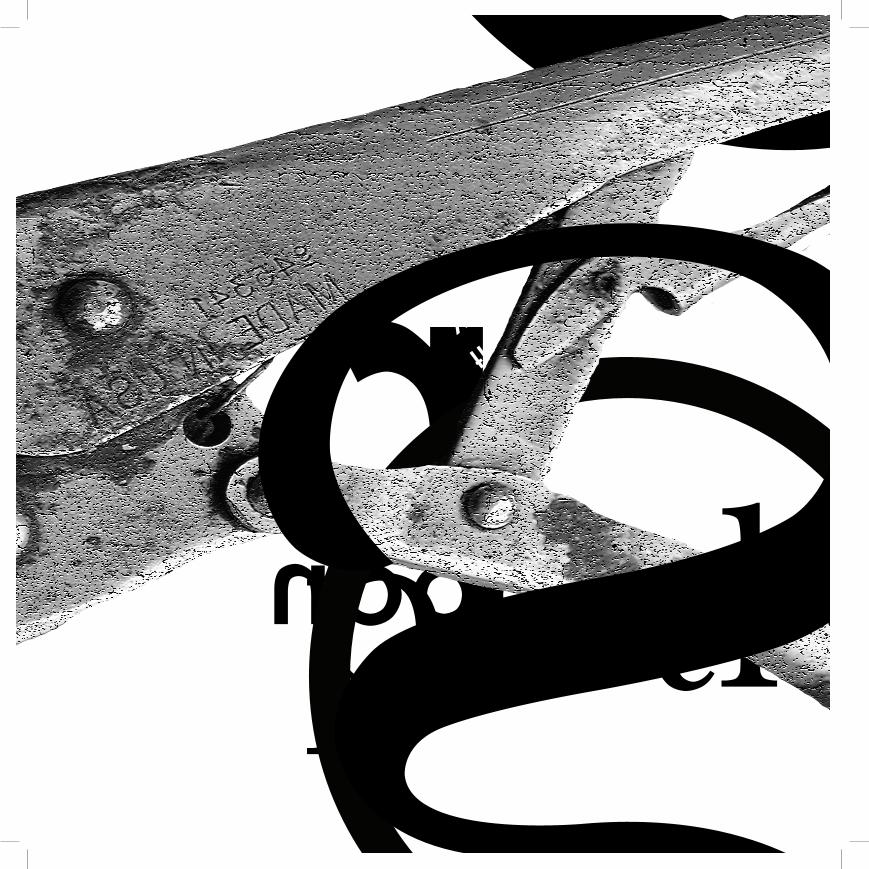
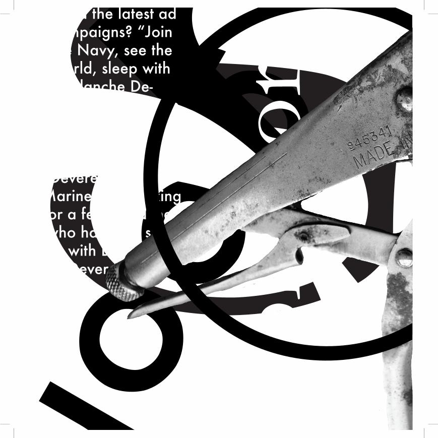
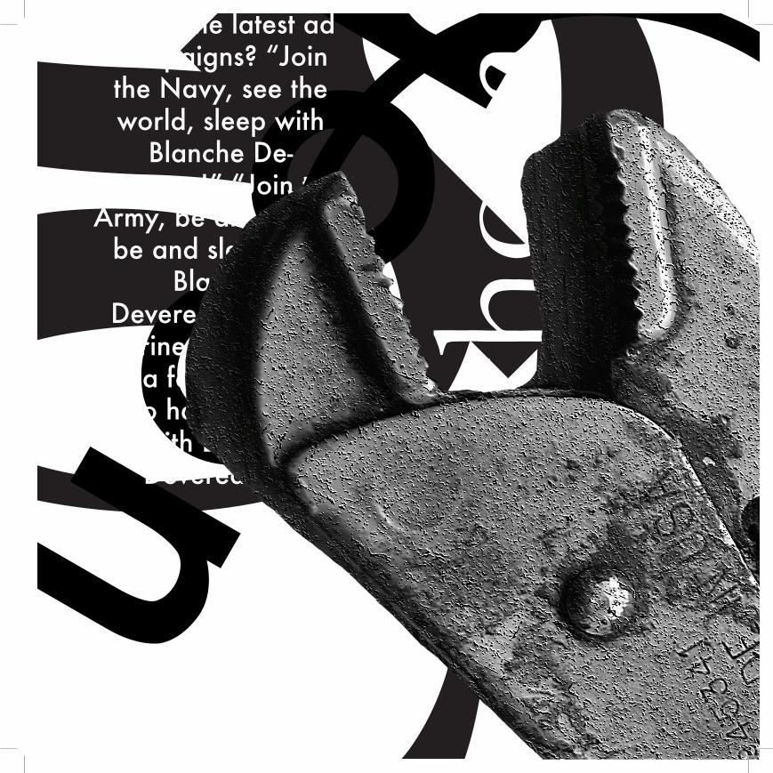
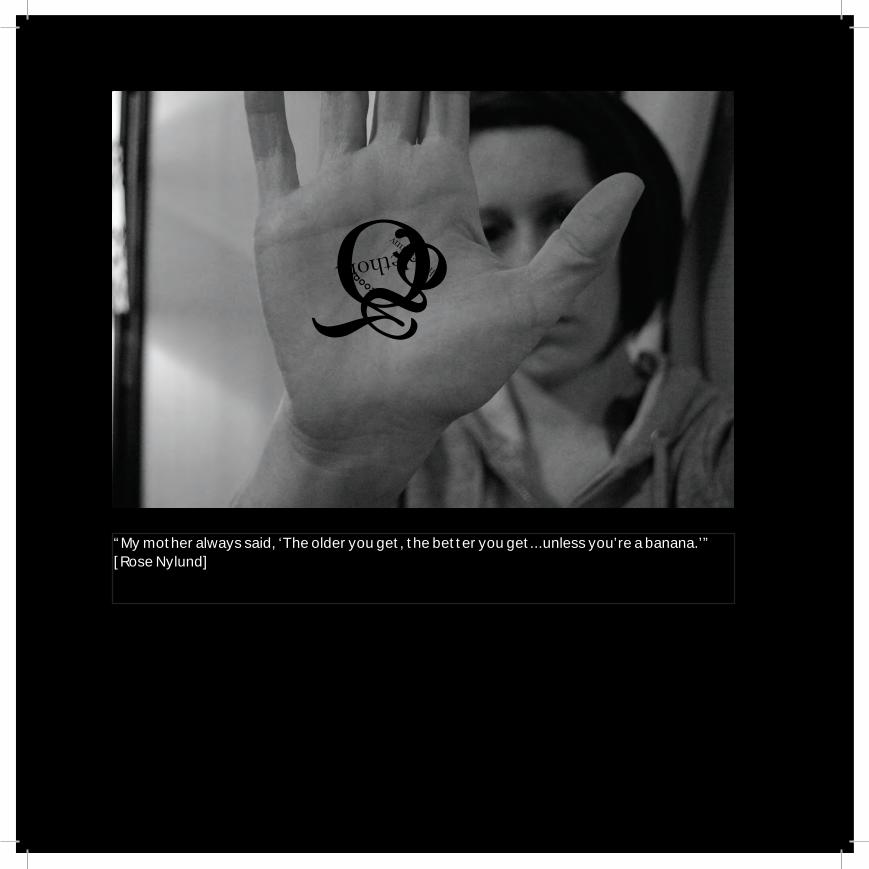
letterforms and imageThe final addition to the compositional process was the incorporation of an
image. With the same three levels of typography—letters, words and text —an image of a simple object was introduced to the mix. The image could
be cropped, silhouetted, texturized or changed in other ways in the course of creating the compositions. Texture could now be a part of the image, or continue
as a separate element. Positive/negative, graphic elements and structure could be incorporated as needed. The resulting compositions are still abstract, but
hint at the richness that can be incorporated into even the simplest realistic project. The complex relationships between typographic elements and the
concepts of scale, balance, focus, etc. are all exhibited in these engaging works that become expressive works of art and communicate on multiple levels.
Qplethorag

Qgplethora
gpl
etho
raQ
51
gQpleth
ora
52
Qplethora hootenanny g
“My mother always said, ‘The older you get, the better you get...unless you’re a banana.’” [Rose Nylund]
53