Tyler Hawkins Graphic Designer
29
T Y L E R HAWKINS P O R T F O L I O
-
Upload
tyler-hawkins -
Category
Documents
-
view
228 -
download
1
description
Portfolio 2013 - 2015
Transcript of Tyler Hawkins Graphic Designer

T Y L E RH A W K I N S
P O R T F O L I O

R E S U M E
ExperienceInternship: Production Designer, Mountain Life Media, Whistler, BC, Summer/ Fall 2015.Project by project, part time graphic design work, remotely and overseen by Mountain Life pub-lisher/ photo editor Todd Lawson: 1 604 907 1074, [email protected].
Internship: Shadowing at Select Design, Burlington, Vermont. 2009.Shadowed and interviewed various positions within the firm in preparation for an 80 hour high school senior project. Positions included graphic designers, illustrators, sales managers, and production managers. Select Design clients include Ben and Jerry’s, Burton Snowboards, Moët Hennessy, Pepsi, and Google. Final products included a 20 page written study of the business of graphic design, including case studies of personal work, both unused mockups and 200 screen printed shirts.
Work Experience: Freelance graphic design for a variety of clients: 2012 to present.Paid and unpaid. Part time. The majority of which is featured here.
SkillsExperience with Adobe CS, Wordpress, Tumblr, HTML, CSS, JS, PHP, Photo Emulsion Silk Screen Printing. Expert with Microsoft Office, copy writing, research, organization, communication, team work.
EducationBachelor of Science, Environmental Economics, Faculty of Land and FoodSystems, UBC, 2014.
Character ReferencesCyrus Schenk, Renoun Skis, Founder, Owner: 1 802 734-4129, [email protected] Dooh, Backcountry ski lodge boss, Winter 2015: 1 250-369-2201, [email protected] Quinde, Academic Advisor: 1 604 822 0181, [email protected]

C O N T A C T1 604 349 4534 [email protected]
tylerhawkns.combehance.net/tylerhawkinseyeofthe-tyler.tumblr.cominstagram.com/tylerwillh
I D E X 1. Renoun Ski Co. 2. Peter Nave, Pacific Rim Mountain Guide 3. Pemberton Taco Company4. Jake Laderoute, Butcher/Chef5. Mountain Life Magazine 6. SUP Explore Adventures 7. Mushboo Mushroom Cultivation Kits8. Greet the Mind Music9. The Offshore Adventure Jounal

1 . R E N O U NSubmissions for two consecutive annual top sheet design competitions for Burl-ington, Vermont based Renoun Ski Co. Fall 2013 and 2014.
In the arguably saturated ski industry, Renoun differentiates with an engineer-ing approach, an exclusive patent on a non Newtonian material which, when layered in the ski, firms on contact with firm snow, and softens in soft snow.
Both designs were asked to accentuate the company’s focus on technical inno-vation while retaining an air of humble, elegant simplicity.
Instead of illustrating original graphics, I chose to focus on intelligent design through collaboration with two well es-tablished artists.
The first design won the people’s choice award and went on to be printed on the vast majority of skis sold that year. The second won nothing, but featured in Instagram publicity for the event and should be featured on a limit run, artist series of skis slated for production late this summer.
Collaborations: Following Page
Top: Albert Bierstadt worked in the late 1800’s, primarily associated with the Hudson River School of landscape painting. His work is in the public do-main, free to transform and adapt via derivative works, commercial or non commercial. Among the Sierra Neva-da Mountains, 1860, oil, available from Wikipedia: http://goo.gl/syYUZo.
Bottom. John Scurlock is an aerial photographer and pilot based in North West Washington state. I contacted him, proposed the project and worked close-ly with him to develope our submission. Example work: Three Climbers, Mt. Baker, 2010. Web gallery: pbase.com/nolock/ monochromatic&page=all
I N S P I R A T I O N S


In completing both pieces, I sought to push the boundaries of my own work and ski top sheet design generally. Re-noun has a digital printer with higher resolution capabilities than most of its competitors. I had never completed such large scale graphics before. The ski industry hasn’t used fine art paint-ings nor landscape photography sig-nificantly. I hadn’t done extensive artist collaborations.
All of these limits presented opportuni-ties to deliver what Renoun had asked for in a progressive, creative way. The ‘broken glass’ composition style has been trending in the ski industry, so it was used to ground the otherwise eye catching designs in something familiar yet trendy.
F I N A L D R A F T S


2 . P A C I F I C R I M
Logos for web and print. Fall 2014. Peter Nave is a backcountry ski guide currently working with Alaska Heli-Ski-ing in Haines, AK, and Black Diamond Touring out of Niseko, Japan. Aiming to expand his personal clientele and ex-pand guiding into South America and the Arctic, he launched his own guiding outfit, Pacific Rim Mountain Guide.
Peter asked me to help brand the proj-ect: to draw logos for a web header, Facebook page profile image, and for future business cards and apparel. Ad-ditionally he asked that I advise his web-site design.
I combined the wonder inspiring land forms of Japan, Alaska, the pacific ocean, with rugged yet progressional typography to deliver a diverse quiver of logos for Peter’s diverse needs.
M O U N T A I NG U I D E
I N S P I R A T I O N S

C O N T E X T S K E T C H E S & D R A F T S

F I N A L D R A F T S

3 . P E M B E R T O NT A C O C O .Logo for web. Spring 2014.
The Pemberton Taco Co. was a food truck and catering service based in the idyllic Pemberton valley. They sold healthy, hearty, as organic as possible tacos in town, at events and weddings. During Whistler Crankworx, they worked for the event’s title sponsor Sram and served the worlds top professional mountain bikers.
I was asked to do their web logo. The owners asked that the piece attempt to balance the trendy hand drawn script aesthetic, wood working/ industrial typography and the simplicity of farmers market signage.
Pemberton itself invokes these cultures with deep historic roots in forestry, farm-ing and strong communities of adrenalin athletes (downhill mountain bikers, ski mountaineers), small farmers and whole foods restaurants, and so referencing the valley itself became important.
I N S P I R A T I O N S

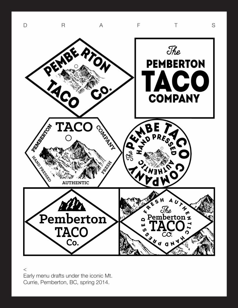
D R A F T S
< Early menu drafts under the iconic Mt. Currie, Pemberton, BC, spring 2014.

F I N A L D R A F T
L I V E S I T E S

4 . J A K ELogo, Business Cards. Fall 2015.
Jake Laderoutte is an up and coming chef and butcher in Vancouver and cooks catering and personal chef jobs on the side. Jake approached me to de-sign a logo which would raise the profile of all of his projects.
He asked that the design embody his bold and ambitious personality. An effec-tive design would communicate these traits much in the same way his dishes do. Pleased with the results, Jake had me lay out his business card, front and back. Cards are currently at the printer.
I N S P I R A T I O N S
D R A F T S & F I N A L

5 . M O U N T A I NL I F EM A G A Z I N EPhoto editing and graphics for social media. Summer 2015.
For a part time internship for Mountain Life Magazine, based out of Whistler, BC, I was asked to unify cohesive im-agery accross all social media chanels and to design an instagram contest to engage a diverse audience.
For the social media unification project, I proposed and implemented aligned profile and banner photos. This enabled us to classily showcase the diversity of outdoors subjects and incredible pho-
tography which drive the magazine, while also paying homage to the brand’s already strong logo and typography.
For the Instagram competition, I pro-posed a simple photo comp to engage users beyond the four annual magazine publication seasons. I was asked to put together a banner advertisement to showcase the campaign, and given free reign, I used the opportunity to recon-nect with the handdrawn aesthetic of my childhood spent with pencils.
I N S P I R A T I O N S


T H I S P A G E :W E BM O C K U P S
P R E V I O U S : D R A F T S &F I N A L

6 . S U P E X P L O R ELogos for web, signage, business cards. Summer 2015.
SUPExplore is a stand up paddle board adventure tours company based out of El Nido, Palawan in the Philipines and run by Whistlerite Todd Lawson, an editor at Mountain Life Magazine. He’s spent his last several winters trading snow in BC to explore the area, and is now launching this luxury tour compa-ny.
Todd asked me to submit drafts for his logo. He asked that the imagery com-municate a certain level of trusted pro-fessionalism, in addition to the adven-ture, fun, and exoticness associated with the stunningly remote and beauti-ful location. Todd required the full brand name to be included and suggested graphic signifyers such as compasses, paddles etc... be included as well.
I N S P I R A T I O N S

With all of these constraints and after several drafts, I narrowed my designs to two primary proposals, one utilizing a strong sans serif font, and another trading moreso on the fun aspect with a brush inspired font (Helvetica neue and Senelma respectively). In the end, neither were chosen for use.
F I N A LP I E C E S

7 . M U S H B O OLogo for web and print. Winter 2012.
Mushboo builds and sells home mush-room growing kits in Vancouver. It re-purposes spent grains from local coffee shops packaged in organically grown bamboo stalks to introduce urbanites to domestic food production.
I was approached to design the logo. The company asked that it be modern,
clean and invoke aesthetics of comfort , environmentalism and innovation.
We used Futura to invoke clean mod-ernism, lowercase to accent comfort, strong lines around the “U” icon to sug-gest technical innovation, and a certain humility to echo green culture.
Drafts have been lost, so here is the final peice and photographs of use.

8 . G R E E TT H E M I N DLogo and t shirt for posters and web. Fall 2013.
Greet the Mind was a a duo, a guitarist and a keyboardist based out of Vancou-ver, BC, inspired equally by Nina Sim-one, The Beatles, A Tribe Called Quest and more recent DJ’s like Bonobo and Emancipator. They played a dozen or so shows and put out an album and a few singles. I did their logo, printed tee shirts and sold them at the Fortune Sound Club, in East Vancouver.
As a band at once acoustic and electric, rock n roll and house electronic, live but also sampled, in between all these influ-ences, it would’ve been difficult to draw a logo with distinct deliberate genre style. Instead I put together a generic logo which could be applied in diverse contexts, with diverse backgrounds. For the shirt, I aimed to create a unique and bold illustration inspired by one of the bands largest inspirations: the natural landscapes of British Columbia.
I N S P I R A T I O N S


9 . T H E O F F S H O R ELogo for web. Winter 2015.
The Offshore is an adventure journal aiming to give voice to those travellers and adrenalin junkies who make it off the beaten path. It prizes concise literature and awe inspiring imagery. The name was inspired by offshore surf breaks, waves which form for moments fleeting, in the middle of oceans, found rarely and only by travelling far, but ep.dhjwk ic and beautiful absolutely.
I was asked to create the logo to serve as the header to the entire online journal. Given free reign, I made two attempts: a conservative first following the distinctly, boldly simple aesthetic common in surf publications, and an unfamiliar second to try something new and appealing to me: rich bold textures and simple stark letterforms in near equal weight.
In the end the client went with bold tex-tures and stark letterforms.
I N S P I R A T I O N S
F O L L O W I N G P A G E :W E B S C R E E N S H O T S
R I G H T : D R A F T S &
F I N A L


T Y L E RH A W K I N S
1 604 349 [email protected]
tylerhawkns.com behance.net/tylerhawkinseyeofthe-tyler.tumblr.cominstagram.com/tylerwillh
01/01/2016 ©