
Tx history-ch-1.3
15
Texas History Chapter 1.3: Using Graphs, Charts, & Tables
Transcript of Tx history-ch-1.3
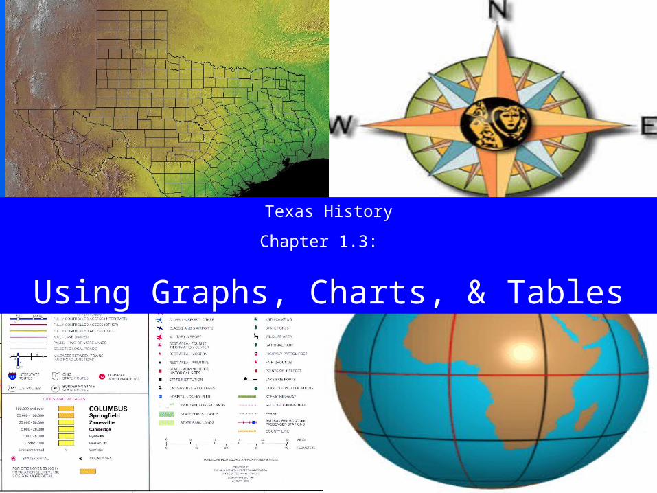
Texas HistoryChapter 1.3:
Using Graphs, Charts, & Tables

Houston: 1.95 millionDallas: 1.18 million
San Antonio: 1.14 millionAustin: .0657 million

Four Largest Texas Cities, 2000
0
0.2
0.4
0.6
0.8
1
1.2
1.4
1.6
1.8
2
Houston Dallas SanAntonio
Austin
Population(In Millions)

Why are we studying this?
Lists of names, facts, and statistics are often clearest when presented visually. Understanding charts and graphs is an essential skill.

Using Graphs
•Statistics—information in the form of numbers
Houston: 1.95 millionDallas: 1.18 millionSan Antonio: 1.14 millionAustin: .0657 million

Using Graphs• Bar graph—uses
bars of different lengths to represent numbers or percentages for comparing information about different places or time periods
0
0.2
0.4
0.6
0.8
1
1.2
1.4
1.6
1.8
2
Houston Dallas SanAntonio
Austin
Population(In Millions)

Using Graphs•Horizontal Axis—the line across the bottom of the graph
•Vertical Axis—is the line along the side

0
0.2
0.4
0.6
0.8
1
1.2
1.4
1.6
1.8
2
Houston Dallas SanAntonio
Austin
Population(In Millions)
Using GraphsV
erti
cal
Axi
s
Horizontal Axis

Using GraphsCollin County Population
0
100000
200000
300000
400000
500000
600000
1950 1960 1970 1980 1990 2000
Population
• Line Graph—graph that indicates a trend or pattern over time, such as whether something is increasing, decreasing, or staying the same

Using Charts & TablesCollin County Race/Ethnicity, 2000
77%
5%
10%
8%
AngloBlackHispanicOther
Pie chart—chart showing how parts of a whole are divided

Using Charts & Tables
Tables help organize
and categorize informatio
n
County Pop. +Harris 20.7%
Dallas 19.8%
Bexar 17.5%
Tarrant 23.6%
Travis 40.9%
Collin 86.2%
Population Growth 1990-2000

Using Charts & Tables
Timeline—chart showing a sequence of events

Using Charts & Graphs• Flow Chart—Chart using boxes,
arrows, or images to show a series of activities or steps
• Causation Chart—Chart that uses pictures, diagrams or arrows to show causes and effects of events

Item Usefulness or purposeBar Graph
Line Graph
Pie Chart
Table
Time Line
Flow Chart
Causation Chart

Item Usefulness or purposeBar Graph to compare data about different places or time
periods
Line Graph to show a trend or pattern
Pie Chart to show how the parts of a whole are divided
Table to organize and categorize descriptive and/or statistical information
Time Line to show the sequence of a series of events
Flow Chart to show steps or a series of activities
Causation Chart To show the cause and effect of an event or situation