Page Design / Style Guide Importance Design Principles Design Elements.
Upload
trinhkhuongCategory
view
218download
0
Transport for London
DESIGN STYLE GUIDE

January 2014 TfL Unclassified
NOTE: You must refer to www.tfl.gov.uk/toolkit for the latest version of this document
2
PURPOSEThe Design style guide for tfl.gov.uk has been created to define the interactive visual language of TfL’s website and digital services. It is a reference starting point for designers and must be followed when producing digital designs on behalf of TfL.

January 2014 TfL Unclassified
NOTE: You must refer to www.tfl.gov.uk/toolkit for the latest version of this document
3
AUDIENCEThis document is aimed at:• Content owners• Designers• Editors• Developers• Relationship managers• Project managers

4January 2014 TfL Unclassified
NOTE: You must refer to www.tfl.gov.uk/toolkit for the latest version of this document
OVERVIEW
DIGITAL EXPERIENCE PRINCIPLES
DEFINING THE VISUAL DIRECTION
CREATIVE DIRECTION: LOOK & FEEL
5
6
9
10
1. TYPOGRAPHY
2. COLOUR PALETTE
3. UI STRUCTURE
3.1 Responsive design
3.2 Universal grid
3.3 Baseline grid
3.4 Desktop grid
3.5 Tablet grid
3.6 Mobile grid
3.7 Pattern behaviour
3.8 Padding
3.9 Global masthead
3.10 Breadcrumbs, headers and icons
3.11 Footer
11
15
19
20
22
23
24
25
26
27
28
29
31
34
CONTENTS4. UI ELEMENTS
4.1 Buttons & calls to action
4.2 Tabs
4.3 Line dividers
4.4 Pagination
4.5 Forms
5. ICONOGRAPHY
6. IMAGE SIZE RATIO
35
36
38
39
40
41
42
44

January 2014 TfL Unclassified
NOTE: You must refer to www.tfl.gov.uk/toolkit for the latest version of this document
5
OVERVIEWThe Design style guide covers the universal elements and user interface (UI) structure that are used to create each of the pages of the website and its applications. The patterns provide a consistent set of elements that can be used to help design each of the page types used across the site.
This guide is designed to help us work as one brand, and to makeit easier to produce high quality communications, experiences and propositions both internally and externally.
These guidelines are intended to help everyone:
• Understand what sits at the heart of TfL• Create experiences that bring the brand strategy to life• Understand the look, feel and behaviour of the TfL brand• Brief teams on the core elements of the digital design system• Enable colleagues, agencies and partners to bring the online brand experience to life

January 2014 TfL Unclassified
NOTE: You must refer to www.tfl.gov.uk/toolkit for the latest version of this document
6
DIGITAL EXPERIENCEPRINCIPLESOur principles inform everything we do. Whether you’re preparing content, designing an interface or developing an entire service, start by reading these.
1. Anticipate users’ needs2. Make things easy3. Keep it clear & simple4. Design for on-the-move5. Build trust6. Continually improve7. Think beyond functional8. Do more with less

January 2014 TfL Unclassified
NOTE: You must refer to www.tfl.gov.uk/toolkit for the latest version of this document
7
1. Anticipate users’ needsOur transport services are for everyone – our digital services should be no different. Start with users - research, use personas, test often. Make accessibility a priority and don’t create anything they don’t really want. Instead, think about localised, personal solutions and only include features, functionality and content that’s genuinely helpful.
2. Make things easyCustomers expect our transport services to be quick, efficient and easy to use. Their online journeys should be no different. Work hard to make things effortless and obvious, and keep the visual language and patterns consistent – this familiarises people with our services and takes the guesswork out of using them.
3. Keep it clear & simplePeople expect our staff to be friendly and approachable. Our digital services should reflect this. Use plain English, get to the point and remember that, even online, we’re talking to people - real people who are more likely to view us in a positive way if we are human, engaging and easy to understand.
4. Design for on-the-moveOur customers are always on the go - and we need to be right there with them. Think about when and where they’re using our services. Are they checking their phone in a rush, at their desk planning a night out or on the sofa visiting Facebook? Consider context to keep things relevant, and ensure everything is as fast and lightweight as possible.

January 2014 TfL Unclassified
NOTE: You must refer to www.tfl.gov.uk/toolkit for the latest version of this document
8
5. Build trustWe want everyone to get the most out of London, so giving them accurate, consistent information is key. Built on central APIs, our digital services should be integrated and up-to-date, reflecting what people are hearing from staff, seeing on screens and reading on Twitter. This builds trust and makes us London’s best source of travel information.
6. Continually improveEverything we do is essentially a work in progress, rather than an end in itself. Start small, test early and keep refining. Be receptive to feedback and learn from what others are saying or doing. Iteration encourages innovation, reduces the risk of failure and helps us build for future needs.
7. Think beyond functionalWe’re passionate about London and want our enthusiasm to rub off on our users. Our staff help do this when they share local knowledge, smile hello or surprise someone with a joke. Digital doesn’t have to mean dry or merely functional. Look for opportunities to make our services engaging, fun and friendly to use.
8. Do more with lessUltimately, we’re building services with our customers’ money and they, quite rightly, expect the best value. Be lean and efficient - focus on users’ core concerns, use modular patterns and develop with APIs. This doesn’t mean you shouldn’t think creatively, it just means you should use your creativity to help deliver value for money.
January 2014 TfL Unclassified
NOTE: You must refer to www.tfl.gov.uk/toolkit for the latest version of this document
9
DEFINING THE VISUAL DIRECTIONWith the Experience principles as our foundation, the interactive visual language of TfL’s website and digital services has been designed using these considerations:
• Truly mobile – think ‘mobile first’, how do we best deliver content to users given any possible device and context of use
• Simple and intuitive – clean, clear and usable
• Modern and exciting – a fresh design that inspires the user and acknowledges both our heritage and 21st century London
• Accessible – we must be compliant, lean and fast-loading
• Consistent – a well thought out and intuitive visual language across all devices, with a clear brand identity
• Personal – a welcoming, more customer-centric and human look, right through to the use of language and integration of social tools
January 2014 TfL Unclassified
NOTE: You must refer to www.tfl.gov.uk/toolkit for the latest version of this document
10
CREATIVE DIRECTION:LOOK & FEELThe interactive visual language has been designed to reflect the look of today’s transport in London. The design is bright and spacious with a bold, modern feel. It provides a real impression of space as the page stands back allowing strong, bright colours to pick out the details the user needs.
The design has been kept clean and flat with large target areas. In order to maintain this, the look has minimised design flourishes such as shadows, double borders, gradients and tiny calls to action.
Although the site has been made to look modern and interactive it also has accessibility needs and is ‘mobile first’. The design uses space, strong colour and large typography to guide the user.
January 2014 TfL Unclassified 11
NOTE: You must refer to www.tfl.gov.uk/toolkit for the latest version of this document
1. TYPOGRAPHY

January 2014 TfL Unclassified
NOTE: You must refer to www.tfl.gov.uk/toolkit for the latest version of this document
12
1. TYPOGRAPHY
ABCDEFGHJKLMNOPQRSTUVWXYZabcdefghijklmnopqrstuvwxyz1234567890£/.,‘’():;New Johnston Medium
ABCDEFGHJKLMNOPQRSTUVWXYZabcdefghijklmnopqrstuvwxyz1234567890£wW/.,‘’():;New Johnston Light
ABCDEFGHJKLMNOPQRSTUVWXYZabcdefghijklmnopqrstuvwxyz1234567890£/.,‘’():;New Johnston Bold
New JohnstonNew Johnston is the corporate and official font for TfL. It is used primarily for titles and subtitles but is also used in body copy and some calls to action on the website. The typeface should be set in mixed upper and lower case.
CopyrightNew Johnston is the exclusive property of TfL and you need a license to use it. Please visit tfl.gov.uk/corporatedesign to apply for one.

January 2014 TfL Unclassified
NOTE: You must refer to www.tfl.gov.uk/toolkit for the latest version of this document
13
1. TYPOGRAPHY
ABCDEFGHJKLMNOPQRSTUVWXYZabcdefghijklmnopqrstuvwxyz1234567890£/.,‘’():;Arial Regular
ABCDEFGHJKLMNOPQRSTUVWXYZabcdefghijklmnopqrstuvwxyz1234567890£/.,‘’():;Arial Italic
ABCDEFGHJKLMNOPQRSTUVWXYZabcdefghijklmnopqrstuvwxyz1234567890£/.,‘’():;Arial Bold
ArialArial is used as the default font for all headlines and body copy. It is also used for buttons and CTAs. Font sizes and padding will change dynamically depending on screen resolution.

January 2014 TfL Unclassified
NOTE: You must refer to www.tfl.gov.uk/toolkit for the latest version of this document
14
1. TYPOGRAPHYFont sizesLarge bold type should be used to establish a clear information hierarchy. Font sizes and padding will change dynamically depending on screen resolution. These are the recommended type sizes to start with.
HeadingsThese are set in New Johnston Medium mixed upper and lower case.
Body textBody text should be set in New Johnston Book mixed upper and lower case.
Tracking and leadingThe typographic style relies on tight tracking,tight leading and large headers. Spacing around headers and body copy should be consistent. Either 10px or 20px above and to the leftwhen content is contained or aligned to the grid (refer to baseline grid) when there is no container.
DESKTOP MOBILE

January 2014 TfL Unclassified 15
NOTE: You must refer to www.tfl.gov.uk/toolkit for the latest version of this document
2. COLOUR PALETTE

January 2014 TfL Unclassified
NOTE: You must refer to www.tfl.gov.uk/toolkit for the latest version of this document
16
Primary colour specifications TfL Blue and Dark Grey/Blue are our lead colours and we use them dominantly in our communications. Our primary colours are used to place emphasis on brand-relevant elements.
2. COLOUR PALETTEPRIMARY
Primary BlueHex 1A5A92R26 G90 B146
TurquoiseHex 66CCCCR102 G204 B204
Dark Grey/BlueHex 2D3039R45 G48 B57
WhiteHex FFFFFFR255 G255 B255
Modified TfL BlueHex 113B92R17 G59 B146

January 2014 TfL Unclassified
NOTE: You must refer to www.tfl.gov.uk/toolkit for the latest version of this document
17
2. COLOUR PALETTEACCENT
Light Grey 1Hex F7F7F7R247 G247 B247
Light BlueHex EFF6FDR239 G246 B253
Light Grey 2Hex EEEEEER238 G238 B238
Mid BlueHex CCDDE8R204 G221 B232
GreenHex E7f6DCR231 G246 B220
Warning YellowHex FAF5E1R250 G245 B225
Error RedHex FFEFEFR255 G239 B239
Mid GreyHex CCCCCCR204 G204 B204
Accent colour specifications
Occasionally we also use our Grey and Light Blue when we need to be more subtle. Our accent colours are used for contrasting content elements (font colour, highlights etc). We don’t use individual colours to identify business offers or products specifically (ie Grey is not our exclusive business colour).

January 2014 TfL Unclassified
NOTE: You must refer to www.tfl.gov.uk/toolkit for the latest version of this document
18
Additional coloursThese include a range of secondary and brand-related colours to help people navigate.
LU RedHex CC3333R220 G36 B31
LU BlueHex 0019a8R0 G25 B168
Victoria Coach StnHex FF9900R241 G171 B0
CentralHex CC3333R220 G36 B31
NothernHex 000000R0 G0 B0
London StreetsHex 999999R151 G166 B155
CircleHex FFCC00R255 G206 B0
PicadillyHex 0019a8R0 G25 B168
RiverHex 0099CCR0 G160 B226
DistrictHex 006633R0 G114 B41
VictoriaHex 0099CCR0 G160 B226
Dial-a-RideHex CC33CCR183 G39 B191
H’smith & CityHex CC9999R215 G153 B175
Waterloo & CityHex 66CCCCR118 G208 B189
Emirates Air LineHex D9002AR217 G0 B42
JubileeHex 868F98R134 G143 B152
BusesHex CC3333R220 G36 B31
DLRHex 009999R0 G175 B173
TramlinkHex 66CC00R0 G189 B25
BCH 1Hex 009EE0 R0 G158 B224
Public CarriageHex 9999CCR132 G128 B215
BakerlooHex 996633R137 G78 B36
MetropolitanHex 660066R117 G16 B86
BCH2Hex 031041R3 G16 B65
TRANSPORT MODE SPECIFIC UNDERGROUND LINE COLOURS
2. COLOUR PALETTE

January 2014 TfL Unclassified 19
NOTE: You must refer to www.tfl.gov.uk/toolkit for the latest version of this document
3. UI STRUCTURE

January 2014 TfL Unclassified
NOTE: You must refer to www.tfl.gov.uk/toolkit for the latest version of this document
20
3.1 RESPONSIVE DESIGNThe TfL website has been designed responsively, which means the layout of the website has been progressively enhanced using flexible grids. Instead of multiple versions of markup language for each individual device screen resolution, responsive design proposes to use one HTML and CSS file to display content correctly.
What this means for devsign is that when creating visuals, we must provide direction for our three major device groups - desktop, tablet and mobile. The design of the website’s core elements has been created to provide a coherent and consistent language, while optimising for the context of use according to the device the site is being viewed on.
January 2014 TfL Unclassified
NOTE: You must refer to www.tfl.gov.uk/toolkit for the latest version of this document
21
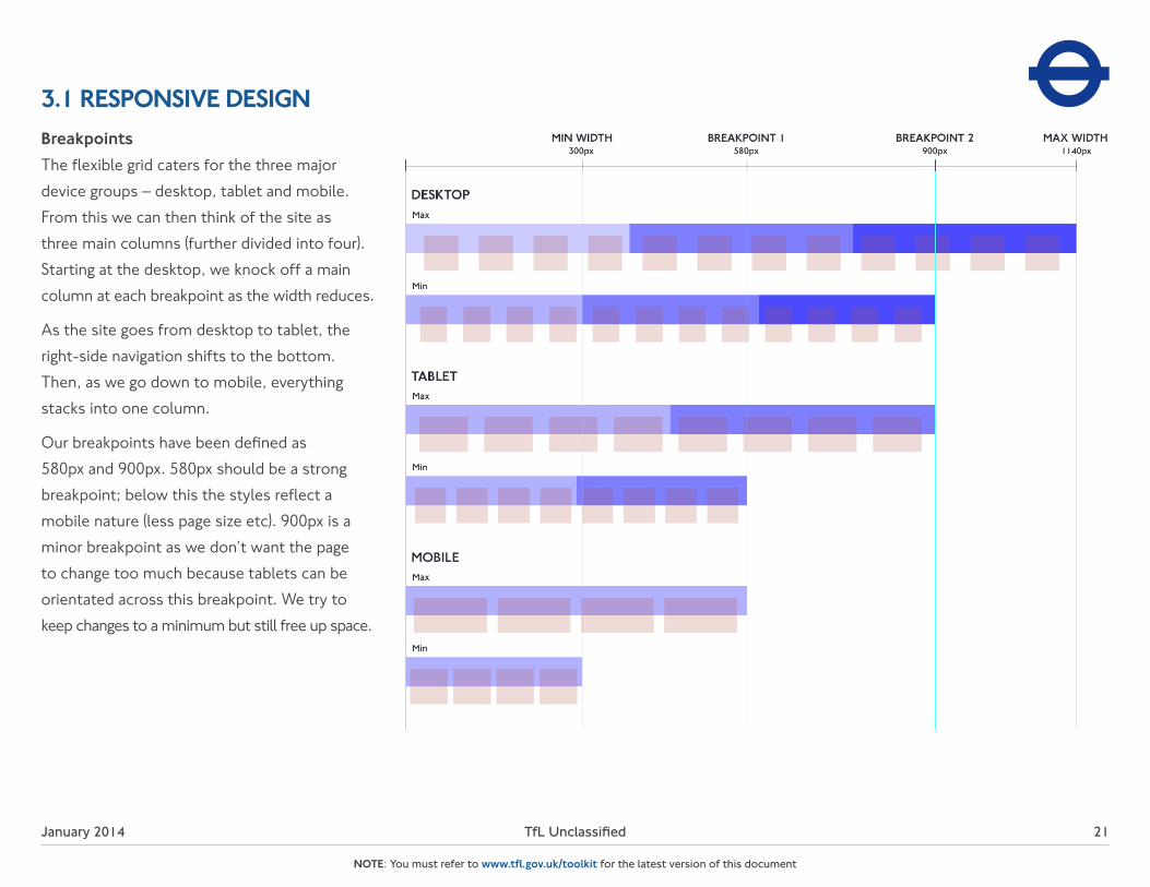
3.1 RESPONSIVE DESIGNBreakpointsThe flexible grid caters for the three major device groups – desktop, tablet and mobile. From this we can then think of the site as three main columns (further divided into four). Starting at the desktop, we knock off a main column at each breakpoint as the width reduces.
As the site goes from desktop to tablet, the right-side navigation shifts to the bottom. Then, as we go down to mobile, everything stacks into one column.
Our breakpoints have been defined as 580px and 900px. 580px should be a strong breakpoint; below this the styles reflect a mobile nature (less page size etc). 900px is a minor breakpoint as we don’t want the page to change too much because tablets can be orientated across this breakpoint. We try to keep changes to a minimum but still free up space.

January 2014 TfL Unclassified
NOTE: You must refer to www.tfl.gov.uk/toolkit for the latest version of this document
22
3.2 UNIVERSAL GRIDWhen designing, your starting point is the universal grid which we use throughout the TfL website for responsive design. It’s divided into 10px vertical units with a max width of 990px.
The grid is composed of 12, eight and four flexible columns, according to the device group you are designing for.
January 2014 TfL Unclassified
NOTE: You must refer to www.tfl.gov.uk/toolkit for the latest version of this document
23
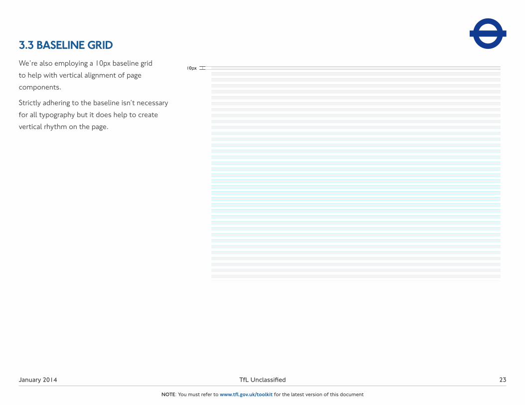
3.3 BASELINE GRIDWe’re also employing a 10px baseline grid to help with vertical alignment of page components.
Strictly adhering to the baseline isn’t necessary for all typography but it does help to create vertical rhythm on the page.

January 2014 TfL Unclassified
NOTE: You must refer to www.tfl.gov.uk/toolkit for the latest version of this document
24
3.4 DESKTOP GRIDWhen creating the psd for desktop design, set the width to 990px. Then use 12 columns with a width of 50px and a gutter and margin of 30px.

January 2014 TfL Unclassified
NOTE: You must refer to www.tfl.gov.uk/toolkit for the latest version of this document
25
3.5 TABLET GRIDWhen creating the psd for tablet design, set the width to 660px. Then use eight columns with a width of 60px and a gutter and margin of 20px.
January 2014 TfL Unclassified
NOTE: You must refer to www.tfl.gov.uk/toolkit for the latest version of this document
26
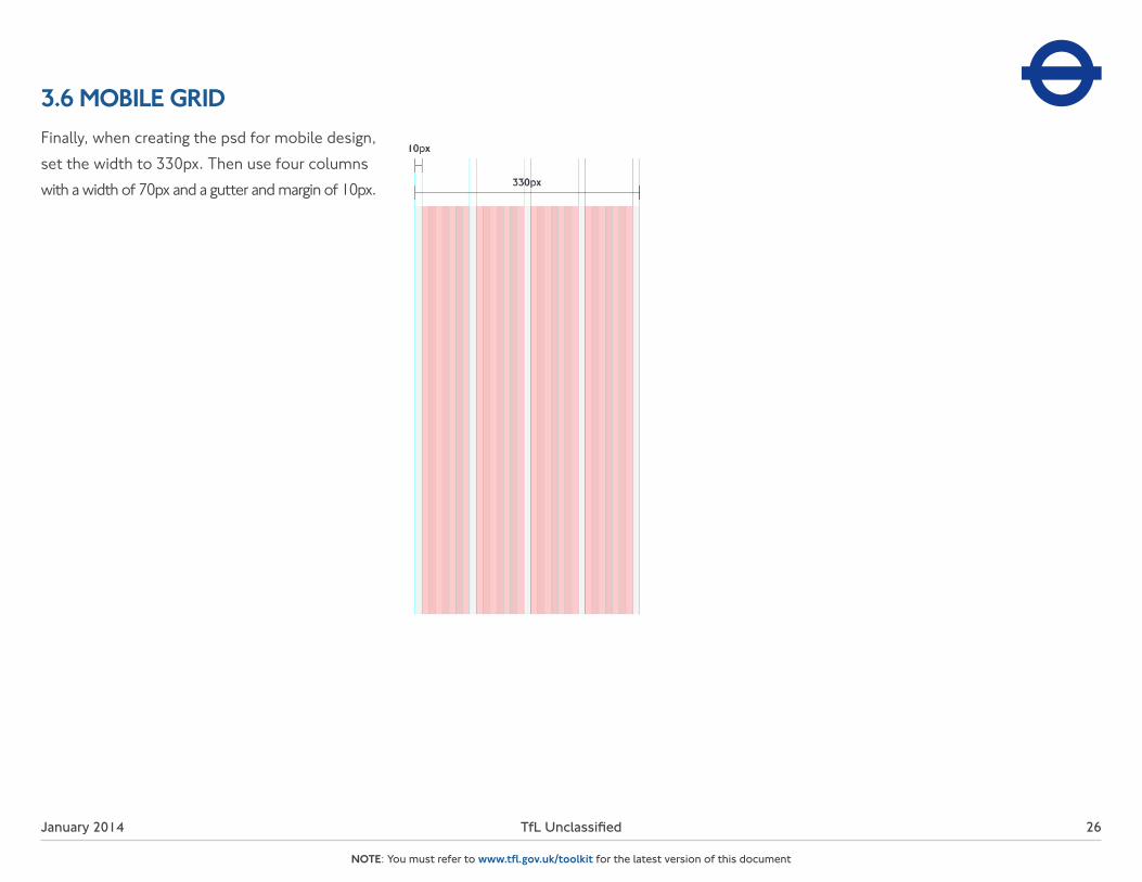
3.6 MOBILE GRIDFinally, when creating the psd for mobile design, set the width to 330px. Then use four columns with a width of 70px and a gutter and margin of 10px.

January 2014 TfL Unclassified
NOTE: You must refer to www.tfl.gov.uk/toolkit for the latest version of this document
27
3.7 PATTERN BEHAVIOURWith our grid system in place, we design content modules to adapt across our breakpoints. At desktop, the main content modules span two columns, with the right-hand side assigned to navigation and related content. When going down to tablet, the column span of the main content remains the same (two columns), with right-hand content shifting to the bottom. This means there is a subtle change in design since tablet can be orientated across this breakpoint. At mobile, content modules stack into one column.

January 2014 TfL Unclassified
NOTE: You must refer to www.tfl.gov.uk/toolkit for the latest version of this document
28
3.8 PADDINGIn order to provide clear page structure, careful attention should be paid to the padding of elements and modules. Using both the universal and baseline grids, padding should be given equal and even weighting in increments of 10px.

January 2014 TfL Unclassified
NOTE: You must refer to www.tfl.gov.uk/toolkit for the latest version of this document
29
3.9 GLOBAL MASTHEADThe global masthead is a navigational hub that directs users to all sections of the TfL site. Users can access primary navigation, brand elements and supporting browsing elements such as Search. The masthead adjusts responsively according to screen width.

January 2014 TfL Unclassified
NOTE: You must refer to www.tfl.gov.uk/toolkit for the latest version of this document
30
3.9 GLOBAL MASTEHEADDESKTOP MOBILEExpanded
In its initial state at desktop, the masthead provides four anchor links, with additional links hidden under the ‘more’ option. On click, the expanded panel reveals a sub-set of links that directs users to further content and functional areas of the site.
As the masthead adjusts according to the screen width, links get placed into the expanded dropdown. At mobile, the entire menu is placed into the dropdown, with links reformatted into touch-friendly buttons.
January 2014 TfL Unclassified
NOTE: You must refer to www.tfl.gov.uk/toolkit for the latest version of this document
31
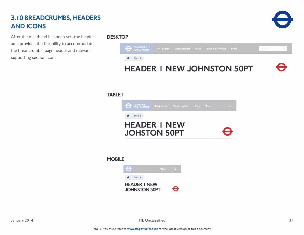
3.10 BREADCRUMBS, HEADERS AND ICONSAfter the masthead has been set, the header area provides the flexibility to accommodate the breadcrumbs, page header and relevant supporting section icon.
DESKTOP
TABLET
MOBILE
January 2014 TfL Unclassified
NOTE: You must refer to www.tfl.gov.uk/toolkit for the latest version of this document
32
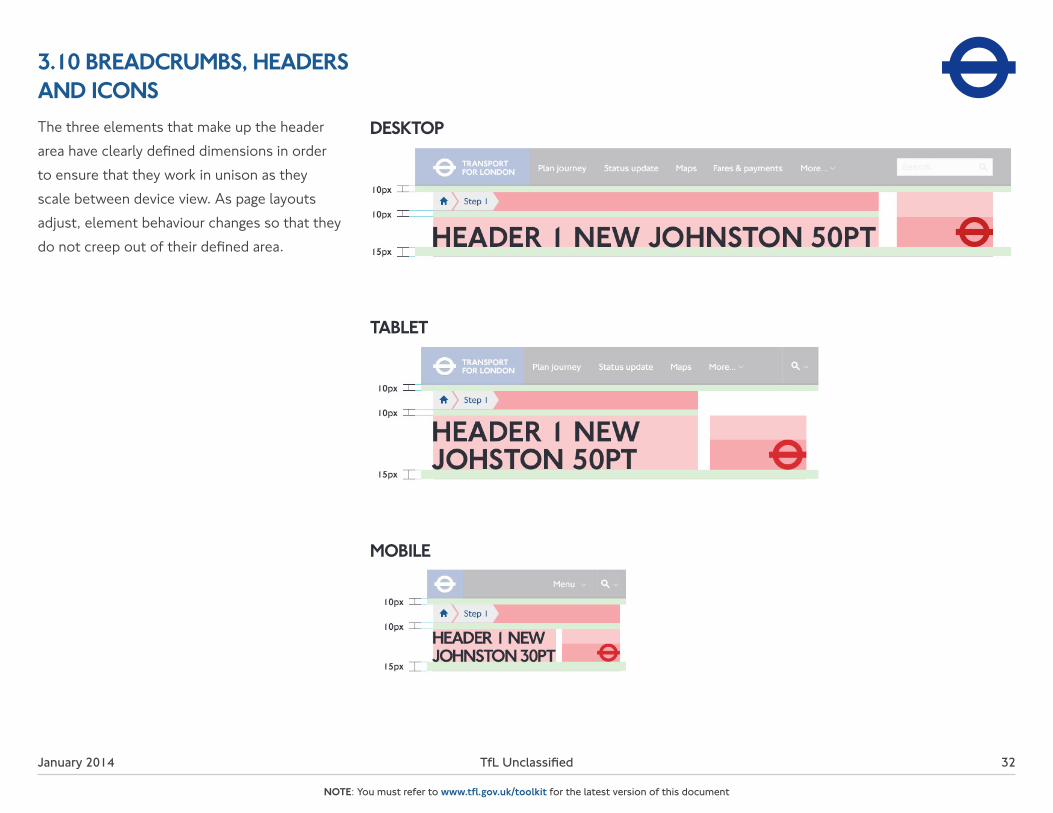
3.10 BREADCRUMBS, HEADERS AND ICONS
DESKTOP
TABLET
MOBILE
The three elements that make up the header area have clearly defined dimensions in order to ensure that they work in unison as they scale between device view. As page layouts adjust, element behaviour changes so that they do not creep out of their defined area.

January 2014 TfL Unclassified
NOTE: You must refer to www.tfl.gov.uk/toolkit for the latest version of this document
33
3.10 BREADCRUMBS, HEADERS AND ICONSBreadcrumbAs screen width decreases and title length increases, breadcrumb titles both truncate or fade out in order to fit within the viewed screen width.
HeaderLong page headers should wrap when they exceed the page width. There is no set character limit of page titles.
IconBy default all supporting page icons should be placed with a maximum height of 50px (30px height for mobile). When a more detailed logo is required, that does not scale well below 50px, the logo area is increased to 90px (54px for mobile). The logo should stay below a maximum width of 160px (96px for mobile).

January 2014 TfL Unclassified
NOTE: You must refer to www.tfl.gov.uk/toolkit for the latest version of this document
34
3.11 FOOTERThe footer has been built to be a strong foundation - one that contains a broad range of links, details of which can be found in our IA principles. More importantly, it aims at optimising the site for search engines, therefore most links are text based.
DESKTOP MOBILE
January 2014 TfL Unclassified 35
NOTE: You must refer to www.tfl.gov.uk/toolkit for the latest version of this document
4. UI ELEMENTS

January 2014 TfL Unclassified
NOTE: You must refer to www.tfl.gov.uk/toolkit for the latest version of this document
36
4.1 BUTTONS & CALLS TO ACTIONThe buttons have been organised into a hierarchy of three levels of importance. For our most important calls to action (CTA), we use our primary blue colour that provides high colour contrast on the page. Secondary CTAs use a more muted colour (Light Grey), and remaining CTAs are text links followed by a chevron.
Rollovers (these become hit states on touchscreens) are used to add a dynamic feel and confirmation of the click-through action.
January 2014 TfL Unclassified
NOTE: You must refer to www.tfl.gov.uk/toolkit for the latest version of this document
37
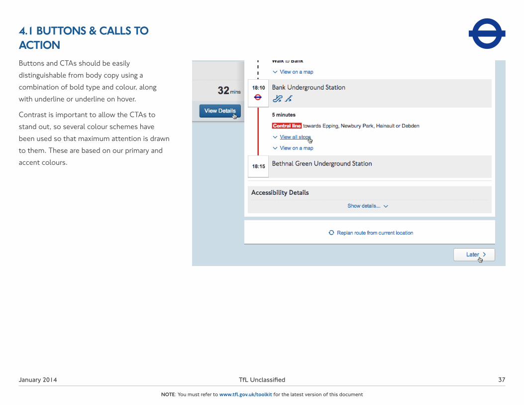
4.1 BUTTONS & CALLS TO ACTIONButtons and CTAs should be easily distinguishable from body copy using a combination of bold type and colour, along with underline or underline on hover.
Contrast is important to allow the CTAs to stand out, so several colour schemes have been used so that maximum attention is drawn to them. These are based on our primary and accent colours.

January 2014 TfL Unclassified
NOTE: You must refer to www.tfl.gov.uk/toolkit for the latest version of this document
38
4.2 TABSTabbed functionality is a key mechanism for organising related content. Tabs are used to help break up content and keep the page structure simple and intuitive.
As another form of CTA tabs use high contrast in order to stand out and be easily distiguishable from the displayed content.

January 2014 TfL Unclassified
NOTE: You must refer to www.tfl.gov.uk/toolkit for the latest version of this document
39
4.3 LINE DIVIDERSDotted lines create clear visual definition between modules. As a general rule, the lines should span the column width and should be spaced at 10px or 20px according to the baseline grid.
January 2014 TfL Unclassified
NOTE: You must refer to www.tfl.gov.uk/toolkit for the latest version of this document
40
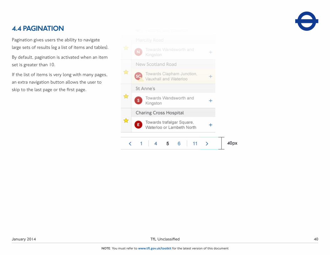
4.4 PAGINATIONPagination gives users the ability to navigate large sets of results (eg a list of items and tables).
By default, pagination is activated when an item set is greater than 10.
If the list of items is very long with many pages, an extra navigation button allows the user to skip to the last page or the first page.

January 2014 TfL Unclassified
NOTE: You must refer to www.tfl.gov.uk/toolkit for the latest version of this document
41
4.5 FORMSThe following are examples of the base form elements used when creating forms. Combinations of these elements placed together on a page create a form for the user to complete. At the end of the page there should be a ‘next page’ link for multi-page forms and, at the end of the overall form, there should be a ‘submit’ button.
If possible and necessary, it is better to provide help close to the action so that users can access it where and when they need it most:
Highlight selected fields allows visual definition where the user is applying the information to.
In-line help should be used in cases where the offered help is specific for a certain element.
If any information required is mandatory, a red asterisk should be placed at the end of the question/request.

January 2014 TfL Unclassified 42
NOTE: You must refer to www.tfl.gov.uk/toolkit for the latest version of this document
5. ICONOGRAPHY
January 2014 TfL Unclassified
NOTE: You must refer to www.tfl.gov.uk/toolkit for the latest version of this document
43
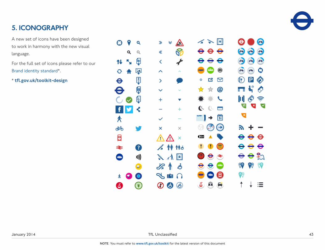
5. ICONOGRAPHYA new set of icons have been designed to work in harmony with the new visual language.
For the full set of icons please refer to our Brand identity standard*.
* tfl.gov.uk/toolkit-design

January 2014 TfL Unclassified 44
NOTE: You must refer to www.tfl.gov.uk/toolkit for the latest version of this document
6. IMAGE SIZE RATIO

January 2014 TfL Unclassified
NOTE: You must refer to www.tfl.gov.uk/toolkit for the latest version of this document
45
6. IMAGE SIZE RATIOWe recommend using 8:5 landscape-orientated images at any size that aligns with the grid.
For portrait-orientated images use an aspect ratio of 7:8.
For profile images, use an aspect ratio of 2:1.
For the full details of how to place imagery and photography refer to the Digital photography standard*.
* tfl.gov.uk/toolkit-design

46January 2014 TfL Unclassified
NOTE: You must refer to www.tfl.gov.uk/toolkit for the latest version of this document
Type:Owner:Department:
Version history
Review history
Version
Name
2.0
Date
Title Date
10/01/2014
Summary of changes
Comment
New Section: Creative direction, padding, forms.Updated: Typography, Breadcrumbs, Buttons & CTAs, Line dividers
GuidelinesTfL Online ComplianceTfL Online
3.0 30/10/2014 Updated: Colour palette
