Tracking User Behavior with Google Analytics Events on … · Library Faculty Publications and...
14
Boise State University ScholarWorks Library Faculty Publications and Presentations e Albertsons Library 5-16-2016 Tracking User Behavior with Google Analytics Events on an Academic Library Website Amy Vecchione Boise State University Deana Brown Boise State University Elizabeth Allen Boise State University Amanda Baschnagel Boise State University is is an author-produced, peer-reviewed version of this article. e final, definitive version of this document can be found online at the Journal of Web Librarianship, published by Routledge. Copyright restrictions may apply. doi: 10.1080/19322909.2016.1175330
Transcript of Tracking User Behavior with Google Analytics Events on … · Library Faculty Publications and...

Boise State UniversityScholarWorks
Library Faculty Publications and Presentations The Albertsons Library
5-16-2016
Tracking User Behavior with Google AnalyticsEvents on an Academic Library WebsiteAmy VecchioneBoise State University
Deana BrownBoise State University
Elizabeth AllenBoise State University
Amanda BaschnagelBoise State University
This is an author-produced, peer-reviewed version of this article. The final, definitive version of this document can be found online at the Journal of WebLibrarianship, published by Routledge. Copyright restrictions may apply. doi: 10.1080/19322909.2016.1175330

Tracking User Behavior with Google Analytics Events on an Academic Library Website
Amy Vecchione
Albertsons Library Boise State University
Deana Brown Albertsons Library
Boise State University [email protected]
Elizabeth Allen Albertsons Library
Boise State University [email protected]
Amanda Baschnagel
Albertsons Library Boise State University
Abstract
The primary purpose of an academic library website is to serve as a portal to library-acquired content. Navigational design of a library website affects the user’s ability to find and access content. At Albertsons Library, the goal of the navigational design of the website is to mimic user behavior on the website to help them access information and articles from over 300 different library vendors. Coordinating with different vendors makes tracking the navigational flow of user behavior difficult with the tool Google Analytics. Using the events feature in Google Analytics, the team responsible for web design was able to track user flow, and was able to quantify how many users were actual “drop-offs” versus those that were clicks into library resources. Decisions made after acquiring this data resulted in a website with a 10 percent or less bounce rate, and decreased the number of clicks required for users accessing the library's content.
Keywords: Google analytics, web analytics, drop-offs, user experience, web design, academic library, user flow, user behavior
Introduction Like most academic library websites, Albertsons Library’s main website (http://library.boisestate.edu) serves as a portal to authoritative digital content ranging from streaming video to eBooks to databases with full-text content to primary source materials, and more. Serving over 30,000 students, staff, faculty, and the general public, Albertsons Library’s digital content is managed centrally by the Web and Emerging Technologies Unit. Staff and faculty in this unit use technological solutions and human centered design strategies to facilitate access to the library’s range of digital content areas. To increase the ease of use of library websites, the navigational design of these websites should mimic or support user behavior based on the navigational pathways that users follow. The Web and Emerging Technologies Unit’s primary goal for the library website is to create a user-centered library website that allows users to quickly and efficiently complete their task. When the team began applying a user-experience process to the website, there were no known user pathways. The links that were listed on the front page of the website were chosen primarily by librarians. To save the time of the user, the team wanted to seek out the user pathways and the primary user tasks to create a website that will easily and quickly fulfill their tasks. Librarians and other researchers can gain insights into user behavior by measuring those pathways to determine which content is the most popular content, and then improve ease of navigation to that content. The web team at Albertsons Library define “popular content” to be anything that is accessed the most frequently. By counting all of the clicks to access resources, percentages of content access emerge. Links that are clicked on less than 0.05% are considered “not popular content,” whereas anything over 10 percent is considered popular. This ranking will likely vary from library to library because of the diversity in user needs. Identifying popular content helps establish the common, preferred pathways used by the largest number of users.
This is an author-produced, peer-reviewed version of this article. The final, definitive version of this document can be found online at the Journal of Web Librarianship, published by Routledge. Copyright restrictions may apply. doi: 10.1080/19322909.2016.1175330
1

To gain a better understanding of our users’ navigational pathways, the library implemented Google Analytics in 2007. This implementation enabled the library to identify, monitor, and track pathways. Viewing the user flow in Google Analytics is useful, because it displays graphically a user path, “from the source, through the various pages, and where along their paths they exited,” (Google n.d.). The flow data, however, does not indicate where off-campus users navigate to when they leave the library’s main website. If they go to a domain that is not managed by the library, the library’s Google Analytics dashboard is not set up to automatically capture that data. For example, when users leave our primary website and search specific database platforms, Google Analytics does not track searchers’ behavior once they have left the library’s main website. In addition, if a user leaves the main library website to search for a book, they utilize the discovery layer, WorldCat (http://boisestate.worldcat.org). This discovery layer is not tracked by the library’s instance of Google Analytics, but by another analytics software. This search appears as a drop-off, which indicates “where users left the flow” (Google n.d.). The Google Analytics user flow showed the majority of our library website users as drop-offs. For some periods of time, the number of drop-offs rose to more than 90 percent of the users. The drop-off data may be misleading when library users are accessing the library’s digital resources or subscription databases that are stored in a separate domain. The team set out to design a data-driven website and to make decisions based on data. By tracking user behavior using event tracking (Google n.d.), the team made decisions that resulted in an improved user experience by moving the most popular resources to the front page, and reducing the number of clicks needed to get to those resources. Additionally, the web team learned which vendor sites users were accessing the most. The goal of this research was to identify drop-offs from the library website, determine how many were true drop-offs, identify popular content, track how users navigate to the most popular content, and then make it easier for users to access popular content. This article will describe our methods and findings.
Literature Review Current literature suggests several ways of using Google Analytics and how to create a larger dashboard with which to monitor some alternative domains beyond the library’s main portal; however, little research has investigated how to track user pathways on a library website using Google Analytics. Existing research regarding key performance indicators in Google Analytics are not analyzed through the lens of user experience, nor is there research on how the use of Google Analytics impacts access to library resources. Instead, the primary articles on using key performance indicators in Google Analytics are oriented towards e-commerce sites to track transaction time and clicks to purchases to serve commercial entities (Fagan 2014). Many articles regarding the assessment of library websites consist of surveys and the use of Google Analytics to determine the top pages of content. Understanding user needs and user behavior on library websites is crucial to designing a successful library website. According to a team at Texas Tech University, “properly assessing the needs and behavior of academic library patrons is essential to the design process of library Web sites” (Barba et al. 2013, 392). Turner (2010) describes library website key performance indicators as based on library website goals, user behavior, and user actions or tasks. In addition, Turner also establishes that Google Analytics can take micro measurements such as the number of times a specific resource is clicked on. Because library websites provide access to many of the library’s services (Yang and Perrin 2014), tracking the performance and understanding user flow are critical to the success of those services. Yang and Perrin write, “Measuring the performance of a library Web site, therefore, becomes a key factor in determining the relative success or failure of library service” (Yang and Perrin 2014, 405). Fagan (2014) suggests adopting specific key performance indicators to acquire information about human behavior on library websites. Many libraries have used Google Analytics to assist in the redesign of their website. For example, Wei Fang, a digital services librarian, used Google Analytics for redesigning the sites at Rutgers-Newark Law Library (Fang 2007). Fang’s goal was to analyze user behavior on the website. Fang and his team analyzed usage statistics before and after the library redesign to determine if the redesign was effective.
This is an author-produced, peer-reviewed version of this article. The final, definitive version of this document can be found online at the Journal of Web Librarianship, published by Routledge. Copyright restrictions may apply. doi: 10.1080/19322909.2016.1175330
2

Some libraries have utilized the events feature in Google Analytics to track events and key performance indicators (KPIs). The standard key performance indicators in Google Analytics “focus on corporate and e-commerce sites where KPIs are relatively easy to identify” (Loftus 2012, 47). Since most key performance indicators in Google Analytics are geared toward commerce, it’s important to establish separate indicators to evaluate how users acquire information that meets their needs and tasks. Libraries have little face time with remote users, so collecting usage data is the primary way to understand their behavior on the website. Reducing the number of clicks to a resource helps keep users on the site. As Buenadicha Mateos and her collaborators note, “If users can access the information they seek quickly (in a few number of clicks), their satisfaction will be increased and therefore the site will probably rise in the number of visits” (2001, 229). The way event tracking works is that event tracking labels are hand coded for each link, which “can be time consuming and difficult to manage over the long term” (Loftus 2012, 52). However, the time and effort put into the hand coding is worth it in order to create a dynamic web environment. Using the events feature in Google analytics is useful because knowledge about the events creates an analytics environment where “iterative changes can be tracked in real-time with minimal effort” (Loftus 2012, 55). Iterative changes are necessary in an ever-evolving library system where services are modified regularly, and therefore websites need to be reorganized or redesigned. Events features can help make sense of the bounce rate, which is a metric often used to make decisions about library websites. Bounce rate and drop offs both indicate the same behavior and are two terms that are defined somewhat similarly with a few small differences. A bounce rate is the calculated percentage of those who engage in the behavior and drop off of the site. Bounce rates can be different from drop offs as a user can drop off after looking at several pages, but a bounce rate is primarily measured after the user looks at one page and subsequently drops off. Google Analytics automatically measures the bounce rate of any website, but for libraries this is a difficult metric to understand in context because library websites also serve as portals to other sites. High bounce rates can be attributed to a variety of factors. Betty (2009, 77) notes the following possible reasons for high bounce rates: “The content on the landing page does not seem valuable or useful to your users, the content may not be clear enough to the user, or the menus pointing to the content are misleading.” Betty suggests that user testing can be used to evaluate and understand these key performance indicators. Events features and user testing both can be used to understand the bounce rates and what they indicate. For example, a high bounce rate on a library website may actually mean that more users are getting to the library resources they want to use. To better understand user flow, librarians at DePaul University combined different Google Analytics dashboards into one single dashboard (Hess 2012). This methodology allows data reviewers to see multiple domains in a single dashboard and to view user flow among the trackable domains for a library. Hess and his team applied code that forced Google Analytics to view different domains as being the same. This enabled them to track use data fluidly in one location via page views. This forcing of Google Analytics resulted in all web domains being able to be viewed as one domain. The subsequent data dashboard is referred to as “über analytics.” For example, a single dashboard would cover a specific domain, such as library.boisestate.edu, but the über dashboard combines: library.boisestate.edu, guides.boisestate.edu, catalog.boisestate.edu, and more. This review of the literature demonstrated that event tracking has not been thoroughly researched in libraries. The goals of this research project were to investigate the feasibility of event tracking to increase retention, decrease bounce rate, and measure actual drop-offs from the library website. This article presents a case study where the implementation of events tracking led to improvements made by using this technology, and analyzing the data. Through identifying and investigating these methods, the researchers found a useful and successful methodology that any library can use on their website to track user flow effectively.
Methodology In October 2012 the team implemented the “über dashboard” developed at DePaul University to unify web analytics across multiple platforms (Hess 2012). The primary question that the web team set out to address was whether or not all of the drop-offs were users exiting the site, or merely users clicking on one of the databases to which the library subscribes. The primary goal was to determine user flow and the most popular content based on the number of user clicks. To solve the problem of being unable to track user behavior to these locations outside of the library’s main portal, the web team developed a method utilizing using Google Analytics’ event tracking. Event tracking is a method for measuring any type of action that takes place on a website. Event tracking is a way to count, measure, and indicate
This is an author-produced, peer-reviewed version of this article. The final, definitive version of this document can be found online at the Journal of Web Librarianship, published by Routledge. Copyright restrictions may apply. doi: 10.1080/19322909.2016.1175330
3

how many times each specific event occurred (Google n.d.). The web team used event tracking to measure user behavior beyond the main portal of the library website, and to show which digital platforms users navigate to from the library’s main portal. Once the data was analyzed and the most popular content was identified, the web team then made those resources more prominent on the website. To create an über dashboard in Google Analytics, our library web team first identified all of the domains to be included on the dashboard. After these domains were identified, the tracking code was changed, and all the domains appeared together in one dashboard. This solution gave us some idea about which pages were most viewed and some sense of users’ flow through our website, but not much of a sense of how they moved from one domain to the next. When users start on one of the library’s domains and move to another one that the library also manages, we have a good understanding of their navigational path. However, most of our users often venture directly into subscription services and domains that the library does not manage independently on our own servers, such as Academic Search Premier and WorldCat Local. This lack of direct control helped explain why this initial solution was not very useful for us. In addition, this solution did not address the drop-offs research question we set out to answer. Next, the web team investigated event tracking to see if this method could give us a better picture of our users’ movements through the library’s site. Event tracking is a binary trigger that allows Google Analytics to record when a certain event occurs on a website. Google Analytics then maintains a record of that event. For example, when an individual clicks on any link from the library’s main website, that click is recorded in Google Analytics’ event tracking. The team set up a series of labels that coordinated to each event. Each label wrapped around each link on the main site including links to every service provided, the About page, the search box, whether or not search was clicked on or not, each database, and the required links in the Boise State University header and footer. Essentially, the web team wrapped a tracker label around every link on the first page a user lands on when they enter the website. This solution allows the team to clearly see the data in Google Analytics and determine where users are going from the library’s main website. The data allows web designers to see which resources are most popular, which domains are most used from the library website, and determine whether or not the drop-offs were users exiting the site or merely using one of the library’s subscription databases. The web team has decided to collect the data in an ongoing process; with each new link added, an event tracking label is wrapped around it. Content that isn’t clicked on more than 0.05% is relegated to subpages and submenus, and more popular content is pulled out. The most popular content gets added to a tabbed search box in the main part of the screen allowing users to click through to the content they desire without leaving the main portal of the site. Although the team collects this data in an ongoing manner, decisions are made in an iterative fashion. The data is useful in meetings where the library leadership team makes decisions about products, and the data has been used to help campus web managers with the user experience design of the header and footer. The web team reviews the data at the end of each semester, and data is collected and reported every semester to library administration. The web team has found that the data allows for conversations and decisions to be made about the website in a positive, deliberate, and user focused way. The overall process for the implementation of event tracking is:
1. Create a naming convention for event labels 2. Place an event label on each link the team wants to track 3. Collect data for a set period of time 4. Analyze data at the end of each semester 5. Revise site based on the data collected 6. Reduce number of clicks to most used content
This is an author-produced, peer-reviewed version of this article. The final, definitive version of this document can be found online at the Journal of Web Librarianship, published by Routledge. Copyright restrictions may apply. doi: 10.1080/19322909.2016.1175330
4

Every link on the library’s main website was hand coded to include an event label. The possible links add up to more than 100. These include, but are not limited to, the following example labels:
• unload: individuals leave the site (a real drop-off) • WorldCat Local All Search: indicates when users hit the button to search after typing in a string of
words • WorldCat Local Articles: users click on the button to search articles • Articles: users click on the Articles & Databases A-Z link which takes users to the list of databases
in alphabetical order • Academic Search Premier: individuals click on the link directly to the database Academic Search
Premier. When link reorganizing occurred, the web team began adding codes to include the location of the link, such as the code “LNav” for the left side navigational menu, and dates as to when the link was added, such as “LNav/Academic Search Premier/May 2013.”
Results The event tracking data showed us that library website users strongly preferred only a few tools and links on the library website. This data gave the team strong arguments for cleaning up and revising the site in order to match user need and to meet user requirements. We created tabbed search boxes to clean up the list of links, and placed the highest accessed content front and center on the main library website. Users no longer need to search and hunt for the right link. The data regarding what was popular content for Albertsons Library is described below, but may vary for other libraries depending on the specific user needs of a library’s scope and audience. For example, medical libraries will likely want to have PubMed or related databases front and center, rather than Academic Search Premier or a discovery layer. Prior to the web team’s implementation of event tracking, between 85-93 percent of clicks on the library website were considered drop-offs. As illustrated in Figure 1, the Google Analytics dashboard does not account for how users accessed library resources such as databases, merely that they left the site http://library.boisestate.edu/. The drop-offs data suggests that 92.8 percent of the library’s website users left the website immediately after their arrival to the site. The web team did not believe that this was the case; rather we believed users were going to library subscription-based resources.
[PLACE FIGURE 1 HERE] After the implementation of event tracking, the team collected data for the spring 2013 semester, analyzed the data regularly throughout the semester, presented recommendations to library stakeholders, and finally made web changes in the summer. The data from the 2013 spring semester established a baseline of what links were being used on the library website. The web team recognized there were so many competing links on the library’s website that users may have been conflicted about what to choose. As illustrated in table 1, the data demonstrates that the primary content being accessed was the discovery layer, WorldCat Local All Search, possibly due to the central placement of the search box, which is the very first box in the left, upper middle of the layout of the website, but clicks on the discovery layer accounted for a very small amount of the overall traffic at 4.82 percent. The unload data skews the results a bit since 67 percent of all users left the site immediately after landing on the page. It is important to consider the number of unloads in the analysis, however, because after the redesign this number dropped considerably.
[TABLE 1] A significant realization was that the most-accessed database from the library’s website was Academic Search Premier, which was the fourth most-accessed content on the site. Based on this data, the web team made the decision to pull out this database and promote it for easy access, especially since it is the primary teaching tool database for many campus information literacy instruction sessions. The team also noticed there was a discrepancy between the
This is an author-produced, peer-reviewed version of this article. The final, definitive version of this document can be found online at the Journal of Web Librarianship, published by Routledge. Copyright restrictions may apply. doi: 10.1080/19322909.2016.1175330
5

numbers of individuals clicking on a WorldCat local tabbed search screen compared to the number clicking the search icon itself. This finding meant that more users were clicking on the box that allowed them to search than are actually searching. The team hypothesized this clicking behavior was due to some confusion about what they were searching. After many discussions, the team decided that if a link is clicked on less than 0.05 percent of the time, then it does not need to be on the front page and can be in the left-side navigation menu or on subpages. The number of 0.05 percent was determined because there were so many links on the front page, and this percentage accounted for the bottom majority of the library’s links. There were natural breaks in the data that helped the web team make this decision. The web team hopes to raise the bar on this key performance indicator to a higher percentage point value so that minimal content is available on the library’s main site. The web team was relieved to find that the actual number of drop-offs was not the roughly 90 percent that the traditional implementation of Google Analytics suggested, but instead was 67 percent. Because our library’s computer lab browsers default to the library website, this was not a surprising observation. The web team sought to make improvements through promoting popular content to reduce the number of actual drop-offs, increase retention on the site, and reduce the number of links on the library’s main web site. Improving the actual drop-off rate, and increasing the percentage of all clicks to library resources, became key performance indicators for the team. After placing the most popular content in tabbed search boxes in the center of the library’s home page, the number of clicks to Academic Search Premier and WorldCat Local All Search went up. In spring 2013 users were not accessing the majority of the databases, but by repositioning links, access to the databases list increased in fall 2013 and made up 6.99 percent of all clicks on the site (see Table 2). The number of unloads or actual drop-offs was reduced by 30 percentage points from 67 percent of users leaving the site immediately to only 37.97 percent of users leaving the site immediately.
[TABLE 2] The bounce rate from previous semesters was between as high as 65 percent fall 2012, but after implementing the tabbed search boxes, this bounce rate was reduced to 12 percent for the overall site and to 4 percent for the index, or main site. The bounce rate for fall semester 2013 was 11.11 percent compared to fall semester 2012 when it was 65.21 percent (see Table 3).
[TABLE 3] The library website’s bounce rate was reduced significantly in the spring of 2013 (see Table 3). This decrease can be attributed to the implementation of improved processes and workflows based on data from the events feature. Analysis of the data showed pages that experienced no events or traffic, and as a result these pages were identified for deletion. Additionally, multiple pages with high traffic were identified and combined into a tabbed search box that was featured on the library’s homepage. These two steps were key in the overall success of the page and the lowered bounce rate. The web team considered this reduction in bounce rates a success for users because this metric indicated they were finding what they needed. However, without user testing data paints only one part of the picture, so the web team will conduct user testing in future semesters to determine if this hypothesis was correct. The number of users clicking on specific databases doubled in some cases. The web retention rate increased from the 2013 spring semester to the 2013 fall semester by 269 percent – meaning that more than twice as many individuals were staying on the site. The site retains 63 percent of all users (this figure was consistent during 2015) as opposed to 35 percent of all traffic in spring 2013. More users clicked on links on the site after the number of links was reduced. During the spring 2013 semester there were a total of 177,521 links clicked, and in the fall 2013 semester the number of links clicked rose to 265,390. Of all of the clicks tracked on the library website, the web team found that most of the links were clicked on less than 1 percent of the time. The web team wanted to drive up the traffic and reduce the time to some of the library databases and library resources. The library’s website screenshot in figure 2 illustrates that the website in spring 2013 was merely a lists of links that were not ranked or ordered based on user needs and tasks. By driving users to the popular content, including Academic Search Premier, searching articles, searching books, and searching our discovery layer, users could more quickly locate the resources they need for their work, rather than hunting through the list to decide which resources they needed.
This is an author-produced, peer-reviewed version of this article. The final, definitive version of this document can be found online at the Journal of Web Librarianship, published by Routledge. Copyright restrictions may apply. doi: 10.1080/19322909.2016.1175330
6

[PLACE FIGURE 2 HERE]
Discussion The event tracking data showed us that library website users strongly preferred only a few tools and links on the library website and barely used others. This data gave the team strong arguments for cleaning up and revising the site in order to match users’ needs. This research and protocol implementation expands the way Google Analytics can be used to track data on a library site. Through a small amount of time and skill investment, library staff can learn how to utilize Google Analytics to their benefit, as demonstrated in previous research as well. As identified in the literature review, key performance indicators for library websites differ somewhat from commerce instances of KPIs, and therefore Google Analytics requires additional coding with events to better understand how websites are being used. This research allows library staff to look at several options for identifying KPIs and gives library teams an additional methodology to consider applying. Library websites are primarily portals to subscription-based content; traditional web analytics are geared towards e-commerce and fail to readily provide key performance indicators to assess users’ navigational flow to resources. Using event tracking, Albertsons Library’s web team was able to clean up the library website and make data-driven decisions about web content, which is often a political decision. By focusing on an iterative process over the course of two semesters, revising popular content, improving access to the popular content, and removing unpopular content, the library’s website is seeing unprecedented retention rates and significantly improved drop-off rates. Furthermore, the library is now aware of how many drop-offs are due to users’ truly leaving the library website versus going to a subscription-based content link from the library’s main website. The web team made many changes on the library website as a result of the data gathered between the 2013 spring and fall semesters. The web team first moved the popular content into a tabbed search box located in the center of the library’s home page. Library hours were relocated to the top left corner of the site. The list of links was relocated to a left side navigational menu with top headings and menus. Many duplicative links were driving users to similar content, so the web team removed the duplication. The 2013 fall semester website appears in figure 3. This website represents a significant change from the previous semester, and the data collected during fall 2013 shows that the redesign facilitated user access to the most popular content.
[FIGURE 3] Although this website design was not perfect, it was a significant improvement, and this workflow allows for the web team to continually iterate based on user flow data, for continual improvement each semester. For example, from fall 2013 to spring 2014, one major revision was changing the article search scope in the tabbed search from searching the discovery layer to searching Academic Search Premier. This adjustment reduced the number of clicks to the content users want, which also drove users to desired content faster. This decision was made to improve access for users who have limited time to access the resources they need, but also to clarify what content users might need for their courses and work. Because the display of a long list of links was confusing in the previous iteration of the site, Albertsons Library’s website now more simply showcases the content that users need with fewer overall link choices. This process and workflow can work to track user flow for any library website, since most library websites are portals to subscription-based content. Though event tracking has been used in other instances, such as mouse hover overs, event tracking can be used to measure access to specific databases, and identify preferred user pathways (Barba et al. 2013). Reviewing this data on a regular basis, as identified by the user needs of each library’s community, the web team can continue to make iterative improvements based on this data. Albertsons Library’s web team has identified future steps to help further improve the library website. The next steps are to continue to identify the users’ tasks as they evolve over time, develop personas for website use, conduct user testing to more fully understand the event tracking data, and collect more event tracking data to verify that the changes made have been effective. The team also plans to add more event tracking labels to evaluate which databases are most used as there is not usage data for every database the library subscribes to, and it can be difficult to compare use statistics uniformly across platforms.
This is an author-produced, peer-reviewed version of this article. The final, definitive version of this document can be found online at the Journal of Web Librarianship, published by Routledge. Copyright restrictions may apply. doi: 10.1080/19322909.2016.1175330
7
Conclusion Event tracking is a great way to manage a library website that connects users to hundreds of different vendors and to the library’s authoritative digital subscription content. In addition to collecting data for navigation to this content through the website, our acquisitions staff are using this data to evaluate which databases and digital content need to be kept. The web team determined that events tracking of user pathways led to better decisions that improved the usability and functionality of the website. The team used the data to make a slight redesign, removing a great number of links from the library’s main website. Some of the decisions the team made after reviewing this data included: eliminating a mobile site in preference for a responsive site, rearranging links and search boxes on the site based on the popularity of the content, reducing the number of links listed on the site in favorite of using a left-side navigation menu, establishing a tabbed search box, and improving access to high-use items. Any library can use this methodology to determine which content users prefer, and which pathways they follow, in order to prioritize access to their most popular content. The authors conclude that using event tracking in Google Analytics will help library web teams determine key performance indicators based on the most used content. The authors highly recommend using “on click” event data through Google Analytics for any library website to track performance. Using event tracking can assist in the development of a composite understanding of library website users. Once library web designers have this data-driven understanding, they can start to improve access by creating more direct pathways. Any library can implement event tracking with Google Analytics, and then choose similar key performance indicators to drive users to the content that they want to access.
References
Barba, Ian, Ryan Cassidy, Esther De Leon, and B. Justin Williams. 2013. “Web Analytics Reveal User Behavior: TTU Libraries’ Experience with Google Analytics.” Journal of Web Librarianship 7 (4): 389-400. doi: 10.1080/19322909.2013.82899
Betty, Paul. 2009. "Assessing Homegrown Library Collections: Using Google Analytics to Track Use of Screencasts and Flash-Based Learning Objects." Journal of Electronic Resources Librarianship 21 (1): 75. doi:10.1080/19411260902858631
Black, Elizabeth. 2009. “Web Analytics: A Picture of the Academic Library Web Site User.” Journal of Web Librarianship 3 (1): 3-14. doi:10.1080/19322900802660292.
Buenadicha Mateos, María, Antonio Chamorro Mera, Francisco Javier Miranda González, and Óscar Rodrigo González López. 2001. "A New Web assessment Index: Spanish Universities Analysis." Internet Research 11(3): 226-234.
Fagan, Jody Condit. 2014. “The Suitability of Web Analytics Key Performance Indicators in the Academic Library Environment.” The Journal of Academic Librarianship 40 (1): 25-34. doi:10.1016/j.acalib.2013.06.005.
Fang, Wei. 2007. “Using Google Analytics for Improving Library Website Content and Design: A Case Study.” Library Philosophy and Practice 9 (2): 22.
Hess, M. Ryan. 2012. "Web Analytics: Using Evidence for Improvement - Über Analytics: Customizing Google Analytics to Track Multiple Library Platforms.” Paper presented at the annual Internet Librarian conference, Monterey, California, Oct. 2012.
Google. n.d. “About the flow visualization reports.” https://support.google.com/analytics/answer/2519986?hl=en. Google. n.d. “Event Tracking.” https://developers.google.com/analytics/devguides/collection/analyticsjs/events. Google. n.d. “Users Flow.” https://support.google.com/analytics/answer/1709395?hl=en. Loftus, Wayne. 2012. "Demonstrating Success: Web Analytics and Continuous Improvement."Journal of Web
Librarianship 6. (1):45-55. doi: 10.1080/19322909.2012.651416. Yang, Le and Joy M. Perrin. 2014. “Tutorials on Google Analytics: How to Craft a Web Analytics Report for a
Library Web Site.” Journal of Web Librarianship 8(4): 404-417. doi:10.1080/19322909.2014.944296.
This is an author-produced, peer-reviewed version of this article. The final, definitive version of this document can be found online at the Journal of Web Librarianship, published by Routledge. Copyright restrictions may apply. doi: 10.1080/19322909.2016.1175330
8
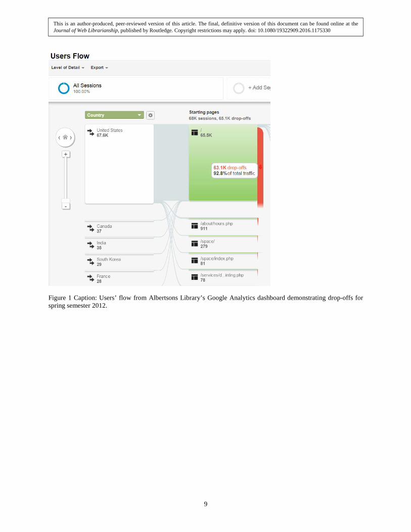
Figure 1 Caption: Users’ flow from Albertsons Library’s Google Analytics dashboard demonstrating drop-offs for spring semester 2012.
This is an author-produced, peer-reviewed version of this article. The final, definitive version of this document can be found online at the Journal of Web Librarianship, published by Routledge. Copyright restrictions may apply. doi: 10.1080/19322909.2016.1175330
9

Figure 2 Caption: Albertsons Library’s website spring semester 2013.
This is an author-produced, peer-reviewed version of this article. The final, definitive version of this document can be found online at the Journal of Web Librarianship, published by Routledge. Copyright restrictions may apply. doi: 10.1080/19322909.2016.1175330
10

Figure 3 Caption: Albertsons Library’s website fall semester 2013.
This is an author-produced, peer-reviewed version of this article. The final, definitive version of this document can be found online at the Journal of Web Librarianship, published by Routledge. Copyright restrictions may apply. doi: 10.1080/19322909.2016.1175330
11

Event label Total Events Percentage of all clicks Unload 372,001 67.09 WorldCat Local All Search 26,710 4.82 WorldCat Local Articles 23,487 4.24 Articles 22,789 4.11 Academic Search Premier 14,061 2.54 WorldCat Local Books 13,151 2.37 WorldCat Local Articles Search 10,367 1.87 Journal Titles 7,669 1.38 WorldCat Local Books Search 6,909 1.25 Subject Guides 5,508 0.99 WorldCat Local Advanced Search 3,651 0.65 Voyager Catalog 3,226 0.58 Off Campus Sign On 2,953 0.53 JSTOR 2,839 0.51 Web of Science 2,368 0.43
Table 1 Caption: Event tracking data and percentages of clicks for the spring 2013 semester.
Event label Total Events Percentage of all clicks Unload 426,751 37.97 WorldCat Local All Tab 405,158 35.86 Databases Tab – A-Z List Tab 78,602 6.99 WorldCat Local Articles Tab 32,762 2.91 WorldCat Local All Search 27,298 2.43 Journals Tab 21,836 1.94 WorldCat Local Books Tab 15,348 1.37 Left Nav Find Articles Databases 13,938 1.24 Guides Tab 12,363 1.10 WorldCat Local Article Search 9,755 0.87 eBooks Tab 7,222 0.64 WorldCat Local Books Search 5,444 0.48 Videos & Music Tab 5,032 0.45
Table 2 Caption: Event tracking data from the fall 2013 semester.
This is an author-produced, peer-reviewed version of this article. The final, definitive version of this document can be found online at the Journal of Web Librarianship, published by Routledge. Copyright restrictions may apply. doi: 10.1080/19322909.2016.1175330
12

Date range Bounce rate Fall 2012: August 27–December 20, 2012 65.21% Spring 2013: January 22–May 16, 2013 18.37% Summer 2013: May 20–August 18, 2013 14.28% Fall 2013: August 26–December 19, 2013 11.11% Spring 2014: January 21–May 16, 2014 10.34% Summer 2014: May 19–August 17, 2014 8.08% Fall 2014: August 25–December 18, 2014 4.56%
Table 3 Caption: Bounce rate data from Google Analytics for library.boisestate.edu from fall 2012 to fall 2014 by semester.
This is an author-produced, peer-reviewed version of this article. The final, definitive version of this document can be found online at the Journal of Web Librarianship, published by Routledge. Copyright restrictions may apply. doi: 10.1080/19322909.2016.1175330
13