Toronto Housing Market Charts November 2013
10
Housing Market Charts – November 2013
-
Upload
marian-neal -
Category
Documents
-
view
224 -
download
0
Transcript of Toronto Housing Market Charts November 2013

8/13/2019 Toronto Housing Market Charts November 2013
http://slidepdf.com/reader/full/toronto-housing-market-charts-november-2013 1/10
Housing Market Charts – November 2013

8/13/2019 Toronto Housing Market Charts November 2013
http://slidepdf.com/reader/full/toronto-housing-market-charts-november-2013 2/10
Explanation: This chart plots monthly MLS® sales for the current year and the previous three years. The
recurring seasonal trend can be examined along with comparisons to previous years for each month.
0
2,000
4,0006,000
8,000
10,000
12,000
Source: Toronto Real Estate Board
TorontoMLS Sales
Monthly with Three Previous Years for Comparison2010 2011 2012 2013
8/13/2019 Toronto Housing Market Charts November 2013
http://slidepdf.com/reader/full/toronto-housing-market-charts-november-2013 3/10
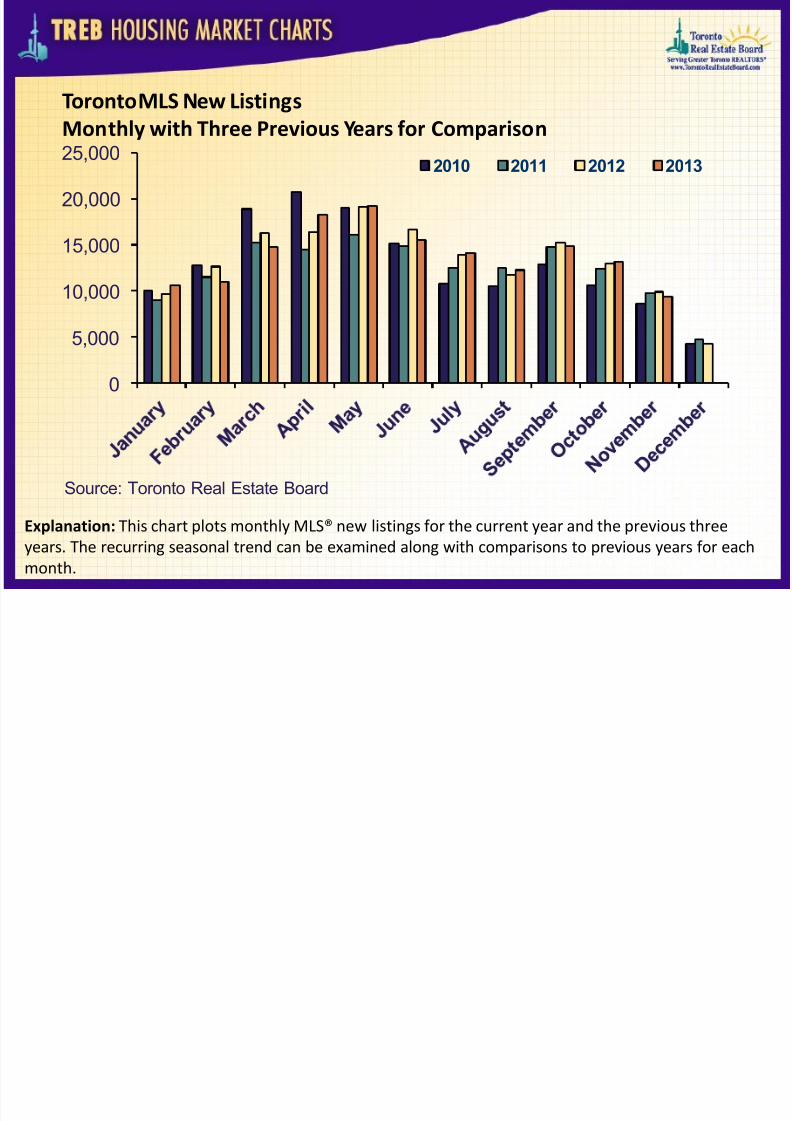
Explanation: This chart plots monthly MLS® new listings for the current year and the previous three
years. The recurring seasonal trend can be examined along with comparisons to previous years for eachmonth.
0
5,000
10,000
15,000
20,000
25,000
Source: Toronto Real Estate Board
TorontoMLS New Listings
Monthly with Three Previous Years for Comparison2010 2011 2012 2013
8/13/2019 Toronto Housing Market Charts November 2013
http://slidepdf.com/reader/full/toronto-housing-market-charts-november-2013 4/10

8/13/2019 Toronto Housing Market Charts November 2013
http://slidepdf.com/reader/full/toronto-housing-market-charts-november-2013 5/10
Explanation: This chart plots the monthly MLS® average home price for the current year and the
previous three years. The recurring seasonal trend can be examined along with comparisons to previousyears for each month.
$300,000
$350,000
$400,000$450,000
$500,000
$550,000
$600,000
Source: Toronto Real Estate Board
TorontoMLS Average Resale Home Price
Monthly with Three Previous Years for Comparison2010 2011 2012 2013

8/13/2019 Toronto Housing Market Charts November 2013
http://slidepdf.com/reader/full/toronto-housing-market-charts-november-2013 6/10
8/13/2019 Toronto Housing Market Charts November 2013
http://slidepdf.com/reader/full/toronto-housing-market-charts-november-2013 7/10
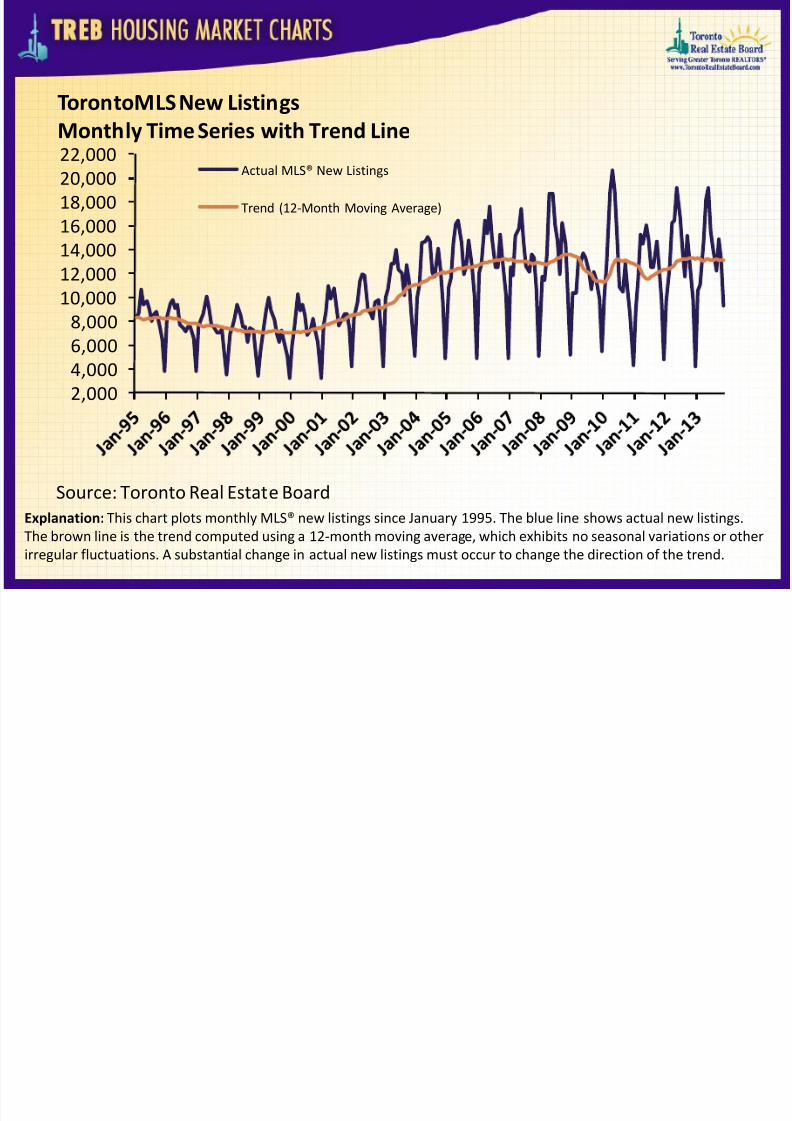
Explanation: This chart plots monthly MLS® new listings since January 1995. The blue line shows actual new listings.The brown line is the trend computed using a 12-month moving average, which exhibits no seasonal variations or other
irregular fluctuations. A substantial change in actual new listings must occur to change the direction of the trend.
2,0004,0006,0008,000
10,00012,000
14,00016,00018,00020,00022,000
Source: Toronto Real Estate Board
TorontoMLS New Listings
Monthly Time Series with Trend LineActual MLS® New Listings
Trend (12-Month Moving Average)

8/13/2019 Toronto Housing Market Charts November 2013
http://slidepdf.com/reader/full/toronto-housing-market-charts-november-2013 8/10
Explanation: This chart plots monthly MLS® average price since January 1995. The blue line shows the actual averageprice. The brown line is the trend computed using a 12-month moving average, which exhibits no seasonal variations or
other irregular fluctuations. A substantial change in actual average price must occur to change the direction of thetrend.
175,000
225,000
275,000
325,000375,000
425,000
475,000
525,000
575,000
Source: Toronto Real Estate Board
TorontoMLS Average Price
Monthly Time Series with Trend LineActual MLS® Average Price
Trend (12-Month Moving Average)

8/13/2019 Toronto Housing Market Charts November 2013
http://slidepdf.com/reader/full/toronto-housing-market-charts-november-2013 9/10
Explanation: This chart plots the monthly sales-to-new listings ratio (blue line) with year-over-year average annual percent price change (brown line). When the sales-to-new listings ratio moves higher, average annual per cent change in
home prices generally trends higher. When the sales-to-new listings ratio moves lower, average annual per cent changein home prices generally trends lower.
-15%
-10%
-5%
0%5%
10%
15%
20%
25%
0.00
0.20
0.40
0.60
0.80
1.00
1.20
A v e r a g e P r i c e A n n u a l P e r C e n t C h a n g e
( B r o w nL i n
e )
S a
l e s - t o - N
e w L i s t i n g s R a t i o
( B l u e L i n e
)
Source: Toronto Real Estate Board
TorontoMLS Sales-to-New Listings Ratio Compared to
Average Annual Per Cent Change in Home PriceSales-to-New Listings RatioAverage Price Annual Per Cent Change

8/13/2019 Toronto Housing Market Charts November 2013
http://slidepdf.com/reader/full/toronto-housing-market-charts-november-2013 10/10