Tools I Used to Create my Magazine Advert
16
Tools Used These are the tools and skills I used to make my poster. I will write a little bit about each one and explain how I used it.
-
Upload
chloe-jayde -
Category
Presentations & Public Speaking
-
view
186 -
download
0
Transcript of Tools I Used to Create my Magazine Advert

Tools Used
These are the tools and skills I used to make my poster. I will write a little bit
about each one and explain how I used it.
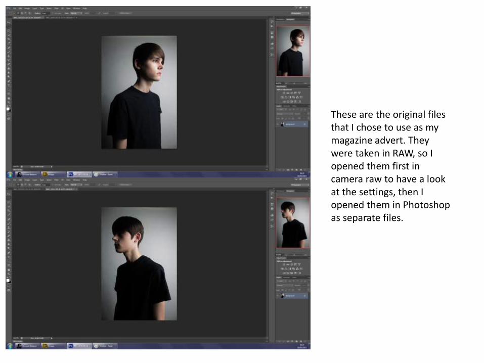
These are the original files that I chose to use as my magazine advert. They were taken in RAW, so I opened them first in camera raw to have a look at the settings, then I opened them in Photoshop as separate files.

I noticed that on one of the files, you could see some of the backdrop and I didn’t realise this when taking the photos. Luckily, with my experience in Photoshop, I was able to get rid of this easily. I selected the area which I didn’t want with the Rectangular Marquee Tool and then I right clicked the selected area. After doing this, the box on the right with some choices comes up. I then clicked fill which brought up the content aware box. The settings were all as I wanted so all I had to do was click ok. After doing this, it automatically clones some of the surrounding area onto the selection and it looks as though nothing was ever there.
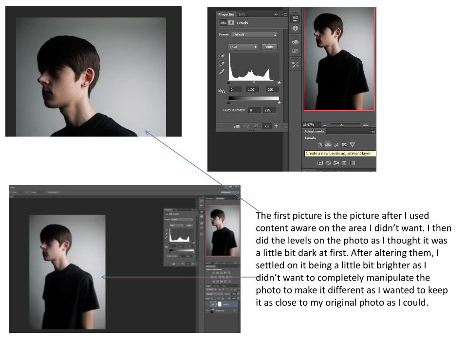
The first picture is the picture after I used content aware on the area I didn’t want. I then did the levels on the photo as I thought it was a little bit dark at first. After altering them, I settled on it being a little bit brighter as I didn’t want to completely manipulate the photo to make it different as I wanted to keep it as close to my original photo as I could.
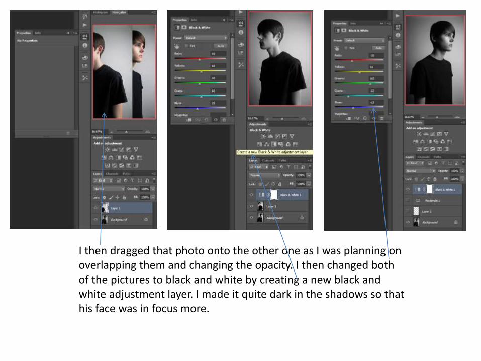
I then dragged that photo onto the other one as I was planning on overlapping them and changing the opacity. I then changed both of the pictures to black and white by creating a new black and white adjustment layer. I made it quite dark in the shadows so that his face was in focus more.

I wanted my artist to look flawless by fitting in with the celebrity stereotypes of looking perfect within the media so I decided to use the spot healing brush tool to airbrush him. He didn’t have many flaws so I didn’t have to use it too much but I just healed some parts which stood out. Above is the before picture and the picture below is the finished result after using the spot healing tool.

Then, to create the box to put all my text on, I used the rectangle tool and filled it in with the colour black. I then downloaded the text Neoteric from dafont.com onto my laptop so that I could easily put it onto my magazine advert. Shown on this slide and the next 2 is how I completed this download. First I searched for the font I used and then I clicked download.

This box then came up where I had to click on which one I wanted to open. I was a bit confused at this so I just clicked on regular demo version. It then brought up this box so I clicked install and waited for it to download onto my laptop. It took about 2 minutes to process.

Then, after it downloaded, I went straight into Photoshop, looked on the font choices and it was there. I was happy at how quick this process was as I thought it was going to be quite difficult and it would take awhile but it took about 4 minutes overall just to get it set up. Doing this made it so much easier when it came to making the rest of my products as I had the font there when I needed it.
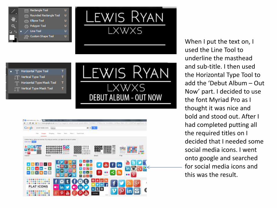
When I put the text on, I used the Line Tool to underline the masthead and sub-title. I then used the Horizontal Type Tool to add the ‘Debut Album – Out Now’ part. I decided to use the font Myriad Pro as I thought it was nice and bold and stood out. After I had completed putting all the required titles on I decided that I needed some social media icons. I went onto google and searched for social media icons and this was the result.

As the theme of my magazine advert is black and white, with a hint of blue, I decided to search for social media icons that were in black and white. I knew that I could alter the colour in Photoshop if I needed to. I found the ones above but I didn’t like how the logo was white and the background was black because this would have blended in with my banner, making it more difficult to view them.

I then came across these and they were exactly what I wanted for my magazine advert so I copied the photo and then pasted it onto the Photoshop file. I then used the ‘Elliptical Marquee Tool’ to circle the specific logos I wanted. I then copied and pasted so I could add it onto my advert.
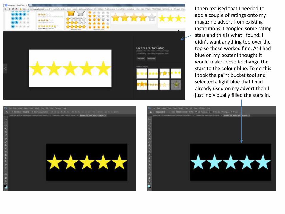
I then realised that I needed to add a couple of ratings onto my magazine advert from existing institutions. I googled some rating stars and this is what I found. I didn’t want anything too over the top so these worked fine. As I had blue on my poster I thought it would make sense to change the stars to the colour blue. To do this I took the paint bucket tool and selected a light blue that I had already used on my advert then I just individually filled the stars in.

I then decided to add more colour to it, I outlined the social media icons in blue so that the colour wasn’t too empowering but there was some there to make it more eye-catching. Again, I did this by using the paint bucket tool and selecting the outline and filling it in. This is how it looked when I had finished and overall I think it worked really well.

To make it look more realistic, I remembered I needed some kind of promotion of where you could purchase the album. I googled the iTunes and Google Play logo and copied these onto the banner. I decided to place them at the bottom as I think this way it all looks neat and tidy and it fits well with the rest of the advert.

Obviously I had 2 ideas for the advert and I decided I would use both then create a survey to see which one people preferred. To create the image where the images overlapped, I went onto opacity then I dropped it to 50% so that it blended in with the other photo. This gave it the double exposure/long exposure effect that I was aiming for. The reason I chose to use a long exposure effect was because I thought it fit in with my whole album as I have also used long exposure on there as well.