Time series analysis with Past -...
18
Time series analysis with Past Øyvind Hammer, Natural History Museum, University of Oslo, 2010-11-19 Introduction A time series is simply a series of data through time, or through some other dimension such as stratigraphic level. The data can be of different types: continuous (e.g. temperature), binary (e.g. presence-absence of a species) or nominal (e.g. three different rock types through a section). The data are usually univariate, but methods have also been devised for multivariate time series analysis. Many methods require that the data are evenly spaced along the time line, and unevenly spaced data will then have to be interpolated before analysis. Some methods can handle unevenly spaced data directly. In principle, there is nothing special about a time series from a mathematical point of view – it is simply a function of a single variable (time). But in practice, time series analysis involves a particular set of problems and methods, and time series analysis is therefore a distinct field within statistics and engineering. Typical questions asked in time series analysis are: Are there periodicities (cyclicities) in the data, maybe controlled by daily or annual cycles, or astronomically forced (Milankovitch) cycles? Is there a trend? Are the points completely unconnected, or is there smoothness in the data? Are two time series (e.g. global temperature and CO 2 levels) correlated? If so, is there a delay between the two? Is there a response in the time series to a particular external event, e.g. a volcanic eruption? A variety of methods have been invented to investigate such problems. Although I will endeavour to make things simple, it can not be denied that time series analysis is a rather complicated and technical field, with many pitfalls and subtleties. The case studies will demonstrate some of these issues. Spectral analysis: searching for cyclicity Periodicity is a fundamental pattern in many time series. Some examples of cycles are: Daily cycles, forced by light, temperature or tides Annual variation 11 years (sunspot cycle) 26,000 years (astronomical precession) 41,000 years (obliquity of Earth’s axis)
Transcript of Time series analysis with Past -...

Time series analysis with Past
Øyvind Hammer, Natural History Museum, University of Oslo,
2010-11-19
Introduction A time series is simply a series of data through time, or through some other dimension such as
stratigraphic level. The data can be of different types: continuous (e.g. temperature), binary (e.g.
presence-absence of a species) or nominal (e.g. three different rock types through a section). The
data are usually univariate, but methods have also been devised for multivariate time series analysis.
Many methods require that the data are evenly spaced along the time line, and unevenly spaced
data will then have to be interpolated before analysis. Some methods can handle unevenly spaced
data directly.
In principle, there is nothing special about a time series from a mathematical point of view – it is
simply a function of a single variable (time). But in practice, time series analysis involves a particular
set of problems and methods, and time series analysis is therefore a distinct field within statistics and
engineering. Typical questions asked in time series analysis are:
Are there periodicities (cyclicities) in the data, maybe controlled by daily or annual cycles, or
astronomically forced (Milankovitch) cycles?
Is there a trend?
Are the points completely unconnected, or is there smoothness in the data?
Are two time series (e.g. global temperature and CO2 levels) correlated? If so, is there a delay
between the two?
Is there a response in the time series to a particular external event, e.g. a volcanic eruption?
A variety of methods have been invented to investigate such problems. Although I will endeavour to
make things simple, it can not be denied that time series analysis is a rather complicated and
technical field, with many pitfalls and subtleties. The case studies will demonstrate some of these
issues.
Spectral analysis: searching for cyclicity Periodicity is a fundamental pattern in many time series. Some examples of cycles are:
Daily cycles, forced by light, temperature or tides
Annual variation
11 years (sunspot cycle)
26,000 years (astronomical precession)
41,000 years (obliquity of Earth’s axis)

100,000 and 400,000 years (eccentricity of Earth’s orbit)
Many other periodicities are also (often controversially) reported in e.g. climatic time series and
seismological data.
The most important approach for identifying and investigating periodicity in a time series is spectral
analysis. The purpose of spectral analysis is to estimate the power (strength) of periodic components
at all possible frequencies. Usually these components are assumed to be sinusoidal, each with a
certain amplitude and phase. Power is proportional to amplitude squared.
One approach to spectral analysis, by no means the only one, is to decompose the time series into a complete set of sine and cosine components. This is called Fourier analysis. It can be shown that any evenly spaced time series of length N can be represented precisely and completely as a sum of N/2-1 sinusoids, each with an amplitude and a phase, and in addition one constant (‘bias’, or zero frequency component) and one amplitude for a fixed-phase sinusoidal at the maximal frequency as limited by half the sampling frequency (the Nyquist frequency). The first of these sinusoids has a period of N samples, the second a period of N/2, the second N/3 etc. up to the Nyquist frequency with a period of only 2 samples. It is possible to plot the spectrum for much more than N/2-1 frequency values, but this must be regarded as an interpolation – the spectral resolution is limited by N and can not be increased. The Fourier approach can be extended to the case of uneven sampling. PAST includes two different modules for such spectral analysis, called Spectral Analysis and REDFIT respectively. The functionality in the Spectral Analysis module is really a subset of the REDFIT module, so the former may be phased out in a future version.
The Spectral analysis module For our case study, we will use a time series provided by Lisiecki and Raymo (2005). The data set consists of an oxygen isotope series from benthic foraminifera through the Pliocene and Pleistocene,
compiled from 57 cores worldwide. The file lisiecki.dat contains the last 400,000 years of this record, sampled at 1,000 years intervals. When we now will use time series analysis to look for Milankovitch cycles in this data set, it should be remembered that the cores were correlated (“tuned”) by assuming such cycles a priori, rendering the exercise slightly circular. Open the file (drag it onto the Past spreadsheet or use “Open” in the File menu). Select both columns (time and isotope values) by clicking and shift-clicking, and select the “Graph XY” option in the Plot menu. Try the different plot styles, and click on the graph to change other preferences.
A roughly 100,000 years cycle is evident from visual inspection. Other Milankovitch cycles (around 26,000 and 41,000 years) are not easy to spot. Can spectral analysis identify these?
50 100 150 200 250 300 350 400
Age (ka)
3
4
5
d18
O

For spectral analysis, you can either select both columns (time and isotope values), or, because the points are evenly spaced in this case, it is sufficient to select the second column (the sampling period is then assumed to be unit). Then run “Spectral analysis” in the Time menu. Note that the frequency axis goes from 0 to 0.5 cycles per time unit, i.e. 0 to 0.5 cycles per 1,000 years. The upper limit is the Nyquist frequency (half the sampling frequency). To zoom in on the frequency axis, as shown in the figure below, type in the value 0.1 (or 0,1 in some countries) in the “X end” box and press Enter.
The frequency of the strongest peak in the spectrum is reported as 0.009398 cycles per 1,000 years. This corresponds to a period of 1/(0.009398 cycles/1000 years) = 106,400 years/cycle, clearly the eccentricity cycle. With the aid of the “View numbers” function, we find that the second strongest peak is at 0.02506 cycles/1000 years, corresponding to a period of 39,900 years – the obliquity cycle. The third strongest peak is found at 0.01535 cycles/1000 years, or a period of 65,150 years( this is possibly a result of the eccentricity modulating the obliquity cycle, producing “side bands” to the
obliquity at 0.025060.009398 = 003446 and 0.01566 cycles/1000 years). The fourth strongest peak at 0.04323 corresponds to 23,130 years, which is precession. A peak at 0.01848 can perhaps be interpreted as the second harmonic of eccentricity. The two red, dashed lines are p<0.01 (upper line) and p<0.05 significance levels with respect to white, uncorrelated noise, which is a somewhat extreme null hypothesis considering that most time series are relatively smooth whether or not they have periodic components.
REDFIT The REDFIT procedure (Schulz and Mudelsee 2002) carries out spectral analysis using a similar algorithm (the Lomb periodogram) as the module above, but includes more analysis options and also statistical testing using the more realistic null hypothesis of red (autocorrelated) noise. Using the lisiecki.dat file again, select both columns or only the second column as described above, and run REDFIT from the Time menu. You should get a similar result as before, especially if you set the “Oversample” value to 4 to increase the number of points on the frequency axis. A factor of ca. 3.14 difference in the Power values is just a matter of different conventions in the two modules.
0 0,01 0,02 0,03 0,04 0,05 0,06 0,07 0,08 0,09 0,1
Frequency
0
10
20
30
40
50
60
70
80
90
Pow
er

If the time series is long compared with the periodicities of interest, it can be advantageous to split the data set into a number of equal segments, and average the spectra obtained. This can reduce noise. The “Segments” parameter controls how many segments to use. A value of 1 means no segmentation. The larger the number of segments, the less noise in the result, but the reduction in the length N of each segment will also decrease the spectral resolution as described above. Try, and note how the reported analysis bandwidth changes. The “Window” parameter is also interesting, controlling the shape of the window, or taper. If left at the “Rectangle” position, the analysis will be carried out on the original series. The other options will “fade out” the time series near the ends, using different functions. The different windows will give different trade-offs between resolution and side lobe rejection. The side lobes are spurious spectral peaks due to so-called spectral leakage from real spectral components. The Rectangle option gives maximal resolution but minimal side lobe rejection, while the Blackman-Harris gives high side lobe rejection but low resolution. Try the different options and compare the results. The Monte Carlo simulation option is time-consuming. It allows the spectrum to be bias-corrected (see Schulz and Mudelsee 2002), and also provides Monte Carlo estimates of significance (see below).
The red-noise model and significance
The REDFIT module will attempt to fit the spectrum to a first-order red-noise model. This is basically a noise model with a degree of smoothness, quantified by a time constant tau. Such a model has proven to be quite appropriate for many time series. The program includes a runs test for fit to the red-noise model, only available when Oversample and Segments are both set to 1 and Monte Carlo simulation is on. In this case, the number of runs is 65, outside the 5% acceptance interval of [86,115]. This means that the red-noise model is not appropriate for this time series, which contains very strong periodic components. However, for the

sake of demonstration we will pretend that the test was passed, allowing us to investigate the statistical significance of the spectral peaks. Select one or several of the chi2 boxes, showing curves for different false-alarm levels using a parametric approach. The “Critical level” option plots the curve for is a particular false-alarm level (here 99.62%) recommended by Schulz and Mudelsee (2002). Curves based on Monte Carlo simulation are also shown – they will usually be similar to the parametric ones.
Sinusoidal curve fitting Often the purpose of spectral analysis is to identify only one or a small number of discrete periodic
components. Instead of decomposing a time series into a (nearly) continuous spectrum, we might
then consider searching for a small set of sinusoids that fit the data optimally, giving a line spectrum.
A number of algorithms have been developed for this purpose. PAST provides a relatively simple but
robust and flexible module called sinusoidal curve fitting, which can model a sum of up to eight
sinusoids. This module can be used in two different ways.
Fitting of sinusoids with known frequencies If the frequencies are known or assumed, they can be specified by the user. The program will then fit
the amplitudes and phases. This is a straightforward operation, because of the linearity of the model.
We will take the four strongest peaks from the spectral analysis above as our frequencies, in order to
see how well these components fit the data.
Select the two columns of the isotope data, and run “Sinusoidal” in the Model menu. Type 106.4 in
the “Period” box for Component 1, and press Enter to update. This will fit the 106 ka eccentricity
cycle to the data. Then type 39.9 (obliquity) in the Period box for the Component 2, press Enter, and
tick the selection box for Component 2. Do the same for Component 3 (period 65.2) and Component
3 (period 23.1; precession). Note how the AIC (Akaike Information Criterion) keeps reducing,
indicating that we are getting improved fits without overfitting. A shown below, a rather good fit is
achieved with only these four sinusoidal components.
Fitting of sinusoids with unknown frequencies When not only the amplitudes and phases are unknown, but also the frequencies, the fitting problem
is nonlinear and much harder. The procedure in PAST, although simple, seems quite robust. The idea

is to keep all frequencies fixed, apart from one which is optimized by clicking the “Search” button for
that component. The amplitudes and phases of all components are free to vary during this
optimization.
Unselect (untick) all components except Component 1. Then click the Search button for that
component. The Period box is updated to 105, which is the best-fit value and reflects eccentricity.
Then select Component 1, and click its search button. Repeat for Component 2. The second
estimated sinusoidal has a period of 39.9, precisely the same as found by the continuous spectral
analysis. Then repeat for Component 3 (gives period 66.5, only slightly different from the 65.2 above)
and Component 4 (gives period 23.2).
We have now carried out a procedure alternative to continuous spectral analysis for finding
periodicities, giving very similar results.
Filtering Filtering a time series allows the removal of some parts of the spectrum, in order to bring out detail
in a frequency band of particular interest. Digital filtering of time series is of enormous importance in
engineering, and digital filter theory is therefore a well developed field. In scientific data analysis, it is
often crucial to have a linear phase response, ensuring that different frequency components keep
their relative positions (i.e. are delayed by the same amount of time) through the filter. This already
narrows down the choice of method considerably, as a linear phase response can be achieved easily
only by a so-called Finite Impulse Response (FIR) filter. A FIR filter is simple in operation: For each
sample in the input, a constant sequence of numbers (called the filter coefficients, or the impulse
response) is scaled by the sample value and positioned in the output according to the position of the
input sample. All these overlapping, scaled sequences are added together. For example, a FIR filter
with three coefficients, forming the sequence (1/3, 1/3, 1/3) will constitute a 3-point moving average
filter, which will dampen high frequencies.
The problem is how to design the filter, i.e. specify its frequency response and calculate an impulse
response that will provide a good approximation to the specification. There are all kinds of trade-offs
involved in filter design. In PAST we have chosen to provide a rather advanced design methodology
called Parks-McClellan, which can give excellent filters but also requires more user intervention than
some simpler methods.
We will continue with the same data set, but now you must select the second column only, as the
Filter module requires evenly spaced data. It will be convenient to have the mean removed from the
data (Subtract mean in the Transform menu). Then select Filter in the Time menu. We will try to
construct a filter that keeps only a spectral band around the ca. 40,000 year cycle (obliquity). The
required filter type is “Bandpass”. When selecting this option, the spectrum of the filter changes, but
does not seem to show a proper bandpass response. This is because the algorithm has not managed
to design a good filter with the given parameters.
The center frequency of the passband should be 1/40 = 0.025. It is not realistic to specify a very
narrow passband using a reasonable filter order (number of coefficients), and not desirable anyway
because this would not allow the amplitude of the filtered output to change with time (amplitude
modulation implies a nonzero bandwidth). Try 0.022 to 0.028 in the “From” and “To” boxes (you

must press Enter to update the value). Then consider the “Transition” value, which is the width of a
transition zone on each side of the passband where the response drops to zero. Setting this too small
will increase the amplitude of the undesirable side lobes. Try 0.01. Your filter response should look as
follows:
Click “Apply filter” and look at the Original+filtered data. The 40,000 year cycle is now isolated, and
you can see how it changes in amplitude through time, but the curve looks slightly “rough”. This is
due to the poor stopband rejection evident in the figure above (select to plot the filter response
again). We will therefore try to increase the filter order by clicking on the up-arrow for filter order.
Order 69 looks good, but clicking on “Apply filter” gives an error message that the filter is not
optimal. Close inspection will show that the passband is incorrectly shifted to the left. Continuing to
increase the filter order, you will notice that many solutions are obviously wrong. A filter order of 79
gives quite good results, and order 111 is even better. The filtered time series is shown below.
50 100 150 200 250 300 350 400 i
-1
-0,8
-0,6
-0,4
-0,2
0
0,2
0,4
0,6
0,8
d18O

Wavelet analysis: when cycles are not stationary The spectral analysis methods described above can indicate periodicities that are stationary,
meaning that they do not change much in amplitude nor in frequency through time. In very many
cases we are interested in non-stationary periodicities. Global spectral analysis can be ineffective at
detecting these, and if they are detected we gain no information about how they vary in strength or
frequency. One partial solution could be to split the time series into shorter bits, and carry out a
Fourier analysis on each of these independently. Another, similar method is wavelet analysis. With
wavelet analysis, a time series can be studied at multiple scales (i.e. at low and high frequencies)
simultaneously.
Wavelet analysis requires evenly spaced data. Select the second column, and run “Wavelet
transform” from the Time menu. You will usually select the “Morlet” basis, and the “Power” option.
The “Colour map” option makes the plot easier to read.
The x axis in the plot is time, as usual. The y axis is scale, in logarithmic units to the base of 2. This
means that for y=4, we are looking at the time series at a scale of 24=16 time units (16,000 years in
this case). The colors indicate strength of the signal.
Around y=6.6, i.e. about 100,000 years, there is a strong signal throughout, perhaps drifting towards
slightly higher frequency towards the end. Such a frequency change in time can not be detected by
global spectral analysis.
Around y=5.3, the 40,000 year cycle is evident, varying slightly in strength (compare with the output
of the bandpass filter above). The precessional ccyle at 23,000 years is seen at y=4.5, also modulated
through time.
0 50 100 150 200 250 300 350 400 i
7
6,5
6
5,5
5
4,5
4
3,5
3
2,5
2
1,5
log
2 s
ca
le

Walsh transform: spectral analysis for binary data
The spectral analyses above decompose the signal into sinusoidal components. If we analyze a binary time series, e.g. a limestone-marl alternation or magnetic polarities,such a method will try to represent the square signal using sinusoidals with harmonics. It may be more natural to use binary basis functions, and the resulting decomposition is called a Walsh transform.
The basis functions have varying "frequencies" (number of transitions divided by two), known as sequencies. In PAST, each pair of even ("cal") and odd ("sal") basis functions is combined into a power value using cal2+sal2, producing a "power spectrum".
In the example above, compare the Walsh periodogram (top) to the Lomb periodogram (bottom).
The data set has 0.125 periods per sample. Both analyses show harmonics.
Autocorrelation Autocorrelation is a simple, classical technique for time series analysis. Like spectral analysis, it can
detect recurring patterns in a time series, but is perhaps more commonly used to get an impression
of the degree of smoothness. The function in Past requires evenly spaced data, so select only the
second column in the lisiecki.dat example and run Autocorrelation from the Time menu. The
result is shown below, including the 95% confidence band expected for a white noise (uncorrelated)
series.
The red curve shows the coefficient of correlation between the time series and a copy of itself,
delayed by the “Lag” value on the horizontal axis. Up to a lag of perhaps 10 time units, the isotope

data are autocorrelated. We could therefore say that the time series is smooth at scales smaller than
10,000 years.
The time series becomes autocorrelated again for lags ca. 90-125. This is an effect of the 100,000
year cycle, as the peaks in the curve become aligned again when the copy of the time series is shifted
100,000 years relative to the original.
The 95% confidence band is technically appropriate only at each individual lag, not for the
autocorrelation function as a whole. An experiment will illustrate this. Select the second column
again, but now replace the values by white noise by selecting “Evaluate expression” in the Transform
menu and typing in (or selecting from the list) the function “random”. Then run the autocorrelation
again and look at the 95% interval. You should see that the autocorrelation nearly touches the
confidence limit at one or more points. For the 200 lag times shown, this may be expected to happen
in 5% of 200, or 10 places in total.
Runs test: testing for autocorrelation or anti-
autocorrelation The runs test is a simple non-parametric test for autocorrelation or anti-autocorrelation (the time
series jumping even more up and down than expected for a random, independent series). In its basic
form it expects a binary series (0 and 1), such as 0010011000. The number of runs of equal,
consecutive values (here 5) is compared with the expected value for a random series with the same
proportion of zeros and ones. Non-binary time series can be converted to a binary form by
subtracting the mean and differentiating only between negative and positive values (“runs about the
mean”), or by taking the differences between consecutuve values (“runs up and down”, not generally
recommended). The oxygen isotope data set is obviusly autocorrelated, as seen by selecting “Runs
test” in the Time menu:
0 20 40 60 80 100 120 140 160 180 Lag
-2
-1.5
-1
-0.5
0
0.5
1
1.5
Corr
ela
tio
n

Autoassociation: autocorrelation for nominal data Series of nominal data are fairly common. In geology,we may want to analyze a succession of rock
types such as shale, limestone and sandstone, coded as 1, 2 or 3. The usual methods for time series
analysis are inappropriate for this type of data.
The analogue of autocorrelation for nominal data is called autoassociation. For each lag, the
autoassociation value is simply the ratio of matching positions to total number of positions
compared (Davis 1986). We will use an example from the Carboniferous of Bear Island in the Barents
Sea, where three rock types (limestone, shale, sand) occur in coarsening-upwards rhythms. Open the
file bjornoya29.dat and run “Autoassociation” from the Time menu. A peak for a lag of 7 units
implies some cyclicity with period 7. The expected average autoassociation value for a random
sequence is given as 0.335. Click on the “p values” box to run a statistical test for each lag. Notice
that the p values around lag 7 are very small, i.e. the autoassociation values here are significantly
different from the expected value.
The test above is not strictly valid for “transition” sequences where repetitions are not allowed. The
sequence in our example is of this type. In this case, select the “No repetitions” option. The p values
will then be computed by an exact test, where all possible permutations without repeats are
computed and the autoassociation compared with the original values. This test will take a long time
to run for n>30, and the option is not available for n>40. The high autoassociation value at lag 7 is
still significant:

Markov chains Given a sequence of nominal data, such as the rock types in the example, above, we can use Markov
chain analysis to investigate whether the rock types are independent, or are influenced by the
previous type. Markov chain analysis consists in counting the number of observed transitions
between every possible pair of rock type, and comparing with a null hypothesis of independence
where every transition is equally likely. Using the bjornoya.dat file again, run “Markov chain”
from the Time menu. Because this is a transition sequence, where a state can not be followed by the
same state, you must tick the “Embedded (no repeats)” option (Davis 1986).
The overall chi-squared test reports p=0.026. This means that there is a significant overall departure
from independence, i.e. certain transitions occur more frequently than expected from the null
hypothesis. The table has “from” states in rows and “to” states in columns. Compare the observed
and expected transition probabilities to identify the preferred transitions.
Point events A different class of time series consist of events on a time line, such as earthquakes or eruptions,
mass extinctions, or special events in a core (e.g. ice-rafted debris events). PAST contains a simple
module for the analysis of such data sets, where the events do not have attributes such as
magnitude. The input therefore consists of a single column of event times. We will use a subset of
the Earth Impact Database made by the Planetary and Space Science Centre, University of New
Brunswick. I have deleted poorly dated impact structures, recent events and events older than the
Mesozoic (impact_database.dat).

Select the column of impact times and run Point events from the Time menu.
A Poisson process is a process that generates points completely randomly, with no regards for the position of existing points. Alternatives are overdispersion, where points “avoid” each other, and clustering. The “Exp test” for Poisson process investigates the time gaps between successive points (waiting times). The M statistic will tend to zero for a regularly spaced (overdispersed) sequence, and to 1 for a highly clustered sequence. This is the basis for the given z test.
In this case, the pattern is not significantly different from a Poisson process at p<0.05, so we have no evidence for clustering or overdispersion of meteorite impacts on Earth from this data set.
The next test is for a trend in density. In this case we can reject the null hypothesis of no trend at
p<0.05, so there is a significant density trend. By plotting the histogram of event times (Plot menu),
this trend is fairly obvious, with an increase towards the Recent. This is no doubt an effect of
improved preservation rather than increased meteorite flux.
The trend actually invalidates one of the assumptions of the Exp test (that the series should be
statistically stationary), but since that test reported no significance then there was no harm done!
Multivariate time series Not many methods are yet available, or at least in common use, for multivariate time series. A
common approach is to reduce to a univariate time series by using the scores on the first axis of an
ordination such as Principal Components Analysis or Correspondence Analysis. This may work to
some extent, but invariably throws away a lot of potentially important data.
PAST includes one module for multivariate time series analysis, with analogues of autocorrelation,
spectral analysis and visualization of non-stationary time series, but based on a distance measure
approach. To illustrate these methods, we will use a data set of Plio-Pleistocene foraminiferans in the
Mediterranean compiled by Lourens et al. Open the data file lourens.dat in Past. The leftmost
0 25 50 75 100 125 150 175 200 225
Ma
column contains ages in thousands of years, and the remaining columns contain abundances
(percentages) of 19 foraminiferan taxa. The 819 samples cover a time span from 5.330 to 1.212
million years ago.
The samples are nearly, but not quite evenly spaced in time. Since the multivariate time series
analysis in Past requires evenly spaced data, we need to interpolate the data set first. Select all, and
then run “Regular interpolation” from the Transform menu. The total number of points will stay the
same, but the time spacing will now become a constant 5034 years. Then select all columns except
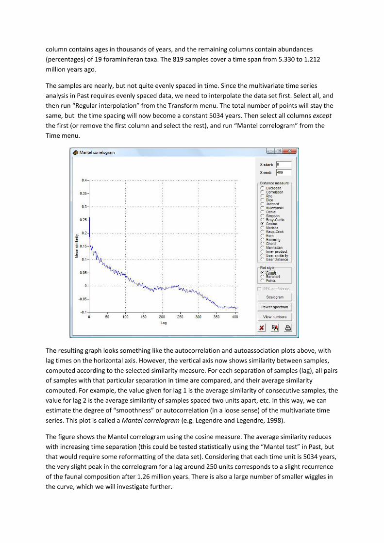
the first (or remove the first column and select the rest), and run “Mantel correlogram” from the
Time menu.
The resulting graph looks something like the autocorrelation and autoassociation plots above, with
lag times on the horizontal axis. However, the vertical axis now shows similarity between samples,
computed according to the selected similarity measure. For each separation of samples (lag), all pairs
of samples with that particular separation in time are compared, and their average similarity
computed. For example, the value given for lag 1 is the average similarity of consecutive samples, the
value for lag 2 is the average similarity of samples spaced two units apart, etc. In this way, we can
estimate the degree of “smoothness” or autocorrelation (in a loose sense) of the multivariate time
series. This plot is called a Mantel correlogram (e.g. Legendre and Legendre, 1998).
The figure shows the Mantel correlogram using the cosine measure. The average similarity reduces
with increasing time separation (this could be tested statistically using the “Mantel test” in Past, but
that would require some reformatting of the data set). Considering that each time unit is 5034 years,
the very slight peak in the correlogram for a lag around 250 units corresponds to a slight recurrence
of the faunal composition after 1.26 million years. There is also a large number of smaller wiggles in
the curve, which we will investigate further.

Click the “Power spectrum” button. This will produce a spectrum of the multivariate data set using
the Mantel corellogram (Hammer 2007). The frequenc y values represent number of cycles through
the whole time series of 819 samples.
Disregarding the high power at very low frequencies, which is due to a long-term trend, we may
identify one distinct spectral peak at a frequency of 100 cycles per 819 samples, or a period of 8.19
samples per cycle. This translates to a period of ca. 41,000 years. A smaller peak at a frequency of ca.
46 cycles per 819 samples is due to a periodicity of ca. 90,000 years, while the double peak centered
at ca. 180 samples translates to a periodicity of ca. 23,000 years. We can ascribe these peaks to
astronomical forcing.
The “Scalogram” function is experimental. It allows the visualization of a nonstationary multivariate
time series at different scales, somewhat similarly to wavelet analysis for univariate data. In the
figure below, we have zoomed in to the smaller scales (set the “y start” value to -60). The color
indicates similarity between pairs of samples at different separations (distance) and with the
midpoint between the pair shown as “position” (in this case with the youngest samples to the right).
We can read many things from this somewhat exotic plot. This includes a tendency towards more
rapid fluctuation (lower similarity values) through time. The precessional cycle is particularly clear
around position 460 (ca. 3.0 million years ago), giving rise to a striped pattern with a distance of 4-5
units between the stripes. The obliquity cycle is prominent around position 750 (1.6 million years
ago), where the fuzzy stripes are distanced some 8 units apart. The cycles are only faintly visible in
the older part of the series.
0 50 100 150 200 250 300 350 400
Frequency
0
0.001
0.002
0.003
Pow
er

Insolation model PAST includes a published astronomical model of solar insolation through geological time, based on
Laskar et al. (2004). Insolation curves can be compared with geochemical, sedimentological or
paleontological data.
Run Insolation from the Time menu (you do not need any data in the spreadsheet). If you have not
done so before, the program will ask you to open a data file containing orbital parameters. Download
the file INSOLN.LA2004.BTL.100.ASC from
http://www.imcce.fr/Equipes/ASD/insola/earth/La2004 and put in anywhere on your computer,
then open it.
You can leave the default options (insolation in the month 21. December to 20. January, from two
million years ago to the present, one value every 1000 years), but set the latitude on Earth to 40
degrees. The “Longitude” referred to in the window is position in the orbit, not longitude on Earth!
0 100 200 300 400 500 600 700 800
Position
60
55
50
45
40
35
30
25
20
15
10
5
0.0467
0.364
0.682
1
Dis
tance

Click Compute, then copy the data from the output window (click button with copy symbol) and
paste into the top left cell of the main spreadsheet. Then select the two columns and run a spectral
analysis. Can you identify any periodicities? Any periodicities that we might expect, but are not
there?
Cross correlation Cross correlation is used to compare two different time series, covering the same time span and with
equal and even sampling frequency. Is there any correlation between the two series, and if so is
there a time delay between them?
The oxygen isotope record and insolation data used in the examples above will provide a good
illustration of the technique. It takes a little bit of editing, sorting etc. to combine the two data sets –
you can try it yourself or you can use the file insol_d18O.dat where you will find the winter
insolation at 40 degrees latitude and the Lisiecki and Raymo (2005) benthic oxygen isotope data from
400 ka to the present, with a 1000 year sampling period. Select the insolation and isotope columns,
and run “Cross correlation” from the Time menu.
In the figure below I have zoomed in on the central part. Note the information message saying that
positive lag values means that the oxygen isotope is leading. Negative lags means the insolation is
leading. We may assume that any causal relationship will imply that the insolation is leading. The first
peak on the negative axis is for a lag of -5, meaning that we are looking at the correlation between
insolation and isotopes with the assumption that the isotope record lags 5,000 years behind
insolation. Peaks further out on the lag axis are due to the periodicities in the signals.

We can conclude that temperature at the sea floor lags about 5,000 years behind the variation in
insolation. This seems quite a lot, but a similar result has been reported in the literature.
References
Davis, J.C. 1986. Statistics and Data Analysis in Geology. John Wiley & Sons.
Hammer, Ø. 2007. Spectral analysis of a Plio-Pleistocene multispecies time series using the Mantel periodogram. Palaeogeography, Palaeoclimatology, Palaeoecology 243:373-377.
Laskar, J., P. Robutel, F. Joutel, M. Gastineau, A.C.M. Correia & B. Levrard. 2004. A long-term
numerical solution for the insolation quantities of the Earth. Astronomy & Astrophysics 428:261-285.
Legendre, P. & L. Legendre. 1998. Numerical Ecology, 2nd English ed. Elsevier, 853 pp.
Lisiecki, L.E., Raymo, M.E. 2005. A Pliocene-Pleistocene stack of 57 globally distributed benthic 18O
records. Paleoceanography 20, PA1003, doi:10.1029/2004PA001071.
Schulz, M., Mudelsee, M. 2002. REDFIT: estimating red-noise spectra directly from unevenly spaced
paleoclimatic time series. Computers & Geosciences 28, 421-426.