
Time-course human urine proteomics in space-flight simulation experiments · RESEARCH Open Access...
57
RESEARCH Open Access Time-course human urine proteomics in space-flight simulation experiments Hans Binder 1* , Henry Wirth 1 , Arsen Arakelyan 2 , Kathrin Lembcke 1 , Evgeny S Tiys 3 , Vladimir A Ivanisenko 3 , Nikolay A Kolchanov 3 , Alexey Kononikhin 4,6 , Igor Popov 5,6 , Evgeny N Nikolaev 4,5,6,7* , Lyudmila Kh Pastushkova 8 , Irina M Larina 8 From IX International Conference on the Bioinformatics of Genome Regulation and Structure\Systems Biol- ogy (BGRS\SB-2014) Novosibirsk, Russia. 23-28 June 2014 Abstract Background: Long-term space travel simulation experiments enabled to discover different aspects of human metabolism such as the complexity of NaCl salt balance. Detailed proteomics data were collected during the Mars105 isolation experiment enabling a deeper insight into the molecular processes involved. Results: We studied the abundance of about two thousand proteins extracted from urine samples of six volunteers collected weekly during a 105-day isolation experiment under controlled dietary conditions including progressive reduction of salt consumption. Machine learning using Self Organizing maps (SOM) in combination with different analysis tools was applied to describe the time trajectories of protein abundance in urine. The method enables a personalized and intuitive view on the physiological state of the volunteers. The abundance of more than one half of the proteins measured clearly changes in the course of the experiment. The trajectory splits roughly into three time ranges, an early (week 1-6), an intermediate (week 7-11) and a late one (week 12-15). Regulatory modes associated with distinct biological processes were identified using previous knowledge by applying enrichment and pathway flow analysis. Early protein activation modes can be related to immune response and inflammatory processes, activation at intermediate times to developmental and proliferative processes and late activations to stress and responses to chemicals. Conclusions: The protein abundance profiles support previous results about alternative mechanisms of salt storage in an osmotically inactive form. We hypothesize that reduced NaCl consumption of about 6 g/day presumably will reduce or even prevent the activation of inflammatory processes observed in the early time range of isolation. SOM machine learning in combination with analysis methods of class discovery and functional annotation enable the straightforward analysis of complex proteomics data sets generated by means of mass spectrometry. Introduction The physiological impact of human space flights mis- sions exceeding several weeks poses problems such as radiation exposure, immunological depression and stress. Part of the concerns occur during the course of a mission, while others - such as cardiovascular decondi- tioning, bone and muscle losses and orthostatic intoler- ance - manifest themselves mainly upon return to earth only. These in-flight and post-flight physiological issues are vital to develop a sustainable program of human space exploration. Long-term space travel simulation experiments on earth are performed to discover the par- ticular factors causing physiological and psychological problems and to develop methods helping to prevent or, at least to counteract them. * Correspondence: [email protected]; [email protected] 1 Interdisciplinary Centre for Bioinformatics, Universität Leipzig, Leipzig, Germany 4 Talrose Institute for Energy Problems of Chemical Physics, RAS, Moscow, Russia Full list of author information is available at the end of the article Binder et al. BMC Genomics 2014, 15(Suppl 12):S2 http://www.biomedcentral.com/1471-2164/15/S12/S2 © 2014 Binder et al.; licensee BioMed Central Ltd. This is an Open Access article distributed under the terms of the Creative Commons Attribution License (http://creativecommons.org/licenses/by/4.0), which permits unrestricted use, distribution, and reproduction in any medium, provided the original work is properly cited. The Creative Commons Public Domain Dedication waiver (http:// creativecommons.org/publicdomain/zero/1.0/) applies to the data made available in this article, unless otherwise stated.
Transcript of Time-course human urine proteomics in space-flight simulation experiments · RESEARCH Open Access...

RESEARCH Open Access
Time-course human urine proteomics inspace-flight simulation experimentsHans Binder1*, Henry Wirth1, Arsen Arakelyan2, Kathrin Lembcke1, Evgeny S Tiys3, Vladimir A Ivanisenko3,Nikolay A Kolchanov3, Alexey Kononikhin4,6, Igor Popov5,6, Evgeny N Nikolaev4,5,6,7*, Lyudmila Kh Pastushkova8,Irina M Larina8
From IX International Conference on the Bioinformatics of Genome Regulation and Structure\Systems Biol-ogy (BGRS\SB-2014)Novosibirsk, Russia. 23-28 June 2014
Abstract
Background: Long-term space travel simulation experiments enabled to discover different aspects of humanmetabolism such as the complexity of NaCl salt balance. Detailed proteomics data were collected during theMars105 isolation experiment enabling a deeper insight into the molecular processes involved.
Results: We studied the abundance of about two thousand proteins extracted from urine samples of sixvolunteers collected weekly during a 105-day isolation experiment under controlled dietary conditions includingprogressive reduction of salt consumption. Machine learning using Self Organizing maps (SOM) in combinationwith different analysis tools was applied to describe the time trajectories of protein abundance in urine. Themethod enables a personalized and intuitive view on the physiological state of the volunteers. The abundance ofmore than one half of the proteins measured clearly changes in the course of the experiment. The trajectory splitsroughly into three time ranges, an early (week 1-6), an intermediate (week 7-11) and a late one (week 12-15).Regulatory modes associated with distinct biological processes were identified using previous knowledge byapplying enrichment and pathway flow analysis. Early protein activation modes can be related to immuneresponse and inflammatory processes, activation at intermediate times to developmental and proliferativeprocesses and late activations to stress and responses to chemicals.
Conclusions: The protein abundance profiles support previous results about alternative mechanisms of salt storagein an osmotically inactive form. We hypothesize that reduced NaCl consumption of about 6 g/day presumably willreduce or even prevent the activation of inflammatory processes observed in the early time range of isolation.SOM machine learning in combination with analysis methods of class discovery and functional annotation enablethe straightforward analysis of complex proteomics data sets generated by means of mass spectrometry.
IntroductionThe physiological impact of human space flights mis-sions exceeding several weeks poses problems such asradiation exposure, immunological depression andstress. Part of the concerns occur during the course of a
mission, while others - such as cardiovascular decondi-tioning, bone and muscle losses and orthostatic intoler-ance - manifest themselves mainly upon return to earthonly. These in-flight and post-flight physiological issuesare vital to develop a sustainable program of humanspace exploration. Long-term space travel simulationexperiments on earth are performed to discover the par-ticular factors causing physiological and psychologicalproblems and to develop methods helping to prevent or,at least to counteract them.
* Correspondence: [email protected]; [email protected] Centre for Bioinformatics, Universität Leipzig, Leipzig,Germany4Talrose Institute for Energy Problems of Chemical Physics, RAS, Moscow,RussiaFull list of author information is available at the end of the article
Binder et al. BMC Genomics 2014, 15(Suppl 12):S2http://www.biomedcentral.com/1471-2164/15/S12/S2
© 2014 Binder et al.; licensee BioMed Central Ltd. This is an Open Access article distributed under the terms of the Creative CommonsAttribution License (http://creativecommons.org/licenses/by/4.0), which permits unrestricted use, distribution, and reproduction inany medium, provided the original work is properly cited. The Creative Commons Public Domain Dedication waiver (http://creativecommons.org/publicdomain/zero/1.0/) applies to the data made available in this article, unless otherwise stated.

An interesting line of investigation was pursued as ‘Marsisolation study’ conducted at the Institute of BiomedicalProblems in Moscow to simulate a journey to our neigh-bor planet. The purpose was to find out more about theeffects of a long period of isolation on the human physio-logical and mental conditions in terms of data gatheredover several weeks. Volunteers were confined to anenclosed, restricted environment where they obtaineddiets with defined amounts of salt (NaCl) and micro ele-ments content and performed different activity programs.These studies were remarkable for their sustained durationand tight control of environmental variables. This ground-based space station model experiment enabled a novel,profound and extended trip to our ‘inner space’ to dis-cover new aspects of human metabolism [1].Particularly, the study provided a unique and detailed
profile of physiological responses to decreasing saltintake. Besides playing a part in the development ofhypertension (an actual study estimates that more than1.5 million annual deaths from cardiovascular causesworldwide were attributed to increased sodium con-sumption [2]) and the weakening of the immune system,too much salt also seems to have a negative effect on themusculo-skeletal system due to acidification caused bythe binding of salt to sugar-protein compounds. In con-sequence a high salt intake increases bone and muscleloss in humans on earth which is even exacerbated in theabsence of gravity. One expects that a salt-reduced dietpossibly diminishes negative effects such as bone degra-dation in space flights.Although the physiology of salt balance is well under-
stood (see the short review in [1] and the references citedtherein) the space flight simulation experiment high-lighted a new complexity in physiological responses thatcannot be easily explained by previous knowledge [3-5].For example, the studies raised doubts about the strictlink between salt and water balance which are presum-ably caused by the storage of NaCl in a molecularly-bound, osmotically-inactive form paralleled by immunesystem driven micro-vascularization in skin which tendsto reduce blood pressure [6-8].One needs further exploration of these findings to
improve our understanding of the effect of diet and of iso-lation on human physiology especially to understand theregulatory modes on the molecular level. So far measuresestimating the kinetics of salt balance and of hormoneproduction were analyzed and related to global parameterssuch as the blood pressure, extracellular water and bodyweight [3-5]. In addition to these measures, detailed urineproteomics data were collected during the Mars105 isola-tion experiment lasting 105 days potentially enabling adeeper insight into the molecular processes involved. Firstanalyses report a high variability of protein abundanceidentified in the urine samples [9]. Another analysis
established associations between clusters of proteins and afunctional protein networks related to sodium intakewhich has been extracted from literature using bioinfor-matics methods [10]. A third study analyzed the possibletissue origin of the proteins detected. It founds anincreased number of renal and urinary tract proteins aftera real space mission compared with the ground-basedflight simulation presumably reflecting the accumulationof sodium in cosmonauts body during space missions [11].A comprehensive analysis of the time-dependent urine
proteomics data set collected during the ground basedflight simulation is still pending. In this publication weanalyze the abundance of the about two thousand proteinsmeasured during the experiment and discover its func-tional impact. We pursue a personalized view to disentan-gle the specifics of protein abundance in each of the sixparticipating individuals. We demonstrate that machinelearning using self organizing maps (SOM) in combinationwith different analysis tools enable a personalized andintuitive view on the data. Application and adaptation ofSOM machine learning to time-resolved protein abun-dance data is novel and challenging due to the special datatype, unknown error structure and possible methodicalbiases of the data.In the first part of this publication we therefore address
methodical issues related to the proteomics data set. Inthe second part we focus on the functional interpreta-tional to answer question such as how urine proteinabundance is affected by decreased salt consumption andisolation in the space flight simulation chamber and whatbiological processes were involved at different stages ofthe experiment.
ResultsSOM abundance portraits and sample trajectoriesFigure 1a shows the gallery of protein abundance land-scapes as seen by the SOM-portraits. They visualize themean protein abundances averaged over the individualvolunteer data at each time point of sample collection.Hence, each landscape ‘portrays’ the proteomics pheno-type of the about 2,000 protein species identified by massspectrometry in the urine samples (IPI items). Proteinswith high topmost over and under-expression levels arelocalized in the red and blue spot-like regions, respec-tively. The spot patterns clearly change in the course ofthe experiment reflecting alterations in the proteomicsphenotypes potentially caused by isolation, modificationsof salt (NaCl) consumption and presumably other factors.Panel b of Figure 1 shows the so-called 2nd-level SOM
which visualizes the mutual similarities between thesamples in a two-dimensional plot. The samples passvirtually four time windows where the first and secondones were indicated by dotted ellipses: The first windowincludes the samples taken before starting the isolation
Binder et al. BMC Genomics 2014, 15(Suppl 12):S2http://www.biomedcentral.com/1471-2164/15/S12/S2
Page 2 of 19

Figure 1 Time dependent SOM proteomics portraits of urine samples taken before, during and after the isolation experiment (panela) and time trajectory as obtained using 2nd level SOM mapping (panel b). The results refer to the ‘mean-volunteer analysis’ by averagingthe proteomics data over the six volunteers at each time point. Each column of images in panel a refers to one cluster as determined using 2nd
level SOM similarity analysis shown in panel b. Thin arrows indicate the temporal order of the specimen and thus the trajectory of the urineproteomics samples. The amount a salt consumption per volunteer and day during the isolation experiment is indicated in the figures: thearrows indicate the times of changing salt consumption. The dashed lines divide the trajectory into early, intermediate and late time ranges. The‘early’ time-regime further subdivides into two clusters of samples collected before and after start of the isolation experiment (ellipses).Alternative independent component analysis of the sample trajectory is given in the supplementary text (Additional file 1).
Binder et al. BMC Genomics 2014, 15(Suppl 12):S2http://www.biomedcentral.com/1471-2164/15/S12/S2
Page 3 of 19

experiment. The second time window lasts roughly untilthe end of the sixth week of isolation in which salt con-sumption is reduced from 12 g/day to 9 g/day. Thethird period ends after week no. 11, i.e. two weeks aftersalt consumption is further reduced to 6 g/day. The lasttime window finally includes the samples taken in thelast three weeks of the isolation experiment and thethree sample points taken afterwards. Note that thetransition between time window two and three forms asort of turning point of the trajectory after that the pro-teomic landscapes in the phase space of the 2nd levelSOM ‘move’ back in direction towards the startingpoint. According to the amount of salt consumption thesamples taken before/after this turning point refer tohigher and lower salt consumption, respectively. In amore rough view we divide the data into an ‘early’,‘intermediate’ and a ‘late’ time regime as indicated inFigure 1: It considers the similarity of the abundancelandscapes in the first two time windows and aggregatesthem into one early phase.In the supplementary text we analyzed similarity rela-
tions using independent component analysis (ICA) pro-jecting the samples in linear scale. ICA virtuallyconfirms the results obtained using 2nd level SOM.
Spot trajectories and module selectionThe SOM-algorithm distributes the proteins over the mapsuch that co-expressed proteins become located nearby. Inconsequence, proteins specifically up-regulated in one ofthe time regimes aggregate into red spot-like textures at acertain position of the map. With evolving time of theexperiment the spot patterns change and, in particular,existing spots disappear and new ones appear at new posi-tions (see Figure 1a). Figure 2 (upper part) illustrates thesespot trajectories for red over- (left panel) and blue under-(right panel) expression spots. The so-called summarymaps aggregate all red or blue spots observed in the indi-vidual profiles into one master map, respectively. Thearrows illustrate the temporal order of appearance of therespective spots: Due to the self-organizing properties ofthe map red and blue spots ‘rotate’ in counterclockwisedirection along the edges of the map in a central-symme-trical fashion. I.e., as a rule of thumb red and blue spotsoften appear as antagonistic twins indicating that eachstate is characterized by a set of up-, and a set of down-regulated proteins as well.This property of self-organization is reflected in the
spot-spot correlation and anti-correlation maps whichwere calculated using a weighted-topology overlap net-work approach as described in the Methods section andin ref. [12]: The bottom left panel in Figure 2 showsthat spots up-regulated in the early time range aremutually highly correlated forming a sort of continuumof states located in right-upper part of the map. The
two time windows in the early range are consequentlyassociated with spots along the right and upper border ofthe map, respectively. The intermediate and late timeranges are accompanied by a marked shift of the spot posi-tion towards the lower left corner of the map thus allow-ing to associate the proteins within the respective spotswith the discontinuous changes in samples trajectorydescribed above (see also Figure 1). The anti-correlationmap (bottom right panel in Figure 2) supports the viewthat spots up-regulated in the early and intermediate/latetime ranges are down regulated at intermediate/late andearly time ranges, respectively. Hence, the characteristicbreakpoints along the spot trajectories observed can beassociated with discontinuous changes of protein abun-dance detected in the spot trajectories.In the next step we address the question how to select
the spots appropriately or, in other words, how to seg-ment the map properly into regions of co-regulated pro-teins. Besides the over- and under-expression spotselection algorithm we also applied alternative methodsbased on correlation and K-means clustering. Detailsand results of this analysis were provided in the supple-mentary text.We found that the spot selection method is not crucial
for extracting the basal dynamic properties of the system.In dependence on partial needs, e.g. to extract strongly dif-ferentially expressed proteins or larger groups of mutuallyco-expressed or even largely invariant features we recom-mend the overexpression, correlation or K-means cluster-ing method, respectively. Here we will focus on theoverexpression spot selection method because it is a goodchoice for marker selection which includes up- and down-regulated features as well. Selected results for the correla-tion and K-means clustering methods are presented in thesupplementary text (Additional file 1).
Spot profiles and functional analysisFigure 3 assigns the spot profiles to selected overex-pression spots. These profiles are mean time-dependentprotein abundance data averaged over all meta-featuresincluded in the respective spot. The meta-features, inturn, are mean protein abundance data averaged overall single protein data contained in each meta-feature.Hence, the spot profiles are mean profiles characteriz-ing the average abundance of the single proteinsincluded in the respective spot. Most of the profilesshow a wave-like shape with a maximum and mini-mum in different time windows reflecting the dynamicup- and down-regulation of proteins during the experi-ment. In direction of the spot trajectories discussedabove, the abundance maximum seen in the individualspot profiles shifts to later times. The spot trajectorythus reflects first of all the phase-shift � of the wave-like profiles which roughly increases from � ~ 0-T*/2
Binder et al. BMC Genomics 2014, 15(Suppl 12):S2http://www.biomedcentral.com/1471-2164/15/S12/S2
Page 4 of 19

for early activation (e.g. spot D) to � ~ T*/2 - T* foractivation at intermediate and late times (e.g. spot R).Here T* denotes the period of the changes, e.g. givenas total time of the experiment. The spot profiles differhowever not only in the position of their abundancemaximum but also in the time delay between maxi-mum and minimum abundance and also in their shapewhich can resemble more a harmonic cosine (e.g. spotsG and R) or more a single peaked function (e.g. spotsM and Q). The period can cover the whole duration ofthe experiment, i.e. T*~105 days (e.g. spots D and J) or
a considerably longer or shorter time, T ~ 2 T* (e.g.spots E and R) or T<T* (e.g. spots L and P), respec-tively. Note that periodic changes of protein abundancecan be induced by different extrinsic factors such asthe activity, nutrition and working regime (e.g. nightshift work during the experiment) of the volunteers,salt consumption but also intrinsic ones such as hor-mone activities (e.g. of andosterone, see discussion)and thus the period, or in other words, the degree ofrecovery of protein abundance after its perturbation,can deviate from the time span of the experiment.
Figure 2 Spot trajectories (part above) and mutual spot correlations: The over- and under-expression spot summary maps collect thered and blue spots observed in the individual portraits into one master map, respectively. The arrows roughly illustrate the time-trajectories of over- and under-expression spots before, during and after the isolation experiment (see also the individual SOM portraits shown inFigure 1a). The correlation and ant-correlation maps visualize mutual correlations between the spots in terms of the weighted topologicaloverlap (wto) measures for positive and negative correlations, respectively. Spots are connected by lines for strong correlations/anti-correlations.
Binder et al. BMC Genomics 2014, 15(Suppl 12):S2http://www.biomedcentral.com/1471-2164/15/S12/S2
Page 5 of 19
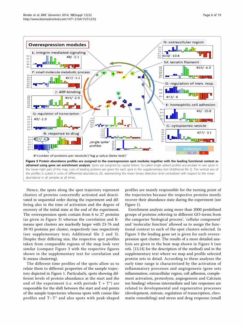
Hence, the spots along the spot trajectory representclusters of proteins concertedly activated and deacti-vated in sequential order during the experiment and dif-fering also in the time of activation and the degree ofrecovery of the initial state at the end of the experiment.The overexpression spots contain from 6 to 27 proteins(as given in Figure 3) whereas the correlation and K-means spot clusters are markedly larger with 23-76 and39-93 proteins per cluster, respectively (see respectively(see supplementary text; Additional file 2 and 3).Despite their differing size, the respective spot profilestaken from comparable regions of the map look verysimilar (compare Figure 3 with the respective figuresshown in the supplementary text for correlation andK-means clustering).The different time profiles of the spots allow us to
relate them to different properties of the sample trajec-tory depicted in Figure 1. Particularly, spots showing dif-ferent levels of protein abundance at the start and theend of the experiment (i.e. with periods T ≠ T*) areresponsible for the shift between the start and end pointsof the sample trajectories whereas spots with cosine-likeprofiles and T~T* and also spots with peak-shaped
profiles are mainly responsible for the turning point ofthe trajectories because the respective proteins mostlyrecover their abundance state during the experiment (seeFigure 1).Enrichment analysis using more than 2000 predefined
groups of proteins referring to different GO-terms fromthe categories ‘biological process’, ‘cellular component’and ‘molecular function’ allowed us to assign the func-tional context to each of the spot clusters selected. InFigure 3 the leading gene set is given for each overex-pression spot cluster. The results of a more detailed ana-lysis are given in the heat map shown in Figure 4 (seerefs. [13,14] for the description of the method) and in thesupplementary text where we map and profile selectedprotein sets in detail. According to these analyses theearly time range is characterized by the activation ofinflammatory processes and angiogenesis (gene setsinflammation, extracellular region, cell adhesion, comple-ment activation, proteolysis, angiogenesis and Calciumion binding) whereas intermediate and late responses arerelated to developmental and regenerative processes(development, mitosis, regulation of transcription, chro-matin remodeling) and stress and drug response (small
Figure 3 Protein abundance profiles are assigned to the overexpression spot modules together with the leading functional context asobtained using gene set enrichment analysis. Spots are assigned by capital letters. So-called single spiked profiles accumulate in rare spots inthe lower-right part of the map. Lists of leading proteins are given for each spot in the supplementary text (Additional file 2). The vertical axis ofthe profiles is scaled in units of differential abundance, ΔE, representing the mean binary detection level centralized with respect to the meanabundance in all samples at all times.
Binder et al. BMC Genomics 2014, 15(Suppl 12):S2http://www.biomedcentral.com/1471-2164/15/S12/S2
Page 6 of 19

molecule regulative process, response to oxidative stress,hypoxia, apoptosis, response to Zinc, Magnesium ionbinding, G-protein coupled activity), respectively. Notethat part of the processes related to inflammation, drugresponse and also to genome and transcriptome activity(chromatin remodeling, DNA repair) can be attributed tothe lack of recovery of the sample trajectories (these pro-cesses are marked by the asterisks in Figure 4).Clusters of proteins associated to the response of the
organism to ‘NaCl’ deficiency are identified previouslyusing a comprehensive interactome network analysis[10]. We mapped proteins from these clusters into SOMspace and found that they mostly refer to the early, andto a less degree, to the intermediate-time response (seesupplementary text).Pathway signal flow analysis (PSF) represents an inde-
pendent option to discover the functional context of thespot profiles. In contrast to gene set enrichment analysisit takes into account the network topology of selectedpathways taken from the KEGG database to obtain PSF-profiles which are compared with the abundance profilesof the spots. It turned out that early and intermediate
protein abundance changes are associated with inflamma-tory responses and metabolic processes (fatty acids,nucleic acids and amino acids) indicating alterations ofnutrition and partly starvation followed by activation ofregenerative processes (Wnt-pathway, N-glycan biosynth-esis) in the intermediate time range and of stress responsesignaling (p53 and mTOR-signaling pathways) and diges-tion at late times of the experiment (see Figure 5 and sup-plementary text for details). Many pathways lead to theactivation of protein kinase C and inositol-triphosphatesignaling cascades in agreement with the enriched proteinsets related to signal transduction such as Ca2+ bindingand G-protein coupled receptor activity.
Individual volunteer analysisSo far we presented results based on the averaging ofthe abundance of each protein at each time point overall six volunteers. This ‘mean volunteer’ analysis allowedextracting mean effects induced by isolation and varyingsalt consumption but it neglects individual differencesbetween the volunteers. We therefore performed a sec-ond independent SOM analysis of the individual data of
Figure 4 Global enrichment analysis heat map: The map clusters top GO-sets of the category ‘biological process’ enriched inoverexpression spots of the time series. The dashed rectangles indicate time regions of marked enrichment of the processes listed in theright part of the figure (orange to brown colors refer to increasing enrichment). The vertical dotted line divides early from late time regimes.Processes marked with an asterisk do not fully recover during the experiment. They are related to the shift between the start and end points ofthe sample trajectories (see Figure 1)
Binder et al. BMC Genomics 2014, 15(Suppl 12):S2http://www.biomedcentral.com/1471-2164/15/S12/S2
Page 7 of 19

each volunteer. Figure 6 shows the gallery of time-dependent ‘personalized’ portraits of all six probands(P1 - P6). As for the ‘mean volunteer analysis’, the pro-tein abundance landscapes can be divided into typicalcolor textures assigned to the early-, intermediate- andlate-response types, respectively. Simple visual inspec-tion of the portraits shows that the abundance patternsof most of the volunteers alter in parallel (see thecolored frames in Figure 6). Partly, one observes
however small variations in the time-dependent changes:For example, the portraits of P4-P5 switch into the timeregime of the ‘late’ type almost one-two weeks earlierthan that of P1-P3. Late-type protein abundance pat-terns were observed for P5 in three samples takenbefore starting isolation.Figure 7 shows the individual sample trajectories of
each of the volunteers using 2nd level SOM analysis. Onesees that virtually each trajectory can be clearly divided
Figure 5 Summary of results obtained from pathway flow analysis: The light blue arrows indicate characteristic processes activatedwith progressing time of the experiment. The processes are identified by comparing the PSF of KEGG-pathways with the spot profiles ofprotein abundance (see supplementary text for details).
Figure 6 Gallery of SOM portraits of the individual volunteers: Each row refers to one proband (P1 to P6) and each column to onetime point of sample collection. Empty positions in the matrix refer to missing data because no samples were collected. The blue, green andred frames include samples showing the characteristics of early, intermediate and late responses, respectively. Note that the SOM texturescannot be directly compared to the textures of the mean volunteer analysis (shown in Figure 1) because both sets of maps are trainedindependently. Note that three out of five urine samples taken from proband no. 5 (P5) and possibly one taken from P6 before starting isolationexpress proteomics characteristics observed apart from that in the samples of all volunteers in the late time range only (see the red framesfor P5).
Binder et al. BMC Genomics 2014, 15(Suppl 12):S2http://www.biomedcentral.com/1471-2164/15/S12/S2
Page 8 of 19

into the early, intermediate and late time ranges. Theborderlines separating the different time regimes how-ever slightly shift between the individuals. One also seesthat volunteer P5 is characterized by a certainly moreintricate trajectory reflecting his individual specifics.Next, we performed functional analysis by applying gene
set enrichment clustering to the single volunteer data (seesupplementary text for details). In general, the functionalcontext of the different time ranges agrees with that of themean volunteer analysis. However, the larger set of indivi-dual sample data provides a more detailed view on thespecifics of each volunteer. For example, features relatedto ‘immune response’ were either up-regulated in the earlyphase of the experiment only (P1, P4, P6) or, in addition,again in the late phase (P2, P3, P5).
Organ related protein abundanceProteins not of renal origin fall in urine from blood andin blood from the respective tissues and cells. We used
Tissue specific Gene Expression and Regulation database (TiGER, [15]) to assign protein species to differenttissues and assess their abundance in the urine samplesstudied (see Figure 8 and supplementary text). First wemap the tissue-related protein sets to SOM space: Itturned out that the respective species of a series of tis-sue sets accumulate in different regions of the mapwhich were assigned to different time ranges. For exam-ple, pancreas and liver proteins show an increased localdensity in the area of early_up proteins, muscle proteinsin the region of intermediate_up region and testis pro-teins in the late_up region. The respective time profilesconfirm the expected activation patterns. We found thatproteins from liver, pancreas and kidney show increasedabundance before and at the beginning of the isolationexperiment. Proteins from muscle are overexpressed atintermediate times of isolation and proteins related totestis and stomach at the end and after isolation. Proteinsets related to skin, lymph nodes, blood, prostate, brain
Figure 7 Individual sample trajectories of each of the six probands (P1 - P6) in 2nd level SOM coordinates. Each of the trajectories canbe divided into early, intermediate and late time regimes despite small individual differences (dashed lines). The 2nd level SOM was trained withthe data of all volunteers. The trajectories shown connect the time-dependent samples of the respective proband. The symbols ‘+’ and ‘x’indicate the start and the end of isolation. Note that the trajectory of proband no. 5 (P5) enters the ‘late time range’ still before starting isolationin correspondence with the respective proteomics portraits shown in Figure 6.
Binder et al. BMC Genomics 2014, 15(Suppl 12):S2http://www.biomedcentral.com/1471-2164/15/S12/S2
Page 9 of 19

and colon show virtually no or only a very weak timedependence in the single volunteer analysis.The single volunteer tissue profiles again reveal indivi-
dual differences between the probands: For example,liver proteins of P1 and P5 respond much weaker thanliver proteins of the other volunteers. The individualprofiles of prostate proteins clearly show time depen-dencies which however are averaged out in the averagevolunteer profile due to their asynchronous character(see supplementary text provided in Additional file 1).
Total protein abundance analysisIn addition to single-, meta-feature and spot related abun-dance levels using centralized values (i.e. normalized oneswith respect to the mean value averaged over all volun-teers and time points) we analyzed the time profile of the
total protein (i.e. integral) abundance level in terms of thevariance of the respective meta-feature abundance land-scapes (Figure 9). The abundance landscapes refer to aseparate SOM training described below and in the supple-mentary text. It turned out that, on average, the totalabundance level slightly increases before isolation in theearly time range but then, after a plateau, it steeplydecreases in the intermediate and late time ranges untilthe end of isolation of the volunteers. Hence, isolationcauses the overall decrease of protein abundance in theurine samples. In other words, processes down-regulatedin the intermediate and late time regimes obviouslyinvolve a larger number of proteins and/or their strongerabundance changes than processes up-regulated in the latetime regime. Analysis of the population map supports thisexpectation (see supplementary text): About 27% of the
Figure 8 Tissue specific protein abundance: Tissue specific protein sets are taken from TiGR [15]and mapped into the single volunteermap (left part). The red rectangles illustrate regions of increased local density of the respective proteins. These regions refer to the early_up,and late_up time ranges. The set-profiles shown in the middle part clearly reveal the different time profiles in the average volunteer analysis. Therespective single volunteer analysis reflects proband-specific differences between their tissue abundances. The respective data of additionaltissues (kidney, muscle, stomach, skin, lymph node, blood, prostate, brain, colon) is given in the supplementary text.
Binder et al. BMC Genomics 2014, 15(Suppl 12):S2http://www.biomedcentral.com/1471-2164/15/S12/S2
Page 10 of 19
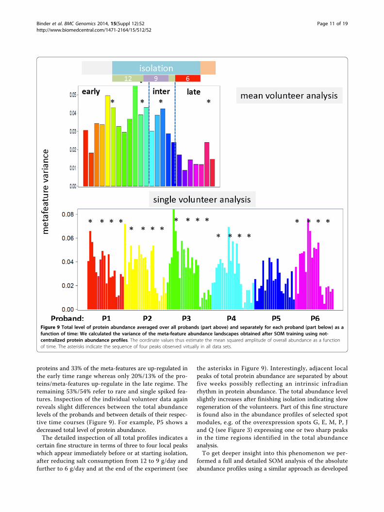
proteins and 33% of the meta-features are up-regulated inthe early time range whereas only 20%/13% of the pro-teins/meta-features up-regulate in the late regime. Theremaining 53%/54% refer to rare and single spiked fea-tures. Inspection of the individual volunteer data againreveals slight differences between the total abundancelevels of the probands and between details of their respec-tive time courses (Figure 9). For example, P5 shows adecreased total level of protein abundance.The detailed inspection of all total profiles indicates a
certain fine structure in terms of three to four local peakswhich appear immediately before or at starting isolation,after reducing salt consumption from 12 to 9 g/day andfurther to 6 g/day and at the end of the experiment (see
the asterisks in Figure 9). Interestingly, adjacent localpeaks of total protein abundance are separated by aboutfive weeks possibly reflecting an intrinsic infradianrhythm in protein abundance. The total abundance levelslightly increases after finishing isolation indicating slowregeneration of the volunteers. Part of this fine structureis found also in the abundance profiles of selected spotmodules, e.g. of the overexpression spots G, E, M, P, Jand Q (see Figure 3) expressing one or two sharp peaksin the time regions identified in the total abundanceanalysis.To get deeper insight into this phenomenon we per-
formed a full and detailed SOM analysis of the absoluteabundance profiles using a similar approach as developed
Figure 9 Total level of protein abundance averaged over all probands (part above) and separately for each proband (part below) as afunction of time: We calculated the variance of the meta-feature abundance landscapes obtained after SOM training using not-centralized protein abundance profiles. The oordinate values thus estimate the mean squared amplitude of overall abundance as a functionof time. The asterisks indicate the sequence of four peaks observed virtually in all data sets.
Binder et al. BMC Genomics 2014, 15(Suppl 12):S2http://www.biomedcentral.com/1471-2164/15/S12/S2
Page 11 of 19

for differential abundance data. Recall that analysis usingcentralized profiles applied so far focuses on abundancechanges independent of the abundance level. For exam-ple, virtually invariant profiles of high and of low abun-dance levels were clustered together in this case.Absolute abundance values certainly distinguish betweenthese two situations. Thus the analysis of absolute abun-dance profiles is expected to provide additional informa-tion about the abundance levels of the proteins in thecourse of the experiment. Detailed results were describedin the supplementary text (Additional file 1). We foundthat a series of processes become activated in relativelynarrow time windows of peaked abundance at the fourfixed times identified in total abundance analysis, namelyat or immediately before isolation (angiogenesis, comple-ment activation and others), at or immediately after redu-cing salt consumption to 9 g/day (focal adhesion andcytoskeleton) and to 6 g/day (cell differentiation andorgan development) and near the end of the experimentafter isolation. The latter trend suggests recovery of theinitial state before starting isolation. Double peaked pro-files combine peaks at late and intermediate times (e.g.metabolic process and apoptosis). Importantly, immuneresponse processes are permanently active during theexperiment with a slight decay in the late time range.About 60% of the proteins are permanently expressed onlow abundance levels during the experiment whereasabout 7% - 10% are permanently expressed on high abun-dance levels. This result agrees with our estimation usingcentralized data.
DiscussionSOM portrays urine proteome abundance landscapeswith high temporal and individual resolutionFrom a methodical point of view we aimed at analyz-ing a complex high-content data set of about 2000protein species measured at 24 different time pointsfor six individuals in terms of clustering and class dis-covery, feature selection an functional informationmining using SOM machine learning. The data set isunique and exceedingly valuable with respect to itsscope, duration, and level of environmental control. Ithas been shown that the analysis pipeline chosen iswell suited to extract longitudinal (i.e. time dependent)as well as transversal (i.e. volunteer specific) informa-tion in detail. One special strength of the approachcan be seen in its visualization capabilities allowing theintuitive perception of essential properties of the datasuch as the detection of spot-like clusters of differen-tially and co-expressed proteins, and especially, of theirtime-dependent changes and/or their volunteer-specificvariations. The basal results of our SOM analysis aresummarized in Figure 10 and Table 1.
We found that- The dynamics of urine proteomics can be described
in terms of sample trajectories reflecting similarity rela-tions between the protein abundance landscapes of thesamples as a function of time; or alternatively, in termsof spot trajectories reflecting similarity relations betweenthe time profiles of different groups of co-expressedproteins. Both types of trajectories describe thedynamics of urine proteomics in a complementaryfashion.- The time course of urine proteomics splits roughly
into three time ranges, an early, an intermediate and alate one using data averaged over all six volunteers stu-died. Each of the time ranges is characterized by rela-tively similar protein abundance landscapes and thus bysimilar biological processes activated (and deactivated).- The abundance of about one half (47%) of the 2000
protein species clearly changes in the course of theexperiment. The total protein abundance level is maxi-mum in the early time region and then it progressivelydecreases until the end of the experiment.- The remaining other half of all proteins (53%) is
either expressed invariantly virtually not or weaklyresponding to the experiment or it shows so-called rare,noisy and single-spiked profiles. The respective proteinspecies are expressed only at very few time points for asmall part of the volunteers only. The further analysisand interpretation of these profiles is beyond the scopeof this study.- The volunteer averaged sample trajectory passes
through a turning point at the end of the early timerange and then it moves backwards in direction of thestarting point revealing the partial recovery of the proteinabundance state observed before starting isolation on onehand, but also certain differences between the start andend points of the experiment on the other hand.- The three characteristic time ranges are consistently
observed in the individual time course proteomics of allsix volunteers. Small but clear individual differences areobserved (e.g. relatively low abundance levels of probandno. 5 and slight variations of the start and end points ofthe time ranges between the individuals). Here we focuson the ubiquitous effects. We note however, that ourmethod enables the personalized view on these indivi-dual differences.- The similar time courses of urine proteomics of all
volunteers let us conclude that the three time rangesreflect representative and essential physiological regimesassociated with isolation, salt consumption and presum-ably also other factors. Note that the intermediate andlate time ranges start one week after reducing the dailysalt consumption from 12 to 9 g and further to 6 g,respectively.
Binder et al. BMC Genomics 2014, 15(Suppl 12):S2http://www.biomedcentral.com/1471-2164/15/S12/S2
Page 12 of 19

Figure 10 Summary graphics of the time course of urine proteomics during the Mars 105 space-flight simulation experiment.
Table 1 Overview over effects observed in space-flight isolation experiments after analysis of urine proteomics
Time range early intermediate late
week of isolation before isolation andweek 1-6
week 7 - 11 week 12 - 15 and after isolation
NaCl consumption 12 g/day (week 1-6) 9 (week 7-9), 12 (week 10) and 6 g/day(week 11)
6 g/day (week 12-15)
Activated biologicalprocesses (enrichmentanalysis)
inflammation, cell adhesion,blood coagulation, proteolysis,angiogenesis, Ca2+ binding,
extracellular region
cell division, lipid metabolism, skindevelopment, keratinization, chromatinremodeling, response to oxidative stressand hypoxia, regulation of apoptosis
response to drug/toxin, small moleculemetabolic process, intracellular, Mg2+
binding, response to Zinc, Cell death,G-protein coupled receptor, regulationof blood pressure (renin/angiotensin)
Activated pathways (PSFanalysis)
immune response; nervoussystem; nucleotide, aminoacid and lipid (butanoate)
metabolism
digestive system; metabolism;regenerative processes (Wnt-signalingpathway and N-glycan biosynthesis)
signal transduction; response to stress(p53-, mTOR-signaling pathway), energymetabolism (ubiquinone biosynthesis)
Activated tissue responses Liver, kidney, pancreas, (partlyskin)
muscle testis, stomach, (partly liver and kidney)
Relation to previous results NaCl related interactome activated [10], NaCl storage in an osmoticallyinactive form and micro-vascularization [6,7], renal proteins activated [11]
blood pressure decrease andaldosterone level increase [4]
Total protein abundance increasing and high decreasing low
Percentage of proteins up-regulated
27% 20%
Binder et al. BMC Genomics 2014, 15(Suppl 12):S2http://www.biomedcentral.com/1471-2164/15/S12/S2
Page 13 of 19

- The so-called ‘spots’ collect co-expressed proteinsrepresenting regulatory modes associated with distinctbiological processes which can be identified using pre-vious knowledge by applying enrichment or pathway flowanalysis. In total we identified about ten different modesof protein abundance. Application of different methodsof spot selection (e.g. using overexpression, correlation orK-means clustering techniques) essentially provides aconsistent picture however with different numbers ofproteins associated with the different modules. Signifi-cance of co-expression of the proteins of each modulewas estimated using a beta test adapted to the spot clus-ters identified in the SOM analysis.- The larger number of spot modules exceeding the
number of time ranges specified reflects the fact thatthis rough classification into three ranges further splitsinto different dynamic modes characterized by theirphase shift, period and particular shape.- The separate SOM analysis of absolute abundance
values provides additional and complementary results: Itallows to identify permanently present and weaklyexpressed proteins, respectively and it allows to extractsingle and double peaked abundance profiles presumablyindicating immediate responses of urine proteomics tochanges of salt consumption and/or infradian rhythmsdue to other factors.
Urine proteome abundance reflects variations of sodiumbalance and of related molecular processesThe similar time courses of urine proteomics of allvolunteers let us conclude that the three time rangesreflect representative and essential physiological regimesassociated with the duration of isolation and salt con-sumption, the only dietary factor that systematically andmarkedly changed in the course of the experiment. Theintermediate and late time ranges start not later than oneweek after reducing the daily salt consumption from 12to 9 g and further to 6 g, respectively (recall that sampleswere collected only once a week which limits the timeresolution of the experiment). Note that a salt consump-tion of 12 g/day to 6 g/day is considered as the normalrange of human daily salt intake. Hence the observed
effects are not related to excessive or deficient salt intakecompared with this normal range but rather reflect subtleresponses to slight but systematic alterations of salt con-sumption within the normal physiological limits.For functional interpretation we applied enrichment
and pathway signal flow analysis. In general, early pro-tein activation can be related to pro-inflammatory pro-cesses as indicated by the GO sets immune responseand inflammatory processes, activation at intermediatetimes to developmental and proliferative processes andlate activations to stress and responses to chemicals. Ithas been reported previously that macrophages, a typeof cells in the immune system, besides defending thebody against infections appear also to be involved in theregulation of the salt balance and blood pressure [4,6,7].In body regions with high salt concentrations, theycause the formation of new blood and lymph vesselsespecially in skin, thus helping to regulate the body’smicrocirculation with consequences for the blood pres-sure. In support of this mechanism we find that pro-cesses like angiogenesis, cell adhesion, proteolysis andproteins in cellular components like extracellular regionbecame activated in parallel to pro-inflammatory pro-cesses. Moreover, also a set of proteins involved into aninteraction network related to organisms response tosalt (NaCl) taken from [10] were activated in the earlytime region immediately following the adjustment of thedaily NaCl-dosis to 12 g. Interestingly, the activity of theprotein set ‘regulation of blood pressure’ increasesslightly in the late phase of the experiment only (seesupplementary results). This set collects a group of pro-teins involved in regulation of blood pressure via the‘conventional’ renin/angiotensin mechanisms: Theirexpression stimulates the release of aldosterone whichin turn reduces blood pressure. Indeed, the blood con-centration of aldosterone is found to continuouslyincrease during the isolation experiment paralleled bythe continuous decrease of systolic blood pressure [4].Part of protein abundance in the early time range can be
related to kidney involved in excretion and water balancein agreement with [11]. According to the generallyaccepted view, sodium accumulation in the human body
Table 1 Overview over effects observed in space-flight isolation experiments after analysis of urine proteomics(Continued)
Percentage of invariant,noisy and single spikedproteins
>50%
Up-regulated modules G, E, D, M, N, L J, P, Q R
Down-regulated modules R, Q, J, P D, E, G, Q, R G, E, D, M, N, L, P
Module-related proteins(differential abundance)
see Additional file 2
Module-related proteins(absolute abundance)
see Additional file 3
Binder et al. BMC Genomics 2014, 15(Suppl 12):S2http://www.biomedcentral.com/1471-2164/15/S12/S2
Page 14 of 19
takes place in the extracellular space and is accompaniedby an increase in the rate of fluid retention and bodyweight gain. In space-flight isolation experiments the rela-tive rate of body weight gain was however lower than therelative rate of gain in the total body sodium, which sug-gested that sodium accumulated in an osmotically inactiveform presumably in bone, skin (connective tissue) or carti-lage (see [7] and references cited therein). Proteins usuallyexpressed in skin were only weakly activated in the earlytime range. Note however that related processes such askeratinization were clearly up-regulated. Other organ spe-cific abundance patterns characteristic for liver and pan-creas become also activated in the early time regime.These alterations in protein abundance presumably reflectthe effect of isolation, nutrition and salt consumption ondigestion and homeostasis. Activation of muscle-specificproteins in the intermediate and of testis-specific proteinsin the late time regime are presumably consequences ofthe physical activity and/or of hormone production of thevolunteers during the experiment.Activation of regenerative processes in the intermedi-
ate time range at least partly might be related to reorga-nization of tissues involved in salt balance and storage.With progressive time of isolation protein abundancestrongly decreases. Stress related signatures becameincreasingly into play accompanied by signatures relatedto drug metabolism.Analysis of absolute abundance values shows that part
of proteins related to immune response and extracellularspace are permanently expressed with a slight decay inthe late time range. In contrast, proteins involved instress response and signal transduction gain in activity inthe late phase of isolation. Interestingly, the abundanceof proteins related to organ morphogenesis, angiogenesisand cell differentiation seem to respond immediately tochanges of salt consumption by abundance peaks of 1-3weeks duration. The question whether these effects areaffected by infradian rhythms due to other effects such asthe night-shift of the working regime and/or periodicchanges of hormone production and salt balance [3,4]requires further studies.
Summary and conclusionsGround-based space station model experiments enabled anovel, profound and extended trip to our ‘inner space’ todiscover different aspects of human metabolism. Analysisof urine proteomics data using SOM machine learning incombination with biological function mining provideddetailed insights into the physiological status of healthycosmonaut-volunteers on protein level. Protein abundancecharacteristics support previous results about alternativemechanisms of salt storage paralleled by the activation ofimmune response in the context of their influence onmicro-vascularization. Based on our results we hypothesize
that reduced NaCl consumption of about 6 g/day presum-ably will reduce or even prevent the activation of inflam-matory processes observed in the early time range ofisolation. Moreover, the physiological status of the volun-teers systematically and consistently changed during the105 day experiment. Extended studies such as the 500 dayisolation study (Mars 500) are required to discover longterm effects. Our data also show that the turning point ofthe time trajectories suggest a first phase of adaptation tothe conditions of isolation about two months after startingthe experiment. Recovery to the ‘normal’ physiological sta-tus before the experiment is not observed during anddirectly after isolation.
Methods and dataExperimental setupSix healthy men aged from 26 to 41 year participated inthe ground based isolation experiment. They spent 105days in an airtight chamber with autonomous systems oflife support which is installed in the Institute of Biome-dical Problems of the Russian Academy of Sciences. Theisolation study was approved by several ethical boards ofthe Russian Federation and European Space Associationauthorities. Written informed consent was obtained andall studies were done as outlined in the Declaration ofHelsinki.The regime of salt consumption was reduced from
12 g/day and volunteer in week 1 - 5, to 9 g/day (week6 - 9) and finally to 6 g/day (week 11 - 15) (see Resultssection for details). In week 10 volunteers consumed12 g/day. Urine was sampled (15 ml) once a week inthe morning after breakfast (middle jet collection) asdescribed previously [10,16]. In addition, four to sixsamples were collected from each subject before theisolation experiment and one to three after the experi-ment. Urine proteomics data were obtained by HighPerformance Liquid Chromatography and TandemMass Spectrometry (HPLC-MS/MS).
Sample Preparation for Mass SpectrometryUrine samples (15 mL) were concentrated using AmiconUltraUltracel-15 5 k tube (Millipore, USA) at 1,000 g for1 h at 4°C. The resultant concentrate (300 ml) was thenevaporated to dryness in a centrifuge evaporator. Sam-ples were normalized up to total protein concentrationof 10 mg/mL using reduction buffer containing 0.2 MTris-HCl, pH 8.5, 2.5 mM EDTA, 8 M urea. Urinaryprotein level was measured by standard method withBradford Protein Kit (Bio-Rad) according to manufac-turer recommendations. To reduce cysteine residues thesolution of urinary proteins was mixed with dithiothrei-tol (0.1 M final concentration) and incubated at 37°C.For alkylation of reduced SH-groups, the reaction mix-ture was cooled and mixed with small amount of
Binder et al. BMC Genomics 2014, 15(Suppl 12):S2http://www.biomedcentral.com/1471-2164/15/S12/S2
Page 15 of 19

concentrated aqueous solution of iodoacetamide up toits final concentration of 0.05 M. After incubation of thereaction mixture at room temperature for 15 min indarkness, the reaction was stopped by adding molarexcess of 2-mercaptoethanol (10 ml per mg of addeddithiothreitol). Proteins were precipitated by addition of10 volumes of acetone containing 0.1% (v/v) trifluoroacetic acid and overnight incubation at -20°C. After cen-trifugation at 12,000 g for 10 min at 4°C the sedimentwas re-suspended in 96% ethanol (v/v), centrifugedagain at 12,000 rpm for 10 min at 4°C, and dried in thecentrifuge evaporator for 1 h at 45°C. Trypsinolysis ofthe urinary protein fraction was performed in 200 mMNH4HCO3 buffer (protein concentration about 1 mg/mL) with modified porcine trypsin (Promega, USA)added at the ratio enzyme/protein of 1:100 (w/w). After6 h incubation at 37°C hydrolysis was stopped with for-mic acid (final concentration of 3.5%). The solution wascentrifuged at 12,000 g for 10 min at 4°C, and thesupernatant was analyzed by HPLC-MS/MS [16].
High Performance Liquid Chromatography and TandemMass Spectrometry (HPLC-MS/MS)HPLC-MS/MS experiments were performed in triplicate ona nano-HPLC Agilent 1100 system (Agilent Tech-nologies,Santa Clara, CA, USA) in combination with a 7-Tesla LTQ-FT Ultra mass spectrometer (Thermo Electron, Bremen,Germany) equipped with a nanospray ion source (in-housesystem) as described in [10,11,16]. A sample volume of 1 μlwas loaded by autosampler onto a homemade capillary col-umn (75 μl id, length 12 cm, Reprosil-Pur Basic C18, 3 μm,100 A; Dr. Maisch HPLC GmbH, Ammerbuch-Entringen,Germany) which was prepared as described in [17]. Separa-tion was performed at a flow rate of 0.3 ml/min using 0.1%formic acid (v/v, solvent A) and acetonitrile 0.1% formicacid (v/v, solvent B). The column was pre-equilibrated with3% (v/v) solvent B. Linear gradient from 3% to 50% (v/v) ofsolvent B in 90 min followed by isocratic elution (95% v/v,of solvent B) for 15 min was used for peptide separation.MS/MS data were acquired in data-dependent mode usingXcalibur (Thermo Finnigan, San Jose, CA, USA) soft-ware. The precursor ion scan MS spectra (m/z 300-1600) were acquired in FT mode with a resolution of50000 at m/z 400. The three most intense ions were iso-lated and fragmented by collision-induced dissociation(CID), MS/MS spectra were measured in the linear iontrap (LTQ). In data-dependent experiments, dynamicexclusion was used with 20 s exclusion duration. Indata-dependent experiments, dynamic exclusion wasused with 20 s exclusion duration.
Urine proteomics data preprocessingRaw MS/MS data from the LTQ-FT were processed tomsm-files using the software RAW2MSM (version
1.10_2007.06.14) [17]. Mascot database searching wasperformed using Mascot Server 2.2 software (MatrixScience, London, UK; version 2.2.06); all tandem massspectra were searched against the human IPI proteinsequence database from the European BioinformaticsInstitute (version 3.82; released 06.04.2011; 92104entries) assuming the digestion enzyme trypsin. Searchcriteria included two missed cleavage, carbamidomethylof cysteine as a fixed modification, oxidation of methio-nine as a variable modification, fragment ion mass toler-ance of 0.50 Da (10 ppm). Protein identifications wereaccepted if they contained at least 2 identified peptideswith ion scores >24. The results were verified againstreverse database to a false discovery rate of less than 1%using Scaffold 4.0 software (version Scaffold-01_07_00,Proteome Software Inc., Portland, OR). All Mascot searchresults and parameters are submitted to the PeptideAtlas(submission PASS00592) repository and are freely avail-able for download with the URL: http://www.peptideatlas.org/PASS/PASS00592. The data file with peptides andproteins are also provided as Additional file 4.This preprocessing provides 2,038 species indexed by
the international protein indices (IPI) in the Mascotdata base. All protein species indexed by IPI wereincluded into our analysis. 1660 (71%) of them wereexplicitly assigned to genes using the biomaRt programpackage available in the bioconductor repository withquery to Ensemble gene annotations http://www.biocon-ductor.org/packages/release/bioc/html/biomaRt.html.The presence/absence of each protein species in eachsample was defined by binary 1/0 values providing anabundance matrix for each volunteer where each rowcorresponds to one protein and each column to onetime point of sample selection (Additional file 5). Fordownstream analysis we used either these individual,volunteer-specific data (single volunteer analysis) or wecalculated the mean abundance for each protein andtime point by averaging protein data over the individualvolunteers (mean volunteer analysis). Single volunteerabundance data are provided as Additional file 5.The time course of abundance of each protein is called
abundance or expression time profile whereas the abun-dance of all proteins considered at one time point is calledabundance or expression state. We will use the terms‘abundance’ and ‘expression’ (of proteins in urine) as syno-nyms throughout the paper. Effectively a protein species ispresent if its MS-signal exceeds the mean detectionthreshold in a constant volume of urine (15 ml). Note thatthe amount of proteins detected refers to a constantvolume collected and thus ‘protein abundance’ estimatesprotein concentration in urine. Decreased amounts of pro-teins detected thus can be explained by decreased proteinpenetration into urine at stable water reabsorption/dilu-tion and/or by decreased water reabsorption by kidney at
Binder et al. BMC Genomics 2014, 15(Suppl 12):S2http://www.biomedcentral.com/1471-2164/15/S12/S2
Page 16 of 19
a constant amount of penetrated proteins. This latter ‘dilu-tion’ effect seems however to play a minor role (i) becausetotal water balance and/or urine excretion varies to amuch less extent compared with the decrease in total pro-tein abundance detected [4]; and (ii) because the proteincomposition alters very strongly reflecting marked changesof the underlying physiology. Upon simple dilution onewould expect only weak alterations of the proteincomposition.For further analysis we used centralized abundance pro-
files as standard by subtracting the mean abundance valueof each profile from the raw profile data. Positive andnegative values consequently define the range of over- andunder-presence of each protein species relatively to itsmean value, respectively. Such centralized data accentalterations of protein expression independent of its abso-lute expression level. The SOM algorithm (see below)clusters profiles of proteins showing similar changestogether. Hence, also invariantly high and invariantly lowexpressed proteins are clustered together. To analyze theabsolute abundance level of the data we also used datawithout centralization. Detailed results of this analysis arepresented in the supplementary text.
SOM machine learningWe used an analysis pipeline based on the R-programopoSOM developed previously for high-throughput geneexpression analysis [13,14]. It transforms the abundancevalues of all proteins measured into an abundance land-scape per state. It serves as fingerprint portrait of therespective proteomic phenotype. The program also per-forms a series of useful downstream analysis tasks suchas sample similarity-, differential feature selection- andgene set enrichment-analyses.After appropriate initialization (see [14]) the SOM-
algorithm distributes the proteins over a 40x 40 two-dimensional quadratic grid such that each protein profileis associated with the most similar grid point using theEuclidian distance as criterion. The grid points are called‘meta features’. Then the method iteratively adjusts themeta-feature profiles in small increments to agree betterwith the observed protein profiles. In consequence, theresulting two-dimensional map of meta-profiles optimallycovers all protein profiles observed experimentally.Moreover, the map becomes self-organized, which meansthat proteins of similar profiles are clustered together,whereas proteins with distinct abundance profiles localizein different regions of the map.The training thus translates the abundance data given
as N × M matrix (N = 2037: number of proteins, M= 24number of time points in mean volunteer) into a K × Mmatrix (K = 1600: number of meta-features). Each pro-teomic phenotype is visualized by color-coding the gridpoints in the two-dimensional grid of meta-features
according to their abundance values from red to bluefor high to low abundance values, respectively. Neigh-bored meta-features tend to be colored similarly owingto their similar profiles. In consequence the obtainedmosaic images show a smooth texture with red and bluespot-like regions referring to clusters of over- andunder-expressed proteins, respectively.The SOM portraying methods has been applied before
to different omics data including also proteomics datafor MALDI-typing [18] (see also [19] and referencescited therein). In extensive benchmark tests we showedthat SOM outperforms alternative methods for dimen-sion reduction of high-dimensional data [13]. Finally,parameter settings for optimal performance of the meth-ods have been systematically studied before [13,14,19].
Spot module selection, enrichment analysis and Betacorrelation testingTo identify groups of co-expressed proteins we appliedan over- and under-expression spot module selectionmethod: It first averages each meta-feature value overall individual expression states considered and thenselects the maximum and minimum 2-percentile ofthem, respectively. Then the spot-modules were definedas closed areas of adjacent, i.e. mutually connectedmeta-features in the map. Alternatively we tested twodifferent module selection methods based on correlationand K-means clustering, respectively (see supplementarytext).Proteins from the same module are co-abundant in
the experimental series and define a functional moduleaccording to the ‘guilt-by-association’ principle [20]. Weapplied gene set enrichment analysis to discover thefunctional context of the module using a data base of afew thousand predefined gene sets according to geneontology (GO) classification as described in [14]. Enrich-ment scores are calculated using either Fishers exact testor the ‘gene set enrichment Z-score’ (GSZ) as proposedin [21]. The former score estimates the probability thatthe number of proteins from the set is found in the listof proteins in a module given the total number of pro-teins studied. The GSZ-score in addition considers thedegree of overexpression of the proteins in the spot (seealso [14] for details).Interrelations between the spot modules are character-
ized in terms of the weighted topological overlap network(wTO) based on correlations between the meta-featuresas described in [12]. It considers not only direct correla-tions between all pairwise combinations of meta-featuresin the spots but also ‘mediated’ ones acting via all possi-ble third meta-features in the map [22].We adapted a multi-test-adjusted correlation test
based on beta-test statistics as proposed previously [23]to estimate the significance of concerted expression of
Binder et al. BMC Genomics 2014, 15(Suppl 12):S2http://www.biomedcentral.com/1471-2164/15/S12/S2
Page 17 of 19

the proteins in each of the modules identified. This testcalculates the significance that the group of proteins col-lected in a given module shows concerted abundanceprofiles. Significance is estimated using the beta value ofeach spot. It is defined as the squared ratio of two sumcorrelations, namely of the sum correlation between themean module profile and the single feature profiles ofthe module and the sum correlation between all singlefeatures of the module. Our method substitutes the sin-gle feature profiles by the profiles of the respectivemeta-features to reduce the computational efforts. Thebeta test statistics is transformed into a p-value whichestimates the multi-test-adjusted probability of the nullhypothesis, namely that the single protein expressionvalues of the module do not correlate each with another.Details of the method are given in the SupplementaryText section provided as Additional file 1.
Pathway signal flow analysis of selected KEGG pathwaysThe Pathway Signal Flow (PSF) algorithm evaluates thechanges in signal flows for a given pathway depending onthe pathway topology and relative protein expression mea-sured [24]. Particularly, it evaluates how a signal from net-work inputs spreads downstream from source nodes tosink nodes depending on the relative expression of theproteins forming the nodes and the types of interactionsbetween them [25]. The more changes in the pathwayflow are observed, the more it is likely that the given path-way will be involved into biological processes underlyingthe phenotypic differences between the conditions studied.The relative expression of a node is calculated as the meanof the relative abundance (fold change) of all items in thegiven node. The PSF method uses Kyoto Encyclopedia ofGenes and Genomes (KEGG) Pathway database as thesource of molecular pathway information [26]. We com-pared PSF time profiles with the time profiles of selectedmodules to assign the respective biological functions asdescribed in Additional file 1.
Time trajectoriesTime trajectories aim at visualizing the time-dependentchanges of the proteomics phenotypes studied. Weapplied standard sample similarity analysis using 2nd
level SOM and independent component analysis (ICA).Both methods project the samples into ‘similarity space’which allows establishing the trajectory as the sequenceof subsequent time points. Similarity analysis comparesthe protein expression states as seen by the SOM por-traits. It uses the abundance of meta-features as theinput data, which has the advantage of improving therepresentativeness and resolution of the results [13]. Weapplied 2nd level SOM analysis as proposed in [27] tovisualize the similarity relations between the samples.This method has the advantage that it projects also
high-dimensional multivariate data into two dimensionswhich allows their straightforward evaluation. Its disad-vantage is that the obtained phase space is scaled non-linearly and non-orthogonally with respect to different,mutually independent variables. We therefore alsoapplied ICA [28] to the SOM meta-feature data usingthe R-package ‘fastICA’. It distributes the samples in thephase space spanned by the components of minimalmutual statistical dependence. These components pointalong the directions of maximum information contentin the data which is estimated by their deviation from a(non-informative) normal distribution [29].
Additional material
Additional file 1: Supplementary text includes supplementarymethods, results, figures and tables.
Additional file 2: Lists of differentially expressed proteins in theoverexpression spot modules.
Additional file 3: List of proteins in the K-means clusterssegmented in the SOM of absolute protein abundance data.
Additional file 4: Single volunteer proteomics data.
Additional file 5: Protein abundance matrix used for SOM analysis.
Competing interestsThe authors declare that they have no competing interests.
Authors’ contributionsConceived and designed the experiments: IML, ENN; performed theexperiments and performed primary LC/MS-proteomics analysis: AK, IP, ENN,IML, LKP, conceived and designed downstream proteomics analysis (SOMand pathway analysis): HB, HW, AA, VI; NAK; performed downstream analysis:HB, HW, AA, KL, EST; wrote the paper: HB, IL, AK.
AcknowledgementsAA thanks DAAD (German Academic Exchange Service) for financial supportduring his stay in Leipzig at IZBI in summer 2013.
DeclarationsPublication of this article has been funded in part by the BMBF within theframe of the German-Russian network of Bioinformatics and Biotechnology(the SOM analysis); Russian Science Foundation grant No 14-24-00114 (AK, IPand EN acknowledge the support in performing of all mass spectrometrymeasurements); Russian Science Foundation grant No 14-24-00123 (EST, VAIand NAK acknowledge the support in performing of the computer analysisof biological pathways and processes).This article has been published as part of BMC Genomics Volume 15Supplement 12, 2014: Selected articles from the IX International Conferenceon the Bioinformatics of Genome Regulation and Structure\Systems Biology(BGRS\SB-2014): Genomics. The full contents of the supplement are availableonline at http://www.biomedcentral.com/bmcgenomics/supplements/15/S12.
Authors’ details1Interdisciplinary Centre for Bioinformatics, Universität Leipzig, Leipzig,Germany. 2Institute of Molecular Biology NAS RA; Yerevan, Armenia.3Institute of Cytology and Genetics SB RAS, Novosibirsk, Russia. 4TalroseInstitute for Energy Problems of Chemical Physics, RAS, Moscow, Russia.5Emanuel Institute for Biochemical Physics, RAS, Moscow, Russia. 6MoscowInstitute of Physics and Technology, Dolgoprudnyi, Russia. 7Skolkovo Instituteof Science and Technology, Skolkovo, Russian Federation. 8Institute ofBiomedical Problems - Russian Federation State Scientific Research CenterRAS, Moscow, Russia.
Binder et al. BMC Genomics 2014, 15(Suppl 12):S2http://www.biomedcentral.com/1471-2164/15/S12/S2
Page 18 of 19
Published: 19 December 2014
References1. Ortiz-Melo D, Coffman Thomas M: A Trip to Inner Space: Insights into Salt
Balance from Cosmonauts. Cell metabolism 2013, 17(1):1-2.2. Mozaffarian D, Fahimi S, Singh GM, Micha R, Khatibzadeh S, Engell RE,
Lim S, Danaei G, Ezzati M, Powles J: Global Sodium Consumption andDeath from Cardiovascular Causes. New England Journal of Medicine 2014,371(7):624-634.
3. Rakova N, Jüttner K, Rauh M, Dahlmann A, Goller U, Beck L, Agureev A,Vassilieva G, Lenkova L, Johannes B, Wabel P, Moissl U, Vienken J, Gerzer R,Eckardt KU, Müller DN, Kirsch K, Morukov B, Luft FC, Titze J: Ultra long-termsodium balance studies during the Mars500 campaign. AktuelErnahrungsmed 2012, 37(03):P9_5.
4. Rakova N, Jüttner K, Dahlmann A, Schröder A, Linz P, Kopp C, Rauh M,Goller U, Beck L, Agureev A, Vassilieva G, Lenkova L, Johannes B, Wabel P,Moissl U, Vienken J, Gerzer R, Eckardt KU, Müller Dominik N, Kirsch K,Morukov B, Luft Friedrich C, Titze J: Long-Term Space Flight SimulationReveals Infradian Rhythmicity in Human Na+ Balance. Cell metabolism2013, 17(1):125-131.
5. Titze J, Larina IM, Garib K, Kirsch KO, Maye A, Lang R, Gunga HK, Johanes B,Gochlen-Koch H, Kim E: Monitoring of Sodium Balance during Long-TermIsolation of Humans in a Ground-Based Space Station Model. HumPhysiol 2003, 29(5):595-605.
6. Kleinewietfeld M, Manzel A, Titze J, Kvakan H, Yosef N, Linker RA, Muller DN,Hafler DA: Sodium chloride drives autoimmune disease by the inductionof pathogenic TH17 cells. Nature 2013, 496(7446):518-522.
7. Machnik A, Neuhofer W, Jantsch J, Dahlmann A, Tammela T, Machura K,Park JK, Beck FX, Muller DN, Derer W, Goss J, Ziomber A, Dietsch P,Wagner H, van Rooijen N, Kurtz A, Hilgers KF, Alitalo K, Eckardt KU, Luft FC,Kerjaschki D, Titze J: Macrophages regulate salt-dependent volume andblood pressure by a vascular endothelial growth factor-C-dependentbuffering mechanism. Nat Med 2009, 15(5):545-552.
8. Marvar PJ, Gordon FJ, Harrison DG: Blood pressure control: salt gets underyour skin. Nat Med 2009, 15(5):487-488.
9. Valeeva OA, Pastushkova LK, Pakharukova NA, Dobrokhotov IV, Larina IM:Variability of urine proteome in healthy humans during a 105-dayisolation in a pressurized compartment. Hum Physiol 2011, 37(3):351-354.
10. Larina IM, Kolchanov NA, Dobrokhotov IV, Ivanisenko VA, Demenkov PS,Tiys ES, Valeeva OA, Pastushkova LK, Nikolaev EN: Reconstruction ofassociative protein networks connected with processes of sodiumexchange regulation and sodium deposition in healthy volunteers basedon urine proteome analysis. Hum Physiol 2012, 38(3):316-323.
11. Pastushkova LK, Kireev KS, Kononikhin AS, Tiys ES, Popov IA,Starodubtseva NL, Dobrokhotov IV, Ivanisenko VA, Larina IM, Kolchanov NA,Nikolaev EN: Detection of Renal Tissue and Urinary Tract Proteins in theHuman Urine after Space Flight. PLOS one 2013, 8(8):e71652.
12. Hopp L, Wirth H, Fasold M, Binder H: Portraying the expressionlandscapes of cancer subtypes: A glioblastoma multiforme and prostatecancer case study. Systems Biomedicine 2013, 1(2).
13. Wirth H, Loeffler M, von Bergen M, Binder H: Expression cartography ofhuman tissues using self organizing maps. BMC Bioinformatics 2011,12:306.
14. Wirth H, von Bergen M, Binder H: Mining SOM expression portraits:Feature selection and integrating concepts of molecular function.BioData Mining 2012, 5:18.
15. Liu X, Yu X, Zack D, Zhu H, Qian J: TiGER: A database for tissue-specificgene expression and regulation. BMC Bioinformatics 2008, 9(1):271.
16. Agron IA, Avtonomov DM, Kononikhin AS, Popov IA, Moshkovskii SA, EN N:Accurate mass tag retention time database for urine proteome analysisby chromatography-mass spectrometry. Biochemistry (Mosc) 2010,75(5):636-641.
17. Ishihama Y, Rappsilber J, Andersen JS, M M: Microcolumns withselfassembled particle frits for proteomics. J Chromotography A 2002,979(1-2):233-239.
18. Wirth H, von Bergen M, Murugaiyan J, Rösler U, Stokowy T, Binder H:MALDI-typing of infectious algae of the genus Prototheca using SOMportraits. Journal of Microbiological Methods 2012, 88(1):83-97.
19. Binder H, Wirth H: Analysis of large-scale OMIC data using SelfOrganizing Maps. In Encyclopedia of Information Science and Technology.Third Edition edition. IGI global;Khosrow-Pour M 2014:1642-1654, in press.
20. Quackenbush J: Microarrays–Guilt by Association. Science 2003,302(5643):240-241.
21. Toronen P, Ojala P, Marttinen P, Holm L: Robust extraction of functionalsignals from gene set analysis using a generalized threshold free scoringfunction. BMC Bioinformatics 2009, 10(1):307.
22. Zhang B, Horvath S: A general framework for weighted gene co-expression network analysis. Statist Appl Genet Mol Biol 2005, 5(1):17.
23. Läuter J, Horn F, Rosolowski M, Glimm E: High-dimensional data analysis:Selection of variables, data compression and graphics - Application togene expression. Biometrical Journal 2009, 51(2):235-251.
24. Arakelyan A, Nersisyan L: KEGGParser: parsing and editing KEGG pathwaymaps in Matlab. Bioinformatics 2013, 29(4):518-519.
25. Arakelyan A: High-throughput Gene Expression Analysis Concepts andApplications. Sequence and Genome Analysis II - Bacteria, Viruses andMetabolic Pathways Hong Kong: iConcept Press; 2013.
26. Kanehisa M, Goto S: KEGG: kyoto encyclopedia of genes and genomes.Nucleic Acids Res 2000, 28(1):27-30.
27. Guo Y, Eichler GS, Feng Y, Ingber DE, Huang S: Towards a Holistic, YetGene-Centered Analysis of Gene Expression Profiles: A Case Study ofHuman Lung Cancers. Journal of Biomedicine and Biotechnology 2006,2006, Article ID 69141.
28. Hyvärinen A, Oja E: Independent component analysis: algorithms andapplications. Neural Networks 2000, 13(4-5):411-430.
29. Liebermeister W: Linear modes of gene expression determined byindependent component analysis. Bioinformatics 2002, 18(1):51-60.
doi:10.1186/1471-2164-15-S12-S2Cite this article as: Binder et al.: Time-course human urine proteomicsin space-flight simulation experiments. BMC Genomics 2014 15(Suppl 12):S2.
Submit your next manuscript to BioMed Centraland take full advantage of:
• Convenient online submission
• Thorough peer review
• No space constraints or color figure charges
• Immediate publication on acceptance
• Inclusion in PubMed, CAS, Scopus and Google Scholar
• Research which is freely available for redistribution
Submit your manuscript at www.biomedcentral.com/submit
Binder et al. BMC Genomics 2014, 15(Suppl 12):S2http://www.biomedcentral.com/1471-2164/15/S12/S2
Page 19 of 19

1
Supplementary Text
Time-course human urine proteomics in space-flight simulation experiments Hans Binder1*, Henry Wirth1, Arsen Arakelyan2, Kathrin Lembcke1, Evgeny S. Tiys3, Vladimir A. Ivanisenko3, Nicolay A. Kolchanov3, Alexey Kononikhin4,6, Igor Popov5,6, Evgeny N. Nikolaev4,5,6,7*, Lyudmila Kh. Pas-tushkova8, Irina M. Larina8 1 Interdisciplinary Centre for Bioinformatics, Universität Leipzig, Leipzig, Germany 2 Institute of Molecular Biology NAS RA; Yerevan, Armenia 3 Institute of Cytology and Genetics SB RAS, Novosibirsk, Russia 4 Talrose Institute for Energy Problems of Chemical Physics, RAS, Moscow, Russia 5 Emanuel Institute for Biochemical Physics, RAS, Moscow, Russia 6 Moscow Institute of Physics and Technology, Dolgoprudnyi, Russia 7 Skolkovo Institute of Science and Technology, Skolkovo, Russian Federation 8 Institute of Biomedical Problems – Russian Federation State Scientific Research Center RAS, Moscow,
Russia *Corresponding authors: Hans Binder. University of Leipzig, Interdisciplinary Centre for Bioinformatics (IZBI), 04107 Leipzig, Haertel-str. 16-18, Germany; e-mail: [email protected]; Tel.: +49-341-9716671; Fax: +49-341-9716679 E.N. Nikolaev. Institute for Energy Problems of Chemical Physics Russian Academy of Sciences, Leninskij pr.38 k.2, 119334 Moscow, Russia, e-mail: [email protected]

2
Content
TIME-COURSE HUMAN URINE PROTEOMICS IN SPACE-FLIGHT SIMULATION EXPERIMENTS 1
1 SUPPLEMENTARY METHODS 3
1.1 BETA CORRELATION TEST OF SPOT MODULES 3 1.2 PATHWAY SIGNAL FLOW ANALYSIS 5
2 SUPPLEMENTARY RESULTS 8
2.1 INDEPENDENT COMPONENT ANALYSIS 8 2.2 SUPPORTING MAPS: POPULATION, VARIANCE AND ENTROPY MAPS 9 2.3 SPOT MODULE SELECTION 11 2.4 ESTIMATING BETA SIGNIFICANCE OF META-FEATURES AND SPOT MODULES 12 2.5 ALTERNATIVE SPOT SELECTION: CORRELATION AND K-MEANS CLUSTERING 14 2.6 OVEREXPRESSION SPOT ANALYSIS: PROTEIN LISTS 16 2.7 SPOT RELATED PATHWAY SIGNAL FLOWS 16 2.8 MAPPING OF SELECTED PROTEIN GROUPS 19 2.9 SINGLE VOLUNTEER ANALYSIS 21 2.10 ORGAN RELATED PROTEIN EXPRESSION 26 2.11 MAPPING AND PROFILING OF SELECTED GO PROTEIN SETS 29 2.12 SOM ANALYSIS OF ABSOLUTE PROTEIN EXPRESSION LEVELS 32
3 REFERENCES 38

3
1 Supplementary methods
1.1 Beta correlation test of spot modules We consider a spot-module taken from the SOM map representing a cluster of s=1,…,S meta-features which, in
turn, are ‘micro-clusters’ of ns single features. In total, the spot thus contains 1
S
ss
P n=
=∑ single features. Meta
features and single features are given as time profiles of protein expression values (Ept, Estmeta, respectively) central-
ized with respect to their mean value, averaged over all time points t=1,…, T of the measurement:
1
1
1
1, 1...
Tmeta meta metast st stT
tT
pt pt ptTt
E E E and
E E E p P
=
=
∆ = −
∆ = − =
∑
∑, (1)
respectively. The ∆E thus define differential expression values given in units of the mean binary detection level (E=0 for absent and E=1 for present). Each spot cluster is characterized by the spot-averaged expression profile
1 1
1 1S Pspot metat S st pt
s pE n E E
S P P= =
∆ = ⋅∆ ≈ ∆⋅ ∑ ∑ . (2)
The latter equation considers the fact, that each meta feature profile is given to a good approximation by the aver-age over all single features of the microcluster. The meta-feature profiles in Eq. (2)are weighted with the respective numbers of single features per meta-feature. We now aim at testing whether spot
tE∆ is significantly co-expressed with the set of single expression values con-
tained in the meta-features of the spot pte∆ or not. For this purpose we make use of the correlation test introduced previously [1, 2]: It states that the correlation of a set of variables xtp(p=1,…,P; t=1,…,T) with a selected variable yt is significant at level a if it meets the condition
( )
11 2
2
2( , )2
( ) '( )
( ) '( ) ( ) '( )
Tbeta BETA with
Y Y Z Zbeta
Y Y Y Y Z Z Z Z
a−−
≥
− −≡
− − ⋅ − −
(3)
and
11 1 1
1
,P
T TP T
x x yX Z XD and Y
x x y
= = =
. (4)
The diagonal matrix D with the elements ( ) ( )( ) 1/21/2var( ) 'pp p p p p pd X X X X X
−−= ≡ − − z-normalizes Xp,
the column vectors of X. 1
1
T
p tpTt
X x=
≡ ∑ denotes the respective column-average (in Eq. (3), analogously for Y and
Z). Eq. (3)states that the beta test statistics is distributed according to the beta-distribution,

4
1/2 /2 2 11 2
2( ) (1 ) / ( , )2
T Tf beta beta beta BETA− − −= ⋅ − .
Eqs. (3) - (4) apply to Eqs. (1) - (2) if one simply sets
spott t tp pty E and x E= ∆ = ∆ . (5)
The test statistics can be expressed as
121/2
'1 ' 1
P
ypp
P P
ppp p
rbeta q with q
r
=
= =
= =
∑
∑∑ , (6)
where q is the ratio of two sum correlations, namely the correlation between Y and Z and the correlation between the columns of Z, i.e.
' ' '1/2
( ) '( )( ) '( )
var( )p p
yp pp p p p p
Y Y Z Zr and r Z Z Z Z
Y− −
= = − − , (7)
respectively. Then the p-value estimates the probability that the single features in the spot cluster are not signifi-cantly correlated and thus not co-expressed,
11 2
2~ ( , )2p
Tbeta BETA −
− . (8)
Let us assume
21 1
' '1 1 1 ' 1 1 ' 1
P S P P S S
yp s ys ij s s ssP Pp s p p s s
r n r and r n n r= = = = = =
≈ ≈ ⋅∑ ∑ ∑∑ ∑∑ , (9)
to a good approximation, i.e. we replace the sum correlations of the single features with that of the meta features and weight them with their populations. Accordingly, the elements of the X-matrix in Eq. (5) should be replaced with
metasp psx E= ∆ . (10)
The beta test was also applied to the meta-features of the map. In this case Eq. (3) applies with
,metat st tp pt metay E x E and P n= ∆ = ∆ = . (11)
It relates the sum correlation of the single features with the meta feature to the mutual sum correlation of the single features.

5
1.2 Pathway signal flow analysis Biological pathways are directed and spatially defined sets of bio-molecular physical and regulatory interactions that represent information propagations (or signal flow) leading to functional realizations of biological processes. Thus, molecular pathways can be represented as directed graphs with nodes corresponding to genes, proteins, and compounds and edges depicting directed relationships between nodes (Figure S 1).
Figure S 1: Fragment of the KEGG Pathway Wnt-signaling pathway map image and corresponding graph object parsed from the KGML file.
Graph structure representation is often used to store pathway information in machine-readable format, usually, as xml files. For KEGG pathway images graph structures are stored in KGML (KEGG pathway xml format) files that can be used for automated analysis of pathways. Using KEGG parser - a Matlab tool for parsing and editing path-ways maps we obtained graphs object for 258 pathways containing in KEGG pathway database[3]. Different inter-action types present in KEGG pathways (i.e. phosphorylation, de-phosphorylation, ubiquitination, methylation, glycolysation, indirect effect, binding, etc.) were generalized in terms of their functional effect into two types: acti-vation and inhibition. Pathway topology is an important characteristic of a pathway and is pivotal for its functioning. The terminal (source and sink) genes seem to be more important from the viewpoint of signal transduction, than genes located in the middle of the pathway. On the other hand, pathway branching and mean number of interactions per gene may also highly influence gene-expression dependent signal transduction. Next parameter influencing pathway activa-tion is the expression level of individual genes/gene products ingiven pathway. Expression, being the marker of gene/protein activity in the cell, is estimated based on the amount of mRNA/protein that has been synthesized from the given gene. Thus based on these two parameters it is possible to identify how pathway activity can be changed compared to reference state.

6
Figure S 2: Schematic representation of PSF algorithm workflow on hypothetic pathway graph.
Figure S 2 schematically shows main steps of pathway signal flow (PSF) calculation. It starts with topological sort-ing of pathway graphs to identify source (input/ gene1) and sink (output/outcome) nodes. Feedback loop containing pathways is sorted partially. After this step an initial unity signal is applied to the pathway source node(s). The sig-nal flow at the outgoing edge is set equal to the product of input signal and relative expression of source node: Si= Si-1
kRi, where Ri is the relative expression of node i; Si-1
k is signal flow at the node incoming edges. k defines the activation exponent with k = 1, if node (i-1) activates node i and k = -1, if node (i-1) inhibits node i. If a node has two or more inputs, its relative expression is partitioned based on the value of input signals and then it is summarized. Signal flow at the sink nodes of a pathway is considered as pathway signal flow (PSF). Significance of pathway flow per-turbation is calculated by reshuffling node relative expressions 1000 times and constructing the empirical distribu-tion. We compared temporal profiles of spot expressions with profiles of pathway flow perturbations in order to identify pathways associated with each spot cluster derived from SOM analysis. Temporal association of pathway signal perturbations with spot expression were performed using regression. R2>0.8 cutoff for association was chosen. It should be noted that many pathways have more than one functional outcome. For example activation of WNT signaling pathway (Figure S 3) may cause activation of Cell Cycle, Adherens junction pathways, proteolysis, gene expression trough activation of NFAT, etc. Thus differential activation of genes belonging to different pathway branches may lead to perturbations of different outcomes. In such multi-branch pathways PSF and its significance is calculated for each functional outcome separately.

7
Figure S 3: Example of multi-branch pathway map.

8
2 Supplementary results
2.1 Independent component analysis The 2nd-level SOM presentation as used in the main paper is advantageous because it visualizes multivariate rela-tions within a relatively simple two-dimensional image using however distorted non-linear distance metrics. We analyzed similarity relations using independent component analysis (ICA) projecting the samples in linear scale. Figure S 4 shows the sample trajectory in the three-dimensional space spanned by the first three independent com-ponents (IC1 – IC3) obtained after independent component analysis (ICA). ICA virtually confirms the results obtained using 2nd level SOM presented in the main paper: During the experi-ment the samples move along the first independent component (IC1), until week 6 in one direction and afterwards backwards (‘early time range’). Both oppositely directed parts of the trajectory refer to the ranges of high and low salt consumption, respectively. They are shifted each to another along IC3 so that the system doesn’t reach its start-ing point after the experiment.
Figure S 4: Independent component analysis (ICA): The left part shows the three dimensional distribution of samples in the space spanned by the first three independent components IC1, IC2 and IC3. The right part shows two-dimensional projections into IC1/IC2 and IC1/IC3 planes.

9
2.2 Supporting maps: population, variance and entropy maps The population map color codes the number of single features per meta-features in the map (Figure S 5). Empty meta-features not containing single features are colored in white. The single features mainly cluster into three re-gions which can be assigned to features up-regulated in the early and in the late (and the intermediate) time ranges and to single spiked and rare features as indicated. Most of the proteins refer to the former cluster (see the table in
Figure S 5). The variance map visualizes the variance of each meta-feature profile, 2var / ( 1)meta
m mtt
E T= ∆ −∑(m=1…M denotes the number of meta features), using an appropriate color code (red to blue means high to low). It reveals that the highly variant profiles in the early_up and late_up clusters are separated by the region of relatively invariant single-spiked profiles.
The entropy map plots the standard entropy of each meta feature profile, 3
21
logm mi mii
h p p=
= −∑ where pmi is the
relative frequency of three levels of protein expression, overerexpression (i=1), underexpression (i=2) and non-differential expression (i=3), in the profile of meta feature m. To estimate pmi we divided the expression values of the meta feature profiles in to three levels by application of a defined threshold (here the 25- and 75-percentile of all meta feature expression values was used). hm is restricted to values in the interval [0, log2 3]. An entropy value of 0 represents a perfectly ‘ordered’ profile, where all meta-feature values are assigned to only one of the expres-sion levels. Contrary, the maximum value of log2 3≈1.58 is reached if the meta-feature values of the profile uni-formly distribute over the three levels. The entropy is an information content measure by definition. A virtually in-variant profile with a low entropy consequently reflects the fact that it is almost uninformative with respect to the time course of protein expression. Contrarily, a high entropy value means that the information content of the re-spective profiles is high. Note that variance and entropy reveal similar but partly also complementary properties of the meta-features: A low variant profile is typically less informative with low entropy too. A highly variant profile however can possess only medium entropy because it lacks maximum diversity (e.g. if it shows a high but constant differential expression). Finally, profiles of maximum diversity and thus maximum entropy usually of medium var-iance only. Comparison of the variance and entropy maps in Figure S 5 reveal an interesting substructure of the high variant areas: Particularly, one identifies a region of less diverse but highly differently expressed profiles in the to-right corner of the map.

10
Figure S 5: Supporting maps characterizing the meta-feature landscapes. The population map visualizes the occupation of meta features with single features (blue to red refers to 1 to 67 single feature/meta features, white are empty meta features). The vari-ance map color codes the variance of the meta feature profiles red (high variance) to blue (small). The entropy map color codes the entropy of the meta-feature profiles from red (high entropy) to blue (low). The ranges referring to early and late time ranges are separated by areas of low populated, low variant and low entropy meta-features. Note that the entropy in the area of highest variance near the top right corner of the map is only medium because the respective profiles are less diverse than that in the ranges of intermediate variant meta-features.

11
2.3 Spot module selection We compared three different methods to identify groups of co-expressed proteins that we call modules: (i) Over- and under-expression spot-modules are calculated by averaging each meta-feature value over all individual ex-pression states considered and then selecting the maximum and minimum 2-percentile of them, respectively. Then the spot-modules were defined as closed areas of adjacent, i.e. mutually connected meta-features in the map. (ii) Correlation spot modules are calculated using a ‘seed algorithm’ starting with the pair of meta-features showing the largest Pearsons correlation coefficient between their profiles. Then adjacent meta-features are add-ed to this module if the mutual correlation coefficient with the seed features exceeds a certain threshold (here 0.5). Otherwise a new seed-pair is selected among the still ‘free’ meta-features (i.e. that which are not assigned to another correlation module so far) defining a new module which grows by adding adjacent free meta-features using the same correlation threshold. This algorithm is repeated until no seed-pair satisfies the correlation crite-rion. (iii) K-means cluster modules are calculated by applying K-means clustering to the profiles of the meta-features using the Euclidian distance between them as similarity metrics. The desired number of cluster is set to the number of overexpression spots determined before. Note that K-means clustering assigns all meta-features to a certain cluster whereas overexpression and correlation clustering leaves a certain number of meta-features un-assigned with respect to the clusters determined. Figure S 6 (upper part) illustrates that the degree of area occupancy of the map increases in this order. In the supplementary material we present a series of so-called supporting maps which have been designed to analyze intrinsic properties of the SOM [4]. The population map shows that the proteins distribute heterogeneously over the map and preferentially accumulate in the regions of overexpression in the early (27 %) and late/intermediate (20 %) time ranges. About 53 % of the proteins are classified into invariant and ‘single spiked’ ones as will be discussed below. They are of limited interest here. The overexpression spot criterion selects 388 (19% of all) proteins where about 178 (46% of selected) can be assigned to the interesting fraction of variable profiles, not referring to the invariant or single spiked proteins. The correlation and K-means cluster methods select 1,288 (63%) and 2,038 (100%) proteins, respectively, where however the fraction of interesting proteins increases only slightly to 63% (correlation spots) and 47% (K-means spots). The heat maps shown in Figure S 6 document that either of the methods well reproduces the time course of the system in terms of spot profiles. We applied beta-testing to estimate the significance of the protein clusters selected by the different methods (see next subsection). It turned out that spots selected in the upper right and lower left regions of the map, independently of the clustering method, collect clusters of proteins concertedly changing with time whereas proteins in the remaining regions in the map do virtually not.

12
Figure S 6: Comparison of overexpression, correlation and K-means spot selection methods: Note that each method selects cluster-areas of different size and shape in the SOM map (see the colored areas in the respective maps). Temporal sequence of protein up-regulation follows roughly the spot trajectory as indicated by the arrows in the overexpression map. The heat maps show the mean abundance of each spot (red…high, white…low) sorted in temporal order in vertical direction. Essen-tially one finds analogous abundance patterns for all methods. All clusters are assigned by letters: Enlarged plots and lists of proteins in each of the overexpression spots are provided in additional file 2..
2.4 Estimating beta significance of meta-features and spot modules The beta map in Figure S 7 color codes the beta value of each meta feature (log10-scale), thus estimating the degree of mutual correlation between the meta feature profile and the profiles of the associated single features (see Eq. (3)). It again identifies the late_up and early_up regions by large beta values. The spot significance maps shown in the lower panes in Figure S 6 color code the spot clusters obtained by means of three independent methods according to their log10p values obtained by means of the beta test described above. The clusters are largely insignificant in the region of rare and single-spike profiles meaning that their meta-features are not co-expressed in terms of corre-lated profiles. Note that the p-value is governed by q2 (see Eq. (6)) which scales with the variance of the meta-features (Eq. (7)). Hence, highly variant regions of the map (see Figure S 5) well match to regions of significant spot clusters. Figure S 7 compares the beta-test significance maps of the mean-volunteer and the single volunteer analyses. The exact localization of the spots differs between both maps because they were obtained in independent training runs. The number of significant spots and their split into an early_up and a late_up cluster agree between both maps. On

13
the other hand, the number of insignificant single spike spots largely increases in the single volunteer map owing to the fact that these profiles mostly refer to proband-specific spikes.
Figure S 7: Beta test significance maps of spots obtained using the overexpression, correlation and K-means clustering meth-ods. Significance for each spot was estimated using the correlation beta test. Green to brown refers to log10p<-0.5 (overexpres-sion and K-means clustering spots) and log10p<-0.25 (correlation cluster). Single spiked and rare spots are found in the central area of the map. They are insignificant in terms of correlated set of genes included in each of the spots. The beta map visual-izes the log beta value of each meta-features (see Eq. (3), blue refers to small values, red to large ones).

14
Figure S 8: Beta test significance maps of the overexpression spots obtained in the ‘mean volunteer analysis’ (left, see also Fig-ure S 7, left panel) and ‘single volunteer analysis’ (right). In both maps insignificant spots accumulate in the central area of the map. Their number is much larger in the ‘single volunteer’-map (~30) than in the ‘mean volunteer’-map (~10) whereas the number of significant spots roughly agrees (8-10). Note also that spot overexpression changes with time either in counter-clockwise or in clockwise direction in both maps due to the independent SOM training of the data.
2.5 Alternative spot selection: correlation and K-means clustering Figure S 9 shows the spot profiles of the significant expression modules obtained by means of the correlation clus-tering and K-mean clustering methods together with the most enriched gene set per module. Profiles and leading gene sets mostly agree between the different methods. Note that the K-means cluster modules contain the largest numbers of single proteins whereas the overexpression modules contain the least number of proteins with correla-tion clusters in between.

15
Figure S 9: Spot profiles and top enriched gene set per spot as seen by the correlation spot (part above) and K-mean clustering (part below) module selection methods. Selected single-spiked spots are shown in the K-means clustering map only.The verti-cal axis of the profiles is scaled in units of differential expression, ∆E, representing the mean binary detection level centralized with respect to the mean expression in all samples at all times (see supplementary text).

16
2.6 Overexpression spot analysis: protein lists Figure S 10 lists the proteins in the overexpression spots ranked with decreasing significance as estimated using the correlation t-test.
Figure S 10: Proteins in the overexpression spot modules.
2.7 Spot related pathway signal flows For functional assignment of the spots we applied pathway flow analysis. Using the protein abundance data at each time point PFA provides pathway flow data for selected proteins in the overexpression spots. Note that in contrast to gene set enrichment analysis PFA uses the topology of selected pathways in combination with the protein data independent of the location of the proteins in the map. Spot assignment was obtained by correlating the pathway flow profiles with the mean meta-feature profiles of each spot and choosing the spot profile of maximum mutual correlation coefficient. Figure S 11 shows the mean spot profiles (red) of selected spots together with the pathways showing strongest cor-relation of the PFA values of selected proteins (blue curves). Early and intermediate time range responses are asso-ciated with inflammatory processes, cell adhesion, ECM-receptor and antigen processing in qualitative agreement with the results of gene set enrichment analysis. Interestingly, metabolisms of nucleotides (purine and pyrimi-dine),of fatty acids (butanoate, pyruvate) and of amino acids (cysteine, metheonine and lysine) are also activated in this time range reflecting specific changes of the activity of liver and, partly kidney tissues in agreement with the results of tissue analysis (see below). Increased concentration of these metabolites in blood is characteristic for starvation when nucleotides and fatty acids are converted into glucose as evidenced by substrate balances across organs [5]. Intermediate time responses tentatively reflect regenerative (Wnt-pathway) and recombinant (N-glycan biosynthesis) processes [6]. Observed late time responses (p53- and mTOR-signaling pathway and ubiquinone bio-synthesis) are indicators for cellular responses to different types of stress such as hypoxia and DNA damage, for nutrient and/or energy deficiency [7] and for changed energy metabolism.

17

18
Figure S 11: Pathway flow analysis of selected overexpression spots referring to different time ranges. The mean expression profiles of the spots are shown in red whereas the respective PFA-profiles are shown in blue below together with the respective pathways and outcome-genes in parentheses.
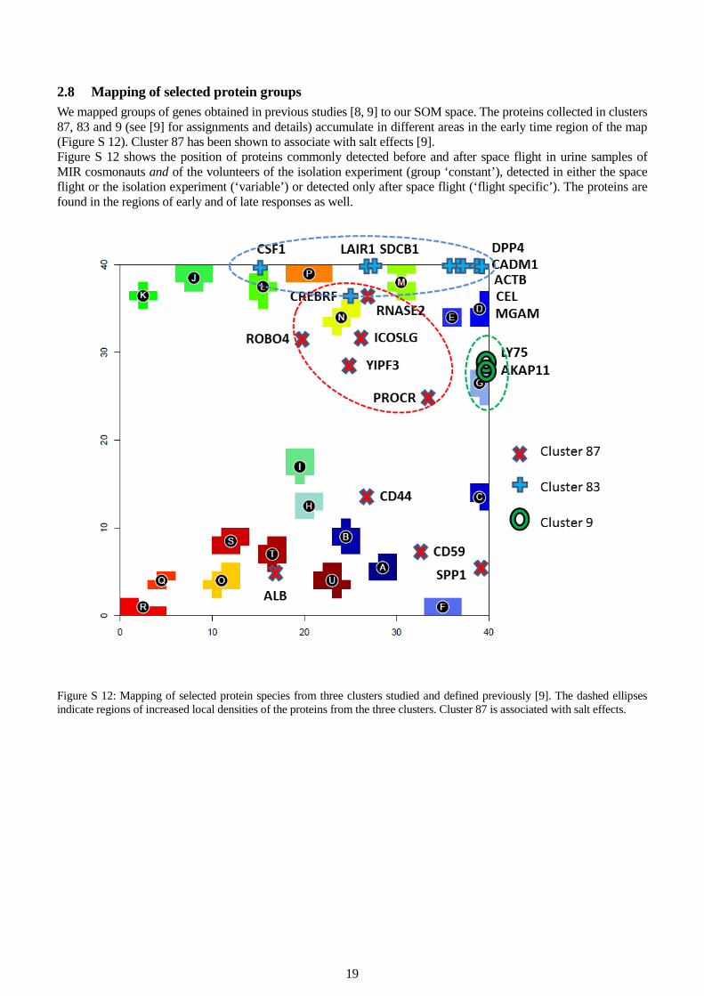
19
2.8 Mapping of selected protein groups We mapped groups of genes obtained in previous studies [8, 9] to our SOM space. The proteins collected in clusters 87, 83 and 9 (see [9] for assignments and details) accumulate in different areas in the early time region of the map (Figure S 12). Cluster 87 has been shown to associate with salt effects [9]. Figure S 12 shows the position of proteins commonly detected before and after space flight in urine samples of MIR cosmonauts and of the volunteers of the isolation experiment (group ‘constant’), detected in either the space flight or the isolation experiment (‘variable’) or detected only after space flight (‘flight specific’). The proteins are found in the regions of early and of late responses as well.
Figure S 12: Mapping of selected protein species from three clusters studied and defined previously [9]. The dashed ellipses indicate regions of increased local densities of the proteins from the three clusters. Cluster 87 is associated with salt effects.
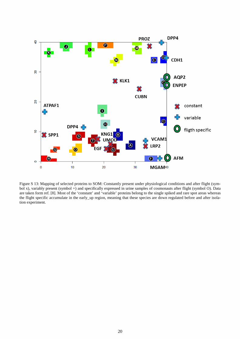
20
Figure S 13: Mapping of selected proteins to SOM: Constantly present under physiological conditions and after flight (sym-bol x), variably present (symbol +) and specifically expressed in urine samples of cosmonauts after flight (symbol O). Data are taken form ref. [8]. Most of the ‘constant’ and ‘variable’ proteins belong to the single spiked and rare spot areas whereas the flight specific accumulate in the early_up region, meaning that these species are down regulated before and after isola-tion experiment.
21
2.9 Single volunteer analysis The spot textures of the individual volunteer SOM cannot be directly compared to that of the mean volunteer analysis because both SOM are trained independently. One gets however an analogous number of about 9 – 10 overexpression spot clusters with continuous profiles containing 12 – 61 features per spot. These profiles reflect the essential properties of protein kinetics for each of the probands as observed also in the mean volunteer SOM (Figure S 14). Detailed inspection of these profiles reveals for example, that, the late regime spot characteristics of P5 in the measurements before isolation is due to a slightly reduced overall level of the abundance of the re-spective proteins compared with the other probands but not to a different time course (see spots H, P and Y in Figure S 14). In addition, our algorithm detects about 30 spots of the single spiked and rare type (Figure S 15): Each of these profiles shows at minimum one spiked protein expression and contains about 20 single proteins. These spots are insignificant in terms of correlated sets of proteins ( -log10p(beta)>0.1). Moreover, each of them was found in less than 5% of the samples and contains usually less than 20 features per spot. They show typically strong positive, spike-like outliers in one or a very few samples only. We attribute these spots tentatively, to technical errors of the measurement and/or to very specific physiological effects of unknown origin. These spots were excluded from further discussion because of their singular character. Importantly, the SOM sorting algorithm reliably sep-arates such features from the features responding continuously to the experimental conditions. The identification of such spiked profiles would allow us to study the origin of this effect more in detail and also to develop and to apply suited correction methods. These issues are however beyond the scope of this publication. Figure S 16 shows the gene set enrichment heatmap of the single volunteer analysis. Most of the enriched processes ‘switch’ in a coordinated fashion in the different volunteers. One sees however also individual differences, e.g. the volunteers show different degrees of immune response during the experiment. An alternative approach to extract single volunteer information is illustrated in Figure S 17: It shows the so-called profiling map which is obtained by training of a coarse grained SOM of size 10x10. Each tile of the map compares the profiles of the individual probands referring to the respective meta features. The profiles roughly divide into early_up, intermediate_up and late_up types which show an almost concerted expression among the probands. A fourth group of profiles indcates stronger individual differences in different time ranges of the experiment. Owing to the smaller number of meta features the individual profiles are less resolved as in the larger 40x40 standard map. Single and rare profiles mostly collect in the range of ‘individual’ profiles.

22
Figure S 14: Protein abundance profiles of overexpression spot clusters. The heat map provides an overview over the abun-dance profiles (dark brown to blue indicate high to low abundance levels, respectively). The right part selects profiles show-ing continuous responses, i.e. not referring to so-called single-spiked or rare profiles (these data are shown in the supple-mentary text). The spiked profiles can be identified in the heat map: They are characterized by single-brown colored bars due to high abundance levels of single or only a few protein species at single time points only (see also the supplementary text for full profiles). Note that the profiles of proband no. 5 (P5) reveal either low (spots H and P) or high (spot Y) abun-dance levels in the early time range compared with the respective spot profiles of the other probands which causes the devi-ating abundance portraits (see the main paper) and course of the sample trajectory of P5. On the other hand, the shapes of the profiles of P5 in general agree with that of the other probands showing that the specifics of P5 refer rather to absolute protein abundance levels and not to relative changes during the experiment.

23
Figure S 15: Protein expression profiles of overexpression spot clusters. The heat map provides an overview over the expres-sion profiles (dark brown to blue indicate high to low expression levels, respectively). The right part selects profiles referring to so-called single-spiked or rare profiles.

24
Figure S 16: Global enrichment analysis heat map of the single volunteer analysis: The map clusters top GO-sets of the catego-ry ‘biological process’ enriched in overexpression spots of the time series. Key processes are listed in the right part of the fig-ure. Brown to grey indicates high-to-low enrichment estimated using the GSZ-score.

25
Figure S 17: Meta-feature profile map of single volunteer analysis: A coarsely resolved 10x10 SOM was trained with single volunteer data. The profile map compares the time profiles of the probands P1 – P6 (see legend for assignment) in each of the meta feature tiles. Profiles divide into early_up, intermediate_up, late_up and ‘individual’ profiles. Profiles of selected tiles are enlarged.

26
2.10 Organ related protein expression We analyzed selected tissue-related sets of proteins as described in the main paper. Figure S 18 shows the results for a series of tissues which can be roughly divided into early responders (pancreas, liver, kidney), intermediate (muscle) and late (testis, stomach) responders and into tissues weakly or not responding to the experiment (skin, lymph node, blood, prostate, brain, colon). The type of response is clearly documented in the respective GSZ-profiles which plot the gene set enrichment score of the set as a function of time. Here all protein expression values of the set are considered, compared with the mean expression of all proteins considered and normalized using the variance of the expression values of the set:
( ), ,
,
,var /
p t p tp set all pset t
p t setp set
E EGSZ
E n∈
∈
−= . (12)
The GSZ-value thus estimates the consistency of differential expression of the set members compared with the mean expression of all genes in a given state. The GSZ consequently characterizes the expression of the whole protein set. In addition we show so-called protein set population maps which mark the positions of the protein species of each set in the average volunteer SOM. Accumulation of the proteins in regions assigned to a certain time range (see red rectangles) indicates that the set is affected by the experiment.

27

28
Figure S 18: Tissue specific protein expression: Tissue specific protein sets are taken from TiGR[10] and mapped into the sin-gle volunteer map (left part). The red rectangles illustrate regions of increased local density of the respective proteins. These regions refer to different time ranges. The set-profiles shown in the middle part clearly reveal the different time profiles in the average volunteer analysis. The respective single volunteer analysis reflects similarities and proband-specific differences be-tween their tissue expressions.

29
2.11 Mapping and profiling of selected GO protein sets Below in Figure S 19 selected protein sets are mapped into the SOM map of average volunteer analysis using the same presentation as for the organ related protein expression in Figure S 18. The bar plots show their average and volunteer specific profiles. The plots support the results obtained using spot analysis and gene set enrichment heat maps shown above.

30

31
Figure S 19: Mapping and profiling of selected GO gene sets into the single volunteer map (left part). The red rectangles illus-trate regions of increased local density of the respective proteins. These regions refer to different time ranges. The set-profiles shown in the middle part clearly reveal the different time profiles in the average volunteer analysis. The respective single vol-unteer analysis reflects similarities and proband-specific differences between the mean expression of the sets selected.

32
2.12 SOM analysis of absolute protein expression levels We trained a SOM with total expression values Ept instead of ∆Ept (see Eq. (1)). This way, absolute levels of protein expression were taken into account. Recall that the expression is defined as the mean detection call of the respec-tive proteins in all six probands. It adopts a value between 0 and 1 defining the fraction of present calls obtained. It means for example that for a value of unity all proteins are detected in all probands. The obtained SOM portraits reveal less structured expression landscapes compared with the SOM of centralized values showing essentially only one global expression maximum and one expression minimum spot in red and blue, respectively. Their position only weakly shifts in the course of the experiment (see the portraits in Figure S 20). These spots obviously collect permanently high and low expressed proteins, respectively. The question arises whether these landscapes contain similar information about the differential expression of groups of proteins detected at early, intermediate and late times of the experiment by means of the SOM analyses performed so far. With this aim we generated the 2nd level SOM of absolute expression landscapes. It closely resembles the respective plot of the centralized data (Figure S 18a). The sample trajectory clearly divides into the three time ranges revealing this way that the individual portraits contain the full information in this respect. The spot trajectory (Figure S 20b) can be assigned to the time ranges discussed so far. In addition to the permanently up and down profiles a ‘late down’ one is identified (see the de-tailed profiles shown in Figure S 20 below). In the next step we used the supporting variance and entropy maps in combination with K-means spot clustering to segment the map into different modules of co-expressed proteins (Figure S 21): a) The area of low variance and low entropy can be attributed to permanently low expressed proteins. About 63% of all proteins show this kind of behavior. b) The area of high variance and high entropy collects proteins permanently highly expressed (7%). c) The area of high variance and high entropy refers to proteins highly expressed in the early and intermediate time ranges only (late down, 13%). d) Profiles of proteins up-regulated in the intermediate time range only possess medium variance and entropy val-ues (7%). These medium values indicate that the high expression states are observed only at a few time points giv-ing rise to relatively sharp peaks in the profiles. e) Late_up-regulated proteins collect in a second area of high variance and high entropy (7%) which is however well separated from area b). Each of these areas splits into several K-means cluster modules of slightly different profiles (see Figure S 21 and Figure S 22). Their inspection reveals a continuum of different shapes which partly cannot be clearly assigned to one of the groups defined above. Instead, they occupy a sort of intermediate position between them. We therefore used the K-means cluster spots for functional analysis using protein set enrichment. We used ‘area-filling’ K-means clustering because we aim at taking into account all proteins. Detailed inspection of the spot modules in Figure S 20 shows that a group of about 65 proteins with an inflammato-ry signature are permanently expressed over the whole period of the experiment. The profiles of the remaining spots of module b) and especially of module c) decrease more or less sharply in the late time range. These modules thus contain the proteins which deplete at low NaCl consumption in the late phase of isolation. Interestingly, part of the spot profiles express onerelative sharp peak in the early time range (spot F and D) or a second one in the inter-mediate one (e.g. spots M, L, B and F). This second peak becomes more pronounced in intermediate-time mode d). The third peak protrudes already in a few spots of this mode but it becomes much more intense in the late mode e) together with the fourth peak near the end of the experiment. Hence, the more or less constant or decreasing pro-files in modes b) and c) overlay with peaked profiles with maxima at distinct positions (as indicated by the asterisks in the figure). Functional analysis essentially supports the results of the previous analysis using centralized expres-sion profiles. In summary, absolute expression analysis shows that a series of processes become activated in relatively narrow time windows at four fixed times during the experiment, namely at or immediately before isolation (angionesis, complement activation and others), at or immediately after reducing salt consumption to 9 g/day (focal adhesion and cytoskeleton) and to 6 g/day (cell differentiation and organ development) and near the end of the experiment after isolation. The latter trend suggests recovery of the initial state before starting isolation. Double peaked profiles combine peaks at late and intermediate times (e.g. metabolic process and apoptosis).Importantly, immune response processes are permanently active during the experiment with a slight decay in the late time range.

33
Figure S 20: Sample and spot trajectories of absolute expression SOM analysis: a) 2nd level SOM mapping of the total expres-sion data of the ‘averaged volunteer’. The trajectory divides into an early, intermediate and late regime in agreement with the respective results obtained from centralized data. Note that the portrays (see the small images) are much less structured show-ing only one red spot compared with the portraits obtained using centralized data. b) Overexpression summary map of the SOM images: The red and blue spots refer to permanently present and almost absent proteins, respectively.

34
Figure S 21: Supporting maps (first row of figures) used to segment the K-means spot map (second row) into six absolute ex-pression modes as indicated by the black curves connecting the spots of each mode. The heat map shows the expression level of each spot (red refers to high, white to low expression). The table assigns the characteristic variance and entropy levels to the modes and provides the number and fraction of proteins per mode.

35

36

37
Figure S 22: Expression profiles of the K-means spot clusters of each of the modes a)-f). Enriched protein sets from the GO-terms biological functions, cellular component and molecular function in each of the spots are listed in the boxes in the right part. The number of proteins per spot is given as #protein_number. The asterisks indicate the peak positions observed also in the overall profiles (see main paper). Note that the scale of vertical expression axis changes from plot to plot. The vertical red dumbbell scales an expression value of 0.1 (module a only) or 0.2. Full protein lists of each of the spot modules are provided in additional file 3.

38
3 References
1. Läuter J, Glimm E, Eszlinger M: Search for relevant sets of variables in a high-dimensional setup keeping the familywise error rate. Statistica Neerlandica 2005, 59:298-312.
2. Läuter J, Horn F, Rosolowski M, Glimm E: High-dimensional data analysis: Selection of variables, data compression and graphics - Application to gene expression. Biometrical Journal 2009, 51(2):235-251.
3. Arakelyan A, Nersisyan L: KEGGParser: parsing and editing KEGG pathway maps in Matlab. Bioinformatics 2013, 29(4):518-519.
4. Wirth H, Loeffler M, von Bergen M, Binder H: Expression cartography of human tissues using self organizing maps. BMC Bioinformatics 2011, 12:306.
5. Owen OE, Felig P, Morgan AP, Wahren J, Cahill GF, Jr.: Liver and kidney metabolism during prolonged starvation. The Journal of Clinical Investigation 1969, 48(3):574-583.
6. Pfeiffer G, Strube K-H, Geyer R: Biosynthesis of sulfated glycoprotein-N-glycans present in recombinant human tissue plasminogen activator. Biochemical and Biophysical Research Communications 1992, 189(3):1681-1685.
7. Wang X, Proud CG: The mTOR Pathway in the Control of Protein Synthesis. Physiology 2006, 21(5):362-369.
8. Pastushkova LK, Kireev KS, Kononikhin AS, Tiys ES, Popov IA, Starodubtseva NL, Dobrokhotov IV, Ivanisenko VA, Larina IM, Kolchanov NA, Nikolaev EN: Detection of Renal Tissue and Urinary Tract Proteins in the Human Urine after Space Flight. PLOS one 2013, 8(8):e71652.
9. Larina IM, Kolchanov NA, Dobrokhotov IV, Ivanisenko VA, Demenkov PS, Tiys ES, Valeeva OA, Pastushkova LK, Nikolaev EN: Reconstruction of associative protein networks connected with processes of sodium exchange regulation and sodium deposition in healthy volunteers based on urine proteome analysis. Hum Physiol 2012, 38(3):316-323.
10. Liu X, Yu X, Zack D, Zhu H, Qian J: TiGER: A database for tissue-specific gene expression and regulation. BMC Bioinformatics 2008, 9(1):271.


![INVITED PAPER URINE PROTEOMICS IN CLINICAL … · logies [3]. This has provoked a shift of biomarker research from blood to other more amenable and stable body fluids such as urine,](https://static.fdocuments.in/doc/165x107/5ec811f1f435dd4e690e933b/invited-paper-urine-proteomics-in-clinical-logies-3-this-has-provoked-a-shift.jpg)


