“THUS WAVES COME IN PAIRS.” - muzee.be€¦ · replaced my world in which were growing stubborn...
17
the sea - salut d’honneur Jan Hoet 1 “THUS WAVES COME IN PAIRS.” (Adnan, Etel. Sea and Fog. 2012) The sea is the ultimate smooth surface. The sun, the moon and the stars travel across the seemingly endless water surface like nomads. They determine the sound, the colour, and the link between the sea and the stars, but without leaving behind any lasting marks. When humans started sailing the seas, these waters needed to be subdivided, borders needed to be marked, maps drawn and measures taken, resulting in the smooth surface presenting more and more grooves. This coincided with major expeditions, the slave trade, and the moment at which Europe spread both its powers and its way of thinking across the globe. It was a French philosopher who pointed to the difference between the grooves and the smooth surface of the sea*. He believed that they symbolise the difference between politics per se (which concerns everyone) and doing politics. What he meant is not difficult to understand: the smooth surface and its grooves cannot exist without one another. A bit like black and white – the difference only becomes clear once they are blended. Black and white follow their own path and are very different from one another. The same goes for the smooth sea surface, which spreads out in all directions, and the groove, which forms a clear line on the map, as it is the result of an agreement between people. Artists encourage us to think and show us how complicated the blend of ‘the smoothness and the groove’ really is. In this booklet several Mu.ZEE collaborators discuss and describe paintings, sculptures and installations from art history. Each and every one of these works is linked to the sea, but also shows us how things are blended and what our role, as humans, is in this mix. It all sounds very serious and complex, but at the same time a piece of music, a play or a painting can invite you to have a conversation, be light-hearted and merry, and even wipe away your tears.
Transcript of “THUS WAVES COME IN PAIRS.” - muzee.be€¦ · replaced my world in which were growing stubborn...
the sea - salut d’honneur Jan Hoet 1
“THUS WAVES COME IN PAIRS.”
(Adnan, Etel. Sea and Fog. 2012)
The sea is the ultimate smooth surface. The sun, the moon and the stars travel across the seemingly endless water surface like nomads. They determine the sound, the colour, and the link between the sea and the stars, but without leaving behind any lasting marks. When humans started sailing the seas, these waters needed to be subdivided, borders needed to be marked, maps drawn and measures taken, resulting in the smooth surface presenting more and more grooves. This coincided with major expeditions, the slave trade, and the moment at which Europe spread both its powers and its way of thinking across the globe.
It was a French philosopher who pointed to the difference between the grooves and the smooth surface of the sea*. He believed that they symbolise the difference between politics per se (which concerns everyone) and doing politics. What he meant is not difficult to understand: the smooth surface and its grooves cannot exist without one another. A bit like black and white – the difference only becomes clear once they are blended. Black and white follow their own path and are very different from one another. The same goes for the smooth sea surface, which spreads out in all directions, and the groove, which forms a clear line on the map, as it is the result of an agreement between people.
Artists encourage us to think and show us how complicated the blend of ‘the smoothness and the groove ’ really is. In this booklet several Mu.ZEE collaborators discuss and describe paintings, sculptures and installations from art history. Each and every one of these works is linked to the sea, but also shows us how things are blended and what our role, as humans, is in this mix. It all sounds very serious and complex, but at the same time a piece of music, a play or a painting can invite you to have a conversation, be light-hearted and merry, and even wipe away your tears.

the sea - salut d’honneur Jan Hoet 32 the sea - salut d’honneur Jan Hoet
We suggest that everyone reads out the descriptions in this booklet to one another, because they invite us to analyse the artwork and make it our own. A piece of art is like a wave – it never comes on its own. Waves always come in pairs.
Jan Hoet spent his life in the public eye. He challenged both artists and citizens with his passion for art. During an interview in 1999 he said, “A museum makes confrontations possible that usually clash. This creates contrasts. Of course, that is what I aim for: to create a clear exhibition and possibly create chaos at a later stage so as to question everything. To decode, rather than just honour. A museum should not be a tribute to art; it should permanently question it.”
Phillip Van den BosscheDirector of Mu.ZEE, Ostend
* Gilles Deleuze (1925-1995)
THE SEA
I need the sea because it teaches me, I don’t know if I learn music or awareness, if it’s a single wave or its vast existence, or only its harsh voice or its shining suggestion of fishes and ships. The fact is that until I fall asleep, in some magnetic way I move in the university of the waves.
It’s not simply the shells crunched as if some shivering planet were giving signs of its gradual death; no, I reconstruct the day out of a fragment, the stalactite from a sliver of salt, and the great god out of a spoonful.
What it taught me before, I keep. It’s air ceaseless wind, water and sand.
It seems a small thing for a young man, to have come here to live with his own fire; nevertheless, the pulse that rose and fell in its abyss, the cracking of the blue cold, the gradual wearing away of the star, the soft unfolding of the wave squandering snow with its foam, the quiet power out there, sure as a stone shrine in the depths, replaced my world in which were growing stubborn sorrow, gathering oblivion, and my life changed suddenly: as I became part of its pure movement.
Pablo Neruda

the sea - salut d’honneur Jan Hoet 54 the sea - salut d’honneur Jan Hoet
1. FRANCIS ALŸS Antwerp, 1959
Originally an architect in Antwerp, Francis Alÿs found his vocation as an artist when he went to live in Mexico City. He is fascinated by the contrasts in society there, by the diversity of life in a metropolis, by the idea of progress which then proves not to be progress, by border conflicts and economic crises. They provide him with inspiration for his paintings, photographs, installations and videos. For example, he records in photographs and video his ambling walks in the metropolises of Mexico, New York, Lima and Jerusalem. For Alÿs walking, strolling and wandering are a sort of protest against the modern-day culture of speed. Because everything has to happen immediately, there is no time for nostalgia, romanticism or simply promenading in the streets. His works are simple, but layered. He conveys a political message with a certain lightness, poetry and sometimes a touch of irony.
In the video Watercolor (2010) Alÿs takes a bucket of water from the Black Sea and pours it into the Red Sea. The geographical locations give this simple act political import. The ‘black’ water is transported from the shores of Trabzon in Turkey to Aqaba in Jordan, where it is mixed with the Red Sea, whose shoreline Jordan shares with Israel, Egypt and other countries. The seas take their names from a warlike past but also from the local soils and when they mingle, the viewer is left wondering if ultimately colour matters.
2. GEORGE BRECHT Oregon (US), 1926 – Keulen (DE), 2008
In de jaren zestig sluit George Brecht zich aan bij een beweging van radicale In the 1960s George Brecht joined a movement of radical musicians and artists linked to the Fluxus group. The name Fluxus derives from the Latin word ‘flux’ and means flow, movement, a continuous succession of changes of condition.
This group of international artists, writers, performers and composers expressed appreciation of ordinary life and events, rather than of ‘high’ art. They loved light-hearted interaction, coincidence and experimentation.
Inspired by the revolutionary musical compositions of John Cage, whose ideas most heavily influenced Fluxus artists, Brecht began experimenting with sound art. His first performance in the 1960s is called Drip music: the sound of water dripping into an empty vessel.
He also made a number of ‘Event Objects’ with randomly assembled, commonplace objects. According to Brecht, the ‘event’ consisted of the viewer taking hold of the objects and doing something with them. Brecht’s main contribution to Fluxus was what he called the ‘Event Score ’. He designed white cards bearing a title and an instruction which he would post to friends. “String Quartet” for example, read simply: “Shaking hands.” Almost all the Fluxus artists carried out these little assignments.
He also made object boxes in which he played with the creative renewal of language. The boxes contain letters in calligraphic pictograms for formulating new words.
3. MARCEL BROODTHAERS Sint-Gillis, 1924 – Keulen (DE), 1976
Marcel Broodthaers started out as a poet. He published four books of poetry, but they met with little success and he turned his attention to visual art. His first visual artwork was one of his books of poetry embedded in plaster.
His Grande casserole de moules is a key work. Broodthaers had a thing about mussels. He liked to play with the dual meaning of the word ‘moule ’: ‘la moule ’ (the mussel) and ‘le moule ’ (the mould). The mussel creates its own shell, just as the content of an artwork determines its form. Moreover, ‘moules-frites’ is a fabled Belgian dish. Broodthaers liked to play with typical Belgian elements.

the sea - salut d’honneur Jan Hoet 76 the sea - salut d’honneur Jan Hoet
In a light-hearted and ironic manner Marcel Broodthaers criticized the role of art and the artist in society, the importance given to the museum and the art trade which determines the value of art. Does only real art belong in a museum? Does an object become art because it is in a museum? Why is an ordinary casserole of mussels suddenly art? Broodthaers asked more questions than he answered. For him the idea was always more important than the result. That made him a conceptual artist. But it is difficult to pigeonhole Broodthaers. He was also inspired by surrealism, dada and pop art.
4. PAUL CÉZANNE Aix-en-Provence (FR), 1839 – Aix-en-Provence (FR), 1906
The French artist Paul Cézanne took a whole new approach to painting, the first time since the Renaissance. He ignored the laws of classical perspective and placed flat blocks of colour one behind the other in the belief that if you apply the customary perspective, you destroy the plane, and if you keep the plane, it is impossible to represent the true space. So he chose a compromise.
Because Cézanne wanted to understand how forms and colours relate to each other in nature, he looked for the unchanging, elemental forms in the landscape, such as a sphere, cylinder, cone, cube or pyramid. He also looked for the ‘basic tone ’, a constant colour in nature derived from several colour contrasts present in the landscape. Eventually he achieved a greatly simplified, pure rendering of reality. Paul Cézanne greatly influenced the evolution of painting. He was the bridge between impressionism and Pablo Picasso’s cubism.
The artist was only twenty-six when he painted Rocks, L’Estaque. He was just re-establishing himself in his native region near Aix-en-Provence, having found it difficult to settle in Paris. L’Estaque is a fishing village just west of Marseilles, where Paul Cézanne often went to paint in the open air. When he painted Rocks, L’Estaque, he was still on the threshold of his long and intensive quest to simplify form, colour and perspective. The small canvas is probably a study. The rocks are already represented as flat planes, painted with broad, staccato brushstrokes and hard, sombre earth colours.
Marcel Broodthaers, Grande casserole de moules, 1966. S.M.A.K., Ghent
the sea - salut d’honneur Jan Hoet 98 the sea - salut d’honneur Jan Hoet
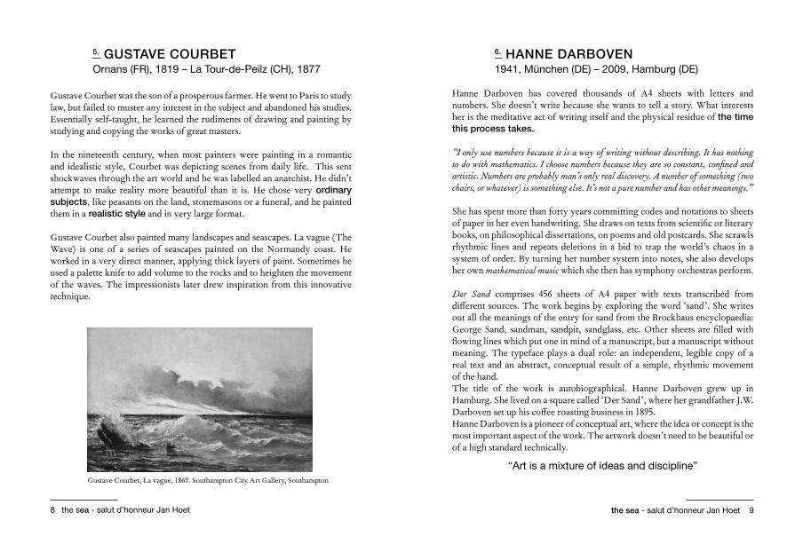
5. GUSTAVE COURBET Ornans (FR), 1819 – La Tour-de-Peilz (CH), 1877
Gustave Courbet was the son of a prosperous farmer. He went to Paris to study law, but failed to muster any interest in the subject and abandoned his studies. Essentially self-taught, he learned the rudiments of drawing and painting by studying and copying the works of great masters.
In the nineteenth century, when most painters were painting in a romantic and idealistic style, Courbet was depicting scenes from daily life. This sent shockwaves through the art world and he was labelled an anarchist. He didn’t attempt to make reality more beautiful than it is. He chose very ordinary subjects, like peasants on the land, stonemasons or a funeral, and he painted them in a realistic style and in very large format.
Gustave Courbet also painted many landscapes and seascapes. La vague (The Wave) is one of a series of seascapes painted on the Normandy coast. He worked in a very direct manner, applying thick layers of paint. Sometimes he used a palette knife to add volume to the rocks and to heighten the movement of the waves. The impressionists later drew inspiration from this innovative technique.
6. HANNE DARBOVEN 1941, München (DE) – 2009, Hamburg (DE)
Hanne Darboven has covered thousands of A4 sheets with letters and numbers. She doesn’t write because she wants to tell a story. What interests her is the meditative act of writing itself and the physical residue of the time this process takes.
“I only use numbers because it is a way of writing without describing. It has nothing to do with mathematics. I choose numbers because they are so constant, confined and artistic. Numbers are probably man’s only real discovery. A number of something (two chairs, or whatever) is something else. It’s not a pure number and has other meanings.”
She has spent more than forty years committing codes and notations to sheets of paper in her even handwriting. She draws on texts from scientific or literary books, on philosophical dissertations, on poems and old postcards. She scrawls rhythmic lines and repeats deletions in a bid to trap the world’s chaos in a system of order. By turning her number system into notes, she also develops her own mathematical music which she then has symphony orchestras perform.
Der Sand comprises 456 sheets of A4 paper with texts transcribed from different sources. The work begins by exploring the word ‘sand’. She writes out all the meanings of the entry for sand from the Brockhaus encyclopaedia: George Sand, sandman, sandpit, sandglass, etc. Other sheets are filled with flowing lines which put one in mind of a manuscript, but a manuscript without meaning. The typeface plays a dual role: an independent, legible copy of a real text and an abstract, conceptual result of a simple, rhythmic movement of the hand. The title of the work is autobiographical. Hanne Darboven grew up in Hamburg. She lived on a square called ‘Der Sand’, where her grandfather J.W. Darboven set up his coffee roasting business in 1895. Hanne Darboven is a pioneer of conceptual art, where the idea or concept is the most important aspect of the work. The artwork doesn’t need to be beautiful or of a high standard technically.
“Art is a mixture of ideas and discipline”Gustave Courbet, La vague, 1869. Southampton City Art Gallery, Southampton
the sea - salut d’honneur Jan Hoet 1110 the sea - salut d’honneur Jan Hoet
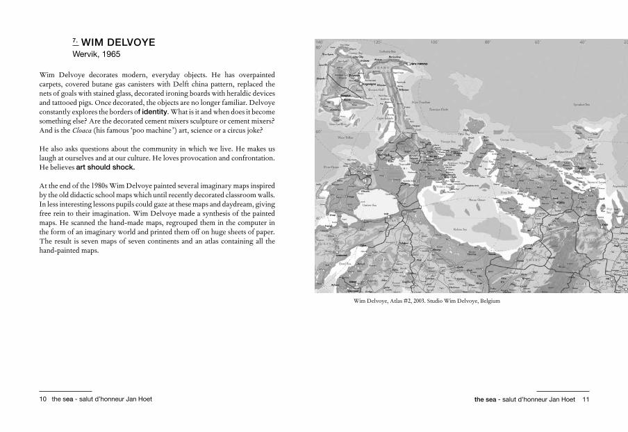
7. WIM DELVOYE Wervik, 1965
Wim Delvoye decorates modern, everyday objects. He has overpainted carpets, covered butane gas canisters with Delft china pattern, replaced the nets of goals with stained glass, decorated ironing boards with heraldic devices and tattooed pigs. Once decorated, the objects are no longer familiar. Delvoye constantly explores the borders of identity. What is it and when does it become something else? Are the decorated cement mixers sculpture or cement mixers? And is the Cloaca (his famous ‘poo machine ’) art, science or a circus joke? He also asks questions about the community in which we live. He makes us laugh at ourselves and at our culture. He loves provocation and confrontation. He believes art should shock.
At the end of the 1980s Wim Delvoye painted several imaginary maps inspired by the old didactic school maps which until recently decorated classroom walls. In less interesting lessons pupils could gaze at these maps and daydream, giving free rein to their imagination. Wim Delvoye made a synthesis of the painted maps. He scanned the hand-made maps, regrouped them in the computer in the form of an imaginary world and printed them off on huge sheets of paper. The result is seven maps of seven continents and an atlas containing all the hand-painted maps.
Wim Delvoye, Atlas #2, 2003. Studio Wim Delvoye, Belgium

the sea - salut d’honneur Jan Hoet 1312 the sea - salut d’honneur Jan Hoet
8. RINEKE DIJKSTRA Sittard (NL), 1959
After breaking her hip in the early 1990s, the Amsterdam photographer Rineke Dijkstra started a long process of rehabilitation in the swimming pool. The prognosis that part of the bone might die made Dijkstra aware of her vulnerability. One day she decided to take photographs of her reflection in a swimming costume in the swimming pool. This self-portrait forms the basis of the Beach Portraits series.
For her Beach Portraits Dijkstra took photographs of young people poised on the brink of adulthood when they are still looking for an identity. Armed with a field camera, she set off for beaches in Belgium, Croatia, America and Poland. She took the teenagers out of their group and had them pose alone – sometimes two or three of them together – in their swimming costumes in front of the camera. Their faces betray a mixture of uncertainty and great self-confidence. Sometimes they are shy and awkward, sometimes full of expectation and bravado. They feel uncomfortable and don’t know how to conceal their uneasiness. Some girls are very aware of their appearance and adopt a model-like pose, belly tucked in, hands taut at their sides.
While Rineke Dijkstra took time preparing her shots – measuring the light, adjusting the tripod to the right height, etc. – the young people would lose concentration and forget about the camera. The moment they lapsed into their natural demeanour, Dijkstra would take the picture. The use of a flash ensures that the adolescents are literally in the spotlight. Nothing is concealed or disguised. This focuses the eye on the uneasiness of the pose and makes the photograph even more intrusive and confrontational.
The composition in the Beach Portraits is always the same. The boys and girls stand in the middle and look straight at the camera. The horizon line and the vertical line of the figures form a cross. The low camera angle has the teenager tower above the viewer. The person is not absorbed into the background: a grey, hazy sealine with no other people around. They look isolated from the world.
“I try to enable the viewer to relate to someone else’s experience.”
Rineke Dijkstra, Oostende (België), 1992. Deutsche Börse Group, Eschborn

the sea - salut d’honneur Jan Hoet 1514 the sea - salut d’honneur Jan Hoet
9. HONORE D’O 1961, Oudenaarde as Raf Van Ommeslaege 1984, Gent as Honoré d’O
“There is a lot of poetry in the things around us, but we don’t see it, we look past it. Art is usually very close by.”
The installations of the Ghent artist Honoré d’O consist of very simple interventions and surprising combinations, devoid of all technical pretension. He likes to work with commonplace materials and objects, like threads, marbles, wads of cotton wool, branches, a playing card... And with cheap commercial products and industrially made materials, such as cotton wadding, polystyrene and PVC. He combines these familiar materials with video and immaterial elements like air and light to form surprisingly poetic artworks, large and small. It is often unclear where reality ends and the artwork begins. The viewer is invited to play an active role. He/she becomes part of the work. Opera Aperto is a roll of paper inspired by the Dead Sea scrolls and the Jewish Torah. It contains images from daily life which the artist has processed digitally and combined with graphic texts. It doesn’t read like a book, but like an artwork which the viewer can operate. The viewer can take his time and put together his own story. The title Opera Aperto denotes openness. A completed work with a commercial value doesn’t interest the artist. He wants to stimulate the viewer’s awareness. The sense of being under way.
“An artist should make things visible.”Honoré d’O, Opera Aperto V. Collection of the artist

the sea - salut d’honneur Jan Hoet 1716 the sea - salut d’honneur Jan Hoet
10. JAN FABRE Antwerp, 1958
Jan Fabre is a theatre director, opera-maker, film producer, choreographer, painter, draughtsman and sculptor, but he works not so much from a particular art form as from ideas, symbols and concepts. Fabre ’s work is very conceptual, but always linked to a strong visual language.
His public debut took the form of performances. One of these gave rise to his ‘Bic’ art: in 1980 he shut himself up in a room for three days and proceeded to cover every available surface with a cross-hatch scrawl in blue ballpoint pen. For Fabre this blue refers to the moment between day and night, between death and life, to the moment when the nocturnal animals go to sleep and the diurnal animals wake up: the ‘Hour Blue ’.
Another favourite subject is the world of animals and in particular that of insects which he depicts in all kinds of guises. The beetle also acts like a second skin covering dresses, globes, even a ceiling at the Royal Palace in Brussels. Sea-Salt of the Fields was one of Jan Fabre ’s first performances. It is a tribute to the artist Marcel Duchamp, his teacher and creative mentor. The title is a literal translation of the name Marcel Duchamp: Sea-Salt-of-the-Fields/ Mer-Sel-du-Champ/Mar-cel-du-champ. In this performance Fabre writes the word ‘art’ with salt on the ground. The salt refers to Duchamp’s Christian name: Mar-cel/sel. In this way the artist is transformed into an artwork. But salt also has another symbolic meaning. It has long been used as a means of payment, it is inextricably linked to the sea, it is a mineral used to flavour food and extend its shelf life. With industrial and kitchen salt he draws the waves of the sea on the stage, and he sprinkles grains of salt on the heads of a number of spectators “to spice their minds”.In Fabre ’s performance Duchamp himself becomes a sort of readymade. Duchamp is there as a concept but also represented as salt.
11. ANSELM KIEFER 1945, Donaueschingen (DE)
The German artist Anselm Kiefer makes huge paintings in which he mixes paint in thick layers with a great variety of materials, including gypsum, clay, mud, sand, straw, dried plants, hair and lead.
The work, including the subject matter, is many layered, which doesn’t make it easy to read. There are many references to historic events and figures and to philosophy and scientific theories. He explores war, destruction, Nazism, the Holocaust, Teutonic mythology and the German national identify. Kiefer sees painting as a mental process for addressing memories. He also wants to confront Germany with the past. Because Kiefer doesn’t adopt an unequivocal position, the viewer finds his work bewildering. Since the mid-1980s Kiefer’s artworks have also revisited biblical themes, philosophical and cosmic considerations, the Egyptian legend of Isis and Osiris and the Jewish doctrine of the Kabbalah.
Kiefer is a storyteller. Books often feature, especially lead books like Naglfar. On the top book of Naglfar rests a warship. Fingernail clippings imitate the lapping of the waves. The books refer to knowledge, but the material from which they are made raises questions. Are these literally weighty tomes whose knowledge is no longer accessible? Is knowledge drowning in an ocean? And so is all knowledge corroding? After all, the books are damaged. The title refers to the Icelandic saga of Naglfar or ‘nail ship’ used by mythological giants to sail to Midgard and to fight in Ragnarok, the ultimate destruction of the gods. With Kiefer the Viking ship becomes a contemporary warship. Because war is of all times.
Kiefer is regarded as one of the most prominent figures in neo-expressionism. The movement emerged from a dissatisfaction with minimalism, which strove for purity and simple basic forms. Neo-expressionism wanted to tell a story with figuration.

the sea - salut d’honneur Jan Hoet 1918 the sea - salut d’honneur Jan Hoet
12. JANNIS KOUNELLIS Piraeus (EL), 1936
In his installations and ‘one-acts’ which have an affinity with the theatre, Jannis Kounellis sets out to visualize the tension and the alienation which characterize modern-day society. He integrates into them symbols of the metropolitan and industrial civilization and primitive, individual values. His artworks contain found objects (such as slats, doors, windows, hat stands, planks, mattresses and sewing machines) and everyday materials (such as earth, clay, coal, tar, jute sacks, iron, stone, cotton, wool, coffee, tresses of hair) and sometimes fire, soot and smoke too.
Jannis Kounellis was part of the Arte Povera group of Italian artists who made installations with simple materials. The term Arte Povera refers to throwaway materials or waste. The work of these artists was often conceived in opposition to the commercialization of art, so they chose naturally ephemeral materials. It was a reaction to cold abstract art. The artists were not looking to tell stories or convey ideas. It was all about noticing the things which are already there. In fact the Italian Arte Povera approach had much in common with American Fluxus from the same period.
13. GUSTAVE LE GRAY Villiers-le-Bel (FR), 1820 – Cairo (EG), 1884
The nineteenth-century French artist Gustave Le Gray began experimenting with photography when it was in its infancy. He started off as a painter, but he fell under the spell of the brand-new medium of photography and experimented with its countless new artistic possibilities. His experiments and studies resulted in several important technical innovations. But he went further. He also used his technical mastery to figure out ways of manipulating the image to heighten its expressive power.
Anselm Kiefer, Naglfar (Die Argonauten), 1998. S.M.A.K., Ghent

the sea - salut d’honneur Jan Hoet 2120 the sea - salut d’honneur Jan Hoet
Brick au clair de lune (The Brig) belongs to an impressive series of seascapes, for which he used a very unusual technique. With the first cameras it was almost impossible to achieve tonal balance between sea and sky in a seascape. So Gustave Le Gray captured on negative two separate images, sky and water, and combined them on the horizon. Sometimes he even photographed the two parts at different moments or in different places. Juxtaposing two negatives also allowed him to adjust the lighting. The expression and dramatic lighting of each part of the picture – sunlight, clouds, water, waves, rocks – resulted in a very poetic, almost surreal image.
14. ROY LICHTENSTEIN New York (US), 1923 – New York (US), 1997
Roy Lichtenstein took details from comic strips – he tended to choose sensitive or violent scenes –, he painted over the chosen details and enlarged them. As in a comic strip he represented the flat planes with dots or raster points. He outlined the colours red, yellow and blue, sometimes green, with thick black lines.
Lichtenstein was one of the foremost practitioners of Pop Art. The artists drew inspiration from modern-day life, the consumer society and mass culture, borrowing from advertising, newspapers, popular magazines and comic strips, television and mass-produced products. Some pop artists presented their images with a heavy dose of irony. They glamorized consumerism and the indifference of the masses.
“It is the indifference, that conventional stereotype and empty emotion that I want to show.” Roy Lichtenstein, Gullscape, 1964. Virginia Museum of Fine Arts, Richmond

the sea - salut d’honneur Jan Hoet 2322 the sea - salut d’honneur Jan Hoet
15. BERND LOHAUS Düsseldorf (DE), 1940 – Antwerp, 2010
The German artist Bernd Lohaus explored the relationship between artist, artwork and viewer, but also between people and between people and things in general.
He juxtaposed forms in the space. Often he would choose undressed stone or washed-up wood or rope found on walks alongside the River Scheldt, material that had a whole life behind it before entering the artist’s studio.
Sometimes he wrote short texts or words on the found material, carefully scratched, chiselled or written in chalk. The words, too, refer to the distance between people and things, how they relate to each other but cannot really ever concur. Words like: together/alone, male/female, I/you.
In his latest works he omitted the passages of text, leaving the interpretation more up to the viewer. The emphasis is on the power of the pure wordless forms. Lohaus also regarded the process as very important, looking for the relationships and the physical and mental exertion involved in moving and positioning the leaden elements. This created a physical tension between the chosen material and the artist.
Bernd Lohaus, without title. Bernd Lohaus Estate, Antwerp.

the sea - salut d’honneur Jan Hoet 2524 the sea - salut d’honneur Jan Hoet
16. REINHARD MUCHA Düsseldorf (DE), 1950
Retrieved pieces of discarded furniture underlie Reinhard Mucha’s installations. He combines them with abstract forms and in that way explores the interfaces between visual art, design and architecture. When constructing the installations, the emphasis is on rhythm, movement and equilibrium.
The artwork Zingst is centred around an old wooden ladder. On the back of the vertical rungs of the ladder are little felt-clad rooms. Around the central structure the artist has built a wooden frame with a multitude of fine horizontal and vertical lines which continue the rhythm of the lines in the ladder. It is a very light and translucent construction, well thought-out and carefully executed. It combines old and new materials and techniques. Light and shadow give the work a sense of space.
17. PABLO PICASSO Malaga (ES), 1881 – Mougins (FR), 1973
Painted in 1907 by the Spanish artist Pablo Picasso, Les demoiselles d’Avignon was a ground-breaking work. It presaged his new style, cubism, and took Paul Cézanne’s quest a stage further. The interesting thing about cubism is that the artist didn’t work with perspective as we know it. The object was shown from different angles and at the same time the flat surface was emphasized. Picasso believed that photography came along to liberate painting. At last painters had the freedom to do something different from photography. Sometimes Picasso is described as the father of abstract art, but he never lost sight of reality. He always took his subject – a person, a landscape or a still life – as his starting point and then proceeded to simplify it.
For his new style Picasso also drew inspiration from the primitive art of Africa and South America which he discovered in museums in Paris. He studied the forms of the images and the masks and used them in his own art. He also built up a large collection of primitive images and masks of his own.
Picasso innovated throughout his life. For example, working with his good friend, the artist Georges Braque, he was the first to use the collage technique. He glued card and paper onto a canvas and painted over it. Later on Picasso also added objects, like a bicycle wheel and a saddle.
Cubism, the collage technique, the addition of ordinary objects, the inspiration from primitive art - Picasso initiated them all and that was nothing short of a revolution in visual art.
18. GERHARD RICHTER Dresden (DE), 1932
Gerhard Richter works in different styles side by side. He copies photographs in a very accurate realism and he makes colourful abstract canvases with thick layers of paint which he then scrapes off. Sometimes these two styles meet, when he also makes scratches in his photorealistic works and scrapes off the paint. With both styles the emphasis is on the observation and studying reality. He produced his first photorealistic works in the early 1960s, when he had just fled to West Germany from the DDR. He selects photographs from newspapers and his own photographs of landscapes, seascapes and family snapshots, which he enlarges and copies very carefully. Initially he chose black and white reproduction to give the painting a more general meaning. He blurs the outline of the motifs, figures and horizon line with a soft brush when the paint is still wet so that the representation appears in a bleary haze. This creates a sense of distance and alienation. It relativizes the meaning of the representation and puts the emphasis on the painted surface.

the sea - salut d’honneur Jan Hoet 2726 the sea - salut d’honneur Jan Hoet
To copy photographs from newspapers and magazines “like a robot”, Gerhard Richter draws inspiration from pop artists.
19. ETTORE SPALLETTI Capelle sul Tavo (IT), 1940
With several shades of yellow, green, grey, blue, red, rose-red, black, white and gold and the geometric shapes rectangle, triangle, circle, cylinder, cone and sphere the Italian artist Ettore Spalletti creates an infinite number of variations in his paintings and sculptures.
For his paintings he makes use of the old ‘impasto’ technique which is also used for painting frescoes. Spalletti first makes a paste of gesso (gypsum) and adhesive which he applies to a medium. He also covers the sides and back with a layer. While the paste is still wet, he scatters pure pigment over the entire surface until the colour has been thoroughly absorbed. The intensity and transparency of the colour depend on the quantity of white that is mixed through the paste. As soon as the paste is dry, Spalletti sands the surface with sandpaper. This makes it powdery and the work more tactile (though on no account may it be touched because the powdery surface is very delicate). The powdery, cloudy effect gives the work the impression of weightlessness. For his colours Spalletti draws inspiration from the late Middle Ages and the Renaissance, from the Italian painters Giotto, Fra Angelico, Antonella da Messina and Piero della Francesca.
Spalletti’s work has much in common with minimalism. Minimalist artists made no attempt to represent an outside reality or to tell a story, but to show pure and simple basic forms.
20. PAUL THEK Brooklyn (US), 1933 – New York (US), 1988
Paul Thek was a versatile American artist. He painted large triptychs, made controversial installations using (among other things) meat from abattoirs and he also worked for many years as a textile designer.
Life is just a bowl of cherries was the artist’s motto and the title of this triptych. The artwork may look very poetic, but it contains an ironic undertone. It is light-hearted and threatening at the same time. The three dream landscapes are difficult to decipher. The left canvas shows a waterfall surrounded by four spheres. Are they planets or air bubbles? Depicted on the canvas in the middle is a bowl of cherries surrounded by rough waves, and on the right canvas several volcanic mountains and a fisherman bottom right. An amalgam of absurd elements which may not stand up to the viewer’s scrutiny, but for the artist depict a joie de vivre.
Paul Thek, Fish Tank, 1980. Privécollectie Beth Rudin DeWoody, New York.

the sea - salut d’honneur Jan Hoet 2928 the sea - salut d’honneur Jan Hoet
21. JOSEPH MALLORD WILLIAM TURNER Londen (UK), 1775 – Londen (UK), 1851
Joseph Mallord William Turner was a nineteenth-century English painter. In a period when all artists painted in an academic style, he was experimenting with colour, light and atmosphere in very large format paintings.
He endeavoured to capture changing weather conditions, a storm brewing, mist, haze, rain, drifting clouds, light and swirls of dust in almost abstract, poetic paintings. Some parts he painted with robust brushstrokes, others with careful precision. He experimented with the juxtaposition of different colour pigments to suggest light and space. He used warm colours to bring the foreground forward and cool colours to have the background recede. He placed the pale, silvery far distance between two dark planes.
The sea played a very important role in Turner’s life. Almost a third of his oil paintings are seascapes. And though he lived and worked mainly in London, he spent long periods at sea. He was also an amateur sailor; from the sea he observed the forces of nature in action.
Three Seascapes tells us a great deal about his technique. He painted several landscapes on a roll of canvas. This painting shows the sky twice and the sea three times. The sky at the top serves both for the water underneath and for the water above (when the canvas is turned upside down). This method enabled Turner to choose which parts he was happiest with and to cut them out.
Joseph Mallord William Turner, Three Seascapes, ca. 1827. Tate London

the sea - salut d’honneur Jan Hoet 3130 the sea - salut d’honneur Jan Hoet
22. HENK VISCH Eindhoven (NL), 1950
Henk Visch makes still, almost withdrawn sculptures, stylized human figures and animals. Some figures seem to delicately balanced. They barely touch the ground, they are constantly in motion. Visch makes images which tell us about his presence in the world. He compares making images to thinking out loud. For him the image is a metaphor for reality.
The works often have poetic titles, which conjure up a torrent of comparisons and meanings. Title and image reinforce each other, they express the same thing by different means. Visch invites viewers to allow their thoughts and imagination to run wild.
LOCATIONS IN THE CITY OF OSTEND
Cinema Capitole, Langestraat 49 - Bill Viola
Gallery Beausite, Albert I Promenade 39 - Matthieu Ronse, Vaast Colson
The beach at Thermae Palace - Kris Martin
Church of Capuchins, Kapucijnenstraat 1 - James Lee Byars
Royal Galleries & Thermae Palace, Koningin Astridlaan 7- Dennis Oppenheim, Joseph Kosuth, Hans-Peter Feldman, Bas Jan Ader, Zoe Leonard, Jan Dibbets
The Ensor House, Vlaanderenstraat 27- Rob Scholte, Josheph Grigely
Leopoldpark, Leopoldpark 1- Frans West & Heimo Zobernig
Railway station, Natiënkaai 1- John Baldessari
Cultural Centre De Grote Post, Hendrik Serruyslaan 18a- Rodney Graham, Tacita Dean, Ilse d’Hollander
Marina Mercatordock, Sir Winston Churchillkaai 1- Lawrence Weiner
Volvo garage, Victorialaan 26- Pascale Marthine Tayou
Henk Visch, The fortune teller, 2010 & Bank Irene, 2013. Collection of the artist, courtesy Galerie Tim Van Laere

32 the sea - salut d’honneur Jan Hoet
“J’ai grandi dans la mer et la pauvreté m’a été fastueuse, puis j’ai perdu la mer, tous les luxes alors m’ont paru gris, la misère intolérable. Depuis, j’attends. J’attends les navires du retour, la maison des eaux, le jour limpide. Je patiente, je suis poli de toutes mes forces. On me voit passer dans de belles rues savantes, j’admire les paysages, j’applaudis comme tout le monde, je donne la main, ce n’est pas moi qui parle. On me loue, je rêve un peu, on m’offense, je m’étonne à peine. Puis j’oublie et souris à qui m’outrage, ou je salue trop courtoisement celui que j’aime. Que faire si je n’ai de mémoire que pour une seule image ? On me somme enfin de dire qui je suis. « Rien encore, rien encore... »”
Camus, Albert. La mer au plus près (Journal de bord). 1953