THREE ESSAYS IN ENERGY, ENVIRONMENTAL AND PUBLIC …
144
THREE ESSAYS IN ENERGY, ENVIRONMENTAL AND PUBLIC ECONOMICS by MOLLY CHRISTINE PODOLEFSKY B.A., California State University, Fullerton M.A., University of Colorado, Boulder A thesis submitted to the Faculty of the Graduate School of the University of Colorado in partial fulfillment of the requirement for the degree of Doctor of Philosophy Department of Economics 2013
Transcript of THREE ESSAYS IN ENERGY, ENVIRONMENTAL AND PUBLIC …

THREE ESSAYS IN ENERGY, ENVIRONMENTAL AND PUBLIC ECONOMICS
by
MOLLY CHRISTINE PODOLEFSKY
B.A., California State University, Fullerton
M.A., University of Colorado, Boulder
A thesis submitted to the
Faculty of the Graduate School of the
University of Colorado in partial fulfillment
of the requirement for the degree of
Doctor of Philosophy
Department of Economics
2013

This thesis entitled:
Three Essays on Energy, Environmental and Public Economics
written by Molly Christine Podolefsky
has been approved for the Department of Economics
———————————————————————
Jonathan Hughes
——————————————————————–
Nicholas Flores
———————————————————————
Donald Waldman
——————————————————————–
Scott Savage
———————————————————————
Steven Pollock
Date ——————————–
The final copy of this thesis has been examined by the signatories, and we
Find that both the content and the form meet acceptable presentation standards
Of scholarly work in the above mentioned discipline.

Podolefsky, Molly Christine (Ph.D., Economics, Department of Economics)
Three Essays in Energy, Environmental and Public Economics
Thesis directed by Assistant Professor Jonathan Hughes
This work comprises three investigations in energy, environmental and public economics: (1)
estimation of tax evasion and subsidy pass-through under the Solar Investment Tax Credit (ITC),
(2) estimation of increased uptake of residential PV systems in response to the California Solar
Initiative (CSI) cash rebate program, and (3) estimation of the increase in ambient ozone levels
due to a cost-saving condensed work week program for state employees in Salt Lake City, Utah.
The first chapter hypothesizes that firms in the third party PV industry over-report prices in
order to exploit tax benefits increasing in price under the ITC program. Using fixed-effects and
nearest neighbor propensity score matching, I find that on average firms inflate reported prices by
8%, or $3,000 per system, leading to $20 million in tax evasion under the ITC in California between
2007 and 2011. Secondly, I exploit exogenous variation in benefits under the ITC stemming from
lifting of the $2,000 cap in 2009 to estimate a model of subsidy incidence under the ITC in the
customer owned PV market. I find that consumers realize only a small portion of ITC benefits,
with 83% passed through to firms.
The second chapter explores the role of the upfront cash rebate program for PV under the CSI.
We find that a 10% increase in the rebate rate has a large positive effect on adoptions, increasing
the uptake rate by 14% at the mean, and that overall 58% fewer installations would have occurred
in the absence of the CSI rebate program. We calculate average abatement costs under the program
to be between $54 and $57 per metric ton of carbon dioxide avoided.
The final chapter explores the unintended air quality consequences of a condensed work week
(CWW) policy for public employees in Utah’s Salt Lake City metro area, moving employees to a
4-day work week. I find that the policy had the perverse effect of increasing levels of ambient ozone.
The maximum daily ozone level on Fridays, the week day immediately affected by the program,
increased by 3 ppb or 5% over pre-CWW levels.
iii

Dedicated to my husband, Noah, and my parents, Steve and Kathy

Acknowledgements
The author thanks Jonathan Hughes, Nicholas Flores, Donald Waldman, Scott Savage, Steven
Pollock, Severin Borenstein, Chrystie Burr, Charles de Bartolome, Lucas Davis, Brian Cadena,
Catherine Hausman, Matthew Kahn, Kelsey Jack, Joe Craig, Austin Smith, Dustin Frye, Daniel
Steinberg of NREL, seminar participants at the 2013 Front Range Energy Camp, the University
of California Energy Institute, the CU Environmental and Resource Economics Workshop, and
the Eighth Annual International Conference on Environmental, Cultural, Economic and Social
Sustainability. Jean Agras of Ventyx and Thomas Dickinson at CU Boulder generously provided
geographic and Census data, Dan Yechout of Namaste Solar provided industry insights and
Jett’s Espressoria provided caffeination.
v

CONTENTS
I. CHAPTER I−−−−−−−−−−−−−−−−−−−−−−−−−−−−−−−−−−−−−−−−−−−−−−−−−−− 1
II. CHAPTER I APPENDIX−−−−−−−−−−−−−−−−−−−−−−−−−−−−−−−−−−−−−−−−− 30
III. CHAPTER II−−−−−−−−−−−−−−−−−−−−−−−−−−−−−−−−−−−−−−−−−−−−−−−−− 32
IV. CHAPTER II APPENDIX−−−−−−−−−−−−−−−−−−−−−−−−−−−−−−−−−−−−−−−− 59
V. CHAPTER III−−−−−−−−−−−−−−−−−−−−−−−−−−−−−−−−−−−−−−−−−−−−−−−−− 60
VI. CHAPTER III APPENDIX−−−−−−−−−−−−−−−−−−−−−−−−−−−−−−−−−−−−−−− 76
VII. REFERENCES−−−−−−−−−−−−−−−−−−−−−−−−−−−−−−−−−−−−−−−−−−−−−−−− 77
VIII. FIGURES−−−−−−−−−−−−−−−−−−−−−−−−−−−−−−−−−−−−−−−−−−−−−−−−−−−− 86
IX. TABLES−−−−−−−−−−−−−−−−−−−−−−−−−−−−−−−−−−−−−−−−−−−−−−−−−−−−−106
vi

LIST OF TABLES
I. TABLE 1−−−−−−−−−−−−−−−−−−−−−−−−−−−−−−−−−−−−−−−−−−−−−−−−− 106
II. TABLE 2−−−−−−−−−−−−−−−−−−−−−−−−−−−−−−−−−−−−−−−−−−−−−−−−− 107
III. TABLE 3−−−−−−−−−−−−−−−−−−−−−−−−−−−−−−−−−−−−−−−−−−−−−−−−− 108
IV. TABLE 4−−−−−−−−−−−−−−−−−−−−−−−−−−−−−−−−−−−−−−−−−−−−−−−−− 109
V. TABLE 5−−−−−−−−−−−−−−−−−−−−−−−−−−−−−−−−−−−−−−−−−−−−−−−−− 110
VI. TABLE 6−−−−−−−−−−−−−−−−−−−−−−−−−−−−−−−−−−−−−−−−−−−−−−−−− 111
VII. TABLE 7−−−−−−−−−−−−−−−−−−−−−−−−−−−−−−−−−−−−−−−−−−−−−−−−− 112
VIII. TABLE 8−−−−−−−−−−−−−−−−−−−−−−−−−−−−−−−−−−−−−−−−−−−−−−−−− 113
IX. TABLE 9−−−−−−−−−−−−−−−−−−−−−−−−−−−−−−−−−−−−−−−−−−−−−−−−−114
X. TABLE 10−−−−−−−−−−−−−−−−−−−−−−−−−−−−−−−−−−−−−−−−−−−−−−−− 115
XI. TABLE 11−−−−−−−−−−−−−−−−−−−−−−−−−−−−−−−−−−−−−−−−−−−−−−−− 116
XII. TABLE 12−−−−−−−−−−−−−−−−−−−−−−−−−−−−−−−−−−−−−−−−−−−−−−−− 117
XIII. TABLE 13−−−−−−−−−−−−−−−−−−−−−−−−−−−−−−−−−−−−−−−−−−−−−−−− 118
XIV. TABLE 14−−−−−−−−−−−−−−−−−−−−−−−−−−−−−−−−−−−−−−−−−−−−−−−− 119
XV. TABLE 15−−−−−−−−−−−−−−−−−−−−−−−−−−−−−−−−−−−−−−−−−−−−−−−− 120
XVI. TABLE 16−−−−−−−−−−−−−−−−−−−−−−−−−−−−−−−−−−−−−−−−−−−−−−−− 121
XVII. TABLE 17−−−−−−−−−−−−−−−−−−−−−−−−−−−−−−−−−−−−−−−−−−−−−−−−122
XVIII. TABLE 18−−−−−−−−−−−−−−−−−−−−−−−−−−−−−−−−−−−−−−−−−−−−−−−− 123
XIX. TABLE 19−−−−−−−−−−−−−−−−−−−−−−−−−−−−−−−−−−−−−−−−−−−−−−−− 124
XX. TABLE 20−−−−−−−−−−−−−−−−−−−−−−−−−−−−−−−−−−−−−−−−−−−−−−−− 125
XXI. TABLE 21−−−−−−−−−−−−−−−−−−−−−−−−−−−−−−−−−−−−−−−−−−−−−−− 126
XXII. TABLE 22−−−−−−−−−−−−−−−−−−−−−−−−−−−−−−−−−−−−−−−−−−−−−−− 127
XXIII. TABLE 23−−−−−−−−−−−−−−−−−−−−−−−−−−−−−−−−−−−−−−−−−−−−−−−− 128
XXIV. TABLE 24−−−−−−−−−−−−−−−−−−−−−−−−−−−−−−−−−−−−−−−−−−−−−−−− 129
XXV. TABLE 25−−−−−−−−−−−−−−−−−−−−−−−−−−−−−−−−−−−−−−−−−−−−−−−−130
vii

XXVI. TABLE 26−−−−−−−−−−−−−−−−−−−−−−−−−−−−−−−−−−−−−−−−−−−−−− 131
XXVII. TABLE 27−−−−−−−−−−−−−−−−−−−−−−−−−−−−−−−−−−−−−−−−−−−−−− 132
XXVIII. TABLE 28−−−−−−−−−−−−−−−−−−−−−−−−−−−−−−−−−−−−−−−−−−−−−− 133
XXIX. TABLE 29−−−−−−−−−−−−−−−−−−−−−−−−−−−−−−−−−−−−−−−−−−−−−− 134
XXX. TABLE 30−−−−−−−−−−−−−−−−−−−−−−−−−−−−−−−−−−−−−−−−−−−−−− 135
viii

LIST OF FIGURES
I. FIGURE 1−−−−−−−−−−−−−−−−−−−−−−−−−−−−−−−−−−−−−−−−−−−−−−−−− 86
II. FIGURE 2−−−−−−−−−−−−−−−−−−−−−−−−−−−−−−−−−−−−−−−−−−−−−−−−− 87
III. FIGURE 3−−−−−−−−−−−−−−−−−−−−−−−−−−−−−−−−−−−−−−−−−−−−−−−−− 88
IV. FIGURE 4−−−−−−−−−−−−−−−−−−−−−−−−−−−−−−−−−−−−−−−−−−−−−−−−− 89
V. FIGURE 5−−−−−−−−−−−−−−−−−−−−−−−−−−−−−−−−−−−−−−−−−−−−−−−−− 90
VI. FIGURE 6−−−−−−−−−−−−−−−−−−−−−−−−−−−−−−−−−−−−−−−−−−−−−−−−− 91
VII. FIGURE 7−−−−−−−−−−−−−−−−−−−−−−−−−−−−−−−−−−−−−−−−−−−−−−−−− 92
VIII. FIGURE 8−−−−−−−−−−−−−−−−−−−−−−−−−−−−−−−−−−−−−−−−−−−−−−−−− 93
IX. FIGURE 9−−−−−−−−−−−−−−−−−−−−−−−−−−−−−−−−−−−−−−−−−−−−−−−−− 94
X. FIGURE 10−−−−−−−−−−−−−−−−−−−−−−−−−−−−−−−−−−−−−−−−−−−−−−−− 95
XI. FIGURE 11−−−−−−−−−−−−−−−−−−−−−−−−−−−−−−−−−−−−−−−−−−−−−−−− 96
XII. FIGURE 12−−−−−−−−−−−−−−−−−−−−−−−−−−−−−−−−−−−−−−−−−−−−−−−− 97
XIII. FIGURE 13−−−−−−−−−−−−−−−−−−−−−−−−−−−−−−−−−−−−−−−−−−−−−−−− 98
XIV. FIGURE 14−−−−−−−−−−−−−−−−−−−−−−−−−−−−−−−−−−−−−−−−−−−−−−−− 99
XV. FIGURE 15−−−−−−−−−−−−−−−−−−−−−−−−−−−−−−−−−−−−−−−−−−−−−−−− 100
XVI. FIGURE 16−−−−−−−−−−−−−−−−−−−−−−−−−−−−−−−−−−−−−−−−−−−−−−−− 101
XVII. FIGURE 17−−−−−−−−−−−−−−−−−−−−−−−−−−−−−−−−−−−−−−−−−−−−−−−−102
XVIII. FIGURE 18−−−−−−−−−−−−−−−−−−−−−−−−−−−−−−−−−−−−−−−−−−−−−−−− 103
XIX. FIGURE 19−−−−−−−−−−−−−−−−−−−−−−−−−−−−−−−−−−−−−−−−−−−−−−−− 104
XX. FIGURE 20−−−−−−−−−−−−−−−−−−−−−−−−−−−−−−−−−−−−−−−−−−−−−−−− 105
ix

Chapter I: Tax Evasion and Subsidy Pass-Through
under the Solar Investment Tax Credit
Introduction
The federal Solar Investment Tax Credit (ITC) is a nation-wide, multi-billion dollar incentive
program to encourage PV adoption. While tax break subsidies play an important role in incen-
tivizing green technologies, little is known about the incidence of, and inefficiencies that may exist
under, these policies. The third party model has increasingly become the norm in the solar market
over the past five years, and other green energy markets may follow. In light of the growing im-
portance of third party markets, it is especially important to understand the interaction between
third party markets and green technology subsidies.
Non-transparent reporting mechanisms and a lax enforcement regime make the ITC a potential
vehicle for tax evasion by third party PV firms. Lacking a transacted system price, third party
firms generate system prices to report under the ITC which are intended to capture the fair market
value of systems. Given that ITC awards are increasing in reported price, third party firms have
both the opportunity and incentive to cheat by over-reporting prices. My empirical analysis of
price misreporting is based on observation of several large firms simultaneously operating in both
the customer owned and third party markets over time. A detailed California Solar Initiative
dataset allows me to observe the make and model of solar modules being installed within firm,
across market types over time. I exploit within firm, within module pricing variation to estimate a
fixed effects model of third party price misreporting. I also estimate this pricing differential using
propensity score matching, which provides the advantage of an improved counterfactual. I find
that on average third party PV firms over-report prices by 8%, translating to $3,000 per system in
excess ITC benefits.
My results suggest that cheating is not uniform across third party firms, though most price
over-reporting appears due to a few large firms. While some major third party firms over-report
prices by as much as 23%, others exhibit no price premium for third party systems. I estimate that
1
in aggregate third party PV firms in California have misreported some $65 million in taxable assets
resulting in $20 million in tax benefits earned under the ITC due to price misreporting between
2007 and 2011. Using an event study centered around 2012 when several large firms were issued
federal subpoenas on suspicion of tax evasion through price over-reporting, I find that firms appear
to have responded to the increased threat of punishment by ceasing to over-report prices.
In addition, I examine the incidence of the ITC subsidy in the customer owned systems market.
On January 1, 2009 the $2,000 cap on ITC awards was lifted, increasing the mean award by over
$10,000. I exploit this source of exogenous variation to estimate a model of subsidy incidence under
the ITC. I estimate the degree of pass-through of the subsidy from consumers to firms in the form
of higher prices by comparing prices on customer owned systems pre and post cap-lift. I find a
pass-through rate of 83% from consumers to firms in this market, suggesting that the vast majority
of ITC benefits are actually realized by firms, rather than consumers.
Nationwide, billions of dollars have been spent incentivizing uptake of green technologies through
tax break subsidies. Meanwhile, third party is becoming the model of choice in the PV industry,
and could become a model for other green technology markets. From 7% of California’s residential
PV market in 2007, third party systems quickly eclipsed customer owned systems, capturing over
70% of the market by 2012 (see Fig’s 1 & 2)1. Therefore, understanding the interaction between
the third party market and the efficient design and implementation of tax subsidies has important
policy implications. Moreover, this paper contributes to a better understanding of the incidence of
green technology subsidies. To the best of my knowledge, this paper is the first to investigate tax
evasion and low pass-through to consumers under the ITC.
The ITC was originally implemented in 2005 as a demand side incentive to encourage PV
adoption by providing consumers with tax benefits based on transacted system price. In the rare
case of a third party transaction, firms were asked to generate plausible “prices” to report which were
intended to capture the system’s fair market value. As the market transitioned to predominantly
third party, the ITC became largely a supply side subsidy and the reporting mechanism remained
unchanged, presenting third party firms with the opportunity to exploit larger tax benefits by
1Third party describes systems which are leased or held under a power purchase agreement (PPA) by householdsrather than purchased outright in the customer owned market
2

mis-reporting system prices. The results of this study suggest the need to carefully consider other
green technologies which have the potential to become third party markets, and to anticipate the
potential consequences for incentive mechanisms.
Due to legislative and regulatory challenges surrounding third party PV financing, only a hand-
ful of states allow third party PV, and fewer still have mature markets. California presents an ideal
setting in which to analyze the behavior of third party PV firms because this model is legal and
encouraged in California’s three large Investor Owned Utilities (IOU’s), SCE, PG&E and SDG&E,
serving more than three quarters of the state’s population of 38 million. Moreover, the California
Solar Initiative (CSI), an agency dedicated to incentivizing PV adoption, keeps detailed records
of all customer owned and third party PV installations in the state which have recieved the CSI
subsidy. Several of California’s largest PV firms operate simultaneously in the third party and
customer owned PV markets, providing invaluable within firm pricing variation between markets.
This paper contributes directly to the economic literature on illicit behavior and tax evasion.
To the best of my knowledge, this study is the first to rigorously examine possible tax evasion in the
third party PV market, and compliments a well-established tax evasion literature (Allingham and
Sandmo (1972); Slemrod, Blumenthal, and Christian (2001); Cowell (2004); Slemrod (2004);). Most
literature in this area explores how firms and individuals avoid paying taxes by under-reporting
income or purchases. Fisman and Wei (2001) investigates tax evasion through under-reporting of
Chinese imports, while Marion and Muehlegger (2008) explore tax evasion in the diesel fuel market
by firms mis-reporting the use of non-taxed diesel fuels for on-road transportation purposes. Mer-
riman (2010) investigates how consumers avoid cigarette taxes by purchasing packs in neighboring
cities with lower tax rates. While these papers investigate firms or individuals directly avoiding or
evading taxes by misreporting income or purchases, this paper investigates the inverse case of firms
exploiting tax benefits by over-reporting prices. This paper also contributes to the understanding of
the function of reporting and enforcement regimes in the manifestation of tax evasion. Specifically,
the event study in this paper illuminates how strengthening enforcement may convince firms to
stop evading. This study also contributes to a growing literature based on empirical analysis of
data to identify evidence of criminal and illegal activity (Hsieh and Moretti (2006); Levitt (2012)).
3

More specifically, this paper contributes to a recent literature examining the PV industry from
the perspective of energy and environmental economics and public policy. To date, most studies
of the PV industry either examine the effectiveness of demand side policy (Hughes and Podolefsky
(2013), Burr (2013)), learning by doing Van Benthem, Gillingham, and Sweeney (2008) and peer
effects on PV adoption Bollinger and Gillingham (2012), or present social cost-benefit analysis of
PV policy Borenstien (2008). Borenstein (2007) also investigates the interaction of time-of-use
electricity rates and PV subsidies. In contrast to previous studies, this paper focuses on efficiency
and distribution. This study explores the consequences of transforming a demand side subsidy to
a supply side subsidy, and investigates inefficiencies of solar tax incentives due to tax evasion and
low pass-through rates to consumers.
A well established literature investigates tax-incidence, pass-through symmetry and how pass-
through to consumers and firms varies according to market type, institutions, time horizons and
demand structure (Seade (1985); Kotlikoff and Summers (1987); Karp and Perloff (1989); Anderson,
De Palma, and Kreider (2001); Fullerton and Metcalf (2002); Cox, Rider, and Sen (2012)). The
literature on the incidence of subsidies is sparser, particularly in terms of green technology subsidies.
Kirwan (2009) investigates the pass-through of agricultural subsidies from farmers of rented land
to land ownders. Saitone and Sexton (2010) explore how market power contributes to incomplete
subsidy pass-through to farmers in the ethanol market. Sallee (2011) finds that subsidies for hybrid
vehicles are captured entirely by consumers in the Prius market. To the best of my knowledge,
this study is the first to provide evidence of low rates of pass-through to consumers under green
technology tax subsidies.
Third Party PV
Third party is a term used to describe PV systems that are installed on a customer’s rooftop and
either leased or held under a power purchase agreement (PPA) rather than being purchased outright
in the customer owned market. In the case of a lease, the consumer makes monthly payments on
the PV equipment to a third party firm, and owns the electrical output of the sytsem. In a PPA,
4

the third party firm owns the electricity generated by the system, and the consumer makes monthly
payment in exchange for the electricity. The main difference from the firm’s perspective is that a
PPA allows any excess electricity generated by the system to be fed back into the grid, generating
revenue for the firm, versus in the case of a solar lease this revenue accrues to the lessee.
The consumer benefits in several ways from holding a third party system rather than purchasing
a system outright. The most salient benefit is that third party arrangements largely or entirely
eliminate the upfront cost of purchasing a system. Between 2007 and 2012, per watt installed PV
prices for all residential installations in the study area, third party and non, declined steadily from
a mean price of $8.13 per watt in 2007 to $5.46 per watt in 2012. Despite falling prices, large
upfront costs remain one of the largest obstacles to PV adoption. Third party arrangements also
relieve consumers of the costs of ongoing maintenance and the uncertainties associated with the
possibility of future system failures.2 From the consumer’s perspective the lease and PPA are fairly
equivalent. Both generally entail a 20 year escalating price contract, in both cases all tax and
subsidy benefits accrue to the firm, and in either case the consumer typically has the option to
purchase the 20-year-old system at the end of the contract at fair market value.
CSI does not differentiate between the two third party arrangements, leases and PPA’s, in its
database. Fortunately there is little practical difference from the perspective of this study. This
paper focuses on the incentive for firms to exaggerate the size of the taxable asset in order to
maximize tax subsidy benefits, and this incentive is the same for either transaction type. As a
result there is no need to distinguish between these arrangements in my study.
Third party PV has only had a significant market presence in California since 2007, when third
party systems accounted for just 7% of the residential market. In that year a mere 400 third party
residential systems were installed compared with nearly 6000 customer owned sales in California’s
Investor Owned Utilities (IOU’s),3 a market encompassing 33 million customers. By 2012, total
2Though both types of arrangement generally include periodic system maintenance by the firm, the firm clearlyhas a stronger incentive to maintain the system in a PPA situation where the homeowner is buying the electricitygenerated by the rooftop system directly from the firm.
3California’s IOU’s, Southern California Edison (SCE), Pacific Gas & Electric (PG&E) and San Diego Gas &Electric (SDG&E) serve over 33 million customers, or roughly 85% of the market. The remainder is served by PubliclyOwned Utilities (POU’s) such as Sacramento Municipal Utility District (SMUD) and the Los Angeles Department ofWater and Power (LADWP). IOU’s are for profit investor owned firms, while POU’s are not-for-profit firms governed
5

installations in this residential market totaled over 30,000, and third party installations had eclipsed
traditional sales, now accounting for 73% of the market (see Fig. 2).4
Several differences are apparent between the third party and customer owned markets (see
Table 1). First, throughout this period, the mean third party installation is significantly larger
than the mean customer owned installation, on the order of 6%. Second, the actual productivity
of systems, as measured by the CSI designated design factor,5 is consistently higher for customer
owned installations by 1 to 2 percentage points. The mean design factor for traditional installations
2008 and forward is 95%, while for third party system mean design factor vacillates between 93
and 94%. In other words, third party systems, on the average, are slightly less optimized for
performance and significantly larger than purchased PV systems.
Though trends in California would suggest that the third party PV model may dominate in
the future, the spread of third party PV has been significantly slowed by legal and regulatory
challenges. Third party PV is currently available in only 10 states. The difficulty lies in the fact
that different states and jurisdictions variously define third party PV owners as monopoly utilities,
competitive service suppliers (in competition with utilities), or some combination thereof, thereby
requiring regulation by the Public Utilities Commission (PUC). In addition to the challenge of
regulation, some states do not allow net metering, presenting a further obstacle for the successful
deployment of third party PV. Moreover, in states which have deregulated electricity markets, the
utilities often maintain monopoly rights, and may forbid entry by third party PV firms outright.6
Tax Structure and Third Party PV Firm Profits
The solar Investment Tax Credit (ITC) is a key federal policy mechanism in support of acceler-
by rate of return regulation and held by municipalities or other government agencies.4 Unless otherwise stated, the market referred to throughout is the portion of the California market served by the
three IOU’s, SCE, PG&E and SDG&E.5The design factor is a number between 0 and 2 describing the actual output of the system as a fraction of
nameplate (the output listed in equipment specifications), due to factors specific to a particular installation includingshading, tilt, geographic placement (angle of the sun), and various other factors. Design factor values in excess of 1are rare but possible because the setup of a system can positively affect its output so that the realized output exceedsthe nameplate value of the system. CSI’s full definition of design factor is given in the Appendix.
6Kollins et al., NREL 2010.
6

ating uptake of green energy technologies. The ITC, also referred to as the Residential Renewable
Energy Tax Credit, was established under the Energy Policy Act of 2005 and provides a tax break
for installed PV systems worth 30% of system price.7 The tax credit has been extended to non-solar
renewable energy sources such as geothermal and wind, though most deductions are claimed for
solar. The credit is currently scheduled to expire December 31, 2016. The original cap at $2,000
was removed in 2009, so that benefits are now unlimited.8
At its inception in 2005 the ITC was designed and implemented as a demand side subsidy for
PV adoption. At that time a tiny fraction (less than 5%) of the market consisted of third party
transactions, and the majority of awards were made to consumers on the basis of the transacted
price of PV systems purchased outright. In the case of third party installations, the award accrued
to firms, who were entrusted with generating plausible prices for these systems reflecting fair market
value, on the basis of which awards were made. Within a few years the market shifted radically
towards the third party model, which today accounts for the vast majority of installations. This
transformed the solar ITC program into mainly a supply side subsidy to third party firms. Failure
to anticipate this shift in the market, and failure to revise reporting and award mechanisms in line
with new market realities allowed for the emergence of tax evasion.
In order to claim ITC benefits, third party PV firms generate a price for each installation
intended to capture the system’s fair market value and report this to the IRS. This price is not in
any way based on the lease payments paid by the consumer. Since tax benefits are increasing in
reported system cost, it would not be in the interest of the firm to report a price based on cost
7The ITC is claimed in Section 48 of the Federal Tax Code, and so is sometimes referred to as the Section 48credit. Because some firms cannot access the full value of all their ITC credits in the current year, firms are al-lowed an alternate form of the ITC, generally referred to as a Section 1603 grant. This alternative award processis administered by the US Treasury instead of the IRS, and rather than receiving a tax credit, the firm receivesthe money directly as a grant disbursed by the Treasury. The review process is largely the same, regardless ofwhich option the firm chooses, and the liability for audit by the IRS is identical between these two mechanisms.For clarity of exposition, I will refer to both throughout the paper as the ITC, despite the more complex real-ity that firms have two different options for receiving the credit. Further clarification of these two options canbe found in ”Evaluating Cost Basis for Solar Photovoltaic Properties,” Office of the Fiscal Assistant Secretary,US Treasury, available at: http://www.treasury.gov/initiatives/recovery/Documents/N%20Evaluating Cost Basisfor Solar PV Properties%20final.pdf and in ”Cost Basis for the ITC and 1603 Applications,” publication of the
Solar Energy Industries Association (SEIA) , available at: http://www.seia.org/research-resources/cost-basis-itc-1603-applications
8DSIRE, the Database of State Incentives for Renewables & Efficiency, offers a summary of the ITC and its historyat: http://www.dsireusa.org/incentives/incentive.cfm?Incentive Code=US37F
7

only. If the firm were to sell the system rather than lease it, the price, of course, would be weakly
greater than cost—hence the true installation cost is a lower bound on the reported price. On the
other hand, since the homeowner does not purchase the system for a set price, but rather leases
the system (or purchases the power generated by the system) for a monthly fee, determining the
upper bound on reported price is not straightforward. Especially in the case of large third party
PV firms which design and build their own systems, derivation of the final price is obscured by the
many layers of engineering, procurement and construction.9
The US Treasury provides limited guidance in this matter by periodically publishing its Fair
Market Value Assessment (FMVA), which loosely regulates the eligible cost basis10 for different
categories of property. In the case of PV, the most recent FMVA, published in 2011, generously
sets the eligible cost basis for residential PV systems under 10 kw at $7 per watt, whereas $5
per watt is the market mean. The firm typically supports its reported price by submitting a cost
workup for each project, including hard costs, soft costs and profit11. A generally agreed upon
profit markup is considered to be 10-20% of cost. Even if a firm’s claimed cost basis is below the $7
per watt benchmark and it’s profit markup is below 20%, the Treasury and IRS have discretionary
powers to deny or reduce the claim.12
In deciding whether and how much to cheat, firms consider the likelihood of detection and
severity of potential punishements. Enforcement of compliance with appropriate cost basis report-
ing has been neither frequent nor uniform. Because price depends on so many factors specific to
each installation, some claims below the $7 per watt benchmark have been questioned or denied,
while other claims above this benchmark have been accepted. Moreover, the IRS has the ability to
audit claims years after the initial taxes are finalized. Even in the case of enforcement, penalties
are assessed on a case by case basis by the IRS, making it difficult for firms to accurately gauge
the consequences of large-scale non-compliance. Most importantly, no firms prior to the issue of
9These firms are often referred to in industry as EPC’s because they control engineering, procurement and con-struction in house
10Eligible cost basis refers to the system price reported to the IRS for tax purposes.11“Evaluating Cost Basis for Solar Photovoltaic Properties,” Office of the Fiscal Assistant Secretary, US Treasury,
available at: http://www.treasury.gov/initiatives/recovery/Documents/N%20Evaluating Cost Basis for Solar PV Properties%20final.pdf12“Cost Basis for the ITC and 1603 Applications,” publication of the Solar Energy Industries Association (SEIA)
, available at: http://www.seia.org/research-resources/cost-basis-itc-1603-applications
8

federal subpoenas in 2011 had ever been investigated or charged for inappropriate price reporting.
This may have left firms with the impression that enforcement was lax and expected penalties low.
Non-transparent reporting and lax enforcement invite cheating by firms.
Recent developments highlight the need for better understanding of tax evasion by third party
PV firms. SolarCity, SunRun and Sungevity, some of the largest third party PV firms operating
in CA, have come under federal scrutiny for alleged price inflation. In July 2012, the US Treasury
issued subpoenas launching an investigation of these firms’ business practices based on allegations
of tax evasion through price misreporting.13 It is not clear what penalty these firms will face in
the event they are found guilty. However, if these firms were to lose ITC funding, or if the Solar
ITC program were discontinued, the consequences for the solar industry could be severe.
Descriptive Statistics
Summary statistics for the residential third party PV market are consistent with the idea that
firms may be over-reporting prices. Of particular interest to this study is the difference between
the price of systems sold outright versus prices reported for third party transactions.14 A simple
comparison of means between the price charged by the same firm for customer owned systems
versus third party systems is consistent with price over-reporting. Figure 3 illustrates, for the five
largest firms operating in both markets in 2008, the difference in dollars between the mean price
charged for third party installations as compared with traditional. It is apparent from Figure 3 that
SolarCity exhibits a large pricing differential. In dollar terms, SolarCity’s mean third party system
price exceeds its customer owned price by nearly $3.00. Sungevity and SunRun, the two other
large firms under investigation for price misreporting are absent from this figure because Sungevity
operates solely in the third party market, and SunRun operates wholly through subsidiary sellers
and installers, and thus is invisible in the CSI dataset.
13Dates and other information on the legal action available in “SolarCity Reveals Details Of Treasury InvestigationIn Pre-IPO Documents” at http://solarindustrymag.com/e107 plugins/content/content.php?content.11339#.UT4wzVeJ2hk
14A representative of the Energy Division of the California Public Utilities Commission confirmed by phone on2/26/13 that the total cost variable reported for third party transactions in the CSI dataset is self-reported by firms,not in any way calculated or generated by CSI or the utilities administering rebates.
9

Figures 4 and 5 demonstrate clearly the difference between firms in pricing third party systems
versus customer owned. Figure 4 plots REC Solar’s customer owned and third party system prices
together on one graph, showing that throughout the study period, these prices are virtually indis-
tinguishable. This contrasts with SolarCity’s pricing in Figure 5, where it is clear that it’s third
party prices greatly exceed its customer owned prices throughout. A natural question that arises
is perhaps SolarCity is systematically installing different, more expensive solar modules in its third
party systems, which might explain this differential. However, inspection of Figure 6 suggests this
is not the case. Figure 6 plots average per watt prices for more than 20 common solar module
and inverter combinations installed by SolarCity. The first thing to notice is that SolarCity uses
all of these combinations in both types of installations. Moreover, the per watt price differential
striking. There is consistantly more than a $3 gap in per watt prices for identical module and
inverter combinations between the two installation types.
SolarCity’s third party price is also a standout compared with the whole market mean third
party price. This point is clearly illustrated in Figure 7 which shows the percentage by which each
firm’s mean third party price exceeds the whole market third party mean price for the six largest
firms in the market in 2008. At first glance it would appear SolarCity’s price excess should be
much larger to balance out all the other firms whose prices are significantly below this market
mean, however the unbalanced appearance of this figure is due to SolarCity’s enormous market
share. Because SolarCity controls such a large share of the market, its moderately high third party
price drags the average up considerably, so that all the other firms appear significanly below the
mean.
Due to fixed costs of installation, per watt price is generally decreasing in system size. As a
result, we might be concerned that the price differential between third party and customer owned
installations is driven by systematic differences in size. For instance, if third party installations are
typically smaller, then ceteris paribus we would expect third party per watt price to be higher. A
comparison of means in Table 1 reassures us that this is not the case. In every year the mean third
party system size exceeded mean customer owned system size.
10

Data
The main dataset used for empirical analysis in this paper comes from the California Solar
Initiative, CSI, a state agency devoted to incentivizing uptake of PV. The CSI oversees state solar
rebates administered through California’s three investor owned utilities (IOU’s), SCE, PG&E and
SDG&E. CSI keeps detailed records on every PV installation in these three utilities including
the date, size, cost, firms involved, module types, inverters and system performance measures.
In this study I utilize residential system installation records from the years 2007 to 2012 in all
three utility territories. The summary statistics for this dataset are displayed in Table 1. Some
overall trends are readily apparent. Third party firms are increasing in market share throughout,
but especially from 2009 forward. While the total number of annual third party installations
increases throughout, the annual number of customer owned transactions increases through 2009,
and decreases thereafter. The mean per watt price of both traditional and third party systems is
steadily decreasing throughout.
It is important that the prices reported by firms in the CSI dataset are the same as prices
reported to the IRS for tax purposes. Through direct conversations with a CPUC representative,
I have determined that this is the case.15 There are three acceptable methods of price reporting
by third party PV firms under the CSI, but out of these only one, the Fair Market Value (FMV)
approach, is relevant. The first applies to commercial transactions where a third party purchases
systems from a contractor during construction of new housing developments, in which case they may
report the actual “sales price.” Because this study only considers retrofitting of existing residential
systems, that reporting option will not appear in my dataset.16 The second is to report the
“appraised sum of cost inputs,” which is purely a total of all input costs. Because CSI benefits are
15In both email and phone conversations with a CPUC Energy Division representative, I was informed of the threeprice reporting methods for third party PV systems accepted by the CSI detailed in this section. The representativealso directed me to the Frequently Asked Questions page of the California Solar Statistics website where these threereporting methods are detailed: http://www.californiasolarstatistics.ca.gov/faq/
16The dataset I am using is that compiled for the CSI upfront cash rebate program in which residential, commercial,government and non-profit entities are awarded rebates for installing PV systems on existing structures. I restrictthis dataset to residential observations for this study. CSI also manages a program called the New Solar HomesPartnership (NSHP) that deals with installations on new construction, however this data is recorded in a separatedataset is not included in my study.
11

increasing in reported price, the firm would never optimally report a cost-only workup as reported
price under the CSI.
The remaining method is reporting Fair Market Value (FMV) for the system, an estimate of
market value of a property defined as “what a knowledgeable, willing, and unpressured buyer would
probably pay in an arm’s-length transaction.” This is the price reported for tax filings with the
IRS and is inclusive of overhead and profit margins in addition to hard costs. For the reasons given
above, the overwhelming majority of prices reported in the CSI dataset are likely to be generated in
this manner. Another reason we should expect prices reported under both programs to be the same
is that reporting different prices for federal tax purposes and state subsidy payments would raise
red flags that firms with questionable pricing policies would want to avoid. Finally, the appearance
of any cost-only prices in my dataset would downward bias my results. In other words, the positive
coefficient on third party would be even larger if there were no cost-only prices reported in the
dataset.
Theory
Non-transparent reporting mechanisms, lack of enforcement and uncertain consequences make
the Solar Investment Tax Credit a likely target for tax evasion by third party PV firms. The ITC
was intended primarily as a demand side subsidy for which individual consumers would claim the
transacted amount spent on the purchase of their solar PV system. Third party transactions pose
a challenge for this system because there is no transacted system price to report, and the claimants
are large firms reporting thousands of systems. Due to lack of a transacted price, firms are trusted
to generate prices to report for the ITC which as nearly as possible capture the Fair Market Value
of a system. Given that ITC awards are increasing in system price, the incentive for firms to
report inflated prices is clear. Prior to the issue of federal subpoenas in 2012 against Sungevity,
SolarCity and SunRun for possible tax evasion through the ITC, no enforcement actions had been
taken against third party PV firms for misreporting system costs. As a result, with no precedent
on which to base expectations, firms may have judged the probability of detection and punishment
12

to be low.
Economic theory provides the motivation for my investigation of cost over reporting by third
party PV firms. A well established literature explores the issue of tax evasion by individuals and
firms who consider the probability of detection and the penalty if caught when deciding whether or
not to cheat. I borrow from the work of Cowell (2004) in formalizing the conditions under which
we would expect third party PV firms to over report prices in order to exploit tax breaks. This
model is similar to models of criminal activity developed by Becker (1974) and collusion by Salant
(1987).17
The firm chooses β to maximize its expected profit:
E[Π] =[P −m− g(β)− [(1− p)(1− β)t+ p(1 + sβ)t]
]Q (1)
where P is actual price, Q is demand, m is constant marginal cost, t is the corporate tax rate, s
is the penalty rate and p is the probability of detection. β, subject to 0 ≤ β ≤ 1, is the proportion
of sales the firm avoids paying taxes on through price misreporting. Misreporting is assumed costly,
where the average cost per unit of misreported sales is given by convex function g(β).
For simplicity, let
t = [(1− p)(1− β)t+ p(1 + sβ)t] (2)
Taking the first-order condition for a maximum yields
dg(β)
dβ+∂t
∂β= 0 (3)
Evaluating at β = 0 and simplifying yields
1− p(1 + s) > 0 (4)
17Cowell’s chapter, ”Sticks and Carrots in Enforcement,” in Aaron and Slemrod (2004), ”The Crisis in Tax Admin-istration,” includes a section on tax evasion by firms, in which Cowell develops a basic framework for firms’ decisionsto evade with respect to costly concealment and the rates of detection and punishment. Cowell references Cremerand Gahvari (1993), Virmani (1989), Marrelli (1984) and Marrelli and Martina (1988) in developing a TAG (TaxPayer as Gambler) model of tax evasion specific to firms.
13

which implies that firms will evade optimally so long as the probability of detection and the pun-
ishment rate are low enough that the expected rate of return to evasion is positive.
In the context of third party PV firm cost reporting for tax incentives, condition (4) is not
difficult to satisfy. Up until 2012, when federal subpoenas were issued to several third party firms
for cost over reporting, no firms had ever been investigated for misrepresenting costs under the ITC.
This might lead firms to believe that the chance of detection was small. Indeed, if firms looked at
IRS corporate income tax audit rates for guidance, which are less than 1%, they would conclude that
the risk of detection was small. At the very least, firms likely percieved the probability of detection
as highly uncertain. Firms had similarly little precedent on which to base perception of potential
punishment or consequences in the event of detection. Individual ITC award claims had, in the
past, been occasionally reduced or denied in cases where costs were judged to be excessive. However,
none of these actions resulted in consequences beyond the immediate reduction of awards. This
provided little guidance for firms in gauging the potential risks of cheating. Given this background,
it is likely that at least some third party PV firms percieved the expected penalty rate to be less
than the corporate tax rate of 35%. The goal of the empirical section which follows is to detect
whether and to what extent firms in the third party PV industry exaggerated reported costs in
order to maximize benefits from ITC green energy tax incentives.
Estimating Third Party Price Premium
I begin my empirical analysis of third party PV firm price over-reporting by focusing on firms
that I observe operating in both the customer owned and third party residential markets simulta-
neously. In this manner I can analyze the price differential in transactions in which the same firms
sells a system of the same size with the same modules at the same time and place for a different
price based on whether the transaction is a customer owned sale or a third party transaction.
My basic identification strategy is a within firm, within module model OLS regression of price
on third party status with zip code, utility, time, firm and module fixed effects:
14

lnpriceit = β0 + β11(thirdpartyit) + β2lnsizeit + ηz + ψu + φt + ωf + νm + εit (7)
The variable of interest in this model is the dummy variable thirdparty denoting that the
installation was third party as opposed to customer owned. Size is included in the model to control
for system size, as per watt price is decreasing in size due to fixed costs of installation.18. An
observation in this model is an individual PV system installation in a given zip code z and utility
service territory u, installed at time t by firm f using modules of type type m. Adding inverter
fixed effects does not change the results, so inverter fixed effects are not included. Higher order
system size variables are not included for the same reason. The model includes εit, a standard zero
mean error term. Standard errors are clustered at the zip code level for estimation throughout.
The rationale for clustering at this level is that the figures reported to the CSI appearing in the
dataset may come from regional CSI offices, and zip code is the best level on which to correct for
this.
The entire dataset is used in this specification. Firm fixed effects eliminate potential bias due
to unobserved heterogeneity at the firm level so that I have accounted for any idiosyncratic firm
characteristics other than third party status influencing price. I am also concerned about the effect
of covariates specific to module type that may also be correlated with price. Module fixed effects,
specific to module make and model, eliminate unobserved module specific heterogeneity. I also use
firm-by-module fixed effects in an alternate specification to identify the premium charged by firms
for third party systems relative to their customer owned prices for identical systems.
Because various subsidy programs and regulations related to PV installations are administered
at the utility level, it is important to include utility service territory fixed effects to account for
unobserved covariates that might bias thirdparty.
I pay special attention to how time enters my model because there are so many time trending
variables involved. Not only is the dependent variable, mean per watt price, trending downward over
time, but the total number of installations and the market share of third party firms are trending
18Controlling for system size is clearly important, but including size as an explanatory variable when the dependentvariable is in terms of price per Watt might be questioned. Alternatively, I have included size deciles in place of thevariable size and the results are unchanged.
15

upwards, while the market share of customer owned PV sales, prices of PV panels and modules,
as well as utility and municipal level cash subsidies are all trending downwards throughout. In
response, different specifications include year, quarter and quartersample fixed effects interacted
with utility. In my prefered specification a third degree polynomial time trend is interacted with
utility to flexibly control for time trends at the utility level. As demonstrated in Hughes and
Podolefsky (2013), accounting for time trending variables at the utility level can be critical in
models of the CA PV market. The preferred OLS specification includes a third degree polynomial
time trend interacted with utility:
lnpriceit = β0 + β11(thirdpartyit) + β2lnsizeit + ηz + ψu ∗ φt + ωf + νm + εit (8)
While the within-firm, within-module fixed-effects model above is a good starting point for my
analysis, it falls short of a true “apples to apples” comparison of prices between markets. The ideal
would be to compare differences in price between identical systems sold in third party and customer
owned markets by the same firm. The specification with firm-by-module fixed-effects more closely
approximates this ideal, as it employs variation in third party and customer owned prices between
identical systems sold by the same firms. As an alternative estimation strategy, I turn to propensity
score matching, a non-parametric regression methodology made popular by Rosenbaum and Rubin
(1983).
The advantage of propensity score matching in this case is that it allows me to create a better
counterfactual. The coefficient in my fixed effects model may be biased if variables that explain price
vary significantly between third party and customer owned markets. Matching pairs third party
observations with customer owned observations which are most comparable in terms of observable
characteristics such as size, module type and location, discarding observations for which there exists
no common support. Conceptualizing third party transactions as being “treated”, let Di = 1 if the
ith system is third party, and Di = 0 if it is customer owned. Then potential price outcomes Yit(1)
and Yit(0) represent the price of system i at time t conditional on that system being sold in the
third party or customer owned market, respectively.
Through matching, we estimate the average treatment effect on the treated (ATT) as:
16

ΛTT = E[Yit(1)− Yit(0)|Di = 1] (9)
or equivalently:
ΛTT = E[Yit(1)|Di = 1]− E[Yit(0)|Di = 1] (10)
where ΛTT is the difference in the expected prices of third party systems actually sold in the the
third party market and prices of third party systems had they instead been sold in the customer
owned market. In other words, ΛTT measures the price premium for third party systems.
In practice, propensity score matching uses a vector of observable characteristics (system size,
solar module models, zip code, etc.) to generate a propensity score, PS = P (D = 1|X = x),
for every observation that describes the probability of that observation being treated (third party)
based on its observable characteristics. These propensity scores are then used to match third party
observations with the most comparable customer owned observations for estimation. In generating
the propensity scores for matching, my vector of observable characteristics includes system size
(W), firm, solar module models, zip code and utility interacted with a third degree polynomial
time trend. I use nearest-neighbor matching, in which each treatment observation is paired one-
to-one with its closest control match, restricting observations to those with common support, to
estimate ΛTT .19 Standard errors are estimated following Abadie and Imbens (2006).
Table 3 presents results from OLS and propensity score matching. Each of the first three OLS
specifications allows time to enter differently into the model as discussed above, though in all
cases the results are qualitatively similar. Column 4 employs firm-by-module fixed effects. The
prefered specification is estimated using propensity score matching, and these results are presented
in Column 5.
The preferred specification suggests that the same firm installing two similar systems charges
an 8% premium for the third party system compared with the customer owned system. Though I
19I implement nearest-neighbor propensity score matching using the PSMATCH2, the most commonly used userwritten propensity score matching program by E. Leuven and B. Sianesi. (2003). ”PSMATCH2: Stata moduleto perform full Mahalanobis and propensity matching, common support graphing, and covariate imbalance testing”.http://ideas.repec.org/c/boc/bocode/s432001.html., version 4.0.6, 17 May, 2012. Common support refers to the rangeof observable values for which there is overlap between the treatment and control groups. Restricting estimation toobservations with common support improves the quality of matches used in estimating the treatment effect.
17

am not concerned with estimating size in this model, the negative coefficient on size corresponds
with the intuition that per Watt price is decreasing in system size due to fixed costs.
The large and statistically significant (p<0.01) coefficient on thirdparty is consistent with the
hypothesis that firms are over reporting third party system prices in order to maximize tax benefits
under the ITC. This 8% inflation of reported price translates to $3,000 higher price per third party
system at the mean. Third party firms claimed a total of $250 million in third party ITC benefits
during this period. Based on my finding of 8% price over-reporting at the mean, this implies $20
million in solar ITC tax benefits owing to price inflation.
An important issue to address is the concern that even after controlling for modules and invert-
ers, there remains some unobservable quality difference responsible for the observed price differential
between third party and customer owned systems. Firms installing third party systems incur ongo-
ing maintenance costs, and in the case of a PPA, they directly profit from the electricity generated
by a system. Thus, it could be the case that firms install higher quality, more expensive systems
in third party transactions.
A careful examination of the components of a PV system and their contribution to system
price helps address this concern. A recent NREL publication by Goodrich, James, and Woodhouse
(2012) suggests that solar modules, inverters and balance of system (BOS) components contribute
$3.00 per Watt to installed system cost. Propensity score matching controlls well for modules and
inverters, so that estimation is based on a comparison of systems with the same components.20 The
remaining cost contributors are BOS components such as the frame, wiring and small hardware
components, which together contribute approximately 40 cents to total cost. I contend that BOS
materials such as wiring and misellaneous hardware are not likely to be the margin along which
firms improve quality in third party systems, since the solar modules are the primary determinant
of system output and longevity. Even if firms optimized third party sytsem performance through
BOS hardware, this would not come close to explaining the large price differential.
Comparing factor design measures for third party and customer owned systems in Table 1
20As mentioned earlier in Section 5, I have estimated the prefered specifications adding inverters and this did notchange the results. For this reason my models do not include inverter model.
18

reinforces the idea that firms are not installing higher quality third party systems. Factor de-
sign is a percentage describing the actual performance of a system versus its nameplate potential.
Throughout my sample, factor design ratings show that third party systems are 1 to 2 percentage
points less optimized for performance than customer owned systems. Finally, the choice of modules
by firm between third party and customer owned systems appears very similar. Table 2 shows
that module manufacturers used by three of the largest firms are fairly evenly distributed between
customer owned and third party installations, while Table 6 reveals that 24 of the most common
module/inverter combinations used by SolarCity are used in both of its installation types. While
it is impossible to completely rule out the existence of unobserved quality issues affecting price,
the evidence suggests unobserved quality factors are unlikely to explain the large price differential
found in this study.
There remain several other possible explanations for the pricing differential that should be
addressed. First, it could be that differences in reported price are reflective of differences in demand
between the third party and customer owned markets, or between leases and PPA’s within the third
party market. The most basic answer to this concern is that the price firms are allowed to report for
third party systems under the ITC is supposed to be based on the Fair Market Value of the system
in the customer owned market–not in the third party market. Hence, regardless of differences,
which inevitably exist, between demand in these markets, the FMV price of systems reported by
third party firms by definition should not reflect these differences. Furthermore, while it is entirely
possible that differences also exist between demand for leases and PPA’s within the third party
market, for the same reasons, these differences should not factor into the price reported by third
party firms under the ITC.
A final concern which has been raised is the possibility that third party firms are incorporating
other costs such as finance charges, capital costs and risk into the prices they report for third party
systems under the ITC. While it is logical that third party firms do indeed face these additional
costs beyond the costs faced by firms in the customer owned market, again, the firm is not allowed
to incorporate these costs into the price reported to the ITC. As explained above, third party
firms are required to report the FMV of systems based on their value if they had been sold in the
19

customer owned market—in which case none of these costs are eligible to be incorporated into the
reported price. This is because if the system had been sold in the customer owned market none
of these additional costs would have been incurred. Clearly third party firms do account for these
costs in the price charged to customers, but that would be reflected in the actual monthly lease or
PPA payments made by the customer, not the system price reported to the ITC for tax purposes.
Third party firms are explicity not allowed to recoup the costs of financing and risk through the
ITC, but rather through monthly payments made by the customer.
Estimating Price Misreporting by Individual Firms
A simple comparison of means conducted in Section 3 suggested that SolarCity and Sungevity,
two of the firms currently under federal investigation, may be responsible for much of the observed
higher price of third party systems. Because price misreporting is potentially illegal, determining
whether the behavior is uniform across firms or unique to specific firms is imperative.
I analyze data on installations by three large firms operating in both the traditional sales market
and the third party market to investigate how much of the estimated price misreporting can be
attributed to the pricing behavior of SolarCity. The two firms I use for comparison in this analysis
are Real Goods Energy Tech and REC Solar.21 I estimate the prefered specification from equation
8, without firm fixed effects, using data from each of these firms in isolation to identify the third
party premium by firm.
Table 4 displays the results of this estimation. The results are striking. Neither REC Solar nor
Real Goods display any premium for third party systems. In both cases the coefficient on third-
party is indistinguishable from zero, consistent with no price misreporting. By contrast, SolarCity
21These three firms, SolarCity, REC Solar and Real Goods Energy Tech, are the only large firms operating simulta-neously in both markets across years. While Akeena Solar had a large market share in 2008, its share 2010 and forwardwas very small. The remaining large third party PV firms operate only in the third party market. While SunRun andSungevity are included in the Treasury’s investigation of price inflation, Sungevity only operates in the third partymarket. SunRun cannot be distinguished in our dataset because it operates whollly through subsidiary sellers andinstallers, many of whom also operate independently of SunRun. As a result, neither SunRun nor Sungevity entersthis analysis. However, in the Appendix I present evidence on Sungevity’s pricing. I examine Sungevity’s pricing ofthird party systems in relation to other firms’ pricing of similar customer owned systems. The results suggest thatSungevity may also be over-reporting price.
20

displays a price premium of 23% for third party installations relative to non. Again, this result is
statistically significant (p<0.01). This evidence is consistent with the hypothesis that certain firms
are misreporting prices in order to maximize tax benefits under the ITC.
Finally, in order to better gauge the contribution of large firms to the 8% premium found in
the main results, I run the set of specifications from equation 8 while excluding SolarCity and
Sungevity. The results, displayed in Table 5, suggest that the majority of the price difference in
the third party market is attributable to SolarCity and Sungevity. The results suggest that smaller
firms contribute 1 to 2 percentage points to the overal finding of an 8% price premium for third
party systems. In other words, several large firms appear to be responsible for most of the overall
finding of price over-reporting.
Observation of such large differences in pricing behavior between firms has led to some concerns
that should be addressed. One concern is that perhaps the observed pricing differential owes
to SolarCity competing in different geographic markets than REC and RealGoods, so that even
though these firms appear to be close competitors based on market share, they do not actually
compete directly in the same markets. In this case, perhaps systematic differences in the geographic
markets in which these firms operate are the cause of the large pricing differential, rather than price
over-reporting. The first point to be made is that the locational fixed effects in all specifications
address this concern in part by absorbing zip code level heterogeneity, so that even if firms are
not competing in the same zip codes, covariates correlated with price at the zip code level have
largely been accounted for by fixed-effects. A careful examination of the data on installations by
SolarCity, Real Goods and REC Solar indicates that these firms are competing directly in the same
markets.22
A logical explanation for the large observed differences in pricing strategy between firms is
that firms assess the benefits and risks of price misreporting differently. Moreover, the managers
and board of directors of different firms may be relatively risk-averse, causing them to forego the
possibly large benefits of price over-reporting when faced with the potentially serious consequences
22Appendix Table 12 shows that these firms are operating in a majority of the same zip codes. Because installationsare still a relatively rare event, many zip codes experience only a single installation during the entire study period.This explains a large percentage of the zip codes we observe with installations by only one of these firms. Despitethis, pairwise we observe installations by these firms in 64-91% of the same zip codes.
21

of detection and punishment. In terms of the theoretical motivation above, different valuations of
p and s, the probability of detection and the severity of punishment, by different firms could lead
some firms to cheat while others do not.
Finally, there is a large literature considering low probability, high cost events and decision
making under uncertainty (Arrow (1966), Chichilnisky (2000), Kahneman and Tversky (1979)). A
recent strand of this literature has developed in response to the need to model valuation of the risks
of the catastrophic climate change related events (Azar and Lindgren (2003),Dietz (2011),Weitzman
(2009)), though it is based in a literature more generally exploring individuals’ willingness to pay to
avoid rare but catastrophic events. An experiment in 1998 faced individuals with the hypothetical
choice to be paid to swallow a potentially lethal pill, given the knowledge that the chance of
swallowing the poison-pill were one in a billion. While some individuals were willing to swallow the
pill, from which their willingness to accept the small chance of death could be inferred, others were
unwilling to swallow the pill at any price, despite the fact that standard expected utility calculations
yeild an exact price which equates benefit with risk (Chanel and Chichilnisky (2013)). This study
coincides with the hypothesis that in the case of low probability, high cost events, standard expected
utility calculations do not always accuratey predict subjects’ responses (Kahneman and Tversky
(1979).) If firms assess potential consequences as severe, despite extremely low probability of
detection, they may forgoe the rewards of cheating even in the face of positive expected returns.
Estimating Price Misreporting Post-Subpoena
Following a well established literature on tax evasion, I have proposed in Section 4 of this paper
that lack of transparency in reporting mechanisms combined with lax enforcement may lead firms
to evade taxes. If firm propensity to cheat is decreasing in the perceived probability of detection
and the severity of punishments, then the events of 2012 may have discouraged firms from over-
reporting prices. In July of 2012 the US Treasury issued federal subpoenas for SolarCity, SunRun
and Sungevity, three of California’s largest third party PV firms, to testify on charges of unlawful
price inflation. Prior to that, no third party PV firm had been investigated for pricing irregularities,
22

and the only consequences firms had witnessed were the IRS’s occasional refusal to honor an ITC
claim or reduction of individual ITC awards on the basis of insufficient price justification. However,
after July of 2012, all firms faced the reality of potentially serious consequences for cheating. It is
likely that the three large firms in question knew of the impending Treasury action well in advance
of recieving federal supboenas.
This unprecedented legal action presents the opportunity to analyze the post-subpoena period
in order to detect a change in pricing behavior either on the part of the three firms in question,
or the industry more broadly. Because these large, well-connected firms were likely aware of the
impending legal action somewhat in advance of July, 2012, I expect any change in pricing behavior
to happen prior to the formal issue of subpoenas.
Figure 8 clarifies for the entire market how and when third party prices re-aligned with customer
owned prices. This figure shows that the price premium for third party systems hovered between 10
and 15% up until July 2011, one year prior to subpoenas. Then beginning in July 2011, third party
prices were adjusted in line with customer owned prices over a period of 7 months, so that by March
2012 the price premium is erased, 5 months before the issue of subpoenas. The point estimates
used to construct this graph come from running 33 separate propensity score matching regressions,
one for each month between February of 2010 and October of 2012. Because installations are still
a relatively rare event, monthly data did not provide sufficient statistical precision. Hence each of
these regressions is run on a 5-month window of data surrounding a given month. Together, these
point estimates provide a 5-month moving average picture of the evolution of third party price
premiums during this period.
For my main post-subpoena results, I re-run the basic fixed effects and propensity score matching
models using data only from 2012 to estimate the premium firms charge for third party systems.
The results presented in Table 6 are starkly different from the main 2007 to 2011 results presented
in Table 3. The point estimate on thirdparty for the preferred specification is not statistically
different from zero, which is consistent with the idea that firms are no longer over-reporting price.
The implication is that third party firms abruptly shifted their pricing in 2012 to bring third party
prices in line with their prices on customer owned systems.
23

As a further check, I reestimate the SolarCity individual firm model with the 2012 data only,
presenting these results in Table 7. SolarCity appears to have completely shifted its third party
pricing to bring it in line with customer owned pricing. Whereas SolarCity displayed a 23% third
party price premium prior to 2012, the coefficient on thirdparty of -0.010 is not statistically different
from zero, suggesting that begining in 2012 SolarCity no longer priced third party systems above
customer owned systems. This result coincides with the hypothesis that when making the decision
whether or not to evade taxes, firms are responding to the perceived probability of detection and
severity of punishment. SolarCity’s swift reversal on pricing of third party systems suggests the
threat of punishment encapsulated in the federal subpoena was a sufficient deterrent to completely
eliminate cheating. In terms of the theoretical framing, SolarCity incorporated the new information
embedded in the subpoena regarding the percieved likelihood and severity of punishment, and the
updated value of the penalty rate, r, became sufficiently large to deter cheating.
Estimating Pass-Through of the ITC
Using a first differences approach to investigate pass-through of the Solar ITC in the customer
owned market, I exploit the lifting of the federal cap on ITC awards in 2009 as a source of exogenous
variation in ITC benefits. Prior to January 1, 2009, while the ITC award was nominally worth 30%
of installed system price, the maximum award was capped at $2,000. Because the mean system
price in the customer owned market was $41,568, the full award at the mean would have been
$12,470. Given that very few systems sold for less than $6,666, the cap was binding in nearly all
cases. Thus the average award increased by over $10,000 discontinuously at the start of 2009, and
I utililize this exogenous change in the ITC award to analyze pass through to firms in the customer
owned systems market. Given that firms may have taken time to adjust their prices, and may
have anticipated the cap-lift, the resulting shift in prices is not observable as a discrete break on
January 1, 2009. Thus a true regression discontinuity approach is not feasible. Instead, I estimate
a difference-in-differences model, restricting data on customer owned installations to a 6-month
window on either side of the cap-lift:
24

lnpriceit = β0 + β11(postcapdummyt) + β2lnsizeit + ηz +ψu +φt +ωf + νm + εit (11)
This model includes zip code, utility, time, firm and module fixed effects, and a mean zero
error term. As in previous modesl, standard errors are clustered at the zip code level. The results
of this estimation are presented in Table 8, where the second column is my prefered specification
with time entering separately from utility fixed effects as a third degree polynomial time trend. I
suspect that during this relatively short period of time the main time trending variable to account
for will be component prices which likely trend independently of utility, which is why my prefered
specification, unlike the models of price over-reporting, does not interact time trends with the
utility fixed effects. The coefficient of 0.21 on the post-cap dummy in my prefered specification in
Column 2 implies that the mean system price increased 21% post cap-lift from $41,992 to $50,810,
in response to a mean ITC award increase of $10,598, from $2,000 pre-cap-lift to $12,598 post. In
terms of subsidy incidence, this implies a pass-through rate of 83%. In other words, 17% of the
ITC subsidy falls on consumers, while the remaining 83% is realized by firms.
While there are only a small number of utility level solar rebate level changes during this period,
these up front cash rebates are downward trending during this period, so one could argue that utility
level time trends are important to captue. To this end, in column 1 I include results with time
trends interacted with utility fixed effects in order to better control for trends at the utility level.
The regression discontinuity approach hinges on identifying a behavioral shift in an arbitrariliy
small time period surrounding the exogenous source of variation, so choice of the window size
shouldn’t unduly influence my results. To verify this, I also present results widening the window
to 12 months on either side of the cap lift, reported in Column 3. Estimation results of both
models are reassuringly similar to prefered specification results, with coefficients of 0.22 and 0.19
respectively, as compared with the prefered specification coefficient of 0.21.
As a robustness check on the results above, I estimate the prefered specification for time peri-
ods other than the cap-lift period, in which case the post-cap dummy should not be statistically
significant. For this falsification test I use January 1, 2010, July 1, 2008 and July 1 2010 as cap-lift
dates, and restrict my data to a 6-month window on either side. Results from this test are presented
in Table 9. The coefficient on the post-cap dummy in this case is not statistically different from
25

zero, while the coefficient on log system size is statistically significant and consistent with previous
results. This result strengthens my claim that the post-cap dummy in my model is in fact identified
off the exogenous variation in ITC awards provided by the cap-lift at the end of 2009.
Without data on leasing prices in the third party market, it is impossible to similarly estimate
pass-through in the third party PV market under the ITC. As I have demonstrated, reported
prices are prone to exaggeration, and are not a function of actual lease payments remmitted by
consumers, and thus cannot be used in any sort of pass-through estimation. As discussed in the
Theory section, a basic assumption of microeconomics is that the incidence of a subsidy, as with
a tax, should be independent of which party is nominally assessed. Rather, the incidence will
be deterined by the relative elasticities of both parties. However, intuition suggests, and recent
research confirms, that in reality this may not be the case, especially in situations of informational
asymmetry (Busse, Silva-Risso, and Zettelmeyer (2006); Kopczuk et al. (2013)). In the third party
PV market, consumers are likely to have less information than firms regarding the ITC. In fact,
the majority of leasing customers may not even be aware that in return for leasing them a system,
the firm claims a 30% tax break under the ITC based on the system value. Contrast this with the
customer owned market, in which virtually all consumers are aware of and claim the ITC award,
and yet the majority of the award is nonetheless passed through to firms. However, pass-through
rates are highly sensitive to the shape of demand curves, which may be quite different between the
customer owned and third party markets. For this reason I remain agnostic regarding pass-through
in the third party market. In the case that pass-through is similar to or lower than that in the
customer owned market, the $20 million lost to tax evasion is largely a cash transfer to third party
firms in the form of rents. However, significant pass-through to consumers would help to justify the
amount lost to tax evasion by bringing down installation costs for consumers. This is an important
question to explore, and presents an opportunity for future research.
Discussion
Between 2007 and 2011, almost 70,000 residential PV systems were installed in California’s
26

IOU’s, of which over 21,000 were third party systems. The reported value of these third party
systems totals over $2.7 billion, implying over $250 million in claimed Solar Investment Tax Credits
by third party PV firms. I estimate that while some large third party firms exaggerated reported
system prices by more than 23%, on average third party firms over-reported prices by 8%, or $3,000
per system. This allowed third party PV firms in California to accrue an extra $20 million in Solar
ITC benefits due to price misreporting, beyond the $230 million in legitimate ITC awards earned
by third party firms. Additionally, I find that pass-through to firms in this market is very large.
83% of ITC benefits are realized by firms, while the remainder accues to consumers.
I find that the majority of potential price over-reporting is due to the pricing behavior of
Sungevity and SolarCity, two of the largest third party firms. My results suggest that SolarCity
charges 23% more at the mean for a third party system than it does for a customer owned system of
the same size using the same solar modules. My results also show that strengthening enforcement
while leaving reporting mechanisms unchanged may discourage cheating. SolarCity appears to
have completely erased the price premium for third party systems following its receipt of a federal
subpoena in 2012 on the suspicion of tax evasion through price over-reporting.
The Solar Investment Tax Credit was designed as a demand side incentive to speed adoption of
solar PV systems. At the time the ITC was first introduced under the Energy Policy Act of 2005,
third party PV accounted for a tiny fraction of the market. As a result it appears not much thought
was given to how to adjust ITC reporting and awards in the case of third party installations. The
main difficulty arises from the fact that, unlike in a traditional PV system sale, in the case of third
party systems there is no transacted price to report. As a de facto solution, third party firms were
entrusted with the responsibility of generating “prices” to report that as closely as possible reflected
the fair market value of a third party system. However, this setup presents a strong incentive for
firms to inflate reported prices to exploit higher tax benefits. In this sense, the inefficiency identified
in this paper is largely an unintended consequence of policy due to its failure to adapt to changing
market realities.
Two important policy considerations are (1) is there a better alternative proccess for making
awards in the case of third party transactions under the ITC, and (2) is the ITC program, even
27

in the customer owned market, an efficient incentivization scheme for PV. In regards to the first
question, it would appear that making awards to consumers instead of firms would be the simplest
way to preserve the intention of the program as a demand side subsidy while eliminating tax evasion.
Instead of basing a single tax break in year one on total system value, consumers could file for a
series of smaller annual tax breaks based on actual yearly lease payments. Answering question 2 is
beyond the scope of the current paper, however, given my finding that the overwhelming majority
of ITC benefits in the customer owned PV market are realized by firms rather than consumers,
exploration of alternative incentive schemes such as upfront cash rebates may be warranted in the
interest of minimizing distortionary effects.
Despite drawbacks of the ITC program identified in this paper, incentivising the third party
PV market may be well justified. A 2012 paper by Drury et al. (2012) suggests that third party
PV is tapping into a new pool of potential adopters, increasing total demand for PV rather than
just supplanting customer owned PV demand. In this case the mere availability of third party PV
may increase the adoption rate, and subsidies for the third party PV industry may be warranted
especially considering the profitability of the third party PV industry is heavily reliant on tax
benefits. While the industry appears to be exploiting the ITC for tax evasion purposes, it is also
likely contributing significantly to the upward trend in PV adoptions–not just by appropriating
customers who would otherwise have installed customer owned systems, but by tapping into a new
pool of adopters and creating new installations that would not have happened in the absence of
third party availability.
In order to weigh the portion of ITC funds lost to tax evasion against the potential benefits
of increased adoption owing to third party availability, I perform a simple back of the envelope
excercise. I would like to be able to calculate the dollar value of avoided CO2 emissions due to
third party availability, however in the absence of any research quantifying the effect of third party
availability on adoptions, I present calculations based on a range of potential contributions. On
the high end I assume that 50% of observed third party installations would not have occurred as
customer owned sales in the absence of third party availability, and on the low end I assume 10%.
For my calculations I use the high, central and low value of the social cost of carbon (SCC), $35,
28

$21 and $5 respectively, from Greenstone, Kopits, and Wolverton (2011). I assume an 18% capacity
factor and a 20-year useful life for the average PV system. For emissions rates, I use the average
marginal emissions rate of 0.36 MT/MWh derived in Graff Zivin, Kotchen, and Mansur (2013)
for the Western interconnection (WECC), based on the US EPA’s coninuous emissions monitoring
data.
The result of these calculations, shown in Figure 9, demonstrates that, for a wide range of
contribution rates and SCC values, the benefit in terms of carbon abatement fails to outweigh the
cost of ITC funds lost to tax evasion.23 Even under the assumption of a high value of SCC of
35$/MT CO2, it would take a contribution rate of over 40% in order for the benefits of carbon
emissions abatement to outweigh the $20 million in ITC funds lost through price over-reporting. In
other words, even if over 40% of all observed installations would not have occurred in the absence of
the ITC program—an extreme assumption—the benefits from carbon reduction fail to balance the
funds lost to tax evasion. This excercise demonstrates that the amount lost to tax evasion under the
ITC is likely to outweigh potential benefits in carbon reduction under any plausible contribution
scenario.
23By contribution rate I mean the percentage of observed third party PV installations that occurred due to theavailability of third party PV, rather than installations that would have occurred as customer owned installations inthe absence of third party.
29

Chapter I Appendix
Of the three large third party PV firms under investigation for price over-reporting, only So-
larCity can be studied using the main empirical methodology used in this paper. SunRun cannot
be distinguished in the CSI dataset, because it performs all installations through subsidiaries. As
such, its name never appears in the CSI dataset. Sungevity does appear in the dataset, but it
operates solely in the third party market.
Because Sungevity participates only in the third party PV market and has no customer owned
sales, I approach price misreporting by this firm in a different manner. I restrict my data only to
observations of Sungevity transactions and to customer owned sales by customer owned sales-only
firms, allowing comparison of Sungevity’s pricing of systems versus pricing of identical systems in
the non-third party market. The intuition here is to estimate the degree to which Sungevity’s third
party prices exceed the mean customer owned market price for identical systems. This estimation
uses the following model:
lnpriceit = β0 + β11(sungevity) + β2lnsizeit + ηz + ψu ∗ φt + νm + εit (12)
The results, reported in Table 10, are consistent with the hypothesis that Sungevity prices third
party systems 21% higher than the mean price charged by a customer owned sales only firm for the
same system. This result is statistically significant across all specifications. While the implications
of these results in terms of price misreporting are more suggestive, they provide additional evidence
of higher prices in the third party market.
In line with previous results, I also estimate this Sungevity model for the post-subpoena period,
restricting observations to 2012 transactions. I report the results of this estimation in Table 11.
The propensity score matching results for Sungevity post-subpoena also suggest that Sungevity
has brought its third party pricing in line with its customer owned pricing. The coefficient on
sungevity of -0.018 is not statistically different from zero. This result is again consistent with the
hypothesis that Sungevity responded to the increased threat of punishment by ceasing to over-
report third party prices. A possible explanation for the large difference in estimates between
30

OLS and matching in this case is that using customer owned systems of all other firms (excluding
SolarCity) provided insufficient common support for the OLS regression. Indeed, only 384 obser-
vations remained to estimate the matching model after discarding observations lacking common
support, versus the 8449 observations used to estimate the OLS fixed effects model. In this case, I
belive the propensity score matching results to be more reliable.
31

Chapter II: Getting Green with Solar Subsidies—Evidencefrom the California Solar Initiative —with Jonathan Hughes
Introduction
Many state and local governments have become involved in efforts to reduce local air pollution
and emissions of greenhouse gases. Electric utilities have also adopted policies to promote residential
energy efficiency and renewable energy production. For both groups, a common approach is the
use of subsidies for “green technologies.” In this paper, we study a popular program that awards
rebates for residential photovoltaic (PV) solar electricity installations in California. Currently, over
130 programs in 27 states and the District of Columbia award rebates for residential PV systems.24
If the effects of these programs are large, residential solar subsidies may play an important role in
efforts to reduce carbon emissions. However, while a number of green technology subsidy programs
have received attention in the empirical literature, the extent to which solar subsidies create new
adopters, lower emissions, raise or lower welfare is still largely unknown. Given that these policies
are costly to ratepayers, governments or both, the extent to which they achieve their desired
environmental goals is an important policy question.
We study the California Solar Initiative (CSI), a large subsidy program which targets residen-
tial and commercial consumers of PV and related solar technologies. We focus on the Expected
Performance Based Buydown (EPBB) program which awards rebates, in dollars per Watt, based
on expected PV system generation capacity. Using installation data from 2007 to 2012, we estimate
the effect of upfront rebates on adoptions. Three investor owned utilities (IOUs) participate in this
program: Pacific Gas and Electric (PG&E), Southern California Edison (SCE) and San Diego Gas
and Electric (SDG&E). Program rebates are substantial and amount to between 5 and 25 percent
of system cost. One feature of the CSI is that rebate rates decline over time depending on each
utility’s total installed capacity. This creates variation in rebates across utilities over time that we
exploit in our empirical analysis. Because rebate levels depend on the history of past installations
and unobserved factors that affect adoption may be correlated over time, our estimation strategy
24For a current count of residential solar rebate programs see http://www.dsireusa.org/solar/.
32

controls for utility-specific time-varying factors related to PV adoption.
Overall, we find that CSI rebates have a large effect on residential PV adoption. Across a
number of specifications we find that a $0.10 per Watt or 7 percent increase in the mean rebate
rate on average increases the number of installations per day between 11 and 15 percent. In our
preferred specification, increasing average rebates from $5,600 to $6,070 would increase installations
by 13 percent. Furthermore, while consumers do appear to anticipate changes in the rebate rate
by increasing adoptions in the weeks immediately prior to a rebate change, the overall effect we
estimate does not depend solely on this short-run behavior. The estimated effect of the rebate does
not change substantially across the geographic areas we study or across IOUs. We also provide
evidence that the level effect of rebates on adoptions is greater later in the sample despite smaller
rebates.
To investigate the overall impacts of the CSI we use our estimates to predict the number of
installations, solar electricity capacity and emissions reductions created by the program. Of the
approximately 99,000 installations that occurred over this period, we find that 57,000 or 58 percent
of installations were due to rebates. This suggests that the CSI had a substantial effect on adoptions.
The estimated increase in solar generation capacity, approximately 260 MW, is small at less than 1
percent of typical electricity load in the state.25 We predict the additional solar generation under
the CSI lowers CO2 emissions by 2.98 to 3.15 million metric tons (MMT) and cuts emissions of
nitrogen oxides (NOx) by 1,100 to 1,900 tons over 20 years.
Back of the envelope calculations suggest the CSI results in large benefits to consumers and
installers. Total rebates paid from 2007 to 2012 are $437 million. Private surplus, defined as
the sum of producer and consumer surplus, increases by approximately $268 million including $98
million in rents to inframarginal installations that would have occurred absent rebates. These
effects may explain the popularity of the program. However, overall the program appears costly.
Social surplus, which we define as private surplus net of subsidy payments, decreases under the CSI
by approximately $169 million.26,27 Comparing this cost to estimated carbon emission reductions
25Daytime loads in California typically range between 25,000 and 30,000 MW but can peak as high as 60,000 MW.26Our calculations assume price taking firms and linear demand. This allows us to estimate welfare effects of the
CSI using only subsidy levels and the change in the number of installations due to CSI rebates.27The change in private surplus in this context is equivalent to the deadweight loss of the subsidy where private
33

implies average abatement costs between $46 and $69 per metric ton (MT) CO2, substantially more
than recent estimates for the social cost of carbon. For NOx, we find average abatements costs are
very high, between $91,000 and $142,000 per MT.
Understanding the relationship between PV subsidies and adoptions is important for several
reasons. Upfront rebates of the type awarded under the CSI are widely used. Many utilities, states
and local governments have programs similar to California’s.28 In addition to upfront rebates, tax
rebates and production based subsidies may provide similar incentives. The US federal government
has awarded a tax rebate of up to 30 percent for qualified solar installations since 2005. Interna-
tionally, several nations including Germany and Spain, offer production based subsidies. Recent
work by Burr (2013) suggests consumers may respond similarly to these different incentives. Un-
derstanding how consumers respond to incentives highlights the costs and benefits of promoting
PV adoption and may help policy makers design more effective policies. Finally, understanding the
effects of solar subsidies provides insight into similar programs for other green energy technologies.
This paper is part of a small but growing literature to understand the impact of subsidies
for solar PV. Bollinger and Gillingham (2012) explore the role of CSI rebates in their study of
peer effects in PV adoption. They use 33 zip codes along the PG&E and SCE boundary to show
that higher CSI rebates are associated with higher adoption rates.29 In contrast to our approach,
Bollinger and Gillingham (2012) use indicator variables instead of the actual rebate levels, and so
they do not fully quantify the relationship between rebate rates and the number of adoptions. More
recently, Burr (2013) explores consumer responses to different incentive designs in the context of
the CSI. Using a dynamic structural model for consumer utility she finds that adoptions would
be 85 percent lower in the absence of current CSI subsidies. She finds the CSI would be welfare
neutral for a social cost of carbon of approximately $100 per MT. Burr assumes that variation in
rebate rates is exogenous, an assumption we explore in our work.
marginal costs exceed private marginal benefits.28Examples of other statewide PV incentive programs include Oregon’s Solar Electric Incentive Program, New
York state’s PV Incentive Program and Massachusetts’ Commonwealth Solar II Rebate Program. Details on theseand similar state administered PV cash subsidy programs are available at DSIRE, the Database of State Incentivesfor Renewables & Efficiency, sponsored by the US Department of Energy, http://www.dsireusa.org
29Specifically, they focus on periods when the rebate on one side of the boundary is higher than the other. However,they only consider two rebate changes.
34

In addition, a number of authors have explored the effect of subsidies on adoption of other
durable green goods. Boomhower and Davis (2013) examine the issue of free riders in the context
of a Mexican subsidy program to incentivize adoption of efficient air conditioners. They find that
while the program did encourage adoption, a large percentage of households would have purchased
air conditioners in the absence of subsidies. Chandra, Gulati, and Kandlikar (2010) investigate
the effect of tax rebates on hybrid vehicle adoption and find that a large share of hybrid vehicle
adoptions, approximately 74 percent, would have occurred without incentives. These results are
consistent with our finding that 42 percent of households which adopted PV under the CSI would
have adopted without rebates.
Several authors have investigated the effects of a variety of demand side incentives for hybrid
vehicle adoption. Gallagher and Muehlegger (2011) study consumer responses to different types of
incentives, and find that the type of incentive matters as much as its magnitude. They find the
effect of sales tax waivers on adoption to be ten times that of income tax credits, in part due to
their relative immediacy and simplicity. Beresteanu and Li (2011) study the effects of federal tax
incentives on hybrid vehicle sales. They find that 20 percent of hybrid vehicle sales in their sample
are the result of tax credits. Sallee (2011) investigates the incidence of tax credits for the Toyota
Prius, and finds that consumers fully capture these incentives. Finally, Mian and Sufi (2012) study
subsidies for adoption of fuel efficient vehicles in the “Cash for Clunkers” program. Both Sallee
(2011) and Mian and Sufi (2012) provide evidence that consumers adjust the timing of automobile
purchases in response to incentives, behavior similar to the short-run effects we observe in the CSI.
This paper also contributes to a larger literature on the costs and benefits of solar. ? esti-
mates benefits of PV due to generation coinciding with peak demand, and reduced congestion of
transmission and distribution systems. Baker et al. (2013) focus on the importance of different
time horizons and associated goals in determining the cost effectiveness of solar PV. Van Benthem,
Gillingham, and Sweeney (2008) investigate whether PV subsidies are justified through decreases
in balance-of-system (BOS) costs via learning-by-doing, and Dastrup et al. (2012) investigate the
extent to which PV installations are capitalized into house values. Recent work by Gowrisankaran,
Reynolds, and Samano (2013) focuses on the social cost of intermittent solar production in large-
35

scale electricity generation. We focus on the effectiveness of a specific policy to promote solar
electricity in California and estimate costs and benefits of this program.
Finally, there is growing interest in the “greenness of cities” (Glaeser and Kahn, 2010) in gen-
eral, and in programs promoting energy efficiency in residential and commercial buildings. Recent
evidence suggests residential and commercial buildings certified as sustainable or energy efficient by
“green labeling” programs sell or lease for higher prices relative to comparable uncertified buildings
(Deng, Li, and Quigley, 2012; Eichholtz, Kok, and Quigley, 2013; Kahn and Kok, 2013). The effects
of these programs appear correlated with local environmental preferences and climate (Kahn and
Kok, 2013). Millard-Ball (2012) studies the impacts of “city climate plans” on outcomes includ-
ing bicycle and pedestrian facilities, green buildings and solar adoption. While cities with climate
plans are more likely to invest in green technologies, this appears to be the result of underlying
environmental preferences in these areas rather than the plans themselves. These results highlight
the spatial aspects of demand for energy efficient building technologies which may parallel trends
in solar adoption.
Policy Background
The California Public Utilities Commission (CPUC) created the California Solar Initiative (CSI)
at the start of 2007 to manage the state PV rebate program and to help meet the solar goals set
by the California greenhouse gas law, AB32. The CSI is a $2 billion program targeting both
commercial and residential customers and includes incentives aimed at low income households
in single and multi-family residences. The CSI is funded by a ratepayer surcharge assessed by
utilities.30 This surcharge contributes an average of $217 million annually to the CSI.31 Three
IOUs participate in the initiative—Pacific Gas and Electric (PG&E), Southern California Edison
(SCE) and San Diego Gas and Electric (SDG&E). Rebates are available for solar PV technologies
30The surcharge is collected as part of an existing distribution surcharge. Unfortunately, this makes it difficult toobserve the actual CSI fee.
31This and other surcharges are detailed in a CPUC (2006) ruling clarifying responsibilities of the IOUs in complyingwith California Senate Bill SB1.
36
as well as solar hot water heaters. In addition, the CSI offers grants for research, development and
deployment of solar technologies. We focus on incentives for residential solar PV installations which
represents approximately $500 million of the overall program budget.32 For these customers the
CSI program offers two options, an upfront rebate based on predicted system electricity production,
and a monthly payment based on actual production. Because relatively few customers select the
monthly option, we focus on the upfront payment called the Expected Performance Based Buydown
(EPBB).33
Under the EPBB system, rebate rates begin at $2.50 per Watt and decrease based on each IOU’s
total installed solar capacity. The schedule, reproduced in Table 13, was set at the program outset
and allocates the statewide solar capacity to utility-specific quantities within each rebate “step.”
For example, for statewide PV capacity greater than 50 MW and less than 70 MW, CSI rebates
are awarded at step 2 or $2.50 per Watt. However, determining whether a particular residential
installation in an IOU qualifies for the step 2 incentive requires that the program administrator
allocate the total capacity within the step to the different utilities and their residential and commer-
cial customers. Table 14 shows that PG&E residential installations that occur when the utility’s
total residential PV capacity is less than 10.1 MW receive $2.50 per Watt. Similarly for SCE and
SDG&E, the relevant thresholds are 10.6 and 2.4 MW. The remaining capacity within the step is
allocated to commercial installations under each of the participating IOUs. Looking ahead to the
empirical exercises, we exploit the fact that rebate levels change at different times for each IOU
depending on that utility’s installed residential capacity.
Overall, CSI statistics suggest that the program had a large effect. As of February 2013, CSI
reports 1,432 MW of capacity installed or pending under the program consisting of nearly 142,000
projects. Approximately 546 MW are listed as residential with the remaining 886 MW classified
as commercial. Since 2007, over $1.5 billion in incentives have been awarded including over $400
million for residential installations.
In addition to the CSI, two other features of the solar market during this period are worth noting.
First, during our sample the federal government offered a tax credit of up to 30 percent of system
32In CSI documents this program is sometimes referred to as the “general market program.”33Fewer than 1 percent of residential installations in our sample opted for the monthly PBI payment.
37

cost for homeowners who installed PV. The credit was initially capped at $2,000. However, the cap
was removed after December 31, 2008 as part of the American Recovery and Reinvestment Act.
Since the mean installation cost in our sample is approximately $40,000, removal of the cap greatly
increased the size of the federal incentive. Second, the end of our sample saw a dramatic increase
in residential PV systems that were owned by third-parties.34 In these cases, the PV equipment is
owned by a firm who then either leases the system back to the homeowner or who sells the residence
electricity via a power purchase agreement. This business model may be attractive to capital or
credit constrained households and may increase the pool of potential solar adopters. Because these
changes may affect PV adoption rates over time, our empirical model below captures these and
other time-varying factors using time fixed-effects.35
Data
Our analysis exploits installation data from the California Solar Initiative (CSI). CSI reports
installation date, rebate amount, utility and zip code as well as installation characteristics for all
solar PV systems that received an incentive under the program.36 We focus on the period from the
beginning of the program on January 1, 2007 through October 31, 2012. We use only installations
that received the upfront EPBB payment and exclude installations that opted for the monthly
PBI incentive. Because the CSI data include all projects for which an application for a rebate was
submitted regardless of whether the project was completed, we drop all observations for cancelled
or delisted projects. We use only those installations classified as residential by CSI. The CSI data
lists dates of several important project milestones. We use the date of the “first reservation request
review” as the installation date for each project.37 Finally, CSI lists the actual rebate rates as
34Based on our calculations in 2007 approximately 7 percent of CSI installations were owned by third parties.However, by 2011 approximately 53 percent were third-party owned.
35These factors may also change the effect of rebates on adoption. We explore this possibility by estimating theeffect of rebates in different time periods. These results are shown in Table 18 below.
36We use the “Working Data Set” file posted on November 14, 2012. We drop the last two weeks to account forany lag in updating the CSI database with new installations.
37The reservation request is the contract between the system owner and the CSI. Upon review, a successful applicantis awarded the current rebate rate which will be used to calculate the total incentive at the completion of the project.
38

well as the total incentive amount awarded to each project. However, many of the actual rebates
listed are constructed as weighted averages of two steps.38 To minimize the potential for bias if
strategic customers are able to obtain higher effective rates when weighted average rates are used,
our calculations use the CSI reported incentive step and rebate rate corresponding to the reservation
request date for each project instead of the reported weighted average.39 The correlation coefficient
between our measure of the rebate rate and the rate reported for each project is 0.99.
Table 13 presents summary statistics for the total rebate awarded, system cost and size by util-
ity. The CSI rating is the electricity generation capacity adjusted for installation specific parameters
such as inverter efficiency, panel orientation, and the solar energy resource of the installation lo-
cation. Looking across IOUs, average system prices range from approximately $35,900 to $37,400
and rebate levels range from $3,600 to $5,300. Average CSI ratings are fairly consistent at between
4.46 to 4.77 kW. The data also suggest large subsidies are awarded for a few very large residen-
tial installations. Across the three IOUs, maximum rebates range from $106,000 to $138,000 for
systems costing between $397,000 and over $1 million.
In several empirical specifications below we focus on a subsample defined by a 20-mile corridor
around the boundary between PG&E and SCE. In this sample, shown in the bottom panel of
Table 13, rebates and system sizes are somewhat larger relative to the full sample. The number
of installations per day for PG&E and SCE average from 16.4 to 23.4 in the full sample and from
0.56 to 0.85 in the 20-mile corridor. In the full sample of zip codes approximately 22 percent of
daily observations have no installations compared with 63 percent of observations in the 20-mile
corridor.
Next, we consider where the locations of installations under the CSI. Figure 10 shows the total
number of residential PV installations under the CSI by zip code compared with zip code level
population density. Installations more or less follow population patterns with a greater number of
installations in California’s developed urban areas. However, solar installations appear clustered
38Presumably this is due to some feature of the timing of application and installation of the various projects thatmay have occurred around a rebate change date.
39We observe the dates at which rebate levels for the IOUs changed from CSI press releases, annual reports andthe “Go Solar California” monthly newsletter. While rebate change dates were not pre-announced, consumers andinstallers were provided information about the remaining capacity at each rebate level (step) via a web-based “CSITrigger Tracker” application.
39

outside major cities. For example, there are relatively few installations in the most densely pop-
ulated parts of the San Francisco and Los Angeles metro areas. Instead, solar counts are highest
in a ring of zip codes outside each city. This likely reflects our focus on residential installations,
which are more likely to occur on single family homes. This pattern illustrates where the CSI may
contribute to the “greenness” of a cities’ housing stock, outside of the urban core. Since Glaeser and
Kahn (2010) find that in general, CO2 emissions from electricity consumption are larger for sub-
urban than for urban households, this pattern of adoption may magnify the effect of solar rebates
on emissions.40
To illustrate the overall trends in rebates and installations, Figures 11(a), 11(b) and 11(c)
summarize average rebate rates, system prices and installations for PG&E, SCE and SDG&E from
2007 through 2012. Rebate levels begin at $2.50 per Watt in 2007 and decrease to $0.20 per Watt
for PG&E and SDG&E, and $0.25 per Watt for SCE by 2012. Notice that the rebate steps change
at different times for each utility. This is the main source of variation we exploit in our empirical
analysis. Average system costs per Watt decrease over the period from approximately $10 per Watt
to $6 per Watt. Average daily installations increase from nearly zero, initially, to almost 50 per
day in 2012 for PG&E and SCE. Daily installations are substantially lower for SDG&E, peaking at
approximately 15 per day.41 Given that prices have steadily decreased over time while installation
rates have risen, one may wonder about the impact of CSI rebates on adoptions.
Figures 13(a), 13(b) and 13(c) provide evidence that consumers do respond to changes in rebate
levels. The number of installations per day is plotted for each utility from 2007 through 2012. For
exposition we plot only weekdays, though a surprising number of installations are recorded on
weekends.42 The vertical lines denote dates when the rebate rate was lowered. In general, we
see large increases in the number of installations in the weeks leading up to a drop in the rebate
rate. The periods between rebate changes also show a general upward trend consistent with greater
numbers of installations over time. Looking forward to the empirical exercises, the overall increase
40In California, Glaeser and Kahn (2010) find this is true in San Francisco and Sacramento, but not Los Angeles.41This difference may largely be due to the relative sizes of these utilities. While SCE and PG&E serve 14 and 15
million electricity consumers respectively, SDG&E serves only 1.4 million. In per capita terms, 2012 installations aresignificantly higher in SDG&E than in either SCE or PG&E.
42Our estimates for the effect of rebates on adoption in the Results section include installations on weekdays andweekends. Parameter estimates are similar to those reported when weekends are excluded.
40

in installation rates combined with decreasing rebate levels suggests that controlling for changes in
time-varying factors that affect PV adoption will be important in identifying the effect of rebates
on installations.
Finally, our empirical approach below proposes using the boundary between the PG&E and
SCE territories to help create exogenous variation in CSI rebate rates. We focus on PG&E and
SCE because SDG&E represents a substantially smaller share of adoptions. We use GIS data
obtained from Ventyx to locate the boundary and to identify zip codes that lie within a 20-mile
corridor around the boundary. Figure 12 shows the PG&E and SCE service territories as well as the
region around the territory boundary. These two IOUs serve regions that cover the vast majority
of the state stretching from southern California to near the Oregon border. The boundary between
PG&E and SCE, drawn in black, begins in Santa Barbara and stretches nearly 900 miles north to
the Nevada border. Zip codes whose centroids fall within the 20-mile corridor are shaded in gray.
Because less populous zip codes tend to be larger in size, the 20-mile corridor excludes some rural
regions of the boundary as some zips code centroids do not fall within 10 miles of either side of the
territory boundary.43
Empirical Strategy
Because rebate levels are determined by prior installations and because unobserved factors
that affect adoptions within each utility territory may be correlated over time, our identification
strategy seeks to isolate exogenous variation in rebate rates while holding constant unobserved
factors that affect PV adoption.44 Our approach is twofold. First, we use time effects to account
for mean and utility specific time varying unobservables that may affect PV adoption. Second, we
exploit the geographic discontinuity created by the boundary between the PG&E and SCE service
43These zip codes are left unshaded in Figure 12.44For example, environmental preferences may vary over time. Bollinger and Gillingham (2012) show that hybrid
vehicle registrations, a proxy for environmental preferences, are positively correlated with PV adoption. Millard-Ball(2012) shows that observable and unobservable local characteristics likely play a role in PV adoption decisions. Ouridentification strategy assumes solar preferences at any given point in time are similar on each side of the utilityboundary.
41

territories. This boundary was created in the early 1900’s when the area between the two utilities
was largely rural, such that the location is plausibly orthogonal to factors affecting PV adoption
today. We focus on a narrow 20 mile corridor around this territory boundary. This approach is
similar to Ito (forthcoming) who investigates consumer responses to marginal and average electricity
prices using the territory boundary between SCE and SDG&E in Southern California. Because
changes in the rebate rate are determined by total installed PV capacity in either IOU’s territory,
installations in the boundary region should minimally affect the rebate rate. Further, by looking in
a small neighborhood around the boundary we hope to hold constant unobserved factors affecting
adoption. A key identifying assumption is that unobservables that affect adoption for households
in the boundary region are not correlated with unobservables at the utility level more broadly.
To get a sense for the similarity of households within each region, Table 15 summarizes zip
code mean demographic and housing characteristics for all zip codes within the PG&E and SCE
territories as well as within 40-mile and 20-mile wide corridors at the territory boundary. These
observable characteristics are reasonably good predictors of PV installations.45 We present means
weighted by population within each zip code. Beginning with the full sample, we see that per-
cent white, household income, percent family occupied, and number of rooms are all significantly
different between PG&E and SCE territories.46 When the sample is limited to the 40-mile corri-
dor around the boundary, the differences in observable characteristics between utilities in general
decrease. Income and number of rooms are no longer statistically significantly different. Finally,
moving to the preferred 20-mile corridor sample, we see that the differences decrease further. In
no case are the differences in means between utilities significant at the 5 percent level and only in
the cases of percent white and percent family occupied are they significant at the 10 percent level.
This suggests that focusing on a small neighborhood around the utility boundary does result in ob-
servations with similar observable characteristics.47 Furthermore, to the extent that unobservables
45A regression of total PG&E and SCE installations from 2007 through 2012 by zip code on the variables in Table 15explains approximately 46 percent of the variation in adoptions. The observable characteristics are jointly significantF (7, 1087) = 135.94 and each variable is independently statistically significant (p < 0.01) with the exception ofpercent of units which are owner occupied.
46Number of rooms can be thought of as a proxy for house size.47As discussed below, our dependent variable aggregates installations across zip codes by utility within the boundary
area. Therefore, including observable characteristics directly or using zip code fixed effects is not possible.
42

that affect solar installations are correlated with these observable factors, these results suggest that
the 20-mile corridor sample may also have the property of holding these factors constant across
utilities.48
Since PV installations even at the zip code level are relatively rare events, we sum installations
on each side of the boundary to produce daily installation totals for each IOU.49 We model the
number of installations per day as:
Iu,t = β0 + β1rebateu,t + εu + εt + εu,t (1)
Where Iu,t is a count variable for the daily installation rate for utility u at time t. We focus
on the effect of changes in the rebate on adoption rather than estimating demand directly from
consumer system prices for two reasons. First, prices reported to the CSI may be unreliable
because of incentives for third-party installers to over-report costs.50 Second rebate levels, rather
than consumer prices net of rebates, may be more salient for policy makers.51 Since the rebate rate
determines the net cost to the consumer of adopting solar, in our preferred specification rebateu,t
enters in levels. We model unobserved factors that affect PV installations at the utility level as
mean effects εu. Time varying factors common to both utilities, such as changes in the federal
tax code and PV component prices, are modeled as mean effects εt.52 Finally, because unobserved
time varying factors such as marketing programs, third-party installers, changes in familiarity with
PV technology and peer effects may also vary by utility, our preferred specification also includes
48While these results also suggest a more narrow corridor may be desirable, we do not observe the precise installationlocation. Therefore, the fineness of the discontinuity is limited by the width of each zip code, which can be severalmiles.
49As a robustness check, in the Appendix we present results using zip code daily level data. These results are quitesimilar to those presented below using utility daily level data.
50Installers may receive a federal tax credit under the Investment Tax Credit program based thefair-market value of leased systems. This may lead to misreporting of prices as alledged by theUS Treasury. http://www.renewableenergyworld.com/rea/news/article/2012/10/treasury-dept-fingers-solarcity-in-exploration-of-the-dark-underbelly-of-solar-leasing.
51Of course, the effect of rebates on consumer prices requires an understanding of subsidy pass-through, which mayvary from market to market. Here by focusing on the equilibrium effect of rebates, we implicitly lump pass-throughinto an overall effect of changing rebate levels on adoption.
52Prices for installed PV systems depend on the fraction of the rebate passed through to consumers and thereforeare likely correlated with rebate rates. Because we are primarily interested in the reduced form relationship betweenrebates and installations, we opt for fixed-effects that capture mean changes in prices and abstract from the specificrelationship between installed prices and adoption. The reader is referred to Burr (2013) for an investigation of therelationship between system prices and adoption.
43
interactions εu × εt.
We estimate the parameters of Equation 1 using negative binomial regression. Given the count
nature of the data and potential for a large fraction of zero values, overdispersion seems likely
and the negative binomial model seems a reasonable choice. We test for overdispersion using the
regression based test proposed by Cameron and Trivedi (2005). We reject the null hypothesis of
no overdispersion with t = 11.90 (g(µ) = µ) and t = 12.20 (g(µ) = µ2). In light of these results,
we present the negative binomial as our preferred specification but also provide results of OLS and
Poisson specifications for comparison.
The Effect of Rebates on Solar Panel Adoption
We begin by focusing on installations near the PG&E and SCE boundary. Table 16 presents
estimates of the effect of the rebate rate on PV installations under different specifications of Equa-
tion 1 in the 20-mile corridor sample. Columns 1, 2 and 3 assume common year effects for PG&E
and SCE. Columns 4, 5 and 6 include utility by year interactions. We report standard errors clus-
tered at the utility level to allow for the possibility of serial correlation. Column 6 is our preferred
model.53 Focusing on the negative binomial results, the coefficient on rebate rate in column 3
is estimated as 0.211 and is not statistically significant when common time effects are assumed.
Including utility by year interactions in column 6, the point estimate on the rebate rate is 1.346 and
is statistically significant (p < 0.05).54 At the mean rebate level of $1.46 per Watt, this estimate
implies that an increase of $0.10 in the rebate rate corresponds to a 14.4 percent increase in the
daily installation rate.55 To get a sense for the size of the incentive change, a $0.10 increase in
the rebate rate equals an increase in the total rebate awarded from $6,193 to $6,728 for the mean
installation in this sample rated at 5.35 kW. Comparing across estimation strategies, the OLS and
53A likelihood ratio test rejects the hypothesis that α=0 with a chi-squared statistic of 580.90, further suggestingthe negative binomial model is preferred to Poisson regression.
54If instead we model time varying unobservables using utility by quarter of sample effects, the coefficient on rebatelevel is 1.32 with p = 0.051. If quadratic or cubic utility-specific time trends are used, the coefficient on rebate levelis 1.15 with p = 0.01.
55From Table 13, the average daily installation rate is approximately 0.70
44

Poisson models produce mean effects of similar magnitudes. An increase in the rebate of $0.10
per Watt is associated with mean effects of 11.8 percent and 14.3 percent in the more flexible
specification and 1.6 percent and 1.7 percent when assuming common time-effects.
The differences in estimates across columns 1-3 and 4-6 of Table 16 suggest that controlling
for utility specific time varying factors is important. While our geographic discontinuity approach
“holds constant” local unobserved factors affecting PV adoption, it would not control for utility
specific trends. For example, if utilities or regional installers had marketing programs that pub-
licized the CSI program or the benefits of solar, we may expect different adoption trends across
IOUs.56 Alternatively, changes to electricity prices or rate structures could drive differences in
adoption behavior across IOUs over time.57 Because there are a number of possible utility specific
time varying factors that may affect PV adoption, our preferred specification includes utility by
time effects. However, this raises another potential issue. With utility by year effects, identification
of the relationship between rebates and adoption relies on within-year variation in rebates.
Given the installation behavior observed in Figures 13(a) and 13(b), one may worry that our
results reflect short-term responses to changes in the rebate rate, i.e. shifting some installations
ahead by a few weeks to take advantage of higher rebates, rather than a longer-run response to
rebate levels. To investigate this issue, we reestimate Equation 1 excluding groups of observations
near each change in the rebate level.58 These results are shown in Table 17. Column 1 shows our
previous estimate. Column 2 drops observations 2 weeks prior to and 2 weeks after each change in
rebate level. Columns 3, 4 and 5 drop observations 4, 8 and 12 weeks before and after each change
in rebate. We see that dropping weeks immediately before and after each rebate change results
in somewhat larger estimates of the effect of the rebates of approximately 14.6 percent and 15.0
percent for a $0.10 change in the rebate level. Excluding observations 8 weeks and 12 weeks before
56Conversations with a senior utility employee suggest that marketing strategies did vary substantially by utilityand over time.
57If instead of utility specific year effects we add average annual electricity prices to the model with common timeeffects (column 3 of Table 16), the estimated coefficient on CSI rebates increases from 0.221 to 0.426 and is significant(p < 0.10). While average prices are likely a poor measure of the actual prices paid by solar adopters, this resultsuggests electricity prices may explain some of the difference between the results in columns 1-3 and those in columns4-6.
58This approach is similar to the “Donut-RD” approach outlined by Barreca, Lindo, and Waddell (2011) for dealingwith heaping in a regression discontinuity framework.
45

and after each change suggests slightly smaller estimates of 10.9 percent and 11.6 percent. These
results seem consistent with the type of anticipatory behavior we observed in Figures 13(a) and
13(b). Overall, the relationship between rebates and adoptions seems fairly robust to the short-run
effects around rebate changes.
One may worry that our use of utility daily level data may ask more of our identification strategy
than is necessary. In particular, aggregation ignores potential spatial variation in solar preferences,
such as those found by Millard-Ball (2012) and Kahn and Kok (2013). This creates the possibility
of measurement error or that our results are driven by a few zip codes. As a robustness check, we
estimate several specifications similar to Table 16 column 6 using zip code level data. These results
are shown in the Appendix. The estimated effects of rebates on installations are quite similar to
the results above, even accounting for zip code level mean effects. An increase of $0.10 per Watt
corresponds to an increase in the daily adoption rate between 13.0 and 13.3 percent across models
that include utility by year fixed effects, demographic and house characteristics, and zip code
effects. Since these results are similar to our main results and because aggregation simplifies our
calculations of overall program effects below, we proceed using utility-day as our unit of analysis.
Next we investigate whether the relationship between rebate rates and installations varies during
our sample period. There are several reasons we might expect the relationship to vary over time.
Consumers may respond differently to changes in the rebate rate when the level is relatively high
or relatively low. For example, the population of potential adopters may be larger when the
overall size of the incentive is greater. On the other hand, if environmental preferences grow over
time or if there are peer effects, the population of potential adopters could be larger later in the
sample despite the overall decline in rebate rates. In addition, larger potential federal tax credits
after 2008 and the entry of third-party owned systems later in the sample may also change the
effect of rebates on a adoption. To investigate these possibilities we divide our sample into three
periods from 2007 through 2008, 2009 through 2010, and 2011 through October 2012. Recall from
Figures 11(a) and 11(b) that average rebate rates drop from period to period, while average daily
installation rates increase. To allow for changes in behavior over time, we interact rebate rates with
an indicator variable for each two-year period. Table 18 shows the results of this exercise. The
46

point estimates vary from 1.826 early in the sample to 0.835 in the period from 2011 through 2012.
The average percentage increase in adoptions due to a $0.10 increase in the rebate rate is 20 percent
in the early period and decreases to approximately 8.7 percent late in the sample. To understand
whether this decline is due to a smaller predicted increase in the number of installations or a greater
overall daily installation rate we also report the estimated increase in installations in levels. Here,
we see that while a $0.10 increase in rebates in 2007 and 2008 translates to approximately 0.07
more installations per day. In the later periods, the effect is approximately 0.11 suggesting that
the decline in the installation semi-elasticity is due to higher daily installation rates later in the
sample. Overall, these results suggest a relatively larger number of potential solar adopters at the
end of the period despite lower rebate levels.
Turning to our choice of the 20-mile corridor as our preferred sample, Table 19 presents estimates
of the relationship between rebates and daily installation for several different samples. Column 1
includes all zip codes within the PG&E and SCE territories. Column 2 includes zip codes within a
40-mile corridor along the boundary and column 3 is the 20-mile sample. Column 4 uses only those
zip codes transected by the boundary. In each case, the total number of installations per day is
calculated as the sum of installations by utility for zip codes that meet the criteria above. Intuitively,
allowing more of the installations to occur away from the boundary increases the likelihood that
rebate levels are responding to unobserved trends in PV adoption and are therefore endogenous.
On the other hand, exploring a larger geographic area can highlight whether the effects estimated
in Table 16 are unique to the boundary region or generalize to the larger population of PG&E and
SCE ratepayers.
Looking across the different samples, the point estimates are surprisingly similar. This suggests
that in percentage terms, the average effect of increasing rebates is similar regardless of sample.
We interpret this result as evidence that, conditional on controlling for utility specific time varying
factors, the geographic discontinuity approach provides little additional benefit in accounting for
unobserved factors that affect adoption. This has two implications. First, there may be remaining
unobserved factors that do matter, meaning that changes in the rebate rate are endogenous. For
example, environmental preferences that vary over time but are correlated across each utility’s
47

territory. In this case, our estimates of the effect of changes in the rebate can be viewed as lower
bounds of the true effect. Second, with the caveat that there may be some remaining bias, the
similarity of our estimates across the different samples suggests that the our results may generalize
more broadly to all of PG&E and SCE.
To investigate the overall impact of the CSI we would like to use data on all installations from
each of the three participating IOUs. Column 5 shows the estimated relationship between rebates
and installation rates using data from all zip codes and all three utilities. We see that the point
estimate is somewhat smaller at 1.223 suggesting that a $0.10 increase in the mean rebate level
implies a 13.0 percent increase in daily installations. Comparing with the 20-mile sample, here
a $0.10 increase in the rebate rate equals an increase in the total rebate awarded from $5,600 to
$6,070 for the mean installation in this sample rated at 4.60 kW. However, since the percentage
effects are quite similar to those in the various PG&E and SCE samples, we use the estimates from
all three IOUs in our calculations of the overall program impacts.
Finally, we relax our assumption that rebates have the same effect on adoptions across the three
IOUs. We estimate the average effect of rebate rates on daily installations by interacting an indica-
tor variable for each utility with the rebate rate. Table 20 summarize the point estimates and the
average effects associated with a $0.10 increase in the rebate rate. We see that the effects are fairly
similar across IOUs. For SCE and SDG&E, a $0.10 increase in the rebate rate is associated with
a 11.8 percent to 12.2 percent increase in the average daily installation rate. The estimated effect
is somewhat larger for PG&E at approximately 15.2 percent. We find the similarity across IOUs
reassuring and adopt the more parsimonious specification assuming equal effects across utilities in
our calculations of the overall program impacts below.
Overall Impacts of the California Solar Initiative
Given consumer responses to CSI rebates estimated above, we would like to understand the
overall effects of the program along several dimensions. Specifically, we are interested in how many
installations the CSI generated, what environmental benefits the program conferred and at what
48

cost. We begin by estimating the total number of installations created. While understanding short-
run inter-temporal substitution is important for isolating the effect of rebate changes on adoptions,
in the context of evaluating the overall impacts of the CSI this behavior is arguably less important
than in the automobile policies studied by Sallee (2011) and Mian and Sufi (2012). Here, because of
the large number of rebate changes, adoptions shifted forward in time to take advantage of higher
rebates are in a sense borrowed from a later time period and would have still occurred under the
program, albeit several weeks later. Therefore, we ignore these effects when calculating the overall
impacts of the CSI. To predict the total number of installations under the CSI program we use
the parameter estimates from the sample including all three IOUs, i.e. column 5 of Table 19. We
then compare the predicted number of installations with a counterfactual prediction assuming no
rebates. In each case, we generate the predicted number of installations (i.e. Iu,t = exp(Xu,tβ))
assuming either the actual CSI rebate or zero rebate then sum over all utilities and all prior
periods to calculate the total number of installations to date. Figure 14 shows the results of this
exercise where cumulative installations are plotted over time using actual installations, predicted
installations under the CSI rebate levels and predicted installations without rebates. Predicted
installations follow the actual CSI installations quite closely, beginning with zero in 2007 and
growing to approximately 99,000 total installations by October 2012. The counterfactual case
assuming no rebates illustrates the large effect of the CSI on installations. Here, the overall growth
in installations is much more modest, reaching a maximum of approximately 41,000 installations
by October 2012. This suggests that the effect of CSI was quite large, resulting in over 57,000
additional installations or approximately 58 percent of total installations.
These results suggest substantial increases in private surplus due to a greater number of adop-
tions and subsidy payments for installations that would have occurred without rebates. For in-
framarginal installations, the CSI generates pure rents that given the size of the rebates awarded
may be substantial. However, estimating the welfare effects of the CSI is difficult without knowing
the nature of competition in the installation market and the underlying marginal cost and demand
curves. To learn something about costs and benefits from the CSI we make the following assump-
tions. We define private surplus as the sum of consumer and producer surplus. Social surplus is
defined as private surplus net of subsidy payments. We estimate the change in private surplus
49

under the CSI by assuming the predicted number of installations with and without rebates fall
on the same demand curve.59 We assume linear demand between these points. In addition, we
assume that installers are price takers and marginal costs are linear. While these assumptions are
admittedly restrictive, to a first approximation, they allow us to estimate the changes in private and
social surplus under the CSI using only subsidy levels and changes in the number of installations
due to rebates. This approach seems reasonable given the limitations of our data, however, several
qualifications are warranted. First, the true surplus changes depend on the shapes of demand and
marginal costs, which are unlikely to be linear. Second, if there is market power in the installation
market, CSI subsidies may act to reduce deadweight loss from market power. In this case, our
calculations would overstate the social cost of the CSI.60 Finally, our assumptions above also imply
the incidence of the subsidy can fall on consumers, installers or can be shared between the two.
For example, with constant marginal costs the subsidy is fully passed on to consumers and the
change in installers’ producer surplus under the CSI is zero. With upward sloping marginal costs
the change in private surplus is shared between consumers and installers. We remain agnostic as
to the distribution of private gains under the CSI program.
Figure 15 illustrates the welfare effects of CSI subsidies under the assumptions above. The
lefthand side shows the constant marginal cost case. CSI subsidies increase the number of instal-
lations from Qo to Qs. Total rebate payments are represented by the sum of areas A, B and C.
Consumer surplus increases by A + B and the change in producer surplus is zero such that the
total increase in private surplus is A + B. Rents to inframarginal installations are equal to Area
A.61 To understand the overall impacts of the CSI, we define the change in social surplus as the
change in private surplus net of rebate payments, here shown as Area C. This term can be thought
of as an overall measure of the social cost of the program.62 The case of upward sloped marginal
59Recall that predicted installations are based on our empirical model using a full set of utility by time effects.Here we assume these effects capture changing preferences for solar, peer effects, marketing, mean electricity pricesand other potential demand shifters.
60Even assuming constant markups, estimating changes in social and private surplus with market power wouldrequire additional assumptions about the shapes of marginal cost and demand.
61As noted by Boomhower and Davis (2013), these transfers are pure rents only if raising rebate dollars is costless.Below we consider the possibility that funding the CSI creates additional deadweight loss.
62If other social costs such as environmental externalities are ignored, the change in social surplus is deadweightloss. Of course, the CSI program may reduce externalities and other social costs. We address the potential benefitsof the CSI below.
50

costs is shown at the right of Figure 15. Here again total adoptions increase from Qo to Qs with
CSI subsidies. Total rebate payments are represented by the area a+ b+ c+ d+ e+ f + g which
is equal to area A+B +C. With rebates, consumer surplus increases by a+ b+ g including rents
of a + g to inframarginal installations. Producer surplus increases by d + e + f including rents
e+ f to inframarginal installations. Overall, private surplus increases by a+ b+ d+ e+ f + g and
social surplus decreases by area c. Under the assumptions above, the changes in private and social
surplus are equivalent regardless of whether marginal costs are constant or increasing. Therefore,
we remain agnostic to the incidence of the subsidy and instead focus on the overall changes in social
and private surplus.63
A final issue relates to the possibility that the financing of CSI rebates creates additional distor-
tions in the residential electricity market. The CSI program is funded by a surcharge on electricity
consumption for the three participating IOUs. Higher prices and lower electricity consumption
under the surcharge, which result in deadweight losses, would impact the overall welfare effects
of the program. Unfortunately, we lack detailed data on electricity consumption and because the
CSI surcharge is bundled as part of a distribution surcharge, the CSI fee is unobserved. To get a
sense for the magnitude of deadweight loss, we estimate the surcharge amount by dividing total
rebate payments by estimated residential electricity consumption for the three IOUs. We assume
the surcharge is fully passed through to ratepayers and calculate the implied change in electricity
consumption using an elasticity of 0.39 (Reiss and White, 2005). This suggests a deadweight loss of
approximately $3.4 million. Since this effect appears small and because we lack precise estimates,
we ignore the cost of raising CSI funds in the welfare calculations below.
We calculate the change in private surplus due to CSI rebates for each day in our sample
and aggregate over the entire period from 2007 to 2012.64 These calculations are summarized in
Table 21. Overall, approximately $437 million in rebates are awarded. Private surplus increases
by approximately $268 million including $98 million in rents to inframarginal installations.65 To
63Estimating pass through of CSI rebates is beyond the scope of this work.64We estimate the total rebate amount awarded and the change in effective price on each day by multiplying the
CSI rebate rate by average system size in the month when the installation occurred.65That inframarginal installations represent 42 percent of adoptions yet receive only $98 million or 22 percent of
subsidies reflects the fact that these installations represent a larger share of adoptions later in the sample when rebatelevels are lower.
51

calculate the change in social surplus under the CSI we subtract total subsidy payments from the
change in private surplus. Social surplus decreases by $169 million reflecting the overall cost of
reallocating subsidy dollars from ratepayers to solar installations.
Because we have not gone to the same lengths to investigate whether rebate rates in SDG&E
can be treated as exogenous, we repeat these calculations excluding installations from SDG&E. The
number of installations with and without rebates are predicted using the parameter estimates from
column 1 in Table 19. The overall effects are summarized on the righthand side of Table 21. We
see that excluding SDG&E leads to qualitatively similar results. The CSI rebates generate approx-
imately 61 percent of installations during this period. Total subsidy payments are approximately
$392 million and lead to an increase in private surplus of approximately $235 million including $78
million in rents for inframarginal installations. The total decrease in social surplus is approximately
$157 million.
One of the main justifications for incentivizing solar is that additional PV capacity lowers emis-
sions associated with electricity generation. We use the predictions above to estimate reductions in
CO2 and NOx emissions due to the CSI. To do this we assume that none of the additional installa-
tions under the CSI would have occurred otherwise at some point in the future. That is to say, the
rebates create new adopters and don’t simply result in the temporal shifting of future adoptions
to the present. This assumption is conservative in the sense that it creates the largest possible
benefit for the CSI. For simplicity, we assume PV systems have a 20-year system life and ignore
discounting.66 We assume a PV capacity factor of 0.18 and use two scenarios for the emissions of
electricity generation displaced by solar installations.67 In the first scenario we use average CO2
and NOx emissions rates for electricity generation. In the second scenario, we note that the solar
generation profile is more likely to coincide with periods of peak electricity demand Borenstien
(2008). We also use two sources for average and marginal emissions rates. Graff Zivin, Kotchen,
and Mansur (2013) derive emission rates for the Western interconnection (WECC) using the US
66The assumption of zero discounting is conservative given that it weighs equally system costs, incentives andbenefits that accrue over many years of operation and treats equally carbon emissions reductions today and at theend of the system’s life. Overall these assumptions are intentionally “generous” to the program in that they result inlower average abatement costs.
67We follow PG&E in assuming an 18 percent capacity factor for PV systemshttp://www.pge.com/about/environment/calculator/assumptions.shtm.
52

EPA’s continuous emissions monitoring data for fossil-fuel electricity generating plants. To approx-
imate the peak period, we average the Graff Zivin, Kotchen, and Mansur (2013) estimates over the
period from 10am to 4pm.68 Second, because WECC as a whole may be dirtier than California, we
use California average emissions rates from eGRID (2009). We approximate peak emissions using
annual “non-baseload” emissions rates.
Results of these calculations are summarized at the bottom of Table 21. Total solar capacity
increases by approximately 260 MW. At the average emissions rate, total emissions savings are
approximately 2.98 MMT CO2 using the WECC rate and 2.45 MMT CO2 using the California
average. Assuming solar displaces primarily peak generation, the estimated CO2 emissions savings
range from 3.15 MMT to 3.70 MMT. As before, the righthand side of Table 21 summarizes results
when installations in SDG&E are excluded. In this case, estimated emissions reductions are between
2.26 and 3.41 MMT CO2. To get a sense for the size of these emissions reductions, the 260 MW of
solar electricity capacity times the assumed capacity factor translates into approximately 50 MW
in effective capacity. The emissions rates we use here closely represent natural gas generators in
California. Since gas fired plants in California range in size from several MW to several hundred
MW, with median size of about 20 MW, these emissions reductions are comparable to removing a
small to mid-sized gas plant. Arguably, these savings are modest but still non-trivial.
In terms of costs, a common measure of cost-effectiveness is program cost, here subsidy pay-
ments, per unit of abatement. Table 21 shows that average program costs range from $139 per MT
to $147 per MT CO2 assuming WECC emissions and $118 per MT to $178 per MT CO2 using Cal-
ifornia values. However, this calculation ignores the benefits of rebates to consumers and installers.
Instead we use average abatement cost, defined as the total change in social surplus divided by the
total change in CO2 emissions, as our measure of the economic cost of carbon reductions under the
CSI. Average abatement costs in Table 21 range from approximately $54 per MT to $57 per MT
(WECC) and $46 per MT to $69 per MT (California). In comparison, the Interagency Working
Group on Social Cost of Carbon, United States Government (2013) estimates the social cost of
68Specifically, for CO2 we use average and peak rates of 0.36 and 0.38 MT per MWh (WECC) and 0.30 and 0.45MT per MWh (California). For NOx we use average and peak rates of 0.50 and 0.42 lb. per MWh (WECC) and 0.42and 0.32 lb. per MWh (California).
53

CO2 under a variety of assumptions. Their mean values for 2010 range from $11 to $52 per MT
depending on the social discount rate. This suggests that the costs of CO2 abatement under the
CSI may exceed the benefits of lower emissions.69
For NOx, the total estimated emissions savings over 20 years range from 1,195 to 1,866 MT for all
three IOUs depending on our assumption about the emissions rate of generation displaced by solar.
When installations in SDG&E are excluded, emissions savings range from 1,100 to 1,718 MT. Across
the scenarios, average abatement costs range from $91,000 and $142,000 per ton of NOx. These costs
are quite high. During the California electricity crisis, permit prices under Southern California’s
NOx trading program peaked at $62,500 per ton. After the crisis, permit prices ranged between
$2,000 and $3,000 per ton (Fowlie, Holland, and Mansur, 2012). This suggests NOx abatement
costs under the CSI are substantially higher than abatement costs for other technologies. Similarly,
abatement costs exceed NOx damages, around $200 per ton, according to recent estimates by Muller
and Mendelsohn (2009).70 Of course, these high abatement costs in part reflect the relatively clean
electricity displaced by solar installations in California. Residential PV would have a larger effect
on NOx emissions in places like the US Midwest where peak NOx emissions rates can be 5 to 10
times larger. Holding constant electricity generation and using an emissions rate 10 times larger
than our California peak estimate still suggests costs on the order of $10,000 per ton.71
Some qualification of the results above is warranted. First, the calculations above can be thought
of as a near-term analysis that holds fixed factors such as load, generation and the configuration
of the electricity grid. Second, additional solar generation capacity may create other benefits such
as reduced grid congestion, improvements in air quality and lower marginal generation costs. Here
we abstract from these other potential benefits and instead focus on CO2 and NOx costs to allow
the reader to compare the CSI with other programs to reduce emissions.72 Third, we ignore the
possibility of peer effects such as those documented by Bollinger and Gillingham (2012) which may
amplify or diminish the effect of rebates. Fourth and perhaps most important, some proponents
69Interestingly, even if the displaced electricity had the emissions rates of peak ERCOT or Eastern interconnectionestimates (Graff Zivin, Kotchen, and Mansur, 2013), average abatement costs would still be approximately $49 and$37 per MT, respectively.
70We use the median across California counties as reported in Appendix B of Muller and Mendelsohn (2009).71This calculation is optimistic as these locations may also have less solar generation potential than California.72For a more thorough discussion of these issues we refer the reader to ? and Baker et al. (2013).
54

of solar subsidies argue that incentives are justified due to learning economies. Our counterfactual
above assumes learning is negligible and therefore would underestimate the overall effect of the CSI
on adoptions if learning effects are large.
While estimating the effect of learning is beyond the scope of this paper, we provide the following
evidence that our assumption of little learning is justified. First, learning implies a reduction in
marginal costs as the industry streamlines production and installation processes. In terms of
materials, over 50 percent of the final installed cost of a system is due to modules and other
components for which prices have fallen considerably over the past decade.73 However, the market
for these components is global, and learning likely depends primarily on total experience. California
PV adoptions, particularly installations attributable to the CSI program, account for only a small
percentage of the global PV market. As of 2012, approximately 100 GW of PV capacity had been
installed worldwide,74 of which about 0.5 GW had been installed in our study area with only 0.3
GW attributable to the CSI. Given that the CSI accounted for less than half a percent of the
worldwide PV market, any learning effects of the CSI on lowering component costs are likely small.
Moreover, recent studies by Nemet (2006) and Papineau (2006) find little evidence for learning in
module costs.
Learning could also bring down labor and overhead costs associated with installation which
account for approximately 25 percent of installed system cost.75 Baker et al. (2013) summarize
recent estimates of learning-by-doing in the PV market and find learning rates of approximately 20
percent. This implies that a doubling of cumulative installed capacity, a proxy for experience, results
in a 20 percent decrease in costs. Given our finding that the CSI roughly doubled adoptions during
our study period, a 20 percent learning rate implies a 20 percent decrease in labor and overhead
costs through learning. Since these costs contribute roughly 25 percent to final system prices, this
73The Solar Energy Industries Association reports a 60 percent decrease in average solar panel prices between 2011and 2012, http://www.seia.org/research-resources/solar-industry-data
74According to the firm GlobalData, 98 GW of PV capacity were installed worldwide as of 2012, http://www.pv-magazine.com/news/details/beitrag/330-gw-of-global-pv-capacity-predicted-by-2020 100010123/#axzz2OKMJuYHI
75An NREL presentation by Woodhouse et al in 2011 reports an average price of $5.71 per Watt for residential PVsystems, of which $0.60 is for electrical labor, $2.15 for modules, $0.42 for inverters, $0.46 for BOS materials, $1.40 forinstaller overhead, labor and profit, and the remainder for permitting taxes and miscellaneous. Assuming 10 percentprofit for simplicity, this implies installer labor and overhead account for $0.83. Together, all labor and overheadcosts account for $1.43 or 25 percent of total installed cost. See http://www.nrel.gov/docs/fy11osti/52311.pdf
55

translates to a 5 percent decrease in system price due to learning. In short, the incremental effect
due to the CSI on prices appears small relative to the approximately 33 percent decrease in installed
prices we observe over our study period.
Conclusions
The goal of this paper is to understand the effect of upfront subsidies on residential solar
PV adoption. Because subsides are a common tool used by policy makers, quantifying consumer
responses has implications for policies to promote solar and a variety of other green technologies.
We explore this question in the context of the California Solar Initiative (CSI), a large and popular
cash subsidy program aimed at increasing PV adoption. We focus on residential rebates under the
CSI between 2007 and 2012. Across a variety of specifications we find that a $0.10 per Watt or
approximately $400 to $500 increase in the rebate is associated with an 11 to 15 percent increase
in the average installation rate. Our preferred estimates suggest that without rebates 57,000 or 58
percent fewer installations would have occurred during this period.
To understand the overall impacts of the program we estimate changes in emissions and private
surplus under the CSI in a series of back of the envelope calculations. We find that benefits to
consumers and installers appear large. Of the approximately $437 million in rebates paid during
this period, private surplus gains to installers and adopters are approximately $268 million. Because
subsidies for green technologies are often motivated by energy or environmental goals, we estimate
the overall increase in PV capacity and reduction in CO2 emissions under the program. We find
that solar capacity increases by approximately 260 MW relative to a counterfactual assuming no
rebates. Emissions of CO2 are between 2.98 million MT and 3.15 million MT lower due to the
program. Similarly, we predict NOx emissions over 20 years fall between 1,100 and 1,900 MT.
However, these emissions reductions are costly. Comparing the estimated change in social surplus
to emissions reductions suggests average abatement costs between $46 per MT to $69 per MT CO2
and $91,000 and $142,000 per MT of NOx.
In terms of program design, a key feature of the CSI is the declining schedule of rebates over
56

time. This appears to have been motivated by the expectation that PV system prices would fall,
potentially leading to a larger market for solar systems later in program. Our results in Table 18
provide some evidence consistent with this idea, namely that changes in rebates later in the sample
appear to have a larger effect on average daily installation rates in levels. Whether this is the effect
of lower prices, third party installers, federal tax credits, stronger environmental preferences or
more familiarity with solar technology remains an open question. Nevertheless, this design feature
may have reduced the overall cost of the program by allowing CSI to pay lower rebates later in the
program.
To explore this issue we compare total rebate payments under the CSI with a constant rebate
designed to produce the same total number of installations. Using our three period model, the
rebate required to achieve the same total number of installations is approximately $0.71 per Watt.
At this level, the overall expenditure on rebates would have been $329 million compared with $437
under the actual program. In hindsight, the CSI may have achieved similar results with a constant
rebate for over $100 million less. That said, the declining rebate schedule did have the advantage
of reducing year-to-year variation in rebate payments, which may have simplified planning and
administration. Because fewer installations took place during the early (late) years when rebate
rates were high (low), annual rebates awarded ranged between $60 and $100 million compared
with $2 to $175 in our constant rebate case. Of course, another potential advantage of the CSI
declining rebate schedule over constant rebates is that more adoptions were encouraged early in
the program. This feature may have helped support early installers through an initial period of
high system prices and low demand.
The popularity of the CSI program could in part be due to the large increases in private
surplus we estimate. It appears that both consumers and installers gained substantially under the
program. In particular, benefits were large for inframarginal installations that would have occurred
absent rebates. This feature appears to be a common characteristic of subsidy programs for green
technologies. Chandra, Gulati, and Kandlikar (2010) and Boomhower and Davis (2013) similarly
find that a large number of consumers of hybrid vehicles and energy efficient appliances would have
purchased these goods absent rebates.
57

Overall, we find that the CSI program had a large affect on adoption of residential PV systems
in California. To the extent that increased production of renewable energy is a goal for policy
makers, PV subsidies could play a role in reaching this goal. That said, our calculations suggest
emissions reductions from new solar installations are modest and the costs of increasing adoption
are large.
58

Chapter II Appendix
As a robustness check on our main specification, we repeat our analysis using zip code daily
installation data in place of our utility level aggregate data. These results are shown in Table
22. Column 1 uses only quarter and utility by year time effects. Because solar preferences may
depend on local demographic factors, column 2 adds zip code level demographics. Column 3 adds
observable characteristics of the local housing stock. Finally, column 4 replaces zip code controls
with mean effects. Across all four specifications the estimated relationship between CSI rebates and
PV installations is quite similar to our main results. A $0.10 per Watt increase in the rebate rate is
associated with a 13.0 to 13.3 percent increase in the average daily adoption rate. In column 2 we
see that population, percentage of households that are white, household income, and the percentage
of houses that are family occupied are all positively correlated with PV adoption. Adding house
characteristics in column 3, we seen that all the parameters remain positive except year built which
is negative. Few of the point estimates are statistically significant which may be the result of
strong correlation across the controls. Finally, controlling for zip code mean effects, the main effect
of rebates on installations is consistent with our main results.
59

Chapter III: Negative Effects of a Compressed Work
Week on Ozone Levels—Evidence from the “Working 4
Utah” Program
Introduction
Traffic congestion and associated air pollution problems continue to be a serious problem for
most major metropolitan areas in the United States. Though many cities have improved air quality
drastically over the past 30 years, many remain out of compliance with EPA standards for ozone,
particulate matter and other air pollutants. As of 2011, 66 out of 736 counties in the US remained
out of compliance with EPA ambient ozone standards.76 Ground level ozone, a key contributor
to smog, increases rates of asthma and mortality rates from heart disease and respiratory failure,
contributing an estimated $1 billion per year in health care costs in the US.77 Many cities have
implemented 4-day compressed work week (CWW) programs to combat traffic congestion and
reduce smog. Between 1970 and 1990, the number of workers on a 4-day work week doubled.78
The increasing presence of CWW programs makes it important to understand the effects of these
programs on ambient ozone levels.
Using a regression discontinuity event study approach, I exploit a natural experiment in Utah
to examine the effects of a compressed work week on ambient ozone levels. In the summer of
2008, Utah implemented a state-wide program moving nearly 20,000 state employees to a 4-day
work week. In many cases, estimating air quality effects of CWW programs is confounded by
simultaneous implementation of other traffic and air quality measures. However, the goal of this
particular CWW program was to reduce state spending on heating, cooling and lighting by leaving
non-essential offices closed on Fridays. Because the measure was not designed to reduce ozone
and did not coincide with a targeted traffic congestion or ozone reduction effort, it provides truly
exogenous variation in the number of Friday commuters. Moreover, ozone is an ideal air pollutant
76http://www.usnews.com/opinion/blogs/on-energy/2011/08/25/epas-proposed-ozone-regulation-could-cost-1-trillion
77http://www.ncbi.nlm.nih.gov/pmc/articles/PMC2516585/78Hammermesh, 1998
60

to study in the context of a CWW policy because it is not persistent—ozone largely dissipates over
night, which facilitates measuring distinct changes in ozone on a daily basis.
Using detailed hourly ambient ozone readings from EPA air quality monitoring stations in the
Salt Lake City (SLC) metropolitan area from 2007 to 2009, I estimate a difference-in-differences
model of the effects of the CWW program on daily maximum ozone concentraions. I find that
the program increased maximum ozone levels by over 2 ppb, which is an increase of 4% over the
mean 55 ppb. On Fridays, the commuting day directly affected by the CWW, maximum ozone
levels increased by 3 ppb or 5%. Moreover, the program appears to have affected weekend driving
behavior as well, increasing Saturday maximum ozone levels by nearly 2 ppb. Based on empirical
studies of ozone related mortality, a permanent 4% increase in ozone concentrations would translate
to an additional 20 deaths from heart disease and 45 deaths from respiratory illness annually in
the SLC metro area.
There are two main causal mechanisms by which a compressed work week can increase ambient
ozone levels. First, rather than removing drivers from the road, CWW programs may simply
transfer drivers from the commuting pool to the pool of elective drivers, running errands or pursuing
leisure activities. Affected employees may shift activities to Friday from other days of the week, or
worse, they may increase total weekly vehicle miles traveled (VMT) by engaging in more activities
involving driving than previously. Moreover, employees with a 3-day weekend every week are
less likely to take sick leave and miss regular work days, potentially increasing commuting traffic
on weekdays.79 A second channel for CWWs to affect ozone concentrations is through an unusual
characteristic of ozone formation. Ozone is formed by the combination of nitrogen oxides (NOx) and
volatile organic compounds (VOCs) in the presence of heat and sunlight. The production function is
slightly backward bending, so that at low levels of VOCs, reductions in NOx, a common by-product
of auto exhaust, actually lead to increased ozone production. Thus, in sufficiently VOC constrained
environments, marginal reductions in traffic may have the counterintuitive effect of worsening smog.
79In a report by National Public Radio (NPR), Mike Hansen, strategic planning officer for the Utah Gov-ernor’s Office of Planning and Budget claimed in April 2009 that employees had claimed 9% less sick leaveand vacation time since the CWW went into effect. This quote is available in transcripts from the NPRbroadcast, Utah Finds Surprising Benefits in 4-day Workweek, by Jenny Brundin, April 10, 2009, available at:http://www.npr.org/templates/story/story.php?storyId=102938615
61

The Salt Lake City metropolitan area is just such a VOC constrained environment.
I conduct traffic flow analysis using detailed hourly traffic flow data from censors throughout
the SLC metro area to show that overall driving appears to have decreased in 2009 relative to 2008.
I estimate a model of vehicle count per hour during the peak commuting hours on three different
main interstate highway commuting routes into SLC in 2008 and 2009. The result shows a weakly
significant decrease of over 1,300 vehicles per hour in 2009 relative to 2008. This result suggests
that the more likely channel for the CWW to impact ozone is through small decreases in driving
increasing overall ozone levels.
This study contributes directly to the literature on alternate work week schedules and their
impacts on driving behavior, traffic congestion and pollution. Two case studies published in the
1980’s (Atherton & Scheuenstuhl, 1982; Hawkins, 1982) used a travel log approach to evaluate
driving changes due to compressed work week programs in Los Angeles and Denver. The Denver
study concluded that CWW lead to overall decreases in VMT, not only through reduced commuting,
but by decreasing non-work driving as well. However, the LA study found that not only did the
CWW increase driving on the day of the week directly affected by the program, but it caused
affected employees to drive more on their day off than any other day of the week. My study
contributes a third perspective to this literature, suggesting that overall CWW programs decrease
driving. Economic studies by Hall (1995), Hung (1996), Meyer (1999), Noland, Cowart, and Fulton
(2006) suggest that CWW programs can positively impact traffic congestion and emissions. My
paper balances these studies by providing evidence for situations in which CWW programs can
worsen these problems.
My work also contributes to the literature on air pollution and transportation based emissions
reduction policies. Cutter and Neidell (2009), and Graff Zivin and Neidell (2009) investigate the
effects of voluntary smog alert driving reduction advisories on driver behavior and ozone reductions.
Davis (2008) investigates the effect of day-of-week driving restrictions on air quality in Mexico City.
To the best of my knowledge, this is the first study to examine the negative consequences of a CWW
policy on ambient air quality. This study also contributes to the economic literature on ozone and
smog abatement. Within this literature, my results complement the findings of Repetto (1987),
62

whose paper explores the consequences of the backward bending ozone formation function on smog
abatement policies.
Condensed Work Week Policy
For nearly a century, a 9 to 5, Monday to Friday workweek has been the norm in the US.
However this has not always been the case. In the 1880’s the typical US worker worked a 10-hour
day, 6 days a week with only Sundays off. By the 1920’s, the average work day had decreased to
8 hours, though most workers did not get weekends off. It wasn’t until the 1940’s that 40-hour,
5-day workweek became standard.80 Recent research by Alesina, Glaeser, and Sacerdote (2006)
suggests that US workers still work longer hours and more weeks out of the year than workers in
most industrialized countries. The average US worker works over 25 hours per week for more than
46 weeks of the year, versus German workers who work on average less than 19 hours per week,
and French workers who work only 40 weeks per year. As a result, US workers spend more time
on the road, contributing to high levels of traffic congestion and air pollution in urban areas.
In response to growing congestion and pollution concerns, compressed work week programs
appeared in the US during the 1970’s and 80’s. While just over 2% of men in the US worked
a 4-day week in the 1970’s, that number had increased to nearly 5% by the 1990’s.81 4/40 and
9/80 programs are the most common CWW configuations, referring to 4-day work weeks with
10-hour days, and alternating 4-day/5-day work weeks, respectively. Los Angeles, Denver and El
Paso are among the major cities to implement CWWs for city employees. While most research has
focused on worker disposition towards alternate work schedules, there have been a limited number
of economic investigations of the effects of CWWs on driver behavior. For instance, a travel-log
based study of a 4-day CWW program in LA in the 1970’s found that affected workers drove
more on their “day off” than any other day of the week.82 A case study of Denver’s 1970’s CWW
80Costa (1998)81Hamermesh (1998)82“Case Study on Impact of 4/40 Compressed Workweek Program on Trip Reduction,” Accession # 00626859,
Transportation Research Record No. 1346, Transportation Demand Management.
63

program found that not only did the program lead to reduced overall VMT (vehicle miles traveled),
but it reduced non-work related driving as well.83 Some of the reasons found for increases in VMT
are the increase in leisure activities requiring driving and running errands separately on weekends
rather than connecting errands with commuting schedules efficienty in a process refered to as “trip
chaining.”84
Utah is the first state in the US to move all state employees to a compressed 4-day work week.
According to the state’s governor, the purpose of the Working 4 Utah CWW program was to cut
costs by reducing the lighting, heating and cooling costs of state buildings, as well as allowing state
employees to save gas money. The program, which began August 1, 2008, lengthened the work day
but gave Fridays off to 18,000 state employees. Employees now work 7 am to 6 pm Monday through
Thursday, but get a 3-day weekend every week. The governor stated that part of the program’s
purpose was to help acheive the state goal of increasing energy efficiency at the state level by 20%.
A report released by the state budget office in May of 2009 claimed that the state had saved $1.9
million and reduced energy expenditures in state buildings by 13% since the start of the program.85
Though the program was designed as a cost-cutting rather than an environmental initiative, the
state government cited carbon reduction and traffic congestion relief as associated benefits. The
Initial Performance Report for the CWW program released in December 2009 claims the program
to have so far avoided over 10,000 metric tons of CO2 emissions, including 4,500 tons from facilities,
and 5,500 tons from cars. The report cites reductions in state fleet vehical usage in addition to
reduced commuting.86
Some back of the envelope calculations will help to give a sense of what impact Utah’s CWW
program might be expected to have on Salt Lake City’s commuter pool. Salt Lake City MSA has
a population of just under 1 million, and accounts for 80% of Utah’s total population (see Fig 16).
83“Transportation-related Impacts of Compressed Workweek: The Denver Experiement,” Accession # 00367846,Transportation Research Record 845, Transportation System Management and Parking, 1982.
84McGuckin, Zmud, and Nakamoto (2005) explore the ways in which workers connect errands more efficientlythrough the proccess of trip-chaining when errands coincide with commuting, as opposed to when errands are runseparately on non-commuting days of the week.
85Scientific American article, “Should Thursday be the New Friday?,” dated 24 July 2009, available at:http://www.scientificamerican.com/article.cfm?id=four-day-workweek-energy-environment-economics-utah
86Figures published in the Initial Performance Report for Working 4 Utah CWW program, December 2009, availableat: http://www.utah.gov/governor/docs/Working4UtahInterimReport.pdf
64

Accordingly we would expect at least 80% of the affected 18,000 employees, or 14,400 employees,
to live within the SLC MSA.87 In the US, 62% of the population is currently working-aged, while
the labor force participation rate is 64.5%. Taken together, this implies 370,000 people employed
within the SLC MSA. The Census Bureau reports that 3/4 of US workers drive to work, which
implies roughly 280,000 commuters.88 Under these assumptions, the CWW could be expected to
remove 5% of drivers from the Friday commuting pool, which could have a measurable effect on
ambient air pollution levels.
Ozone Formation and Characteristics
Ozone, or O3, is one of six criteria pollutants monitored and regulated by the EPA under the
National Ambient Air Quality Standards (NAAQS) because of its negative health and environmen-
tal impacts. Atmospheric ozone is harmless and shields the Earth from ultraviolet radiation, while
ground level ambient ozone is a key component of smog, which limits visibility in many urban areas
and contributes to increased rates of asthma, chronic respiratory illness and deaths from cardiovas-
cular and cardiopulmonary diseases. According to EPA guidelines, ozone levels are unacceptably
high if the fourth highest maximum 8-hour concentration recorded exceeds 75 ppb. The Salt Lake
City MSA runs along the Wasatch mountain range in Utah, and the geography of a large flat urban
corridor alongside a mountain range creates an inversion layer, an air current phenomenon that
contributes to the formation and persistence of smog.89 As a result, two counties in the Salt Lake
City MSA, Davis and Salt Lake, have been designated EPA non-attainment areas in the past, and
are currently designated ozone maintenance areas (see Fig 17).
Ozone is formed through a photochemical reaction joining airborn nitrogen oxide, NOx, molecules
with volatile organic compounds (VOCs), in the presence of sunlight and heat. Because heat and
sunlight catalyze ozone formation, maximum ozone concentrations are reached afternoons and
87The majority of state services providers are likely to be located within Utah’s largest metropolitan area, so 14,400is likely to be a lower bound on affected employees within the SLC MSA.
88http://usgovinfo.about.com/b/2011/09/29/america-still-drives-alone.htm89EPA report, Analyses of Individual Nonattainment Area, Factor 7: Geography /topography (mountain ranges or
other air basin boundaries), available at: www.epa.gov/pmdesignations/.../final/.../tsd 4.0 4.10 4.10.2 r10 ID.pdf
65

evenings, particularly during the warmest summer months. Though both are released through
automobile exhaust, NOx is also released by certain industrial processes, while VOCs are emitted
by a wide range of natural and anthropogenic processes. Agricultural lands or other plant rich
environments tend to produce large amounts of VOCs, as VOCs are also naturally released by
plants. The relative contributions of automobile exhaust, industrial proccesses and plants deter-
mine whether certain environments are richer in NOx or VOCs, and environments poor in one
or other ozone ingredient are said to be NOx or VOCs constrained. The relative abundance of
either ingredient plays an interesting role in ozone formation because of its unusual back-bending
production function (see Fig 18). In VOC constrained envirionments, marginal decreases in NOx
can actually increase ozone formation.
The back-bending nature of ozone production is due in part to the dual roles of NOx which
acts both as a remover of ozone and as a precursor. NOx molecules remove free O3 molecules
from the air in a proccess called “NOx scavnging.” This ozone titration cannot occur however if
there is not enough free NOx. Thus in VOC constrained environments (where NOx molecules
outnumber VOCs), not all NOx molecules find VOCs to pair with, and as a result they engage
in NOx scavenging, removing ozone from the air. Utah’s Salt Lake City MSA is highly VOC
constrained, and as such, marginal decreases in NOx may remove the excess NOx molecules from
the air so that NOx scavenging fails to occur, and as a result, ambient ozone levels increase.
In response to EPA proposals for stricter NOx regulation, Utah’s state government sent a
response to the EPA citing the possible damage in increased ozone that would result. The following
excerpt highlights the importance of NOx scavenging in the Salt Lake City MSA:
“Efforts to reduce ozone related emissions and PM2.5 related emissions may
be counter- productive. Ozone conditions in the urbanized area of the Wasatch
Front are VOC limited. This means that in the combination of VOC and NOx
that leads to ozone formation, there is more NOx than VOC. This situation
results in NOx scavenging of ozone the additional NOx emissions react with O3
molecules and eliminate some of the ozone that is formed. There is concern that
action to reduce NOx emissions may actually result in increasing summer time
66

ozone formation by reducing the NOx scavenging effect.90
Based on this evidence, it is clear that a CWW program in the Salt Lake City MSA could have
the unintended effect of lowering ambient NOx levels to the point of reducing or eliminating NOx
scavenging, thereby increasing ozone concentrations.
Data
The main dataset used in this study is a collection of ambient ozone readings from the US EPA’s
Air Quality System (AQS) database. This dataset contains hourly readings from 22 ambient air
pollution monitoring stations around Utah over the period 2007 to 2009. Because air pollution
problems are concentrated in the more heavily populated counties, monitors are situated in only 10
of Utah’s more populous counties: Box Elder, Cache, Davis, Salt Lake, San Juan, Tooele, Uintah,
Utah, Washington and Weber. Out of these, only San Juan and Washington fall outside the greater
Salt Lake City MSA commuting area. In specifications estimated only on the Salt Lake City MSA,
I exclude monitors in these two counties. Only 3 of the 14 counties comprising the Salt Lake City
MSA are not represented by air quality monitors, hence monitors provide fairly complete coverage
of the study area.
As described in the previous section, weather conditions, particularly temperature and sunshine,
play an important role in ozone formation, while cloud cover, wind and precipitation can also affect
ozone concentrations. To this end, my models of the effects of a CWW program on ozone formation
include weather controls. Weather data is obtained from the National Weather Service Forecast
Office of NOAA, the National Oceanic and Atmospheric Agency.91 Because my study focuses on
the Salt Lake City MSA, and weather conditions are likely to be fairly uniform across this region,
I use weather observations from Salt Lake City throughout. The four weather variables I use are
maximum daily temperature, total daily precipitation, average daily cloudcover (a 0 to 10 measure)
and average daily windspeed.
90Excerpt from the body of a letter to the EPA by Utah Councilman Michael H. Jensen, Chairman, WasastchFront Regional Council, Docket no. EPA-HQ-OAR-2005-0172, January 28, 2010
91Weather data can be accessed at: http://www.weather.gov/climate/index.php?wfo=slc
67

Because driving behavior is affected by economic and employment conditions, I include a
monthly unemployement rate variable in all models. Monthly county unemployment statistics
are obtained from the US Bureau of Labor Statistics.92 The county unemployment rate variable I
use in all specifications is not seasonally adjusted.
I also use a dataset provided by the Utah Department of Transportation, containing hourly
traffic flow readings for 89 sites throughout the state, representing city streets, rural routes, local
highways and interstate highways, from 2008 and 2009. Hourly traffic flow by site is further broken
down by direction. This data did not exist in 2007, but the 2008 and 2009 data allows me to
examine changes in traffic flows just before and after program implementation and through the
following year. This allows me to examine whether increased driving or decreased driving is more
likely responsible for the estimated increases in ozone levels.
Estimation
This study investigates the effect of compressed work week programs on ambient ozone levels
using a regression discontinuity event study approach. On August 1, 2008, Utah transitioned 18,000
state employees to a 4-day, Monday through Thursday, compressed work week. I estimate the effect
of this CWW program on ambient ozone levels using the following model:
maxdailyozoneit = β0 + β11(program) + β2lnunemploymentit + β3lnmaxtempit + β4precipit +
β5precipsqit + β6cloudcoverit + β7cloudcoversqit + β8avgwindspeedit + ηp + ψc + φm + ωy + εit
(1)
The dependent variable, maxdailyozone is the maximum daily ozone reading for a pollution
monitor m located in county c on day d of month m, year y. In using maximum ozone readings
rather than average, I follow the EPA’s harmful ozone designations, which are based on maximum
values. The dependent variable enters in levels because ozone readings of zero ppb are common.
92This data is obtained from the Bureau of Labor Statistics at: http://www.bls.gov/lau/home.htm#data
68

The explanatory variable of interest is program, a dummy variable activated post August 1, 2008 at
the start of the CWW program. Montly unemployment rates by county are included in the model
to account for macroeconomic changes during the study period. In particular, the unemployment
variable is intended to account for changes in driving owing to the Great Recession that began in
2008.
Weather variables all vary at the daily level and daily weather is assumed uniform throughout
the study area. Temperature enters as the maximum daily temperature reading in logs. Maximum
temperature is used as opposed to average because maximum temperature is a better predictor
of maximum ozone levels. Precipitation variables enter as levels because zero inches is the most
common daily precipitation reading. Cloudcover is a 0 to10 variable indicating cloudiness. This
variable is included because of the key role of sunshine in ozone formation. Winspeed is also
included in the model, as high windspeeds can help to clear out ozone. Higher order temperature
and wind speed terms are not statistically significant, and hence excluded.93 The model includes
a mean-zero error term, and errors are clustered at the monitor-year level to account for potential
measurement error.
I begin my analysis using data from all 22 pollution monitors located throughout Utah. These
monitors are spread throughout 11 counties within the Salt Lake City MSA and two additional
counties in southwestern and southeastern Utah. First, I run the model on the unrestricted dataset,
including observations for all days of the week to capture the average effect on maximum daily ozone
concentrations. The results of this estimation are presented in Table 25. The coefficient of 1.7 on
program is statistically significant and implies the program caused mean daily maximum ozone
levels to increase by nearly 2 ppb. Based on the pre-program mean daily maximum ozone reading
of 57.7 ppb (see Table 24), this translates to a 3% increase in maximum ambient ozone levels.
Table 26 presents the results of estimating this model separately by day of week. The coefficients
on program for the Friday and Saturday regressions are positive and statistically significant, while
93The Auffhammer and Kellog (2010) paper on the effects of gasoline content regulation on air quality outcomeshas been very influential in the air quality literature, and the weather controls used in this paper are widely accepted.I prefer the more parsimonious weather control specification in the prefered specification, in part because I includecloud coverage and wind speed variables. However, for robustness in Table 30 I present results of the model runwith a full complement of flexible weather controls interacted with time to approximate the weather controls used inAuffhammer and Kellog. The results are qualitatively similar.
69

the other days of the week, with the exception of Wednesday, show statistically insignificant, small
changes in ozone. Wednesday shows a weakly significant increase of 0.9 ppb. These results suggest
that the CWW program increased ambient ozone levels by nearly 2 ppb, or 3%, on Fridays, the
commute day directly impacted by the CWW. Additionally, the program appears to have impacted
ozone levels on Saturdays, increasing maximum ozone levels by 1 ppb or 1.7%.
Next, I drop observations from pollution monitors in the two counties outside the Salt Lake
City MSA, narrowing my focus on the areas most likely impacted by commuting changes owing
to the CWW. This also restricts the study area to a purely VOC constrained area. As a result, I
expect the magnitude of effects on ozone to increase. The results of this estimation are presented
in Tables 27 and 28. As expected, the effects are qualitatively similar to previous results yet larger.
Table 27 shows that the mean effect of the CWW is to increase maximum daily ozone levels
by over 2 ppb, or 3%. Table 28 clarifies that the bulk of this increase occured on Fridays, the
commuting day directly affected by the CWW program, though Saturday and Wednesday experi-
ence statistically significant increases as well. Theprogram coefficient of 2.9 on Fridays suggests the
program increased Friday maximum ozone concentrations by almost 3 ppb, or just over 5%, while
Saturday and Wednesday levels increased by 3% and 2% respectively.
As mentioned above, there are several possible explanations for the increased Friday ozone levels.
One possibility is that affected employees actually drive more on Fridays after implementation of
the CWW because they now utilize Fridays to pursue leisure activities involving travel, or to run
errands and other elective trips that would usually have occured on other days of the week. Previous
studies suggest that days off under CWW programs often become the day of the week that affected
employees drive the most.94 Thus, while the 4-day week removes employees from the commuter
pool, it may shift them to the elective driver pool without reducing actual VMT (vehicle miles
traveled). Again, increases in Saturday ozone are consistent with this story, as more relaxed, better
rested employees report engaging in more recreation, outdoor and volunteer activites, which may
in turn increase Saturday driving as well.95 The Wednesday effect may be due to fewer workers
94“Case Study on Impact of 4/40 Compressed Workweek Program on Trip Reduction,” Accession # 00626859,Transportation Research Record No. 1346, Transportation Demand Management.
95Utah Finds Surprising Benefits in 4-day Workweek, by Jenny Brundin, April 10, 2009, available at:
70

taking sick days mid-week. Tired workers are more likely to take sick days, especially by mid-week,
whereas CWW employees report being better rested and using fewer sick days overall. In this case,
there may be more workers commuting on Wednesdays post-CWW, because they are less likely to
stay home sick.96
An alternate explanation, however, is equally compelling. As described above, the Salt Lake City
MSA is a VOC constrained environment, which means that marginal reductions in NOx emissions
from reduced automobile traffic may have the counterintuitive result of increasing ambient ozone
concentrations. This is because in a VOC constrained environment, reducing free NOx inhibits
NOx scavenging behavior through which ozone is titrated from the atmosphere. For this reason,
a reduction in cars on the road and VMT could actually lead to the same outcome as increased
driving and VMT—increased ambient ozone levels. Thus, the CWW program might actually lead
to less driving Fridays, causing ozone to increase. Under this scenario, affected employees may
simply spread out errands and driving from 2-day weekends to 3-day weekends without increasing
overall driving. This would explain decreased driving leading to increased ozone on Fridays and
Saturdays. In Section5, I examine both of these scenarios in light of traffic flow data.
Discussion
As discussed above, there are two competing explanations for how Utah’s compressed work week
policy could lead to increased ozone levels. The first is that the policy actually reduced driving,
taking Friday commuters off the road, and spreading errand running activities over a 3-day weekend
as opposed to a 2-day weekend, thus decreasing Saturday driving as well. Under this scenario, the
increased ozone could be explained by the VOC constrained environment. Because Salt Lake City
http://www.npr.org/templates/story/story.php?storyId=102938615, and Scientific American article, “Should Thurs-day be the New Friday?,” dated 24 July 2009, available at: http://www.scientificamerican.com/article.cfm?id=four-day-workweek-energy-environment-economics-utah
96In a report by National Public Radio (NPR), Mike Hansen, strategic planning officer for the Utah Gov-ernor’s Office of Planning and Budget claimed in April 2009 that employees had claimed 9% less sick leaveand vacation time since the CWW went into effect. This quote is available in transcripts from the NPRbroadcast, Utah Finds Surprising Benefits in 4-day Workweek, by Jenny Brundin, April 10, 2009, available at:http://www.npr.org/templates/story/story.php?storyId=102938615
71

MSA is VOC constrained, marginal reductions in driving could lower NOx emissions just enough
to reduce or eliminate NOx scavenging behavior, thus increasing ambient ozone levels. It is hard
to make a case for this explaining the observed Wednesday increase. On the other hand, the policy
may have increased driving, merely shifting Friday commute drivers into the pool of elective drivers.
Giving employees Fridays off has the potential to increase their participation in leisure and outdoor
recreation activities associated with driving. Moreover, workers on a 4-day schedule who are more
relaxed and better rested may increase driving associated leisure activities on other weekend days
as well. There is also evidence that weekend driving may increase as affected employees now run
errands that were previously linked efficiently to commuting separately on weekend days, increasing
overall VMT. Affected employees are less likely to take sick leave, and thus midweek driving may
increase as well. Under this scenario, ozone increases are simply due to increased driving which
releases more NOx and VOC, leading to increased ozone formation.
I would like to evaluate which of these explanations, more driving or less driving, is more likely
to explain the estimated increase in ozone. To this end, I employ a detailed hourly traffic flow
dataset for the Salt Lake City MSA, to gauge whether or not driving appears to have increased or
decreased following implementation of the CWW. In Figure 19, a map of the SLC MSA shows the
three traffic flow sensor points used. I chose three major interstate highway arteries for this analysis.
The northern site is located along interstate highway 15 in Davis county, a major commuting route
from the north into SLC. The central site is located in Salt Lake City, Salt Lake county, along
interstate highway 215. This cite is located along a major commuting artery within SLC. The final
site is located south of SLC in Utah county along interstate highway 15. Again, this site is located
along a major commuting route into SLC from the south. Figure 20 shows descriptive statistics
for each of the sites comparing traffic flows at the peak commuting hour, 7-8am, Fridays—the
day of the week directly impacted by the CWW program, for which I estimate significant ozone
increases. If increased driving, regardless of the ultimate cause, is responsible for the estimated
ozone increases, we would expect to see higher levels of driving in 2009 vs 2008. However, these
figures suggest the opposite—year on year traffic flows at all three points appear to have decreased.
In order to estimate the change in traffic flows on these three commuting arteries between 2008
72

and 2009, I use the following simple specification:
numbervehiclesit = β0 + β11(2009dum) + ηt + ψm + φw + εit (2)
An observation in this model is the number of vehicles passing one of the three traffic flow
monitors between 7 and 8 am Friday mornings, from May to October of 2008 and 2009. The
variable of interest is the 2009 dummy, which reveals the overall difference in traffic flows for 2009
relative to 2008. The model includes traffic flow monitor, month and weekend fixed effects, and a
standard zero mean error term. By focusing on the peak commuting time of day, the results are
most likely to capture the effect of the CWW program. However, this model need not capture the
effects of the CWW program in order to weigh in on which causal channel is most likely to have
lead to increased ozone levels— increased or decreased driving.
The results presented in Table 29 suggest that driving did not increase in 2009 relative to 2008.
In fact, the results strongly suggest that overall driving declined. While I cannot rule out the
possibility that the CWW caused increased driving, which in turn increased ozone levels, it is less
likely given this evidence on traffic flows. The more likely scenario is that the CWW program
caused marginal decreases in driving, which in turn impeded NOx scavenging, leading to overall
higher ambient ozone levels.
To give a sense of the negative consequences of an ozone increase of the magnitude my results
suggest, I perform some back of the envelope calculations to gauge likely health impacts. One of the
most serious health consequences of ozone is its contribution to mortality rates from heart disease
and respiratory illness. Jerrett et al. (2009) provide empirical evidence of the health damages due
to lifetime ozone exposure. The authors find that increasing average liftetime exposure to ozone by
10 ppb increases the relative risk of death from heart disease by 1.2%, and from respiratory causes
by 2.9%.97 My findings suggest that the CWW increased maximum ozone concentrations by 2 ppb
or 4% at the mean. Based on Jerrett et al.’s findings, a permanent increase of this magnitude would
increase an individual’s relative risk of death due to these causes from between 0.22% to 0.58%.
97An increase in relative risk of mortality due to a given cause refers to the increased risk above the risk faced bythe general population. In other words, due to ozone exposure, individuals are more likely to die of heart disease orrespiratory illness relative to the unexposed population.
73

According to recent estimates by the Centers for Disease Control (CDC), 24.2% of deaths in the
US are caused by heart disease and 5.6% are due to respiratory disease. 98 In the metropolitan
Salt Lake City area, with a population of 968,858, the general population at normal exposure levels
to ozone would experience 234,463 deaths from heart disease and 54,256 deaths due to respiratory
disease. Thus a permanent increase in ozone concentrations of 2 ppb (the magnitude estimated
in this study) would translate over a lifetime to 2,500 additional deaths from heart disease and
another 5,600 deaths from respiratory disease. In annual terms, based on the CDC reported 2011
US death rate of 800 per 100,000, 99 SLC should experience 7,750 deaths per year, of which 1,876
will be from heart disease and 434 will be from respiratory disease. A permanent 2 ppb increase in
ozone concentrations would increase these figures to 1,896 and 479 respectively, translating to an
additional 20 deaths from heart disease and 45 deaths from respiratory illness.
Increased mortality is the most serious health impact of ozone, though elevated ozone levels also
contribute to loss of productivity through “reduced activity days” (RAD), absences from school
due to ozone related health issues, increased emergency room visits, lowered visibility reduced
participation in outdoor recreation.100
Conclusion
This study exploits a natural experiment in Utah in 2005 to investigate the impacts of a com-
pressed work week (CWW) program on ambient air quality. On August 1, 2008, Utah transitioned
18,000 state employees to a 4-day, Monday through Thursday, workweek. Because this program was
designed as part of a cost-reduction plan and not an environmental or health initiative, it avoids
the confounding effect of having other driving reduction programs implemented simultaneously.
I estimate a model of the effect of a CWW on ambient ozone levels, and find that the program
acutally worsened ozone.
98http://www.cdc.gov/nchs/data/nvsr/nvsr61/nvsr61 04.pdf99http://www.cdc.gov/nchs/fastats/deaths.htm
100EPA researchers Hubbell et al. (2005) provide a comprehensive analysis of the total economic costs of elevatedlifetime ozone exposure in their paper, ”Health-Related Benefits of Attaining the 8-Hr Ozone Standard.”
74

My results suggest that Utah’s CWW program had the unintended consequence of worsening
ambient air quality. On average, the CWW program increased daily maximum ozone concentrations
by 2 ppb, or 3%. The largest effects occured on Fridays, the commuting day directly impacted by
the program, with Friday maximum ozone levels increasing by 3 ppb or 5% over pre-program levels.
Saturday and Wednesday ozone levels increased as well, by 3% and 2% respectively.
My analysis suggests two possible explanations for the CWW program increasing ozone levels.
Under the first scenario, the CWW leads to increased driving, which in turn increases NOx and
VOC emissions, thereby increasing ambient ozone levels. The second scenario posits that while the
CWW program decrased driving overall, the VOC constrained environement of the Salt Lake City
MSA caused this to increase ozone levels. In VOC constrained environments, marginal decreases in
NOx emissions, due to decreased driving, can lead to increased ozone levels by inhibiting the NOx
scavenging proccess through which free NOx molecules titrate ozone from the atmosphere. While
neither explanation can be ruled out, evidence from traffic flow monitors suggests that incrased
driving is unlikely to have caused the estimated increase in ozone. Traffic flow analysis suggests
that overall driving declined between 2008 and 2009. In this case, the more likely explanation is
that the CWW program decreased driving slightly, which in turn impeded NOx scavenging, leading
to overall higher ozone levels.
Back of the envelope calculations suggest that a permament ozone increase of the magnitude
found in this study could increase annual mortality due to heart disease and respiratory illlness. A
permanent mean ozone increase of 2 ppb could translate to 20 additional deaths from heart disease
and an additional 45 deaths from respiratory illness annually in the SLC metropolitan area.
75

Chapter III Appendix
A recent paper by Auffhammer and Kellog (2010) investigating the effects of gasoline content
regulation on air quality outcomes has become the standard for weather controls in the literature.
I prefer the weather controls used in my main specifications primarily because I include controls
for cloud cover and wind speed, which are not included in the Auffhammer and Kellog complement
of weather controls. For robustness however, in this section I present results from estimation of my
main model using weather controls similar to Auffhammer and Kellog.
The results are presented in Table 29. Model 1 is my prefered specification from Table 5. Model
2 includes cubic polynomials in maximum temperature, quadratics in precipitation, interatctions
between maximum temperature and precipitation, one-day lags of maximum temperature and one-
day lags of maximum temperature interacted with maximum daily temperature. The model also
includes all of the above weather controls interacted with month-of-year and day-of-week dummies
to allow for variation in ozone level on different days of the week and months of the year. The
results are qualitatively similar to the results of the prefered specification, hence I retain the prefered
specification weather controls with cloud cover and wind speed included throughout the paper.
76

References
Aaron, Henry J and Joel Slemrod. 2004. The crisis in tax administration. Brookings Institution
Press.
Abadie, Alberto and Guido W Imbens. 2006. “Large sample properties of matching estimators for
average treatment effects.” Econometrica 74 (1):235–267.
Alesina, Alberto F, Edward L Glaeser, and Bruce Sacerdote. 2006. “Work and Leisure in the US
and Europe: Why so Different?” In NBER Macroeconomics Annual 2005, Volume 20. MIT
Press, 1–100.
Allingham, Michael G and Agnar Sandmo. 1972. “Income Tax Evasion: A.” .
Anderson, Simon P, Andre De Palma, and Brent Kreider. 2001. “Tax incidence in differentiated
product oligopoly.” Journal of Public Economics 81 (2):173–192.
Arrow, Kenneth J. 1966. “Exposition of the theory of choice under uncertainty.” Synthese
16 (3):253–269.
Auffhammer, Maximilian and R Kellog. 2010. “Clearing the Air.” The Effects of Gasoline Content
Regulation on Air Quality .
Azar, Crhistian and Kristian Lindgren. 2003. “Catastrophic events and stochastic cost-benefit
analysis of climate change.” Climatic Change 56 (3):245–255.
Baker, Erin, Meredith Fowlie, Derek Lemoine, and Stanley S Reynolds. 2013. “The economics of
solar electricity.” Annual Review of Resource Economics 5 (1):387–426.
Barreca, Alan I., Jason M. Lindo, and Glen R. Waddell. 2011. “Heaping-induced Bias in Regression-
Discontinuity Designs.” Working Paper 17408, National Bureau of Economic Research, Cam-
bridge, MA.
Becker, Gary S. 1974. “Crime and punishment: An economic approach.” In Essays in the Economics
of Crime and Punishment. UMI, 1–54.
77

Beresteanu, Arie and Shanjun Li. 2011. “Gasoline Prices, Government Support, and The Demand
For Hybrid Vehicles In The United States.” International Economic Review 52 (1):161–182.
Bollinger, Bryan and Kenneth Gillingham. 2012. “Peer effects in the diffusion of solar photovoltaic
panels.” Marketing Science 31 (6):900–912.
Boomhower, Judson and Lucas W. Davis. 2013. “Free Riders and the High Cost of Energy-Efficiency
Subsidies.” Working paper, The Energy Institute at Haas, Berkeley, CA.
Borenstein, Severin. 2007. “Electricity Rate Structures and the Economics of Solar PV: Could
Mandatory Time-of-Use Rates Undermine Californias Solar Photovoltaic Subsidies?” .
Borenstien, Severin. 2008. “The Market Value and Cost of Solar Photovoltaic Electricity Produc-
tion.” Working Paper 176, Center for the Study of Energy Markets, University of California
Energy Institute, Berkeley, CA.
Burr, Chrystie. 2013. “Subsidies, Tariffs and Investments in the Solar Power Market.” Working
paper, University of Colorado, Boulder, Boulder, CO.
Busse, Meghan, Jorge Silva-Risso, and Florian Zettelmeyer. 2006. “$1,000 cash back: The pass-
through of auto manufacturer promotions.” The American Economic Review :1253–1270.
Cameron, A. Collin and Pravin K. Trivedi. 2005. Microeconometrics Methods and Applications.
Cambridge University Press, New York.
Chandra, Ambarish, Sumeet Gulati, and Milind Kandlikar. 2010. “Green drivers or free riders?
An analysis of tax rebates for hybrid vehicles.” Journal of Environmental Economics and Man-
agement 60 (2):78 – 93.
Chanel, Olivier and Graciela Chichilnisky. 2013. “Valuing life: experimental evidence using sensi-
tivity to rare events.” Ecological Economics 85:198–205.
Chichilnisky, Graciela. 2000. “An axiomatic approach to choice under uncertainty with catastrophic
risks.” Resource and Energy Economics 22 (3):221–231.
78

Costa, Dora L. 1998. “The Wage and the Length of the Work Day: From the 1890s to 1991.” Tech.
rep., National Bureau of Economic Research.
Cowell, Frank. 2004. “Carrots and Stieks in Enforeement.” The crisis in tax administration :230.
Cox, James C, Mark Rider, and Astha Sen. 2012. “Tax incidence: Do institutions matter? an
experimental study.” Tech. rep., Experimental Economics Center, Andrew Young School of
Policy Studies, Georgia State University.
CPUC. 2006. “California Public Utilities Commission Decision 06-12-033, December 14, 2006,
Order Instituting Rulemaking Regarding Policies, Procedures and Rules for the California So-
lar Initiative, the Self-Generation Incentive Program and Other Distributed Generation Issues.”
URL http://docs.cpuc.ca.gov/PublishedDocs/WORD_PDF/FINAL_DECISION/63031.PDF. Ac-
cessed, April 7, 2013.
Cremer, Helmuth and Firouz Gahvari. 1993. “Tax evasion and optimal commodity taxation.”
Journal of Public Economics 50 (2):261–275.
Cutter, W Bowman and Matthew Neidell. 2009. “Voluntary information programs and environ-
mental regulation: Evidence from Spare the Air.” Journal of Environmental Economics and
Management 58 (3):253–265.
Dastrup, Samuel R, Joshua Graff Zivin, Dora L Costa, and Matthew E Kahn. 2012. “Understanding
the Solar Home Price Premium: Electricity Generation and Green Social Status.” European
Economic Review 56 (5):961–973.
Davis, Lucas W. 2008. “The effect of driving restrictions on air quality in Mexico City.” Journal
of Political Economy 116 (1):38–81.
Deng, Yongheng, Zhiliang Li, and John M Quigley. 2012. “Economic returns to energy-efficient
investments in the housing market: evidence from Singapore.” Regional Science and Urban
Economics 42 (3):506–515.
Dietz, Simon. 2011. “High impact, low probability? An empirical analysis of risk in the economics
of climate change.” Climatic change 108 (3):519–541.
79

Drury, Easan, Mackay Miller, Charles M Macal, Diane J Graziano, Donna Heimiller, Jonathan
Ozik, and Thomas D Perry IV. 2012. “The transformation of southern California’s residential
photovoltaics market through third-party ownership.” Energy Policy 42:681–690.
eGRID, US EPA. 2009. “eGRID2012 Version 1.0 Year 2009 GHG Annual Output Emis-
sion Rates.” URL http://www.epa.gov/cleanenergy/documents/egridzips/eGRID2012V1_
0_year09_GHGOutputrates.pdf. Accessed, April 3, 2013.
Eichholtz, Piet, Nils Kok, and John M Quigley. 2013. “The economics of green building.” Review
of Economics and Statistics 95 (1):50–63.
Fisman, Raymond and Shang-Jin Wei. 2001. “Tax rates and tax evasion: Evidence from” missing
imports” in China.” Tech. rep., National Bureau of Economic Research.
Fowlie, Meredith, Stephen P. Holland, and Erin T. Mansur. 2012. “What Do Emissions Markets
Deliver and to Whom? Evidence from Southern California’s NOx Trading Program.” American
Economic Review 102 (2):965–93.
Fullerton, Don and Gilbert E Metcalf. 2002. “Tax incidence.” Handbook of public economics
4:1787–1872.
Gallagher, Kelly Sims and Erich Muehlegger. 2011. “Giving green to get green? Incentives and
consumer adoption of hybrid vehicle technology.” Journal of Environmental Economics and
Management 61 (1):1 – 15.
Glaeser, Edward L and Matthew E Kahn. 2010. “The greenness of cities: carbon dioxide emissions
and urban development.” Journal of Urban Economics 67 (3):404–418.
Goodrich, Alan, Ted James, and Michael Woodhouse. 2012. “Residential, commercial, and utility-
scale photovoltaic (PV) system prices in the United States: current drivers and cost-reduction
opportunities.” Contract 303:275–3000.
Gowrisankaran, Gautam, Stanley S Reynolds, and Mario Samano. 2013. “Intermittency and the
value of renewable energy.” Working Paper 17086, National Bureau of Economic Research,
Cambridge, MA.
80

Graff Zivin, Joshua, Matthew J. Kotchen, and Erin T. Mansur. 2013. “Spatial and Temporal Het-
erogeneity of Marginal Emissions: Implications for Electric Cars and Other Electricity-Shifting
Policies.” Working paper, Dartmouth College, Hanover, NH.
Graff Zivin, Joshua and Matthew Neidell. 2009. “Days of haze: Environmental information disclo-
sure and intertemporal avoidance behavior.” Journal of Environmental Economics and Manage-
ment 58 (2):119–128.
Greenstone, Michael, Elizabeth Kopits, and Ann Wolverton. 2011. “Estimating the social cost of
carbon for use in us federal rulemakings: A summary and interpretation.” Tech. rep., National
Bureau of Economic Research.
Hall, Jane V. 1995. “The role of transport control measures in jointly reducing congestion and air
pollution.” Journal of Transport Economics and Policy :93–103.
Hamermesh, Daniel S. 1998. “When we work.” The American Economic Review 88 (2):321–325.
Hsieh, Chang-Tai and Enrico Moretti. 2006. “Did Iraq cheat the United Nations? Underpricing,
bribes, and the oil for food program.” The Quarterly Journal of Economics 121 (4):1211–1248.
Hubbell, Bryan J, Aaron Hallberg, Donald R McCubbin, and Ellen Post. 2005. “Health-related
benefits of attaining the 8-hr ozone standard.” Environmental Health Perspectives 113 (1):73.
Hughes, Jonathan and Molly Podolefsky. 2013. “Getting Green with Solar Subsidies: Evidence
from the California Solar Initiative.” Working paper, University of Colorado, Boulder, Boulder,
CO.
Hung, Rudy. 1996. “Using compressed workweeks to reduce work commuting.” Transportation
Research Part A: Policy and Practice 30 (1):11–19.
Interagency Working Group on Social Cost of Carbon, United States Government. 2013. “Techni-
cal Support Document: Technical Update of the Social Cost of Carbon for Regulatory Impact
Analysis - Under Executive Order 12866.” Tech. rep., Council of Economic Advisers, Council on
Environmental Quality, Department of Agriculture, Department of Commerce, Department of
81

Energy, Department of Transportation, Environmental Protection Agency, National Economic
Council Office, Office of Management and Budget, Office of Science and Technology Policy,
Department of the Treasury. URL http://www.whitehouse.gov/sites/default/files/omb/
inforeg/social_cost_of_carbon_for_ria_2013_update.pdf.
Ito, Koichiro. forthcoming. “Do consumers respond to marginal or average price? Evidence from
nonlinear electricity pricing.” American Economic Review .
Jerrett, Michael, Richard T Burnett, C Arden Pope III, Kazuhiko Ito, George Thurston, Daniel
Krewski, Yuanli Shi, Eugenia Calle, and Michael Thun. 2009. “Long-term ozone exposure and
mortality.” New England Journal of Medicine 360 (11):1085–1095.
Kahn, Matthew E and Nils Kok. 2013. “The Capitalization of Green Labels in the California
Housing Market.” Regional Science and Urban Economics .
Kahneman, Daniel and Amos Tversky. 1979. “Prospect theory: An analysis of decision under risk.”
Econometrica: Journal of the Econometric Society :263–291.
Karp, Larry S and Jeffrey M Perloff. 1989. “Estimating market structure and tax incidence: the
Japanese television market.” The Journal of Industrial Economics :225–239.
Kirwan, Barrett E. 2009. “The incidence of US agricultural subsidies on farmland rental rates.”
Journal of Political Economy 117 (1):138–164.
Kopczuk, Wojciech, Justin Marion, Erich Muehlegger, and Joel Slemrod. 2013. “Do the Laws of
Tax Incidence Hold? Point of Collection and the Pass-through of State Diesel Taxes.” Working
paper.
Kotlikoff, Laurence J and Lawrence H Summers. 1987. Tax incidence. National Bureau of Economic
Research.
Levitt, Steven D. 2012. “Identifying Terrorists using Banking Data.” The BE Journal of Economic
Analysis & Policy 13 (3).
82

Marion, Justin and Erich Muehlegger. 2008. “Measuring Illegal Activity and the Effects of Regula-
tory Innovation: Tax Evasion and the Dyeing of Untaxed Diesel.” Journal of Political Economy
116 (4):pp. 633–666. URL http://www.jstor.org/stable/10.1086/591805.
Marrelli, Massimo. 1984. “On indirect tax evasion.” Journal of Public Economics 25 (1):181–196.
Marrelli, Massimo and Riccardo Martina. 1988. “Tax evasion and strategic behaviour of the firms.”
Journal of Public Economics 37 (1):55–69.
McGuckin, Nancy, Johanna Zmud, and Yukiko Nakamoto. 2005. “Trip-chaining trends in the United
States: understanding travel behavior for policy making.” Transportation Research Record: Jour-
nal of the Transportation Research Board 1917 (1):199–204.
Merriman, David. 2010. “The micro-geography of tax avoidance: evidence from littered cigarette
packs in Chicago.” American Economic Journal: Economic Policy 2 (2):61–84.
Meyer, Michael D. 1999. “Demand management as an element of transportation policy: using
carrots and sticks to influence travel behavior.” Transportation Research Part A: Policy and
Practice 33 (7):575–599.
Mian, Atif and Amir Sufi. 2012. “The Effects of Fiscal Stimulus: Evidence from the 2009 Cash for
Clunkers Program.” The Quarterly Journal of Economics 127 (3):1107–1142.
Millard-Ball, Adam. 2012. “Do city climate plans reduce emissions?” Journal of Urban Economics
71 (3):289 – 311.
Muller, Nicholas Z. and Robert Mendelsohn. 2009. “Efficient Pollution Regulation: Getting the
Prices Right.” American Economic Review 99 (5):1714–39.
Nemet, Gregory F. 2006. “Beyond the learning curve: factors influencing cost reductions in pho-
tovoltaics.” Energy Policy 34 (17):3218–3232.
Noland, Robert B, William A Cowart, and Lewis M Fulton. 2006. “Travel demand policies for
saving oil during a supply emergency.” Energy policy 34 (17):2994–3005.
83

Papineau, Maya. 2006. “An economic perspective on experience curves and dynamic economies in
renewable energy technologies.” Energy Policy 34 (4):422–432.
Reiss, Peter C. and Matthew W. White. 2005. “Household Electricity Demand, Revisited.” The
Review of Economic Studies 72 (3):853–883.
Repetto, Robert. 1987. “The policy implications of non-convex environmental damages: A smog
control case study.” Journal of Environmental Economics and Management 14 (1):13–29.
Rosenbaum, Paul R and Donald B Rubin. 1983. “The central role of the propensity score in
observational studies for causal effects.” Biometrika 70 (1):41–55.
Saitone, Tina L and Richard J Sexton. 2010. “Product differentiation and quality in food markets:
industrial organization implications.” Annu. Rev. Resour. Econ. 2 (1):341–368.
Salant, Stephen W. 1987. “Treble damage awards in private lawsuits for price fixing.” The Journal
of Political Economy 95 (6):1326–1336.
Sallee, James M. 2011. “The surprising incidence of tax credits for the Toyota Prius.” American
Economic Journal: Economic Policy 3 (2):189–219.
Seade, Jesus. 1985. “Profitable cost increases and the shifting of taxation: equilibrium response of
markets in Oligopoly.” Tech. rep., University of Warwick, Department of Economics.
Slemrod, Joel. 2004. “The economics of corporate tax selfishness.” Tech. rep., National Bureau of
Economic Research.
Slemrod, Joel, Marsha Blumenthal, and Charles Christian. 2001. “Taxpayer response to an in-
creased probability of audit: evidence from a controlled experiment in Minnesota.” Journal of
public economics 79 (3):455–483.
Van Benthem, Arthur, Kenneth Gillingham, and James Sweeney. 2008. “Learning-by-doing and
the optimal solar policy in California.” Energy Journal 29 (3):131.
Virmani, Arvind. 1989. “Indirect tax evasion and production efficiency.” Journal of Public Eco-
nomics 39 (2):223–237.
84

Weitzman, Martin L. 2009. “On modeling and interpreting the economics of catastrophic climate
change.” The Review of Economics and Statistics 91 (1):1–19.
85

Figures
Figure 1: Growth of third party installations in the study area, all California IOUs, by zip code,between 2007 and 2012.
(a) 2007 (b) 2012
(c) Key
0 to 5 Installations
100 to 200 Installations
25 to 50 Installations
50 to 100 Installations
5 to 25 Installations
86

Figure 2: Number of third party versus non-third party installations in whole market by year,where the total market is residential installations in California IOUs.
0
5000
10000
15000
20000
25000
2007 2008 2009 2010 2011 2012
Total Installations in Market by Type
Third Party
Customer Owned
87

Figure 3: This figure shows the percentage by which the mean reported price for third partysystems exceeds the mean price for customer owned systems in 2008 by firm. The firms includedin this figure are the five largest firms operating simultaneously in both customer owned and thirdparty markets in 2008.
-0.2
-0.1
0
0.1
0.2
0.3
0.4
0.5
SolarCity Borrego SolarSystems
REC Solar Akeena Solar Real Goods EnergyTech
% Third Party Price Exceeds Customer Owned, 200850
40
30
20
10
0
- 10
88

Figure 4: Prices for third party versus non-third party installations by REC Solar, one of thelargest firms operating in both customer owned and third party PV markets, 2007 through 2011.
$0
$2
$4
$6
$8
$10
$12
$14
$16
1/3/2007 7/22/2007 2/7/2008 8/25/2008 3/13/2009 9/29/2009 4/17/2010 11/3/2010 5/22/2011 12/8/2011
REC Solar Customer Owned Price Vs. Third Party Price $/Watt
third partycustomer owned
89

Figure 5: Prices for third party versus non-third party installations by SolarCity, 2007 through2011.
$0
$2
$4
$6
$8
$10
$12
$14
$16
$18
$20
1/1/2007 7/20/2007 2/5/2008 8/23/2008 3/11/2009 9/27/2009 4/15/2010 11/1/2010 5/20/2011 12/6/2011
SolarCity Customer Owned Price Vs. Third Party Price $/Watt
third partycustomer owned
90

Figure 6: SolarCity price differential between third party and non-third party transactions havingidentical module/inverter combinations.
$4.00 $6.00 $8.00 $10.00 $12.00
Evergreen ES-180-SL/Fronius
Evergreen ES-180-SL/Xantrex
Evergreen ES-190-SL/Fronius
Evergreen ES-190-SL/Xantrex
Evergreen ES-A-200-fa2/Xantrex
Evergreen ES-A-205-fa2/Fronius
Evergreen ES-A-205-fa2/Xantrex
Evergreen ES-A-205-fa3/Fronius
Evergreen ES-A-205-fa3/Xantrex
First Solar FS-275/Fronius
First Solar FS-275/Xantrex
Sanyo HIP-200BA19/Fronius
Sanyo HIP-200BA3/Fronius
Sanyo HIP-200BA3/Xantrex
Kyocera KD205GX-LP/Fronius
Kyocera KD205GX-LP/Xantrex
Kyocera KD210GX-LP/Fronius
Kyocera KD210GX-LP/Xantrex
SolarWorld SW175 mono/Xantrex
BP Solar SX3190B/Fronius
BP Solar SX3190W/Fronius
BP Solar SX3190W/Xantrex
BP Solar SX3200B/Fronius
BP Solar SX3200B/Xantrex
SolarCity Price Differential 2008 for PV Module/Inverter Combinations
Mean Third Party Price $/Watt Mean Customer Owned Price $/Watt
91

Figure 7: This figure shows the percentage by which each firm’s mean third party price exceedsthe whole market third party mean price in 2008 for the six largest firms in the market. SolarCity’slarge market share causes its higher price to drag the mean whole market price up considerably, sothat the five other largest firms are all significantly below market mean price.
-30%
-25%
-20%
-15%
-10%
-5%
0%
5%
10%
15%
SolarCity REC Solar Akeena Solar Borrego SolarSystems
Real Goods EnergyTech
Advanced SolarElectric
Mean Price by Third Party Firm as % of Mean Third Party Market Price 2008
Mean Price by Third Party Firm as % Above Mean Third Party Market Price 2008
92

Figure 8: This figure shows the whole market third party premium by month as a 5-month movingaverage. Each of the points is the point estimate from a propensity score matching regression ofthe main model using a 5 month window centered around the month. A 5-month moving averagewas used rather than straight monthly regressions because installations are a relatively rare event,and monthly data is not sufficient to derive a statistically significant result. The shaded areas showthat up till one year before issue of federal subpoenas, the third party premium hovers between%10 and %15, then the price premium declines for six months, after which the price premium isessentially zero
-15%
-10%
-5%
0%
5%
10%
15%
20%
25%
30%
Feb-
10
Mar
-10
Apr-
10
May
-10
Jun-
10
Jul-1
0
Aug-
10
Sep-
10
Oct
-10
Nov
-10
Dec-
10
Jan-
11
Feb-
11
Mar
-11
Apr-
11
May
-11
Jun-
11
Jul-1
1
Aug-
11
Sep-
11
Oct
-11
Nov
-11
Dec-
11
Jan-
12
Feb-
12
Mar
-12
Apr-
12
May
-12
Jun-
12
Jul-1
2
Aug-
12
Sep-
12
Oct
-12
Whole Market Third Party Price Premium by Month
federal subpoena
93

Figure 9: This graph plots the value of avoided CO2 emissions owing to the availability of thirdparty PV under different social cost of carbon values, versus the $20 million in ITC funds lost totax evasion by third party firms. The contribution rate is the percentage of observed third partyinstallations that would not have occured as customer owned system installations in the absence ofthird party. This graph shows that even under a high value of the SCC, the contribution rate ofthird party would have to be more than 40% to offset the ITC funds lost to tax evasion.
Value of Avoided CO2 Emissions
Mill
ion
$
0
5
10
15
20
25
30
35
10% 20% 30% 40% 50%
Low SCC ($5/MT)
Central SCC ($21/MT)
High SCC ($35/MT)
94

Figure 10: Total CSI residential PV installations and population density by zip code.
95

Figure 11: Average rebates, system prices and installations for Pacific Gas and Electric (PG&E),Southern California Edison (SCE) and San Diego Gas and Electric (SDG&E).
(a) PG&E
1020
3040
50D
aily
Inst
alls
02
46
810
$/W
att
01jan2007 01jul2008 01jan2010 01jul2011 01jan2013date
Rebate PV Price PV Net Price Installs
PG&E PV Trends
(b) SCE
010
2030
4050
Dai
ly In
stal
ls
02
46
810
$/W
att
01jan2007 01jul2008 01jan2010 01jul2011 01jan2013date
Rebate PV Price PV Net Price Installs
SCE PV Trends
(c) SDG&E
05
1015
Dai
ly In
stal
ls
02
46
810
$/W
att
01jan2007 01jul2008 01jan2010 01jul2011 01jan2013date
Rebate PV Price PV Net Price Installs
SDG&E PV Trends
96

Figure 12: Map of PG&E, SCE and SDG&E territories and the PG&E-SCE boundary region.Zip codes included in the 20-mile buffer sample are darkly shaded in the righthand figure.
97
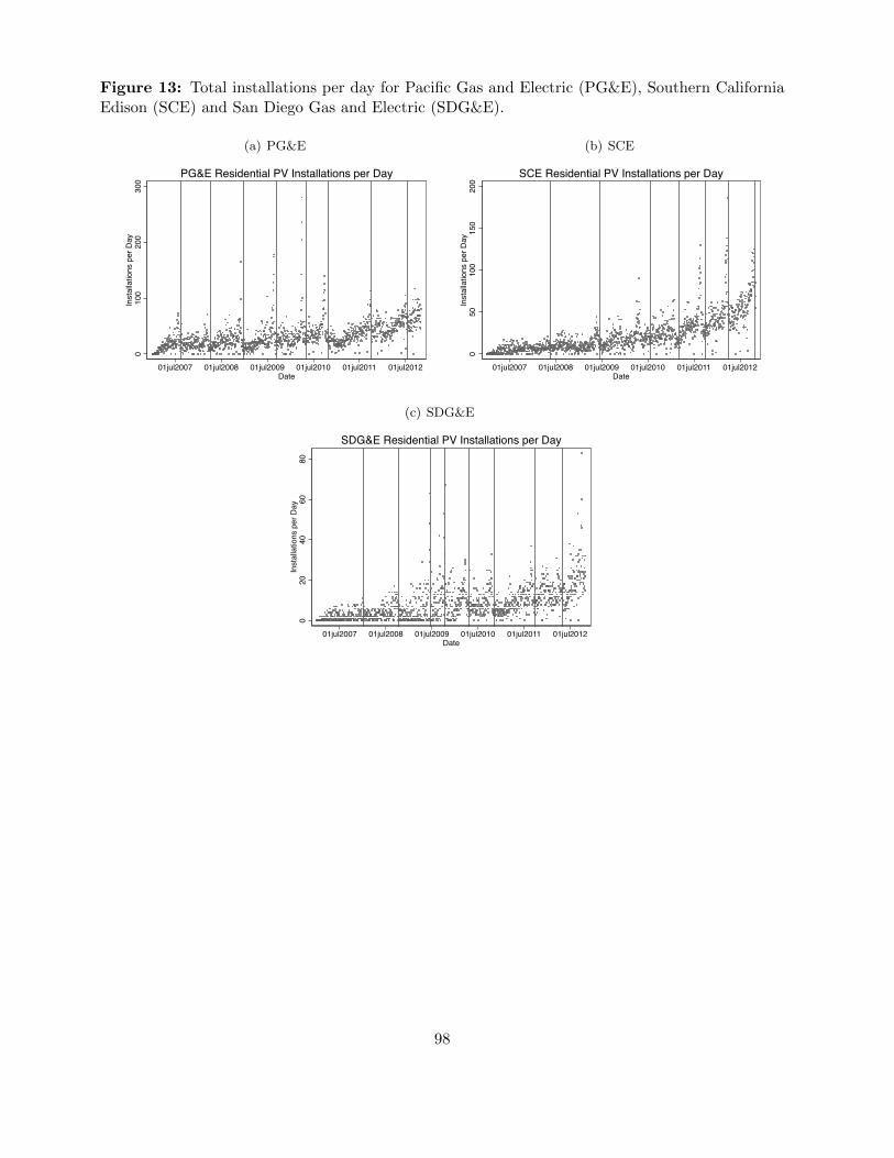
Figure 13: Total installations per day for Pacific Gas and Electric (PG&E), Southern CaliforniaEdison (SCE) and San Diego Gas and Electric (SDG&E).
(a) PG&E0
100
200
300
Inst
alla
tions
per
Day
01jul2007 01jul2008 01jul2009 01jul2010 01jul2011 01jul2012Date
PG&E Residential PV Installations per Day
(b) SCE
050
100
150
200
Inst
alla
tions
per
Day
01jul2007 01jul2008 01jul2009 01jul2010 01jul2011 01jul2012Date
SCE Residential PV Installations per Day
(c) SDG&E
020
4060
80In
stal
latio
ns p
er D
ay
01jul2007 01jul2008 01jul2009 01jul2010 01jul2011 01jul2012Date
SDG&E Residential PV Installations per Day
98

Figure 14: Predicted total PV installations and counterfactual installations assuming no CSIprogram rebates.
020
000
4000
060
000
8000
010
0000
PV In
stal
latio
ns
01jul2007 01jul2008 01jul2009 01jul2010 01jul2011 01jul2012date
Total Installs Pred. Installs Without Rebates
Counterfactual PV Installations
99

Figure 15: Welfare effects of CSI program rebates in terms of changes in private and social surplus.
Price
Qo Number of Installa4ons
Qs
Marginal Cost
Marginal Private Benefit
A B C
Subsidy
Price
Qo Number of Installa4ons
Qs
Marginal Cost
Marginal Private Benefit
a b c Subsidy
d e f
g
100

Figure 16: This figure shows population density in Utah by county.
101
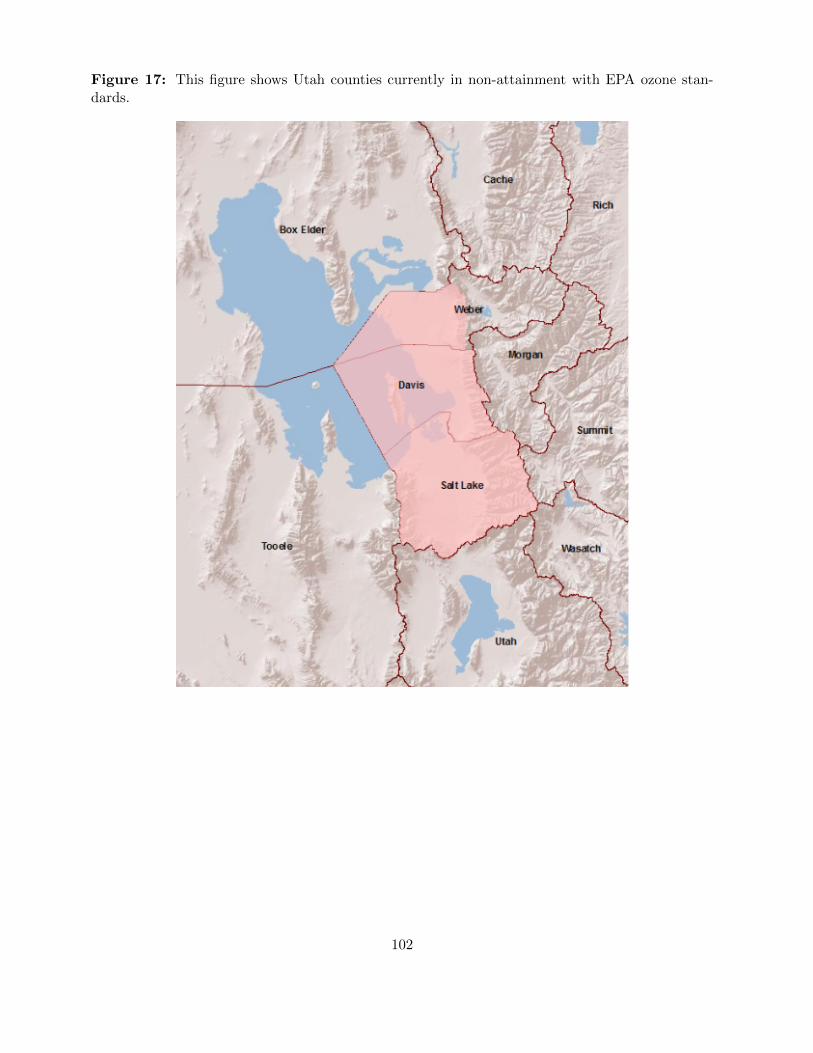
Figure 17: This figure shows Utah counties currently in non-attainment with EPA ozone stan-dards.
102

Figure 18: This isopleth figure borrowed from Repeto (1983) shows the unusual back-bendingnature of ozone formation as a function of NOx and VOC’s.
103

Figure 19: This map shows the three large interstate highway points used in the traffic flowanalysis. The northern site is along interstate highway 15 in Davis County, a major commutingroute into SLC from the north. The central site is along interstate highway 215 in Salt Lake County,within Salt Lake City. It is a major artery for commuters within SLC. The southern site is alonginterstate highway 15 in Utah County, another major commuting route into SLC from the south.
Davis I-15
SL I-215
Utah I-15
104

Figure 20: This figure contains graphs for average 7-8am Friday traffic flows by month and yearfor 3 major interstate highways in Salt Lake City MSA. These figures show no evidence that trafficflows increased between 2008 and 2009. Rather, these figures suggest traffic flows decreased onall three interstates between 2008 and 2009. This makes it unlikely that increased driving is thechannel through which the CWW impacts ozone.
(a) Salt Lake County I-215
5000
6000
7000
8000
9000
10000
11000
May June July Aug Sept Oct
I-215 Salt Lake County 2008
I-215 Salt Lake County 2009
7-8 am Average Friday Tra�c Flow by Year
(b) Davis County I-15
5000
5500
6000
6500
7000
7500
8000
8500
9000
9500
10000
May June July Aug Sept Oct
I-15 Davis County 2008
I-15 Davis County 2009
7-8am Average Friday Tra�c Flow by Year
(c) Utah County I-15
3000
3500
4000
4500
5000
5500
May June July Aug Sept Oct
I-15 Utah County 2008
I-15 Utah County 2009
7-8 am Average Friday Tra�c Flow by Year
105

Tables
Table 1: This table displays descriptive statistics for the third party and customer owned marketsbased on the main CSI dataset.
2007 2008 2009 2010 2011 2012Mean total cost ($) 44791 43634 41751 39078 34562 32403Mean cost per Watt ($/W) 8.06 8.19 7.34 6.71 6.31 5.45Third party only firms 6 4 13 15 35 73Customer owned only firms 300 560 792 922 683 605Firms in both markets 100 40 71 88 217 266Third party installations 414 1367 1880 5819 11735 22306Customer owned installations 5742 8063 11064 12680 10247 8282Third party market share 7% 15% 14% 31% 53% 73%Total installations 6297 9430 13041 18563 21985 30588Mean customer owned design factor 95% 94% 95% 95% 95% 95%Mean third party design factor 94% 93% 94% 93% 94% 94%Mean customer owned size (W) 5.6 5.3 5.6 5.6 5.3 5.9Mean third party size (W) 5.4 5.4 6.0 5.9 5.6 6.1
Descriptive Statistics
106

Table 2: This figure shows the distribution of module manufacturers used by the three largestfirms operating in both customer owned and third party markets in 2010. For SolarCity the listsfor each contain nearly identical manufacturers–the only manufacturers used solely in one or theother type installation account for small shares of installations. Moreover, the most commonly usedmanufacturers are the same for both install types. Both RealGoods Energy Tech and REC showa similar pattern. Given the small number of total installations—SolarCity had 2175 installations,Real Goods 1179, and REC 927 in 2010—and the large variety of module manufacturers, somevariation is inevitable.
Module Manufacturer Share Module Manufacturer Share
BP 5% BP 4%Canadian Solar 6% Canadian Solar 0%Evergreen Solar 5% Evergreen Solar 2%First Solar 1% First Solar 1%Kyocera 36% Kyocera 56%Sanyo 5% Sanyo 1%Sharp 11% Sharp 6%Solar World 5% Sunpower 0%Suntech 3% Suntech 1%Yingli 22% Yingli 28%
Andalay Solar 0% Andalay Solar 2%ET Solar Industry 1% ET Solar Industry 2%Kaneka 1% Kaneka 0%Kyocera Solar 49% Kyocera Solar 36%Sanyo Electric 3% Sanyo Electric 2%Sharp 35% Sharp 22%SunPower 1% SunPower 0%Suntech Power 7% Suntech Power 24%Westinghouse Solar 2% Westinghouse Solar 11%
Kyocera Solar 22% Kyocera Solar 18%Mitsubishi Electric 1% Mitsubishi Electric 0%REC Solar 40% REC Solar 65%Sanyo Electric 36% Sanyo Electric 17%
REC Solar
2010 Module DistributionNon Third Party Third Party
SolarCity
Real Goods Solar Tech
107

Table 3: This table displays estimation results for the main model. The first three columns presentresults of OLS fixed effects regression with time entering as year effects interacted with utility,year-by-quarter effects interacted with utlity, and in column 3, the prefered specification, utilityinteracted with a third degree polynomial time trend. The fourth column employs firm-by-modulefixed effects. The fifth column presents results using propensity score matching nearest-neighborestimation of the prefered specification.
OLS (1) OLS (2) OLS (3) OLS (4) PS Matching
Third Party 0.037*** 0.043*** 0.041*** 0.036*** 0.078***(0.0031) (0.0030) (0.0031) (0.0033) (0.0068)
Log Size (W) -0.069*** -0.068*** -0.070*** -0.065***(0.0021) (0.0021) (0.0020) (0.0019)
FE's/Matching CriteriaSize (W) no no no no yesUtility no no no no noZip yes yes yes yes yesQuarter yes no no no noSeller yes yes yes no yesModule Manufacturer yes yes yes no yesFirm-Module Combination no no no yes noUtility*Year yes no no no noUtility*QuarterYear no yes no no noUtility*Trend no no yes yes yesObservations 68680 68680 68680 68680 64119Adjusted \T-stat 0.67 0.68 0.67 0.74 11.42
Base Results
Notes: Trend denotes a 3rd-degree polynomial time trend. Standard errors for OLS regressions clustered at the zip code level.***, ** and * denote significance at the 1 percent, 5 percent and
R2
108

Table 4: This table shows the results of running the main model using data for each firm inisolation. While SolarCity shows a large, statistically significant premium for third party prices,the coefficients on thirdparty for Real Goods and REC Solar are not statistically different fromzero, suggesting no third party price premium.
SolarCity RealGoods REC
OLS (1)size utility zip year quarter mod
manufutility*
yearutility*
qyutility* trend
Third Party 0.260*** 0.009 0.000(0.0085) (0.0065) (0.0034)
no no yes no yes yes yes no noObservations 7683 4233 4386Adjusted \T-stat 0.636 0.67 0.733OLS (2)Third Party 0.244*** 0.005 0.000
(0.0090) (0.0063) (0.0033)no no yes no no yes no yes no
Observations 7683 4233 4386Adjusted \T-stat 0.689 0.67 0.738OLS (3)Third Party 0.261*** 0.007 0.002
(0.0078) (0.0064) (0.0034)no no yes no no yes no no yes
Observations 7683 4233 4386Adjusted \T-stat 0.657 0.67 0.73PSMThird Party 0.229*** 0.032 0.010
(0.0177) (0.0216) (0.0106)yes no yes no no yes no no yes
Observations 5571 3069 3674Adjusted \T-stat 12.93 1.47 0.90Notes: Trend denotes a 3rd-degree polynomial time trend. Standard errors clustered at the zip code level. ***, ** and * denote significance at theat the 1 percent, 5 percent and 10 percent levels.
Individual Firm Results
R2
R2
R2
R2
109
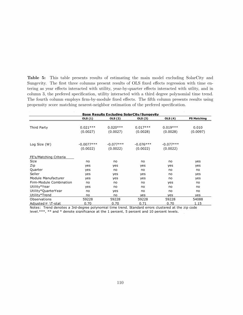
Table 5: This table presents results of estimating the main model excluding SolarCity andSungevity. The first three columns present results of OLS fixed effects regression with time en-tering as year effects interacted with utility, year-by-quarter effects interacted with utlity, and incolumn 3, the prefered specification, utility interacted with a third degree polynomial time trend.The fourth column employs firm-by-module fixed effects. The fifth column presents results usingpropensity score matching nearest-neighbor estimation of the prefered specification.
OLS (1) OLS (2) OLS (3) OLS (4) PS Matching
Third Party 0.021*** 0.020*** 0.017*** 0.019*** 0.010(0.0027) (0.0027) (0.0028) (0.0028) (0.0097)
Log Size (W) -0.0077*** -0.077*** -0.076*** -0.077***(0.0022) (0.0022) (0.0022) (0.0022)
FE's/Matching CriteriaSize no no no no yesZip yes yes yes yes yesQuarter yes no no no noSeller yes yes yes no yesModule Manufacturer yes yes yes no yesFirm-Module Combination no no no yes noUtility*Year yes no no no noUtility*QuarterYear no yes no no noUtility*Trend no no yes yes yesObservations 59228 59228 59228 59228 54088Adjusted \T-stat 0.70 0.70 0.71 0.70 1.15
Base Results Excluding SolarCity/Sungevity
Notes: Trend denotes a 3rd-degree polynomial time trend. Standard errors clustered at the zip code level.***, ** and * denote significance at the 1 percent, 5 percent and 10 percent levels.
R2
110

Table 6: This table presents the results of estimating the main model restricting data to 2012, afterthe issue of federal subpoenas. The first three columns present results of OLS fixed effects regressionwith time entering as year effects interacted with utility, year-by-quarter effects interacted withutlity, and in column 3, the prefered specification, utility interacted with a third degree polynomialtime trend. The fourth column employs firm-by-module fixed effects. The fifth column presentsresults using propensity score matching nearest-neighbor estimation of the prefered specification.
R2
OLS (1) OLS (2) OLS (3) OLS (4) PS Matching
Third Party -0.027*** -0.026*** -0.027*** -0.027*** 0.007(0.0041) (0.0041) (0.0041) (0.0042) (0.0154)
Log Size (W) -0.053*** -0.053*** -0.052*** -0.046***(0.0027) (0.0027) (0.0027) (0.0025)
FE's/Matching CriteriaSize no no no no yesZip yes yes yes yes yesQuarter yes no no no noSeller yes yes yes no yesModule Manufacturer yes yes yes no yesFirm-Module Combination no no no yes noUtility*Year yes no no no noUtility*QuarterYear no yes no no noUtility*Trend no no yes yes yesObservations 28886 28886 28886 28886 24737Adjusted \T-stat 0.70 0.70 0.70 0.77 0.46
Base Results Post-Subpoena, 2012
Notes: Trend denotes a 3rd-degree polynomial time trend. Standard errors clustered at the zip code level.***, ** and * denote significance at the 1 percent, 5 percent and 10 percent levels.
R2
111
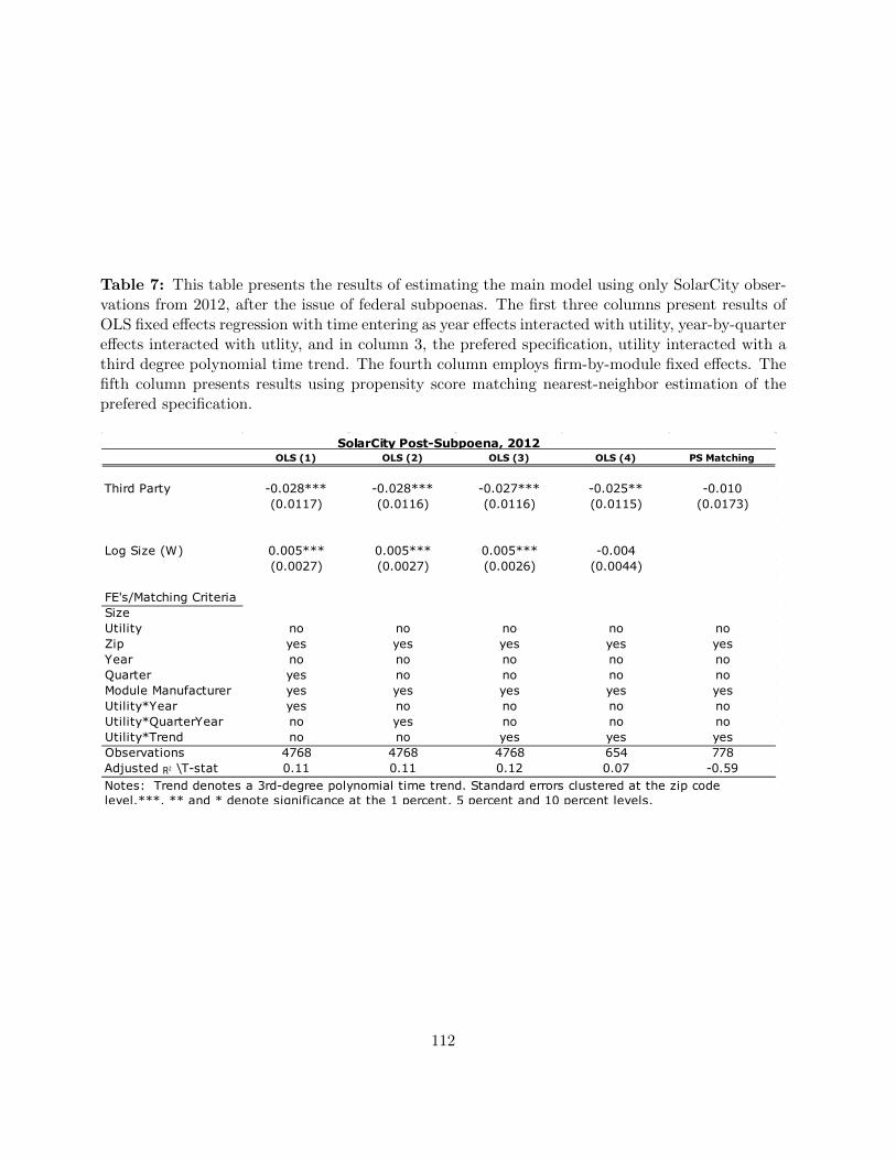
Table 7: This table presents the results of estimating the main model using only SolarCity obser-vations from 2012, after the issue of federal subpoenas. The first three columns present results ofOLS fixed effects regression with time entering as year effects interacted with utility, year-by-quartereffects interacted with utlity, and in column 3, the prefered specification, utility interacted with athird degree polynomial time trend. The fourth column employs firm-by-module fixed effects. Thefifth column presents results using propensity score matching nearest-neighbor estimation of theprefered specification.
OLS (1) OLS (2) OLS (3) OLS (4) PS Matching
Third Party -0.028*** -0.028*** -0.027*** -0.025** -0.010(0.0117) (0.0116) (0.0116) (0.0115) (0.0173)
Log Size (W) 0.005*** 0.005*** 0.005*** -0.004(0.0027) (0.0027) (0.0026) (0.0044)
FE's/Matching CriteriaSizeUtility no no no no noZip yes yes yes yes yesYear no no no no noQuarter yes no no no noModule Manufacturer yes yes yes yes yesUtility*Year yes no no no noUtility*QuarterYear no yes no no noUtility*Trend no no yes yes yesObservations 4768 4768 4768 654 778Adjusted \T-stat 0.11 0.11 0.12 0.07 -0.59
SolarCity Post-Subpoena, 2012
Notes: Trend denotes a 3rd-degree polynomial time trend. Standard errors clustered at the zip code level.***, ** and * denote significance at the 1 percent, 5 percent and 10 percent levels.
R2
112

Table 8: This table displays results of estimation of the OLS fixed effects difference-in-differencesmodel of customer owned system prices pre and post-cap lift, January 1, 2009. Observations in theprefered specification are restricted to a 6-month window on either side of the cap-lift, while thethird column presents results from widening this window to 12 months on either side of the cap-lift.The pass-through rate from consumers to firms is calculated as (increase in mean per Watt systemprice)/(increase in mean ITC award), where mean per Watt system price increase is calculated atthe mean from the regression coefficient on post-cap dummy.
(1) (2) (3)
Post-cap dummy 0.220** 0.210** 0.190***
(0.0919) (0.0878) (0.0618)
Confidence interval (95%) [0.039,0.400] [0.035,0.380] [0.068,0.311]
Pass-Through Rate 0.87 0.83 0.75
Log Size (W) -0.037*** -0.037*** -0.045***
(0.0122) (0.0122) (0.0085)
Confidence interval (95%) [-0.061,-0.013] [-0.061,-0.013] [-0.061,-0.028]
Zip Effects yes yes yes
Seller Effects yes yes yes
Module Effects yes yes yes
Utility Effects no yes no
Time Trend no yes no
Utility*Trend Effects yes no yes
Window 6 mo 6 mo 12 mo
Observations 9044 9044 18986
Adjusted 0.44 0.44 0.48Notes: Trend denotes a 3rd-degree polynomial time trend. Standard errors clustered at the zip code level. ***, ** and
* denote significance at the 1 percent, 5 percent and 10 percent levels.
ITC Pass-Through in Customer Owned Market
𝑅2
113

Table 9: This table displays results of a falsification test of the pass-through of ITC benefits fromconsumers to firms. The difference-in-differences model of customer owned system prices pre versuspost-cap-lift is estimated below using a fake cap-lift date of January 1, 2010 (the actual cap-lift dateis Jan 1, 2009). As with the main pass-through model, observations are restricted to a 6-monthwindow on either side of the cap-lift date.
Test (1) Test (2) Test(3)
Post-cap dummy -0.094 -0.042 -0.000(0.0594) (0.0729) (0.0324)
Log Size (W) -0.048*** -0.0536*** -0.024***(0.0064) (0.0068) (0.0060)
Zip Effects yes yes yesSeller Effects yes yes yesModule Effects yes yes yesUtility*Trend Effects yes yes yesWindow 6 mo 6 mo 6 moFake Cap-lift Date Jan1, 2010 July1,2008 July1, 2010Observations 12757 7931 20338Adjusted 0.67 0.39 0.77
Pass Through Falsification Test Results
Notes: Falsificaion test uses a 6 month window on either side of fake cap-lift dates, using Jan 1, 2009, July 1, 2008 and July 1, 2010 as fake cap-lift dates. Trend denotes a 3rd-degree polynomial time trend. Standard errors clustered at the zip code level. ***, ** and * denote significance at the 1 percent, 5 percent and 10 percent levels.
R2
114

Table 10: This table presents results of estimating the degree to which Sungevity’s third partyprices exceed customer owned prices of all other firms operating in the customer owed market. Thefirst four columns present results of OLS fixed effects regression with time entering as separateyear and quarter effects, year effects interacted with utility, year-by-quarter effects interacted withutlity, and in column 4, the prefered specification, utility interacted with a third degree polynomialtime trend. The fifth column presents results using propensity score matching nearest-neighborestimation of the prefered specification.
OLS (1) OLS (2) OLS (3) OLS (4) PS Matching
Sungevity 0.141*** 0.141*** 0.141*** 0.144*** 0.216***(0.0123) (0.0124) (0.0124) (0.0125) (0.0462)
Log Size (W) -0.146*** -0.145*** -0.144*** -0.145***(0.0041) (0.0041) (0.0041) (0.0041)
FE's/Matching CriteriaSize no no no no yesUtility yes no no no noZip yes yes yes yes yesYear yes no no no noQuarter yes yes no no noModule Manufacturer yes yes yes yes yesUtility*Year no yes no no noUtility*QuarterYear no no yes no noUtility*Trend no no no yes yesObservations 49564 49564 49564 49564 7013Adjusted \T-stat 0.45 0.45 0.46 0.45 4.46
Sungevity Results
Notes: Trend denotes a 3rd-degree polynomial time trend. Standard errors clustered at the zip code level. ***, ** and * denote significance at the 1 percent, 5 percent and 10 percent levels.
R2
115

Table 11: This table presents results of estimating the degree to which Sungevity’s third partyprices exceed customer owned prices of all other firms operating in the customer owed marketrestricting data to 2012, after the issue of federal subpoenas. The first four columns present resultsof OLS fixed effects regression with time entering as separate year and quarter effects, year effectsinteracted with utility, year-by-quarter effects interacted with utlity, and in column 4, the preferedspecification, utility interacted with a third degree polynomial time trend. The fifth column presentsresults using propensity score matching nearest-neighbor estimation of the prefered specification.
OLS (1) OLS (2) OLS (3) OLS (4) PS Matching
Sungevity 0.185*** 0.185*** 0.185*** 0.185*** -0.018(0.0204) (0.0204) (0.0204) (0.0204) (0.1151)
Log Size (W) -0.100*** -0.100*** -0.100*** -0.100***(0.0080) (0.0080) (0.0080) (0.0080)
FE's/Matching CriteriaSize no no no no yesUtility yes no no no noZip yes yes yes yes yesYear yes no no no noQuarter yes yes no no noModule Manufacturer yes yes yes yes yesUtility*Year no yes no no noUtility*QuarterYear no no yes no noUtility*Trend no no no yes yesObservations 8449 8449 8449 8449 384Adjusted \T-stat 0.55 0.55 0.55 0.55 0.16
Sungevity Post-Subpoena, 2012
Notes: Trend denotes a 3rd-degree polynomial time trend. Standard errors clustered at the zip code level. ***, ** and * denote significance at the 1 percent, 5 percent and 10 percent levels.
R2
116

Table 12: This table presents evidence that three of the largest firms operating in both thecustomer owned and third party markets, SolarCity, Real Goods Energy Tech and REC Solar, aredirect competitors in the same geographical markets. This table lists the percentage of the zipcodes in which a firm operates that it shares with each of its competitors. For instance, the bottomrow reveals that SolarCity operates in 88% of the zip codes in which Real Goods has installations,and REC Solar operates in 75% of the zip codes in which Real Goods has installations. While thereare a considerable number of zip codes without overlap, these are largely explained by the fact thatinstallations are a relatively rare event, and a large number of zip codes have only 1 installationduring the entire study period.
SolarCity REC Solar Real GoodsSolarCity 1.00 0.69 0.64REC Solar 0.91 1.00 0.71Real Goods 0.88 0.75 1.00
Percentage Shared Zip Codes
117

Table 13: CSI rebate rate schedule for EPBB program by utility. Adapted from CSI StatewideTriggerTracker at http://www.csi-trigger.com/
118
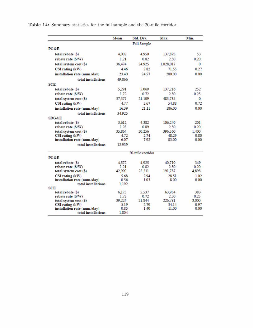
Table 14: Summary statistics for the full sample and the 20-mile corridor.
119

Table 15: Observable household characteristics by geographic region.
Population % White HH Income % Family % Own. Occ. Rooms Year Built
full samplePG&E 35,271 0.63 54,384 0.71 0.59 5.08 1970.4SCE 45,607 0.57 49,112 0.76 0.57 4.86 1968.8Difference -10,336*** 0.07*** 5,273*** -0.05*** 0.02 0.21*** 1.56
40 mi. bufferPG&E 34,789 0.61 38,060 0.78 0.57 4.99 1973.5SCE 28,750 0.66 40,671 0.73 0.55 4.81 1956.4Difference 6,039* -0.06* -2,611 0.05*** 0.03 0.18 17.10
20 mi. bufferPG&E 31,496 0.61 36,509 0.77 0.55 4.85 1973.5SCE 33,382 0.66 39,437 0.75 0.57 4.94 1972.8Difference -1,886 -0.05* -2,927 0.02* -0.02 -0.09 0.70
Notes: Reported observables are populated weighted means of zip code average values. Test statistics for differences in means are from a populated weighted regression where standard errors are clustered at the zipcode level. ***, ** and * denote significanceat the 1 percent, 5 percent and 10 percent levels respectively.
Differences in Zip Code Means of Observable Demographics and House Characteristics Across Utilities
120

Table 16: Effect of California Solar Initiative (CSI) rebate rates on the daily PV installation ratenear the PG&E and SCE boundary.
(1) (2) (3) (4) (5) (6)
OLS Poisson Neg. Binomial OLS Poisson Neg. Binomial
Rebate rate ($/W) 0.116 0.170*** 0.211 0.829 1.337** 1.346**(0.1520) (0.0540) (0.1740) (0.4210) (0.6060) (0.6550)
Confidence interval (95%) [-1.817,2.049] [0.065,0.275] [-0.131,0.552] [-4.518,6.176] [0.149,2.525] [0.061,2.630] % change in install rate 1.6% 1.7% 2.1% 11.8% 14.3% 14.4%
Year Effects Yes Yes Yes No No NoQuarter Effects Yes Yes Yes Yes Yes YesUtility Effects Yes Yes Yes No No NoYear*Utility Effects No No No Yes Yes YesObservations 4262 4262 4262 4262 4262 4262Notes: Dependent variables are the total daily PV installation rates in number per day by utility for zipcodes within 20 mile buffer. Percentage change in installation rate calculated for a $0.10 increase in the rebate rate at the mean values of independent variables.Standard errors clustered at the utility level. ***, ** and * denote significance at the 1 percent, 5 percent and 10 percent levels.
Models for Average Daily Installation Rates in 20 Mile Region
121

Table 17: Robustness to excluding periods near rebate step changes for installations in the 20mile region near the PG&E and SCE boundary.
(1) (2) (3) (4) (5)
Base 2 wk. 4 wk. 8 wk. 12 wk.
Rebate rate ($/W) 1.346** 1.361** 1.401** 1.034*** 1.095**(0.6550) (0.6270) (0.6320) (0.3160) (0.4280)
Confidence interval (95%) [0.061,2.630] [0.133,2.589] [0.163,2.640] [0.415,1.652] [0.257,1.933] % change in install rate 14.4% 14.6% 15.0% 10.9% 11.6%
Year Effects No No No No NoQuarter Effects Yes Yes Yes Yes YesUtility Effects No No No No NoYear*Utility Effects Yes Yes Yes Yes YesObservations 4262 3865 3459 2647 1835Notes: Dependent variables are the total daily PV installation rates in number per day by utility for zipcodes within 20 mile buffer. Base model includes all observations. "2 week," "4 week," "8 week," and "12 week" models drop observations within 2, 4, 8, and 12 weeks of each change in rebate level. Percentage change in installation rate calculated for a $0.10 increase in the rebate rate at the mean values of independent variables. Standard errors clustered at the utility level. ***, ** and * denote significance at the 1 percent, 5 percent and 10 percent levels.
Robustness to Excluding Observations Near Rebate Change Dates
122

Table 18: Effect of California Solar Initiative (CSI) rebate rates on the daily PV installation ratenear the PG&E and SCE boundary during different sample periods.
2007-2008 2009-2010 2011-2012
Rebate rate ($/W) 1.826*** 1.720*** 0.835***(0.4230) (0.3460) (0.2370)
Confidence interval (95%) [0.997,2.655] [1.043,2.398] [0.370,1.300] % change in install rate 20.0% 18.8% 8.7% Level Change in install rate 0.067 0.112 0.106
Year Effects No No NoQuarter Effects Yes Yes YesUtility Effects No No NoYear*Utility Effects Yes Yes YesObservations 4262 4262 4262Notes: Dependent variables are the total daily PV installation rates in number perday by utility for zipcodes within 20 mile buffer. Percentage change in installation rate calculated for a $0.10 increase in the rebate rate. Standard errors clusteredat the utility level. ***, ** and * denote significance at the 1 percent, 5 percent and 10 percent levels.
Average Daily Installation Rates in 20 Mile Region by Period
123

Table 19: Robustness of main results across different geographic samples.
(1) (2) (3) (4) (5)
All PG&E and SCE Zip Codes
40 mi. 20 mi. Split Zip Codes All IOUs
Rebate rate ($/W) 1.321*** 1.306*** 1.346** 1.283* 1.223***(0.2070) (0.3850) (0.6550) (0.7600) (0.1430)
Confidence interval (95%) [0.914,1.727] [0.551,2.060] [0.061,2.630] [-0.206,2.771] [0.942,1.504] % change in install rate 14.1% 14.0% 14.4% 13.7% 13.0%
Quarter = 2 0.571*** 0.610*** 0.649*** 0.611*** 0.517***(0.0120) (0.0620) (0.0880) (0.1240) (0.0530)
Quarter = 3 0.890*** 0.881*** 1.003*** 0.990*** 0.814***-0.08 -0.109 -0.131 -0.139 -0.087
Quarter = 4 1.013*** 0.950*** 1.078*** 1.010*** 0.976***(0.0210) (0.1020) (0.1690) (0.1770) (0.0320)
Year = 2008 0.998*** 0.665*** 0.593*** 0.620*** 1.148***-0.04 -0.084 -0.142 -0.164 -0.05
Year = 2009 1.761*** 1.209*** 1.095*** 1.243*** 2.684***(0.1010) (0.1870) (0.3190) (0.3700) (0.1390)
Year = 2010 2.677*** 1.993*** 1.885*** 2.002*** 3.852***-0.162 -0.305 -0.513 -0.593 -0.252
Year = 2011 4.012*** 3.138*** 3.201*** 3.376*** 4.480***-0.311 -0.573 -0.973 -1.122 -0.314
Year = 2012 5.461*** 4.582*** 4.687*** 4.820*** 5.154***-0.431 -0.813 -1.383 -1.602 -0.33
Utility = PG&E 1.456*** 0.372*** -0.367*** -0.148 2.326***-0.024 -0.048 -0.083 -0.095 -0.013
Utility = SCE 0.882***-0.004
Year = 2008 & Utility = PG&E -0.064 0.384*** 0.531*** 0.545*** -0.262***-0.046 -0.082 -0.138 -0.161 -0.014
Year = 2008 & Utility = SCE -0.174***-0.02
Year 2009 & Utility = PG&E 0.016 0.751*** 0.942*** 0.804** -1.007***-0.104 -0.188 -0.313 -0.359 -0.004
Year = 2009 & Utility = SCE -0.975***-0.067
Year = 2010 & Utility = PG&E 0.388** 1.439*** 1.544*** 1.477** -0.950***-0.174 -0.325 -0.556 -0.644 -0.017
Year = 2010 & Utility = SCE -1.257***-0.136
Year = 2011 & Utility = PG&E -0.425*** 1.087*** 0.900** 0.777* -1.101***-0.119 -0.225 -0.374 -0.44 -0.014
Year = 2011 & Utility = SCE -0.618***-0.097
Year = 2012 & Utility = PG&E -1.247*** 0.328*** -0.054 -0.161*** -1.160***-0.023 -0.033 -0.045 -0.05 -0.012
Year = 2012 & Utility = SCE 0.095***-0.027
Constant -2.830*** -4.761*** -5.199*** -5.591*** -3.419***-0.544 -1.043 -1.754 -2.029 -0.394
Observations 4262 4262 4262 4262 6393Notes: Dependent variables are the total daily PV installation rates in number per day by utility for zipcodes within eacharea. The results in column 1 aggregate installations over PG&E's and SCE's territories. "40 mi." includes only installations within 20 miles on each side of the PG&E/SCE territory boundary, "20 mi." includes installations within10 miles of the boundary and "split zip codes"include installations in in zip codes divided by the utility boundary. All IOUs includes observations for all zip codes within PG&E, SCE and SDG&E territories. Percentage change in installation rate calculated for a $0.10 increase in the rebate rate at the mean values of independent variables. Standard errors clustered at the utility level. ***, ** and * denote significance at the 1 percent, 5 percent and 10 percent levels.
Robustness to Different Geographic Samples
124

Table 20: Effect of rebates on average daily installation rates by utility.
PG&E SCE SDG&E
Rebate rate ($/W) 1.417*** 1.118*** 1.150***(0.0530) (0.0790) (0.0370)
Confidence interval (95%) [1.314,1.521] [0.964,1.272] [1.077,1.223] % change in install rate 15.2% 11.8% 12.2%
Year Effects No No NoQuarter Effects Yes Yes YesUtility Effects No No NoYear*Utility Effects Yes Yes YesObservations 6393 6393 6393Notes: Dependent variables are the total daily PV installation rates in number perday by utility for all zipcodes within PG&E, SCE and SDG&E territories. Percentage change in installation rate calculated for a $0.10 increase in the rebate rate. Standard errors clustered at the utility level. ***, ** and * denote significanceat the 1 percent, 5 percent and 10 percent levels.
Effect of Rebates on Average Daily Installation Rates by Utility
125

Table 21: Installations, capacity, carbon emissions and social surplus under the California SolarInitiative.
Total Installations 98,621 85,950 Intallations Without Rebates 41,236 33,171 Percentage Due to CSI 58% 61%
Total Capacity (kW) 452,822 393,258 Capacity Without Rebates 192,547 153,680 Percentage Due to CSI 57% 61%
Total Subsidy Payments ($M) 437$ 392$ Change in Private Surplus 268$ 235$ Rents to Inframarginal Install. 98$ 78$ Change in Social Surplus (169)$ (157)$
Avg. Grid Peak Grid Avg. Grid Peak GridWECC Emissions Rates
CO2 Abatement (MMT CO2) 2.98 3.15 2.74 2.90 Program Cost per Ton ($/MT) 146.72$ 138.79$ 142.98$ 135.25$ Average Abatement Cost ($/MT) 56.74$ 53.67$ 57.26$ 54.17$
NOx Abatement (MT NOx) 1,866.20 1,569.02 1,717.81 1,444.26 Program Cost per Ton ($/MT) 234,165.18$ 278,517.62$ 228,197.66$ 271,419.84$ Average Abatement Cost ($/MT) 90,558.16$ 107,710.48$ 91,395.49$ 108,706.41$
CA Emissions RatesCO2 Abatement (MMT CO2) 2.45 3.70 2.26 3.41 Program Cost per Ton ($/MT) 178.20$ 118.10$ 173.66$ 115.09$ Average Abatement Cost ($/MT) 68.91$ 45.67$ 69.55$ 46.09$
NOx Abatement (MT NOx) 1,560.72 1,195.49 1,436.62 1,100.43 Program Cost per Ton ($/MT) 279,998.26$ 365,541.41$ 272,862.69$ 356,225.68$ Average Abatement Cost ($/MT) 108,283.08$ 141,364.98$ 109,284.29$ 142,672.02$
Notes: Carbon abatement calculations under WECC emissions use average and peak emissions rates from Graff Zivin et. al. (2013). California emissions rates use average and peak emissions from eGrid (2009).
Overall Impacts of the California Solar Initiative
CSI Overall (All IOUs) PG&E and SCE Only
126

Table 22: Effect of California Solar Initiative (CSI) rebate rates on the daily zip code-level PVinstallation rate near the PG&E and SCE boundary.
(1) (2) (3) (4)
Neg. Binomial Neg. Binomial Neg. Binomial Neg. Binomial
Rebate rate ($/W) 1.238* 1.253*** 1.245*** 1.220***(0.7000) (0.2880) (0.2890) (0.2870)
Confidence interval (95%) [-0.134,2.611] [0.688,1.818] [0.678,1.811] [0.657,1.784] % change in install rate 13.2% 13.3% 13.3% 13.0%
Population (1000s) 0.055*** 0.053***(0.0060) (0.0060)
% White 1.759* 2.119(1.0400) (1.3080)
HH Income ($1000s) 0.036*** 0.018(0.0120) (0.0150)
% Family 1.881* 1.699(1.0070) (1.6720)
% Own. Occ. 2.022(1.8650)
Rooms 0.047(0.3680)
Year Built -0.032**(0.0160)
Year Effects No No No NoQuarter Effects Yes Yes Yes YesUtility Effects No No No NoYear*Utility Effects Yes Yes Yes YesZip Effects No No No YesObservations 128526 128526 128526 128526Notes: Dependent variables are the total daily PV installation rates in number per day by zipcode, by utility for zipcodes within 20 mile buffer. Percentage change in installation rate calculated for a $0.10increase in the rebate rate. Standard errors clustered at the zipcode level . ***, ** and * denotesignificance at the 1 percent, 5 percent and 10 percent levels. Models 1, 2 and 3 use quarter and utility*year effects. Model 4 adds zip code fixed effects.
Zip Code Level Installation Rates in 20 Mile Region
127

Table 23: This table displays descriptive statistics for all counties, 2007 to 2009.
Observations Mean St. dev Minimum MaximumHourly ozone reading (ppb) 261594 37.47 17.96 0 125Max daily ozone (ppb) 268444 55.34 14.5 2 125Unemployment rate 271739 4.93 2.25 1.9 12.9Max temperature (F) 186879 85.22 11.68 48 105Rain (cubic in) 186879 0.03 0.10 0 0.84Average windspeed (mi/h) 186879 8.48 2.95 3.7 21Sky cover 186879 2.59 2.58 0 10
Descriptive Statistics
128

Table 24: This table displays mean maximum ozone readings by day of week for all counties, pre-and post-program, from 2007 to 2009. The program start date is August 1, 2008.
Pre-program mean Post-program mean Difference T-stat P-valueMax daily ozone (ppb) 57.74 49.77 -7.98 -135 0.00Friday max daily ozone (ppb) 57.45 51.29 -6.16 -38 0.00Sat max daily ozone (ppb) 58.08 50.70 -7.68 -48 0.00Sun max daily ozone (ppb) 58.55 49.73 -8.82 -64 0.00Mon max daily ozone (ppb) 57.21 48.45 -8.76 -57 0.00Tues max daily ozone (ppb) 58.54 48.66 -9.88 -63 0.00Wed max daily ozone (ppb) 57.46 49.60 -7.86 -47 0.00Thurs max daily ozone (ppb) 56.93 49.98 -7.26 -43 0.00
Pre and Post Program Mean Daily Maximum Ozone
129

Table 25: This table displays results of estimating the base model, Eq 1, using the unrestricteddataset including all days of the week, all pollution monitors and all counties.
Coefficient 95% CI
Post-program dummy 1.70*** [0.334 , 3.060](0.679)
Log max temp 38.47*** [31.390 , 45.542](3.526)
Rain -11.15*** [-16.260 , -6.036](2.547)
Rain sq 17.15*** [10.014 , 24.295](3.559)
Avg windspeed -0.70*** [-0.900 , -0.509](.097)
Skycover 0.55*** [0.152 , 0.949](0.198)
Skycover sq -0.08*** [-0.136 , -0.030](0.026)
Log unemployment -1.543 [-6.124 , 3.038](2.283)
Observations 185391Adjusted 0.41
All Utah Base Results
Notes: Standard errors clustered at the monitor/year level. Post-program dummy represents time period beginning on August 1, 2008. Observations limited to 2007, 2008 and 2009. *, ** and *** denote significance at the p = .1, p = .05 and p = .01 levels respectively.
R2
130

Table 26: This table displays the results of estimating the base model, Eq 1, by day-of-week,using the unrestricted dataset including all pollution monitors and all counties .
Coefficient 95% CI Observations Adjusted
Friday post-program dummy 1.94*** [0.780 , 3.106] 185391 0.41(0.580)
Saturday post-program dummy 1.02*** [0.254 , 1.792] 185391 0.41(0.383)
Sunday post-program dummy -0.46 [-1.225 , 0.309] 185391 0.41(0.382)
Monday post-program dummy -0.58 [-1.640 , 0.473] 185391 0.41(0.526)
Tuesday post-program dummy -0.35 [-1.338 , 0.632] 185391 0.41(0.491)
Wednesday post-program dummy 0.89** [0.200 , 1.578] 185391 0.41(0.343)
Thursday post-program dummy 0.22 [-0.754 , 1.203] 185391 0.41(0.488)
All Utah Base Results by Day of Week
Notes: Standard errors clustered at the monitor/year level. Post-program dummy represents time period beginning on August 1, 2008. Observations limited to 2007, 2008 and 2009. *, ** and *** denote significance at the p = .1, p = .05 and p = .01 levels respectively.
R2
131

Table 27: This table presents the results of estimating the base model, Eq 1, using all days of theweek but restricting observations to pollutions monitors and counties located within the Salt LakeCity MSA.
Coefficient 95% CI
Post-program dummy 2.06*** [0.643 , 3.478](0.701)
Log max temp 46.79*** [40.363 , 53.212](3.179)
Rain -11.88*** [-17.579 , -6.174](2.822)
Rain sq 18.59*** [10.818 , 26.359](3.845)
Avg windspeed -0.70*** [-0.118 , -0.024](0.023)
Skycover 0.47*** [0.118 , 0.817](0.173)
Skycover sq -0.07*** [-0.118 , -0.024](0.023)
Log unemployment 0.17 [-5.634 , 5.980](2.874)
Observations 147791Adjusted R2 0.47
Metro Salt Lake City Base Results
Notes: Standard errors clustered at the monitor/year level. Post-program dummy represents time period beginning on August 1, 2008. Observations limited to 2007, 2008 and 2009. *, ** and *** denote significance at the p = .1, p = .05 and p = .01 levels respectively.
132

Table 28: This table presents the results of estimating the base model, Eq 1, by day-of-week, andrestricting observations to pollution monitors and counties located within the Salt Lake City MSA.
Coefficient 95% CI Observations Adjusted R2
Friday post-program dummy 2.90*** [1.552 , 4.240] 147791 0.47(0.665)
Saturday post-program dummy 1.68*** [0.802 , 2.556] 147791 0.47(0.434)
Sunday post-program dummy -0.47 [-1.169 , 0.227] 147791 0.47(0.345)
Monday post-program dummy -1.23 [-2.449 , -0.007] 147791 0.47(0.604)
Tuesday post-program dummy -1.01* [-2.099 , 0.071] 147791 0.47(0.537)
Wednesday post-program dummy 1.20*** [0.423 , 1.972] 147791 0.47(0.383)
Thursday post-program dummy 0.50 [-0.701 , 1.692] 147791 0.47(0.592)
Metro Salt Lake City Base Results by Day of Week
Notes: Standard errors clustered at the monitor/year level. Post-program dummy represents time period beginning on August 1, 2008. Observations limited to 2007, 2008 and 2009. *, ** and *** denote significance at the p = .1, p = .05 and p = .01 levels respectively.
133

Table 29: This table presents the results of estimating Eq 2 using daily traffic flow observationson three main highways in the Salt Lake City MSA. The comparison is between traffic flow in 2008and 2009. The results suggest that increased driving is not likely the causal mechanism throughwhich the CWW increases ozone.
Coefficient
2009 -1328.80*(749.60)
Salt Lake I-215 23139.43***(923.10)
Davis I-15 48447.75***(910.25)
June 1010.28(1284.23)
July -800.90(1279.8)
Aug 239.87(1296.47)
Sept -5359.27***(1296.05)
Oct -6792.98***(1290.43)
Weekend -29960.13***(828.07)
Observations 1073R2 0.80
Traffic Flow Comparison 2008 vs 2009
Notes: *, ** and *** denote significance at the p = .1, p = .05 and p = .01 levels respectively.
134

Table 30: This table presents estimation results of the prefered specification alongside results of es-timating the prefered specification with Auffhammer and Kellog (2010) style weather controls.Theseweather controls include flexible polynomial trends in maximum temperature and precipitation andall weather controls are interacted with day-of-week and month-of-year dummies. The full set ofweather control variables included in Model 2 are described in the Appendix. the results arequalitatively similar.
Model 1 Model 2
Post-program dummy 2.06*** 3.22***(0.701) (0.655)
Observations 147791 147778Adjusted R2 0.47 0.51
Metro Salt Lake City Weather Control Variations
Notes: Model 1 is the prefered model from Table 5. Model 2 includes a fully interacted set of weather variables described in the Appendix, following Auffhammer and Kellog, 2009. Standard errors clustered at the monitor/year level. Post-program dummy represents time period beginning on August 1, 2008. Observations limited to 2007, 2008 and 2009. *, ** and *** denote significance at the p = .1, p = .05 and p = .01 levels respectively.
135