
THE USE OF PUBLIC PARTICIPATION IN THE DESIGN OF …
103
THE USE OF PUBLIC PARTICIPATION IN THE DESIGN OF EFFECTIVE INTERNET-BASED ADVANCED TRAVELER INFORMATION SYSTEMS A Thesis Presented to The Academic Faculty By Maria Roell In Partial Fulfillment Of the Requirements for the Degrees Master of City and Regional Planning and Master of Science in Civil Engineering in the School of City and Regional Planning and the School of Civil and Environmental Engineering Georgia Institute of Technology December, 2012
Transcript of THE USE OF PUBLIC PARTICIPATION IN THE DESIGN OF …

THE USE OF PUBLIC PARTICIPATION IN THE DESIGN OF
EFFECTIVE INTERNET-BASED ADVANCED TRAVELER
INFORMATION SYSTEMS
A Thesis
Presented to
The Academic Faculty
By
Maria Roell
In Partial Fulfillment
Of the Requirements for the Degrees
Master of City and Regional Planning and Master of Science in Civil Engineering in the
School of City and Regional Planning and the
School of Civil and Environmental Engineering
Georgia Institute of Technology
December, 2012

THE USE OF PUBLIC PARTICIPATION IN THE DESIGN OF
EFFECTIVE INTERNET-BASED ADVANCED TRAVELER
INFORMATION SYSTEMS
Approved by:
Dr. Kari Watkins, Advisor
School of Civil and Environmental Engineering
Georgia Institute of Technology
Dr. Bruce Stiftel, Advisor
School of City and Regional Planning
Georgia Institute of Technology
Dr. Randall Guensler, Advisor
School of Civil and Environmental Engineering
Georgia Institute of Technology
Date Approved: 11/12/2012
iii
ACKNOWLEDGEMENTS
I would like to thank my advisor Dr. Kari Watkins for her help and constant
support during the writing and researching of this thesis. I would also like to thank my
advisors Dr. Randall Geunsler, and Dr. Bruce Stiftel for their helpful comments and
input.
Furthermore, I would like to thank Mark Demidovich of the Georgia Department
of Transportation for his cooperation throughout this research process.

iv
TABLE OF CONTENTS
Page
ACKNOWLEDGEMENTS iii
LIST OF TABLES vi
LIST OF FIGURES vii
LIST OF SYMBOLS AND ABBREVIATIONS ix
SUMMARY x
CHAPTER
1 INTRODUCTION 1
2 BACKGROUND/LITERATURE REVIEW 4
Types of Traveler Information Data 4
Degrees of Integration in Traveler Information 5
Types of Advanced Traveler Information System Technologies 6
Effective Website Design 8
Demand for Traveler Information 10
Effectiveness in Changing Travel Decisions 12
A User-Based Approach to ATIS Development 14
3 METHODOLOGY 16
4 WEBSITE EVALUATION 19
Methodology 19
Results 29
5 SURVEY 39
Methodology 39

v
Results 40
6 FUTURES WORKSHOP 55
Origins 55
Methodology 56
Results 57
7 FEEDBACK WEBSITE 62
Methodology 62
Results 64
8 COMBINED ANALYSIS 69
9 DISCUSSION 75
Georgia Department of Transportation 75
Use of Public Participation in ATIS Development 78
10 CONCLUSION 80
APPENDIX A: SCORES FROM THE WEBSITE EVALUATION 82
APPENDIX B: SURVEY 84
REFERENCES 91

vi
LIST OF TABLES
Page
Table 1: Preliminary ratings of state and regional traveler information websites 19
Table 2: A comparison of criteria used between Currie and Gook and this study 20
Table 3: Descriptions of criteria used in this study 22
Table 4: Scoring system applied to each criterion 25
Table 5: Statements used to determine user satisfaction 52
Table 6: Results of Workshop 58
Table 7: Ideas from UserVoice by number of votes 65

vii
LIST OF FIGURES
Page
Figure 1: Scores of all evaluated websites for Functionality Category 30
Figure 2: Scores of all evaluated websites for Accessibility Category 32
Figure 3: Scores of all evaluated website for Usability Category 35
Figure 4: Scores of all evaluated websites for Features Category 37
Figure 5: Scores of all evaluated websites 38
Figure 6: Age of respondents 41
Figure 7: Primary mode of transportation of respondents 41
Figure 8: Income level of respondents 42
Figure 9: Ways respondents currently access the NaviGAtor 43
Figure 10: Ways respondents prefer to access the NaviGAtor 44
Figure 11: Combined mobile methods of access 44
Figure 12: Use of other sources outside of GDOT 45
Figure 13: Frequency respondents use NaviGAtor at different points in their trip 46
Figure 14: Average satisfaction rating by tool 47
Figure 15: Average importance rating 48
Figure 16: Distribution of responses for importance and satisfaction for each tool 49
Figure 17: Combined satisfaction and importance ranking across all tools 50
Figure 18: New tool ranking scores 51
Figure 19: Responses to statements about website metrics 53
Figure 20: Overall satisfaction results 53
Figure 21: Screenshot of Feedback tab on NaviGAtor home page 64

viii
Figure 22: Screenshot of Feedback window after tab is clicked 64

ix
LIST OF SYMBOLS AND ABBREVIATIONS
ATIS Advanced Traveler Information System
GDOT Georgia Department of Transportation
SAFETEA-LU Safe, Accountable, Flexible, Efficient Transportation Equity Act:
A Legacy for Users
x
SUMMARY
This thesis examines three methods of public participation and their potential
application to the design of internet-based Advanced Traveler Information Systems
(ATISs). ATISs have the ability to reduce congestion by providing their users with real-
time traffic information that can affect their travel decisions to avoid areas of high traffic.
This study first uses a website evaluation method to determine a baseline of ATIS
website quality. It then uses three forms of public participation, a survey, a future’s
workshop, and a feedback website to determine user preferences for Georgia’s traveler
information website, NaviGAtor. The results of the participation are then analyzed for
their strengths and weaknesses and their applicability to ATIS development. The study
concludes that the feedback website is the most applicable form of participation for ATIS
design, followed by surveys that should be used periodically, and future’s workshops that
should be used rarely.
1
CHAPTER 1
INTRODUCTION
Congestion remains one of the most significant issues facing transportation
planners today. U.S. citizens spend approximately $101 billion a year on extra fuel and
wasted time alone. [1] Hundreds of billions more are spent on roadway expansion for
congestion relief. Indirect costs linked to congestion include increased air pollution,
which cause a substantial amount of monetary and social costs due to its negative health
impacts. For these reasons, there is a great need for congestion relief in our major cities.
Advanced Traveler Information Systems (ATISs) can help provide that relief. ATIS is
defined as “the systematic application of information and communications technologies
to the collection of travel-related data and the processing and delivery of information of
value to the traveler.” [2] In lay terms, ATISs use various types of travel data to provide
traveler information through many different mediums, including the internet, telephone,
smart phones, and other media outlets.
ATISs can help relieve congestion by providing the user of the ATIS with enough
detailed information that they will be able to make the efficient travel decisions. Some
travel decisions that can be changed through traveler information are: route choice, mode
choice, travel destination, time of travel, and trip cancellation. An ATIS allows traveler
information to change its users’ travel behavior by giving them real-time or probable
information on conditions such as congestion level. ATIS users then change their
behavior to avoid any areas of congestion. Therefore, the more users of the ATIS there
are, the faster congested areas will be cleared due to drivers’ avoidance of congestion.

2
For long term congestion relief, multimodal ATISs can make riding transit easier for
users by providing easy to understand transit information, increasing transit ridership and
decreasing car use.
The effectiveness of ATISs can vary dramatically across systems. This is mostly
due to the variability of ATISs themselves. Currently, there is no regulation or standards
on how to execute an ATIS. The Real-Time System Management Information Program
is a federal mandate held in the Safe, Accountable, Flexible, Efficient Transportation
Equity Act: A Legacy for Users (SAFETEA-LU) requiring all states to have the ability to
monitor, in real-time, the traffic and travel conditions on major roadways, as well as
share those data with state and local governments and the public. [3] However, while this
mandate requires the information be provided, it leaves the implementation of the
information distribution up to state and local governments. This means that there is a
wide variety of ATISs, some of which are more effective than others. The objective of
this research is to determine what technologies, features, and information work to build
effective ATISs from the perspective of their users.
The objective of this research is to study the most effective methods to
disseminate traveler information. The focus will be on Georgia’s Department of
Transportation’s ATIS and particularly on its NaviGAtor website. This will be done
through a review of top ATIS websites across the U.S. using evaluation standards found
in the literature, as well as various public outreach methods including a survey, forum,
and online feedback tool directed at users of the NaviGAtor website. The resulting
analysis will provide a rough outline of the traveler information priorities of the users of
the Georgia traveler information system, as well as a review of the methods used and
3
their possible application by state and local Departments of Transportation in internet-
based ATIS development.
This thesis will describe the methods used to evaluate both ATIS websites and
public participation as applied to ATIS design for the first time. It will also display the
results of the public participation methods, and their meaning to ATIS development.
Finally, this thesis will make recommendations to the Georgia Department of
Transportation for its future ATIS design and to the Departments of Transportation
nationally for the recommended use of public participation in ATIS design.

4
CHAPTER 2
BACKGROUND/LITERATURE REVIEW
Traveler information is far from new. Before the advent of radio and television,
when the news media took up much of the responsibility of reporting traffic conditions,
individuals relied on informal verbal communication of traveler information. However,
the dawn of the information age has made traveler information more accessible than ever
before. A wide range of new technologies exist to collect more travel data, as well as to
deliver data in greater quantities, with greater accuracy, and through more mediums than
ever before. One problem with all of this information is that, while it has greater
potential to be useful, it also has greater potential to be more confusing. For instance,
research shows that providing transit information effectively can counteract many
negative perceptions about how difficult it is to take transit rather than drive, whereas, an
ineffective transit information website can actually reinforce those negative perceptions.
[4] Humans only have so much cognitive power that they are willing to spend on
deciphering complicated traveler information. It is important to use the most convenient
format for the most pertinent information on the most appropriate technologies.
Types of Traveler Information Data
ATIS can use many different types of data to provide information, including static
data, dynamic data, and real-time data. Static information is made up of any information
that infrequently changes including directional information and transit schedules. These
types of information is helpful to travelers, but does not accurately portray the current
travel conditions. Dynamic data is made up of planned deviations from the norm, historic

5
information, observed conditions, and predicted conditions. Examples of this
information include construction reports, planned bus rerouting, travel time averages for
different times of day, incident reporting and travel time estimates. This type of data is
very common in traveler information and is closer to providing users with an accurate
picture of current travel conditions than static data. Real-time information is the only
type of data that can fully inform travelers about the current travel conditions. Real-time
data have the ability to give the actual location and arrival time of transit vehicles, as well
as provide information on the actual location and amount of congestion. These are the
most difficult data to provide to travelers because it can have many technical difficulties
that cause inaccuracies and are more expensive to collect than other data types. [5]
Typically, an ATIS will include several or all of these different types of data.
This is one reason why ATISs can be difficult to execute. It is important to build a
system in which all of these data types can be used and understood together to effectively
communicate information to the ATIS user.
Degrees of Integration in Traveler Information
Three degrees of integration available in traveler information systems include
unimodal traveler information, multimodal traveler information, and integrated
multimodal traveler information. Unimodal traveler information (UTI) is currently the
most common and least integrated type of traveler information. UTI contains only
information on one mode of travel, such as auto or transit. Multimodal traveler
information (MTI) contains information on at least two modes of transportation, usually
auto and transit, but the information is kept separately, each in a similar format to UTI.
Integrated multimodal traveler information (IMTI) also contains information on at least

6
two types of transportation modes. However, instead of just keeping the information in
one place, IMTI also contains features that use both types of information at the same
time. For instance, an IMTI website might have a real-time information map that
included both traffic disturbances and transit disturbances. [5]
The hypothesized advantage of an IMTI system is that it has a greater propensity
to change its user’s mode choice. For instance, if a user regularly used the system for
auto travel, but could not use a car one day, their familiarity with the system could make
it easier to find an alternate mode, such as transit. Thus, this type of system would
increase their chances of using transit. However, more research needs to be done on the
effectiveness of this type of ATIS in changing mode choice decisions.
Types of Advanced Traveler Information System Technologies
ATISs typically encompass several different traveler information sources. The
most popular of these are variable message signs, the telephone, radio and television, and
the internet including websites and mobile applications. These information sources are
described in more detail below.
- Variable Message Signs (VMSs): VMSs display traveler information on the
side of major roadways. For this reason, they are particularly useful for
providing en route information when unexpected congestion occurs.
However, permanent installations of these signs can be costly and often
require substantial maintenance in order to be reliably functional. [6]
- In-Vehicle Navigation System: Many cars are now available with GPS
enabled navigation systems. Many of these systems also include traffic data
from a variety of sources. The major benefit of in-vehicle navigation systems

7
is its ability to provide alternative routes when unexpected congestion occurs.
However, this technology can be expensive and many individuals do not have
access to them.
- Telephone Advisory Services: In 2000, the Federal Communication
Commission designated 5-1-1 as the national calling number for traveler
information. [3] As of May 2008 there were 43 active 511 systems including
33 state-wide and 10 regional systems. [7] Telephone services can provide
information based on any type of data and use menus to direct callers to their
desired information. The 511 call-in system can also function adaptively by
adjusting what traveler information is heard upon first answering based on the
number calling. For example, an adaptive 511 system will recall previously
requested roadway segments from a specific number and will provide
information on them the next time that numbers calls into the system. [8]
- Radio/Television: Using radio and television is a very popular way for the
public to obtain traveler information. Because both of these devices are
typically available to all income levels and frequently used for recreational
purposes, it is very common for the public to own these technologies. [5] As
of 1998 98.3% of U.S. households have access to a television and 99% have
access to a radio. [9] The convenience of these technologies is expanded by
the passive nature of the devices. These devises are valued by the public
because the user has the ability to gain traveler information though listening,
which allows for multi-tasking. [5] Television specifically offers information

8
pre-trip, while the radio’s portability allows it to, also offer en route
information.
- Internet: The internet offers many more features than the other types of
technologies mentioned. The internet can offer both pre-trip information via a
computer and en route information via an internet enabled device. It is also
the most cost-effective method of disseminating information. [5] The internet,
along with radio and television, is one of the most popular types of technology
used by the public for traveler information. Not only is this one of the most
popular mediums for users to seek traveler information, but it is also the
technology with the largest propensity to change travel decisions. [6]
As of 2010, the U.S. Department of Commerce National
Telecommunications and Information Administration found that over 70% of
U.S. households have access to the internet and there are current initiatives to
increase this percentage, particularly for segments of the population in rural
and low income areas. [10] The popularity and potential effectiveness of the
internet heightens the importance of proper execution of websites and mobile
apps.
Effective Website Design
There are many possible reasons that internet resources are the most effective
mediums for changing travel decisions. One difference inherent in using the internet, as
opposed to listening to the radio to obtain information, is that it is a predominantly active
behavior. Unlike merely having a radio on in the background, using the internet to find
traveler information requires conscious effort. This required effort could mean that

9
internet users are more predisposed to using the information they find to better inform
their travel decisions. [6] Therefore, the traveler information users who are most likely to
be affected by traveler information can be targeted through this specific technology,
making the importance of proper implementation of internet-based ATISs more crucial to
ATIS effectiveness than any other type of ATIS technology.
As described earlier, internet-based ATIS technologies are primarily made up of
websites and internet enabled mobile applications. Because mobile phone traveler
information applications are relatively new, relatively little research has been done on
their proper implementation. ATIS websites, on the other hand, have been studied for the
past decade for their effectiveness and proper design. According to the literature, the
building blocks of an effective website are functionality and reliability, accessibility, and
usability. Functionality and reliability refers to the functionality of the software. It is
important for the public to be able to trust a website to work properly for them to use it
frequently. While, some technical problems are inevitable, it is important that they are
fixed promptly and that the users are kept up-to-date about any changes to give the
website credibility. Another way of establishing credibility with users and demonstrating
proper functionality is through time stamping relevant information and displaying the
date of the site’s last update. Maintaining this type of currency is especially important in
traveler information, because the information is dynamic. [11, 12]
Website accessibility refers to its accessibility to those with disabilities. For
example, green and red should not be used on top of each other, as those who are color
blind will not be able to see the contrast. Other features that fall under this category are
10
the ability to display an HTML version of the site, the ability to convert the text to a
different language, and the use of graphics for lower reading levels. [11]
The usability of a website encompasses many different aspects. For instance, ease
of navigation makes the website easier to understand and use. One rule of thumb for
creating easy, quick navigation is to use the “three click” rule. [12] As the title suggests,
this means that it should take no more than three mouse clicks to get to any pertinent
information. Consistency is another quality of usability. The website should remain
consistent within itself, and within general internet convention, such as using blue
underlined hyperlinks that turn purple after use. Keeping these types of features
consistent will also help new users with navigation. [11]
While the quality of information itself is one of the most important aspects of an
ATIS website, it is argued by the Transit Cooperative Research Program (TCRP) that a
very important part of a transit website is the homepage. [12] The importance is similar to
the importance of a first impression. If the homepage loads quickly, is easy to navigate,
and is attractive, the user is more likely to remain in the website. The user will also have
confidence that the website will be pleasant to use and meet their needs. The TCRP
suggests the three previously mentioned criteria as a way to create effective home pages:
quick load time, ease of navigation, and aesthetic quality. TCRP also suggest that while
alerts are appropriate for the home page, its main purpose is to be a portal for the rest of
the site. Therefore, it should be kept clean and simple. [12]
Demand for Traveler Information
Traveler information’s effectiveness is always constrained by the level of demand
from the public. There have been many studies on this topic and so far the results seem

11
inconclusive. The conventional school of thought on traveler information was that
humans are rational decision makers who make their decisions based on an internal cost
benefit analysis, Rational Choice Theory. [13,14] According to this theory, people are
prone to seeking information that will better prepare them to make the best decision. In
terms of travel decisions, it has generally been believed that an individual will always
choose the least congested or most efficient route, unless they are working with imperfect
or incomplete information. It is also assumed that they will make use of any and all
information that is available to them to make this decision. [5, 15] However, in recent
years more focus has been placed on the psychology behind individuals’ decision making
and how it affects demand for traveler information, as well as traveler information’s
ability to change individual’s travel decisions. [5, 15]
Studies have found that most people do not make decisions as stated in Rational
Choice Theory. Instead, it is theorized that they use habitual behavior or satisficing
behavior to make decisions. An individual demonstrating habitual behavior would not
seek out traveler information to make a travel decision. Instead, they would favor a
commonly used route or their preferred transportation mode. Studies have shown that
most people choose their travel route based on past experience and familiarity. [5,15]
Additionally, it is thought that most individuals have a ‘primary’ mode of transportation
that they habitually use and a ‘default’ mode of transportation that they will use in the
event that they are unable to use their primary mode. This means that individuals are not
actively seeking information on alternative routes or transportation modes. [16]
However, traveler information can change these habits when unfamiliar trips are
required. [5]

12
Satisficing behavior is an approach to decision making that assumes individuals
have a minimum set of requirements for any decision. Once the minimum requirements
have been met by an alternative, no further information is needed; that alternative is used,
even if it is not the most efficient. Satisficing behavior is demonstrated frequently with
fatalistic attitudes. For example, commuters who have accepted longer travel times as a
fact of life are less likely to seek out traveler information or change their travel decision.
[5, 18-17]
Despite these behavioral tendencies, there are certain conditions and
demographics that show a higher demand for traveler behavior. Lyons [5] found three
significant attributes that contributed to travelers using traveler information in the Los
Angeles and Seattle regions: 1. those who were exposed to the greatest amount of
congestion and volatility in traffic conditions, 2. those whose arrival times were more
sensitive, and 3. those whose arrival times had more variability or uncertainty. Also in
high demand in these regions was en route information when unexpected congestion
occurred.
Simply providing traveler information is not enough to effectively change travel
decisions. One solution could be to reach out to potential users through features like
automatic alerts. [5] ATIS effectiveness is more important given the low level of demand
for traveler information. Effective systems can be created by knowing who the users are
and what they want.
Effectiveness in Changing Travel Decisions
In the literature, the demonstrated ability of traveler information to affect travel
decisions has been mixed. However, many of the studies that found the effects to be

13
negligible or inconclusive were done in the late 1990’s and early 2000’s. [19-24] This
was a time when new types of traveler information, such as internet-based traveler
information, had not yet become popular. Also, the technological breakthroughs since
have made information of all kinds much more accessible. For example, the Apple
iPhone was released in 2007, marking a breakthrough in mobile internet-enabled devices
and the newest medium through which, travelers can receive information en route. It is
very possible that the full potential of traveler information’s ability to affect travel
decisions is yet unknown. However, through the more recent studies, it is clear that many
variables play a significant role in determining the effectiveness of an ATIS.
Khattak, et.al. in northern California, analyzed associations between the number
of traveler information sources an individual reported using and the probability of their
reported travel behavior adjustments. Their research, which used data from the 2006
Greater Triangle Household Travel Survey, found that 22% of the respondents that used
traveler information used an alternative route when one information source was accessed,
but the chances jumped to 54% when an additional source was used, and adding a third
source increased the chances of a route change to 83%. [6] Meaning that these
respondents allowed traveler information to change their travel decisions more often
when that information was coming from multiple sources.
Khattak, et.al. also found many other variables significant to the likelihood of
travel decision changes. One of the significant variables was trip type. Work-related
travel time had a stronger effect on travel decision changes than non-work related travel
time. Also, accessing traveler information five days a week, as opposed to at least once a
14
week, changed the chance of travel decision changes from 22% to 65%. Additionally,
those using internet sources were also more likely to adjust their travel decisions. [6]
One of the other findings of Khattak, et.al. was that 49% of respondents reported
using no traffic information at all. The data for this study had come from a 2006 survey,
so this is further evidence that more research needs to be done today on how travelers
access ATISs. New research is needed because of the availability of new technologies
that could presumably change traveler information demand, but also because it is
important to stay up to date with the public’s information needs in order to develop a
truly effective ATIS.
Other studies have continued to increase the understanding of the variables
associated with traveler decision changes due to traveler information. For instance,
Wang’s study [25] explored if spatial patterns existed in the effectiveness of an ATIS to
change travel behavior. This study, unlike Khattak’s, found that the purpose of the trip,
work-related or non-work-related, was less influential than the distance being traveled.
In this case, the travel time of the trip was more strongly associated with travel decision
changes. [25]
A User-Based Approach to ATIS Development
Due to the large number of variables and the ever changing technological
landscape, creating an effective ATIS requires a user-based approach. However, this is
an under-researched aspect of ATIS development. While many surveys have been done
to find if and how travelers use ATISs and their satisfaction with these systems, very few
comprehensive studies have been done on what it is travelers want out of an ATIS
system.

15
Public participation methods are procedures designed to involve the public to
allow those affected by decisions have input into how they are made. [22] There are
many different methods of public participation. The three used in this study range from
common, a survey, to uncommon, a future’s workshop. Since feedback websites are a
relatively new method of participation, no research has been done on their effectiveness
relative to other participation methods. However, Rowe and Frewer [23] discuss the
relative effectiveness of surveys and focus groups in their 2000 study. Rowe and Frewer
created two sets of criteria to evaluate the methods: acceptance criteria, whether or not
the public accepts the decisions made, and process criteria, how efficient the method is to
complete. The survey and focus group methods differed in their representativeness of
citizens with surveys likely to reach a higher number of participants. The survey was
also thought to be less well defined than a focus group. However, most of the criteria
such as cost effectiveness and the influence on the final product are equal across the
methods. [23] Therefore, given this equal footing and the lack of research on feedback
websites as a form of participation, these three methods were chosen.

16
CHAPTER 3
METHODOLOGY
To study user-based approaches to effective ATIS development, a variety of
ATISs had to be evaluated for typical attributes and general quality. There are many
ways this evaluation could be done, considering all of the different forms ATISs can take.
Websites were chosen to be the main focus of evaluation because this research was
conduct at GDOT while it was in the process of a major redesign of its 511 website. The
use of a previous study by Currie and Gook [11] led to a website evaluation rubric
specific to traveler information websites.
Once the Georgia website was evaluated with respect to other similar ATIS
websites, the user perspective of traveler information could be ascertained. The three
strategies used in this regard were a survey, a forum, and a feedback website. The survey
was used to study the demographic and usage characteristics of the users, the forum was
held as a future’s workshop, which is a way to find creative solutions to complex
problems. [32] The purpose of this forum was to allow the ATIS users to share and
brainstorm creative solutions for the system from their prospective. The feedback
website is an online discussion board where users can submit their own ideas for the
ATIS or vote on other users’ ideas. These techniques were chosen based on their
different strengths and weaknesses.
When studying the user perspective of ATIS, it is important to be able to identify
the demographic and usage characteristics of its current users. This identification is one
of the key strengths of survey results. A survey is able to gather detailed information and
reach the greatest number of people, at the same time. The detailed information that was

17
particularly important for this study is how users currently access the site and what
information they use most frequently, in comparison to how they would most like to
access the site and what information they would most like to use. However, surveys are
restricted to a set of answers provided by the researcher. Surveys fail to adequately
provide room for the creative thinking required to achieve elegant solutions to any user
problems. Also, with no opportunities to ask for explanations, the full meaning of the
respondent’s answers might be misinterpreted.
The forum and feedback website were chosen to supplement the survey results
with more creative and in-depth responses from the public. These two techniques also
have different strengths and weaknesses. A forum, because it is a facilitated small group,
has the potential to result in creative ideas that are targeted to specific problems. On the
other hand, a feedback website provides a public arena for ongoing discussion, where a
breadth of ideas can be proposed and a wide array of people can participate.
The type of forum used in this study is called a future’s workshop. [32] This style
of workshop is used to identify the root of problems and find innovative solutions. In the
past, the workshop has been primarily used to solve complex social and environmental
problems. [31] However, today the workshop’s use in varying fields has been
increasingly common. The advantage of a future’s workshop is its structure. A future’d
workshop begins with a critique phase, which allows the participants to identify the main
problems they experience in the ATIS. After problem identification, utopian futures are
imagined and described in the fantasy phase, as a way to identify goals and interests.
Finally, implementation strategies are proposed as a way to reach the major goals
uncovered in the fantasy phase. Through this structure, the entire experience of ATIS
18
usage is explored from the current problems, to the ideal system, to the ways in which the
public would like the problems to be addressed.
A feedback website also inspires creative problem solving from users, but it has
the capability of reaching a much greater number of participants than a future’s
workshop. The way in which most feedback websites work is through a tab on the
participating organization’s website. Once clicking on the tab, labeled “feedback”, the
user is shown ideas from fellow users and has the opportunity to vote for one of the ideas
already proposed, or to propose their own. The primary advantage to this participation
method, besides its widespread distribution, is the ability of the participants and the
organization to see and respond to each other’s ideas. This increases dialogue between
the organization and its users, which could make ATIS development much more
transparent. Also, the participating organization automatically receives a prioritized list of
ideas directly from the system’s users, because of the ability for participants to vote on
ideas.
In the following chapters, individualized methodologies and results from each of
the methods described here will be explained in further detail in four separate chapters.
Then, they will be examined together in a combined analysis of their affect on ATIS
development. Finally, conclusions and recommendations, first for Georgia, then
nationally, will be presented.

19
CHAPTER 4
WEBSITE EVALUATION
Methodology
The websites that were evaluated in this study were chosen based on a
preliminary review of all of the state traveler information websites, as well as 12 regional
511 websites. During the preliminary evaluation, general notes were taken on usability,
and features. Based on these initial categories, websites were given a rating of 0-10. The
top 5 state traveler information websites and the top 5 regional websites were selected to
be evaluated using the evaluation rubric created for this study. Table 1 shows the
preliminary ratings of the state and regional traveler information websites used in thie
study. Georgia’s 511 website was also included, creating a total of 11 websites to be
evaluated.
Table 1: Preliminary ratings of state and regional traveler information websites
State Rating (0-10)
New Jersey 9
New York 9
Arizona 8
Colorado 8
Florida 7
Regional
San Francisco-Oakland-Fremont, CA 10
Los Angeles-Long Beach-Santa Ana, CA 9
Houston-Sugar Land-Baytown, TX 8
Philadelphia-Camden-Wilmington, PA-NJ-DE-MD 7
Many studies have been done on evaluating websites, including those that focus
on user satisfaction [26] and those that focus on the website itself [11]. The rubric used

20
for website evaluation in this study is focused on the website itself and is based on
previous research done by Currie and Gook [11] on measuring the performance of transit
passenger information websites. While the method and some of the criteria included in
their study are directly utilized here, some of the content and scoring mechanisms were
changed due to the broader context of traveler information and technological
improvements since their study was published in 2009. Also, the Currie and Gook study
focused primarily on the usability, accessibility, and consistency of the website. The
features included in their study were primarily targeted to these areas of interest. This
study, on the other hand, is more concerned with the features and functionality of traveler
information and has therefore added more to these categories. Table 2 below contains the
criteria for both reports.
Table 2: A comparison of criteria used between Currie and Gook and Roell
Currie and Gook This Study
Criteria Criteria
Accessibility
Home page accessibility (Etre.com) Home page accessibility: Etre.com score
Journey planner input page (etre.com) Traffic Map accessibility:Etre.com score
Good home page load speed Home page load time pingdom.com
Traffic map load time pingdom.com
Languages available
Text available in HTML and plain text
format
Images, graphics, and PDF have alternative
text
Print quality
Internet Explorer, Firefox, Chrome
Capability

21
Table 2: continued
Usability
Colored lines to denote routes on map
Appropriate font style Aesthetics: fonts, colors, page balance
Appropriate font size
Appropriate font color (Etre.com) Brightness: Etre.com
Appropriate background color Color contrast: Etre.com
Number of clicks to find desired
information 3 Click Rule
Current location within site shown clearly
homepage link available on all pages Navigation pane content
information currency Time Stamps
Hyperlink identification Hyperlinks conventionality
Navigation tools (pane) consistency Navigation Pane consistency
Colors and fonts consistency
Wording consistency
Direct link from home page to most
accessed information
Javascript is unobtrusive
Minimal usage of frames
Information located on the left side of
home page
Features
Trip Planning
Real-Time Traffic Map features/ layers
Personalized Account
Integration Level
Streaming Video
Feedback form Feedback Tool
Search function
Frequently asked questions
Links
Site description
Site map
Contact details
Most of the criteria added were functions or features that are available on traveler
information websites today, such as a trip planning tool. The level of sophistication of
these tools is also considered. Another area that has greater emphasis in this study is the
navigation of the website, such as navigation pane content and direct links from the home

22
page to the most accessed information. This increased emphasis was added in place of
some of the usability and consistency criteria used by Currie and Gook including search
function and site map, which were considered a given for most websites today. Also, it
was decided that while features such as a site map make navigation easier, it is more
important for information and navigation to be made obvious without the assistance of
such tools. A description of each criterion used in this study can be found in Table 3
below.
Table 3: Descriptions of criteria used in this study
Website Evaluation Rubric Descriptions
Criteria Description
Functionality
Internet Explorer Capability
Firefox Capability
Chrome Capability
How well the website functions in all of the major
browsers used today. Each test (plan a trip, view
camera, move traffic map) is given separate values
and averaged together. If a website doesn't have
the function needed for the test (ie. no trip planner)
then that test is skipped and the other two are
averaged for the final score.
Time Stamps
Looked for on all data (incidents, cameras, etc).
Accuracy and existence are factored into the final
score.
Home page load time
Traffic map load time
pingdom.com
Three times were logged for all sites and averaged
together to get the final score.
Accessibility
Etre.com score
Home page accessibility
Traffic Map accessibility
Etre is a web development consulting firm
specializing in usability and accessibility. One of
their online tools checks the script of a specific
webpage for common accessibility errors, which
are coded in terms of severity; Priority 1 errors
must be fixed, whereas Priority 3 errors can be
fixed. The homepage and traffic map scores are
both considered for this assessment.
Brightness: Etre.com
Color contrast: Etre.com
Etre.com also offers checks for brightness and
contrast of text color by selecting colors that are
closest to those on the webpage in question.

23
Table 3: Continued
Usability
Navigation Pane consistency This criterion refers to the navigation pane's
placement and wording on all pages in the website.
Navigation pane content
This criteria refers the content of the navigation
pane and is specific to how much information can
be consistently reached throughout all of the pages
of the website
Hyperlinks conventionality
Hyperlinks are a main tool for navigation. The
internet convention of hyperlinks (underlined, blue,
purple after use)is assessed by how many of the
common elements exist.
3 Click Rule
The 3 Click Rule was tested by counting the
number of clicks necessary to get to the traffic map,
incidents, and construction and averaging the
number of clicks together.
Direct link from home page:
The navigation from the homepage required the
listing of all information given on the homepage
and directly linked to the homepage. This
information was checked against the most common
and most useful information for a traffic
information website, such as those listed.
Aesthetics
Aesthetics were critiqued based on font, color use,
overall visual balance and any other visual
interruptions of the homepage.
Features
Integration Level A general range of one mode to integrated
multimodal was used.
Trip Planning
Trip planning tools included any tool which could
be used to specify origin and destination. A range
based on the elements included in the trip planner
and possible options was used.
Real-Time Traffic Map
The traffic map was judged based on the ease of
using features, such as zoom and different layers
Map Layers:
road network, cameras,
incidents, construction, traffic
(colors), changeable message
signs, arterial level data,
weather
The average of scores for each of these layers in the
traffic map was also considered. Existence and
proper functioning was given a 3 on the 0-5 scale to
account for the few instances where a tool was
made exceptional by some account, either by
providing different traffic colors for the color blind,
or some other means of functionality.
Personalized account Only the existence of these tools were considered
Streaming video
Feedback tool
The feedback tool was given a range: supplying an
email address to having a public forum type of
feedback for the public to discuss new ideas.

24
The scoring system applied to each criterion, shown in Table 4, replicates Currie
and Gook’s study. Each item is scored on a 0-5 scale and is given a weighted multiplier
of 1-3 to give priority to those criteria that are more important to a traveler information
website. Minor adjustments to the scales and weights have been made to Currie and
Gook’s original methodology. For example, the webpages loaded much more quickly
than Currie and Gook’s previous webpage load time scale would account for, so the scale
was changed to account for the range present in the data.
Also, due to the greater emphasis on features, the maximum number of points
possible for this category is greater than the rest. In this study, the functionality category
constitutes 75 possible points, the accessibility and usability categories are 70 points
each, and the features category makes up 95 possible points, totaling 310 possible points.
The disparity between the categories is acceptable in this study because the quality of
features on traveler information websites greatly affects the sites effectiveness.
One of the areas where this scoring rubric departs from Currie and Gook’s is in
the accessibility category. The erte.com test that runs through a website’s script was
originally scored at 5 points for 0 errors, 4 for 1-3, 3 for 4-6, 2 for 7-9, and 1 for 10 or
more errors. However, some the websites had a total of errors that were well outside of
this range. In the results, a break occurred, at which sites had more than 60 errors. A
new scoring scale was created to account for this break, which gave 1 point for 10-60
errors and 0 points for over 60 errors.
Several items are made up of averages in this scoring rubric, including the
compatibility of the website with different browsers, the amount of clicks it takes to get
to certain features, and the scores of each layer on the traffic map. In the case of the map

25
layers, the scores are averaged in order to keep the maximum points possible for each
category relatively even. Otherwise they were averaged to ensure the quality of the
result. This type of scoring system is used in spite of its inherent problem of subjectively
quantifying unquantifiable data. The subjective nature of this system is necessary,
however, in order to compare different websites.
Table 4: Scoring system applied to each criterion
Website Evaluation Rubric
Criteria Score system Weight
Functionality
IE Capability 0- no functionality 3
- Plan a trip 3- text/graphics skewed
- View camera 5- no change
- Move traffic map
Firefox Capability 0- no functionality 3
- Plan a trip 3- text/graphics skewed
- View camera 5- no change
- Move traffic map
Chrome Capability 0- no functionality 3
- Plan a trip 3- text/graphics skewed
- View camera 5- no change
- Move traffic map
Time Stamps 0- no time stamp 1
1- inaccurate times
5 accurate times
Home page load time 1- more than 4 seconds 3
pingdom.com 2- 3-4 seconds
(average of three) 3- 2-3 seconds
4- 1-2 seconds
5- less than 1 second
Traffic map load time 1- more than 4 seconds 2
pingdom.com 2- 3-4 seconds
(average of three) 3- 2-3 seconds
4- 1-2 seconds
5- less than 1 second

26
Table 4: Continued
Accessibility
Home Page: Etre.com 0- over 60
Priority 1 Error 1- 10-60 errors 3
Priority 2 Error 2- 7-9 errors 2
Priority 3 Error 3- 4-6 errors 1
4- 1-3 errors
5- 0 errors
Traffic Map: Etre.com 0- over 60
Priority 1 Error 1- 10-60 errors 3
Priority 2 Error 2- 7-9 errors 2
Priority 3 Error 3- 4-6 errors 1
4- 1-3 errors
5- 0 errors
Brightness: Etre.com 1- score = <50 1
2- score = 50-74
3- score = 75-99
4- score = 100-124
5- score = >125
Color contrast: Etre.com 1- score = <200 1
2- score = 200-299
3- score = 300-399
4- score = 400-499
5- score = >500
Usability
Navigation Pane consistency 1- inconsistent, wording/ placement 2
3- Consistent, but not on all pages
5- consistent throughout website
Navigation pane content 1- not useful, 5- prolific 3
Hyperlinks conventionality 1- unconventional 1
(underlined, blue, 3- have some elements but not all
purple after use) 5- conventional
3 Click Rule 1- more than 3 clicks 3
- To traffic map 2- 3 clicks
- To incidents 3- 2 clicks
- To construction 4- 1 click
5- 0 clicks
Direct link from home page to: 1- no crucial info linked 2
incidents, construction, traffic 2- Some of crucial info linked
map, cameras, trip planner 3- Most crucial information linked
4-All crucial information linked
5- All crucial info, plus extras
Aesthetics 0- inappropriate - 5-exceptional 3
27
Table 4: Continued
Features
Integration Level 1- Unimodal 3
2- Unimodial; connection to other modes
3- Multimodal
4- Partially integrated multimodal
5- Integrated Multimodal
Trip Planning 1- Most basic, least amount of features 3
directions, alternatives, trip times, 3- provides some of optimal features
alt modes, origin/destination 5- provides all optimal features
Real-Time Traffic Map 1-difficult to use 5- exceptional 3
Map Layers
0- not available - 5-exceptional
3
road network
camera 0- not available - 5-exceptional
incidents 0- not available - 5-exceptional
construction 0- not available - 5-exceptional
traffic (colors) 0- not available - 5-exceptional
changeable message signs 0- not available - 5-exceptional
covers arterials 0- not available - 5-exceptional
weather 0- not available - 5-exceptional
Personalized Account 0- not available - 5-exceptional 3
Streaming Video 0- not available - 5-exceptional 1
Feedback Tool 0- not available - 5-exceptional 3
To evaluate the websites, two online tools were utilized, Etre.com and
pingdom.com. Etre is a web design consulting firm that specializes in website usability
and accessibility. Two of its online tools were used in this study, including an
accessibility tool and a color brightness and contrast tool. The accessibility tool is given
a website url and runs through the script of a website looking for common errors. A brief
report is then given stating the number of Priority 1 errors that must be fixed, Priority 2
errors that should be fixed, and Priority 3 errors that may be fixed. [27] Etre.com’s color
brightness and contrast tool allows two colors to be selected from their given array (one
for background and one for font) and the values of the colors are then scored on
brightness and level of contrast. [28] The World Wide Web Consortium, which
establishes web design standards, recommends that color brightness should be 125 or

28
greater, and color contrast should be 500 or greater. These standards were created as a
resource for web designers to create legible websites. [29]
Pingdom is a company that specializes in maintaining a website’s uptime, or the
time in which it is operational. Pingdom offers an online tool that measures how long a
webpage takes to load. A detailed report is then given cataloguing each element’s load
time and suggestions for increasing the loading speed. The speed itself is gathered by
loading the page several times on Google’s Chrome browser in Dallas, Texas and
recording the data. [30] For this study, three separate tests were done for each page and
averaged together, in case of any technological interference.
The rest of the evaluations in this section of the study were made based on the
researcher’s best judgment. This was primarily executed by order of comparison. For
example, after having examined all of the chosen websites extensively, most of the
differences between them became increasingly obvious and were used in creating the
scoring scales. One such example is seen in the traffic map layers. The layers originally
had a binary scoring system, 5 points if it was available and 0 points if it was not
available. However, after scrutinizing all of the websites it became clear that some of
these features, while present, were not as detailed or as functional on some websites, as
compared to the others. In this way, the range of quality in each criterion provided the
scoring ranges.
The final score for each website was calculated by multiplying each individual
score with its criteria’s weight. The sum of the products was divided by the sum of the
weights. The formula to the overall score of each website is shown in the equation
below. The resulting scoring scale is then 0-5.

29
Results
A table of all of the numeric results for the website evaluations can be found in
Appendix A. A description of each category’s results, as well as the overall result of the
rubric is provided below.
Functionality
The most important metric in the functionality category was the website’s
compatibility with the three most common browsers used today, Internet Explorer,
Mozilla Firefox, and Google Chrome. Most of the websites did very well with all of
these browsers with the exception of Colorado, Los Angeles, and Houston. These three
sites’ traffic maps were much slower loading in Internet Explorer than the other two
browsers. However, because they did eventually function, they were each given a score
of three.
The other metrics in the functionality category included the presence and
accuracy of time stamps, and the load times of the home pages and traffic map pages for
each website. About half of the sites earned the full amount of points for time stamps.
Most of the other websites lost points for not including time stamps on all time sensitive
information. However, neither New Jersey nor Philadelphia included any timestamps,
only providing the dates of planned construction.
The load times of the different websites had a much greater range. The shortest
load time of any webpage was Houston’s home page at 0.110 seconds and the longest
was Arizona’s traffic map at 5.140 seconds. Most of the websites maintained similar
load times for their homepages and their traffic map pages. However, Arizona’s load
30
times were 1.353 and 5.140 seconds for its homepage and traffic map, respectively and
Colorado’s load times were 0.506 and 4.730 seconds for its homepage and traffic map,
respectively. The two fastest websites overall were Houston and Florida and the slowest
website overall was Arizona.
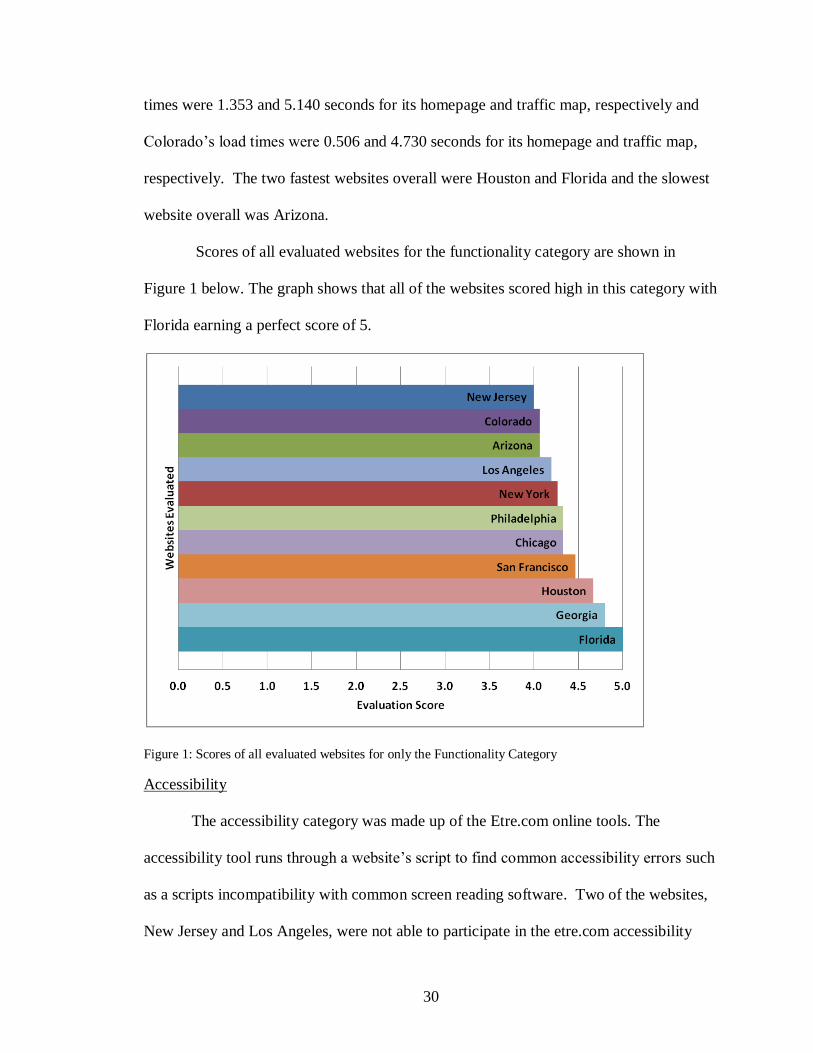
Scores of all evaluated websites for the functionality category are shown in
Figure 1 below. The graph shows that all of the websites scored high in this category with
Florida earning a perfect score of 5.
Figure 1: Scores of all evaluated websites for only the Functionality Category
Accessibility
The accessibility category was made up of the Etre.com online tools. The
accessibility tool runs through a website’s script to find common accessibility errors such
as a scripts incompatibility with common screen reading software. Two of the websites,
New Jersey and Los Angeles, were not able to participate in the etre.com accessibility
31
test. However, the tool was used successfully for all of the other websites. Since this test
has the highest weighting in the accessibility category, the averages of the other website’s
errors were used for New Jersey and Los Angeles for the final scoring.
None of the tested websites had any Priority 1 errors with the exception of
Georgia’s NaviGAtor site, which had three on its home page. The Priority 2 errors
demonstrated much more variability. The only site without any Priority 2 errors was
Florida. The rest of the tested websites had a range of Priority 2 errors from 6 (Arizona)
to 104 (New York). The Priority 3 errors were not nearly as varied. Most websites had
0 errors; the rest had a range of errors from 1 to 11.
Etre.com also offers a color brightness and contrast tool. This tool did not require
the use of the website URL so every website was able to be tested. The only website that
did not pass this test was the Georgia NaviGAtor site. Its use of a bright blue background
and white text failed both the brightness and contrast test. Most of the other websites
used black text on a white field and therefore, passed both of these categories. It should
be noted, however, that the colors used for the test are chosen from a set of provided
colors, not a continuous spectrum. The colors that were chosen for the test for the
NaviGAtor website were the closest colors available, but may not have been exactly the
same color combination. It is suggested that the NaviGAtor website make use of a darker
color of the text and a lighter color for the background.
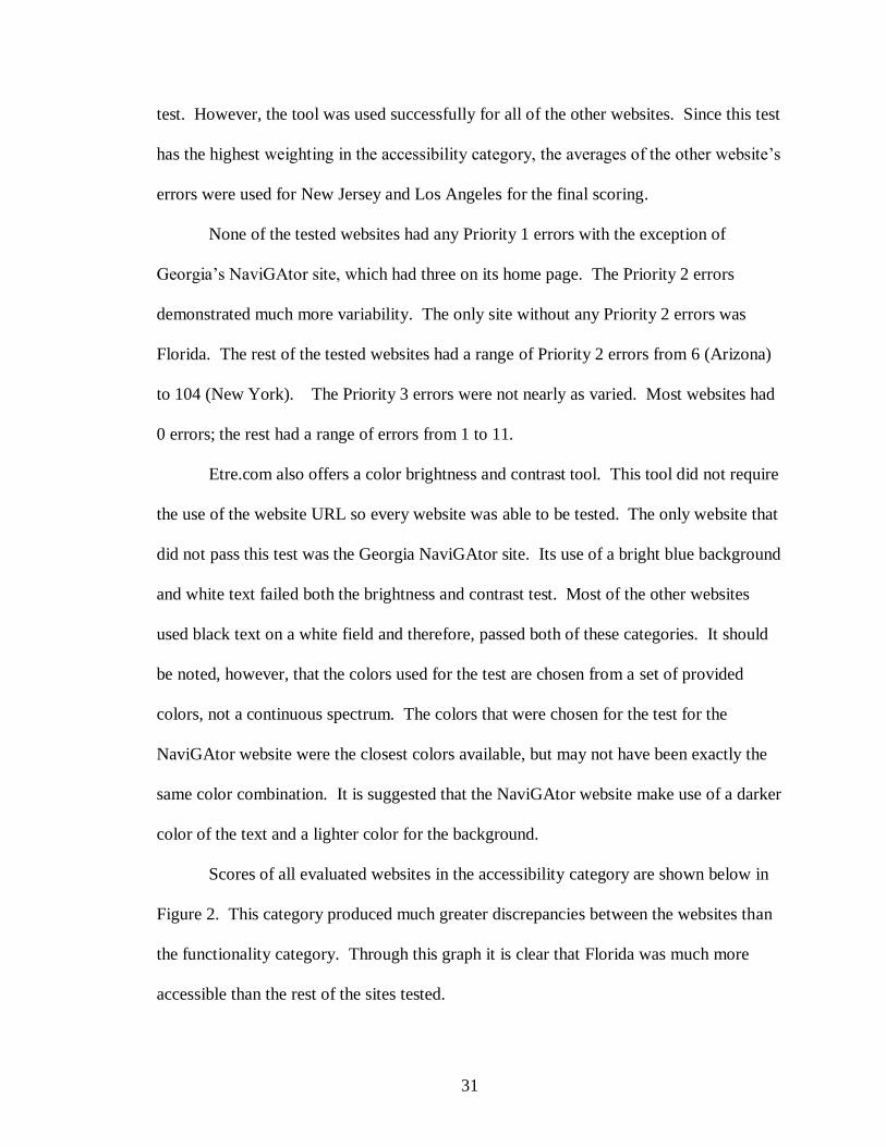
Scores of all evaluated websites in the accessibility category are shown below in
Figure 2. This category produced much greater discrepancies between the websites than
the functionality category. Through this graph it is clear that Florida was much more
accessible than the rest of the sites tested.

32
Figure 2: Scores of all evaluated websites for only the Accessibility Category with Los Angeles and New
Jersey removed due to lack of data
Usability
The usability category contains criteria related to consistency, navigation, and
aesthetics. Consistency was tested in the website’s navigation pane and its hyperlinks.
Consistency of the navigation pane was present for most of the websites with the
exception of Houston’s site, which had tabs that were generally consistent, but
disappeared on several pages. Likewise, most of the websites had hyperlinks that were
consistent with internet convention, although only New Jersey used every element of
conventional hyperlinks.
The navigation metric for each of the pages consists of the content available in the
navigation pane, compliance with the 3 Click Rule, and the amount of information linked
directly to the homepage. There was more variability in the navigation pane content, then
in its consistency. New Jersey, San Francisco, and Los Angeles’s websites all
Florida
Chicago
Houston
Philadelphia
Arizona
Colorado
San Francisco
New York
Georgia
0.0 0.5 1.0 1.5 2.0 2.5 3.0 3.5 4.0 4.5 5.0
Evaluation Score
Web
site
s Ev
alu
ate
d
33
demonstrated excellent navigation panes. In their sites, the use of drop-down menus
significantly increased the amount of information that could be found from any page. In
contrast, Houston and Philadelphia’s websites’ navigation panes contained the least
amount of information. The Philadelphia website’s navigation pane content was limited
because the website itself has much less information than any of the other websites
evaluated. The Houston website’s navigation pane, on the other hand, consisted solely of
a link to the home page, their contact information, and an about section. This is the least
frequently used information on traveler information websites and makes their website
significantly more difficult to navigate.
The number of mouse clicks it takes to get to important information is also a
navigational concern. All of the websites abided by the 3 Click Rule, none needed more
than three clicks to get to any of the three tools tested. Most of the time, two clicks were
necessary it was because the information required some amount of sorting such as by
information type or roadway. San Francisco had a high number of clicks because of the
large amount of information available on the site. San Francisco’s homepage works as a
portal to get to transit, traffic, rideshare, bicycling, and parking specific homepages,
which then lead to more direct navigation opportunities for information specific to each.
The amount of content linked directly to the home page also helps with
navigation. This criterion also had a lot of variation among the websites. Georgia,
Chicago, and Philadelphia’s websites did the worst in this category. Philadelphia’s
website scored poorly because of the site’s lack of content, Chicago’s homepage was a
full screen traffic map, which made it difficult to make many direct links outside of the
navigation pane, and Georgia’s NaviGAtor homepage was mostly ads, limiting the space
34
that could be used for information. Most of Georgia’s website’s information was also
kept in lists of roads that had to be individually selected, so that direct links to
information could not exist, with the exception of the traffic map.
The aesthetics criterion contained all of the visual elements of the homepage for
each website and was also quite variable. San Francisco’s website had the only perfect
score for this criterion because the homepage had a very simple and clear layout. San
Francisco’s used appropriate fonts, creating an obvious navigation flow. Georgia had the
lowest score for this criterion because the NaviGAtor website used distracting colors,
inappropriate fonts, and confusing graphics, such as a picture that looks like an
interactive traffic map. It was also difficult to distinguish the boxes that contain
important information from the boxes that contain ads. The inappropriate, large size of
the agencies’ icons along the top of the screen also caused an imbalance in the page,
which makes navigation more difficult. Houston’s webpage had many issues, the biggest
of which is using appropriate font styles to create information flow. Instead, lists of
many types of information and destinations were displayed without visual distinctions.
The final scores for all of the evaluated websites in the usability category are
shown below in Figure 3. This category has a greater range of scores than the previous
two categories. Also, websites that had low scores in the other two categories achieved
much higher scores in this category, such as San Francisco and New York. There are two
possible reasons for some of these switches. Firstly, the increased usability in these
websites may cause a more complicated script, which could affect usability.
Alternatively, it could be that usability is simply a higher priority to these sites, than

35
accessibility. The reason for the discrepancy is most likely different for each site based
on the web designer and the agency’s priorities.
Figure 3: Scores of all evaluated website for only the Usability Category
Features
The features category is focused on the content of the website and includes six
main features: level of integration, real-time traffic map, traffic map layers, trip planning,
streaming video, personalized account, and a feedback tool. Most of the websites
evaluated were unimodal. However, New York was partially integrated multi-modal due
to its addition of transit information on its real-time traffic map. San Francisco and Los
Angeles were also considered partially integrated multimodal, although not as strongly as
New York, because their trip planners allowed for some multimodal options.
All of the websites contained a real-time traffic map. Some of the functionality
varied across websites. For instance, Florida’s map does not show half of is data layers
36
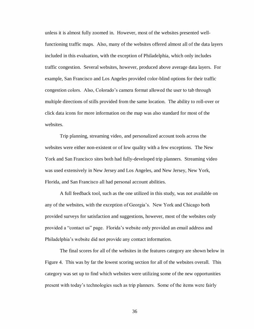
unless it is almost fully zoomed in. However, most of the websites presented well-
functioning traffic maps. Also, many of the websites offered almost all of the data layers
included in this evaluation, with the exception of Philadelphia, which only includes
traffic congestion. Several websites, however, produced above average data layers. For
example, San Francisco and Los Angeles provided color-blind options for their traffic
congestion colors. Also, Colorado’s camera format allowed the user to tab through
multiple directions of stills provided from the same location. The ability to roll-over or
click data icons for more information on the map was also standard for most of the
websites.
Trip planning, streaming video, and personalized account tools across the
websites were either non-existent or of low quality with a few exceptions. The New
York and San Francisco sites both had fully-developed trip planners. Streaming video
was used extensively in New Jersey and Los Angeles, and New Jersey, New York,
Florida, and San Francisco all had personal account abilities.
A full feedback tool, such as the one utilized in this study, was not available on
any of the websites, with the exception of Georgia’s. New York and Chicago both
provided surveys for satisfaction and suggestions, however, most of the websites only
provided a “contact us” page. Florida’s website only provided an email address and
Philadelphia’s website did not provide any contact information.
The final scores for all of the websites in the features category are shown below in
Figure 4. This was by far the lowest scoring section for all of the websites overall. This
category was set up to find which websites were utilizing some of the new opportunities
present with today’s technologies such as trip planners. Some of the items were fairly
37
new concepts, such as a feedback tool, so it was expected that no website would have all
of the elements included in the rubric.
Figure 4: Scores of all evaluated websites for only the Features Category
Overall
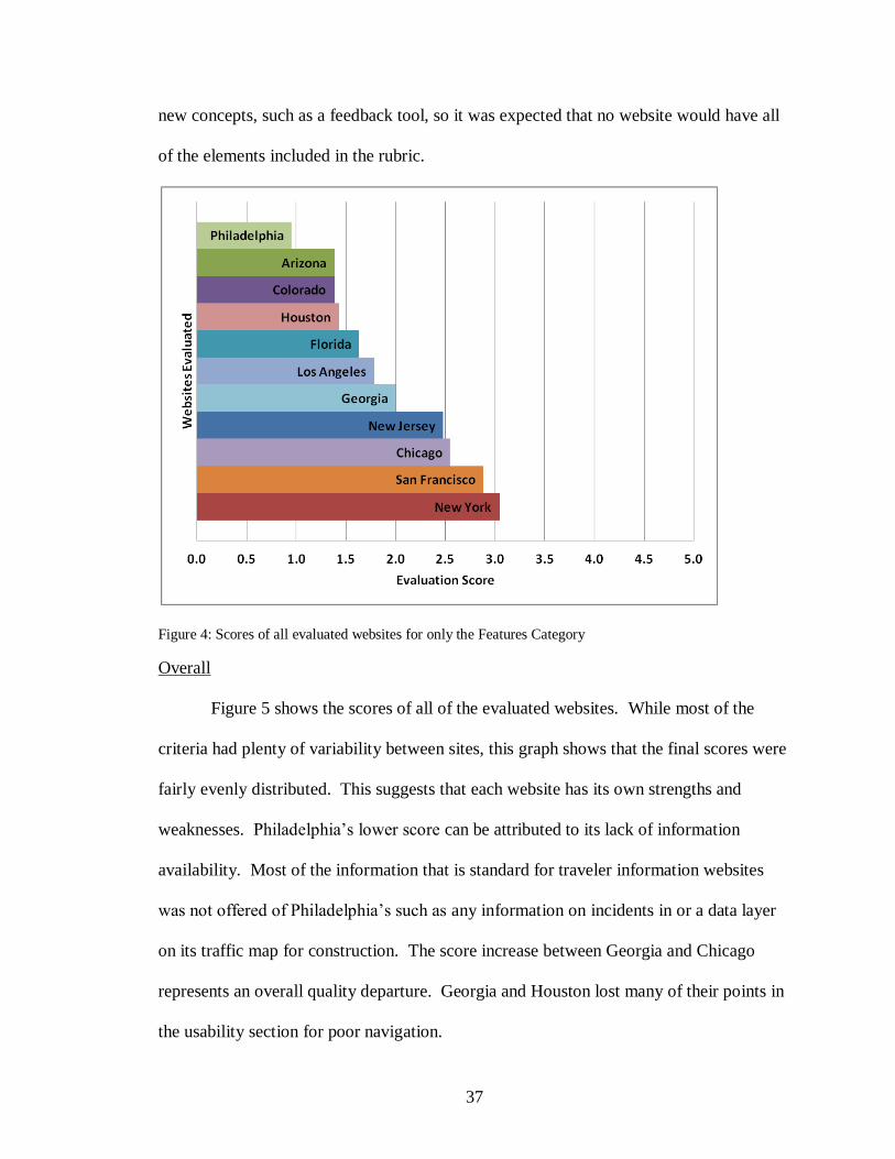
Figure 5 shows the scores of all of the evaluated websites. While most of the
criteria had plenty of variability between sites, this graph shows that the final scores were
fairly evenly distributed. This suggests that each website has its own strengths and
weaknesses. Philadelphia’s lower score can be attributed to its lack of information
availability. Most of the information that is standard for traveler information websites
was not offered of Philadelphia’s such as any information on incidents in or a data layer
on its traffic map for construction. The score increase between Georgia and Chicago
represents an overall quality departure. Georgia and Houston lost many of their points in
the usability section for poor navigation.
38
Figure 5: Scores of all evaluated websites; Scale = 0-5
Overall the website evaluation shows that there are many different aspects of
traveler information websites that can be focused on in their design. However, they are
all important to the overall quality and effectiveness of the website. Many of the
websites evaluated displayed strong quality in one or two aspects, but fell below in the
other aspects. None of the websites evaluated exhibited excellence in every category.
However a website with all of these qualities would most likely have a higher quality and
be more effective in reducing congestion.

39
CHAPTER 5
SURVEY
Methodology
The survey used in this study was designed to be administered online through
Georgia Tech’s School of Civil and Environmental Engineering’s online survey platform.
A link to the survey was posted on the alerts page of the NaviGAtor website and was also
visible on the alerts section on the homepage, making all of the respondents self-selected.
This format and distribution method was used to obtain as many respondents who were
familiar with the NaviGAtor website as possible. Since no contact information was
known about the website’s users, a link on the website itself was the best way to survey
that group.
The content of the survey included demographic, traveler information technology
and access, current available features, possible future features, and satisfaction questions.
The main purpose of the survey was to ascertain how most people use and access the
information, what information they most typically use, how satisfied they are with the
website, and if they would prefer different methods for access or different capabilities.
The survey questions can be found in Appendix B.
The survey was finalized and IRB certified in early July 2012. As part of the
certification, no minors under the age of 18 were allowed to complete the survey. The
survey officially went live on August 10th 2012 and collected data for 33 days until
September 12th 2012.

40
Results
During the month that the survey was online, 65 NaviGAtor users responded.
However, retention of respondents slowly declined throughout the survey. Question 1
retained 94%, question 5, 80%, question 6, 78%, question 9, 51%, and question 13, the
second to last question, retained 48% of the original respondents. Therefore, the total
number of completed surveys is 31, less than half of the original respondents. The high
dropout rate is, in part, due to question 8, where the number of respondents dropped from
51 to 33. This question involved ranking 11 potential new tools for the website in order
of importance. However, the process of clicking each individual button, as well as
reading each description, may have been a factor some of the respondents to drop out.
The total estimated number of visitors to the NaviGAtor website daily is 20,000.
Given the high percentage of dropouts and the small sample size, this survey is not
representative of the user population. The error values for such a small sample size
would be too wide for most statistical testing to be considered significant. However, the
trends it does show have the potential to offer some insight into some of the population’s
opinion of Georgia’s ATIS.
Demographics
Figure 6-Figure 8 show the age of all of the respondents, their primary mode of
transportation, and their income level. Figure 6 shows that very few respondents were
under the age of 25. However, the other age ranges had a pretty even response rate with a
slightly higher rate of respondents in the 25-35 range and a slightly lower rate of response
from users 55 and older. Also, Figure 7, shows that almost all of the respondents stated
that their primary mode of transportation is driving alone. This is not surprising since the

41
NaviGAtor website is currently unimodal and only provides traffic information on major
highways. Finally, Figure 8 shows that most of the respondents were at an income level
of over $75,000. The clear over sampling of high income individuals is considered to be
a major flaw in the survey results.
Figure 6: Age of respondents
Figure 7: Primary mode of transportation of respondents

42
Figure 8: Income level of respondents
Access
One of the major goals of this study was discovering how the users of NaviGAtor
access the site and if they would prefer a different method of access. Figure 9 shows the
ways in which respondents currently access the Navigator website. This question
allowed the respondents to check all that applied. The table in the top right hand corner
of the chart displays the number of respondents who reported one, two, and three current
sources. Of those who responded, most access NaviGAtor’s traveler information through
the website on their computer. The second most used source is a mobile device and
calling is the least used method of access for those taking the survey. This is not
surprising since the survey itself was online, so the users of the website had a much
higher chance of seeing the survey.

43
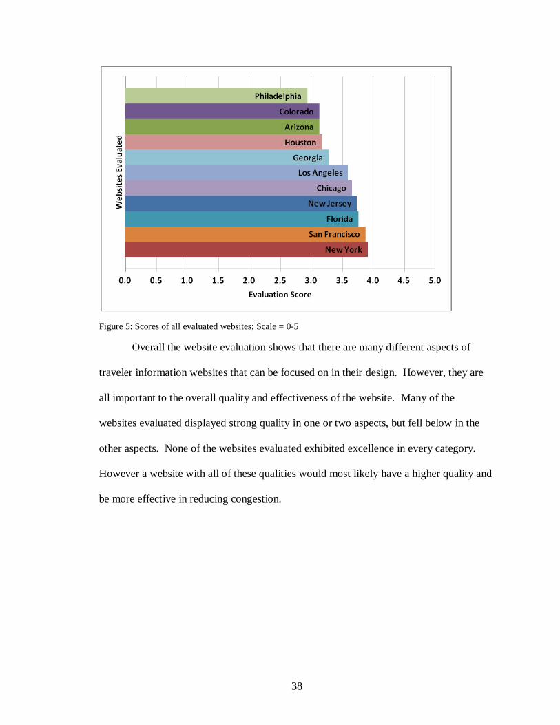
Figure 9: The ways in which respondents currently access the NaviGAtor website
In comparison, Figure 10 shows the ways in which respondents would prefer to
access the NaviGAtor traveler information. This question was a single answer question
and mobile-optimized website and smart phone specific application were broken out into
two separate methods of access. However, if they are combined to resemble Figure 9,
such as they are in Figure 11, then the difference between the current method of access
and the preferred method is abundantly clear. Most of the respondents currently use their
computer to access NaviGAtor, but would like to use their mobile. The higher
Number of Sources Respondents
One source 48
Two sources 11
Three sources 2
44
socioeconomic status of the respondents could be a factor in the apparent desire for
mobile access.
Figure 10: The ways in which respondents would prefer to access the NaviGAtor website
Figure 11: Combined mobile methods of access

45
Outside Sources
Other sources were also considered. Figure 12 shows the other sources
respondents use outside of GDOT. It also includes a table of the number of respondents
who reported one, two, and three or more additional sources. Most of these sources are
trip planners or can be used as trip planners, a tool that the NaviGAtor system does not
offer. Based on these results it appears that most NaviGAtor users are supplementing
NaviGAtor with additional sources.
Figure 12: Use of other sources outside of GDOT
Number of Sources Respondents
One source 48%
Two sources 34%
Three or more sources 18%

46
Frequency of Use
The frequency at which respondents use NaviGAtor at different points in their trip
is shown in Figure 13. The responses for frequency of use when first planning a trip and
during the trip are mostly unvaried. However, over half of the respondents reported to
check NaviGAtor shortly before leaving, every time they make a trip. The high use of
NaviGAtor shortly before leaving suggests that the survey respondents are a group more
likely to change their travel decisions based on traveler information, because they are
only seeking the information shortly before making their travel decisions.
Figure 13: The frequency at which respondents use NaviGAtor at different points in their trip
Satisfaction
Another major goal of the survey was to ascertain what information the users of
NaviGAtor were most interested in and whether the current tools provided were meeting
their expectations. These questions used range answers, such as very important,
important, neutral, unimportant, not at all important, and no answer. These options were
weighted with values from 5-0 respectively. The results were then averaged for each
tool. Figure 14 shows the average satisfaction rating by tool and Figure 15 shows the
average importance rating. Ideally, the tools considered to be most important would also
be most satisfactory. Comparing these two graphs, it becomes clear that this is not the

47
case. Several tools, including traffic map, which is considered the most important, are
found at much lower satisfaction ratings than their respective importance rating. This
may be because the tools that are thought of as more important are likely held to a higher
standard than those tools that are not as important or not used as often.
Figure 14: Average satisfaction rating by tool
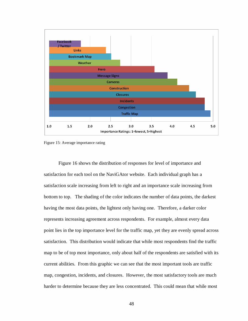
48
Figure 15: Average importance rating
Figure 16 shows the distribution of responses for level of importance and
satisfaction for each tool on the NaviGAtor website. Each individual graph has a
satisfaction scale increasing from left to right and an importance scale increasing from
bottom to top. The shading of the color indicates the number of data points, the darkest
having the most data points, the lightest only having one. Therefore, a darker color
represents increasing agreement across respondents. For example, almost every data
point lies in the top importance level for the traffic map, yet they are evenly spread across
satisfaction. This distribution would indicate that while most respondents find the traffic
map to be of top most importance, only about half of the respondents are satisfied with its
current abilities. From this graphic we can see that the most important tools are traffic
map, congestion, incidents, and closures. However, the most satisfactory tools are much
harder to determine because they are less concentrated. This could mean that while most

49
users are looking for the same information, their expectation of how the information will
be displayed varies.
Figure 16: Distribution of responses for level of importance and satisfaction for each tool on the NaviGAtor
website

50
The importance and satisfaction ratings for each tool were averaged to show how
the tools compare to each other in Figure 17. This graphic also plots each tool along an
importance scale (y-axis) and a satisfaction scale (x-axis). If the tools exhibited a linear
pattern it would indicate that the ATIS developer was putting more effort into all of the
most important tools, as opposed to the less important tools. This graph demonstrates
this effect to some extent as all of the data is clustered in either the
unimportant/dissatisfied or the important/satisfied quadrants. However, tools such as the
traffic map and incidents should be improved since they are the top most rated tools for
importance and are not found to be as satisfactory as other tools.
Figure 17: Combined satisfaction and importance ranking across all tools

51
New Features
To survey what types of information the current users of NaviGAtor might feel is
missing from the system as it is, 11 different tools, common to other ATIS websites, but
not available on NaviGAtor, were described and participants were asked to rank them in
order of importance. Their answers were weighted, 11 points for an answer of 1 and so
on, and averaged for each tool. Figure 18 shows the new tool ranking scores with a
margin of error of 17.06%. Most of the tools rank too closely to separate them out from
each other with any confidence. However, the travel time calculator is clearly considered
more important by the survey respondents.
Figure 18: New tool ranking scores
Website Satisfaction
Finally, the last piece of targeted information in the survey was the participants’
opinion of the site itself. For these questions, a series of statements were provided, for
which the respondents would answer how strongly they agreed or disagreed with them.
Table 5 shows the statements used to determine user satisfaction with each metric of the
website. A distinction is made between needed information and desired information,
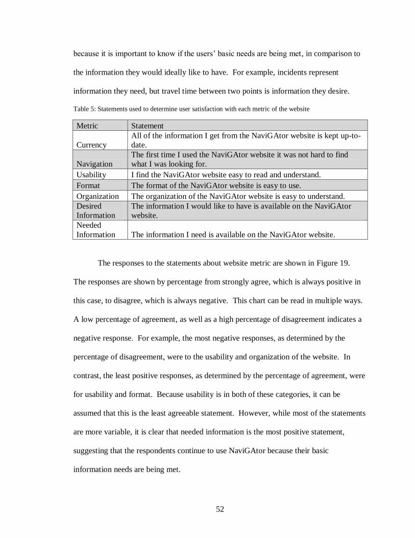
52
because it is important to know if the users’ basic needs are being met, in comparison to
the information they would ideally like to have. For example, incidents represent
information they need, but travel time between two points is information they desire.
Table 5: Statements used to determine user satisfaction with each metric of the website
Metric Statement
Currency
All of the information I get from the NaviGAtor website is kept up-to-
date.
Navigation
The first time I used the NaviGAtor website it was not hard to find
what I was looking for.
Usability I find the NaviGAtor website easy to read and understand.
Format The format of the NaviGAtor website is easy to use.
Organization The organization of the NaviGAtor website is easy to understand.
Desired
Information
The information I would like to have is available on the NaviGAtor
website.
Needed
Information The information I need is available on the NaviGAtor website.
The responses to the statements about website metric are shown in Figure 19.
The responses are shown by percentage from strongly agree, which is always positive in
this case, to disagree, which is always negative. This chart can be read in multiple ways.
A low percentage of agreement, as well as a high percentage of disagreement indicates a
negative response. For example, the most negative responses, as determined by the
percentage of disagreement, were to the usability and organization of the website. In
contrast, the least positive responses, as determined by the percentage of agreement, were
for usability and format. Because usability is in both of these categories, it can be
assumed that this is the least agreeable statement. However, while most of the statements
are more variable, it is clear that needed information is the most positive statement,
suggesting that the respondents continue to use NaviGAtor because their basic
information needs are being met.

53
Figure 19: Responses to statements about website metrics
The overall satisfaction of the website was also surveyed. The results of which
are shown in Figure 20. Despite the overall negative responses to the website metric
statements, the respondents’ overall satisfaction with the website was mostly positive.
This could mean that the respondents of the survey are not looking for much more than
the basic needed information.
Figure 20: Overall satisfaction results
Open Answer Responses
The survey also contained two opportunities for respondents to leave open answer
comments including suggestions on new tools and suggestions to make the site easier and
more useful. Thirteen suggestions of new tools were made, six of which were about a
mobile app or an improvement to the current mobile website. The remaining seven
included providing alternate routes, providing trip times, providing live camera feeds,
improving the traffic map so it would hold its position when zooming in, improving the
display of the upcoming construction, including the live map and incident report on the
home page, and getting access to more cameras.

54
The second open response question yielded ten suggestions. These included three
suggestions about improving the legibility of current and upcoming construction,
including putting upcoming construction on the traffic map. Also, two suggestions were
made about improving the mobile version of the website, two suggestions were made
about removing the ads on the homepage The rest of the suggestions included improving
the zooming functions on the traffic map, improving the reliability of cameras and road
signs, and providing more relevant information on the homepage.

55
CHAPTER 6
FUTURES WORKSHOP
Origins
A future’s workshop is a method of participation that encourages creative
solutions from the public. The workshop’s designer, Robert Jungk, was a socialist who
believed in participative and collective decision-making. His desire to affect social
change and bring greater power to the public manifested when he was arrested for anti-
Nazi activities as student in Nazi Germany. Later, his work led him to an anarchist
socialist group, whose non-hierarchical, decentralized, and collective decision-making
style motivated Jungk to design the future’s workshop in the 1950s. [31] The basic
structure of a future’s workshop is: critique phase, fantasy phase, and implementation
phase. The critique phase is meant to expose and bring to light the actual problem
situation. The fantasy phase, designed after Alex Osborne’s brainstorming techniques, is
meant to develop new ideas. While the future’s workshop was created to empower
oppressed groups and create social change, this technique has been used extensively in
environmental issues, and has been increasingly applied in varied settings with many
objectives. [32]
The main purpose of a future’s workshop is to gain implementable ideas to fix a
problem. In the critique phase, the goal is to list all of the negative aspects of the forum
topic. Then the fantasy phase changes those negative statements to positives and expands
to encompass anything and everything needed in a utopian version of the forum topic.
Working backwards from there, an implementation phase is used to define the ways in
56
which some pieces of the fantasy phase could be provided and prioritized. The main
outcome of this workshop is to devise creative and implementable solutions.
Methodology
A future’s workshop was chosen as a method for collecting data on GDOT’s 511
traveler information system, because a main piece of creating an effective and efficient
traveler information system is to create the system that the public wants to use. A
future’s workshop can allow more freedom than a survey and inspire a more creative
environment. However, the workshop’s structure was changed slightly because the
participants were not capable of implementation and had no way of knowing by what
means their ideas would or could be implemented. Therefore, the implementation phase
was omitted and more focus was placed upon the fantasy phase.
To receive the most creative responses to the workshop, a supportive environment
is necessary so that average commuters would not feel intimidated by industry
professionals such as Intelligent Transportation Systems specialists. Therefore, the
decision was made to hold separate workshops for each stakeholder group. Stakeholder
groups that had a formal organizations and regularly scheduled meetings were initially
targeted, as it would be easier to coordinate logistics for the workshops. Unfortunately,
although several organizations were willing to participate in the forums, schedule
conflicts prevented any of their participation.
The general public workshop was also difficult to coordinate, because the general
users of 511 do not have any kind of formal coalition. To gather them together, the
database created from the “Contact us” page of the NaviGAtor website was used. The
“Contact us” page of NaviGAtor contains a form, in which users can send a message to

57
the website’s managers. The form itself asks for general information including name, e-
mail, telephone number, “nature of request”, and message. The “nature of request”
question has four options including website or system problem, ramp meter, camera, or
sign malfunction, schedule a tour of the TMC, and other. After the user completes the
form, its contents are placed into a database. The database used in this research
contained almost 1,500 emails from January 28th
2011 to June 26th 2012. The messages
containing comments about the 511 system were found and the commenter was asked to
participate in a Future’s Workshop via email. Initially only those comments that were
not aggressive were chosen, however, due to the lack of response, all of the most recent
comments about the 511 system were chosen. In total, almost 100 people were asked to
participate via email, of which, five people confirmed their interest in attending,
ultimately resulting in three actual attendees.
During the workshop, large pieces of paper were used by the recorder to record
the ideas made by the participants as the facilitator conducted the workshop. These
comments were later permanently recorded and coded by topic using three different
categories including functionality/features, organization/aesthetics, and data/information.
These were then analyzed on content and given implementation strategies.
Results
The workshop lasted an hour and yielded a total of 32 main discussion points, 13
during the critique phase and 19 during the fantasy phase. These were coded into the
three previously named categories: functionality/features, organization/aesthetics, and
data/information. The results are provided in Table 6.

58
Table 6: Results of Workshop
Functionality/Features Organization/Aesthetics Data/Information
Critiques
Moving map location difficult: zooming/scale
Mobile app and website take too long to load
App hard to navigate while driving: dangerous
Radio updates take too long while driving: ads, announcers
Too many menus when calling 511
The web interface is too complex: difficult to navigate (fake map on the home page)
Takes too long to get important information on website, not all in one place: incidents
Map is too small
Too many tabs on website
Too many ads on website
Inaccurate information: sometimes listed correctly, but misplaced on map, or missing, etc
Too much jargon: connector, spaghetti junction
There is not enough information about incidents: exit number, mile post, clearance time
Functionality/Features Organization/Aesthetics Data/Information
Fantasy
Allow app to use GPS to give relevant updates
Put quick button on app screen to call in incidents
Shorten load times on website and app
Allow hovering on map to see features: cameras, incidents, construction, etc
Create app that can use voice control
Allow use of origin and destination instead of only dropdown menu on map
Include local businesses in app using GPS
- Could sort/filter by popularity/ratings
- Could pay for the advertisement = revenue
Have a place for public input instead of ‘contact us’
White background for website
Simple map (green, yellow, red is good)
Unite under one name: NaviGAtor and 511 confusing, 511 is enough
Make map bigger
Work with WSB to build on what they have
- Allow others to use data to make websites/apps
Include estimated time of clean up for incidents
Show closed roads as different than red on map
Remove jargon from radio and 511 or also include mile markers and exit numbers
Give alternate route for avoiding traffic via website, app, or radio
Put estimated time on changeable message signs
Add pavement markers and directional signs to confusing parts of the system for
wayfinding

59
While the results of the forum may be useful for gauging what the public wants,
the actual contents of this list are merely suggestions. The more important result comes
from teasing out the participants actual interests from the list. For example, four of the
13 critiques are related to the participant’s dissatisfaction with receiving information
while driving including “Mobile app takes too long to load”, “App hard to navigate while
driving: dangerous”, “Radio updates take too long while driving”, and “Too many menus
when calling 511”. Also, 7 (37%) of the 19 suggestions made in the fantasy phase are
relevant to receiving information while driving including “Allow app to use GPS to give
relevant updates”, “Put quick button on app screen to call in incidents”, “Shorten load
time on app”, “Create app that can use voice control”, “Include local businesses in app
using GPS”, “Give alternative route info for avoiding traffic”, and “Put estimated time on
changeable message signs”. Given the consistency, one of the public’s main interests
may be the availability of travel information during one’s trip. Looking more closely at
all 11 of the comments made on this subject we see that safety, speed,
convenience/relevance, and accuracy appear to be priorities.
With a better understanding of actual interests regarding information while
traveling, the solution can have a better gauge of effectiveness. For instance, many of
these interests can be included in the development of a new app. If a new app is
designed, which is hands-free, can update quickly and frequently with regard to the user’s
current location, and in which the information is accurate, then all of the interests
regarding a mobile app will have been met. One such application of this nature currently
exists. It is called “Trip Talk” and was created by Information Logistics for the
Pennsylvania Turnpike. While reviews for this app are mixed, with a score of 3.8 out of

60
5 from 29 reviewers, its features contain all of the elements found to be of interest to the
public in this forum. The application is opened at the beginning of the trip and remains
on throughout the duration. The app automatically “broadcasts” traffic updates and
advisories, using public agency’s data, within a specified range of the mobile device’s
GPS. When there are no updates, the app remains silent, outside of advertisements for
businesses also within range of the GPS. It is likely that there are many apps currently
being developed that are similar to this one and are worth looking into.
Most of the other suggestions are fairly straightforward. For example, there
appears to be an interest for speed and convenience with regard to the website, in which
load times and the poor organization make finding information quickly difficult. Most of
the solutions to these issues are technical. For instance showing camera pictures, incident
reports, and construction reports when hovering over the icons shown on the map,
changing the programming to allow faster loading speeds, and adding a trip planning
function by allowing users to input an origin and destination can all take time to
implement. However, in lieu of these technical changes, organizational changes can be
made to meet some of the vested interests and make the website more efficient. For
instance, the real time traffic map can be relocated to the home page. Additionally, the
incidents and construction pages can include the actual report listed below the location to
minimize the number of clicks. In fact, given the space required to report incidents and
construction, including both on one page could also be feasible.
Some suggestions may not be feasible. For example, working with WSB on
creating a traveler information website might not work, as it is important to have a 511
website as a resource for out of town travelers. However, the interest behind it suggests

61
that the organization and functionality of WSB’s website is superior to GDOT’s, for all
of the reasons listed in the critique phase, and can be used as a model to be improved
upon.
The WSB comment in the fantasy phase also suggests that GDOT allow its data to
be used by private website and application developers. While GDOT currently does
allow developers to use their data, advertising its availability more explicitly to
developers could generate more interest and, thus lead to the creation of more
applications and websites.
62
CHAPTER 7
FEEDBACK WEBSITE
Methodology
One of the tools used to seek out user input in GDOT’s ATIS was an online
feedback tool. Online feedback tools are a new way to survey a customer base. There
are many online feedback tools for purchase and they have many different formats and
features. Common features include a short satisfaction pop-up survey, a forum where
users can seed ideas, questions, problems, and praise, a tab on the side of the website, and
an analytic component to view some of the website’s statistics. Different feedback tools
also have different functionalities, for instance, the ability to customize the tool, and the
level of moderation available for the comments can vary between different websites.
This was a large factor in choosing a feedback tool for this study, because, as a public
institution, GDOT had to be very careful about what kinds of comments were shown on
the site. Five of the most popular tools available today are CrowdSound, IdeaScale,
GetSatisfaction, UserEcho, and UserVoice. UserVoice was chosen for this study because
it was available to public institutions for free through a civil engagement discount, free
use for government agencies, and had all of the functionality we were interested in. The
functionalities that we were most interested in through this study were a high level of
customizability, the ability for users to see other users’ ideas, and the ability for users to
vote for each other’s ideas, all of which were offered by UserVoice.
Once UserVoice was selected as the online tool, the site was set up and
customized to restrict the form to only ideas, which were to be approved through email

63
before being published. The reason the form was restricted to ideas was because of the
backlash from the public after the NaviGAtor website was redesigned. GDOT found the
comments sent in after the redesign to be aggressive in nature. In order to keep the users
of NaviGAtor thinking toward the future in positive ways, it was decided that moderated
new ideas would be appropriate at the start, with the addition of comments and problems
later.
The feedback tab was put on the NaviGAtor website on August 20th. Screen shots
of the tab are provided in Figure 21 and Figure 22 below. The tab was seeded with eight
ideas for features that were found from surveying other ATIS websites and used in the
survey including ‘Let people calculate the approximate time of their trip’, ‘Show when
the next bus/train is coming’, and ‘Show the status of ramp meters’. This was in an effort
to show users how the system worked and to note their reactions to these ideas.

64
Figure 21: Screenshot of Feedback tab on NaviGAtor home page
Figure 22: Screenshot of Feedback window after tab is clicked
Results
In the two months that the UserVoice feedback website has been active, 40 ideas
have been added. Between September 24
th and October 24
th, there have also been 144
visits and 25 active users. Table 7 below contains all of the ideas ordered by number of
votes and color coded by type of request as of October 23rd
2012.
Twenty-six of the ideas have one vote, seven have two votes, one has three votes,
and seven have more than 3 votes with 16 as the highest number of votes for any one
idea. This level of activity is low considering the amount of people visiting the site each
day; however, it is not unexpected. There are many possible reasons for the low
percentage of participation. For example, the feedback tab, as an internet convention, is a
fairly new concept that many of the NaviGAtor users may not be familiar with.

65
Therefore, they may be less likely to see the tab. Also, many users of the NaviGAtor
system, according to our survey, use the NaviGAtor site shortly before leaving on their
trip, which could indicate that they do not have time to browse the ideas. This is further
illustrated by the same ideas being suggested with only one vote each. It is possible that
there will be an increase in feedback site usage the longer it is left active.
Table 7 also breaks down the ideas into type of request using the same categories
as the forum comments. The breakdown is 21 ideas for features/functionality, 13 ideas
for data/information, and 4 ideas for organization/aesthetics. Similar to the workshop
comments, the feedback ideas tend to find more solutions in the creation of features or
improved functionality, rather than through changes to the organization of the site.
However, there are many more ideas related to functionality and the site working
properly in the feedback ideas than in the workshop comments. This is most likely
because when something does go wrong, the feedback tab is readily accessible. Adding
the questions, problems, and praise options into the feedback tab would help sort these
ideas out into temporary glitches and more persistent issues.
Table 7: Ideas from UserVoice by number of votes and color coded by type of request as of 10/23/2012
Functionality/Features Organization/Aesthetics Data/Information
Number of
Votes Idea Comment
16 votes Show GA 400 traffic GA 400 traffic should be displayed on your
maps.
15 votes Put the cameras back
on the traffic map
11 votes Trip Times vs.
Historical Trip Times
Bring back the option to calculate current trip
times between exits/interchanges and pair
them with the old historical trip times. So, if
the current trip time is longer than the
historical trip time (say for the past year), let
us know. If it's speedier, that will help people
choose the right route.

66
Table 7: Continued
10 votes Impact of Incidents
I miss the detail on the incidents. Showing
moderate for example, then an approximate
time the road will be cleared.
8 votes
Let people calculate
the approximate time
of their trip
This could be in the form of a travel time
calculator.
6 votes
Show the status of all
of the ramp meters,
whether they are on,
off, or not functioning
6 votes Have more cameras
Would be nice to have more cameras for a
more complete traffic view and instead of
snap shots how about live cameras.
3 votes Adjust scroll bar
logic/ clean up icons
Scroll bar scrolls both page and zoom
simultaneously; it's annoying, only do zoom!
Certain boards will only show if you zoom in.
2 votes Show when the next
train or bus is coming
Use GPS to map or give estimated times of
arrival of transit vehicles
2 votes Add a weather map to
the traffic map
Overlay weather on the traffic map to review
both conditions at the same time
2 votes Include transit alerts Map and list all of the transit service
interruptions or diversions
2 votes Show current price of
HOT lane
2 votes
Update incident
reports as soon as they
are cleared
2 votes Update FAQs
Your FAQ section has info that is obviously
pre 2011 as many answers state "expected
2011" and such. If you don't keep FAQs
current, they are pointless. Save resources by
just deleting that section of the site if it's not
current and misleading.
2 votes Put traffic signs (cms)
back on map
1 vote Site doesn’t work with
internet explorer 9 Says its some kind of javascript error
1 vote show alternative
routes to avoid traffic
Have an icon to click on which shows
alternate routes to avoid or go around major
traffic incidents.

67
Table 7: Continued
1 vote Make live traffic video
available
Picture is worth 1000 words. Video is worth
1000 pictures + you could make $ from
advertisements on the site, more than enough
to pay for the necessary upgrades.
Maybe feed it through youtube?
1 vote
Need a chart to show
best times of the day to
travel interstates
I want to calculate the best time-of-day to
travel alternate routes to work. The traffic
rush-hour seems to be getting wider, but is it
starting earlier, later, or what?
I want to drive from Cartersville to Norcross,
and I am looking for "Best Drive Times" that
are very specific.
1 vote Give option to save
preferences
After turning some features off, such as
cameras, need to be able to save this view in
a profile
1 vote
Show scale at bottom
of traffic maps.
Google has it, you
don’t.
1 vote
Show cameras,
incidents, cms, etc.
when button is turned
on
I have cameras, incidents, cms, closure and
construction turned on, and it says they are
on...but they are not on.
1 vote
Make the map bigger.
Make the page fill the
screen.
The current map page leaves about 1-1/2" of
blue margin on the left and right sides. Why
not just make the page fill the screen? Give
the user a 'full screen' option to view the
map. I constantly have to zoom in and then
zoom out to see various parts and to read the
street names.
1 vote
update the traffic on
the map more
frequently
1 vote Keep up the good
work
1 vote Simplify look
Takes too long to load on computer or
portable phone. More space between color
lines showing traffic flow along a highway
so we can see which direction is having
traffic flow issues.
1 vote: Get a mobile app! Develop a mobile application for the georgia-
navigator.com website!!!
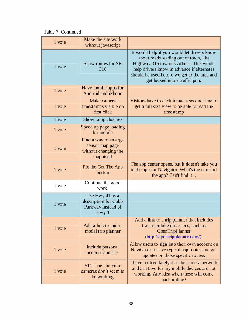
68
Table 7: Continued
1 vote Make the site work
without javascript
1 vote Show routes for SR
316
It would help if you would let drivers know
about roads leading out of town, like
Highway 316 towards Athens. This would
help drivers know in advance if alternates
should be used before we get to the area and
get locked into a traffic jam.
1 vote Have mobile apps for
Android and iPhone
1 vote
Make camera
timestamps visible on
first click
Visitors have to click image a second time to
get a full size view to be able to read the
timestamp
1 vote Show ramp closures
1 vote Speed up page loading
for mobile
1 vote
Find a way to enlarge
sensor map page
without changing the
map itself
1 vote Fix the Get The App
button
The app center opens, but it doesn't take you
to the app for Navigator. What's the name of
the app? Can't find it...
1 vote Continue the good
work!
1 vote
Use Hwy 41 as a
description for Cobb
Parkway instead of
Hwy 3
1 vote Add a link to multi-
modal trip planner
Add a link to a trip planner that includes
transit or bike directions, such as
OpenTripPlanner
(http://opentripplanner.com/).
1 vote include personal
account abilities
Allow users to sign into their own account on
NaviGator to save typical trip routes and get
updates on those specific routes.
1 vote
511 Line and your
cameras don’t seem to
be working
I have noticed lately that the camera network
and 511Live for my mobile devices are not
working. Any idea when these will come
back online?

69
CHAPTER 8
COMBINED ANALYSIS
While larger samples and more representative participants would have improved
this study, all four of the methods used in this research are informative to an internet-
based ATIS design process. The website evaluation provides a baseline for comparison
of features with other traveler information websites, as well as provides a checklist of
criteria that traveler information websites should try to accommodate. Survey methods
provide the demographic characteristics of users and can gather the general preferences
of those users. Future’s workshops provide face-to-face interaction, improving the
relationship between the agency and the users of the ATIS, as well as providing a helpful
dialogue to tease out users’ actual interests. Feedback websites also improve the
relationship between the agency and the users, as well as providing the user’s priorities
and creative problem solving abilities to the agency.
The results obtained from the website evaluation were varied for most of the
categories, but lacked a large range in the overall results, because each website excelled
in different categories. It is possible that one category might be more effective in
increasing user satisfaction than the other. This could be studied by surveying all of the
users across the different websites to see which are the most satisfied in comparison to
the how well each website performed in each of the categories. While surveying users
from every website for satisfaction was outside of the scope of this study, the results of
the public participation methods can be used to make some assumptions about which
categories are currently the most important to Georgia’s NaviGAtor users. In this case,
70
the users represented in this study seem most interested in the availability of features, the
ease of navigation, and convenience.
The users’ preference for features in the website was most apparent in their
discussions of the traffic map. Many of the comments they made were about putting
information that GOT already has access to on the map, which would add to the level of
features offered in the map’s data layers. Participants also had recommendations for
improving the functionality of the map, such as the ability to roll-over icons for
information, or improving the zoom mechanism. In the survey, respondents also showed
a preference for a travel time calculator to be added to the list of available features on the
website.
The ease of navigation and convenience was also very important to the
participants of these methods. The organization of the website was mentioned frequently
as a problem during the future’s workshop, as well as in the feedback site’s ideas. The
survey respondents also scored usability as the lowest metric in the website satisfaction
questions. Thus, our recommendations for the website include reorganization and an
update to the navigation pane.
Based upon this study’s website evaluation, Georgia’s NaviGAtor website was
ranked fourth for features and ninth for usability. These results suggest that the users of
the website have identified the deficiencies the site has in these areas. It could also imply
that user satisfaction for the NaviGAtor website would increase with the improvement of
the navigation and organization of the website. However, this does not give much insight
into whether or not these categories are the most important for website quality. More
data would be needed to compare the level of satisfaction between websites with different

71
deficiencies to see which categorical deficiencies have the greatest impact on overall
website satisfaction.
The results of the survey, future’s workshop, and feedback site were in agreement
with each other and reinforced one another. Each of these methods suggested that most
of the basic information considered as necessary is available, but it may not be presented
in the most convenient ways. They also all found a preference for increasing the mobile
capabilities of Georgia’s ATIS.
The survey was especially effective for examining the usage characteristics of its
respondents. For instance, there was a significant preference shown for mobile use, but a
majority of the respondents responded that their current method of use was their
computer. It was also clear that most of the respondents check the site most often shortly
before leaving. This type of frequency suggests that the users are likely to change their
travel decisions based on the traveler information, because this is the time when many
travel decisions are being made. It also means that it is important to keep the website
convenient and easy to use, because users may be under time constraints. This usage
pattern could explain a disparity that can be seen between the website evaluation and the
public participation comments. In the website evaluation of webpage load time,
NaviGAtor was among the top performing websites as compared to the other site
evaluated. However, many of the comments in the future’s workshop and the feedback
site were about the website taking too long to load. The users’ perception of time in this
case is may be affected by the time pressure they are usually under when they are
accessing the site.

72
The survey had very few respondents compared to the volume of visitors the
website regularly receives. Several factors could have contributed to the low response
rate on the survey. First, the survey was only advertised in the alerts box on the
homepage and on the alerts page itself. Therefore, as more alerts were added, the survey
link moved down the list and eventually out of sight. Second, the time in which users
might regularly access the site, according to the survey results, would mean that most
users may be using the site quickly and may not want to stop to take the survey. The high
dropout rate could also indicate this, as users may have left the survey because they no
longer felt they had the time to finish it. Therefore, a different recruitment plan is needed
with a more prevalent placement of the survey link. The user of the website could also be
prompted to take the survey upon entering the site via a pop-up message.
Overall, the survey was effective at providing general characteristics of the
respondent population, but was less useful in describing the areas with the biggest need
for improvement, or the ways in which most users would like to see the issues resolved.
These characteristics are supported by Rowe and Frewer’s study [23], which found that
surveys are able to clarify agreement and disagreement in a population, but do not give a
clear direction for policy makers. The future’s workshop and the feedback website also
had small samples, but provided a better picture of these aspects of the ATIS
development process.
The future’s workshop was held with a very limited number of participants.
There are many possibilities for this low level of enthusiasm. Firstly, the workshop was
held at 5:30pm on a workday, so people might be less inclined to take the time to
participate. Secondly, the only users whose contact information was available were those

73
who were dissatisfied enough with the website that they sent a comment to GDOT via the
Contact Us page. These users may have been too discouraged by then to feel that a
workshop was worth their time. Third and finally, it is generally difficult to get
participants involved in workshops, because workshops are thought of as inconvenient.
Even with the low level of participation, the results of the workshop seemed to
reflect the interests of many of the general users of Georgia’s 511 system in the Atlanta
area. Also, the results were instructive in determining the participants’ actual interests
imbedded in their suggestions. In reaching these interests, simple solutions that resolve
multiple suggestions can be found more easily. This is the greatest advantage of this
participation method as Rowe and Frewer found “’focus groups’ advantage lie in…
identifying values that underlie opinions.” [23] The participants also expressed gratitude
in our holding the workshop. They mentioned that they had felt that their feedback was
unimportant to GDOT’s web development and that they had had a lack of trust for the
agency. Therefore, the workshop helped to make the participants feel that their opinions
were being heard. However, this is too small a sample size to make any conclusions
about how the general public would feel in a future’s workshop.
The feedback website also had fewer participants than the number of daily users
of the site would warrant. The reasons for the low response rate were most likely time
constraints, similar to the survey, and also unfamiliarity with the feedback tab. Also,
there were six ideas submitted to the feedback website that were not approved by the
moderator due to their negative or unhelpful language. While none of them were outright
offensive, they did display anger, which does not help produce a creative discussion
forum. These comments were either edited by the site moderator to be more direct and
74
less emotional, and then resubmitted to the forum or deleted, in the case of those that did
not have any focused directives. The number of angry ideas submitted was not
significant compared to the acceptable ideas posted (6/40), suggesting that the users who
were completely dissatisfied were not the only ones using the feedback site.
The results do coincide with survey and future’s workshop comments. This could
mean that even though there was a low participation rate for each method, they each gave
a fair representation of the general user’s perspective of the NaviGAtor website.
However, because the survey and feedback site’s participants were both self-selected and
the workshop’s participants were selected from a list of users who had previously made
comments on the site, it is more likely that there is a significant bias toward a specific
group of users. Further research should be done on the actual composite of the
NaviGAtor users using a wider participant base.
Overall, all of the participation methods showed different strengths and
weaknesses. The survey provided the most analytical data for the widest span of users,
but lacked any real depth of user input. The future’s workshop provided the most in-
depth user input, but is also the most difficult to implement and involves the least amount
of users. Finally, the feedback website provides a medium level of user input at a wide
span, but lacks the analytical data of the survey and the ability to tease out users’ actual
interests versus their suggestions. The small sample size and clear bias toward higher
incomes, in the case of the survey, require this test to be repeated for larger samples to
make any strong conclusions.

75
CHAPTER 9
DISCUSSION
Georgia Department of Transportation
This study found many potential issues in GDOT’s current ATIS. Its
technological shortcomings caused the most user dissatisfaction, but the website’s
navigation and features were also frequently mentioned throughout all of the public
participation methods and the website evaluation. Several recommendations for each of
these issues are outlined below, as well as a recommendation for all Departments of
Transportation on the use of public participation to avoid user dissatisfaction and increase
the effectiveness of ATISs to reduce congestion.
Technological Recommendations
The most frequently mentioned recommendation in all of the three participation
methods used was the lack of options for mobile access of traveler information. The
typical mobile-optimized website and mobile application can cause some major safety
issues when they are applied to traveler information, because of the distraction they can
create while driving. This was recognized by participants in the future’s workshop.
There are several options in creating mobile traveler information without endangering
drivers. One of these options, the Trip Talk application, was already mentioned in this
report. It is recommended that this application be further researched by GDOT, along
with similar technologies, in order to create a safe, user-friendly mobile traveler
information option for travelers in Georgia.

76
It is also recommended that GDOT ensure the quality of its data. This will allow
it the freedom to open its data up to mobile application creators, in order to give the users
more options as to how we could receive their traveler information. In order to have an
ATIS that is effective in reducing congestion, the greatest number of people possible
must use the information often to make their travel decisions. Providing many different
options will work to meet the greatest number of people’s preferences. This is only
possible if many developers are given the opportunity to create applications, resulting in
competition, which will increase the sophistication and functionality of the applications.
Website Recommendations
One of the factors that led to an increase in demand for traveler information in the
literature was for those who were exposed to the greatest amount of congestion and
volatility in traffic conditions. Atlanta’s congestion fits this description well. Therefore,
there is a high probability that demand for traveler information is high for the commuters
in the Atlanta area. Coupled with the fact that internet technologies are the most
effective form of ATIS, it is important that Georgia’s NaviGtor website be high quality.
The results of the website evaluation find that NaviGAtor’s lowest scoring category is
usability. Most of the site’s potential issues in this category were for poor navigation. It
is recommended that the website’s organization be changed, specifically for construction
and incidents. Currently, these alerts are found by clicking through individual roads.
Providing an interactive table with both construction and incidents, where sorting and
filtering by construction or incidents, time, road, and direction would be more
convenient.

77
Based upon the color, fonts, use of graphics, and page balance the aesthetics of
the NaviGAtor website were also ranked very low. The agency icons at the top of the
page were very large and eye-catching, making the actual traveler information harder to
find. Also, the current advertisements are displayed in the same area and using the same
designs as the actual information. It is recommended that the icons be reduced in size
and that the ads be more obviously separated so that the information that a user requires
stands out more clearly. The picture of the traffic map on the home page was also found
to be confusing to some users, so it is recommended that either a small version of the
actual, interactive map replace the current picture, or that the picture be removed all
together.
The survey found that most users find the real time traffic map to be of the
greatest importance, but they were not fully satisfied with it in its current state. It is
recommended that the traffic map be reformatted according to some of their requests to
make it easier to use. For instance, implementing roll-over information instead of
clicking each icon for more information would make using the map faster. Also,
providing the planned construction in its own data layer would increase the amount of
information that can be displayed. Finally, the zooming mechanism was cited several
times for its inconvenience. Consultation with web developers may provide more options
for this function.
The survey also found that a travel time calculator is one of the most desired tools
for the current website. Travel times were also mentioned in the future’s workshop and
the feedback website. The addition of this information, whether in the form of a

78
calculator or tabulated for each road segment, is an addition the users of NaviGAtor
would most likely welcome.
Use of Public Participation in ATIS Development
It is recommended that all Departments of Transportation running an active ATIS
investigate the usefulness of a feedback website, such as UserVoice. Not only is the
service free to public institutions, the moderation of the ideas is simple and quick, very
similar to the processing of the comments made on a Contact Us page. The minimal to
nonexistent cost of the service is worth the added transparency between agency and user,
as well as providing the agency with a wealth of knowledge from the user on how to
make a more effective ATIS. It is also recommended that the options for questions,
problems, and praise be opened up for users, as these would mostly serve to assist the
moderator in sorting the responses.
It is also recommended that a user survey be provided periodically to stay
informed on any changes to the users’ general demographics, usage characteristics, and
overall satisfaction with the site. This could provide insights before dramatic upgrades
or changes to the system take place, which could be taken into consideration when
planning a system redesign.
Implementing future’s workshops is only recommended for ATIS development
when the results of both the feedback website and surveys are predominantly negative.
Also, different recruiting methods are recommended to have more users engaged in the
process. Future’s workshops can be used to find the actual interests of the systems users
to discover the precise reason of their dissatisfaction more than either of the other
methods. It can also give the agency more credibility and create more loyal users.

79
However, the workshops are also the most difficult to implement, and the feedback
website can provide similar results if very in-depth information is not needed.

80
CHAPTER 10
CONCLUSION
Overall the use of public participation was found to be instructive in the
development of ATISs. Information on the users of the systems is invaluable in
determining how to best disseminate traveler information to most impact travel decisions.
For example, the survey respondents were found to have a different preferred method of
access, mobile, than their current method of access, computer. A majority of survey
respondents also reported that they visit the NaviGAtor website most often shortly before
leaving. Both of these user attributes lead to different ATIS designs than user
preferences for call-in access when first planning a trip.
The future’s workshop and feedback website were less instructive on the usage
characteristics of the NaviGAtor website, but were found to be better at eliciting creative
responses from those who participated. The responses from the future’s workshop were
primarily focused on the safety of a new mobile application, whereas the responses on the
feedback website offered pointed solutions to typical user issues, such as providing GA
400 data on the traffic map.
This research was conducted at GDOT primarily because they were undergoing a
major redesign of their ATIS, especially their website, during the research process. It is
clear that many of the recommendations that came out of this research were followed by
the new website’s designers after reviewing a beta version of the site. For instance, new
features have been added, including a travel time calculator. Also, many of the usability
characteristics suggested, such as using drop-down menus, minimizing the icons, and

81
separating out the ads from the informational space are included in the new website
design. More specific suggestions from the participants, such as a larger traffic map and
a report of the expected clear time incidents are also provided. Many new functions, such
as the traffic data from Georgia 400 are going to be added before the site goes live.
Future research will include a the new NaviGAtor website in the same method of
website evaluation as presented in Chapter 4 of this thesis. However, as a beta website,
the lack total functionality reduces the applicability of the website evaluation rubric.
Once the website is live, its score for the rubric can be compared to the current website’s
score, as well as a measurement of the reaction of the users using the three participation
methods researched here, with new recruiting techniques. The comparison of findings
before and after the website upgrade will be instructive of the appropriateness of the
website evaluation rubric, as well as the further study of the appropriateness of using
public participation for ATIS design.
More research should also be done on general traveler information user
preferences, but it is more important for each agency to research their own constituents,
as every area has different needs and preferences. Only three types of participation
methods were examined here, but there any many that could be used to assist agencies in
creating their ATIS. If users begin to have input into design, ATISs could be a low cost,
effective method of reducing congestion.

82
APPENDIX A
SCORES FROM THE WEBSITE EVALUATION
Website Evaluation
Rubric NJ NY AZ CO FL SF L. A. HO PH CH GA
Criteria
Functionality
Explorer 5 5 n/a n/a n/a 5 5 5 n/a n/a n/a
- Plan trip 5 5 5 3 5 n/a 5 5 n/a 5 5
- camera 5 5 5 3 5 5 3 3 5 5 5
- map 5.0 5.0 5.0 3.0 5.0 5.0 4.3 4.3 5.0 5.0 5.0
Firefox 5 5 n/a n/a n/a 5 5 5 n/a n/a n/a
- Plan trip 5 5 5 5 5 n/a 5 5 n/a 5 5
- camera 5 5 5 5 5 5 5 5 5 5 5
- map 5.0 5.0 5.0 5.0 5.0 5.0 5.0 5.0 5.0 5.0 5.0
Chrome 5 5 n/a n/a n/a 5 5 5 n/a n/a n/a
- Plan trip 5 5 5 5 5 n/a 5 5 n/a 5 5
- camera 5 5 5 5 5 5 5 5 5 5 5
- map 5.0 5.0 5.0 5.0 5.0 5.0 5.0 5.0 5.0 5.0 5.0
Time Stamps 0 4 2 5 5 5 5 2 0 5 5
Home time 3 3 4 5 5 3 3 5 4 3 4
Traffic time 3 3 1 1 5 4 3 5 4 3 5
Cat. Score 4.000 4.267 4.067 4.067 5.000 4.467 4.200 4.667 4.333 4.333 4.800
Accessibility
Home page:
Priority 1 5 5 5 5 5 5 5 5 5 5 4
Priority 2 1 0 3 0 4 1 1 1 1 2 1
Priority 3 4 3 5 5 5 1 4 4 4 5 5
Traffic Map:
Priority 1 5 5 4 5 5 5 5 5 5 5 5
Priority 2 1 0 0 0 5 1 1 1 1 2 1
Priority 3 4 3 4 5 5 2 4 5 4 5 5
Brightness 5 5 5 5 5 5 5 5 5 5 3
Contrast 5 5 5 5 5 5 5 5 5 5 2
Cat. Score 3.714 3.286 3.714 3.571 4.857 3.357 3.714 3.786 3.714 4.143 3.286

83
Usability
Pane consistency
5 5 4 5 5 4 4 3 5 4 5
Pane content 5 4 3 3 3 5 5 1 2 4.5 4
Hyperlinks 5 4 4 3 4 4 4 4 4 4 4
3 Click Rule
- map 5 4 4 4 4 4 4 4 5 5 4
- incidents 4 4 5 4 4 3 4 4 n/a 3 3
- construction
4 4 4 3 4 3 3 4 3 3 3
4.3 4.0 4.3 3.7 4.0 3.3 3.7 4.0 4.0 3.7 3.3
Direct link 5 5 5 5 5 4 5 4 2 2 2
Aesthetics 4 4.5 2 3 3 5 4.5 2 2 3.5 1
Cat. Score 4.643 4.393 3.571 3.714 3.857 4.286 4.393 2.786 3.000 3.643 3.071
Features
Integration 2 4 1 1 1 3.5 3.5 2 1 1 1
Trip Planning 2 4 0 0 0 4 3 2 0 0 0
Traffic Map 4 4 4 5 2 5 4 2 2 5 4
3 3 3 3 3 3 3 3 3 3 3
4 4 4 5 4 3 3 4 2 4 4
4 4 4 4 4 4 4 4 0 4 4
4 4 4 4 4 4 4 4 0 5 4
4 3 3 3 5 5 4 4 3 3 3
0 4 4 0 2 0 4 4 0 4 4
0 0 0 0 0 0 0 0 0 3 0
4 4 4 0 4 0 0 5 0 0 2
Map layers 2.9 3.3 3.3 2.3 3.3 2.3 2.7 3.6 0.7 3.3 3.0
Personalized account
4 4 0 0 4 4 0 0 3 3 0
streaming video
4 0 0 3 2 0 4 3 0 0 0
Feedback 2 3 1 1 0.5 2 1 1 0 4 5
Cat. Score 2.476 3.048 1.381 1.381 1.631 2.881 1.786 1.429 0.952 2.548 2.000
Overall Score
3.731 3.907 3.129 3.129 3.760 3.875 3.593 3.176 2.937 3.653 3.279

84
APPENDIX B
SURVEY
This is a research study of the Georgia Department of Transportation’s
NaviGAtor website. The NaviGAtor website brings you real-time travel information to
get you to your destination faster and safer. This website is currently being redesigned
and GDOT and Georgia Tech are looking for your input to get the user’s perspective on
its best attributes, as well as its shortcomings. The following survey is meant to help us
better understand how you use the NaviGAtor website. It will also allow you to voice
your opinion on what should change and what should stay the same.
This study is anonymous and your participation in this study is voluntary. You do
not have to fill out the survey if you do not want to. There will be no penalty and you do
not waive any of your legal rights if you choose not to complete the survey. No one
under 18 years old may participate in this survey. Your completion of the survey
provides your consent to participation and is greatly appreciated.
By taking 15 minutes to share your answers to these questions you will help make
this website better suited to your needs. We look forward to incorporating your opinions
into the new version of NaviGAtor!
1. What is your age?
a. Under 18
b. 18-24
c. 25-34
d. 35-44
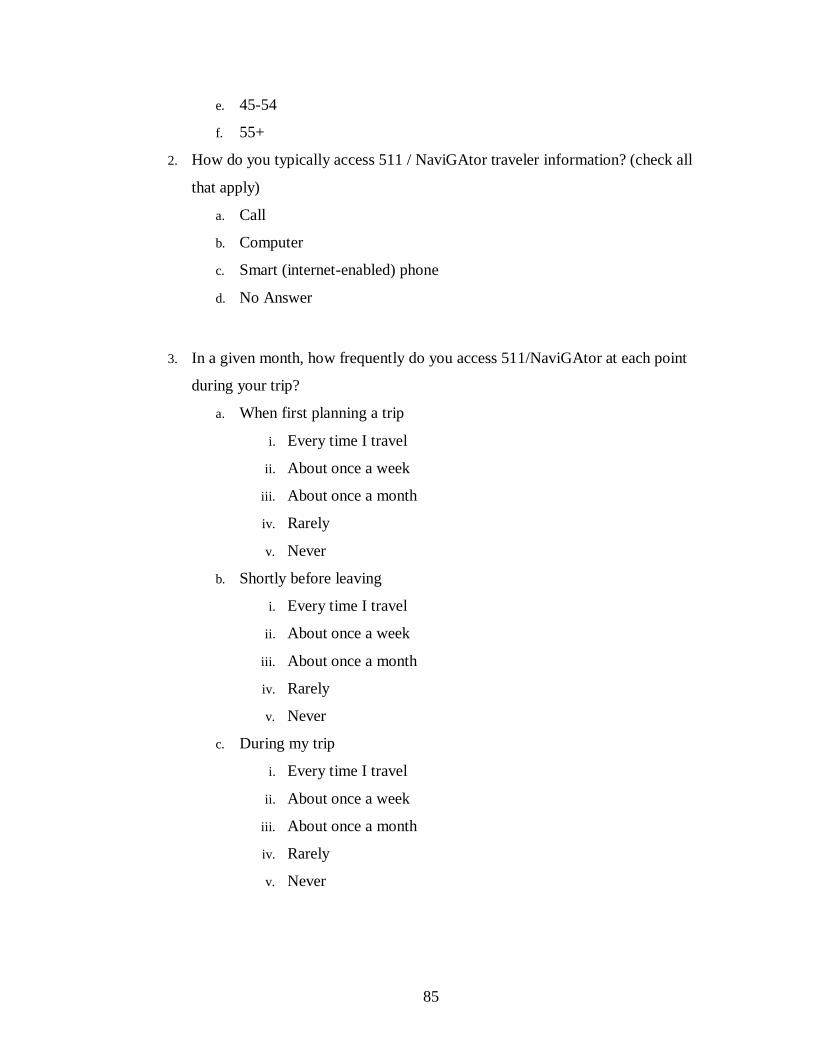
85
e. 45-54
f. 55+
2. How do you typically access 511 / NaviGAtor traveler information? (check all
that apply)
a. Call
b. Computer
c. Smart (internet-enabled) phone
d. No Answer
3. In a given month, how frequently do you access 511/NaviGAtor at each point
during your trip?
a. When first planning a trip
i. Every time I travel
ii. About once a week
iii. About once a month
iv. Rarely
v. Never
b. Shortly before leaving
i. Every time I travel
ii. About once a week
iii. About once a month
iv. Rarely
v. Never
c. During my trip
i. Every time I travel
ii. About once a week
iii. About once a month
iv. Rarely
v. Never

86
4. What other sources of traveler information do you regularly use? (check all that
apply)
a. Google, Bing or other online trip planners
b. Mobile device maps and trip planners
c. In-vehicle GPS
d. Radio or television traffic reports
e. Other _______________
f. No Answer
5. How satisfied are you with the following tools currently featured on the
NaviGAtor site?
(Very Satisfied, Satisfied, Neutral, Dissatisfied, Not At All Satisfied, No Answer)
a. Congestion/ Speed
b. Incidents
c. Cameras
d. Message Signs
e. Closures
f. Construction Reports
g. Real-Time Traffic Map
h. 511 Hero service
i. Weather
j. Twitter Feed and Facebook
k. Bookmark Map Feature
l. Links to other websites (tolls, transit, etc.)
6. How important do you find the following tools currently featured on the
NaviGAtor site?
(Very Important, Important, Neutral, Unimportant, Not at all Important, No
Answer)
a. Congestion/ Speed
b. Incidents
c. Cameras
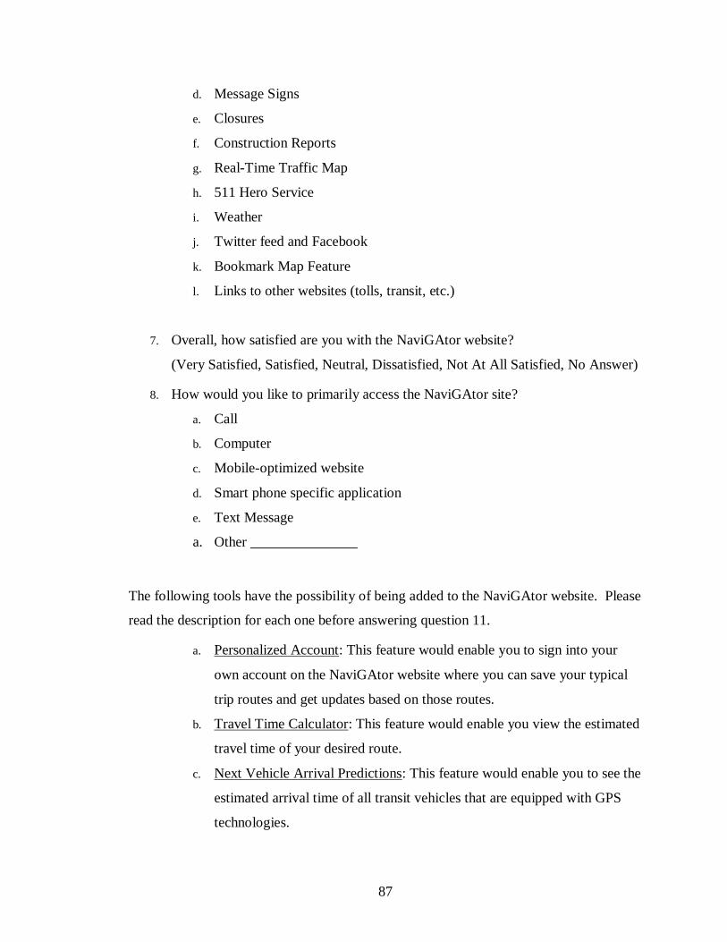
87
d. Message Signs
e. Closures
f. Construction Reports
g. Real-Time Traffic Map
h. 511 Hero Service
i. Weather
j. Twitter feed and Facebook
k. Bookmark Map Feature
l. Links to other websites (tolls, transit, etc.)
7. Overall, how satisfied are you with the NaviGAtor website?
(Very Satisfied, Satisfied, Neutral, Dissatisfied, Not At All Satisfied, No Answer)
8. How would you like to primarily access the NaviGAtor site?
a. Call
b. Computer
c. Mobile-optimized website
d. Smart phone specific application
e. Text Message
a. Other _______________
The following tools have the possibility of being added to the NaviGAtor website. Please
read the description for each one before answering question 11.
a. Personalized Account: This feature would enable you to sign into your
own account on the NaviGAtor website where you can save your typical
trip routes and get updates based on those routes.
b. Travel Time Calculator: This feature would enable you view the estimated
travel time of your desired route.
c. Next Vehicle Arrival Predictions: This feature would enable you to see the
estimated arrival time of all transit vehicles that are equipped with GPS
technologies.
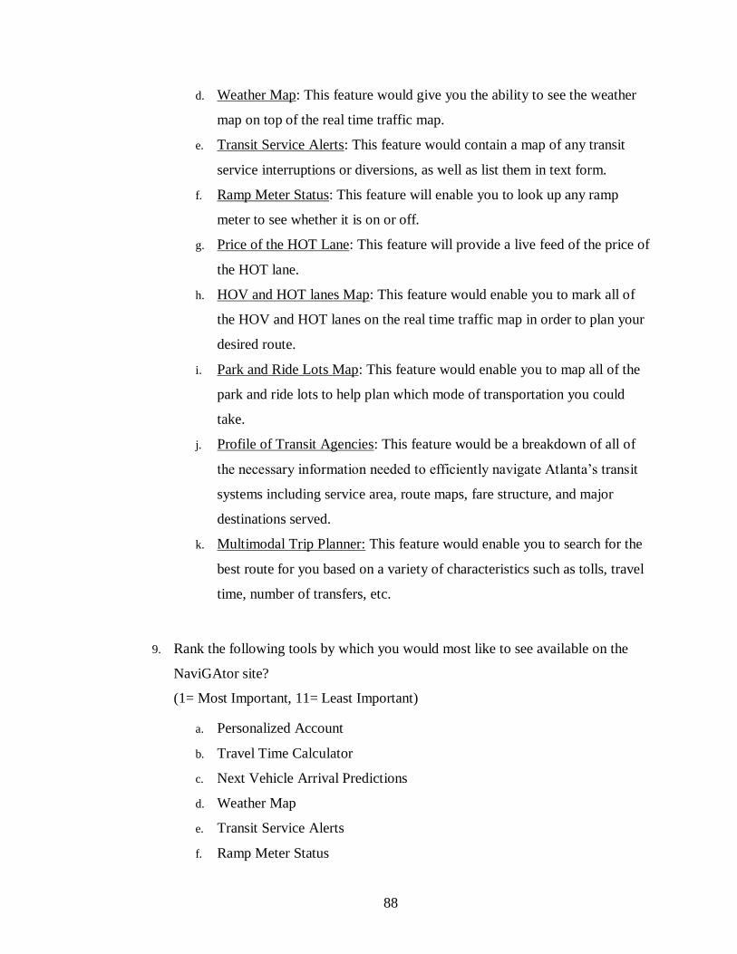
88
d. Weather Map: This feature would give you the ability to see the weather
map on top of the real time traffic map.
e. Transit Service Alerts: This feature would contain a map of any transit
service interruptions or diversions, as well as list them in text form.
f. Ramp Meter Status: This feature will enable you to look up any ramp
meter to see whether it is on or off.
g. Price of the HOT Lane: This feature will provide a live feed of the price of
the HOT lane.
h. HOV and HOT lanes Map: This feature would enable you to mark all of
the HOV and HOT lanes on the real time traffic map in order to plan your
desired route.
i. Park and Ride Lots Map: This feature would enable you to map all of the
park and ride lots to help plan which mode of transportation you could
take.
j. Profile of Transit Agencies: This feature would be a breakdown of all of
the necessary information needed to efficiently navigate Atlanta’s transit
systems including service area, route maps, fare structure, and major
destinations served.
k. Multimodal Trip Planner: This feature would enable you to search for the
best route for you based on a variety of characteristics such as tolls, travel
time, number of transfers, etc.
9. Rank the following tools by which you would most like to see available on the
NaviGAtor site?
(1= Most Important, 11= Least Important)
a. Personalized Account
b. Travel Time Calculator
c. Next Vehicle Arrival Predictions
d. Weather Map
e. Transit Service Alerts
f. Ramp Meter Status

89
g. Price of the HOT Lane
h. HOV And HOT Lanes Map
i. Park And Ride Lots Map
j. Profile Of Transit Agencies
k. Multimodal Trip Planner
10. Are there any additional tools that you would like to see on the NaviGAtor
website?
__________________________________________________________________
11. Please state how much you agree or disagree with the following statements.
(Strongly agree, agree, neither agree or disagree, disagree, strongly disagree)
a. The information I need is available on the NaviGAtor website.
b. The information I would like to have is available on the NaviGAtor
website.
c. The organization of the NaviGAtor website is easy to understand.
d. The format of the NaviGAtor website is easy to use.
e. I find the NaviGAtor website easy to read and understand.
f. The first time I used the NaviGAtor website, it was not hard to find what I
was looking for.
g. All of the information I get from the NaviGAtor website is kept up-to-
date.
12. Do you have any other suggestions to make the NaviGAtor website more useful,
or easier to use for you?
13. What is your primary mode of travel?
a. Drive alone
b. Carpool
c. Bus or train
d. Bike or walk
e. Other
14. What is your household income?

90
a. $0-$25,000
b. $25,000-$50,000
c. $50,000-$75,000
d. $75,000-$100,000
e. $100,000+
91
REFERENCES
1. Shrank, D., T. Lomax, B. Eisele (2011) Urban Mobility Report. Texas
Transportation Institute, Texas A&M University
2. McQueen, B., R. Schuman, K. Chen, and G. Halstead. (2002) Advanced Traveler
Information Systems. Artech House
3. Federal Highway Administration (2010) Safe, Accountable, Flexible, Efficient
Transportation Equity Act: A Legacy for Users.
https://www.federalregister.gov/articles/2010/11/08/2010-27987/real-time-
system-management-information-program Accessed on 09/24/2012
4. Lyons, G. (2004) Communicating Your Brand through the Web: Good Practice
and Accreditation. University of Southampton Transport Research Group.
Southampton, Hampshire, United Kingdom.
5. Lyons, G. (2006) The Role of Information in Decision-Making with Regard to
Travel. IEE Proceedings: Intelligent Transportation Systems. 153.3
6. Khattak, A., X. Pan, B. Williams, N. Rouphail, and Y. Fan (2008) Traveler
Information Delivery Mechanisms: Impact on Consumer Behavior. Transportation
Research Record: Journal of the Transportation Research Board. Washington
D.C. 2069.
7. 511 Deployment Coalition. (2008) Usage Statistics.
http://www.deploy511.org/usage.html Accessed on: 09/25/2012
8. Sendza. (2010) Get Above the Noise.
http://www.deploy511.org/docs/511%20Presentation%209.10/Sendza%20511%2
0Coalition.ppt Accessed on: 09/25/2012
9. U.S. Census Bureau. (2000). Statistical Abstract of the United States. U.S.
Department of Commerce
10. U.S. Department of Commerce National Telecommunications and Information
Administration. (2010). Exploring the Digital Nation: Home Broadband Internet
Adoption in the United States. http://www.ntia.doc.gov/data Accessed 10/12/2012
11. Currie, G., M. Gook. (2010) Measuring the Performance of Transit Passenger
Information Websites. Transportation Research Record: Journal of the
Transportation Research Board. Washington D.C. 2110.
12. Schaller, B. (2002) TCRP Synthesis 43: Effective Use of Transit Websites.
Transportation Research Board of the National Academies, Washington D.C.

92
13. Coleman, J.S., T.J. Fararo, edit. (1992). Rational Choice Theory: Advocacy and
Critique. London: Sage Publications
14. Meyerson, M., E. Bainfield. (1955). Politics, Planning and the Public Interest:
The Case of Public Housing in Chicago. Free Press.
15. Lyons, G., E. Avineri, S. Farag. (2008) Assessing the Demand for Travel
Information: Do We Really Want to Know?. Leeuwenhorst, The Netherlands.
Proceedings of the European Transport Conference.
16. Kenyon, S., G. Lyons. (2003) Value of Integrated Multimodal Traveller
Information and Its Potential Contribution to Modal Change. Transportation
Research F. 6.
17. Simon, H. (1945) Administrative Behavior. The Free Press. New York
18. Ben-kiva, M., S.R. Lerman. (1993) Discrete Choice Analysis: Theory and
Application to Travel Demand. The MIT Press.
19. Khattak, A., F. Targa, and Y. Yim. (2004). Advanced Travler Information
Systems: Relationship to Traveler Behavior. In Assessing the Cots and Benefits
of Intelligent Transportation Systems. (d. Gillen and D. Lvinson, eds.), Kluwer
Academic Publishers, Dordrecht, Netherlands, pp. 218-240.
20. Chatterjee, K., N. Hounsell, and P. Firmin. (2002) Driver Response to Variable
Message Sign Information in London. Transportation Research C: Emerging
Technologies. 10,2
21. Yim, Y. (2001) TravInfo EvaluationL Traveler Response Element Broad Area
Study: Phase 2 Results Analysis of Wave-2 Survey. California PATH Working
Paper. California PATH Program, University of California at Berkley.
22. Smith, G. (1983). Impact Assessment and Sustainable Resource Management.
Harlow, UK: Longman.
23. Rowe, G. and L. Frewer. (2000). Public Participation Methods: A Framework for
Evaluation. Science, Technology, & Human Values. 25.1
24. Zumkeller, D. and S. Geweke. (2006) Simulation Game to Explore Effects of
Information on Traveler Behavior. Presented at 85th Annual Meeting of the
Transportation Research Board, Washington D.C.
25. Wang, X., A. Khattak. (2010) Role of Travel Information in Supporting Travel
Decision Adaptation: Exploring Spatial Patterns. Presented at the World
Conference on Transport Research. Lisbon, Portugal.
26. Horan, T., T. Abhichandani, R. Rayalu. (2006) Assessing User Satisfaction of E-
Government Services: Development and Testing of Quality-In-Use Satisfaction

93
with Advanced Traveler Information Systems. Kauai, HI. Proceedings of the
Hawaii International Conference on System Sciences
27. Etre. (2012). Accessibility Check. http://etre.com/tools/accessibilitycheck/
Accessed 10/16/2012
28. Etre. (2012). Color Check. http://etre.com/tools/colourcheck/ Accessed
10/16/2012
29. World Wide Web Consortium. (2012) http://www.w3.org/standards/ Accessed
10/16/2012
30. Pingdom. (2012). Pingdom Tools. http://tools.pingdom.com/fpt/ Accessed
10/16/2012
31. Global Ideas Bank. Robert Jungk, Futurist and Social Inventor.
www.globalideasbank.org/site/bank/idea.php?ideaId=145 Accessed on
10/12/2012
32. Vidal, R.V.V. (2006). The Future Workshop. In Creative and Participative
Problem Solving – The Art and the Science. Denmark, Informatics and
Mathematical Modeling, Technical University of Denmark.