
The U.S. Economy After the Great Recession: America’s Deleveraging and Recovery Experience Sherle...
47
The U.S. Economy After the Great Recession: America’s Deleveraging and Recovery Experience Sherle R. Schwenninger and Samuel Sherraden Economic Growth Program March 2014
-
Upload
allan-armstrong -
Category
Documents
-
view
214 -
download
2
Transcript of The U.S. Economy After the Great Recession: America’s Deleveraging and Recovery Experience Sherle...

The U.S. Economy After the Great Recession:America’s Deleveraging and Recovery Experience
Sherle R. Schwenninger and Samuel SherradenEconomic Growth Program
March 2014

IntroductionThe bursting of the housing bubble in 2008 plunged the U.S economy into a serious crisis, leaving American households with a huge debt overhang and the economy with a large gap in output and employment. This Report reviews the economy’s deleveraging and recovery experience more than five years after the crash. It explores the following questions: • How far has the economy come in the deleveraging process? Is private sector debt now at a sustainable level or do households and the financial sector continue to need to pay down debt? • To what extent has the U.S. economy recovered from the large plunge in output and employment? How close is the economy to full employment?
• What kind of recovery has the U.S economy had? What has driven the recovery and has it become self-sustaining?
• How has the recovery affected the long-term growth potential of the U.S. economy? Has it made U.S. economic growth less dependent on debt-financed and wealth-driven consumption? • To what extent does policy explain the kind of recovery the U.S. economy has had? What were the main shortcomings of policy?
2

3
Part I: The Deleveraging Experience: Has America Fully De-Levered?
Part II: The Recovery: What Kind of Recovery?
Part III: Policy: Explaining the Deleveraging and Recovery We Got
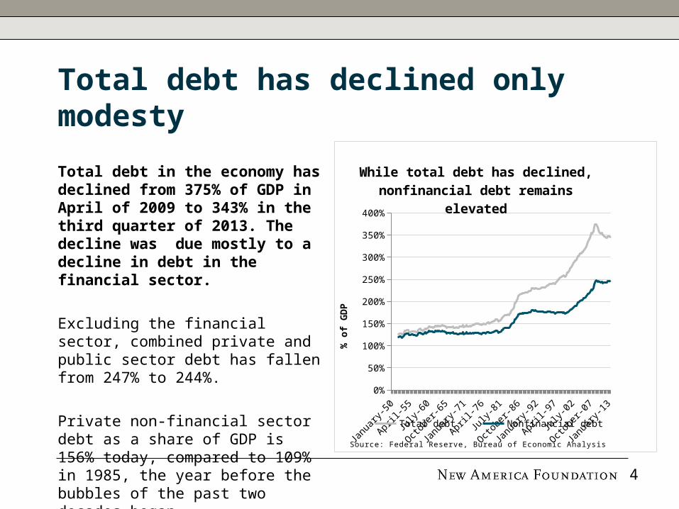
Total debt has declined only modesty
Total debt in the economy has declined from 375% of GDP in April of 2009 to 343% in the third quarter of 2013. The decline was due mostly to a decline in debt in the financial sector.
Excluding the financial sector, combined private and public sector debt has fallen from 247% to 244%.
Private non-financial sector debt as a share of GDP is 156% today, compared to 109% in 1985, the year before the bubbles of the past two decades began.
1950 1960 1970 1980 1990 2000 20100%
50%
100%
150%
200%
250%
300%
350%
400%
While total debt has declined, nonfinancial debt remains el-
evated
Total debt Nonfinancial debt
% o
f G
DP
Source: Federal Reserve, Bureau of Economic Analysis
4
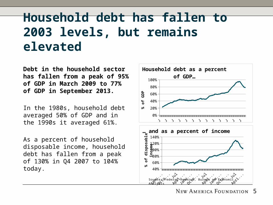
Household debt has fallen to 2003 levels, but remains elevated
Debt in the household sector has fallen from a peak of 95% of GDP in March 2009 to 77% of GDP in September 2013.
In the 1980s, household debt averaged 50% of GDP and in the 1990s it averaged 61%.
As a percent of household disposable income, household debt has fallen from a peak of 130% in Q4 2007 to 104% today.
1950 1960 1970 1980 1990 2000 20100%
20%
40%
60%
80%
100%
Household debt as a percent of GDP…
% o
f G
DP
1950 1960 1970 1980 1990 2000 201040%
60%
80%
100%
120%
140%
… and as a percent of income
% o
f dis
posa
ble
in
com
e
Source: Federal Reserve, Bureau of Economic Analysis
5

Other measures of deleveraging: low debt service burden and delinquency
Debt service has fallen from 13.2% of disposable income in 2007 to 9.9% today, due to low interest rates.
Mortgage delinquency rates (loans 30+ days past due) increased from 2% at the beginning of 2007 to 11.3% in the first quarter of 2010. Since then, they have fallen to 8.6%.
Only 2.5% of credit cards are today considered delinquent, the lowest rate on record. By these measures, the worst of the deleveraging is over.
1990 1995 2000 2005 20108%
10%
12%
14%
Household debt service burden
Source: Federal Reserve, Bureau of Economic Analysis
6

New credit growth for households, led by student loans
Household debt increased $127B in the third quarter of 2013 and $241B in the fourth quarter, the largest increase since the third quarter of 2007.
While household mortgage debt has declined, student debt has soared from $548B in the fourth quarter of 2007 to $1.08T, an increase of $533B.
Credit card loans have remained flat at around $700B since 2010, while auto loans have rebounded from $711B in the fourth quarter of 2010 to $863B today. 7
2007
2007
2008
2009
2010
2010
2011
2012
2013
2013
6.0
8.0
10.0
12.0
14.0
Household debt by instrument
Other
Student Loan
Credit Card
Auto Loan
HE Revolving
Mortgage
$T
Source: Federal Reserve Board of New York

Private sector deleveraging was made possible by an increase in public debt
The decline in private debt from 279% of GDP to 238% of GDP since 2007 was made possible by an increase in government debt.
Total government debt increased from 54% in the fourth quarter of 2007 to 90% in the first quarter of 2013. Since then, it has fallen to 88% of GDP.
State and local government debt, not including pension obligations, peaked in the first quarter of 2010 at 20.4% and has since declined to 17.5% of GDP.
1990 1995 2000 2005 201040%
50%
60%
70%
80%
90%
100%
110%
120%
Government leveraging, private sector deleveraging
GovernmentHouseholdsFinancial business
% o
f G
DP
Source: Federal Reserve, Bureau of Economic Analysis
8

US public debt is below that of many other advanced economies
Net federal government debt in the US increased from 46% of GDP in 2007 to 84% of GDP in 2012.
Net federal government debt excludes securities held by the public sector, such as government debt held by the Social Security Trust Fund.
US federal government debt is slightly above the average for advanced economies of 76%. But it is well below its immediate post-war high of 113% of GDP in 1945.
Uni
ted
State
s
Euro
area
Franc
e
Germ
any
Greec
e
Irel
and
Italy
Portu
gal
Spain
Japa
n
Uni
ted
Kingd
om
0
20
40
60
80
100
120
140
160
180
Net government debt, 2012
% o
f G
DP
Note: IMF figures differ from Federal ReserveSource: IMF
Advanced economy average = 76%
9

The middle class remains burdened with debt
The bottom 95% have two times more debt than the top 5% of households.
The debt-to-income levels of the bottom 95% of households increased from 84% of disposable income in 1989 to 156% in 2007. The debt to income levels of the top 5% increased from 56% to 62%.
From 2007 to 2010, the bottom 95% of households have been forced to pay down debt and cut consumption, while the top 5% have taken on slightly more debt and increased consumption.
0%
20%
40%
60%
80%
100%
120%
140%
160%
180%
Debt-to-income
Bottom 95%
Top 5%
Source: Cynamon and Fazzari, “Inequality, the Great Recession, and Slow Recovery”
10

More private sector deleveraging is needed
Household debt is still higher than the pre-tech and housing bubble norm, and is only sustainable if interest rates remain low, housing prices continue to rise, and wages and incomes grow.
To get back to debt levels in 1996:• Households would have to reduce debt by $2.5T, or 15% of GDP• The financial sector would have to reduce by $4.5T, or 26% of GDP• And the non-financial business sector would have to reduce debt by $4.1T, or 24% of GDP
Gover
nmen
t
Hou
seho
lds
Finan
cial
bus
ines
s
Non
-fina
ncia
l bus
ines
s0%
10%20%30%40%50%60%70%80%90%
100%
Debt is high compared to the 1990s
19962013
% o
f G
DP
Source: Federal Reserve
11

12
Part I: The Deleveraging Experience: Has America Fully De-Levered?
Part II: The Recovery: What Kind of Recovery
Part III: Policy: Explaining the Deleveraging and Recovery We Got

Real GDP growth has been weak, weighed down by deleveraging
The economy returned to its 2007 peak of real output in the second quarter of 2011, and is currently 6.5% above its 2007 peak.
Recent growth has been slower than during previous recoveries. In the four and a half years since the recession ended, real GDP growth has averaged 2.4%.
In the four and half years following the recessions in 1982 and 1990, the average growth rate was 5% and 3.2%, respectively.
13
1 4 7 10 13 16 19 22 2590
95
100
105
110
115
120
125
The current recovery has been slow by historical
standards
1980199120012007
Quarters after business cycle peak
100=
busi
ness
cycle
peak
Source: Bureau of Economic Analysis

A still sizable output gap means the recovery is incomplete
The output gap—which is the difference between potential GDP and actual GDP—was 4.4% of GDP in the fourth quarter of 2013 ($740B), down from 7.4% in the third quarter of 2009.
Premature fiscal consolidation beginning in 2010 has kept the output gap larger than it would otherwise have been, costing the economy over this time hundreds of billions of dollars in lost income and millions of jobs.
14
2007
2008
2009
2010
2012
2013
2014
2015
2017
2018
2019
2020
10,000
12,000
14,000
16,000
18,000
20,000
Output gap
Actual GDPProjected GDPPotential GDP
2009 $
T
Source: Congressional Budget Office

The official unemployment rate declined from a peak of 10% in October 2009 to 6.6% in January 2014.
Including workers that are marginally attached to the workforce and those that are employed part-time for economic reasons, the U-6 unemployment rate is 12.7%, down from a peak of 17.2% in April 2010.
The labor force participation rate has declined from 66% before the recession to 63% today.
1990 1995 2000 2005 20100%
5%
10%
15%
20%
Unemployment rate
U-6*
Of-fi-cial rate
*Total unemployed, plus all marginally attached workers plus total employed part time for economic reasonsSource: Bureau of Labor Statistics
15
The unemployment rate has fallen, in part due to lower participation in the labor force

A decline in public employment has undercut job growth
Since 2009, local governments have cut 551,000 jobs, states have eliminated 153,000 jobs, and the federal government has cut 62,000 jobs, partly offsetting the 4.3 million jobs created in the private sector during the same period.
Government jobs as a share of total employment have fallen from 17.2% in July 2009 to 15.9% in December 2013.
If the government had maintained its share of employment, there would be 1.9 million more jobs and the unemployment rate would be 5.4% instead of 6.6%.
16
2009 2010 2011 2012 2013128
132
136
140
21
22
23
24
Increase in private employ-ment and fall in government
employment
Total (left)
Tota
l em
plo
ym
ent
M
Govern
ment
em
plo
ym
ent
M
* Spike due to temporary hiring for the 2010 CensusSource: Bureau of Labor Statistics
*

According to Daniel Alpert, 54% of the jobs created in 2013 were low-wage jobs, well above the percentage of low-wage jobs in the economy at the start of the year.
The BLS projects that many of the fastest growing categories of jobs in the period 2012-2022 will be in low-wage sectors like retail, food service, and personal care.
For example, the number of software developers in the higher wage tech sector is expected to increase by 140K, compared to 580K personal care aides.
100 200 300 400 500 600 7000
20,000
40,000
60,000
80,000
100,000
120,000
Personal care aides
Registered nurses
Retail
Home health aides
Food service
General managers
Software developers
Employment growth 2012-2022, and 2012 median
annual wage
‘000s of jobs created 2012-2022
2012 m
edia
n i
nco
me
$
Source: Bureau of Labor Statistics
Private-sector job growth has been mostly in
low-wage jobs
17

Many unemployed workers have left the labor force
The drop in the unemployment rate has been the result of private sector job creation (in mostly low-wage jobs) and workers leaving the labor force.
The average unemployed worker has been unemployed for 35 weeks—far above other recoveries.
The labor force participation rate is 63%, down from a peak of 67% in the late 1990s. Some of the decline is due to the aging of the population, but prolonged periods of unemployment can also cause people to give up looking for a job.
18
1990 1995 2000 2005 20100.0
5.0
10.0
15.0
20.0
25.0
30.0
35.0
40.0
45.0
Average duration of un-employment
Source: Bureau of Labor Statistics

Unemployment disproportionately impacts the younger generation
The unemployment rate for 16-19 year olds has fallen from a peak of 27.2% in October 2009 to 20.7% today. The rate for 20-24 year olds has fallen from 17.2% in April 2010 to 11.9% today.
In 1996, the unemployment rates for 16-19 year olds and 20-24 year olds were 16.7% and 9.3%, respectively.
According to the Center for American Progress, long-term unemployment will result in $22,000 in lost earnings during the next decade for each of the million young workers who have experienced long-term unemployment.
1990 1995 2000 2005 20100%
5%
10%
15%
20%
25%
30%
Youth unemployment
16-19 20-24 25+
Source: Bureau of Labor Statistics
19

Real wages have been essentially flat
Real wages have not increased during the recovery because of high levels of unemployment and because of the increase in the proportion of low-wage jobs.
Real wages increased 3.9% in 2008, mostly due to a 3.5% decline in prices. Since then, wages have declined by 1%.
Since the end of the recession, retail trade employment increased by 734K but wages declined 1%. During the same period, leisure and hospitality jobs increased 962K, but wages fell 3.7%.
22.500
23.000
23.500
24.000
24.500
25.000
Real wages in the private sector
Source: Bureau of Labor Statistics
20

Median household income has fallen, even with the recovery
Median income declined during the recovery from $53,285 in 2009 to $51,017 in 2012.
Today median household income is 9% lower than it was at its peak of $56,080 in 1999.
Households income:• At the 20th percentile was $20,599• At the 40th percentile was $39,764• At the 60th percentile was $64,582• And at the 80th percentile was $104,096
1990
1992
1994
1996
1998
2000
2002
2004
2006
2008
2010
2012
44,000
46,000
48,000
50,000
52,000
54,000
56,000
58,000
Median household income
2012 $
Source: US Census Bureau
21
Still too dependent on consumption
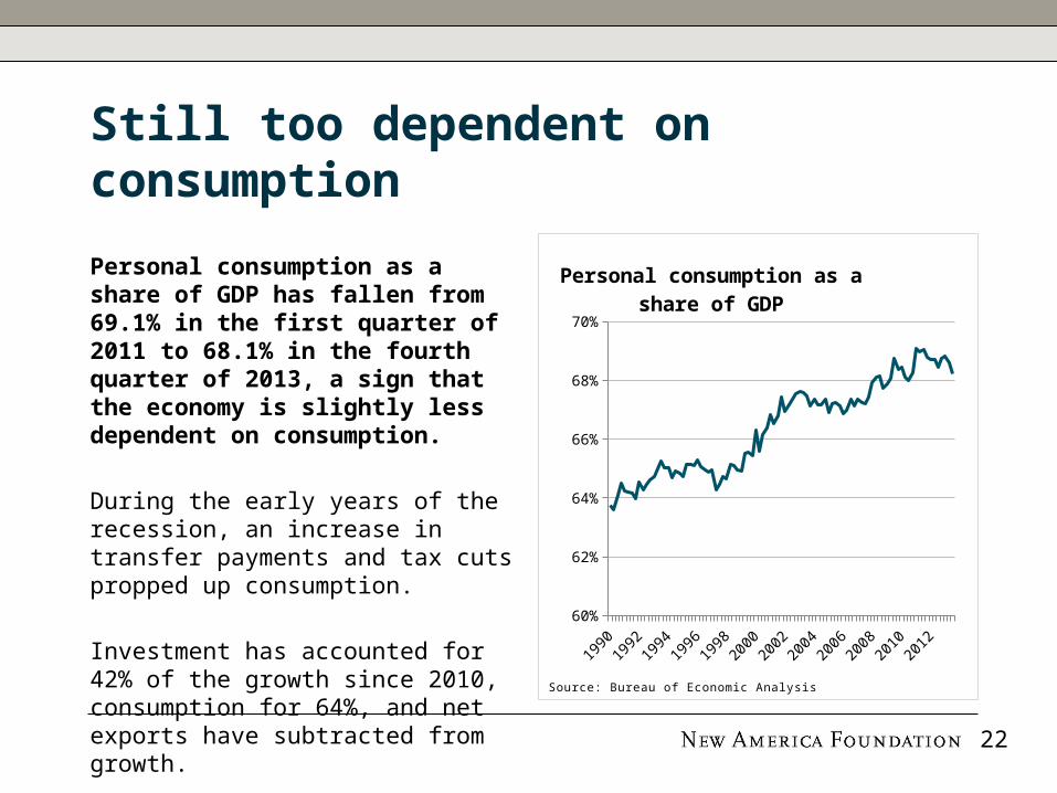
Personal consumption as a share of GDP has fallen from 69.1% in the first quarter of 2011 to 68.1% in the fourth quarter of 2013, a sign that the economy is slightly less dependent on consumption.
During the early years of the recession, an increase in transfer payments and tax cuts propped up consumption.
Investment has accounted for 42% of the growth since 2010, consumption for 64%, and net exports have subtracted from growth.
1990
1991
1993
1995
1997
1998
2000
2002
2004
2005
2007
2009
2011
2012
60%
62%
64%
66%
68%
70%
Personal consumption as a share of GDP
Source: Bureau of Economic Analysis
22
A modest improvement in the savings rate, but savings remain too low
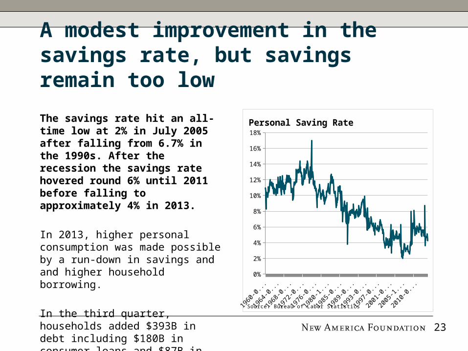
The savings rate hit an all-time low at 2% in July 2005 after falling from 6.7% in the 1990s. After the recession the savings rate hovered round 6% until 2011 before falling to approximately 4% in 2013.
In 2013, higher personal consumption was made possible by a run-down in savings and and higher household borrowing.
In the third quarter, households added $393B in debt including $180B in consumer loans and $87B in mortgages.
1960 1970 1980 1990 2000 20100%
2%
4%
6%
8%
10%
12%
14%
16%
18%
Personal Saving Rate
Source: Bureau of Labor Statistics
23
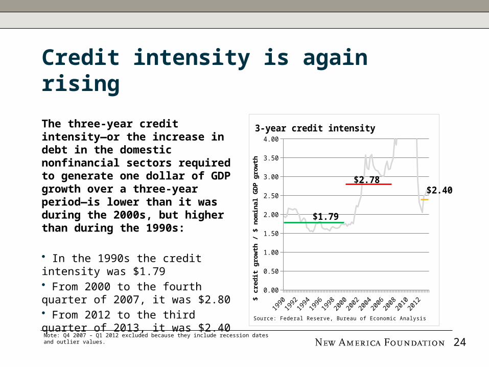
Credit intensity is again rising
The three-year credit intensity—or the increase in debt in the domestic nonfinancial sectors required to generate one dollar of GDP growth over a three-year period—is lower than it was during the 2000s, but higher than during the 1990s:
• In the 1990s the credit intensity was $1.79 • From 2000 to the fourth quarter of 2007, it was $2.80 • From 2012 to the third quarter of 2013, it was $2.40Note: Q4 2007 – Q1 2012 excluded because they include recession dates and outlier values. 24
0.00
0.50
1.00
1.50
2.00
2.50
3.00
3.50
4.00
$1.79
$2.78$2.40
3-year credit intensity
$ c
redit
gro
wth
/ $
nom
inal
GD
P g
row
th
Source: Federal Reserve, Bureau of Economic Analysis

A weak recovery in investment and capital expenditure
Fixed investment was $2.5T (2009 dollars) in the fourth quarter of 2013. This is $200B below the peak in the first quarter of 2006.
Fixed investment growth has slowed since the years immediately after the recession, growing 4.5% from 2012 to 2013. Business investment in equipment and software increased 3.1%.
Companies are sitting on cash rather than investing. The ratio of cash to net assets among U.S. non-financial non-utility companies is approximately 12%, double the rate during the 1990s.
2007
2007
2008
2008
2009
2009
2010
2010
2011
2011
2012
2012
2013
2013
1,500
1,700
1,900
2,100
2,300
2,500
2,700
Gross fixed investment
2009 $
B
Source: Bureau of Economic Analysis
25

Government investment has fallen
Net government investment has fallen from 1.4% of GDP in 2009 to 0.8% of GDP in 2012. State and local governments invested 0.6% of GDP in 2012, the lowest investment share since 1947.
Gross government investment, before accounting for depreciation, is currently 3.8% of GDP, the lowest rate since 1948.
The government invests 0.6% of GDP in structures, 0.1% of GDP in equipment, and 0.1% in intellectual property.
1980
1983
1986
1989
1992
1995
1998
2001
2004
2007
2010
-0.5%
0.0%
0.5%
1.0%
1.5%
2.0%
2.5%
Net government investment
State & Local Federal defense
% o
f G
DP
Source: Bureau of Economic Analysis
26

Private investment has only modestly rebounded
Net private nonresidential investment in fixed assets declined to 0.6% of GDP in 2009, its lowest level in six decades.
Since 2009, investment has rebounded to 1.8% of GDP, which is still lower than any level seen since World War II.
As a result of systemic under-investment in the economy, the age of private fixed assets has risen to 21.7 years, the highest rate since the late 1950s.
1980
1983
1986
1989
1992
1995
1998
2001
2004
2007
2010
2013
0.0%
1.0%
2.0%
3.0%
4.0%
5.0%
6.0%
Private nonresidential net investment
% o
f G
DP
Source: Bureau of Economic Analysis
27

Productivity growth has declined
Annual labor productivity growth was 1.7% at year-end 2013, 0.9% in 2012, and 0.4% in 2011.
During the current recovery, productivity growth has averaged 1.8% (red), while after the 1982 recession and 2001 recession productivity averaged 2.5% and 3.1%, respectively. 20
0820
0820
0920
1020
1120
1120
1220
13-1.0%
0.0%
1.0%
2.0%
3.0%
4.0%
5.0%
6.0%
Productivity growth
productiv-ity growth
post-2007
post-2001
post-1982
Annual
% c
hange
Source: Bureau of Labor Statistics
The slow recovery has depressed the pace of capital accumulation, and it may also have hindered new business formation and innovation, developments that would have an adverse effect on structural productivity.
- Janet Yellen, Chair, Federal Reserve28
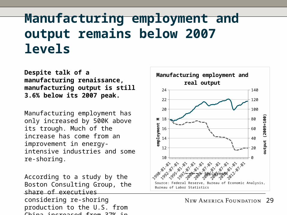
Manufacturing employment and output remains below 2007 levels
Despite talk of a manufacturing renaissance, manufacturing output is still 3.6% below its 2007 peak.
Manufacturing employment has only increased by 500K above its trough. Much of the increase has come from an improvement in energy-intensive industries and some re-shoring.
According to a study by the Boston Consulting Group, the share of executives considering re-shoring production to the U.S. from China increased from 37% in 2012 to 54% in 2013.
1990 1995 2000 2005 201010
12
14
16
18
20
22
24
0
20
40
60
80
100
120
140
Manufacturing employment and real output
Employment
em
plo
ym
ent
M
outp
ut
(2009=
100)
Source: Federal Reserve, Bureau of Economic Analysis, Bureau of Labor Statis-tics
29

A modest improvement in net exports
The trade deficit shrunk from 5.1% of GDP in 2008 to 2.6% of GDP today.
From the fourth quarter of 2007 to the fourth quarter of 2014, exports grew from 12.0% to 13.6% of GDP, while imports fell from 16.7% to 16.2% of GDP.
The decline in the trade deficit contributed to an increase in GDP in 2008-2009, but since has not contributed much.
30
2007
2007
2008
2008
2009
2009
2010
2010
2011
2011
2012
2012
2013
2013
-6.0%
-5.0%
-4.0%
-3.0%
-2.0%
-1.0%
0.0%
Net export share of GDP
% o
f G
DP
Source: Bureau of Economic Analysis
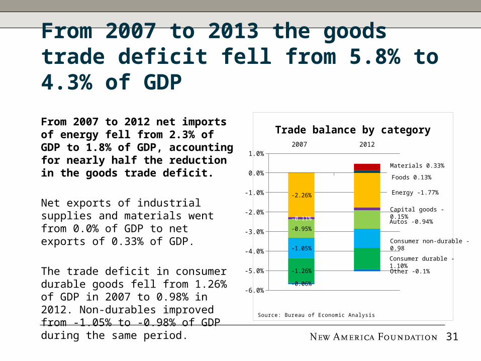
From 2007 to 2013 the goods trade deficit fell from 5.8% to 4.3% of GDP
From 2007 to 2012 net imports of energy fell from 2.3% of GDP to 1.8% of GDP, accounting for nearly half the reduction in the goods trade deficit.
Net exports of industrial supplies and materials went from 0.0% of GDP to net exports of 0.33% of GDP.
The trade deficit in consumer durable goods fell from 1.26% of GDP in 2007 to 0.98% in 2012. Non-durables improved from -1.05% to -0.98% of GDP during the same period.
2007 2012
-6.0%
-5.0%
-4.0%
-3.0%
-2.0%
-1.0%
0.0%
1.0%
-2.26%
-0.11%
-0.95%
-1.05%
-1.26%
-0.06%
Trade balance by category
Source: Bureau of Economic Analysis
31
Materials 0.33%
Foods 0.13%
Energy -1.77%
Capital goods -0.15%
Autos -0.94%
Consumer non-durable -0.98
Consumer durable -1.10%Other -0.1%

Energy has been a bright spot in the economic recovery
The oil and gas boom has lowered the cost of energy and increased American competitiveness in sectors from energy to manufacturing. The domestic energy boom is also inherently supportive of middle-class prosperity because it creates good-paying middle-class jobs and strengthens the tradable sector.
While total nonfarm employment has not surpassed its pre-recession levels, employment in oil and gas extraction increased 34% from 2007 to 2014 and support activities have increased 37%. 32
2007 2008 2009 2010 2011 2012 201380
90
100
110
120
130
140
Index of employment in oil and gas extraction and
support activities
Extraction Support activitiesTotal employment
Dec 2
007 =
100
Source: Bureau of Labor Statistics

An uneven and not yet sustainable housing recovery
Housing prices have rebounded 24% from the post-recession lows in March 2012, according to the Case-Shiller index.
Since reaching a high in November 2013 at 1.1M, housing starts have fallen to 880,000. The number of homes for sale, or inventories, has declined from a peak of 3.5M in 2007 to 1.9M in 2013.
The housing recovery has been held back by lack of first-time home buyers owing to high levels of unemployment and low rates of household formation.
0
50
100
150
200
250
Case-Shiller Index
Source: S&P
33

This has been a wealth-driven recovery
Household net worth increased $21.5T from $55.7T in the first quarter of 2009 to $77.3T in the third quarter of 2013.
$2.7T of the increase was due to the increase in real estate, while $18T, or 84% of the increase, was due to a rise in the value of financial assets, including deposits, stocks, and pensions.
The S&P peaked at 1565 in October 2007 and fell to 677 in March 2009. Since then, it has risen to 1859—170% above the trough and 17% above its previous peak.
1990 2000 20100
10,000
20,000
30,000
40,000
50,000
60,000
70,000
80,000
90,000
Household net worth
$B
Source: Federal Reserve
34

In 2013, expansion of the trailing P/E multiple from 16.5x to 19.6x accounted for two thirds of the increase in the S&P.
Higher stock prices will boost consumer wealth and help increase confidence, which can also spur spending.
- Ben Bernanke
Low interest rates enable corporations to borrow cheaply and buy back shares. S&P 500 companies did $346B of buybacks in the first three quarters of 2013, effectively paying out 3% to shareholders.
Stock market recovery: multiple expansion, Fed Policy, and share buybacks
35
2009 2010 2011 2012 Q1 to Q3 2013
$0
$50
$100
$150
$200
$250
$300
$350
$400
$450
S&P share buybacks
Source: Standard & Poor’s

Inequality has increased
Income inequality is at all-time highs:• Top 10% earn 48.2% of total income• Top 1% earn 19.3% of total income• Top 0.1% earn 8.8% of income
From 2009 to 2012, the top 1% has captured 95% of the increase in national income.
In other words, the top 1% of incomes grew by 31.4% while bottom 99% incomes increased by 0.4%.
36
1922
1930
1938
1946
1954
1962
1970
1978
1986
1994
2002
2010
0
10
20
30
40
50
60
Income share of top earners
Top 10%
Top 1%
Top 0.1%
Top 0.01%
Source: Piketty and Saez

The rise of the American plutonomy: an economy driven by high-end consumption
Consumption growth by top-earners has driven the recovery: consumption for households in the top 5% of incomes increased 16% from 2007 to 2012, while consumption by the bottom 95% fell by 2%.
In 2012 the top 5% of earners were responsible for 38% of domestic consumption, up from 28% in 1995 and 34% in 2007.
37
1989
1991
1993
1995
1997
1999
2001
2003
2005
2007
2009
2011
0%
5%
10%
15%
20%
25%
30%
35%
40%
Consumption share of the top 5%
Source: Cynamon and Fazzari, “Inequality, the Great Recession, and Slow Recovery”
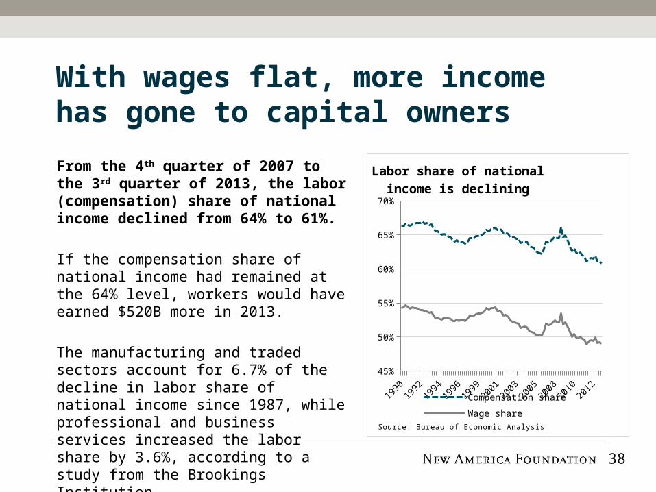
With wages flat, more income has gone to capital owners
From the 4th quarter of 2007 to the 3rd quarter of 2013, the labor (compensation) share of national income declined from 64% to 61%.
If the compensation share of national income had remained at the 64% level, workers would have earned $520B more in 2013.
The manufacturing and traded sectors account for 6.7% of the decline in labor share of national income since 1987, while professional and business services increased the labor share by 3.6%, according to a study from the Brookings Institution.
1990
1991
1993
1995
1997
1998
2000
2002
2004
2005
2007
2009
2011
2012
45%
50%
55%
60%
65%
70%
Labor share of national income is declining
Compensation share
Wage shareSource: Bureau of Economic Analysis
38

1990
1992
1994
1996
1998
2000
2002
2004
2006
2008
2010
2012
4.0%
4.5%
5.0%
5.5%
6.0%
6.5%
Households with head of household 25 years or
younger
House
hold
s ‘0
00s
Source: US Census
A tough start for younger Americans
Households with a head of household 25 years or younger declined from 6.6M in 2006 to 6.1M in 2012.
The 500,000 decline in households with heads of households 25 or younger indicates that many youth have moved back in with their parents.
In part due to the weak labor market, many youth have gone back to school. This and high tuition costs have burdened youth with $1.2T in student loans.
39

40
Part I: The Deleveraging Experience: Has America Fully De-Levered?
Part II: The Recovery: What Kind of Recovery?
Part III: Policy: Explaining the Deleveraging and Recovery We Got

Outcomes reflect policy decisions
Monetary reflation and Wall Street
bailout
Recovery of financial assets and profits
Tax cuts and unemployment
insurance
(Temporary) support of consumer spending
Modest infrastructure and
public works spending
Weak job creation and stagnant wages
Policy gridlock and weak demand
Weak private investment and slower productivity growth
Policy Choice Result
41

Monetary reflation and the wealth effect:QE is the ultimate trickle down
The Fed has expanded its balance sheet to more than $4 trillion (or 24% of GDP) by buying Treasuries and Mortgage-Backed Securities.
Quantitative easing is the ultimate trickle-down economic policy: it has caused huge gains in the stock market and boosted housing. But it has done little to create real wage growth.
Since the recession ended in 2009, the S&P has increased 90%, housing has gained 16%, and real wages have increased only 0.5%. 42
2009 2010 2011 2012 201380
100
120
140
160
180
200
2.0
2.5
3.0
3.5
4.0
4.5
5.0
QE pushes stocks up more than housing and housing
more than wages
Federal Reserve assets (right)S&P500 (left)Case-Shiller 20-city (left)Real Wages (left)
Index (
July
2009=
100)
$T
Source: Federal Reserve, Bureau of Labor Statistics, Standard and Poor’s

Transfer payments temporarily supported household income and consumption
Transfer payments temporarily supported household income during the recession, but unemployment insurance and other benefits have fallen $102B and $30B in real terms since the beginning of 2010.
The decline in temporary benefits has hit working-age and middle-class populations the hardest.
Transfer payments as a share of income have declined from 18.1% in the first quarter of 2010 to 17.0% today.
2000
2001
2003
2004
2006
2007
2009
2010
2012
2013
0
100
200
300
400
500
600
700
800
900
Government Benefits
Social se-curity
Medicare
Medicaid
Unem-ployment insurance
Veterans' benefits
Other
$B
Source: Bureau of Economic Analysis
43

Weak public and private investment has resulted in weak job and wage growth
Public net investment and private non-residential net investment were 2.6% of GDP in 2012, near multi-decade lows.
Weak public and private investment have constrained the supply side of the economy and resulted in lower job and wage growth.
If the private sector is reluctant to invest, government investment becomes more critical to “crowding in” private investment. But government investment has declined.
1990
1992
1994
1996
1998
2000
2002
2004
2006
2008
2010
2012
0.0%
1.0%
2.0%
3.0%
4.0%
5.0%
6.0%
7.0%
Private and public net investment
Private nonresidential net investmentGovernment net investmentTotal
% o
f G
DP
Source: Bureau of Economic Analysis
44

Weak capital investment has also meant slower productivity growth
Weak investment has resulted in slower productivity growth, reducing the economy’s longer term growth potential.
The average age of fixed assets in the United States is 21.7 years—11% higher than the average during the 1990s.
If workers have permanently left the labor force and the capital stock has deteriorated and not been replaced by new investment, the supply side of the economy will be a constraint on growth when demand increases.
1980
1983
1986
1989
1992
1995
1998
2001
2004
2007
2010
17
18
19
20
21
22
Age of private fixed assets
Age i
n y
ears
Source: Bureau of Economic Analysis
45

Weak global growth has meant limited improvement in net exports
The rest of the world has made it more difficult for the United States to adjust away from consumption toward greater investment and production.
The trade deficit with the euro area has recently expanded to 0.42% of GDP, from 0.2% of GDP in 2009 because the euro area has grown slowly and moved to a large current account surplus.
The trade deficit with China is 1.8% of GDP, and has begun to widen again to near its all-time high. 46
2001
2002
2003
2004
2006
2007
2008
2009
2011
2012
2013
-2.00%
-1.50%
-1.00%
-0.50%
0.00%
Trade balance with the EU and China
EU
% o
f U
S G
DP
Source: Bureau of Economic Analysis

47
Visit New America’s Economic Growth Program online: growth.newamerica.org
For media inquiries, contact Jenny Mallamo at:[email protected]