THE TRANSFORMATION OF MANUFACTURING AND THE …
71
NBER WORKING PAPER SERIES THE TRANSFORMATION OF MANUFACTURING AND THE DECLINE IN U.S. EMPLOYMENT Kerwin Kofi Charles Erik Hurst Mariel Schwartz Working Paper 24468 http://www.nber.org/papers/w24468 NATIONAL BUREAU OF ECONOMIC RESEARCH 1050 Massachusetts Avenue Cambridge, MA 02138 March 2018 We thank Mark Aguiar, David Autor, John Cochrane, Steve Davis, David Dorn, Bob Hall, Gordon Hanson, Matt Notowidigdo, Jonathan Parker and seminar participants at the Hoover Policy Workshop for helpful comments. The views expressed herein are those of the authors and do not necessarily reflect the views of the National Bureau of Economic Research. NBER working papers are circulated for discussion and comment purposes. They have not been peer-reviewed or been subject to the review by the NBER Board of Directors that accompanies official NBER publications. © 2018 by Kerwin Kofi Charles, Erik Hurst, and Mariel Schwartz. All rights reserved. Short sections of text, not to exceed two paragraphs, may be quoted without explicit permission provided that full credit, including © notice, is given to the source.
Transcript of THE TRANSFORMATION OF MANUFACTURING AND THE …

NBER WORKING PAPER SERIES
THE TRANSFORMATION OF MANUFACTURING AND THE DECLINE IN U.S. EMPLOYMENT
Kerwin Kofi CharlesErik Hurst
Mariel Schwartz
Working Paper 24468http://www.nber.org/papers/w24468
NATIONAL BUREAU OF ECONOMIC RESEARCH1050 Massachusetts Avenue
Cambridge, MA 02138March 2018
We thank Mark Aguiar, David Autor, John Cochrane, Steve Davis, David Dorn, Bob Hall, Gordon Hanson, Matt Notowidigdo, Jonathan Parker and seminar participants at the Hoover Policy Workshop for helpful comments. The views expressed herein are those of the authors and do not necessarily reflect the views of the National Bureau of Economic Research.
NBER working papers are circulated for discussion and comment purposes. They have not been peer-reviewed or been subject to the review by the NBER Board of Directors that accompanies official NBER publications.
© 2018 by Kerwin Kofi Charles, Erik Hurst, and Mariel Schwartz. All rights reserved. Short sections of text, not to exceed two paragraphs, may be quoted without explicit permission provided that full credit, including © notice, is given to the source.

The Transformation of Manufacturing and the Decline in U.S. EmploymentKerwin Kofi Charles, Erik Hurst, and Mariel SchwartzNBER Working Paper No. 24468March 2018JEL No. E24,J21,J23,R23
ABSTRACT
Using data from a variety of sources, this paper comprehensively documents the dramatic changes in the manufacturing sector and the large decline in employment rates and hours worked among prime-aged Americans since 2000. We use cross-region variation to explore the link between declining manufacturing employment and labor market outcomes. We find that manufacturing decline in a local area in the 2000s had large and persistent negative effects on local employment rates, hours worked and wages. We also show that declining local manufacturing employment is related to rising local opioid use and deaths. These results suggest that some of the recent opioid epidemic is driven by demand factors in addition to increased opioid supply. We conclude the paper with a discussion of potential mediating factors associated with declining manufacturing labor demand including public and private transfer receipt, sectoral switching, and inter-region mobility. Overall, we conclude that the decline in manufacturing employment was a substantial cause of the decline in employment rates during the 2000s particularly for less educated prime age workers. Given the trends in both capital and skill deepening within this sector, we further conclude that many policies currently being discussed to promote the manufacturing sector will have only a modest labor market impact for less educated individuals.
Kerwin Kofi CharlesHarris School of Public Policy University of Chicago1155 East 60th Street Chicago, IL 60637and [email protected]
Erik HurstBooth School of Business University of Chicago Harper CenterChicago, IL 60637and [email protected]
Mariel SchwartzKenneth C. Griffin Department of Economics University of Chicago5757 S. University AvenueChicago, IL [email protected]

1 Introduction
The period since 2000 has witnessed two profound changes in the U.S. economy. One of these
has been the dramatic transformation of the manufacturing sector along several dimensions.
Manufacturing employment fell by about 5.5 million jobs between 2000 and 2017, with much
of these losses occurring even before the start of the Great Recession. While manufacturing
employment has been in decline since the 1970, this fall far surpasses the already substantial
loss of 2 million jobs between 1980 and 2000. Despite employing less labor, however, the
manufacturing sector has seen no persistent decline in its output. Instead, in spite of a
decline during the recession, real manufacturing output is at least 5 percent higher today
than it was in 2000. During this time, the manufacturing sector has become much more
capital intensive. Both the capital to labor ratio of the manufacturing sector increased
sharply and the labor share of manufacturing fell sharply during the 2000s relative to other
sectors. Finally, workers employed in manufacturing are now less likely to be drawn from
those with less education.
Contemporaneous with these changes in the manufacturing sector has been a large and
sustained decline in employment and hours worked for prime age workers. Between 2000
and 2017, employment rates for men aged 21-55 fell by 4.6 percentage points and hours
worked fell by over 180 hours per year. The declines in employment started prior to the
Great Recession, accelerated during the Great Recession, and have only rebounded partially
as of 2017. For comparison, the secular decline in annual hours worked for prime age men
from 2000 to 2017 is as large as the cyclical decline in their annual hours worked during
the 1982 recession. The declines are even larger for prime age workers with lower levels
of accumulated schooling. Notably, less educated women also saw a pronounced decline in
hours worked during the 2000s, reversing a century long trend.
While other sectors in the economy have undoubtedly changed in significant ways over the
past few decades, the transformation of manufacturing is of particular interest to economists
for several reasons.1 The massive historical size of the manufacturing sector in the economy,
accounting in 1980 for nearly one-fifth of all jobs, is one reason to be especially interested
in the effect of changes in manufacturing. Another reason is that manufacturing tends
to be highly spatially concentrated compared to other sectors. Consequently, shocks to
manufacturing may have larger labor market effects given both local spillovers and the fact
that cross-region mobility is costly. Additionally, compared to other sectors, manufacturing
has traditionally occupied a disproportionate role in policy debates. This has been evident
1Manufacturing decline has also attracted considerable recent popular attention. For example, seeQuinones (2015) and Goldstein (2017).
1

recently in the US with discussions of how both trade and environment policies interact with
the manufacturing sector. Finally, for many decades the manufacturing sector has been one
where relatively less-educated Americans, and especially less-educated men, have enjoyed
labor market success. As of 1980, over one-third of employed men between the ages of 21
and 55 with a high school degree or less worked in the manufacturing sector.
In this paper, we examine how much, and by what mechanisms, changes in manufacturing
since 2000 have affected the employment rates of prime age men and women. We use a vari-
ety of data sources and empirical approaches to answer these questions. We document that
the persistent long run decline in employment and hours for prime age workers did not occur
evenly across the United States. Furthermore, exploiting cross-region variation, we estimate
a strong cross-commuting zone correlation between declining manufacturing employment and
declining employment rates of prime age workers. Using a shift share instrument, we find
that a 10 percentage point decline in the local manufacturing share reduced local employ-
ment rates by 3.7 percentage points for prime age men and 2.7 percentage points for prime
age women. To put the magnitude in perspective, naively extrapolating the local estimates
suggests that between one-third and one-half of the decline in employment rates and annual
hours for prime age workers during the 2000s can be attributed to the decline in the man-
ufacturing sector. This naive estimate ignores many important general equilibrium effects
that will certainly alter the exact quantitative magnitude, but it suggests that the decline
of the manufacturing sector is a first order factor explaining the declining participation rate
of prime age workers in the U.S. during the last two decades. Our results are even larger for
prime age men with lower levels of accumulated schooling.
Because it is based, in part, on the national trend in manufacturing, the shift share
instrument captures the combined effect of all shocks that affected national manufacturing
activity. One of these shocks, which has received considerable attention in the literature,
is increased import competition because of rising trade with China. Yet, estimates in the
literature suggest that import competition from China accounted for only about one-quarter
of the decline in manufacturing during the 2000s.2 The manufacturing sector has simul-
taneously experienced other dramatic changes over the past two decades most notably in
automation and the rise of robotics.3 We extend our shift-share IV analysis to examine how
the effect of manufacturing decline from Chinese import-competition compares to the effect
of other shocks in manufacturing that are orthogonal to trade-related factors. First, we show
that manufacturing employment declined substantially over the 2000s even in markets where
there was essentially no manufacturing loss because of Chinese imports. Further, we show
2See, for example, Autor et al. (2013).3See, for example, Acemoglu and Restrepo (2017).
2

that shocks to manufacturing that were unrelated to China or trade (including presumably,
things like rising automation) had very similar effects on local labor markets to the Chinese
import shock. An implication of these results is that policy efforts to address the adverse
labor market effects of trade will not reverse the broader trend in manufacturing employment
that has significantly weakened labor market options, particularly for less educated workers.
We find that local employment losses from manufacturing decline were accompanied
by reductions in wages. This suggests that the negative employment effects were not due
to shifts in labor supply but were instead the result of falling labor demand, which likely
adversely affected worker wellbeing. Consistent with this interpretation, we use data from
a variety of sources to show that local manufacturing decline was associated with increased
prescription opioid drug use and overdose deaths at the local level. We also show that
manufacturing decline resulted in more failed drug tests among workers tested by their firms,
confirming that much of this local increased drug use occurred among the affected workers
themselves. Besides providing evidence about the adverse effect of negative manufacturing
shocks on worker well-being, the drug results highlight how, by virtue of the effect on opioid
use that they stimulate, negative local labor market shocks may have interacted with factors
like changes in physician prescription behavior to drive the ongoing opioid epidemic in the
U.S. More generally, our findings contribute to an emerging consensus that labor market
conditions may drive different dimensions of health.4
One natural question is why the decline in the manufacturing sector has led to such
persistent declines in employment rates. The U.S. economy has experienced sector declines
throughout its history, and the manufacturing sector itself has, at other periods, shed large
numbers of jobs. Yet, rarely have the negative employment rate effects of these changes
been as large or persistent - presumably because of various mediating mechanisms that have
eased employment transitions. To highlight the differences with earlier periods, we use our
shift share methodology to show that local manufacturing employment declines during the
1980s had little effect on local employment rates during that time period. To help explain
this difference, we present evidence on the role of three mediating mechanisms: transfer
receipt from public and private sources; skill-mismatch within the manufacturing sector;
and regional migration.
We find some evidence that declining manufacturing labor demand is associated with
increased disability take up. However, the effects are quantitatively small and are not likely
to explain why employment rates have remained so persistently low in the wake of declining
manufacturing employment for most individuals. Additionally, we find no evidence of altered
cohabitation patterns - a measure of private transfers - in response to declining local man-
4See, for example, Charles and DeCicca (2008).
3

ufacturing shares. We provide further evidence of increasing skill mismatch even within the
manufacturing sector. Manufacturing is becoming an increasingly skilled sector, particularly
relative to other industries that have historically employed lower educated workers such as
retail and construction. We show that relative to other industries, the manufacturing sector
has experienced the largest increase in the the job opening rate during the 2000s. Finally,
we document that the reduced propensity of workers to move across regions in response to
a local manufacturing shock is a striking feature of the data during recent periods relative
to prior periods.
Our work complements the growing literature exploring the declining employment to
population ratio during the 2000s. Moffitt (2012) was one of the early contributors to
this literature documenting that employment rates for younger and less educated men were
declining sharply prior to the Great Recession. Krueger (2017) documents the change in labor
force participation rates for different demographic groups based on age and sex. He finds that
both the aging of the population and an increase in school enrollment explains some of the
declining labor force participation rate. Aguiar et al. (2017) documents declining employment
rates and hours worked for individuals aged 21-30 and 31-55 by sex and education. They find
that employment rates and hours worked fell most for young less-educated men. Abraham
and Kearney (2018) survey the literature on declining employment rates during the 2000s.
Others have made the link between declining manufacturing employment and labor mar-
ket outcomes during the 2000s. For example, Charles et al. (2016) and Charles et al. (Forth-
coming) show that manufacturing employment has declined sharply during the early 2000s
and that local declines in the share of workers employed in manufacturing are strongly cor-
related with increased rates of non-employment during the 2000-2007 period. Acemoglu et
al. (2016), Autor et al. (2013), and Pierce and Schott (2016) all highlight the role of in-
creased competition from China in declining manufacturing employment during the 2000s.
Acemoglu et al. (2016) and Autor et al. (2013) use local labor market variation to show
that increased Chinese import competition in the manufacturing sector led to declining local
employment rates. In a separate line of work, Acemoglu and Restrepo (2017) show that in-
creased automation via the use of robots has led to a decline in manufacturing employment
and a decline in employment. Our work complements both of these extensive literatures by
providing a broad overview of the link between declining manufacturing employment and
labor market outcomes of prime wage workers during the 2000-2017 period. We also discuss
potential reasons why the decline in manufacturing demand may result in lower employment
rates.
4

2 Aggregate Trends in Labor Markets and Manufac-
turing During the 2000s
Two changes in the economy of historically massive size and significance occurred during the
2000s. One of these was a massive transformation in the manufacturing sector. The other
was a sharp secular decline in work propensity among prime age persons with few, if any,
historical precedents. The bulk of our analysis in this paper examines whether and how much
these two phenomena are causally related, and evaluates alternative mechanisms that might
account for the link between them. Before turning to this work, this section summarizes
the magnitude and key features of national changes in manufacturing and employment rates
over the 2000s.
2.1 Declining Work During the 2000s
We use two main data sources to study employment changes during the 2000s: several years
of March Supplement of the Current Population Survey (CPS) plus the 1980, 1990, and 2000
U.S. Census, which we combine with the 2001-2016 American Community Surveys (ACS).5
The CPS allows us to study long time series while the large samples in the Census/ACS
facilitate cross region analysis. For both datasets, we restrict the samples to persons aged 21
to 55 (inclusive), who are living outside of group quarters and who are not in the military.
The data are weighted using survey weights provided by the CPS and Census/ACS.
Figure 1 plots the trends in annual hours worked for men aged 21-55 using the CPS
sample. The figure shows that from 1976 through 2000, prime age men worked slightly more
than 1,950 hours per year on average at the peak of business cycles. Annual hours began
falling before the Great Recession, declining throughout most of the period from 2000 to
2007. Hours plummeted during the Great Recession and have only rebounded modestly
after its end. By 2016, men aged 21-55 worked, on average, only 1,785 per year. These
primed-aged men thus work, on average, 185 fewer hours per year than they did in 2000,
which represents a massive decline in work activity by historical standards. Figure 1 shows
that the secular decline in annual hours worked for prime age men between 2000 and 2016
is larger than the drop in hours this group experienced during the severe 1982 recession.
A striking feature of the hours reduction between 2000 and 2016 is that almost all of
the decline was the result of changes along the extensive margin of labor supply. While
unemployment rates have returned to pre-recessionary levels, the employment rate for prime
5We downloaded all the CPS and the Census/ACS data directly from http://cps.ipums.org/cps/ andhttps://usa.ipums.org/usa/, respectively.
5

Figure 1: Annual Hours Worked, Males 21-55, CPS
1,600
1,650
1,700
1,750
1,800
1,850
1,900
1,950
2,000
Ann
ual H
ours
Wor
ked
Year
Note: Figure shows the annual hours worked by year of men 21 to 55 using the CPS sample.Annual hours worked are recorded by multiplying weeks worked during the prior calendar yearby the number of hours per week the individual usually works. Year t measures of annual hoursworked were reported by year t + 1 respondents.
6

age men as of 2016 is still 4.6 percentage points below its 2000 level. In 2016, only 82.2
percent of prime age men were working, compared to 86.8 percent of men aged 21-55 worked
in 2000. About half of this decline occurred prior to the Great Recession.
Figure 2 shows the annual decline in hours worked for men aged 21 to 55 relative to year
2000 for different education groups: persons with a bachelor’s degree or more (accumulated
education ≥ 16 years), persons with some college but no bachelor’s degree (accumulated
education = 13, 14, or 15 years), and persons with only a high school degree or less (ac-
cumulated educated ≤ 12 years). The declines in annual hours worked during the 2000s
was largest for those with the least completed schooling. By 2016, prime age men with a
bachelor’s degree experienced a decline in annual work hours of roughly 150 hours, or about
7%, whereas those with less than a bachelor’s degree saw their annual hours of work fall by
over 200 hours relative to levels in 2000, a decrease of nearly 12%.6
Figure 3 plots the change over time in the share of 21 to 55 year old men who report not
working during the year, separately by their level of education. In the mid-1980s, only about
9 percent of males aged 21-55 with education ≤ 12 worked zero weeks during the year. This
number has increased with each successive recession and has generally not fallen back to its
original level when the recession is over. By 2016, fully one-fifth of all men who had only
a high school education or less worked zero weeks during the year. Among men with some
college training but no Bachelors’ degree, the fraction working zero hours over the entire
year rose from about 6 percent to about 15 percent. Long-term detachment from the labor
market appears to be becoming a defining feature of the labor market experience of men
who are not college graduates.7
Table 1 shows that the decline in annual work hours for men with less than a bachelor’s
degree spanned different races and locations. The first two columns of the table show results
for native born white and black men of prime age. While white men worked more than black
men in all years during the 2000s, the decline in annual hours worked was slightly larger for
white men (233 vs 201 hours per year). The latter three columns examine patterns for prime
age men with less than a bachelor’s degree who live in city centers, those in the suburbs
(within a metro area but outside the city center), and those living in rural areas (outside
of a metro area). While hours of work fell substantially for men everywhere, those living
outside of city centers experienced the largest reductions.
We have thus far presented annual hours results only for prime-aged men. Figure 4
presents trends in hours worked for prime age women during the 2000s, separately by their
6In 2000, prime age men with at least a bachelor’s degree worked 2,190 hours per year. The correspondingannual hours worked in 2000 for those with some college and those with a high school degree or less were1,950 and 1,830 hours per year, respectively.
7Excluding individuals enrolled full time in school has little effect on these time series patterns.
7

Figure 2: Annual Hours Worked, Males 21-55, By Education, CPS
-400
-350
-300
-250
-200
-150
-100
-50
0
2000 2001 2002 2003 2004 2005 2006 2007 2008 2009 2010 2011 2012 2013 2014 2015 2016
Ann
ual H
ours
Dec
line
Rel
ativ
e to
Yea
r 20
00
Year
Ed ≥ 16
Ed ≤ 12
Ed = 13, 14, or 15
Note: Figure shows the annual hours worked by year of men 21 to 55 by education using theCPS sample. Annual hours worked are recorded by multiplying weeks worked during the priorcalendar year by the number of hours per week the individual usually works. Year t measures ofannual hours worked were reported by year t + 1 respondents. Education groups include having abachelor’s degree or more (Ed ≥ 16), some college but no bachelor’s degree (Ed = 13, 14, or 15),or no post high school training (Ed ≤ 12).
8

Figure 3: Fraction Working Zero Weeks During the Year, Males 21-55, By Education, CPS
0.00
0.04
0.08
0.12
0.16
0.20
0.24
1985
1986
1987
1988
1989
1990
1991
1992
1993
1994
1995
1996
1997
1998
1999
2000
2001
2002
2003
2004
2005
2006
2007
2008
2009
2010
2011
2012
2013
2014
2015
2016
Frac
tion
Wor
king
Zer
o W
eeks
Dur
ing
the Y
ear
Year
Ed ≥ 16
Ed ≤ 12
Ed = 13, 14, and 15
Note: Figure shows the fraction of males aged 21-55 working zero hours during the year. Thedashed line measures those with these than a bachelor’s degree while the solid measures thosewith a bachelor’s degree or more. Annual hours worked are recorded by multiplying weeks workedduring the prior calendar year by the number of hours per week the individual usually works. Yeart measures of annual hours worked were reported by year t + 1 respondents.
9

Table 1: Annual Hours Worked for Men Aged 21-55 With Less Than A Bachelor’s Degree,March CPS
Native White Native Black City Center Suburb Rural
2000 1,947 1,556 1,748 1,938 1,920
2016 1,714 1,355 1,569 1,714 1,697
∆ 2000-2016 -233 -201 -179 -224 -223
% Decline -12.0% -12.9% -10.2% -11.6% -11.6%
Note: Table shows the annual hours worked for men aged 21-55 with less than a bachelor’s degreein 2000 and 2016. Columns 1 and 2 further restricts the sample include whites and blacks born inthe U.S. The latter three columns restricts the sample to those of all races living in center cities,suburbs, or rural areas. See text for additional details.
level of education. We show results separately by gender chiefly because of the massive
secular increase in women’s hours worked over the past century. Showing results for the full
population runs the risk of having this well-understood secular change for women be the
dominant feature of the series, swamping the key features of men’s annual hours patterns
that we have shown. Figure 4 shows that while annual hours worked for college-graduate
women were relatively constant over the 2000s, women with less than a bachelor’s degree
experienced a decline of about 140 hours per year between 2000 and 2016. The pattern of
hours changes for these prime-age, less educated women was very similar to that of their
male counterparts: declines pre-dated the start of the Great Recession, accelerated over the
course of the recession, and have only modestly recovered since. Also like less educated
men, the decline in annual hours worked for less educated women was chiefly driven by
falling employment propensities. Whereas 71 percent of women aged 21-55 with less than a
bachelor’s degree were employed in 2000, the shared was only 66 percent in 2017.
To summarize, during the 2000s, there were large reductions in annual hours worked
for both prime age men and women, with the declines concentrated among those with less
than a bachelor’s degree. Further, nearly all of the hours reduction was the result of falling
employment rates. Although the U.S. unemployment rate has returned to its pre-recession
level, employment rates for prime age workers still lag behind where they were before the
recession. What reconciles these seemings conflicting two facts is the decision of many of
those not working to cease searching for work.
10

Figure 4: Annual Hours Worked, Females 21-55, By Education, CPS
-300
-250
-200
-150
-100
-50
0
50
2000 2001 2002 2003 2004 2005 2006 2007 2008 2009 2010 2011 2012 2013 2014 2015 2016
Ann
ual H
ours
Dec
line
Rel
ativ
e to
200
0
Year
Ed ≥ 16
Ed < 16
Note: Figure shows the annual hours worked by year of women 21 to 55 by education using theCPS sample. Annual hours worked are recorded by multiplying weeks worked during the priorcalendar year by the number of hours per week the individual usually works. Year t measures ofannual hours worked were reported by year t + 1 respondents. Education groups include having abachelor’s degree or more (Ed ≥ 16) or less than a bachelor’s degree (Ed < 16).
11

2.2 The Transformation of the Manufacturing Sector During the
2000s
Although, as shown below, the manufacturing sector has been undergoing large evolution
since at least the mid-1970s, the changes the sector has experienced since 2000 have been
particularly profound. We highlight key features of these dramatic changes.
Perhaps the most stunning transformation in the sector has been the massive national
decline in the number of manufacturing jobs. Figure 5 shows the trend in monthly employ-
ment in the U.S. manufacturing industry from January 1977 through December 2017. These
data come from the BLS’s Current Employment Statistic’s establishment survey. Continu-
ing a pattern that dates to the mid-1970s, the U.S. lost about 2 million manufacturing jobs
between 1980 and 2000. After 2000, the trend decline in manufacturing employment acceler-
ated dramatically. Six million manufacturing jobs disappeared between 2000 and 2010, with
much of the job loss occurring prior to the start of the Great Recession. In the years after
the Great Recession, U.S. manufacturing employment has remained depressed, rebounding
only slightly through 2017. On net, 5.5 million U.S. manufacturing jobs were lost between
2000 and 2017. These large recent declines dwarf those of the 1980s and 1990s.
Figure 6 shows that declining manufacturing employment corresponded with a sharp
decline in the number of manufacturing establishments. After a steady rise in the number of
manufacturing establishments between the late 1970s and late 1990s, the U.S. lost over 75,000
manufacturing establishments between 2000 and 2014. Like the decline in manufacturing
employment, much of the decline in establishments occurred prior to the Great Recession.
Since the end of the Great Recession, the number of establishments in the manufacturing
industry has not rebounded. As of 2014, the number of U.S. manufacturing establishments
were 50,000 lower than in 1977. The decline in the manufacturing employment during the
2000s is distinct in modern U.S. history. Not only did manufacturing employment fall by
one-third since 2000, the declines were associated with a twenty percent reduction in the
number of manufacturing establishments.
What has driven this decline in manufacturing employment and establishments? Figure
7 shows dramatically that manufacturers did not hire less labor because of falling demand
for manufacturing output. The figure plots the percent deviations in real output for the
U.S. manufacturing sector relative to 2000Q1, which is anchored at 100.8 The figure shows
that, in spite of some reduction in manufacturing output during the Great Recession, a 27%
decline in manufacturing employment and a 21% decline in manufacturing establishments,
U.S. total manufacturing output is today seven percent higher than its 2000 level. Thus,
8Data from the U.S. Bureau of Labor Statistics.
12

Figure 5: Monthly U.S. Manufacturing Employment 1977-2014
8,000
10,000
12,000
14,000
16,000
18,000
20,000
22,000
Jan-
77Ja
n-78
Jan-
79Ja
n-80
Jan-
81Ja
n-82
Jan-
83Ja
n-84
Jan-
85Ja
n-86
Jan-
87Ja
n-88
Jan-
89Ja
n-90
Jan-
91Ja
n-92
Jan-
93Ja
n-94
Jan-
95Ja
n-96
Jan-
97Ja
n-98
Jan-
99Ja
n-00
Jan-
01Ja
n-02
Jan-
03Ja
n-04
Jan-
05Ja
n-06
Jan-
07Ja
n-08
Jan-
09Ja
n-10
Jan-
11Ja
n-12
Jan-
13Ja
n-14
Jan-
15Ja
n-16
Jan-
17
U.S
. Man
ufac
turi
ng E
mpl
oym
ent (
in 1
,000
's)
Month‐Year
Note: Figure shows total employment in the manufacturing industry within the U.S. over time.Data comes for the Bureau of Labor Statistic’s (BLS) Current Employment Statistics and wasdownloaded directly from the St. Louis Federal Reserve’s economic data website. Vertical linesrepresent January of 1980, 1990, 2000, and 2010, respectively.
13

Figure 6: Total Manufacturing Establishments 1977-2017 (in 1,000s)
200,000
225,000
250,000
275,000
300,000
325,000
350,000
375,000
400,000
1977
1978
1979
1980
1981
1982
1983
1984
1985
1986
1987
1988
1989
1990
1991
1992
1993
1994
1995
1996
1997
1998
1999
2000
2001
2002
2003
2004
2005
2006
2007
2008
2009
2010
2011
2012
2013
2014
Firm
/Est
ablis
hmen
t Cou
nt
Manufacturing Establishments
Note: Figure shows total number of establishments in the manufacturing industry within the U.S.over time. Data comes for the Longitudinal Business Database (LBD). Vertical lines represent1980, 1990, 2000, and 2010, respectively.
14

Figure 7: U.S. Quarterly Real Output Index for the Manufacturing Sector (2000Q1 = 100)
80
85
90
95
100
105
110
115
Jan-
00Ju
l-00
Jan-
01Ju
l-01
Jan-
02Ju
l-02
Jan-
03Ju
l-03
Jan-
04Ju
l-04
Jan-
05Ju
l-05
Jan-
06Ju
l-06
Jan-
07Ju
l-07
Jan-
08Ju
l-08
Jan-
09Ju
l-09
Jan-
10Ju
l-10
Jan-
11Ju
l-11
Jan-
12Ju
l-12
Jan-
13Ju
l-13
Jan-
14Ju
l-14
Jan-
15Ju
l-15
Jan-
16Ju
l-16
Jan-
17Ju
l-17
Man
ufac
turi
ng O
utpu
t Ind
ex (Y
ear
2000
= 1
00)
Month-Year
Note: Figure shows an index for real output in the manufacturing sector over time. Data from2000Q1 is set to 100. All subsequent quarter-year pairs are percent changes relative to 2000Q1.Data comes for the U.S. Bureau of Labor Statistics and was downloaded directly from the St.Louis Federal Reserve’s economic data website.
demand for manufacturing labor has not been accompanied by a commensurate decline in
the demand for the goods made by manufacturers.9
The adoption of production techniques that use less labor in favor of technology and other
inputs is a potential explanation for manufacturing’s falling labor demand. Various pieces
of evidence suggest that there has been greater technology adoption and capital deepening
9There is a fair bit of heterogeneity across manufacturing sub-industries with respect to output growthduring the 2000s. Using data from the Bureau of Economic Analysis, we measure annualized growth ratesin real value added between 2000 and 2016 for each three-digit manufacturing sub-industry. During thisperiod, seven manufacturing sub-industries had growth rates larger than 10 percent, another six had growthrates between -10 percent and 10 percent, and six had growth rates less than -10 percent. The largestpositive growth rate was in “computer and electronic products” (over 200 percent increase) while the largestcontraction was in “apparel and leather and allied products” (over 50 percent decline). Houseman et al.(2015) emphasize the importance of computer and electronic products in driving U.S. manufacturing outputgrowth during the 2000s.
15

in the sector over the past two decades.
Figure 8 plots the evolution of the labor share for the manufacturing sector and for
the total non-farm business sector from 1987 through 2015. Consistent with the findings of
Karabarbounis and Neiman (2014), the labor share fell broadly in the U.S. economy, with the
declines concentrated in the post-2000 period. The labor share in the manufacturing sector
fell by about 20 percent between 2000 and 2015. By comparison, the labor share in the
broad non-farm business sector (which includes the manufacturing sector) fell by only about
10 percent over the same period. Figure 9 shows the capital intensity of the manufacturing
sector and the non-farm business sector during the 1987 to 2015 period. The figure shows
clearly that manufacturing became substantially more capital intensive during the 2000s,
both absolutely and relative to other non-farm sectors in the economy. The manufacturing
sector has not dramatically shrunk since 2000. Rather, the sector has grown and done so
while sharply substituting capital for workers in production.
Another potential driver of decreased labor demand in manufacturing is the phenomenon
of rising import competition from China during the 2000s. According to Autor et al. (2013),
the real value of Chinese imports to the U.S.increased by 1,156% from early 1990s through
2007, with much of the growth occurring after 2000. This surge in Chinese imports to the
U.S. relative to changes from other U.S. trading partners both in terms of levels and growth
rates.10
Figure 10 shows the relationship between different 4-digit manufacturing industries’ ex-
posure to Chinese import competition and the percent decline in employment in the industry
between 1999 and 2011 for the entire United States.11 As highlighted by Autor et al. (2013),
the figure shows that employment losses were larger in manufacturing industries that ex-
perienced larger Chinese import competition shocks. For example, during 1999 to 2011,
industries where Chinese import competition grew by 30 percent experienced a 60 percent
reduction in employment, compared to the 40 percent employment decline in industries that
saw import competition grow by between 5 and 10 percent. This variation in industry em-
ployment loss by the amount of import competition underlies the regional analysis in Autor
et al. (2013) and Acemoglu et al. (2016). Consistent with our earlier results on capital deep-
ening and capital substitution, the figure also shows that industries that experienced little
or no growth in import competition from China, represented in the first two bins, also had
substantial declines in employment, with reductions of about 30-40 percent during the early
2000s. As Autor et al. (2013) note, import competition from China explains only about
10See Table 1 of Autor et al. (2013).11For this analysis, we combine the Chinese import competition from Acemoglu et al. (2016) with data
from NBER’s CES Manufacturing Industry Database which tracks employment by detailed manufacturingindustry through 2011. See http://www.nber.org/nberces/ for more details.
16

Figure 8: Labor Share Index for US Manufacturing and Private Non-Farm Business Sectors(Year 2000 = 100)
60
65
70
75
80
85
90
95
100
105
110
1987
1988
1989
1990
1991
1992
1993
1994
1995
1996
1997
1998
1999
2000
2001
2002
2003
2004
2005
2006
2007
2008
2009
2010
2011
2012
2013
2014
2015
Lab
or S
hare
Inde
x (Y
ear
1987
= 1
00)
Year
Manufacturing Labor Share Index
Non Farm Business SectorLabor Share Index
Note: Figure shows the annual index for the labor share in the manufacturing sector (solid line)and the private non-farm business sector (dashed lined). We index the labor share in both sectorsto 100 in 1987. All subsequent years are percent changes relative to 2000. Data comes for theU.S. Bureau of Labor Statistics and was downloaded directly from the St. Louis Federal Reserve’seconomic data website. Vertical line indicates year 2000.
17

Figure 9: Capital Intensity for US Manufacturing and Private Non-Farm Business Sectors(Year 2000 = 100)
80
100
120
140
160
180
200
220
240
260
280
1987
1988
1989
1990
1991
1992
1993
1994
1995
1996
1997
1998
1999
2000
2001
2002
2003
2004
2005
2006
2007
2008
2009
2010
2011
2012
2013
2014
2015
Cap
ital I
nten
sity
Inde
x (Y
ear
2000
= 1
00)
Year
Manufacturing Capital Intensity Index
Non Farm Business SectorCapital Intensity Index
Note: Figure shows the annual index for the capital intensity in the manufacturing sector (solidline) and the private non-farm business sector (dashed lined). Capital intensity is defined as theratio of capital services to hours worked in the production process. The higher the capital to hoursratio, the more capital intensive the production process is. We index the capital intensity measureto 100 in 1987. All subsequent years are percent changes relative to 2000. Data comes for theU.S. Bureau of Labor Statistics and was downloaded directly from the St. Louis Federal Reserve’seconomic data website. Vertical line indicates year 2000.
18

Figure 10: Employment Decline and Import Competition
-60
-40
-20
0
Empl
oym
ent G
row
th
<0 [0-2) [2-5) [5-10) [10-15) [15-20) [20-30) 30+Change in China's IPR in the US, 1999-2011
Note: Figure shows the estimated percentage change in employment by bins of the change in importpenetration by China between 1999 and 2011. Each bin also shows the 95% confidence intervalaround the employment decline. Data on important penetration changes comes from (Acemoglu etal., 2016), and data on employment levels by manufacturing subindustry comes from NBER-CES’sManufacturing Industry Database. The import competition measure is defined as the change inimports from China over the period 1999-2011, divided by initial absorption (measured as industryshipments plus industry imports minus industry exports).
one-quarter of U.S. manufacturing decline during the 1990-2007 period.
While often analyzed in isolation, capital deepening of the manufacturing sector and
import competition from China may be linked. Figure 11 shows the mean change in the
ratio of real production worker wages to real capital stock for manufacturing industries
between 1999 and 2011, according to the change in Chinese import competition. The large
employment declines in manufacturing industries at all levels of Chinese import competition
growth are matched by a marked change in the production technology, as indicated by a
falling of the labor to capital ratio. The declines were largest in industries that faced the
largest growth in Chinese import competition. We cannot disentangle whether the threat
or reality of competition from imports induced manufacturers to automate their processes
or whether imports happened to grow most in places where automation was rising for other
reasons. In either case, this association between import shocks and automation suggests that
policies that restrict trade with the aim of returning employment to its pre-China-shock level
19

Figure 11: Labor to Capital Ratio and Import Competition
-.4
-.3
-.2
-.1
0
Cha
nge
in P
rodu
ctio
n W
ages
to C
apita
l Sto
ck R
atio
<0 [0-2) [2-5) [5-10) [10-20) 20+Change in China's IPR in the US, 1999-2011
Note: Figure shows the change in the ratio of real production worker wages to real capital stock bybins of the change in import penetration by China between 1999 and 2011. Each bin also shows the95% confidence interval around the employment decline. Data on important penetration changescomes from (Acemoglu et al., 2016), and data on the real production wages and real capital stockby manufacturing subindustry come from NBER-CES’s Manufacturing Industry Database. Theimport competition measure is defined as the change in imports from China over the period 1999-2011, divided by initial absorption (measured as industry shipments plus industry imports minusindustry exports).
confront the problem that the affected industries are now significantly more capital intensive
than before. They are thus unlikely to raise labor demand to old levels even if they are
protected from trade competition,
The reduction in the amount of labor used in the sector is only one of two major trans-
formations in manufacturing. The other major change during the last two decades has been
a fundamental shift in the types of workers whom the sector employs, as measured by their
completed schooling. Using data from several years of March Supplements to the Current
Population Survey (CPS), we plot the time series patterns in the share of men and women
aged 21 to 55 of different education levels and regardless of employment status working in
the manufacturing sector.
Figure 12 shows a large decline in the likelihood of working in manufacturing for men
without any college training. Whereas three decades ago nearly one in three of such men
20

Figure 12: Manufacturing Share of Population for Prime Age Men 1977-2016, by Education
0.00
0.05
0.10
0.15
0.20
0.25
0.30
0.35Sh
are
of M
en 2
1-55
Wor
king
in M
anuf
actu
ring
Indu
stry
Year
Ed ≥ 16
Ed ≤ 12
Ed = 13-15
Note: Figure shows the share of men aged 21-55 who work in the manufacturing industry byeducational attainment. The sample includes both men who are employed and not employed.Data comes from the CPS. See the data appendix for additional details.
worked in manufacturing, by 2017 the share had plummeted to only 12 percent. The man-
ufacturing employment share among men with college training also fell between 1977 and
2017, but at only about 10 percentage points the decline was much smaller than that for
less educated men, and occurred from a much lower initial level of around 20 rather than
30 percent. Figure 13 shows results for women. Manufacturing has and continues to play a
much smaller role in women’s employment compared to men’s, but the figure show that the
same qualitative patterns shown for men of different education levels occurred among women
as well. Between 2000 and 2017, the share of prime age women with no college training who
worked in manufacturing fell by about 5 percentage points, from 11 percent to 6 percent.
This reduction was larger than the retreat from manufacturing work experienced by more
educated women, whose propensity to work in manufacturing fell by around 2 percentage
points between 2000 and 2017.
A consequence of the differential changes in manufacturing employment shares by edu-
21

Figure 13: Manufacturing Share of Population for Prime Age Women 1977-2016, by Educa-tion
0.00
0.02
0.04
0.06
0.08
0.10
0.12
0.14
Shar
e W
omen
21-
55 W
orki
ng in
Man
ufac
turi
ng
Year
Ed ≥ 16
Ed ≤ 12
Ed = 13-15
Note: Figure shows the share of women aged 21-55 who work in the manufacturing industry byeducational attainment. The sample includes both women who are employed and not employed.Data comes from the CPS. See the data appendix for additional details.
cation level in Figures 12 and 13 is that manufacturing has become a more highly-skilled
sector, as measured by workers’ education. As of 2017, the manufacturing sector is no longer
the disproportionately important source of employment for the less-educated that it was in
the late 1970s and early 1980s. At the same time, the share of manufacturing workers who
are college educated and the fraction of college-educated workers employed in manufacturing
have grown sharply.
Before concluding our discussion of the profound changes in the manufacturing sector,
we note that another analysis might have sorted workers by occupation rather than industry.
How much of what we summarize about manufacturing is really about particular occupations
in the economy? Over three-quarters of the prime-aged men with less than a bachelor’s de-
gree working in manufacturing worked as production workers between 2000 and 2017, with
little change in the share in that time.12 By contrast, for prime age men with at least a
bachelor’s degree working in the manufacturing industry, the share working in production
occupations was only 15 percent during the same time period. Most college-educated men in
12We define production workers as those with a 2010 occupation code over 6000.
22

manufacturing during the 2000s were managers, engineers, computer programmers or soft-
ware developers. Consistent with the shifts in education shares during the 2000s, the share
of prime age men in manufacturing working in production as opposed to other occupations
fell from 61 percent in 2000 to 58 percent in 2017.13
2.3 Aggregate Relationship Between Manufacturing Decline and
Declining Employment
Taken together, the changes in the manufacturing sector summarized above point to a sub-
stantial decline in labor demand in the manufacturing sector over the past two decades. In
the next section, we provide causal estimates of the effects of changes in manufacturing la-
bor demand on employment and hours. Before turning to this causal evidence, we conclude
this section by presenting some associational results from aggregate time series data that is
consistent with the notion that the manufacturing decline may have played an important
explanatory role in the changes in employment and hours we have discussed.
Figure 14 shows the association between declining manufacturing shares and employment
rates for different education groups in time series data. The top panel in the figure shows
that, for prime-aged men of each education level, the decline in the manufacturing share
between 2000 and 2017 was nearly identical to the decline in that group’s employment rate.
For example, the manufacturing share for men aged 21 to 55 with a high school degree or
less fell by 7 percentage points between 2000 and 2017, as was previously shown in Figure 12.
This group’s employment rate fell by 6 percentage points during that time period. For the
other two education groups similar patterns emerge. To a first approximation, reductions
in manufacturing shares for prime age men were matched by a roughly equal declines in
employment rates during the 2000 to 2017 period. The patterns are most pronounced for
lower educated workers.
Charles et al. (2016) and Charles et al. (Forthcoming) highlight how the construction
boom during the late 1990s and early 2000s masked the adverse effects of the secular decline
in manufacturing in aggregate statistics. For prime age men with less education, there is a fair
degree of substitutability between the skills required in the manufacturing and construction
sectors. The results in the bottom panel of Figure 14 show that any period since 1990,
roughly 52 percent of men with a high school degree or less have been engaged in one of
three activities at any point in time: working in manufacturing; working in construction;
or not working at all. The share of all less-educated men in one of these three states at
13During the 2000-2017 period, roughly 60 percent of prime age women working in manufacturing withless than a bachelor’s degree worked in production occupations, compared with only 10 percent of prime agewomen working in manufacturing with a bachelor’s degree or more.
23

a point in time has been nearly constant over three decades despite the massive decline in
manufacturing employment. This composite share, which is plotted in the figure, increased
slightly during the Great Recession but by 2012 it had returned to its long-run level. During
the period depicted in the figure, the share of men working in construction was quite similar
in 1990, 2000 and 2017. It therefore follows that, over approximately 30 years, there has been
a one-to-one mapping between declining manufacturing shares and rising non-employment
rates for prime age men with a high school degree or less. At around 40 percent from 1990
to 2017, the composite share for men with some college training but no bachelor’s degree
was lower than than for men with only high school educations, but the flat time series trend
is identical. For men with a bachelor’s degree or more there is a 4 percentage point decline
in this composite share over time. These patterns are consistent with the results in the top
panel of the figure.
3 The Effect of Local Labor Market Manufacturing
Shocks on Employment Since 2000
In this section, we move beyond suggestive aggregate evidence and apply instrumental vari-
ables methods to local labor market data to estimate the causal effect of declining local
manufacturing labor demand in the 2000s on changes in local annual hours and employment
rates for prime-aged men and women.
We use data from the 2000 U.S. Census and the pooled 2014-2016 American Community
Surveys (ACS). For ease of exposition, we will refer to the latter as 2016 data. Unlike the
CPS, the large sample sizes in the Census and the ACS allow us to explore labor market
variables at detailed sub-regions of the U.S.14 As with the CPS analysis shown previously,
we restrict the sample to non-military individuals between 21 and 55 who live outside of
group quarters. The local labor market we analyze is the commuting zone, which we classify
using the commuting zone definitions in Autor et al. (2013). There are 741 of these areas
in our sample. These are relatively self-contained areas where the vast majority of residents
also work. Unlike metropolitan areas, commuting zones span the entire U.S. In the analysis,
we weight commuting zones by the size of their population of prime age workers in 2000 to
mitigate the larger measurement error in sparsely populated commuting zones.
Figure 15 shows the commuting zones in the U.S. identified by the size of their manu-
facturing share of the population among 21 to 55 year olds in 2000. Darker shading in a
commuting indicates a higher manufacturing share. This regional variation will be a com-
14The time series patterns in the Census/ACS and the CPS are nearly identical during this period.
24

Figure 14: Time Series Relationship Between Manufacturing Shares and Employment Rates,Prime Age Men
(a) Change in Manufacturing Share and Employment Rate 2000-2017
-0.08
-0.07
-0.06
-0.05
-0.04
-0.03
-0.02
-0.01
0.00Ed <= 12 Ed = 13, 14, 15 Ed = 16+
Cha
nge
in S
hare
, 20
00-2
017
Change in Man. Share 00-17 Change in Emp. Rate 00-17
(b) Share Working in Manufacturing, Construction or Not Working At All, 1990-2017
0.20
0.24
0.28
0.32
0.36
0.40
0.44
0.48
0.52
0.56
0.60
Shar
e of
Men
21-
55 in
Muf
actu
ring
, Con
truc
tion,
or
Not
Wor
king
Year
Ed ≥ 16
Ed ≤ 12
Ed = 13-15
Note: The top panel of the figure shows the decline in the manufacturing share (left bar) and thedecline in the employment rate (right bar) between 2000 and 2017 for men aged 21-55 in the CPSof differing years of accumulated schooling. The bottom panel shows the share of men 21-55 overdiffering education levels that either work in the manufacturing industry, construction or who donot work at all.
25

Figure 15: Manufacturing Share of Prime Age Population by Commuting Zone, 2000
Note: Figure shows the manufacturing share of the the 21-55 year population by commuting zonefrom the 2000 Census. The shaded areas represent six quantiles of commuting zones based ontheir 2000 manufacturing share. Commuting zones that are grey indicate no data. The darker thecommuting zone, the higher the manufacturing share in 2000.
ponent of our identification strategy.
The figure shows that community zones varied widely in terms of the importance of their
manufacturing industries in 2000. For example, in most commuting zones in Nevada less
than 7 percent of the prime age population worked in manufacturing in 2000. Conversely,
in Indiana most commuting zones had manufacturing shares of at least 15 percent. An-
other pattern the figure shows is that much of the manufacturing industry in the U.S. was
concentrated in the Mid-west and South East in 2000. For example, states like Georgia, In-
diana, western Kentucky, Michigan, Minnesota, North Carolina, Ohio, Pennsylvania, South
Carolina, Tennessee, West Virginia and Wisconsin had commuting zones with very large
fractions of the population working in the manufacturing sector as of 2000.
Figure 16 shows that commuting zones with the largest manufacturing share in 2000
experienced the largest decline in the manufacturing share between 2000 and 2016. This is
not surprising. As aggregate employment in the manufacturing industry declined, regions
that specialized in manufacturing were most adversely effected. The weighted regression line
through the scatter plot in Figure 16 suggests that a 10 percentage point higher manufac-
turing share in 2000 was associated with a 2.6 percentage point decline in the manufacturing
share between 2000 and 2016.
Figure 17 provides some preliminary evidence linking declines in the manufacturing sector
26

Figure 16: Change in Manufacturing Share 2000-2016 vs. 2000 Manufacturing Share
-.15
-.1
-.05
0
.05
Chan
ge in
Man
ufac
turin
g Sh
are
0 .1 .2 .3 .4Manufacturing Share of Population 2000
Note: Figure shows the change in the manufacturing share for prime age workers between 2000and 2016 versus the initial manufacturing share in 2000. Each observation is a commuting zone.The size of the circle reflects the size of the 2000 prime age population in each commuting zone.The figure includes the weighted regression line of the scatter plot. The slope of the regression lineis -0.26 with a robust standard error of 0.02.
27

in a local area to changes in employment rates of prime age men and women during the 2000s.
The figure presents a scatter plot of the initial manufacturing share in the commuting zone
in 2000 against the change in the employment rate of men (top panel) and women (bottom
panel) in the commuting zone between 2000 and 2017. The manufacturing share, as above,
is defined for all individuals aged 21 to 55 regardless of sex and education. The figure shows
the strong negative relationship between a commuting zone’s manufacturing share in 2000
and the subsequent change in employment rates there between 2000 and 2016. For men,
a 10 percentage point increase in the manufacturing share in 2000 is associated with a 3
percentage point decline in their employment rate (standard error = 0.4). The R-squared
of the simple scatter plot for men was 0.24. For women, the results are similar, with a
10 percentage point increase in the commuting zone’s manufacturing share reducing their
employment rate by 2.5 percentage points (standard error = 0.6). There is thus a strong
cross-sectional relationship between initial manufacturing intensity and the subsequent long
run change in employment rates for both prime age men and women.
We assume that the relationship between a commuting zone’s decline in the manufactur-
ing share and labor market outcomes is given by
∆Lg,kt+1 = αg + βg∆Mank
t+1 + ΓgXkt + εg,kt+1 (1)
In the above specification, ∆Mankt+1 denotes the change in the manufacturing share in
commuting zone k between period t (2000) and t+ 1 (2016) for all persons 21-55 years old.
The variable ∆Lg,kt+1 measures the change in labor market outcomes between 2000 and 2016
in commuting zone k for demographic group g based on sex and education. The outcomes
studied for each group g in k are the change in log average annual hours worked, the change
in the employment rate, and the change in log hourly wages (described in the data appendix).
All regressions include a vector of year 2000 controls for k, denoted Xkt , which include the
share of the prime age population with a bachelor’s degree, the prime age female labor force
participation rate, and the share of the population that is foreign born. These controls
capture other potential determinants of labor market outcomes that might be correlated
with initial manufacturing share. Our coefficient of interest is βg, the responsiveness of local
labor market conditions to changes in the local manufacturing share.
There are at least two potential threats to identification from estimating equation (1) via
OLS. First, local labor supply shifts can simultaneously reduce local employment rates and
draw individuals out of the manufacturing sector. For example, if individuals in a given area
were to acquire a distaste for work, then observed employment might fall. As individuals stop
28

Figure 17: Change in Employment Rate 2000-2016 vs. 2000 Manufacturing Share
(a) Men 21-55
-.1
-.05
0
.05
.1
Chan
ge in
Em
ploy
men
t Rat
e
0 .1 .2 .3 .4Manufacturing Share of Population 2000
(b) Women 21-55
-.1
-.05
0
.05
.1
.15
Chan
ge in
Em
ploy
men
t Rat
e
0 .1 .2 .3 .4Manufacturing Share of Population 2000
Figure shows the change in the employment rate for prime age individuals between 2000 and 2016versus the initial manufacturing share in 2000. Panel (a) of figure shows the change for men whilepanel (b) shows the changes for women. Each observation is a commuting zone. The size of thecircle reflects the size of the 2000 prime age population in each commuting zone. Each panel ofthe figure includes the weighted regression line of the scatter plot. For panel (a), the slope of theregression line is -0.30 with a standard error of 0.04. For panel (b), the slope of the regression lineis -0.25 with a standard error of 0.06.
29

working, some may be drawn out of the manufacturing sector. Thus, a positive correlation
between changes in local employment rates and changes in local manufacturing shares need
not imply that the decline in manufacturing labor demand caused a fall in local employment
rates. Likewise, an increase in labor demand for a non-manufacturing sector, such as the
energy sector, could pull individuals out of the manufacturing sector and simultaneously
increase local employment rates. This would cause a negative correlation between changes
in local manufacturing shares and changes in local employment rates that is not due to the
causal channel we wish to capture.
To overcome potential endogeneity concerns, we use a Two Stage Least Squares (TSLS)
approach, in which we use an instrumental variable (IV) for changes in the local manufac-
turing employment shares. Following Charles et al. (Forthcoming), our IV, Skt+1, is given
by:
Skt+1 =
J∑n=1
ψkj,2000(Man−k
j,2016 −Man−kj,2000) (2)
where ψkj,2000 is the share of prime age individuals in commuting zone k working in detailed
manufacturing sub-industry j in year 2000.15 The shares are defined over all prime age
individuals regardless of sex and education. The term in the brackets of (2) represents
the change in aggregate employment shares in manufacturing industry j during the 2000s.
When calculating the instrumental variable for region k, we calculate the aggregate change
in employment in industry j excluding any changes in that industry within k. We define the
change in aggregate employment shares within j for all 21 to 55 year olds in the Census/ACS
data.
The IV is an example of the well-known “shift-share” (or “Bartik”) instrument, which has
become a commonly-used tool for identifying local labor demand shocks.16 The instrument
isolates two sources of variation that help with causal identification. First, as seen in Figure
15, some commuting zones are more manufacturing intensive than others, so part of the
identifying variation comes from a comparison across areas with high versus low initial
manufacturing intensity. Second, because of differences in their specific industrial mix within
the manufacturing sector, some commuting zones that were initially manufacturing intensive
specialized in industries that declined more during the 2000s.
15We use the 2000 census industry codes to define these 74 detailed manufacturing sub-industries.16See Murphy and Topel (1987), Bartik (1991), Blanchard and Katz (1992), Bound and Holzer (2000),
Charles et al. (2016), Charles et al. (Forthcoming), Autor et al. (2013), Acemoglu and Restrepo (2017)and Goldsmith-Pinkham et al. (2017) for examples of other papers that employ variants of this shift shareinstrument.
30

The validity of the shift-share instrument hinges on two assumptions. First, national
changes in employment shares in manufacturing industry j need to be uncorrelated with
local labor market conditions aside from their effect on local manufacturing labor demand.
Second, initial local industry shares should be uncorrelated with changes in local labor market
conditions aside from their effect on changes in local manufacturing labor demand. It is, as
always, impossible to prove that the exclusion restriction holds. However, the literature has
stressed that important components of national changes in manufacturing are the result of
factors like import competition and trade policy at the national level (see Autor et al. 2013)
and the exogenous secular changes at national and international level in the development and
adoption of automation and technology (Acemoglu and Restrepo 2017). These factors are
arguably orthogonal to the factors other than manufacturing labor demand that determine
local labor demand and labor supply.
Figure 18 relates the observed change in manufacturing in a commuting zone, ∆lnMankt+1,
to the change predicted by the shift share instrumental variable, ∆ ̂lnMankt+1. The figure
shows that the IV strongly predicts actual changes in local manufacturing shares. Areas
that had larger predicted declines in their manufacturing share had systematically larger
actual declines in their manufacturing share. The slope coefficient from the simple weighted
regression line of the scatter plot is 0.68 (standard error = 0.03) with a R-squared of 0.68
and an F-statistic of 498.
Table 2 shows estimates of βg from estimating equation (1) by TSLS and instrumenting
for ∆lnMankt+1 with Sk
t+1. We present separate estimates for different sex and education
groups. Across the different regressions, the labor market dependent variables are specific
to sex×education groups, but both the change in manufacturing share and our instrument
are defined at the commuting zone level. Having the same independent variable of interest
facilitates comparisons of the coefficients across the various specifications.
We find that the decline in manufacturing shares between 2000 and 2016 led to large
reductions in employment rates and annual hours worked for prime age men and women. The
90-10 difference in the decline in manufacturing shares across commuting zones was roughly
5.7 percentage points.17 Thus, commuting zones at the 10th percentile of the manufacturing
change distribution experienced a decline in the employment rate for prime age men between
2000 and 2016 (pooling across all education groups) that was 2.11 percentage points larger
than commuting zones at the 90th percentile of the manufacturing change distribution (0.057
* 0.37 * 100). The difference in the declines in annual hours worked for prime age men
17The 10th percentile of the actual decline in manufacturing shares across the 741 commuting zones was-0.065 while the 90th percentile was -0.008. Essentially all commuting zones experienced a decline in themanufacturing share of prime age individuals during the 2000 to 2016 period, with the mean decline being-0.034 and a standard deviation of 0.023.
31

Figure 18: Predicted Change in Manufacturing Share 2000-2016 vs. Change in Manufactur-ing Share 2000-2016
-.1
-.08
-.06
-.04
-.02
0
Pred
icte
d Ch
ange
in M
anuf
actu
ring
Shar
e
-.15 -.1 -.05 0 .05Observed Change in Manufacturing Share
Note: Figure shows the relationship between the predicted change in the manufacturing sharebetween 2000 and 2016 and the observed change. The change is predicted using our shift shareinstrument and local area baseline controls. Each observation is a commuting zone. The size ofthe circle reflects the size of the 2000 prime age population in each commuting zone. The figureincludes the weighted regression line of the scatter plot. The slope of the regression line is 0.68with a robust standard error of 0.03.
32

Table 2: IV Regression of Changing Manufacturing Employment on Changing Labor MarketConditions 2000-2016, by Sex and Education Groups
Education
All ≤ 12 13-15 ≥ 16
Change in Employment Rate
Men 0.37 0.46 0.35 0.13(0.08) (0.13) (0.08) (0.06)
Women 0.27 0.56 0.14 0.09(0.08) (0.08) (0.08) (0.08)
Change in Log Average Annual Hours Worked
Men 0.54 0.79 0.67 0.04(0.15) (0.24) (0.18) (0.11)
Women 0.55 1.15 0.43 0.08(0.15) (0.21) (0.16) (0.11)
Change in Log Average Wage
Men 1.23 1.83 1.41 0.68(0.36) (0.34) (0.33) (0.35)
Women 1.00 1.34 1.28 0.60(0.30) (0.25) (0.36) (0.31)
Note: Table shows the two-stage least squares estimates of the effect of the change in the manufac-turing share on changes in local labor market conditions. The change in the manufacturing share isinstrumented using our shift share instrument. In all specifications, we include the baseline shareof the prime age population with a bachelor’s degree, the baseline prime age female labor forceparticipation rate, and the baseline share of the population that is foreign born as controls. Realwages are adjusted to account for the changing demographic composition between 2000 and 2016.Robust standard errors are shown in parentheses.
between the 10th and 90th percentiles was 3.08 percent (0.057 * 0.54 * 100). The magnitudes
were very similar for prime age women.
Employment rates and annual hours worked of less educated men and women were af-
fected particularly strongly by a declining local manufacturing sector. For example, compar-
ing the 10th and 90th percentile commuting zones with respected to manufacturing decline,
the decline in employment rates was 2.6 percentage points larger and the decline in annual
hours worked was 4.5 percent larger for prime age men with a high school degree or less.
33

The comparable numbers for prime age men with a bachelor’s degree or more were much
smaller, at 0.74 percentage points and 0.2 percent, respectively. Manufacturing decline had
smaller effects on employment rates and hours worked the more educated the worker.
Table 2 also shows how changes in local manufacturing share affected average demograph-
ically adjusted real wages. As employment and hours fell, so did wages in the commuting
zone. We take this as strong evidence that the reductions in employment and hours that we
estimate do not primarily reflect reduced labor supply, but instead are primarily the product
of decreased labor demand in commuting zones. Comparing the coefficients from the wage
and hours regression provides a rough estimate of local labor supply elasticities.
As noted above, the TSLS results in Table 2 based on the shift-share instrumental vari-
able ultimately come from two types of comparisons. One of these is the contrast between
commuting zones with large rather than small pre-existing manufacturing shares - the impor-
tance of manufacturing in the area at the start of our study period. The other comparison is
the contrast across areas based on whether the composition of their manufacturing industry
in 2000 led there being bigger or smaller reductions when manufacturing declined nationally
during the 2000s. One potential concern with the results in Table 2 is that places with
large manufacturing shares in 2000 might have been systematically different from places
where manufacturing shares were smaller. To explore whether this concern is valid, we re-
estimated all the results in Table 2, including the initial manufacturing share in 2000 as
an additional regressor. Doing this generally increased both the coefficients and standard
errors reported in Table 2. However, the results are not statistically different from what we
show in the table. For example, for all prime age men, the coefficients on the change in the
employment rate and the change in log annual hours worked become 0.64 (standard error =
0.21) and 0.81 (standard error = 0.45) when the 2000 manufacturing share is included as an
additional control.
The estimates from the commuting-zone analysis shed light on how much the decline
in manufacturing explains the aggregate decline in employment rates and hours worked for
prime age men and women. It should be stressed that cross-area estimates only provide an
accurate assessment of the effects of aggregate manufacturing decline on aggregate changes
in employment rates and labor market conditions under a stringent set of conditions. This
point has been made in recent work by Beraja et al. (2016), Nakamura and Steinsson (2014),
and Adao et al. (2017). The cross-region estimates ignore the mobility of labor, capital and
goods across space, changes in national monetary, fiscal and regulatory policy that affect all
regions, and the financial flows across regions through government transfer policies. All of
these factors imply that the local employment elasticity to a local shock (like the decline in
manufacturing labor demand) differs from the aggregate employment elasticity to the same
34

aggregate shock.
Given these concerns, we do not use estimates from our local labor market analysis to
provide an exact counterfactual of how aggregate manufacturing declines affect aggregate
employment rates. Instead, these estimates enable us to give a sense of the potential magni-
tudes of the role of declining aggregate manufacturing employment in explaining aggregate
declines in employment and hours for prime age workers, while holding these other general
equilibrium forces and margins of adjustment constant.
Table 3 has two panels and shows four columns of results. Columns 1 and 3 show,
respectively, the actual change in the employment rates (in percentage points) and the actual
change in log annual hours (in percent) for different demographic groups for the entire U.S.
between 2000 and 2016. Columns 2 and 4 show the predicted change in these variables
for the different demographic groups during the same period. To calculate the predicted
change, we multiply the demographic group specific coefficients in Table 2 by the actual
change in the manufacturing share for prime age workers during the 2000 to 2016 period.18
Between 2000 and 2016, the decline in the prime age manufacturing share using CPS data
was 6.3 percentage points. The top panel of Table 3 shows the results for men while the
bottom panel shows the results for women. Within each panel, we show results for the pooled
education groups as well as for individuals with a high school degree or less, some college
but no bachelor’s degree, and a bachelor’s degree or more.
One of the headline results from Table 3 is that our regressions suggest that declining
manufacturing employment was an important explanation of the aggregate decline in hours
worked and employment rates for both men and women during the 2000s, holding potential
general equilibrium forces constant. For example, our estimates suggest that 50 percent of
the employment rate decline (-0.023/-0.046) and 35 percent of the annual hours decline (-
0.034/-0.097) can be attributed to the decline in the manufacturing share of employment. For
women, -1.7 percentage points of the -2.8 percentage points decline in employment rates can
be attributed to declining manufacturing. Collectively, these results suggest that the decline
in the manufacturing sector was likely an important explanation for why employment rates
and annual hours worked declined so sharply during the 2000s. As the literature evolves,
understanding the general equilibrium forces associated with the decline in manufacturing
will be an important contribution to the literature.19
18As noted above, for each demographic group, we defined the change in the manufacturing share inequation 1 for all prime age workers.
19Some authors use detailed tables on input-output linkages to assess the spillover effects of declining localdemand on other regions. Incorporating this general equilibrium force tends to amplify the aggregate effectsrelative to the naive calculation. See, for example, Acemoglu et al. (2016) for a discussion of these issueswith respect to increased import competition from China.
35

Table 3: Predicted Employment Rate and Annual Hours Change Due to Declining Manu-facturing, by Sex and Education Groups
∆ Emp. Rate ∆ Ln Annual Hours(in percentage points) (in percent)
Actual Predicted Actual PredictedChange Change Change Change
Men
Ed = All -4.6 -2.3 -9.7 -3.4Ed ≤ 12 -6.4 -2.9 -11.6 -5.0Ed = 13, 14 and 15 -5.3 -2.2 -12.4 -4.2Ed ≥ 16 -3.0 -0.8 -7.4 -0.3
Women
Ed = All -2.8 -1.7 -4.2 -3.5Ed ≤ 12 -7.5 -3.5 -14.1 -7.2Ed = 13, 14 and 15 -4.9 -0.9 -9.1 -2.7Ed ≥ 16 -1.6 -0.6 -0.7 -0.5
Note: Table shows the predicted and actual changes in the employment rate (in percentage points)and log annual hours (in percent) for different demographic groups for the entire U.S. during the2000 to 2016 period. The predicted change is calculated by multiplying the demographic groupspecific coefficients in Table 2 by the actual change in the manufacturing share for prime ageworkers during the 2000 to 2016 period. Between 2000 and 2016, the decline in the prime agemanufacturing share using CPS data was 6.3 percentage points.
Table 3 also reinforces the results in the aggregate time series patterns. Our cross re-
gion regressions imply that manufacturing declines have a greater impact on less-educated
workers. As the time series patterns showed, these workers experienced the largest declines
in employment rates and annual hours worked. Our estimates imply that manufacturing
decline is responsible for a decline in annual hours worked of about 5 percent for prime age
men with a high school degree or less. By contrast, we find that manufacturing decline ex-
plains essentially none of the decline in annual hours for college-graduates. While hours and
employment fell for these more highly educated persons at the aggregate level, our estimates
imply that essentially none of that decline can be explained by a declining manufacturing
sector, holding other general equilibrium forces constant.
The shift-share IV strategy discussed above captures the combined exogenous effect on
local manufacturing of all national factors that change labor demand in the manufacturing
sector: capital deepening and technology, Chinese import competition, new management
techniques, etc. Yet, knowing something about these separate effects of the different factors
36

might be important to policy-makers contemplating alternative policies that affect specific
mechanisms driving local manufacturing demand changes. Data limitations prevent us from
providing evidence on the separate effects of the many different types of national shocks to
manufacturing. However, because we have a direct measure of trade shocks in a commuting
zone, we can say something about how the local effect of trade-related shocks compare to
the local effect of all other shocks that are statistically orthogonal to trade.20
Our approach is straightforward. To isolate the part of the shift share instrument that
is purged of the effect of increased Chinese import competition, we estimate the following
regression:21
Skt+1 = ω0 + ω1Import
kt+1 + ω2X
kt + νkt+1 (3)
where S and X are defined as above and Importkt+1 is the instrument for Chinese import
competition measure as defined in Acemoglu et al. (2016). The residuals from this regression,
which we denote S̃kt+1, are the portion of the shift-share measure that is orthogonal to the
Chinese import competition measure (Skt+1 − ω̂0 − ω̂1Import
kt+1 − ω̂2X
kt ). We leave the
instrument for Chinese import competition as is, so that any common component of the two
instruments is loaded onto the import competition measure. We then predict the change
in the local manufacturing share between 2000 and 2016 using the residualized shift-share
measure and the Chinese import competition instrument:
∆Mankt+1 = γ0 + γ1S̃
kt+1 + γ2Import
kt+1 + ΓXk
t + νkt+1 (4)
Given the estimates from equation 4 we define the following two variables for each com-
muting zone:
∆M̂ant+1
S̃,k= γ̂1S̃
kt+1 (5)
∆M̂ant+1
Import,k= γ̂2Import
kt+1 (6)
∆M̂ant+1
Import,kand ∆M̂ant+1
S̃,kare the percentage point change in a commuting zone’s
20Recall, for example, our previous discussion showing that there was a correlation between technologyadoption and capital deepening. Our approach would isolate the effect of trade and any the portion oftechnology correlated with trade.
21We downloaded the import competition instrument directly from David Dorn’s website.
37

manufacturing share predicted by the Chinese import competition instrument and all other
factor, respectively. We then estimate the regression below on the sample of prime age men:
∆Lkt+1 = α + βS∆M̂ant+1
S̃,k+ βI∆M̂ant+1
I,k+ ΓXk
t + εkt+1 (7)
The results of the above regression are shown in Table 4. The dependent variable in
the regression is the change in the commuting zone’s employment rate between 2000 and
2016. Columns (1) includes the same X vector of controls as in Table 2 while column (2)
follows the work of Autor et al. (2013) and Acemoglu et al. (2016) and includes the initial
manufacturing share out of total population in year 2000 as an additional control. In column
(2) the identification comes from variation in trends in manufacturing employment among
commuting zones with similar manufacturing shares in 2000.
The key takeaway from Table 4 is that the local labor market effects of local manufactur-
ing employment due to Chinese import competition are very similar to the local labor market
effects of manufacturing declines due to other forces. For example, a 10 percentage point
reduction in the manufacturing share caused by the increased Chinese import competition
leads to a decline in local male employment rates of 4.2 percentage points, whereas the male
employment rate decline from a 10 percentage point decline in the manufacturing share from
forces orthogonal to increased Chinese import competition is 2.5 percentage points. These
estimates are not statistically different from each other. If we control for initial manufac-
turing share the small difference between these two estimated effects effectively disappears.
These finding suggest that, in terms of local employment effects, it is the fact of a local
manufacturing shock that matters, and not its precise source.
At first blush, the findings above seem inconsistent with Autor et al. (2015), whose results
suggest that the labor market response to trade shocks were much larger than the labor
market response to technology shocks. This is not the case. When Autor et al. measure the
effect of a local area’s exposure to routine occupations across all sectors, including services,
they find automation has little effect on overall employment. This is due to the offsetting
effect of increased demand for abstract work, which typically dominates in areas with large
service sectors. When Autor et al. measure an area’s exposure to routine occupations using
only the manufacturing sector, however, they find that automation does produce employment
losses. This finding, which, like our work, exploits variation from within the manufacturing
sector, is consistent with our findings that manufacturing areas subject to Chinese import
competition experienced labor market outcomes that are similar to manufacturing areas that
experienced declining employment for other reasons (including increased automation).
38

Table 4: Response of Changing Employment Rate 2000-2016 to Different Variation in Man-ufacturing Decline, Prime Age Men
∆ Employment Rate(1) (2)
∆ ̂lnMant+1
S̃,k0.25 0.66
(0.16) (0.24)
∆ ̂lnMant+1
I,k0.42 0.63
(0.08) (0.20)
p-value of Difference 0.37 0.92
Total R-Squared 0.69 0.69
Controls
Base Controls From Table 2 Yes Yes2000 Manufacturing Share No Yes
Note: Table shows the coefficients from a regression of changes commuting zone employment rate
between 2000 and 2016 on ∆ ̂lnMant+1
S,kand ∆ ̂lnMant+1
I,k. Each observation is a commuting
zone. The results in column (1) include our base controls from Table 2 as regressors. In column (2),we also control for the manufacturing share in the commuting zone in year 2000 as an additionalregressor. Bootstrapped standard errors are in parenthesis.
4 Effect of Manufacturing Decline on Wellbeing: Evi-
dence from Opioid-Use
The findings in the previous section show that the declines in the manufacturing sector
lowered employment and wages of prime-aged workers. These findings, which are consistent
with reductions in the the demand for labor rather than voluntary labor supply shifts, suggest
that manufacturing decline may have substantial adverse effects on agents’ wellbeing in local
markets. In this section, we provide some novel evidence about changes in wellbeing by
examining the relationship between local manufacturing shocks and opioid drug use and
addiction.22
22Our examination of the link between opioid use and deteriorating local labor market conditions arisingfrom broad manufacturing decline extends an emerging literature that studies the relationship economicconditions and different measures of wellbeing. This includes the analysis of Case and Deaton (2017) docu-menting rising mortality rates for non-Hispanic whites; recent work by Ruhm (2018) and Currie et al. (2018)on labor market conditions and drug use; and work by Pierce and Schott (2017) and Autor et al. (2018)studying how local exposure to trade liberalization affects drug deaths and suicides.
39

According to the U.S. Center for Disease Control (CDC), drug overdoses accounted for
the deaths of nearly 64,000 people in the U.S. in 2016, and are now the leading cause of death
for Americans under age 50. Opioid overuse accounts for much of the growth in drug-related
deaths over the past two decades and for a growing addiction problem that has attracted the
concerned attention of policymakers and analysts. Furthermore, according to the American
Society of Addiction Medicine, 2.6 million Americans in 2016 were addicted to prescription
pain relievers or heroin.23 The opioid crisis facing the country was recently described by the
New York Times as the “deadliest drug crisis in American history”.24
While there is agreement among doctors and policymakers that the opioid epidemic
started with a rapid increase in opioid prescriptions as pain relievers in the late 1990s and
early 2000s, there is still some debate about the link between opioid use and labor mar-
ket outcomes.25 While there is a correlation between high opioid use and low employment
rates (Krueger, 2017), there is little work interpreting causation. As labor market conditions
worsen, and workers see their wages and employment prospects decline, the associated re-
duction in their wellbeing might induce an increased demand for opioids. On the other hand,
local shocks to opioid demand, which presumably reduce worker productivity and reliability,
might make firms unwilling to hire in an area.
Did local adverse shocks to manufacturing increase opioid use in the area? To address this
question, we use data from the US Center for Disease Control (CDC) that tracks the amount
of per capita opioids prescribed by doctors at both county and state levels. The data is
provided at the level of morphine milligram equivalents (MME) which allows for a comparison
of different opioid prescriptions in similar units of potency.26 Figure 19 graphically represents
the amount of opioids prescribed (in MME equivalents) per 1,000 individuals, separately
by commuting zones. The darker red areas show a higher per-capita prescription rate.27
The figure shows that opioid prescriptions were much higher in the West, Midwest and the
Southeast - the latter two being places that experienced particularly large reductions in
manufacturing employment.
The simple scatter plot in Figure 20 shows that there is a large, statistically significant
relationship between the log of MME’s prescribed per 1,000 individuals in the commuting
23See https://www.asam.org/docs/default-source/advocacy/opioid-addiction-disease-facts-figures.pdf24“The Opioid Epidemic: A Crises Years in the Making”, New York Times (October 26, 2017).25Laird and Nielsen (2016) exploit variation across doctors in Denmark to show that doctors with a higher
propensity to prescribe opioids have patients with lower subsequent employment rates.26This data was also used in Krueger’s Brookings Paper “Where Have All the Workers Gone?
An Inquiry into the Decline of the U.S. Labor Force Participation Rate ” (2017). We accessedthe data from https://www.brookings.edu/bpea-articles/where-have-all-the-workers-gone-an-inquiry-into-the-decline-of-the-u-s-labor-force-participation-rate.
27Note that the CDC does not provide prescription data for all commuting zones. As a result, some partsof the map are blank.
40

Figure 19: Morphine Milligram Equivalents Prescribed per Capita, 2015
Note:
zone in 2015 and the change in the commuting zone’s manufacturing share between 2000
and 2016. A 5.7 percentage point decline in a commuting zone’s manufacturing share (the
90-10 difference) is associated with a 34 log point increase in MME prescribed per 1,000
individuals - an economically very large effect. Systematically, the commuting zones with
the largest declines in the share of workers in the manufacturing sector are the commuting
zones with the largest amounts of opioid prescriptions.
Column 1 of Table 5 shows the response of log MME prescribed in commuting zone k in
2015 as a function of the change in the commuting zone’s manufacturing share of prime age
workers between 2000 and 2016 (∆Mankt+1), as well as controls for the commuting zone’s
age distribution.28 We control for the age distribution in the commuting zone to account for
the fact that older residents are more likely to be issued prescription medication. The top
panel of the table presents OLS results. In the bottom panel, we present 2SLS results which
instrument for ∆Mankt+1 using the shift-share instrument discussed above. The 2SLS results
28Specifically, we include the three variables measuring the fraction of commuting zone residents betweenthe ages of 21 and 40 in 2000, between 41 and 60 in 2000, and over 60 in 2000. We use the 2000 ACS tocreate these measures.
41

Figure 20: Decline in Manufacturing Share 2000-2016 vs Morphine Milligram EquivalentsPrescribed per Capita 2015
4
5
6
7
8
-.15 -.1 -.05 0 .05Observed Change in Manufacturing Share 2000-2016
Ln Morphine Milligram Equivalents Prescribed per Capita, 2015Fitted Line
Coefficient = -5.95*** (1.74)
Note: Figure shows the observed change in the manufacturing share of population between 2000-2016 and log per capita milligram morphine equivalents prescriptions in 2015. Each circle representsa commuting zone, and the size of the circle represents the commuting zone population in 2000.The weighted regression line is shown. The estimated coefficient is -5.95 with a robust standarderror of 1.74.
42

suggest that opioid prescription use in 2015 (as measured by MME) is about 20 log points
higher in the commuting zone at 10th percentile of the manufacturing decline distribution
relative to the commuting zone at the 90th percentile (0.057 * -3.54).
Column 2 shows the cross-state relationship between opioid prescriptions and the decline
in the manufacturing share.29 Comparing the commuting zone results in column 1 with the
state-level results in column 2 shows that aggregating to the state level yields a stronger
estimated relationship between 2015 opioid prescriptions and the change in local manufac-
turing shares. According to the state regressions, a 5.7 percentage point decline in the state
level manufacturing share (the 90-10 difference) would increase local opioid prescriptions per
1,000 individuals by about 49 log points. These findings are consistent with deteriorating
labor market conditions leading to higher opioid use. It appears that in places with declin-
ing demand for manufacturing workers, doctors prescribe more opioids - presumably to meet
patient demand. Collectively, these results suggests that some of the opioid increase stems
from weak labor market conditions resulting from the decline in labor demand.
A limitation of the results above is that the data on which they are based only allow us
to estimate how the level of prescription opioid use varies with the change in manufacturing
employment. There may therefore be a concern that the level of latent opioid demand was
already higher in places where manufacturing declined the most. To further explore the
relationship between deteriorating manufacturing employment and increased drug use, we
use two additional measures from the CDC which track changes in per capita drug overdose
deaths. The first measure tracks all drug overdose deaths while the second measures only
deaths from opioid drug overdoses.30
Because the CDC suppresses drug overdose counts in counties with few overdose deaths,
there are many counties with missing information. Given this, we explore the relation-
ship between increased drug overdose deaths and manufacturing decline using state level
variation. To do so, we use age-adjusted drug and opioid overdose deaths per 1,000 indi-
viduals provided at the state level by the CDC.31 Our dependent variable is the change in
age-adjusted death rates for each state per 1000 individuals between 1999-2003 (averaged
across years at state level) and 2012-2016 (averaged across years at the state level). Figure
21 shows a simple scatter plot of the relationship between the percentage point change in
age adjusted per capita drug overdoses during the 2000s and our measure of the decline in
29For this analysis, we recreate our measures of ∆Mankt+1 and Sk
t+1 at the state level using the Census/ACSdata. As before, we exploit changes in the manufacturing share at the state level between 2000 and 2016.
30The primary difference between the two measures are deaths associated from overdoses of cocaine andmethamphetamines.
31The CDC provides age adjusted death rates given that different types of deaths (like drug overdoses)occur with a higher frequency for some ages than others. Our results are nearly identical if we used theunadjusted drug overdose measures.
43
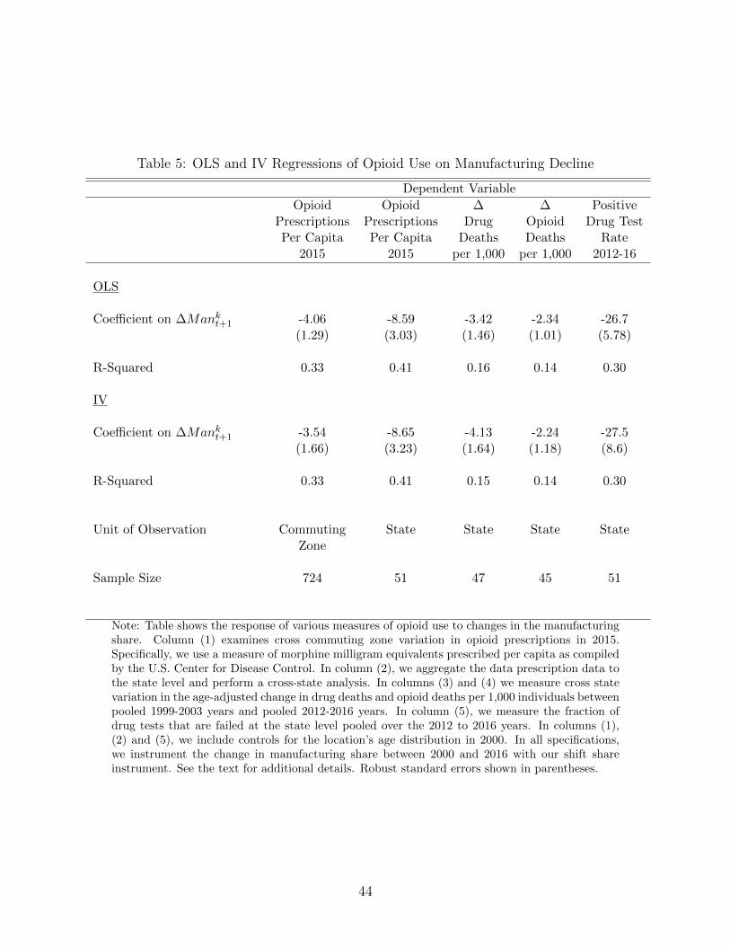
Table 5: OLS and IV Regressions of Opioid Use on Manufacturing Decline
Dependent Variable
Opioid Opioid ∆ ∆ PositivePrescriptions Prescriptions Drug Opioid Drug TestPer Capita Per Capita Deaths Deaths Rate
2015 2015 per 1,000 per 1,000 2012-16
OLS
Coefficient on ∆Mankt+1 -4.06 -8.59 -3.42 -2.34 -26.7
(1.29) (3.03) (1.46) (1.01) (5.78)
R-Squared 0.33 0.41 0.16 0.14 0.30
IV
Coefficient on ∆Mankt+1 -3.54 -8.65 -4.13 -2.24 -27.5
(1.66) (3.23) (1.64) (1.18) (8.6)
R-Squared 0.33 0.41 0.15 0.14 0.30
Unit of Observation Commuting State State State StateZone
Sample Size 724 51 47 45 51
Note: Table shows the response of various measures of opioid use to changes in the manufacturingshare. Column (1) examines cross commuting zone variation in opioid prescriptions in 2015.Specifically, we use a measure of morphine milligram equivalents prescribed per capita as compiledby the U.S. Center for Disease Control. In column (2), we aggregate the data prescription data tothe state level and perform a cross-state analysis. In columns (3) and (4) we measure cross statevariation in the age-adjusted change in drug deaths and opioid deaths per 1,000 individuals betweenpooled 1999-2003 years and pooled 2012-2016 years. In column (5), we measure the fraction ofdrug tests that are failed at the state level pooled over the 2012 to 2016 years. In columns (1),(2) and (5), we include controls for the location’s age distribution in 2000. In all specifications,we instrument the change in manufacturing share between 2000 and 2016 with our shift shareinstrument. See the text for additional details. Robust standard errors shown in parentheses.
44

state level manufacturing share between 2000 and 2016. As seen from the figure, there is
a strong statistically significant relationship between declining manufacturing employment
and increasing death rates from drug overdose.
Columns 3 and 4 of Table 5 show the OLS and IV estimates of the effect of declining
manufacturing employment on both increased drug overdose deaths and increased opioid
drug overdose deaths. For every one percentage point decline in the manufacturing employ-
ment share of prime age workers between 2000 and 2016, drug and opioid death rates per
1,000 individuals increased by 0.04 and 0.02, respectively, during the same time period. The
mean drug overdose rate and opioid overdose rate per 1000 in the pooled 1999-2003 years
was 0.10 and 0.06, respectively, for the U.S. as a whole. For the pooled 2011-2015 years,
the national mean drug overdose rate and opioid overdose rate was 0.25 and 0.16. Our cross
region estimates are large relative to the time series trends in aggregate death rates. While
without more structure it is hard to extrapolate the cross region estimates to the aggregate,
the results in Table 5 suggest that declining manufacturing demand - potentially through
weakening employment conditions - had a role in increased opioid deaths at the aggregate
level.
Our results complement recent analysis by Krueger (2017). Krueger documents that
opioid prescriptions are higher in counties where employment rates have fallen the most. He
interprets access to opioids as being an important causal factor explaining why employment
rates in the U.S. have fallen during the 2000s. His analysis controls for initial manufacturing
share when documenting the cross county relationship between opioid prescriptions and
declining employment rates. Our results suggest that declining manufacturing demand might
partly explain why opioid use has increased during the 2000s. The shift share instrument
isolates arguably exogenous reductions to manufacturing demand in a local areas. We find
that opioid use rose the most in precisely places that experienced the biggest exogenous
adverse shocks to manufacturing. Weak labor demand could be a factor contributing to the
rising opioid epidemic in the U.S. during the 2000s.32
The results thus far leave open the question of which specific persons in the community
increase their drug use when jobs disappear. It might be persons who lose work or family
members whose income falls when breadwinners are displaced. Similarly, the results shown
thus far do not distinguish between increased use for persons who will be seeking jobs and
those who will not. To the extent that current or future job-seekers are led to use drugs
because of an adverse shock to wellbeing when their labor market opportunities worsen, even
32This direction of causality is consistent with recent work by Autor et al. (2018), who show that commutingzones that experienced greater manufacturing trade shocks had more deaths due to drugs and alcohol among20-39 year old men by 2015.
45

Figure 21: Change in Manufacturing Share vs Change in Per Capita Opioid Overdose DeathRate 1999-2016, State Level Variation
-.1
0
.1
.2
.3
.4
.5
-.08 -.06 -.04 -.02 0Observed Change in Manufacturing Share 2000-2016
Coefficient = -2.33** (1.01)
Note: Figure shows the observed change in the manufacturing share of population between 2000-2016 and the change in per capita opioid overdose death rates between the early 2000s (1999-2003pooled) and the late 2000s (2011 - 2015 pooled). Each circle represents a U.S. state, and the sizeof the circle represents the state population in 2000. The weighted regression line is shown. Theestimated coefficient is -2.33 with a robust standard error of 1.01.
46

temporary wellbeing shocks might lead to future reductions in employment if job-seekers who
become addicted to drugs find it difficult to find a new job or to acquire the skills necessary
to fill open jobs. In other words, opioid use, manufacturing loss and employment might be
connected through employment hysteresis.
How does manufacturing decline affect drug use among people currently working or look-
ing for work? To answer this question, we examine the incidence of positive results on drug
tests given by employers to current and potential workers. We use novel data from Quest
Diagnostics. Quest Diagnostics is a private company that performs and analyzes a number
of health and wellness programs for employers. Among the services provided to employers is
drug testing of existing and potential employees. Using their data, Quest Diagnostics puts
out a Drug Testing Index that measures the fraction of their urine-based drug tests resulting
in a positive result.33 Underlying their Drug Testing Index are millions of individual drug
tests. In 2016 alone, Quest Diagnostics performed about 9 million urine-based drug tests on
existing and potential employees. While the sample is large, there are two potential selection
issues with their data. First, the data is limited to only current and prospective employees
of the firms that contract with Quest Diagnostics. To the extent that there is selection in
these firms, this could make their Drug Testing Index not nationally representative. For
example, Quest has a large sample of firms that are federally mandated to drug test their
employees (e.g., pilots, truck drivers, workers in nuclear power plants, etc.). Second, within
a given firm, not all drug tests are random. While many firms test all potential employees
prior to starting an employment relationship or randomly drug test existing employees, firms
also drug test employees for cause. According to the Quest data, employees drug tested for
cause have a probability of a positive drug test that is five times higher than a typical new
employee. When compiling their Drug Testing Index, Quest pools together the results of
potential new employees, randomly tested existing employees, and existing employees tested
for cause.
Despite these caveats, we think it is interesting to use the data to explore both time series
and cross-region trends in their Drug Testing Index. In terms of units, the index measures
the fraction of potential or existing employees with a positive drug test.34 According to the
Quest data, the propensity to fail a drug test has increased steadily since after the Great
Recession. In 2010, 3.5 percent of their sample had a positive drug test. By 2016, the positive
drug test rate increased to 4.2 percent. The increase was most pronounced in positive tests
for marijuana, amphetamines, and opioids.
33For more information see https://www.questdiagnostics.com/home/physicians/health-trends/
drug-testing.34All data was manually collected from the information provided on the Quest Diagnostics website (http:
//www.dtidrugmap.com/).
47

Since 2007, Quest has published state level measures of the Drug Testing Index on their
web page. Given that the data is only available from 2007 onwards, we cannot do a long
difference to explore changes in the propensity for a positive drug test. Instead, we only
explore the relationship between current propensity to have a positive drug test and the
decline in the manufacturing share between 2000 and 2016. To average out potential noise
in the index, we pool together the state level Drug Testing Index over the five year period
between 2012 and 2016. Figure 22 shows the relationship between the state level Drug Testing
Index (averaged between 2012 and 2016) and the change in the state level manufacturing
share for prime age workers between 2000 and 2016 (∆lnMankt+1). The figure shows that
states that experienced large declines in their manufacturing shares between 2000 and 2016
were much more likely to be home to a failed drug test in the 2012-2016 period. According to
the simple scatter plot, a 5.7 percentage point decline in the manufacturing share (the 90-10
difference) is associated with a 1.5 percentage point increase in the probability of failing an
employer provided drug test (p-value < 0.01). Given the base probability of testing positive
for drugs is about 4 percent, the findings suggest an economically large relationship between
manufacturing decline and the probability of testing positive for drugs.
Column 5 of Table 5 shows more causal estimates. The results in column 5 are analogous
to column 2 of the table except that the dependent variable is the state level Drug Testing
Index (pooled over the 2012 - 2016 years). Like the results in column 2, we also control for
the state’s age distribution in 2000. Focusing on the 2SLS results, a 5.7 percentage point
decline in the manufacturing share results in a 1.5 percentage point increase in the propensity
to have a positive drug test.
On the whole, our results strongly suggest that local wellbeing losses associated with job
and wage reductions from local manufacturing decline led to greater opioid use and increased
drug and opioid deaths at the local level. While some of this increased use might have been
among others in the community, it seems that workers and job-seekers accounted for some
of the increased use, based on the results of drug test firms conduct on their workers. This
latter finding raises the possibility that workers hurt by manufacturing decline, who salve the
negative shock to their wellbeing by using drugs, may confront worse employment prospects
in the future than would have otherwise been true.
5 Why A Persistent Employment Effect?
The fact that the adverse employment effects from the decline in manufacturing have lasted
as long as they have is both striking and puzzling. Different sectors, including manufacturing
at other times, have always routinely grown and declined in the economy, yet various me-
48

Figure 22: Average Positive Drug Test Rate (2012-2016) vs. Change in Manufacturing Share2000-2016
2
3
4
5
6
-.08 -.06 -.04 -.02 0Change in Manufacturing Share of Population, 2000-2016
Average Drug Test Positivity Rate, 2012-2016Fitted values
Coefficient = -26.82*** (6.24)
Note: Figure shows the average drug test positivity rate by state between 2012-2016 and theobserved change in the manufacturing share of the population between 2000 and 2016. Circle sizeindicates state population in 2000. The slope on the linear fit is -26.8 (robust standard error =6.2).
49

diating mechanisms ensure that affected workers generally do not have lowered employment
prospects years after the initial dislocation. It is clear that some of the mediating mechanism
have not worked, or else were not large enough, for post-2000 manufacturing change. For ex-
ample, from our local labor market results we know that many workers of a given level of skill
living in a particular market who lost their jobs in manufacturing did not get jobs requiring
the same skill in another industry in their same locality. Had this traditional mechanism
of adjustment worked strongly, then we would not have estimate negative within-location,
within-skill employment effects from manufacturing decline. In this section, we provide some
evidence about the operation and importance of three other mediating mechanisms: public
and private insurance, skill-mismatch, and mobility.
5.1 Disability and Private Transfers
One mediating mechanism that might be expected to affect the speed at which workers
transition from job losses associated with sectoral decline is the availability of alternative
sources of income to replace lost earnings because of non-work. To the extent that worker are
insured against earnings losses, from public or private sources, their transitions out of non-
work might be slowed. How important have public and private insurance been for affected
workers since 2000?
Recent scholarship has argued that reduced labor demand for lower educated workers has
led to increased disability take-up.35 Autor et al. (2013) use regional variation in the exposure
to their Chinese import competition shock to show that declining manufacturing shares in
a local area results in higher government transfers to that local area during the early 2000s.
Using this previous work as motivation, we examine changes in government transfer take-up
over the 2000s in response to our broader manufacturing changes. We measure the extent
to which increased receipt of government transfers is associated with the dramatic decline
in employment in response to declining manufacturing during the 2000s. We conclude that
if the receipt of government transfers contributed to the low employment rates of prime age
workers during this period, its effect was most likely small.
We use our Census/ACS sample to conduct this analysis. From these data, we know
whether individuals receive Supplemental Security Income (SSI) inclusive of Social Security
Disability Insurance (SSDI) income. For persons in age range we study, essentially all of
this income is SSDI associated with disability or blindness. Table 6 examines the fraction
of individuals receiving SSI/SSDI income for various sex and age demographic groups. We
35See, for example, Autor and Duggan (2003) and Sloane (2017) for evidence. The issue has also receivedattention in the popular press. See, for example, “Trends with Benefits” (NPR’s American Life, March 22,2013.)
50

Table 6: Share Receiving SSI/SSDI Income Received 2000 and 2016, By Demographic Group
Share Receiving Share ReceivingSSI/SSDI: All SSI/SSDI: Non-Working
2000 2016 2000 2016
Men
Age 21-40 0.01 0.02 0.06 0.10
Age 41-55 0.02 0.03 0.10 0.16
Women
Age 21-40 0.01 0.02 0.04 0.06
Age 41-55 0.03 0.04 0.08 0.11
Note: Table shows the share of individuals by age and sex that received Supplemental SecurityIncome (SSI) inclusive of Social Security Disability Insurance (SSDI) income in 2000 and 2016.Columns (1) and (2) does not restrict the sample based on employment status, while columns (3)and (4) restrict the sample to non-working individuals.
split our sample into a younger group (aged 21-40) and an older group (aged 41-55). The
age split allows us to compare labor market patters between groups that are more likely to
receive disability income (the older group) and are less likely to receive disability income
(the younger group).
The first two columns of Table 6 show the fraction of each group receiving SSI/SSID
income in 2000 and 2016. The third and fourth columns show similar statistics for non-
working members of each group. There are four key facts from Table 6. First, only between
1 percent and 4 percent of all prime age persons receive SSI/SSDI benefits in either 2000 or
2016. Second, the propensity to receive SSI/SSDI benefits is much lower for younger individ-
uals relative to older individuals. Third, all four sex-age groups increased their propensity
to receive SSI/SSDI benefits between 2000 and 2016. Fourth, and most importantly, most
young and old non-working individuals did not receive SSI/SSDI benefits in either 2000 or
2016. For example, only 10 percent of younger non-working men and 16 percent of older
non-working men received SSI benefits in 2016. Collectively, the table shows that the receipt
of SSI/SSDI benefits is relatively rare among non-working prime age individuals.
Although rare, it is possible that SSI/SSDI benefits could explain a portion of the decline
in employment rates in the 2000s. As seen from Table 6, SSI/SSDI receipt has increased by 1
percentage point nationally for all prime age-sex groups between 2000 and 2016. Employment
51

rates have fallen by about 4 percentage points for both younger and older men during
this period. At most, increased access to disability could explain one-quarter of declining
employment rates for prime age men during this period. That is an upper limit given
that these aggregate relationships do not imply that access to disability caused declining
employment.
Table 7 uses the cross-region variation exploited previously in the paper to more carefully
assess how the change in the fraction of a group receiving SSI/SSDI/SSDI payments during
the 2000s responds to changes in the manufacturing share. Specifically, we re-estimate
equation (1) with the dependent variable being the change in share of each demographic
group withing a commuting zone receiving SSI/SSDI benefits between 2000 and 2016 (column
1) and reestimate the change in the share of the demographic group employed within a
commuting zone between 2000 and 2016 (column 2). Each entry in the table is the coefficient
on the change in the manufacturing share in the commuting zone between 2000 and 2016 from
different regression. The various regressions differ by dependent variable and demographic
group. We only show the 2SLS estimates where we instrument for ∆Mankt+1 with Sk
t+1.
Column 1 of the table shows that manufacturing decline does raise SSI/SSDI receipt. For
every 10 percentage point decline in the manufacturing share, SSI/SSDI receipt by younger
men, older men and younger women increases by between 0.5 and 0.8 percentage points.
There is no statistically significant effect on SSI/SSDI receipt for older women. These results
are consistent with the findings in Autor et al. (2013) showing that manufacturing decline
driven by increased import competition from China resulted in an increased take up of public
transfers during the early 2000s. However, Table 7 also highlights why it is very unlikely
that increased SSI/SSDI participation is a dominant driver of persistently low employment
rates. Column 2 shows the change in the employment rate during the 2000s in response to
the declining manufacturing share for the different demographic groups. The response of the
change in the employment rate is roughly 5 to 7 times larger than the response of the change
in SSI/SSDI take up rate. This suggests SSI/SSDI participation could explain at most 15
to 20 percent of the persistent decline in employment during the 2000s. We conclude that
access to SSI/SSDI is at best only a small part of the story of why employment rates have
remained low as manufacturing employment has declined during the 2000s.
Apart from any public source, workers displaced from manufacturing might also receive
insurance against earnings losses from private sources, especially in form of different types
of assistance from friends and loved ones. Moving in with relatives might be one such
form of assistance. Aguiar et al. (2017) document that there has been a dramatic shift in the
propensity for young individuals (those aged 21-30) to live with their parents or another close
relative during the 2000s. For example, they find that roughly 30 percent of young men live
52

Table 7: IV Regression of Changing SSI/SSDI Receipt and Changing Employment Rates toChanges in Manufacturing Share 2000-2017, by Sex-Age Groups
Dependent Variable
∆ Share Receiving ∆ EmploymentSSI/SSDI Rate2000-2016 2000-2016
Men
Age 21-40 -0.08 0.40(0.02) (0.10)
Age 40-55 -0.05 0.35(0.03) (0.07)
Women
Age 21-40 -0.06 0.27(0.02) (0.11)
Age 40-55 0.00 0.30(0.03) (0.08)
Sample size 741 741
Note: Table shows the coefficients from a regression of changes in the share of individuals receivingSSI/SSDI transfers (column 1) or changes in employment rate between t and t + 1 by age and sexon ∆lnMank
t+1 (column 2) instrumented with Skt+1. Each observation is a commuting zone. All
regressions include our base set of additional controls. Robust standard errors are in parenthesis.
53

with a parent or close relative in 2000. By 2015, 45 percent of young men report living with a
parent or close relative. Given these time series trends, we explored whether the propensity
for young individuals to cohabitate with their parents or other close relatives increased more
in places that experienced a larger declining in the manufacturing share during the 2000s.
The results suggest that cohabitation patterns of 21-30 year olds are not systematically
related to declining manufacturing employment. The results of a regression of the change in
the propensity to live with a parent between 2000 and 2015 by younger households on the
decline in the manufacturing share in our base TSLS specification suggest that cohabitation
patterns are not systematically related to declining manufacturing employment.36 Based on
this important measure of family support, we think that private insurance via cohabitation
is not a first order explanation for why declining manufacturing employment is leading to
persistent declines in employment rates for young workers.
5.2 Changes in Skill Composition of Manufacturing Sector
A mechanism by which workers can adjust to sectoral transformation would be switch to new
jobs, either in their former sector or a new one. A factor that might act as a brake on the
smooth operation of this adjustment mechanism, and lead to persistently lower employment,
is if workers affected by sectoral transformation of the sort that occurred in manufacturing
in the 2000s lack the requisite skills for work in either their transformed former sector or
in another new sector. How important a role has this played in explaining the persistent
employment losses we document?
The possible importance of “skill mismatch” has appeared frequently in the popular press
in recent years.37 Proponents of the view that rising skill mismatch is a primary driver of
increasing labor market effects of manufacturing decline see evidence in support of their
hypothesis in the sharp increase in the job opening rate for the manufacturing sector during
the 2000s. The job opening rate is measured as the number of job openings in a given
industry divided by the sum of employment in that industry and the number of job openings
in that industry. We use data from the BLS’s Job Opening and Labor Turnover Survey
(JOLTS) to create Table 8. This table documents the trend in the job opening rate for the
total US economy and for various industries between 2001 and 2017.38 As the table shows,
36The full set of results provided by the authors upon request.37See, for example “Manufacturing’s Big Challenge: Finding Skilled and Interested Workers” (Chicago
Tribune, December 17, 2016), “As Skill Requirements Increase, More Manufacturing Jobs Go Unfilled”(Wall Street Journal, September 1, 2016) and “The Future of U.S. Manufacturing Jobs Will Require MoreBrain than Brawn” (NPR’s American Made series, November 7, 2014).
38The JOLT’s data comes monthly. For our yearly measures we take the simple average of the monthlymeasures during the year.
54

Table 8: Job Opening Rate By Industry, 2001 - 2017
2001 2017 Change LogRate Rate in Rate Difference
All Industries 3.32 4.16 0.85 0.23
Manufacturing 1.84 3.08 1.24 0.52Retail Trade 2.66 3.80 1.14 0.36Professional Services 3.98 4.97 0.99 0.22FIRE 3.53 4.25 0.72 0.19Leisure/Hospitality 4.49 4.82 0.33 0.07Construction 2.53 2.69 0.17 0.06Education/Health 4.63 4.74 0.10 0.02
Note: Data downloaded directly from the BLS’s Job Opening and Labor Turnover Survey. Seehttps://www.bls.gov/data/. To make yearly measures, we take the simple average of monthlyobservations over the year. For column (3), the change in rate is defined as the simple differencebetween the 2017 and 2001 job opening rate. For column (4), the log difference is defined as thedifference in the log job opening rate in 2017 relative to the log job opening rate in 2000.
the job opening rate has increased for the economy as a whole as well as for each broad
industry. However, between the early 2000s and 2017, the largest increase in the job opening
rate (in both absolute changes and percentage changes) was in the manufacturing sector.
The job opening rate in manufacturing nearly doubled during the 2000s from an initial rate
of 1.8 percent to the current rate of 3.1 percent.
The most obvious potential explanation for the increased job opening rate in the U.S.
economy is that it has become cheaper to post job openings. However, skill mismatch is an
alternative explanation. In addition to firms posting more vacancies because it is now cheaper
to do so, skill mismatch would cause vacancies firms post to stay unfilled longer because of
the difficulty of finding qualified workers. The available information on job openings data
does not allows to distinguish between these two explanations. However, it is interesting to
note that the job opening rate has grown the most (in both levels and percentage change)
within the manufacturing industry. Since there is no particular reason to suppose that is
somehow harder to post a job in manufacturing than in other sectors, this fact is consistent
with job mismatch being more important for manufacturing that for other sectors in the
economy. Construction is another sector that employs less educated men. Notice that the
job finding rate in construction has not increased that much at all during the 2000s.
To further explore the potential for skill mismatch in the manufacturing industry during
the 2000s, Table 9 looks at the educational composition of the manufacturing sector over
55

Table 9: Percent Bachelor’s Degree or More By Industry Over Time, Men Aged 25-30
1998-2001 2014-2017 ChangeShare Share in Share
All Men 25-29 26.5 31.9 5.4
Men 25-29 Working in Manufacturing 21.1 26.6 5.5Men 25-29 Working Retail Trade 16.6 20.2 3.6Men 25-29 Working in Construction 8.6 12.1 3.5
Note: Data from our CPS sample. We use the 1990 industry classification to define the Manufac-turing, Retail Trade and Construction industries. Table shows the share of men aged 25-29 withat least a bachelor’s degree in the total population (row 1), working in the manufacturing industry(row 2), working in the retail trade industry (row 3) and working in the construction industry (row4) in different years.
this time period. Our measure of educational composition is the share of workers who have
at least a bachelor’s degree within the industry. To illustrate the educational composition
of the manufacturing sector over time, we use our CPS sample. To facilitate exposition,
we focus on men between the ages of 25 and 29. The age restriction is imposed to look at
workers post bachelor’s degree but still young enough to be responsive to changing industry
level skill demands. Given the narrow age range, we pool our CPS data over 4 year intervals
between 1998-2001 (starting period) and 2013-2017 (ending period). We show results for
all 25-29 year old men (row 1) as well as men working in the manufacturing, retail trade
and construction industries. These three industries employ 45 percent of all working 25-29
year olds and 57 percent of all working 25-29 years with a high school degree or less in the
1998-2001 period. We pool data over the 1889-2001 samples (column 1) and the 2014-2017
samples (column 2).
We would like to highlight three results from Table 9. First, young men working in
manufacturing, retail trade, and construction tend to be relatively less skilled compared
young men in the economy overall. In all periods, the share of men aged 25-29 with Bachelors
degrees overall is higher than the proportion of 25-29 year olds in these three industries who
have college degrees. Second, young men in these sectors, as in the economy overall, became
more skilled during 2000s, as least as measured by the bachelors’ degree holding. Finally, the
manufacturing sector has experienced the largest increase in the share of young men with a
bachelor’s degree or more over this time period compared to retail trade and construction.
In the early 2000s, one in five younger workers in manufacturing had a bachelor’s degree.
By 2017, one in four workers in manufacturing had a bachelor’s degree. The 5.5 percentage
56

point increase in the bachelor’s degree share was larger than the increase in either retail trade
or construction. Additionally, it was on par with the increase in the bachelor’s degree share
for the population as a whole. Again, these results provide some additional evidence that
the manufacturing sector is becoming more skilled relative to other historically industries
populated by lower educated workers such as construction and retail trade during the 2000s.
Collectively, the above results suggest a potential role for skill mismatch in explaining
the sluggish response of employment to local manufacturing labor demand during the 2000s.
While many formerly lower skilled sectors attracted more educated workers during the 2000s
and whereas job opening rates have increased in all sectors during the 2000s, the increases
have been largest in the manufacturing sector. This is consistent with the substantial capi-
tal deepening that took place in the manufacturing sector during this time period. Overall,
we conclude that skill mismatch can potentially explain some of the sluggish response of
employment rates to declining employment needs in the manufacturing sector. Displaced
manufacturing workers may not have the skills to fill the jobs currently available in their
former sector. However, future work needs to be done to assess how quantitatively impor-
tant this mechanism is relative to other mechanisms.39 If the skill mismatch hypothesis is
quantitatively important, it suggests that policies to promote the manufacturing sector may
not substantively increase employment rates among less educated men.
5.3 Regional Mobility
A final mediating mechanism for adjustment to regional shocks of the sort that occurred in
manufacturing during the 2000s is cross-region migration. If a region experiences a decline
in labor demand relative to other areas, its residents may be more likely to out-migrate and
people from other areas may be less likely to migrate in. Both the increased out-migration
and the reduced in-migration will lower the number of potential workers in the affected
region to shrink. Because of cross-region migration, declining local labor demand shocks can
lead to declining local labor supply. As local labor supply responds to declining local labor
demand, equilibrium wage and employment responses are muted. This is the mechanism at
the heart of the seminal work of Blanchard and Katz (1992).
It is well documented that cross-region migration rates have fallen sharply in the U.S.
between over time . For example, Molloy et al. (2011) use data from the CPS, Census/ACS
and IRS to show that cross-region migration rates have consistently declined over the last
39Our results are broadly consistent with the recent findings of Weaver and Osterman (2017). Weaverand Osterman survey plant managers about their ability to hire qualified workers for their manufacturingfacilities. Their survey evidence finds that while many manufacturers do not have trouble finding qualifiedworkers, about one-quarter of the manufacturers they surveyed may show signs of not being able to hirequalified workers.
57

35 years. While the magnitudes of the declines differed across the surveys, all three surveys
showed declining inter-state mobility in the U.S. since 1980. Kaplan and Schulhofer-Wohl
(2017) further explore the decline in cross-region mobility in the U.S. Using data from the
CPS, they find that for individuals between the ages of their early 20s and 55, annual
interstate mobility rates have fallen from about 4 percent in 1990 to under 2 percent in
2011. Dao et al. (2017) find that interstate mobility in response to local labor demand
shocks has been declining since the early 1990s, and Autor et al. (2014) find that workers
in trade-exposed areas in 1994 do not increase employment or earnings in other commuting
zones, suggesting that they do not shift labor supply across geographic areas. Not only are
individuals moving across regions less over time, but they are also less likely to move across
regions in response to relative changes in labor market conditions. Declining cross-area
mobility and a reduced mobility response to local labor demand shocks might explain, in
part, why local sectoral shocks in the 2000s are more likely to result in declining employment
rates.
On the surface, the persistent employment effects we find for the manufacturing changes
in the 2000s are strongly consistent with the strongly reduced role of the mediating mech-
anism of mobility. To explore this declining mobility hypothesis further, we examine how
manufacturing declines in 1980s affected employment rates during that time period and then
compare cross-regional mobility in the earlier period to the 2000s. We proceed in two parts.
First, we re-do our cross-region analysis on the link between manufacturing decline and labor
market outcomes for the 1980 to 1990 period. As seen from Figures 12 and 13, employment
shares in manufacturing declined steadily during the 1980s. Figure 23 shows the shift share
instrument defined for the 1980s also has strong predictive power during the 1980-1990 pe-
riod.40 Specifically, predicted manufacturing decline based on initial manufacturing shares
and national trends between 1980 and 1990 are strongly predictive of actual manufacturing
shares at the commuting zone level between 1980 and 1990. The scatter plot shows that the
shift-share instrument predicts changes in the commuting zone’s manufacturing share in the
1980s as well as the 2000s version does for the recent period (R-squared = 0.46, F-stat =
189.13).
Row 1 of Table 10 shows our IV estimates of manufacturing decline on employment
rates of prime age men and women during the 2000-2016 period (column 1) and during
the 1980-2000 period (column 2). The column 1 results in row 1 are analogous to those in
Table 2 except in this table we pool together men and women for ease of exposition. As
before, during the 2000s, a ten percentage point decline in the manufacturing share reduced
prime age employment rates by 3.4 percentage points. The patterns during the 1980s are
40We define our Skt+1 variable for the 1980s analogously to the way we computed it for the 2000s.
58

Figure 23: Predicted Change in Manufacturing Share 1980-1990 vs. Change in Manufactur-ing Share 1980-1990
-.1
-.05
0
.05
Pred
icte
d Ch
ange
in M
anuf
actu
ring
Shar
e
-.1 -.05 0 .05Observed Change in Manufacturing Share
Note: Figure shows the relationship between the predicted change in the manufacturing sharebetween 1980 and 1990 and the observed change. The change is predicted using our shift shareinstrument and local area baseline controls. Each observation is a commuting zone. The size ofthe circle reflects the size of the 1980 prime age population in each commuting zone. The figureincludes the weighted regression line of the scatter plot. The slope of the regression line is 0.46with a robust standard error of 0.03.
59

Table 10: IV Response of Change in Log Population to Change Manufacturing Share OverTime, Individuals Aged 21-55
Dependent Variable Time Period
2000-2016 1980-1990
∆ Employment Rate 0.34 -0.15(0.07) (0.10)
∆ ln Popkt+1 0.86 3.84
(0.45) (1.04)
Standard Controls Yes Yes
Sample size 741 741
Note: The first row of the table shows the coefficient on predicted manufacturing decline from aregression of changes in the employment rate between t and t + 1 to ∆lnMank
t+1 instrumentedwith Sk
t and additional controls. The second row of the table shows the coefficient on predictedmanufacturing decline from a regression of changes in log population between t and t + 1 to∆lnMank
t+1 instrumented with Skt and additional controls. Each observation is a commuting
zone. The results in column (1) use t = 2000 and t + 1 = 2016 while the results in column (2) uset = 1980 and t + 1 = 1990. All regressions include our base set of additional controls, while thepopulation change regressions additionally include census division fixed effects. Robust standarderrors are in parentheses.
quite different. In column 2 we show that a decline in the local manufacturing share had
no statistically significant effect on local employment rates. During the 1980s, there was
essentially no persistent effect of manufacturing decline on local employment rates.41
To examine whether differential mobility patterns may have contributed to the differential
findings between the 1980s and today, we estimate the following regressions on both our
1980-2000 and 2000-2016 samples:
∆ lnPopkt+1 = α + β∆Mankt+1 + ΓXk
t + εkt+1 (8)
where lnPopkt is the log of all individuals between the ages of 21 and 55 living in k in period t
and ∆ lnPopkt+1 is the change in lnPopk between periods t and t+1. As above, we instrument
41These findings hold if we look at men and women separately or if we look at different sex-skill groups.Additionally, our results are in line with the finding of Bound and Holzer (2000) which found demand shiftsaway from manufacturing had a small but significant effect on employment rates of men during during the1970s and 1980s.
60

∆Mankt+1 using our time period specific shift share instrument. This regression is analogous
to the regressions in Tables 2 except that the dependent variable is the change in prime age
population rather than the change in labor market outcomes. When estimating regression
8, we follow the lead of Autor et al. (2013) and control for census division fixed effects, in
additional to the same Xk vector of controls in the models presented in Table 2. Given the
secular shifts in population from the northeast and the midwest to the south and western
states during the last half century, one needs to include such controls when assessing the the
causal relationship between manufacturing decline and changes in population.
The second row of Table 10 presents the estimation results for regression (8). The table
shows that a 1 percentage point change in the manufacturing share caused population to
respond by only 2.3 percent over the 2000 to 2016 period and by roughly 4.0 percent over
the 1980 to 1990 period. These results are consistent with the finding of Doa et al. (2017)
showing that the population response to local labor market shocks is smaller in recent periods
than it was in the 1980s. We also wish to note that the number of years over which the
population is changing is not the same across the two regressions. Our 2000s regressions are
over a 16 year period while the 1980s regressions are over a 10 year period. If there is some
sluggishness in the population response, a longer time period may allow for more population
adjustments. However, if we annualized the coefficients, the differences between the 2000s
and the 1980s become even more dramatic.42 When we omit the census division controls,
the same qualitative patterns emerge in that manufacturing decline has a larger effect on
population changes in the 1980s than it does in the 2000s.
These results suggest that declining cross-region mobility might, in fact, be an important
reason for the large and persistent effects of manufacturing decline on employment rates
during the 2000s compared to the 1980s. A question that arises immediately, however, is
why mobility rates (and mobility in response to shocks) have fallen as much as they have.
Although much more work needs to be one on this question, results from work by Molloy et
al. (2014) indicates that reduced gains from job switching might be an especially key driver of
these changes in mobility over time, compared to demographic factors like population aging
or homeownership. Might these reduced gains workers receive from switching jobs, if true
in manufacturing, be related to standardization of production processes through robotics or
consolidation in firm ownership in the sector? If so, declining mobility would itself be a result
of a change in the manufacturing sector rather than an explanation for why manufacturing
42Our results contrast somewhat with the results of Autor et al. (2013) suggesting that the Chinese importshock did not have an effect on local population. In addition to using a broader source of variation, oursample period is over a much longer horizon. They examined patterns through 2007. We are looking atpatterns through 2016. If migration is sluggish, the longer time period allows us to better uncover thesluggish population response to manufacturing decline.
61

reductions currently have larger employment effects than they one did. Questions of this sort
remain to be answered before definitive conclusions can be drawn about the role of falling
population mobility for the larger effect that manufacturing changes have on labor market
outcomes today compared to the 1980s.
6 Discussion and Conclusion
Employment rates and annual hours worked have fallen substantially throughout the 2000
to 2017 period. The declines have been most pronounced among those with lower levels of
accumulated schooling. For example, prime age men without a bachelor’s degree are working
over 200 hours per year less than their counterparts in 2000. Much of this decline is due to
individuals who have persistently left the labor market.
In this paper, we highlight the importance of the structural change in the manufacturing
sector in explaining these patterns. Exploiting cross-region variation, we document that the
persistent long run decline in employment and hours for prime age workers did not occur
evenly across the United States. Furthermore, we document a strong cross-region correlation
between declining manufacturing employment and declining employment rates of prime age
workers. Using a shift share instrument, we find that a 10 percentage point decline in the
local manufacturing share reduced local employment rates of by 3.7 percentage points for
prime age men and 2.7 percentage points for prime age women. To put the magnitude
in perspective, naively extrapolating the local estimates suggests that between one-third
and one-half of the decline in employment rates and annual hours for prime age workers
can be attributed to the decline in the manufacturing sector. This naive estimate ignores
many important general equilibrium effects that will certainly alter the exact quantitative
magnitude. However, the naive results suggest that the decline of the manufacturing sector
is a first order factor in the depressed labor market outcomes for prime age workers in the
United States.
We present novel evidence showing how local manufacturing decline has adversely affected
local wellbeing. Using data from a variety of sources, we document that declining manufac-
turing employment is associated with increased prescription opioid use and increased death
rates from drug overdoses. There is a growing literature suggesting that physician behav-
ior is in part responsible for the opioid epidemic within the U.S. Our results highlight how
local economic conditions are interacting with these other potential causes of opioid behav-
ior. These results suggest that a combination of both opioid supply and opioid demand are
contributing to the rise in opioid use and opioid deaths during the 2000s.
One natural question is why the decline in the manufacturing sector is leading to per-
62

sistent declines in employment rates. The U.S. economy has experienced sector declines
throughout its history, and the manufacturing sector itself has, at other periods, shed large
numbers of jobs. Yet, rarely are the negative employment rate effects of these changes been
as large or persistent - presumably because of various mediating mechanisms that, in gen-
eral, might be expected to ease employment transitions. We present evidence relevant to
the operation of three of these mediating mechanism during the 2000s: transfer receipt from
public and private sources; skill-mismatch and job finding; and regional migration. Our
results suggest that whereas the other factors play some role in explaining long-term adverse
employment outcomes from manufacturing loss, the reduced propensity of workers to move
across regions is a striking feature of the data during recent periods relative to prior periods.
Our finding that opioid drug use has risen in areas hard-hit by manufacturing decline may
have implications for future employment prospects in these areas. To the extent that these
workers become addicted to drugs, which they might have taken in the first place because
of the shock of a job loss, their likelihood of getting and retaining a job in the future will
be lower. We know that employers are testing more for drug use and that the incidence of
positive result on these tests is rising. Even if those individuals who are taking drugs want
to find a job, employers may screen them out at the application phase.43 Increased drug use
in a local area arising from manufacturing job loss might itself lead to further reductions
in employment. In other words, opioid use, manufacturing loss and employment might be
connected through employment hysteresis.
Finally, our results contribute to ongoing debates about policies concerning the manufac-
turing sector. There has been much recent discussion from policymakers about industrial,
environmental, and trade policy - all with the aim of promoting employment in the manu-
facturing sector. Behind these discussion appears to be the view that if policies like freer
trade contributed to the decline in U.S. manufacturing employment, restricting trade should
cause lost manufacturing jobs to come back. As we have discussed, results from Pierce and
Schott (2016), Autor et al. (2013), Acemoglu et al. (2016) do indeed suggest that import
competition has played an important role in the decline of U.S. manufacturing employment
during the 2000s.
However, our results also suggest that imposing trade barriers against the rest of the
world is unlikely to substantially increase the employment prospects of workers with lower
levels of accumulated schooling. For one thing, we have shown that the manufacturing sector
is becoming increasingly highly skilled in terms of the education of the workers it hires. We
43In recent years, the popular press has reported that firms are struggling to hire workers who can passa drug test. See, for example, “Hiring Hurdle: Finding Workers Who Can Pass a Drug Test” (New YorkTimes, May 17, 2016).
63

have also shown that manufacturing has become much more capital intensive since 2000.
Those manufacturing sectors that were most exposed to the trade shock from China actually
experienced the largest declines in the labor share, suggesting that if they were to rebound
they would do so with a much higher capital share relative to the early 2000s. Finally the
specific factories whose closings accounted for much of trade-related job loss during the 2000s
were likely using “20th century”, more labor-intensive technology. Should trade barriers be
erected, the new manufacturing plants that would created in the U.S. would almost surely
use more capital-intensive, “21st century” technologies than the plants that were wiped out
by trade shocks. While certain policies to support the manufacturing sector (like imposing
tariffs on imports) may increase U.S. manufacturing output, they will likely not have large
effects on the employment rates of workers with lower levels of education.
References
Abraham, Katharine and Melissa Kearney, “Explaining the Decline in the U.S.
Employment-to-Population Ratio: A Review of the Evidence,” NBER Working Paper
No. 24333, February 2018.
Acemoglu, Daron and Pascual Restrepo, “Robots and Jobs: Evidence from US Labor
Markets,” March 2017.
, David Autor, David Dorn, Gordon H. Hanson, and Brendan Price, “Import
Competition and the Great US Employment Sag of the 2000s,” Journal of Labor Eco-
nomics, 2016, 34 (S1), S141–S198.
Adao, Rodrigo, Costas Arkolakis, and Federico Esposito, “Trade, Agglomeration
Effects, and Labor Markets: Theory and Evidence,” Working Paper 2017.
Aguiar, Mark, Mark Bils, Kerwin Kofi Charles, and Erik Hurst, “Leisure Luxuries
and the Labor Supply of Young Men,” Working Paper 23552, National Bureau of Economic
Research June 2017.
Autor, David H and Mark G Duggan, “The rise in the disability rolls and the decline
in unemployment,” The Quarterly Journal of Economics, 2003, 118 (1), 157–206.
Autor, David H., David Dorn, and Gordon H. Hanson, “The China Syndrome: Local
Labor Market Effects of Import Competition in the United States,” American Economic
Review, October 2013, 103 (6), 2121–68.
64
, , and , “Untangling Trade and Technology: Evidence from Local Labour Markets,”
The Economic Journal, May 2015, 125 (584), 621–646.
, , and , “When Work Disappears: Manufacturing Decline and the Falling Marriage
Market Value of Young Men,” Working Paper 2018.
, , , and Jae Song, “Trade Adjustment: Worker-Level Evidence,” The Quarterly
Journal of Economics, 2014, 129 (4), 1799–1860.
Bartik, Timothy, “Who Benefits from State and Local Development Policies,” W.E. Up-
john Institute for Employment Research, 1991.
Beraja, Martin, Erik Hurst, and Juan Ospina, “The Aggregate Implications of Re-
gional Business Cycles,” Working Paper 21956, National Bureau of Economic Research
February 2016.
Blanchard, Olivier J. and Lawrence F. Katz, “Regional Evolutions,” Brookings Papers
on Economic Activity, 1992, 1, 1–75.
Bound, John and Harry J. Holzer, “Demand Shifts, Population Adjustments, and Labor
Market Outcomes during the 1980s,” Journal of Labor Economics, 2000, 18 (1), 20–54.
Case, Anne and Angus Deaton, “Mortality and Morbidity in the 21st Century,” Brook-
ings Papers on Economic Activity, 2017.
Charles, Kerwin Kofi and Philip DeCicca, “Local labor market fluctuations and health:
Is there a connection and for whom?,” Journal of Health Economics, ? 2008, 27 (6), 1532–
1550.
, Erik Hurst, and Matthew J. Notowidigdo, “The Masking of the Decline in Man-
ufacturing Employment by the Housing Bubble,” Journal of Economic Perspectives, May
2016, 30 (2), 179–200.
, , and , “Housing Booms, Manufacturing Decline, and Labor Market Outcomes,”
Economic Journal, Forthcoming.
Currie, Janet, Jonas Jin, and Molly Schnell, “U.S. Employment and Opioids: Is There
a Connection,” Princeton Working Paper, March 2018.
Dao, Mai, Davide Furceri, and Prakash Loungani, “Regional Labor Market Adjust-
ment in the United States: Trend and Cycle,” The Review of Economics and Statistics,
2017, 99 (2), 243–257.
65

Goldsmith-Pinkham, Paul, Isaac Sorkin, and Henry Swift, “Bartik Instruments:
What, When, Why, and How,” Working Paper July 2017.
Goldstein, Amy, Janesville: An American Story, New York: Simon & Schuster, 2017.
Houseman, Susan, Timothy Bartik, and Timothy Sturgeon, “Measuring Manufac-
turing: How the Computer and Semiconductor Industries Affect the Numbers and Per-
ceptions,” in Susan Houseman and Michael Mandel, eds., Measuring Globalization: Better
Trade Statistics for Better Policy, Volume 1, Biases to Price, Output, and Productivity
Statistics from Trade, Kalamazoo, MI: W.E. Upjohn Institute for Employment Research,
2015, chapter 5, pp. 151–193.
Kaplan, Greg and Sam Schulhofer-Wohl, “Understanding the Long-Run Decline in
Interstate Migration,” International Economic Review, 2017, 58 (1), 57–94.
Karabarbounis, Loukas and Brent Neiman, “The Global Decline of the Labor Share,”
The Quarterly Journal of Economics, 2014, 129 (1), 61–103.
Krueger, Alan B, “Where have all the workers gone? An inquiry into the decline of the
U.S. labor force participation rate,” Brookings Papers on Economic Activity, 2017.
Laird, Jessica and Torben Nielsen, “The Effects of Physician Prescribing Behaviors on
Prescription Drug Use and Labor Supply: Evidence from Movers in Denmark,” Working
Paper 2016.
Moffitt, Robert A., “The U.S. Employment-Population Reversal in the 2000s: Facts and
Explanations,” Working Paper 18520, National Bureau of Economic Research November
2012.
Molloy, Raven, Christopher L. Smith, and Abigail K. Wozniak, “Declining Migra-
tion within the U.S.: The Role of the Labor Market,” Working Paper 20065, National
Bureau of Economic Research April 2014.
, , and Abigail Wozniak, “Internal Migration in the United States,” Journal of
Economic Perspectives, September 2011, 25 (3), 173–96.
Murphy, Kevin M. and Robert H. Topel, “The Evolution of Unemployment in the
United States: 1968-1985,” NBER Macroeconomics Annual, 1987, 2, 11–58.
Nakamura, Emi and Jon Steinsson, “Fiscal Stimulus in a Monetary Union: Evidence
from US Regions,” American Economic Review, March 2014, 104 (3), 753–92.
66

Pierce, Justin R. and Peter K. Schott, “The Surprisingly Swift Decline of US Manu-
facturing Employment,” American Economic Review, July 2016, 106 (7), 1632–62.
and , “Trade Liberalization and Mortality: Evidence from U.S. Counties,” Yale Work-
ing Paper, October 2017.
Quinones, Sam, Dreamland: The True Tale of America’s Opiate Epidemic, New York:
Bloomsbury Press, 2015.
Ruhm, Christopher, “Deaths of Despair or Drug Problems,” NBER Working Paper No.
24188, January 2018.
Sloane, Carolyn M., “Where Are the Workers? Technological Change, Rising Disability
and the Employment Puzzle of the 2000s: A Regional Approach,” Working Paper October
2017.
Weaver, Andrew and Paul Osterman, “Skill Demands and Mismatch in U.S. Manufac-
turing,” ILR Review, 2017, 70 (2), 275–307.
67

7 Data Appendix
Capital intensity The value of capital services relative to the value of hours worked in the
production process.
Chinese Import Competition The change in imports from China over the period 1999-
2011, divided by initial absorption (measured as industry shipments plus industry
imports minus industry exports). Source: Acemoglu et al. (2016).
Manufacturing Share Also referred to as the “Manufacturing Share of the Population”,
and “Manufacturing to Population Ratio”, and measured in the CPS, ACS, and Census,
the manufacturing share is the ratio of the number of persons aged 21-55 in the relevant
group working in manufacturing to the number of all such persons between 21 and 55,
regardless of employment status. The data are weighted using survey weights provided
in the relevant survey.
Demographically Adjusted Real Wages at the Commuting-Zone Level We make wage
measures by diving annual labor earnings by annual hours worked for all individuals
with positive labor earnings. We then compute average wages within each commuting
zone. To adjust wages for demographic traits, we re-weighted the 2016 sample to match
the age, education, and gender distribution within each commuting zone in 2000, using
five-year age bins and three education groups. Finally, we compute the change in log
demographically adjusted wages within each commuting zone.
Annual Hours in the CPS To create the annual hours measure, we multiply an individ-
ual’s report of the number of weeks they worked during the prior calendar year by their
report of usual hours worked per week. We then average the individual reports for an-
nual hours worked over all prime age males by year. Individuals who report not having
worked at all during the prior year are assigned zero hours. Given the CPS sample
design, individuals from survey year t report their annual hours worked in survey year
t − 1. Throughout the paper, we will refer to years in which hours were worked, not
when they were reported. Thus, for CPS sample, hours worked in 1976 was reported
by respondents in 1977.
Annual Hours in the ACS To create the annual hours measure in the ACS, we follow
the same procedure as in the CPS, using intervalled weeks worked from 2000-2016,
since these are the only measure of weeks worked in the later years. Given the ACS
sample design, individuals from survey year t report their annual hours worked in the
68

previous 12 months. For this reason, we assign hours worked to the survey year, not
the prior year as in the CPS.
69