The Trade Theorist's Sacred Diagram: Its Origin and Early Development
13
THE TRADE THEORIST’S SACRED DIAGRAM: ITS ORIGIN AND EARLY DEVELOPMENT ThomasM. HunqQirey Introduction In his celebrated 1945 essay on international trade under variable returns in a simple model’ the noted Dutch economist Jan Tinbergen presented his ver- sion of what Robert Baldwin calls “the sacred diagram of the international trade economist” [ 1, p. 142). Tinbergen used the diagram, which consists of a transformation or production possibility curve, taste indifference curves, and relative price or terms-of- trade lines, to show how a country gains from the opportunity to trade at a world price ratio different from the closed-economy one (see Figure 1). Given that opportunity, the country does two things. First, it produces the output mix that maximizes its national product valued at world prices. That is, it produces at the point of tangency of the production possi- bility curve and world price line. Then it trades along that line, exporting products in which it has a com- parative cost advantage in exchange for imports of products in which it has a comparative disadvantage, until it reaches its point of maximum satisfaction on its highest attainable indifference curve. There it enjoys a bundle of goods that it could not produce or consume in isolation. Here is the economist’s case for free trade captured in a single diagram. That a simple geometrical diagram would become an icon is hardly surprising. Other economic diagrams have enjoyed that same distinction-the Keynesian cross, Marshallian sissors, Hicksian IS-LM, Edgeworth-Bowley box, Phillips curve, and Knight- ian circular flow are cases in point. What is sur- prising is how little has been written on the trade diagram’s history. Few systematic surveys of that history exist; textbooks say little about it. Tinbergen himself said nothing about earlier versions of the diagram even though it was 38 years old at the time he presented it. Who invented the diagram? How was it initially received? Who exerted the greatest influence in getting it accepted into trade theory? ’ Tinbergen’s essay, originally entitled “Professor Graham’s Case for Protection,” was reprinted in 1965 in a slightly abbreviated version as “International Trade Under Variable Returns in a Very Simple Model.” See [ 161. Figure 1 TINBERGEN’S DIAGRAM cu COMMODITY 1 Before trade the economy produces and consumes at A, the common point of tangency of transformation curve and indifference curve. Given the opportunity to trade at the world price ratio shown by the slope of line PC, it produces commodity bundle P which it then trades for bundle C to reach its point of maximum satisfaction C on its highest attainable indifference curve. Source: Tinbergen [16, p. 1291. Today these issues still remain unresolved and one finds such writers as Samuelson, Baldwin, Maneschi and Thweatt disagreeing over whether Viier, Lerner, Haberler, or Barone contributed most to the diagram’s development. 2 In an effort to rectify this situation and to provide some needed historical perspective, this article traces the evolution of the trade diagram from its 1907 origins to its presenta- tion by Tinbergen in 1945 by which time it had already become the standard geometrical tool of the trade theorist. A word of explanation is in order, however. Today analysts put the diagram to many 2 See Maneschi and Thweatt [ 12, pp. 375-781 for a review of the controversy. FEDERAL RESERVE BANK OF RICHMOND 3
Transcript of The Trade Theorist's Sacred Diagram: Its Origin and Early Development

THE TRADE THEORIST’S SACRED DIAGRAM:
ITS ORIGIN AND EARLY DEVELOPMENT
Thomas M. HunqQirey
Introduction
In his celebrated 1945 essay on international trade under variable returns in a simple model’ the noted Dutch economist Jan Tinbergen presented his ver- sion of what Robert Baldwin calls “the sacred diagram of the international trade economist” [ 1, p. 142). Tinbergen used the diagram, which consists of a transformation or production possibility curve, taste indifference curves, and relative price or terms-of- trade lines, to show how a country gains from the opportunity to trade at a world price ratio different from the closed-economy one (see Figure 1). Given that opportunity, the country does two things. First, it produces the output mix that maximizes its national product valued at world prices. That is, it produces at the point of tangency of the production possi- bility curve and world price line. Then it trades along that line, exporting products in which it has a com- parative cost advantage in exchange for imports of products in which it has a comparative disadvantage, until it reaches its point of maximum satisfaction on its highest attainable indifference curve. There it enjoys a bundle of goods that it could not produce or consume in isolation. Here is the economist’s case for free trade captured in a single diagram.
That a simple geometrical diagram would become an icon is hardly surprising. Other economic diagrams have enjoyed that same distinction-the Keynesian cross, Marshallian sissors, Hicksian IS-LM, Edgeworth-Bowley box, Phillips curve, and Knight- ian circular flow are cases in point. What is sur- prising is how little has been written on the trade diagram’s history. Few systematic surveys of that history exist; textbooks say little about it. Tinbergen himself said nothing about earlier versions of the diagram even though it was 38 years old at the time he presented it. Who invented the diagram? How was it initially received? Who exerted the greatest influence in getting it accepted into trade theory?
’ Tinbergen’s essay, originally entitled “Professor Graham’s Case for Protection,” was reprinted in 1965 in a slightly abbreviated version as “International Trade Under Variable Returns in a Very Simple Model.” See [ 161.
Figure 1
TINBERGEN’S DIAGRAM
cu
COMMODITY 1
Before trade the economy produces and consumes at A, the common point of tangency of transformation curve and indifference curve. Given the opportunity to trade at the world price ratio shown by the slope of line PC, it produces commodity bundle P which it then trades for bundle C to reach its point of maximum satisfaction C on its highest attainable indifference
curve.
Source: Tinbergen [16, p. 1291.
Today these issues still remain unresolved and one finds such writers as Samuelson, Baldwin, Maneschi and Thweatt disagreeing over whether Viier, Lerner, Haberler, or Barone contributed most to the diagram’s development. 2 In an effort to rectify this situation and to provide some needed historical perspective, this article traces the evolution of the trade diagram from its 1907 origins to its presenta- tion by Tinbergen in 1945 by which time it had already become the standard geometrical tool of the trade theorist. A word of explanation is in order, however. Today analysts put the diagram to many
2 See Maneschi and Thweatt [ 12, pp. 375-781 for a review of the controversy.
FEDERAL RESERVE BANK OF RICHMOND 3
uses-to depict the effects of protection, of non- economic objectives of tariffs, of domestic market distortions, and of growth on trade, to name just a few. Historically, however, economists chiefly em- ployed it to illustrate trade equilibrium and the gains from trade in a fully competitive economy in which the balance of payments for simplicity consists of the balance of trade. Given this article’s historical focus, it too concentrates on those traditional concerns.
Historical Evolution
Historically the diagram evolved through at least eight stages. Each stage saw a different innovator con- tribute to the diagram’s development. Irving Fisher (1907) invented the diagram to illustrate a problem in capital theory, Enrico Barone (1908) extended it to international trade, and Allyn Young (1928) ap- plied it to a hypothetical closed economy operating under constant, decreasing, and increasing returns. Gottfried Haberler (1930) introduced the strictly con- cave production frontier version into foreign trade theory. Jacob Viner (193 1) added community indif- ference curves to Haberler’s diagram and criticized the entire apparatus. Abba Lerner (1932) extended the diagram to the level of the aggregate world economy, Wassily Leontief (1933) applied it to two countries simultaneously, and Jan Tinbergen (1945) elegantly consolidated their results. Except for Young, each analyst used the diagram to emphasize the gains from trade. Of these analysts, it was Haberler and Leontief who had the greatest influence. It was they who convinced trade theorists to add the diagram to their analytical tool kit. What follows describes in chronological order the specific contributions of each of these pioneers.
Irving Fisher
Francis Y. Edgeworth invented indifference curves in his Matktikal Py&s 188 Similarly, Pareto the of curves
his di poh%-a 1906. Irving in 1907 Th of was first combine and mation together market lines a
diagram to it illustrate gains exchange Figure
True, applied diagram a in theory than the of trade.
is, used to an optimum decision than country’s
trade But difference only ficial. trade after Fisher the
Figure 2
FISHER’S DIAGRAM
Y’ C A
PRESENT CONSUMPTION
.co
Given the interest rate implicit in the slope of line AB, an investor produces the two-period consumption bundle P having the highest present value. Then he trades that bundle for bundle Q by lending PD units of present consumption for DQ units of future con- sumption to reach his point of maximum satisfaction Q.
Source: Fisher 14, p. 409).
diagram to demonstrate the gains from trade (albeit intertemporal rather than international). And like trade theorists, he showed the individual moving along the production possibility frontier to the highest attainable price line and then trading along that line to reach the point of maximum satisfaction. In terms of abstract economic logic, his demonstration matches that of the trade theorists. To Fisher, then, must go the credit for inventing the trade diagram.
His diagram appears on page 409 of T/re Rate of Intemt.3 The transformation or production possi- bility or (as Fisher called it) opportunity curve ZPW shows an individual’s opportunity to transform present consumption (measured on the horizontal axis) into future consumption (measured on the
3 Fisher also used the diagram in his Th T~OIY of Zn~eresf (1930). On Fisher’s diagram see Hirshleifer 19, pp. 330-34 and Samuelson 115, pp. 29-333.
4 ECONOMIC REVIEW, JANUARY/FEBRUARY 1988
vertical axis) by investing in real capital projects. The concave shape of the curve represents diminishing returns to investment as the sacrifice of more and more units of consumption today yields smaller and smaller increments to consumption tomorrow.
The set of convex iso-desirability curves (as Fisher called them) labeled 10, 20, 30, etc. constitute the individual’s indifference map. Each curve shows altei- native combinations of present and future consump- tion that yield equal satisfaction. Higher curves repre- sent higher levels of satisfaction. Finally, the interest line AB shows the opportunity to convert P dollars of present consumption into Q dollars of future con- sumption by lending at the market rate of interest shown by the slope of the line. In other words, one can lend as well as invest.
Fisher explains that the individual, if deprived of the opportunity to lend on the money market, would choose the two-period consumption combination shown by the common point of tangency of indiffer- ence curve and production possibility curve (point S).4 This is analogous to the trade diagram’s closed- economy equilibrium production and consumption point.
Given the opportunity to lend at the going rate of interest, however, the individual equates that rate with the marginal rate of return on real investment by moving along the production frontier to point P on the highest attainable interest line AB. That is, he chooses the two-period consumption bundle having the highest present value calculated at the market interest rate shown by the slope of AB. Then he trades along that line, lending PD (= x’) dollars of current consumption in exchange for DQ ( = x “) dollars of future consumption, to reach a point of maximum satisfaction Q. In short, given the oppor- tunity to trade at a market price, the individual pro- duces the bundle of goods having the highest market value and then trades it for a preferred bundle lying beyond the production frontier. But this is exactly what a fully competitive open national economy does when given the opportunity to trade at world prices.
Modern users of the trade diagram note that in- ternational equilibrium requires the world price ratio be such as to balance trade across nations. In other words, the desired exports of one nation must at the equilibrium price ratio equal the desired imports of another and vice versa. Fisher argued the same about the equilibrium rate of interest. That rate, he said, equates the desired lending of one individual with the desired borrowing of another-that is, it ensures
4 Fisher omits the relevant indifference curve to avoid clutter- ing the diagram.
that the legs of the trade triangle PDQ are equal in length but opposite in sign across lenders and borrowers. Thus Fisher did more than specify trade equilibrium conditions for a single individual facing a given market rate. He also specified the market equilibrium conditions that determine that rate. True, he did not show such conditions in his diagram. That is, he did not extend it to the two-person case. But he stated how it could be done. His work presaged later uses of the diagram to depict world trade equilibrium in the two-country case.
Enrico Barone
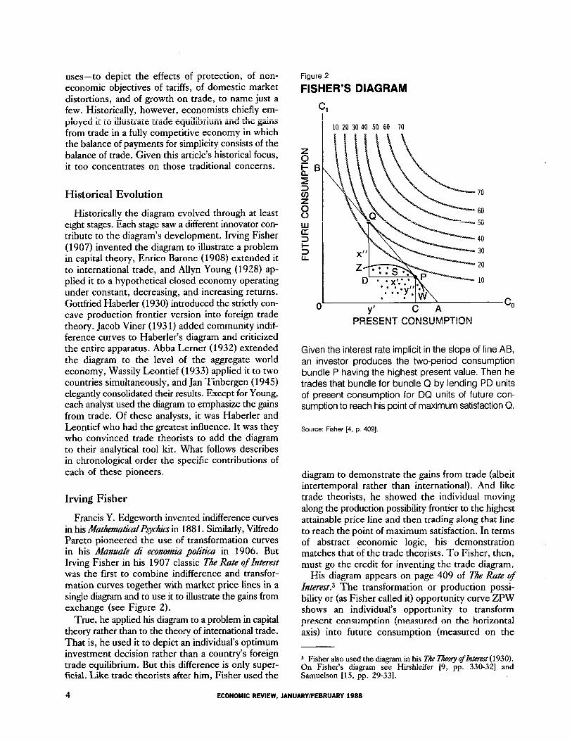
If Fisher was the first to use the diagram to show the gains from itzzemmpora~ trade, then Enrico Barone, the Italian mathematical economist and author of the famous article on “The Ministry of Production in the Collectivist State,” was the first to use it to depict the gains from intemahnaf trade.5 In a long footnote in the 1908 edition of his Pn*m$i di economkz pobica, he presented a diagram showing pre- and post-trade equilibrium positions for a single national economy that produces and con- sumes two goods A and B (see Figure 3). His diagram, like Fisher’s, consists of three types of curves.
His “production indifference” or transformation curve AB shows the maximum alternative combina- tions of the two goods the economy can produce from available resources. Its nonlinear curved shape indi- cates that production takes place under conditions of nonconstant costs. The slope of the curve at any point M represents what Barone called “comparative cost,” or the ratio of the marginal costs of production.
The curves bearing the numbers 3 and 8 are two of a set of community taste indifference curves that represent demand conditions in the economy. Each curve shows alternative commodity bundles yielding equal satisfaction, Higher curves represent higher levels of satisfaction as indicated by the higher numbers they bear. Finally, the curve PC is the world price line whose slope indicates the relative cost of obtaining goods A and B on the world market.
Before trade, the country produces and consumes at the autarky equilibrium point M characterized by the common tangency of production possibility and taste indifference curves. The slope of that tangent represents the domestic pre-trade price ratio and indicates that the country has a comparative cost advantage over the rest of the world in the produc- tion of good B.
5 What follows draws heavily on Maneschi and Thweatt [ 121.
FEDERAL RESERVE BANK OF RICHMOND 5

Figure 3
BARONE’S DIAGRAM
N D R B
COMMODITY B
Given opportunity to along the price line the country production from point M specialization point Then it commodity bundle for bundle by exporting of B QC of to reach point of satisfaction C.
Maneschi and [12. p.
When trade opens at the price ratio by the of line the country its com-
advantage by to production P where ratio of marginal costs the world ratio and valued at prices is In short, country produces the point tangency of transformation curve the (highest world price Then it
along that exporting PQ good B ex- change imports of of good until it the point maximum satisfaction By taking vantage of it separates production and sumption points consumes beyond transfor- mation
Here are the elements in modern sions of diagram- the apparatus, the
between autarky economy) and prices that trade feasible, movement to
specialization point maximum-value output, post-trade separation production and
tion points, the trade that reconciles points. All was a performance that
have made the leading in the development. Such, was not
case. For its brilliance, contribution went unnoticed and had no
ble influence the work his contemporaries immediate successors. himself may been partly for this of affairs. bury- ing diagram in footnote of 1908 Prim@ he effectively its importance. he may
intended to so is by his to include diagram in other writings. any rate is not be found later editions the Prin-
When it finally restored the 1936 tion it seemed original. then, other had independently the diagram had developed beyond Barone. in recent with the of the scarce 1908
of the have scholars able to firm the of Barone’s
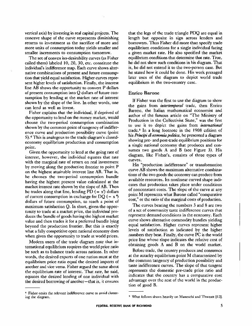
Allyn Young
After and Barone, on the languished. During next 20 (1909-1929) only new version in print it was
to the ones. In ignorance of contributions of and Barone, A.
Young the appendix his famous Economic humaL on “Increasing and Economic
presented a version of diagram that to him straight from
(see Figure
Young did use his to illustrate parative advantage the gains trade. Still merits recognition at least reasons. He
Gottfried Haberler two years de- fining slope of production frontier “curve of costs”) as opportunity cost produc- ing unit increase either good terms of amount of other good Also he plained better his predecessors a concave
reflects increasing cost, a curve constant and a curve decreasing
Finally, he how increasing in one might introduce convex segment
a otherwise curve. In connection
6 ECONOMIC JANUARY/FEBRUARY 1988
Gottfried Haberler
We have seen how Fisher in 1907 invented the diagram, how Barone in 1908 extended it to inter- national trade, and how Young in 1928 applied it to the closed economy. In 1930, however, Gottfried Haberler in his seminal paper on comparative cost, did what none of his predecessors had done.6 He introduced into international trade theory a strictly concave production possibility curve showing diminishing returns and increasing costs in the pro- duction of both goods (see Figure 5). Fisher and Young, of course, had worked with such concave transformation curves, but not within the context of international trade theory. Barone, on the other hand, had used transformation curves to analyze foreign trade; But the curves he used were not strictly concave.
Figure 4
YOUNG’S DIAGRAM
u ,.
COMMODITY X
Curves dd and cc are the production frontiers show- ing increasing costs and constant costs, respec- tively. Curves dPi and cPi represent cases in which decreasing costs prevail over part of the production frontier. Tangency .with indifference curves II, etc., yields equilibrium at P in the first set of cases, P, in the second.
Source: Young 118, p. 540).
he discussed stability of closed-economy equilibrium under increasing, constant, and decreasing costs. He correctly noted that stability is ensured in all cases provided collective indifference curves possess greater convexity than the production frontier.
As for collective indifference curves, he noted that their location on the diagram assumes a f=ed distribu- tion of income when in fact that distribution and thus the indifference map itself changes with movements along the production frontier. In other words, a reallocation of production from good X to good Y redistributes income from X producers to Y producers and thus shifts the indifference map. For this reason he thought such curves should be treated as an ex- pository device and not as a rigorous conception. His discussion anticipated Lerner and Tinbergen, both of whom analyzed decreasing costs, and Viner, who criticized the concept of community indifference maps.
6 See Haberler [6] for an English translation of his 1930 paper from the original German. Haberler’s diagram and its under- lying analysis also appears in Chapter 10 of his The Thory of Intemationat Trade, with Its Applications to Commmiial PO&Y (1936).
Figure 5
HABERLER’S STRICTLY CONCAVE PRODUCTION FRONTIER
A
a
0 b&l b B
COMMODITY B
The concavity of curve ab shows that successive unit increases in one good require progressively larger decreases in the other. The opportunity cost of each good increases as more is produced.
Source: Haberler [6, p. lo]
FEDERAL RESERVE BANK OF RICHMOND

Nor had Haberler’s predecessors adequately ex- plained the reasons for the curve’s concave shape. Such concavity they attributed to diminishing returns and increasing costs without specifing the forces causing these phenomena. Haberler, however, ex- plained the causes of the curve’s concavity by in- voking the notion of specific and nonspecific factors of production. Specific factors he defined as those tied to a particular industry and suitable to the pro- duction of no other good. Nonspecific factors on the other hand are those freely transferable between in- dustries and equally suited to the production of both goods.
Using a two-good, three-factor model, he as- sumed that each good requires for its production one specific factor which it uses exclusively and a nonspecific factor shared in common with the other industry. Combining increasing amounts of the nonspecific factor with fixed amounts of a specific one to produce more of either good yields decreas- ing increments of output, i.e., diminishing returns. Thus the amount of one good sacrificed to free enough nonspecific resources to produce a unit in- crease in the other good must rise as output of the latter good increases. The same thing would happen, Haberler noted, if all resources, though mobile, were not equally well-suited for different employ- ments. For example, suppose that of the nation’s fixed stock of resources all initially employed in pro- ducing A, part is better suited to producing B. One might think of mountainous land better suited to skiing or mining than to wheat production. Trans- ferring such resources to B at first results in a large rise in the output of that good at the cost of little sacrifice of A. Beyond some point, however, con- tinued expansion of B necessitates the transfer of resources less and less suited to B production and more and more suited to A production. At that point the opportunity costs of B in terms of A sacrificed rises. Either case, Haberler said, yields a smooth con- cave curve with the marginal opportunity cost of transforming one good into the other rising con- tinuously over the whole range of the curve.
Finally, Haberler better than any of his predecessors explained the place of the transforma- tion curve in the theory of comparative advantage. According to him, the curve together with demand conditions (indifference curves) determines an economy’s production point and thus relative com- modity costs in the absence of trade. On the assump- tion that prices equal costs, those curves also deter- mine relative commodity prices. Differences in these autarky relative costs and prices across nations reflect comparative advantages that make trade mutually
advantageous. When trade takes place at the equi- librium world price ratio each nation tends to specialize in the production of the commodity of its comparative advantage. As it does so, however, it incurs increasing opportunity costs. Specialization continues up to the point at which marginal oppor- tunity costs equal world prices, i.e., up to the point at which the transformation curve just touches the world price line. Each nation then trades along that line, exporting its comparative advantage commodity in exchange for the other commodity, until it reaches its point of maximum satisfaction.
Haberler’s analysis had a galvanizing effect on his contemporaries. In quick succession Jacob Viner, Abba Lerner, and Wassily Leontief combined his concave transformation curve with collective indif- ference curves to obtain the basic diagram of the trade theorist. Each of these writers, however, put the diagram to somewhat different uses described below.
Jacob Viner
Viner’s version of the diagram, presented in a lecture at the London School of Economics in January 1931 but not published until the 1937 appearance of his StudiRF in th Thq of International Trzade, shows before- and after-trade equilibria for a single country (see Figure 6). Before trade, the country produces and consumes at point K on the highest attainable indifference curve tangent to the production frontier. When presented with the opportunity to trade at a world price ratio different from the autarky one- this difference indicated by the different slopes of the price lines FFr and mm ‘-the country shifts pro- duction to point G and then trades along the world price line, exporting Gs units of wheat in exchange for imports of sH units of copper. In so doing, it ends up consuming commodity bundle H lying on a higher indifference curve than the autarky bundle K con- sumed before trade.
Except for the concavity of the production possi- bility curve, Viner’s diagram is virtually the same as Barone’s. But Viner did one thing that neither Barone nor anyone else had done up to that time. He pointed to certain logical flaws in the diagram’s construction and questioned its usefulness in showing the gains from trade.
In particular, he focused on the shortcomings of community indifference maps and production possibility curves. Community indifference maps were suspect because they embodied the assump- tion of a fixed distribution of income when in fact trade would change that distribution and thus the indifference map itself. Likewise the production
8 ECONOMIC REVIEW, JANUARY/FEBRUARY 1988

Figure 6
VINER’S DIAGRAM
AMOUNT OF WHEAT
Given the opportunity to trade at world prices shown by the slope of line FF,, the economy shifts produc- tion from autarky bundle K to bundle G, which it then trades for preferred bundle H by exporting Gs wheat for sH copper.
Source: Viner 117, p. 5211.
possibility curve was flawed because it assumed perfectly inelastic (fixed) factor supplies when in fact those supplies vary with changes in their prices. Trade, by changing factor prices, would change the quantities of factors supplied and thus the produc- tion possibility curve itself. Nor was this the only problem. The curve, Viner noted, also embodied the assumption of factor indifference between alter- native uses when in reality factors may prefer one employment to another. Assuming factors employed in the industry of their preference are paid the value of their marginal product there, they must receive a premium over that to induce them to work in the other industry. In that case, factor costs to one in- dustry will not equal sacrificed factor product in the other, and the cost of securing a unit increase in either good is not accurately measured by the quantity of the other good given up.’ Viner’s conclusion was
7 An example will suffice. Industry A pays each unit of labor a real wage wA equal to its marginal product there. But that same labor unit costs industry B the amount We +d, where d is the wage differential or pay premium that compensates for the nonpecuniary disadvantages (subjective disutility) of work-
straightforward. Job preferences and the resulting compensating pay differentials drive a wedge between commodity prices the ratio factor marginal reflected in slope of transformation schedule. other words, would not opportunity costs Haberler supposed.
trenchant criticisms less than For the possibility curve
simply too a tool abandon. Despite restrictive assumptions, captured the of a commodity supply For that
trade theorists the diagram its underlying cost interpretation Viner’s real interpretation.
Abba Lemer
Unlike Viner, Lerner accepted the trade diagram uncritically. He used it to depict trade equilibrium for the aggregate world economy in a two-country model.* His demonstration, as presented in his celebrated 1932 Economica article on “The Diagram- matical Representation of Cost Conditions in Inter- national Trade,” required three steps.
First, he derived the world transformation curve by optimally adding national production possibilities at equal marginal cost ratios. He did so by sliding one country’s production possibility block along the other’s with the slopes or marginal opportunity cost ratios always kept equal (see Figure 7). In this way he traced out an efficient world production possibility frontier, something nobody had done before.
Second, he confronted this world production fron- tier with a global community indifference curve which he implicitly derived by aggregating over the under- lying country curves (not shown by him). The resulting common point of tangency of the two curves determines the world production and consumption points as well as the equilibrium terms of trade.
Finally, he located each country’s post-trade pro- duction point by moving the world terms-of-trade lime parallel to itself until it just touched the individual production possibility curves. He did not identify the consumption point or the exports and imports of each
ing in B. Thus labor’s cost to B exceeds its foregone product in A by the factor d. Similarly, labor’s marginal product in B equals its wage rate there, wA +d. But that same unit of labor costs A only We. Thus labor’s cost to .A understates its sacri- ficed alternative product by the factor d. True costs deviate from opportunity cost.
8 On Lerner see Mundell [ 13, pp. 147-483 and Samuelson [ 15, p. 6453.
FEDERAL RESERVE BANK OF RICHMOND 9

Figure 7
LERNER’S DERIVATION OF THE WORLD TRANSFORMATION CURVE
Y I I.
0 m Mb B
COMMODITY B
Moving one country’s production block along the other’s traces out the world transformation curve AB. The diagram shows three successive positions of the second country’s block o’a’b’ as it slides along the first country’s production frontier ab. Tangency of transformation curve and indifference curve yields world equilibrium at P with country post-trade produc- tion points being p’ and p, respectively.
Source: Lerner [I 1, p. 901.
nation. But he did remark that both nations would benefit from trade even if they possessed identical concave transformation curves provided their indif- ference maps differed. His remark anticipated Wassily Leontief s geometrical demonstration of this case.
He also showed what the world production possibility curve looks like when at least one of the countries produces under conditions of increasing returns such that its production frontier is convex. Richard E. Caves neatly summarizes his analysis.
He proved that increasing returns necessitate complete specialization by at least one country. This can occur not only when both countries’ transformation curves are convex to the origin, but also if one (national) trans- formation curve is convex while the other shows a con- stant rate of transformation, or even concavity to the origin, so long as the convexity of the one exceeds the concavity of the other. There will normally be points on the world transformation curve where more than one
pattern of international specialization is efficient. No matter which of the two countries specializies com- pletely, the same commodity totals will be produced. Another trait of such a point is if a change in world tastes is moving the world production combination past one, the optimal pattern of specialization may shift markedly 13, pp. 162-631.
Wassily Leontief
In the year after Lerner’s article appeared, Leontief in his paper on “The Use of Indifference Curves in the Analysis of Foreign Trade” completed Lerner’s demonstration of world trade equilibrium. He did so by depicting for both countries the post- trade consumption points and trade triangles that con- nect those points with their corresponding produc- tion points, something Lerner had failed to do. Unlike Lerner, however, he did not work with world pro- duction possibility and taste indifference curves. Instead, he focused on the curves of each country, combining them together in a single chart. In this way he was able to use the diagram to show how trade affects both countries simultaneously.
He showed how gains from trade arise when (1) production conditions alone and (2) demand condi- tions alone differ across countries. In the first case, countries have different production possibility curves but identical indifference maps (see Figure 8A). In the second case (anticipated by Lerner), production possibility curves are the same and only indifference maps differ across countries (see Figure 8B).
Figure 8A depicts the first case. Here the country possessing the vertically elongated transformation curve produces at q where its output valued at world prices is maximized. Then it trades along the relative price line qP2, exporting qf of good A against im- ports of fPz of good B, and consumes at P2, a point it could not reach before trade when it was con- strained to consume on its production possibility curve. Likewise the other country gains by produc- ing its highest valued output at K, trading along the price line KPi, and consuming at Pi beyond its production possibility frontier.
As for equilibrium conditions, Leontief specified that the price lines connecting the production and consumption points must be of the same slope and length for both countries. The first condition ensures that both countries face the same price ratio or terms of trade. The second ensures that exports of one country equal imports of the other. In other words, it ensures that the trade triangles PlRK and qfPz are the same, as required for international equilibrium.
10 ECONOMIC REVIEW, JANUARY/FEBRUARY 1988

LEONTIEF’S DIAGRAMS
Figure 8a Figure 8b
Different Transformation Curves, Identical Transformation Curves, Identical Indifference Maps Different Indifference Maps
m
C g b 6
GOOD B
One country produces at q and exports qf of A for fP, of B. The other produces at K and exports KR of B for RP, of A. The equilibrium world price ratio shown by the common slope of lines qP, and P,K must be such as to make the trade triangles identical.
Source: Leontief [lo, pp. 25, 27)
c* M C,b B
GOOD B
Both countries produce at K, one exporting KR, of A for R,P’, of B, the other exporting KR, of 6 for R,P; of A. The equilibrium world price ratio must be such as to make the trade triangles identical.
Trade also enables countries to consume beyond their production possibility curves when only demand conditions (indifference maps) differ. Leontiefs second diagram shows why: different demand con- ditions result in different pre-trade equilibrium points on the production possibility curve. At these different points, comparative costs differ making trade advantageous.
Thus before trade the country with the steeper in- difference curves initially consumes and produces at PI on its production possibility curve while the other country does the same at Pa. The different slopes of the production possibility curve at those two autarky points show that comparative costs differ across countries making trade profitable. When trade takes place at the equilibrium price ratio given by the slope of line PiPi, each country produces at K and exports the good in which it has a (pre-trade) cost advantage. The first country exports KRI of good A for imports of RrPr’ of good B, reaching consump- tion point Pi in the process. Similarily, the other
country exports RaK of good B in exchange for im- ports of RaPi of good A, and consumes at P1 beyond its production possibility curve. Both countries gain from trade despite having identical production fron- tiers. Here in Leontiefs 1933 diagram is everything and more found in the earlier constructions of his predecessors.
In short, Leontief brought the diagram to its highest stage of development up to the mid-1940s and established it as the standard geometrical tool of the international trade textbooks. It was his ver- sion, showing as it does in one Cartesian plane the mutual gains from trade and the international equilibrium conditions for both countries simultaneously, that entered such influential early texts as D.B. Marsh’s fir/d Trade and Investment (195 1) and Charles Kindleberger’s ZnterxatiwzaL Economics (1953). Even today one finds it in such leading texts as Caves’ and Jones’ cyofcd Trade and Payments and W. Ethier’s Modern International Economics.
FEDERAL RESERVE BANK OF RICHMOND 11
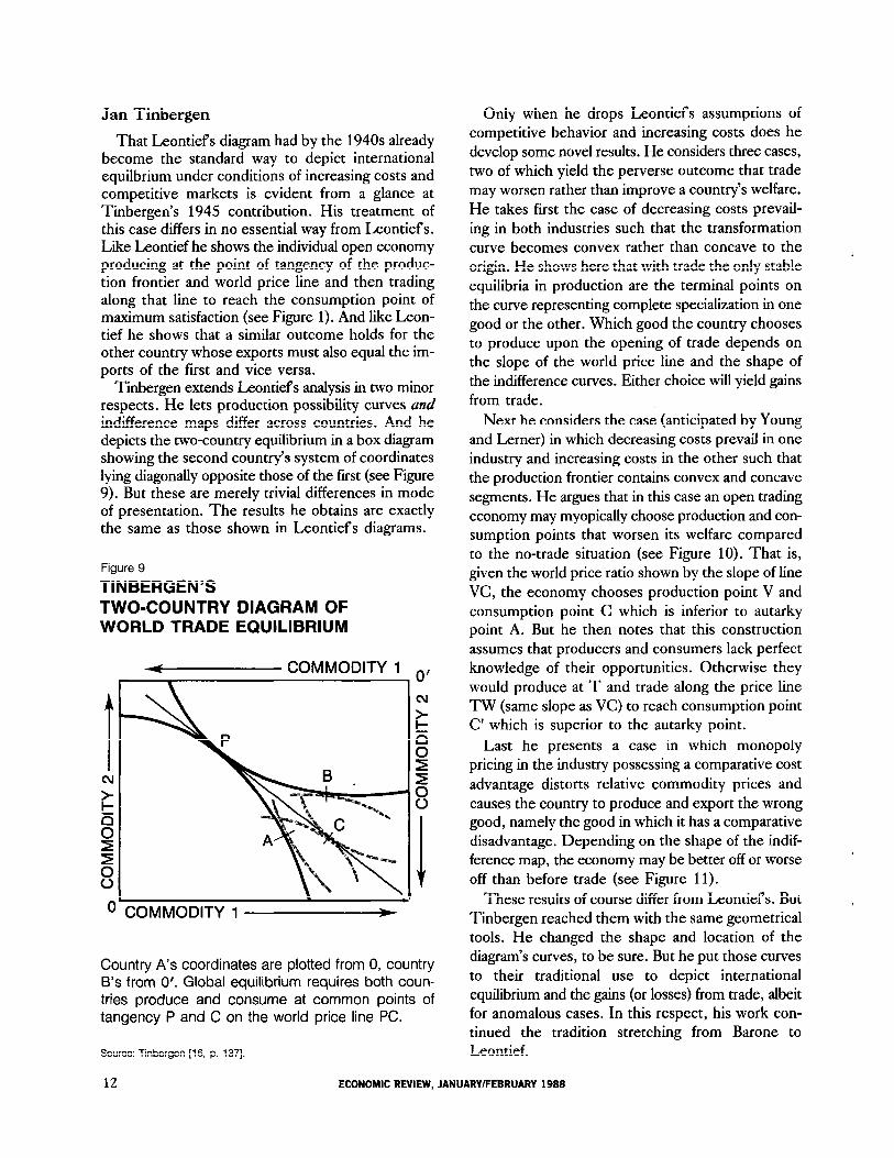
Jan Tinbergen
That Leontiefs diagram had by the 1940s already become the standard way to depict international equilbrium under conditions of increasing costs and competitive markets is evident from a glance at Tinbergen’s 1945 contribution. His treatment of this case differs in no essential way from Leontiefs. Like Leontief he shows the individual open economy producing at the point of tangency of the produc- tion frontier and world price line and then trading along that line to reach the consumption point of maximum satisfaction (see Figure 1). And like Leon- tief he shows that a similar outcome holds for the other country whose exports must also equal the im- ports of the first and vice versa.
Tinbergen extends Leontiefs analysis in two minor respects. He lets production possibility curves and indifference maps differ across countries. And he depicts the two-country equilibrium in a box diagram showing the second country’s system of coordinates lying diagonally opposite those of the first (see Figure 9). But these are merely trivial differences in mode of presentation. The results he obtains are exactly the same as those shown in Leontiefs diagrams.
Figure 9
TINBERGEN’S TWO-COUNTRY DIAGRAM OF WORLD TRADE EQUILIBRIUM
P COMMODITY 1
1 0’
cv
COMMODITY 1 t
Country A’s coordinates are plotted from 0, country B’s from 0’. Global equilibrium requires both coun- tries produce and consume at common points of tangency P and C on the world price line PC.
Source: Tinbergen 116, p. 1371.
Only when he drops Leontiefs assumptions of competitive behavior and increasing costs does he develop some novel results. He considers three cases, two of which yield the perverse outcome that trade may worsen rather than improve a country’s welfare. He takes first the case of decreasing costs prevail- ing in both industries such that the transformation curve becomes convex rather than concave to the origin. He shows here that with trade the only stable equilibria in production are the terminal points on the curve representing complete specialization in one good or the other. Which good the country chooses to produce upon the opening of trade depends on the slope of the world price line and the shape of the indifference curves. Either choice will yield gains from trade.
Next he considers the case (anticipated by Young and Lerner) in which decreasing costs prevail in one industry and increasing costs in the other such that the production frontier contains convex and concave segments. He argues that in this case an open trading economy may myopically choose production and con- sumption points that worsen its welfare compared to the no-trade situation (see Figure 10). That is, given the world price ratio shown by the slope of line VC, the economy chooses production point V and consumption point C which is inferior to autarky point A. But he then notes that this construction assumes that producers and consumers lack perfect knowledge of their opportunities. Otherwise they
would produce at T and trade along the price line TW (same slope as VC) to reach consumption point C’ which is superior to the autarky point.
Last he presents a case in which monopoly pricing in the industry possessing a comparative cost
advantage distorts relative commodity prices and causes the country to produce and export the wrong good, namely the good in which it has a comparative disadvantage. Depending on the shape of the indif- ference map, the economy may be better off or worse off than before trade (see Figure 11).
These results of course differ from Leontiefs. But Tinbergen reached them with the same geometrical tools. He changed the shape and location of the diagram’s curves, to be sure. But he put those curves to their traditional use to depict international equilibrium and the gains (or losses) from trade, albeit for anomalous cases. In this respect, his work con- tinued the tradition stretching from Barone to Leontief.
12 ECONOMIC REVIEW, JANUARY/FEBRUARY 1988

Figure 10
TRADE EQUILIBRIUM WITH A MIXED TRANSFORMATION CURVE
Figure 11
MONOPOLY PRICING IN THE COMPARATIVE ADVANTAGE INDUSTRY
COMMODITY 1 0 \
COMMODITY 1
Imperfect knowledge and a mixed (concave-convex) transformation curve can make the country worse off with than without trade. At the world price ratio given by the slope of line VC, the economy produces at V and consumes at point C which lies on a lower indif- ference curve than the autarky point A. Conversely, with perfect knowledge the economy produces at T and consumes at C’, reaping a clear gain.
Source: Tinbergen 116, p. 1331.
The Diagram Since Tinbergen
After Tinbergen, Haberler in 1950 used the diagram to distinguish between the consumption (ex- change) and production (specialization) components of the total gain from trade. The total gain of course is the jump from the autarky consumption point to the preferred point on the (highest attainable) world price line just touching the production possibility curve. Of this total, the consumption gain stems from the opportunity to exchange the pre-trade bundle of goods at world prices. Haberler shows this gain as the movement from P to T” along a world price line passing through the pre-trade consumption point (see Figure 12). Added to this is the production gain stemming from the opportunity to produce the highest valued bundle of commodities measured at world prices. Haberler shows this gain as the move-
Monopoly pricing raises the relative price of good 1 (slope of line AB) above its relative marginal cost (slope of the production frontier at autarky point A) and makes it appear that comparative advantage lies in good 2 when in fact it lies in good 1. Consequently, when trade opens up at the world price ratio given by the slope of line PQ, the economy specializes in the wrong good, producing at P and trading along line PQ to reach point C, or C, depending on the loca- tion of the indifference map. Trade yields losses in the first case, gains in the second.
Source: Tinbergen [16, p. 1361.
ment from T” to T’ that results when the economy produces the output mix whose marginal oppor- tunity cost just equals the world terms of trade.
The point of Haberler’s demonstration is this: of the two sources of gain, exchange and specialization, the first is fundamental. For, as the diagram shows, exchange yields gains even in the absence of specialization (that is, in the absence of a change of production). The economy simply trades its given autarky bundle for a preferred one at world prices. By contrast, specialization without exchange yields no gains. For it never pays to produce the output mix valued highest at world prices when one cannot trade at those prices: in such cases the autarky mix
FEDERAL RESERVE BANK OF RICHMOND 13

Figure
HABERLER ON THE GAINS FROM TRADE
QUANTITIES OF B
Consumption (exchange) gains are shown by the jump from P to T” as the economy swaps its autarky bundle for a preferred one at world prices. Produc- tion (specialization) gains are shown by the further jump to T’ that results when the economy produces and trades the output bundle P’ having the highest value at world prices. Trade yields gains even in the absence of specialization.
Source: Haberler [8, P. 381
is preferred. On the contrary, specialization without trade yields losses since a closed economy must be self-sufficient (diversified) in all goods. In short, exchange rather than specialization is the necessary and sufficient condition for trade gains.
Haberler’s demonstration did not exhaust the diagram’s potential: new uses were found for it. Haberler himself employed it again in 1950 to illus- trate the infant industry argument for protection. In 1952 James Meade employed it to derive trade in- difference curves used in advanced trade geometry. Harry Johnson in 1964 used it to depict noneconomic objectives of tariffs. Jagdish Bhagwati in 19.57 used it to show the effects of technological progress on the terms of trade and national welfare. Robert Mundell in 1957 used the diagram to show how international factor mobility negates the protective effects of tariffs. Haberler in 1950, Bhagwati and Ramaswami in 1963, and Johnson in 1965 employed the diagram to analyze domestic market distortions (divergences between private and social marginal costs) arising from external economies or disecon- omies and rigid factor prices. The best corrective, they showed, is not a tariff but rather taxes and sub- sidies in the sector in which the distortions arise.
In all these uses the diagram proved its strength and versatility. So much so that trade theorists will undoubtedly employ it again and again. When they do, they will owe a large debt of gratitude to the pioneers who developed this powerful tool. Even to- day, if one understands the diagram one understands the logic of comparative advantage and gains from trade.
14 ECONOMIC REVIEW, JANUARY/FEBRUARY 1988

References
1. Baldwin, R.E. “Gottfried Haberler’s Contribution to International Trade Theory and Policy.” QaartAy humaL of Economics 97 (February 1982): 141-48.
2.
3.
4.
5.
6.
7.
8.
9.
10.
Barone, E. Prim@ di economia politica. Roma: Tipografia Nazionale di G. Bertero, 1908.
Caves, R.E. Traa’e and Economic Smccture. Cambridge, MA.: Harvard University Press, 1960.
Fisher, I. Tire Rate of Interest. New York: Macmilhan Co., 1907.
co., 1930.’ Th Theory of Interest. New York: Macmillian
Haberler, G. “The Theory of Comparative Costs and Its Use in the Defense of Free Trade.” WehwittschajhMes hhiv 32 (July 1930): 349-70. As reprinted in Selected &rays of Gbttjkd Haberler, edited by A.Y.C. Koo. Cam- bridge, MA.: MIT Press, 1985, pp. 1-19.
- . Tire Thory of International Trade, witfi Its &plications to Conzmetz%i Policy. London: William Hodge & Co., 1936.
“Some Problems in the Pure Theory of Inter- national Trade.” Economic Journal60 (June 1950): 223-40. As reprinted in SeLected hays of Cottjied Haberbr, edited by A.Y.C. Koo. Cambridge, MA.: MIT Press, 1985, pp. 37-54.
Hirshleifer, J. “On the Theory of the Optimal Investment Decision.” Journal of Political Economy 66 (August 1958): 329-52.
Leontief, W.W. “The Use of Indifference Curves in the Analysis of Foreign Trade.” Qaarterb Journal of Economics 47 (May 1933): 493-503. As reprinted in International Trade, selected Readings, edited by J. Bhagwati. Harmondsworth, England: Penguin Books, 1969, pp. 21-29.
11.
12.
13.
14.
15.
16.
17.
18.
Lerner, A.P. “The Diagrammatical Representation of Cost Conditions in International Trade.” Economica 34 (August 1932): 346-56. As reprinted in his Ersayssin &on& Analysis. London: Macmillian Co., 1953, pp. 8.5-100.
Maneschi, A., and W.O. Thweatt. “Barone’s 1908 Representation of an Economy’s Trade Equilibrium and the Gains from Trade.” .lbtunaZ of ZnternotioaZ Zkmotnics 22 (May 1987): 375-82.
Mundell, R.. “Abba Lerner and the Theory of Foreign Trade.” In Thory for Economic Efiemy: hays in Honor ofAbba P. Lerner, edited by H.I. Greenfield, A.M. Leven- son, W. Hamovitch, and E. Rotwein. Cambridge, MA.: MIT Press, 1983.
Samuelson, P.A. “A.P. Lerner at Sixty.” Review of Eco- nomic Stadies 3 1 (1964): 169-78.
-. “Irving Fisher and the Theory of Capital.” In Ten Economic &dies in the Tradition of Zmig F&er. New York: J. Wiley, 1967, pp. 17-37.
Tinbergen, J. “Professor Graham’s Case for Protection.” In Appendix I of his ZntrmatinaL Economic Co-operation. Amsterdam: Elsevier, 1945. Reprinted as “International Trade under Variable Returns in a Very Simple Model’ in Appendix II of his InternationaL EconomiG Znteqratkm. 2d ed., rev. Amsterdam: Elsevier, 1965, pp. 126-37.
Viier, J. StudLz in the T/leoty of Zntenwtiona/ Traak New York: Harper & Brothers, 1937.
Young, A.A. “Increasing Returns and Economic Progress.” Economic JoumaZ 38 (December 1928): 527-42.
FEDERAL RESERVE BANK OF RICHMOND 15