The Process of Statistical Investigation Mathematics Background The Process of Statistical...
32
UNIT OVERVIEW GOALS AND STANDARDS MATHEMATICS BACKGROUND UNIT INTRODUCTION UNIT PROJECT Mathematics Background The Process of Statistical Investigation Statistics is the science of collecting, analyzing, and interpreting data to answer questions and make decisions. Statistical reasoning is a crucial part of science, engineering, business, government, and everyday life. Because of this, statistics has become an important strand in school curricula. Understanding variability—how data vary—is at the heart of statistical reasoning. Variability must be considered within the context of a problem. There are several aspects of variability to consider, including noticing and acknowledging, describing and representing, and identifying ways to reduce, eliminate or explain patterns of variation. Components of Statistical Investigation Statistics is a process of data investigation, which involves four interrelated components (Alan Graham, Statistical investigations in the secondary school [Cambridge: Cambridge University Press, 1987]). • Pose the question(s): formulate the key question(s) to explore and decide what data should be collected in order to address the question(s) • Collect the data: decide on a method of data collection, and then collect the data • Analyze the distribution: organize, represent, summarize, describe, and identify patterns in the data • Interpret the results: predict, compare, and identify relationships, and use the results of the data analysis to make decisions about the original question(s) A statistical investigation is a dynamic process that involves moving back and forth among the four interconnected components. For example, after collecting data and completing some analysis, statisticians may decide to refine the original question and gather additional data. The process may involve spending time working within a single component. For example, a statistician might form several different representations of the data at various stages of the process before selecting the representation(s) to be used in a final presentation of the data. continued on next page 13 Mathematics Background CMP14_TG06_U7_UP.indd 13 11/12/13 3:47 PM
Transcript of The Process of Statistical Investigation Mathematics Background The Process of Statistical...

UNIT OVERVIEW
GOALS AND STANDARDS
MATHEMATICS BACKGROUND
UNIT INTRODUCTION
UNIT PROJECT
Mathematics BackgroundThe Process of Statistical Investigation
Statistics is the science of collecting, analyzing, and interpreting data to answer questions and make decisions. Statistical reasoning is a crucial part of science, engineering, business, government, and everyday life. Because of this, statistics has become an important strand in school curricula.
Understanding variability—how data vary—is at the heart of statistical reasoning. Variability must be considered within the context of a problem. There are several aspects of variability to consider, including noticing and acknowledging, describing and representing, and identifying ways to reduce, eliminate or explain patterns of variation.
Components of Statistical Investigation
Statistics is a process of data investigation, which involves four interrelated components (Alan Graham, Statistical investigations in the secondary school [Cambridge: Cambridge University Press, 1987]).
• Pose the question(s): formulate the key question(s) to explore and decide what data should be collected in order to address the question(s)
• Collect the data: decide on a method of data collection, and then collect the data
• Analyze the distribution: organize, represent, summarize, describe, and identify patterns in the data
• Interpret the results: predict, compare, and identify relationships, and use the results of the data analysis to make decisions about the original question(s)
A statistical investigation is a dynamic process that involves moving back and forth among the four interconnected components. For example, after collecting data and completing some analysis, statisticians may decide to refine the original question and gather additional data. The process may involve spending time working within a single component. For example, a statistician might form several different representations of the data at various stages of the process before selecting the representation(s) to be used in a final presentation of the data.
continued on next page
13Mathematics Background
CMP14_TG06_U7_UP.indd 13 11/12/13 3:47 PM

Look for these icons that point to enhanced content in Teacher Place
DoingMeaningful
Statistics
Pose thequestion(s)
Collectthe data
Interpret theresults
Analyze thedistribution(s)
In Data About Us, several big ideas about statistics are explored, including the use of analytical tools and the reasoning involved when analyzing data. The concept map below illustrates relationships among these big ideas and other important concepts.
Doing Meaningful Statistics
Hypothesizeabout possible
outcomes
Identify whatdata to collect
Tallying,counting,measuring
CharacterizeVariability
Probability,Randomness
categorical
nominal
ordinal
interval
ratio
numerical
Representativeness
Levels ofMeasurement-Types of data
Populations
Samples
Interviews,Surveys and
Other methods
includes
in order to
in order to
sources
by
usingdistinguishing
from
using
suchas
are
using
DoingMeaningful
Statistics
Pose thequestion(s)
Collectthe data
Interpret theresults
Analyze thedistribution(s)
Organizingdata
using interactswith
interacts with
related to
interacts with depends on
can be
represented using
involvingsuch as
such as
such assuch as
Designingrepresentations
Characterizingshape
Computingnumericalsummaries
Partitioningthe data
Quantifying/modeling
association
Ordering
Tables
Diagrams
Graphs
Counts orpercents
Sorting/classifying
Part-Wholereasoning
symmetricor
skewed
Type ofData
scatter plot two-waytables or
segmentedgas graphs
strength anddirection
relativefrequencies
correlationcoefficient
numericaldata
categoricaldata
Relativefrequencyreasoning
Describingclusters and
gaps
value bar graphdot or line plot
frequency bar graph histogrambox plot
scatter plotcircle graphline graph
Reasoning withproportions
Measures ofcenter: mean,mode, median
Measures ofSpread, e.g.,range, IQR,
outliers, MAD,standard deviation
represented using
reported as reported as
measured using
interacts with interacts with
measurementvariability
inducedvariability
naturalvariability
samplingvariability
Describedata
Summarizedata
Compare andcontrast data
Generalizeabout data
Communicatingprocess, results,and conclusions
Drawing andjustifying
conclusions
Identifypatterns/trends
in data
inorder
to
addressing
are
14 Data About Us Unit Planning
Interactive ContentVideo
CMP14_TG06_U7_UP.indd 14 11/12/13 3:47 PM

UNIT OVERVIEW
GOALS AND STANDARDS
MATHEMATICS BACKGROUND
UNIT INTRODUCTION
UNIT PROJECT
Enlarged sections of the concept map appear below. Consider having students use concept maps, such as the one above, to link together ideas that they explore during this Unit. Of course, their concept maps will not involve as many parts as the concept map above.
Hypothesizeabout possible
outcomes
Identify whatdata to collect
includes
in order to
DoingMeaningful
Statistics
Pose thequestion(s)
Interpret theresults
Describedata
Summarizedata
Compare andcontrast data
Generalizeabout data
Communicatingprocess, results,and conclusions
Drawing andjustifying
conclusions
identifypatterns/trends
in data
inorder
to
Tallying,counting,measuring
Probability,randomness
Representativeness
Populations
Samples
Interviews,Surveys, and
Other methods
using
from
using
usingCollect
the data
Analyze thedistribution(s)
addressing
continued on next page
15Mathematics Background
CMP14_TG06_U7_UP.indd 15 11/12/13 3:47 PM

Look for these icons that point to enhanced content in Teacher Place
by
Analyze thedistribution(s)
Organizing
using interactswith
interacts with
related to
such as
such as
such assuch as
Designingrepresentations
Characterizingshape
Characterizingvariability
Ordering
Tables
Diagrams
Graphs
Clustersand gaps
Sorting/classifying
Moundshaped or
skewed
value bar graphdot or line plot
(frequency) bar graph stem-and-leaf plot
histogrambox plot
scatter plotcircle graphline graph
Measures ofvariation: quartiles,
range, outliers
interacts with interacts with
involving
such as
Computingsummaries
Partitioningthe data
Counts orpercents
Part-Whole(additive)reasoning
Relativefrequency
(multiplicative)reasoning
Measures ofcenter: mean,mode, median
interacts with
Posing Questions
Statisticians need to decide upon what questions to ask. The questions asked impact the rest of the process of statistical investigation. A statistical question is posed when the investigator anticipates that the answers will vary; answers of these questions are not predetermined.
In this Unit, students will answer questions that may be classified as summary questions or comparison questions.
Summary questions focus on descriptions of a single data set.
ExampleWhat is the class’s favorite kind of pet?
How many pets does the typical student have?
Comparison questions involve relating two (or more) sets of data across a common attribute.
ExampleHow much taller is a sixth‑grade student than a second‑grade student?
How much heavier is a sixth‑grade student’s backpack than a second‑grade student’s backpack?
Collecting Data
Statistical investigations explore attributes of people, places, and objects. An attribute is a particular characteristic or quality that describes the person, place, or thing about which data are being collected. The data values (or observations) associated with those attributes are collected during the study.
16 Data About Us Unit Planning
Interactive ContentVideo
CMP14_TG06_U7_UP.indd 16 11/12/13 3:47 PM

UNIT OVERVIEW
GOALS AND STANDARDS
MATHEMATICS BACKGROUND
UNIT INTRODUCTION
UNIT PROJECT
For example, height is an attribute of NBA players. The height 6 feet 9 inches might be a data value collected for an individual case of that attribute. If there were three NBA players that measured 6 feet 9 inches, then the frequency of the observation 6 feet 9 inches would be three occurrences.
In many Problems in this Unit, data are provided. If your students have not had much experience with collecting data as part of statistical investigations, it is important that your class collect their own data for some of the Problems in Data About Us. The Problems can be explored either with the data provided or with data collected by students. Keep in mind that collecting data is time-consuming, so carefully choose the Problems for which your students with gather data.
Problem 1.2:Describing NameLengths
Problem 2.1:What’s a MeanHousehold Size?
Problem 2.3:Making Choices
Problem 3.2:Connecting CerealShelf Location andSugar Content
Problem 4.1:Traveling to School
name lengths in your ownclassroom
household sizes of yourstudents
prices of favorite games
amounts of a particularnutrient in a variety of snacks
time spent doing a certain task(such as traveling to school ordoing homework)
Problem Numberand Title Attributes to Investigate
Types of DataStatistical questions in real life typically involve one of two general kinds of data: categorical data or numerical data. Knowing whether the data are numerical or categorical helps determine which representations and measures of center and spread are appropriate to report.
Numerical data are data that are numbers, such as counts, measurements, and ratings. In Data About Us, students work with two types of numerical data: counts and measurements.
continued on next page
17Mathematics Background
CMP14_TG06_U7_UP.indd 17 11/12/13 3:47 PM

Look for these icons that point to enhanced content in Teacher Place
Categorical data have values that represent discrete responses within a given category. There is no consistent scale involved. In this Unit, students experience two types of categorical data. One type, nominal data, has no order. Any link to a numbering system is arbitrary. The other type, ordinal data, has a numerical order, but the intervals between the data may be uneven. For both types of categorical data, it is impossible to perform numerical operations on the data.
Examples of Numerical Data•Household size, which can be organized by displaying frequencies of
households with one person, two people, and so on
•Student heights, which can be organized into intervals of observations on a bar graph from 40 to 44 inches, 45 to 49 inches, and so on
Examples of Categorical Data•Birth years, which can be organized by displaying frequencies of people
born in 1980, 1981, 1982, and so on
•Favorite types of books, which can be displayed by observations of people’s preferences for mysteries, adventure stories, science fiction, and so on
Some categorical data seem to be similar to numerical data. For example, a bar graph of birth months may use numbers to represent months: 1 is used for January, 2 is used for February, 3 is used for March, and so on. You cannot, however, perform numerical operations using months of the year. For example, 1 is not half of 2 when 1 represents January and 2 represents February. Months represented numerically are actually categories labeled by numbers.
Generally, in Data About Us, students will tally, count, or measure data. The data are often recorded in tables organized by categories and values, such as the class lists of names in which counts of the letters in each name are used to analyze name lengths.
Analyzing Individual Cases vs. Overall Distributions
The primary purpose of statistical analysis is to describe aspects of variability in the data. Because of this purpose, data should be displayed, and their patterns should be examined. The distribution of data refers to the way the data in a set appear overall, highlighting how data cluster or vary. The patterns in the data require the aggregate features of the set be analyzed.
When students work with data, they are often interested in individual cases, particularly if the data are about themselves. Statisticians look at the overall distribution of a set of data, however, and are generally not interested in individual cases. Distributions, unlike individual cases, can be described by measures of central tendency (i.e., mean, median, and mode), spread (e.g., range, interquartile range, outliers, and mean absolute deviation), and shape (e.g., clusters, gaps, symmetry, and skew).
18 Data About Us Unit Planning
Interactive ContentVideo
CMP14_TG06_U7_UP.indd 18 11/12/13 3:47 PM

UNIT OVERVIEW
GOALS AND STANDARDS
MATHEMATICS BACKGROUND
UNIT INTRODUCTION
UNIT PROJECT
Students can think about data in a number of ways. Statisticians often use graphs to clarify a distribution of data. The graphs below help to illustrate how students may think about data. The following progression suggests growth in statistical thinking.
Individual Cases Students may focus on each data value. For example, they may focus on name lengths of individual cases rather than noticing that a group of cases may be related (e.g., several name lengths cluster around 11 to 15 letters). This kind of thinking is characteristic of young children.
8 9 10 11 12 17Number of Letters
Name Lengths of Ms. Jee’s Students
13 14 15 16
No students have 8letters in their names. Six students have 15
letters in their names.
Middle Stage Students may focus on subsets of data values that are the same or similar, such as a category or a cluster. This may be more obvious when analyzing categorical data (e.g., a majority of students choose dogs as their favorite kind of pet). If students are working with numerical data, they might notice clusters (e.g., a group of students takes 8.9 to 9.6 seconds to complete a shuttle run).
There is a cluster ofdata from 2 to 5people.
There is a gap in datafrom 5 to 8 people.
0 1 2 3 5 6 7 98 10
Number of People
Household Size 3
40 1 2 3 5 6 7 98 10
Number of People
Household Size 3
4
continued on next page
19Mathematics Background
CMP14_TG06_U7_UP.indd 19 11/12/13 3:47 PM

Look for these icons that point to enhanced content in Teacher Place
Overall Distributions Students may view the set of data values as one distribution. Students look for features of the whole distribution that are not features of any of the individual cases (e.g., shape, center, spread). For example, in the distribution below showing the number of pets students have, the data cluster at one end but trail off to the right for several cases in which students have more than six pets.
Freq
uen
cy
Number0 2 4 6 8 10 12 14 16 18 20
0
1
2
3
4
5
6Number of Pets
2.4 Who Else is in Your Household? Categorical and Numerical Data
This distribution is skewedto the right. Many valuesare on the left side of thegraph, while relatively feware on the right side. Themean, therefore, will beshifted to the right of themedian.
Choosing Representations for Distributions
Students learn about various types of graphs during their Elementary School experiences. These graph types, which are further addressed in Data About Us, include the following:
Line Plots and Dot PlotsLine plots and dot plots organize data along a number line. The Xs or dots above the number line represent the frequency of occurrence of each data value. Students find these plots easy to construct and interpret. They are useful first displays when there are not too many data values.
Line Plot Each case is represented by an “X” positioned over a number line.
1 3 5 70 2 4 6 98
Name Lengths of Chinese Students
Number of Letters
There are sevenoccurrences of thedata value 9.
There are fouroccurrences ofthe data value 5.
20 Data About Us Unit Planning
Interactive ContentVideo
CMP14_TG06_U7_UP.indd 20 11/12/13 3:47 PM

UNIT OVERVIEW
GOALS AND STANDARDS
MATHEMATICS BACKGROUND
UNIT INTRODUCTION
UNIT PROJECT
Dot Plot Each case is represented by a circle or a dot positioned over a number line.
5 15 25 350 10 20 30 40
Travel Time (minutes)
Students’ Travel Times to School
45 50 55 60
There are twooccurrences ofthe data value 35.
There are nooccurrences ofthe data value 7.
The scale of the numberline on which the dotsare plotted is 5 minutes.
4.1 Traveling to School
Ordered-Value Bar GraphsIn an ordered-value bar graph, the lengths of bars show the magnitude of individual data values. Each bar’s length or height is the measure of an individual case. In Data About Us, the bars are generally displayed horizontally and are ordered by magnitude of data values. Students can mark up these graphs as they explore the concept of mean. They can even out the bars to locate the mean.
These two bars indicatethat two students have6 people in their households.Each bar represents onestudent’s data.
0 1 2 3 5 6 7
Number of People
2
4
33
4
66
Frequency Bar GraphsIn a frequency bar graph, the length of each bar indicates the number of occurrences of that data value in the set. The height of a bar is not the value of an individual case; rather, it is the number of cases (frequency) that have that value. The bars can be drawn either vertically or horizontally. Students find these
continued on next page
21Mathematics Background
CMP14_TG06_U7_UP.indd 21 11/12/13 3:47 PM

Look for these icons that point to enhanced content in Teacher Place
graphs helpful when identifying the most frequently occurring data value (mode). Frequency bar graphs are very useful when displaying categorical data. They may be also be used with numerical data.
Freq
uen
cy
Type of Petcat dog fish bird horse goat cow rabbit duck pig
01234
65
87
2.4 Who Else is in Your Household? Categorical and Numerical Data
Three people listed“rabbit” as theirfavorite pet.
Favorite Pet
2 3 4 510
0
1
2
3
4
5
6
7
8
9
10
11
12
13
14
15
16
17
18
19
20
21
Number
Freq
uen
cy
Three peoplehave 6 pets.
Number of Pets
22 Data About Us Unit Planning
Interactive ContentVideo
CMP14_TG06_U7_UP.indd 22 11/12/13 3:47 PM

UNIT OVERVIEW
GOALS AND STANDARDS
MATHEMATICS BACKGROUND
UNIT INTRODUCTION
UNIT PROJECT
HistogramsHistograms display the distribution of numerical data using intervals. The vertical axis is labeled with either number counts or percents. So, the height of the bar indicates the frequency of data values within an interval. Students can use histograms to group data into intervals. This allows them to see patterns in the data distribution and identify the overall shape of a distribution.
Students' Travel Times to School; Intervals of 5 Minutes
Travel Times (minutes)
0
1
30 35 40 45 502520151050
2
3
4
5
Travel Times (minutes)
0
1
50403020100
2
3
4
5
6
7
8
9
10
Students' Travel Times to School;Intervals of 10 Minutes
continued on next page
23Mathematics Background
CMP14_TG06_U7_UP.indd 23 11/12/13 3:47 PM

Look for these icons that point to enhanced content in Teacher Place
Because data are organized by intervals, the bars touch. This shows the continuous nature of the number line. There are conventions that determine where entries whose data values occur at the end points of an interval will be placed. The animation below shows how to construct a histogram, paying particular attention to where points on the borders of intervals belong. Visit Teacher Place at mathdashboard.com/cmp3 to see the complete animation.
Box-and-Whisker Plots, or Box PlotsA box plot shows the distribution of values in a data set separated into four groups of equal size: each section of the box and each whisker represents 25, of the data. Students may use this type of graph to highlight a few important features of the data. They may also find it easier to use box plots to make comparisons among more than one set of data. Since the individual data values are not shown on the box plot, it can seem less cluttered.
24 Data About Us Unit Planning
Interactive ContentVideo
CMP14_TG06_U7_UP.indd 24 11/12/13 3:47 PM

UNIT OVERVIEW
GOALS AND STANDARDS
MATHEMATICS BACKGROUND
UNIT INTRODUCTION
UNIT PROJECT
A box plot is constructed from the five-number summary of the data stemming from the interquartile range (IQR): minimum data value, lower quartile (Q1), median (Q2), upper quartile (Q3), and maximum data value. Outliers can be identified using the IQR.
Pack Weights (lb)
0 5 10 15 20 25 30 35 40
25% of the data isrepresented by theleft box.
25% of the data isrepresented by theright box.
25% of the data isrepresented by thefirst “whisker.”
The IQR tells the rangeof the middle 50% ofthe data.
25% of the data isrepresented by thelast ”whisker”.
Guiding Students to Construct and Read Graphs
Constructing GraphsGraph paper is suggested as an optional tool for students to use when representing data distributions.
• When students draw bar graphs to represent categorical data, the bars may be drawn between the lines of the graph paper. Labels are placed below the bars.
Perc
ent
of
Res
po
nd
ents
Cereal
WheatyO’s
HoneyClouds
OatLoops
FruityCrisps
PuffyRice
RaisinFlakes
Other0%
5%
10%
15%
25%
20%
30%Favorite Cereal
3.1 Estimating Cereal Serving Sizes
continued on next page
25Mathematics Background
CMP14_TG06_U7_UP.indd 25 11/12/13 3:47 PM

Look for these icons that point to enhanced content in Teacher Place
• When students draw bar graphs to represent numerical data, the data values may be marked on the lines of the graph paper.
Nu
mb
er o
f St
ud
ents
Number of Juice Drinks Consumed0 1 2 3 4 5 6 7 8 9 10
02468
10121416182022242628303234
Juice Drinks Consumed byStudents in One Day
Investigation 2 ACE Exercises 30–33
Reading GraphsGraphs are a central component of data analysis. The following three concepts help students to understand and analyze graphs.
Reading the Data: Students must be able to locate specific information on a graph. Understanding the data involves being able to answer explicit questions, such as How many students have 12 letters in their names?
Reading Between the Data: Students must be able to answer questions relating to subsets, or groups, of data. For example, students may be asked questions such as How many students have more than 12 letters in their name? or How many of the students’ name lengths cluster at 6–7 letters?
Reading Beyond the Data: Students must be able to extend the information they read from the graph in order to predict or infer when asked questions such as What is the typical number of letters in these students’ names? If a new student joined our class, how many letters would you predict that student would have in his or her name? These questions cannot be answered directly by reading specific values on the graph. Instead, the knowledge of the graph must be applied and extended.
Once students draw their graphs, they can use them in the interpretation phase of the statistical-investigation process. The first two categories of questions, reading the data and reading between the data, require basic skills in understanding graphs. It is reading beyond the data, however, that helps students to develop higher-level thinking skills, such as inference and justification.
26 Data About Us Unit Planning
Interactive ContentVideo
CMP14_TG06_U7_UP.indd 26 11/12/13 3:47 PM
UNIT OVERVIEW
GOALS AND STANDARDS
MATHEMATICS BACKGROUND
UNIT INTRODUCTION
UNIT PROJECT
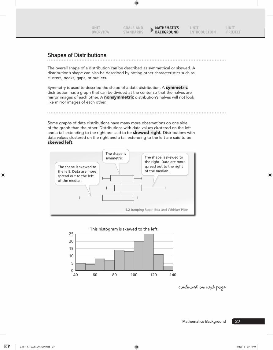
Shapes of Distributions
The overall shape of a distribution can be described as symmetrical or skewed. A distribution’s shape can also be described by noting other characteristics such as clusters, peaks, gaps, or outliers.
Symmetry is used to describe the shape of a data distribution. A symmetric distribution has a graph that can be divided at the center so that the halves are mirror images of each other. A nonsymmetric distribution’s halves will not look like mirror images of each other.
Some graphs of data distributions have many more observations on one side of the graph than the other. Distributions with data values clustered on the left and a tail extending to the right are said to be skewed right. Distributions with data values clustered on the right and a tail extending to the left are said to be skewed left.
The shape is symmetric.
The shape is skewed tothe left. Data are morespread out to the leftof the median.
The shape is skewed tothe right. Data are morespread out to the rightof the median.
4.2 Jumping Rope: Box-and-Whisker Plots
0
5
140120100806040
10
15
20
25This histogram is skewed to the left.
continued on next page
27Mathematics Background
CMP14_TG06_U7_UP.indd 27 11/12/13 3:47 PM

Look for these icons that point to enhanced content in Teacher Place
0
10
6258545046
20
30
40
50
60This histogram is symmetric around the center.
0
10
605040302010
20
30
40
50
60This histogram is skewed to the right.
Students need to be able to recognize and generally describe the overall shapes of distributions. They can describe the shape by identifying skew or symmetry or by identifying clusters, gaps, and outliers.
Describing Data With Measures of Center
The purpose of data analysis is to describe areas of stability or consistency in the natural variability that occurs in a distribution. There are several numbers that can be used to summarize values in a distribution. These numbers are categorized into two groups: measures of center and measures of spread. These summary numbers are essential tools in statistics.
In the Connected Mathematics curriculum, students learn about three measures of central tendency: mean, median, and mode.
The mean represents an equal sharing of values in a data set. The median marks the midpoint of a set of ordered data. The mode is the value that occurs most frequently in a set of data.
28 Data About Us Unit Planning
Interactive ContentVideo
CMP14_TG06_U7_UP.indd 28 11/12/13 3:47 PM

UNIT OVERVIEW
GOALS AND STANDARDS
MATHEMATICS BACKGROUND
UNIT INTRODUCTION
UNIT PROJECT
For example, consider the following situation.
Six students in a middle‑school class use the United States Census guidelines to identify the number of people in their households.
This situation can be modeled using cubes. Each cube represents one person in a household. Each stack of cubes represents the number of people in a specific student’s household.
Ollie Yarnell Gary Ruth Pablo Brenda
Measures of center can be used to identify a good estimate of the typical household size for all sixth-grade students.
Students might find it helpful to organize the data from smallest household size to largest household size.
Name
Ollie
Yarnell
Gary
Ruth
Pablo
Brenda
2
3
3
4
6
6
Number of Peoplein Household
continued on next page
29Mathematics Background
CMP14_TG06_U7_UP.indd 29 11/12/13 3:47 PM

Look for these icons that point to enhanced content in Teacher Place
ModeThe mode is the data value that occurs most frequently in a set of data. There are two occurrences each of households with 3 people and with 6 people, whereas the other values only have one occurrence each. So, this data set is bimodal; for these data, there are two modes: 3 and 6.
Ollie Yarnell Gary Ruth Pablo Brenda
The mode sometimes has more than one value. A distribution may be unimodal, bimodal, or multimodal. It can also have no mode if there are no duplicate data values.
The mode is unstable because a change in just a few data values can lead to a change in the mode. Because of this, statisticians often use other measures of center to summarize numerical data.
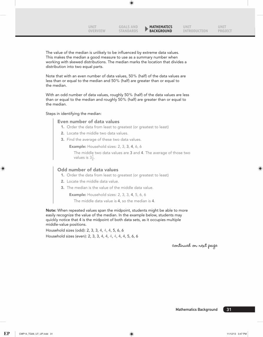
MedianThe median is the numerical value that has both a position and value. Its position marks the midpoint of a set of ordered data. The value of the median is the value of the midpoint (when there is an odd number of data values) or the average of the two middle data values (when there is an even number of data values).
In the data below, the median is 312 people.
Ollie Yarnell Gary Ruth Pablo Brenda
30 Data About Us Unit Planning
Interactive ContentVideo
CMP14_TG06_U7_UP.indd 30 11/12/13 3:47 PM
UNIT OVERVIEW
GOALS AND STANDARDS
MATHEMATICS BACKGROUND
UNIT INTRODUCTION
UNIT PROJECT
The value of the median is unlikely to be influenced by extreme data values. This makes the median a good measure to use as a summary number when working with skewed distributions. The median marks the location that divides a distribution into two equal parts.
Note that with an even number of data values, 50, (half) of the data values are less than or equal to the median and 50, (half) are greater than or equal to the median.
With an odd number of data values, roughly 50, (half) of the data values are less than or equal to the median and roughly 50, (half) are greater than or equal to the median.
Steps in identifying the median:
Even number of data values1. Order the data from least to greatest (or greatest to least)
2. Locate the middle two data values.
3. Find the average of these two data values.
Example: Household sizes: 2, 3, 3, 4, 6, 6
The middle two data values are 3 and 4. The average of those two values is 31
2.
Odd number of data values1. Order the data from least to greatest (or greatest to least)
2. Locate the middle data value.
3. The median is the value of the middle data value.
Example: Household sizes: 2, 3, 3, 4, 5, 6, 6
The middle data value is 4, so the median is 4.
Note: When repeated values span the midpoint, students might be able to more easily recognize the value of the median. In the example below, students may quickly notice that 4 is the midpoint of both data sets, as it occupies multiple middle-value positions.
Household sizes (odd): 2, 3, 3, 4, 4, 4, 5, 6, 6
Household sizes (even): 2, 3, 3, 4, 4, 4, 4, 4, 4, 5, 6, 6
continued on next page
31Mathematics Background
CMP14_TG06_U7_UP.indd 31 11/12/13 3:47 PM

Look for these icons that point to enhanced content in Teacher Place
MeanThe word average usually refers to the mean. The mean is influenced by all values of a distribution of data, including extremes or outliers. It is a good measure of center to describe data distributions when working with distributions that are roughly symmetric. In the data shown below, the mean is 4 people.
Ollie Yarnell Gary Ruth Pablo Brenda
In Connected Mathematics, students are encouraged to think about the mean in a few related ways:
Evening OutIf everyone receives or has the same amount, what would that amount be? For example, suppose the members of the six households are rearranged so that each household has the same number of people. How many people are in each household?
Original distribution:
Ollie Yarnell Gary Ruth Pablo Brenda
32 Data About Us Unit Planning
Interactive ContentVideo
CMP14_TG06_U7_UP.indd 32 11/12/13 3:47 PM

UNIT OVERVIEW
GOALS AND STANDARDS
MATHEMATICS BACKGROUND
UNIT INTRODUCTION
UNIT PROJECT
Evened-out distribution:
Ollie Yarnell Gary Ruth Pablo Brenda
The same idea can be used to locate the mean of data displayed on an ordered-value bar graph.
Evened-out distribution—initial step:
Brenda
Pablo
Ruth
Gary
Yarnell
0 2 4 6 8
Ollie
Evened-out distribution—final step:
Brenda
Pablo
Ruth
Gary
Yarnell
0 2 4 6 8
Ollie
continued on next page
33Mathematics Background
CMP14_TG06_U7_UP.indd 33 11/12/13 3:48 PM

Look for these icons that point to enhanced content in Teacher Place
Balance model:Differences from the mean balance out so that the sum of differences below and above the mean equal 0. When students find the mean absolute deviation (MAD), they consider this balance model.
4 6 8 10 12 14 16 18 20 22 2425
25
26 28 30 32 34 36 38 4020
Scenic Trolley (min)
Distance from the Mean
Less than the Mean Greater than the Mean15
1065
0–3–3
–5–10
–15
20 4 6 8 10 12 14 16 18 20 22 24 26 28 30 32 34 36 38 40
Scenic Trolley (min)
Typical value:What is a typical value that could be used to characterize these data? This is a general interpretation used more casually when students are being asked to think about the three measures of center and which to use. Students should consider what values influence each measure of center. They should also think about what claim they are making with the measures they report.
34 Data About Us Unit Planning
Interactive ContentVideo
CMP14_TG06_U7_UP.indd 34 11/12/13 3:48 PM

UNIT OVERVIEW
GOALS AND STANDARDS
MATHEMATICS BACKGROUND
UNIT INTRODUCTION
UNIT PROJECT
Moving from models to algorithms—Computing with an algorithm:The sum of all values is taken, and then it is divided by the number of observations. This is a computational version of the models described above. It groups all values together, and then partitions them into equal groups.
The mean number of peoplein a household is 4.
The quotient is the mean.
24÷ 6 = 4 (2) Divide the sum of the data values by the number of data values. (There are six data values.)
6+6+4+3+3+2 = 24 (1) Add all the data values together.
Note that Ollie has two people in his family. Yarnell and Gary each have three people in their families. Ruth has four people in her family. Paul and Brenda each have six people.
What is the average (mean) number of people in these six households?
Ollie 2 peopleYarnell 3 peopleGary 3 peopleRuth 4 peoplePablo 6 peopleBrenda 6 people
Total 24 people
Ollie 4 peopleYarnell 4 peopleGary 4 peopleRuth 4 peoplePablo 4 peopleBrenda 4 people
Total 24 people
Before After
In summary, to identify measures of center:
• Mode: Locate the most-frequent value from a graph or a table of data
• Median: List data values in order from least to greatest, and then identify the location that divides the data set in half (50,)
• Mean: Evenly distribute the quantities among the cases; to compute, add up all the data values and divide by the number of data values
35Mathematics Background
CMP14_TG06_U7_UP.indd 35 11/12/13 3:48 PM
Look for these icons that point to enhanced content in Teacher Place
Describing Data With Measures of Spread
Other summary numbers that are used to describe data distributions are measures of variability.
Measures of variability, or measures of spread, describe the degree of variability of individual data values, as well as their distances from measures of center. In statistics, variability is a quantitative measure of how close together or spread out a distribution of data is. Several questions may be used to highlight interesting aspects of variation.
• What does the distribution look like?
• How much do the data points vary from one another, or from the mean or median?
• Why might these data vary?
In Data About Us, students identify three measures of variability, or spread. These measures of spread are helpful tools with which two or more data distributions can be compared.
The range is the difference between the maximum and the minimum data values. The IQR (interquartile range) is the range of the middle 50, of the data values. The MAD (mean absolute deviation) describes the average distance between each data value and the mean (the absolute value of the difference between each data value and the mean). The MAD and IQR are both connected to measures of center. In addition, students are encouraged to discuss where data cluster and where there are holes or gaps in the data.
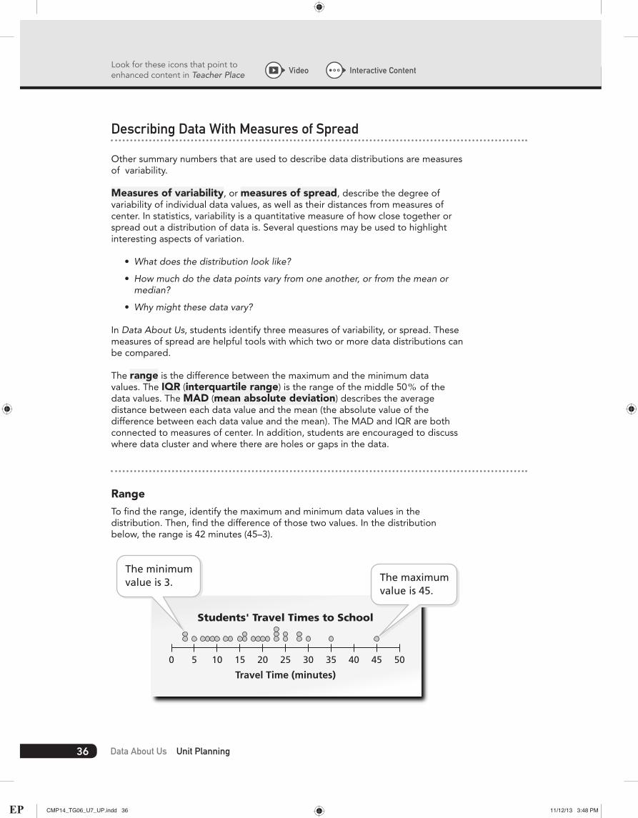
RangeTo find the range, identify the maximum and minimum data values in the distribution. Then, find the difference of those two values. In the distribution below, the range is 42 minutes (45–3).
Travel Time (minutes)
Students' Travel Times to School
0 5 10 15 20 25 30 35 40 45 50
The minimumvalue is 3. The maximum
value is 45.
36 Data About Us Unit Planning
Interactive ContentVideo
CMP14_TG06_U7_UP.indd 36 11/12/13 3:48 PM

UNIT OVERVIEW
GOALS AND STANDARDS
MATHEMATICS BACKGROUND
UNIT INTRODUCTION
UNIT PROJECT
Interquartile Range (IQR)The IQR (interquartile range) is the range of the middle 50, of the data values; it is often associated with the median. Because the IQR does not include the upper or lower quartiles (upper and lower 25, of the data values), it reduces the effect of any outliers. The IQR provides a numerical measure of how close to or distant from the data values in the second and third quartiles of a distribution are with respect to the median.
Consider the distribution of U.S. Name Lengths in a class of 30 students. The image below shows both the original data set, listed in order from least to greatest, as well as a dot plot representation of the data set.
9 9 9 101010111111111111121212131313131313141515151515151517
Quartile 1 MedianQuartile 2
Quartile 3
0 1 3 5 7 9 11 13 15 172 4 6 8 10 12 14 16 18
Number of Letters
Lengths of U.S. Names
12.5
Notice that the median of 12.5 letters is marked on the graph. Because there are 30 data values, the median partitions the name lengths into two equal-sized groups. In this example, fifteen of the name lengths are less than the median, and fifteen of the name lengths are greater than the median.
On the dot plot, the median and Quartiles 1, 2, and 3 are marked. The quartiles are determined by partitioning the ordered distribution into four parts, each containing one quarter of the data values. The median is the midpoint of the distribution, found between 12 and 13 letters. This is the same value as Quartile 2. Quartile 1 divides the lower half of the data set in half. In this case, Quartile 1 is located at the eighth smallest name length, 11 letters. Quartile 3 partitions the upper half of the data set in half. In this example, Quartile 3 is located at the eighth largest name length, 15 letters.
The IQR is the distance between the two values that mark Quartile 1 and Quartile 3—the range of the middle 50, of all the students’ name lengths. In this example, the IQR is 15 - 11, or 4 letters. The middle 50, of the name lengths has a spread of 4 letters.
continued on next page
37Mathematics Background
CMP14_TG06_U7_UP.indd 37 11/12/13 3:48 PM

Look for these icons that point to enhanced content in Teacher Place
A similar process can be found for identifying the IQR for Japanese name lengths. The range between the greatest values of Quartile 1 and Quartile 3 is 2 letters. The middle 50, of the name lengths has a spread of 2 letters.
0 1 3 5 7 9 11 13 15 172 4 6 8 10 12 14 16 18
Number of Letters
Lengths of Japanese Names
12
7 7 8 8 8 8 9 1010101011111212121212121212121212131313131414
Quartile 1 MedianQuartile 2
Quartile 3
From the analysis of the two dot plots, you can conclude that the middle 50, of U.S. name lengths are more spread out than the middle 50, of Japanese name lengths.
Note: In the Student Edition, students use the manipulative of folding pieces of paper to locate the lower quartile, median, and upper quartile. This manipulative works well when the ordered set of data can be evenly grouped into four groups. This manipulative becomes more difficult to work with when the data cannot be grouped in this manner. The images below show the process of finding the IQR for an even number of data values and for an odd number of data values.
19 19 203 8 12 16 17
Q1 = 10Q3 = 19
median = 16.5
Each partition contains two data values.Find Q1 and Q3 by identifying the midpoints of the
four values to either side of the median.
19 19 203 8 12 13 16 17Find Q1 and Q3 by identifying the midpoints
of the four values to either side of the median.
Q1 = 10 Q3 = 19
median = 16
38 Data About Us Unit Planning
Interactive ContentVideo
CMP14_TG06_U7_UP.indd 38 11/12/13 3:48 PM

UNIT OVERVIEW
GOALS AND STANDARDS
MATHEMATICS BACKGROUND
UNIT INTRODUCTION
UNIT PROJECT
Mean Absolute Deviation (MAD)The MAD (mean absolute deviation) relates the variability of a distribution to the mean. It determines whether or not the data values in the data set are close to the mean. The MAD is the average distance between each data value and the mean.
Consider the representations below. Visit Teacher Place at mathdashboard.com/cmp3 to see the complete animation.
4 6 8 10 12 14 16 18 20 22 2425
25
26 28 30 32 34 36 38 4020
Scenic Trolley (min)
Distance from the Mean
Less than the Mean Greater than the Mean15
1065
0–3–3
–5–10
–15
20 4 6 8 10 12 14 16 18 20 22 24 26 28 30 32 34 36 38 40
Scenic Trolley (min)
The ordered-value bar graph and the dot plot show ten different wait times that customers experienced while waiting to ride the Scenic Trolley. This information can be used to find out how much the data vary in relation to the mean of the distribution.
The mean of the data in this distribution is 25 minutes. Four people waited longer than 25 minutes, five people waited less than 25 minutes, and one person waited exactly 25 minutes.
continued on next page
39Mathematics Background
CMP14_TG06_U7_UP.indd 39 11/12/13 3:48 PM

Look for these icons that point to enhanced content in Teacher Place
The diagram above the ordered-value bar graph shows the distances of all the data values from the mean. The MAD is the number that summarizes these differences. It answers the question On average, how much do the wait times for the Scenic Trolley differ from the mean wait time for the Scenic Trolley?
To compute the MAD,
1. Add the distances of each value from the mean. (The distance is the absolute value of the difference between the value and the mean.)
Note: Students may not be comfortable finding absolute values until later grades. The type of graphic that appears here and in the Student Edition helps students to see the distance between each data value and the mean.
ExampleFor the ordered value bar graph in the animation, the sum of the distances of each value from the mean is 15 + 10 + 6 + 5 + 0 + 3 + 5 + 10 + 15, or 72. Notice that the sum of the distances greater than the mean (15 + 10 + 6 + 5) is the same as the sum of the distances less than the mean (3 + 3 + 5 + 10 + 15), or 36 minutes. This is not a coincidence but is instead a pattern that will be seen in every data distribution.
2. Divide the sum of the distances by the number of data values in the distribution.
ExampleThe MAD of the ordered value bar graph in the animation, therefore, is 72 , 10 (the sum of the differences between the data values and the mean , the number of data values in the distribution), or 7.2. So, on average, a person may wait 7.2 minutes more than or less than the mean wait time of 25 minutes. Recall, however, that the graph indicates that, while the MAD is 7.2 minutes and the average is 25 minutes, it is possible to wait anywhere from 10 minutes to 40 minutes to ride the roller coaster.
When considering the mean absolute deviation, it is important to remember that the MAD provides an average measure of how close the data values are to the mean of a distribution. The MAD is small when the data are close to the mean and show little variation or spread. It is large when the data values are further from the mean and show more variation.
Choosing an Appropriate Summary Statistic
Many factors can influence which summary statistic to report when describing a data distribution. No measure of center or spread is best to use in all situations. Instead, the context and the shape of the distribution affect which measure should be reported. It is important to choose statistics that represent data with as much integrity as possible. With that in mind, the following questions can help you choose which summary statistic to report.
What shape does the distribution have? Is it skewed or symmetric? Are there any outliers?
If the data values of a distribution are arranged symmetrically around the median, then the mean and median usually have a similar value. Either measure of center will be representative of the typical value in a distribution. You can choose to report whichever measure is easier for you to compute.
40 Data About Us Unit Planning
Interactive ContentVideo
CMP14_TG06_U7_UP.indd 40 11/12/13 3:48 PM

UNIT OVERVIEW
GOALS AND STANDARDS
MATHEMATICS BACKGROUND
UNIT INTRODUCTION
UNIT PROJECT
When the distribution is skewed (not symmetric), however, then the mean and median will most likely be different. Extreme outliers on either end of the graph pull the mean toward that end of the distribution.
The median, on the other hand, is resistant to any extreme observations (outliers) in a data set. So, for skewed distributions, statisticians often choose to report the median as the representative statistic for a data set.
A distribution that is greatly skewed will have a greater difference between the mean and the median.
0
5
140120100806040
10
15
20
25This histogram is skewed to the left.
0
10
6258545046
20
30
40
50
60This histogram is symmetric around the center.
0
10
605040302010
20
30
40
50
60This histogram is skewed to the right.
continued on next page
41Mathematics Background
CMP14_TG06_U7_UP.indd 41 11/12/13 3:48 PM

Look for these icons that point to enhanced content in Teacher Place
Which is easier to compute?
One of the benefits of reporting the mean is that the data can be tracked more easily. An investigator can keep a running total of the data as it is being collected. Additional values that are collected later can simply be added to the running total, and the new mean can be quickly calculated.
Identifying the median, on the other hand, can be difficult when there are either many data values or when additional values are collected later. The data values have to be rearranged with each additional value.
Which measure best answers your question or supports your intent?
When choosing a data measure to report, it is important to keep your question and purpose in mind. For example, both means and medians are measures of center. They describe what is typical. Because these measures can be very different from one another, however, you need to consider which measure supports your ideas or questions.
For example, suppose a city’s mean household income is $70,000, and the median household income is $50,000. Since the median household income is less than the mean household income, the distribution must be skewed to the right. A reporter may choose one statistic over the other to make a particular point. In this case, the mean and median are substantially different, and each can be used to support different ideas.
Which measure of variability best represents the distribution?
The IQR is linked to the median, and the MAD is linked to the mean. Because of this, the measure of variability that best represents a data distribution depends on which measure of center best represents the distribution. Frequently, means, and therefore MADs, are chosen to represent symmetric distributions. For skewed distribution, medians and IQRs are often chosen as good representations. This is because medians and IQRs are less influenced by outliers or extreme data values.
Which measure might you choose to represent categorical data?
When the data distribution does not contain numerical values, the mode is used to represent the distribution. Mean and median cannot be calculated, so the mode is the only way to report a most popular or most frequent observation. For categorical data, there is no appropriate measure of spread. For example, if you investigate favorite pets, there are no “least” or “greatest” values. A range cannot be calculated.
Interpreting Results
The final stage of any statistical investigation is interpreting the results of the data collection and analysis. The initial question, or any questions that arose from the investigation’s process, still need to be answered. Interpretations usually involve summarizing or comparing data distributions while keeping the variability in the data in mind. Suggested guidelines for describing are listed below. The responses to these prompts can help to summarize or compare data.
42 Data About Us Unit Planning
Interactive ContentVideo
CMP14_TG06_U7_UP.indd 42 11/12/13 3:48 PM
UNIT OVERVIEW
GOALS AND STANDARDS
MATHEMATICS BACKGROUND
UNIT INTRODUCTION
UNIT PROJECT
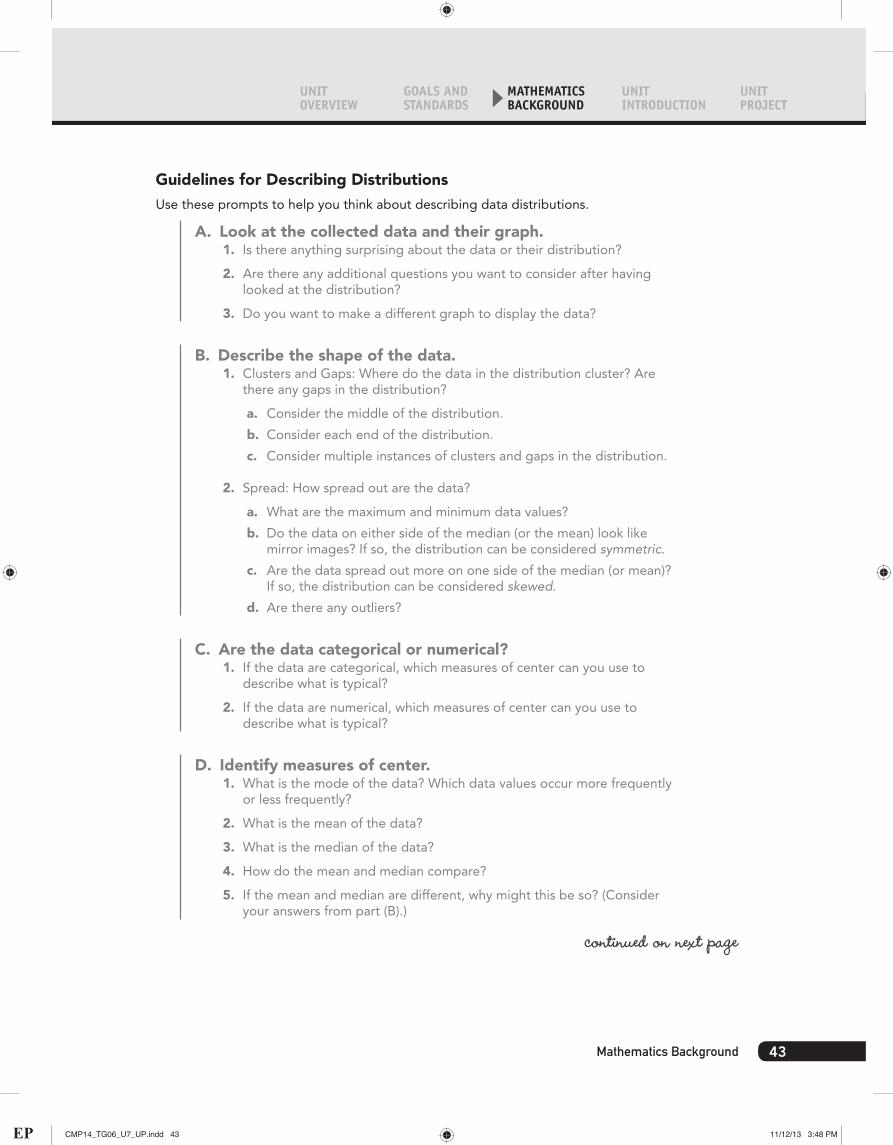
Guidelines for Describing DistributionsUse these prompts to help you think about describing data distributions.
A. Look at the collected data and their graph.1. Is there anything surprising about the data or their distribution?
2. Are there any additional questions you want to consider after having looked at the distribution?
3. Do you want to make a different graph to display the data?
B. Describe the shape of the data.1. Clusters and Gaps: Where do the data in the distribution cluster? Are
there any gaps in the distribution?
a. Consider the middle of the distribution.
b. Consider each end of the distribution.
c. Consider multiple instances of clusters and gaps in the distribution.
2. Spread: How spread out are the data?
a. What are the maximum and minimum data values?
b. Do the data on either side of the median (or the mean) look like mirror images? If so, the distribution can be considered symmetric.
c. Are the data spread out more on one side of the median (or mean)? If so, the distribution can be considered skewed.
d. Are there any outliers?
C. Are the data categorical or numerical?1. If the data are categorical, which measures of center can you use to
describe what is typical?
2. If the data are numerical, which measures of center can you use to describe what is typical?
D. Identify measures of center.1. What is the mode of the data? Which data values occur more frequently
or less frequently?
2. What is the mean of the data?
3. What is the median of the data?
4. How do the mean and median compare?
5. If the mean and median are different, why might this be so? (Consider your answers from part (B).)
continued on next page
43Mathematics Background
CMP14_TG06_U7_UP.indd 43 11/12/13 3:48 PM
Look for these icons that point to enhanced content in Teacher Place
E. Identify measures of spread.1. How alike or different are the data values from one other?
2. How close together or spread out are the data values?
3. Identify the range. What information does the range provide? Is this an appropriate measure of spread for the distribution being analyzed?
4. Identify the IQR. What information does the IQR provide? Is this an appropriate measure of spread for the distribution being analyzed?
5. Identify the MAD. What information does the MAD provide? Is this an appropriate measure of spread for the distribution being analyzed?
F. Revisit the original questions.1. Is there anything surprising about the data or their distribution?
2. Are there any additional questions you want to consider after having looked at the distribution?
3. Do you want to make a different graph to display the data?
44 Data About Us Unit Planning
Interactive ContentVideo
CMP14_TG06_U7_UP.indd 44 11/12/13 3:48 PM