The Price Impact of Physician Fee Schedules Price Impact of Physician Fee Schedules Physician fee...
24
1 April 2014 Barry Lipton, John Robertson, Patrick O’Brien, and Dan Corro The Price Impact of Physician Fee Schedules Physician fee schedules specify a maximum amount reimbursable (MAR) for a large number of medical services identified by CPT 1 code. Properly designed physician fee schedules can help to contain workers compensation (WC) medical costs. 2 While WC fee schedules have been shown to be effective at controlling costs, particular circumstances can undermine their effectiveness, such as when fee schedule amounts are high relative to Group Health. Generally, high shares of WC payments are at or near the fee schedule MAR. Whether due to negotiated arrangements between WC insurers and their provider networks or to doctors acting individually, this occurs so frequently to suggest that fee schedules in fact set the prices that many medical providers charge for WC services. One consequence is that high MARs (relative to Group Health) may result in some providers charging WC claimants more than they would patients covered under Group Health. By examining the entire distribution of payments, we show that the influence of fee schedules is not confined to limiting reimbursements and, moreover, their consequences are not always as intended. We look at how fee schedules relate to the broader marketplace for medical care, using experience from Group Health and fees paid by Medicare. KEY FINDINGS Some key findings are: Large discounts off the WC physician fee schedule maximum allowable reimbursements do not ensure low prices WC fee schedule MARs not only limit payments, they may also become common WC prices—the median WC price is always at or very near the fee schedule Surgery has higher fee schedules than Evaluation and Management relative to Group Health payments Similar WC discounts do not necessarily imply similar prices relative to Group Health: In some states, even after large discounts off the state physician fee schedule, the prices for some services may remain high relative to Group Health payments In other states, a smaller discount off the fee schedule may produce prices more in line with Group Health payments BACKGROUND/METHODOLOGY The study uses a new source of workers compensation medical data—NCCI’s Medical Data Call (MDC). The MDC captures transaction level detail on medical bills processed on or after July 1, 2010, including dates of service, charges, payments, procedure codes, and diagnoses codes. NCCI has the Call for the 35 jurisdictions where NCCI provides ratemaking services and for a number of additional states. 3 Services used in this study are those that are identified in the MDC by a CPT code. 1 CPT Copyright © 2012 American Medical Association (AMA). All rights reserved. CPT (Current Procedural Terminology) assigns numbers to the specific tasks and services of medical providers, including medical, surgical, and diagnostic services. These codes are uniformly applied by providers and are used by insurers to determine reimbursements. 2 For example, see B. Lipton, D. Corro, N. Moore, J. Robertson, Effectiveness of Workers Compensation Fee Schedules—A Closer Look, NCCI, February 2009. See also the WCRI series on designing and benchmarking fee schedules. 3 Jurisdictions included in this study are AK, AL, AR, AZ, CO, CT, DC, FL, GA, HI, ID, IL, KS, KY, LA, MA, MD, ME, MN, MS, MT, NC, NE, NM, NV, NY, OK, OR, RI, SC, SD, TN, UT, VT, and WV. These are the jurisdictions that, during the appropriate period, have a physician fee schedule and for which NCCI has the Medical Data Call.
Transcript of The Price Impact of Physician Fee Schedules Price Impact of Physician Fee Schedules Physician fee...
1
April 2014
Barry Lipton, John Robertson, Patrick O’Brien, and Dan Corro
The Price Impact of Physician Fee Schedules
Physician fee schedules specify a maximum amount reimbursable (MAR) for a large number of medical services identified by CPT
1 code. Properly designed physician fee schedules can help to contain workers compensation (WC) medical costs.
2
While WC fee schedules have been shown to be effective at controlling costs, particular circumstances can undermine their effectiveness, such as when fee schedule amounts are high relative to Group Health. Generally, high shares of WC payments are at or near the fee schedule MAR. Whether due to negotiated arrangements between WC insurers and their provider networks or to doctors acting individually, this occurs so frequently to suggest that fee schedules in fact set the prices that many medical providers charge for WC services. One consequence is that high MARs (relative to Group Health) may result in some providers charging WC claimants more than they would patients covered under Group Health.
By examining the entire distribution of payments, we show that the influence of fee schedules is not confined to limiting reimbursements and, moreover, their consequences are not always as intended. We look at how fee schedules relate to the broader marketplace for medical care, using experience from Group Health and fees paid by Medicare.
KEY FINDINGS
Some key findings are:
Large discounts off the WC physician fee schedule maximum allowable reimbursements do not ensure low prices
WC fee schedule MARs not only limit payments, they may also become common WC prices—the median WC price is always at or very near the fee schedule
Surgery has higher fee schedules than Evaluation and Management relative to Group Health payments
Similar WC discounts do not necessarily imply similar prices relative to Group Health:
In some states, even after large discounts off the state physician fee schedule, the prices for some services may remain high relative to Group Health payments
In other states, a smaller discount off the fee schedule may produce prices more in line with Group Health payments
BACKGROUND/METHODOLOGY
The study uses a new source of workers compensation medical data—NCCI’s Medical Data Call (MDC). The MDC captures transaction level detail on medical bills processed on or after July 1, 2010, including dates of service, charges, payments, procedure codes, and diagnoses codes. NCCI has the Call for the 35 jurisdictions where NCCI provides ratemaking services and for a number of additional states.
3 Services used in this study are those that are identified in the MDC by a
CPT code.
1 CPT Copyright © 2012 American Medical Association (AMA). All rights reserved. CPT (Current Procedural Terminology) assigns numbers
to the specific tasks and services of medical providers, including medical, surgical, and diagnostic services. These codes are uniformly applied by providers and are used by insurers to determine reimbursements. 2 For example, see B. Lipton, D. Corro, N. Moore, J. Robertson, Effectiveness of Workers Compensation Fee Schedules—A Closer
Look, NCCI, February 2009. See also the WCRI series on designing and benchmarking fee schedules. 3 Jurisdictions included in this study are AK, AL, AR, AZ, CO, CT, DC, FL, GA, HI, ID, IL, KS, KY, LA, MA, MD, ME, MN, MS, MT,
NC, NE, NM, NV, NY, OK, OR, RI, SC, SD, TN, UT, VT, and WV. These are the jurisdictions that, during the appropriate period, have a physician fee schedule and for which NCCI has the Medical Data Call.
2
In order to understand how fee schedules impact payments, we relate WC experience to the prices general health insurers pay for medical care. For this, we use experience from Group Health (GH) insurance and Medicare. Medicare reimbursement amounts are determined from relative values and conversion factors published by the federal government. Distributions of Group Health prices were derived from the FAIR Health “Allowed Medical Benchmarks Module.” This data is geographically dispersed, is based on experience for over 125 million covered lives, and includes a variety of GH products (HMO, PPO, fee for service). The GH price data takes the form of percentiles (10th, 15th, 20th, …, 95th), by CPT code and 3-digit Zip code.
4 Both
the Group Health and Medicare experience are adjusted to the WC mix of services by CPT code and geographic area within each state. The treatment of CPT code modifiers is discussed in the Appendix at the end of the section "Interpreting the Graphs".
Physician fee schedules are based on AMA CPT codes for services provided. A standard grouping of CPT codes identifies six major service categories:
Evaluation and Management (E&M)
Anesthesia
Surgery
Radiology
Pathology and Laboratory
Medicine
In this brief, we look at four of these major service categories. Anesthesia is not included because the GH data does not include anesthesia. Pathology and Laboratory is not included because less than 2% of WC services and less than 1% of WC costs are in this category.
A Technical Supplement, to be published separately, includes studies for:
The Pathology and Laboratory major category
Three to six subcategories of each major service category other than Anesthesia
Some individual CPT codes
The appendix to this study lists the subcategories and the shares of number of services and costs for each major service category and the subcategories.
Drugs are not included in this study, because data for drug codes (NDC or similar codes) are not included in the GH data.
The next two sections highlight the major findings; later sections provide more detail and support.
INITIAL ILLUSTRATIVE COMPARISONS We begin with a handful of examples that illustrate that there is no uniform relationship among:
The workers compensation physician fee schedule MAR
Prices paid for medical services in workers compensation
Prices paid for comparable medical services in Group Health
The major service categories of Surgery and Evaluation and Management (E&M) have very different relationships between physician fee schedules, prices paid in workers compensation, and prices paid in Group Health, so we start by exploring these two service categories.
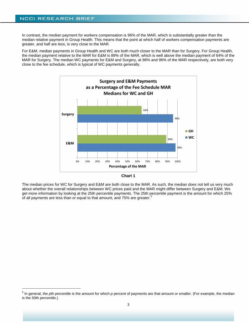
In general, WC physician fee schedule MARs for Surgery are substantially higher than most Group Health surgery payments. WC payments for surgery tend to be closer to the MAR than payments for comparable services in Group Health. A good way to see this is to compare the shares of payments in workers compensation and Group Health that are above or below given fractions of the MAR.
Chart 1 compares median payments relative to the MAR for Surgery and E&M. The median Group Health Surgery payment relative to the MAR is 64% of the MAR. This means that half of Group Health surgical services are paid at less than 64% of the workers compensation fee schedule MAR for those services. In turn, this says that, for Surgery, workers compensation fee schedule MARs are substantially higher than the majority of payments in Group Health.
4 More information on the FH
® Allowed Medical Benchmarks product can be found at www.fairhealth.org.
3
In contrast, the median payment for workers compensation is 96% of the MAR, which is substantially greater than the median relative payment in Group Health. This means that the point at which half of workers compensation payments are greater, and half are less, is very close to the MAR.
For E&M, median payments in Group Health and WC are both much closer to the MAR than for Surgery. For Group Health, the median payment relative to the MAR for E&M is 89% of the MAR, which is well above the median payment of 64% of the MAR for Surgery. The median WC payments for E&M and Surgery, at 98% and 96% of the MAR respectively, are both very close to the fee schedule, which is typical of WC payments generally.
Chart 1
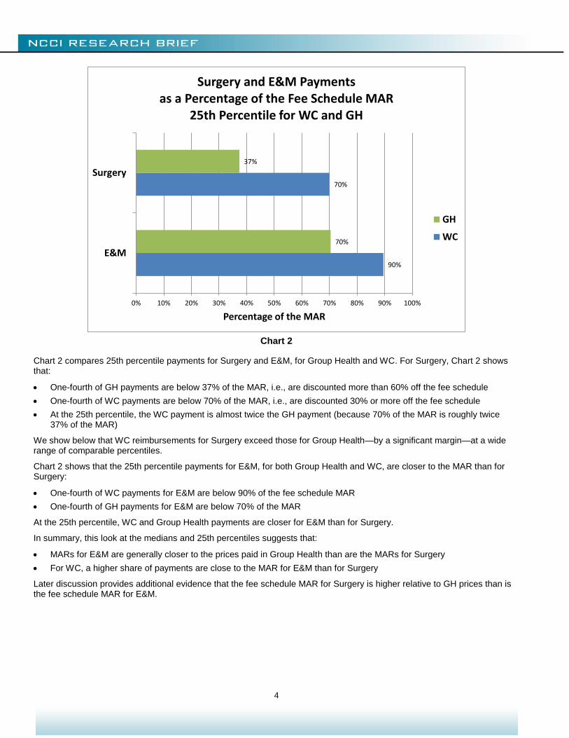
The median prices for WC for Surgery and E&M are both close to the MAR. As such, the median does not tell us very much about whether the overall relationships between WC prices paid and the MAR might differ between Surgery and E&M. We get more information by looking at the 25th percentile payments. The 25th percentile payment is the amount for which 25% of all payments are less than or equal to that amount, and 75% are greater.
5
5 In general, the pth percentile is the amount for which p percent of payments are that amount or smaller. (For example, the median
is the 50th percentile.)
98%
96%
89%
64%
0% 10% 20% 30% 40% 50% 60% 70% 80% 90% 100%
E&M
Surgery
Percentage of the MAR
Surgery and E&M Paymentsas a Percentage of the Fee Schedule MAR
Medians for WC and GH
GH
WC
4
Chart 2
Chart 2 compares 25th percentile payments for Surgery and E&M, for Group Health and WC. For Surgery, Chart 2 shows that:
One-fourth of GH payments are below 37% of the MAR, i.e., are discounted more than 60% off the fee schedule
One-fourth of WC payments are below 70% of the MAR, i.e., are discounted 30% or more off the fee schedule
At the 25th percentile, the WC payment is almost twice the GH payment (because 70% of the MAR is roughly twice 37% of the MAR)
We show below that WC reimbursements for Surgery exceed those for Group Health—by a significant margin—at a wide range of comparable percentiles.
Chart 2 shows that the 25th percentile payments for E&M, for both Group Health and WC, are closer to the MAR than for Surgery:
One-fourth of WC payments for E&M are below 90% of the fee schedule MAR
One-fourth of GH payments for E&M are below 70% of the MAR
At the 25th percentile, WC and Group Health payments are closer for E&M than for Surgery.
In summary, this look at the medians and 25th percentiles suggests that:
MARs for E&M are generally closer to the prices paid in Group Health than are the MARs for Surgery
For WC, a higher share of payments are close to the MAR for E&M than for Surgery
Later discussion provides additional evidence that the fee schedule MAR for Surgery is higher relative to GH prices than is the fee schedule MAR for E&M.
90%
70%
70%
37%
0% 10% 20% 30% 40% 50% 60% 70% 80% 90% 100%
E&M
Surgery
Percentage of the MAR
Surgery and E&M Paymentsas a Percentage of the Fee Schedule MAR
25th Percentile for WC and GH
GH
WC
5
ILLUSTRATIONS OF SOME STATE DIFFERENCES
The illustrations given so far have been on a countrywide basis. States employ different means to construct and maintain their physician fee schedules, and relationships among MARs, WC prices paid, and Group Health prices paid vary by state. Our illustrations in this section will show that even when two states are similar in terms of one relationship, they can be quite different in terms of the other relationships.
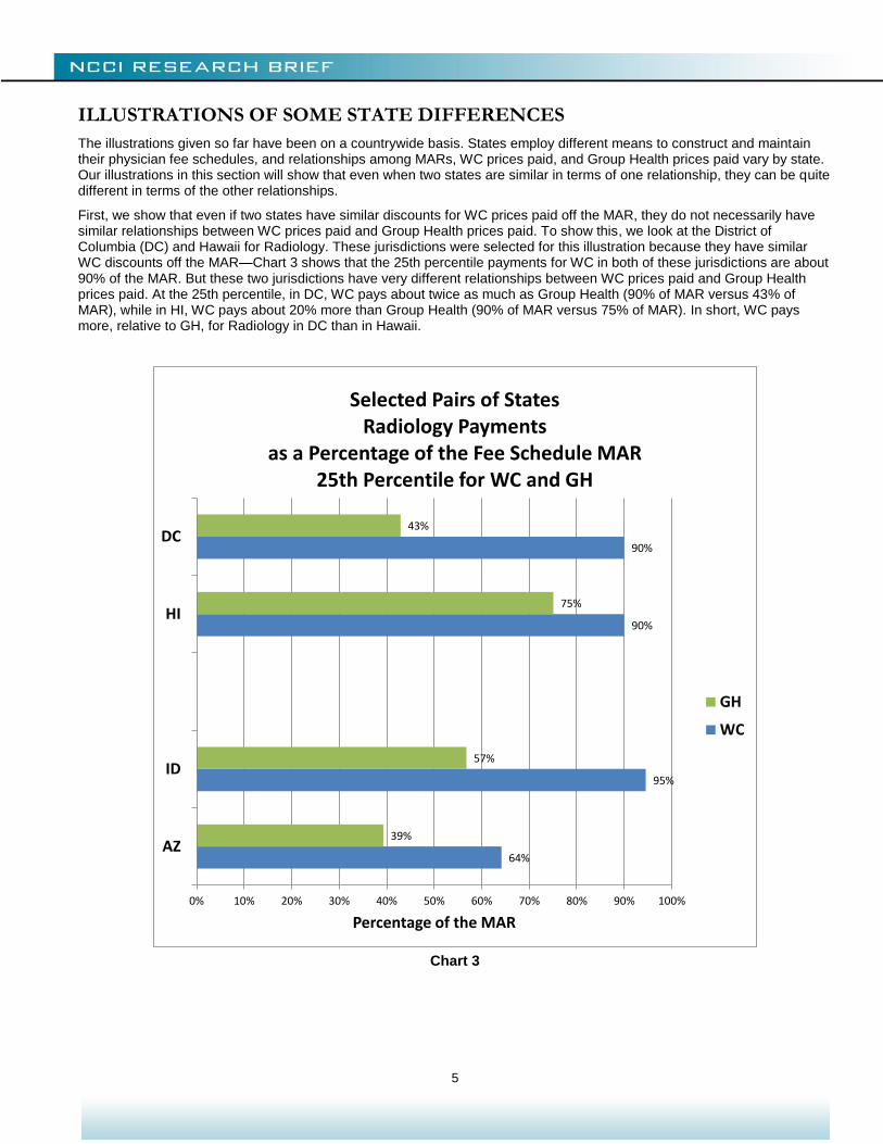
First, we show that even if two states have similar discounts for WC prices paid off the MAR, they do not necessarily have similar relationships between WC prices paid and Group Health prices paid. To show this, we look at the District of Columbia (DC) and Hawaii for Radiology. These jurisdictions were selected for this illustration because they have similar WC discounts off the MAR—Chart 3 shows that the 25th percentile payments for WC in both of these jurisdictions are about 90% of the MAR. But these two jurisdictions have very different relationships between WC prices paid and Group Health prices paid. At the 25th percentile, in DC, WC pays about twice as much as Group Health (90% of MAR versus 43% of MAR), while in HI, WC pays about 20% more than Group Health (90% of MAR versus 75% of MAR). In short, WC pays more, relative to GH, for Radiology in DC than in Hawaii.
Chart 3
64%
95%
90%
90%
39%
57%
75%
43%
0% 10% 20% 30% 40% 50% 60% 70% 80% 90% 100%
AZ
ID
HI
DC
Percentage of the MAR
Selected Pairs of StatesRadiology Payments
as a Percentage of the Fee Schedule MAR25th Percentile for WC and GH
GH
WC
6
Conversely, different WC discounts for Radiology do not necessarily imply different relationships between WC and GH prices. Again, we’ve selected two states to illustrate, Arizona and Idaho, and are still focusing on 25th percentiles:
WC discounts from the fee schedule at the 25th percentile differ substantially for these two states:
Idaho, at 5% below the MAR, has one of the smallest discounts of all states
Arizona has one of the largest discounts, at 36% below the MAR
However, at the 25th percentile, GH payments are about 60% of the WC payment in each state
Later discussion looks at more states, the median as well as the 25th percentile, and E&M as well as Radiology, to further demonstrate that the discount off the fee schedule does not necessarily indicate the relationship between WC payments and the market price for that medical care, as measured by prices paid in GH.
FINDINGS WITHIN SERVICE CATEGORIES AND STATES
Surgery
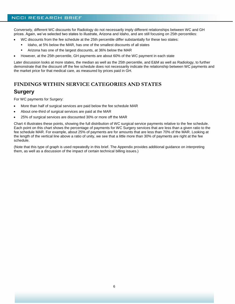
For WC payments for Surgery:
More than half of surgical services are paid below the fee schedule MAR
About one-third of surgical services are paid at the MAR
25% of surgical services are discounted 30% or more off the MAR
Chart 4 illustrates these points, showing the full distribution of WC surgical service payments relative to the fee schedule. Each point on this chart shows the percentage of payments for WC Surgery services that are less than a given ratio to the fee schedule MAR. For example, about 25% of payments are for amounts that are less than 70% of the MAR. Looking at the length of the vertical line above a ratio of unity, we see that a little more than 30% of payments are right at the fee schedule.
(Note that this type of graph is used repeatedly in this brief. The Appendix provides additional guidance on interpreting them, as well as a discussion of the impact of certain technical billing issues.)
7
Chart 4
0%
10%
20%
30%
40%
50%
60%
70%
80%
90%
100%
0.0 0.2 0.4 0.6 0.8 1.0 1.2 1.4 1.6 1.8 2.0
Pe
rce
nti
le o
f Se
rvic
es
De
live
red
Ratio of Payment to WC Fee Schedule
Surgery Service CategoryDistribution of Ratios of
WC Payments to the WC Fee Schedule
WC
8
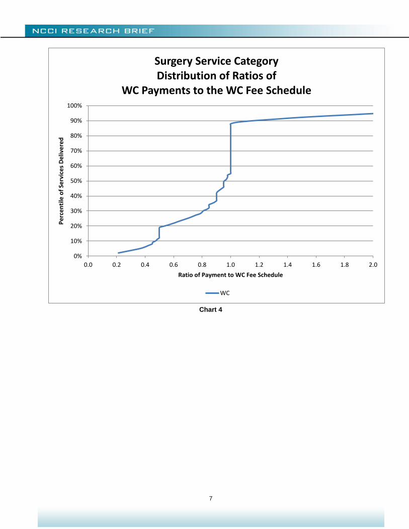
Chart 5 compares WC payments relative to the fee schedule MAR to Group Health and Medicare payments, also relative to the MAR. The GH and Medicare distributions are based on the WC mix of services. We find that:
Nearly three-fourths of GH payments for surgical services are below the WC MAR, as compared to about 55% of WC payments
25% of GH payments for surgical services are paid at amounts less than 40% of the MAR
Nearly 90% of Medicare payments are below the MAR
Chart 5
Chart 5 prompts some general observations on how the WC payment pattern for surgery differs from that of Group Health and Medicare:
Workers Compensation prices are concentrated at the fee schedule MAR.
WC prices paid below the MAR are still well above GH and Medicare prices. For example, while the median WC payment is discounted less than 10% off the MAR, the median GH and Medicare reimbursement are both about 40% below the MAR.
Some WC prices paid at the fee schedule MAR are below prices paid at the same percentile by GH, which conforms to a fee schedule imposing maximum allowable amounts on WC payments. For example, the 80th percentile WC payment is at the MAR, while the 80th percentile GH payment is about 15% above the MAR.
Chart 5 illustrates both intended and unintended consequences of fee schedules. Comparing GH with WC from the 75th to the 90th percentiles illustrates the intended consequence of lowering prices in WC that might otherwise have been higher. On the other hand, comparing GH with WC from the 55th to the 75th percentiles illustrates the unintended consequence where the presence of a fee schedule motivates some providers to charge the fee schedule MAR, thereby raising prices for
0%
10%
20%
30%
40%
50%
60%
70%
80%
90%
100%
0.0 0.2 0.4 0.6 0.8 1.0 1.2 1.4 1.6 1.8 2.0
Pe
rce
nti
le o
f Se
rvic
es
De
live
red
Ratio of Payment to WC Fee Schedule
Surgery Service CategoryDistribution of Ratios of
Payments to the WC Fee Schedule
WC GH Medicare
9
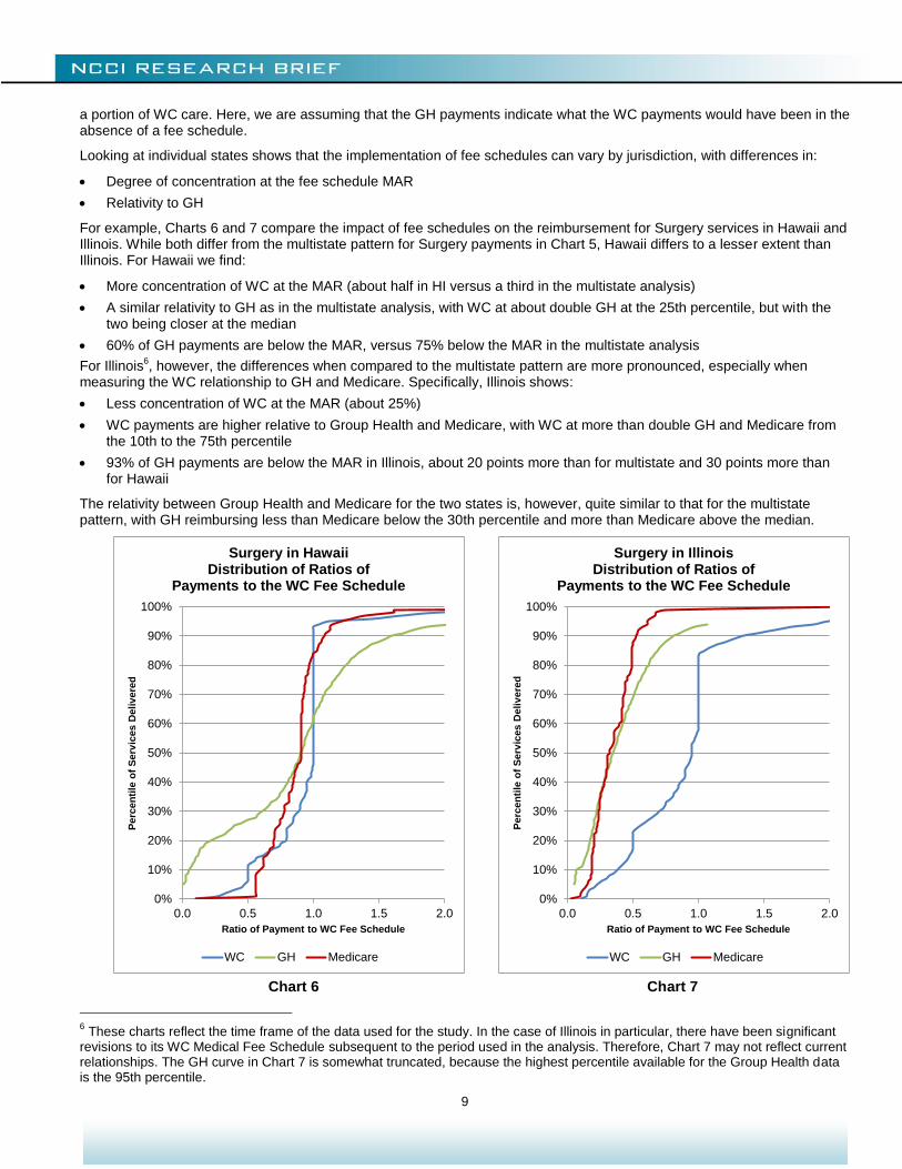
a portion of WC care. Here, we are assuming that the GH payments indicate what the WC payments would have been in the absence of a fee schedule.
Looking at individual states shows that the implementation of fee schedules can vary by jurisdiction, with differences in:
Degree of concentration at the fee schedule MAR
Relativity to GH
For example, Charts 6 and 7 compare the impact of fee schedules on the reimbursement for Surgery services in Hawaii and Illinois. While both differ from the multistate pattern for Surgery payments in Chart 5, Hawaii differs to a lesser extent than Illinois. For Hawaii we find:
More concentration of WC at the MAR (about half in HI versus a third in the multistate analysis)
A similar relativity to GH as in the multistate analysis, with WC at about double GH at the 25th percentile, but with the two being closer at the median
60% of GH payments are below the MAR, versus 75% below the MAR in the multistate analysis
For Illinois6, however, the differences when compared to the multistate pattern are more pronounced, especially when
measuring the WC relationship to GH and Medicare. Specifically, Illinois shows:
Less concentration of WC at the MAR (about 25%)
WC payments are higher relative to Group Health and Medicare, with WC at more than double GH and Medicare from the 10th to the 75th percentile
93% of GH payments are below the MAR in Illinois, about 20 points more than for multistate and 30 points more than for Hawaii
The relativity between Group Health and Medicare for the two states is, however, quite similar to that for the multistate pattern, with GH reimbursing less than Medicare below the 30th percentile and more than Medicare above the median.
Chart 6 Chart 7
6 These charts reflect the time frame of the data used for the study. In the case of Illinois in particular, there have been significant
revisions to its WC Medical Fee Schedule subsequent to the period used in the analysis. Therefore, Chart 7 may not reflect current relationships. The GH curve in Chart 7 is somewhat truncated, because the highest percentile available for the Group Health data is the 95th percentile.
0%
10%
20%
30%
40%
50%
60%
70%
80%
90%
100%
0.0 0.5 1.0 1.5 2.0
Perc
en
tile
of
Serv
ices D
eliv
ere
d
Ratio of Payment to WC Fee Schedule
Surgery in HawaiiDistribution of Ratios of
Payments to the WC Fee Schedule
WC GH Medicare
0%
10%
20%
30%
40%
50%
60%
70%
80%
90%
100%
0.0 0.5 1.0 1.5 2.0
Perc
en
tile
of
Serv
ices D
eliv
ere
d
Ratio of Payment to WC Fee Schedule
Surgery in IllinoisDistribution of Ratios of
Payments to the WC Fee Schedule
WC GH Medicare
10
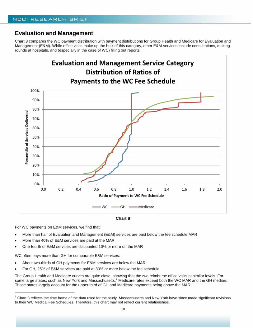
Evaluation and Management
Chart 8 compares the WC payment distribution with payment distributions for Group Health and Medicare for Evaluation and Management (E&M). While office visits make up the bulk of this category, other E&M services include consultations, making rounds at hospitals, and (especially in the case of WC) filling out reports.
Chart 8
For WC payments on E&M services, we find that:
More than half of Evaluation and Management (E&M) services are paid below the fee schedule MAR
More than 40% of E&M services are paid at the MAR
One-fourth of E&M services are discounted 10% or more off the MAR
WC often pays more than GH for comparable E&M services:
About two-thirds of GH payments for E&M services are below the MAR
For GH, 25% of E&M services are paid at 30% or more below the fee schedule
The Group Health and Medicare curves are quite close, showing that the two reimburse office visits at similar levels. For some large states, such as New York and Massachusetts,
7 Medicare rates exceed both the WC MAR and the GH median.
Those states largely account for the upper third of GH and Medicare payments being above the MAR.
7 Chart 8 reflects the time frame of the data used for the study. Massachusetts and New York have since made significant revisions
to their WC Medical Fee Schedules. Therefore, this chart may not reflect current relationships.
0%
10%
20%
30%
40%
50%
60%
70%
80%
90%
100%
0.0 0.2 0.4 0.6 0.8 1.0 1.2 1.4 1.6 1.8 2.0
Pe
rce
nti
le o
f Se
rvic
es
De
live
red
Ratio of Payment to WC Fee Schedule
Evaluation and Management Service CategoryDistribution of Ratios of
Payments to the WC Fee Schedule
WC GH Medicare
11
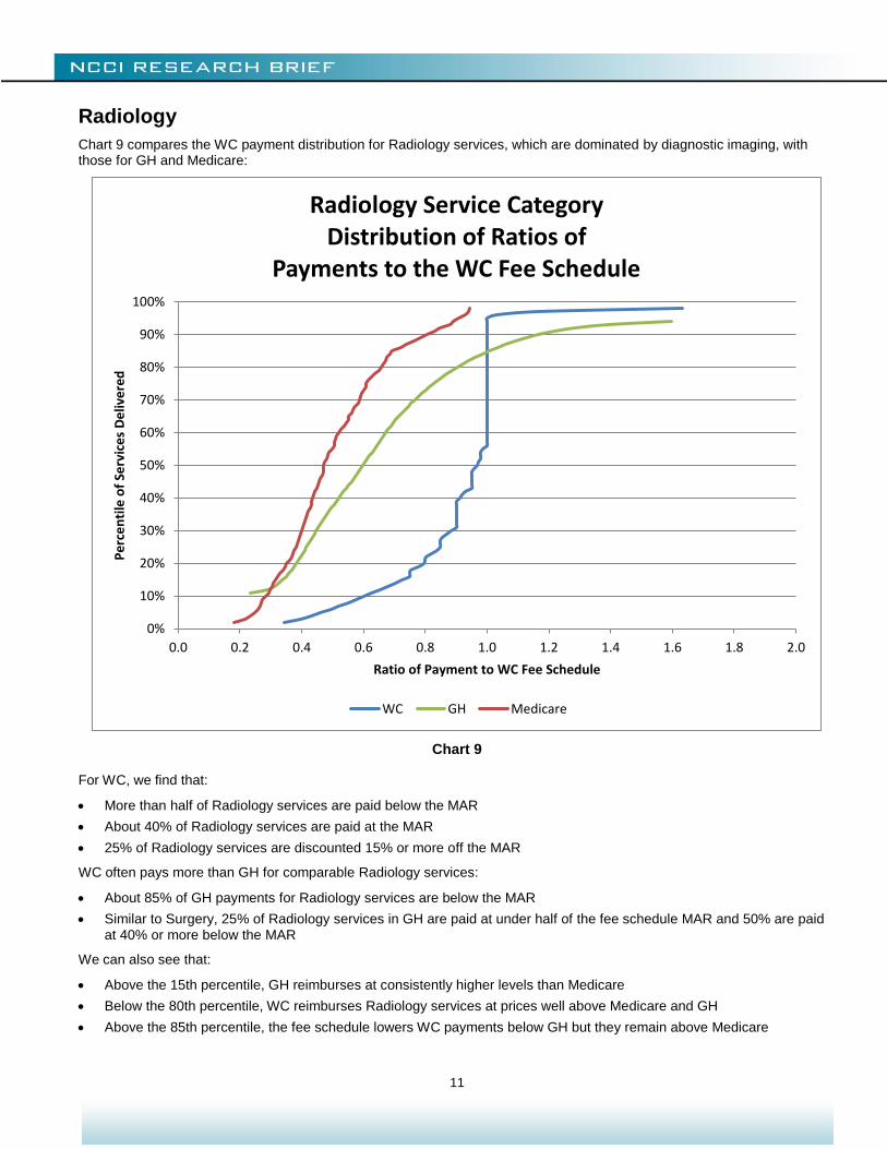
Radiology
Chart 9 compares the WC payment distribution for Radiology services, which are dominated by diagnostic imaging, with those for GH and Medicare:
Chart 9
For WC, we find that:
More than half of Radiology services are paid below the MAR
About 40% of Radiology services are paid at the MAR
25% of Radiology services are discounted 15% or more off the MAR
WC often pays more than GH for comparable Radiology services:
About 85% of GH payments for Radiology services are below the MAR
Similar to Surgery, 25% of Radiology services in GH are paid at under half of the fee schedule MAR and 50% are paid at 40% or more below the MAR
We can also see that:
Above the 15th percentile, GH reimburses at consistently higher levels than Medicare
Below the 80th percentile, WC reimburses Radiology services at prices well above Medicare and GH
Above the 85th percentile, the fee schedule lowers WC payments below GH but they remain above Medicare
0%
10%
20%
30%
40%
50%
60%
70%
80%
90%
100%
0.0 0.2 0.4 0.6 0.8 1.0 1.2 1.4 1.6 1.8 2.0
Pe
rce
nti
le o
f Se
rvic
es
De
live
red
Ratio of Payment to WC Fee Schedule
Radiology Service CategoryDistribution of Ratios of
Payments to the WC Fee Schedule
WC GH Medicare
12
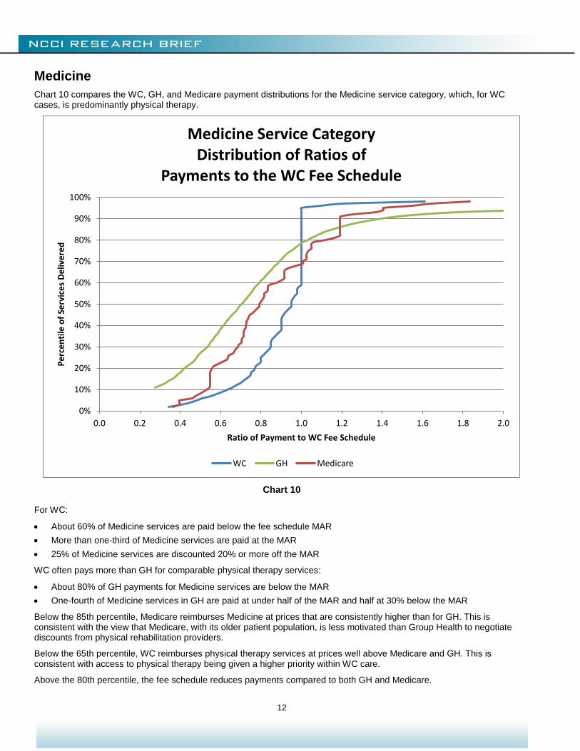
Medicine
Chart 10 compares the WC, GH, and Medicare payment distributions for the Medicine service category, which, for WC cases, is predominantly physical therapy.
Chart 10
For WC:
About 60% of Medicine services are paid below the fee schedule MAR
More than one-third of Medicine services are paid at the MAR
25% of Medicine services are discounted 20% or more off the MAR
WC often pays more than GH for comparable physical therapy services:
About 80% of GH payments for Medicine services are below the MAR
One-fourth of Medicine services in GH are paid at under half of the MAR and half at 30% below the MAR
Below the 85th percentile, Medicare reimburses Medicine at prices that are consistently higher than for GH. This is consistent with the view that Medicare, with its older patient population, is less motivated than Group Health to negotiate discounts from physical rehabilitation providers.
Below the 65th percentile, WC reimburses physical therapy services at prices well above Medicare and GH. This is consistent with access to physical therapy being given a higher priority within WC care.
Above the 80th percentile, the fee schedule reduces payments compared to both GH and Medicare.
0%
10%
20%
30%
40%
50%
60%
70%
80%
90%
100%
0.0 0.2 0.4 0.6 0.8 1.0 1.2 1.4 1.6 1.8 2.0
Pe
rce
nti
le o
f Se
rvic
es
De
live
red
Ratio of Payment to WC Fee Schedule
Medicine Service CategoryDistribution of Ratios of
Payments to the WC Fee Schedule
WC GH Medicare
13
FINDINGS ACROSS SERVICE CATEGORIES
Surgery and E&M
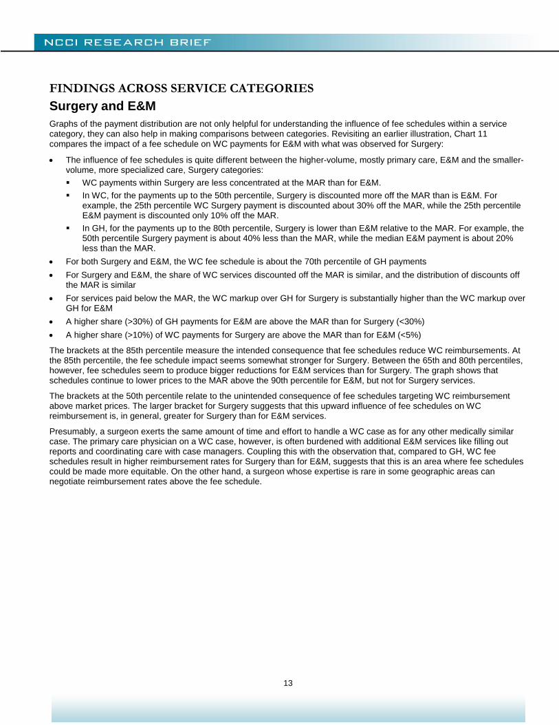
Graphs of the payment distribution are not only helpful for understanding the influence of fee schedules within a service category, they can also help in making comparisons between categories. Revisiting an earlier illustration, Chart 11 compares the impact of a fee schedule on WC payments for E&M with what was observed for Surgery:
The influence of fee schedules is quite different between the higher-volume, mostly primary care, E&M and the smaller-volume, more specialized care, Surgery categories:
WC payments within Surgery are less concentrated at the MAR than for E&M.
In WC, for the payments up to the 50th percentile, Surgery is discounted more off the MAR than is E&M. For example, the 25th percentile WC Surgery payment is discounted about 30% off the MAR, while the 25th percentile E&M payment is discounted only 10% off the MAR.
In GH, for the payments up to the 80th percentile, Surgery is lower than E&M relative to the MAR. For example, the 50th percentile Surgery payment is about 40% less than the MAR, while the median E&M payment is about 20% less than the MAR.
For both Surgery and E&M, the WC fee schedule is about the 70th percentile of GH payments
For Surgery and E&M, the share of WC services discounted off the MAR is similar, and the distribution of discounts off the MAR is similar
For services paid below the MAR, the WC markup over GH for Surgery is substantially higher than the WC markup over GH for E&M
A higher share (>30%) of GH payments for E&M are above the MAR than for Surgery (<30%)
A higher share (>10%) of WC payments for Surgery are above the MAR than for E&M (<5%)
The brackets at the 85th percentile measure the intended consequence that fee schedules reduce WC reimbursements. At the 85th percentile, the fee schedule impact seems somewhat stronger for Surgery. Between the 65th and 80th percentiles, however, fee schedules seem to produce bigger reductions for E&M services than for Surgery. The graph shows that schedules continue to lower prices to the MAR above the 90th percentile for E&M, but not for Surgery services.
The brackets at the 50th percentile relate to the unintended consequence of fee schedules targeting WC reimbursement above market prices. The larger bracket for Surgery suggests that this upward influence of fee schedules on WC reimbursement is, in general, greater for Surgery than for E&M services.
Presumably, a surgeon exerts the same amount of time and effort to handle a WC case as for any other medically similar case. The primary care physician on a WC case, however, is often burdened with additional E&M services like filling out reports and coordinating care with case managers. Coupling this with the observation that, compared to GH, WC fee schedules result in higher reimbursement rates for Surgery than for E&M, suggests that this is an area where fee schedules could be made more equitable. On the other hand, a surgeon whose expertise is rare in some geographic areas can negotiate reimbursement rates above the fee schedule.
14
Chart 11
0%
10%
20%
30%
40%
50%
60%
70%
80%
90%
100%
0.0 0.2 0.4 0.6 0.8 1.0 1.2 1.4 1.6 1.8 2.0
Pe
rce
nti
le o
f Se
rvic
es
De
live
red
Ratio of Payment to WC Fee Schedule
E&M and Surgery Service CategoriesDistribution of Ratios of
Payments to the WC Fee Schedule
WC_E&M GH_E&M
WC_Surgery GH_Surgery
E&M
E&M
Surgery
Surgery
15
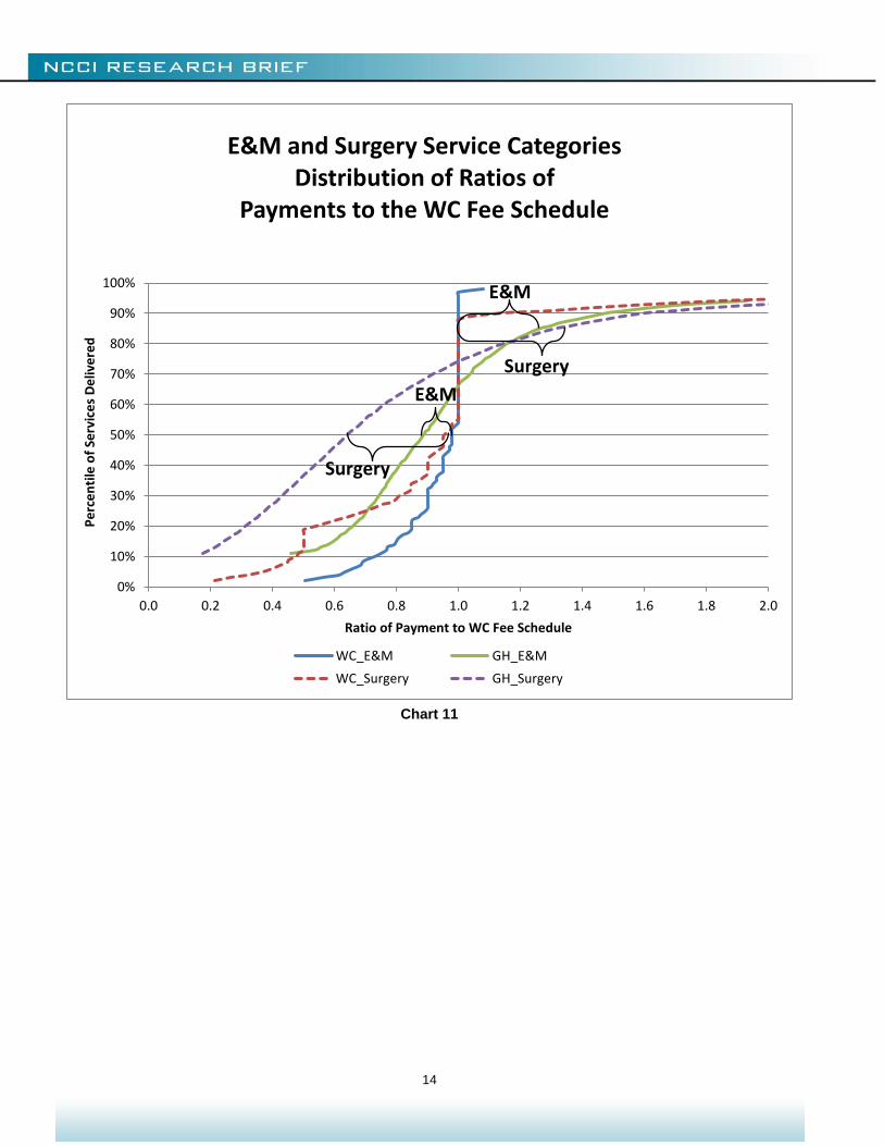
Radiology and Medicine
Chart 12 compares the impact of a fee schedule on WC payments for Medicine with Radiology. This contrasts with what was observed between E&M and Surgery in the previous section. There is less of a difference between the way physician fee schedules relate to payments for primary-care Medicine and how they relate to more specialized Radiology services:
The influence of fee schedules is generally similar between the two service categories
The two WC distributions are quite similar
The two GH distributions are reasonably close, with Radiology showing a somewhat lower reimbursement rate relative to the MAR
The WC fee schedule is near the 80th percentile of GH payments for Medicine and the 85th percentile for Radiology
A higher share of GH payments is above the MAR for Medicine (>20%) than for Radiology (15%).
Chart 12 shows that GH pays less relative to the MAR for specialty-care Radiology than for primary care physical medicine.
Chart 12
The brackets at the 90th percentile measure the intended consequence that WC fees be reduced by the fee schedule. At the 90th percentile, the fee schedule impact seems somewhat stronger for Medicine than for Radiology. The brackets at the 50th percentile show the unintended consequence of fee schedules setting target prices for WC reimbursement that are above market. The larger bracket for Radiology indicates that this upward influence of fee schedules on WC reimbursement
0%
10%
20%
30%
40%
50%
60%
70%
80%
90%
100%
0.0 0.2 0.4 0.6 0.8 1.0 1.2 1.4 1.6 1.8 2.0
Pe
rce
nti
le o
f Se
rvic
es
De
live
red
Ratio of Payment to WC Fee Schedule
Radiology and Medicine Service CategoriesDistribution of Ratios of
Payments to the WC Fee Schedule
WC_Medicine GH_Medicine
WC_Radiology GH_Radiology
Radiology
Radiology
Medicine
Medicine
Medicine
Medicine
16
is somewhat greater for the more specialized Radiology services. While less pronounced, this pattern is similar to what was seen in the comparison between Surgery and E&M services on Chart 11.
MORE FINDINGS ACROSS STATES
By concentrating payments at their respective fee schedule MARs, fee schedules influence the relative cost of WC medical payments between states. However, this does not necessarily mean that fee schedules keep WC payments in line with the market rates for medical care by state.
When comparing medical payment levels, it is common to compare median prices. Comparisons of median prices are not as affected by a few unusually high or low prices paid as comparisons of mean or average prices.
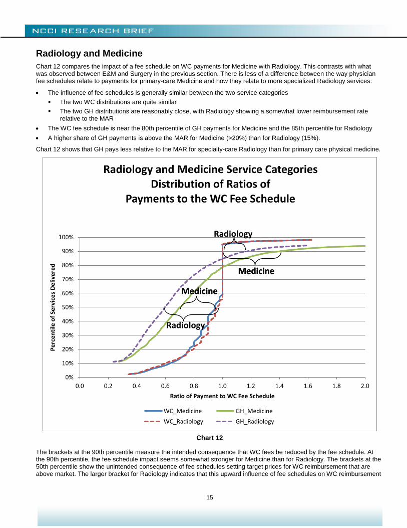
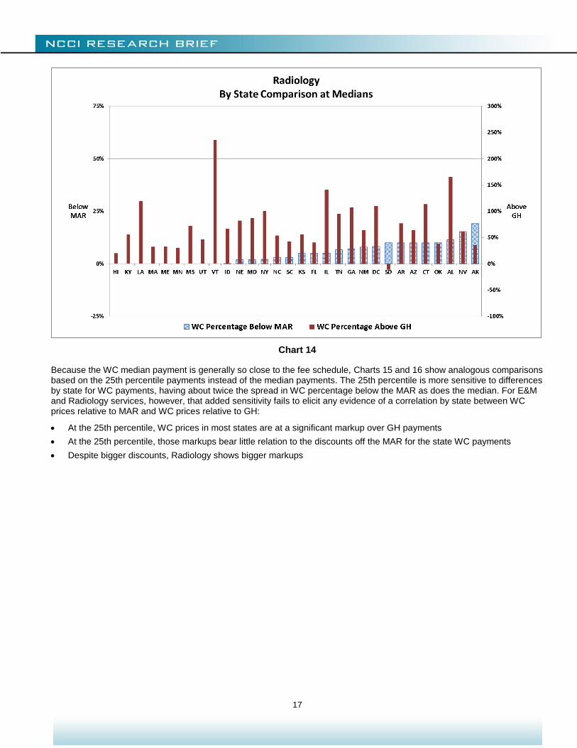
For E&M and Radiology services, Charts 13 and 14 compare state8 median WC payments, expressed as a percentage
discount off the fee schedule, with the percent by which this median exceeds the median GH payment for comparable services. States are sorted according to the median WC discount off the MAR. (Note the use of two different scales because the percentages above GH are larger than the WC percentages below the MAR.)
One would expect the majority of WC payments to be below the maximum allowed by the fee schedule and, therefore, expect the WC median not to exceed the MAR. This implies that the WC percentage below the MAR is a positive amount, as is the case in Charts 13 and 14. On the other hand, GH payments are not subject to the fee schedule. While WC reimbursement levels are typically above GH, for a few states the median WC payment is less than the GH median—when payments are expressed as percentages of the MAR. This is the case for E&M and Radiology in South Dakota, as indicated by negative amounts for the WC percentage above GH for that state on Charts 13 and 14.
If fee schedules produced a strong correlation between WC and GH reimbursement levels, then one would expect the WC median, as a percentage discount off the fee schedule, to be low when the WC percentage over GH is high, and vice versa. The charts do not show that relationship for either E&M or Radiology. This comparison is confounded by the median WC payment being equal to or very near the MAR, making it difficult to relate differences by state to a value that itself varies so little by state.
Chart 13
8 States for which reimbursements from one WC insurer dominates the experience are excluded from Charts 13–16.
17
Chart 14
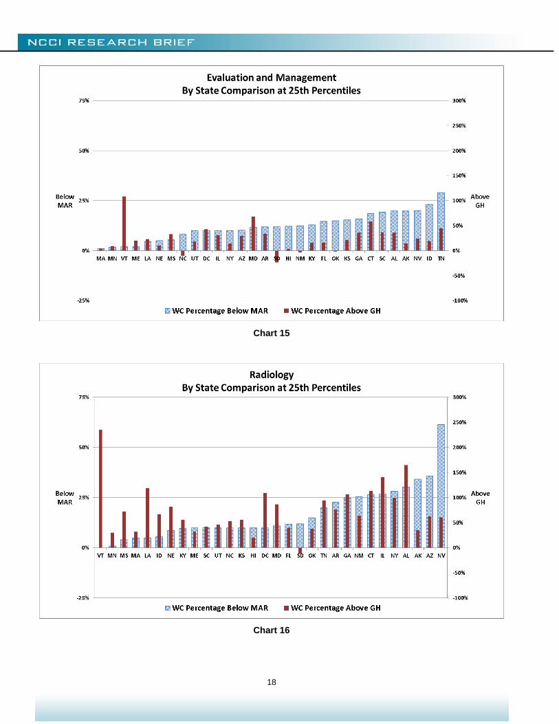
Because the WC median payment is generally so close to the fee schedule, Charts 15 and 16 show analogous comparisons based on the 25th percentile payments instead of the median payments. The 25th percentile is more sensitive to differences by state for WC payments, having about twice the spread in WC percentage below the MAR as does the median. For E&M and Radiology services, however, that added sensitivity fails to elicit any evidence of a correlation by state between WC prices relative to MAR and WC prices relative to GH:
At the 25th percentile, WC prices in most states are at a significant markup over GH payments
At the 25th percentile, those markups bear little relation to the discounts off the MAR for the state WC payments
Despite bigger discounts, Radiology shows bigger markups
18
Chart 15
Chart 16
19
Conclusion
A few key findings from this study are that:
Physician fee schedules influence more than just the small share of charges that exceed the MAR
Fee schedules may have the unintended consequence of increasing some payments
A discount from a fee schedule amount does not ensure a price that is competitive in the healthcare marketplace
To determine the effectiveness of fee schedules, it is important to consider market rates
This research is an early application of NCCI’s new Medical Data Call. Applications will expand as more experience is captured.
Other research on the impact of fee schedules includes a series of studies published by the Workers Compensation Research Institute, including Designing Workers’ Compensation Fee Schedules by O. Fomenko and T. Liu (WCRI, June 2012).
Previous NCCI research on WC medical costs and fee schedules includes:
F. Schmid, N. Lord, The Impact of Physician Fee Schedule Introductions in Workers Compensation: An Event Study, NCCI, August 2012
F. Schmid, N. Lord, The Impact of Physician Fee Schedule Changes in Workers Compensation: Evidence From 31 States, NCCI, May 2013
D. Corro, J. Robertson, The Impact on Physician Reimbursement of Changes to Workers Compensation Medical Fee Schedules, NCCI, March 2011
B. Lipton, J. Robertson, D. Corro, Medicare and Workers Compensation Medical Cost Containment, NCCI, January 2010
B. Lipton, D. Corro, N. Moore, J. Robertson, Effectiveness of Workers Compensation Fee Schedules—A Closer Look, NCCI, February 2009
J. Robertson, D. Corro, Making Workers Compensation Medical Fee Schedules More Effective, NCCI, December 2007
These and more NCCI research studies can be found at ncci.com.
20
APPENDIX
Categories of Services
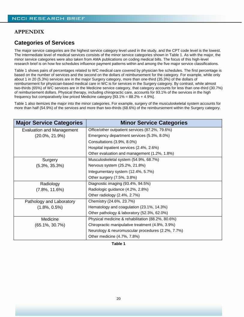
The major service categories are the highest service category level used in the study, and the CPT code level is the lowest. The intermediate level of medical services consists of the minor service categories shown in Table 1. As with the major, the minor service categories were also taken from AMA publications on coding medical bills. The focus of this high-level research brief is on how fee schedules influence payment patterns within and among the five major service classifications.
Table 1 shows pairs of percentages related to WC medical care covered by physician fee schedules. The first percentage is based on the number of services and the second on the dollars of reimbursement for the category. For example, while only about 1 in 20 (5.3%) services are in the major Surgery category, more than one-third (35.3%) of the dollars of reimbursement for physician-based medical care in WC is for services in the Surgery category. By contrast, while almost two-thirds (65%) of WC services are in the Medicine service category, that category accounts for less than one-third (30.7%) of reimbursement dollars. Physical therapy, including chiropractic care, accounts for 93.1% of the services in the high frequency but comparatively low priced Medicine category [93.1% = 88.2% + 4.9%].
Table 1 also itemizes the major into the minor categories. For example, surgery of the musculoskeletal system accounts for more than half (54.9%) of the services and more than two-thirds (68.6%) of the reimbursement within the Surgery category.
Major Service Categories Minor Service Categories
Evaluation and Management Office/other outpatient services (87.2%, 79.6%)
(20.0%, 21.9%) Emergency department services (5.3%, 8.0%)
Consultations (3.9%, 8.0%)
Hospital inpatient services (2.4%, 2.6%)
Other evaluation and management (1.2%, 1.8%)
Surgery Musculoskeletal system (54.9%, 68.7%)
(5.3%, 35.3%) Nervous system (25.2%, 21.8%)
Integumentary system (12.4%, 5.7%)
Other surgery (7.5%, 3.8%)
Radiology Diagnostic imaging (93.4%, 94.5%)
(7.8%, 11.6%) Radiologic guidance (4.2%, 2.8%)
Other radiology (2.4%, 2.7%)
Pathology and Laboratory Chemistry (24.6%, 23.7%)
(1.8%, 0.5%) Hematology and coagulation (23.1%, 14.3%)
Other pathology & laboratory (52.3%, 62.0%)
Medicine Physical medicine & rehabilitation (88.2%, 80.6%)
(65.1%, 30.7%) Chiropractic manipulative treatment (4.9%, 3.9%)
Neurology & neuromuscular procedures (2.2%, 7.7%)
Other medicine (4.7%, 7.8%)
Table 1
21
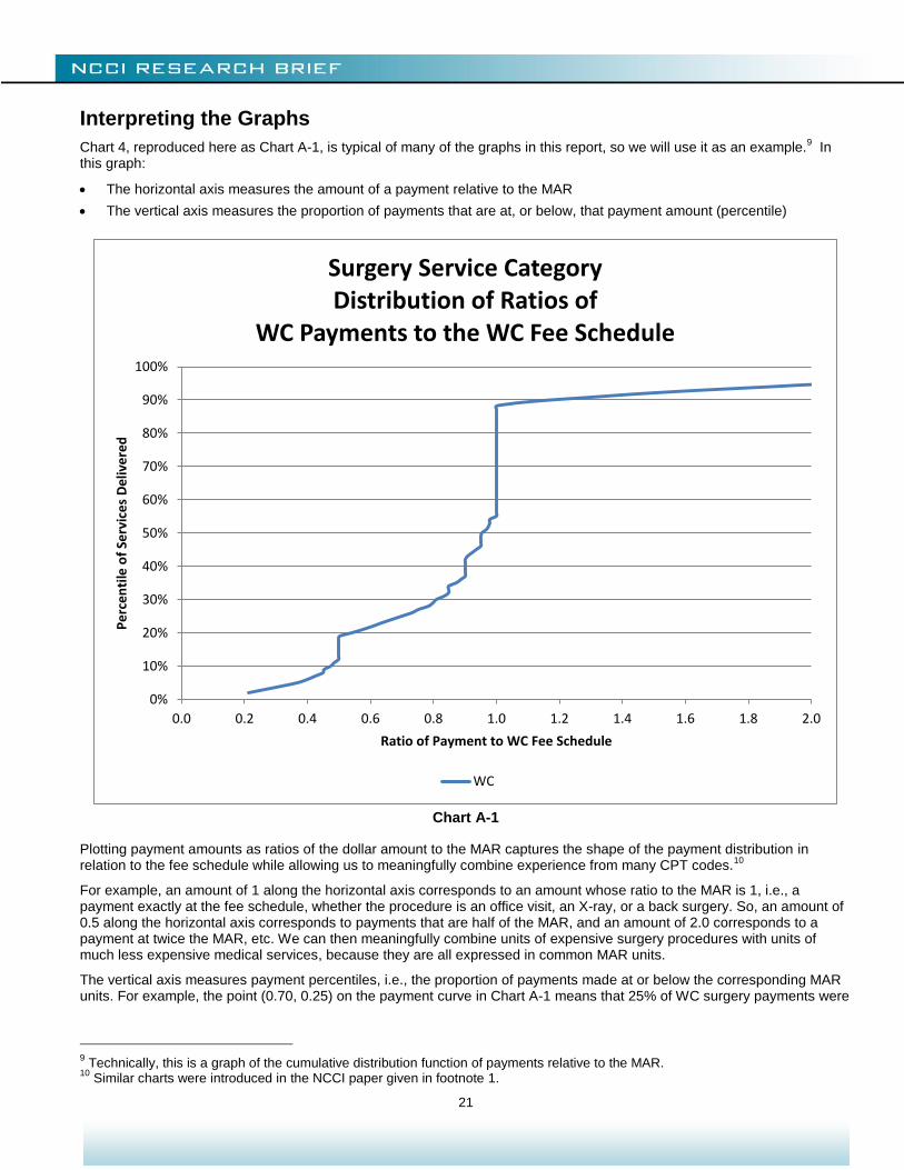
Interpreting the Graphs
Chart 4, reproduced here as Chart A-1, is typical of many of the graphs in this report, so we will use it as an example.9 In
this graph:
The horizontal axis measures the amount of a payment relative to the MAR
The vertical axis measures the proportion of payments that are at, or below, that payment amount (percentile)
Chart A-1
Plotting payment amounts as ratios of the dollar amount to the MAR captures the shape of the payment distribution in relation to the fee schedule while allowing us to meaningfully combine experience from many CPT codes.
10
For example, an amount of 1 along the horizontal axis corresponds to an amount whose ratio to the MAR is 1, i.e., a payment exactly at the fee schedule, whether the procedure is an office visit, an X-ray, or a back surgery. So, an amount of 0.5 along the horizontal axis corresponds to payments that are half of the MAR, and an amount of 2.0 corresponds to a payment at twice the MAR, etc. We can then meaningfully combine units of expensive surgery procedures with units of much less expensive medical services, because they are all expressed in common MAR units.
The vertical axis measures payment percentiles, i.e., the proportion of payments made at or below the corresponding MAR units. For example, the point (0.70, 0.25) on the payment curve in Chart A-1 means that 25% of WC surgery payments were
9 Technically, this is a graph of the cumulative distribution function of payments relative to the MAR.
10 Similar charts were introduced in the NCCI paper given in footnote 1.
0%
10%
20%
30%
40%
50%
60%
70%
80%
90%
100%
0.0 0.2 0.4 0.6 0.8 1.0 1.2 1.4 1.6 1.8 2.0
Pe
rce
nti
le o
f Se
rvic
es
De
live
red
Ratio of Payment to WC Fee Schedule
Surgery Service CategoryDistribution of Ratios of
WC Payments to the WC Fee Schedule
WC
22
reimbursed at less than, or equal to, 70% of the MAR. We express this by saying that the 25th percentile is 70% of the MAR.
The vertical line segment at 1 MAR is of particular interest, because it corresponds to payments made at the fee schedule MAR. It is typical for WC payments to have a concentration at the MAR and, consequently, for the WC payment curve to exhibit a vertical segment at that point. In Chart A-1, the segment goes from the point (0.55,1.00) up to (0.88,1.00) with a length of 0.33. This implies that one payment in three, or 33%, was made at the MAR.
MARs used in this study are those for the CPT code, without application of any modifiers. For example, the fee schedule might say that an assistant surgeon is reimbursed at 50% of the reimbursement for the primary surgeon. In this study, the payment to the assistant surgeon is treated as a payment at 50% of the MAR. Such reimbursement rules (cascade billing) explain the small vertical segment above the value 0.5 along the WC curve in the Surgery charts like Charts 4 to 7.
11 We do
not have CPT code modifier data for GH, so comparisons at the CPT code level are the most accurate that can be made.
11
The graphs relate payments to the MAR for the CPT code, because the GH data provided percentiles by CPT code. It was not possible to adjust the GH percentiles to account for cascade billing, professional or technical components, or other billing rules that apply within a CPT code.
23
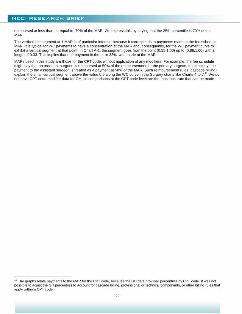
Services Versus Dollars
Charts in this study reflect distributions of services in which each service is given equal importance, be it an expensive back surgery or treatment of a simple cut. The focus of this study is on such distributions of transactions as they relate directly with physician billing behavior. To obtain a more price homogeneous comparison, we can drill down to a more restricted service category, as in the Technical Supplement. In the case of the WC data, where we have individual payment amounts, we can also shift from frequency to a dollar perspective. This is achieved by assigning dollars, rather than services, to the ratio of payment to MAR. For Surgery, this is shown Chart A-2, which compares the frequency of WC services, relative to the MAR, to that payment distribution.
Chart A-2
Since the largest WC payment transactions are also the more likely to exceed the MAR, it is to be expected that the 30% share of WC dollars shown exceeding the MAR in Chart A-2 is greater than the 12% share of the number of services reimbursed in excess of the MAR.
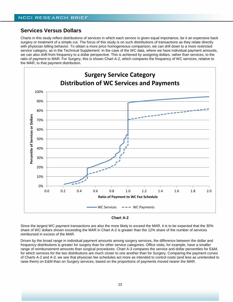
Driven by the broad range in individual payment amounts among surgery services, the difference between the dollar and frequency distributions is greater for surgery than for other service categories. Office visits, for example, have a smaller range of reimbursement amounts than surgical procedures. Chart A-3 compares the service and dollar percentiles for E&M, for which services for the two distributions are much closer to one another than for Surgery. Comparing the payment curves of Charts A-2 and A-3, we see that physician fee schedules act more as intended to control costs (and less as unintended to raise them) on E&M than on Surgery services, based on the proportions of payments moved nearer the MAR.
0%
10%
20%
30%
40%
50%
60%
70%
80%
90%
100%
0.0 0.2 0.4 0.6 0.8 1.0 1.2 1.4 1.6 1.8 2.0
Pe
rce
nti
le o
f Se
rvic
es
or
Do
llars
Ratio of Payment to WC Fee Schedule
Surgery Service CategoryDistribution of WC Services and Payments
WC Services WC Payments
24
Chart A-3
© Copyright 2014 National Council on Compensation Insurance, Inc. All Rights Reserved. THE RESEARCH ARTICLES AND CONTENT DISTRIBUTED BY NCCI ARE PROVIDED FOR GENERAL INFORMATIONAL PURPOSES ONLY AND ARE PROVIDED “AS IS.” NCCI DOES NOT GUARANTEE THEIR ACCURACY OR COMPLETENESS NOR DOES NCCI ASSUME ANY LIABILITY THAT MAY RESULT IN YOUR RELIANCE UPON SUCH INFORMATION. NCCI EXPRESSLY DISCLAIMS ANY AND ALL WARRANTIES OF ANY KIND INCLUDING ALL EXPRESS, STATUTORY AND IMPLIED WARRANTIES INCLUDING THE IMPLIED WARRANTIES OF MERCHANTABILITY AND FITNESS FOR A PARTICULAR PURPOSE.
0%
10%
20%
30%
40%
50%
60%
70%
80%
90%
100%
0.0 0.2 0.4 0.6 0.8 1.0 1.2 1.4 1.6 1.8 2.0
Pe
rce
nti
le o
f Se
rvic
es
or
Do
llars
Ratio of Payment to WC Fee Schedule
Evaluation and Management Service CategoryDistribution of WC Services and Payments
WC Services WC Payments