The Parasite Community Species Accumulation Curve
33
The Parasite Community Species Accumulation Curve An enzyme kinetics metaphor [or vice versa?] John Janovy, Jr.; January 18, 2007 © Phillip Colla OceanLight.com http://www.gygis.com
Transcript of The Parasite Community Species Accumulation Curve

The Parasite Community Species Accumulation Curve
An enzyme kinetics metaphor [or vice versa?]John Janovy, Jr.; January 18, 2007
© Phillip Colla OceanLight.comhttp://www.gygis.com

Typical species accumulation curve
0
5
10
15
20
25
1 3 5 7 9 11 13 15 17 19
Sampling Effort Measure
Num
ber o
f Spe
cies
Dis
cove
red

Typical species accumulation curve (first approximation, expectation)
0
0.5
1
1.5
2
2.5
0 25 50 75 100 125 150 175
Sampling Effort Measure
Num
ber o
f Spe
cies
Dis
cove
red Y = ln x

A typical species accumulation curve (max = 12 species; an impoverished community)
02468
101214
0 3 6 9 12 15 18 21 24 27 30 33
Sampling Effort Measure
Num
ber o
f Spe
cies
Dis
cove
red
# SpeciesReturn
Y = c – [1/((ln x)x)]
C = 12
Y = 1/((ln x)x)
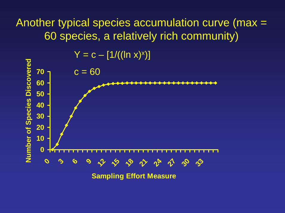
Another typical species accumulation curve (max = 60 species, a relatively rich community)
010203040506070
0 3 6 9 12 15 18 21 24 27 30 33
Sampling Effort Measure
Num
ber o
f Spe
cies
Dis
cove
red
Y = c – [1/((ln x)x)]
c = 60

Two typical species accumulation curves (two different communities; two different “c” values)
010203040506070
0 3 6 9 12 15 18 21 24 27 30 33
Sampling Effort Measure
Num
ber o
f Spe
cies
Dis
cove
red
Poor commRich comm
Y = c – [1/((ln x)x)]
“c” can be considered a richness constant, or a richness parameter
C = 60
C = 12
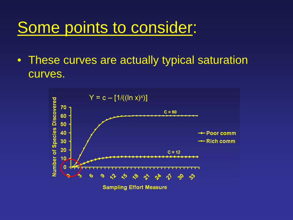
Some points to consider:
• These curves are actually typical saturation curves.
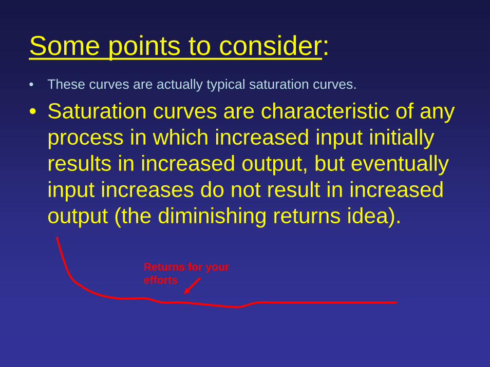
Some points to consider:• These curves are actually typical saturation curves.
• Saturation curves are characteristic of any process in which increased input initially results in increased output, but eventually input increases do not result in increased output (the diminishing returns idea).
Returns for your efforts

The basis for this curve as an ecological phenomenon is quite obvious to anyone who has gone to the field and tried to determine species richness of a particular habitat. Eventually you get to the point where no matter how seriously you look, you can’t find anything new.
However, you can always find new problems to study, and in fact the problem supply might actually be the inverse of the diminishing returns line!

Some points to consider:• These curves are actually typical saturation curves.• Saturation curves are characteristic of any process in which
increased input initially results in increased output, but eventually input increases do not result in increased output (the diminishing returns idea).
• So the real issue, parasitologically, is what determines the value of “c”* (i.e., the landscape epizootiology/epidemiology problem).
Now, the enzyme kinetics “metaphor”
*And the relative prevalences or p/inf/ of the c species.

The multiple-kind lottery:
rnd
A A A A 0 0 0 0 0 0 B B 0 0 0 0 0 0 0 0 . . . . . . n n n n n 0 0 0 0 0
(the parasites; species “a” through “n” [“n” = any number])

The parasite supply (n species, distributed in the landscape so as to provide different relative probabilities of infection, and of failure to get infected)
Host can sample this pool as often as the keyboard God declares (= the effort)
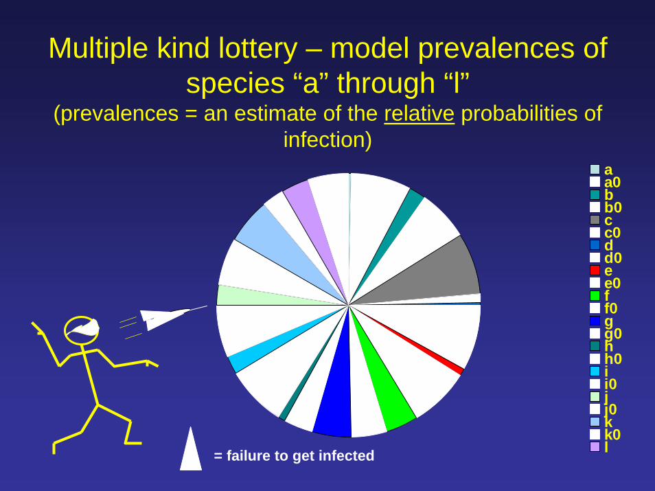
Multiple kind lottery – model prevalences of species “a” through “l”
(prevalences = an estimate of the relative probabilities of infection)
aa0bb0cc0dd0ee0ff0gg0hh0ii0jj0kk0l= failure to get infected

Prevalences to start the investigation:A = 0.04 I = 0.24
B = 0.23 J = 0.31
C = 0.87 K = 0.67
D = 0.06 L = 0.41
E = 0.12
F = 0.45
G = 0.56
H = 0.09Mean prevalence = 0.338 = 33.8%

Species accumulation curve (different p/inf/ per species*)
Mean infra-richness in a sample of 24 hosts, each making the effort.
0
2
4
6
8
10
12
0 10 50 100 200 500 1000 2000
Sampling Effort Measure
Num
ber o
f Spe
cies
Dis
cove
red
*=the relative probabilities of infection as shown on the previous pie chart
*
All prev = 0.50

Species accumulation curve (different p/inf/ per species*)
Mean infra-richness in a sample of hosts, each making an effort of 1000.
0
2
4
6
8
10
12
5 10 15 20 25 30
Number of Hosts Examined
Num
ber o
f Spe
cies
Dis
cove
red
# SpeciesMean H'ISample H'
*=the relative probabilities of infection as shown on the previous pie chart
*

H’ value (diversity index) varies with number of species and even-ness of representation.
You can calculate this parasite community diversity for individuals (infradiversity) or for the sample as a whole (sample diversity).

Species accumulation curve (different p/inf/ per species*)
Mean infra-richness in a sample of 24 hosts, each making the effort.
0
2
4
6
8
10
12
10 50 100 200 500 1000 2000
Sampling Effort Measure
Num
ber o
f Spe
cies
Dis
cove
red
# SpeciesMean H'ISample H'
*
*=the relative probabilities of infection as shown on the previous pie chart

Species accumulation curve (different p/inf/ per species*)
Mean infra-richness in a sample of 24 hosts, each making the effort.
0
1
2
3
10 50 100 200 500 1000 2000
Sampling Effort Measure
Num
ber o
f Spe
cies
Dis
cove
red
Mean H'ISample H'
*
(A property of the null model)
*=the relative probabilities of infection as shown on the previous pie chart

Species accumulation curve (two communities, different p/inf/ per species*)Mean infra-richness in a sample of 24 hosts, each making the effort.
0
2
4
6
8
10
12
10 50 100 200 500 1000 2000 5000
Sampling Effort Measure
Num
ber o
f Spe
cies
Dis
cove
red
# Species - 1 # Species - 2
Mean prev= 33.8%
Mean prev= 16.8%
You can increase your efforts 500-fold and still not find all the species in a parasite community if mean prevalence is low.
(You can never get to max if prevalences are low.)

Some model communities:Prev’s (%) Comm 1 Comm 2 Comm 3 Comm 4
Sp A 17 9 68 7
Sp B 34 12 45 4
Sp C 56 45 55 12
Sp D 23 15 38 32
Sp E 87 61 74 18
MeanPrev.
43.4 28.4 56 14.6

Species accumulation curve (two communities, different p/inf/ per species)Mean infra-richness in a sample of 24 hosts, each making the effort.
0
1
2
3
4
5
0 10 50 100 200 500 1000 2000 5000
Sampling Effort Measure
Num
ber o
f Spe
cies
Dis
cove
red
# Species - 1 # Species - 2# Species - 3 # Species - 4
Mean prev= 10.2%
In a poor community, you find most of the species in a hurry.
Mean prev= 56.0%

Community diversity measures (different p/inf/ per species*)
Results from a sample of 24 hosts, each making the effort.
010203040506070
10 50 150
250
350
450
550
650
750
850
950
Sampling Effort Measure
Thre
e Sp
ecie
s M
ean
Abu
ndan
ce SpDensMean c/hostMean g/hostMean k/host
*Accumulation of parasites is of fundamental interest.
*=the relative probabilities of infection as shown on the previous pie chart

However, saturation curves also are characteristic of enzymatic reactions, in which active sites eventually become saturated.
Figs. from en.wikipedia.org/wiki/Enzyme_kinetics
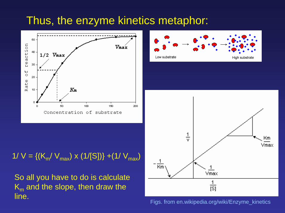
Thus, the enzyme kinetics metaphor:
1/ V = {(Km/ Vmax) x (1/[S])} +(1/ Vmax)
So all you have to do is calculate Km and the slope, then draw the line.
Figs. from en.wikipedia.org/wiki/Enzyme_kinetics
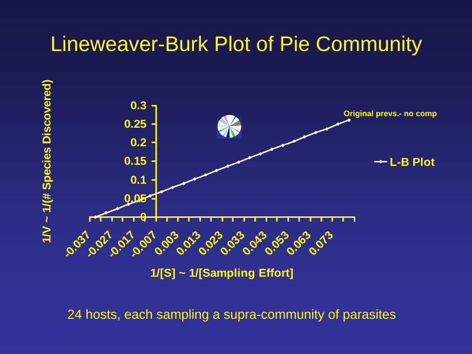
Lineweaver-Burk Plot of Pie Community
00.050.1
0.150.2
0.250.3
-0.03
7-0.
027
-0.01
7-0.
007
0.003
0.013
0.023
0.033
0.043
0.053
0.063
0.073
1/[S] ~ 1/[Sampling Effort]
1/V
~ 1/
(# S
peci
es D
isco
vere
d)
L-B Plot
Original prevs.- no comp
24 hosts, each sampling a supra-community of parasites

The inhibition exercise
Figs. from en.wikipedia.org/wiki/Enzyme_kinetics

Lineweaver-Burk Plot of Pie
00.050.1
0.150.2
0.250.3
0.35
-0.03
7-0.
027
-0.01
7-0.
007
0.003
0.013
0.023
0.033
0.043
0.053
0.063
0.073
1/[S] ~ 1/[Sampling Effort]
1/V
~ 1/
(# S
peci
es D
isco
vere
d)
L-B Plotk elim c
Original prevs.- no compk elim c
24 hosts, each sampling a supra-community of parasites
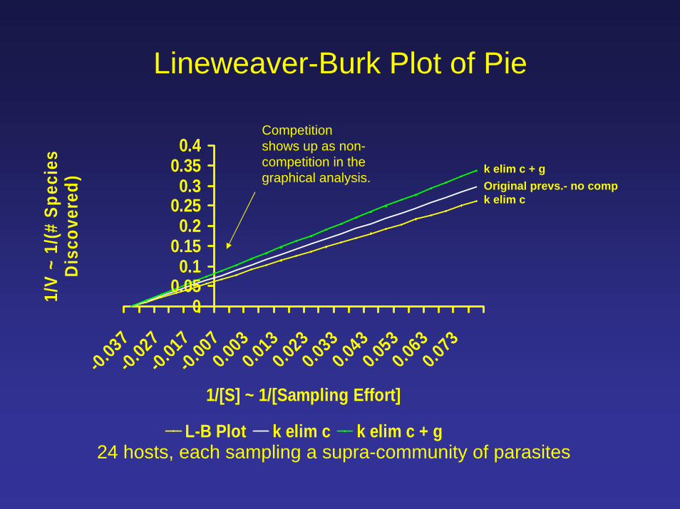
Lineweaver-Burk Plot of Pie
00.050.1
0.150.2
0.250.3
0.350.4
-0.03
7-0.
027
-0.01
7-0.
007
0.003
0.013
0.023
0.033
0.043
0.053
0.063
0.073
1/[S] ~ 1/[Sampling Effort]
1/V
~ 1/
(# S
peci
es
Dis
cove
red)
L-B Plot k elim c k elim c + g24 hosts, each sampling a supra-community of parasites
Original prevs.- no compk elim c
k elim c + g
Competition shows up as non-competition in the graphical analysis.

For parasite communities, and for individuals seeking to use the SAC as a guide to investigation of community and population dynamics, what, actually, are “V” and “S” in the metaphorical sense?

For parasite communities, and for individuals seeking to use the SAC as a guide to investigation of community and population dynamics, what, actually, are “V” and “S” in the metaphorical sense?
In enzyme kinetics studies, V is velocity, or rate or product production, whereas S is the substrate, and substrate concentration, or [S], is the independent variable.

For parasite communities, and for individuals seeking to use the SAC as a guide to investigation of community and population dynamics, what, actually, are “V” and “S” in the metaphorical sense? In enzyme kinetics studies, V is velocity, or rate or product production, whereas S is the substrate, and substrate concentration, or [S], is the independent variable.
But in parasitological studies, V is actually the number of species found, and S is actually the sampling effort.
So the analytical geometry is intriguing, but we’re still a ways off from figuring out how to decide whether communities are “interactive” or “isolationist”.

The Old Parasitologist’s Conclusion:In landscape epidemiology (epizootiology), the real issue is relative prevalence, and ultimately relative probability of infection that drives both SAC dynamics.
And it really matters how much the host, not the parasitologist, samples the system.