The Map as Intent: Variations on the Theme of John Sno4)1_14_2004.pdfThe Map as Intent: Variations...
14
The Map as Intent: Variations on the Theme of John Snow TOM KOCH Department of Geography / UnivlrrsiQ of British Columbia / Vancouver / BC / Canada Abstract "Critical geographers" concerned with cartography insist maps are first and foremost social artefacts that must be "read" as authorial documents rather than perceived as data statements. Their argument is typically dismissed as trivial because the relation between intent and output has rarely been demonstrated in a critical way. This article seeks to demonstrate the degree to which authorial in- tent defines map content and appearance through an analysis of a single set of maps. All are based on the orig- inal data collected in 1854 by Dr John Snow as part of his study of the cholera outbreak in London's Soho district. Snow's original map is included as baseline for a study that includes versions of the Snow map by a range of au- thors, including Cliff and Haggett; the US Centers for Disease Control; Gilbert; Tufte; and Monmonier. The re- sulting appropriations bear progressively less resem- blance to the original work, despite the use of the same data set and its clear availability. The result is a cautionary tale of the distance between maps and the data they rep- resent. The article also insists upon the close relation be- hveen authorial intent and mapped result irrespective of the data available. Finally, the article concludes that be- cause mapping is not value-free, dangers occur when pro- fessional cartographers and geographers attempt to map data from fields in which they are ignorant. Keywords: cartography, cholera, epidemiology, GIS, med- ical mapping, John Snow Resume Les << gkographes critiques ,, qui s'intiressent a la carto- graphie soutiennent que les cartes sont d'abord et avant tout des artefacts sociaux que I'on doit N lire comme des documents Cmanant d'auteurs plut6t que percevoir com- Tom Koch is adjunct professor of geography at the University of British Colun~biaand adjunct professor of gerontology at Simon Fraser University. Address correspondence to Professor Tom Koch, Depart- ment of Geography, University of British Columbia, 1984 West Mall, Vancouver, BC V6T 122 Canada. Tel.: (604) 714-0348. E-mail: [email protected]. me des knoncks informatifs. On considere en gknkral leur argument comme futile vu qu'on a rarement prouvk de fa~on critique le rapport entre intention et rksultat. Cet article cherche a dkmontrer le degrk auquel l'intention de l'auteur dkfinit le contenu et la presentation d'une carte par le biais de l'analyse d'une skrie unique de cartes gkographiques. Ces dernieres sont toutes klaborkes a partir des donnkes d'origine recueillies en 1854 par le docteur John Snow, dans le cadre de son ktude sur l'ipidkmie de cholera dans le quartier londonien de Soho. On inclut la carte originale de Snow comme base de rifkrence pour une Ctude qui comprend des versions de cette carte ktablies par toute une gamme d'auteurs, dont Cliff et Haggett, le Center for Disease Control amiricain, Gilbert, Tufte et Monmonier. Les appropria- tions qui en dkcoulent ressemblent de moins en moins a l'oeuvre originale, bien qu'elles aient recours au m6me ensemble de donnkes et qu'elles puissent facilement y ac- cider. Cela se solde par un rkcit Cdifiant au sujet de l'kcart entre les cartes et les donnkes qu'elles reprksentent. L'ar- ticle insiste kgalement sur le rapport ktroit entre l'inten- tion de l'auteur et la carte qui en rCsulte et qui ne tient pas compte des donnkes disponibles. Pour finir, l'article conclut que, la cartographie n'ktant pas une science ob- jective, il existe un reel danger lorsque les cartographes et gkographes professionnels tentent de cartographier des donnkes dans des domaines qu'ils connaissent mal. Mots cles : cartographie, cholkra, epidkmiologie, SIG, cartographie midicale, John Snow Introduction I t is easy to dismiss the so-called "critical geogra- phers" (Lemann 2001) who write about map-making as non-mapping, armchair theorists whose view of cartography is social and theoretical rather than practi- cal or real (Harley 2001). Even when their central point is ceded ("maps are social documents"), the result seems a trivial point, irrelevant to the greater issues of map making. With Brian Harley (1989) we can "deconstruct" the map as a social artefact. But does his (or another's) interpretation lead to different cartographic techniques or outcomes? We may know, as Denis Wood writes, that CARTOGRAPHICA, VOLUME 39, # 4, WINTER 2004
Transcript of The Map as Intent: Variations on the Theme of John Sno4)1_14_2004.pdfThe Map as Intent: Variations...

The Map as Intent: Variations on the Theme of John Snow
TOM KOCH
Department of Geography / UnivlrrsiQ of British Columbia / Vancouver / BC / Canada
Abstract "Critical geographers" concerned with cartography insist maps are first and foremost social artefacts that must be "read" as authorial documents rather than perceived as data statements. Their argument is typically dismissed as trivial because the relation between intent and output has rarely been demonstrated in a critical way. This article seeks to demonstrate the degree to which authorial in- tent defines map content and appearance through an analysis of a single set of maps. All are based on the orig- inal data collected in 1854 by Dr John Snow as part of his study of the cholera outbreak in London's Soho district. Snow's original map is included as baseline for a study that includes versions of the Snow map by a range of au- thors, including Cliff and Haggett; the US Centers for Disease Control; Gilbert; Tufte; and Monmonier. The re- sulting appropriations bear progressively less resem- blance to the original work, despite the use of the same data set and its clear availability. The result is a cautionary tale of the distance between maps and the data they rep- resent. The article also insists upon the close relation be- hveen authorial intent and mapped result irrespective of the data available. Finally, the article concludes that be- cause mapping is not value-free, dangers occur when pro- fessional cartographers and geographers attempt to map data from fields in which they are ignorant.
Keywords: cartography, cholera, epidemiology, GIS, med- ical mapping, John Snow
Resume Les << gkographes critiques ,, qui s'intiressent a la carto- graphie soutiennent que les cartes sont d'abord et avant tout des artefacts sociaux que I'on doit N lire comme des documents Cmanant d'auteurs plut6t que percevoir com-
Tom Koch is adjunct professor of geography at the University of British Colun~bia and adjunct professor of gerontology at Simon Fraser University. Address correspondence to Professor Tom Koch, Depart- ment of Geography, University of British Columbia, 1984 West Mall, Vancouver, BC V6T 122 Canada. Tel.: (604) 714-0348. E-mail: [email protected].
me des knoncks informatifs. On considere en gknkral leur argument comme futile vu qu'on a rarement prouvk de f a ~ o n critique le rapport entre intention et rksultat. Cet article cherche a dkmontrer le degrk auquel l'intention de l'auteur dkfinit le contenu et la presentation d'une carte par le biais de l'analyse d'une skrie unique de cartes gkographiques. Ces dernieres sont toutes klaborkes a partir des donnkes d'origine recueillies en 1854 par le docteur John Snow, dans le cadre de son ktude sur l'ipidkmie de cholera dans le quartier londonien de Soho. On inclut la carte originale de Snow comme base de rifkrence pour une Ctude qui comprend des versions de cette carte ktablies par toute une gamme d'auteurs, dont Cliff et Haggett, le Center for Disease Control amiricain, Gilbert, Tufte et Monmonier. Les appropria- tions qui en dkcoulent ressemblent de moins en moins a l'oeuvre originale, bien qu'elles aient recours au m6me ensemble de donnkes et qu'elles puissent facilement y ac- cider. Cela se solde par un rkcit Cdifiant au sujet de l'kcart entre les cartes et les donnkes qu'elles reprksentent. L'ar- ticle insiste kgalement sur le rapport ktroit entre l'inten- tion de l'auteur et la carte qui en rCsulte et qui ne tient pas compte des donnkes disponibles. Pour finir, l'article conclut que, la cartographie n'ktant pas une science ob- jective, il existe un reel danger lorsque les cartographes et gkographes professionnels tentent de cartographier des donnkes dans des domaines qu'ils connaissent mal.
Mots cles : cartographie, cholkra, epidkmiologie, SIG,
cartographie midicale, John Snow
Introduction
I t is easy to dismiss the so-called "critical geogra- phers" (Lemann 2001) who write about map-making as non-mapping, armchair theorists whose view of
cartography is social and theoretical rather than practi- cal or real (Harley 2001). Even when their central point is ceded ("maps are social documents"), the result seems a trivial point, irrelevant to the greater issues of m a p making. With Brian Harley (1989) we can "deconstruct" the map as a social artefact. But does his (or another's) interpretation lead to different cartographic techniques or outcomes? We may know, as Denis Wood writes, that
CARTOGRAPHICA, VOLUME 39, # 4, WINTER 2004

2 TOM KOCH
"what the map's about - what is really at stake - is what- ever the discourse facilitated by this pointing [mapping] is about" (2002, 145). But unravel that, and the lesson is that this or that map is about the subject we choose to describe 011 its surface.
In the main, working cartographers have treated this class of social theorists as irrelevant - or, worse, treated them with condescension - because their conclusions do not seem to affect the physical reality of the maps we make. Theory, or at least relevant theory, concerns itself with issues of symbolization and design that improve a map's communicability. As Mark Monmonier puts it, "I'm especially concerned that proponents of social criti- cism of cartography don't really seem to be very commit- ted to communication" (Crampton 2002,638).
Until it can be shown that intention and the rest of so- cial theory matter in a concrete way to the maps that are daily drawn, the arguments of the critics from social the- ory will remain ephemeral to the greater issues of map- making perceived by those, like Monmonier, who as- sume that cartography is about the representation of specific, presumably objective, phenomena. To take seri- ously the stance of critics such as Harley and Wood is to accept that mapping is, first and foremost, manipulation; that social and conceptual prejudices and perspectives are determining elements in mapmaking.
Generalization is always difficult. Wood and Harley are distinct voices in the broad and sometimes crowded field of cartographic (and geographic) theory. So, too, is Monmonier, albeit in a different tradition. In the main, however, the so-called critical geographers writing on cartography can be distinguished by their rejection of the general theory of maps as first and foremost repre- sentative artefacts. They stand in opposition to the main line of cartographic (and geographic) theory that the map is a tool of concrete presentation, a method of graphic representation of spatial relationships and forms (Robinson and others 1984; Wood in press). For the crit- ics, that pretence to representative objectivity, as Stephen Turner has put it in another context, "exists only as a product of human activity" (1991, 23). From the perspective of the critical geographers concerned with mapping, maps are the externalization of subjective decisions in a construction that owes everything to au- thorial choice. "Each map is made from a particular per- spective and for a particular purpose" (Fleersink 2003, 136). The implication is that this purpose defines the subjectively grounded result (Wood in press).
This article offers a case in point, one whose authorial transformations can be traced, their importance demon- strated. It applies the general perspective of these "criti- cal geographers" in cartography to one of the most famous of all nineteenth-century maps: John Snow's map of the 1854 cholera outbreak in Soho, London (To- bler 1994). Its approach follows that of Wood (1992) in its reliance on Roland Barthes' system of semiotic analy- sis. One reason for this is Wood's position on the use of
semiology in the analysis of mapping and my own fimili- arity with it as a tool for the understanding of text and image (Koch 1990). Another is Wood's role as a com- mentator on other "new geographers" concerned with cartography, such as P.D.A. Harvey and Brian Harley (see Wood 1993, 1994, 2002). The article thus serves, at one level, as a critical study of the transformation of Snow's work, and, at another, as both a new contribution to the critical discourse of map-making and a practical application of semiotics to its understanding.
The History A series of maps of the 1854 cholera outbreak in Soho, London - historical and contemporary - serve as an example of the manner and degree to which a map- maker's intent defines the context that determines the content of the resulting map. The maps include John Snow's original maps; E.W. Gilbert's 1958 version of Snow's map; Andrew D. Cliff and Peter Haggett's 1988 maps; Edward Tufte's 1983 revision of Gilbert's 1958 map; Monmonier's 1990s revision of the Gilbert-Tufte map; and the US Centers for Disease Control's (CDC)
2001 map based on Snow, Gilbert, and Tufte. Not only does the interpretation of the Snow map change, but the map itself is twisted, turned, and truncated - violated, for want of a better word - by each map-maker's mindset and point of view. Even in its most "scientific" mode - a GIS version by the US CDC designed for teaching purpos- es - the context of its making defines the map - its ap- pearance and content - in ways that are demonstrably false and inaccurate.
The cholera maps begin with the John Snow's 1854 map of the cholera outbreak in Soho, London. The im- age of cholera deaths Snow produced is now invoked as an icon so well known that it is assumed to require nei- ther analysis nor discussion. It serves, for example, as the cover of a recent text titled Gpographic Information Analy- sis (O'Sullivan and Unwin 2003), not as an example of material the book covers (it does not) but because it is so well known - so emblematic of what mapped analysis can do - that no discussion is necessary.
That Snow's work has been mythologized almost be- yond historical redemption is generally accepted (McLeod 2000). In this article, however, the focus is on the mythic icon, Snow's 1854 map, and the ways it has been distorted beyond recognition in the service of this or that author's personal agenda. 111 this way the con- cerns of McLeod (2000) and Brody and others (2000) - the general myth of Snow - are extended to consider the appropriation and transformation of Snow's mapping to serve interests Snow himself would not have recognized as legitimate.
THE SNOW MAP
John Snow was a medical assistant in Newcastle-area coal mines during the first of four cholera pandemics to sweep through England in the 1800s (Winterton 1980).
CART0C;RAPHICA. VOI,UME 39, # 4, WINTER 2004
THE MAP AS INTENT: VARIATIONS ON THE THEME OF JOHN SNOW 3
During the second great epidemic that began in the late 1840s, Snow was a physician in London, where a total of 14,600 deaths, or 6.2 deaths per 1000 persons, were re- corded (Winterton 1980). The epidemic was especially severe in the Berwick Street area of Soho, where Snow lived. In 1849 Snow published a long two-part paper on cholera in the Medical Gazette and Times (Snow 1849a, 1849b) as well as a short monograph, 0 1 1 the Mode of Trarlsmission of Cholera (Snow 1849~) .
In these works Snow argued that cholera was water- borne rather than. as most then believed, airborne. His hypothesis was clinical rather than spatial: airborne dis- eases affect the lungs, but cholera is an intestinal disor- der causing extensive and sometimes fatal diarrhoea. It was, therefore, he argued, caused by something ingested rather than inhaled (Snow 1849a). Snow further be- lieved the vector of transmission was either personal contact with an infected person or the drinking of con- taminated water in which some materies morbi travelled (Snow 1849c; McLeod 2000). Unfortunately, he wrote in his review of the literature. "as we are never informed in works on cholera what water the people drink I have scarcely been able to collect any information on this point" (Snow 1849b, 926).
The 1854 cholera epidemic gave Snow a chance to gather data that would redress that signal failing. In that year he undertook two separate studies. One considered the correlation between water sources and the incidence of cholera in South London. Another famously exam- inrd a localized outbreak in London's Soho District. The results of both studies were published in a second and greatly expanded edition of On the Mode of 7ransmission of C h o h (Snow 1854/1936). In that publication was the first appearance of Snow's large-scale cholera outbreak map, the one that, in the twentieth century, became em- blematic of the potential of medical cartography.
Snow's map was not a self-conscious exercise in analyt- ic cartography, however. It was instead, he said, a "dia- gram of the topography of the outbreak," a graphic summary of the elements he analysed textually (Snow 1854/1936, 45). It is useful to think of Snow as an early ecologist seeking to describe a range of elements con- tributing to a phenomenon. He was not a medical car- tographer using maps to uncover the epicentre of a disease outbreak or the vector of a specific pathogen. In- deed, he was not a map-maker at all.
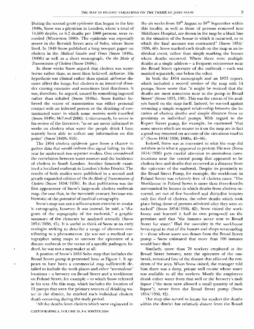
A portion of Snow's 1854 Soho map that includes the Broad Street pump is presented here as Figure 1. It ap- pears to have been a commercial map sufficiently de- tailed to include the work places and other "anomalous" locations - a brewery on Broad Street and a workhouse on Poland Street, for example - to which Snow referred in his text. On this map, which includes the location of 13 pumps that were the primary sources of drinking wa- ter in the district, he marked each individual cholera death occurring during the study period.
"All the deaths from cholera which were registered in
the six weeks from lgth August to 3oth September within this locality, as well as those of persons removed into Middlesex Hospital, are shown in the map by a black line in the situation of the house in which it occurred, or in which the fatal account was contracted" (Snow 1854/ 1936,46). Snow marked each death on the map as an in- dividual event, rather than simply marking the houses where deaths occurred. Where there were multiple deaths at a single address - a frequent occurrence near the Broad Street epicentre of the outbreak - each was marked separately, one below the other.
In both the 1854 monograph and an 1855 report, which included a second version of the map with 14 pumps, Snow wrote that "it might be noticed that the deaths are most numerous near to the pump in Broad Street" (Snow 1855, 109). This was the extent of his anal- ysis based on the map itself. Indeed, he warned against assuming a simple mapped relationship between the lo- cation of cholera deaths and simple distance from or proximity to individual pumps. With regard to the Rupert Street pump, for example, he cautioned "that some streets which are nearer to it on the map are in fact a good way removed on account of the circuitous road to it" (Snow 1854/1936; 1849a, 45-46).
Indeed, Snow was as interested in what the map did not show as in what it appeared to portray. His text (Snow 1854/1936) pays careful attention to anomalous cases: locations near the central pump that appeared to be cholera free and deaths that occurred at a distance from the epicentre of the outbreak. Despite its proximity to the Broad Street Pump, for example, the workhouse in Poland Street was relatively free of cholera cases: "The Workhouse in Poland Street is more than three-fourths surrounded by houses in which deaths from cholera oc- curred, yet out of five hundred and thirty-five inmates only five died of cholera, the other deaths which took place being those of persons admitted after they were at- tacked" (Snow 1854/1936, 42). Snow visited the work- house and learned it had its own pump-well on the premises and that "the inmates never sent to Broad Street for water." Had the mortality in the workhouse been equal to that of the houses and shops surrounding i t - those whose water was drawn from the Broad Street pump - Snow estimated that more than 100 inmates would ha\e died.
Similarly, more than 70 workers employed at the Broad Street brewer): near the epicentre of the out- break, remained free of the disease that affected the resi- dents of the area. When Snow visited, the manager told him there was a deep, private well on-site whose water was available to all the workers. Mostly the employees drank either water from that well or the brewery's malt liquor ("the men were allowed a small quantity of malt liquor"), never from the Broad Street pump (Snow 1854/1936,42).
The map also served to locate for readers the deaths within the district but relati\ely distant from the Broad
CARTOGRAPHICA, VOLUME 39, # 4, WINTER 2004

4 TOM KOCH
Figure 1. Detail ofJohn Snow's 1854 map ofthe Soho area cholera outbreak, from Snow (184%). The m'gznal is 415 by 384 mm.
CARTOGRAPHICA, VOLUME 39, # 4, MTNTER 2004

T H E MAP AS INTENT: VARIATIONS O N THE THEME OF J O H N SNOW 5
0 yards 25 t '7
0 metres 25
0 yards 100 I 1
0 metres 100
Figure 2. Two views of Snow: (a) Cliff and Haggett ( 1 988) used Snow 'J cholera map as a tool to describe distrirting using a Lbronoi network of Thiessen polygons. Numbers i n individual polygons represent deaths occurring within each. I n his 1855 map, (b) Snow used a n irregular distance measure to create a single boundary around the Broad Street pump. Rrproduced by permission of the authors.
Street epicentre, anomalies that appeared to challenge the centrality of the Broad Street pump. In each in- stance, however, interviews with relatives revealed that the deceased either worked or studied near the Broad Street pump - from which each was known to drink - or had been with cholera patients in the Broad Street area immediately prior to the onset of their own fatal illness. These included, for example, the cases of a young girl from Ham Yard (south of Brewer Street) and another from Angel Court, off Great Windmill Street. Both typi- cally drank from the Broad Street pump on their way to or from a school off Broad Street. So, too, he discovered, did another school child from Naylor's Yard, off Silver Street. The seemingly anomalous death of a Noel Street boy, who lived north of Portland and east of Wardour Streets, was similarly explained by his attendance at the National School at the end of Broad Street.
Nor did all anomalies involve schoolchildren. Prior to contracting cholera a tailor at 6 Heddon Court, west of Regent Street, had spent most of his time on Broad Street; and prior to her death, a woman from 10 Heddon Court had been nursing a Broad Street friend who also died of the disease. Snow carefully investigated each case; each was represented as a mark on his map of chol- era deaths.
Snow was perhaps the first to carefully use proximity as a measurement in analysing the intensity and diffu- sion of a disease at this scale. In an attempt to define a "cholera area" for his 1855 report to parish officials, he created an irregular boundary, centred on the Broad Street pump, that included the majority of deaths occur- ring in the Soho outbreak. "By the most careful calcula- tion," Snow (1855) wrote, he had drawn a line marking the median distance between the Broad Street pump and the others that were nearest to it in the district. The resulting boundary (Figure 2b) describing the area of greatest intensity of occurrence (the "cholera area") was an eccentric and irregular line approximating the medi- an distance between the Broad Street pump and other local pumps.
This irregular line is the source of the erroneous but entrenched myth of Snow as the originator of Thiessen polygon analysis creating what is sometimes called a Voronoi network.' This is central to the myth of Snow as a father of analytic cartography. It is also a critical mis- reading of Snow's maps and work. Snow neither drew a polygon network nor used one to calculate relative rates of death for the 13 pumps in his study area. The source of the myth may be Cliff and Haggett's use of Snow's data in 1988 to demonstrate how a Voronoi network of
CARTOGRAPHICA, VOLUME 39, # 4, WINTER 2004

6 TOM KOCH
CARTOGRAPHICA, VOLUME 39, # 4, U'INTER 2004
Yords SO 0 so 100 150 200
convinced by his argument, were chal- lenged to consider his theory. The Reverend Henry Whitehead (1855), for example, was sufficiently engaged by Snow's work - and sufficiently scep- tical - that he independently collected data on the 1854 cholera deaths and later became a strong supporter of Snow's theory.
While Snow was by no means the first to use maps to study disease - as Gilbert (1958) and Robinson (1982), among others, have pointed out - his Soho map was perhaps the most com- prehensive study of a large-scale out- break attempted to that date. That he was generally umuccessful at convinc- ing his peers of cholera's water-borne vector does not detract from his real ac- complishments. Snow's conclusion flew in the face of then accepted medi- cal wisdom, and his data and analysis were insufficient to convince his con- tenlporaries otherwise. It was not until after Robert Koch identified the bacte- rium Vibn'o chokrae in 1883 that most physicians accepted Snow's argument that the disease was water-borne rather
Figure 3. E. W! Gilbert's z~ersion (with original caption) ofJohn Sn,ozo's 1855 map of the than carried on the "miasma" of the air. Soho chokra outbreak ( I 958, 174). Reproduced 4y permission ofBlnckwel1 Publishing.
The Modern Turn In the 1950s a "lively interest in rriedi-
Thiessen polygons might be created (Figure 2a). In their cal geography" led E.W. Gilbert to publish a paper on work, however, they were careful to distinguish between the Pioneer Maps of Health and Disease in England (1958). Snow's original mapping and their use of his data to il- In it he reviews "early writers on 'medical topography"' lustrate modern analytic approaches. and presents a small set of nineteenth-century maps pur-
What Snow contributed was, perhaps, the idea of dis- porting to describe the incidence or diffusion of various tricts based on a calculation of proxirnity. His contempo- diseases. The first map in his paper is "Dr. John Snow's raries suggested other solutions to defining the disease map (1855) of deaths from cholera in the Broad Street outbreak's boundaries, based primarily on density of oc- area of London in September 1854." In the text Gilbert currence. These included manually drawing boundary describes Snow as the man "largely responsible for dem- lines around the affected area and a circle thatwould en- onstrating the water-borne origin of cholera" (174). Gil- compass the majority of deaths (General Report 1855: bert's reproduction (Figure 3) of Dr Snow's 1855 map is Whitehead 1855). Snow's insight was an important ad- used to show how the nineteenth-century physician de- vance, but it was certainly not the polygonal network that fined a "cholera field" based on disease occurrence and some contemporary writers attribute to him. To state then identified the Broad Street pulnp as the centre of Snow's failure to develop this modern spatial analytic in the disease outbreak. no way diminishes his importance as a critical thinker The map Gilbert presented, however, was not Snow's whose work contributed enormously to the emerging map but, instead, one broadly based on it. Individual fields of epidemiology and public health. deaths are marked, not by Snow's bars, but by small dots
Snow framed a hypothesis based on a clinical insight (an innovation first introduced by public health expert and investigated it at a range of scales with all the data W.T. Sedgwick in 1914; Vinten-Johansen and others that he could collect. He used maps in his 1854 and 1855 2003); the pulnps are not circles but x's. Absent are the reports to summarize what he described as a topography breweries, the workhouse, and the other "anomalous" lo- of the localized outbreak in a way that would permit cations whose investigation was critical to Snow's study. readers to see the landscape of the illness he described. Gone, too, are many of the roads, streets, and mews. The His mapped approach influenced others who, while not major streets that are retained (Oxford, Carnaby, Re-

THE MAP AS INTENT: VARIATIONS ON THE THEME OF JOHN SNOW 7
Signifier Signifed
I 1
r' 4
3
2
Figure 4. The manner in which myth appropn'ates language or images in the creation of myth. Adapted from Barthes (1983, 100 and Koch (1 990, 26).
,
Sign - Myth
Signifier Signified
Sign
gent, etc.) serve less to locate the deaths than as a frame highlighting the relationship between central deaths and the Broad Street pump. There is little resemblance to the environment that was Snow's mapped subject. There were 12 water pumps identified in Snow's 1854 map, and 14 are seen in his 1855 map, but only 11 are marked on Gilbert's map. All in all, the ecology is denud- ed of myriad elements that made the original richly use- ful and informative.
Gilbert's version "updates" Snow by converting the lat- ter's idiosyncratic Victorian image into a standard 1950s- style dot map. Snow's map self-consciously summarized research that considered a hypothesis about the precise pattern of diffusion of a specific disease. It was dense and complex, an artefact illustrating a detailed study. Gil- bert's abridgement - drawn either by him or at his direc- tion - self-consciously sought to assign to Snow a simple, very legible correlation: many deaths, one pump, and therefore one source for the outbreak. Gilbert's changes to Snow's map served to emphasize that single theme. Gilbert - or a cartographer he hired, perhaps, to do the work at his direction - removed everything in Snow's map that would not contribute to this goal in the crea- tion of his own "Snow" map. We know this was a self- conscious revision because Gilbert cites the 1936 repro- duction of Snow's 1854 monograph On the Mode of Trans- mission of Cholma as well as the 1855 Snow map as the source of his 1958 "Snow" map.
Gilbert's map of Snow's work is clear, simple, and ex- tremely legible. It reproduces more easily than the origi- nal, but if ease of reproduction were the essential purpose of Gilbert's adaptation he would have noted the changes made and described the map as one based on Snow's. His failure to do so forces the question of why Gilbert presented his map as Snow's work.
The answer is that Gilbert clearly was not interested in the complex ecological portrait that Snow crafted in his effort to make sense of the 1854 outbreak. Gilbert appro- priated Snow's map - there is no better word except,
perhaps, "stole" - so that his own would serve the then evolving myth of Snow as the man who "discovered" the cause of cholera through mapping a simple correlation. In advancing the myth of John Snow as a self-conscious and analytic map-maker (not a mapper graphically sum- marizing data to help illustrate an argument) Gilbert turns the 1854 and 1855 Snow maps into an icon that fal- sified history.
At this level of understanding, the distinction between "mapper" and "map-maker" is critical (Wood 1993; Koch 1990). Snow mapped elements pertinent to the cholera outbreak in Soho in an attempt to advance an argument about the nature of the disease through an investigation of the Soho outbreak. The map was not a stand-alone an- alytic tool but one summarizing (and locating) a wealth of data. Gilbert-the-map-maker created a graphic, a map designed to show a clear correspondence between the incidence of a disease outbreak and a single source of contagion. The elements of Snow's map that did not contribute to this goal were eliminated by Gilbert to transform Snow's complex investigation into what Ro- land Barthes (1983) calls a "simple signification."
Figure 4 is a basic schematic of the process by which, at level 1, individual marks (signifier) together create a dedicated map (signified) generating a synthesis at level 2 of a sign (a true representation of "x"). This, in turn, serves at level 3 as a signifier as the raw material by which objects or words (maps, paintings, photographs, etc.) are further transformed into general myth (level 4). The arrow in Figure 4 shows how the level 2 sign, created by level 1's signifier and signified, is appropriated and transformed, at levels 3 and 4, into myth. The whole is a second-order system in which signified and signifier op- erate at the level of language (verbal or visual) to create the signifiers and signs that become a mythic (or iconic) statement.
At one level Gilbert's map signifies "map reveals dis- ease source"; globally, that "maps serve medicine" - or, more precisely, "medical science." As a mapmaker, Gil- bert crafted a myth precisely as Barthes defines it, as a "kind of speech better defined by its intention than its literal sense" (1983, 103). The resulting image exempli- fies the "naturalization of the cultural" (Barthes 1972, 131) in support of a system of values that in this case re- volves around the potential of medical mapping to iden- tify the source of an epidemic outbreak. It represents not a lie but an "inflection," in this case an emphasis in the service of a view of maps as tools in the service of a type of science (Barthes 1983). This emphasis required that Snow's complex researches -which did not convince his peers - be transformed into the myth of the independ- ent nineteenth-century researcher who mapped the out- break and so discovered a simple correlation proving that cholera was water-borne. In the process, the myth continues, Snow single-handedly introduced analytic mapping to nineteenth-century medical researchers. How do we know this? We have Snow's map a la Gilbert
CARTOGWHICA, VOLUME 39. # 4, WINTER 2004

8 TOM KOCH
as proof. That Snow was one of a phalanx of persons John Snow. Infinitely superior to his earlier work, this mapping the incidence of cholera in the mid-nineteenth version bases its analysis on a reading of Snow and in- century (Robinson 1982) is a fact politely ignored in the cludes detail of the original map rather than one based myth-making. on Gilbert.
THE TUFTE CONTRIBUTION
Gilbert's map was reproduced as "the famous dot map of Dr. John Snow" in Edward R. Tufte's influential The Visu- al Display of Quantitative Information. Tufte presented Gil- bert's version as Snow's work, "an early and most worthy use of a map to chart patterns of disease" (Tufte 1983, 24). Snow did not "chart" the patterns of disease in his map, however: that term implies a rigour and complete- ness his map did not present and Snow himself did not claim. Because there were pockets of cholera distant from the pump and areas near the Broad Street that were cholera-free (the Brewery, the workhouse, etc.), Snow was careful not to assert that his map offered a con- vincing proof of his theory or a complete chart of the disease on which conclusions resulting from a simple re- lation or equivalence (proximity to pump = deaths) could be drawn. For Snow himself, the result was sugges- tive but not conclusive.
Tufte, whose principal interest (as the title of his 1983 book indicates) is the "visual display of quantitative in- formation," appropriated Gilbert's map, itself an appro- priation of Snow's map. In his text, Tufte emphasizes Snow's map as a technical advance, but in his presenta- tion he uses Gilbert's map to signify not simply that "maps serve medicine" but that the degree to which they do so depends on the map-maker's clarity of presenta- tion. Tufte thus talks about Snow not as a mapper but as a map-maker who created a dot map to "chart" the dis- ease to reveal a simple correlation between cholera and water, and between the Soho cholera deaths and the Broad Street pump. Although Gilbert changed Snow's symbolization, in his text Gilbert (1958) describes the original Snow map's symbol system. Tufte, however, writes that in Snow's map (meaning Gilbert's), "deaths were marked by dots and, in addition, the area's eleven water pumps were located by crosses" (1983, 24).
Tufte's focus is neither epidemiology nor the map- ping of disease. Even had he been aware of it, his interest was certainly not Snow's hard thinking about the Soho cholera outbreak. Rather, Tufte's interest was in the visu- al display of quantitative information. His intent was to promote the best graphical portrayal of data to maxi- mize its utility, and for this purpose, Gilbert's simplifica- tion served better than Snow's original. Tufte's (1983) appropriation serves his purpose but does not reflect the reality of Snow, the "map thinker," considering a prob- lem whose solution was unknown. What Tufte gained in the process was a simple argument represented by a sim- ple icon; what he lost were the complicated reality Snow considered and his efforts to understand it. Tufte implic- itly acknowledged these shortcomings in his later book Visual Explanations (1997), which included a section on
THE MONMONIER CONTRIBUTION
Tufte's 1983 book became a standard, and his appropria- tion of Gilbert's appropriation of Snow became, in turn, the standard referent for Snow's map. Indeed, the de- fault assumption among medical cartographers and ge- ographers, who frequently riproduce it, is that Gilbert/ Tufte is Snow's map.' And, since Tufte, other authors have felt free to modify the Gilbert/Tufte icon for their own purposes and call it "Dr Snow's." In How to Lie with Maps, for example, Mark Monmonier (1996) uses the Tufte/Gilbert map to create his own version of "Snow's Dot Map" (Figure 5). In this version, however, the em- phasis is not on the many deaths but on the pumps, which Monmonier has again re-symbolized for emphasis. The vastly enlarged circles exist upon the attenuated field of streets, whose width has been made uniform. The width of remaining streets (e.g., Oxford Street) is al- tered in a manner subtly emphasizing the centrality of the Broad Street pump.
Lest anyone miss the point, an arrow and legend are used to locate the Broad Street pump. The emphasis has shifted in the process, and the point of the whole is the importance of the pumps themselves. The point be- comes "Snow discovered the pump that caused the out- break," not "Snow mapped a correlation between deaths and water sources" or the earlier "Snow discovered through mapping that cholera is water-borne."
At this stage in the transformation of Snow's map into an iconic image his map-making has become an instru- ment of discovery, a critical analytical tool. The global signifier in this iteration (maps serve medicine) is here sub- ordinated to the more local maps reueal disease source. By invoking Snow in this appropriation, Monmonier simul- taneously invokes Gilbert and Tuftes' message of maps as important analytic tools in medicine and in the study of specific disease events. Monmonier was free to empha- size how maps serve medicine through his version of their map and the myth it served to promote: Snow identified one pump out of many through brilliant mapmaking.
Certainly nothing Snow wrote - and nothing in the data Snow collected and mapped - make the Soho chol- era outbreak inherently superior as a case study for Mon- monier's thesis in How to Lie with Maps. But by the early 1990s, the time of Monmonier's writing, the question was notwhy but.. . why notuse what had become the "famous," iconic map always used to talk about mapmaking. Snow's original interest had been wholly lost in the now abstract icon at the heart of the myth. Simply, Snow's data and map were now up for grabs, and anyone could do any- thing they wished without attention to the original work by Snow the medical thinker and researcher.
With the signifier secured (maps serve medicine) and
C:ARTOGRAPHICA, VOLUME 39, # 4, WINTER 2004

THE MAP AS INTENT: VARIATIONS O N THE THEME OF JOHN SNOW 9
1 Snow's Dot Map
Figurr 5. Mark Monmonier's vrrsion of the Tuftr/Gzlbert map (Monmonier 1996, 158). Image courtesy of University of Chicago Press.
the potential of mapping for epidemiology encoded (map reveals disease source), not only the original map but also the Snow myth and the tnap icon themselves could be dispensed with. Thus Monmonier was able to dismiss Snow's work as largely irrelevant to contemporary epide- miology or public health: "Real epidemiology isn't like that, at least not in late-twentieth-centiiry America. Chol- era is rare, if not extinct, and contagious diseases like pneumonia and influenza are less troublesome than heart disease, cancer, stroke, and numerous degenera- tive ailments once ascribed to old age" (1997, 263).
But heart disease, cancer, influenza, and stroke are all diseases that aremapped (as Monmonier's own examples illustrate) by epidemiologists attempting to define clus- ters and patterns in a manner similar to the one Snow pi- oneered (US DHHS 1997). Nor is cholera any more extinct than pneumonia and influenza, both of which re- main extremely serious diseases. In fact, at the time of Monmonier's writing in the 1990s, the world was in the midst of the seventh international cholera pandemic, which began in 1961 and by the early to mid-1990s was diffusing through the Americas (CDC 2000a). The Pan American Health Organization (PAHO) reported 391,751 cases in the Americas in 1991 and 85,802 cases in 1995 (Arbona and Crum 1996). Extinct? Hardly.
In the 1990s the US Centers for Dis- ease Control and Prevention (CDC) , the World Health Organization (WHO), and PAHO all presented data, often in map form, on epidemics and pandem- ics of AIDS, flu (influenza), hepatitis, and the West Nile Virus, to name sever- al examples. All were complex region- al, national, and global health problems. Data for these and more lo- calized outbreaks of specific diseases (e.g., meningitis and salmonella) were (and are) frequently mapped by inter- national, national, regional, and local health organizations concerned with precisely the type of disease investiga- tion that John Snow pioneered in the 1850s.
THE US CENTERS FOR DISEASE CONTROI,
AND PREVENTION
Which is why the US CDC now distrib- utes a simple mapping program, Epi Map, with its epidemiology software, Epi Info 2000 (cnc 2000b). Training modules provided by the CDC include. not surprisingly, data from Snow's 1854 study of the Soho outbreak in the CD-ROM that accompanies its analysis and mapping programs.
By 2000 this version of Snow's work was 'frequently reproduced in intro-
ductory books on medical mapping, especially those us- ing GIS (Lang 2000). Unfortunately, maps based on the CDC data (Figure 6), and described as John Snow's, bear even less resemblance to the original than the Gilbert/ Tufte or Monmonier versions.
On a severely truncated, undifferentiated street net- work that ,draws no distinction between wider or nar- rower streets, deaths are represented by georeferenced house location (street number and name assigned). Un- like previous iterations, the CDC map does not represent deaths from cholera but, instead, 206 homes at which cholera fatalities occurred. The total database of deaths, including multiple deaths at many of the locations, totals only 456 deaths from cholera. The result is that 372 sym- bols representing cholera deaths (578 deaths on the Gil- bert map minus 206 homes where death occurred) are omitted. Even more egregiously, 122 deaths are not only not represented on the map but also wholly excluded from the database. So excised are all deaths occurring at homes situated west of Carnaby Street, east of Berwick Street, or south of Brewer Street: deaths whose location outside the Broad Street epicentre required Snow's care- ful investigations to determine the relation between the deceased (students and workers) and the Broad Street pump.
CARTOGRAPHICA, VOLUME 39, # 4, WINTER 2004

10 TOM KOCH
But because this version advocates implicitly for map- street network. From these, each chose which data to making using GIS, the message subtly changes. It is now would include and then manipulated it for his own pur- not simply that "maps reveal disease sources" or that poses. All except Cliff and Haggett called the result "maps serve medicine" but that "CIS mapping reveals dis- "John Snow's map." ease sources" and thus, at another level, "CIS serves medi- The result is a series of very different maps, each a cine." The mapping of individual deaths is rejected in function of its author's intention. In Gibert's and then
Vlgo Streat Pump ------' 7 \
- - - favour of mapping houses where deaths occurred, pre- sumably to facilitate the georeferencing of cases, elec- tronically collapsing them at a single street address. Outliers (deaths nearest to other pumps) are excluded to avoid the necessity of a case-by-case analysis that, while critical epidemiologically, is not easily persuasive graphi- cally. This version is all about the visual display ( a la Tufte) and analysis (a la Monmonier) of electronically stored health data, not about the investigation of the cause of the deaths in Soho in 1854.
This is not an inevitable consequence either of the digitization of data or of the use of GIS (Vinten-Johansen and others 2003). Figure 7 shows a map based on a digi- tized version of Snow's data obtained in 1998 from the Environmental Sciences Resources Institute (ESRI). In- ternal evidence strongly suggests that the ESRI data set was digitized from a map originally prepared by Cliff and Haggett (1988). On that map, the number of pumps is
returned to the original 13 of Snow's 1855 map and the registry of deaths (N=578) is undiminished. Absent, however, are the institutions Snow in- vestigated (brewery, schools, work- house, etc.) and a system of street assignments that would show their rel- ative width, data Snow presumably used in making his eccentric "cholera district." Nor is the "plague pit" that some believed to be the origin of the epidemic included. But then, while the plague pit appears on the CDC map as a transparent rectangle, it was ab- sent in Snow's own work, which the CDC map purports to present and dis- cuss. Still, the whole serves better than the CDC version, and most of the other appropriations, not only because Cliff and Haggett self-consciously distin- guished between maps based on Snow's and those they themselves made but because the base data of deaths,
Tufte's, the deaths - individual dots - are predominant and the pumps almost invisible. Gilbert but not Tufte em- phasized the map-maker's ability to display a simple cor- relation in an objective fashion in the service of medical and health science. In Monmonier's version the pumps dominate the landscape with large, circular symbols, em- phasizing the outcome of the analysis. Building on the myths fanned by these map-makers, the CDC created an abstract landscape whose resemblance to Snow's is mini- mal and wildly misleading. Its purpose is to serve as an ad- vertisement for GIS mapmaking as an instrument of medical science. ESRI similarly sought to promote its GIS
product through a use of Snow's data - and the myth of its efficacy - but did so in a manner that, while less visually
Figure 6. CLIC map of the Soho cholera outbreak with deaths aggregated by location pumps, and streets more closely reflect rather than individually displayed. The map results from data prepared and mapped in own. t h ~ CDC'S EpiInfo and Epi Map programs. It is here rendered in black an,d white, with its font size increased for kgability, from a map @ Lung (2000, 15). Discussion
Gilbert, Tufte, Monmonier, Cliff and Haggett, the folk at the CDC, and those
What results is a clear, visually precise cartographic at ESRI: all had access to data from the original Snow product that fails by any standard of epidemiological ac- map, which included (a) deaths from cholera occurring curacy. The CDC product builds not upon Snow's work in the Soho area in 1854; (b) the location of public water but on the iterations of Gilbert, Tufte, and Monmonier. pumps in that district in that year; and (c) the Soho-area
satisfying, is less egregiously misleading. Some will insist, as did one peer reviewer of this arti-
cle, that while later authors should, perhaps, have identi- fied the manner of their appropriation, the sin itself is
W T O G M P H I C A , VOLUME 39, # 4, WINTER 2004

THE MAP AS INTENT: VARIATIONS ON THE THEME OF JOHN SNOW 11
Broad Street Pump area
0 yards 50 P 0 metres 50
Figure 7. A (;IS-generated map with data based on Cliff and Haggett (1 988). Map drawn 4y a.uthor,f;rom data provided 4y ESH.
CARTOGRAPHICA, VOLUME 39, # 4, WINTER 2004

12 TOM KOCH
Marks On Cholera I "'P I I Figure 8. I l lustrat~.~ the steps @ which Snow's origtnal work is appropriated to creak the myth that GZS (or mapping generally) serves objective science. It is the rpecijic verrion of Barthes' semiotic map, summarized i n Figure 4 .
trivial. "Of course they simplified in order to instruct," said the reviewer. "This didn't imply they were obfuscat- ing the message of Snow, just that his data provided a compelling example for other points." The destruction and manipulation of data go well beyond simplification in the service of pedagogy, however. When the data themselves are diminished - 13 or 14 pumps reduced to 11; deaths removed from the database; the street net- work denuded and homogenized; pertinent locations like the brewery excised - obfuscation (or worse) is what occurs.
The point is that, as M700d writes, 'What the map's about - what is really at stake - is whatever the discourse facilitated by this pointing [mapping] is about" (2002, 145). Each map-maker was engaged in a different dis- course; each discourse resulted in a very different map. These maps were not objective and ''value-free" repre- sentations of Dr Snow's map - both the data and its mode of representation were altered - but reflections of the individual map-makers' intentions. Snow was inter- ested in creating a "topography of cholera" to summa- rize a wealth of data all of which were potentially pertinent to an understanding of the Soho outbreak. He worked in ignorance of the specific cause of the disease (t'ibn'o cholerne) and included as much information as he could to illustrate his arguments. His map was designed to assist a reader interested in the problem (the mode of transmission of cholera) but unfamiliar with the study area. It complemented a text that paid special attention to areas close to the pump that were free of the disease as well as to those distant from Broad Street where chol- era was present.
Gilbert's interest was not in cholera (or epidemiology in general) but in "pioneers" of medical cartography, the very idea of which serves a myth of the map-maker-as- hero. In service of this interest his map emphasized the correlation between the incidence of disease and its single source. This polemically advanced the potential of map-making for epidemiology and, more generally,
medical science. Tufte built upon Gilbert's treatment of Snow's work in a discourse about the visual display of quantitative data and, more specifically, mapped displays of that data. Monmonier emphasized the pumps to legit- imize his own work. The CDC map simplified things even further to transform the myth of map-making as medical science into one about GIS, map-making, and medical science. The ESRI version did the same thing, although it did not insist that the result was "Dr Snow's map" and its manipulation of the data set~was far less egregious.
The result is that "Dr Snow's map," in its many mod- ern forms, is no longer about understanding the 1854 cholera outbreak but about the power of GIS, graphic analysis, and map-making that is presumed to result when map-makers work in the service of science. Figure 8 presents this in a manner similar to the general semiot- ic paradigm summarized in Figure 4. The level 1 marks on the map (points, lines, polygons) together signified "Cholera in London." The conjuriction of signifier (marks) and signified together became "Snow's Map" (level 2). This was appropriated, in turn (level 3), as a signifier unrelated to the original event, one that signi- fied "Science," or at least a scientific form of investiga- tion. The result is the myth that "GIS Serves Medicine" (or "mapping serves medicine") in a manner that owes at once everything and nothing to the marks Snow made on his map as part of his consideration of the 1854 chol- era outbreak in this district of London.
Gilbert, Tufte, Monmonier, and the CDC were all free to appropriate Snow's work and transform it into what- ever they wanted because it had become an artefact di- vorced from its purpose. They did so because Snow's map had become an icon in the public domain and they were therefore free to do with it as they would, just as anyone may bend a myth to his or her own individual purpose. That is their function, after all; in myth's plas- ticity and adaptability lies its attraction.
The failure here lies primarily in appropriating and manipulating the data without acknowledging the act. Secondarily, it is in the individual authors' insistence (implied where not stated) that each is presenting "Dr Snow's map" when, in fact, the resulting map is their own work, designed to facilitate their own discourse, not Snow's. The problem is that Gilbert, Tufte, Monmonier, and the CDC mapmakers do not say why they left out some details and emphasized others in a way Snow him- self would not have countenanced. But that is what hap- pens in myth: it becomes so naturalized, its presence so taken for granted, that one is invited to forget that it is a myth. The myth appropriates the work on which it is based.
At another level, the point is that Harley (1989), Wood (1992), and others are right: maps are as much about what we want them to mean as they are about the data they purport to represent. Map-making is manipula- tion, a process dependent on authorial background, intent, and perspective. Intention determines which ele-
C-mTOGRAPHIC,4, VOLUME 39, # 4, WINTER 2004

T H E MAP AS INTENT: VARIATIONS ON THE THEME OF JOHN SNOW 13
ments of what data set will be included in a map and how those data are symbolized for editorial emphasis. None of these maps are value-free representations of reality, pieces of "neutral science." All are self-conscious manip- ulations of a rich ecology. The conclusion seems una- voidable: map-making - including computer-based map- making - results first and foremost from intention. It is the mapmaker's intent that defines the artefact that results.
The most egregious departure from the original - and from the data it presents - is the CDC version of Snow's work. Even in the design of a simple teaching case, the absence of graphically troublesome but epide- miologically critical deaths is egregious. It is an extreme version of the maps of Gilbert, Tufte, and Monmonier, whose relative ignorance of epidemiology, and of Snow's cholera studies, permitted progressively radical distor- tions of the work they purported to present. The CDC
version may thus be read as a cautionary example of what happens when the myths of map-making and the requirements of visual clarity overwhelm the mapmaker.
This consideration leads directly to the problem of what might be called "specialized ignorance." Map-mak- ers lacking detailed knowledge of the subjects they seek to represent will be prone to mistakes. Electronic map- ping is relatively easy, and with GIS, some believe that the map-maker may stand forth as an expert scientist (Schu- urman 1999), able to solve complex spatial problems, without a deep understanding of the subject, through a process of data manipulation and representation.
The Snow maps suggest that it isn't that easy, that spa- tially related data do not "speak for themselves." Where the relation between cause and effect - between contam- inated water and incidence of cholera - are known, then mapping may serve as an analytic. But such problems are essentially trivial, the outcome a foregone conclusion. When a clear causal relationship is unknown, the prob- lem is returned to the level of complexity Snow con- fronted. His map struggled with ecological data, the relationship between its elements uncertain. It did not solve the problem - "What causes cholera?" - but contrib- uted to Snow's thinking on the subject. Gilbert, Tufte, Monmonier, and the CDC sacrificed Snow's brilliantly complex and amazingly thorough thinking - which in- cluded mapping - in service of a myth whose ultimate message is that mapmaking is a science that, without fur- ther research, can solve complex problems with nothing more than the possibility of a simple spatial correlation.
Many with expertise in medical history and modern epidemiology view modern mapping with suspicion pre- cisely because it advances the assumption of simple cor- relations as an answer to complex phenomena. As Brody and others put it, "One sees an echo of Snow the map- maker without the corresponding appreciation of Snow the thinker in today's 'desktop mapping revolution"' (2000, 66). Until the thinking is taken into account, their caution will be justified. But when that happens, the
myth itself will have been transformed, and "thinking serves medicine" will be the message. Should that hap- pen, attention will return to Snow, not his map alone.
Conclusion Critical geographers argue that maps are not value-free representations of spatial phenomena but meditations by map-makers on those phenomena. Some cartogra- phers have dismissed this argument because it seemed ir- relevant to the practical task of graphically presenting specific data. Here a series of maps based on data first collected and mapped in 1854 by Dr John Snow has been used to demonstrate the degree to which intent matters in cartographic representation. Depending on the map-maker's purpose, elements have been excluded, networks truncated, and pertinent cases removed from the original and widely available data set. In every case the changing map can be seen to result from the inter- play between authorial intent and the data the map- maker manipulates.
The conclusion seems inescapable: maps reflect spe- cific phenomena of interest to map-makers, who choose from the available data to fashion idiosyncratic interpre- tations of those phenomena. Each map results from the selection of data by the map-maker from a greater set of potentially relevant data. Map-making is not a value-free science that somehow stands apart from social, cultural, economic, and professional prejudices. Like all other sci- ences, and other forms of exposition, map-making is mired in the myths and assumptions of the individuals who promote this or that map within the culture(s) the map-makers serve.
Acknowledgements The author acknowledges the assistance of the peer re- viewers and Cartographica editor who read and comment- ed on earlier drafts of this paper. He also gratefully acknowledges the editorial review of Denis Wood, whose comments on an earlier draft of this paper added greatly to its final form.
Notes 1. See. for example, McLeod (2000); O'Sullivan and Unwin
(2003, 931-32). 2. See Meade and Earickson (2000,447). They, in turn, cite as
a source the Snow map not by Tufte hut by Howe (1972,
178).
References Arbona, S., and S. Crum. 1996. "Medical Geography and Chol-
era in Peril." Geographers' Craft Project, Department of Ge- ography, The University of Colorado at Boulder. Available at http://~~~.c~lorado.edu/geography/gcraft/warmup/
cholera/cholera.html. Barthes, R. 1972. Mythologies. New York: Hill & Wang.
. 1983. "Myth Today." In A Bnrthes Readc7, ed. S. Sontag. New York: Hill & Wang.
CARTOGRAPHTCA, VOLUME 39, # 4, WINTER 2004

14 TOM KOCH
Brody, H., M.R. Ripp, P. Vinten-Johansen, N. Paneth, and S. Rachman. 2000. "Mapmaking and Myth-making in Broad Street: The London Cholera Epidemic, 1854." Lancet 356: 54-58.
Centers for Disease Control and Prevention [CDC]. 2000a. Weekly Epidaiological Record 31 (4 Aug.), C h o h , 1999: 249-56.
. 2000b. Epi Info Manual. Atlanta, GA: CDC. Cliff, A.D., and P. Haggett. 1988. Atlas ofDisease Distributions: An-
alytic Approaches to Epidemiological Data. London: Blackwell. Crampton, J.W. 2002. "Maps, Politics, and History: An Interview
with Mark Monmonier." Environment and Planning D: Society and Space 20: 637-46.
General Report. 1855. In Repmt of the Cholera Outbreak in the Par- ish of St. Jams, Westminster during the Autumn of 1854. London: Churchill. 16.
Gilbert, E.W. 1958. "Pioneer Maps of Health and Disease in England." Geographical Journal 124: 172-83.
Harley, J.B. 1989. "Deconstructing the Map." Cartographica 26/ 2: 1-20.
. 2001. The New Nature of Maps: Essays in the History of Car-
tography. Baltimore: Johns Hopkins University Press. Heersink, P. 2003. Review of Lie of the Land: The Secret Life of
Maps (ed. A. Carlucci and P. Barber). Cartographica 38/1&2: 136-37.
Howe, G.M. 1972. Man, Environment, and Disease in Great Britain. New York: Barnes & Noble.
Koch, T. 1990. The News as Myth: Fact and Context in Journalism. Westport, CT: Greenwood.
Lang, L. 2000. GIs for Health Organizations. Redlands, CA: ESRI Press.
Lemann, N. 2001. "Atlas Shrugs: The New Geography Argues That Maps Have Shaped the World." Ntw Yorkq 9 April: 131-34.
McLeod, K. 2000. "Our Sense of Snow: The Myth ofJohn Snow in Medical Geography." So&l Science & Medicine 7&8: 923-36.
Meade, MS., and R.J. Earickson. 2000. Medical Geography, 2nd ed. New York: Guilford.
Monmonier, M. 1996. How to Lie with Maps, 2nd ed. Chicago: University of Chicago Press.
. 1997. Cartographies of Danger Chicago: University of Chi- cago Press.
O'Sullivan, D.. and D.J. Unwin. 2003. Geographic Information Analysis. Hoboken, NJ: Wiley.
Robinson, A.H. 1982. Ear4 Thematic Mapping in the History of
Cartography. Chicago: University of Chicago Press. Robinson, A.H., R. Sale, J. Morrison, and P. Muehrcke. 1984.
Ebments of Cartograph) 5th ed. New York: Wiley.
Schuurman, N. 1999. Critical GIs: Theorizing an Emerging Science. Cartographica 36/4: Monograph 53.
Segwick, W.T. 1914. Pn'ncipbs of Sanitary Science and the Public Health, with Special Reference to the Causation and Prevention of Infectious Diseases, 4th ed. New York: MacMillan.
Snow, J. 1849a. "On the Pathology and Mode of Transmission of Cholera." Medical Times and Gazette 44: 745-52.
. 1849b. "On the Pathology and Mode of Transmission of Cholera." Medical Times and Gazette 44: 923-29.
. 1849c. On the Mode of Transmission of Cholera. London: Churchill.
. 1855. "Dr. Snow's Report." In Repmt on the Cholera Out- break in the Parish of St. James, W~stminstq during the autumn of 1854. London: Churchill. 97-120.
. 1936. On the Mode of Transmission of Cholera, Second Edition. 1854. Reprinted in Snow on C h o h : Bang a Reprint of Two Papers John Snow, M.D. London: Oxford University Press.
Tobler, W. 1994. Snoru's Cholera Map. National Center for Geo- graphic Information and Analysis. Available at http:// www.ncgia.ucsb.edu/pubs/snow/snow.html.
Tufte, E.R. 1983. The Visual Display of Quantitative Information. Cheshire, CT: Graphics Press.
. 1997. VisualExplanations. Cheshire, CT: Graphics Press. Turner, S. 1991. "Social Constructionism and Social Theory."
S0ci0l0gzcal7'hpor:y 9/ 1: 22-33. United States Department of Health and Human Services [US
DHHS]. 1997. Atlas of United States Mortality. Washington, DC: National Center for Health Statistics, CDC.
Vinten-Johansen, P., H. Brodv, N. Paneth, S. Rachman, and M. Ripp. 2003. Cholera, Chlorofmm, and the Science of Medicine: A Life ofJohn Snozu. London: Oxford LJniversity Press.
Whitehead, H. 1855. "Mr. Whitehead's Keport." &port on the Cholera Outbreak in the Parish of St. James, Westminstq during the
autumn of 1854. London: Churchill. 120-67. Winterton, W.R. 1980. "The Soho Cholera Epidemic of 1854."
History of Medicine 8/2: 11-20. Wood, D. 1992. The Power of Maps. New York: Guilford.
. 1993. "The Fine Line Between Mapping and Map- making." Cartographica 30/4: 50-60.
. 1994. "P.D.A. Harvey and Medieval Mapmaking: An Essay Review." Cartographica 31/3: 52-59.
. 2002. "The Map as a Kind of Talk: Brian Harley and the Confabulation of the Inner and Outer Voice." Visual Commu- nication 1/2: 139-61.
. In press. Introduction. In What Makes a Map a Map? Lynchberg, VA: Center for American Places.
CARTOGRAPHICA, VOLUME 39, # 4, WINTER 2004


![files/Chamber/[Clarinet_Institute] Salamon... · Piano Sean Salarnon 10 Variations on a Theme: 'Brâul" ... Variations on a Theme Variations on a Theme Lento Variations on a Theme](https://static.fdocuments.in/doc/165x107/5b3431957f8b9a7e4b8bd2d8/clarinetinstitute-salamon-piano-sean-salarnon-10-variations-on-a-theme.jpg)