THE FORMAL THEIR DESIGN Line - University of...
20
55 Line chapter Fig. 62 Paul Cézanne, The Basket of Apples, c. 1895. Oil on canvas, 21 7 / 16 31 1 / 2 in. Helen Birch Bartlett Memorial Collection. 1926.252. © The Art Institute of Chicago. All rights reserved. P aul Cézanne’s The Basket of Apples (Fig. 62) is a still life, but it is also a complex arrangement of visual elements: lines and shapes, light and color, space, and, despite the fact that it is a “still” life, time. Upon first encountering the painting, most people sense immediately that it is full of what appear to be visual “mistakes.” The edges of the table, both front and back, do not line up. The wine bottle is tilted sideways, and the apples appear to be spilling for- ward, out of the basket, onto the white napkin, which in turn seems to project forward, out of the picture plane. Indeed, looking at this work, one feels compelled to reach out and catch that first apple as it rolls down the napkin’s central fold and falls into our space. However, Cézanne has not made any mistakes at all. Each decision is part of a strategy designed to give back life to the “still life”—which in French is called nature morte—“dead nature.” He wants to animate the picture plane, to make its space dynamic rather than static, to engage the imagination of the viewer. He has taken the visual elements of line, space, and texture, and has deliberately manipulated them as part of his 4 PART 2 THE FORMAL ELEMENTS AND THEIR DESIGN ISBN 0-558-55180-7 A World of Art, Sixth Edition, by Henry M. Sayre. Published by Prentice Hall. Copyright © 2010 by Pearson Education, Inc.
Transcript of THE FORMAL THEIR DESIGN Line - University of...
55
Line
chapter
Fig. 62 Paul Cézanne, The Basket of Apples, c. 1895.Oil on canvas, 217/16 � 311/2 in. Helen Birch Bartlett Memorial Collection. 1926.252.© The Art Institute of Chicago. All rights reserved.
Paul Cézanne’s The Basket of Apples (Fig. 62) isa still life, but it is also a complex arrangementof visual elements: lines and shapes, light andcolor, space, and, despite the fact that it is a
“still” life, time. Upon first encountering the painting,most people sense immediately that it is full of whatappear to be visual “mistakes.” The edges of the table,both front and back, do not line up. The wine bottle istilted sideways, and the apples appear to be spilling for-ward, out of the basket, onto the white napkin, whichin turn seems to project forward, out of the picture
plane. Indeed, looking at this work, one feels compelledto reach out and catch that first apple as it rolls downthe napkin’s central fold and falls into our space.
However, Cézanne has not made any mistakes atall. Each decision is part of a strategy designed to giveback life to the “still life”—which in French is callednature morte—“dead nature.” He wants to animate thepicture plane, to make its space dynamic rather thanstatic, to engage the imagination of the viewer. He hastaken the visual elements of line, space, and texture,and has deliberately manipulated them as part of his
4P A R T 2
THE FORMALELEMENTS ANDTHEIR DESIGN
ISB
N 0
-558
-551
80-7
A World of Art, Sixth Edition, by Henry M. Sayre. Published by Prentice Hall. Copyright © 2010 by Pearson Education, Inc.

56 Part 2 The Formal Elements and Their Design
composition, the way he has chosen to organize thecanvas. As we begin to appreciate how the visual ele-ments routinely function—the topic of this and thenext four chapters—we will better appreciate howCézanne manipulates them to achieve the wide vari-ety of effects in this still life.
VARIETIES OF LINE
One of the most fundamental elements of art is line.To draw a line, you move the point of your pencilacross paper. To follow a line, your eye moves as well.Lines seem to possess direction—they can rise or fall,head off to the left or to the right, disappear in the dis-tance. Lines can divide one thing from another, orthey can connect things. They can be thick or thin,long or short, smooth or agitated. Lines also reflect
movement in nature. The patterns of animal andhuman movement across the landscape are traced inpaths and roadways. The flow of water from moun-taintop to sea follows the lines etched in the landscapeby streams and rivers. Shooting stars track short-livedlines across the sky.
British artist Andy Goldsworthy experimentswith the movement of line in art and nature throughsculptural works that are constructed entirely out ofnatural materials. An example is a line of hazelleaves that Goldsworthy stitched together with grassstalks, shaped into a spiral, and placed in a pool in asmall stream in southern Scotland (Fig. 63). Thepath of a similar work is recorded in the documen-tary Rivers and Tides (2001). In the film, we see thecurrent take hold of the outer end of the spiral andpull it downstream. As it unfurls in the pool, a longline of hazel leaves undulates downstream on the
current. Eventually, partsof the green line arecaught on rocks anddebris. The leaves breakapart, caught in thisswirl or that, until thepiece’s journey is over.Goldsworthy’s change-able and impermanentlines are a metaphor forhuman life, both thepaths of our personallives and the “time line”of human history.
Fig. 63 Andy Goldsworthy, Hazel Leaves (each stitched to next with grassstalks/gently pulled by the river/out of a rock pool/floating downstream/low water),Scaur Water, Dumfriesshire, June 5, 1991.© Andy Goldsworthy, courtesy Gallery Lelong, New York.
ISB
N 0-558-55180-7
A World of Art, Sixth Edition, by Henry M. Sayre. Published by Prentice Hall. Copyright © 2010 by Pearson Education, Inc.

Chapter 4 Line 57
Fig. 65 Henri Gaudier-Brzeska, Female Nude Back View, c. 1912.Drawing, pen and blue ink on paper, 145/8 � 10 in. Princeton University ArtMuseum. Bequest of Dan Fellows Platt, Class of 1895. Acc #1948-137.Photo: Bruce M. White.
Outline and Contour LineAn important feature of line is that it indicates theedge of a two-dimensional (flat) shape or a three-dimensional form. A shape can be indicated by meansof an outline, as in Jaune Quick-to-See Smith’s House(Fig. 64), and a three-dimensional form can be indi-cated by contour lines, as in Henri Gaudier-Brzeska’sFemale Nude Back View (Fig. 65).
In Smith’s painting, a black outline in the shape ofan Indian tipi establishes her subject for the viewer.By stenciling the word “House” on the image, shereminds us of the difference between her mental imageof a house as a Native American artist and our own.Pasted into the painting are a number of purposefullyironic messages: “Remember How Much Easier aHome Came Together When You Didn’t Have toChoose Carpet”; “All Sunrooms Are Not CreatedEqual”; “Some Children Lead a Very Sheltered Life”;“Room for Two”; and, perhaps most tellingly, “’Tis aGift to Be Simple”. Smith’s simple outline drawing, inother words, underscores with some real nostalgia thesimplicity of a traditional Native American lifestyle
Fig. 64 Jaune Quick-to-See Smith, House, 1995.Acrylic and mixed media on canvas, 6 ft. 8 in. � 5 ft.Courtesy of Jaune Quick-to-See Smith.
still enjoyed by many families on Smith’s reservationwhen, in the summer, they erect tipis behind theirhouses or cabins for cool summer sleeping.
The contour lines in Gaudier-Brzeska’s drawingcreate the illusion of a body occupying space. Lines atthe outside of the form define the limits of ourvision—what we can see of the form from our point ofview. Lines within the figure suggest the inner curve ofelbow, calf, and buttocks. It is as if each line surroundsand establishes a volume.
ISB
N 0
-558
-551
80-7
A World of Art, Sixth Edition, by Henry M. Sayre. Published by Prentice Hall. Copyright © 2010 by Pearson Education, Inc.

58 Part 2 The Formal Elements and Their Design
Implied LineIf we point our finger at something, we visually “follow”the line between our fingertip and the object in ques-tion. Although Alberto Giacometti’s sculpture Man
Pointing (Fig. 66) points at nothing specific, hisgesture does activate the space around it. Likesome traffic officer in the middle of an inter-section, he seems to command the viewer’sspace, even as the almost immaterial thin-
ness of his figure suggests his fragility. ForGiacometti, this skeletal figure represents the
human condition itself, isolated and alone, andyet, somehow, still managing and willing to com-
municate with the world around it.One of the most powerful kinds of implied line is
a function of line of sight, the direction the figures in agiven composition are looking. In his Assumptionand Consecration of the Virgin (Fig. 67), Titian tiestogether the three separate horizontal areas of thepiece—God the Father above, the Virgin Mary in themiddle, and the Apostles below—by implied linesthat create simple, interlocking, symmetrical triangles(Fig. 68) that serve to unify the worlds of the divineand the mortal.
Implied line can also serve to create a sense ofdirectional movement and force, as in Calvary, apainting by African artist Chéri Samba (Fig. 69).Samba began his career before he was 20, working asa signboard painter and newspaper cartoonist inKinshasa, the capital of Zaire. With their boldshapes and captions (in French and Langala, Zaire’sofficial language), they are, in essence, large-scalepolitical cartoons. Cavalry places the artist in theposition of Christ, not on the cross but splayed outon the ground, a martyr. He is identified as “le pein-tre,” the painter, on the back of his shirt. He liesprostrate before “the house of painting,” so identi-fied over the doorway. He is being beaten by threesoldiers, identified on the back of one as agents ofthe Popular Church of Zaire. The caption at the topleft reads: “The Cavalry of a painter in a countrywhere the rights of man are practically nonexistent.”Here implied lines arc over the artist—the immi-nence of the downward thrust of the soldiers’whips—and the political power of the image rests inthe visual anticipation of terror that these impliedlines convey.
QUALITIES OF LINE
Line delineates shape and form by means of outline andcontour line. Implied lines create a sense of enclosureand connection as well as movement and direction. But
Fig. 66 Alberto Giacometti, Man Pointing, 1947.Bronze, 701/2 � 403/4 � 163/8 in. Museum of Modern Art, New York.Gift of Blanchette Hooker Rockefeller.© 2008 Artists Rights Society (ARS), New York / ADAGP, Paris.
ISB
N 0-558-55180-7
A World of Art, Sixth Edition, by Henry M. Sayre. Published by Prentice Hall. Copyright © 2010 by Pearson Education, Inc.

Chapter 4 Line 59
Fig. 67 Titian, Assumption and Consecrationof the Virgin, c. 1516–18.Oil on wood, 221/2 � 114/5 ft. Santa MariaGloriosa dei Frari, Venice.Scala / Art Resource, New York.
Fig. 68 Line analysis of Titian,Assumption and Consecration of theVirgin, c. 1516–18.Oil on wood, 221/2 � 114/5 ft. SantaMaria Gloriosa dei Frari, Venice.Scala / Art Resource, New York.
Fig. 69 Chéri Samba, Calvary, 1992.Acrylic on canvas, 35 � 45 5/8 in. AnninaNosei Gallery, New York.
ISB
N 0
-558
-551
80-7
A World of Art, Sixth Edition, by Henry M. Sayre. Published by Prentice Hall. Copyright © 2010 by Pearson Education, Inc.

60 Part 2 The Formal Elements and Their Design
line also possesses certain intellectual, emotional, andexpressive qualities.
In a series of seven works entitled Drawing Lesson,Part I, Line #1, Pat Steir has created what she calls “adictionary of marks,” derived from the ways in whichartists whom she admires employ line. Each pair ofworks represents a particular intellectual, emotional,or expressive quality of line. One pair, of which Figure70 is an example, refers to the work of Rembrandt,particularly to the kinds of effects Rembrandtachieved in works like The Three Crosses (Fig. 71).The center square of Steir’s piece is a sort of “blow-up”of Rembrandt’s basic line; the outside frame showsthe wide variety of effects achieved by Rembrandtas he draws this line with greater or lesser density.Rembrandt’s lines seem to envelop the scene, shroud-ing it in a darkness that moves in upon the crucifiedChrist like a curtain closing upon a play or a stormdescending upon a landscape. Rembrandt’s line—andSteir’s too—becomes more charged emotionally as itbecomes denser and darker.
Fig. 70 Pat Steir, Drawing Lesson, Part I, Line #1, 1978.Drypoint with aquatint, from a portfolio of seven etchings, each 16 � 16 in., edition of 25.Courtesy of Crown Point Press, San Francisco.
Fig. 71 Rembrandt vanRijn, The Three Crosses,1653.Etching, 15 1/4 � 17 3/4 in.© The British Museum, London.
ISB
N 0-558-55180-7
A World of Art, Sixth Edition, by Henry M. Sayre. Published by Prentice Hall. Copyright © 2010 by Pearson Education, Inc.

A second pair of Steir’s “drawing lessons” is evenmore emotionally charged. In the center of Figure 72is a dripping line, one of the basic “signatures” of con-temporary abstract painting. It indicates the presenceof the artist’s brush in front of the canvas.Surrounding it is a series of gestures evocativeof Vincent van Gogh. Of the swirling turmoilof line that makes up The Starry Night (Fig. 73), vanGogh would write to his brother Theo, “Is it not emo-tion, the sincerity of one’s feeling for nature, thatdraws us?” Steir has willingly submitted herself to vanGogh’s emotion and style. “Getting into his mark,”she says, “is like getting onto a merry-go-round, youcan’t stop. . . . It’s like endless movement.”
Expressive Qualities of LineVan Gogh’s paintings are, for many, some of the mostpersonally expressive in the history of art. His use ofline is loose and free, so much so that it seems almostout of control. It remains, nevertheless, consistentenough that it is recognizably van Gogh’s. It hasbecome, in this sense, autographic. Like a signature, it
identifies the artisthimself, his deeplyanguished and creativegenius (see Works inProgress, p. 62).
Chapter 4 Line 61
Fig. 72 Pat Steir, Drawing Lesson, Part I, Line #5, 1978.Sugar lift aquatint with soft ground etching from a portfolio of sevenetchings, each 16 � 16 in., edition of 25.Courtesy of Crown Point Press, San Francisco.
Fig. 73 Vincent van Gogh, The Starry Night, 1889.Oil on canvas, 29 � 36 1/4 in. The Museum of Modern Art, New York. Acquired through the Lillie P. Bliss Bequest. (472.1941)Digital Image © The Museum of Modern Art / Licensed by Scala / Art Resource, New York.
For additionalexercises go toMyArtsLab
ISB
N 0
-558
-551
80-7
A World of Art, Sixth Edition, by Henry M. Sayre. Published by Prentice Hall. Copyright © 2010 by Pearson Education, Inc.

We know more about the genesis and devel-opment of The Sower than of almost all ofVincent van Gogh’s other paintings, andwe can follow the work’s progress in some
detail. There are four different descriptions of it in hisletters, the first on June 17, 1888, in a letter toAustrian painter John Russell (Fig. 74) that includesa preliminary sketch of his idea. “Am working at aSower,” van Gogh writes in the letter, “the great fieldall violet the sky & sun very yellow. It is a hard subjectto treat.”
62 Part 2 The Formal Elements and Their Design
The difficulties he was facing in the painting werenumerous, having particularly to do with a colorproblem. At sunset, he wrote in a letter to the painterEmile Bernard on the very next day, June 18, VanGogh was faced with a moment when the “excessive”contrast between the yellow sun and the violet shad-ows on the field would necessarily “irritate” thebeholder’s eye. He had to be true to that contrast andyet find a way to soften it. For approximately eightdays he worked on the painting. First, he tried makingthe sower’s trousers white in an effort to create a place
in the painting that would “allow the eyeto rest and distract it.” That strategy appar-ently failing, he tried modifying the yellowand violet areas of the painting. On June26, he wrote to his brother Theo:“Yesterday and today I worked on thesower, which is completely recast. The skyis yellow and green, the ground violet andorange.” This plan succeeded (Fig. 75).Each area of the painting now containedcolor that connected it to the oppositearea, green to violet and orange to yellow.
The sower was, for van Gogh, the sym-bol of his own “longing for the infinite,” ashe wrote to Bernard, and having finishedthe painting, he remained, in August, stillobsessed with the image. “The idea of theSower continues to haunt me all the time,”he wrote to Theo. In fact, he had begun tothink of the finished painting as a studythat was itself a preliminary work leading toa drawing (Fig. 76). “Now the harvest, theGarden, the Sower . . . are sketches afterpainted studies. I think all these ideas aregood,” he wrote to Theo on August 8, “butthe painted studies lack clearness of touch.That is [the] reason why I felt it necessaryto draw them.”
Fig. 74 Vincent van Gogh, Letter to John Peter Russell,June 17, 1888.Ink on laid paper, 8 � 101/4 in. Solomon R. GuggenheimMuseum, New York. Thannhauser Collection, Gift, Justin K. Thannhauser, 1978. 78.2514.18.Photo by Robert E. Mates. © The Solomon R. Guggenheim Foundation, New York.
ISB
N 0-558-55180-7
A World of Art, Sixth Edition, by Henry M. Sayre. Published by Prentice Hall. Copyright © 2010 by Pearson Education, Inc.

Vincent van Gogh’s The Sower
Chapter 4 Line 63
Fig. 75 Vincent van Gogh, The Sower, 1888.Oil on canvas, 251/4 � 313/4 in. Signed, lower left: Vincent.Collection Kröller-Müller Museum, Otterlo, The Netherlands.
Fig. 76 Vincent van Gogh, The Sower, 1888.Drawing. Pencil, reed pen, and brown and black ink on wove paper, 95/8 � 121/2 in. Amsterdam, Van Gogh Museum, Vincent vanGogh Foundation.
In the drawing, sun, wheat, and the sower himselfare enlarged, made more monumental. The house andtree on the left have been eliminated, causing us tofocus more on the sower himself, whose stride is nowwider and who seems more intent on his task. But it isthe clarity of van Gogh’s line that is especially astoni-shing. Here we have a sort of anthology of line types:short and long, curved and straight, wide and narrow.Lines of each type seem to group themselves into bun-dles of five or ten, and each bundle seems to possess itsown direction and flow, creating a sense of the tilledfield’s uneven but regular furrows. It is as if, wanting torepresent his longing for the infinite, as it is containedat the moment of the genesis of life, sowing the field,van Gogh himself returns to the most fundamentalelement in art—line itself.
ISB
N 0
-558
-551
80-7
A World of Art, Sixth Edition, by Henry M. Sayre. Published by Prentice Hall. Copyright © 2010 by Pearson Education, Inc.

64 Part 2 The Formal Elements and Their Design
During the 15 months just before Starry Night waspainted, while he was living in the southern Frenchtown of Arles, van Gogh produced a truly amazingquantity of work: 200 paintings, more than 100 draw-ings and watercolors, and roughly 200 letters, mostlywritten to his brother Theo. Many of these letters helpus understand the expressive energies released in thiscreative outburst. In Starry Night, life and death—thetown and the heavens—collide, and they are con-nected by both the church spire and the swayingcypress, a tree traditionally used to mark graves insouthern France and Italy. “My paintings are almost acry of anguish,” van Gogh wrote. On July 27, 1890, alittle over a year after The Starry Night was painted, theartist shot himself in the chest. He died two days laterat the age of 37.
Sol LeWitt employs a line that is equally auto-graphic, recognizably his own, but one that reveals to usa personality very different from van Gogh’s. LeWitt’sline is precise, controlled, mathematically rigorous, log-ical, and rationally organized, where van Gogh’s line isimprecise, emotionally charged, and almost chaotic.One seems a product of the mind, the other of theheart. And while van Gogh’s line is produced by hisown hand, LeWitt’s often is not.
Fig. 77 Sol LeWitt, Wall Drawing No. 681 C, A wall divided vertically into four equal squares separated and bordered by black bands. Within eachsquare, bands in one of four directions, each with color ink washes superimposed, 1993.Colored ink washes, image: 120 � 444 in. The National Gallery of Art, Washington, D.C.The Dorothy and Herbert Vogel Collection, Gift of Dorothy Vogel and Herbert Vogel, Trustees. 1993.41.1.
Fig. 78 Installation of Wall Drawing No. 681 C, August 25, 1993.National Gallery of Art, Washington, D.C.Photo © Board of Trustees, National Gallery of Art, Washington, D.C.
ISB
N 0-558-55180-7
A World of Art, Sixth Edition, by Henry M. Sayre. Published by Prentice Hall. Copyright © 2010 by Pearson Education, Inc.

Chapter 4 Line 65
LeWitt’s works are usuallygenerated by museum staffaccording to LeWitt’s instruc-tions. Illustrated here is WallDrawing No. 681 C (Fig. 77),along with two photographsof the staff at the NationalGallery of Art installing thework in 1993 (Fig. 78). If amuseum “owns” a LeWitt, itdoes not own the actual walldrawing but only the instruc-tions on how to make it.Since LeWitt often writes hisinstructions so that the staffexecuting the drawing mustmake its own decisions aboutthe placement and arrange-ment of the lines, the workhas a unique appearance eachtime that a museum or galleryproduces it.
LeWitt’s drawings usuallyecho the geometry of theroom’s architecture, lendingthe work a sense of mathe-matical precision and regular-ity. But it is probably the grid,the pattern of vertical andhorizontal lines crossing oneanother to make squares, thatmost characteristically domi-nates compositions of thisvariety. The grid’s geometricregularity lends a sense oforder and unity to any com-position. Jasper Johns’sNumbers in Color (Fig. 79) isa case in point. Johns’s brushwork—what we call hisgesture—is fluid and loose, yet the grid here seems tocontain and control it, to exercise some sort of ratio-nal authority over it. The numbers themselves repeatregularly, and like the alphabet, which arbitrarily orga-nizes random elements into a coherent system, theyimpose a sense of logic where none necessarily exists.
Often artists use both loose and controlledline in the same work. The work of London-bornpainter Matthew Ritchie is a prime example.Ritchie’s project is ambitious and vast. He seeks torepresent the entire universe and the structures ofknowledge and belief through which we seek tounderstand it. His work begins with drawings that
Fig. 79 Jasper Johns, Numbers in Color, 1958–59.Encaustic and collage on canvas, 67 � 491/2 in.Albright-Knox Art Gallery, Buffalo, New York. Gift of Seymour H. Knox, Jr.,1959.© Jasper Johns / Licensed by VAGA, New York.
ISB
N 0
-558
-551
80-7
A World of Art, Sixth Edition, by Henry M. Sayre. Published by Prentice Hall. Copyright © 2010 by Pearson Education, Inc.

66 Part 2 The Formal Elements and Their Design
he scans into a computer. In that environment, hecan resize and reshape them, make them three-dimensional, take them apart, combine them withother drawings, and otherwise transform them.The drawing is above all linear and charged with apersonal symbolism, as he explains:
I use the symbol of the straight line a lot in my draw-ings and paintings. It usually represents a kind ofwound, or a direction. The curved line is like a linkinggesture that joins things. But the straight line is usuallymore like an arrow, or rein, or a kind of rupture. Itreminds me of St. Sebastian [the third century BCE
Christian martyr who was tied to a tree, shot witharrows, and left for dead]. Whenever you see anarrow or spear in a painting, it’s always much moredamaging than it is constructive, whereas the loopingsort of curved line is much more generous and inclu-sive. Often, in my drawings and paintings, you’ll seefigures being pierced by multiple fates that are sort ofembodied in the lines. It’s like the lines in your destiny.
Who would want a straight-line destiny? It’d berotten, right?
From the bottom of No Sign of the World (Fig. 80),violet straight lines shoot up into a field of whatappear to be broken sticks and branches. Above thehorizon line, across the sky, looping lines of thissame violet color appear to gather these fragmentsinto circular fields of energy. After 9/11, in fact,Ritchie began to make paintings, in his words,“about figures being reassembled and rebuilt insidethe people that had survived.” It is as if we are atthe dawn of creation, at the scene of some original“big bang.”
A painting on the same theme, the creation ofthe universe, but employing an entirely differentcharacter of line, is Hung Liu’s Relic 12 (Fig. 81). AChinese-born painter working today in the UnitedStates, Hung Liu’s work consistently addresses woman’splace in both pre- and post-revolutionary China (seeWorks in Progress, pp. 68–69). Here she represents
Fig. 80 Matthew Ritchie, No Sign of the World, 2004.Oil and marker on canvas, 99 � 154 in. ARG # RM2004–001.Courtesy of Andrea Rosen Gallery, New York.
ISB
N 0-558-55180-7
A World of Art, Sixth Edition, by Henry M. Sayre. Published by Prentice Hall. Copyright © 2010 by Pearson Education, Inc.

Chapter 4 Line 67
a Chinese courtesan surrounded by symbols fromclassical Chinese painting, including the circle,or pi, the ancient Chinese symbol for the universe,and the butterfly, symbol of change, joy, and love.In front of her, in the red square in the middleof the painting, are Chinese characters represent-ing “female” and “Nu-Wa.” Nu-Wa is the Chinesecreation goddess. It was she who created the firsthumans from the yellow earth, after Heaven andEarth had separated. Since molding each figure indi-vidually was too tedious a process, she dipped a ropeinto mud and then swung it about her, covering theearth around her with lumps of mud. The early hand-
made figurines became the wealthy and the noble;those that arose from the splashes of mud were thepoor and the common. Nu-Wa is worshipped as theintermediary between men and women, as the god-dess who grants children, and as the inventor of mar-riage. Here the soft curves of her figure, and of thebutterfly, circles, flowers, and leaves, seem to con-spire with the vertical drips of paint that fall softly tothe bottom of the canvas like life-giving rain. Asopposed to Ritchie’s work, in which straight andcurved lines contrast with one another, here theyseem to work together to create an image of thewholeness and unity of creation.
Fig. 81 Hung Liu, Relic 12, 2005.Oil on canvas and lacquered wood, 66 � 66 in.Courtesy of Nancy Hoffman Gallery, New York.
ISB
N 0
-558
-551
80-7
A World of Art, Sixth Edition, by Henry M. Sayre. Published by Prentice Hall. Copyright © 2010 by Pearson Education, Inc.

Born in Changchun, China, in 1948, the yearthat Chairman Mao forced the NationalistChinese off the mainland to Taiwan, painterHung Liu lived in China until 1984. Beginning
in 1966, during Mao’s Cultural Revolution, sheworked for four years as a peasant in the fields.Successfully “re-educated” by the working class, shereturned to Beijing where she studied, and latertaught, painting of a strict Russian Social Realist
style—propaganda portraits of Mao’s new soci-ety that employed a precise and hard-edgedline. But this way of drawing and painting
constricted Hung Liu’s artistic sensibility. In 1980,she applied for a passport to study painting in theUnited States, and in 1984 her request was granted.An extraordinarily independent spirit, raised and
educated in a society that values social conformityabove individual identity, Liu depends as a painter onthe interplay between the line she was trained topaint and a new, freer line more closely aligned toWestern abstraction but tied to ancient Chinese tra-ditions as well.
During the Cultural Revolution, Liu had begunphotographing peasant families, not for herself, but asgifts for the villagers. She has painted from pho-tographs ever since, particularly archival photographsthat she has discovered on research trips back to Chinain both 1991 and 1993. “I am not copying pho-tographs,” she explains. “I release information fromthem. There’s a tiny bit of information there—thephotograph was taken in a very short moment, maybe1/100 or 1/150 of a second—and I look for clues. Theclues give me an excuse to do things.” In other words,for Liu, to paint from a photograph is to liberate some-thing locked inside it. For example, the disfigured feetof the woman in Virgin/Vessel (Fig. 82) are the result oftraditional Chinese foot-binding. Unable to walk,even upper-class women were forced into prostitutionafter Mao’s Revolution confiscated their material pos-sessions and left them without servants to transportthem. In the painting, the woman’s body has become asexual vessel, like the one in front of her. She is com-pletely isolated and vulnerable.
Three Fujins (Fig. 83) is also a depiction ofwomen bound by the system in which they live. TheFujins were concubines in the royal court at the endof the nineteenth century. Projecting in front of eachof them is an actual birdcage, purchased by Liu in SanFrancisco’s Chinatown, symbolizing the women’s spir-itual captivity. But even the excessively unified for-mality of their pose—its perfect balance, its repeti-tious rhythms—belies their submission to the rule oftyrannical social forces. These women have given upthemselves—and made themselves up—in order to fitinto their proscribed roles. Liu sees the compositionof the image as symbolizing “relationships of power,and I want to dissolve them in my paintings.”
68 Part 2 The Formal Elements and Their Design
Fig. 82 Hung Liu, Virgin/Vessel, 1990.Oil on canvas, broom, 72 � 48 in. Collection of Bernice and HaroldSteinbaum.© Hung Liu. Courtesy Bernice Steinbaum Gallery, Miami, FL.
WATCHVIDEO
ISB
N 0-558-55180-7
A World of Art, Sixth Edition, by Henry M. Sayre. Published by Prentice Hall. Copyright © 2010 by Pearson Education, Inc.

Speaking of Three Fujins, Liu explains how thatdissolution takes place, specifically in terms of heruse of line: “Contrast is very important. If you don’thave contrast, everything just cancels each otherthing out. So I draw, very carefully, and then I letthe paint drip—two kinds of contrasting line.” Oneis controlled, the line representing power, and theother is free, liberated. “Linseed oil is very thick,”Liu goes on, “it drips very slowly, sometimesovernight. You don’t know when you leave what’s
going to be there in the morning. You hope for thebest. You plant your seed. You work hard. But for theharvest, you have to wait.” The drip, she says, givesher “a sense of liberation, of freedom from what I’vebeen painting. I could never have done this work inChina. But the real Chinese tradition—landscapepainters, calligraphers—are pretty crazy. My drip iscloser to the real Chinese tradition than my train-ing. It’s part of me, the deeply rooted traditionalChinese ways.”
Hung Liu’s Three Fujins
Chapter 4 Line 69
Fig. 83 Hung Liu, Three Fujins, 1995.Oil on canvas, bird cages, 96 � 126 � 12 in. Private collection, Washington, D.C.Photo: Ben Blackwell. Courtesy of Bernice Steinbaum Gallery, Miami, FL.
Watch Hung Liu as she works on the series of paintings of which Three Fujins is a part in The Works in Progress video series.WATCH VIDEO
ISB
N 0
-558
-551
80-7
A World of Art, Sixth Edition, by Henry M. Sayre. Published by Prentice Hall. Copyright © 2010 by Pearson Education, Inc.

Line OrientationMost viewers react instinctively to the expressive qual-ities of line, and these expressive qualities are closelyassociated with their orientation in the composition.Linear arrangements that emphasize the horizontal andvertical possess a certain architectural stability, thatmathematical, rational control. The deliberate, precisearrangement of Jacques Louis David’s Death of Socrates(Fig. 84) is especially apparent in his charcoal study forthe painting (Fig. 85). David portrays Socrates, thefather of philosophy, about to drink deadly hemlockafter the Greek state convicted him of corrupting hisstudents, the youth of Athens, by his teaching. In thepreliminary drawing, David has submitted the figure ofSocrates to a mathematical grid of parallels and per-pendiculars that survives into the final painting. Thebody of the philosopher is turned toward the viewer.
This frontal pose is at an angle of 90 degrees to the profile poses of most of the other figures in thecomposition—at a right angle, that is, that correspondsin three dimensions to the two-dimensional grid struc-ture of the composition. Right angles in fact dominatethe painting. Socrates, for instance, points upwardwith his left hand in a gesture that is at a right angle tohis shoulders. Notice especially the gridwork of stoneblocks that form the wall behind the figures in the finalpainting. The human body and the drama of Socrates’ssuicide are submitted by David to a highly rationalorder, as if to insist on the rationality of Socrates’sactions.
The structure and control evident in David’s lineis underscored by comparing it to Eugène Delacroix’smuch more emotional and romantic Study for The
70 Part 2 The Formal Elements and Their Design
Fig. 84 Jacques Louis David, The Death of Socrates, 1787.Oil on canvas, 51 � 771/4 in. The Metropolitan Museum of Art, New York.Catherine Lorillard Wolfe Collection, Wolfe Fund, 1931 (31.45).Photo © 1980 The Metropolitan Museum of Art.
ISB
N 0-558-55180-7
A World of Art, Sixth Edition, by Henry M. Sayre. Published by Prentice Hall. Copyright © 2010 by Pearson Education, Inc.

Chapter 4 Line 71
Fig. 85 Jacques Louis David, Study for the Death of Socrates, 1787.Charcoal heightened in white on gray-brown paper, 201/2 � 17 in. Musée Bonnat, Bayonne, France.Art Resource, New York.
ISB
N 0
-558
-551
80-7
A World of Art, Sixth Edition, by Henry M. Sayre. Published by Prentice Hall. Copyright © 2010 by Pearson Education, Inc.

72 Part 2 The Formal Elements and Their Design
Death of Sardanapalus (Fig. 86). (The term romantic,often used to describe nineteenth-century art such asDelacroix’s, does not refer just to the expression oflove, but also to the expression of all feelings andpassions.) The finished painting (Fig. 87) showsSardanapalus, the last king of the second Assyriandynasty at the end of the ninth century BCE, who wasbesieged in his city by an enemy army. He ordered allhis horses, dogs, servants, and wives slain before him,and all his belongings destroyed, so that none of hispleasures would survive him when his kingdom wasoverthrown. The drawing is a study for the lowercorner of the bed, with its elephant-head bedpost, and,below it, on the floor, a pile of jewelry and musical
Fig. 86 Eugène Delacroix, Study for The Death of Sardanapalus, 1827–28.Pen, watercolor, and pencil, 101/4 � 121/2 in. Cabinet des Dessins, Musée du Louvre, Paris. Cliché des Musées Nationaux, Paris.Photo © R.M.N.-SPADEM.
instruments. The figure of the nude leaning backagainst the bed in the finished work, perhaps alreadydead, can be seen at the right edge of the study.Delacroix’s line is quick, imprecise, and fluid. A flurryof curves and swirls, organized in a diagonal recessionfrom the lower right to the upper left, dominates thestudy. And this same dynamic quality—a sense ofmovement and agitation, not, as in David’s Death ofSocrates, stability and calm—is retained in the compo-sition of the final painting. It seems almost chaotic inits accumulation of detail, and its diagonal orientationseems almost dizzyingly unstable. Delacroix’s line,finally, is as compositionally disorienting as his subjectis emotionally disturbing.
ISB
N 0-558-55180-7
A World of Art, Sixth Edition, by Henry M. Sayre. Published by Prentice Hall. Copyright © 2010 by Pearson Education, Inc.

Chapter 4 Line 73
Fig. 87 Eugène Delacroix, The Death of Sardanapalus, 1827.Oil on canvas, 12 ft. 11/2 in. � 16 ft. 27/8 in. (3.69 � 4.95 m). Musée du Louvre, Paris.Photo RMN Reunion des Musées Nationaux / Art Resource, New York.
THE CRITICAL PROCESS Thinking about Line
Line is, in summation, an extremely versatile ele-ment. Thick or thin, short or long, straight orcurved, line can outline shapes and forms, indi-cate the contour of a volume, and imply direc-
tion and movement. Lines of sight can connectwidely separated parts of a composition and direct theviewer’s eye across it. Depending on how it is ori-ented, line can seem extremely intellectual and ratio-nal or highly emotional. It is, above all, the artist’smost basic tool.
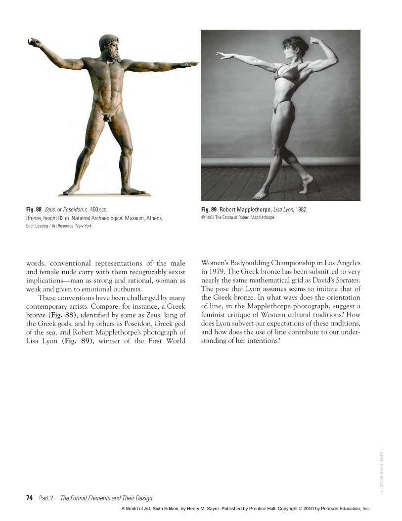
It should come as no surprise, then, that the biasesof our culture are, naturally, reflected in the uses artistsmake of line. Especially in the depiction of humananatomy, certain cultural assumptions have come tobe associated with line. Conventionally, vertical andhorizontal geometries have been closely identifiedwith the male form—as in David’s Death of Socrates.More loose and gestural lines seem less clear, less “logi-cal,” more emotional and intuitive, and traditionallyhave been identified with the female form. In other
ISB
N 0
-558
-551
80-7
A World of Art, Sixth Edition, by Henry M. Sayre. Published by Prentice Hall. Copyright © 2010 by Pearson Education, Inc.
74 Part 2 The Formal Elements and Their Design
Fig. 89 Robert Mapplethorpe, Lisa Lyon, 1982.© 1982 The Estate of Robert Mapplethorpe.
Fig. 88 Zeus, or Poseidon, c. 460 BCE.Bronze, height 82 in. National Archaeological Museum, Athens.Erich Lessing / Art Resource, New York.
words, conventional representations of the maleand female nude carry with them recognizably sexistimplications—man as strong and rational, woman asweak and given to emotional outbursts.
These conventions have been challenged by manycontemporary artists. Compare, for instance, a Greekbronze (Fig. 88), identified by some as Zeus, king ofthe Greek gods, and by others as Poseidon, Greek godof the sea, and Robert Mapplethorpe’s photograph ofLisa Lyon (Fig. 89), winner of the First World
Women’s Bodybuilding Championship in Los Angelesin 1979. The Greek bronze has been submitted to verynearly the same mathematical grid as David’s Socrates.The pose that Lyon assumes seems to imitate that ofthe Greek bronze. In what ways does the orientationof line, in the Mapplethorpe photograph, suggest afeminist critique of Western cultural traditions? Howdoes Lyon subvert our expectations of these traditions,and how does the use of line contribute to our under-standing of her intentions?
ISB
N 0-558-55180-7
A World of Art, Sixth Edition, by Henry M. Sayre. Published by Prentice Hall. Copyright © 2010 by Pearson Education, Inc.