The Ethics Issue What should you show in a graphic?elartefuncional.com/im/whatShouldYouShow.pdfThe...
4
30 DESIGN JOURNAL NO. 99 | SUMMER 2006 | WWW.SND.ORG The Ethics Issue What should you show in a graphic? Some g uidelines for breaking-news online infographics BY ALBERTO CAIRO Assistant professor, University of North Carolina I f you don’t know how it looks, don’t draw it. If you don’t know how it moves, don’t animate it. What should I show? That’s one of the most important questions an infographics artist should ask himself or herself when facing a visual reconstruction in a breaking-news situation. In this article we will explore some basic guidelines and take a look to some examples of the most common mistakes. FIRST, THE THEORY Believe or not, the work of an infograph- ics artist should be based on what we know about how communication works. All the means we use for conveying information are sign systems: a sign is not the thing we are t t referring to. It represents that thing. Pretty basic, right? By saying “truck”, for example, we are not conveying the idea of a particular truck. r r Every person listening to us will create a dif- ferent mental image based on that word. But if we draw a colored, very detailed truck, the amount of information transmitted is higher and the picture will be closer to our mental image, so our audience will not have as much freedom to imagine a different truck than the one we have in mind. The more detailed the truck, the less freedom other people’s minds will have to recreate it because its representation is closer to the original object. This has to do with what is called the level of iconicity of a picture, which can be mea- y y sured using a scale invented by the French thinker Abraham Moles. The less iconicity a picture has, the more abstract it is and the less similar to the actual object it will be. Words and mathematical formulas are the most abstract (and less iconic) visual means of conveying an idea, while photographs are much less abstract (and more iconic). In between those two extremes, you can find several steps. How does it all this theory affect our work as breaking-news infographics artists? Well, a lot, actually. Information usually gets to our hands as words, which are extremely abstract (the word “lion” is not visually similar to an actual lion), and we are forced to translate them in a more iconic/less abstract representation: an illustration. This always creates tensions as sometimes it is difficult to say what it is acceptable or not: do you really know that the scene of the crime looked exactly like that? In spite that breaking-news reconstructions are always tricky business, there are a few dos and don’ts that you can use to guide yourself. TRUCK FACE A drawing has more information A drawing is a less abstract representation so if you draw a detailed truck, you are saying: THIS is how the truck looks like Basic communication: words Words are the most abstract symbolic visual representations of things. If you say “truck” each person will depict a different picture in his or her mind. NIC AB How iconic is the image? Abraham Moles defined iconicity as the level of re- semblance between a sign (a visual representation, in our business) and the object represented. The less iconicity, the more abstract a picture is. The more iconic is the picture, the more similar it is to the object represented.
Transcript of The Ethics Issue What should you show in a graphic?elartefuncional.com/im/whatShouldYouShow.pdfThe...
30 DESIGN JOURNAL NO. 99 | SUMMER 2006 | WWW.SND.ORG
The Ethics Issue
What should you show in a graphic?Some guidelines for breaking-news online infographics
BY ALBERTO CAIROAssistant professor, University of North Carolina
If you don’t know how it looks, don’t draw it. If you don’t know how it moves, don’t animate it.
What should I show?That’s one of the most important
questions an infographics artist should ask himself or herself when facing a visual reconstruction in a breaking-news situation. In this article we will explore some basic guidelines and take a look to some examples of the most common mistakes.
FIRST, THE THEORYBelieve or not, the work of an infograph-
ics artist should be based on what we know about how communication works. All the means we use for conveying information are sign systems: a sign is not the thing we are not the thing we are not
referring to. It represents that thing. Pretty basic, right?
By saying “truck”, for example, we are not conveying the idea of a particular truck. particular truck. particularEvery person listening to us will create a dif-ferent mental image based on that word. But if we draw a colored, very detailed truck, the amount of information transmitted is higher and the picture will be closer to our mental image, so our audience will not have as much freedom to imagine a different truck than the one we have in mind. The more detailed the truck, the less freedom other people’s minds will have to recreate it because its representation is closer to the original object.
This has to do with what is called the level of iconicity of a picture, which can be mea-of iconicity of a picture, which can be mea-of iconicitysured using a scale invented by the French thinker Abraham Moles. The less iconicity a picture has, the more abstract it is and the less similar to the actual object it will be.
Words and mathematical formulas are the most abstract (and less iconic) visual means of conveying an idea, while photographs are much less abstract (and more iconic). In between those two extremes, you can find several steps.
How does it all this theory affect our work as breaking-news infographics artists? Well, a lot, actually.
Information usually gets to our hands as words, which are extremely abstract (the word “lion” is not visually similar to an actual lion), and we are forced to translate them in a more iconic/less abstract representation: an illustration.
This always creates tensions as sometimes it is difficult to say what it is acceptable or not: do you really know that the scene of the crime looked exactly like that? In spite that breaking-news reconstructions are always tricky business, there are a few dos and don’ts that you can use to guide yourself.
TRUCK
FACE
A drawing has more informationA drawing is a less abstract representation so if you draw a detailed truck, you are saying: THIS is how the truck looks like
Basic communication: wordsWords are the most abstract symbolic visual representations of things. If you say “truck” each person will depict a different picture in his or her mind.
ICONICICONICABSTRACTABSTRACT
How iconic is the image?Abraham Moles defined iconicity as the level of re-semblance between a sign (a visual representation, in our business) and the object represented. The less iconicity, the more abstract a picture is. The more iconic is the picture, the more similar it is to the object represented.

WWW.SND.ORG | SUMMER 2006 | DESIGN JOURNAL NO. 99 31
W hat do I really know? I know that the criminals fled driving a Ford Escort but do I know if it was red or blue? Do I know if
they drove down Franklin Street until they got to Interstate 40? Do I know what kind of clothes they wore? Those are all questions we should ask ourselves before we start making the recre-ation of what happened. We should use the level of abstraction (or iconicity) that best matches what we actually know. The less you know about something, the less detail you can put into its recreation.
The examples I provide in this page are among the worst infographics I have ever made. They are both visual reconstructions of terrorist attacks, a kind of work that was pretty common in Spanish newspapers a few years ago (less com-mon today, fortunately). From a technical stand-point they don’t look bad at all: the illustrations are ok, the maps are quite informative and the animation is the best I could do at that time.
However, from an informative and journal-istic standpoint these works are terrible. In “Terrorist Attack in Sallent de Gállego” I used 3D for the portraits of the victims. Did I know what these people look like? No, I did not have pictures of them to base my work on. Did I know for sure that they approached their car follow-ing the path shown on the infographic? No and, even though, I animated them. Moreover, I animated the explosion of the car. Extremely disrespectful and ethically dubious.
If I did this infographic today it would look very different: First of all, I don’t think I would use a close-up like that, I did not have enough visual references, pictures or sketches (we had a reporter in the area, though) so the reconstruc-tions should have been much less detailed. Also, I would have used silhouettes for the victims. And I would not have animated the explosion. I would have added a subtle flash effect that could indicate the explosion had taken place.
In “Terrorist attack in Berriozar” I incurred in the same sins. I did not know that the terrorist approached the victim that way. The buildings and the area are represented
quite accurately (we had some reference pic-tures) but I did not know that both terrorists were wearing red T-shirts… or that they were twins! Now that is a big leap?
There are more examples like this in the ar-chives of elmundo.es but I think that these two summarize our gravest mistakes. Unfortunately, I still see infographics like these everyday in many newspapers in the world. Remember: Be true to the facts. We will not be respected as journalists until we learn that our work should be guided by the same rigid standards as the reporters’ work: tell only what you know, is their slogan. Show (and animate) only what you know, should be ours.
TWO EXAMPLES OF WHAT NOT TO DO
Not enough visual referenceWhat did the victims look like? What paths did they walk to the vehicle? This is key in-formation to have when making this kind of animated graphic. If I did this same graphic today it would be much simpler. And for ethical reasons, I would not have animated the explosion.See it online: “Terrorist attack in Sallent de Gállego” http://www.elmundo.es/noti-cias/2000/graficos/agosto/semana3/sal-lent5.html
What I knew and what I didn’t knowI had good information on the surrounding buildings, but not on what the terrorists wore. See it online: Berriozar 1 to Berriozar5: “Terrorist attack in Berriozar”http://www.elmundo.es/noticias/2000/graficos/agosto/semana2/navarra.html

32 DESIGN JOURNAL NO. 99 | SUMMER 2006 | WWW.SND.ORG
Professor Rich BeckmanThe head of the School’s Visual Communication sequence fell asleep in his office after the kidnapper put some drug in his sweet tea
2
Open doorAccording to witnesses, Alberto Cairo’s office was open while he was teaching a class in a nearby computer lab.
1
DefenselessThe victim was on a round table very close to the office door. The kidnapper took it right after entering.
3
zzz
Art lover
Pc ComputerBelieve it or not,Prof. Cairo is a Windowsuser! Shame on him!
Tons of booksProf. Cairo pretendsthat he read a lot. This seemsto be a bunch of booksabout type and design butit is his collection ofSuperhero comic-books
Mac ComputerIt is switched offmost of the time. It isnot possible to installvideo games in those things!
Before fleeing from the crime scene, the kidnapper stopped for a few minutes and kept staring at one of the strange pieces of art Cairo has in his office.
4
How the kidnapping happenedHere you will place an introduction to the story. Try to make it informative but keep it short. The kidnapper was a bearded man wearing a black T-shirt
OPTION4
Franklin St.
Cameron Ave.
OldWell
Carroll Hall
Co
lum
bia
St.
OldWell
RaleighChapel Hill
NorthCarolina
Most editors love flashy info-graphics with lots of color and cool 3D effects. A good-looking breaking news infographic is
always great... If you have enough informa-tion to make it.
Even when you don’t, your bosses might ask you to add more details, to be bolder, to make the explanation more “cinematic”, more Pixar-like. They know that you can use 3D and they usually love 3D and realistic illustrations. I am a huge 3D advocate but, like any other technology, with great power, comes great responsibility.
In the case that you don’t have enough information, you will have to explain to your bosses why you cannot do it: in order to achieve what they want you would have to make up details on the illustration. And making up is one of the most serious jour-nalism offenses, as every journalism student knows.
There’s an argument that works for me when I face such a situation in breaking-news reconstructions: editors are usually word guys, reporters. Ask them: would you add details of your own (that are not based on actual facts) to your story just to make it more attractive? Of course not, it would not be ethical. So why are you asking me to do so in an infographic?
Whatever the situation, make sure that
you only draw what you know. The less you know about something, the less detailed the reconstruction should be.
I’ve created an infographic to explain this principle. I have a bunch of use-less things in my office at the School of
Journalism (Carroll Hall) in Chapel Hill. My favorite one is an action figure of Einstein. Everybody that comes to visit loves it! Ok, let’s suppose that someone kidnaps my ac-tion figure (no ransom asked so far) and that I want to explain what happened by visual means.
If I don’t have information at all, I will be able to do only a locator map. Locator maps are underrated among too many editors, especially in South America and Spain, but they are very good information tools. If you don’t have reliable data, stick to that.
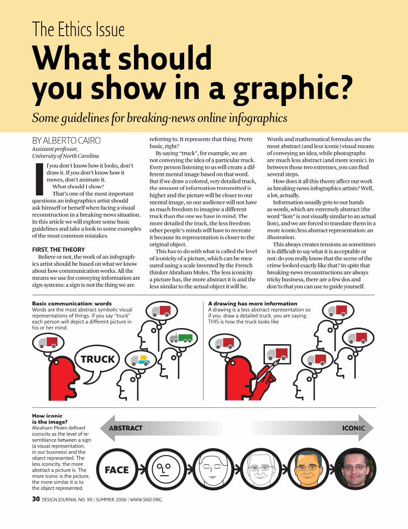
Depending on the amount of text and visual information, you will be able to create a more detailed illustration. If you cannot send an infographics artist of your team to the place but you have a reporter there, maybe you can ask for a rough sketch and some bad pictures to use as a reference. If you get just the sketch you can give Option 2 a try: just the outlines, aerial view.
With more pictures and information available (remember that it is always bet-ter to contact the sources yourself and no through middlemen: work as a reporter) Option 3 or even Option 4 can be a solution. If you want to pick Option 4 you will really need to have someone from your team in the scene of the crime! That’s the only way you can be sure that the colors and the look of the textures are right.
A CASE STUDY: SHOWING SPECIFICS
OPTION1 Franklin St.
Cameron Ave.
OldWell
Carroll Hall
Co
lum
bia
St.
Old
RaleighChapel Hill
NorthCarolina
THE STORYProfessor Cairo’s trea-sured figurine of Alberto Einstein has been kid-napped. What kind of graphic is possible to explain this, this horrible event?
OPTION 1: THE LOCATORNo visual references are necessary. You just need to know where the incident occurred.
OPTION 4: DETAILED EXPLAINER AND 3-D GRAPHICDetailed description, sketches made by an infographics artist and sent from the place, pictures, witnesses’ information that make possible to show the path of the kidnapper... All that you will pos-sibly need.
WWW.SND.ORG | SUMMER 2006 | DESIGN JOURNAL NO. 99 33
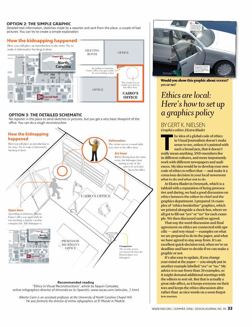
BY GERT K. NIELSENGraphics editor, Ekstra Bladet
T he idea of a global code of ethics in Visual Journalism doesn’t make sense to me, unless it’s painted with such a broad pen, that it doesn’t
really mean anything. SND-members live in different cultures, and more importantly work with different newspapers and audi-ences. My idea would be to develop your own code of ethics to reflect that — and make it a conscious decision in your local newsroom what to do and what not to do.
At Ekstra Bladet in Denmark, which is a tabloid with a reputation of being provoca-tive and daring, we had a good discussion on ethics between the editor-in-chief and the graphics department. I prepared 16 exam-ples of “ethics-borderline” graphics, which we printed alongside a check-box, where we all got to fill out “yes” or “no” for each exam-ple. We then discussed until we agreed.
That way the word-discussion and final agreement on ethics are connected with spe-cific — and very visual — examples on what we are prepared to do in the paper, and what we have agreed to stay away from. It’s an excellent quick-decision tool, when we’re on deadline and have to decide if we can make a graphic or not.
It’s also easy to update, if you change your mind at the paper — you simply put in another example labelled “yes” or “no.” My advice is to use fewer than 20 examples, so it might demand additional meetings with the editors to sort oit. But that is actually a great side-affect, as it keeps everyone on their toes and keeps the ethics-discussion alive rather than as nice words on a soon-forgot-ten memo.
OPTION 3: THE DETAILED SCHEMATICNo reporter in the place to send sketches or pictures, but you get a very basic blueprint of the office. You can do a rough reconstruction.
Recommended readingRecommended reading“Ethics in Visual Reconstructions”, article by Xaquin Gonzalez,
online infographics director of elmundo.es (in Spanish): www.xocas.com/articulos_1.html
Alberto Cairo is an assistant professor atAlberto Cairo is an assistant professor atAlberto Cairo is an assistant professor the University of North Ca at the University of North Ca at rolina Chapel Hill. He was formerly the director of online infographics at El Mundo in Madrid.
OPTION2
CAIRO’SOFFICE
OFFICE
OFFICEMEETING
ROOM
The victim was on a table very close to
the office door.
How the kidnapping happenedHere you will place an introduction to the story. Try to make it informative but keep it short.
Locator map
According to witnesses, Cairo’s office was open while
he was teaching a class
Franklin St.
Cameron Ave.
OldWell
Carroll Hall
Co
lum
bia
St.
make it informative but keep it short.
Old
RaleighChapel Hill
NorthCarolina
Ethics are local: Here’s how to set up a graphics policyHere’s how to set up a graphics policyHere’s how to set up
Would you show this graphic about xxxxxx? Would you show this graphic about xxxxxx? yes or no?
OPTION 2: THE SIMPLE GRAPHICDetailed text information, sketches made by a reporter and sent from the place, a couple of bad pictures. You can try to create a simple explanation.
How the kidnappinghappened
OPTION3
DefenselessThe victim was on a round table very close to the office door.
Open doorAccording to witnesses, Alberto Cairo’s office was open while he was teaching a class in a nearby computer lab. The kidnapper x
ComputersThe security systemwas turned off when theEinstein figure waskidnapped
Art loverBefore fleeing from the crime scene, the kidnapper kept
staring at one of the pieces of art Cairo
has in his office.
CAIRO’S OFFICE
PROFESSORBECKMAN’S
OFFICE
Here you will place an introduction to the story. Try to make it informative but keep it short.
Franklin St.
Cameron Ave.
OldWell
Carroll Hall
Co
lum
bia
St.
OldWell
RaleighChapel Hill
NorthCarolina