The Big Picture Populations and Samples · Independent vs Paired Samples ... •As with histogram,...
54
Introduction to Environmental Statistics Professor Jessica Utts University of California, Irvine [email protected] Day 1, Morning, Slide 2 A Few Sources for Data Examples Used 1. Statistical Methods in Water Resources by D.R. Helsel and R.M. Hirsch (H&H) 2. Statistical Methods and Pitfalls in Environmental Data Analysis, Yue Rong, Environmental Forensics, Vol 1, 2000, pgs 213-220. (Rong) 3. Data provided by Steve Saiz (Saiz) 4. Introduction to Probability and Statistics, Mendenhall and Beaver (M&B) 5. Occasionally, my own data because I understand it! Day 1, Morning, Slide 3 The Big Picture Why use statistical methods? • Describe features of a data set • Make inferences about a population using sample data – Estimate parameters (such as means) with a certain level of confidence – Test hypotheses about specific parameters or relationships • Predict future values based on past data Day 1, Morning, Slide 4 Populations and Samples Population data: • Measurements available on all “units” of interest. – Example: Annual peak discharge for Saddle River, NJ from 1925 to 1989. (H&H) – Can be considered as population data if only those years are of interest. – Can be considered as sample data and used for inference about all possible years. Day 1, Morning, Slide 5 Sample Data Sample data used for two purposes: • Describing that sample only • Making inferences to a population • Ideal is a “random sample” but almost impossible to get. Instead: Fundamental Rule for Using Data for Inference: Available data can be used to make inferences about a much larger group if the data can be considered to be representative with regard to the question(s) of interest. Day 1, Morning, Slide 6 Examples of sample data • Nickel effluent data, City of San Francisco (data from Saiz) – Grab samples from 1999 to 2002 – Representative of a larger population of nickel concentration data; what population? • Groundwater monitoring data for benzene concentrations for 16 quarters, 1996 to 1999 (data from Rong) – Representative of a larger population?
Transcript of The Big Picture Populations and Samples · Independent vs Paired Samples ... •As with histogram,...

1
Introduction to Environmental Statistics
Professor Jessica UttsUniversity of California, Irvine
Day 1, Morning, Slide 2
A Few Sources for Data Examples Used
1. Statistical Methods in Water Resources by D.R. Helsel and R.M. Hirsch (H&H)
2. Statistical Methods and Pitfalls in Environmental Data Analysis, Yue Rong, Environmental Forensics, Vol 1, 2000, pgs 213-220. (Rong)
3. Data provided by Steve Saiz (Saiz)4. Introduction to Probability and Statistics,
Mendenhall and Beaver (M&B)5. Occasionally, my own data because I
understand it!
Day 1, Morning, Slide 3
The Big PictureWhy use statistical methods?• Describe features of a data set• Make inferences about a population using
sample data– Estimate parameters (such as means) with a
certain level of confidence– Test hypotheses about specific parameters or
relationships• Predict future values based on past data
Day 1, Morning, Slide 4
Populations and Samples
Population data:• Measurements available on all “units” of
interest.– Example: Annual peak discharge for Saddle
River, NJ from 1925 to 1989. (H&H)– Can be considered as population data if only
those years are of interest.– Can be considered as sample data and used
for inference about all possible years.
Day 1, Morning, Slide 5
Sample DataSample data used for two purposes:• Describing that sample only• Making inferences to a population• Ideal is a “random sample” but almost impossible
to get. Instead:
Fundamental Rule for Using Data for Inference: Available data can be used to make inferences about a much larger group if the data can be considered to be representative with regard to the question(s) of interest.
Day 1, Morning, Slide 6
Examples of sample data
• Nickel effluent data, City of San Francisco (data from Saiz)– Grab samples from 1999 to 2002– Representative of a larger population of nickel
concentration data; what population?• Groundwater monitoring data for benzene
concentrations for 16 quarters, 1996 to 1999 (data from Rong)– Representative of a larger population?

2
Day 1, Morning, Slide 7
Independent vs Paired SamplesFor comparing two situations, data can be
collected as independent samples or as “matched pairs.” Examples:
• Independent samples: – Compare wells upgradient and downgradient
from a toxic waste site for a certain chemical. • Matched pairs (H&H):
– Compare atrazine concentrations before (June) and after (Sept) application season in 24 shallow groundwater sites (same sites both times).
Day 1, Morning, Slide 8
Class Input and Discussion
Share examples of data you have collected and/or dealt with in your job:• How were the data collected?• What was the “question of interest?”• Paired data or independent samples?• Population or sample?• If sample, what larger population do
they represent?
Day 1, Morning, Slide 9
Types of DataThere are various ways to classify data, but
probably not too useful for your data:• Nominal:
– “Name” only, also called categorical data– Example: Classify wells by land use in area (residential,
agricultural, industrial, etc)• Ordinal:
– Ordered, but numbers may not have much meaning.– Example (H&H): 0 = concentrations below reporting
limit, 1 = above rl but below a health standard, 2 = above health standard.
Day 1, Morning, Slide 10
Types of Data, Continued• Interval:
– Numbers have meaning, but ratios do not.– There is no absolute 0 (“none”).– Example: Temperature
• Ratio: – There is an absolute 0– Ratios have meaning.– Example: Nickel concentration (it makes
sense to talk about a sample having twice the concentration of another sample).
Day 1, Morning, Slide 11
Categorical vs Quantitative Data• Categorical data
– Nominal, and sometimes ordinal– For a single variable, summaries include frequencies
and proportions only• Quantitative data
– Interval, ratio, sometimes ordinal– Summarize with numerical summaries
• Multiple variables (same or different types). For instance, categorize wells by land use, and compare a quantitative measure across uses.
Day 1, Morning, Slide 12
Types of Statistical ProceduresGraphical summaries
– Provide visual information about the data set– Provide guidance on what statistical methods
are appropriateNumerical summaries
– Provide information about specific features of the data set
Inference (parametric, nonparametric)– Infer things about a population, often to
answer a yes/no question

3
Day 1, Morning, Slide 13
Summary Features of Quantitative Data
1. Location (Center, Average)2. Spread (Variability)3. Shape (Normal, skewed, etc)4. Outliers (Unusual values)
We use pictures and numerical information to examine these.
Day 1, Morning, Slide 14
Questions about quantitative variables:One Quantitative VariableQuestion 1: What interesting summary measures, like the
average or the range of values, can help us understand the data?Example: What is the average nickel concentration in the SF effluent data, and how much variability is there?
Question 2: Are there individual data values that provide interesting information because they are unique or stand out in some way (outliers)?Example: (M&B) Data on mercury concentration in livers of 28 dolphins were all over 100 micrograms/gram except 4 of them, which were all under 10. Explanation: 4 dolphins under 3 years old, others all more than 8 years old.
Day 1, Morning, Slide 15
One Categorical, One Quantitative Variable (Comparing across categories)Question 1: Are the quantitative measurements similar
across categories of the categorical variable?Example: (H&H) Do wells upgradient and downgradient of a hazardous waste site have the same average concentration of a toxic compound?
Question 2: When the categories have a natural ordering (an ordinal variable), does the quantitative variable increase or decrease, on average, in that same order?Example: Do low, medium and high flow areas of a
stream have an increasing (or decreasing) average amount of a certain type of vegetation?
Day 1, Morning, Slide 16
Pictures for Quantitative Data• Look at shape, outliers, center (location),
spread, gaps, any other interesting features.Four common types of pictures:• Histograms: similar to bar graphs, used for
any number of data values.• Stem-and-leaf plots and dotplots: present all
individual values, useful for small to moderatesized data sets.
• Boxplot or box-and-whisker plot: useful summary for comparing two or more groups.
• Values are “centered” at about 2.6 or 2.7 (µg/L)• Shape is “skewed to the right” (more on this later)• Values range from about 1.9 to 4.5
Histogram: SF Nickel Effluent Data (Saiz)
4.54.03.53.02.52.0
12
10
8
6
4
2
0
Nickel
Freq
uenc
y
Histogram of N ickel
Day 1, Morning, Slide 18
Notes about histograms• Intervals are equally spaced. Example: Each interval has
width 0.25.• One goal is to assess shape. Between 6 and 15 intervals is a
good number (may need to use more if there are gaps and/or outliers). 11 in nickel example.
• Some authors suggest using smallest k with 2k ≥ n, but not good for small n. Ex: n =39, so would use only k = 6.
• Decide where to put values that are on the boundary. For instance, would 2 go in the interval from 0 to 2, or from 2 to 4? Need to be consistent. (Not relevant in this example.)
• Can use frequencies (counts) or relative frequencies(proportions) as vertical axis. Example uses frequencies.

4
Number of “bins” can change pictureEx: Peak discharge, Saddle River, NJ (H&H)
40003200240016008000
18
16
14
12
10
8
6
4
2
0
PeakDischarge, Saddle River, NJ
Freq
uen
cy
12 intervals
40003000200010000
20
15
10
5
0
PeakDischarge, Saddle River, NJ
Freq
uen
cy
10 intervals
Even a small change in number of intervals made a difference.Day 1, Morning, Slide 20
Creating a DotplotThese can be useful for comparing groups•Ideally, number line represents all possible values and there is one dot per observation. Not always possible. If dots represent multiple observations, footnote should explain that.•As with histogram, divide horizontal axis into equal intervals, then put dots on it for each individual in each interval.•Example (next slide): Compare ln(specific capacity) for wells in Appalachians of Pennsylvania, 4 rock types. [ln(x) = natural log of x]
Dotplots of Ln(specific capacity), H&H
5.64.22.81.40.0-1.4-2.8-4.2
Dolomite
Limestone
Siliclastic
Metamorphic
Log of Specific Capacity (gal/min/ft)
Each dot represents one observation. Note different ranges, and possibly different centers.
Divide range of data into equal units to be used on stem. Have 6 to 15 stem values, representing equally spacedintervals. Here, we could use 2 or 5 for each digit from 1 to 4.
Creating a Stemplot (stem and leaf plot) Ex: SF nickel effluent data
Step 1: Create the Stem
Example: Each of the 6 stem values represents a possible range of 0.5 First one represents 1.5 to 1.9, then 2.0 to 2.4, then 2.5 to 2.9, and so on, up to 4.0 to 4.4.
1|2|2|3|3|4|
2.8, 3.0, 3.3, 2.5, 2.3, 2.4, 2.7, 2.8, 2.6, 3.9, 3.5, 2.5, 3.7, 4.4, 2.3, 2.6, 2.5, 2.2, 2.6, 3.2, 3.0, 1.9, 2.3, 2.3, 3.5, 2.4, 2.2, 2.4, 2.4, 2.2, 2.0, 2.5, 2.8, 2.7, 2.8, 2.1, 2.6, 3.3, 2.1
Day 1, Morning, Slide 23
Creating a Stemplot
Attach a leaf to represent each data point. Next digit in number used as leaf; drop any remaining digits.Example: First 5 values are 2.8, 3.0, 3.3, 2.5, 2.3. The numbers after the decimal point are the “leaves”
Step 2: Attach the Leaves
Optional Step: order leaves on each branch.
1|2| 32| 8 53| 0 33|4|
Reusing digits two or five times. Goal: assess shape.
Further Details for Creating Stemplots
Stemplot A:1|92|011222333344442|555566667788883|002333|55794|4
EX: 1|9 = 1.9
Stemplot B:1|92|0112|22233332|444455552|6666772|88883|003|2333|553|73|94|4|4|4
Two times:1st stem = leaves 0 to 42nd stem = leaves 5 to 9
Five times:1st stem = leaves 0 and 12nd stem =leaves 2 and 3, etc.

5
Nickel Example: Shape
4.54.03.53.02.52.0
12
10
8
6
4
2
0
Nickel
Freq
uenc
y
Histogram of NickelStemplot B:1|92|0112|22233332|444455552|6666772|88883|003|2333|553|73|94|4|4|4This shape is called
“skewed to the right.” Day 1, Morning, Slide 26
Describing Shape• Symmetric, bell-shaped• Symmetric, not bell-shaped• Bimodal: Two prominent “peaks” (modes)• Skewed Right: On number line, values
clumped at left end and extend to the right(Very common in your data sets.)
• Skewed Left: On number line, values clumped at right end and extend to the left (Ex: Age at death from heart attack.)
Day 1, Morning, Slide 27
Bell-shaped example: Heights of 94 femalesHeights of 94 female college students. Bell-shaped, centered around 64 inches with no outliers.
Day 1, Morning, Slide 28
Bimodal Example: Old Faithful Geyser, time betweeneruptions, histogram from R Commander
Times between eruptions of the Old Faithful geyser, shape is bimodal. Two clusters, one around 50 min., other around 80 min.
Source: Hand et al., 1994
Day 1, Morning, Slide 29
Boxplots, based on “Five Number Summary”:
MedianLower Quartile Upper Quartile
Lowest Highest
The five-number summary display
• Lowest = Minimum• Highest = Maximum• Median = number such that half of the values are at
or above it and half are at or below it (middle value or average of two middle numbers in ordered list).
• Quartiles = medians of the two halves.Day 1, Morning, Slide 30
BoxplotsVisual picture of the five-number summary
190 statistics students asked how many hours they slept the night before (a Tuesday night).
Example: How much do statistics students sleep?
76 83 16
Five-number summary for number of hours of sleep (details of how to find these a little later)
Two students reported 16 hours; the max for the remaining 188 students was 12 hours.

6
Day 1, Morning, Slide 31
1. Draw horizontal (or vertical) line, label it with values from lowest to highest in data.
2. Draw rectangle (box) with ends at quartiles.3. Draw line in box at value of median.4. Compute IQR = distance between quartiles.5. Compute 1.5(IQR); outlier is any value more
than this distance from closest quartile. Draw line (whisker) from each end of box extending to farthest data value that is not an outlier. (If no outlier, then to min and max.)
6. Draw asterisks to indicate the outliers.
Creating a Boxplot
Day 1, Morning, Slide 32
1. Draw horizontal line and label it from 3 to 16.2. Draw rectangle (box) with ends at 6 and 8 (quartiles).3. Draw line in box at median of 7.4. Compute IQR (interquartile range) = 8 – 6 = 2.5. Compute 1.5(IQR) = 1.5(2) = 3; outlier is any value
below 6 – 3 = 3, or above 8 + 3 = 11.
Creating a Boxplot for Sleep Hours
6. Draw line from each end of box extending down to 3 and up to 11.
7. Draw asterisks at outliers of 12 and 16 hours.
• Divides the data into fourths.
• Easily identify outliers.• Useful for comparing two or more groups.
Interpreting Boxplots
Outlier: any value more than 1.5(IQR) beyond closest quartile.
¼ of students slept between 3 and 6 hours
¼ slept between 6 and 7 hours
¼ slept between 7 and 8 hours
¼ slept between 8 and 16 hours
Sometimes boxplots are vertical instead of horizontal; also, useful for comparisons
MetamorphicSiliclasticLimestoneDolomite
5.0
2.5
0.0
-2.5
-5.0
Ln (
Spec
ific
Capa
city
)Boxplot of ln(Spec, Cap.) of Wells in PA
Day 1, Morning, Slide 35
Outlier: a data point that is not consistent with the bulk of the data.
Outliers and How to Handle Them
• Look for them via graphs.• Can have big influence on conclusions.• Can cause complications in some statistical analyses.• Cannot discard without justification.• May indicate that the underlying population is
skewed, rather than one unique outlier (especially with small samples)
Possible reasons for outliersand what to do about them:1. Outlier is legitimate data value and represents
natural variability for the group and variable(s) measured. Values may not be discarded. They provide important information about location and spread.
2. Mistake made while taking measurement or entering it into computer. If verified, should be discarded or corrected.
3. Individual observation(s) in question belong(s) to a different group than bulk of individuals measured. Values may be discarded if summary is desired and reported for the majority group only.

7
Day 1, Morning, Slide 37
Example: Sleep hoursTwo students were outliers in amount of sleep, but the values were not mistakes.
Reason 1: Natural variability, it is not okay to remove these values.
Example: Students gave mother’s height
80.577.073.570.066.563.059.556.0momheight
Dotplot of momheight
Height of 80 inches = 6 ft 8 inches, almost surely an error!Reason #2, investigate and try to find error; remove value.
Day 1, Morning, Slide 39
Example: Weights (in pounds) of 18 men on crew teams:
Cambridge:188.5, 183.0, 194.5, 185.0, 214.0, 203.5, 186.0, 178.5, 109.0
Oxford: 186.0, 184.5, 204.0, 184.5, 195.5, 202.5, 174.0, 183.0, 109.5
Note: last weight in each list is unusually small. ???
Day 1, Morning, Slide 40
They are the coxswains for their teams, while others are rowers. Reason 3: different group, okay to remove if only interested in rowers.
Cambridge:188.5, 183.0, 194.5, 185.0, 214.0, 203.5, 186.0, 178.5, 109.0
Oxford: 186.0, 184.5, 204.0, 184.5, 195.5, 202.5, 174.0, 183.0, 109.5
Note: last weight in each list is unusually small. ???
Example: Weights (in pounds) of 18 men on crew teams:
Day 1, Morning, Slide 41
Numerical Summaries of Quantitative Data
Notation for Raw Data:n = number of individual observations in a data setx1, x2 , x3,…, xn represent individual raw data values
Example: Nickel effluent data: So n = 39, and
x1= 2.8, x2 = 3.0, x3 = 3.3, x4 = 2.5 etc....
Day 1, Morning, Slide 42
Describing the “Location” of a Data Set• Mean: the numerical average• Median: the middle value (if n odd)
or the average of the middle two values (n even)
Symmetric: mean = medianSkewed Left: usually mean < medianSkewed Right: usually mean > median
8
Day 1, Morning, Slide 43
Pictures from Helsel &Hirsch:Data values skewed to the right
Day 1, Morning, Slide 44
Bell-shaped distribution
Day 1, Morning, Slide 45
Determining the Mean and Median
The Mean
where means “add together all the values”∑ ixn
xx i∑=
The MedianIf n is odd: Median = middle of ordered values.
Count (n + 1)/2 down from top of ordered list.If n is even: Median = average of middle two ordered
values. Average the values that are (n/2) and (n/2) + 1 down from top of ordered list.
Day 1, Morning, Slide 46
• Mean (numerical average): 327.0
• Median: 190 (halfway between 180 and 200)
• Mode (most common value): no single mode
The Mean, Median, and Mode
Ordered Listing of 16 Benzene values (Rong)3.8, 35, 38, 55, 110, 120, 130, 180, 200, 230, 320, 340, 480, 810, 980, 1200
Median (190, half of area) vs Mean (327, balance point)
Skewed to Right
120010008006004002000
9
8
7
6
5
4
3
2
1
0
Benzene
Freq
uenc
y
190 327
Histogram of Benzene
Day 1, Morning, Slide 48
The Influence of Outliers on the Mean and Median
•Larger influence on mean than median.•High outliers and data skewed to the right will increase the mean. •Low outliers and data skewed to the left will decrease the mean.
Ex: Suppose ages at death of your eight great-grandparents are: 28, 40, 75, 78, 80, 80, 81, 82.
Mean age is 544/8 = 68 years oldMedian age is (78 + 80)/2 = 79 years old

9
Day 1, Morning, Slide 49
Caution: Confusing Normal with Average
Common mistake to confuse “average” with “normal”.Is woman 5 ft. 10 in. tall 5 inches taller than normal??
Article had thermometer showing “normal high” for the day was 84 degrees. High temperature for Oct. 1st is quite variable, from 70s to 90s. While 101 was a record high, it was not “17 degrees higher than normal” if “normal” includes the range of possibilities likely to occur on that date.
Example: How much hotter than normal is normal?“October came in like a dragon Monday, hitting 101 degrees in Sacramento by late afternoon. That temperature tied the record high for Oct. 1 set in 1980 – and was 17 degrees higher than normal for the date. (Korber, 2001, italics added.)”
Day 1, Morning, Slide 50
Describing Spread (Variability): Range, Interquartile Range and Standard deviation
• Range = high value – low value• Interquartile Range (IQR) =
upper quartile – lower quartile = Q3 - Q1 (to be defined)
• Standard Deviation (most useful for bell-shaped data)
Benzene Example, n = 163.8, 35, 38, 55, [Q1 = (55+110)/2 = 82.5]110, 120, 130, 180, [Median = 190]200, 230, 320, 340, [Q3 = (340+480)/2 = 410]480, 810, 980, 1200
• Median = 190 has half of the values above, half below• Two extremes describe spread over 100% of data
Range = 1200 – 3.8 = 1196.2• Two quartiles describe spread over middle 50% of data
Interquartile Range = 410 – 82.5 = 327.5
Five number summary190
82.5 4103.8 1200
Day 1, Morning, Slide 52
Finding Quartiles “by hand”Split the ordered values at median: •half at or below the median (“at” if ties)•half at or above the medianQ1 = lower quartile
= median of data valuesthat are (at or) below the median
Q3 = upper quartile= median of data values
that are (at or) above the median
Day 1, Morning, Slide 53
Hands-On Activity #1Data and details on activity sheet
• For the San Francisco effluent nickel data:– Find a 5-number summary – Draw a boxplot
• What can be concluded about shape from the boxplot?
Day 1, Morning, Slide 54
Results given in class
• Five number summary:
• Boxplot:
• Shape:

10
Day 1, Morning, Slide 55
Percentiles
The kth percentile is a number that has k% of the data values at or below it and (100 – k)% of the data values at or above it.
• Lower quartile: 25th percentile• Median: 50th percentile• Upper quartile: 75th percentile
Day 1, Morning, Slide 56
Describing Spread (Variability):
• Range = high value – low value
• Interquartile Range (IQR) = upper quartile – lower quartile = Q3 - Q1
• Standard Deviation – most useful for bell-shaped data
Day 1, Morning, Slide 57
Describing Spread with Standard Deviation
Standard deviation measures variability by summarizing how far individual data values are from the mean.
Think of the standard deviation as roughly the average distance values fall from the mean.
Day 1, Morning, Slide 58
Describing Spread with Standard Deviation: A very simple example
Both sets have same mean of 100.Set 1: all values are equal to the mean so there is
no variability at all. Set 2: one value equals the mean and other four values
are 10 points away from the mean, so the average distance away from the mean is about 10.
Numbers Mean Standard Deviation100,100,100,100,100 100 090, 90,100,110,110 100 10
Day 1, Morning, Slide 59
Formula for the (sample) standard deviation:
The value of s2 is called the (sample) variance. An equivalent formula, easier to compute, is:
Calculating the Standard Deviation
( )1
2
−−
= ∑n
xxs i
1
22
−−
= ∑n
xnxs i
Step 1: Calculate , the sample mean. Ex: = 100Step 2: For each observation, calculate the difference
between the data value and the mean. Ex: -10, -10, 0, 10, 10
Step 3: Square each difference in step 2. Ex: 100, 100, 0, 100, 100
Step 4: Sum the squared differences in step 3, and then divide this sum by n – 1. Result = variance s2
Ex: 400/(5 – 1) = 400/4 = 100Step 5: Take the square root of the value in step 4.
Ex: s = standard deviation =
Calculating the Standard DeviationExample: 90, 90, 100, 110, 110
x x
10100 =

11
Day 1, Morning, Slide 61
Data sets usually represent a sample from a larger population. If the data set includes measurements for an entire population, the notations for the mean and standard deviation are different, and the formula for the standard deviation is also slightly different. A population mean is represented by the Greek µ(“mu”), and the population standard deviation is represented by the Greek “sigma” (lower case)
Population Standard Deviation
( )n
xi∑ −=
2µσ
Day 1, Morning, Slide 62
Bell-shaped distributions• Measurements that have a bell-shape are so
common in nature that they are said to have a normal distribution.
• Knowing the mean and standard deviation completely determines where all of the values fall for a normal distribution, assuming an infinite population!
• In practice we don’t have an infinite population (or sample) but if we have a large sample, we can get good approximations of where values fall.
Day 1, Morning, Slide 63
Examples of bell-shaped data
• Women’s heights mean = 64.5 inches, s = 2.5 inches
• Men’s heightsmean = 70 inches, s = 3 inches
• IQ scoresmean = 100, s = 15 (or for some tests, 16)
Women’s heights, n = 94 studentsNote approximate bell-shape of histogram“Normal curve” with mean = 64.5, s = 2.5
superimposed over histogram
706866646260
18
16
14
12
10
8
6
4
2
0
Height
Freq
uenc
y
Mean = 64.5Mean 64.5StDev 2.5N 94
Histogram of Women's Heights
Day 1, Morning, Slide 65
Interpreting the Standard Deviation for Bell-Shaped Curves:
The Empirical Rule
For any bell-shaped curve, approximately • 68% of the values fall within 1 standard
deviation of the mean in either direction • 95% of the values fall within 2 standard
deviations of the mean in either direction• 99.7% (almost all) of the values fall within 3
standard deviations of the mean in either direction
Ex: Population of women’s heights• 68% of heights are between 62 and 67 inches• 95% of heights are between 59.5 and 69.5 inches• 99.7% of heights are between 57 and 72 inches

12
Women’s Heights: How well does the Empirical Rule work?Mean height for the 94 students was 64.5, and the standard deviation was 2.5 inches. Let’s compare actual with ranges from Empirical Rule:
Range of Values:
Empirical Rule
Actual number
Actual percent
Mean ± 1 s.d. 68% in 62 to 67
7070/94= 74.5%
Mean ± 2 s.d.95% in 59.5 to 69.5
8989/94= 94.7%
Mean ± 3 s.d.99.7% in57 to 72
9494/94= 100% Day 1, Morning, Slide 68
The Empirical Rule, the Standard Deviation, and the Range
• Empirical Rule tells us that the range from the minimum to the maximum data values equals about 4 to 6 standard deviations for data sets with an approximate bell shape.
• For a large data set, you can get a rough idea of the value of the standard deviation by dividing the range by 6 (or 4 or 5 for a smaller dataset)
6Ranges ≈
Day 1, Morning, Slide 69
Standardized z-ScoresStandardized score or z-score:
deviation StandardMean valueObserved −
=z
Example: UCI Verbal SAT scores had mean = 569 and s = 75. Suppose someone had SAT = 674:
674 569 1.4075
z −= = +
Verbal SAT of 674 for UCI student is 1.40 standard deviations above the mean for UCI students.
Day 1, Morning, Slide 70
Verbal SAT of 674 is 1.40 standard deviations above mean. To find proportion above or below, use Excel or R Commander
Verbal SAT Score674569
About 8% above 674
Normal, Mean=569, StDev=75Verbal SAT scores for UCI students
About 92% below 674
Day 1, Morning, Slide 71
The Empirical Rule Restated for Standardized Scores (z-scores):
For bell-shaped data, • About 68% of the values have
z-scores between –1 and +1. • About 95% of the values have
z-scores between –2 and +2. • About 99.7% of the values have
z-scores between –3 and +3.

1
Day 1, Afternoon, Slide 1
HANDS ON, USING R COMMANDER
Day 1, Afternoon
Day 1, Afternoon, Slide 2
Using R Commander• “R” is a sophisticated and free statistical
programming language.• R Commander is an add-on, also free, that is
menu-driven. It doesn’t do everything R does.• Website for installing R:
http://www.r-project.org/• To install R Commander: Open R, then type:> install.packages("Rcmdr", dependencies=TRUE)
• Wait until it finishes.
Day 1, Afternoon, Slide 3
Opening R and R Commander
• Click on the R icon on the desktop to open R.• At the prompt, type
>library(Rcmdr)OR go to the R menu Packages → Load package
scroll down to Rcmdr, and click “OK”• R Commander should open in a new window.To close them, in R Commander go to File→ Exit→ From Commander and R
Day 1, Afternoon, Slide 4
Entering Data by HandData → New data set• Enter a name for the data set, click “OK”• A spreadsheet should pop up. Click on “var1” in the
upper left, type a name (e.g. benzene), click numeric, then X out the name box.
• Enter the data into the first column of the spreadsheet.Example: Enter the 16 Benzene values (Rong)
3.8, 35, 38, 55, 110, 120, 130, 180,200, 230, 320, 340, 480, 810, 980, 1200
Day 1, Afternoon, Slide 5
Save data, then try some graphs• Verify correct entry “View data set”• Save the data set for later:Data → Active data set → Save active data set • Histogram of benzene (Graphs → Histogram)
– Note that it appears in a separate window• Stem and leaf plot of benzene• Boxplot of benzene• Graphs → Save graph to file → Bitmap → jpeg• What did you learn about the benzene data from
the graphs?Day 1, Afternoon, Slide 6
Numerical summariesStatistics → Summaries → Numerical summariesResults: Q1 Median Q2mean sd 0% 25% 50% 75% 100% n326.9875 362.2683 3.8 96.25 190 375 1200 16
• Note that the quartiles differ slightly from the ones computed “by hand” which were 82.5 and 410.
• The formula R uses for quantiles is i = 1+q(n−1), where i is the ordered rank of the q quantile. Here, n = 16 and q = .25, so i = 4.75
• If i is not an integer, a weighted average is used. In this case, .75 of distance from 55 to 110.

2
Day 1, Afternoon, Slide 7
Benzene data, continuedInterpreting the Results:mean sd 0% 25% 50% 75% 100% n326.9875 362.2683 3.8 96.25 190 375 1200 16
• From mean and standard deviation alone, we can tell that the distribution is not bell-shaped!
• What is it that lets us know that?• What does the 5 number summary tell us?
Day 1, Afternoon, Slide 8
Transforming variablesFor reasons more clear later, we would like
natural log of benzene.Data → Manage variables in active data set → Compute new variable
Under New variable name put LnBenzeneUnder Expression to compute put
log(Benzene)View data set to make sure it worked!
Day 1, Afternoon, Slide 9
Now do graphs on LnBenzene
• Histogram• Stem and leaf plot• Box plot
What do you notice about the shape of Benzene compared to LnBenzene?See next slide for histograms.
Day 1, Afternoon, Slide 10
Benzene versus Ln(Benzene)
Day 1, Afternoon, Slide 11
Importing Data into R CommanderData → Import dataYou can import data from the following sources:• Text file in a folder on your computer• Clipboard• Internet URL• SPSS Data sets created by these• Minitab statistical software packages• Stata• Excel• Access• dBase
Day 1, Afternoon, Slide 12
Example to Import from Excel• Data from H&H, years from 1925 to 1989, Annual
peak discharge, Saddle River, NJ, variable name is “Flow” (cubic feet/sec)
• Data → Import data → From Excel, Access...• Enter a name (e.g. SaddleRiver), click “OK”• Local files will pop up; find file “EnvStatData”, click
“Open”, then in the pop up box “Select one table”click on “SaddleRiver”
• Click View data set to make sure it worked. You should see columns labeled “Year” and “Flow”
3
Day 1, Afternoon, Slide 13
“View data set” should show something like this.
First column is YearSecond column is Flow
Don’t forget to save the data set:Data → Active data set → Save active data set
Day 1, Afternoon, Slide 14
Summaries for Bivariate Data
• “Bivariate” = two variables measured on each “unit.”
• Often there is a natural designation of one as “explanatory” variable and one as “response”variable.
• In plots, x = explanatory, y = response• Saddle River Example:
Year = x = explanatoryFlow = y = response
Day 1, Afternoon, Slide 15
Bivariate Data: Visual Summaries
• Most general is a “scatter plot”• If x = time (such as year) can do a line graph,
which connects the dots across time.Graphs → Line graph
• For scatter plot, can add “least squares line”and/or “lowess* smoother”Graphs → Scatterplot
*lowess = locally weighted scatterplot smootherDay 1, Afternoon, Slide 16
Line graph
Day 1, Afternoon, Slide 17
Scatter plot with least squares line and smoother
Day 1, Afternoon, Slide 18
What to notice in a scatterplot:• If the average pattern is linear, curved,
random, etc.• If the trend is a positive association or a
negative association• How spread out the y-values are at each
value of x (strength of relationship)• Are there any outliers – unusual
combination of (x, y)?

4
Day 1, Afternoon, Slide 19
Saddle River Example
• Somewhat linear• Positive association• Quite spread out • A few possible
outliers (1945 in particular, shown in blue)
19901980197019601950194019301920
5000
4000
3000
2000
1000
0
Year
Peak
Dis
char
ge
Day 1, Afternoon, Slide 20
Bivariate data: Numerical summaries• Algebra Review (Linear relationship)• Equation for a straight line:
y = b0 + b1xb0 = y-intercept, the value of y when x = 0b1= slope, the increase in y when x goes up by 1
• Example: One pint of water weighs 1.04 pounds. (“A pint’s a pound the world around.”)
• Suppose a bucket weighs 3 pounds. Fill it with x pints of water. Let y = weight of the filled bucket.
• How can we find y, when we know x?
Day 1, Afternoon, Slide 21
Water and weight example: A deterministic relationship
b0 = y-intercept, the value of y when x = 0This is the weight of the empty bucket, so b0 = 3b1 = slope, the increase in y when x goes up by 1
unit; this is the added weight for adding 1 pint of water, i.e. 1.04 pounds.
The equation for the line: y = b0 + b1x
y = 3 + 1.04 xx = 1 pint → y = 3 + 1.04(1) = 4.04 poundsx = 2.5 pints → y = 3 + 1.04(2.5) = 5.6 pounds
Day 1, Afternoon, Slide 22
Statistical Relationship• In a statistical relationship there is variation in
the possible values of y at each value of x. • If you know x, you can only find an average or
approximate value for y.• Regression equation – to describe the “best”
straight line through the data, and predict y, given x in the future.
• Correlation coefficient – to describe the strength and direction of the linear relationship
Day 1, Afternoon, Slide 23
Saddle River: Numerical Summary• Regression equation:
Predicted flow = −58299 + 30.65 (Year)Example: Predict flow value for 1980:−58299 + 30.65(1980) = −58299 + 60687 = 2388Actual for 1980: 2470
• Correlation between year and peak discharge is .626
• Will do more with these on Day 3.
Day 1, Afternoon, Slide 24
R Commander: Regression and CorrelationStatistics → Fit Models → Linear Regression• Identify the Response variable and Explanatory variable (Ex:
Flow, Year)• Partial Results:Coefficients:
Estimate Std. Error t value Pr(>|t|) (Intercept) -58299.189 9417.584 -6.190 5.02e-08 ***Year 30.647 4.812 6.369 2.48e-08 ***
Statistics → Summaries → Correlation matrix [Highlight variables]Flow YearFlow 1.0000000 0.6258355Year 0.6258355 1.0000000

5
Day 1, Afternoon, Slide 25
Other Software Options• See “Resources for Learning about Statistics
& Data Analysis” by Steve Saiz for options specific to State and Regional Water Board
• Excel has some basic statistics options• Commercial packages are expensive, but very
powerful (Minitab, SAS, SPSS, etc.)• Highly recommended website:
www.statpages.orgHas links to hundreds of free statistics websites.
Day 1, Afternoon, Slide 26
Hands-On Activity: www.statpages.org
Details to be given in class
Day 1, Afternoon, Slide 27
Random Variables• A random variable is a numerical outcome
of a “random” circumstance.• Examples:
– Rainfall in Sacramento on a randomly selected day in January.
– Nickel concentration in a random grab sample.– Specific capacity of a randomly selected well in
limestone in Pennsylvania– Weight of a randomly selected fish
Day 1, Afternoon, Slide 28
Probability Distributions• Before it’s measured, a random variable
has a bunch of possible values it could be.• The range of possible values and their
associated probabilities make up the probability distribution for the random variable.
• In many cases the possibilities are anything on a continuum: A continuous probability distribution. Those will be our focus.
Day 1, Afternoon, Slide 29
Examples on next few slides• Normal distribution: Symmetric, very common in
nature, often required for statistical procedures.• Lognormal distribution: A random variable x has a
lognormal distribution if log of x has a normal distribution. Skewed to the right.
• Exponential distribution: Often used to model waiting times between events (and has other uses).
R Commander will draw these for you:Distributions → Continuous Distributions → [Choose] → Plot ...

6
.5
Here, log(x) is normal with Mean = 0 and s.d. = 0.5.
Day 1, Afternoon, Slide 33
Probability Distributions as Models• Statistician George Box “Essentially no
models are correct, but some are useful.”• It is useful to “model” data as fitting a
particular distribution.• Common to use normal distribution.• For skewed to the right, can use log normal. • If x is log normal, then do transformation to
get y = log(x), and y is normal.
Simulated data, 100 lognormal observations
Simulated data, 100 normal observations Simulated data, 1000 normal observations

7
Simulated data, 100 exponential observations
Day 1, Afternoon, Slide 38
Testing for Fit: A Q-Q Plot
• Q = quantile• Compare actual data (smallest, next
smallest, up to largest) with what would be expected for a normal distribution.
• Plot these; if “normal distribution” is a good model, should see approximately a straight line.
Day 1, Afternoon, Slide 39
Q-Q Plot, normal data, n = 1000
Day 1, Afternoon, Slide 40
Q-Q Plot, log normal data, n = 100Obvious problems!
Do log transformation, then redo plot –looks much better
Day 1, Afternoon, Slide 42
Shapiro-Wilk Test of NormalityNull hypothesis: Normal model is good
Statistics → Summaries → Shapiro Wilk...Results for the log normal sample (reject null):Shapiro-Wilk normality test
data: LogNormalSamples$obs
W = 0.8702, p-value = 7.152e-08
Results after log transform (don’t reject null):data: LogNormalSamples$logobsW = 0.9896, p-value = 0.6348

8
Day 1, Afternoon, Slide 43
Caution about using a formal test• A small p-value implies problems with using
normal model, but a large p-value does notmean we can accept the normal assumption.
• Especially a problem for small sample size, because test has low “power.”
• Will explain more when we cover hypothesis testing.
Day 1, Afternoon, Slide 44
Summary• Graphs and summary statistics are useful:
– For understanding a data set on its own– For checking whether appropriate model holds,
such as “normal distribution” or “linear relationship,” required for doing further analysis
• If model does not seem appropriate, creating a “transformed variable” may work.
Day 1, Afternoon, Slide 45
Hands-On Activity: To be given in class

Day 2, Morning, Slide 1
Day 2, MorningStatistical IntervalsHypothesis Tests
Day 2, Morning, Slide 2
Statistical Inference• Population and samples• Remember, to use sample data for inference,
needs to be representative of population for the question(s) of interest.
• Some definitions:– A parameter is a number associated with a
population. Assumed to be fixed but unknown.– A statistic is a number computed from a sample.
Changes with each new sample.
Day 2, Morning, Slide 3
Statistical Inference: Intervals• Estimate a parameter using sample data.
– Point estimate: A single number.– Interval estimate (aka confidence interval): An
interval of values we are fairly confident covers the true population parameter.
• Find an interval that is likely to cover a specified percentage of new values from the same population– This is a prediction interval.
Day 2, Morning, Slide 4
Statistical Inference: Hypothesis Tests
• Test whether a parameter = a specific value, versus either not equal, greater than, or less than that value.
• Special case: In regression, test whether the slope of the line = 0, meaning there is no linear relationship between x and y.
• Compare populations, for instance to see if means for several populations are equal.
Day 2, Morning, Slide 5
Parametric and Nonparametric• Parametric methods (bit of a misnomer):
– Based on assuming a particular underlying population distribution, usually “normal.”
– Can sometimes be used even without that assumption, for large samples.
• Nonparametric methods: – Can be used without assuming a distribution.– Often not as “powerful” as parametric methods.
• When in doubt, safer to use nonparametric method
Day 2, Morning, Slide 6
Confidence Intervals• A parameter is a population characteristic – value
is usually unknown. We estimate the parameter using sample information.
• A statistic, or estimate, is a characteristic of a sample. A statistic estimates a parameter.
• A confidence interval is an interval of values computed from sample data that is likely to include the true population value.
• The confidence level (often .95) for an interval describes our confidence in the procedure we used. We are confident that most of the confidence intervals we compute using our procedure will contain the true population value.
Hands-On Activity
• Applet to demonstrate confidence interval concepts
http://www.rossmanchance.com/applets/NewConfsim/Confsim.html
• Details on activities handout• Note that on average, about 19 out of 20 of
all 95% confidence intervals should cover the true population value.
Day 2, Morning, Slide 7
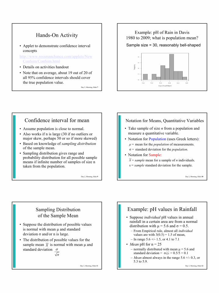
Example: pH of Rain in Davis1980 to 2009; what is population mean?Sample size = 30, reasonably bell-shaped
Day 2, Morning, Slide 9
Confidence interval for mean• Assume population is close to normal.• Also works if n is large (30 if no outliers or
major skew, perhaps 50 or so if more skewed)• Based on knowledge of sampling distribution
of the sample mean.• Sampling distribution gives range and
probability distribution for all possible sample means if infinite number of samples of size n taken from the population.
Day 2, Morning, Slide 10
Notation for Means, Quantitative Variables
• Take sample of size n from a population and measure a quantitative variable.
• Notation for Population (uses Greek letters):µ = mean for the population of measurements. σ = standard deviation for the population.
• Notation for Sample:= sample mean for a sample of n individuals.
s = sample standard deviation for the sample.x
Day 2, Morning, Slide 11
Sampling Distribution of the Sample Mean
• Suppose the distribution of possible values is normal with mean µ and standard deviation σ and/or n is large.
• The distribution of possible values for the sample mean is normal with mean µ and standard deviation
x
nσ
Day 2, Morning, Slide 12
Example: pH values in Rainfall• Suppose individual pH values in annual
rainfall in a certain area are from a normal distribution with µ = 5.6 and σ = 0.5. – From Empirical rule, almost all individual
values are with 3(0.5) = 1.5 of mean,– In range 5.6 +/- 1.5, or 4.1 to 7.1
• Mean pH for n = 25– normally distributed with mean µ = 5.6 and
standard deviation = σ/ = 0.5/5 = 0.1– Mean almost always in the range 5.6 +/- 0.3, or
5.3 to 5.9.
n

7.16.66.15.65.14.64.1pH
0.50.1
StDev
Comparing individual pH values with Mean pH for n=25
Mean of 25 pH values
Individual pH values
Also, from Empirical Rule, about 95% of sample means in range 5.4 to 5.8.
Day 2, Morning, Slide 14
Confidence Interval for Mean µ
• Suppose we know population s.d. σ = .5, and we have one sample mean = 5.67.
• For n = 25, 95% of the time is within 2(.1) = .2 of the true mean µ.
• If this is one of those times, then we know µ and are no more than 0.2 apart.
• So, we guess that µ is in the interval 5.67 ± .2 or 5.47 to 5.87.
• We have just found a 95% confidence interval for µ.
xx
x
Day 2, Morning, Slide 15
Student’s t-Distribution:Replacing σ with s
If the sample size n is small, this standardized statistic will not have a normal distribution but rather a t-distribution with n – 1 degrees of freedom (df).
Dilemma: we generally don’t know σ. Using s we have:
( )/
x n xtss n
µ µ− −= =
Day 2, Morning, Slide 16
General Formula, C.I. for a Mean
* sx tn
± ×
Explanation of the pieces:= sample mean
t* = value from “t distribution”s = sample standard deviation
x
Day 2, Morning, Slide 17
Finding the t-multiplier• R Commander:
Distributions → Continuous distributions → t distribution → t quantiles– Probabilities: For 95% C.I., use .025– Degrees of freedom = n – 1– Lower tail– Gives negative of the t-multiplier– Ex: .025, 25, lower tail → −2.059539,
multiplier ≈ 2.06
Day 2, Morning, Slide 18
Using R Commander to find a confidence interval for a mean directly
• R Commander links tests and confidence intervals.Statistics → Means → Single sample t-test
• Give desired confidence level (most common is .95, but sometimes use .90 or .99)
• Ignore remaining options for now (they are for hypothesis tests).
Day 2, Morning, Slide 19
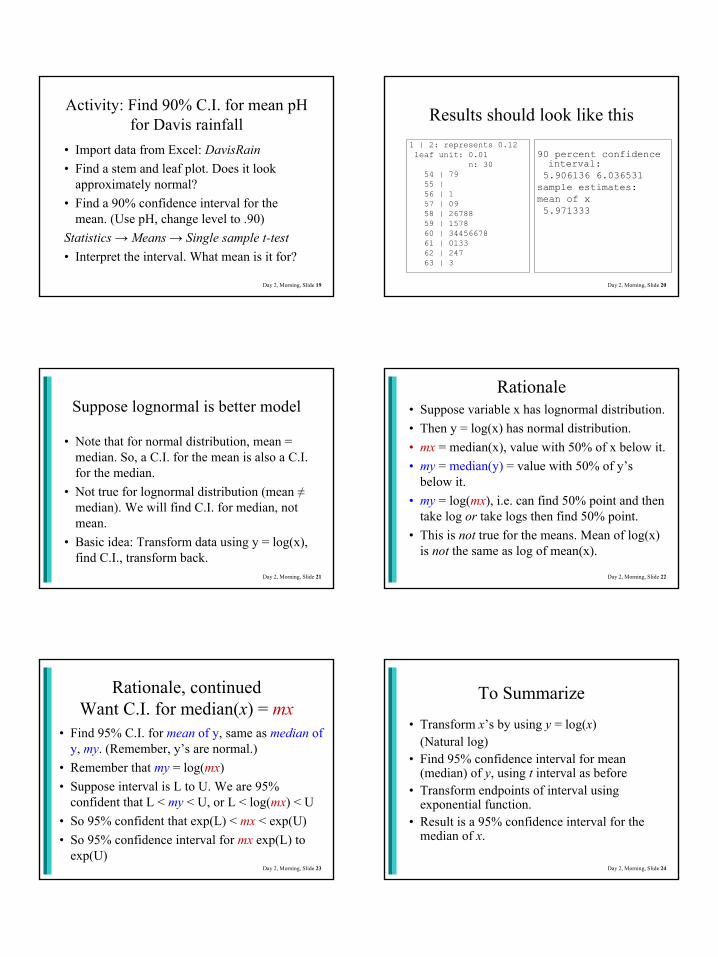
Activity: Find 90% C.I. for mean pH for Davis rainfall
• Import data from Excel: DavisRain• Find a stem and leaf plot. Does it look
approximately normal?• Find a 90% confidence interval for the
mean. (Use pH, change level to .90)Statistics → Means → Single sample t-test• Interpret the interval. What mean is it for?
Day 2, Morning, Slide 20
Results should look like this1 | 2: represents 0.12leaf unit: 0.01
n: 3054 | 7955 | 56 | 157 | 0958 | 2678859 | 157860 | 3445667861 | 013362 | 24763 | 3
90 percent confidence interval:5.906136 6.036531
sample estimates:mean of x 5.971333
Day 2, Morning, Slide 21
Suppose lognormal is better model
• Note that for normal distribution, mean = median. So, a C.I. for the mean is also a C.I. for the median.
• Not true for lognormal distribution (mean ≠median). We will find C.I. for median, not mean.
• Basic idea: Transform data using y = log(x), find C.I., transform back.
Day 2, Morning, Slide 22
Rationale• Suppose variable x has lognormal distribution. • Then y = log(x) has normal distribution.• mx = median(x), value with 50% of x below it.• my = median(y) = value with 50% of y’s
below it. • my = log(mx), i.e. can find 50% point and then
take log or take logs then find 50% point.• This is not true for the means. Mean of log(x)
is not the same as log of mean(x).
Day 2, Morning, Slide 23
Rationale, continuedWant C.I. for median(x) = mx
• Find 95% C.I. for mean of y, same as median of y, my. (Remember, y’s are normal.)
• Remember that my = log(mx)• Suppose interval is L to U. We are 95%
confident that L < my < U, or L < log(mx) < U• So 95% confident that exp(L) < mx < exp(U)• So 95% confidence interval for mx exp(L) to
exp(U)Day 2, Morning, Slide 24
To Summarize
• Transform x’s by using y = log(x) (Natural log)
• Find 95% confidence interval for mean (median) of y, using t interval as before
• Transform endpoints of interval using exponential function.
• Result is a 95% confidence interval for the median of x.

Day 2, Morning, Slide 25
Activity: Benzene data• Import data from Excel: Benzene• Look at histogram to see right skewed.• Create new variable, logBenzData → Manage variables in → Compute new...
logBenz is created as log(Benzene)• Find 95% confidence interval for mean of
logBenz. Should get 4.29842 to 5.85981• Use calculator to find exp(4.29842) to
exp(5.85981) is 73.583 to 350.658
Day 2, Morning, Slide 26
Benzene example, continued
• 95% confidence interval for population median benzene is 73.583 to 350.658.
• If we had used normal model assumption on original benzene data, 95% confidence interval for the mean would be 133.9483 to 520.0267.
• Remember that mean is 327, median is 190, so they are very different.
Day 2, Morning, Slide 27
Activity• Import the Saddle River data from Excel file.• Investigate the shape of the “Flow” variable.• Compare the sample mean and sample median.• Get a 95% confidence interval for the mean.• Transform and get a 95% confidence interval for
the median that way.• Results: C.I. for mean: (1447.787, 1906.644)
C.I. for median: exp(7.134264, 7.413504), which is (1254.21, 1658.23)
Day 2, Morning, Slide 28
Prediction Interval
• A prediction interval is an interval predicted to include a new observation from the same population with specified probability.
• Example: A 90% confidence interval for the mean pH for Davis rainfall is 5.91 to 6.04.
• What interval do we predict 90% of future individual values to fall in, assuming the past and future represent the same population?
Day 2, Morning, Slide 29
Nonparametric Prediction Interval
• Suppose there are 30 observations. What is the probability that a new, 31st observation, will fall between the minimum and maximum of the first 30 observations?
• Probability that the 31st observation will be the largest is 1/31. Similarly, probability that it will be the smallest is 1/31. So probability that it will not be largest or smallest is 29/31.
• Thus, the interval (min to max) is a 29/31 or 93.5% prediction interval.
Day 2, Morning, Slide 30
Nonparametric P.I., continued• In general, if there are n observations, then (min to
max) is a (n – 1)/(n + 1) prediction interval.• Reasoning can be extended. For a (1 – α) P.I., find c
= (α/2)(n + 1). Then the interval is the the c-th smallest to c-th largest observation.
• Ex: 90%, α = .10. For n = 30, c = (.05)(31) = 1.55. Interpolate, or roughly, use 1.5th smallest and largest.
• Davis pH data: Lower end, halfway between 1st and 2nd smallest (5.47+5.49)/2=5.48. Upper end, halfway between 6.27 and 6.33, or 6.30.

Hands-On Activity
• Find a 90% prediction interval for a new value based on the San Francisco effluent nickel data.
• There are 39 observations• Lowest 3 observations are 1.9, 2.0, 2.1• Highest 3 observations are 3.7, 3.9, 4.4
Day 2, Morning, Slide 31 Day 2, Morning, Slide 32
Parametric P.I., assuming normal
• If we knew µ and σ, then 95% P.I would be about µ ± 2σ.
• More complicated otherwise.– Because of estimating µ, need to add same
variability we use to get C.I. for µ .– Because of estimating σ, need to use t* as
multiplier instead of 2.
Day 2, Morning, Slide 33
Parametric P.I., continued
Prediction interval is1* 1x t sn
± +
where t* is chosen so the area above it is α/2 in a t-distribution with degrees of freedom = n – 1. There is no easy way to do this in R Commander, but see next slide.
Day 2, Morning, Slide 34
Using C.I. to find P.I.
Recall, a confidence interval is Prediction interval is
1 1* 1 * * 1n sx t s x t s x t nn n n
+± + ⇒ ± ⇒ ± +
So if you have a C.I. for µ:• Find the “half-width” (part after the ± sign)• Multiply it by to get half-width for P.I.• Add and subtract that half-width to
1n +x
* sx tn
±
Day 2, Morning, Slide 35
Davis pH Example• R Commander gave 90 percent confidence
interval as 5.906136 to 6.036531and mean of x as 5.971333.
• From these, easy to see half-width is .0652.•• So a 90% P.I. is 5.971 ± .363 or 5.608, 6.334• Nonparametric version was 5.55 to 6.30.• Note that P.I. is much wider than C.I for mean.
(.0652) 31 .3630=
Day 2, Morning, Slide 36
Basics of Hypothesis Testing

Day 2, Morning, Slide 37
Basic Steps for Testing Hypotheses
1. Determine the null hypothesis and the alternative hypothesis.
2. Collect data and summarize with a single number called a test statistic.
3. Determine how unlikely test statistic would be if null hypothesis were true.
4. Make a statistical decision.5. Make a conclusion in context.
Day 2, Morning, Slide 38
Step 1. Determine the hypotheses.
• Null hypothesis—hypothesis that says nothing is happening, status quo, no relationship, chance only, parameter equals a specific value (called “null value”).
• Alternative (research) hypothesis —hypothesis is usually the reason data being collected; researcher suspects status quo belief is incorrect or that there is a relationship or change, or that the “null value” is not correct.
Day 2, Morning, Slide 39
Class Input and DiscussionShare examples of hypothesis testing situations for your job:
• What was the question of interest?• What were the null and alternative
hypotheses?• What kind of data did you have
available to make a decision?
Day 2, Morning, Slide 40
Example (analogy): A Jury TrialIf on a jury, must presume defendant is innocent unless enough evidence to conclude is guilty.
Null hypothesis: Defendant is innocent.Alternative hypothesis: Defendant is guilty.
• Trial held because prosecution believes status quo of innocence incorrect.
• Prosecution collects evidence, like researchers collect data, in hope that jurors convinced such evidence extremely unlikely if assumption of innocence were true.
Day 2, Morning, Slide 41
Step 2. Collect data and summarize with a test statistic.
Decision in hypothesis test based on single summary of data – the test statistic. Often this is a standardized version of the point estimate.
Step 3. Determine how unlikely test statistic would be if null hypothesis true.
If null hypothesis true, how likely to observe sample results of this magnitude or larger (in direction of the alternative) just by chance? … called p-value.
Day 2, Morning, Slide 42
Step 4. Make a Statistical Decision.Choice 1: p-value not small enough to convincingly
rule out chance. We cannot reject the null hypothesis as an explanation for the results. There is no statistically significant differenceor relationship evidenced by the data.
Choice 2: p-value small enough to convincingly rule out chance. We reject the null hypothesisand accept the alternative hypothesis. There is a statistically significant difference or relationship evidenced by the data.
How small is small enough? Standard is 5%, also called level of significance.
Day 2, Morning, Slide 43
What Can Go Wrong:The Two Types of Errors
Courtroom Analogy: Potential choices and errors
Choice 1: We believe we have enough evidence to conclude the defendant is guilty. Potential error: Defendant is innocent; an innocent person falsely convicted and guilty party remains free.
Choice 2: We cannot rule out that defendant is innocent, so he or she is set free without penalty.Potential error: Defendant is guilty; a criminal has been erroneously freed.
Choice 2 is usually seen as more serious.Day 2, Morning, Slide 44
Medical Analogy: False Positive vs False Negative
Tested for a disease; most tests not 100% accurate.
Choice 1: Medical practitioner thinks you have disease. Test result strong enough to be “positive” for disease.Potential error: You are healthy but told you’re diseased. Your test was a false positive.
Choice 2: Medical practitioner thinks you are healthy. Test result weak enough to be “negative” for disease.Potential error: You have disease but told you do not. Your test was a false negative.
Which is more serious? Depends on disease and consequences.
Null hypothesis: You do not have the disease.Alternative hypothesis: You have the disease.
Day 2, Morning, Slide 45
The Two Types of Errors in Testing
• Type 1 error can only be made if the null hypothesis is actually true.
• Type 2 error can only be made if the alternative hypothesis is actually true.
Day 2, Morning, Slide 46
Class Input and DiscussionIn hypothesis tests for your job:
• What are the null and alternative hypotheses?
• What would be the conclusion in context if the null hypothesis were rejected?
• What would be a Type 1 error?• What would be a Type 2 error?
Day 2, Morning, Slide 47
Probabilities Associated with Errors
• If the null hypothesis is true, probability of making a type 1 error is equal to the level of significance, usually 0.05.
• If the null hypothesis is not true, a type 1 error cannot be made.
We can only specify the conditional probability of making a type 1 error, given that the null hypothesis is true. That probability is called the level of significance, usually 0.05.
Level of Significance and Type I Errors
Day 2, Morning, Slide 48
Probabilities Associated with Errors
• A type 2 error is made if the alternative hypothesis is true, but you fail to choose it.
• A type 2 error can only be made if the alternative is true.
• The probability of doing that depends on which part of the alternative hypothesis is true, so computing the probability of making a type 2 error is not feasible unless a specific value in the alternative is specified.
Type 2 Errors

Day 2, Morning, Slide 49
Probabilities Associated with Errors
• The power of a test is the probability of making the correct decision when the alternative hypothesis is true.
• Power = 1 – P(Type 2 error)• If the population value falls close to the value
specified in null hypothesis, then it can be difficult to get enough evidence from the sample to conclusively choose the alternative hypothesis, so low power if null and truth are close.
The Power of a TestType 2 Errors and Power
Three factors that affect probability of a type 2 error1. Sample size; larger n reduces the probability of a
type 2 error without affecting the probability of a type 1 error.
2. Level of significance; larger α reduces probability of a type 2 error by increasing the probability of a type 1 error.
3. Actual value of the population parameter; (not in researcher’s control). Farther truth falls from null value (in direction of alternative), the lower the probability of a type 2 error.
Power curves, one-sided t-test for one mean; effect size = mean difference/s.d. (from Mind On Statistics)
51 Day 2, Morning, Slide 52
• If consequences of a type 1 error are very serious, then only reject null hypothesis if the p-value is very small.
• If type 2 error more serious, should be willing to reject null hypothesis with a moderately large p-value, 0.05 to 0.10.
Possible Errors and Level of Significance
In deciding whether to reject the null hypothesis consider the consequences of the two potential types of errors.
Truth, decision, errors, probabilities
Day 2, Morning, Slide 54
Real Importance versus Statistical Significance
A statistically significant relationship or difference does not necessarily mean an important one.
Whether results are statistically significant or not, it is helpful to examine a confidence interval so that you can determine the magnitude of the effect.
From width of the confidence interval, also learn how much uncertainty there was in sample results.

Day 2, Morning, Slide 55
Role of Sample Size in Statistical Significance
If the sample size is large enough, almost any null hypothesis can be rejected. There is almost always a slight relationship between two variables, or a difference between two groups, and if you collect enough data, you will find it.
Day 2, Morning, Slide 56
No Difference versus No Statistically Significant Difference
• If the sample size is too small, an important relationship or difference can go undetected.
• In that case, we would say that the powerof the test is too low.
• This is more likely to be a problem with your data than the other issue (statistical significance but not practical significance.
Day 2, Morning, Slide 57
Finding Appropriate Sample Size and/or Power
• Specify what you think the truth is for the population.
• Specify the level of significance you plan to use (usually .05)
• Specify what power you want (probability of detecting the “truth” you specified above).
• Alternatively, specify what sample size you can afford, and compute power.
Day 2, Morning, Slide 58
Resources and Example• R Commander doesn’t calculate power.• Some good links at www.statpages.org• Example (Carrie Austin): Compare mercury
in Walker Creek delta and other areas. Suppose true means and std. deviations are:
Walker Creek delta Other locations
Mean 1.6 .5Std Dev 1.1 .3
Day 2, Morning, Slide 59
Link from statpages.org to Power, sample size, for two groups and click on first entry.
http://www.dssresearch.com/toolkit/sscalc/size_a2.asp
Result (next slide): Need n = 9 in each sample.
Used level of significance = .05 and power = .90.
Walker Creek delta Other locations
Mean 1.6 .5Std Dev 1.1 .3
Day 2, Morning, Slide 60

Hands-On Activity
Instructions on Activities Handout
Day 2, Morning, Slide 61

1
Mercury in Tomales Bay
Data & Statistical Analysis for Training AcademyCarrie M. Austin, P.E.
San Francisco Bay Regional Water Board
Gambonini Mercury Mine drains to Walker Creek
Tomales Bay watershed
San Francisco Bay
Good reason to believe TomalesBay is polluted by mercury, because of Gambonini mercury mine on Walker Creek.Data set is focused on the Walker Creek delta, shown in red (red = mercury & elevated concentrations)
Several previous studies
Average surface sediment (upper 5 cm) mercuryError bars are two times the standard deviation.
3 to 5 samples per location.
Except hereand no data here
Highest sediment [mercury]
Walker Creek delta
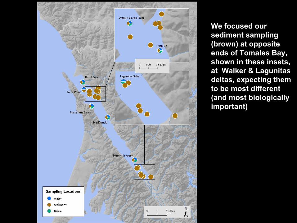
We focused our sediment sampling (brown) at opposite ends of Tomales Bay, shown in these insets, at Walker & Lagunitas deltas, expecting them to be most different (and most biologically important)
Sediment SamplingPLAN• n = 8 for each of Walker Creek delta and
Lagunitas Creek delta at head of bay, additional samples from along the bay
• Each sample composited in field from 4 locations 1 meter apart
• Each delta sample collected in replicate within 100 meters (submitted individually to lab, then average results)
REALITY• field error, n = 6, not 8, at Lagunitas

2
Lagunitas DeltaWalker DeltaOther
2.0
1.5
1.0
0.5
0.0
Mer
cury
(ug/
g, d
ry w
t)
0.15
0.73
0.11
Total mercury in sediment (2009)Walker Creek delta is obviously different, and
“other” is similar to Lagunitas Creek deltaIs the difference statistically significant?
ACTIVITYCompare total mercury in sediment from Walker
Creek delta to “other” and “Lagunitas Creek delta” sites combined
• Load Walker Creek dataset • Recode Location so there is only “Walker delta” & “other”Data → Manage variables in active... → Recode...Click “Location” → New variable name (e.g. AllOther) →Recode directives: "Lagunitas delta" = "other"• Do boxplots of mercury, by groups using “AllOther”• Do independent sample t-test to compare mercury; look at
CI for difference.• Create new variable: log(mercury) and repeat.

Mercury in Tomales Bay
Data & Statistical Analysis for Training AcademyCarrie M. Austin, P.E.
San Francisco Bay Regional Water Board

Gambonini Mercury Mine drains to Walker Creek
Tomales Bay watershed
San Francisco Bay
Good reason to believe TomalesBay is polluted by mercury, because of Gambonini mercury mine on Walker Creek.Data set is focused on the Walker Creek delta, shown in red (red = mercury & elevated concentrations)

Several previous studies

Average surface sediment (upper 5 cm) mercuryError bars are two times the standard deviation.
3 to 5 samples per location.
Except hereand no data here
Highest sediment [mercury]
Walker Creek delta
We focused our sediment sampling (brown) at opposite ends of Tomales Bay, shown in these insets, at Walker & Lagunitas deltas, expecting them to be most different (and most biologically important)

Sediment SamplingPLAN• n = 8 for each of Walker Creek delta and
Lagunitas Creek delta at head of bay, additional samples from along the bay
• Each sample composited in field from 4 locations 1 meter apart
• Each delta sample collected in replicate within 100 meters (submitted individually to lab, then average results)
REALITY• field error, n = 6, not 8, at Lagunitas

Lagunitas DeltaWalker DeltaOther
2.0
1.5
1.0
0.5
0.0
Mer
cury
(ug/
g, d
ry w
t)
0.15
0.73
0.11
Total mercury in sediment (2009)Walker Creek delta is obviously different, and
“other” is similar to Lagunitas Creek deltaIs the difference statistically significant?

ACTIVITY:Compare total mercury in sediment from Walker Creek
delta to “other” and “Lagunitas Creek delta” sites combined
• Import dataset (comma separators):www.ics.uci.edu/~jutts/data/WalkerDelta.txt• Recode variables, give new name, use
“Lagunitas Delta” = “other”• Do boxplots (by groups) of mercury• Do independent sample t-test to compare
mercury; look at CI for difference.• Create new variable: log(mercury) and repeat.

1
Nonparametric Tests
Day 3, Morning
2
Reminder: Parametric and Nonparametric Procedures
• Parametric methods (bit of a misnomer):– Based on assuming a particular underlying population
distribution, usually “normal.”– Can sometimes be used even without that assumption, for
large samples.
• Nonparametric methods: – Can be used without assuming a distribution.– Often not as “powerful” as parametric methods.
• When in doubt, safer to use nonparametric method
3
Review of Parametric Inference Procedures• One sample t-test and confidence interval:
– Estimate and test mean of one population– Example: Is pH for Davis rainfall 5.6? Get C.I.
• Paired t-test and confidence interval:– Estimate and test mean of differences for pairs– Example: Pilots sober and with alcohol
• Independent samples t-test:– Are the means of two populations equal? If not, what
is a confidence interval for the difference?– Example: Dolomite vs limestone wells– Example: Mercury concentration in Tomales Bay
4
Sign Test: One Sample or Paired Data Example: Pilot and alcohol data. Are population
differences equally likely to be positive or negative? Or more likely to be positive?
5
Five Steps in Hypothesis Test
Step 1: Null and alternative hypothesesTwo ways to state these: 1. One sample or sample of differences, want to test
specific value for the population median M. Null: H0: M = M0
Alternative: Ha: M > M0 or Ha: M < M0 or Ha: M ≠ M0
2. Matched Pairs (X, Y)H0: P(X > Y) = .5 [X equally likely to be > or < Y]Ha: P(X > Y) > .5 or Ha: P(X > Y) < .5 or Ha: P(X > Y) ≠ 5
6
Example: No alcohol > Alcohol?
Step 1: Null and alternative hypothesesVersion 1: Is the median population difference 0, or is it greater than 0?
H0: M = 0Ha: M > 0
Version 2: Is P(No alcohol > Alcohol) = .5, or is it greater than .5, so No alcohol values are larger?
H0: P(X > Y) = .5 Ha: P(X > Y) > .5

7
Step 2: Test statistic (no data conditions needed)
S+ = Number of observations greater than M0or Number of observations with x > y
S− = Number of observations less than M0or Number of observations with x < y
Ties are not used, so use n = S+ + S−.Ex: There were 2 negative differences and 1
zero difference, so S+ = 7, S− = 2, n = 9.Is that convincing evidence that in population
No alcohol values > alcohol values?
8
Step 3: Finding the p-valueRemember, p-value is:• Probability of observing a test statistic as
large as or larger than that observed • in the direction that supports Ha
• if the null hypothesis is true.Example: For n = 9, what is the probability of
observing 7 or more positive differences, if in fact probability is ½ for each pair?
Analogy: Same as probability of 7 or more heads in 9 flips of a fair coin!
9
Properties of a Binomial Experiment1. There are n "trials" where n is determined in advance.
(Sign test: n pairs or single data points)2. There are the same two possible outcomes on each trial,
called "success" and "failure" and denoted S and F. (Sign test: “Success” is X > Y, “Failure” is X < Y)
3. The outcomes are independent from one trial to the next. Knowledge of one does not help predict the next one. (Sign test: Data points or pairs are independent)
4. The probability of a "success" remains the same from one trial to the next, and this probability is denoted by p. The probability of a "failure" is 1− p for every trial. (Sign test, under the null p = .5.)
10
P-value for the sign test, rationale
• For a binomial experiment, if S+ = number of successes, then for k = 0, 1, ..., n
• When p = .5, this becomes
• But we want P(S+ or more successes)
!Pr( ) (1 )!( )!
k n knS k p pk n k
+ −= = −−
!Pr( ) (.5)!( )!
nnS kk n k
+ = =−
11
Sign Test p-value
Let B = binomial with n trials and p = .5.Ha: “greater than” → p-value = P(B ≥ S+)Ha: “less than” → p-value = P(B ≤ S+)Ha: “not equal” → p-value =
2 × [smaller of P(B ≤ S+) and P(B ≥ S+)]Alcohol Example: “Greater than” so p-value = P(B ≥ S+) = P(B is 7, 8 or 9) = .0195
12
Finding Sign Test p-value
R Commander:Distributions → Discrete distributions → Binomial distribution → Binomial tail probabilitiesFill in boxes:Variable value(s): Fill in S+ (Ex: 7)Binomial trials: Fill in n (Ex: 9)Probability of success: Leave default of .5Click radio button “lower tail” or “upper tail.”

13
Hands-On Activity: To be given in class
Sign test for atrazine concentrations.Results shown in class.
14
Nonparametric test for independent samples: Two-sample Wilcoxon
• Other names are Wilcoxon rank sum test and Mann-Whitney test.
• Assume two populations have approximately the same shape, but shape is not specified.
• Null hypothesis: Centered at same value (so the two distributions are the same)
• Alternative hypothesis: One distribution is shifted to the right (or left) of the other. (One-sided test specifies which direction.)
15
Picture (From Statistical Ideas and Methods, Utts and Heckard)
16
Wilcoxon test, rationale and method• Assign ranks to all of the observations in both
samples, with 1 = smallest, 2 = next, ... to NT largest, where NT = n1 + n2
• For ties, use average rank.• Test statistic W = Sum of ranks for Sample 1
(sometimes subtract minimum it could be).• The sum of all numbers from 1 to NT is
• The smallest W could be is if Sample 1 values are allsmaller then Sample 2 values, then W =
( 1)2
T TN N +
1 1( 1)2
n n +
17
Wilcoxon test rationale, continued• Remember, test statistic W = Sum of ranks for
sample 1, but sometimes use:(Sum of ranks for Sample 1) –
• Suppose H0 is true. Then W should be close to the proportion n1/ NT of sum of all possible ranks, or
• P-value complicated, but R commander finds it.
1 1( 1)2
n n +
1 1( 1) ( 1)2 2
T T T
T
n N N n NN
+ +× =
Example: Walker Creek Delta mercuryStep 1: H0: Mercury values for Walker Creek Delta and “other” have same distribution.Ha: Distribution of mercury values for Walker Creek Delta is shifted to the right compared to “other”Sum of all ranks (1 to 19): If H0 true:
Step 2: Compute W = ranks of values in blue
= sum of 1 to 10 + 12.5 = 67.5.Minimum possible is sum of 1 to 11 = 66, so alternative version is to use W = 67.5 – 66 = 1.5
0.056
0.069
0.072
0.087
0.095
0.13
0.15
0.16
0.21
0.22
0.38
0.62
0.62
0.67
0.68
0.78
1.4
1.4
1.6
1
2
3
4
5
6
7
8
9
10
11
12.5
12.5
14
15
16
17.5
17.5
19
11W 190 11019
≈ × =19(19 1) 190
2+
=

19
R CommanderStatistics → Nonparametric tests → Two-sample Wilcoxon testChoose variables, specify alternative.Results for the example:
data: Mercury by WalkerOther W = 1.5, p-value = 0.0002592alternative hypothesis: true location shift is less than 0
Since p-value is so small, reject null hypothesis. Conclude mercury levels are higher in Walker Creek delta. (Note: t-test gave p-value of .0008)
20
Hands-On Activity: To be given in class
Simulation comparing t-test and Wilcoxon test for skewed (log normal) data
21
Dealing with Non-detects
22
Left Censored Data = Non-detects
• Non-detects occur when the actual value is below the detection limit of the measuring instrument. They are recorded as < dl, where dl = detection limit.
• Special case of “censored data.”• Simple methods include replacing all non-
with a fixed value. Commonly used values are 0, dl/2, dl.
• Simulation studies have shown that this is not a good idea.
23
Robust Probability Plot Method
• Construct a “probability plot” using data above the reporting limit.
• Use regression to extrapolate what the values would be below the reporting limit.
• Use those values to find summary statistics.• See pictures on next slide, from Helsel and
Hirsch.

25
RPcalc• Written by Steven Saiz to accompany new
regulatory procedures in the CA Ocean Plan to determine if a discharge has the "reasonable potential" to exceed a water quality standard.
• Download it at:http://www.waterboards.ca.gov/water_issues/program
s/ocean/docs/oplans//rpcalc.zip• The program will estimate summary statistics and
calculate the upper tolerance bound even if there are non-detects in the data.
• Uses the robust probability plot method to handle non-detects.
26
Demonstration and Example of Using RPcalc
• Lead data from San Francisco, from Steve Saiz
• Has non-detects with different detection limits

1
More about Regression*
Day 3, Afternoon
*Some of these power point slides are courtesy of Brooks-Cole, accompanying Mind On Statistics by Utts & Heckard.
2
Making Inferences1. Does the observed relationship in a sample
also occur in the population? 2. For a linear relationship, what is the slope of the
regression line in the population?3. What is the mean value of the response
variable (y) for cases with a specific value of the explanatory variable (x)?
4. What interval of values predicts an individual value of the response variable (y) for a case with a specific value of the explanatory variable (x)?
3
Sample and Population Regression Models• If the sample represents a larger population,
we need to distinguish between the regression line for the sample and the regression line for the population.
• The observed data can be used to determine the regression line for the sample, but the regression line for the population can only be imagined.
4
Regression Line for the Sample
is spoken as “y-hat,” and it is also referred to either as predicted y or estimated y.
b0 is the intercept of the straight line. The intercept is the value of y when x = 0.
b1 is the slope of the straight line. The slope tells us how much of an increase (or decrease) there is for the y variable when the x variable increases by one unit. The sign of the slope tells us whether y increases or decreases when x increases.
xbby 10ˆ +=
y
5
Deviations from the Regression Line in the Sample
For an observation yi in the sample, the residual is:
= value of response variable for ith obs., where xi is the value of the
explanatory variable for the observation.
iii yye ˆ−=
xbby 10ˆ +=iy
6
Example: Height and handspans of studentsData: Heights (in inches) and Handspans
(in centimeters) of 167 college students.
Regression equation: Handspan = -3 + 0.35 Height
Slope = 0.35 => Handspan increases by 0.35 cm, on average, for each increase of 1 inch in height.

7
Example, continuedConsider a person 70 inches tall
whose handspan is 23 centimeters. xy 35.03ˆ +−=The sample regression line is
so cm for this person.
The residual =observed y – predicted y = 23 – 21.5 = 1.5 cm.
5.21)70(35.03ˆ =+−=y
8
Regression Line for the Population
E(Y) represents the mean or expected value of y for cases in the population that all have the same x.
β0 is the intercept of the straight line in the population.β1 is the slope of the straight line in the population.
Note that if the population slope were 0, there is no linear relationship in the population.
These population parameters are estimated using the corresponding statistics.
( ) xYE 10 ββ +=
9
Assumptions about Deviations
1. Assume the general size of the deviations of y values from the line is the same for all values of the explanatory variable (x) – called the constant variance assumption.
2. For any x, the distribution of y values is normal
=> Deviations from the population regression line have a normal distribution.(This can be relaxed if n is large)
10
Simple Regression Model for a Population
y = Mean + Deviation
1. Mean in the population is the line E(Y ) = β0 + β1x if the relationship is linear.
2. Individual case’s deviation = y − mean, which is what is left unexplained after accounting for the mean y value at that case’s x value.
11
Estimating the Standard Deviation around the LineThe standard deviation for regression measures …• roughly, the average deviation of y values from
the mean (the regression line). • the general size of the residuals.
( )2
ˆ2
2Residuals Squared of Sum
2
−−
=−
=
−=
∑n
yynSSE
ns
ii
12
Example: Height and WeightData: x = heights (in inches)y = weight (pounds) of n = 43 male students.
Standard deviation s = 24.00 (pounds): Roughly measures, for any given height, the general size of the deviations of individual weights from the mean weight for the height.

13
Proportion of Variation ExplainedSquared correlation r2 is between 0 and 1 and indicates the proportion of variation in the response explained by x.SSTO = sum of squares total = sum of squared differences between observed y values and .
SSE = sum of squared errors (residuals) = sum of squared differences between observed y values and predicted values based on least squares line.
SSTOSSESSTOr −
=2
y
14
Example: Height and Weight, continued
R-Sq = 32.3% =>The variable height explains 32.3% of the variation in the weights of college men.
15
Example: Driver Age and MaximumLegibility Distance of Highway SignsStudy to examine relationship between age and maximum distance at which drivers can read a newly designed sign.
Average Distance = 577 – 3.01 × Age16
Example: Age and Distance, continueds = 49.76 and R-sq = 64.2% => Average distance from regression line is about 50 feet, and 64.2% of the variation in sign reading distances is explained by age.
642.193667
69334193667
2
=−
=
−=
SSTOSSESSTOr
SSE = 69334SSTO = 193667
76.4928
693342
==
−=
nSSEs
17
Hands-On Activity: To be given in class
Applet to try to find least squares line (maximize R2 and minimize MSE =
SSE/n – 2)http://onlinestatbook.com/stat_sim/reg
_by_eye/index.html18
Inference About Linear Regression Relationship
The statistical significance of a linear relationship can be evaluated by testing whether or not the slope is 0.
H0: β1 = 0 (the population slope is 0, so y and x are not linearly related.)
Ha: β1 ≠ 0 (the population slope is not 0, so y and x are linearly related.)
Alternative may be one-sided or two-sided.

19
Test for Zero Slope
Under the null hypothesis, this t statistic follows a t-distribution with df = n – 2.
( )1
1
..0
error Standard valueNullstatistic Sample
besbt −
=−
=
x
y
ss
rb =1
( )( ) 2
e wher..21 −
=−
=∑ n
SSEsxx
sbes
20
Example: Is pH in Davis rainfall changing over time?
21
R CommanderStatistics → Fit model → Linear regressionSpecify x (explanatory) and y (response = pH)
Residuals:Min 1Q Median 3Q Max
-0.39811 -0.09337 0.00545 0.11777 0.27777
Coefficients:Estimate Std. Error t value Pr(>|t|)
(Intercept) -25.701060 6.719198 -3.825 0.00067 ***Year 0.015880 0.003369 4.714 6.06e-05 ***---Signif. codes: 0 '***' 0.001 '**' 0.01 '*' 0.05 '.' 0.1
Residual standard error: 0.1597 on 28 degrees of freedomMultiple R-squared: 0.4424, Adjusted R-squared: 0.4225
22
Example Year and pH for Davis
H0: β1 = 0 (y and x are not linearly related.)
Ha: β1 ≠ 0 (y and x are linearly related.)
Probability is close to 0 that observed slope could be as far from 0 or farther if there is no linear relationship in population (p-value shown in box) => Appears the relationship in the sample represents a real relationship in the population. So conclude that pH actually is increasing over time.
Coefficients:Estimate Std. Error t value Pr(>|t|)
(Intercept) -25.701060 6.719198 -3.825 0.00067 ***Year 0.015880 0.003369 4.714 6.06e-05 ***
23
Confidence Interval for the Slope
A Confidence Interval for a Population Slope
where the multiplier t* is the value in a t-distribution with degrees of freedom = df = n - 2 such that the area between -t* and t* equals the desired confidence level.
( )( )∑ −
×±⇒×±2
*11
*1 ..
xx
stbbestb
24
Testing Hypotheses about the Correlation Coefficient
The statistical significance of a linear relationship can be evaluated by testing whether or not thecorrelation between x and y in the population is 0.
H0: ρ = 0 (x and y are not correlated.)
Ha: ρ ≠ 0 (x and y are correlated.)
where ρ represents the population correlation
Results for this test will be the same as for the test of whether or not the population slope is 0.

25
Effect of Sample Size on Significance
With very large sample sizes, weak relationships with low correlation values
can be statistically significant.
Moral: With a large sample size, saying two variables are significantly related may only mean the correlation is not precisely 0.
We should carefully examine the observed strength of the relationship, the value of r.
26
Predicting for an Individual
A 95% prediction interval estimates the value of yfor an individual case with a particular value of x. This interval can be interpreted in two equivalent ways:
1. It estimates the central 95% of the values of y for cases in a population with specified value of x.
2. Probability is .95 that a randomly selected case from population with a specified value of x falls into the 95% prediction interval.
27
R Commander: Storing residuals and predicted values
Models → Add observation statistics to data →Check “fitted values” and “residuals” to store these in the data set.Histogram of residuals for pH example:
28
Prediction Interval
Note:• t* found from t-distribution with df = n – 2.
• Width of interval depends upon how far the specified x value is from (the further, the wider).
• When n is large, s.e.(fit) will be small, and prediction interval will be approximately …
( ) ( )( )∑ −−
+= 2
21.. wherexx
xxn
sfitesi
( )[ ]22* ..ˆ fitessty +±
x
*y t s±
29
Estimating the Mean at given x
A 95% confidence interval for the mean estimates the mean value of the response variable y, E(Y), for (all) cases with a particular value of x.
( ) ( )( )∑ −−
+= 2
21.. wherexx
xxn
sfitesi
( )fitesty ..ˆ * ×±
t* found from t-distribution with df = n – 2.
30
Checking Conditions for Regression Inference
Conditions:1. Form of the equation that links the mean value of y to x
must be correct.2. No extreme outliers that influence the results unduly.3. Standard deviation of values of y from the mean y is same
regardless of value of x. 4. For cases in the population with same value of x, the
distribution of y is a normal distribution. Equivalently, the distribution of deviations from the mean value of y is a normal distribution. This can be relaxed if the n is large.
5. Observations in the sample are independent of each other.

31
Hands-On Activity: To be given in class
How outliers influence regression http://illuminations.nctm.org/Lesson
Detail.aspx?ID=L455
32
Checking Conditions with PlotsConditions 1, 2 and 3 checked using two plots:
Scatterplot of y versus x for the sampleScatterplot of the residuals versus x for the sample
If Condition 1 holds for a linear relationship, then:Plot of y versus x should show points randomly scattered around an imaginary straight line. Plot of residuals versus x should show points randomly scattered around a horizontal line at residual 0.
If Condition 2 holds, extreme outliers should not be evident in either plot.
If Condition 3 holds, neither plot should show increasing or decreasing spread in the points as x increases.
33
Example: Residuals vs Year for pH
Residual plot:Is a somewhat random-looking blob of points => linear model ok.A few possible outliers?Spread looks somewhat constant across years.
34
Conditions 4 and 5
Condition 4: examine histogram or normal probability plot of the residuals
Histogram:Residuals are approximately normally distributed
Condition 5: follows from the data collection process. Units must be measured independently. Is pH of rainfall across years independent?? Perhaps consider time series models.
35
When Conditions Are Not MetCondition 1 not met: use a more complicated model
Based on this residual plot, a curvilinear model, such as the quadratic model, may be more appropriate.
36
When Conditions Are Not MetCondition 2 not met: if outlier(s), correction depends
on the reason for the outlier(s)
Outlier is legitimate. Relationship appears to change for body weights over 210 pounds. Could remove outlier and use the linear regression relationship only for body weights under about 210 pounds.
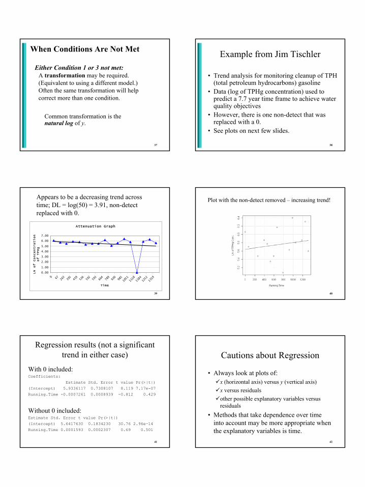
37
When Conditions Are Not Met
Either Condition 1 or 3 not met:A transformation may be required. (Equivalent to using a different model.) Often the same transformation will help correct more than one condition.
Common transformation is the natural log of y.
38
Example from Jim Tischler
• Trend analysis for monitoring cleanup of TPH (total petroleum hydrocarbons) gasoline
• Data (log of TPHg concentration) used to predict a 7.7 year time frame to achieve water quality objectives
• However, there is one non-detect that was replaced with a 0.
• See plots on next few slides.
39
Attenuation Graph
0.00
1.00
2.00
3.00
4.00
5.00
6.00
7.00
0 67 263
395
459
526
592
593
664
789
920
985
1051
1118
1184
1252
1319
Time
LN of Concentration
of TPHg
Appears to be a decreasing trend across time; DL = log(50) = 3.91, non-detect replaced with 0.
40
Plot with the non-detect removed – increasing trend!
41
Regression results (not a significant trend in either case)
With 0 included:Coefficients:
Estimate Std. Error t value Pr(>|t|) (Intercept) 5.9336117 0.7308107 8.119 7.17e-07 Running.Time -0.0007261 0.0008939 -0.812 0.429
Without 0 included:Estimate Std. Error t value Pr(>|t|) (Intercept) 5.6417630 0.1834230 30.76 2.96e-14Running.Time 0.0001593 0.0002307 0.69 0.501
42
Cautions about Regression
• Always look at plots of: x (horizontal axis) versus y (vertical axis)x versus residualsother possible explanatory variables versus residuals
• Methods that take dependence over time into account may be more appropriate when the explanatory variables is time.

43
Debriefing: Suggestions for future offerings of the course
![Solar Geyser Brochure2011[1]](https://static.fdocuments.in/doc/165x107/577d21871a28ab4e1e956e68/solar-geyser-brochure20111.jpg)