The Awards...48 Best visual identity from the financial services sector ... copywriting, editing,...
64
Transcript of The Awards...48 Best visual identity from the financial services sector ... copywriting, editing,...


3
Many of the brand transformations the Transform Awards has recognised recently have focused on the regeneration of a brand for a modern audience, for digital communications or for a changed sector. This year, what stands out are the many rebrands that are focusing on a company’s heritage in a newly-imagined way. Those that have succeeded at this year’s awards are those that have made their history relevant to the modern business.
The best example is British Steel, tonight’s Grand Prix winner, which not only reimagines a historic brand, but regenerates a historic industry in England’s north east. Judge’s darling, Selwyn’s, puts its heritage literally on the package, to great success. Growth Rings, a company that makes furniture from trees with historic significance, puts history into its brand and into its product in a unique way. NatWest revives an old favourite to make a new statement with its visual identity. And Lenovo Moto’s focus on the revival of Motorola’s beloved logo complements a vivid brand that challenges sector norms and wins this year’s ‘Best overall visual identity’ prize.
It has been a joy to see these organisations change not only their own strategies, but their sectors and their audiences in the pursuit of excellence in communications and rebranding. Each brand here tonight is truly deserving of being called the best in brand development. Congratulations to all the winners and nominees of this year’s Transform Awards Europe!
Brittany GolobEditor, Transform magazine
04 Meet the judges10 The winners
The Awards
Content
13 Best use of a visual property 14 Best brand architecture solution16 Best use of copy style/tone of voice 17 Best brand experience18 Best use of packaging21 Best wayfinding or signage22 Best use of audio branding23 Best use of typography25 Best place or nation brand
Process
26 Best internal communications during a brand development project28 Best implementation of a brand development project30 Best implementation of a brand development project across multiple markets
Strategy
32 Best creative strategy33 Best brand evolution34 Best strategic/creative development of a new brand 35 Best development of a new brand within an existing brand portfolio36 Best naming strategy
Type
37 Best corporate rebrand following a merger or an acquisition39 Best brand development project to reflect changed mission/values/positioning40 Best brand consolidation41 Best rebrand of a digital property
Sector
43 Best visual identity from the charity/NGO/non-profit sector44 Best visual identity from the education sector 45 Best visual identity from the energy and extractives sector Best visual identity from the engineering and manufacturing sector46 Best visual identity from the fast-moving consumer goods sector48 Best visual identity from the financial services sector49 Best visual identity from the food and beverage sector50 Best visual identity from the healthcare and pharmaceutical sector52 Best visual identity from the industrial and basic materials sector54 Best visual identity from the professional services sector55 Best visual identity from the property sector56 Best visual identity from the public sector Best visual identity from the retail sector58 Best visual identity from the technology, media and telecommunications sector 59 Best visual identity from the travel, leisure and tourism sector61 Best overall visual identity62 Grand Prix
ContentsWelcome
4
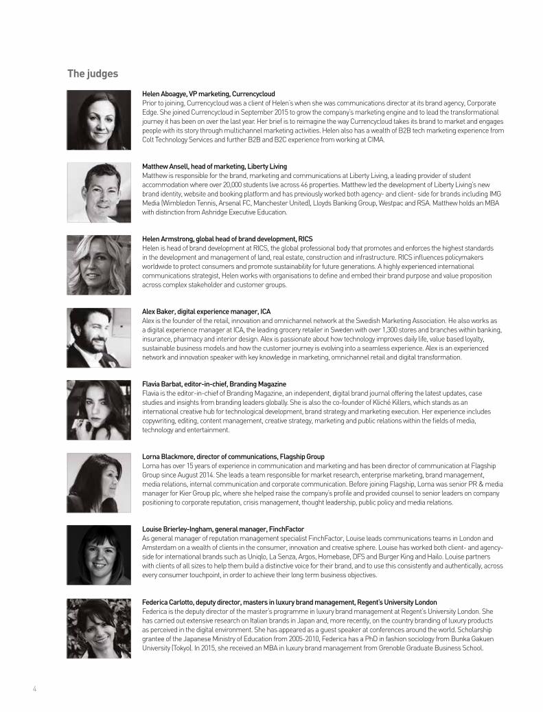
Helen Aboagye, VP marketing, CurrencycloudPrior to joining, Currencycloud was a client of Helen’s when she was communications director at its brand agency, Corporate Edge. She joined Currencycloud in September 2015 to grow the company’s marketing engine and to lead the transformational journey it has been on over the last year. Her brief is to reimagine the way Currencycloud takes its brand to market and engages people with its story through multichannel marketing activities. Helen also has a wealth of B2B tech marketing experience from Colt Technology Services and further B2B and B2C experience from working at CIMA.
Matthew Ansell, head of marketing, Liberty LivingMatthew is responsible for the brand, marketing and communications at Liberty Living, a leading provider of student accommodation where over 20,000 students live across 46 properties. Matthew led the development of Liberty Living’s new brand identity, website and booking platform and has previously worked both agency- and client- side for brands including IMG Media (Wimbledon Tennis, Arsenal FC, Manchester United), Lloyds Banking Group, Westpac and RSA. Matthew holds an MBA with distinction from Ashridge Executive Education.
Helen Armstrong, global head of brand development, RICSHelen is head of brand development at RICS, the global professional body that promotes and enforces the highest standards in the development and management of land, real estate, construction and infrastructure. RICS influences policymakers worldwide to protect consumers and promote sustainability for future generations. A highly experienced international communications strategist, Helen works with organisations to define and embed their brand purpose and value proposition across complex stakeholder and customer groups.
Alex Baker, digital experience manager, ICAAlex is the founder of the retail, innovation and omnichannel network at the Swedish Marketing Association. He also works as a digital experience manager at ICA, the leading grocery retailer in Sweden with over 1,300 stores and branches within banking, insurance, pharmacy and interior design. Alex is passionate about how technology improves daily life, value based loyalty, sustainable business models and how the customer journey is evolving into a seamless experience. Alex is an experienced network and innovation speaker with key knowledge in marketing, omnichannel retail and digital transformation.
Flavia Barbat, editor-in-chief, Branding MagazineFlavia is the editor-in-chief of Branding Magazine, an independent, digital brand journal offering the latest updates, case studies and insights from branding leaders globally. She is also the co-founder of Kliché Killers, which stands as an international creative hub for technological development, brand strategy and marketing execution. Her experience includes copywriting, editing, content management, creative strategy, marketing and public relations within the fields of media, technology and entertainment.
Lorna Blackmore, director of communications, Flagship GroupLorna has over 15 years of experience in communication and marketing and has been director of communication at Flagship Group since August 2014. She leads a team responsible for market research, enterprise marketing, brand management, media relations, internal communication and corporate communication. Before joining Flagship, Lorna was senior PR & media manager for Kier Group plc, where she helped raise the company’s profile and provided counsel to senior leaders on company positioning to corporate reputation, crisis management, thought leadership, public policy and media relations.
Louise Brierley-Ingham, general manager, FinchFactorAs general manager of reputation management specialist FinchFactor, Louise leads communications teams in London and Amsterdam on a wealth of clients in the consumer, innovation and creative sphere. Louise has worked both client- and agency-side for international brands such as Uniqlo, La Senza, Argos, Homebase, DFS and Burger King and Hailo. Louise partners with clients of all sizes to help them build a distinctive voice for their brand, and to use this consistently and authentically, across every consumer touchpoint, in order to achieve their long term business objectives.
Federica Carlotto, deputy director, masters in luxury brand management, Regent’s University LondonFederica is the deputy director of the master’s programme in luxury brand management at Regent’s University London. She has carried out extensive research on Italian brands in Japan and, more recently, on the country branding of luxury products as perceived in the digital environment. She has appeared as a guest speaker at conferences around the world. Scholarship grantee of the Japanese Ministry of Education from 2005-2010, Federica has a PhD in fashion sociology from Bunka Gakuen University (Tokyo). In 2015, she received an MBA in luxury brand management from Grenoble Graduate Business School.
The judges
Tisa Advert 2.1.2.pdf 1 17/02/2017 14:28

6
Katrin Menne, senior manager brand communication, Merck GroupBefore joining the corporate world Katrin worked as a brand strategy and management consultant for different agencies. From international blue chip to mid-size companies, she has advised clients in the healthcare, technology, service or furniture sectors. She is passionate about brands and has extensive knowledge of brand strategy, management, design and communication along with a considerable understanding of how to implement brand change. In 2014, she joined Merck to drive the revolution of its corporate brand as a leading project and communication manager.
Rachel Collins, head of marketing, Wellcome collectionRachel has worked for the Wellcome Trust for 14 years. For the past 10 years, she has led an expanding team responsible for marketing the Wellcome Collection, a museum originally expected to attract 100,000 visits a year. Before a major development project (which began in August 2013 and ended in February 2015) Wellcome Collection was attracting more than 550,000 people each year to its critically-acclaimed programme and spaces. Now, with more spaces, more rich content and a broader and more immersive visitor experience, this figure is soon likely to reach 800,000.
Rupert Daniels, global marketing director, Cambridge University PressRupert is the global marketing director for the Cambridge University Press where he is leading the development of Cambridge’s global marketing strategy and shaping the transformation of the world’s oldest publisher into a 21st century digital content brand. Rupert has over 20 years of interdisciplinary global experience in general management, sales, media rights, digital, production, branding and marketing. Prior to joining Cambridge he held senior marketing and sales positions at Arsenal Football Club, FIFA and 1GOAL.
Giles Davis, consultant, Sensible Branding LtdFormerly head of brand at Karhoo and client services director at Tribal DDB, Giles’ experience has spanned brand consultancy, copywriting, strategy and account handling in advertising, design and digital. He has worked both client side and agency side on brands global and local, most of them famous but a few of them that disappeared without trace. Whatever the project, he tries to steer brands past the sirens of jargon towards a fitting, sensible brand strategy.
Jon Hunter, head of design, Transport for LondonJon has worked at Transport for London for 10 years. Prior to that, he worked for agencies in the Midlands. He currently leads a multidisciplinary team that manages the design of all things – from the graphical world of branding strategy through to the physical delivery of uniforms, trains and stations.
Oliver Jaycock, head of marketing and strategic affairs, London Luton AirportOver the past decade, Oliver has built a successful career in aviation with a particular emphasis on the business development functions. Previously commercial manager at Cardiff Airport, Oliver now leads London Luton’s communications, marketing and rail development, with a view to creating a leading airport serving those living in London, Luton and the surrounding regions.
Naomi Jones, director of communications, SUEZNaomi joined SUEZ, one of the world’s largest water, recycling and waste management service providers, in 2008 at the age of 28. Having cut her teeth in local government public affairs and regional corporate affairs and having worked across a number of sectors from retail and banking to waste management, she became a team leader at 23. She went on to work at FTI Consulting (then FD). She is responsible for marketing and communications for the UK and Scandinavia. She is the co-author of the book ‘Managing a Crisis – A Practical Guide’ with Tom Curtin and Daniel Hayman.
Mike McNeil, head of brand strategy, Sir Robert McAlpineMike is responsible for leading brand development at major UK construction and civil engineering company Sir Robert McAlpine. Originally from an engineering background, Mike has 20 years of experience in marketing and communications. Working in a highly competitive sector, Mike understands the importance of perception and reputation.
www.rocksaltcopycreatives.com
PUT A ROCKET IN YOUR COPYWRITING
Fast turnaround content from Rocksalt Copy Creatives
Same-day delivery to meet your launch dateMission control from an expert digital copywriting team
Lift-off with copy that’s out of this world
C
M
Y
CM
MY
CY
CMY
K
Rocksalt_fullpage_Communicate_Mag_Rocket_AW.pdf 1 17/05/2016 15:47
8
Sarah Miles, director of brand, marketing and communications, io oil & gas consultingSarah is a branding and marketing leader in the energy industry with a rich and varied experience across global brands. Sarah is the director of branding and marketing at io oil & gas consulting, a joint venture between GE Oil & Gas and McDermott, where she leads the company’s brand, marketing and communications activities and has led io to multiple award wins. Prior to this, Sarah held a number of marketing directorial roles and spent more than 10 years at Shell, latterly as global head of premium fuels brands.
Lilian Prodromou, head of communications, Big Lottery FundLilian is head of communications at the Big Lottery Fund, the largest funder of communities in the UK, which each year awards 12,000 grants worth £700m raised by National Lottery players. This funding supports a wide range of projects, from grassroots community activity to large and long-term partnerships that address some of society’s most difficult social challenges. Lilian has held a number of senior communications roles over the last decade and currently oversees the fund’s media relations, awareness-raising campaigns website, brand and public-facing partnerships.
Rebecca Sinclair, VP of brand, PearsonRebecca is VP of brand at Pearson, the world’s learning company. She led the launch of the new Pearson brand, which was unveiled in January 2016, to reflect Pearson’s evolution from print publisher to digital learning company. Prior to this, Rebecca led corporate affairs for Pearson in Asia, where she was based in Singapore, and led global communications at Penguin Books. Rebecca is experienced in leading global strategic and integrated communications programmes with particular skills in branding, corporate reputation and change management.
Alain Sylvain, CEO, Sylvain LabsAlain is a brand and innovation consultant who established Sylvain Labs in 2010 to guide companies through complex business problems and identify new product and brand opportunities. He believes that by applying imagination, some science and a little whimsy, no challenge is too complex. This approach has led Sylvain Labs to lasting and growing results for clients including Google, Samsung, GM, AB InBev, Pepsico, Patagonia, Calvin Klein and others. Alain is a dedicated partner of several investment ventures, including Master + Dynamic and So Choice Softworks – a mobile gaming company.
Gemma Vallet, innovation director, PHD MediaGemma is a graduate and programme director of one of the first Master’s degrees in digital branding – from La Salle BCN University. She has worked in digital branding and marketing strategy for brands such as Abertis, Basi Group, Gucci Watches, Futbol Club Barcelona and O2 mobile across Europe. Today she is innovation director at PHD Media Spain. Vallet has a PhD in digital branding from Universitat of Barcelona, with a Master’s in e-commerce from the Business Engineering School at La Salle Universities.
Kirsten Walkom, director of global communications, Save the ChildrenNamed one of Marketing Magazine’s Top 30 Under 30 and Top 10 to Watch, Kirsten is an experienced communications and branding leader and current director of communications for Save the Children International. She aims to empower 17,000 employees across 120 countries to bring immediate and lasting change for children. Working in some of the most dangerous and difficult contexts in the world, Kirsten knows the importance of strong communication and brand leadership in helping to inspire change.
Jacqui White, marketing director, Care UKJacqui is marketing director at Care UK and held the role of head of digital and brand strategy for over three years prior. Since 2014, she has provided digital and brand support to Care UK to help drive the company’s commercial growth through brand development, design and online positioning.

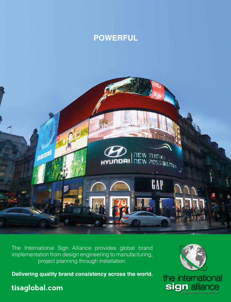
Delivering your brand from concept to reality
The Experts in Global Brand Implementation
Perfectly, precisely, professionally, anywhere in the world, thanks to our network of branding experts spanning 100+ countries.
Across five continents, brands from FedEx and Dior to Nokia and HSBC trust our award winning global branding expertise.
+44 020 704 31322 | www.glimma.com

10
Content
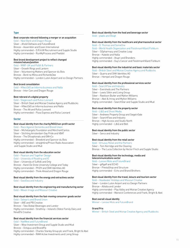
Best use of a visual propertyGold – Selwyn’s and Brand UnionSilver – Warwick Conferences and Frank, Bright & AbelBronze – Radeon Technologies Group and Brand & DeliverBronze – Renaissance Villages Ltd and me&daveHighly commended – D&AD and the Beautiful MemeHighly commended – Pearson and Together DesignHighly commended – pladis and BisqitHighly commended – University of Reading and IE
Best brand architecture solutionGold – Cranfield University and IESilver – Ascot and the ClearingBronze – Nexia International and IndustryHighly commended – JetBrains and Pajama LimitedHighly commended – Lewis Silkin and Living Group
Best use of copy style/tone of voiceGold – Argos and The PartnersSilver – Great Western Railway (GWR) and the First WordBronze – AXE and the WriterHighly commended – Growth Rings and Lantern
Best brand experienceGold – Lloyds Banking Group and M WorldwideSilver – Telenor Digital and Pajama LimitedBronze – Fitness Garage and WPA PinfoldBronze – The Athenaeum Hotel & Residences and Kinnersley Kent DesignHighly commended – Pizza Express and Rufus LeonardHighly commended – SOpharmacy and Creative Leap
Best use of packagingGold – Green’s Gluten Free Beer and WPA PinfoldGold – Selwyn’s and Brand UnionSilver – Arla Foods and ElmwoodSilver – Danone Light & Free and Dragon RougeBronze – Organic Seed and Bean company and Family (and friends) BrandingHighly commended – Border Biscuits and Coley Porter BellHighly commended – Tom Kerridge and the Clearing
Best wayfinding or signageGold – Merck and FutureBrand and VIM GroupSilver – Play Valley and Moirae Creative AgencyBronze – LB Camden and Whybrow + Atelier WorksHighly commended – Capital Partners, Turkey and Powell Allen
Best use of audio brandingGold – Premier League and MassiveMusicSilver – Josef Manner & Comp AG and WESOUNDBronze – UniCredit and ampHighly commended – Bundesagentur für Arbeit and why do birds and Kolle RebbeHighly commended – KWS SAAT SE and why do birdsHighly commended – Renault and Sixième Son
Best use of typographyGold – Race Against Dementia and Brand UnionSilver – The EXceptionals and GW+CoBronze – Pollitt & PartnersBronze – Warwick Conferences and Frank, Bright & AbelHighly commended – Rapha and Dalton MaagHighly commended – Waitrose Drinks Festival and Nalla
Best place or nation brandGold – Camden Market and Ragged EdgeBronze – National Memorial Arboretum and Business Partners London
Process
Best internal communications during a brand development projectGold – British Steel and Moirae Creative Agency and RuddocksSilver – ING Bank and Twofish and MediaMonksSilver – Merck KGaA and Ligalux, fischerAppelt and Fork Unstable MediaBronze – Pearson and Together DesignHighly commended – Lucite International and the Allotment
Best implementation of a brand development projectGold – British Steel and Moirae Creative Agency and RuddocksSilver – KNect365 an Informa business and NallaBronze – Atkins Acuity and Dragon RougeBronze – Hempel and Dragon RougeHighly commended – Warwick Conferences and Frank, Bright & Abel
Best implementation of a brand development project across multiple marketsGold – IG Design Group plc and Mattr Media, Ampersand Company and Lyons BennettSilver – Merck KGaA and Ligalux, fischerAppelt and Fork Unstable MediaBronze – Hempel and Dragon RougeHighly commended – Nexia International and IndustryHighly commended – Nokia and Global Image Management
Strategy
Best creative strategyGold – Growth Rings and LanternGold – St Andrew’s Hospice and AppetiteSilver – WWF-UK and Pollitt & PartnersBronze – SearchFlow and IndustryHighly commended – IAM RoadSmart and IndustryHighly commended – Pollitt & PartnersHighly commended – University of Reading and Bell
Best brand evolutionGold – St John Ambulance and Pollitt & PartnersSilver – British Steel and Moirae Creative Agency and RuddocksBronze – University of Reading and BellBronze – WWF-UK and Pollitt & PartnersHighly commended – Ascot and the ClearingHighly commended – Selwyn’s and Brand Union
Best strategic/creative development of a new brandGold – Octopus and BrandPieGold – Warwick Conferences and Frank, Bright & AbelSilver – Michelangelo Foundation and MerchantCantosBronze – SOpharmacy and Creative LeapHighly commended – Eleni & Chris and DewGibbons + Partners
Best development of a new brand within an existing brand portfolioSilver – Danone Light & Free and Dragon RougeBronze – Chivas Regal and Coley Porter BellHighly commended – FRANCK PROVOST and RAISON PURE
Best naming strategyGold – The EXceptionals and GW+CoSilver – AXE and the WriterSilver – Race Against Dementia and Brand UnionBronze – GivGo and Living GroupHighly commended – ISHO and Storience
The winners
11
Type
Best corporate rebrand following a merger or an acquisitionGold – Nest Bank and Dragon RougeSilver – Ahold Delhaize and FutureBrandBronze – Assemblin and Essen InternationalHighly commended – D.R.A.W Recruitment and Supple StudioHighly commended – RunMyProcess and Pixeldot
Best brand development project to reflect changed mission/values/positionGold – WWF-UK and Pollitt & PartnersSilver – Growth Rings and LanternSilver – Volunteering Matters and Spencer du BoisBronze – Bord na Móna and RichardsDeeHighly commended – London Luton Airport and ico Design Partners
Best brand consolidationGold – KNect365 an Informa business and NallaBronze – Inter Cars and Dragon Rouge
Best rebrand of a digital propertyGold – Stagecoach and Rufus LeonardSilver – British Steel and Moirae Creative Agency and RuddocksSilver – KNect365 an Informa business and NallaBronze – The AA and Rufus LeonardHighly commended – Pizza Express and Rufus Leonard
Sector
Best visual identity from the charity/NGO/non-profit sectorGold – Race Against Dementia and Brand UnionSilver – Michelangelo Foundation and MerchantCantosSilver – Stichting Amsterdam Gay Pride and VBATBronze – The EXceptionals and GW+CoHighly commended – Brewbird and Spencer du BoisHighly commended – straightline/Prison Radio Association and Supple Studio and Mud
Best visual identity from the education sectorGold – Pearson and Together DesignGold – University of Reading and IESilver – University of Suffolk and OnlyBronze – Karel De Grote University College and TodayHighly commended – PHZH and SNK Identities AGHighly commended – Think Ahead and Dragon Rouge
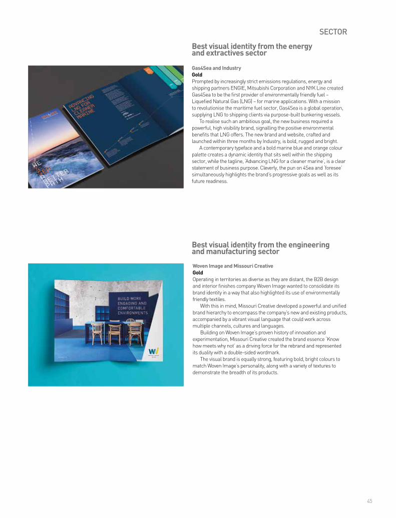
Best visual identity from the energy and extractives sectorGold – Gas4Sea and Industry
Best visual identity from the engineering and manufacturing sectorGold – Woven Image and Missouri Creative
Best visual identity from the fast-moving consumer goods sectorGold – Selwyn’s and Brand UnionSilver – AXE and PB CreativeBronze – Tata Global Beverages and LandorHighly commended – Strathroy – Ireland’s Oldest Family Dairy and Nine874 Creative
Best visual identity from the financial services sectorGold – NatWest and FutureBrandSilver – Wise Investment Group and Supple Studio and MudBronze – Octopus and BrandPieHighly commended – Charles Stanley Group plc and Frank, Bright & AbelHighly commended – RAM Active Investments and Living Group
Best visual identity from the food and beverage sectorGold – pladis and Bisqit
Best visual identity from the healthcare and pharmaceutical sectorGold – D. Thomas and SomeOneGold – World Health Organization and FleishmanHillard FishburnSilver – SOpharmacy and Creative LeapBronze – Kaleido and NallaHighly commended – Atupri and BrandersHighly commended – Guy’s Cancer and FleishmanHillard Fishburn
Best visual identity from the industrial and basic materials sectorGold – British Steel and Moirae Creative Agency and RuddocksSilver – Quarra and SNK Identities AGBronze – Hempel and Dragon Rouge
Best visual identity from the professional services sectorGold – SearchFlow and IndustrySilver – Eversheds and The PartnersSilver – Lewis Silkin and Living GroupSilver – Rawlison Butler and Mytton WilliamsBronze – Abel & Imray and Mytton WilliamsHighly commended – SearchStar and Supple Studio and Mud
Best visual identity from the property sectorGold – L&Q and Shoot MediaSilver – Andrews Property Group and Siegel+GaleSilver – SearchFlow and IndustryBronze – High Access and Studio NorthHighly commended – L&Q and Bell
Best visual identity from the public sectorSilver – Serco and Industry
Best visual identity from the retail sectorGold – Virtuous Retail and the PartnersSilver – Tom Kerridge and the ClearingBronze – The Lucia Collection by Hector Finch and Supple Studio
Best visual identity from the technology, media and telecommunications sectorGold – Lenovo Moto and FutureBrandSilver – giffgaff and ECHOBronze – PrestaShop and StructureHighly commended – Echo and Brand Brothers
Best visual identity from the travel, leisure and tourism sectorGold – Headwater Holidays and Missouri CreativeSilver – London Luton Airport and ico Design PartnersBronze – Alitalia and LandorHighly commended – Play Valley and Moirae Creative AgencyHighly commended – Warwick Conferences and Frank, Bright & Abel
Best overall visual identityWinner – Lenovo Moto and FutureBrand
Grand PrixWinner – British Steel and Moirae Creative Agency and Ruddocks
an audio brand consultancy
we givebrands athen we teach them to sing.
ivaudiobranding.com | @ivgroup | facebook.com/ivgroup
usiV LLC622 Hamilton Avenue Nashville, TN 37203p: +1.615.320.1444
euiV2 GmbHSchmickstr.18D-60314 Frankfurtfon: +49.69.99999.300.82
s t ra t e g y c o n t e n t r e s e a r c h management
13
CONTENT
Radeon Technologies Group and Brand & DeliverBronzeTo support the launch of Radeon Technologies Group’s new RX 480 graphics card, Brand & Deliver crafted a characterful campaign that positioned Radeon as a champion of the underdogs, subverting expectations to great success.
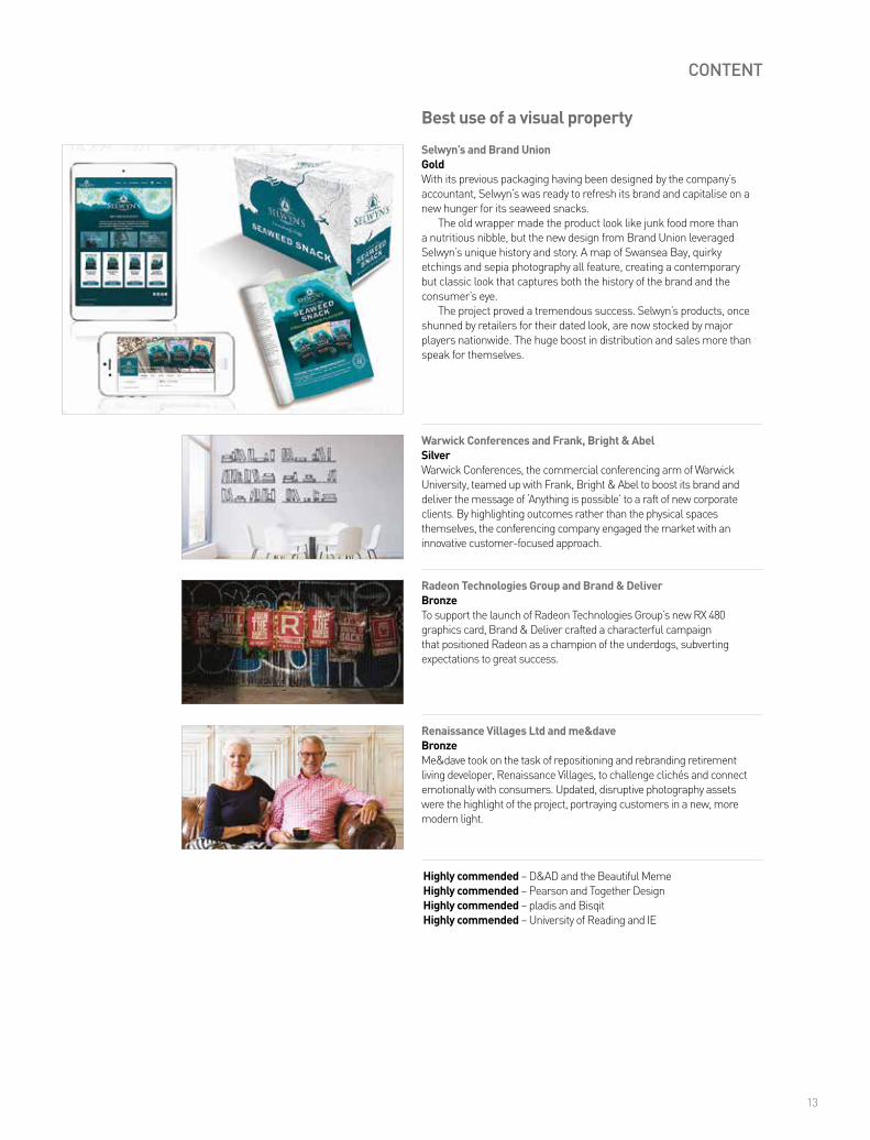
Selwyn’s and Brand UnionGoldWith its previous packaging having been designed by the company’s accountant, Selwyn’s was ready to refresh its brand and capitalise on a new hunger for its seaweed snacks.
The old wrapper made the product look like junk food more than a nutritious nibble, but the new design from Brand Union leveraged Selwyn’s unique history and story. A map of Swansea Bay, quirky etchings and sepia photography all feature, creating a contemporary but classic look that captures both the history of the brand and the consumer’s eye.
The project proved a tremendous success. Selwyn’s products, once shunned by retailers for their dated look, are now stocked by major players nationwide. The huge boost in distribution and sales more than speak for themselves.
Warwick Conferences and Frank, Bright & AbelSilverWarwick Conferences, the commercial conferencing arm of Warwick University, teamed up with Frank, Bright & Abel to boost its brand and deliver the message of ‘Anything is possible’ to a raft of new corporate clients. By highlighting outcomes rather than the physical spaces themselves, the conferencing company engaged the market with an innovative customer-focused approach.
Best use of a visual property
Highly commended – D&AD and the Beautiful MemeHighly commended – Pearson and Together DesignHighly commended – pladis and BisqitHighly commended – University of Reading and IE
Renaissance Villages Ltd and me&daveBronzeMe&dave took on the task of repositioning and rebranding retirement living developer, Renaissance Villages, to challenge clichés and connect emotionally with consumers. Updated, disruptive photography assets were the highlight of the project, portraying customers in a new, more modern light.

14
CONTENT
Nexia International and IndustryBronzeForging ahead of moves from industry rivals to consolidate under one brand, global accountancy network, Nexia worked with Industry to deliver a unifying performance and reaffirm its position as a major player in the market.
Cranfield University and IEGoldWhile Cranfield University has prospered through 70 years of organic growth, its success led to scores of separate sub-brands with disparate logos and the lack of a unified brand identity. By partnering with agency IE, the university hoped to find a united voice and become more than the sum of its parts.
IE delivered a new framework for unifying the university’s brands with a more structured architecture based around eight themes, including aerospace, energy and power and water. By engaging the heads of each theme in the process, IE and the university ensured that sub-brands fit neatly into the new architecture.
The exercise has brought clarity and vision to Cranfield’s identity, harmonising its brands into a logical system underpinned by strong thematic links. Our judges praised the partnership for taking on a huge challenge and executing the goal with aplomb, as well as the strong strategy and smooth implementation.
Ascot and the ClearingSilverAs part of a powerful repositioning exercise, Ascot, the iconic British racecourse, partnered with the Clearing to redefine the relationship between Ascot, the destination, and Royal Ascot, the racing event. The new architecture is already making an impact, reinforcing Royal Ascot as the jewel in the crown of UK racing as well as raising the stakes across the Ascot raceday calendar.
Best brand architecture solution
Highly commended – JetBrains and Pajama LimitedHighly commended – Lewis Silkin and Living Group
Creating Difference
Transformation starts with differenceEven the strongest brands need to know how they are different and have the edge over the competition.
We strengthen brands, giving them that edge. We make them work across media and across continents – so they can transform your business. Living. Creating difference.
Contact Greg Hobden on 020 7739 8899 or email [email protected] to have a chat. www.living-group.com
“ We create verbal identities aligned to core brand promise, consistency of purpose and value proposition to deliver sustainable differentiation, expression of essence and consistent execution at every customer touchpoint, reinforcing tone of voice ‘share of heart’ across time, media and geographies.”
SOUND FAMILIAR?
If your brand agency speaks like this, fire them.Then hire us.For business writing without the brand blah, call Cristina on 07715 587592 or visit thefirstword.co.uk

16
CONTENT
AXE and the WriterBronzeMen’s grooming brand AXE, popularly known as Lynx in the UK, had its audience firmly in mind with a unique tone of voice themed around male brain scans. Manly and memorable, the resonating content – developed by the Writer – was rolled out across more than 50 products.
Argos and the PartnersGoldAsked to rebrand the packaging for the Argos Simple Value range, a collection of 140 classic household products, the Partners went back to the drawing board to deliver a straight-forward but effective design featuring clear, concise copy.
Low on price, the Simple Value range is also of solid quality and great value, and that was reflected in the design. The packaging speaks for itself, with bold red packaging and attention grabbing, yet functional, type. A twist, in the form of almost slogan-like box copy, elevates the products, highlighting their ease-of-use and functionality.
The new branding easily allows customers to identify the classic versions of Argos’ popular items, while the clear-cut packaging appeals to a broad demographic. It was also a breath of fresh air to our judges, who praised the range as: “Brilliantly simple and effective – the new tone of voice gives real authenticity to the brand – simple, honest and straightforward with a twist of fun.”
Great Western Railway (GWR) and the First WordSilverFollowing its rebrand from First Great Western to Great Western Railway, GWR challenged itself to ditch the rail-speak and technical jargon and adopt a new, customer-friendly tone of voice. Instead of focusing on marketing and ad campaigns, GWR worked with the First Word to rewrite its style from the ground up, applying the rail operator’s creative approach to hundreds of day-to-day communications across the business.
Best use of copy style/tone of voice
Highly commended – Growth Rings and Lantern

17
CONTENT
The Athenaeum Hotel & Residences and Kinnersley Kent DesignBronzeOne of London’s most iconic hotels, the Athenaeum Hotel wanted to redefine its position to stay fresh and relevant in the competitive hospitality industry. A bespoke graphic identity and refreshed public spaces – crafted by Kinnersley Kent Design – including a new bar and restaurant, achieved just that.
Lloyds Banking Group and M WorldwideGoldRealising that the way people do their banking and make financial decisions is changing quickly, Lloyds Banking Group decided that a radical shift in the way it organises its branches was in order. With a new site in Clapham Junction in the offing, Lloyds began working with M Worldwide to create a new customer experience and design concept.
Instead of the old paradigm of operational efficiency, the new branch was designed to appeal to local customers. This was achieved through an emphasis on community focus, engaging with customer needs, offering services not available online, adding value and building loyalty.
A few highlights of the new branch include self-service areas, allowing customers to feel productive and at ease, hip-to-hip help instead of across-desk meetings and a range of private, reconfigurable spaces that can be adapted to customer needs. It was to little surprise that our judges described it as, “A holistic experience that was a great fit for the area and delivered impressive results.”
Telenor Digital and Pajama LimitedSilverTelenor Digital partnered with Pajama to boost the uptake of mobile data plans by Bangladesh’s affluent youth by introducing WowBox, a revolutionary platform for online content. Allowing users to earn out-of-app data by interacting with WowBox content, Telenor not only boosted its profile but also gained substantial sponsor revenue.
Best brand experience
Highly commended – Pizza Express and Rufus LeonardHighly commended – SOpharmacy and Creative Leap
Fitness Garage and WPA PinfoldBronzeFitness Garage teamed up with WPA Pinfold for an explosive launch, developing a unique identity, backed up by strong branding to successfully break into the fast-paced fitness market.

18
Green’s Gluten Free Beer and WPA Pinfold GoldEstablished in 2004, Green’s Gluten Free Beers were the first beers to be specifically brewed for coeliacs in the UK. The range includes both naturally gluten free and de-glutenised beers, craft brewed in Belgium.
Originally, the target market for Green’s was coeliacs and those who are gluten intolerant. However, as more people are opting to follow a gluten-free diet as a lifestyle health choice, the target market has expanded to both the coeliac market, craft and beer enthusiasts.
With its growth in market-share and audience, Green’s decided it was time to move away from its old, somewhat clinical packaging and future-proof the brand with a more contemporary, premium look.
WPA Pinfold delivered a fresh, elegantly simple design with a prominent and iconic brand marque, helping the beers to stand out on a shelf stacked with competition. Our judges praised the new visual identity both for its aesthetics and alignment with objectives, “The packaging well reflects the company’s strategic growth in terms of branding as well as the trends in the beer consumption.”
Best use of packaging
Selwyn’s and Brand UnionGoldBrand Union leveraged Selwyn’s rich story and tradition of making nutritious seaweed snacks in a powerful rebrand for the historic Swansea company.
With its previous packaging having been designed by Selwyn’s accountant, looking more like junk food than a healthy treat, Brand Union crafted a unique look for the brand. A map of Swansea Bay, quirky etchings and sepia photography all feature, creating a contemporary but classic look that captures both the history of the brand and the consumer’s eye. The tone of the copy is smart and contemporary, with hidden jokes throughout the text, adding a wry sense of humour to an already somewhat quirky product.
The new packaging has already proved its worth, with Selwyn’s products, once overlooked by retailers, now being stocked by major stores nationwide. Our judges were also sold on the snack’s resurgence. One called the work, “A well-researched rebrand with lots of craft in the details. The results are a testament to the effort.”
Arla Foods and ElmwoodSilverArla Foods cut through the noise of loud packaging and pseudo-science to create a winning design for its Skyr range of traditional Icelandic yoghurt. A calming, simplified packaging design won consumers over and Arla now has the enviable challenge of ensuring production keeps up with demand.
CONTENT

19
Danone Light & Free and Dragon RougeSilverTo break free from the traditionally reductive visual and verbal vernacular of diet yoghurt, Danone teamed up with Dragon Rouge to create a stunning new look for its Light & Free range. Light-hearted and hand-crafted black line drawings featured prominently, resonating with the young, stylish target market.
Organic Seed and Bean company and Family (and friends) BrandingBronzeOrganic Seed and Bean relaunched its range of health-conscious chocolate treats to great acclaim, reversing its fortunes with stand-out design, bold colours and a vibrant kaleidoscopic theme, by Family (and friends) Branding.
CONTENT
Highly commended – Border Biscuits and Coley Porter BellHighly commended – Tom Kerridge and the Clearing
21
CONTENT
LB Camden and Whybrow + Atelier WorksBronzeThe London Borough of Camden redefined its identity with a brand new headquarters, designed by Whybrow + Atelier Works. A particular highlight of the project was the introduction of pictograms, designed to cater to Camden’s high proportion of non-English speaking residents.
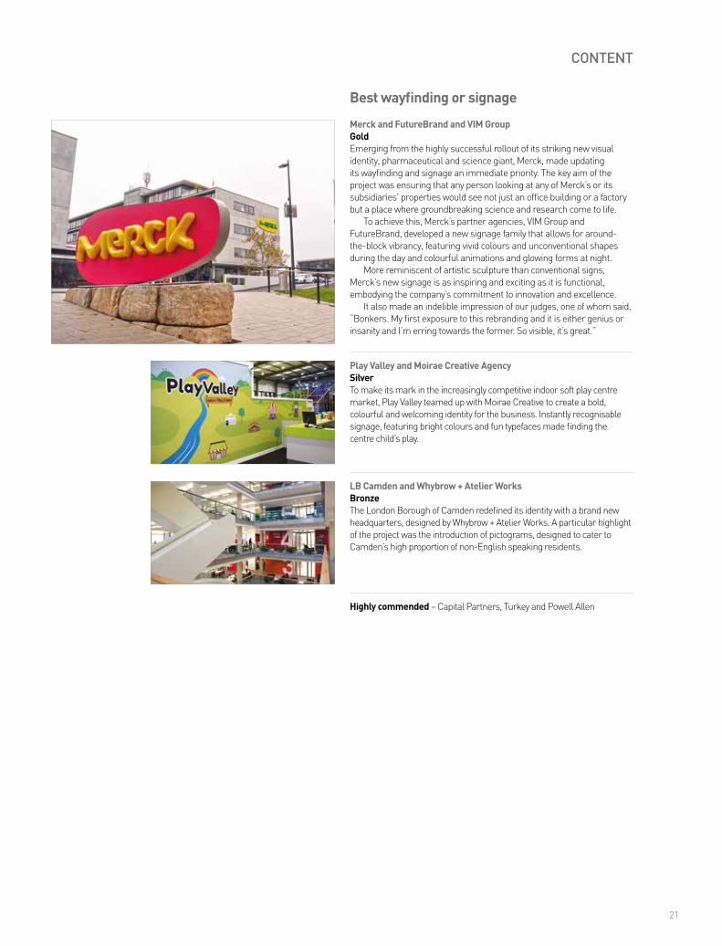
Merck and FutureBrand and VIM GroupGoldEmerging from the highly successful rollout of its striking new visual identity, pharmaceutical and science giant, Merck, made updating its wayfinding and signage an immediate priority. The key aim of the project was ensuring that any person looking at any of Merck’s or its subsidiaries’ properties would see not just an office building or a factory but a place where groundbreaking science and research come to life.
To achieve this, Merck’s partner agencies, VIM Group and FutureBrand, developed a new signage family that allows for around-the-block vibrancy, featuring vivid colours and unconventional shapes during the day and colourful animations and glowing forms at night.
More reminiscent of artistic sculpture than conventional signs, Merck’s new signage is as inspiring and exciting as it is functional, embodying the company’s commitment to innovation and excellence.
It also made an indelible impression of our judges, one of whom said, “Bonkers. My first exposure to this rebranding and it is either genius or insanity and I’m erring towards the former. So visible, it’s great.”
Play Valley and Moirae Creative AgencySilverTo make its mark in the increasingly competitive indoor soft play centre market, Play Valley teamed up with Moirae Creative to create a bold, colourful and welcoming identity for the business. Instantly recognisable signage, featuring bright colours and fun typefaces made finding the centre child’s play.
Best wayfinding or signage
Highly commended – Capital Partners, Turkey and Powell Allen
22
CONTENT
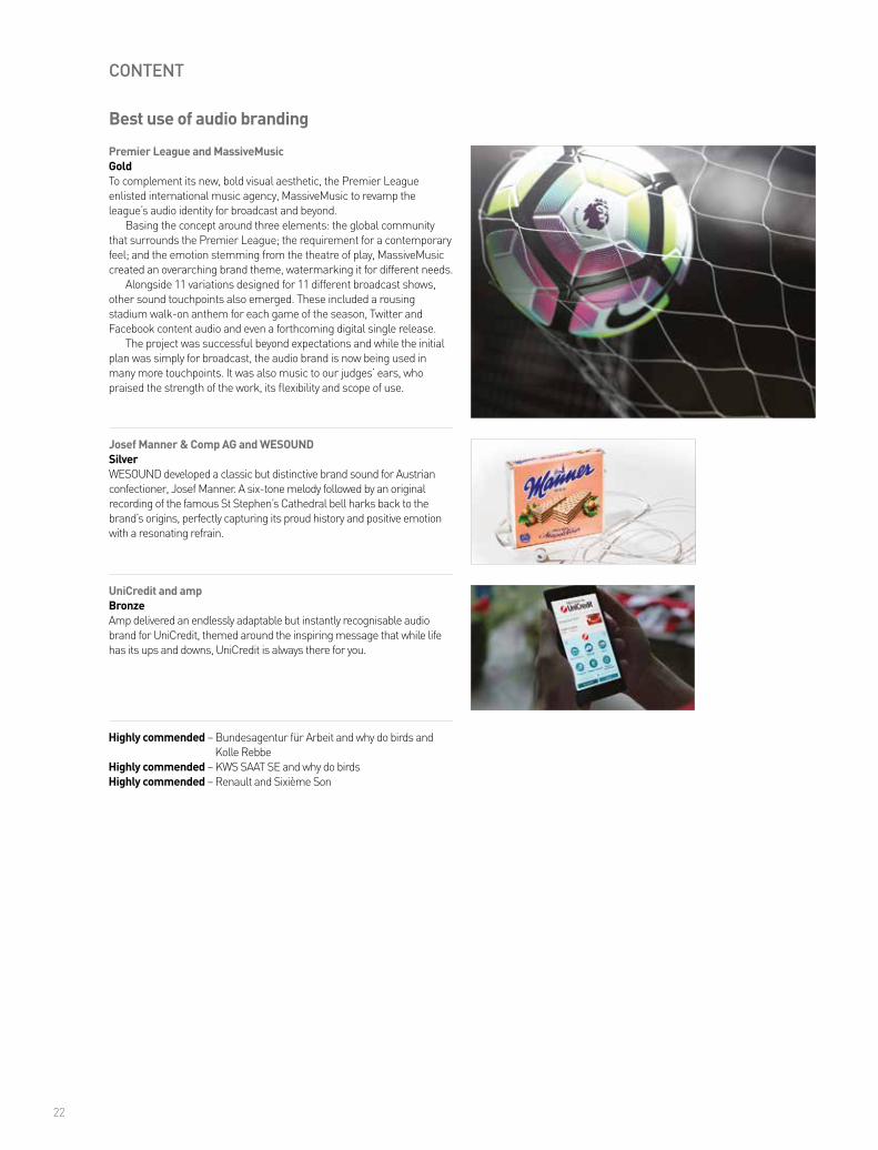
Premier League and MassiveMusicGoldTo complement its new, bold visual aesthetic, the Premier League enlisted international music agency, MassiveMusic to revamp the league’s audio identity for broadcast and beyond.
Basing the concept around three elements: the global community that surrounds the Premier League; the requirement for a contemporary feel; and the emotion stemming from the theatre of play, MassiveMusic created an overarching brand theme, watermarking it for different needs.
Alongside 11 variations designed for 11 different broadcast shows, other sound touchpoints also emerged. These included a rousing stadium walk-on anthem for each game of the season, Twitter and Facebook content audio and even a forthcoming digital single release.
The project was successful beyond expectations and while the initial plan was simply for broadcast, the audio brand is now being used in many more touchpoints. It was also music to our judges’ ears, who praised the strength of the work, its flexibility and scope of use.
Josef Manner & Comp AG and WESOUNDSilverWESOUND developed a classic but distinctive brand sound for Austrian confectioner, Josef Manner. A six-tone melody followed by an original recording of the famous St Stephen’s Cathedral bell harks back to the brand’s origins, perfectly capturing its proud history and positive emotion with a resonating refrain.
Best use of audio branding
Highly commended – Bundesagentur für Arbeit and why do birds and Kolle RebbeHighly commended – KWS SAAT SE and why do birdsHighly commended – Renault and Sixième Son
UniCredit and ampBronzeAmp delivered an endlessly adaptable but instantly recognisable audio brand for UniCredit, themed around the inspiring message that while life has its ups and downs, UniCredit is always there for you.

23
CONTENT
Warwick Conferences and Frank, Bright & AbelBronzeWarwick University boosted the brand of its conference hosting arm with a highly successful rebrand from Frank, Bright & Abel. The highlight was four handwritten fonts, chosen to represent the live conversations and ideas hosted by the university’s conference spaces.
Race Against Dementia and Brand UnionGoldWhen racing royalty Sir Jackie Stewart approached Brand Union to help him build a new global charity to drive a cure for dementia, the agency knew that the key to the project was to leverage Stewart’s personal story in an impactful and meaningful way.
Named Race Against Dementia, resonating with Stewart’s racing pedigree and with a strong call to action, the charity needed an equally powerful visual design – evoking both the speed of F1 driving and the fracturing effect of dementia.
Brand Union, in collaboration with Colophon Foundry, developed a striking and disruptive bespoke typeface, inspired by the disorienting world of dementia and the speed felt inside a race car. Named Helen, after Stewart’s wife, recently diagnosed with dementia herself, the font is a remarkable storytelling device in itself.
Our judges were in pole position with their praise; one said, “I love the way the name connects two concepts and conveys a sense of urgency about an often overlooked subject.”
The EXceptionals and GW+CoSilverWith the noble aim of encouraging employers to consider hiring ex-offenders, the Traverse Trust partnered with GW+Co to develop a bold campaign. Called ‘The EXceptionals,’ the initiative harnessed striking script, featuring a mixture of outlined and filled type to symbolise the fulfilled potential of these often overlooked members of society.
Best use of typography
Highly commended – Rapha and Dalton MaagHighly commended – Waitrose Drinks Festival and Nalla
Pollitt & PartnersBronzeFor its rebrand from Bostock and Pollitt to Pollitt & Partners, the creative design agency chose a bold, clear and striking font that clearly encapsulates its straightforward, clear and classic style.
B2B branding is branding in the real world. At Frank, Bright & Abel we’ve managed every corner of it. Whether you need to develop your brand or tackle the challenges around it, get in touch.
[email protected] frankbrightabel.com
“The logo is a no go” “CEO wants me to prove ROI”
“The brand is managed out of the US”
“My colleagues think the only branding is consumer”

25
CONTENT
Camden Market and Ragged EdgeGoldLondon’s historic markets are becoming ever more popular tourist attractions and Camden Market is no exception. In fact, it is now the fourth-most visited attraction in the capital. To capitalise on this growth, Camden enlisted Ragged Edge to create a cohesive new brand for the market, drawing on its proud tradition as a magnet for counterculture outsiders.
The result was ‘Unfollow Convention,’ a radical rallying cry that unites Camden’s disparate groups against a common enemy: conformity. With a bold black and white palette to help the brand speak out against the vibrant market backdrop and typefaces inspired by the iconic hand-painted Camden Lock sign, the visual and verbal identity is at once understated yet also infused with the market’s irrepressible spirit.
Even the brand guidelines are rebellious. Instead of rigid rules, Ragged Edge developed a set of tools to help guardians use the brand to challenge creative conventions.
National Memorial Arboretum and Business Partners LondonBronzeTo coincide with the opening of its new Remembrance Centre, the National Memorial Arboretum updated its brand identity, with help from Business Partners London, using both traditional and modern concepts to ensure it remains ‘The place the nation comes to remember.’
Best place or nation brand
26
PROCESS
ING Bank and Twofish and MediaMonksSilverTo support the introduction of the ‘Orange Code,’ an inspiring employee manifesto, ING and its partner agencies, Twofish and MediaMonks, created kudos, a platform and mobile app that allows employees to give each other a digital thumbs up for embodying brand values.
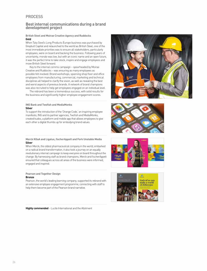
British Steel and Moirae Creative Agency and RuddocksGoldWhen Tata Steel’s Long Products Europe business was purchased by Greybull Capital and relaunched to the world as British Steel, one of the most immediate priorities was to ensure all stakeholders, particularly employees, were on board and backing the business. Following years of uncertainty, morale was low, but with an iconic name and an open future, it was the perfect time to take stock, inspire and engage employees and move British Steel forward.
Key to the internal comms campaign – spearheaded by Moirae Creative and Ruddocks – was ensuring as many employees as possible felt involved. Brand workshops, spanning shop floor and office employees from manufacturing, commercial, marketing and technical disciplines all helped to clarify the vision, as well as revealing the best and worst aspects of previous brands. A network of brand champions was also recruited to help get employees engaged on an individual level.
The rebrand has been a tremendous success, with solid results for the business and significantly higher employee engagement scores.
Merck KGaA and Ligalux, fischerAppelt and Fork Unstable MediaSilverWhen Merck, the oldest pharmaceutical company in the world, embarked on a radical brand transformation, it also took a journey on an equally revolutionary internal campaign to keep everyone on board throughout the change. By harnessing staff as brand champions, Merck and fischerAppelt ensured that colleagues across all areas of the business were informed, engaged and inspired.
Best internal communications during a brand development project
Highly commended – Lucite International and the Allotment
Pearson and Together DesignBronzePearson, the world’s leading learning company, supported its rebrand with an extensive employee engagement programme, connecting with staff to help them become part of the Pearson brand narrative.

Truth. Told.Customers. Captivated.Disruptors. Readied.Expand. Faster.Growth. Accelerated.
designbystructure.com
Transform ad 2017 concepts v3 DB 220217.indd 1 22/02/2017 16:25

28
PROCESS
Atkins Acuity and Dragon RougeBronzeFor the launch of its new advisory business, leading design, engineering and project management consultancy, Atkins, knew it needed to cut through the clutter. The company enlisted Dragon Rouge, who crafted a clean, confident style for the brand, evoking all the sharpness and clarity of thought and perception that Acuity is renowned for.
British Steel and Moirae Creative Agency and RuddocksGoldMoirae Creative and Ruddocks developed and implemented a powerful rebrand for British Steel, reforging the historic name for Tata Steel’s Long Products Europe business after its acquisition by Greybull Capital.
With an old name but a new start for the business, it was essential that the fresh brand resonated with stakeholders and stirred emotions, while being globally recognisable. The agencies established a strong brand narrative before infusing it throughout the organisation.
Employees were a key focus; Moirae and Ruddocks wanted to inspire them to act as brand champions. The agencies ensured the new branding was present throughout the organisation, and an early priority was replacing old logos with the new branding. Equally, a strong launch campaign, including events, a video and a digital media push, helped to reach as many employees as possible.
Employee engagement has jumped significantly, along with strong increases in social media activity and recruitment levels. The business has returned to profit and is currently investing in growing its staff.
KNect365 an Informa business and NallaSilverInforma’s Knowledge and Networking division (K&N) underwent a challenging rebrand with the aid of agency, Nalla. The scope was wide-ranging, with K&N’s core business encompassing over 2,000 different yearly conferences, training events and webinars. Nalla delivered, crafting a system of modular identity assets that give each event its own brand while still being part of a greater whole.
Best implementation of a brand development project
Highly commended – Warwick Conferences and Frank, Bright & Abel
Hempel and Dragon RougeBronzeGlobal coating solutions provider, Hempel, teamed up with Dragon Rouge to deliver an expertly implemented rebrand, engaging 6,000 employees in 80 countries in just six months.
The key to building a better brand experience?
Simplicity
Get to the heart of your brand. Communicate your story, your value and ultimately your reason for being and take it across channels, audiences and categories. Maximise your business impact through simplicity. Talk to us [email protected] www.siegelgale.com

30
Hempel and Dragon RougeBronzeHempel and Dragon Rouge delivered a powerful rebrand, capturing the global coating solutions provider’s rich history and innovative spirit across more than 6,000 employees in 80 countries.
IG Design Group plc and Mattr Media, Ampersand Company and Lyons BennettGoldOnce a gift manufacturer and supplier, IG Design Group plc, previously International Greetings, is now a design-focused multi-category business, operating around the world and serving the world’s biggest retailers. The goal of the rebrand was threefold: to unify and simplify the company’s corporate presentation, to enable customers, suppliers, investors and staff to better navigate, understand and engage with the whole organisation, and to unite employees across the world and create a sense of community.
A highlight of the employee engagement programme was the ‘Smile Campaign’ which saw 950 giant jigsaw pieces sent to different branches around the world to be decorated by employees. The jigsaw pieces were returned to the UK to be assembled. The process was filmed and a morale-boosting video was shared with employees around the world.
The results have been impressive, and the rebrand proved the missing piece of the puzzle, with business growth across all regions.
Merck KGaA and Ligalux, fischerAppelt and Fork Unstable MediaSilverMerck, the world’s oldest and largest pharmaceutical and chemical company, rolled out a truly global rebrand, alongside fischerAppelt, bringing its new identity to over 50,000 employees across more than 50 countries. A particular highlight was a virtual reality brand space that allowed staff to immerse themselves in vibrant and responsive worlds that highlighted key brand elements.
Best implementation of a brand development project across multiple markets
Highly commended – Nexia International and IndustryHighly commended – Nokia and Global Image Management
PROCESS


32
STRATEGY
Growth Rings and LanternGoldGrowth Rings is a remarkable business; as well as crafting fine oak flooring, furniture and homewares, it also provides education and training opportunities for those with barriers to employment, including criminal records, a history of addiction or low skills levels.
To highlight its social mission, Growth Rings enlisted Lantern to reposition the organisation, showcasing its heritage and craft alongside its noble approach to social responsibility. Lantern delivered with aplomb.
Key to the brand concept was the provenance of the wood used by Growth Rings. Hand selected from the forests of France, the surface of the company’s oak acts as a rich tapestry of bullet holes from the first world war, bomb damage from the second world war and the weathered scars from some of history’s greatest storms.
Strength in the face of adversity – of the wood and the trainees who work with it – proved the perfect theme, and it emanates throughout the rebrand.
Best creative strategy
WWF-UK and Pollitt & PartnersSilverWhile the WWF and its iconic panda logo are known around the world, this strong identity was making it challenging for the charity’s UK office to express the breadth and depth of its work. A powerful rebrand from Pollitt & Partners proved the solution, delivering an identity that clearly positions the WWF-UK for the future.
St Andrew’s Hospice and AppetiteGoldSt Andrew’s Hospice is a regional adult hospice and one of only a few children’s hospices in the UK. Facing a number of challenges, including a dated visual identity, confusion between the adult and children’s brands and a need for greater awareness, the hospice enlisted Appetite to rebrand, redefining St Andrew’s identity and mission.
Following extensive stakeholder interviews and workshops, the agency settled on the creative idea of ‘under one roof,’ a powerful expression of a home away from home, a place of protection and a place of counselling, support and emotional and physical wellbeing.
This roof motif was infused throughout the hospice’s visual identity, particularly online, creating an instantly recognisable and immensely comforting graphical hook for the brand.
The results have already been overwhelmingly positive, securing the hospice additional funding, increased awareness on social media and a surge of support for the Big Fish Lottery, a charitable drive to help support St Andrew’s funding for the future.
SearchFlow and IndustryBronzeWhen SearchFlow needed a rebrand that would clearly mark it out from its competitors, Industry came to the rescue with bespoke icons and a rich, bold colour palette for high impact and instant appeal.
Highly commended – IAM RoadSmart and IndustryHighly commended – Pollitt & PartnersHighly commended – University of Reading and Bell
33
STRATEGY
WWF-UK and Pollitt & PartnersBronzePollitt & Partners delivered a revitalising rebrand for wildlife charity, WWF-UK, skilfully expressing the true depth and breadth of the organisation’s work in communities across the country and shifting it away from dated ideas about its mission.
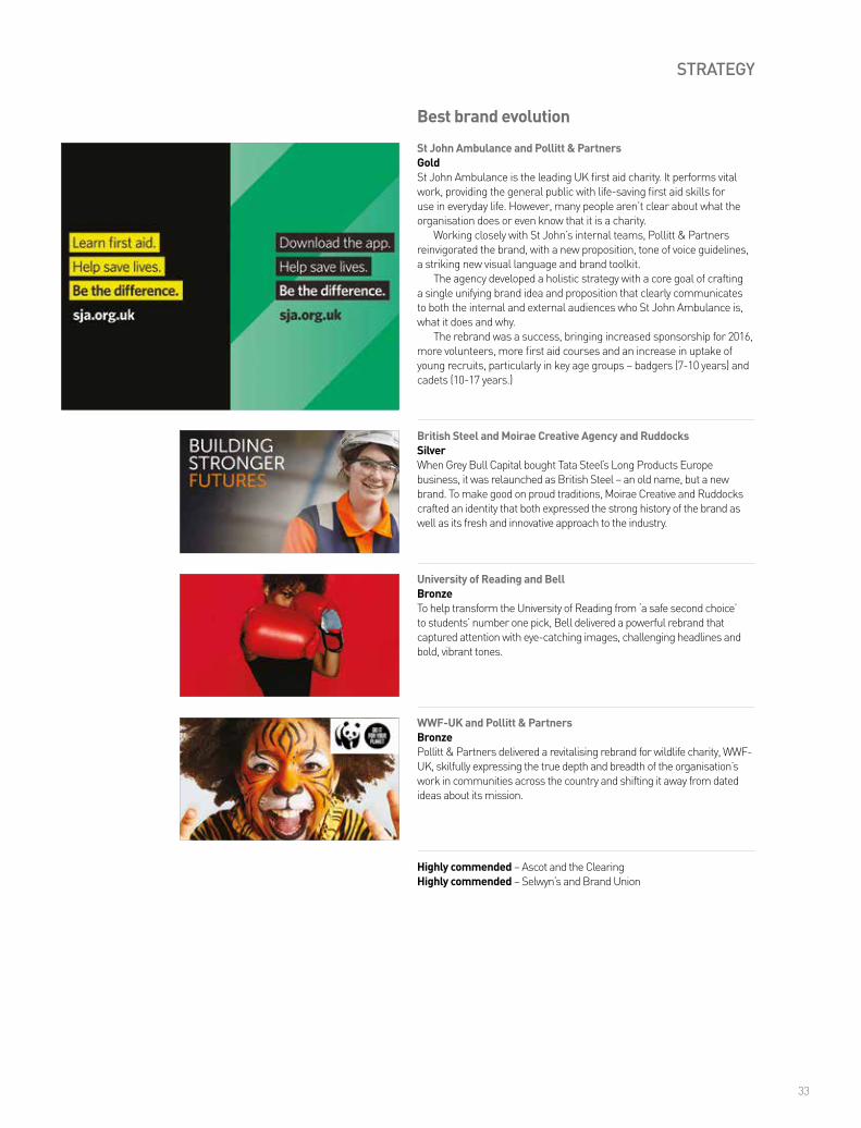
St John Ambulance and Pollitt & PartnersGoldSt John Ambulance is the leading UK first aid charity. It performs vital work, providing the general public with life-saving first aid skills for use in everyday life. However, many people aren’t clear about what the organisation does or even know that it is a charity.
Working closely with St John’s internal teams, Pollitt & Partners reinvigorated the brand, with a new proposition, tone of voice guidelines, a striking new visual language and brand toolkit.
The agency developed a holistic strategy with a core goal of crafting a single unifying brand idea and proposition that clearly communicates to both the internal and external audiences who St John Ambulance is, what it does and why.
The rebrand was a success, bringing increased sponsorship for 2016, more volunteers, more first aid courses and an increase in uptake of young recruits, particularly in key age groups – badgers (7-10 years) and cadets (10-17 years.)
British Steel and Moirae Creative Agency and RuddocksSilverWhen Grey Bull Capital bought Tata Steel’s Long Products Europe business, it was relaunched as British Steel – an old name, but a new brand. To make good on proud traditions, Moirae Creative and Ruddocks crafted an identity that both expressed the strong history of the brand as well as its fresh and innovative approach to the industry.
Best brand evolution
Highly commended – Ascot and the ClearingHighly commended – Selwyn’s and Brand Union
University of Reading and BellBronzeTo help transform the University of Reading from ‘a safe second choice’ to students’ number one pick, Bell delivered a powerful rebrand that captured attention with eye-catching images, challenging headlines and bold, vibrant tones.
34
STRATEGY
Octopus and BrandPieGoldOctopus is a successful investment business with a bold ambition: to be in every home by 2030. To achieve that goal, Octopus is building a portfolio of businesses to disrupt broken sectors and offer consumers and customers fresh alternatives. To succeed, it needed to become a portfolio master brand, able to traverse finance, energy, property and start-ups. To do so, Octopus turned to BrandPie for assistance.
Defining the Octopus brand essence as ‘Naturally Different,’ BrandPie used this idea as a springboard for its creative solution, crafting a new and inspiring concept that reflects the company’s caring values and makes Octopus accessible to every audience.
While the new visual identity has only launched internally so far, it has already been embraced and delivered across the whole business. Judges praised the project’s solid analysis, good strategy and creative approach, and remarked on the clear and coherent brand identity.
Best strategic/creative development of a new brand
Michelangelo Foundation and MerchantCantosSilverThe Michelangelo Foundation for Creativity and Craftsmanship is an international non-profit organisation that supports master craftsmanship in all forms. MerchantCantos delivered a powerful new brand for the foundation, with a visual system based around the unlimited potential of creativity and craftsmanship coming together.
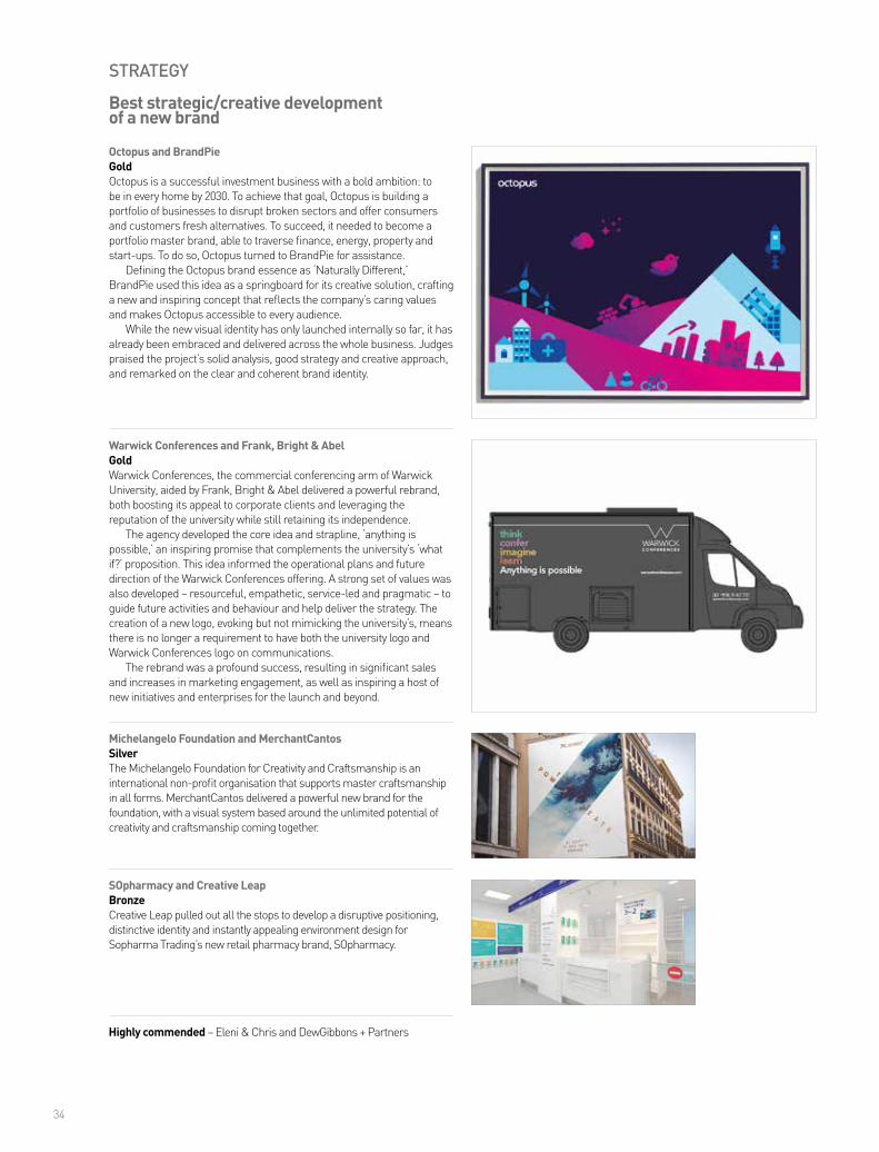
Warwick Conferences and Frank, Bright & AbelGoldWarwick Conferences, the commercial conferencing arm of Warwick University, aided by Frank, Bright & Abel delivered a powerful rebrand, both boosting its appeal to corporate clients and leveraging the reputation of the university while still retaining its independence.
The agency developed the core idea and strapline, ‘anything is possible,’ an inspiring promise that complements the university’s ‘what if?’ proposition. This idea informed the operational plans and future direction of the Warwick Conferences offering. A strong set of values was also developed – resourceful, empathetic, service-led and pragmatic – to guide future activities and behaviour and help deliver the strategy. The creation of a new logo, evoking but not mimicking the university’s, means there is no longer a requirement to have both the university logo and Warwick Conferences logo on communications.
The rebrand was a profound success, resulting in significant sales and increases in marketing engagement, as well as inspiring a host of new initiatives and enterprises for the launch and beyond.
SOpharmacy and Creative LeapBronzeCreative Leap pulled out all the stops to develop a disruptive positioning, distinctive identity and instantly appealing environment design for Sopharma Trading’s new retail pharmacy brand, SOpharmacy.
Highly commended – Eleni & Chris and DewGibbons + Partners

35
Danone Light & Free and Dragon RougeSilverDragon Rouge delivered a bright, fresh and upbeat brand for Danone’s new range of Light & Free fruit yoghurts. The joyful, dynamic and stylish design of the packaging was a key factor in Danone’s success in expanding its market, separating the range from more functional and less fun products.
Chivas Regal and Coley Porter BellBronzeChivas Regal enlisted Coley Porter Bell to deliver a true luxury brand for its new entrant into the ultra-prestige end of the market. The agency reimagined the classic 1909 bottle, crafting an identity that evokes both tradition and excellence.
Highly commended – FRANCK PROVOST and RAISON PURE
STRATEGY
Best development of a new brand within an existing brand portfolio

36
STRATEGY
AXE and the WriterSilverFollowing a more mature rebrand, AXE (Lynx in the UK) set out to grow the character of its range with the help of the Writer. The agency leveraged its copywriting craft to ensure each of AXE’s product names was a distinctive brand asset, combining clarity and a touch of personality for instant customer appeal.
The EXceptionals and GW+CoGoldThe Traverse Trust offers people the chance to embark on an experience that could change their perspective on life – through travel, education or the creation of social enterprise. Its newest challenge is to help ex-offenders find jobs by creating a one-stop online resource aimed at employers, with persuasive content to help overcome their fears and clear help to guide them through the process of hiring ex-offenders.
With the aid of GW+Co, the charity developed ‘The EXceptionals,’ a bold brand that centres around how ex-offenders can be exceptionally loyal, reliable and hard-working employees. The agency supplied powerful infographics, documentary films, social media content and printed campaign materials. While the project is still in its early days, 21 charities have already signed up to help, while a social media campaign is continuing to gather momentum. Our judges praised the campaign’s clever approach, worthwhile mission and creative strategy and were particularly impressed by the way it stands out among other offerings in the charity sector.
Race Against Dementia and Brand UnionSilverWhen Sir Jackie Stewart approached Brand Union to build a new global charity to fund ground-breaking research into curing dementia, the agency knew that the name had to say it all. They delivered Race Against Dementia, conveying all the speed, determination and empowerment of its founder.
Best naming strategy
Highly commended – ISHO and Storience
GivGo and Living GroupBronzeTo break into the corporate fundraising market, Givergy and Living Group delivered GivGo, a disruptive brand named for its engaging, inspiring and innovative mission and model.
37
TYPE
Assemblin and Essen InternationalBronzeAssemblin, a leading service and installation partner, consolidated its brand with a powerful shake-up from Essen International. By unifying its disparate operations under a new name, the partnership crafted a brand that is ready to stand the test of time.
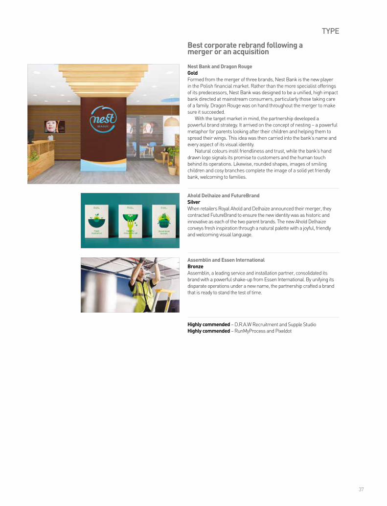
Nest Bank and Dragon RougeGoldFormed from the merger of three brands, Nest Bank is the new player in the Polish financial market. Rather than the more specialist offerings of its predecessors, Nest Bank was designed to be a unified, high impact bank directed at mainstream consumers, particularly those taking care of a family. Dragon Rouge was on hand throughout the merger to make sure it succeeded.
With the target market in mind, the partnership developed a powerful brand strategy. It arrived on the concept of nesting – a powerful metaphor for parents looking after their children and helping them to spread their wings. This idea was then carried into the bank’s name and every aspect of its visual identity.
Natural colours instil friendliness and trust, while the bank’s hand drawn logo signals its promise to customers and the human touch behind its operations. Likewise, rounded shapes, images of smiling children and cosy branches complete the image of a solid yet friendly bank, welcoming to families.
Ahold Delhaize and FutureBrandSilverWhen retailers Royal Ahold and Delhaize announced their merger, they contracted FutureBrand to ensure the new identity was as historic and innovative as each of the two parent brands. The new Ahold Delhaize conveys fresh inspiration through a natural palette with a joyful, friendly and welcoming visual language.
Best corporate rebrand following a merger or an acquisition
Highly commended – D.R.A.W Recruitment and Supple StudioHighly commended – RunMyProcess and Pixeldot
CLEAR DEFENDABLE TERRITORYFOR BRANDS
theclearing.co.uk
We’ve helped them find theirs. Have you found yours?
Transformingbrands
pollittandpartners.com
39
TYPE
Growth Rings and LanternSilverGrowth Rings, which brings 70 years of New Zealand’s sawmilling heritage to the Kent coastline, set out – with Lantern – to rebrand following its new emphasis on providing opportunities and training to those otherwise left out of the job market. The focus on grit, determination and strength in the face of adversity are fitting themes for the historic company, as well as for those to whom Growth Rings gives second chances.
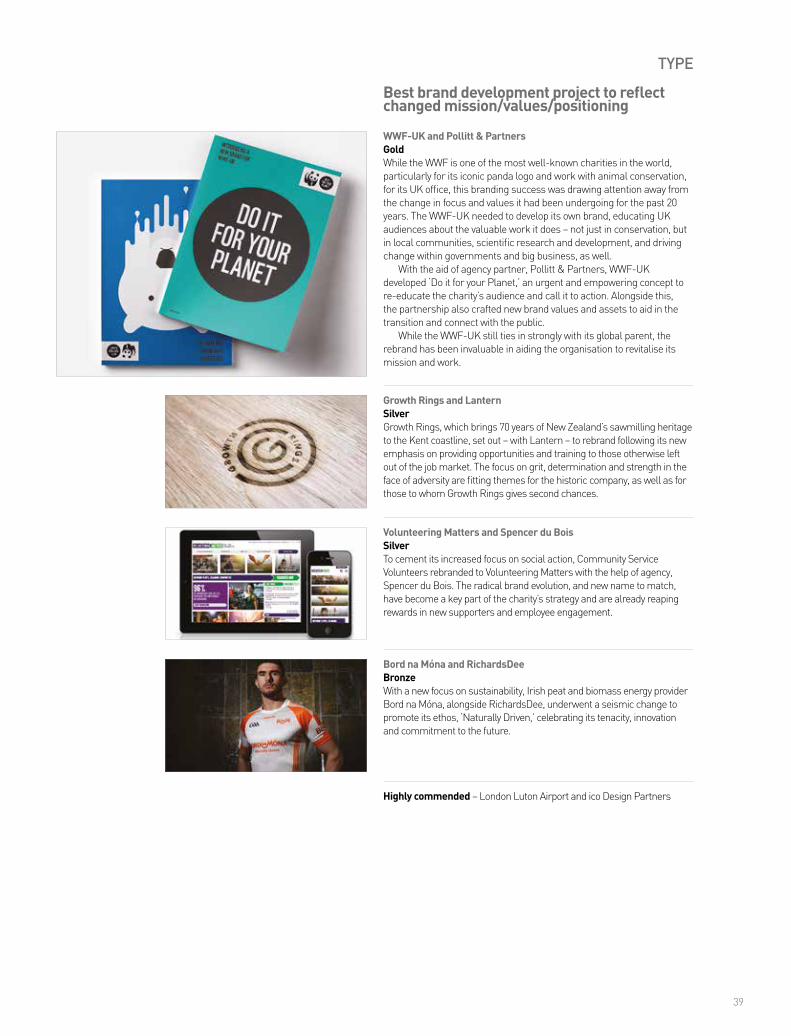
WWF-UK and Pollitt & PartnersGoldWhile the WWF is one of the most well-known charities in the world, particularly for its iconic panda logo and work with animal conservation, for its UK office, this branding success was drawing attention away from the change in focus and values it had been undergoing for the past 20 years. The WWF-UK needed to develop its own brand, educating UK audiences about the valuable work it does – not just in conservation, but in local communities, scientific research and development, and driving change within governments and big business, as well.
With the aid of agency partner, Pollitt & Partners, WWF-UK developed ‘Do it for your Planet,’ an urgent and empowering concept to re-educate the charity’s audience and call it to action. Alongside this, the partnership also crafted new brand values and assets to aid in the transition and connect with the public.
While the WWF-UK still ties in strongly with its global parent, the rebrand has been invaluable in aiding the organisation to revitalise its mission and work.
Volunteering Matters and Spencer du BoisSilverTo cement its increased focus on social action, Community Service Volunteers rebranded to Volunteering Matters with the help of agency, Spencer du Bois. The radical brand evolution, and new name to match, have become a key part of the charity’s strategy and are already reaping rewards in new supporters and employee engagement.
Best brand development project to reflect changed mission/values/positioning
Highly commended – London Luton Airport and ico Design Partners
Bord na Móna and RichardsDeeBronzeWith a new focus on sustainability, Irish peat and biomass energy provider Bord na Móna, alongside RichardsDee, underwent a seismic change to promote its ethos, ‘Naturally Driven,’ celebrating its tenacity, innovation and commitment to the future.
40
TYPE
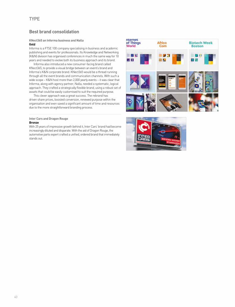
KNect365 an Informa business and NallaGoldInforma is a FTSE 100 company specialising in business and academic publishing and events for professionals. Its Knowledge and Networking (K&N) division has organised conferences in much the same way for 10 years and needed to evolve both its business approach and its brand.
Informa also introduced a new consumer-facing brand called KNect365, to provide a visual bridge between an event’s brand and Informa’s K&N corporate brand. KNect365 would be a thread running through all the event brands and communication channels. With such a wide scope – K&N host more than 2,000 yearly events – it was clear that Informa, along with agency partner, Nalla, needed a systematic, logical approach. They crafted a strategically flexible brand, using a robust set of assets that could be easily customised to suit the required purpose.
This clever approach was a great success. The rebrand has driven share prices, boosted conversion, renewed purpose within the organisation and even saved a significant amount of time and resources due to the more straightforward branding process.
Inter Cars and Dragon RougeBronzeWith 25 years of impressive growth behind it, Inter Cars’ brand had become increasingly diluted and disparate. With the aid of Dragon Rouge, the automotive parts expert crafted a unified, ordered brand that immediately stands out.
Best brand consolidation
41
TYPE
British Steel and Moirae Creative Agency and RuddocksSilverDespite severe challenges in the UK market, Long Products Europe, now rebranded as British Steel, is making a strong start on success, thanks in part to its newly designed web presence. The new site, by Moirae Creative and Ruddocks, conveys the pride, spirit, passion and positive ethos that is British Steel, as well as providing a wealth of information to prospective customers.
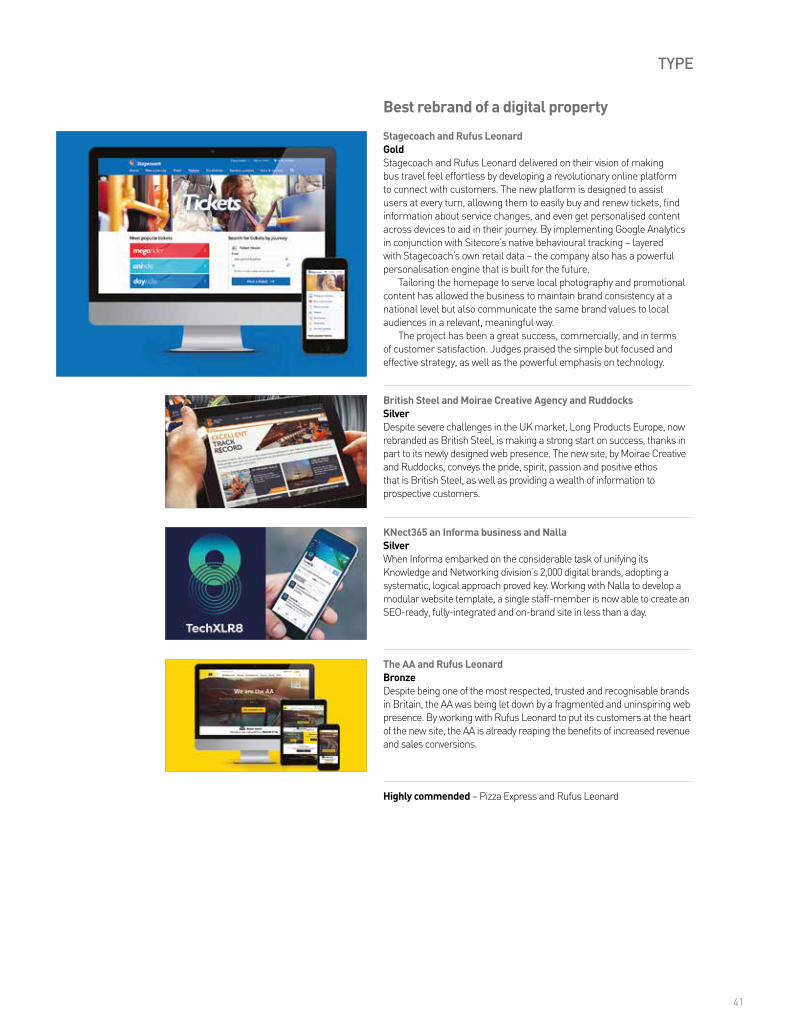
Stagecoach and Rufus LeonardGoldStagecoach and Rufus Leonard delivered on their vision of making bus travel feel effortless by developing a revolutionary online platform to connect with customers. The new platform is designed to assist users at every turn, allowing them to easily buy and renew tickets, find information about service changes, and even get personalised content across devices to aid in their journey. By implementing Google Analytics in conjunction with Sitecore’s native behavioural tracking – layered with Stagecoach’s own retail data – the company also has a powerful personalisation engine that is built for the future.
Tailoring the homepage to serve local photography and promotional content has allowed the business to maintain brand consistency at a national level but also communicate the same brand values to local audiences in a relevant, meaningful way.
The project has been a great success, commercially, and in terms of customer satisfaction. Judges praised the simple but focused and effective strategy, as well as the powerful emphasis on technology.
KNect365 an Informa business and NallaSilverWhen Informa embarked on the considerable task of unifying its Knowledge and Networking division’s 2,000 digital brands, adopting a systematic, logical approach proved key. Working with Nalla to develop a modular website template, a single staff-member is now able to create an SEO-ready, fully-integrated and on-brand site in less than a day.
Best rebrand of a digital property
Highly commended – Pizza Express and Rufus Leonard
The AA and Rufus LeonardBronzeDespite being one of the most respected, trusted and recognisable brands in Britain, the AA was being let down by a fragmented and uninspiring web presence. By working with Rufus Leonard to put its customers at the heart of the new site, the AA is already reaping the benefits of increased revenue and sales conversions.
TINTUP.COM
Display content made by real people for real people.
More than 5,000 brands use TINT to display user-generated content. Join them today!

43
SECTOR
Michelangelo Foundation and MerchantCantosSilverAs an organisation that proudly supports master craftsmanship in all forms, the Michelangelo Foundation was in need of a visual identity to match its aspirational aims. MerchantCantos delivered with a visual language that embodies the foundation’s mission to bring together craftsmanship and creativity and create unlimited potential for excellence.
Race Against Dementia and Brand UnionGoldFollowing his wife’s diagnosis with dementia, Sir Jackie Stewart approached Brand Union to help him build a new global charity to fund groundbreaking research into a cure for the disease. With such a strong name behind the brand, the agency knew it would be key to harness Stewart’s personal story while ensuring the identity was fresh and accessible.
Powerfully named Race Against Dementia, the charity features a strong visual identity driven by the French racing blue of Stewart’s race cars. The logo is an iconic mark with a deliberately distorted character – as a nod to both the speed of Formula 1 racing and the fracturing effect of dementia. Perhaps most striking and poignant is the photography, with the distinct style and treatment of the images crafting a moving story of Stewart and his wife across more than 50 years.
Race Against Dementia also resonated with judges. One said, “I love the way the name connects two concepts and conveys a sense of urgency about an often overlooked subject.”
Stichting Amsterdam Gay Pride and VBATSilverProudly hosting the annual EuroPride festival for the second time, the city of Amsterdam partnered with VBAT to develop a powerful visual identity that encapsulates the event’s celebration of LGBT culture and community. Featuring the three crosses of the city arms, the logo resonates with the festival’s ‘proud to be who you are’ message and also acts as a striking emblem to unite the LGBT, European and Amsterdam communities.
Best visual identity from the charity/NGO/non-profit sector
Highly commended – Brewbird and Spencer du BoisHighly commended – straightline/Prison Radio Association and Supple Studio and Mud
The EXceptionals and GW+CoBronzeIn its bold mission to help ex-offenders find work, the Traverse Trust worked with GW+Co to develop an equally bold visual identity to match. Themed around fulfilling potential, the brand and associated visuals form a strong call to action for prospective employees and employers alike.
44
SECTOR
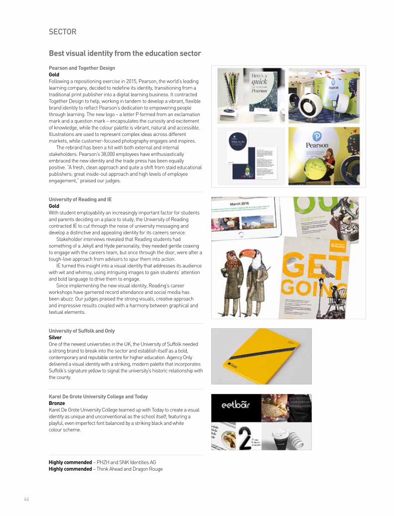
University of Reading and IEGoldWith student employability an increasingly important factor for students and parents deciding on a place to study, the University of Reading contracted IE to cut through the noise of university messaging and develop a distinctive and appealing identity for its careers service.
Stakeholder interviews revealed that Reading students had something of a Jekyll and Hyde personality, they needed gentle coaxing to engage with the careers team, but once through the door, were after a tough-love approach from advisors to spur them into action.
IE turned this insight into a visual identity that addresses its audience with wit and whimsy, using intriguing images to gain students’ attention and bold language to drive them to engage.
Since implementing the new visual identity, Reading’s career workshops have garnered record attendance and social media has been abuzz. Our judges praised the strong visuals, creative approach and impressive results coupled with a harmony between graphical and textual elements.
Best visual identity from the education sector
University of Suffolk and OnlySilver One of the newest universities in the UK, the University of Suffolk needed a strong brand to break into the sector and establish itself as a bold, contemporary and reputable centre for higher education. Agency Only delivered a visual identity with a striking, modern palette that incorporates Suffolk’s signature yellow to signal the university’s historic relationship with the county.
Pearson and Together DesignGoldFollowing a repositioning exercise in 2015, Pearson, the world’s leading learning company, decided to redefine its identity, transitioning from a traditional print publisher into a digital learning business. It contracted Together Design to help, working in tandem to develop a vibrant, flexible brand identity to reflect Pearson’s dedication to empowering people through learning. The new logo – a letter P formed from an exclamation mark and a question mark – encapsulates the curiosity and excitement of knowledge, while the colour palette is vibrant, natural and accessible. Illustrations are used to represent complex ideas across different markets, while customer-focused photography engages and inspires.
The rebrand has been a hit with both external and internal stakeholders. Pearson’s 38,000 employees have enthusiastically embraced the new identity and the trade press has been equally positive. “A fresh, clean approach and quite a shift from staid educational publishers; great inside-out approach and high levels of employee engagement,” praised our judges.
Karel De Grote University College and TodayBronzeKarel De Grote University College teamed up with Today to create a visual identity as unique and unconventional as the school itself; featuring a playful, even imperfect font balanced by a striking black and white colour scheme.
Highly commended – PHZH and SNK Identities AGHighly commended – Think Ahead and Dragon Rouge
45
SECTOR
Gas4Sea and IndustryGoldPrompted by increasingly strict emissions regulations, energy and shipping partners ENGIE, Mitsubishi Corporation and NYK Line created Gas4Sea to be the first provider of environmentally friendly fuel – Liquefied Natural Gas (LNG) – for marine applications. With a mission to revolutionise the maritime fuel sector, Gas4Sea is a global operation, supplying LNG to shipping clients via purpose-built bunkering vessels.
To realise such an ambitious goal, the new business required a powerful, high visibility brand, signalling the positive environmental benefits that LNG offers. The new brand and website, crafted and launched within three months by Industry, is bold, rugged and bright.
A contemporary typeface and a bold marine blue and orange colour palette creates a dynamic identity that sits well within the shipping sector, while the tagline, ‘Advancing LNG for a cleaner marine’, is a clear statement of business purpose. Cleverly, the pun on 4Sea and ‘foresee’ simultaneously highlights the brand’s progressive goals as well as its future readiness.
Best visual identity from the energy and extractives sector
Woven Image and Missouri CreativeGoldOperating in territories as diverse as they are distant, the B2B design and interior finishes company Woven Image wanted to consolidate its brand identity in a way that also highlighted its use of environmentally friendly textiles.
With this in mind, Missouri Creative developed a powerful and unified brand hierarchy to encompass the company’s new and existing products, accompanied by a vibrant visual language that could work across multiple channels, cultures and languages.
Building on Woven Image’s proven history of innovation and experimentation, Missouri Creative created the brand essence ‘Know how meets why not’ as a driving force for the rebrand and represented its duality with a double-sided wordmark.
The visual brand is equally strong, featuring bold, bright colours to match Woven Image’s personality, along with a variety of textures to demonstrate the breadth of its products.
Best visual identity from the engineering and manufacturing sector

46
SECTOR
Tata Global Beverages and LandorBronzeTo combat declining sales and increasing fragmentation, Tata Global Beverages commissioned Landor to craft a category leading, globally powerful brand for Tetley that would unite it across the global marketplace. The result is an identity that is both friendly and human as well as iconic and premium.
Selwyn’s and Brand UnionGoldWith its sales and penetration let down by poor packaging, Selwyn’s contracted Brand Union to develop a game-changing rebrand for its range of seaweed snacks.
The old wrapper did little to appeal to customers – in fact, some retailers turned it down due to the packaging alone – but the growing popularity of health food and expanding consumer tastes made it the perfect time for Selwyn’s to rethink its strategy.
For the new look, Brand Union leveraged Selwyn’s unique history and story to craft a contemporary, yet classic look. Featuring a map of Swansea Bay, quirky etchings and sepia photography, the new packaging is immediately recognisable on and off the shelf and is a far cry from its previously junk food style appearance.
The project proved a tremendous success, spearheading huge boosts in both distribution and sales, and praised by our judges for its sympathy to heritage while maintaining a strong focus on the customer.
AXE and PB CreativeSilverFollowing its shift toward a more aspirational and premium proposition, AXE (Lynx in the UK) enlisted PB Creative to develop a fresh visual style to complement its new positioning. PB delivered, with an iconic new brand identity that creates an understated confidence allowing the packaging to leap off the shelf.
Best visual identity from the fast-moving consumer goods sector
Highly commended – Strathroy – Ireland’s Oldest Family Dairy and Nine874 Creative
www.transformmagazine.net
Take out a print subscription for only £50. Available quarterly.
The global publication for brand development
and rebranding.
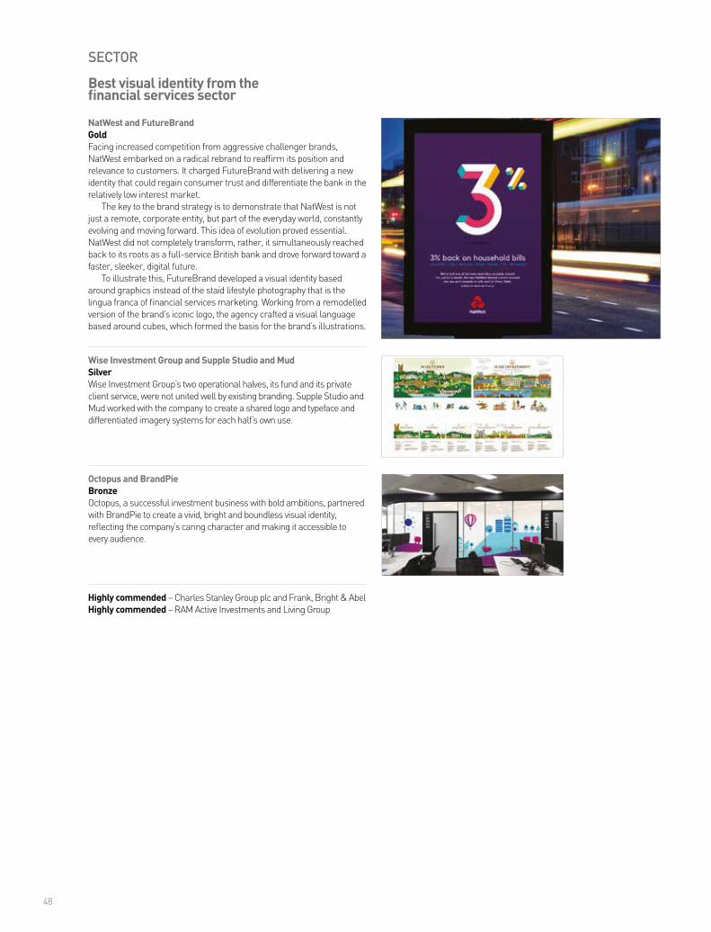
48
SECTOR
Octopus and BrandPieBronzeOctopus, a successful investment business with bold ambitions, partnered with BrandPie to create a vivid, bright and boundless visual identity, reflecting the company’s caring character and making it accessible to every audience.
NatWest and FutureBrandGoldFacing increased competition from aggressive challenger brands, NatWest embarked on a radical rebrand to reaffirm its position and relevance to customers. It charged FutureBrand with delivering a new identity that could regain consumer trust and differentiate the bank in the relatively low interest market.
The key to the brand strategy is to demonstrate that NatWest is not just a remote, corporate entity, but part of the everyday world, constantly evolving and moving forward. This idea of evolution proved essential. NatWest did not completely transform, rather, it simultaneously reached back to its roots as a full-service British bank and drove forward toward a faster, sleeker, digital future.
To illustrate this, FutureBrand developed a visual identity based around graphics instead of the staid lifestyle photography that is the lingua franca of financial services marketing. Working from a remodelled version of the brand’s iconic logo, the agency crafted a visual language based around cubes, which formed the basis for the brand’s illustrations.
Wise Investment Group and Supple Studio and MudSilverWise Investment Group’s two operational halves, its fund and its private client service, were not united well by existing branding. Supple Studio and Mud worked with the company to create a shared logo and typeface and differentiated imagery systems for each half’s own use.
Best visual identity from the financial services sector
Highly commended – Charles Stanley Group plc and Frank, Bright & AbelHighly commended – RAM Active Investments and Living Group

49
pladis and BisqitGoldFollowing the merger of Godiva Chocolatier, United Biscuits, Ulker and DeMet’s Candy Company into a single new global company, pladis, owner, Yildiz Holding, needed to quickly develop a strong identity to unite the disparate businesses into one, powerful brand. Particularly so, as while the acquisitions and mergers were a core business strategy, they came as a surprise to the 26,000 affected employees.
Bisqit was commissioned to create the new brand and immediately began crafting a brand architecture to ensure everything fit into place. The new brand system features key applications such as the website, guidelines and a launch across social channels. But, the most important part of the rebrand was the development of a flexible brand property that could be customised and used across all operating companies while still allowing each to display its own consumer brands.
Our judges praised Bisqit’s efforts for responding to “a tough challenge with a bright and cheery solution.”
Best visual identity from the food and beverage sector
SECTOR
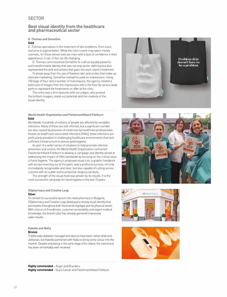
50
SECTOR
World Health Organization and FleishmanHillard FishburnGoldWorldwide, hundreds of millions of people are affected by avoidable infections. Many of these are self-inflicted, but a significant number are also caused by provision of medicines by healthcare professionals. Known as healthcare-associated infections (HAIs), these infections are particularly prevalent in challenging healthcare environments that lack sufficient infrastructure to ensure good hygiene.
As part of a wider series of initiatives to help promote infection prevention and control, the World Health Organization contracted FleishmanHillard Fishburn to develop a campaign and identity aimed at addressing the impact of HAIs worldwide by focusing on the critical issue of hand hygiene. The agency’s proposed visual icon, a graphic handprint with an eye reversing out of the palm, was a profound success, not only immediately recognisable and clear, but also capable of cutting across cultures with its subtle nod to protective religious symbols.
The strength of the visual hook was proven by its results. It is the most successful campaign for hand hygiene in the last 10 years.
Best visual identity from the healthcare and pharmaceutical sector
SOpharmacy and Creative LeapSilverTo cement its successful launch into retail pharmacy in Bulgaria, SOpharmacy and Creative Leap developed a strong visual identity that permeates throughout both the brands logotype and its physical stores. With a focus on friendliness, customer accessibility and expert medical knowledge, the brand’s pilot has already garnered impressive sales results.
D. Thomas and SomeOneGoldD. Thomas specialises in the treatment of skin problems, from scars and acne to pigmentation. While the clinic’s work may seem merely cosmetic, for those whose lives are riven with a lack of confidence in their appearance, it can, in fact, be life changing.
D. Thomas commissioned SomeOne to craft an equally powerful and transformative identity that was not only sector-defining but also represented the skill and artistry that goes into each client’s treatment.
To break away from the sea of flawless skin and smiles that make up skincare marketing, SomeOne instead focused on impressions. Using 100 bags of flour and a number of mannequins, the agency created a bold suite of images from the impressions left in the flour by various body parts to represent the treatments on offer at the clinic.
This entry was a firm favourite with our judges, who praised the brilliant imagery, stand-out potential and the creativity of the visual identity.
Kaleido and NallaBronzeTraditionally diabetes management devices have been rather drab and utilitarian, but Kaleido partnered with Nalla to bring some colour into the market. Despite only being in the early stage of its rollout, the new brand has been remarkably well-received.
Highly commended – Atupri and BrandersHighly commended – Guy’s Cancer and FleishmanHillard Fishburn

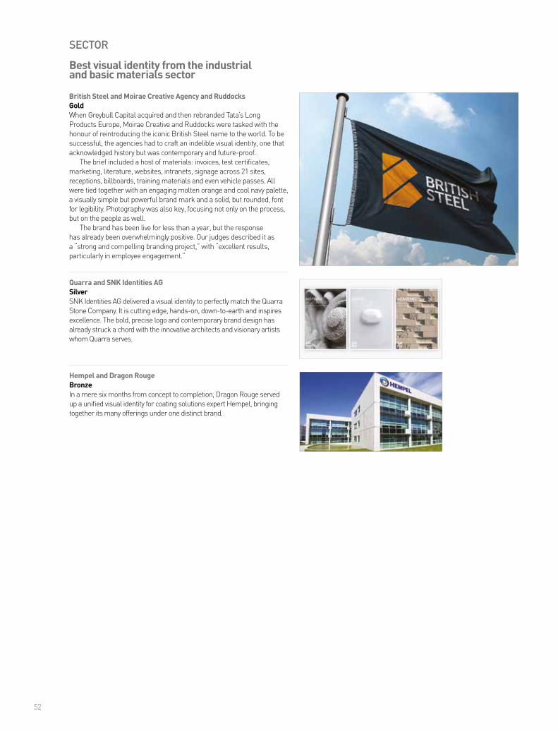
52
SECTOR
Hempel and Dragon RougeBronzeIn a mere six months from concept to completion, Dragon Rouge served up a unified visual identity for coating solutions expert Hempel, bringing together its many offerings under one distinct brand.
British Steel and Moirae Creative Agency and RuddocksGoldWhen Greybull Capital acquired and then rebranded Tata’s Long Products Europe, Moirae Creative and Ruddocks were tasked with the honour of reintroducing the iconic British Steel name to the world. To be successful, the agencies had to craft an indelible visual identity, one that acknowledged history but was contemporary and future-proof.
The brief included a host of materials: invoices, test certificates, marketing, literature, websites, intranets, signage across 21 sites, receptions, billboards, training materials and even vehicle passes. All were tied together with an engaging molten orange and cool navy palette, a visually simple but powerful brand mark and a solid, but rounded, font for legibility. Photography was also key, focusing not only on the process, but on the people as well.
The brand has been live for less than a year, but the response has already been overwhelmingly positive. Our judges described it as a “strong and compelling branding project,” with “excellent results, particularly in employee engagement.”
Quarra and SNK Identities AGSilverSNK Identities AG delivered a visual identity to perfectly match the Quarra Stone Company. It is cutting edge, hands-on, down-to-earth and inspires excellence. The bold, precise logo and contemporary brand design has already struck a chord with the innovative architects and visionary artists whom Quarra serves.
Best visual identity from the industrial and basic materials sector
UPCOMING AWARDS OPEN FOR ENTRIES
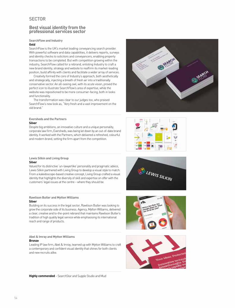
54
SECTOR
Lewis Silkin and Living GroupSilverValued for its distinctive ‘un-lawyerlike’ personality and pragmatic advice, Lewis Silkin partnered with Living Group to develop a visual style to match. From a kaleidoscope-based creative concept, Living Group crafted a visual identity that highlights the diversity of skill and expertise on offer with the customers’ legal issues at the centre – where they should be.
SearchFlow and IndustryGoldSearchFlow is the UK’s market leading conveyancing search provider. With powerful software and data capabilities, it delivers reports, surveys and identity checks to solicitors and conveyancers, enabling property transactions to be completed. But with competition growing within the industry, SearchFlow called for a rebrand, enlisting Industry to craft a new brand identity, strategy and website to reaffirm its market-leading position, build affinity with clients and facilitate a wider array of services.
Creativity formed the core of Industry’s approach, both aesthetically and strategically, injecting a breath of fresh air into a traditionally conservative sector. An all-seeing owl, with its acute vision, proved the perfect icon to illustrate SearchFlow’s area of expertise, while the website was repositioned to be more consumer-facing, both in looks and functionality.
The transformation was clear to our judges too, who praised SearchFlow’s new look as, “Very fresh and a vast improvement on the old brand.”
Rawlison Butler and Mytton WilliamsSilverBuilding on its success in the legal sector, Rawlison Butler was looking to grow the corporate side of its business. Agency, Mytton Williams, delivered a clear, creative and to-the-point rebrand that maintains Rawlison Butler’s tradition of high quality legal service while emphasising its international reach and range of products.
Best visual identity from the professional services sector
Eversheds and the PartnersSilverDespite big ambitions, an innovative culture and a unique personality, corporate law firm, Eversheds, was being let down by an out-of-date brand identity. It worked with the Partners, which delivered a refreshed, colourful and modern brand, setting the firm apart from the competition.
Abel & Imray and Mytton WilliamsBronzeLeading IP law firm, Abel & Imray, teamed up with Mytton Williams to craft a contemporary and confident visual identity that shines for both clients and new recruits alike.
Highly commended – SearchStar and Supple Studio and Mud
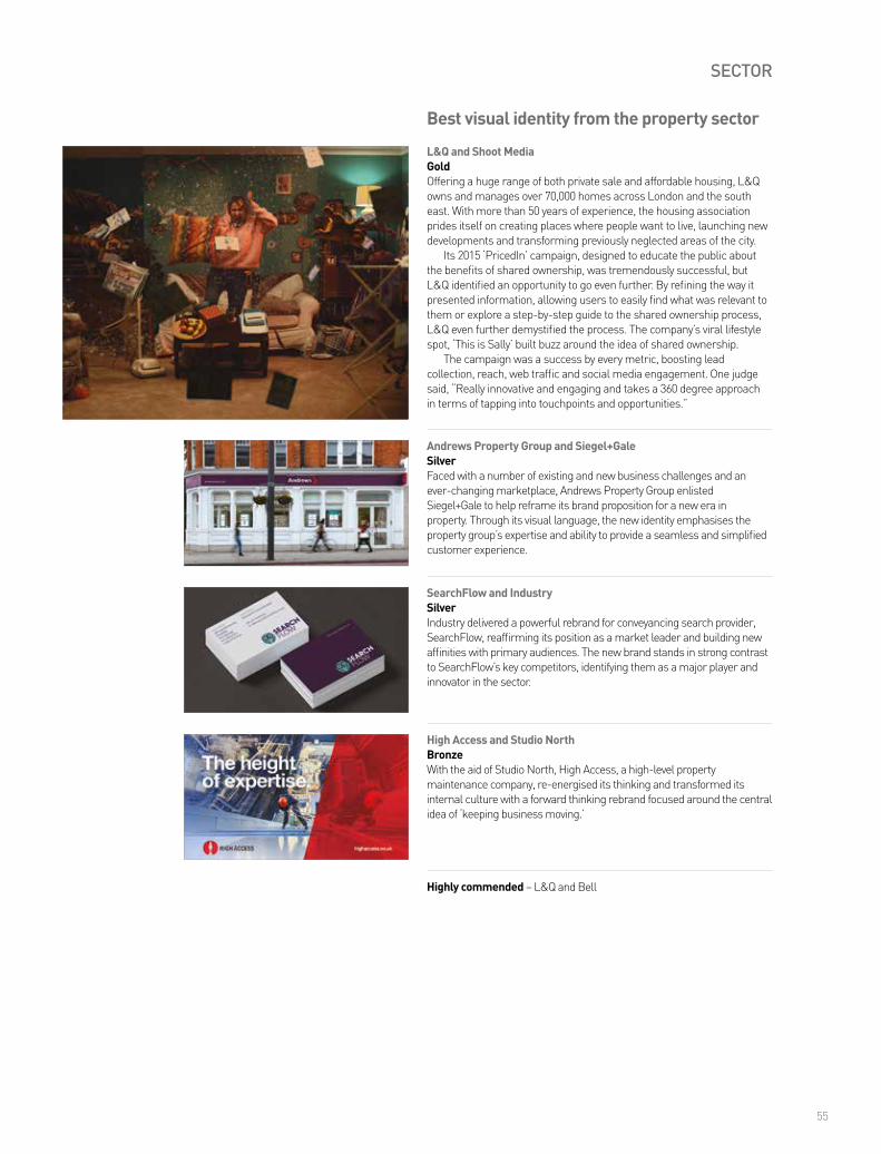
55
SECTOR
SearchFlow and IndustrySilverIndustry delivered a powerful rebrand for conveyancing search provider, SearchFlow, reaffirming its position as a market leader and building new affinities with primary audiences. The new brand stands in strong contrast to SearchFlow’s key competitors, identifying them as a major player and innovator in the sector.
L&Q and Shoot MediaGoldOffering a huge range of both private sale and affordable housing, L&Q owns and manages over 70,000 homes across London and the south east. With more than 50 years of experience, the housing association prides itself on creating places where people want to live, launching new developments and transforming previously neglected areas of the city.
Its 2015 ‘PricedIn’ campaign, designed to educate the public about the benefits of shared ownership, was tremendously successful, but L&Q identified an opportunity to go even further. By refining the way it presented information, allowing users to easily find what was relevant to them or explore a step-by-step guide to the shared ownership process, L&Q even further demystified the process. The company’s viral lifestyle spot, ‘This is Sally’ built buzz around the idea of shared ownership.
The campaign was a success by every metric, boosting lead collection, reach, web traffic and social media engagement. One judge said, “Really innovative and engaging and takes a 360 degree approach in terms of tapping into touchpoints and opportunities.”
Andrews Property Group and Siegel+GaleSilverFaced with a number of existing and new business challenges and an ever-changing marketplace, Andrews Property Group enlisted Siegel+Gale to help reframe its brand proposition for a new era in property. Through its visual language, the new identity emphasises the property group’s expertise and ability to provide a seamless and simplified customer experience.
Best visual identity from the property sector
Highly commended – L&Q and Bell
High Access and Studio NorthBronzeWith the aid of Studio North, High Access, a high-level property maintenance company, re-energised its thinking and transformed its internal culture with a forward thinking rebrand focused around the central idea of ‘keeping business moving.’
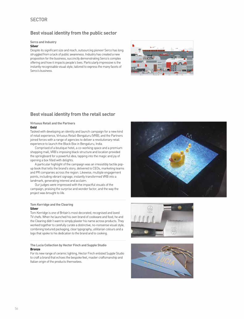
56
SECTOR
Serco and IndustrySilverDespite its significant size and reach, outsourcing pioneer Serco has long struggled from a lack of public awareness. Industry has created a new proposition for the business, succinctly demonstrating Serco’s complex offering and how it impacts people’s lives. Particularly impressive is the instantly recognisable visual style, tailored to express the many facets of Serco’s business.
Best visual identity from the public sector
The Lucia Collection by Hector Finch and Supple StudioBronzeFor its new range of ceramic lighting, Hector Finch enlisted Supple Studio to craft a brand that echoes the bespoke feel, master craftsmanship and Italian origin of the products themselves.
Virtuous Retail and the PartnersGoldTasked with developing an identity and launch campaign for a new kind of retail experience, Virtuous Retail-Bengaluru (VRB), and the Partners joined forces with a range of agencies to deliver a revolutionary retail experience to launch the Black Box in Bengaluru, India.
Comprised of a boutique hotel, a co-working space and a premium shopping mall, VRB’s imposing black structure and location provided the springboard for a powerful idea, tapping into the magic and joy of opening a box filled with delights.
A particular highlight of the campaign was an irresistibly tactile pop-up book that tells the brand’s story, delivered to CEOs, marketing teams and PR companies across the region. Likewise, multiple engagement points, including vibrant signage, instantly transformed VRB into a landmark, generating interest and acclaim.
Our judges were impressed with the impactful visuals of the campaign, praising the surprise and wonder factor, and the way the project was brought to life.
Tom Kerridge and the ClearingSilverTom Kerridge is one of Britain’s most decorated, recognised and loved TV chefs. When he launched his own brand of cookware and food, he and the Clearing didn’t want to simply plaster his name across products. They worked together to carefully curate a distinctive, no-nonsense visual style, combining textured packaging, clear typography, utilitarian colours and a logo that spoke to his dedication to the brand and to cooking.
Best visual identity from the retail sector

Stand out from the crowd
We build brand advantage

58
SECTOR
PrestaShop and StructureBronzeStructure developed an innovative and colourful visual identity for PrestaShop, well-matched to the company’s equally bold ambition to become the worldwide leader in the e-commerce software sector.
Lenovo Moto and FutureBrandGoldDespite Motorola’s history as one of the most iconic brands in communications technology, the advent of the iPhone led to increasingly lower market shares. After being acquired by Lenovo in 2014, the brand’s fortune began to change, and by 2016, it was undergoing a significant rebrand.
FutureBrand, Lenovo’s global brand partner, was commissioned to take charge and delivered a new visual identity that boldly captures Lenovo Moto’s adventurous spirit. Instead of the muted colours, white spaces and refined product presentation that define the modern mobile market, FutureBrand’s design is colourful and arresting, resurrecting the iconic Emsignia (batwing) logo in a new and vibrant form.
As one of our judges said, “Like seeing an old friend with a cool new haircut, the distinction within the category is to be commended – bold, colourful and fun – exactly what they set out to do.”
giffgaff and ECHOSilvergiffgaff, the quintessential challenger brand, is run by its members and mutuality, not contracts, shops or call centres. With brand engagement key for the telecommunications disruptor, it enlisted ECHO to ensure its visual language spoke volumes to customers. ECHO delivered, crafting a visual identity that captures the vibrant, youthful and dynamic tone that is at the heart of giffgaff’s success.
Best visual identity from the technology, media and telecommunications sector
Highly commended – Echo and Brand Brothers

59
SECTOR
Alitalia and LandorBronzeWith business facing headwinds, Alitalia enlisted Landor to remind customers why they used to love flying with the flagship Italian airline. The agency delivered a visual style inspired by the precision and detail of Italian design, crafting a new brand that is already proving a winner.
Headwater Holidays and Missouri CreativeGoldHeadwater is a well-established tour operator with over 30 years of experience in the soft activity holiday market, offering some of the finest walking, cycling, canoeing and snow holiday experiences available.
While the brand had undergone a refresh in 2012, a lack of clear guidelines had led to a disjointed mix of messages across communication channels leading to inconsistent and sometimes confusing customer journeys.
Headwater’s agency, Missouri Creative, developed a new brand positioning and essence for the holidaymaker, centred around four major pillars to ensure every aspect of the visual design was centred on driving business and attracting customers.
Inspiring photography and bold iconography are key aspects of the new brand, with a vibrant, bespoke blue colour tying the various visual aspects together. Our judges described the rebrand as a “brilliant transition to a striking premium brand, really capturing the independent traveller experience.”
London Luton Airport and ico Design PartnersSilverWith six international airports serving London, the aviation market in the south east is extremely competitive. To edge itself above its rivals, Luton embarked on a radical rebranding project. Positioning Luton not just as a piece of infrastructure but an emotive and welcoming business, the rebrand, crafted by ico Design Partners, features a colourful, modern visual style, bringing real personality to a functional industry.
Best visual identity from the travel, leisure and tourism sector
Highly commended – Play Valley and Moirae Creative AgencyHighly commended – Warwick Conferences and Frank, Bright & Abel
Browse our font library and download a free, fully-functioning trial of any of our fonts today. Interested in a typography and branding workshop? Get in touch to arrange a studio visit.
daltonmaag.com
for the Love of type
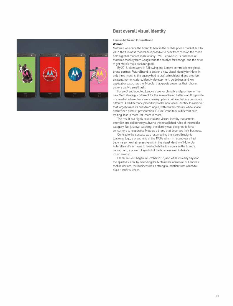
61
Lenovo Moto and FutureBrandWinnerMotorola was once the brand to beat in the mobile phone market, but by 2012, the business that made it possible to hear from men on the moon held a global market share of only 1.9%. Lenovo’s 2014 purchase of Motorola Mobility from Google was the catalyst for change, and the drive to get Moto’s mojo back for good.
By 2016, plans were in full swing and Lenovo commissioned global brand partner, FutureBrand to deliver a new visual identity for Moto. In only three months, the agency had to craft a fresh brand and creative strategy, nomenclature, identity development, guidelines and key applications, such as the ‘Moodle’ that greets a user as their phone powers up. No small task.
FutureBrand adopted Lenovo’s over-arching brand promise for the new Moto strategy – different for the sake of being better – a fitting motto in a market where there are so many options but few that are genuinely different. And difference proved key to the new visual identity. In a market that largely takes its cues from Apple, with muted colours, white space and refined product presentation, FutureBrand took a different path, trading ‘less is more’ for ‘more is more.’
The result is a highly colourful and vibrant identity that arrests attention and deliberately subverts the established rules of the mobile category. Not just eye-catching, the identity was designed to force consumers to reappraise Moto as a brand that deserves their business.
Central to the success was resurrecting the iconic Emsignia (batwing) logo, a proud relic of the 1950s which in recent years had become somewhat recessive within the visual identity of Motorola. FutureBrand’s aim was to reestablish the Emsignia as the brand’s calling card, a powerful symbol of the business akin to Nike’s iconic swoosh.
Global roll-out began in October 2016, and while it’s early days for the spirited vision, by extending the Moto name across all of Lenovo’s mobile devices, the business has a strong foundation from which to build further success.
Best overall visual identity
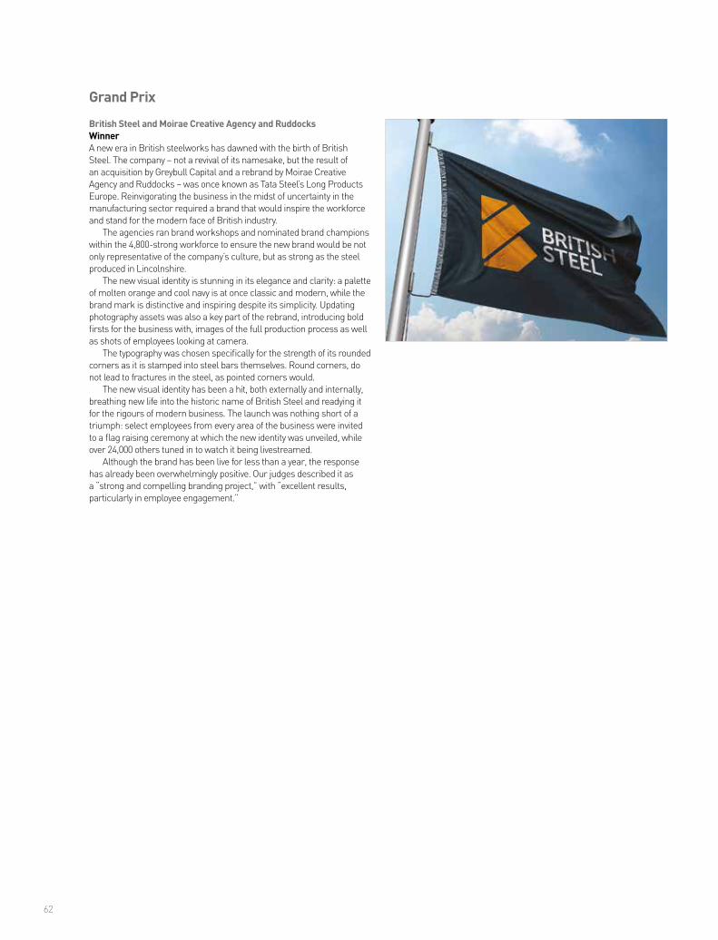
62
British Steel and Moirae Creative Agency and RuddocksWinnerA new era in British steelworks has dawned with the birth of British Steel. The company – not a revival of its namesake, but the result of an acquisition by Greybull Capital and a rebrand by Moirae Creative Agency and Ruddocks – was once known as Tata Steel’s Long Products Europe. Reinvigorating the business in the midst of uncertainty in the manufacturing sector required a brand that would inspire the workforce and stand for the modern face of British industry.
The agencies ran brand workshops and nominated brand champions within the 4,800-strong workforce to ensure the new brand would be not only representative of the company’s culture, but as strong as the steel produced in Lincolnshire.
The new visual identity is stunning in its elegance and clarity: a palette of molten orange and cool navy is at once classic and modern, while the brand mark is distinctive and inspiring despite its simplicity. Updating photography assets was also a key part of the rebrand, introducing bold firsts for the business with, images of the full production process as well as shots of employees looking at camera.
The typography was chosen specifically for the strength of its rounded corners as it is stamped into steel bars themselves. Round corners, do not lead to fractures in the steel, as pointed corners would.
The new visual identity has been a hit, both externally and internally, breathing new life into the historic name of British Steel and readying it for the rigours of modern business. The launch was nothing short of a triumph: select employees from every area of the business were invited to a flag raising ceremony at which the new identity was unveiled, while over 24,000 others tuned in to watch it being livestreamed.
Although the brand has been live for less than a year, the response has already been overwhelmingly positive. Our judges described it as a “strong and compelling branding project,” with “excellent results, particularly in employee engagement.”
Grand Prix
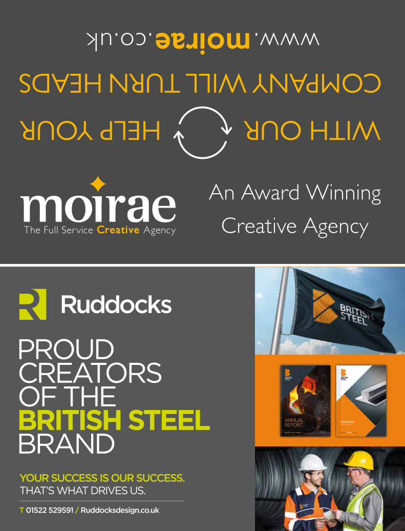


![index [] · Authoring, copywriting, pre- and post-editing Translation of SeO-friendly websites Software and app localization Audio-video transcripts, dubbing and subtitling electronic](https://static.fdocuments.in/doc/165x107/5ecd1537381ce046273d9001/index-authoring-copywriting-pre-and-post-editing-translation-of-seo-friendly.jpg)