THE 20 RULES FOR MAKING GOOD DESIGN. Rules can be broken-but never ignored Rules exist as...
22
THE 20 RULES FOR MAKING GOOD DESIGN
-
Upload
andrea-randall -
Category
Documents
-
view
222 -
download
2
Transcript of THE 20 RULES FOR MAKING GOOD DESIGN. Rules can be broken-but never ignored Rules exist as...

THE 20 RULES FOR MAKING GOOD
DESIGN
Rules can be broken-but never ignoredRules exist as guidelines, based on accumulation of
experienceBreaking the rules often leads to true innovation It is beneficial to know which rules are considered
important and whyRules ≠ law
REMINDER

A design can be incredibly beautiful, but if there is no message, it is just an empty shell
A design without a message, story, idea, narrative, or concept is not a design at all
RULE #1: HAVE A CONCEPT
Remember that form carries meaning, no matter how simple or abstract
Eye candy does not qualify as design
If the form ain’t right, get rid of it!
RULE #2: COMMUNICATE- DON’T DECORATE

Design so that anyone can understand what is happening in your art
Speak to the world at large
Draw upon humanity’s shared narrative of form and metaphor
If you are unsure people will “get” it or not, simply show it to people and ask their opinion
RULE #3: BE UNIVERSAL

Make sure all of the elements in your design “talk” to each other
Good design has internal logic and is resolved
If one element is out of place, it disconnects the totality and the message is weakened
RULE #4: SPEAK WITH ONE VISUAL VOICE

Less is moreDon’t add more to a
design just because you think it needs more decoration
True power lies in creativity applied to very little
The more stuff on the page, the more cluttered the design becomes
Just because something is “complicated” does not mean it is “complex”
RULE #5: IF YOU CAN DO IT WITH LESS, THEN DO IT
Negative space is critical to good design
Calls our attention to the content and gives the eyes a place to rest
Negative space is as much a shape as any positive space or form in the design
RULE #6: CREATE SPACE-DON’T FILL IT

Establish visual hierarchyFocus the viewer’s
attention on one important thing fi rst a big shape, startling image, type treatment, bold colors, etc.
Next lead the viewer’s eye to the less important elements in a logical way
RULE #7: GIVE ‘EM THE ONE-TWO PUNCH
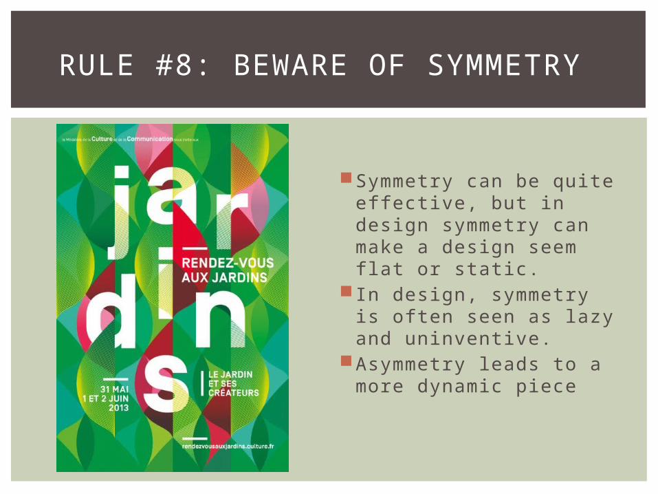
Symmetry can be quite eff ective, but in design symmetry can make a design seem flat or static.
In design, symmetry is often seen as lazy and uninventive.
Asymmetry leads to a more dynamic piece
RULE #8: BEWARE OF SYMMETRY

Although design is a two-dimensional format, your design should impart a sense of depth and movement
Don’t make everything the same size, color, weight, or distance as everything else
Try to create a three-dimensional “window” into the design
Exploit changes in size and transparency
Apply color so that some elements recede and others advance
RULE #9: FIGHT THE FLATNESS

Know what your colors will do when you combine them and what those colors may mean to your audience
Color carries abundant meaning
Color aff ects visual hierarchy
You don’t always need to choose expected colors
RULE #10: PICK COLORS ON PURPOSE
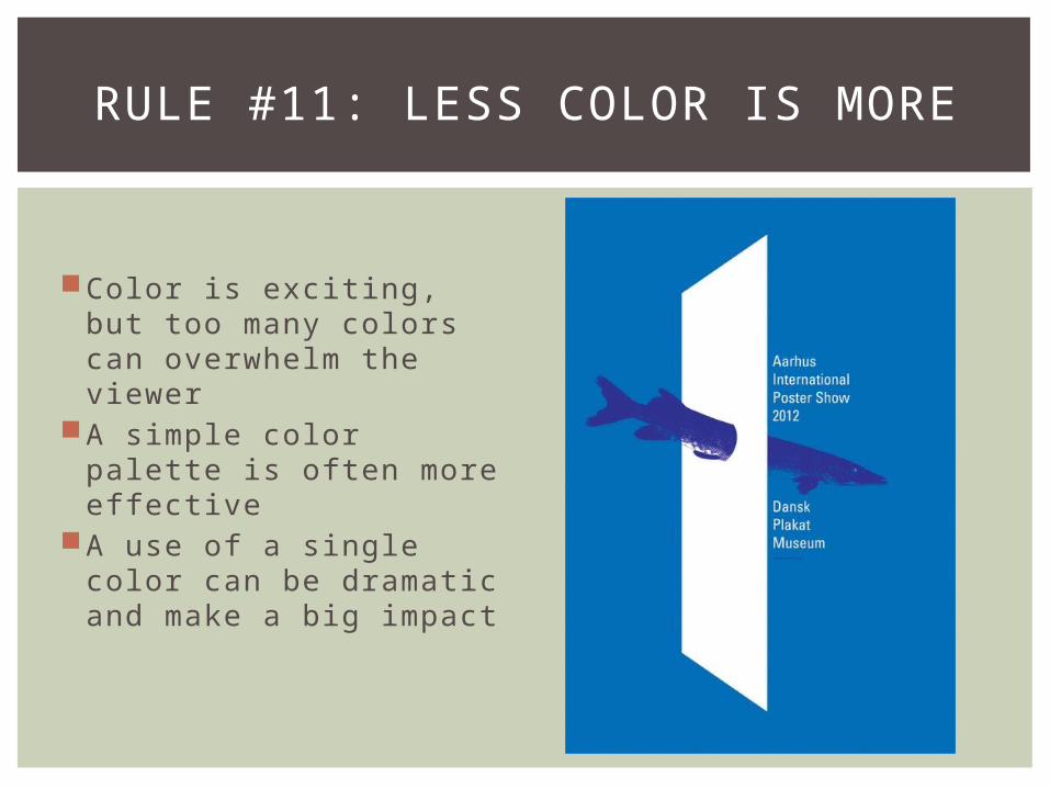
Color is exciting, but too many colors can overwhelm the viewer
A simple color palette is often more eff ective
A use of a single color can be dramatic and make a big impact
RULE #11: LESS COLOR IS MORE

Make sure you use a range of dark and light
Concentrate on areas of extreme dark and light; create explosions of luminosity
Make noticeable distinctions in value
RULE #12: MASTER THE DARK AND THE LIGHT
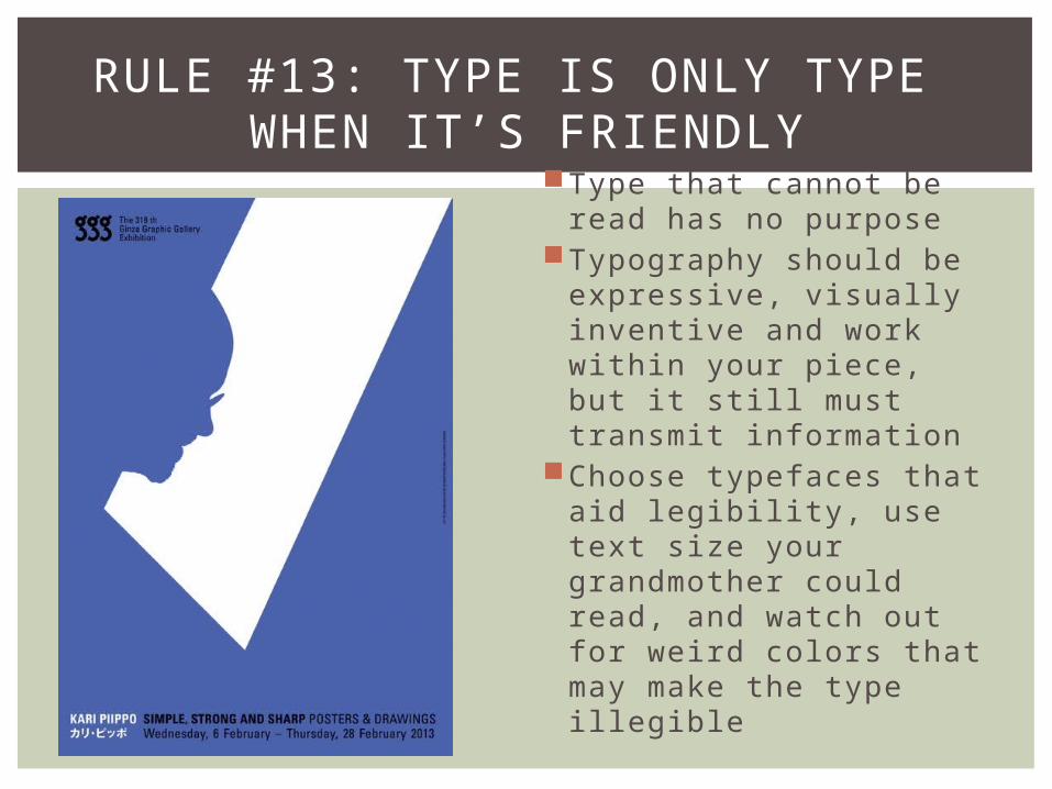
Type that cannot be read has no purpose
Typography should be expressive, visually inventive and work within your piece, but it still must transmit information
Choose typefaces that aid legibility, use text size your grandmother could read, and watch out for weird colors that may make the type illegible
RULE #13: TYPE IS ONLY TYPE WHEN IT’S FRIENDLY
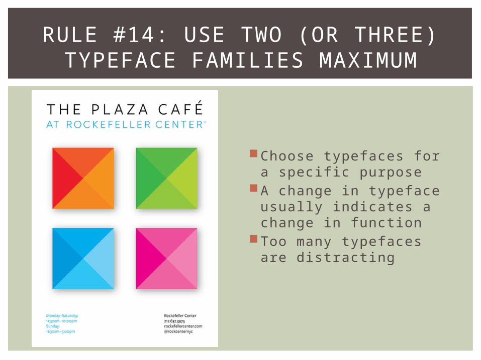
Choose typefaces for a specific purpose
A change in typeface usually indicates a change in function
Too many typefaces are distracting
RULE #14: USE TWO (OR THREE) TYPEFACE FAMILIES MAXIMUM

Type is visual material as much as images are
The type must relate to the other elements of your design and further the tone, message, or narrative of the design
Don’t blandly separate type from image, work it into your design
RULE #15: TREAT TYPE AS YOU WOULD IMAGE

Be conscious of how much information is conveyed by the text. You don’t need to show the same information. Instead, show what the text is relaying in a creative way
Text and image should complement one another and push one another to a greater meaning and understanding.
RULE #16: AVOID REDUNDANT REDUNDANCIES

If your options are limited, consider them all
Try not to rely on whatever exists even though it may be cheaper
Beware of stock images, very often an original solution is no further away then dots, lines, or an abstract shape
Inventing images from scratch will help you connect your unique message to your audience
RULE #17: CREATE IMAGES-DON’T SCAVENGE

It is great to be inspired by past design, but do not reproduce a particular period style just because it looks cool
Learn from others, but ultimately do your own work
Remember that all great designers work within the context of their era but push the boundaries as well. Those designers you admire were not merely copying older designers. If you really want to be like your favorite designer, stick to your own unique style so that one day, someone will want to copy your work, just like you want to copy theirs.
RULE #18: LOOK TO HISTORY BUT DON’T REPEAT IT

People in the present respond to what is cool and hip right now.
Forget being trendy. Design around meaning, not current styles
Who knows, maybe your design style could be the next big thing!
RULE #19: IGNORE FASHION
Place material on the page with confidence, using your eye as your guide
Make things look the way you intend
Decisiveness makes for a convincing impression
RULE #20: BE DECISIVE: DO IT ON PURPOSE, OR NOT AT ALL


![NBER WORKING PAPER SERIES WEALTH ACCUMULATION …cycle model, are strongly related to wealth accumulation. For example, Madrian and Shea [2001] show that default rules in defined](https://static.fdocuments.in/doc/165x107/5eceaa4b1f3056299e53b666/nber-working-paper-series-wealth-accumulation-cycle-model-are-strongly-related.jpg)