tfsg.orgtfsg.org/resources/Maps about the world.docx · Web viewA fascinating set of maps showing a...
18
A fascinating set of maps showing a variety of similarities – and differences -- in the world as we think we know it. It may change your perspective on both. 1.This map shows the world divided into 7 sections (each with distinct color) each section containing 1 billion people. 2. This map shows (in white) where 98 percent of Australia 's entire population lives.
Transcript of tfsg.orgtfsg.org/resources/Maps about the world.docx · Web viewA fascinating set of maps showing a...

A fascinating set of maps showing a variety of similarities – and differences -- in the world as we think we know it. It may change your perspective on both.
1.This map shows the world divided into 7 sections (each with distinct color) each section containing 1 billion people.
2. This map shows (in white) where 98 percent of Australia 's entire population lives.

3. It may not come as a surprise but more people live inside the circle than outside of it.

4. This map shows what is on the other side of the world from where you're standing. For the most part it's water.

5. Apparently you can't get Big Macs everywhere. This map shows (in red) the countries that have McDonalds.

6. This map shows the countries (in blue) where people drive on the left side of the road.

7. This map shows countries (in white) that England has never invaded. There are only 22. (In the WORLD!)

8. The line on this map shows all of the world's Internet connections in 1969.

9. This map shows the countries that heavily restricted Internet access in 2013.

10. This map shows (in red) countries that were all Communist at one point in time.

11. This map shows (in red) the countries that don't use the metric system.

12. This map shows (in blue) places where Google street view is available.
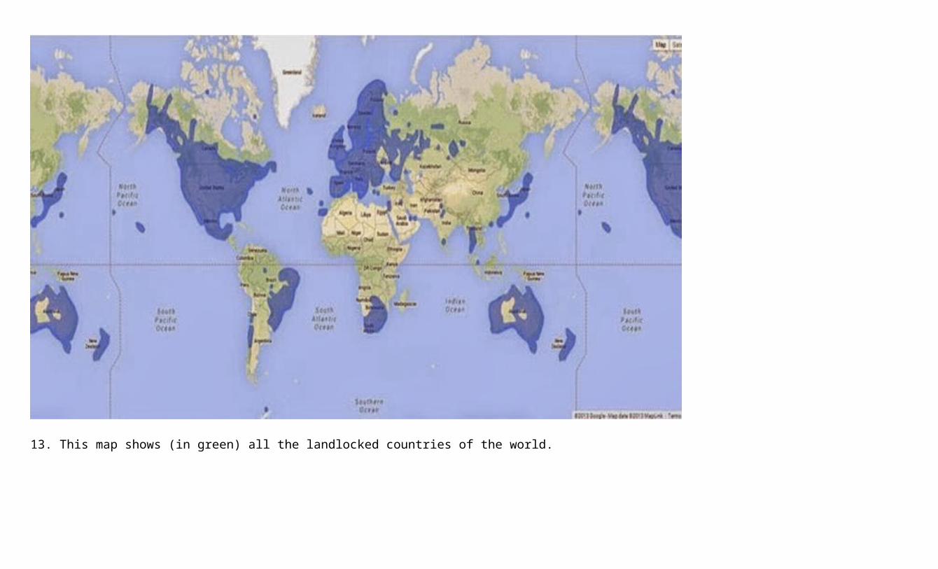
13. This map shows (in green) all the landlocked countries of the world.

14. And this is what the world would look like if all the countries with coast lines sank.
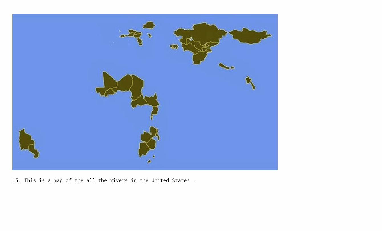
15. This is a map of the all the rivers in the United States .
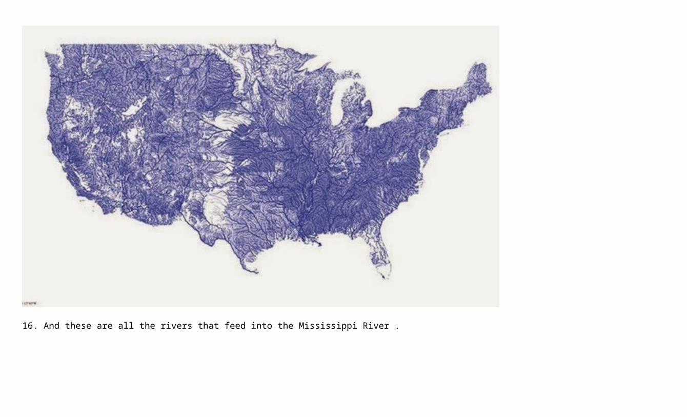
16. And these are all the rivers that feed into the Mississippi River .

17. This is a map of the highest paid public employees in the U. S. (Quite telling as to what our 'priorities' are.)

18. This map shows how much space the United States would occupy on the moon.