Textual analysis of music magazine front covers
6
-
Upload
amandamulligan -
Category
Technology
-
view
469 -
download
3
Transcript of Textual analysis of music magazine front covers
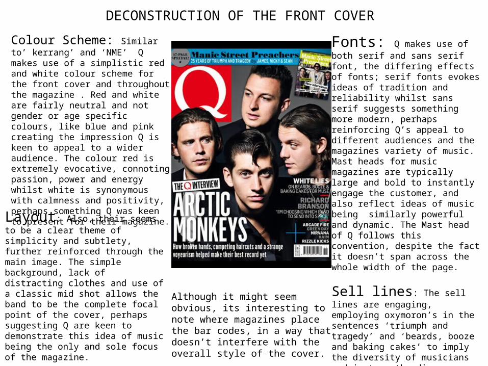
DECONSTRUCTION OF THE FRONT COVER Fonts: Q makes use of both serif and sans serif font, the differing effects of fonts; serif fonts evokes ideas of tradition and reliability whilst sans serif suggests something more modern, perhaps reinforcing Q’s appeal to different audiences and the magazines variety of music. Mast heads for music magazines are typically large and bold to instantly engage the customer, and also reflect ideas of music being similarly powerful and dynamic. The Mast head of Q follows this convention, despite the fact it doesn’t span across the whole width of the page.
Sell lines: The sell lines are engaging, employing oxymoron’s in the sentences ‘triumph and tragedy’ and ‘beards, booze and baking cakes’ to imply the diversity of musicians and in turn the diverse nature of the interviews, also the sentence ‘beards, booze and baking cakes’ employs makes use of alliteration, to create an almost rhythmic effect.
Colour Scheme: Similar to’ kerrang’ and ‘NME’ Q makes use of a simplistic red and white colour scheme for the front cover and throughout the magazine . Red and white are fairly neutral and not gender or age specific colours, like blue and pink creating the impression Q is keen to appeal to a wider audience. The colour red is extremely evocative, connoting passion, power and energy whilst white is synonymous with calmness and positivity, perhaps something Q was keen to present for their magazine.
Layout: Also, their seems to be a clear theme of simplicity and subtlety, further reinforced through the main image. The simple background, lack of distracting clothes and use of a classic mid shot allows the band to be the complete focal point of the cover, perhaps suggesting Q are keen to demonstrate this idea of music being the only and sole focus of the magazine.
Although it might seem obvious, its interesting to note where magazines place the bar codes, in a way that doesn’t interfere with the overall style of the cover.
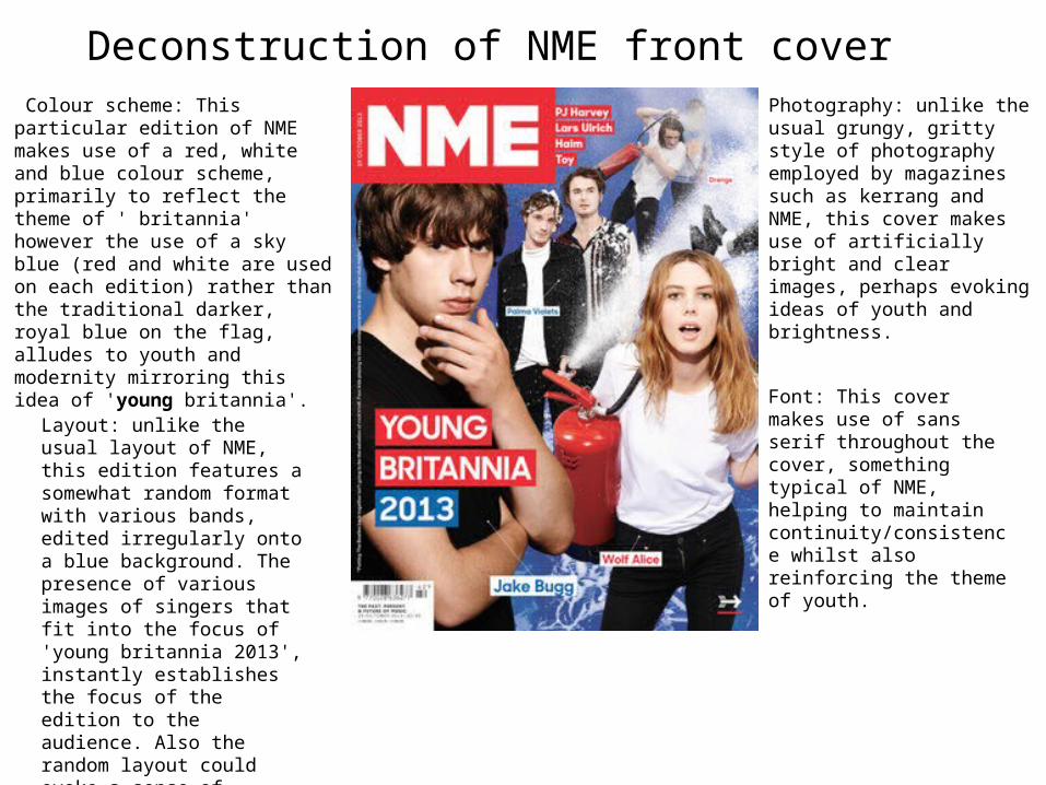
Deconstruction of NME front cover Colour scheme: This particular edition of NME makes use of a red, white and blue colour scheme, primarily to reflect the theme of ' britannia' however the use of a sky blue (red and white are used on each edition) rather than the traditional darker, royal blue on the flag, alludes to youth and modernity mirroring this idea of 'young britannia'.
Photography: unlike the usual grungy, gritty style of photography employed by magazines such as kerrang and NME, this cover makes use of artificially bright and clear images, perhaps evoking ideas of youth and brightness.
Layout: unlike the usual layout of NME, this edition features a somewhat random format with various bands, edited irregularly onto a blue background. The presence of various images of singers that fit into the focus of 'young britannia 2013', instantly establishes the focus of the edition to the audience. Also the random layout could evoke a sense of spontaneity and freedom, associated with youth.
Font: This cover makes use of sans serif throughout the cover, something typical of NME, helping to maintain continuity/consistence whilst also reinforcing the theme of youth.
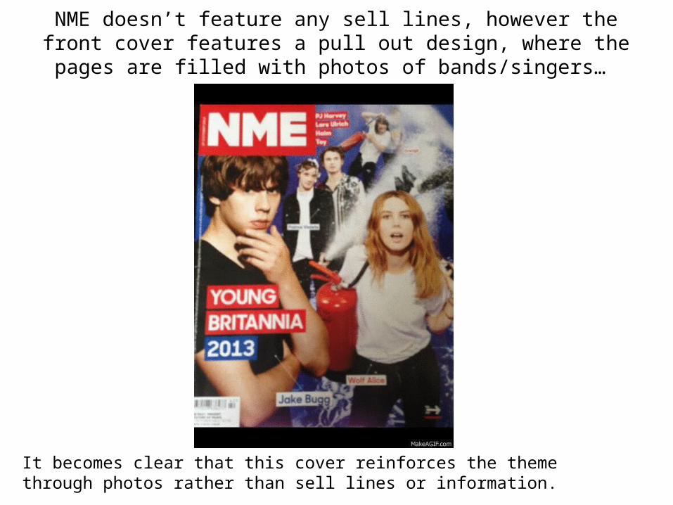
NME doesn’t feature any sell lines, however the front cover features a pull out design, where the pages are
filled with photos of bands/singers…
It becomes clear that this cover reinforces the theme through photos rather than sell lines or information.
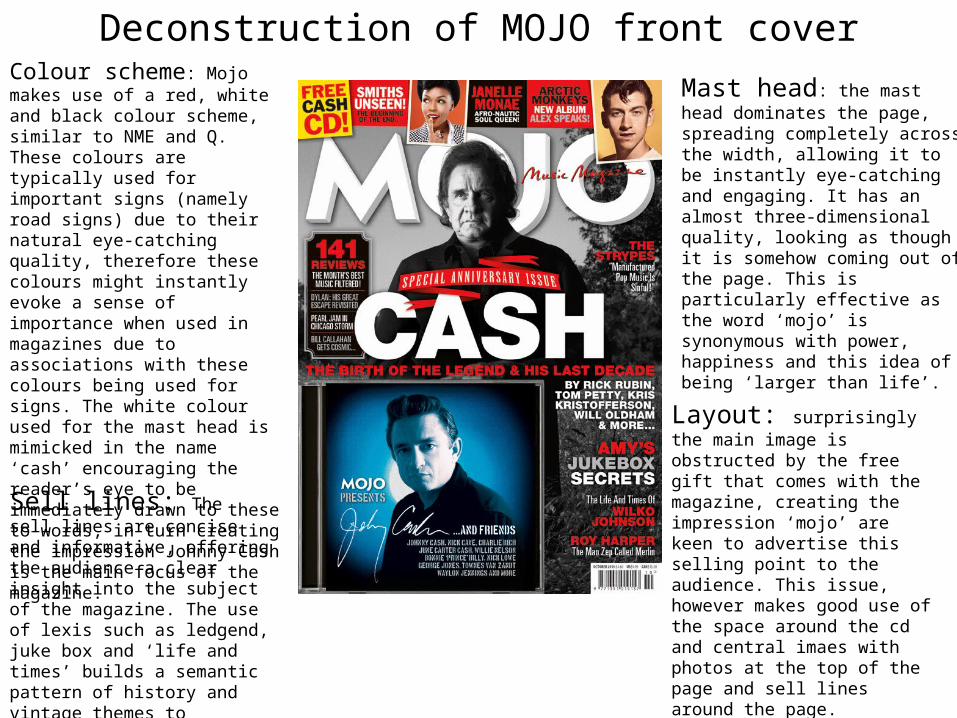
Deconstruction of MOJO front coverColour scheme: Mojo makes use of a red, white and black colour scheme, similar to NME and Q. These colours are typically used for important signs (namely road signs) due to their natural eye-catching quality, therefore these colours might instantly evoke a sense of importance when used in magazines due to associations with these colours being used for signs. The white colour used for the mast head is mimicked in the name ‘cash’ encouraging the reader’s eye to be immediately drawn to these to words, in turn creating the impression Johnny Cash is the main focus of the magazine.
Mast head: the mast head dominates the page, spreading completely across the width, allowing it to be instantly eye-catching and engaging. It has an almost three-dimensional quality, looking as though it is somehow coming out of the page. This is particularly effective as the word ‘mojo’ is synonymous with power, happiness and this idea of being ‘larger than life’.
Layout: surprisingly the main image is obstructed by the free gift that comes with the magazine, creating the impression ‘mojo’ are keen to advertise this selling point to the audience. This issue, however makes good use of the space around the cd and central imaes with photos at the top of the page and sell lines around the page.
Sell lines: The sell lines are concise and informative, offering the audience a clear insight into the subject of the magazine. The use of lexis such as ledgend, juke box and ‘life and times’ builds a semantic pattern of history and vintage themes to emphasize its focus as an anniversary issue.