Textual analysis
4
Textual analysis
-
Upload
sallyreeves19 -
Category
Art & Photos
-
view
120 -
download
0
Transcript of Textual analysis
Textual analysis
Front cover
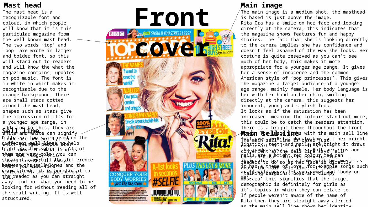
Main imageThe main image is a medium shot, the masthead is based is just above the image.Rita Ora has a smile on her face and looking directly at the camera, this indicates that the magazine shows features fun and happy stories. The fact that she is looking directly to the camera implies she has confidence and doesn’t feel ashamed of the way she looks. Her costume is quite reserved as you can’t see much of her body, this makes it more appropriate for a younger age range. It gives her a sense of innocence and the common American style of ‘pop princesses’. This gives the magazine a target audience of a younger age range, mainly female. Her body language is her with her hand on her chin, smiling directly at the camera, this suggests her innocent, young and stylish look.It looks as if the saturation has been increased, meaning the colours stand out more, this could be to catch the readers attention. There is a bright theme throughout the front cover. The image links with the main sell line ‘all eyes on Rita’ due to the fact her bright lipstick, teeth and nails are bright it draws the readers eyes to this. Both her lips and nails are a bright red colour red can insinuate love, this links with her music as it has a theme of love, for example songs such as ‘I will never let you down’ and ‘body on me’.
Mast head The mast head is a recognizable font and colour, in which people will know that it is this particular magazine from the well known mast head. The two words ‘top’ and ‘pop’ are wrote in larger and bolder font, so this will stand out to readers and will know the what the magazine contains, updates on pop music. The font is in white in which makes it recognizable due to the orange background. There are small stars dotted around the mast head, shapes such as stars give the impression of it’s for a younger age range, in addition to this, they are white and white can signify innocence and purity, in which younger people are. Just above the mast head is the ‘BBC’ logo, this advertises BBC in a way that you will find contents of the magazine on BBC.
Main sell lineThe main sell line is based just underneath Rita’s face. This is convenient as the sell line says ‘all eyes on Rita’, this is easy for the readers to do so as her face is directly above the main sell line. It says ‘talking bargains, boys and clumpy mascara’ this signifies that the target demographic is definitely for girls as it’s topics in which they can relate to. If people weren’t aware of the name of Rita then they are straight away alerted as the main sell line shows her identity. The yellow background helps the writing on the main sell line to stand out as there is quite a lot, if there was not a bright background people may be put off reading it due to the large amount of writing on such a small template.
Sell lineDifferent fonts are used on the different sell lines to help highlight the subjects. All of them are very bold, you can straight away tell the difference between the sell lines and the normal text, it is beneficial to the reader as you can straight away find out what you need to be looking for without reading all of the small writing. It is well structured.
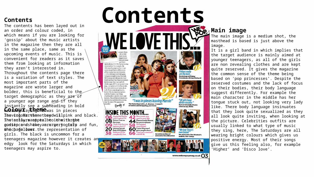
Contents page Main image
The main image is a medium shot, the masthead is based is just above the image.It is a girl band in which implies that the target audience is mainly aimed at younger teenagers, as all of the girls are non revealing clothes and are kept quite reserved. It gives the magazine the common sense of the theme being based on ‘pop princesses’. Despite the reserved costumes and the lack of focus on their bodies, their body language suggest differently. For example the main character in the middle has her tongue stuck out, not looking very lady like. There body language insinuates that they look quite sexualized as they all look quite inviting, when looking at the picture. Celebrities outfits are usually linked to what type of music they sing, here, The Saturdays are all wearing bright colours which gives us positive energy. Most of their songs give us this feeling also, for example ‘Higher’ and ‘Disco love’.Colour theme
The colour theme used is pink and black. The colours appeal to the target audience as they are very girly and fun, which follows the representation of girls. The black is uncommon for a teenagers magazine however it creates an edgy look for the Saturdays in which teenagers may aspire to.
ContentsThe contents has been layed out in an order and colour coded, in which means if you are looking for ‘gossip’ about the music artists in the magazine then they are all in the same place, same as the upcoming events of music. This is convenient for readers as it saves them from looking at information they aren’t interested in. Throughout the contents page there is a variation of text styles. The most important parts of the magazine are wrote larger and bolder, this is beneficial to the target demographic as they are of a younger age range and if they instantly see a subheading in bold writing saying “I was in pieces leaving Marvin” they will instantly want to be in with the gossip and have an urge to turn the page over.
Double page
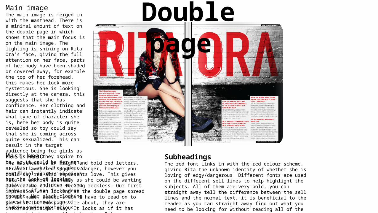
Main imageThe main image is merged in with the masthead. There is a minimal amount of text on the double page in which shows that the main focus is on the main image. The lighting is shining on Rita Ora’s face, giving the full attention on her face, parts of her body have been shaded or covered away, for example the top of her forehead, this makes her look more mysterious. She is looking directly at the camera, this suggests that she has confidence. Her clothing and hair can instantly indicate what type of character she is, here her body is quite revealed so toy could say that she is coming across quite sexualized. This can result in the target audience being for girls as this is what they aspire to be, or it could be for men as this is what they admire. Her facial expression gives her the look of looking quite upset and down as she looks as if she is in deep thought. Her black clothing gives the connotation of looking quite mysterious.
Mast headThe masthead is in bright and bold red letters. Straight away red suggests danger, however you could say red also represents love. This gives Rita an unknown identity as she could be wanting love or she could be feeling reckless. Our first impression when looking at the double page spread is the name, reader’s don’t have to read on to see what the two pages are about, they are informed straight away. It looks as if it has been painted on a wall, this gives Rita a reckless look, it is as if she has broken the rules and done this herself, perhaps she has gone off the rails and started to break rules.
SubheadingsThe red font links in with the red colour scheme, giving Rita the unknown identity of whether she is loving of edgy/dangerous. Different fonts are used on the different sell lines to help highlight the subjects. All of them are very bold, you can straight away tell the difference between the sell lines and the normal text, it is beneficial to the reader as you can straight away find out what you need to be looking for without reading all of the small writing. It is well structured. However the red font is the questions in which Rita is being asked, this prevents confusion with the readers as they will know exactly the difference between the questions and the answers.