
Textual analysis
3
Textual Analysis of Album Cover In the background there is a stadium full with people, these people are the fans of Michael Jackson. This portrays the popularity of the artist. The colour red shows that the artist is a danger to the music industry and connotes energy and power, this also then links to the album name ‘immortal’. The fact that he believe he will not die, his music will always be around, and that also no matter what he will also be remembered. As you can see all these people/characters are performers. Within there are people playing guitars, singers and also dancers. On this album cover it’s made to look like Michael Jackson is the dominant, more powerful performer. And that with his music and the content he produces is simply so much better than what they produce. The stance that this artist is performing is the same as god when was on the cross, this also shows how important he is. Most of his fans think of him as a religious icon, they worship and appreciate what he does. The text on this album cover also links to the theme, this is because it looks like the letters have been made from either stone or steel which are all strong and long lasting materials, this can link to The angry look on his face shows that he is serious and also passionate about what he does. This also shows that he is competitive and is ready to fight to be Jack Hickford
-
Upload
maxbranning -
Category
Education
-
view
212 -
download
0
Transcript of Textual analysis
Textual Analysis of Album Cover
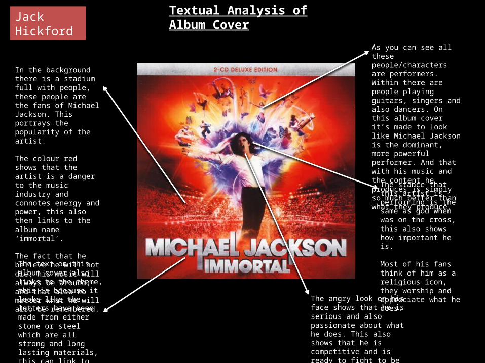
In the background there is a stadium full with people, these people are the fans of Michael Jackson. This portrays the popularity of the artist.
The colour red shows that the artist is a danger to the music industry and connotes energy and power, this also then links to the album name ‘immortal’.
The fact that he believe he will not die, his music will always be around, and that also no matter what he will also be remembered.
As you can see all these people/characters are performers. Within there are people playing guitars, singers and also dancers. On this album cover it’s made to look like Michael Jackson is the dominant, more powerful performer. And that with his music and the content he produces is simply so much better than what they produce.
The stance that this artist is performing is the same as god when was on the cross, this also shows how important he is.
Most of his fans think of him as a religious icon, they worship and appreciate what he does.The text on this album
cover also links to the theme, this is because it looks like the letters have been made from either stone or steel which are all strong and long lasting materials, this can link to the life of Michael Jackson and his career in music.
The angry look on his face shows that he is serious and also passionate about what he does. This also shows that he is competitive and is ready to fight to be the best.
Jack Hickford
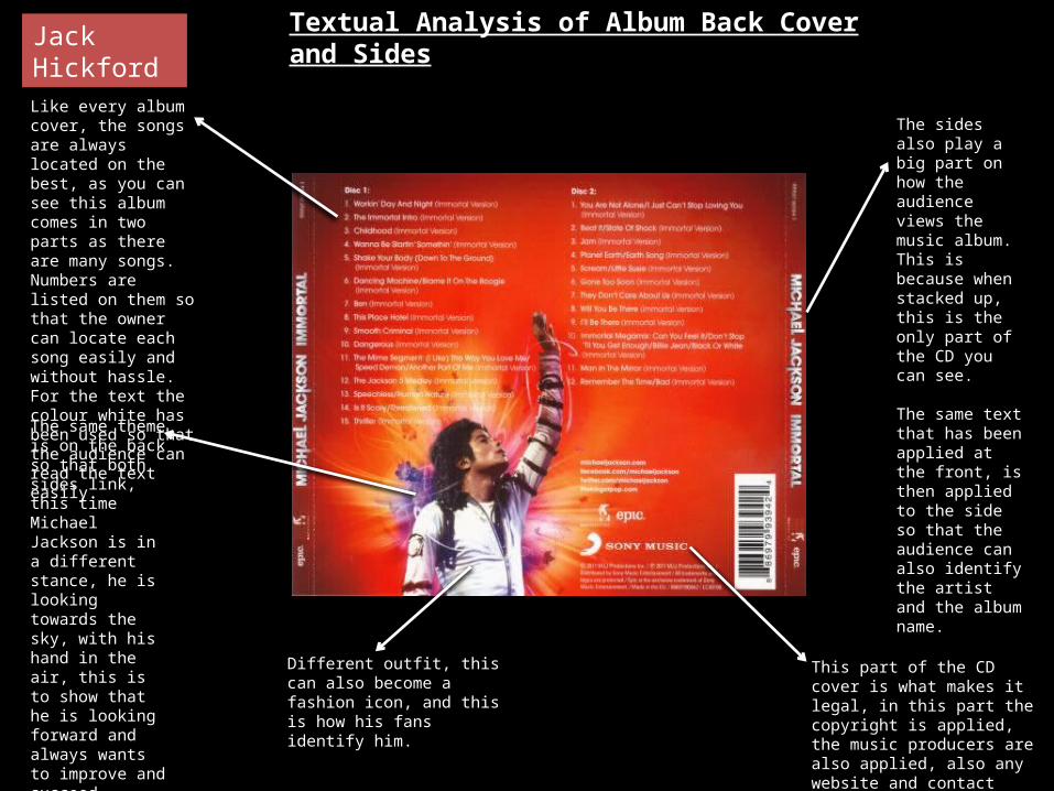
Like every album cover, the songs are always located on the best, as you can see this album comes in two parts as there are many songs. Numbers are listed on them so that the owner can locate each song easily and without hassle. For the text the colour white has been used so that the audience can read the text easily.
The same theme is on the back so that both sides link, this time Michael Jackson is in a different stance, he is looking towards the sky, with his hand in the air, this is to show that he is looking forward and always wants to improve and succeed higher, it shows that we have not seen the best of him and that there is still more to come.
The sides also play a big part on how the audience views the music album. This is because when stacked up, this is the only part of the CD you can see.
The same text that has been applied at the front, is then applied to the side so that the audience can also identify the artist and the album name.
This part of the CD cover is what makes it legal, in this part the copyright is applied, the music producers are also applied, also any website and contact information could be applied
Different outfit, this can also become a fashion icon, and this is how his fans identify him.
Textual Analysis of Album Back Cover and SidesJack Hickford

The titles are also applied to the front of the case too.
The colours are also themed throughout, again the use of red and purple link to the front and back cover.
Disc numbers are applied so that the audience don’t have trouble of getting them mixed, they can also identify this from the colour of each disc.
Contact information such as emails, also websites and also social network information could be added such as Twitter accounts or Facebook accounts/pages. This is so that they are able to build there fan base and become even more popular.
Again copyright information on the CD too. Just make make full aware.
The stars that are applied to the CD’s can show the fact that he is a pop star and are also applied for decoration.
Jack Hickford Textual Analysis of Album CD’s


